[TA] Sessions OHLC# TA Sessions OHLC
TA Sessions OHLC is a session-based market structure indicator that maps Regular Trading Hours (RTH) and Globex / Extended Hours (ETH) levels directly onto your chart.
It provides a clear, consistent framework for understanding where price is trading relative to session structure , so you can make better decisions around context, bias, and execution.
This indicator does not generate signals. It defines the map.
---
## What TA Sessions OHLC Plots
### 🔹 Regular Trading Hours (RTH)
* Session High
* Session Low
* Session Mid
* RTH Open
* Optional Previous RTH High / Low
### 🔹 Globex / Extended Trading Hours (ETH)
* Session High
* Session Low
* Session Mid
* Globex Open
* Globex Close
* Optional Previous Globex High / Low
### 🔹 Additional References
* Previous Open / Previous Close
* Week Open / Previous Week Open
* Optional RTH range extension levels (projected above and below the session range)
### 🔹 Session Table (Optional)
An on-chart table showing:
* Open, High, Low, Mid, Close, Range
For both RTH and ETH , with configurable layout and styling.
---
## How Traders Use This Indicator
TA Sessions OHLC is designed to answer one core question:
“Where are we trading relative to the session?”
Below are common, practical use cases.
---
## 1️⃣ Session Bias & Context
* Price above RTH Mid → bullish session context
* Price below RTH Mid → bearish session context
* Price rotating around mid → balanced / rotational session
Many traders use the session mid as a bias filter , not an entry signal.
---
## 2️⃣ RTH vs Globex Behavior
Globex often sets the range , and RTH decides acceptance or rejection .
Common observations:
* RTH breaking and holding above Globex High → acceptance
* RTH failing at Globex High/Low → rejection / fade opportunity
* RTH trading back into Globex range → balance / chop risk
TA Sessions OHLC makes these relationships explicit.
---
## 3️⃣ Previous Session Levels as Reaction Zones
Previous RTH and Globex highs/lows frequently act as:
* Support / resistance
* Liquidity targets
* Decision points during trend continuation or reversal
Use them to:
* Define areas to take profits
* Avoid chasing trades into known reference levels
* Frame risk (what happens if this level fails?)
---
## 4️⃣ Opens & Closes as Anchors
* RTH Open often defines early bias
* Globex Close often acts as an overnight reference
* Previous Close is frequently defended or tested early in the session
These levels help identify:
* Early trend days
* Failed opens
* Range-bound sessions
---
## 5️⃣ Range Expansion & Extension Levels
Optional extension levels project potential expansion beyond the RTH range.
Typical use:
* Price breaks RTH High → extension levels become contextual upside zones
* Price breaks RTH Low → downside extensions frame potential continuation
These are reference zones , not targets.
---
## How NOT to Use This Indicator
* Do not treat levels as automatic buy/sell signals
* Do not assume every level must hold
* Do not trade every touch
This tool defines structure , not entries.
---
## Best Practices
* Use on intraday charts (1–30 minute recommended)
* Combine with:
* Order flow
* Price action
* Volume / VWAP
* Your existing execution model
* Disable levels you don’t use to keep charts clean
---
## Supported Sessions
Preconfigured for:
* CME
* NYSE
* London
* Tokyo
Higher-timeframe session modes (weekly/monthly) are not included in this version and may be added later.
---
## Who This Indicator Is For
TA Sessions OHLC is built for traders who:
* Care about session behavior
* Trade futures, indices, or liquid intraday markets
* Want objective structure without signals or bias
* Prefer understanding context before execution
---
🎄 Released free as part of a Christmas giveaway.
Invite-only access.
Merry Christmas 🎅
Indicadores e estratégias

Ingenuity Crazy Strategy BasicThis indicator works — IF you use it correctly.
Wrong settings = bad results.
That’s why we keep:
🔥 The exact settings
🔥 Market-specific presets
🔥 Live trade examples
INSIDE OUR DISCORD ONLY.
🚫 Do not guess
🚫 Do not freestyle settings
👉 Join the Discord and trade it the way it’s meant to be traded.
discord.gg/uRs3DWXu

True Candle Analysis [cx.liquidityhunter]Ever seen a green candle that actually signals a drop? This educational and operational indicator analyzes the **True Structure** of each candle, revealing what really happened in the auction, beyond the surface color.
Key Features:
🕯️ "True Candle" Analysis: Determines if a candle is structurally bullish or bearish based on where the price closed within its total range.
⚠️ Contradiction Detection: Alerts when there is a "Fake Green Candle" (weak close with long upper wick) or a "Fake Red Candle" (rejection of low prices).
📍 Pattern Identification: Pin Bars, Momentum Candles, and Indecision Dojis.
🎨 Smart Recoloring: Option to paint candles their "true color" to eliminate visual noise.
📋 Info Table: Educational panel explaining the analysis of the current candle in real-time.
How to use:
Excellent for beginners and Price Action traders. Use it to filter false entries. If your strategy signals a buy, but TCA shows the candle is "Truly Bearish", wait!
Custom Indicators / Indicadores Personalizados
Do you have a strategy idea? I can code it for you.
¿Tienes una idea de estrategia? Puedo programarla para ti.
Contact & Portfolio:
Instagram: @cx.liquidityhunter

Ingenuity Crazy Strategy AdvanceThis indicator works — IF you use it correctly.
Wrong settings = bad results.
That’s why we keep:
🔥 The exact settings
🔥 Market-specific presets
🔥 Live trade examples
INSIDE OUR DISCORD ONLY.
🚫 Do not guess
🚫 Do not freestyle settings
👉 Join the Discord and trade it the way it’s meant to be traded.
discord.gg

Real-Time Mitigation FVG [cx.liquidityhunter]
This is the only **Fair Value Gap (FVG)** indicator 100% focused on **Liquidity Warfare**. It doesn't just detect the gap; it monitors in **Real-Time** how buyers and sellers are fighting inside that zone and how much of it has been mitigated (filled).
Why "Real-Time Mitigation"?
Because it shows you live mitigation % and Buy/Sell Pressure. If a Bullish FVG is being mitigated but Sell Pressure is 90%, it's a trap! This indicator reveals it.
Key Features:
⚡ Live Mitigation Monitor: Calculates tick-by-tick what percentage of the FVG has been filled (0-100%).
⚖️ Sell/Buy Pressure: Internal bar showing volume dominance. Who controls the gap?
🚨 Mitigation Entry Alerts: Set alerts for when price mitigates a specific % (e.g., 50% "Equilibrium") of a high-quality FVG.
🧹 Quality Filtering: Hides "trash" FVGs that lack institutional volume.
How to use:
Use it to validate your entries. Before placing a limit order on an FVG, check this indicator:
1. Is volume supporting the direction? (Internal bar matches FVG color).
2. Has it mitigated at least 50% (discount zone)?
Custom Indicators / Indicadores Personalizados
Do you have a strategy idea? I can code it for you.
¿Tienes una idea de estrategia? Puedo programarla para ti.
Contact & Portfolio:
Instagram: @cx.liquidityhunter

Conditional Candles - Full ControlVolume-Conditional Custom Candles
Candle coloring and style based on volume relative to its 20-period EMA:
High-volume bars (volume > EMA(20) of volume) – strong conviction:
- Bullish (close > open): White body with green border and green wicks
- Bearish (close < open): Solid red body with red border and red wicks
Low-volume bars (volume ≤ EMA(20) of volume) – weak conviction:
- Bullish (close > open): White body with black border and black wicks
- Bearish (close < open): Solid black body with black border and black wicks
Purpose: Highlights price moves backed by above-average volume while de-emphasizing low-participation bars. Strong bullish moves appear as hollow green-bordered candles, strong bearish as solid red, and weak moves are muted (white/black or solid black).

SISTEMA V12: Dashboard Recuperado (Anti-Fallo 1D)System Description: Techno-Fundamental Fusion V12
This system is a high-precision Swing Trading tool that filters assets through four rigorous layers of analysis: Fundamental, Statistical, Probabilistic, and Technical.
1. Custom Intrinsic Value Engine (Fundamental)
Unlike traditional formulas, this system uses a Market-Implied Valuation model. It captures the exact Price-to-Earnings (P/E) ratio that investors were willing to pay on the last Earnings date (Variable K) and projects it based on a custom growth expectation (Variable R).
Formula: VI=B×(1+R)×K
It ensures you only buy stocks trading at a discount relative to their future growth potential.
2. Galton Distribution Filter (Statistical)
Based on the Normal Distribution (Bell Curve), it calculates 2 Standard Deviations from the mean.
It acts as a safety guard. If the price is "Overextended" (outside the 95% probability zone), the system blocks the entry to prevent buying at a local top.
3. Markov Chain Analysis (Probabilistic)
The script analyzes the historical sequence of candles to calculate the mathematical probability of the next day being bullish.
It provides a "Probabilistic Edge," ensuring that the momentum is statistically likely to continue.
4. Swing Master Trigger (Technical)
The final confirmation comes from price action:
Trend: EMA 20 must be above EMA 50.
Breakout: Price must break above the 20-day high.
Exit Strategy: The system automatically closes the position if the price closes below the EMA 20.
🛠️ User Manual & Filling Instructions
To ensure the system works correctly across all timeframes (especially on the Daily 1D chart), follow these steps:
When to use "Manual Rescue Mode"?
If the Dashboard disappears on the Daily (1D) chart.
If the B or K values show as "0" or "Cargando..."
Immediately after a new Earnings report before the database updates.
Step-by-Step Filling (Input Settings)
Variable B (Accumulated EPS): Sum the "Basic EPS" of the last 4 quarters (TTM).
Example: 0.11+0.12+0.31+0.16=0.70.
Manual Price: Locate the "E" icon on the chart and find the Closing Price of that specific day.
Example: $15.59.
Variable R (Growth): Enter your estimated growth or revenue guidance as a percentage.
Example: For 52.36%, enter 52.36.
How to Activate in TradingView:
Open the Script Settings (Gear icon ⚙️).
Under the "⚠️ RESCATE MANUAL" section:
Check the box "ACTIVAR Entrada Manual".
Input your calculated Manual Price and Manual B.
Check the Dashboard (Bottom Right) to confirm the "BUY" signal.
Dashboard Key Legend
Upside (Margen): Percentage distance to the target price. Green = Undervalued.
Galton: NORMAL means the price is in a safe statistical zone.
Markov: Must be above your threshold (default 50%) to confirm probability.
Action: Displays "BUY" only when all four filters are Green.

STM APEX Pro - Smart Money Multi-Timeframe SystemSTM APEX Pro: Advanced Smart Money Multi-Timeframe System
This professional-grade indicator combines multiple institutional trading methodologies into a comprehensive market structure analysis tool suitable for all timeframes and asset classes.
═══════════════════════════════════════════════════════════════
CORE METHODOLOGY
The indicator employs a multi-layered approach to identifying high-probability trading setups:
━━━━━━━━━━━━━━━━━━━━━━━━━━━━━━━━━━━━━━━━━━━━━━━━━━━━━━━━━━━
1. MARKET STRUCTURE DETECTION (BOS/CHoCH)
- Dynamically identifies Break of Structure (BOS) and Change of Character (CHoCH) using swing pivot analysis
- Configurable lookback period (3-50 bars) for structure sensitivity
- Validates structural breaks with price-close confirmation to reduce false signals
- Trend state machine tracks bullish/bearish/neutral market conditions
The algorithm maintains a trend state variable that updates when:
- Price breaks above the most recent swing high (uptrend confirmation)
- Price breaks below the most recent swing low (downtrend confirmation)
- Trend reversal occurs when opposite structure break happens
BOS signals indicate trend continuation, while CHoCH signals indicate potential trend reversal.
━━━━━━━━━━━━━━━━━━━━━━━━━━━━━━━━━━━━━━━━━━━━━━━━━━━━━━━━━━━
2. SUPPLY & DEMAND ZONE MAPPING
- Identifies institutional accumulation/distribution zones using pivot strength analysis
- Zones formed at significant swing points where price rejected strongly
- Extended projection shows active zones for future price interaction
- Strength-based filtering (1-10 bars) removes weak/invalid zones
- Maximum 10 active zones per type to maintain chart clarity
Zone creation criteria:
- Supply zones: Bearish candle (close < open) at pivot high
- Demand zones: Bullish candle (close > open) at pivot low
- Zone height calculated from candle body (open to close range)
- Tolerance buffer (±0.2%) for price-zone interaction detection
━━━━━━━━━━━━━━━━━━━━━━━━━━━━━━━━━━━━━━━━━━━━━━━━━━━━━━━━━━━
3. DUAL EMA TREND FILTER
- Fast EMA (default 50) and Slow EMA (default 200) for trend confirmation
- Calculates EMA distance percentage to measure trend strength
- Requires minimum 0.3% separation to confirm directional bias
- Prevents counter-trend signals in ranging markets
Market Bias Determination:
- BULLISH: Fast EMA > Slow EMA AND distance > 0.3%
- BEARISH: Fast EMA < Slow EMA AND distance > 0.3%
- NEUTRAL: Distance < 0.3% (ranging/consolidation)
━━━━━━━━━━━━━━━━━━━━━━━━━━━━━━━━━━━━━━━━━━━━━━━━━━━━━━━━━━━
4. SIGNAL GENERATION ALGORITHM
Primary signals require:
- Structural break (BOS/CHoCH) + EMA trend alignment
- Minimum 10-bar spacing between signals to prevent over-trading
- 3-bar cooldown between opposing signals
Alternative signals trigger on:
- Price interaction with supply/demand zones (±0.2% tolerance)
- MACD crossover confirmation (12,26,9 standard parameters)
- EMA trend alignment
Signal Sensitivity Modes:
- LOW: 1.5x threshold multiplier (fewer, higher-quality signals)
- MEDIUM: 1.0x standard threshold (balanced)
- HIGH: 0.5x threshold multiplier (more frequent signals)
Anti-Overtrading Mechanism:
- Tracks last bullish and bearish signal bar indices
- Enforces minimum 10-bar gap between same-direction signals
- Requires 3-bar gap between opposite signals
- Prevents signal clusters in choppy conditions
━━━━━━━━━━━━━━━━━━━━━━━━━━━━━━━━━━━━━━━━━━━━━━━━━━━━━━━━━━━
5. REFERENCE LEVEL SYSTEM (4-Line Framework)
Each setup generates:
- ENTRY LEVEL: Calculated from candle close (conservative) or wick (aggressive)
- INVALIDATION LEVEL: ATR-based stop loss (1.5x ATR default)
- PROJECTED TARGET 1: First profit target (1.5R default)
- PROJECTED TARGET 2: Extended profit target (3.0R default)
- OPTIONAL TARGET 3: Advanced swing target (5.0R+)
Level Calculation Logic:
For Bullish Setups:
- Entry = close (or low if wick mode)
- Invalidation = Entry - (ATR × multiplier)
- Risk Distance = Entry - Invalidation
- TP1 = Entry + (Risk Distance × P1 R:R)
- TP2 = Entry + (Risk Distance × P2 R:R)
For Bearish Setups:
- Entry = close (or high if wick mode)
- Invalidation = Entry + (ATR × multiplier)
- Risk Distance = Invalidation - Entry
- TP1 = Entry - (Risk Distance × P1 R:R)
- TP2 = Entry - (Risk Distance × P2 R:R)
All levels extend to chart right edge with price scale labels for easy reference.
━━━━━━━━━━━━━━━━━━━━━━━━━━━━━━━━━━━━━━━━━━━━━━━━━━━━━━━━━━━
6. RISK ASSESSMENT MODULE
- Real-time ATR calculation (14-period standard)
- Risk level categorization: NORMAL vs HIGH
- Threshold: 1.8+ ATR multiplier = HIGH risk
- Dynamic adjustment based on volatility environment
Risk Context Display:
- GREEN "NORMAL" = Standard risk conditions
- YELLOW "HIGH" = Elevated volatility, wider stops required
This helps traders understand when market conditions require larger stops or reduced position sizing.
═══════════════════════════════════════════════════════════════
VISUAL COMPONENTS
- Market Bias Badge: Real-time trend state (BULLISH/BEARISH/NEUTRAL)
- Signal Panel: Current setup parameters with all entry/exit levels
- Setup Markers: Mobile-optimized dual-circle indicators at signal bars
- Zone Boxes: Semi-transparent supply/demand rectangles with adjustable extension
- Reference Lines: Color-coded entry, invalidation, and target lines with right-edge extension
Mobile Optimization:
- Large visual markers (dual-circle design) visible on small screens
- Optional text labels can be disabled for cleaner mobile display
- Adjustable panel positions (4 corner options)
- Minimal clutter with intelligent object limits
═══════════════════════════════════════════════════════════════
CUSTOMIZATION OPTIONS
Display Controls:
- Toggle all components individually (zones, structure, signals, EMAs, levels)
- 3 sensitivity modes (Low/Medium/High) for different trading styles
- Fully configurable colors for all visual elements
- Mobile-friendly mode (toggle labels/text for clean mobile charts)
- Position adjustable panels (Top/Bottom × Left/Right = 4 positions)
- Optional P3 target for swing traders
Zone Settings:
- Strength adjustment (1-10 bars) controls zone significance
- Extension length (10-200 bars) for future projection
- Customizable colors with transparency
Structure Settings:
- Lookback period (3-50 bars) for swing detection
- Separate colors for BOS vs CHoCH signals
Level Settings:
- Entry method: Close (safer) vs Wick (aggressive)
- ATR multiplier for invalidation (0.5x - 5.0x)
- Customizable R:R ratios for all profit targets
═══════════════════════════════════════════════════════════════
ALERT SYSTEM
Native TradingView Alerts:
- Bullish setup alerts (once per bar close)
- Bearish setup alerts (once per bar close)
- Standard alert message format with key levels
Optional Telegram Integration:
- User provides their own Chat ID (not pre-configured)
- JSON webhook format for automation
- Includes symbol, bias, risk level, and all trading levels
- Compatible with Telegram Bot API webhooks
Alert Frequency:
- once_per_bar_close prevents alert spam
- Respects signal filtering (10-bar minimum spacing)
═══════════════════════════════════════════════════════════════
TECHNICAL SPECIFICATIONS
Performance Optimization:
- Max objects: 500 boxes, 500 labels, 500 lines
- Intelligent object cleanup (removes oldest when limit reached)
- Efficient array management for zone storage
- Lightweight calculations suitable for real-time streaming
Compatibility:
- All TradingView timeframes (1m - 1M)
- All asset classes (Forex, Crypto, Stocks, Indices, Commodities)
- Pine Script v5 for latest platform features
- Mobile app compatible
Data Requirements:
- Minimum 200 bars history for EMA calculations
- ATR requires 14 bars warmup period
- Structure detection adapts to available data
═══════════════════════════════════════════════════════════════
WHAT MAKES THIS ORIGINAL
Unlike basic SMC indicators that only show structure or zones in isolation, APEX Pro combines:
1. Multi-Confirmation Signal Logic
- Requires structure + momentum + trend alignment
- Alternative path via zone interaction + MACD
- Prevents low-quality signals through multiple filters
2. Adaptive Risk Assessment
- Context-aware risk labeling based on volatility
- Helps traders adjust position sizing to conditions
- Threshold-based HIGH/NORMAL categorization
3. Professional Money Management Framework
- R:R-based profit targets (not arbitrary levels)
- ATR-based invalidation (volatility-adjusted)
- Scalable from day trading (1.5R) to swing (5R+)
4. Anti-Overtrading Architecture
- Bar spacing enforcement between signals
- Cooldown period between opposing signals
- Prevents signal clustering in choppy markets
5. Mobile-Optimized Interface
- Dual-circle markers visible on small screens
- Toggleable text/labels for clean display
- Repositionable panels for user preference
- Clear visual hierarchy with color coding
6. Algorithmic Approach to Classic Concepts
- Synthesizes institutional concepts (order blocks, liquidity, structure)
- Retail-friendly visualization and risk parameters
- Quantified criteria remove subjective interpretation
- Systematic rules allow for backtesting and automation
The combination of these elements creates a comprehensive trading system rather than just another indicator displaying support/resistance or moving averages.
═══════════════════════════════════════════════════════════════
EDUCATIONAL VALUE
This indicator helps traders understand:
- How institutional players leave footprints via supply/demand imbalances
- Why market structure breaks signal potential trend changes
- The importance of multi-timeframe trend confirmation
- Proper risk management using ATR-based stops
- Risk:Reward ratio planning for profitable trading
Rather than "black box" signals, all components are explained and customizable, allowing traders to learn the methodology while using the tool.
═══════════════════════════════════════════════════════════════
DISCLAIMER
This indicator provides technical analysis levels based on price action, mathematical calculations, and algorithmic pattern recognition. It does not constitute financial advice, investment recommendations, or trading signals to be followed blindly.
All trading involves substantial risk of loss. Past performance of any trading system or methodology is not indicative of future results. Users should:
- Combine this tool with their own analysis and risk management
- Never risk more than they can afford to lose
- Understand that no indicator guarantees profitable trades
- Practice proper position sizing and money management
- Consider their own financial situation and risk tolerance
The developer makes no claims about profitability or win rates. This is a technical analysis tool for educational and informational purposes only.
═══════════════════════════════════════════════════════════════
SUPPORT & USAGE
For optimal results:
1. Start with default settings on your preferred timeframe
2. Observe how signals align with obvious structure breaks
3. Adjust sensitivity based on your trading style (scalper = High, swing = Low)
4. Use higher timeframe bias to filter lower timeframe entries
5. Always confirm setups match your own analysis
The indicator works best when used as part of a complete trading plan, not as a standalone signal provider.
═══════════════════════════════════════════════════════════════

[iQ]PRO O.M.N.I. APEX [Institutional]+O.M.N.I. APEX Institutional Strategy
By integrating advanced signal processing with probabilistic modeling, this strategy aims to isolate high-conviction trend movements while filtering out the "noise" typically found in retail indicators.
Theoretical Methodology
This strategy operates on the principle that market data is inherently noisy and subject to shifting regimes. To combat this, the script utilizes a three-tiered mathematical approach:
State-Space Data Cleansing: Before any analysis occurs, the raw price data is processed through a Kalman Filter. This recursive algorithm estimates the "true" price of an asset by minimizing the mean squared error of noisy measurements, resulting in a cleaner signal that reacts faster than a standard EMA.
Adaptive Fractal Efficiency: Instead of using fixed lookback periods, the strategy employs an Adaptive Laguerre Filter. The sensitivity of this filter (Gamma) is dynamically adjusted based on the market's "Fractal Efficiency." In trending markets, the filter becomes more reactive; in range-bound markets, it increases smoothing to prevent whipsaws.
Markovian Regime Detection: The core "filter" for entering trades is a Hidden Markov Model (HMM). This logic treats market movements as a series of transition probabilities. It continuously calculates the probability of the market sustaining a bullish state. Signals are only validated when the mathematical probability of a continuing regime exceeds a specific institutional threshold.
Key Features
Kalman Core: Reduces lag while maintaining high-frequency smoothing for precise entry points.
Dynamic Laguerre Gamma: Automatically adapts to market volatility and "chop" using fractal efficiency metrics.
HMM Regime Filter: Utilizes transition matrices to identify the underlying market state (Bullish/Bearish) before allowing entries.
Lorentzian Classification Logic: Incorporates multi-dimensional distance metrics to evaluate the relationship between price and trend baseline.
Institutional Dashboard: A real-time data table providing transparency into market efficiency, gamma levels, and regime probabilities.
How to Use
Identify the Regime: Observe the background color and the HMM Bull Prob on the dashboard. A bullish regime is indicated by a green background and a probability score above the user-defined threshold (default 50%).
Wait for the Signal:
Long Entry: Occurs when the yellow Kalman-smoothed price crosses above the fuchsia Laguerre trend line while the HMM confirms a bullish regime.
Short Entry: Occurs when price breaks below the Laguerre trend line (and optionally when the regime shifts to bearish).
Confirming Volatility: Check the Market Efficiency metric. Higher values indicate a strong trending environment, while lower values suggest a transitioning or ranging market.
Risk Management: It is recommended to place stop losses at the recent swing low for longs or swing high for shorts, or use the Laguerre trend line as a trailing stop.
Settings & Configuration
Quant Core (Kalman): Adjust the "Gain" for tighter tracking or "Measurement Noise" for increased smoothing.
Trend Logic (Laguerre): Toggle between Adaptive Gamma (automated) or Manual Gamma for fixed sensitivity.
Regime (HMM): Customize the "Transition Matrix Lookback" to define how much historical data influences the current probability calculation.
Signal (ML): Fine-tune the K-Nearest Neighbors and training window for the pattern recognition components.
Backtests are purely educational and parameter testing research, no guarantees of future results.
MMiQ

IDS - Institutional Dip Sniper (Mean Reversion)Concept & Originality: Standard Mean Reversion strategies (buying the dip) often fail in Crypto because algorithms cannot distinguish between a healthy pullback (Golden Pit) and a market crash (Falling Knife). IDS (Institutional Dip Sniper) is a sophisticated counter-trend system designed for high-beta assets like SOL. Its proprietary edge lies in its "Falling Knife Filter." instead of relying solely on technical indicators like RSI, this script analyzes the Coinbase Premium (USD vs USDT spread) to verify if the dip is being bought up by US Institutions.
Key Features & Logic:
Panic Detection (Micro-Structure): The script utilizes a tuned, high-velocity oscillator (Larry Connors modified logic) to detect extreme short-term oversold conditions. It waits for moments of pure retail panic.
Institutional Verification (The Safety Net): A buy signal is FORBIDDEN unless the proprietary Cross-Exchange Flow Monitor confirms that Institutions are accumulating (Positive Premium). This is the key difference between this script and a standard RSI bot.
Logic: We only buy when Smart Money provides a "floor" to the price.
Trend & Exit Mechanics:
Macro Filter: Trades are only taken in the direction of the long-term trend (EMA 200).
Snap-Back Exit: The strategy employs a quick mean-reversion exit logic (Yellow Line) to capture the immediate bounce and release capital, minimizing exposure time.
Usage:
Target Asset: SOL/USDT (Optimized for SOL's volatility profile).
Visuals:
Green Triangle: Buy Signal (Confirmed by Institutions).
Green Background: Institutional Accumulation Zone.
Yellow Line: Mean Reversion Target (Take Profit).
策略核心與原創性: 傳統的均值回歸策略(抄底)在加密貨幣市場常因無法分辨「良性回調與「市場崩盤」而導致鉅額虧損。 IDS 是一套專為 SOL 等高波動資產設計的逆勢交易系統。其獨家的優勢在於**「過濾器」**。不同於單純依賴 RSI 等技術指標,本策略深入分析 Coinbase 溢價(USD 與 USDT 之價差),以確認該次下跌是否有美國機構資金進場護盤。
主要功能與邏輯:
恐慌偵測 (微觀結構): 使用經過改良的高速震盪指標 (Larry Connors 優化邏輯) 來偵測極短線的超賣狀態。系統專門捕捉散戶恐慌拋售的瞬間。
機構確認 (安全網): 除非獨家的**「跨交易所資金流監測」確認機構正在吸籌(正溢價),否則禁止**執行買入訊號。這正是本腳本與普通 RSI 機器人最大的區別。
邏輯: 我們只在聰明錢 (Smart Money) 進場打底時,才跟隨進場。
趨勢與出場機制:
宏觀濾網: 僅在長線趨勢向上 (EMA 200) 時操作。
反彈快出: 採用快速均值回歸出場邏輯(黃金線),捕捉瞬間反彈並快速釋放資金,將持倉風險降至最低。
用法:
適用標的: SOL/USDT (已針對 SOL 的波動特性優化)。
圖表說明:
綠色三角形: 買入訊號 (機構確認)。
綠色背景: 機構吸籌區。
黃線: 均值回歸目標價 (止盈線)。

DMI with ADX Weekly > Daily & Rising AlertWe sincerely apologise, but this script is currently undergoing testing and is unavailable for use.
This script features functionality to notify when both the weekly and daily DMI charts are trending upwards.

RSI Forecast [QuantAlgo]🟢 Overview
While standard RSI excels at measuring current momentum and identifying overbought or oversold conditions, it only reflects what has already happened in the market. The RSI Forecast indicator builds upon this foundation by projecting potential RSI trajectories into future bars, giving traders a framework to consider where momentum might head next. Three analytical models power these projections: a market structure approach that reads swing highs and lows, a volume analysis method that weighs accumulation and distribution patterns, and a linear regression model that extrapolates recent trend behavior. Each model processes market data differently, allowing traders to choose the approach that best fits their analytical style and the asset they're trading.
🟢 How It Works
At its foundation, the indicator calculates RSI using the standard methodology: comparing average upward price movements against average downward movements over a specified period, producing an oscillator that ranges from 0 to 100. Traders can apply an optional signal line using various moving average types (e.g., SMA, EMA, SMMA/RMA, WMA, or VWMA), and when SMA smoothing is selected, Bollinger Bands can be added to visualize RSI volatility ranges.
The forecasting mechanism operates by first estimating future price levels using the chosen projection method. These estimated prices then pass through a simulated RSI engine that mirrors the actual indicator's mathematics. The simulation updates the internal gain and loss averages bar by bar, applying the same RMA smoothing that powers real RSI calculations, to produce authentic projected values.
Since RSI characteristically moves in waves rather than straight lines, the projection system incorporates dynamic oscillation. This draws from stored patterns of recent RSI movements, factors in the tendency for RSI to pull back from extreme readings, and applies mathematical wave functions tied to current momentum conditions. The Oscillation Intensity control lets traders adjust how much waviness appears in projections. Signal line (RSI-based MA) projections follow the same logic, advancing the chosen moving average type forward using its proper mathematical formula. The complete system generates 15 bars of projected RSI and signal line values, displayed as dashed lines extending beyond current price action.
🟢 Key Features
1. Market Structure Model
This projection method reads price action through swing point analysis. It scans for pivot highs and pivot lows within a defined lookback range, then evaluates whether the market is building bullish patterns (successive higher highs and higher lows) or bearish patterns (successive lower highs and lower lows). The algorithm recognizes structural shifts when price violates previous swing levels in either direction.
Price projections under this model factor in proximity to key swing levels and overall trend strength, measured by tallying trend-confirming swings over recent history. When bullish structure prevails and price hovers near support, upward price bias enters the projection, pushing forecasted RSI higher. Bearish structure near resistance creates the opposite effect. The model scales its projections using ATR to keep them proportional to current volatility conditions.
▶ Practical Implications for Traders:
Aligns well with traders who focus on support, resistance, and swing-based entries
Provides context for where RSI might travel as price interacts with structural levels
Tends to perform better when markets display clear directional swings
May produce less useful output during consolidation phases with overlapping swings
Offers early visualization of potential divergence setups
Swing traders can use structure-based projections to time entries around key pivot zones
Position traders could benefit from the trend strength component when holding through larger moves
On lower timeframes, it helps scalpers identify micro-structure shifts for quick momentum plays
Useful for mapping out potential RSI behavior around breakout and breakdown levels
Day traders can combine structural projections with session highs and lows for intraday context
2. Volume-Weighted Model
This method blends multiple volume indicators to inform its price projections. It tracks On-Balance Volume to gauge cumulative buying and selling pressure, monitors the Accumulation/Distribution Line to assess where price closes relative to its range on each bar, and calculates volume-weighted returns to give heavier influence to high-volume price movements. The model examines the directional slope of these metrics to assess whether volume confirms or contradicts price direction.
Unusually high volume bars receive special attention, with their directional bias factored into projections. When all volume metrics point the same direction, the model produces more aggressive price forecasts and consequently stronger RSI movements. Conflicting volume signals lead to more muted projections, suggesting RSI may move sideways rather than trending.
▶ Practical Implications for Traders:
Suited for traders who incorporate volume confirmation into their analysis
Works best with instruments that report accurate, meaningful volume data
Useful for identifying situations where momentum lacks volume support
Less applicable to instruments with sparse or unreliable volume information
Scalpers on liquid markets can spot volume-backed momentum for quick entries and exits
Helps intraday traders distinguish between genuine moves and low-volume fakeouts
Position traders can assess whether institutional participation supports longer-term trends
Effective during news events or market opens when volume spikes often drive directional moves
Swing traders can use volume divergence in projections to anticipate potential reversals
3. Linear Regression Model
The simplest of the three methods, linear regression fits a straight line through recent price data using least-squares mathematics and extends that line forward. These projected prices then generate corresponding RSI forecasts. This creates a clean momentum projection without conditional logic or interpretation of market characteristics. The forecast simply asks: if the recent price trend continues at its current rate of change, where would RSI be in the coming bars?
▶ Practical Implications for Traders:
Delivers a clean, mathematically neutral projection baseline
Functions well during sustained, orderly trends
Involves fewer parameters and produces consistent, reproducible output
Responds more slowly when trend direction shifts
Works best in trending environments rather than ranging markets
Ideal for position traders who want to ride established trends
Useful for swing traders to gauge trend exhaustion when actual RSI deviates from linear projections
Scalpers can use the smooth output as a reference point to measure short-term momentum deviations
Effective baseline for comparing against structure or volume models to measure market complexity
Works particularly well on higher timeframes where trends develop more gradually
🟢 Universal Applications Across All Models
Regardless of which forecasting method you select, the indicator projects future RSI positions that may help with:
▶ Overbought/Oversold Planning: See whether RSI trajectories point toward extreme zones, giving you time to prepare responses before conditions develop
▶ Entry and Exit Timing: Factor projected RSI levels into your timing decisions for opening or closing positions
▶ Crossover Anticipation: Watch for projected crossings between RSI and its signal line (RSI-based MA) that might indicate upcoming momentum shifts
▶ Mean Reversion Context: When RSI sits at extremes, projections can illustrate potential paths back toward the midline
▶ Momentum Evaluation: Assess whether current directional strength appears likely to continue or fade based on projection direction
▶ Divergence Awareness: Use forecast trajectories alongside price action to spot potential divergence formations earlier
▶ Comparative Analysis: Run different projection methods and note where they agree or disagree, using alignment as an additional filter, for instance
▶ Multi-Timeframe Context: Compare RSI projections across different timeframes to identify alignment or conflict in momentum outlook
▶ Trade Management: Reference projected RSI levels when adjusting stops, scaling positions, or setting profit targets
▶ Rule-Based Systems: Incorporate projected RSI conditions into systematic trading approaches for more forward-looking signal generation
Note: It is essential to recognize that these forecasts derive from mathematical analysis of recent price behavior. Markets are dynamic environments shaped by innumerable factors that no technical tool can fully capture or foresee. The projected RSI values represent potential scenarios for how momentum might develop, and actual readings can take different paths than those visualized. Historical tendencies and past patterns offer no guarantee of future behavior. Consider these projections as one element within a comprehensive trading approach that encompasses disciplined risk management, appropriate position sizing, and diverse analytical methods. The true benefit lies not in expecting precise forecasts but in developing a forward-thinking perspective on possible market conditions and planning your responses accordingly.

FVG Volume MultiFrame [cx.liquidityhunter]
ENGLISH
This indicator takes Fair Value Gap (FVG) detection to the next level, integrating an internal Volume Profile and a Premium Glassmorphism Design . Built for Institutional and Smart Money Concepts (SMC) traders seeking precision and aesthetics.
Key Features:
💎 Premium Design : Modern interface with glassmorphism effect, sharp borders, and smooth gradients.
📊 Internal Volume Profile : Analyzes volume inside the gap using Low Time Frame data to find true liquidity.
📍 Dynamic POC : Displays the Point of Control (highest volume point) within the FVG, key for sniper entries.
📏 Smart Extensions : Automatic zone projection until mitigation.
🎨 100% Customizable : Adjust transparency, colors, line styles, and profile resolution.
How to use:
Use it to identify zones of interest where price and volume confluence. The POC inside the FVG often acts as a high-probability hidden support/resistance.
This indicator does not repaint and supports alerts.
Custom Indicators / Indicadores Personalizados
Do you have a strategy idea? I can code it for you.
¿Tienes una idea de estrategia? Puedo programarla para ti.
Contact & Portfolio:
Instagram: @cx.liquidityhunter

The Probability Swing🎯 The Probability Swing: Institutional Logic & Macro Bias
The Probability Swing is not just a signal indicator; it is a complete trading ecosystem. It combines Macro-Economic Fundamentals, Institutional Volume Analysis, and Market Structure to calculate a real-time "Win Probability" for every trade setup.
Stop guessing. Let the script calculate the math, the money management, and the macro bias for you.
🌍 1. The Fundamental Macro Dashboard
Most indicators ignore the real world. This script connects to external economic data (DXY, US10Y, VIX, SPX) to give you a directional Fundamental Bias.
How the Bias Works (What changes it?):
The dashboard in the bottom-left adapts automatically based on what asset you are trading:
Forex (USD Pairs): Watches the DXY (Dollar Index).
Bias Shift: If DXY breaks above its 200 SMA, the Bias turns BEARISH for pairs like EURUSD. If DXY weakens, Bias turns BULLISH.
Gold (XAUUSD): Watches Real Yields (US10Y) and Dollar Strength.
Bias Shift: Gold hates high yields. If US10Y and DXY are rising, the Bias will turn Red (Bear). If Yields crash, the Bias turns Green (Bull).
Indices/Crypto (Risk Assets): Watches VIX (Volatility) and SPX.
Bias Shift: If VIX spikes (Fear), the Bias turns Risk Off (Bear). If SPX is trending up (Greed), the Bias turns Risk On (Bull).
Note: The "Fund Bias" on the dashboard tells you strictly which direction the economy suggests you should trade.
📊 2. Institutional Volume & Traps
The script analyzes volume relative to the average to detect "Smart Money" activity vs. "Retail" activity.
💎 BLUE TRAP (Shakeout): This appears at lows. It indicates that price was pushed down to hit retail stop-losses, but volume suggests institutions are absorbing the selling. Potential Bullish Entry.
⚠️ RED TRAP (Fake Pump): This appears at highs. It indicates a breakout with weak volume or a "stop hunt" into resistance. Potential Bearish Entry.
🟡 INSTITUTIONAL VOL: Yellow bars/text indicate volume is significantly higher than average (2x+), suggesting a major move is imminent.
🚀 3. The "A+ Sniper" Signal
The script calculates a probability score (0-99%) based on 7 factors (Trend, Htf Trend, VWAP, Volatility, Divergence, Structure, and Fundamentals).
A+ SNIPER BUY: Requires >75% Probability + Institutional Volume + Fundamental Alignment.
A+ SNIPER SELL: Requires >75% Probability + Institutional Volume + Fundamental Alignment.
💰 4. Built-in Money Management (Auto-Risk)
Stop calculating lot sizes manually. The dashboard displays the exact Lot Size you should use for the current setup.
Go to Settings > Money Management.
Enter your Account Balance and Risk % (e.g., 1%).
The Dashboard (bottom left) will calculate the Lot Size automatically based on the current volatility (ATR) of the asset.
🛠️ How to Trade This System
Check the Dashboard: Look at "Fund Bias." Is it Green (Bull) or Red (Bear)? Try to trade in the direction of the macro bias.
Wait for Structure: Wait for price to enter a Green Zone (Support) or Red Zone (Resistance).
Spot the Trap: Look for a Blue Trap (at support) or Red Trap (at resistance).
Execute on Signal: If you see an A+ SNIPER label, enter the trade.
Place Stops: The script automatically plots a Dotted Line for your Stop Loss based on ATR. If a "Trap" is detected, the Stop Loss tightens to the trap candle (Solid Line).
⚙️ Settings Overview
Money Management: Set your account size here for the Lot Calculator.
Fundamental: Toggle Macro Bias on/off.
Institutional Tools: Turn on/off Fair Value Gaps (FVG) and Session VWAP.
Session Filter: "Only Allow Snipers in High Liquidity Sessions" ensures you don't get signals during low-volume hours (Asian session/Lunch).
Disclaimer: Trading involves significant risk. This tool uses historical data and probabilities to assist in decision-making but does not guarantee future results. Always use proper risk management.

REM Algo - Futures/CryptoRisk Evaluated Momentum Algo (REM Algo - Futures/Crypto) is a swing-trading indicator built for hourly futures or crypto charts, designed to help you visualize a symbol’s underlying strength vs. weakness in real time—while also issuing alerts for potential entries, exits, and profit-taking opportunities.
REM Algo appears as an indicator below your chart with three key reference levels, calculated dynamically for each symbol, plus the REM line itself:
• Gray Take Profit Line (dynamic)
• Red Stop Loss Line (dynamic)
• Dashed Zero Line (strength/weakness threshold)
ibb.co
Between these levels, the REM Line (zigzag) represents the REM formula:
• Green REM line = hourly closes above 0 (underlying strength)
• Red REM line = hourly closes below 0 (underlying weakness)
Signals (crosses) and what they mean
Crosses can appear/disappear in real time as conditions develop, giving you early visibility into developing setups:
• Green cross (Entry / Buy)
Signals a potential long entry as REM transitions from negative to positive (weakness → strength).
ibb.co
• Red cross (Exit / Sell)
Signals potential weakness and a possible exit. REM dipping below zero can be an early warning, but the Stop Loss Line defines the “maximum tolerated weakness” before the position should be cut.
ibb.co
• Gray cross (Take Profit / Sell sooner)
When REM rises above the Take Profit Line, it suggests exuberance. A gray cross appears when REM drops back below that take-profit level—often indicating exhaustion. If “Take Profit Sooner” is enabled, this becomes an earlier sell trigger rather than waiting for a red exit cross.
ibb.co
How alerts work
Because the REM line is calculated in real time, signals can briefly trigger and then reverse. To reduce the impact of momentary false breaks (“fake-outs”), REM Algo only issues trade alerts at fixed hourly checkpoints, and only if the signal is still valid at that time.
Alert windows
Alerts trigger if the signal conditions are met on each hourly close. The contents of the alert message is prepopulated with the templates used by trading automation systems such as TradersPost, or you can input your own custom messages.
Important performance considerations
REM Algo is a momentum approach:
• Performs best when price is trending
• Choppy/sideways conditions can result in losses that the algo aims to keep small
• Long-run profitability is supported by risk controls (dynamic stop/TP levels, hourly confirmation, optional profit-taking sooner) and allowing winners room to develop.
The aim is to keep the losses small and manageable while letting any winning trades mature for overall trading strategy profitability.
RISK DISCLAIMER
This indicator provides signals and risk-management structure, not guarantees. The inherent risks involved with trading and investing in the markets, include the loss of your investment. All content, tools, scripts, articles, and education provided by REM Algo are for informational and educational purposes only. Past performance is not indicative of future results.

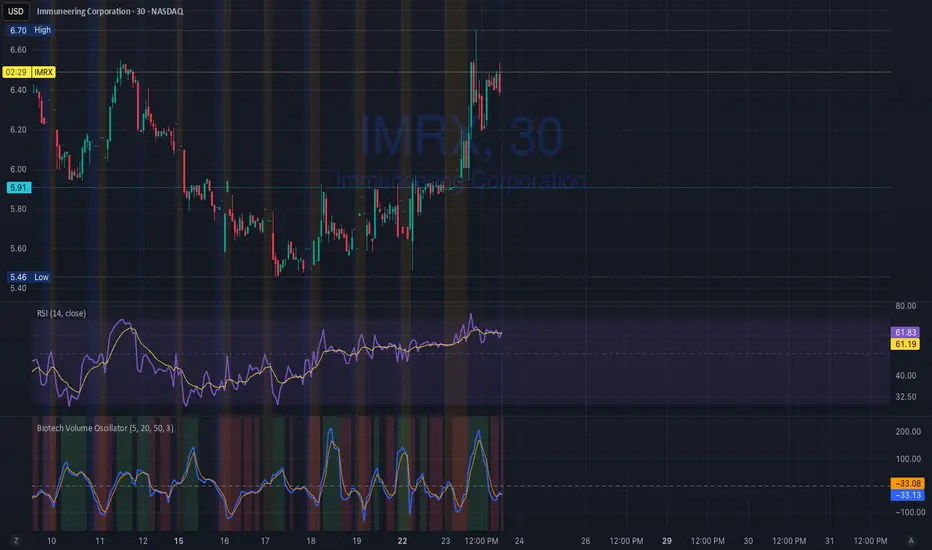
Biotech Volume Oscillator
This oscillator is percentage-based, not raw volume.
Key Levels (Rules of Thumb)
Above +25 → abnormal participation (real interest)
+10 to +25 → constructive, but not decisive
Around 0 → drift / float
Below –25 → participation drying up
These levels work well for:
Small-cap biotech
Catalyst setups
Pre-data ramps
How You’d Use This With RSI (Your Exact Setup)
Bullish / Valid Move
RSI above 50
RSI purple > yellow
Biotech Volume Osc above +10 and rising
➡️ Move has sponsorship
Fake / Suspect Move
Price up
RSI flat or diverging
Volume Osc near 0 or falling
➡️ Float + headline + thin liquidity
Distribution Signal (Very Useful)
Price makes higher high
RSI fails to confirm
Volume Osc rolls over from +25
➡️ Selling into strength
➡️ Excellent context for sell orders like your 7.75
Pinnacle ICT Basic (PICT Basic) v1.22.4 (LOCKED)Pinnacle ICT Basic highlights market regime (stand down vs trending), HTF alignment, and two structure-only setup types (Sweep reversal and Continuation first-touch). It then issues binary “Confirm” signals when displacement + volume + HTF + micro alignment are present. This is an educational structure tool—no entries/exits, targets/stops, or trade advice.

powfrom 𐤀 family.
maybe prime sht.
why i didnt did this much earlier?!
so simple...
more simplicity and less complexity.
powpowpow
s
h
a
2
5
6

Volume Profile Lite [JOAT]
Volume Profile Lite — Simplified Volume-at-Price Analysis
Volume Profile Lite creates a histogram showing volume distribution across price levels using a proprietary lightweight calculation method. It identifies the Point of Control (POC), Value Area High, and Value Area Low—key concepts from auction market theory—in an optimized, easy-to-read format that won't slow down your charts.
Why This Script is Protected
This script is published as closed-source to protect the proprietary volume distribution algorithm and the optimized Value Area calculation methodology from unauthorized republishing. The specific implementation of volume allocation across price rows, the buy/sell volume separation logic, and the efficient POC detection system represents original work that provides a unique lightweight alternative to standard volume profile implementations.
What Makes This Indicator Unique
Unlike heavy volume profile indicators that can slow down charts, Volume Profile Lite:
Uses an optimized algorithm designed for performance
Separates buying and selling volume for additional insight
Provides clean visual presentation without chart clutter
Includes extending reference lines for key levels
Features a dashboard with price position relative to POC
What This Indicator Does
Distributes volume across price rows to create a visual profile histogram
Identifies the Point of Control (highest volume price level)
Calculates Value Area (where specified percentage of volume traded)
Separates buying and selling volume for each price level
Extends key levels as reference lines on the chart
Highlights the POC row with a distinct border
Core Methodology
The indicator uses a proprietary approach to volume-at-price analysis:
Price Row Division — The lookback range is divided into configurable price rows (default: 24 rows)
Volume Distribution — Each bar's volume is allocated to the price rows it touches. If a bar spans multiple rows, volume is distributed proportionally.
Buy/Sell Separation — Volume is classified based on bar direction (close >= open = buying volume, close < open = selling volume)
POC Detection — The row with maximum accumulated volume is identified as the Point of Control
Value Area Calculation — Starting from POC, expands outward (alternating up and down) until target volume percentage is captured
Key Concepts Explained
Point of Control (POC) — The price level with the highest volume concentration. Often acts as a magnet for price and represents "fair value" for the analyzed period. Price tends to return to POC.
Value Area High (VAH) — Upper boundary of the value area zone. Acts as resistance when price is below, support when price is above.
Value Area Low (VAL) — Lower boundary of the value area zone. Acts as support when price is above, resistance when price is below.
Value Area — Price range containing specified percentage (default 70%) of total volume. This is where most trading activity occurred.
Visual Features
Volume Histogram — Horizontal bars showing volume at each price level
Buy/Sell Coloring — Green portions show buying volume, red shows selling volume
POC Highlight — The POC row has a distinct orange border and fill
POC Line — Horizontal line extending from POC (optional extension to right)
Value Area Lines — Dashed blue lines at VAH and VAL
Value Area Fill — Subtle blue fill between VAH and VAL
Color Scheme
Up Volume Color — Default: #26A69A (teal) — Buying volume
Down Volume Color — Default: #EF5350 (red) — Selling volume
POC Color — Default: #FF9800 (orange) — Point of Control
Value Area Color — Default: #2196F3 (blue) — VAH/VAL lines and fill
Dashboard Information
The on-chart table (bottom-right corner) displays:
POC price level
Value Area High price level
Value Area Low price level
Current price position relative to POC (ABOVE POC, BELOW POC, or AT POC)
Distance from current price to POC as percentage
Inputs Overview
Calculation Settings:
Lookback Period — Number of bars to analyze (default: 100, range: 20-500)
Number of Rows — Price level divisions for the profile (default: 24, range: 10-50)
Value Area % — Percentage of volume for value area calculation (default: 70%, range: 50-90%)
Visual Settings:
Up/Down Volume Colors — Customizable buy/sell colors
POC Color — Point of Control highlighting
Value Area Color — VAH/VAL line and fill color
Profile Width — Visual width of histogram in bars (default: 30, range: 10-100)
Show POC Line — Toggle POC horizontal line
Show Value Area — Toggle VAH/VAL lines and fill
Show Dashboard — Toggle the information table
Extend Lines — Project POC and VA lines further right
How to Use It
For Support/Resistance:
Use POC as a potential support/resistance reference point
Price often gravitates back to POC (mean reversion)
VAH acts as resistance when approaching from below
VAL acts as support when approaching from above
For Trend Analysis:
Price above POC suggests bullish control
Price below POC suggests bearish control
Breaking out of Value Area often leads to trending moves
Returning to Value Area suggests failed breakout
For Entry/Exit:
Enter longs near VAL with stops below
Enter shorts near VAH with stops above
Target POC for mean-reversion trades
Use POC as a trailing stop reference in trends
Alerts Available
VPL Cross Above POC — Price crosses above Point of Control
VPL Cross Below POC — Price crosses below Point of Control
VPL Cross Above VAH — Price breaks above Value Area High
VPL Cross Below VAL — Price breaks below Value Area Low
Best Practices
Use longer lookback periods for more significant levels
Increase row count for more precise level identification
POC from higher timeframes is more significant
Combine with other indicators for confirmation
This indicator is provided for educational purposes. It does not constitute financial advice. Past performance does not guarantee future results. Always conduct your own analysis and use proper risk management before making trading decisions.
— Made with passion by officialjackofalltrades

Price Action ICT SMC - Crypto Lidya (Lite)Price Action • ICT • SMC — Crypto Lidya (Lite)
Short title: PA Lite — Crypto Lidya
ONE CHART. ONE FLOW. TEXTBOOK PA + ICT + SMC.
This is not “more drawings”. It’s a structured, rule-based framework that merges:
Market Structure + Liquidity + Confirmation → into a single decision flow.
Core textbook sequence:
Liquidity → (IDM) → Displacement → CHoCH / BOS → Return to PD / OB / FVG / BPR
Built for traders who want clean context, multi-timeframe discipline, and professional-grade confluence
without turning the chart into a mess.
━━━━━━━━━━━━━━━━━━━━━━━━━━━━━━━━━━━━━━━━━━━
WHAT YOU GET (HIGHLIGHTS)
━━━━━━━━━━━━━━━━━━━━━━━━━━━━━━━━━━━━━━━━━━━
- Market Structure engine: CHoCH + BOS with configurable confirmation logic
- Liquidity context: EQH/EQL sweeps + deterministic “linking” to structure breaks
- HTF Bias (Regime Filter): optional direction gating for cleaner, textbook alignment
- TF Bias Table (Multi-TF dashboard): “at-a-glance” bias stacking with reasons
- PD Range (Premium/Discount): dealing-range alignment filter (OB / FVG or both)
- Displacement filter: impulse-quality confirmation (Body% / ATR / Close-position)
- Killzones / Sessions: time-window validation (London / NY AM / NY PM)
- FVG + BPR: imbalance mapping + balanced range overlap logic
- OB / BB engine: source models, refinement, quality filters, strength scoring, overlap pruning
- Alerts + Webhook-ready output: Human / JSON format, HTF gate, cooldown controls
“Structure + Liquidity + Confirmation in one workflow (no clutter).”
━━━━━━━━━━━━━━━━━━━━━━━━━━━━━━━━━━━━━━━━━━━
QUICK START (RECOMMENDED FLOW)
━━━━━━━━━━━━━━━━━━━━━━━━━━━━━━━━━━━━━━━━━━━
1) Performance
- Set Lookback Window (bars) to match your chart speed/history needs.
- View when “Lookback Window (bars)” is increased (with “Limit to Nearest” OFF / all zones visible).
- View when “Lookback Window (bars)” is decreased (with “Limit to Nearest” OFF / all zones visible).
2) Regime & Multi-TF Context (ICT)
- Enable HTF Bias if you want direction filtering.
- Use TF Bias Table to verify alignment across your chosen timeframes.
3) Timing Filter (Optional)
- Enable Killzones / Sessions to focus on high-liquidity delivery windows.
4) Confirmation Quality
- Enable Displacement filter to reduce range noise / weak breaks.
5) Structure Execution (SMC)
- Use CHoCH / BOS for the “break confirmation” layer.
- Use Buffers / Confirm Modes for stricter or faster validation.
6) Zones & Returns
- Use PD Range to validate where setups “should” form (Premium/Discount).
- Map FVG / BPR and OB / BB for return-to-zone models.
━━━━━━━━━━━━━━━━━━━━━━━━━━━━━━━━━━━━━━━━━━━
MODULES (TEXTBOOK EXPLANATION)
━━━━━━━━━━━━━━━━━━━━━━━━━━━━━━━━━━━━━━━━━━━
1) HTF BIAS (REGIME FILTER)
HTF Bias acts as your directional framework (macro context).
When enabled, signals can be suppressed if they conflict with the HTF direction.
Two professional ways to define bias (you choose via Trend Mode):
A) Swing Structure Bias (HH/HL – LH/LL) — “stable”
- Uptrend requires HH + HL confirmation
- Downtrend requires LL + LH confirmation
- Best when you want fewer, higher-quality flips
B) Legacy / Break of Extreme — “faster”
- Bias can flip as soon as a new pivot breaks the last major extreme
- Best for aggressive / fast markets (but can be noisier)
2) TF BIAS TABLE (MULTI-TIMEFRAME DASHBOARD)
The TF Bias Table is built for disciplined multi-timeframe execution:
- Answers “Are higher TFs aligned?” in seconds
- Helps you avoid taking LTF triggers against HTF context
- Can show reasoning text (optional) to keep the logic transparent
Bias calculation options (Table Bias Mode):
- Swing Structure Bias (HH/HL – LH/LL): more stable, flips later
- Structure-Scope Bias (msStructScope aligned): follows your chosen structure scope and flips faster
Hybrid rule is deterministic:
External dominates; if External is not ready, fallback to Internal.
Provisional Bias (UI only, optional):
- If pivots are not fully confirmed, the table can display a provisional bias based on HTF candle direction
- UI only (does not change signals)
3) PD RANGE (PREMIUM / DISCOUNT)
PD Range defines where price is “dealing” relative to its midpoint (50%):
- Bullish context → Discount is preferred
- Bearish context → Premium is preferred
You can apply PD filtering to:
- OB + FVG (default), OB only, or FVG only
Optional strict mode:
- Require the level/zone to remain fully inside the dealing range (more textbook)
“Discount buys / Premium sells with a clear dealing range reference.”
4) DISPLACEMENT (IMPULSE CONFIRMATION)
Displacement filter keeps breaks “honest”.
CHoCH/BOS confirms only if the break candle shows real intent:
- Body dominance (Body% rule)
- Volatility expansion (ATR multiple rule)
- Close position in break direction (optional strictness)
This is designed to reduce fake breaks in ranges and thin-liquidity periods.
“Impulse-quality break passes; weak range poke fails.”
5) KILLZONES / SESSIONS (TIME-WINDOW VALIDATION)
Session gating is a professional timing filter:
- Validate structure breaks/sweeps only inside enabled windows
- Focus execution during high-liquidity delivery hours (London / NY AM / NY PM)
“Cleaner signals when you trade only the active delivery windows.”
- Normal vs Killzone:
6) MARKET STRUCTURE (CHoCH / BOS)
CHoCH (Change of Character):
- Signals a character shift by breaking a key protected point (optionally)
BOS (Break of Structure):
- Confirms continuation breaks in the current structure direction
Confirmation controls:
- Close / Wick / Body / combined modes
- Optional buffers (Ticks or Percent) to reduce micro-noise
Optional Protected Swing Mode:
- Uses protected HL/LH as reference (closer to classic SMC)
7) LIQUIDITY (EQH/EQL SWEEPS + LINKING)
Liquidity sweeps identify stop-runs / grabs around equal highs/lows:
- Wick Only: faster tagging
- Wick + Close Back: more textbook (grab + rejection)
Link Window (bars) ties a sweep to the next CHoCH/BOS:
- Smaller window = stricter context
- Larger window = more permissive linking
8) FVG + BPR (IMBALANCE & REBALANCE)
FVG (Fair Value Gap):
- Shows active imbalances and mitigation behavior
- Optional size filter (Percent / ATR / Ticks / Absolute)
BPR (Balanced Price Range):
- Overlap zone formed by Bull FVG + Bear FVG
- Used as a confluence zone for rebalance and continuation models
9) OB / BB (ZONES)
Order Blocks (OB):
- Anchored to BOS/CHoCH breaks or derived from displacement candles (source mode)
- Refinement modes: Body / Wick / Mean Threshold
- Optional quality filter (Balanced / Strict, etc.)
- Strength scoring + confluence bonuses (FVG overlap, liquidity context)
- Overlap pruning keeps the chart clean and relevant
Breaker Blocks (BB):
- Derived from invalidated OBs
- Can show inherited strength % (optional)
- Cleanup options preserve performance without deleting open zones
10) ALERTS (REALTIME / WEBHOOK)
- Enable Alerts: master switch
- Choose Human or JSON message format
- Optional gates: HTF Bias alignment, cooldown (anti-spam)
TradingView setup tip:
Use alert condition = “Any alert() function call” for full detail messages.
━━━━━━━━━━━━━━━━━━━━━━━━━━━━━━━━━━━━━━━━━━━
LITE / COMMUNITY ROADMAP (IMPORTANT)
━━━━━━━━━━━━━━━━━━━━━━━━━━━━━━━━━━━━━━━━━━━
This is the free Lite / Community release.
To keep this project sustainable and continue improving it for the community:
- This Lite edition is planned to become limited to 3 symbols in a future update (e.g., BTC / ETH / SOL).
- The full, unrestricted version (all symbols + advanced upgrades) will be released separately as the PRO edition.
You’ll always see clear release notes before major changes.
━━━━━━━━━━━━━━━━━━━━━━━━━━━━━━━━━━━━━━━━━━━
DISCLAIMERS
━━━━━━━━━━━━━━━━━━━━━━━━━━━━━━━━━━━━━━━━━━━
- Educational / analytical tool only. Not financial advice.
- No guarantees. Always manage risk.
- “ICT / SMC” terminology is used as a category reference to commonly known concepts.
This script is not affiliated with any third-party educator or brand.

REM Algo - StocksRisk Evaluated Momentum Algo (REM Algo) is a swing-trading indicator built for hourly stock charts , designed to help you visualize a stock’s underlying strength vs. weakness in real time—while also issuing alerts for potential entries, exits, and profit-taking opportunities .
REM Algo appears as an indicator below your chart with three key reference levels, calculated dynamically for each stock, plus the REM line itself:
• Gray Take Profit Line (dynamic)
• Red Stop Loss Line (dynamic)
• Dashed Zero Line (strength/weakness threshold)
ibb.co
Between these levels, the REM Line (zigzag) represents the REM formula:
• Green REM line = hourly closes above 0 REM (underlying strength)
• Red REM line = hourly closes below 0 REM (underlying weakness)
Signals (crosses) and what they mean
Crosses can appear/disappear in real time as conditions develop (during regular market hours), giving you early visibility into developing setups:
• Green cross (Entry / Buy)
Signals a potential long entry as REM transitions from negative to positive (weakness → strength).
ibb.co
• Red cross (Exit / Sell)
Signals potential weakness and a possible exit. REM dipping below zero can be an early warning, but the Stop Loss Line defines the “maximum tolerated weakness” before the position should be cut.
ibb.co
• Gray cross (Take Profit / Sell sooner)
When REM rises above the Take Profit Line , it suggests exuberance. A gray cross appears when REM drops back below that take-profit level—often indicating exhaustion. If “Take Profit Sooner” is enabled, this becomes an earlier sell trigger rather than waiting for a red exit cross.
ibb.co
How alerts work
Because the REM line is calculated in real time, signals can briefly trigger and then reverse. To reduce the impact of momentary false breaks (“fake-outs”), REM Algo only issues trade alerts at fixed hourly checkpoints , and only if the signal is still valid at that time.
Alert windows
Alerts trigger if the signal conditions are met on each hourly close (from 10:30 AM to 3:30 PM ET ). The contents of the alert message is prepopulated with the templates used by trading automation systems such as TradersPost, or you can input your own custom messages.
Earnings risk controls (optional)
If enabled, Close Positions Before Earnings adds an “earnings blackout” risk filter:
• No new buys on the day before earnings
• If already in a position, the system aims to close at 3:30 PM ET the day before earnings to avoid earnings-gap risk.
Best use cases
REM Algo – Stocks works best for:
• Growth stocks with market cap > $5B and share price > $1
• It is best to avoid using it on penny stocks and stocks exhibiting extreme volatility.
Important performance considerations
REM Algo is a momentum approach:
• Performs best when price is trending
• Choppy/sideways conditions can result in losses that the algo aims to keep small
• Long-run profitability is supported by risk controls (dynamic stop/TP levels, hourly confirmation, optional profit-taking sooner, earnings avoidance) and allowing winners room to develop.
The aim is to keep the losses small and manageable while letting any winning trades mature for overall trading strategy profitability.
RISK DISCLAIMER
This indicator provides signals and risk-management structure, not guarantees. The inherent risks involved with trading and investing in the markets, include the loss of your investment. All content, tools, scripts, articles, and education provided by REM Algo are for informational and educational purposes only. Past performance is not indicative of future results.

EDMR Index (Event Driven Mean Reversion Index)EDMR Index is a market context and exhaustion indicator designed to identify short term instability, stretch, and mean reversion risk in fast intraday markets.
Rather than generating trade signals, EDMR provides a real time regime framework that helps traders understand when price action is statistically favorable and when it is not.
This is not a buy / sell indicator.
It is a context engine built to integrate seamlessly with existing strategies.
Key Features
Composite 0–100 exhaustion index
Measures:
- Price stretch from equilibrium
- Recency of extreme conditions
- Momentum deceleration
Regime-based background visualization:
- Neutral
- Developing
- Elevated
- Extreme
Thin, non-intrusive EDMR line for precise reading
Volume exhaustion markers highlighting abnormal participation
Color-coded status-line value for instant regime awareness
Fully protected, invite-only script
Why Event-Driven Context Matters
Most indicators react after conditions change.
EDMR focuses on market state, not signals — highlighting when price action is becoming unstable or statistically stretched before risk escalates.
This allows traders to:
Avoid entries during high-risk exhaustion regimes
Better time mean-reversion setups
Scale aggression up or down based on context
Stay out of overextended or unstable conditions
Intended Use
Intraday trade filtering
Mean-reversion context
Momentum exhaustion awareness
Risk modulation for discretionary strategies
Optimized for lower timeframes (1–3 minute charts).
On higher timeframes, regimes will naturally remain elevated more often. This is expected behavior with the current parameters set. Changing of parameters are available in the settings menu and individual settings may work for you on higher timeframes.
Who This Is For
✔ Traders who already have defined entries
✔ Active intraday traders and scalpers
✔ Traders who value context over signals
✖ Not a buy/sell signal
✖ Not a standalone strategy
✖ Not designed for higher-timeframe swing trading out of the box
Disclaimer
This indicator is provided for educational and informational purposes only.
It does not constitute financial advice or guarantee performance.
Trading involves risk.
EDMR Index on SPY (2-minute).Visualizes exhaustion, compression, and reversion context during high-liquidity market conditions:
EDMR applied to BTCUSD (2-minute). Designed to respond to event-driven volatility across asset classes:
Consistent behavior across index ETFs. EDMR highlights mean-reversion pressure without generating trade signals:
High-beta equity example (NVDA, 2-minute). EDMR adapts to rapid volatility expansion and contraction:

Trading Navigator Pro V6 - ESTRUCTURA TOTAL📘 Trading Navigator Pro V6 Operations Manual
This system is not just an indicator; it's a command center. To get the most out of it, follow these golden rules.
1. Opening Strategy
How to open a LONG (Buy) position
1. Dashboard: The ACTION column should show LONG on the timeframe you are trading, and preferably on the higher one (e.g., 15M and 1H).
2. Price: The price should be near or touching the 50-period EMA (Yellow) or the 200-period EMA (Red), using them as a springboard.
3. Entry: Place your limit order at the price indicated by the E. OPT. column (which is the structural support).
4. Confirmation: If the AGAINST THE MASS signal appears (green triangle), the probability of success increases to 85%.
How to open a SHORT (Sell) position
1. Dashboard: The ACTION column should show SHORT.
2. Price: The price must have rallied and be testing the Resistance or EMAs below.
3. Entry: Your order must be placed at the E. OPT. price (which in this case is the Resistance).
4. Confirmation: Look for the RSI on the chart to be above 60-70 before entering a short position.
________________________________________
2. The 3 "Golden Tricks" 🏆
• Trick 1: Planetary Alignment: Don't trade if the timeframes conflict. If the 15M chart says LONG but the 1H and 4H charts say SHORT, the 15M chart is most likely just a bounce before the price continues to fall. Look for at least 3 timeframes to agree in the Action column.
• Trick 2: The ADX Filter: Look at the FIAB (Reliability) column. If it shows DOWN, it means the market is ranging (sideways). In this scenario, take profit and stop loss (TP and SL) levels should be shorter. If the price shows a high trend, let the trade run; there's a strong trend.
• Trick 3: The EMA Kiss: The 200-period EMA (red, thick line) is your wall. If the price is far from it, wait for a pullback. The best entries occur when the price "kisses" the 50-period or 200-period EMA and the chart confirms the direction.
• Trick 3: The EMA Kiss: The 200-period EMA (red, thick line) is your wall. If the price is far from it, wait for a pullback. ________________________________________
3. Recommended Markets
Your indicator has been designed to be versatile, but it shines especially in:
1. Cryptocurrencies
2. Forex (Major Pairs)
3. Indices (Nasdaq, S&P 500)
4. Momentum Stocks
5. Gold-Silver
6. Commodities
7. Futures
________________________________________
4. Risk Management (Non-negotiable)
Remember that the TP and SL prices provided by the board are mathematically calculated so that, even if you lose 4 out of every 10 trades, you will still be very profitable thanks to the profit multiplier.
📈 Visual Projector Guide (Forecasting Line)
The projector generates a dynamic line of 20 candles forward on the time axis. It is not a crystal ball, but a regression and oscillation algorithm based on true volatility (ATR) and relative strength (RSI).
How to read the projection?
1. The Direction (Slope):
If the projected line is green: The RSI is below 50 and has recovery momentum. This suggests that the price will seek higher equilibrium zones.
If the projected line is red: The RSI is above 50 and shows exhaustion. This suggests an imminent correction towards the mean.
2. The Shape (Wave):
The line is not straight; it has a wave based on the sine function. If the line is projected with very wide waves, expect a volatile and erratic market. If the line is smoother, expect a clean and steady trend movement.
3. The Target (The Arrowhead):
The end of the line marks the short-term "Fair Value Target." If that endpoint coincides with a Resistance or Support level on the chart, you have a high-probability confluence.
________________________________________
💡 Golden Trick: "The Projector Trap"
• Confirmation Scenario: If the chart shows ACTION: LONG and the projector points Upward (Green), confidence to enter is at its highest.
• Divergence Scenario: If the board shows ACTION: LONG but the projector starts to curve downward (turns red), beware! This is a sign that the upward momentum is waning and you could be entering at the peak of the trend. Wait for the projector to align with the board.
________________________________________
🛠 Technical Considerations
The projector updates in real time. You'll notice the line moves with each tick of the price. This is normal:
• If the line changes direction abruptly, it's a sign of institutional volatility.
• Use it primarily to decide whether to hold a trade or close it early if the projection turns against you.
