NQ2K SSS# Intelligent Trend Identification
**Adaptive Channels**: Utilizes dynamically adjusted volatility channels that automatically optimize parameters based on market volatility
**Bull-Bear Judgment**: Monitors trend direction changes in real-time, accurately capturing bull-to-bear conversion opportunities
**Signal Confirmation**: Multiple condition verification ensures the reliability of trading signals
# ⏰ Precise Timing Control
**Scheduled Execution**: Built-in intelligent timing trading system that automatically executes during optimal periods
**Cross-day Processing**: Comprehensive handling of overnight positions and cross-trading day logic
**Time Filtering**: Customizable trading time windows to focus on high-probability periods
# 🛡️ Strict Risk Control System
**Automatic Stop Loss**: Risk control mechanism based on fixed percentage
**Position Management**: Zero pyramiding strategy, strictly controlling single exposure risk
**Real-time Monitoring**: Continuous tracking of position status, timely execution of risk control measures
# 📊 Professional Visualization
**Trend Visualization**: Clearly displays current trend direction and strength
**Signal Marking**: Intuitive buy/sell point markers and trend conversion prompts
**Candlestick Coloring**: Real-time candlestick color changes reflect bull-bear power comparison
# Applicable Markets
**Main Products**: Stock index futures, commodity futures, forex, and other products with moderate volatility
**Time Frames**: Suitable for multiple time periods, recommended for daily or 4-hour charts
**Market Conditions**: Particularly suitable for markets with clear trends and moderate volatility
# Strategy Advantages
**Clear Rules**: All trading logic is fully quantified, avoiding subjective judgment interference
**Strong Adaptability**: Dynamic parameter adjustment mechanism adapts to different market environments
**Rigorous Execution**: Strict timing control and risk management system
**Intuitive and Easy to Use**: Clear chart displays and signal prompts for easy monitoring and decision-making
Bandas e Canais

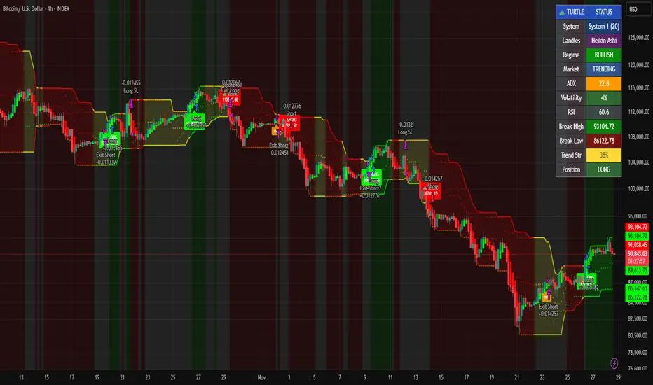
Grok/Claude Turtle Trend Pro Strategy Turtle Trend Pro Strategy: A Modern Implementation of the Legendary Turtle Trading System
Historical Background: The Original Turtle Experiment
In 1983, legendary commodities trader Richard Dennis made a bet with his partner William Eckhardt: could successful trading be taught, or was it an innate skill? To settle the debate, Dennis recruited and trained a group of novices—whom he called "Turtles" (inspired by turtle farms he'd visited in Singapore)—teaching them a complete mechanical trading system. The results were remarkable: over the next four years, the Turtles reportedly earned over $175 million, proving that systematic, rule-based trading could be taught and replicated.
The strategy you've shared is a faithful modern adaptation of those original Turtle rules, enhanced with contemporary technical filters.
Core Turtle Principles Preserved in This Strategy
1. Donchian Channel Breakouts (The Heart of Turtle Trading)
The original Turtles used Donchian Channels—a simple concept where you track the highest high and lowest low over a specific lookback period. This strategy implements both original Turtle systems:
System 1 (Default): 20-period entry breakout, 15-period exit
System 2 (Optional): 55-period entry breakout, 20-period exit
The logic is elegantly simple:
Go long when price breaks above the highest high of the last 20 (or 55) periods
Go short when price breaks below the lowest low of the last 20 (or 55) periods
This captures the Turtle philosophy of trend-following through momentum breakouts—the idea that markets trending strongly in one direction tend to continue.
2. ATR-Based Position Sizing and Stops
The Turtles were pioneers in using Average True Range (ATR) for risk management. This strategy preserves that approach:
Stop Loss: Set at 2× ATR from entry (the original Turtle rule)
ATR Period : 20 days (matching the original)
The ATR stop adapts to market volatility—wider stops in volatile markets, tighter stops in calm ones—preventing premature exits while still protecting capital.
3. Opposite Channel Exit
Rather than using arbitrary profit targets, the Turtles exited positions when price broke the opposite channel:
Exit longs when price breaks below the 15-period (or 20-period) low
Exit shorts when price breaks above the 15-period (or 20-period) high
This allows winning trades to run while providing a systematic exit that doesn't rely on prediction.
Modern Enhancements Beyond the Original System
While the core mechanics remain true to 1983, this strategy adds sophisticated filters the original Turtles didn't have access to:
Trend Filter (200 EMA)
Only takes long trades when price is above the 200-period moving average (and the MA is sloping up), and vice versa for shorts. This aligns trades with the major trend, reducing whipsaws in choppy markets. Set of off by default and fully adjustable in settings.
ADX Filter (Trend Strength)
The Average Directional Index ensures trades are only taken when the market is actually trending (ADX > 20 threshold). The original Turtles suffered significant drawdowns in ranging markets—this filter addresses that weakness.
Optional RSI Filter
Adds overbought/oversold confirmation to entries, though this is disabled by default to stay closer to the original system.
Volume Confirmation
Optional requirement for volume surges on breakouts, adding conviction to signals.
The Strategy's Risk Management Framework
Parameter Setting Turtle Origin Position Size 10% of equity. Turtles used volatility-adjusted sizing.
Stop Loss2× ATR.
Original Turtle rule Commission 0.075%. Modern crypto exchange rate.
Pyramiding Disabled.
Turtles did pyramid, but simplified here.
Visual Elements and Regime Detection
The strategy includes a "Neural Fusion Pro" styled display that would make the original Turtles jealous:
Color-coded Donchian Channels: Green (bullish), Red (bearish), Yellow (neutral)
Trend Strength Meter: Combines ADX, price vs. MA distance, channel position, and DI spread
Regime Classification : Automatically identifies Bull, Bear, or Neutral market conditions
Information Panel: Real-time display of all key metrics
Why Turtle Trading Still Works
The genius of the Turtle system lies in its mechanical discipline. It removes emotion from trading by providing explicit rules for:
What to trade (anything with sufficient liquidity and volatility)
When to enter (channel breakouts)
How much to trade (volatility-adjusted position sizing)
When to exit (opposite breakout or ATR stop)
This strategy faithfully preserves that mechanical approach while adding modern filters to improve the win rate in today's markets.

Bitcoin Optimized ScalperBasically tracks orderflow and pairs with Hurst exponents and KAMA aggression to tell you when to enter short or long. Join my discord for more.
discord.gg

Smart Bottom Catcher @ Le DReversal strategy using recent lowest lows and a fast RSI. Long entries trigger on extreme drops, exits occur when RSI crosses a set threshold. Includes optional SMA55 filter and allows up to 3 pyramids.

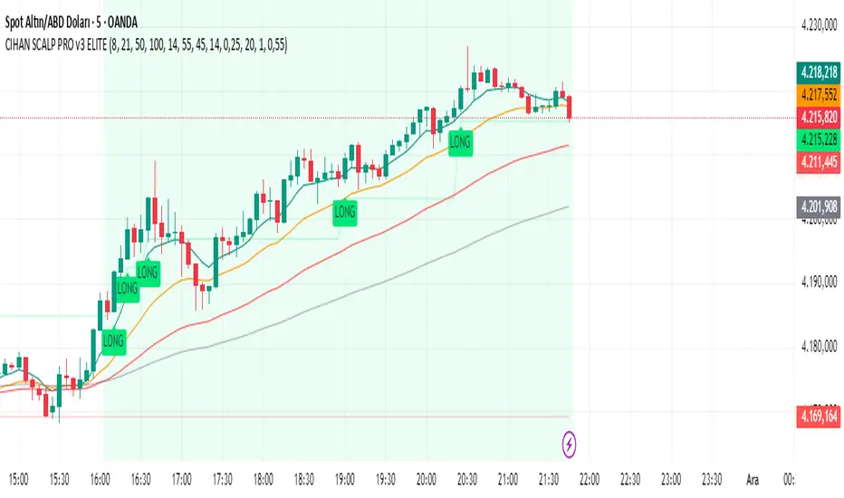
CIHAN SCALP PRO v3 ELITEI’m sharing a testable scalping strategy:
When you see a Long or Short signal, you can open a position without waiting for the candle to close and take quick profits with a short TP.
But the real game-changer is coming soon!
The Professional Scalping System I’ve been working on, with 85%+ accuracy, is almost ready.
This system is fully mechanical — no analysis needed, it instantly catches momentum and trend shifts.
It will be available soon with a small monthly subscription fee.
Stay tuned!
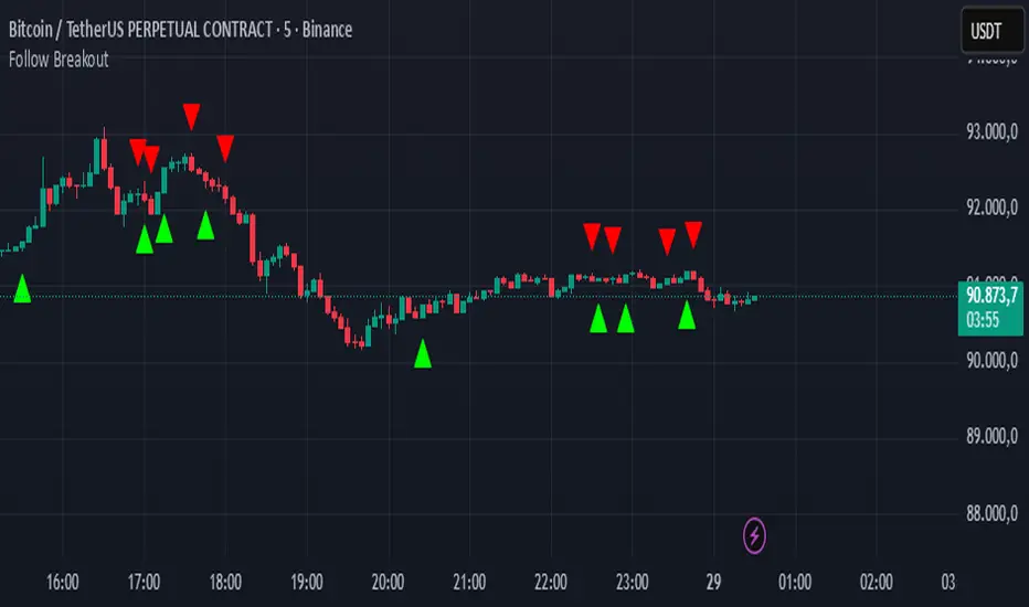
Follow BreakoutThe indicator tracks trend breakouts. It generates multiple signals during sideways trends.
Nifty Daily Movement Filter with DaysThis indicator provides detailed statistical analysis of NIFTY 50's daily percentage movements, categorized into four distinct volatility ranges with complete weekday distribution tracking.
Features:
Analyzes daily price movements from January 1, 2024 to November 28, 2025
Categorizes volatility into 4 ranges:
0.01-0.25% (Very Low - Blue)
0.26-0.50% (Low - Green)
0.51-0.75% (Medium - Orange)
0.76%+ (High - Red)
Visual Elements:
Color-coded background highlights for each volatility range
Distinct marker shapes below bars (circles, triangles, squares, diamonds)
Labels showing day of week and exact percentage change
Comprehensive statistics table with:
Total count per volatility range
Complete Monday-Friday breakdown for each range
Overall totals by day of week
Use Cases:
Identify volatility patterns across different days of the week
Track frequency of calm vs volatile trading sessions
Analyze if specific weekdays tend toward higher/lower movements
Historical volatility distribution analysis for strategy development
Risk assessment and position sizing based on historical volatility patterns

BURAK KRİPTO AL - SAT BOTUBURAK CRYPTO BUY-SELL BOT — Designed for high performance in crypto markets!This strategy is built on a powerful algorithm optimized with years of real trading experience. It follows trends while perfectly catching buy-at-the-bottom and sell-at-the-top opportunities.Main Features:
Trend direction detection with EMA + SMA combination
Overbought/oversold filters using RSI and Stochastic
Volume confirmation (volume breakout filter included)
ATR-based dynamic stop loss and take profit
Sideways market filter — prevents unnecessary trades
Works on all cryptocurrencies (BTCUSDT, ETHUSDT, SOLUSDT, XRPUSDT, etc.)
Both long and short signals (can be turned off separately)
High win rate and excellent profit factor in backtests Who is it for?Daily and swing traders
Spot and futures traders
Those who want to run fully automated bots (easily connected via alerts to 3Commas, Pionex, Bitsgap, etc.)
How to use:Add the script to your chart
Create an alert → “Alert on BURAK CRYPTO BUY-SELL BOT”
In the alert message field, write: For buy: BUY {{ticker}}
For sell: SELL {{ticker}}
Connect to your bot and let it do the rest automatically!
Disclaimer: No strategy guarantees 100% profit. Always apply your own risk management. Past performance is not indicative of future results.If you like it, don’t forget to hit the Like button and leave a comment! ♡
Any questions? Drop them in the comments — I reply as fast as possible!#crypto #bitcoin #tradingbot #tradingview #signals #altsat

SNP420/INDI/support_resist_future_levelFunctionality – short description
The indicator automatically detects the latest pivot highs/lows and builds the current resistance and support levels from them. New levels start as candidate levels (dotted lines).
Using an ATR-based tolerance, it counts how many times price precisely tests and rejects the level (touch + reversal).
Once the minimum number of touches is reached, the level is marked as validated (solid line). The indicator also detects breakouts of S/R, colors breakout candles, projects a target level after the breakout, and highlights retests of the broken levels with boxes.
autor: SNP_420
project: FNXS
ps: Piece a love

NQBA RSI This indicator is designed for educational purposes only, providing an enhanced visualization of the Relative Strength Index (RSI) along with additional tools that help in understanding momentum behavior and price characteristics.
Key features include:
🔹 1. Enhanced RSI Visualization
Customizable RSI length with an optional neutral zone (40–60).
Dynamic gradient shading for overbought and oversold areas.
Optional RSI-based moving averages and Bollinger Bands for volatility interpretation.
🔹 2. Divergence Detection
Supports both regular and hidden divergence.
Visual markers and optional alert notifications.
🔹 4. Dynamic RSI/MA Cloud
A visual cloud representing the interaction between RSI and its moving average, helping illustrate general momentum conditions.
🔹 5. Multi-Timeframe RSI Table
A compact table that displays RSI readings across several timeframes, with automatic background/text color adjustments.
⚠️ Disclaimer:
This script does not guarantee performance or profitability.
It is not financial advice and should be used alongside other analysis tools.
هذا المؤشر مخصص لأغراض تعليمية فقط، ويهدف إلى تقديم قراءة متقدمة لمؤشر القوة النسبية (RSI) مع دمج أدوات إضافية تساعد على تحسين تحليل الزخم والسلوك السعري.
يقدّم المؤشر مجموعة من المزايا، منها:
🔹 1. قراءة RSI متطورة
حساب RSI بطول مخصص وإضافة منطقة حياد اختيارية بين 40 و60.
تظليل ديناميكي لمناطق التشبّع الشرائي والبيعي.
إمكانية إضافة متوسطات متحركة وبولينجر باند على RSI لقياس التذبذب.
🔹 2. كشف الدايفرجنس
دعم الدايفرجنس الكلاسيكي والمخفي.
عرض إشارات بصرية وتنبيهات اختيارية.
🔹 4. سحابة ديناميكية بين RSI والمتوسط
تساعد على توضيح حالة الزخم واتجاه الحركة ضمن نطاق مرئي مبسط.
🔹 5. جدول RSI متعدد الأطر الزمنية
يعرض المؤشر جدولاً لقراءات RSI من عدة أطر زمنية، مع تلوين تلقائي للخلفية والنص بناء على قوة الزخم.
⚠️ ملاحظة:
هذا المؤشر لا يقدم نتائج مضمونة ولا يعتبر نصيحة مالية.
يجب استخدامه كأداة مساعدة ضمن تحليلات إضافية قبل اتخاذ أي قرار تداول.

The Consolidator [Pattern Foresight]Overview
This Consolidator script uses detection logic to chart bullish and bearish consolidation markers and to chart shaded high/low price range lines (with green shading between the bottom range line and the price for bullish trends and with red shading between the top range line and the price for bearish trends). A consolidation point is telling you: “Price has gone quiet here. Expect expansion—likely a breakout—once volume returns.” Low volatility squeezes often lead to a breakout.
The Consolidator attempts to identify periods where the price is moving sideways, compressing into a tighter range, forming a base or coil, or preparing for a trend continuation or reversal.
Bullish Consolidation Markers - Bullish consolidation occurs when the price is coiling but buyers are in control. These are useful to help detect bull flags, ascending triangles, tight bases before breakouts.
Bearish Consolidation Markers - These are useful to help detect bear flags, descending triangles, distribution periods.
Why this indicator is unique
The Consolidator attempts to be a predictive pattern-recognition system, not a simple channel indicator by measuring consolidation tightness and high/low price ranges. The range lines help visualize the “coil” where price is compressing. Consolidation markers classify which side of the coil price is leaning toward: bullish pressure or bearish pressure. The script attempts to detect structural bullish patterns with breakout intelligence.
Usage
Consolidation Lookback - Controls how many bars are examined when determining the consolidation “box.” Think of it as: “How wide of a window do you want to search for a sideways range?” Shorter lookback (10–20): Tighter, more sensitive consolidations, faster signals, more false positives, and useful for scalping and day trading. Longer lookback (30–60): Larger, more stable consolidation zones, fewer false positives, and better for swing trading.
Tolerance Percent - Defines how “flat” highs/lows must be to qualify as consolidation. This is the key part of compression detection. Lower tolerance (0.3–0.6%): Only very tight ranges qualify with fewer but higher-quality consolidation zones. Higher tolerance (0.7–1.5%): wider ranges and more consolidation signals. Small changes to tolerance drastically change the number of consolidation markers (higher = more consolidation markers).
Disclaimer:
This script is for informational purposes only. Nothing contained herein should be construed as financial, investment, or trading advice. The author is not a financial advisor and is not providing personalized recommendations. All trading involves risk, including the potential loss of principal. The author makes no assurances of accuracy, performance, or future results. History may not reflect future performance. You are solely responsible for your own investment decisions and agree to use this script entirely at your own risk.

21 & 55 EMA CloudWhenever prices goes inside the cloud and comes out
Entry: After coming out of the 21-55 EMA Cloud in uptrend
Confirm with CPR and support/resistance, breakout of resistance is good sign.
Stop loss is previous swing low.
Success Rate will be good

Third eye • StrategyThird eye • Strategy – User Guide
1. Idea & Concept
Third eye • Strategy combines three things into one system:
Ichimoku Cloud – to define market regime and support/resistance.
Moving Average (trend filter) – to trade only in the dominant direction.
CCI (Commodity Channel Index) – to generate precise entry signals on momentum breakouts.
The script is a strategy, not an indicator: it can backtest entries, exits, SL, TP and BreakEven logic automatically.
2. Indicators Used
2.1 Ichimoku
Standard Ichimoku settings (by default 9/26/52/26) are used:
Conversion Line (Tenkan-sen)
Base Line (Kijun-sen)
Leading Span A & B (Kumo Cloud)
Lagging Span is calculated but hidden from the chart (for visual simplicity).
From the cloud we derive:
kumoTop – top of the cloud under current price.
kumoBottom – bottom of the cloud under current price.
Flags:
is_above_kumo – price above the cloud.
is_below_kumo – price below the cloud.
is_in_kumo – price inside the cloud.
These conditions are used as trend / regime filters and for stop-loss & trailing stops.
2.2 Moving Average
You can optionally display and use a trend MA:
Types: SMA, EMA, DEMA, WMA
Length: configurable (default 200)
Source: default close
Filter idea:
If MA Direction Filter is ON:
When Close > MA → strategy allows only Long signals.
When Close < MA → strategy allows only Short signals.
The MA is plotted on the chart (if enabled).
2.3 CCI & Panel
The CCI (Commodity Channel Index) is used for entry timing:
CCI length and source are configurable (default length 20, source hlc3).
Two thresholds:
CCI Upper Threshold (Long) – default +100
CCI Lower Threshold (Short) – default –100
Signals:
Long signal:
CCI crosses up through the upper threshold
cci_val < upper_threshold and cci_val > upper_threshold
Short signal:
CCI crosses down through the lower threshold
cci_val > lower_threshold and cci_val < lower_threshold
There is a panel (table) in the bottom-right corner:
Shows current CCI value.
Shows filter status as colored dots:
Green = filter enabled and passed.
Red = filter enabled and blocking trades.
Gray = filter is disabled.
Filters shown in the panel:
Ichimoku Cloud filter (Long/Short)
Ichimoku Lines filter (Conversion/Base vs Cloud)
MA Direction filter
3. Filters & Trade Direction
All filters can be turned ON/OFF independently.
3.1 Ichimoku Cloud Filter
Purpose: trade only when price is clearly above or below the Kumo.
Long Cloud Filter (Use Ichimoku Cloud Filter) – when enabled:
Long trades only if close > cloud top.
Short Cloud Filter – when enabled:
Short trades only if close < cloud bottom.
If the cloud filter is disabled, this condition is ignored.
3.2 Ichimoku Lines Above/Below Cloud
Purpose: stronger trend confirmation: Ichimoku lines should also be on the “correct” side of the cloud.
Long Lines Filter:
Long allowed only if Conversion Line and Base Line are both above the cloud.
Short Lines Filter:
Short allowed only if both lines are below the cloud.
If this filter is OFF, the conditions are not checked.
3.3 MA Direction Filter
As described above:
When ON:
Close > MA → only Longs.
Close < MA → only Shorts.
4. Anti-Re-Entry Logic (Cloud Touch Reset)
The strategy uses internal flags to avoid continuous re-entries in the same direction without a reset.
Two flags:
allowLong
allowShort
After a Long entry, allowLong is set to false, allowShort to true.
After a Short entry, allowShort is set to false, allowLong to true.
Flags are reset when price touches the Kumo:
If Low goes into the cloud → allowLong = true
If High goes into the cloud → allowShort = true
If Close is inside the cloud → both allowLong and allowShort are set to true
There is a key option:
Wait Position Close Before Flag Reset
If ON: cloud touch will reset flags only when there is no open position.
If OFF: flags can be reset even while a trade is open.
This gives a kind of regime-based re-entry control: after a trend leg, you wait for a “cloud interaction” to allow new signals.
5. Risk Management
All risk management is handled inside the strategy.
5.1 Position Sizing
Order Size % of Equity – default 10%
The strategy calculates:
position_value = equity * (Order Size % / 100)
position_qty = position_value / close
So position size automatically adapts to your current equity.
5.2 Take Profit Modes
You can choose one of two TP modes:
Percent
Fibonacci
5.2.1 Percent Mode
Single Take Profit at X% from entry (default 2%).
For Long:
TP = entry_price * (1 + tp_pct / 100)
For Short:
TP = entry_price * (1 - tp_pct / 100)
One strategy.exit per side is used: "Long TP/SL" and "Short TP/SL".
5.2.2 Fibonacci Mode (2 partial TPs)
In this mode, TP levels are based on a virtual Fib-style extension between entry and stop-loss.
Inputs:
Fib TP1 Level (default 1.618)
Fib TP2 Level (default 2.5)
TP1 Share % (Fib) (default 50%)
TP2 share is automatically 100% - TP1 share.
Process for Long:
Compute a reference Stop (see SL section below) → sl_for_fib.
Compute distance: dist = entry_price - sl_for_fib.
TP levels:
TP1 = entry_price + dist * (Fib TP1 Level - 1)
TP2 = entry_price + dist * (Fib TP2 Level - 1)
For Short, the logic is mirrored.
Two exits are used:
TP1 – closes TP1 share % of position.
TP2 – closes remaining TP2 share %.
Same stop is used for both partial exits.
5.3 Stop-Loss Modes
You can choose one of three Stop Loss modes:
Stable – fixed % from entry.
Ichimoku – fixed level derived from the Kumo.
Ichimoku Trailing – dynamic SL following the cloud.
5.3.1 Stable SL
For Long:
SL = entry_price * (1 - Stable SL % / 100)
For Short:
SL = entry_price * (1 + Stable SL % / 100)
Used both for Percent TP mode and as reference for Fib TP if Kumo is not available.
5.3.2 Ichimoku SL (fixed, non-trailing)
At the time of a new trade:
For Long:
Base SL = cloud bottom minus small offset (%)
For Short:
Base SL = cloud top plus small offset (%)
The offset is configurable: Ichimoku SL Offset %.
Once computed, that SL level is fixed for this trade.
5.3.3 Ichimoku Trailing SL
Similar to Ichimoku SL, but recomputed each bar:
For Long:
SL = cloud bottom – offset
For Short:
SL = cloud top + offset
A red trailing SL line is drawn on the chart to visualize current stop level.
This trailing SL is also used as reference for BreakEven and for Fib TP distance.
6. BreakEven Logic (with BE Lines)
BreakEven is optional and supports two modes:
Percent
Fibonacci
Inputs:
Percent mode:
BE Trigger % (from entry) – move SL to BE when price goes this % in profit.
BE Offset % from entry – SL will be set to entry ± this offset.
Fibonacci mode:
BE Fib Level – Fib level at which BE will be activated (default 1.618, same style as TP).
BE Offset % from entry – how far from entry to place BE stop.
The logic:
Before BE is triggered, SL follows its normal mode (Stable/Ichimoku/Ichimoku Trailing).
When BE triggers:
For Long:
New SL = max(current SL, BE SL).
For Short:
New SL = min(current SL, BE SL).
This means BE will never loosen the stop – only tighten it.
When BE is activated, the strategy draws a violet horizontal line at the BreakEven level (once per trade).
BE state is cleared when the position is closed or when a new position is opened.
7. Entry & Exit Logic (Summary)
7.1 Long Entry
Conditions for a Long:
CCI signal:
CCI crosses up through the upper threshold.
Ichimoku Cloud Filter (optional):
If enabled → price must be above the Kumo.
Ichimoku Lines Filter (optional):
If enabled → Conversion Line and Base Line must be above the Kumo.
MA Direction Filter (optional):
If enabled → Close must be above the chosen MA.
Anti-re-entry flag:
allowLong must be true (cloud-based reset).
Position check:
Long entries are allowed when current position size ≤ 0 (so it can also reverse from short to long).
If all these conditions are true, the strategy sends:
strategy.entry("Long", strategy.long, qty = calculated_qty)
After entry:
allowLong = false
allowShort = true
7.2 Short Entry
Same structure, mirrored:
CCI signal:
CCI crosses down through the lower threshold.
Cloud filter: price must be below cloud (if enabled).
Lines filter: conversion & base must be below cloud (if enabled).
MA filter: Close must be below MA (if enabled).
allowShort must be true.
Position check: position size ≥ 0 (allows reversal from long to short).
Then:
strategy.entry("Short", strategy.short, qty = calculated_qty)
Flags update:
allowShort = false
allowLong = true
7.3 Exits
While in a position:
The strategy continuously recalculates SL (depending on chosen mode) and, in Percent mode, TP.
In Fib mode, fixed TP levels are computed at entry.
BreakEven may raise/tighten the SL if its conditions are met.
Exits are executed via strategy.exit:
Percent mode: one TP+SL exit per side.
Fib mode: two partial exits (TP1 and TP2) sharing the same SL.
At position open, the script also draws visual lines:
White line — entry price.
Green line(s) — TP level(s).
Red line — SL (if not using Ichimoku Trailing; with trailing, the red line is updated dynamically).
Maximum of 30 lines are kept to avoid clutter.
8. How to Use the Strategy
Choose market & timeframe
Works well on trending instruments. Try crypto, FX or indices on H1–H4, or intraday if you prefer more trades.
Adjust Ichimoku settings
Keep defaults (9/26/52/26) or adapt to your timeframe.
Configure Moving Average
Typical: EMA 200 as a trend filter.
Turn MA Direction Filter ON if you want to trade only with the main trend.
Set CCI thresholds
Default ±100 is classic.
Lower thresholds → more signals, higher noise.
Higher thresholds → fewer but stronger signals.
Enable/disable filters
Turn on Ichimoku Cloud and Ichimoku Lines if you want only “clean” trend trades.
Use Wait Position Close Before Flag Reset to control how often re-entries are allowed.
Choose TP & SL mode
Percent mode is simpler and easier to understand.
Fibonacci mode is more advanced: it aligns TP levels with the distance to stop, giving asymmetric RR setups (two partial TPs).
Choose Stable SL for fixed-risk trades, or Ichimoku / Ichimoku Trailing to tie stops to the cloud structure.
Set BreakEven
Enable BE if you want to lock in risk-free trades after a certain move.
Percent mode is straightforward; Fib mode keeps BreakEven in harmony with your Fib TP setup.
Run Backtest & Optimize
Press “Add to chart” → go to Strategy Tester.
Adjust parameters to your market and timeframe.
Look at equity curve, PF, drawdown, average trade, etc.
Live / Paper Trading
After you’re satisfied with backtest results, use the strategy to generate signals.
You can mirror entries/exits manually or connect them to alerts (if you build an alert-based execution layer).

CTO Line Advanced CloneThis is what I think CTO Larsson is using for his CTO Line Indicator
Use at your own risk

Adaptive Trend Mapper-ATM (Arjo)Adaptive Trend Mapper (ATM) is a multi-factor trend, momentum, and compression-analysis tool designed to help traders visually map the strength and direction of market pressure.
Instead of simply combining existing indicators, ATM creates a new composite framework that blends momentum imbalance, directional strength, volatility contraction, and adaptive smoothing into a single, unified model.
Originality and usefulness
Adaptive Trend Mapper (ATM) does not replicate any one indicator.
It generates two custom indices— Bull Pressure Index and Bear Pressure Index —derived from a mathematical combination of RSI, inverse-RSI, and ADX. These indices behave differently from traditional oscillators:
They represent directional pressure on a 0–100 scale , not momentum.
They are designed to converge/diverge, forming a basis for the built-in Squeeze Detection Engine.
They can be optionally step-compressed , making the movement easier to read on fast or small charts.
The script also integrates a custom SuperSmoother trend model (not TradingView’s built-in function), which acts as an adaptive trend curve on the chart.
All calculations are combined intentionally—not as a mashup—to create a framework that allows traders to understand trend strength, compression phases, and micro-trend shifts in one place.
How the Indicator Works
1. Bull & Bear Pressure Indices:
These indices measure directional imbalance:
Bull Index = ADX strength weighted against inverse-RSI
Bear Index = ADX strength weighted against normal RSI
This produces two opposing pressure curves that rise or fall depending on whether buyers or sellers dominate.
You can optionally smooth these using:
SMA / EMA / WMA / RMA via the “Smoothing Settings” panel.
2. Squeeze & Compression Detection:
A squeeze is detected when:
ADX stays below a user-defined threshold
Bull–Bear Index difference shrinks
Average difference is falling (convergence)
This is a volatility-contraction model inspired by squeeze logic but applied to directional pressure, not Bollinger Bands/Keltner Channels .
3. Adaptive Trend Curve (SuperSmoother Engine)
The indicator applies a two-pole SuperSmoother filter to the price, then smooths it again using EMA.
The slope color flips between bullish and bearish and is displayed using:
A thin SuperSmoother curve
A thicker band for visual context
4. EMA-50 Trend Context:
An optional EMA-50 helps identify broad directional bias .
5. Step-Based Scaling
You can quantize the Bull/Bear indices using custom step intervals.
This makes the indicator easier to read on noisy intraday charts.
How to Use the Indicator
1. Trend Analysis
A rising Bull Index shows strengthening upward pressure
A rising Bear Index shows strengthening downward pressure
Wide divergence between the indices signals a strong trend
2. Compression / Squeeze Analysis
Yellow background = volatility compression + pressure convergence
Breakouts from this zone often precede directional expansion
3. Trendline Reading
SuperSmoother line color flip = micro trend shift
EMA-50 slope gives macro-trend direction
Perfect for combining trend and momentum maps on the same chart
4. Visual Interpretation
Cyan/teal → strong bullish pressure
Purple/red/orange → various levels of bearish control
Neutral/teal background → weak ADX
Yellow background → squeeze zone
Open-Source Notes
This script uses:
TradingView built-in RSI, ADX/DMI, and smoothing functions
A SuperSmoother implementation based on known DSP filter coefficients
All remaining logic, signal methods, composite indices, and compression model are original developments by ARJO .
The script is published open-source to comply with TradingView’s reuse policy.
Disclaimer
This tool is for educational and analytical purposes only.
It does not generate buy or sell signals.
Always use proper risk management.
Happy Trading (ARJO)

Titan EMA Liquidity [Stansbooth]
🔥 Precision EMA + FVG Liquidity Sweep System
Advanced Buy/Sell Signal Engine for High-Probability Trade Entries
Unlock a new level of precision with this all-in-one market structure indicator built for traders who demand accuracy, clarity, and confidence.
This tool combines EMA trend filtration , Fair Value Gap (FVG) detection , and liquidity sweep analysis to deliver powerful buy and sell signals that align with institutional price behavior.
✅ Key Features
Dynamic EMA Trend Filter:
Identifies true trend direction and filters out low-quality trades. Signals only trigger when momentum aligns with higher-timeframe directional bias.
Smart FVG Detection:
Automatically highlights bullish and bearish Fair Value Gaps, helping you spot premium/discount zones where institutional traders seek entries.
Liquidity Sweep Identification:
Detects equal highs/lows, stop hunts, and engineered liquidity grabs—then confirms reversals when price sweeps liquidity and returns inside structure.
High-Accuracy Signal Engine:
Buy/Sell alerts trigger only when three layers agree:
1. EMA trend alignment
2. FVG confirmation
3. Liquidity sweep completion
This results in cleaner signals , fewer false entries, and strong trend continuation setups.
Optimized for All Market Conditions:
Works for scalping, day trading, and swing trading across Forex, Crypto, Indices, and Stocks.
What This Indicator Helps You Achieve
Capture smart-money style entries with reduced drawdown
Enter after liquidity grabs instead of before them
Avoid chop with EMA-filtered market direction
Spot precision premium/discount zones using automatic FVG mapping
Obtain high-confidence Buy/Sell signals based on institutional concept
Why Traders Love It
This system isn’t just another signal generator—it’s a market-structure aware model that reads the chart the same way professional traders do.
Every signal is based on probability stacking , giving you the clarity and confidence to take the best setups while ignoring noise.

CPA 3 PROTitle: CPA 3 PRO: Ultimate Price Action & Liquidity Suite
Overview CPA 3 PRO is a comprehensive, all-in-one trading system designed primarily for Crypto markets. It combines classic Price Action concepts with advanced Liquidity Analysis, Volume profiling, and a multi-timeframe scoring system. Unlike simple signal indicators, CPA 3 PRO aggregates over 10 different technical factors to calculate a "Confidence Score" before generating a trade setup.
It features a built-in Multi-Symbol Scanner that allows you to monitor the health of 5 different assets simultaneously directly from your chart dashboard.
Key Features
1. Confluence Scoring System (The Engine) The indicator uses a point-based system to generate Buy/Sell signals. A signal is only confirmed if the cumulative score exceeds a specific threshold based on your chosen Risk Level.
Factors analyzed: Breakouts, EMA Crosses, VWAP position, OBV Trends, MACD Momentum, RSI levels, and Multi-Timeframe trends (4H/1D).
Thresholds: You can set the risk to Low, Medium, or High, which adjusts the required points to trigger a signal.
2. Liquidity & Volume Analysis
Bid/Ask Spread Monitor: Detects low liquidity periods where slippage might occur.
Order Walls: Identifies potential large buy/sell walls based on volume anomalies relative to price movement.
Manipulation Detection: Flags "Suspicious Volume" and "Wash Trading" patterns to help you avoid traps.
3. Advanced Risk Management
Dynamic SL/TP: Automatically calculates Stop Loss and Take Profit levels based on ATR (Volatility) and Fibonacci levels.
View Modes: Choose between ATR-based, Fibonacci-based, or an Average of both for your targets.
Risk/Reward Calculation: Displays the potential R/R ratio for every setup.
4. Dashboard & Scanner A sophisticated on-screen table provides real-time data:
Scanner: Checks 5 user-defined symbols (default: BTC, ETH, BNB, SOL, ADA) for buy/sell conditions simultaneously.
Technical Details: Displays current Breakout status, EMA trends, and OBV direction.
Risk Data: Shows entry price, calculated SL/TP levels, and current volatility status.
How to Use
Select Risk Level: Go to settings and choose your risk appetite (Low/Medium/High).
Wait for Confluence: Look for the "STRONG BUY" (Triangle Up) or "STRONG SELL" (Triangle Down) labels.
Check the Dashboard:
Ensure the Liquidity section is stable (Green).
Check the Time Filter (avoid low liquidity hours if you are a scalper).
Verify the Signal Power score in the table.
Risk Management: Use the displayed SL and TP levels to manage your position. The lines are plotted automatically when a signal is active.
Settings
Volume Multiplier: Adjust sensitivity for volume spike detection.
Risk Level: Filters signals based on the strength of the confluence.
Scanner Symbols: Customize the 5 assets you want to monitor in the dashboard.
TP Calculation Method: Choose between ATR, Fibonacci, or a mix.

BTC (4 Hours) - VPIN [VWAP]Volume Synchronized Probability of Informed Trading (VPIN), theory is based on sell and buy orders originating from informed market participants, also known as "smart money."
Republishing again on Bitcoin chart on the 4 hour timeframe because it seems to work pretty remarkably, particularly because crypto liquidity is driven by a subset of large whales.
***Using a regime change indicator seems better in conjunction as it seems this indicator marks buy signal from large short covering as well
Educational purpose only

[iQ]PRO Fractals in Dealing Range and Fib Levels+⚡️ PRO Combined Fractal & Dealing Range THEORY W QUADRANTS AND FIB LEVELS: Dynamic Price Structure Analysis
The PRO Combined Fractal & Dealing Range indicator is a proprietary, cutting-edge market structure analysis tool designed to give serious traders a tactical edge by merging advanced Fractal-based wave detection with a sophisticated Dynamic Dealing Range system. This professional-grade utility provides a crystal-clear, multi-layered view of key supply and demand zones, trend reversals, and structural boundaries.
Key Features & Proprietary Logic
This indicator is built on two harmoniously integrated engines, providing a comprehensive view that goes far beyond standard technical analysis.
📈 Adaptive Fractal Wave Engine
Our custom-tuned Fractal Engine employs a unique, multi-degree detection process to identify both Base Swings and Higher Degree Swings with unparalleled precision.
Proprietary Period Calculation: The engine utilizes a specialized formula based on the Golden Ratio (ϕ) to determine a refined higher-degree lookback period: Period
F
=floor(Period
Base
ϕ
). This adaptive logic helps filter market noise and highlight only the most significant structural turning points.
Dynamic Labeling: Automatically places visual markers on the chart to define confirmed Highs and Lows, simplifying the interpretation of market structure and potential directional shifts.
🎯 Dynamic Dealing Range System
This core component provides a detailed, automatically calculated framework of critical price levels, serving as a roadmap for potential entries, targets, and risk management.
Strategic Quadrant Mapping: Automatically establishes a significant Dealing Range based on a customizable lookback period, then divides it into four distinct Quadrants (Q1-Q4). These zones highlight areas of Premium, Equilibrium (Q2-Q3), and Discount, guiding trading decisions relative to the overall range.
Advanced Level Detection:
Fibonacci Retracement: Displays key Fibonacci levels (e.g., 50%, 61.8%, 78.6%) within a user-defined range, identifying high-probability reversal and reaction areas.
Liquidity & Pivots: The indicator incorporates a proprietary Liquidity Detection Algorithm using adaptive pivot sensitivity to identify significant historical support and resistance zones.
Inter-Timeframe Structure: Features a non-repainting method to display Important Highs/Lows (such as Monthly, Weekly, and Daily extremes) right on your current chart, bridging the gap between timeframes.
Professional Trader Utility
Clarity on Price Action: Instantly see the structure of the market and which direction the momentum is flowing based on the confirmed fractal swings.
Actionable Alerts: Receive timely and precise alerts when price approaches critical psychological and structural levels, including the Quadrant boundaries and the highly reactive Fibonacci 0.618 level.
Information at a Glance: A clean, professional table is displayed on the chart, summarizing the calculated range boundaries (Quadrant and Fibonacci Highs/Lows) for immediate reference.
The PRO Combined Fractal & Dealing Range is an indispensable tool for traders focused on market structure, institutional price action, and trading within clearly defined ranges. It is designed to minimize subjectivity and maximize clarity on your TradingView chart.
NO REPAINT ;)

GIX-Fibonacci Levels This indicator is for analyzing time frames with volatility
For feedback, I am at your disposal on WhatsApp 0040734534441 or Email George.Catinca@gmail.com

Advanced Bitcoin Cycle Detector with Projections & Hursttest script created with openrouter adn google gemmi 3

stock whisperersdfasow, why your line.new failed:
If Pine isn’t exactly v5, TradingView treats line like it doesn’t exist and throws “undeclared identifier”. That’s what you saw.
If you still want the fancy extending lines instead of plots, I can give you a version that forces Pine v5. But this one already does what you asked:
Shows the levels on top of candles, not in a lower pane.
Copy. Paste. Add. Done.
If it still breaks, the issue is your TradingView editor, not the code.
