Fibot X: CAKE Hyperliquid (Katōshi) Auto StrategyFibot X – Hyperliquid CAKE Edition (Katōshi Connector)
This Fibot X v4 edition is specially optimized for trading CAKE on the Hyperliquid DEX, with native Katōshi connector integration for fast, stable automated execution.
The system has been internally tuned to match CAKE’s volatility and structural behavior on Hyperliquid while preserving the original Fibot X engine: precise entries, progressive TP management, risk control, and long-term consistency.
⚙️ Operational Requirements
• Mandatory timeframe: 30 minutes
• Fixed leverage: x1 (higher leverage reduces system consistency)
• Each bot must operate with its own dedicated initial capital
Features
• Exclusive internal optimization for CAKE
• Full automation through Katōshi
• Logic adapted to decentralized environments
• Structured multi-TP risk-managed system
• Reliable backtesting with a stable performance curve
Designed for algorithmic traders seeking accuracy and consistency in a focused asset.
(For access or subscription details, check my X profile linked here.)
Bandas e Canais

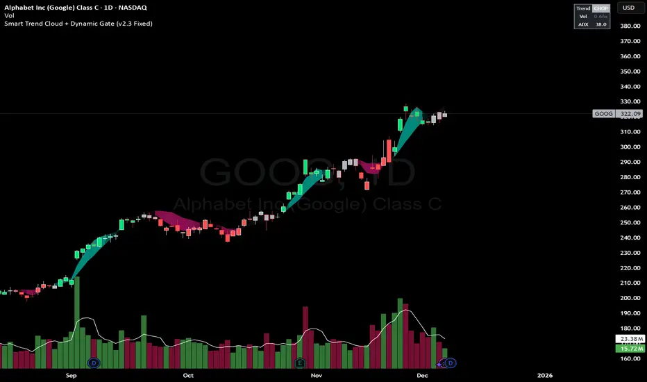
Smart Trend Cloud + Dynamic Gate (V 2.3)Smart Trend Cloud + Dynamic Gate
The Smart Trend Cloud + Dynamic Gate is a comprehensive trend-following system designed to filter out market noise and identify high-probability trend entries. Unlike simple Moving Average crossovers which often fail in ranging markets, this indicator employs a multi-stage validation system (The "Gate") combining Volume, Momentum, and Volatility filters to ensure you only trade when the market has conviction.
Key Features:
> Multi-Type Trend Cloud: Choose between HMA (Hull Moving Average), EMA, or ZeroLag EMA to define the trend baseline.
> The "Dynamic Gate" Filter: A crossover alone does not trigger a signal. The move must be validated by Relative Volume or MACD Histogram momentum within a specific window.
> Choppiness Suppression: Integrated ADX filter turns the candles gray during low-volatility consolidation zones to prevent over-trading.
> Stretch Bands: Optional ATR-based bands to highlight when price is over-extended from the mean.
> Live Dashboard: A table on the chart displaying current Trend State, Relative Volume strength, and ADX values.
How logic Works
1. Trend Definition & The Cloud The core trend is defined by the relationship between a Fast and Slow Moving Average.
Visuals: The space between these MA's forms the "Cloud". The cloud color transparency adjusts dynamically based on the strength of the trend (the spread between the MAs).
MA Options:
HMA: Best for scalping (1m/5m) due to low lag.
ZeroLag EMA: Custom calculation to reduce latency while retaining smoothness.
EMA: Standard trend following.
2. The Entry Gate (Validation) To avoid false signals during "whipsaw" price action, this script uses a logic gate. When a MA crossover occurs, it enters a "Pending" state. It only confirms a BULL or BEAR state if one of the following conditions is met within Gate Window bars:
Volume Spike: Relative Volume (Current Vol / Avg Vol) is greater than the defined threshold (default 1.2x).
Momentum Shift: The MACD Histogram confirms the direction of the trend.
3. Consolidation Filter The script calculates the ADX (Average Directional Index). If the ADX is below the Min ADX Strength threshold (default 20), the market is considered "Choppy."
Visual: Bars turn Gray.
Logic: Trend signals are suppressed until volatility expands.
4. Visual Dashboard A panel is located in the top-right corner providing real-time data:
Trend: Current State (Bull, Bear, or Chop).
Vol: Current Relative Volume (Green if > 1.0).
ADX: Current Trend Strength value.
Settings:
Trend Settings:
Adjust MA types and lengths to fit your timeframe.
Entry Gate: Toggle the Volume/Price gate on/off and adjust the Relative Volume requirement.
Consolidation: Enable/Disable the ADX filter to see all signals or only high-strength ones.
Visuals: Toggle the Cloud, Dashboard, or "Stretch Bands" (ATR bands) to declutter your chart.
Recommended Settings by Timeframe
Since different timeframes require different sensitivities to noise, here are the optimized settings for the Smart Trend Cloud:
⚡ 5 Minute Chart (Scalping)
Best for: Catching quick intraday momentum bursts while filtering chop.
MA Type: HMA (Hull Moving Average for speed)
Fast Length: 9
Slow Length: 21
Min Relative Volume: 1.3 (Requires higher volume to confirm entry)
Min ADX: 25 (Stricter chop filter)
⏱️ 15 Minute Chart (Intraday Swing)
Best for: Day trading with a balance of speed and stability.
MA Type: ZeroLag EMA (Reduces noise better than HMA)
Fast Length: 10
Slow Length: 30
Min Relative Volume: 1.2
Min ADX: 20
hrs 1 Hour Chart (Short-Term Swing)
Best for: Capturing the trend of the week.
MA Type: EMA or ZeroLag EMA
Fast Length: 12
Slow Length: 26 (Classic MACD correlation)
Min Relative Volume: 1.1
Min ADX: 20
📅 1 Day Chart (Position Trading)
Best for: Long-term trends and "Golden Cross" style entries.
MA Type: EMA (Standard Institutional Moving Average)
Fast Length: 20
Slow Length: 50
Min Relative Volume: 1.2
Min ADX: 15 (Allows for earlier entries on major trend shifts)
Alerts:
The script includes built-in alertcondition events for:
Trend Start: Bull (Valid trend detected after filtering).
Trend Start: Bear (Valid trend detected after filtering).
Access & Authorization
This is an Invite-Only script.
st reversal detector" Highly accurate reversal-detection algorithm that identifies market reversals before they occur, focusing on early signals at swing highs and swing lows. The tool must work seamlessly with confluences such as RSI overbought/oversold levels, bullish or bearish divergence, and other reversal confirmations to filter only A+ setups. no lag, no repainting, and clear visual signals for intraday trading. The model should work exceptionally well on the 10-minute and 5-minute timeframes and be specifically optimized for XAUUSD m10 and ETH m5 timeframe ''

Trend Step Channel [BigBeluga]🔵 OVERVIEW
Trend Step Channel identifies directional bias by forming a dynamic volatility-based step channel. It detects trend shifts when candle lows close above the upper band (bullish) or when candle highs drop below the lower band (bearish). A step-style midline tracks the trend evolution, while an integrated dashboard shows price positioning percentages across multiple timeframes.
🔵 CONCEPTS
ATR-Based Channel — The indicator constructs upper and lower channel boundaries using ATR distance around a single adaptive trend line, providing automatic scaling with volatility.
Trend Direction Logic —
• Low above upper band → uptrend confirmation.
• High below lower band → downtrend confirmation.
Step Trend Line — A reactive midline that locks onto price swings, stepping upward or downward as new trend confirmations occur.
Channel Width — Defines the total volatility range around the midline; a wider channel smooths market noise, while a narrower one reacts faster.
Price Position Ratio — Calculates the relative position of the close within the channel, from 0% (bottom) to 100% (top).
🔵 FEATURES
Volatility-Adaptive Channel — Expands and contracts dynamically to match market volatility, maintaining consistent distance scaling.
Configurable MA Source — Choose from SMA, EMA, SMMA, WMA, or VWMA as the base smoothing method.
Color-Coded Step Line —
• Green indicates an uptrend.
• Orange indicates a downtrend.
Channel Fill Visualization — Semi-transparent fills highlight active volatility zones for clear trend identification.
Price Position Label — Displays a “<” marker and percentage at the channel edge showing how far the current close is from the lower or upper band.
Multi-Timeframe Dashboard —
• Displays alignment across 1H–5H charts.
• Each cell shows an arrow (↑ / ↓) with price % positioning.
• Cell background color reflects bullish or bearish bias.
Real-Time Updating — The channel, midline, and dashboard refresh dynamically every bar for continuous feedback.
🔵 HOW TO USE
Trend Confirmation —
• Bullish trend forms when candle low closes above the upper band.
• Bearish trend forms when candle high closes below the lower band.
Trend Continuation — Maintain bias while the step line color remains consistent.
Volatility Breakouts — Sudden candle breaks outside the band suggest new directional strength.
Dashboard Alignment — Confirm trend consistency across multiple timeframes before entering trades.
Entry Planning — In uptrends, consider entries near the lower band; in downtrends, focus on upper-band rejections.
Price Position Insight — Use the % label to judge whether price is extended (near 100%) or compressed (near 0%) within the channel.
🔵 CONCLUSION
Trend Step Channel delivers a precise, volatility-driven view of trend structure using ATR-based boundaries and a step-line framework. The integrated dashboard, color-coded channel, and live positioning metrics give traders a complete picture of market direction, trend strength, and price location within evolving conditions.

Buy & Sell Arrows - MACD + Best_Solve WPRMACD + Best_Solve Williams %R – Aggressive Trend-Reversal Catcher
(Allow Signals Even in Overbought/Oversold Zones)
This indicator combines the classic MACD histogram with Best_Solve’s popular custom Williams %R (a 0–100 momentum oscillator that behaves more like a fast Stochastic) to deliver clean, high-conviction entry signals on daily (and higher) timeframes.
Core Logic – Only TWO conditions are required
BUY (large green arrow below bar)
MACD histogram is green (bullish momentum)
Williams %R fast line is crossing above OR already above its EMA
SELL (large red arrow above bar)
MACD histogram is red (bearish momentum)
Williams %R fast line is crossing below OR already below its EMA
Unlike most oscillators, this version deliberately removes the traditional “do not buy when overbought / do not sell when oversold” filters. This allows the script to catch powerful trend reversals and explosive moves immediately — even on violent earnings gaps or panic sell-offs (example: META’s -11 % drop on Oct 30 2025 triggered an instant sell even though %R was deeply oversold).
Built-in Clean-Signal Logic
No consecutive buys or sells — each new signal must be preceded by the opposite direction.
This keeps the chart extremely clean and prevents whipsaw clusters during strong trends.
Best Use Cases
Daily and 4H swing trading on stocks, indices, crypto, forex
Excellent for catching sharp reversals after earnings, news events, or overextended moves
Works especially well on high-beta names and growth stocks
Visuals
Large green/red arrows with “BUY” / “SELL” text (your favorite style)
Subtle transparent MACD histogram overlaid on price for instant momentum context
Ready-to-use alerts (“Buy Alert” / “Sell Alert”)
Set it, alert it, trade it — one of the cleanest and most responsive daily reversal systems you’ll find.
Enjoy the edge!


Minho Index | SETUP+@TraderMinho//@version=5
// By: Trader Minho — Analista Gráfico desde 2022
indicator("Minho Index | SETUP+@TraderMinho", shorttitle="Minho Index (Classic)", overlay=false)
//--------------------------------------------------------
// PARAMETERS
//--------------------------------------------------------
shortPeriod = input.int(3, "Short Period")
mediumPeriod = input.int(8, "Medium Period")
longPeriod = input.int(20, "Long Period")
intensityFactor = input.float(3.0, "Intensity Factor", step = 0.1)
shortSmoothing = input.int(2, "Short Smoothing (EMA)")
mediumSmoothing = input.int(5, "Medium Smoothing (EMA)")
shortColor = input.color(color.new(#00CED1, 0), "Short Line Color (Aqua Blue)")
mediumColor = input.color(color.new(#FFD700, 0), "Medium Line Color (Yellow)")
zeroColor = input.color(color.new(color.white, 0), "Zero Line Color")
lineWidth = input.int(1, "Line Thickness")
//--------------------------------------------------------
// MOVING AVERAGE CALCULATIONS
//--------------------------------------------------------
smaShort = ta.sma(close, shortPeriod)
smaMedium = ta.sma(close, mediumPeriod)
smaLong = ta.sma(close, longPeriod)
//--------------------------------------------------------
// CLASSIC DIDI NORMALIZATION
//--------------------------------------------------------
priceBase = ta.sma(close, longPeriod)
didiShort = ((smaShort - smaLong) / priceBase) * intensityFactor
didiMedium = ((smaMedium - smaLong) / priceBase) * intensityFactor
//--------------------------------------------------------
// FINAL SMOOTHING (CLASSIC NEEDLE EFFECT)
//--------------------------------------------------------
aquaSmooth = ta.ema(didiShort, shortSmoothing)
yellowSmooth = ta.ema(didiMedium, mediumSmoothing)
//--------------------------------------------------------
// PLOTS
//--------------------------------------------------------
hline(0, "Zero Line", color = zeroColor, linewidth = 1)
plot(aquaSmooth, "Short (Aqua)", color = shortColor, linewidth = lineWidth)
plot(yellowSmooth, "Medium (Yellow)", color = mediumColor, linewidth = lineWidth)

Opening Range with Breakouts & Targets w/ Alerts [LuxAlgo]This is the exact Lux Algo opening range with Breakouts and Targets, but added the ability to fire alerts on buy and sell signals

Grok/Claude AI Neural Fusion Pro V2AI Neural Fusion Pro V2 - New Features
Overview
Version 2 of AI Neural Fusion Pro introduces two complementary protection systems designed to preserve capital during market extremes. The first prevents over-buying during violent crashes. The second prevents over-selling during powerful rallies. Together, they transform a reactive trading system into one that adapts intelligently to market conditions.
Feature 1: Cascade Protection
Purpose
Cascade Protection prevents capital destruction during violent market crashes by implementing two independent safeguards that must both pass before any buy signal can fire.
The Problem It Solves
During market crashes, several dangerous conditions occur simultaneously. Volatility spikes to extreme levels, indicators scream "oversold," and each dip looks like the bottom. Traditional systems fire buy after buy, depleting capital reserves while price continues falling. By the time the actual bottom forms, there's no capital left to capture it.
How It Works
Layer 1: BBWP Freeze
Bollinger Band Width Percentile measures current volatility relative to historical volatility. When BBWP exceeds 92%, it indicates the market is experiencing abnormal volatility—typically during liquidation cascades or panic selling. During these periods, all buy signals are frozen regardless of how oversold conditions appear. This is an absolute freeze with no exceptions.
Layer 2: Consecutive Buy Counter
This layer limits the maximum number of buy orders that can execute without an intervening sell. The default limit is 3 consecutive buys. Once reached, additional buy signals are blocked until a sell signal fires and resets the counter. This prevents the common scenario where a bot keeps averaging down position after position during an extended decline.
Configuration
SettingDefaultDescriptionEnable Cascade ProtectionONMaster toggle for entire featureBBWP Length7Period for Bollinger Band calculationBBWP Lookback100Historical period for percentile rankingBBWP Freeze Level92%Threshold above which buys freezeMax Consecutive Buys3Maximum buys before forced pause
Panel Display
The info panel shows real-time protection status with color-coded feedback:
BBWP row: Shows current percentage and status (OK in green, FROZEN in red)
Buy Counter row: Shows current count versus maximum (green when available, orange approaching limit, red when blocked)
Key Behavior
Sell signals are never affected by cascade protection
The buy counter resets to zero after any sell signal fires
BBWP freeze is absolute—even extreme oversold conditions cannot bypass it
Feature 2: Dynamic Cooldown
Purpose
Dynamic Cooldown prevents over-selling during powerful rallies by automatically extending the minimum time between signals when the market enters a strong trend.
The Problem It Solves
During strong rallies, traditional indicators repeatedly hit overbought conditions, triggering sell after sell as price climbs. A trader might execute 10-15 sells during a sustained move from $86K to $93K, selling away their position piece by piece instead of letting profits run. Each sell captures a small gain while missing the larger move.
How It Works
The system monitors ADX (Average Directional Index) to detect trend strength. When ADX exceeds 50 and is rising, the market has entered a powerful trending phase. During these conditions, the cooldown period between signals automatically increases from 5 bars to 10 bars.
This means signals fire less frequently during strong trends, allowing positions more time to develop before the next potential exit. The extended cooldown applies equally to both buy and sell signals, though the primary benefit is reducing premature sells during rallies.
Normal Market (ADX < 50 or falling):
Cooldown = 5 bars (25 minutes on 5-minute chart)
Standard signal frequency
Strong Trend (ADX > 50 and rising):
Cooldown = 10 bars (50 minutes on 5-minute chart)
Reduced signal frequency to let trends develop
Configuration
SettingDefaultDescriptionEnable Dynamic CooldownONMaster toggle for featureSignal Cooldown5 barsStandard cooldown between signalsStrong Trend ADX Threshold50ADX level that triggers extended cooldownStrong Trend Cooldown10 barsExtended cooldown during strong trends
Panel Display
The info panel provides visual indication of current cooldown state:
ADX row: Shows value with arrow indicator (ADX ↑) when in strong trend mode, blue background when above threshold
Cooldown row: Shows active cooldown period with arrow indicator (Cooldown ↑) when extended, blue background during strong trends
Key Behavior
Cooldown applies to both buy and sell signals equally
Transition between modes is automatic based on ADX conditions
ADX must be both above threshold AND rising to trigger extended cooldown
When ADX stops rising or drops below threshold, cooldown returns to normal immediately
Combined Effect
These two features work together to create a more intelligent trading system:
During Crashes:
BBWP spikes above 92% → Buys frozen
System waits for volatility to normalize
When BBWP drops, limited buys (3 max) capture the actual bottom
Capital preserved for recovery
During Rallies:
ADX rises above 50 → Cooldown extends to 10 bars
Fewer sell signals fire during the move
Positions held longer, capturing more of the trend
Profits allowed to run
During Normal Markets:
Standard 5-bar cooldown
No BBWP restrictions
Full signal frequency for active trading
Summary
Version 2 transforms AI Neural Fusion Pro from a purely reactive indicator into an adaptive system that recognizes market extremes and adjusts its behavior accordingly. Cascade Protection guards against buying into crashes. Dynamic Cooldown guards against selling out of rallies. Together, they help preserve capital during adverse conditions while allowing full participation when markets behave normally.


Мой скриптinputs:
window(1),
type(0), // 0: close, 1: high low, 2: fractals up down, 3: new fractals
persistent(False),
exittype(1),
nbars(160),
adxthres(40),
nstop(3000);
vars:
currentSwingLow(0),
currentSwingHigh(0),
trailStructureValid(false),
downFractal(0),
upFractal(0),
breakStructureHigh(0),
breakStructureLow(0),
BoS_H(0),
BoS_L(0),
Regime(0),
Last_BoS_L(0),
Last_BoS_H(0),
PeakfilterX(false);
BoS(window,persistent,type,Bos_H,BoS_L,upFractal,downFractal,breakStructureHigh,breakStructureLow);
//BOS Regime
If BoS_H <> 0 then begin
Regime = 1; // Bullish
Last_BoS_H = BoS_H ;
end;
If BoS_L <> 0 Then begin
Regime = -1; // Bearish
Last_BoS_L = BoS_L ;
end;
//Entry Logic: if we are in BoS regime then wait for break swing to entry
if ADX(5) of data2 < adxthres then begin
if time>900 and Regime = 1 and EntriesToday(date)= 0 and Last_BoS_H upFractal then buy next bar at market;
end;
if time>900 and EntriesToday(date)= 0 and Regime = -1 and Last_BoS_L>downFractal then
begin
if close < downFractal then sellshort next bar at market;
end;
end;
// Exits: nbars or stoploss or at the end of the day
if marketposition <> 0 and barssinceentry >nbars then begin
sell next bar at market;
buytocover next bar at market;
end;
setstoploss(nstop);
setexitonclose;

Custom ORB (Adjust Time, Color, + Alerts)Set Opening Range Break Out for whatever time range you choose for current day only. 15 min, 30 min etc. You can add alerts on ORB High Low and change color of Lines.


Center and Volume AnalyzerCenter and Volume Analyzer that utilizes the chart's Center of Gravity alongside the Rate of Change with Bollinger Bands with a basis for the midpoint. As always, none of this is investment or financial advice. Please do your own due diligence and research.

SPX EMAs - Bala//@version=5
indicator("SPX EMAs", overlay = true)
// Inputs
ema8 = ta.ema(close, 8)
ema21 = ta.ema(close, 21)
ema50 = ta.ema(close, 50)
ema200 = ta.ema(close, 200)
// Plot EMAs
plot(ema8, "EMA 8", color=color.new(color.green, 0), linewidth=2)
plot(ema21, "EMA 21", color=color.new(color.orange, 0), linewidth=2)
plot(ema50, "EMA 50", color=color.new(color.blue, 0), linewidth=2)
plot(ema200,"EMA 200",color=color.new(color.red, 0), linewidth=2)

Estrategia Trend Following: 52w/26w BreakoutThis is a classic long-term Trend Following strategy, heavily inspired by the Donchian Channel system and the legendary "Turtle Trading" rules. It is designed to capture major market moves (bull runs) while filtering out short-term market noise and volatility.
This script is ideal for investors and swing traders who prefer a "hands-off" approach, looking to catch large trends rather than day-trading small fluctuations.
How it Works:
1. Entry Condition (The Breakout):
52-Week High: The strategy enters a Long position when the price breaks above the highest high of the last 252 trading days (approx. 1 year).
SuperTrend Filter: An additional filter using the SuperTrend indicator ensures that the breakout is supported by positive momentum, helping to reduce false signals during choppy lateral markets.
2. Exit Condition (The Trailing Stop):
26-Week Low: The strategy ignores short-term corrections. It only closes the position if the price closes below the lowest low of the last 126 trading days (approx. 6 months).
This wide stop allows the trade to "breathe" and stay open during significant pullbacks, ensuring you stay in the trend for as long as possible.
Features & Settings:
Customizable Lookback Periods: You can adjust the Entry (default 252 days) and Exit (default 126 days) periods in the settings menu.
Visual Aids:
Blue Line: Represents the 1-Year High (Entry Threshold).
Red Line: Represents the 6-Month Low (Dynamic Stop Loss).
Channel Shading: Visualizes the trading range between the high and low.
Labels: Clearly marks "BUY" and "EXIT" points on the chart.
Recommended Usage:
Timeframe: Daily (1D). This logic is designed for daily candles.
Assets: Works best on assets with strong trending characteristics (e.g., Bitcoin/Crypto, Tech Stocks, Indices like SPX/NDX, and Commodities).
Patience Required: This strategy generates very few signals. It may stay quiet for months and then hold a position for over a year.

Interactive Compound Interest ProjectorThis indicator is an interactive tool designed for long-term investors and analysts who want to compare an asset's performance against a theoretical compound interest growth curve.
Unlike static tools, this script utilizes the Interactive Anchor feature. This allows you to click on any specific point on the chart (e.g., a market bottom, a specific entry date, or a previous all-time high) to serve as the starting point ("Principal") for the projection.
How to use
Add the indicator to your chart.
Important: Because confirm=true is enabled, the script will wait for you to click on the chart. Click on the specific candle you want to use as the "Start Date".
The Yellow Line will appear starting from that candle.
Open the indicator settings to adjust:
Annual Interest Rate: (Default 6.0%).
Project until Year: (Default 2050).
Use this to visualize if an asset is "beating" a standard benchmark (like a 10% S&P500 average or a 4% risk-free rate) from a specific moment in time.
Disclaimer: This tool is for educational and comparative analysis purposes only and does not guarantee future results.

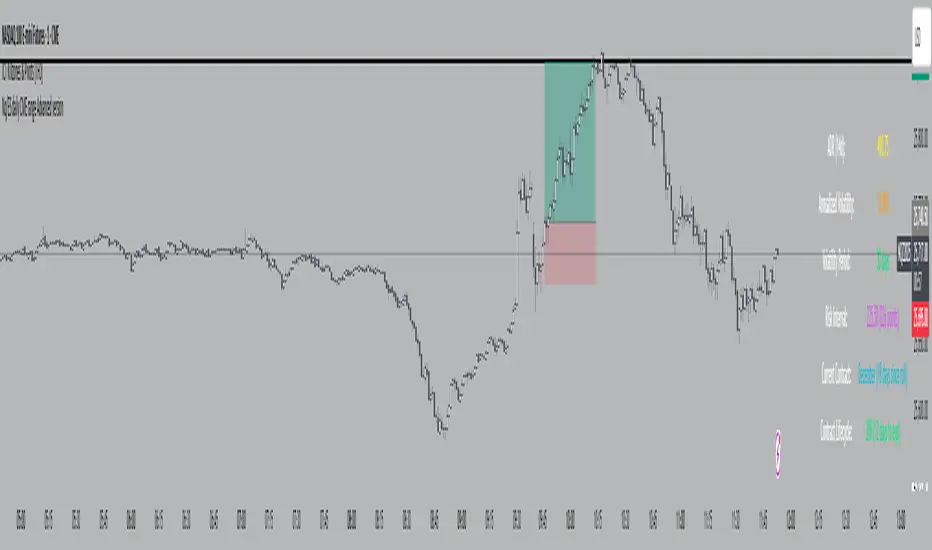
Nq/ES daily CME risk intervalNQ/ES Daily CME Range Indicator: Description and Usage
What the Indicator Does
Reverse engineering the risk interval for CME (Chicago Mercantile Exchange) products based on margin requirements involves understanding the relationship between margin requirements, volatility, and the risk interval (price movement assumed for margin calculation)
The CME uses a methodology called SPAN (Standard Portfolio Analysis of Risk) to calculate margins. At a high level, the initial margin is derived from:
Initial Margin = Risk Interval × Contract Size × Volatility Adjustment Factor
This indicator creates daily risk intervals for NQ/ES futures contracts based on volatility measurements given the fact that the CME volatility adjustment factor is not public.
The indicator draws horizontal lines on your chart that represent expected price movement ranges based on:
Your specified maintenance margin requirements
Current and historical volatility calculations
Contract lifecycle and rollover detection
The indicator automatically detects when futures contracts roll over to a new contract month, dynamically adjusts volatility calculations throughout the contract lifecycle, and displays the intervals as horizontal lines that extend from the previous day's close. These intervals give you a visual representation of likely price ranges for the current trading session.
How to Use the Indicator
To use this indicator effectively:
Add it to your NQ or ES futures chart (works on continuous contracts or individual contract months)
Set your maintenance margin amount in the risk interval settings (product margins page from the CME website. I tend to use the maintenance short margin)
The indicator will automatically draw horizontal lines at 18:00 ET each day
Use these lines as potential profit targets in volatile days
Monitor the information table for details on volatility, risk interval size, and contract lifecycle
The indicator helps you visualize expected price movement based on market volatility and your specified risk parameters, allowing you to make more informed trading decisions about position sizing and potential profit targets.
Additionally, when the market moves on news/events you will notice it will most often move exactly the risk interval value.
Why These Settings Work as Defaults
First Month Vol Period (30): The first 30 days after contract rollover typically have different volatility characteristics. This setting ensures accurate volatility measurements during this period when contract behaviour may be less stable.
Enable Volatility Floor (Checked): This prevents volatility from falling below historical levels, ensuring your risk intervals don't become too narrow during artificially calm periods. Research shows that protracted low volatility can lead to a build-up of leverage and risk, making the system vulnerable.
Volatility Floor % (0.7): The 0.7 setting works better than higher values because it better accounts for how equity volatility behaves at lower bounds. It allows for natural mean reversion while still providing protection against underestimating risk during low volatility periods.
Transition Period (30 days): This creates a smooth transition from the first month volatility period to the actual days since rollover calculation, preventing abrupt changes in your risk intervals.
Annual Trading Days (252): 252 is the standard number of trading days in a year used in financial calculations. This value is used for properly annualizing volatility measurements.
Long-Term Volatility Period (504): A 504-day period (approximately 2 years of trading days) provides several advantages over the standard 252-day setting. It better captures full market cycles including both bull and bear markets, provides more stable volatility estimates across regime changes, and results in more reliable risk intervals. Research shows this longer timeframe produces better volatility forecasts for futures markets, as it captures a more comprehensive range of market conditions while smoothing out anomalous periods.
The combination of these settings—particularly the 504-day long-term period with the 0.7 volatility floor—creates more stable and reliable risk intervals that adapt appropriately to changing market conditions without becoming overly sensitive to short-term fluctuations or too sluggish during genuine market shifts.
Adaptive Dual MA Trend Ribbon Community “Larsson-Style” PresetsMany traders enjoy experimenting with dual-moving-average “trend ribbon” structures that resemble the visual style of popular tools such as the Larsson Line. While the internal logic of closed-source indicators is not publicly available, the trading community often explores MA combinations like SMMA 15/29 or EMA 30/60 with ATR filters to study trend transitions and visualize momentum shifts.
This script does not replicate, reverse-engineer, or replace any closed-source indicator. Instead, it provides a flexible, open-source framework that lets traders build their own trend-ribbon configuration inspired by similar visual concepts while maintaining full transparency. Because the calculations rely only on standard, well-known moving-average and ATR methods, traders can experiment freely with community-discussed presets without relying on proprietary tools.
What the Script Does
• Plots Fast and Slow moving averages using the method of your choice: SMMA (RMA), EMA, SMA, or WMA
• Colors the ribbon to show directional bias:
• Bullish when Fast MA > Slow MA
• Bearish when Fast MA < Slow MA
• Neutral when the difference is small (optional ATR filter)
• Supports ATR-based neutral zone filtering
• Supports optional bar coloring
• Works on all markets and timeframes
• Fully open-source and customizable
Why This Script Is Useful
Traditional moving averages identify trend direction but lack context during uncertain or low-momentum conditions. This script adds value by:
1. Allowing multiple smoothing techniques (SMMA/EMA/SMA/WMA)
2. Highlighting clearer trend transitions
3. Identifying low-confidence periods using ATR
4. Providing a visually intuitive ribbon instead of single-line signals
Suitable for swing traders, trend followers, breakout traders, and anyone who wants cleaner structure-based contextualization.
Popular Community MA Combinations
Many traders experiment with specific MA pairs to understand trend-ribbon behavior:
• SMMA 15/29 → smoother structural trend flow
• EMA 30/60 → more responsive momentum shifts
• EMA 10/21 → intraday rhythm
• EMA 50/100 → higher-timeframe structure
These examples are commonly used by the community—but this script does not recreate or imitate any closed-source or commercial indicator.
How to Use
1. Choose your preferred MA type
2. Adjust Fast/Slow lengths to match your timeframe
3. Enable ATR Neutral Zone to reduce false flips
4. Optionally enable bar coloring
5. Combine with structure, volume, or price action for decision-making
Important Notes
• This script is original, open-source, and not affiliated with any commercial indicator or author.
• It does not reproduce, imitate, or reverse-engineer any closed-source logic.
• All computations are standard MA/ATR methods for clarity and transparency.
Disclaimer
This tool is for educational and analytical purposes only.
Always test parameters and use proper risk management before applying to live trading.

London First 15m Candle (Real-Time NY)London First 15-Minute Candle (Real-Time New York Time)
This custom TradingView indicator identifies and tracks the first 15-minute candle of the London session, but calculated in real-time according to New York time (EST/EDT).
🔹 What the Indicator Does
1. Detects the London Session Open (Real NY Time)
You define the London session start time in New York hours (default: 3:00 AM NY Time).
The indicator monitors the first 15 minutes from the defined start time (3:00–3:15 NY time).
Only today’s candle is tracked — historical London ranges are not shown.
2. Builds the London Opening Range Candle (15m)
While the 15-minute window is still open, it continuously tracks:
Highest price reached (London High)
Lowest price reached (London Low)
The values update in real time only within the 3:00–3:15 window.
At 3:15 NY time, the candle is locked in and no longer changes.
3. Draws Three Persistent Levels on the Chart
Once the London candle closes, the indicator plots:
🔴 Top Line (London High)
Extended to the right across the chart.
🟢 Bottom Line (London Low)
Extended to the right across the chart.
⚪ Mid Line (Middle of the Range)
Computed as:
(londonHigh + londonLow) / 2
Also extended to the right.
All lines:
Are only drawn for today.
Auto-delete and refresh when a new trading day begins.
4. Works on ANY Timeframe
Even if the indicator runs on:
1m
2m
5m
1h
etc.
…it still uses a real 15-minute aggregation, ensuring the London candle is accurate.
5. Clean Chart — No Historical London Levels
The script:
Removes old lines at the start of each new day.
Keeps only today’s active London range.
This prevents clutter and ensures clarity.
6. Optional Alerts (if enabled)
The indicator can generate alerts when the market crosses:
The top of the London range
The bottom of the London range
The midline
For example:
Price breaks above London High
Price breaks below London Low
Price crosses the Midline up or down
These can be used for:
Breakout strategies
Liquidity grabs
Range-trading confirmations
7. Fully Customizable
User inputs allow you to modify:
London session start hour (NY Time)
Candle duration (fixed at 15 minutes)
Line colors:
High line color
Low line color
Midline color
Line widths
Summary
This indicator gives you a clean and accurate view of the first 15-minute candle of the London session — critical for many ICT/SMS/prop firm strategies — with:
Real-time NY-based calculation
Automatic cleanup
Clear range lines
Custom colors
Alerts for breakouts

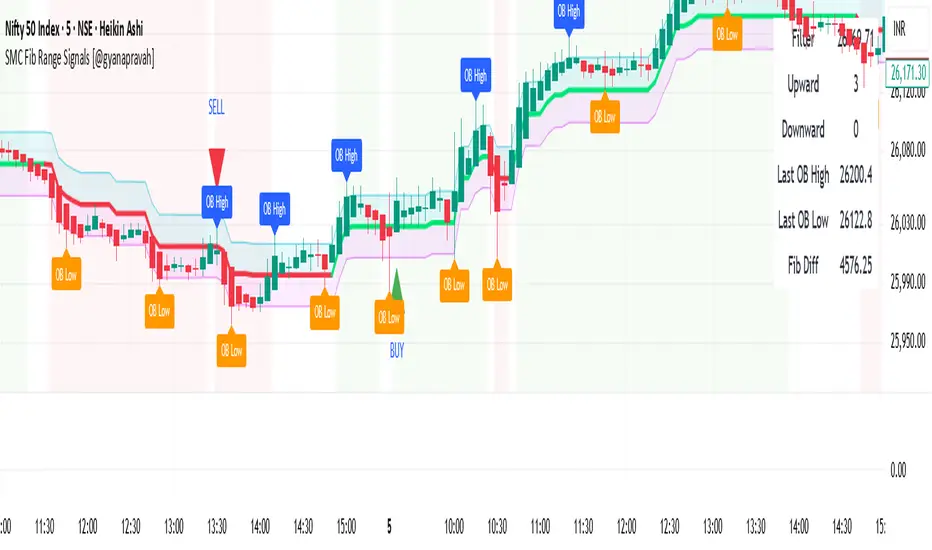
SMC Fib Range Signals [@gyanapravah]SMC Fib Range Signals
This indicator blends Smart Money Concepts (SMC) with a Range Filter Trend System and Fibonacci Retracement & Extensions to generate high-probability automated Buy/Sell signals.
Designed to avoid noise and focus on market structure + trend + price confluence, this tool is ideal for:
1. Intraday traders
2. Swing traders
3. Index & stock traders
4. Crypto & Forex traders
CORE FEATURES
Range Filter Trend Detection
Smooth adaptive filter identifies true trend direction
Visual confirmation:
🟢 Green filter = bullish pressure
🔴 Red filter = bearish pressure
🟡 Yellow filter = neutral
Upper & Lower Bands act as dynamic support/resistance zones
Smart Money Order Blocks (SMC)
Automatically detects important pivot highs & lows
Marks:
OB High → supply / resistance zone
OB Low → demand / support zone
Continuously tracks latest OB levels for live price interaction
Fibonacci Engine
Detects the current swing zone and plots:
Retracement levels
0.236 – 0.382 – 0.500 – 0.618 – 0.786 (editable)
Extension targets
1.272 – 1.618
All levels update dynamically on new market structure and pivots.
SIGNAL ENGINE
This indicator generates signals from three independent confirmation systems:
BUY SIGNALS trigger when:
1. Trend flips bullish (price crosses above the Filter)
2.Bullish trend + price reacts near:
Order Block support
Fibonacci 0.382 / 0.618 levels
Bounce from the Lower Band with trend support
All setups require volume confirmation to filter fake breakouts.
SELL SIGNALS trigger when:
1. Trend flips bearish (price crosses below the Filter)
2. Bearish trend + price reacts near:
Order Block resistance
Fibonacci 0.382 / 0.618 levels
Rejection from the Upper Band with trend support
ALERTS READY
Two built-in alerts:
BUY Alert — fires on bullish signal
SELL Alert — fires on bearish signal
INPUT SETTINGS
Trend Engine
1.Source
2.Sampling Period
3.Range Multiplier
Smart Money
Pivot detection sensitivity (Left / Right bars)
Fibonacci
1.Swing lookback length
2.Editable Fib retracement and extension values
3.Toggle show/hide Fib levels
BEST USE CASE
Works extremely well on:
⏱️ 3M – 15M Intraday scalping
⏱️ 30M – 1H positional entries
⏱️ 4H – D1 swing trading
Tested on:
NIFTY / BANKNIFTY / FINNIFTY
Stocks
Crypto
Forex
DISCLAIMER
This indicator is for educational purposes only.
It does NOT guarantee profits.
Always use:
Proper risk management
Stop-loss rules
Your own confirmation before entering trades.
AUTHOR
Built & shared by @gyanapravah (Odisha, India)
Open-source for learning and community improvement.
RoseTree Golden BandsRoseTree Golden Bands
Overview
RoseTree Golden Bands is a volatility-based support indicator that uses Fibonacci ratios combined with Average True Range (ATR) to identify potential buy zones below price action.
How It Works
The indicator calculates a simple moving average (SMA) of the closing price, then subtracts ATR-based offsets using two key Fibonacci extensions (2.618 and 4.236) to create dynamic support bands that expand and contract with market volatility.
Components
Orange Line (Level 2) — SMA minus ATR × 2.618. Acts as the first support level and early warning zone.
Green Line (Buy Zone) — SMA minus ATR × 4.236. Represents deeper support where price has historically found strong buying interest.
BUY Signal — Triggers when the candle's low comes within 2% of the green line, alerting you to potential accumulation opportunities.
Settings
Length: Period for both SMA and ATR calculations (default: 20)
Fibonacci Ratio 2: Multiplier for the orange band (default: 2.618)
Fibonacci Ratio 3: Multiplier for the green buy zone (default: 4.236)
Usage
Look for BUY signals during pullbacks in an uptrend. The bands adapt to volatility, widening during turbulent markets and narrowing during consolidation. Best used alongside trend confirmation and volume analysis rather than as a standalone signal.

20 SMA Break FLOWThis script is a full 20-SMA breakout + R-multiple playbook with context:
20 SMA Channel: Plots a 20-period SMA High and Low, fills the channel between them for a clear visual “belt” around price.
Breakout Entries:
Long: waits for a bar to close above the 20 SMA High, then arms that bar’s high as the trigger.
A long entry signal prints when a later bar’s close is above that trigger high.
Short: mirror logic using the 20 SMA Low and trigger low.
Stops & R-Multiples: On entry it auto-sets stop at the opposite end of the trigger bar, calculates 1R/2R/3R price levels, and plots those lines on the chart.
R Labels & Info Panel: Draws “SL / 1R / 2R / 3R” labels at entry, and a top-right panel showing:
Current R (live P&L in R)
Entry & SL prices
Max R reached
Drawdown from peak R
ONH/ONL: Tracks and plots the overnight high and low from 18:00–09:29 as horizontal reference lines into RTH.
SHA Trend Filter: Adds smoothed Heikin-Ashi background coloring and optional SHA candles as a directional/volatility filter.
Alerts:
Long/short entry alerts when the close breaks the trigger bar high/low
Target alerts when 1R, 2R, or 3R are hit for either direction.
