Bandas e Canais

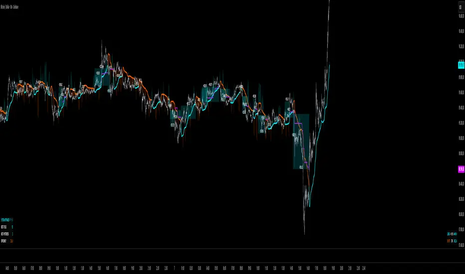
Vegas plus by stanleyThis Pine Script implements a comprehensive trend-following strategy known popularly as the **Vegas Tunnel Method**. It combines multiple Exponential Moving Averages (EMAs) to define trends, pullbacks, and breakouts.
Here is a step-by-step walkthrough of how the code works, broken down by its components and logic.
---
### 1. The Anatomy (The Indicators)
The script uses three distinct groups of Moving Averages to define the market structure.
#### A. The Fast EMAs (The Trigger & Exit)
* **EMA 12 (Signal):** The fastest line. It is used to trigger entries (crossing the tunnel).
* **EMA 21 (Exit):** Used as a trailing stop. If the price crosses this line against your trade, the script signals an exit.
* **EMA 55 (Filter):** A medium-term filter, often used visually to gauge trend health.
#### B. The "Hero" Tunnel (The Action Zone)
* **EMAs 144 & 169 & 200:** These creates the main "Tunnel."
* **Function:** This acts as dynamic Support and Resistance.
* **Bullish:** If the 144 (Top) is above the 200 (Bottom), the tunnel is painted Blue.
* **Bearish:** If the 144 is below the 200, it is painted Red.
#### C. The "Anchor" Tunnel (The Deep Trend)
* **EMAs 576 & 676:** This creates a massive, slow-moving background tunnel.
* **Function:** It tells you the long-term trend. Generally, you only want to take Buy signals if price is above this Anchor, though the script logic focuses primarily on the Hero tunnel for triggers.
---
### 2. State Memory (`var` Variables)
This is a sophisticated part of the script. It uses `var` variables to "remember" where the price was in the past.
* `originPrice`: Remembers if the price was last seen **Above** (1) or **Below** (-1) the tunnel.
* `originEMA`: Remembers if the EMA 12 was last seen **Above** (1) or **Below** (-1) the tunnel.
**Why is this needed?**
To distinguish between a **Breakout** (crossing from Bear to Bull) and a **Pullback** (already Bull, dipped into tunnel, and coming back out).
---
### 3. The Four Entry Triggers
The script looks for four specific scenarios to generate a Buy or Sell signal. You can turn these on/off in the settings.
#### Trigger 1: Price U-Turn (Trend Continuation)
* **Logic:** The Price was *already* above the tunnel (`originPrice == 1`), dipped down, and is now crossing back up (`crossover`).
* **Meaning:** This is a classic "Buy the Dip" signal within an existing trend.
#### Trigger 2: EMA U-Turn (Lagging Confirmation)
* **Logic:** Similar to Trigger 1, but uses the **EMA 12** line instead of the Price candle.
* **Meaning:** This is safer but slower. It waits for the average price to curl back out of the tunnel.
#### Trigger 3: Breakthrough (Momentum Shift)
* **Logic:** The EMA 12 was previously *below* the tunnel (`originEMA == -1`) and has just crossed *above* it (`crossover`).
* **Meaning:** This is a Trend Reversal signal. The market has shifted from Bearish to Bullish.
#### Trigger 4: Wick Rejection (Touch & Go)
* **Logic:**
1. Price is generally above the tunnel.
2. The `Low` of the current candle touches the tunnel.
3. The `Low` of the *previous* candle did NOT touch the tunnel.
4. The candle closes *outside* (above) the tunnel.
* **Meaning:** The price tested the support zone and was immediately rejected (bounced off), leaving a wick.
---
### 4. Trade Management (State Machine)
The script uses a variable called `tradeState` to manage signals so they don't spam your chart.
* `tradeState = 0`: Flat (No position).
* `tradeState = 1`: Long.
* `tradeState = -1`: Short.
**The Rules:**
1. **Entry:** If `validLong` is triggered AND `tradeState` is not already 1 -> Change state to 1 (Long) and plot a **BUY** label.
2. **Holding:** If you are already in State 1, the script ignores new Buy signals.
3. **Exit:** If `tradeState` is 1 AND price closes below EMA 21 -> Change state to 0 (Flat) and plot an **Exit L** label.
---
### 5. Visual Summary
* **Green Label:** Buy Signal (Long Entry).
* **Red Label:** Sell Signal (Short Entry).
* **Grey X:** Exit Signal (Close the position).
* **Blue/Red Tunnel:** The "Hero" tunnel (144/169/200).
* **Grey Background Tunnel:** The "Anchor" tunnel (576/676).
### How to read the signals:
You are looking for the price to interact with the **Hero Tunnel** (the thinner, brighter one).
1. **Trend:** Look at the slope of the Anchor (thick grey) tunnel.
2. **Setup:** Wait for price to come back to the Hero Tunnel.
3. **Trigger:** Wait for a **Green Label**. This means the price dipped into the tunnel and is now blasting out (U-Turn), or has rejected the tunnel (Wick), or has broken through a new trend (Breakthrough).
4. **Exit:** Close the trade when the **Grey X** appears (Price crosses the EMA 21).


VIX + Weekly ATR Hybrid RangeVIX + Weekly ATR Hybrid Range best used for complete range with accuracy

Auto Line📌 **《Auto Line》 Overview
Auto Line is a multi-level analytical engine that automatically generates structural price levels based on a variety of frameworks such as:
Moving averages
Upper / Lower band logic
Previous High / Previous Low
Swing pivot highs and lows
Fibonacci Pivot levels
Multi-timeframe (HTF) inputs
Each level is evaluated using a Break Count grading system, which measures how frequently price has crossed the level.
This grading does not produce buy or sell signals—it simply visualizes how often the market has interacted with that price area.
Auto Line is a market structure reference tool, not a prediction or signal generator.
✨ Key Features
1) Nine Independent Level Engines (SET 1–9)
Each of the nine SETs can independently generate levels using one of the following methods:
SMA
Upper band
Lower band
Previous High / Previous Low
Swing Points
Fibonacci Pivot Levels
NONE (disabled)
Each SET has its own:
Length
Multiplier
HTF timeframe
This allows full customization of the level-generation logic.
2) Built-in Multi-Timeframe (HTF) Support
Every SET can request data from any higher timeframe via request.security().
Example usage:
SET1 → Daily
SET3 → Weekly
SET9 → Weekly Fibonacci
Thus, the user can visualize multiple timeframe structures on a single chart.
3) Break-Count Level Strength System
Auto Line evaluates the “strength” of each level using a break-count formula:
breaks = Number of times price crosses above/below the level
grade = 0–100 scale based on breaks
More breaks → higher grade → lower opacity (more faded)
This gives a visual sense of how frequently the market has interacted with a level.
It is not a probability measure and does not imply trade direction or outcome.
4) Swing-Based Structural Levels
The indicator detects swing highs and lows using left/right parameters and converts them into structural levels.
Includes:
Automatic swing labeling
Break-count evaluation
Optional display of all swing points (showPP)
5) Automatic Fibonacci Pivot Levels
When the Fibonacci option is selected:
P
R1 to R5
S1 to S5
are generated automatically and evaluated just like any other level.
6) Selective Output (A–E Pick Slots)
The user can selectively display specific SET outputs using pick slots:
Pick A → choose SET #1 to SET #9
Pick B → choose another SET
… up to five independent visible selections
Each pick can display either:
a single line level
or a full 11-level Fibonacci set (when applicable)
📌 Explanation of User Inputs
Swing Settings
Left / Right: Controls pivot swing sensitivity
Show PP: Option to show all swing labels on chart
SET Parameters (1 to 9)
Each SET contains:
Parameter Description
Method SMA / Upper / Lower / Prev High / Prev Low / Swings / Fibonacci
Length Used for SMA/Band logic
Multiplier Used for Upper/Lower band expansion
HTF Timeframe used for data calculation
Each SET behaves independently.
Display Options (Picks A–E)
Each pick allows selecting one SET to display.
Example:
Pick A = SET3
Pick B = SET5
Fibonacci levels generate up to 11 plots;
other methods produce a single structural line.
📌 How Level Strength Is Calculated (Technical Description)
Auto Line tracks how often price alternates above and below a level:
Determine whether price begins above or below the level
Count each time price crosses it
Convert break count into a grade:
grade = min(100, round((100 / fade) * breaks))
The grade affects opacity only, giving a visual representation of interaction frequency.
This grading does not represent trade probability or outcome.
📌 Repainting Behavior
Auto Line:
Uses confirmed historical bars
Uses security() for HTF data
Does not modify past values once bars are confirmed
Therefore, the indicator does not repaint.
However, structural levels such as:
Swings
Pivot Levels
HTF lines
will naturally update when new bars close, which is expected behavior for this style of indicator.
📌 Purpose of the Indicator
Auto Line is designed for:
Identifying structural price regions
Observing where the market most frequently interacts
Comparing levels across multiple frameworks
Creating a comprehensive multi-timeframe level map
It does not:
❌ predict future price
❌ provide buy/sell signals
❌ guarantee profitable outcomes
It is a supporting tool for market structure analysis.
📌 Notes & Considerations
Swings and pivot levels depend on chart range and may change as new bars appear
Too many SETs may clutter the chart—use pick slots to selectively display
Break-count is purely informational, not directional

AJ Price Action Trading SetupThe AJ Price action trading setup Involves :
1. Buy / Sell Signals Based On Previous Price Action
2. BOS/ COCH Showing Trend Reversals
3. Market Momentum Based On Price Action
Disclaimer :
Never Take trades based on Indicator only, make your own analysis and trade accordingly.
Price Action is not every body cup of cake, we are trading against smart and educated institutions its not easy to steal money from them.There is nothing in this world which helps in guaranteed returns,no indicator have done yet neither this one do.Try to Control your emotions and do not over trade.This is my updated version of my previous indicator Previous Candle Breakout Startegy.Follow and Comment for any clarifications.

RSI++ Smoothed + Divergence Lines by Indicatorhouse🚀 Introducing RSI++ Smoothed + Divergence Lines: Your Advanced Momentum Edge! 🚀
Hey,
I'm thrilled to share an indicator we've poured a lot of effort into, designed to give you a significant edge in understanding market momentum and anticipating reversals: RSI++ Smoothed + Divergence Lines.
This isn't just another RSI; it's a comprehensive momentum powerhouse built to provide cleaner signals, dynamic context, and crucial foresight that standard indicators often miss. If you're looking to reduce noise, spot high-probability reversals, and align with the broader market trend, this indicator is for you.
Why RSI++ is Different & What You Get:
Crystal-Clear Momentum with Advanced Smoothing Forget the jittery, noisy lines of a basic RSI. My indicator features a double-layered smoothing engine (EMA/SMA options + an additional EMA) to deliver a super-clean momentum line. This means you can spot actual shifts in market strength, not just minor wiggles.
Benefit: Reduces false signals, giving you more reliable entry and exit points.
Dynamic Overbought/Oversold Bands Static 70/30 levels are good, but dynamic levels are better! RSI++ integrates Bollinger Bands directly onto the RSI line itself. This means the overbought and oversold thresholds adapt to the current volatility of the momentum, giving you a more intelligent read on extreme conditions.
Benefit: Context-aware signals that truly reflect when momentum is stretched, regardless of market conditions.
Precision 'B'uy & 'S'ell Reversal Signals When the smoothed RSI changes direction from an extreme (overbought or oversold) zone, the indicator plots clear 'B' (Buy) or 'S' (Sell) labels. These are filtered signals designed to highlight high-probability reversals from significant momentum exhaustion.
Benefit: Pinpoint powerful turning points with easy-to-read visual cues directly on the indicator panel.
Automated Divergence Detection (Regular & Hidden!) One of the most powerful leading indicators is now automated for you! RSI++ automatically identifies and plots both Regular (trend reversal) and Hidden (trend continuation) Bullish and Bearish divergences between price and the smoothed RSI.
Benefit: No more squinting to find divergences. Clear lines and labels appear, giving you an early warning of potential shifts or continuations.
Multi-Timeframe (MTF) Confluence Dashboard Never trade against the higher timeframe trend again! A customizable dashboard discreetly shows you the momentum direction (RSI slope) across five different timeframes. It even calculates a confluence score!
Benefit: Gain instant perspective on the market's overall bias, helping you confirm trades and avoid low-probability setups.
Built-In Professional Alerts
Stay on top of the market without being glued to your screen. RSI++ comes with a comprehensive suite of alerts:
RSI Color Change (Slope): Get notified when momentum direction shifts.
Sell/Buy Signal (Extreme Reversal): Alerts for those high-conviction 'B' and 'S' signals.
Multi-Timeframe Confluence: Be alerted when 3 or more timeframes align, or when your first 3 timeframes are fully aligned.
Ready to Elevate Your Trading?
The RSI++ Smoothed + Divergence Lines indicator is available for purchase now! Experience a cleaner, smarter way to trade momentum.
🔑 Request Access: RSI++ (7-Day Trial)
We offer a 7-day free trial of the RSI++ Smoothed + Divergence Lines indicator!
To get access:
Follow My Profile.
Send a Private Message with your TradingView Username (ID).
We will grant access promptly!
Feel free to drop any questions below. Happy trading!
#RSI #MomentumTrading #Divergence #TradingView #CustomIndicator #TechnicalAnalysis #PineScript #PremiumIndicator

RSI Volume Order BlocksOverview
This script builds structured order blocks using a combination of RSI pivots, price structure, and optional volume/ATR-based scaling.
It is designed to create a clean, explainable map of support/resistance levels that respond only to meaningful momentum shifts rather than small, insignificant oscillations.
Core Idea
Traditional order blocks rely solely on price highs/lows, which often produces excessive or noisy zones.
This model instead:
Detects pivot highs/lows on the RSI (controlled by RSI Length and Sensitivity).
Generates bearish order blocks from RSI pivot highs and bullish order blocks from RSI pivot lows.
Allows the user to choose whether blocks are based on candle bodies or the full candle range.
Optionally filters blocks so that:
bearish OBs form only when RSI is above an overbought threshold,
bullish OBs form only when RSI is below an oversold threshold.
The resulting zones represent areas of momentum exhaustion and imbalance rather than random price fluctuations.
Volume–ATR Height Mode
The script offers two approaches for block height:
1. Price Candle Mode
Block height equals either:
the candle body, or
the full high–low range of the pivot bar.
2. Volume–ATR Mode
Block height is adaptively scaled using:
ATR (ATR Length for Height),
relative volume compared to a baseline (Volume Baseline Length),
a global height multiplier.
This makes zones thicker when the pivot candle had both higher volatility and above-average volume, and thinner when market participation was lower.
Lifespan and Mitigation
Each block extends forward in time until price mitigates it.
Mitigation Method: Close
Bearish OB is removed when a candle closes above its top.
Bullish OB is removed when a candle closes below its bottom.
Mitigation Method: Wick
Bearish OB is removed when a wick breaks above the top.
Bullish OB is removed when a wick breaks below the bottom.
Additional controls:
Maximum number of stored OBs per side.
Maximum number of displayed OBs per side.
Overlap filtering to avoid redundant zone stacking.
Main Inputs (Summary)
RSI Length – standard RSI lookback.
RSI OB Sensitivity – pivot aggressiveness (higher = fewer, stronger pivots).
Overbought/Oversold Levels – thresholds for optional filters.
RSI Filter –
bearish OB only if RSI > overbought,
bullish OB only if RSI < oversold.
Order Block Style – candle body or full range.
Mitigation Method – close-based or wick-based.
OB Height Mode – price candle or volume–ATR scaling.
Volume Baseline Length, ATR Length for Height, Height Scale – parameters for adaptive height mode.
Show Bullish / Bearish OBs – toggles for each side.
Color settings for zone visualization.
How to Use
Typical workflows include:
Using higher-timeframe OB zones as structural support/resistance, then refining entries on lower timeframes.
Watching for price reactions inside thick Volume–ATR zones, which may indicate areas of strong participation.
Combining this tool with trend filters, volume metrics, or price action confirmation (e.g., rejection wicks or engulfing patterns).
This script does not generate automated entries/exits; it is a contextual mapping tool designed to highlight where meaningful imbalance likely originated and where reactions may occur.
Notes
Works on any symbol and timeframe available on TradingView.
Most effective when combined with disciplined risk management and a defined trading plan.
Provided for research, chart analysis, and backtesting.
Disclaimer
This tool is for educational and informational purposes only.
It does not constitute financial advice or a recommendation to buy or sell any asset.
Always perform your own analysis and manage risk appropriately.

Vegas Pro_邀請版Vegas Pro
Access Requirements To access this script, please follow these steps:
Register on MEXC using the link below.
Deposit at least 200 USDT.
Provide your email address to receive access.
Sign up link: www.mexc.com

Weekly & Monthly Thresholds + VIX-Based Dynamic Targets copyWeekly & Monthly Thresholds + Targets copy backup in case of issue with the previous " Weekly & Monthly Thresholds + VIX-Based Dynamic Targets "

SMC Pro: Real-Time Final**Description:**
This comprehensive SMC indicator is designed to automatically visualize major **Trading Sessions** and **Killzones**, alongside Fair Value Gaps (FVG). It helps traders identify high-probability setups by correlating time and price, specifically during key market hours (London, New York, Asia).
**Key Features:**
1. **Trading Sessions & Killzones:** The indicator clearly highlights the open and duration of major sessions (Asia, London, New York), allowing traders to spot volatility injections and "Judas Swings."
2. **Automated FVG Detection:** Scans price action to locate valid Fair Value Gaps and Imbalances within these sessions.
3. **Entry Logic:** Marks potential entry zones at the 50% retracement level of the identified FVG.
4. **Risk Management:** Projects a fixed Risk-to-Reward ratio (e.g., 1:3) with automatic Stop Loss and Take Profit levels.
5. **Clean Visualization:** Color-coded boxes for sessions and gaps keep the chart organized.
**How to Use:**
* **Time Analysis:** Watch for price action as the London or NY session opens (highlighted by the indicator).
* **Signal:** Wait for an Imbalance/FVG to form during these high-volume times.
* **Entry:** Set a limit order at the 50% mark of the gap.
* **Exit:** Use the projected TP levels.
**Disclaimer:**
This tool is for educational purposes and technical analysis assistance only. Past performance does not guarantee future results.

Range&Swing - 2SD Band + 2/3SD Arrows + HTF Supertrendthis is my first indicator, please be nice to me
i combined Band, 2sd + 3sd arrows and also supertrend for swing plays

IndiabizlistFX Scalper 1.0the detailed description will be updated soon
basically an indicator with customized settings for reversal trading, i am currently updating it, with the dashboard, it will be updated soon

Trend Finder - Buy/Sell (Anuj Edition)Renko Trend Finder – Anuj Edition is a powerful trend-following tool designed to detect market direction using Renko logic instead of traditional candlesticks.
Renko filtering removes market noise, making trends clearer and reversals easier to identify.
This indicator internally builds Renko-style price movement and generates clean, high-quality Buy and Sell signals without repainting.

Setup Keltner Banda 3 e 5 - MMS
⚙️ How It Works:
• Calculates a 20-period Simple Moving Average (SMA) as the central line.
• Uses the ATR (Average True Range) to build two volatility bands:
o 3x ATR Band (more sensitive)
o 5x ATR Band (more extreme)
• Detects potential reversals when the price closes outside a band and then re-enters it.
🔍 Signals Generated:
• 🔻 Bearish Reversal: Price re-enters from above the upper band.
• 🔺 Bullish Reversal: Price re-enters from below the lower band.
• Signals are displayed with colored arrows on the chart for easy visual recognition.
🔔 Alerts:
The script also triggers automatic alerts for each type of reversal, so you can be notified in real time.
🧱 Ideal For:
• Traders using Renko, Range, or traditional candlestick charts
• Scalping or swing trading strategies
• Anyone looking for visual confirmation of price exhaustion and potential reversals

SBT LEVELS with CR Daily time frame levels PDH/ PDL/ PDC. I managed to code day count directly into the indicator complete with a table to show you the trigger day as well as current day. Im measuring higher and lower closes. that being said it is up to the trader to realize when a FRD/FGD is a A+/A++/A+++ setup. BO is the designation to show when breakout traders are triggered into the market. CIB (close in breakout). FB- FALSE BREAK- INSIDE - inside day.

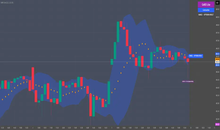
GARO Lite - Free Regime EngineGARO — Gamma Regime Engine
Overview
GARO (Gamma Regime Oscillator) is a visual regime engine that shows market conditions in real-time. This free edition is for educational and charting purposes only.
Key Features
Regime Detection: Highlights Expansion, Contraction, and Spike conditions using trend, volatility, and volume-based calculations.
Core and Bands: Central reference line with upper and lower bands.
Visual Alerts: Orange dots appear under candles during compressions; background colors indicate current regime.
Signal Labels: Labels provide visual guidance based on regime and trend slope.
Gamma Exposure (GEX) Proxy & Zero Gamma Flip: Optional visual overlays for contextual awareness.
User Inputs: Some settings are visible in the input panel but are disabled in this free edition.
How to Use
Regime Colors:
Expansion (green background): Market trending/expanding; core line indicates direction.
Contraction (blue background): Market range-bound; orange dots indicate compression.
Spike (red background): High volatility; visual alert only.
Labels & Signals:
Labels highlight potential regime moves; not trade advice.
Combine colors, core/band positions, and label cues with your own analysis.
Core Line & Bands:
Core line shows central reference per regime.
Upper/lower bands provide context for potential support/resistance zones.
Orange Dots:
Indicate compressions or regime-specific signals; visual only.
Gamma Exposure & Zero Gamma Flip (Optional):
Illustrates potential price sensitivity; charting/educational use only.
Important:
Protected code; underlying calculations are not visible.
For educational and visual guidance only; not financial or trading advice.
Works on any timeframe; free edition gives visual regime insights.
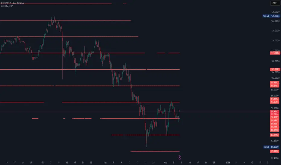
GridMap PRO by TradeAkademiGridMap PRO is a professional level-mapping framework built on the premise that price action tends to develop within repeatable percentage-based bands. Using mathematically derived projections, the indicator identifies potential support and resistance zones where the market is statistically more likely to react.
All calculations are anchored to the asset’s historical low; therefore, levels remain structurally stable unless a new low is formed.
To support different trading environments, GridMap PRO offers two calculation modes:
Long Term: Designed for high-volatility markets, macro structure assessments and broader trend inflection points.
Short Term: Optimized for shorter-term setups, providing precise reaction zones and tactical entry/exit levels.
Users are encouraged to validate the levels against historical price behavior. In some environments, price may respect a level multiple times with minimal deviation, while in others it may break through several levels without hesitation. GridMap PRO is not a standalone signal generator but an institutional-grade framework that enhances the decision-making process.
Primary use cases:
Identifying accurate buy/sell/SL/TP zones
Constructing optimal grid or DCA entry layers
Mapping pinpoint reaction levels for leveraged trades with tight stops
Note: Even though these structures have historically performed extremely well, no level guarantees a future reaction. Always consider broader market conditions, volatility, news flow, and complementary technical data. When using the levels in leveraged setups, apply reasonable stop distances or opt for a DCA-based entry approach rather than a single-point execution.
Trinity Supertrend EliteTrinity Supertrend Elite - the one line to rule them all!
This is the smoothest, most respected, and most adaptive super trend line on TradingView today in our humble opinion.
When price is above the line → only longs make sense.
When price is below the line → only shorts make sense.
When the line is solid color → the daily trend agrees (extra confidence).
When the line is faded → you are fighting the higher-timeframe (be careful).
That’s it. One line tells you the entire market bias.
Why this beats every standard SuperTrend and every EMA (34, 50, 200, etc.)
Standard SuperTrend flips too early and too often — you get chopped to death in sideways markets.
Classic EMAs (34, 50, 200) lag so much that by the time they turn, half the move is gone.
The Trinity Baseline fixes both problems at once:
It uses a long, smart ATR + double smoothing (WMA → EMA) so the line is silky smooth and almost never whipsaws.
It adapts itself in real time — tightens in explosive trends, widens in chop, and even listens to the daily chart before committing.
It adds two-candle confirmation so fake flips are virtually eliminated.
It can optionally weigh real volume, making it follow institutional money instead of random noise.
Result: the line price respects like a magnet, often for weeks at a time.
How to use it (simple rules)
Never fight the line
Cyan = long only
Magenta = short only
Flat/sideways line = sit on your hands
Best entries
Pullbacks or bounces directly off the line
Breakouts that happen while the line is solid color (daily agreement)
Best timeframes
<10mins use the scalping the Holy Trinity Line preset
15m–1H for scalping/swing (use “15m–1H God Mode Enabled” preset)
4H–Daily for swing/position (use “4H–Daily Swing King”)
Weekly for long-term holds (use “Weekly Master of the Universe”)
Custom Settings: do you dare change the presets. If you do then we wish you well...
Combine with anything you already like
RSI, MACD, order blocks, liquidity grabs, your own Trinity Impulse oscillator — everything works better when you only take trades in the direction of this line.
Bottom line
If you want the single highest-probability filter that exists in the public TradingView world — one line that removes 80-90 % of losing trades before you even press the button — this is it.
Add it once, pick your preset, and watch how clean your curve becomes.

Breakout PRO (B:Pro) v3.0Breakout PRO (B:Pro) v3.0 is a multi-filter breakout and trend suite designed for discretionary trading on any symbol and timeframe. It combines a custom EMA cloud, volatility and momentum filters, higher-timeframe trend, and quality scoring into one tool, instead of using multiple separate indicators.
Core concept
The script builds a three-layer EMA cloud around price. The relative position of fast, mid, and slow EMAs plus an ATR padding defines:
Bull regime: stacked EMAs with cloud acting as dynamic support
Bear regime: stacked EMAs with cloud acting as dynamic resistance
Neutral regime: mixed EMAs, cloud fades to neutral color
This cloud defines the main trend and the breakout levels (cloud upper / cloud lower).
A higher-timeframe 200 EMA (configurable timeframe) adds a long-term bias filter.
Support, resistance and structure
Last confirmed swing high and swing low are detected with pivot logic and plotted as dotted support / resistance lines.
These levels are invalidated with a small ATR buffer when price clearly breaks them.
Optional long-term EMA targets (T1 and T2, default 233 and 377) are plotted on the price scale as potential mean-reversion or trend-continuation targets.
Filters used in entries
Long and short breakout signals are only shown when multiple conditions agree. You can enable or disable each filter:
Volume: current volume vs volume SMA
MACD: direction and histogram momentum
RSI: classic OB/OS, with sentiment-adjusted levels
Stoch RSI: direction of K vs D in valid zones
Bollinger Bands + Keltner Channel: squeeze and BB breakouts
VWAP: price relative to VWAP
ADX: trend strength threshold
OBV and Ichimoku: optional extra trend confirmation
A separate Market Sentiment input (Standard, Bullish, Bearish, Consolidation) shifts RSI zones, ADX threshold, and volume requirements so the same logic adapts to different environments.
Signals and exits
The main entry logic:
Long signal: bull EMA stack, breakout above the last pivot resistance and above the upper cloud, plus all enabled long filters are satisfied.
Short signal: mirror conditions below support and below the lower cloud.
Trade state is tracked inside the script:
ATR-based stop level is set on entry using mode-dependent ATR multipliers.
Optional maximum trade duration (different for Short, Mid and Long modes).
Exit markers are plotted when stops are hit, the cloud / EMA stack flips against the trade, MACD or RSI contradict the position, or the time limit is exceeded.
Additional icons mark:
Strong breakouts / breakdowns with large ATR and volume
Squeeze releases after a volatility contraction
EMA cross signals
Continuation and potential reversal zones inside the cloud
Optional RSI divergence arrows based on a separate RSI tuned per trade mode.
Quality and safety scoring
For every entry the script computes:
Safety score (1–3): based mainly on volume, ADX trend strength, and alignment with the cloud regime.
Quality score (1–3): based on BB breakout, MACD and RSI agreement, and whether the signal matches the selected market sentiment.
You can:
Show small S/Q labels next to the entry signal
Use the fixed panel in the bottom-left corner to view the last 5 trade events (opens, closes, crosses) with their S and Q values.
Inputs and layout options
Key inputs:
Trade Mode: Short (e.g. 30 min), Mid (e.g. 4h), Long (e.g. 1D+). Adjusts EMA lengths, ATR settings and the RSI length used for divergences.
Market Sentiment: adjusts filters as described above.
Per-filter toggles for volume, MACD, RSI, Stoch RSI, BB, Ichimoku, ADX, OBV, VWAP, HTF levels.
Panel size: Desktop, Phone, or None for the signal history table.
Side labels: Desktop (full text labels on the price scale) or Phone (compact labels without text) for better compatibility on small screens.
Usage notes
This is a technical analysis tool, not a trading system or financial advice. Signals are calculated on closed data without intentional look-ahead, but values on the current forming bar can still change until the bar closes. Use the script as a structured framework for trend, breakout and confluence analysis, and always confirm signals with your own risk management and testing.

SmartDCA by TradeAkademiSmartDCA is an advanced position-management strategy built to deliver consistent results even as market conditions shift. Its price-action–driven structure, intelligent DCA scaling model, and multiple entry options provide a powerful automation framework suitable for both beginners and professional traders. With flexible TP/DCA configurations and safety modules such as Smart Take Profit, Risk Reset Exit, and Fail Safe Stop, positions scale more efficiently, risks are managed proactively, and capital remains protected at every stage. SmartDCA is a fully customizable, modern trading engine that offers high adaptability across different assets and timeframes.
The strategy supports five entry methodologies:
ta_default – Opens positions on breakout confirmations based on the selected period’s local highs and lows.
ta_volatility – Uses the same breakout logic while filtering entries that would place the target level outside the system’s defined safety zone.
ta_safety – Extends the volatility model with an additional candle-quality filter, avoiding structurally weak entries and behaving more conservatively.
rsi_based – Generates entries when RSI drops below 30 or rises above 70.
ema_based – Opens positions based on directional shifts in the moving average.
SmartDCA is fully configurable: entry logic, DCA percentage and multiplier, take-profit (TP) settings, maximum DCA steps, order-size mode, and directional preferences can all be tailored to fit any asset, market condition, or timeframe .
Default parameters are optimized for the 30-minute chart.
The strategy also includes three optional protective mechanisms:
Smart Take Profit – Closes profitable trades early when price approaches the target within a configurable proximity, reducing exposure to potential reversal signals.
Risk Reset Exit – After a defined DCA step, the position is closed at breakeven once price returns to the average entry level.
Fail Safe Stop – If the maximum DCA step is reached and recovery fails to occur, the trade is closed at a controlled loss.
All protection modules can be enabled individually and configured to activate only after specific DCA levels, allowing SmartDCA to remain adaptive yet controlled under varying market dynamics.

MTF Step EMA With ColorMTF Stepped EMA – Dynamic & Color-Coded (Green / Red / Yellow)
This indicator plots a higher-timeframe EMA as a stepped line (staircase style) directly on your current chart, with smart dynamic coloring:
- Green → The stepped EMA is actively rising (higher highs in the staircase) → bullish higher-timeframe momentum
- Red → The stepped EMA is actively falling (lower lows in the staircase) → bearish higher-timeframe momentum
- Yellow → The EMA has been flat (no new step) for a user-defined number of bars → consolidation / range phase
Features
• Fully dynamic – updates instantly when the higher-timeframe EMA changes
• Clean step-line style (plot.style_stepline) – no diagonal lines, pure staircase
• Automatic color switching based on the actual direction of the last step
• Yellow "flat" detection after X bars without movement (customizable)
• Thin reference line of the original smooth higher-timeframe EMA (optional)
• Very lightweight and repaints-free (uses proper request.security)
How to use
• Classic setup: Daily or Weekly EMA 50/200 on 1H or 4H charts
• Green steps → look for longs in lower timeframes
• Red steps → look for shorts
• Yellow → caution or stay out – higher timeframe is ranging
Perfect for multi-timeframe trend confirmation, pullback trading, and avoiding choppy markets.
Enjoy & trade safe!

QuantMotions - TPR SentinelQuantMotions – TPR Sentinel
The TPR Sentinel Band is a full trade-assistant for discretionary traders.
It combines an adaptive trend engine, directional TPR logic, volume intelligence, ATR-based risk management, a brute-force parameter optimizer, and a modern on-chart UI (entries/TP/SL panel + stats). The goal: fewer fake flips, clearer trend shifts, and visually guided trade management.
1. Core Concept
The Sentinel Line is built from a blend of:
- SMA + EMA
- Midline of highest/lowest high/low (Kijun-style)
- Donchian-style mid close
On top of that, the script calculates a Directional TPR (Time-Price-Ratio):
- Short / medium / long slopes of price
- Normalized by ATR
- Converted into a trend state:
+1 = Uptrend
-1 = Downtrend
0 = Neutral / transition
Hysteresis (Flux) controls how easily the trend flips:
- Higher hysteresis → harder to reverse → fewer fake-outs in chop.
2. Signals, Filters & Volume Intelligence
Signals
- Trend Flip Long: TrendState changes from −1/0 → +1.
- Trend Flip Short: TrendState changes from +1/0 → −1.
Filters
- ADX Filter (optional):
- Only allows trades if ADX is above a chosen threshold.
- Avoids trading in flat, low-energy markets.
R:R Filter:
- Before any signal is accepted, the script checks whether the distance to TP1 is at least the configured Risk:Reward ratio relative to the distance to SL.
- Only if that minimum R:R is reached, a signal becomes valid.
Volume Intelligence & Clouds
- Aggregates up/down volume (optionally across multiple tickers you define).
- Builds Volume Clouds around the Sentinel Line:
a) Positive intensity → buying pressure (bullish cloud).
b) Negative intensity → selling pressure (bearish cloud).
Optional Volume Direction Filter:
- Long only when volume intensity ≥ 0.
- Short only when volume intensity ≤ 0.
3. Risk, Exits & Trailing Stop
The indicator includes a complete exit framework (for visual/manual trading):
Stop Loss Modes
- ATR Fixed: SL placed at a fixed ATR multiple from the entry.
- Trend Line (Dynamic): SL placed directly on the Sentinel Band (structural stop).
Take Profits
- TP1 – “safe target”:
a) Based on ATR distance.
b) Closes a configurable percentage of the position (e.g., 50%).
- TP2 (optional):
Second fixed target used only when Trailing Stop is OFF.
- Trend Runner Mode (Use TP = OFF):
Ignores fixed TP levels and rides the trend until the trend state flips.
Trailing Stop
- Activates after TP1 is hit (if enabled).
- Moves with price at a configurable ATR distance:
a) Long: trail creeps up under price.
b) Short: trail creeps down above price.
- Visually plotted as a purple trail line, dynamically replacing the original SL as the effective exit point.
Each trade is tracked internally and drawn as a green/red box with PnL labels between entry and exit.
4. UI & Stats
Candle Coloring (TRON Theme)
- Cyan = active uptrend & valid environment.
- Orange = active downtrend & valid environment.
Modern Trade Panel (on last bar)
- Live overlay of:
a) Entry
b) TP1
c) TP2
d) SL or active Trail (with dynamic label text: “SL (ATR)”, “SL (Struct)”, “TRAIL”)
Info label shows:
- Historical win rate in the current direction (Long/Short).
- Distance to SL, TP1, TP2 from current price.
- Box color blends from red → green depending on whether price is closer to SL or TP.
Stats Table (Bottom Right)
- Separate stats for Long and Short trades:
a) Win rate (%)
b) Cumulative PnL
Alerts
- Generates JSON alerts on signals, for example: {"side":"buy","ticker":"XYZ","price":123.45}
Perfect for webhooks, bots, or external automation.
5. Brute Force Optimizer (TPR Lab) – Important Limitations
The built-in Optimizer is a numerical helper, not a full strategy optimizer.
What it does:
- Runs brute-force simulations over a sliding window of historical data.
- Scans user-defined ranges for:
- Best Period (“Best Cycle”)
- Best Hysteresis (“Best Flux”)
Uses an efficiency score (average profit per trade) to rank combinations.
Displays results in the bottom-left TRON panel:
- Best Cycle
- Best Hysteresis
- Efficiency Score
What it does NOT optimize or take into account:
- It does not include your actual minimum R:R filter.
- It does not simulate or optimize your Stop Loss modes.
- It does not simulate Trailing Stops.
- It does not use the ADX filter.
- It does not use the Volume filters or Volume Clouds.
Because of this, the suggested “best” Period and Hysteresis are purely computational recommendations based on a simplified internal model.
In real trading, with your full setup (R:R filter, SL mode, Trailing, ADX, Volume confirmation, personal style), other parameter combinations can be superior to what the Optimizer suggests.
You should treat the Optimizer as:
A starting point or a research tool, not the final truth.
Always validate its suggestions visually, in the context of your full system and risk management.
6. Practical Usage
- Works on FX, indices, crypto, commodities – anything with decent liquidity.
- Scalping → use lower Period values, higher responsiveness.
- Swing → use higher Period values, more stability.
Recommended:
- Keep ADX filter ON to avoid dead markets.
- Use Volume Clouds as directional bias.
- Use the Info Panel and Stats to align with your own R:R and risk rules.
Disclaimer
This script is for educational/analytical purposes only and does not constitute financial advice. It does not execute trades or manage your risk automatically. Always combine it with your own strategy, money management, and independent decision-making.
Use the Info Panel and Stats to align with your own R:R and risk rules.