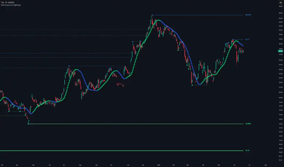
HMA Swing Levels [BigBeluga]An advanced swing structure and trend-following tool built on Hull Moving Average logic, designed to detect major reversals and track dynamic support/resistance zones.
This indicator analyzes price swings using pivot highs/lows and a smoothed HMA trend baseline. It highlights key reversal levels and keeps them active until breached, giving traders a clear visual framework for price structure and trend alignment. The pivots are calculated in real-time using non-lagging logic, making them highly responsive to market conditions.
🔵 CONCEPTS
Combines a fast-reacting Hull Moving Average (HMA) with pivot logic to capture precise directional changes.
Detects non-lagging reversal highs and lows when pivot points form and the HMA direction flips.
Projects these reversal levels forward as horizontal support/resistance lines until broken by price.
Active trend is shown with a step-style trail line that reflects HMA bias over time.
🔵 FEATURES
Swing Level Detection:
Identifies high/low reversals when trend direction changes and plots horizontal zones.
Non-lagging logic of swing points detection:
if h == high and high < h and change > 0
// Detected Swing High
if l == low and low > l and change < 0
// Detected Swing Low
Persistent Support & Resistance Lines:
Each detected swing high or low is extended forward until price invalidates the level. Dotted style is applied once breached.
Color-Coded Trend Trail:
Displays a stepped trend trail using HMA slope: lime = uptrend, blue = downtrend.
Automatic Labeling:
Each reversal level is labeled with its price for clear reference.
Age-Based Line Thickness:
Every level increases in thickness every 250 bars. The longer the level lasts, the stronger it is.
🔵 HOW TO USE
Use green (support) and blue (resistance) levels to frame key reaction zones.
Trade with the trend defined by the trail color: lime for bullish bias, blue for bearish.
Explore where buy or sell orders are stacked
Look for breaks of swing lines to anticipate trend shifts or breakout setups.
Adjust the "Trend Change" input to tune the sensitivity of swing detection.
Adjust the "SwingLevels" input to define how far back to search for valid pivots.
🔵 CONCLUSION
HMA Swing Levels offers a hybrid approach to structural and trend-based trading. With automated non-lagging swing detection, persistent support/resistance tracking, and intuitive HMA-based trend coloring, it provides a powerful visual system for discretionary and systematic traders alike.
Indicadores e estratégias
Bitcoin Power Law Clock [LuxAlgo]The Bitcoin Power Law Clock is a unique representation of Bitcoin prices proposed by famous Bitcoin analyst and modeler Giovanni Santostasi.
It displays a clock-like figure with the Bitcoin price and average lines as spirals, as well as the 12, 3, 6, and 9 hour marks as key points in the cycle.
🔶 USAGE
Giovanni Santostasi, Ph.D., is the creator and discoverer of the Bitcoin Power Law Theory. He is passionate about Bitcoin and has 12 years of experience analyzing it and creating price models.
As we can see in the above chart, the tool is super intuitive. It displays a clock-like figure with the current Bitcoin price at 10:20 on a 12-hour scale.
This tool only works on the 1D INDEX:BTCUSD chart. The ticker and timeframe must be exact to ensure proper functionality.
According to the Bitcoin Power Law Theory, the key cycle points are marked at the extremes of the clock: 12, 3, 6, and 9 hours. According to the theory, the current Bitcoin prices are in a frenzied bull market on their way to the top of the cycle.
🔹 Enable/Disable Elements
All of the elements on the clock can be disabled. If you disable them all, only an empty space will remain.
The different charts above show various combinations. Traders can customize the tool to their needs.
🔹 Auto scale
The clock has an auto-scale feature that is enabled by default. Traders can adjust the size of the clock by disabling this feature and setting the size in the settings panel.
The image above shows different configurations of this feature.
🔶 SETTINGS
🔹 Price
Price: Enable/disable price spiral, select color, and enable/disable curved mode
Average: Enable/disable average spiral, select color, and enable/disable curved mode
🔹 Style
Auto scale: Enable/disable automatic scaling or set manual fixed scaling for the spirals
Lines width: Width of each spiral line
Text Size: Select text size for date tags and price scales
Prices: Enable/disable price scales on the x-axis
Handle: Enable/disable clock handle
Halvings: Enable/disable Halvings
Hours: Enable/disable hours and key cycle points
🔹 Time & Price Dashboard
Show Time & Price: Enable/disable time & price dashboard
Location: Dashboard location
Size: Dashboard size

suppot and daimandRESHA Indicator
The RESHA Indicator is an advanced price action tool designed for precision trading based on dynamic supply and demand zones. It automatically identifies key price levels, draws structured zones, and adapts to market behavior with a strict entry logic. The indicator monitors the first touch of each zone, confirms breakouts with candle closes, and detects retests before generating trading signals.

NCrypt30 Combined RSI (Auto Timeframe)I have combined the RSI on all of the top 30 coins on Coinbase excluding BTC, ETH & Stables. I have then used this to plot good value zones.
Traders can use this on multiple timeframes and be used in conjuction with the breadth strategy for added confluence on deep value zones.

Heatmap Trailing Stop with Breakouts (Zeiierman)█ Overview
Heatmap Trailing Stop with Breakouts (Zeiierman) is a trend and breakout detection tool that combines dynamic trailing stop logic, Fibonacci-based levels, and a real-time market heatmap into a single, intuitive system.
This indicator is designed to help traders visualize pressure zones, manage stop placement, and identify breakout opportunities supported by contextual price–derived heat. Whether you're trailing trends, detecting reversals, or entering on explosive breakouts — this tool keeps you anchored in structure and sentiment.
It projects adaptive trailing stop levels and calculates Fibonacci extensions from swing-based extremes. These levels are then colored by a market heatmap engine that tracks price interaction intensity — showing where the market is "hot" and likely to respond.
On top of that, it includes breakout signals powered by HTF momentum conditions, trend direction, and heatmap validation — giving you signals only when the context is strong.
█ How It Works
⚪ Trailing Stop Engine
At its core, the script uses an ATR-based trailing stop with trend detection:
ATR Length – Defines volatility smoothing using EMA MA of true range.
Multiplier – Expands/retracts the trailing offset depending on market aggression.
Real-Time Extremum Tracking – Uses local highs/lows to define Fibonacci anchors.
⚪ Fibonacci Projection + Heatmap
With each trend shift, Fibonacci levels are projected from the new swing to the current trailing stop. These include:
Fib 61.8, 78.6, 88.6, and 100% (trailing stop) lines
Heatmap Coloring – Each level'slevel's color is determined by how frequently price has interacted with that level in the recent range (defined by ATR).
Strength Score (1–10) – The number of touches per level is normalized and averaged to create a heatmap ""score"" displayed as a colored bar on the chart.
⚪ Breakout Signal System
This engine detects high-confidence breakout signals using a higher timeframe candle structure:
Bullish Breakout – Strong bullish candle + momentum + trend confirmation + heatmap score threshold.
Bearish Breakout – Strong bearish candle + momentum + trend confirmation + heatmap score threshold.
Cooldown Logic – Prevents signals from clustering too frequently during volatile periods.
█ How to Use
⚪ Trend Following & Trail Stops
Use the Trailing Stop line to manage positions or time entries in line with trend direction. Trailing stop flips are highlighted with dot markers.
⚪ Fibonacci Heat Zones
The projected Fibonacci levels serve as price magnets or support/resistance zones. Watch how price reacts at Fib 61.8/78.6/88.6 levels — especially when they're glowing with high heatmap scores (more glow = more historical touches = stronger significance).
⚪ Breakout Signals
Enable breakout signals when you want to trade breakouts only under strong context. Use the "Heatmap Strength Threshold" to require a minimum score (1–10).
█ Settings
Stop Distance ATR Length – ATR period for volatility smoothing
Stop Distance Multiplier – Adjusts the trailing stop'sstop's distance from price
Heatmap Range ATR Length – Defines how far back the heatmap scans for touches
Number of Heat Levels – Total levels used in the heatmap (more = finer resolution)
Minimum Touches per Level – Defines what counts as a ""hot"" level
Heatmap Strength Threshold – Minimum average heat score (1–10) required for breakouts
Timeframe – HTF source used to evaluate breakout momentum structure
-----------------
Disclaimer
The content provided in my scripts, indicators, ideas, algorithms, and systems is for educational and informational purposes only. It does not constitute financial advice, investment recommendations, or a solicitation to buy or sell any financial instruments. I will not accept liability for any loss or damage, including without limitation any loss of profit, which may arise directly or indirectly from the use of or reliance on such information.
All investments involve risk, and the past performance of a security, industry, sector, market, financial product, trading strategy, backtest, or individual's trading does not guarantee future results or returns. Investors are fully responsible for any investment decisions they make. Such decisions should be based solely on an evaluation of their financial circumstances, investment objectives, risk tolerance, and liquidity needs.

Multiple Indicators Screener [NASAlgo]Functionality Overview
This Multiple Indicators Screener is a powerful tool for traders who need a quick, organized, and multi-timeframe view of market conditions. By combining trend, momentum, and volatility indicators, it helps traders:
✅ Identify high-probability setups
✅ Avoid conflicting signals
✅ Save time by analyzing multiple assets at once
Ideal for scalpers, day traders, and swing traders looking for an efficient way to scan markets.
Multiple Indicators Screener is designed to help traders analyze multiple technical indicators across different timeframes and symbols in a single, organized table. It provides a comprehensive view of market conditions by evaluating:
Moving Averages (MA) – Distance from price (above/below)
Relative Strength Index (RSI) – Overbought/Oversold conditions
Stochastic %K – Momentum signals
True Strength Index (TSI) – Trend strength and direction
Average Directional Index (ADX) – Trend strength
Supertrend – Trend direction (Up/Down)
The screener supports up to 13 different symbols and three customizable timeframes, allowing traders to compare multiple assets and timeframes efficiently.
How Traders Can Use This Screener
Trend Identification
Check if price is above/below MA (trend bias).
Confirm with Supertrend & ADX (strong trend if ADX > 40).
Overbought/Oversold Conditions
Look for RSI, Stochastic, and TSI in extreme zones (potential reversals).
Multi-Timeframe Confirmation
Example: If 5min RSI is oversold but 15min trend is bullish, traders may look for long entries.
Swing Trading & Day Trading
Swing traders can use higher timeframes (1H, 4H) for trend bias.
Day traders can use lower timeframes (5min, 15min) for entry signals.
Portfolio Monitoring
Track multiple assets in one place to spot the strongest trends.

PulseMA OscillatorOverview
PulseMA Oscillator is a technical analysis tool that transforms the relationship between price and a base moving average (EMA) into an oscillator fluctuating around a zero line. It is based on counting consecutive candles closing above or below the EMA and factoring in the slope of the average to gauge trend momentum.
This indicator helps assess not only the direction of the market but also the strength of the movement and potential exhaustion, making it useful for identifying trade entry and exit points.
Key Features
PulseMA Oscillator: Calculates a value based on the number of consecutive candles above or below an EMA and the angle (slope) of that EMA. Positive values indicate bullish dominance; negative values indicate bearish pressure.
Smoothing (SMA): A moving average of the oscillator to highlight the broader trend and reduce noise.
Zero Line: Acts as a baseline to distinguish between bullish and bearish conditions.
Use Cases
PulseMA Oscillator is designed for technical traders who want to:
Determine the direction and strength of the trend based on candle positioning relative to an EMA.
Identify potential market reversals or exhaustion when the oscillator reaches extreme values.
Generate trade signals when:
The oscillator crosses above/below its smoothed version.
The oscillator crosses the zero line.
The smoothed line (PulseMA MA) crosses the zero line, confirming a shift in the longer-term trend.
Analyze trend momentum with a fresh perspective — different from traditional oscillators like RSI or MACD.
How to Use
Add the indicator to your chart: Search for "PulseMA Oscillator" in the indicators library.
Adjust parameters as needed:
EMA Length (PulseMA Length) – default: 50
SMA Length (Smoothing) – default: 20
Interpretation
Positive values: A series of candles are closing above the EMA — indicates bullish momentum.
Negative values: A series of candles are closing below the EMA — indicates bearish momentum.
Cross of PulseMA above SMA: Potential buy signal.
Cross of PulseMA below SMA: Potential sell signal.
Crossing the zero line by PulseMA: May indicate trend shift.
Crossing the zero line by PulseMA MA: May confirm a more sustained trend change.
Notes
Best used in trending markets. In sideways/consolidating conditions, consider combining with other filters.
Using a higher EMA length (e.g., 100) results in a smoother and more long-term trend representation.
Fine-tuning the parameters to your specific asset and timeframe can greatly improve effectiveness.

BuySell-byRaufIndicator Overview
This script is a custom indicator that generates buy and sell signals based on a proprietary algorithm. It utilizes a custom library (signalLib) to analyze market data and identify potential trading opportunities.
How it Works
The script uses three input parameters:
DEPTH_ENGINE: controls the depth of the analysis
DEVIATION_ENGINE: controls the deviation threshold for signal generation
BACKSTEP_ENGINE: controls the number of bars to look back for signal confirmation
The script analyzes the market data using the signalLib library and generates a direction signal, which indicates whether the market is trending up or down.
When the direction signal changes, the script generates a buy or sell signal, depending on the direction of the trend.
The script plots a label on the chart to indicate the buy or sell signal, with customizable colors and label size.
The script also generates alerts when a buy or sell signal is generated, which can be used to trigger trades.
Signal Generation
The script generates buy and sell signals based on the direction signal, which is calculated using the signalLib library. The direction signal is generated when the market trend changes, and the script plots a label on the chart to indicate the signal.
Customization
The script allows for customization of the input parameters, label colors, and label size. This allows users to tailor the script to their specific trading needs and preferences.
Overall, this script provides a powerful tool for identifying potential trading opportunities and generating buy and sell signals based on a proprietary algorithm.

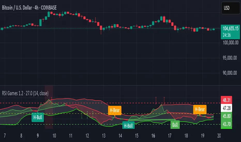
RSI Games 1.2he "RSI Games 1.2" indicator enhances the standard RSI by adding several layers of analysis:
Standard RSI Calculation: It calculates the RSI based on a configurable length (default 14 periods) and a user-selected source (default close price).
RSI Bands: It plots horizontal lines at 70 (red, overbought), 50 (yellow, neutral), and 30 (green, oversold) to easily identify extreme RSI levels.
RSI Smoothing with Moving Averages (MAs) and Bollinger Bands (BBs):
You can apply various types of moving averages (SMA, EMA, SMMA, WMA, VWMA) to smooth the RSI line.
If you choose "SMA + Bollinger Bands," the indicator will also plot Bollinger Bands around the smoothed RSI, providing dynamic overbought/oversold levels based on volatility.
The RSI line itself changes color based on whether it's above (green) or below (red) its smoothing MA.
It also fills the area between the RSI and its smoothing MA, coloring it green when RSI is above and red when below.
Bollinger Band Signals: When Bollinger Bands are enabled, the indicator marks "Buy" signals (green arrow up) when the RSI crosses above the lower Bollinger Band and "Sell" signals (red arrow down) when it crosses below the upper Bollinger Band.
Background Coloring: The background of the indicator pane changes to light green when RSI is below 30 (oversold) and light red when RSI is above 70 (overbought), visually highlighting extreme conditions.
Divergence Detection: This is a key feature. The indicator automatically identifies and labels:
Regular Bullish Divergence: Price makes a lower low, but RSI makes a higher low. This often signals a potential reversal to the upside.
Regular Bearish Divergence: Price makes a higher high, but RSI makes a lower high. This often signals a potential reversal to the downside.
Hidden Bullish Divergence: Price makes a higher low, but RSI makes a lower low. This can indicate a continuation of an uptrend.
Hidden Bearish Divergence: Price makes a lower high, but RSI makes a higher high. This can indicate a continuation of a downtrend.
Divergences are visually marked with labels and can trigger alerts.
Trendlines with Breaks [LuxAlgo]The Best Trendline indicator: CMCMARKETS:EURUSD FX:EURUSD CAPITALCOM:GBPUSD OANDA:GBPJPY OANDA:USDJPY OANDA:XAUUSD INDEX:BTCUSD

Super MTF Clouds (4x3 Pairs)Overview:
This script is based on Ripster's MTF clouds, which transcends the standard moving average cloud indicator by offering a powerful and deeply customizable Multi-Timeframe (MTF) analysis. Instead of being limited to the moving averages of your current charts from the current timeframe, this tool allows you to project and visualize the trend and key support/resistance zones from up to 4 different timeframes simultaneously. User can input up to 6 different EMA values which will form 3 pairs of EMA clouds, for each of the timeframes.
The primary purpose is to provide traders with immediate confluence. By observing how price interacts with moving average clouds from higher timeframes (e.g., Hourly, Daily, Weekly), you can make more informed decisions on your active trading timeframe (e.g., 10 Minute). It's designed as a complete MTF Cloud toolkit, allowing you to display all necessary MTFs in a single script to build a comprehensive view of the market structure without having to flick to different timeframe to look for cloud positions.
Key features:
Four Independent Multi-Timeframe Slots: Each slot can be assigned any timeframe available on TradingView (e.g., D, W, M, 4H).
Three MA Pairs Per Timeframe: For each timeframe, configure up to three separate MA clouds (e.g., a 9/12 EMA pair, a 20/50 EMA pair, and a 100/200 SMA pair).
Complete Customisation: For every single moving average (24 in total), you can independently control:
MA Type: Choose between EMA or SMA.
Length: Any period you require.
Line Color: Full colour selection.
Line Thickness: Adjust the visual weight of each line.
Cloud Control: For every pair (12 in total), you can set the fill colour and transparency.
How To Use This Script:
This tool is best used for confirmation and context. Here are some practical strategies that one can adopt:
Trend Confluence: Before taking a trade based on a signal on your current timeframe, glance at the higher timeframe clouds. If you see a buy signal on the 15-minute chart and the price is currently trading above a thick, bullish Daily cloud, the probability of that trade succeeding is significantly higher. Conversely, shorting into strong HTF support is a low-probability trade.
Dynamic Support & Resistance: The edges of the higher timeframe clouds often act as powerful, dynamic levels of support and resistance. A pullback to the 4-Hour 50 EMA on your 15-minute chart can be a prime area to look for entries in the direction of the larger trend.
Gauging Market Regimes: Use the toggles in the settings to quickly switch between different views. You can have a "risk-on" view with short-term clouds and a "macro" view with weekly and monthly clouds. This helps you adapt your trading style to the current market conditions.
Key Settings:
1. Global Setting
Source For All MAs: This determines the price data point used for every single moving average calculation.
Default: hl2 (an average of the High and Low of each bar). This gives a smooth midpoint price.
Options: You can change this to Close (the most common method), Open, High, Low, or ohlc4 (an average of the open, high, low, and close), among others.
Recommendation: For most standard trend analysis, the default hl2 is the common choice.
2. The Timeframe Group Structure
The rest of the settings are organized into four identical, collapsible groups: "Timeframe 1 Settings" through "Timeframe 4 Settings". Each group acts as a self-contained control panel for one multi-timeframe view.
Within each timeframe group, you have two master controls:
Enable Timeframe: This is the main power switch for the entire group. Uncheck this box to instantly hide all three clouds and lines associated with this timeframe. This is perfect for quickly decluttering your chart or focusing on a different set of analyses.
Timeframe: This dropdown menu is the heart of the MTF feature. Here, you select the higher timeframe you want to analyse (e.g., 1D for Daily, 1W for Weekly, 4H for 4-Hour). All calculations for the three pairs within this group will be based on the timeframe you select here.
3. Pair-Specific Controls
Inside each timeframe group, there are three sections for "Pair 1", "Pair 2", and "Pair 3". These control each individual moving average cloud.
Enable Pair: Just like the master switch for the timeframe, this checkbox turns a single cloud and its two MA lines on or off.
For each pair, the settings are further broken down:
Moving Average Lines (A and B): These two rows control the two moving averages that form the cloud. 'A' is typically used for the shorter-period MA and 'B' for the longer-period one.
Type (A/B): A dropdown menu to select either EMA (Exponential Moving Average) or SMA (Simple Moving Average). EMAs react more quickly to recent price changes, while SMAs are smoother and react more slowly.
Length (A/B): The lookback period for the moving average (e.g., 21, 50, 200).
Color (A/B): Sets the specific colour of the MA line itself on your chart.
Cloud Fill Settings
Fill Color: This controls the colour of the shaded area (the "cloud") between the two moving average lines. For a consistent look, you can set this to the same colour as your shorter MA line.
Transparency: Controls how see-through the cloud is, on a scale of 0 to 100. 0 is a solid, opaque colour, while 100 is completely invisible. The default of 85 provides a light, "cloud-like" appearance that doesn't obscure the price action.
----------------------------------------------------------------------
If anything is not clear please let me know!

🔥 Nikko Ultra-Active Scalper (MACD + RSI)🔥 Nikko Ultra-Active Scalper (MACD + RSI)
This is a fun, high-frequency scalper with some unpredictable results in backtesting. II recommend you backtest it over a 1-year period with CRYPTOCAP:SUI to see for yourself.
While the strategy works in live conditions, there seems to be a strange issue with how TradingView calculates the backtesting (the Hold blue line behaves oddly). It might be due to certain factors in the script's execution, but I’m not entirely sure. Sor example I get a negative PNL while making profit? That is weird. I might have missed something.
I’ve not encrypted the source code, so I’m hoping someone in the community can help identify why the backtest results are behaving unexpectedly.
Enjoy experimenting with this little bot, use 1m-2n timeframe— and while it’s fun to imagine getting rich with minimal effort, remember, it’s just for entertainment and educational purposes!
----------------------------------------------
DESCRIPTION: READ FIRST
This script is a high-frequency trading strategy written in Pine Script v6 for use on TradingView, designed to open several long positions per day on fast-moving markets like crypto. Here's how it works:
📌 Strategy Overview:
It uses short-term technical indicators — MACD and RSI — to detect brief momentum bursts, enters trades quickly, and exits with a tight take-profit. It’s optimized for 1-minute timeframes.
🧠 Entry Conditions (When it Buys):
The strategy opens a long position when:
MACD > Signal Line using fast settings (6,13,5):
This shows short-term upward momentum.
RSI > 40 with a 7-period length:
This confirms bullish strength, even if modest.
Because the settings are very relaxed, this combination triggers frequently, producing multiple trades per day.
🎯 Exit Condition (When it Sells):
It closes all open positions when:
The price rises to a set profit target (takeProfitPercent, default 0.9%).
There is no stop loss or trailing stop — this means the trade will stay open until it either hits the profit or you close manually (or modify the script).
⚙️ Other Features:
pyramiding = 100
Allows up to 100 simultaneous open positions (great for scalping in volatile uptrends).
strategy.percent_of_equity = 1
Each trade uses 1% of available equity, but can be adjusted.
Visual Bar Coloring
Bars turn green when an entry condition is met (barcolor(entryCond ? color.lime : na)).
📈 Designed For:
1-2 minute(S) timeframes
Volatile assets (crypto, meme coins, high-volume stocks)
High-frequency trading where you're in/out fast with small gains

Candle Opens by HAZEDCandle Opens by HAZED
🎯 Overview
A clean, optimized indicator that displays key timeframe opening prices with enhanced performance and modern styling. Perfect for identifying critical support/resistance levels across multiple timeframes without chart clutter.
📈 Key Features
- 5 Major Timeframes: Daily, Weekly, Monthly, Quarterly, and Yearly opens
- Current Opens Only: No historical lookback - shows only the most recent/relevant levels
- Smart Positioning: Toggle between staggered lines (prevents overlap) or uniform length
- Dual Label Styles: Choose plain text (minimal) or enhanced labels with prices
- Performance Optimized: Streamlined code for faster loading and smoother operation
- Alert System: Get notified when any timeframe opens change
- Extended Hours Support: Works with pre/post market sessions
🎨 Customization Options
- Individual color selection for each timeframe
- Adjustable line width (1-4px)
- Right extension length control
- Optional left tail extensions
- Show/hide labels with style options
- Same length lines toggle for clean alignment
⚙️ Advanced Settings
- Discover Prices: Use chart data instead of HTF requests (for data feed discrepancies)
- Extended Hours: Display opens during pre/post market sessions
- Alert Controls: Enable/disable notifications for timeframe changes
📊 Default Configuration
- Enabled: Daily (Green), Weekly (Orange), Monthly (Red), Yearly (Blue)
- Disabled: Quarterly (Purple) - easily enabled if needed
- Labels: Enhanced style with prices shown by default
- Lines: 2px width, staggered positioning for optimal spacing
🚀 Performance Improvements
- Removed unnecessary historical data tracking
- Optimized drawing functions for better responsiveness
- Cleaner variable management and memory usage
- Enhanced yearly open detection algorithm
💡 Best Use Cases
- Swing trading: Identify key weekly/monthly levels
- Day trading: Respect daily opens as support/resistance
- Long-term investing: Monitor yearly opens for major trends
- Multi-timeframe analysis: See all key levels at once
🔧 Technical Notes
- Uses proper request.security() calls for accurate data
- Smart change detection prevents unnecessary redraws
- Handles different chart timeframes automatically
- Compatible with all asset classes and exchanges
Original concept enhanced and optimized by HAZED for modern trading needs.

Adaprive Cycle Oscillator with EMAThe ACO with Adaptive EMA & Divergence indicator helps new traders identify market cycles and trend reversals using simple, colorful visuals. It combines the Adaptive Cycle Oscillator (ACO) with seven Exponential Moving Averages (EMAs) and divergence signals, displayed as wavy, rainbow-colored lines in a separate chart pane.
What It Does:
ACO: Tracks price cycles, signaling buy (green triangles) when crossing above the oversold level or sell (red triangles) when crossing below the overbought level.
EMAs: Seven rainbow-colored lines (red, orange, yellow, green, blue, indigo, violet) smooth the ACO to confirm trends. When shorter lines (e.g., red) are above longer ones (e.g., violet), it suggests a bullish trend.
Easy Steps to Use (for TradingView):
Add Indicator: Open TradingView, go to the Pine Editor, paste the script, and click “Add to Chart.”
Understand Visuals: Look at the bottom pane. Seven wavy, rainbow lines show trend direction. Solid wavy gray (zero), red (overbought), and green (oversold) lines are reference levels.
Spot Signals: Watch for larger green triangles (buy) or red triangles (sell) if “Show Buy/Sell Signals” is enabled in settings.
Adjust Settings: Tweak “EMA Base Length” (default 10) or “Threshold” (default 0.0) in inputs to fit your asset/timeframe.
Tips: Use on any timeframe (e.g., 1-hour, daily). Test on historical data to optimize settings. Combine with price action for better accuracy. Avoid choppy markets to reduce false signals.

📈 Pro BUY/SELL Optimized v1.1 (SMC + Divergence + Trend Slope)đây là cách mới tôi thử nghiệm hãy thử cùng trải nghiệm với tối nhé, rsi, macd, ema, smc

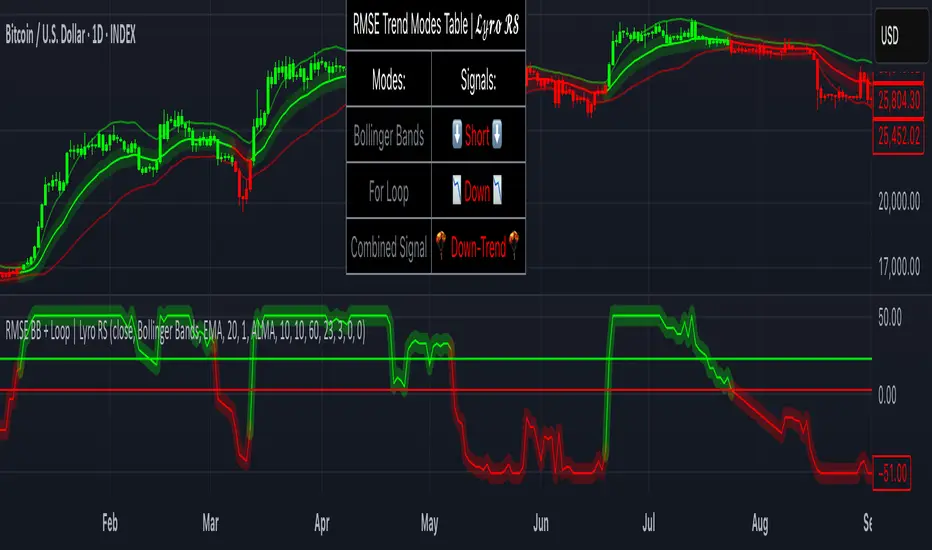
RMSE Bollinger Bands + Loop | Lyro RSRMSE Bollinger Bands + Loops
Overview
The RMSE Bollinger Bands + Loops is a sophisticated technical analysis tool designed to identify and quantify market trends by combining dynamic moving averages with statistical measures. This indicator employs a multi-model approach, integrating Bollinger-style RMSE bands, momentum scoring, and a hybrid signal system to provide traders with adaptive insights across varying market conditions.
Indicator Modes
Bollinger-style RMSE Bands: this mode calculates dynamic volatility bands around the price using the following formula:
Upper Band = Dynamic Moving Average + (RMSE × Multiplier)
Lower Band = Dynamic Moving Average - (RMSE × Multiplier)
These bands adjust to market volatility, helping identify potential breakout or breakdown points.
For-Loop Momentum Scoring, momentum is assessed by analyzing recent price behavior through a looping mechanism. A rising momentum score indicates increasing bullish strength, while a declining score suggests growing bearish momentum.
Hybrid Combined Signal: this mode assigns a directional score to the other two modes:
+1 for bullish (green)
–1 for bearish (red)
An average of these scores is computed to generate a combined signal, offering a consolidated market trend indication.
Practical Application
Signal Interpretation: A buy signal is generated when both the RMSE Bands and For-Loop Momentum Scoring align bullishly. Conversely, a sell signal is indicated when both are bearish.
Trend Confirmation: The Hybrid Combined Signal provides a consolidated view, assisting traders in confirming the prevailing market trend.
Note: Always consider additional technical analysis tools and risk management strategies when making trading decisions.
⚠️Disclaimer
This indicator is a tool for technical analysis and does not provide guaranteed results. It should be used in conjunction with other analysis methods and proper risk management practices. The creators of this indicator are not responsible for any financial decisions made based on its signals.
DP_MoneyFlow_Osc_V4**DP_Moneyflow_Osc_V4** is a custom, volume‐weighted momentum oscillator built around the classic Money Flow Index (MFI), with a few twists to help you spot more reliable reversal points:
***Best way to use it is to take the signals as alert points, to understand when money is starting to flow in or starting to flow out. It is not intended to be a Buy or Sell signal at the point of entry where the label is printed.***
1. **Core Calculation**
* Computes the standard MFI on your chart’s native timeframe:
* Money Flow = typical price (H+L+C)/3 × volume
* Segregates positive vs. negative flow based on whether price rose or fell on each bar
* Smooths each with an N-bar SMA, forms the ratio, and maps it into a 0–100 scale
2. **Inversion & Smoothing**
* You can **invert** the oscillator around 50 (so peaks become troughs and vice versa) with the **Reverse MFI** toggle.
* Applies two layers of smoothing (one for raw noise reduction, another for longer-term trend stability).
3. **Dynamic Coloring**
* Above Overbought (OB) threshold → solid red; below Oversold (OS) → solid green.
* In between, it linearly fades from red/green toward black as it approaches the 50 midpoint.
* **Invert Colors** flips the hue logic (red ↔ green) if you prefer.
4. **Overbought/Oversold Zones**
* Plots horizontal lines at your chosen OB/OS levels.
* Optionally fills the zone between them for quick visual reference.
5. **Peak/Trough Signal Labels**
* Detects **true extremes** by finding when the oscillator reverses direction right at or beyond your OB/OS levels.
* Prints a tiny “OB” or “OS” label **exactly at that pivot bar**, so you see the high or low of the swing.
6. **Alternation Toggle**
* Prevents two consecutive “OS” or “OB” labels by enforcing strict Buy/Sell alternation—turn this on or off via **Enable Signal Alternation**.
---
**Use-Case**: This oscillator excels at pinpointing the *tops* and *bottoms* of strong volume‐backed moves, giving you clear pivot markers rather than every threshold crossover. Tweak the smoothing and threshold inputs to calibrate sensitivity to your market and timeframe.

RSI Pullback Signal (Confirmed Logic)Indicator used for XAUUSD pullback strategy . Waiting for price on RSI to go past the 30 or 70 then come back through the 30 or 70 then pullback to give me an opportunity to buy or sell .

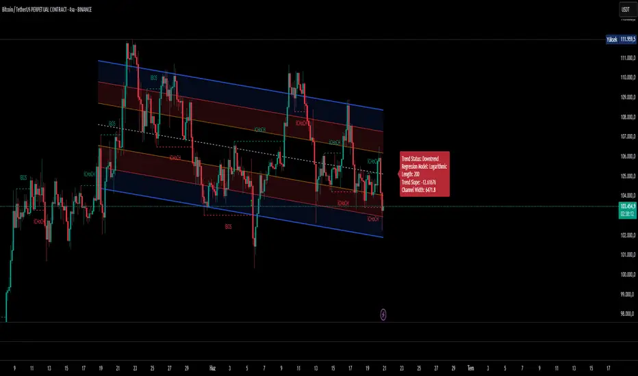
Ultimate Regression Channel v5.0 [WhiteStone_Ibrahim]Ultimate Regression Channel v5.0: Comprehensive User Guide
This indicator is designed to visualize the current trend, potential support/resistance levels, and market volatility through a statistical analysis of price action. At its core, it plots a regression line (a trend line) based on prices over a specific period and adds channels based on standard deviation around this line.
1. Core Features and Settings
Length Mode:
Numerical (Manual): You define the number of bars to be used for the regression channel calculation. You can use lower values (e.g., 50-100) for short-term analysis and higher values (e.g., 200-300) to identify long-term trends.
Automatic (Based on Market Structure): This mode automatically draws the channel starting from the highest high or lowest low that has formed within the Auto Scan Period. This allows the indicator to adapt itself to significant market turning points (swing points), which is highly useful.
Regression Model:
Linear: Calculates the trend as a straight line. It generally works well in stable, short-to-medium-term trends.
Logarithmic: Calculates the trend as a curved line. It more accurately reflects price action, especially on long-term charts or for assets that experience exponential growth/decline (like cryptocurrencies or growth stocks).
Channel Widths:
These settings determine how far from the central trend line (in terms of standard deviations) the channels will be drawn.
The 0 (Inner), 1 (Middle), and 2 (Outer) channels represent the "normal" range of price movement and the "extreme" zones. Statistically, about 95% of all price action occurs within the outer channels (2nd standard deviation).
2. Visual Extras and Their Interpretation
Breakout Style:
This feature alerts you when the price closes above the uppermost channel (Channel 2) with a green arrow/background or below the lowermost channel with a red arrow/background.
This is a very important signal. A breakout can signify that the current trend is strengthening and likely to continue (a breakout/trend-following strategy) or that the market has become overextended and may be due for a reversal (an exhaustion/top-bottom signal). It is critical to confirm this signal with other indicators (e.g., RSI, Volume).
Info Label:
This provides an at-a-glance summary of the channel on the right side of the chart:
Trend Status: Identifies the trend as "Uptrend," "Downtrend," or "Sideways" based on the slope of the centerline. The Horizontal Threshold setting allows you to filter out noise by treating very small slopes as "Sideways."
Regression Model and Length: Shows your current settings.
Trend Slope: A numerical value representing how steep or weak the trend is.
Channel Width: Shows the price difference between the outermost channels. This is a measure of current volatility. A widening channel indicates increasing volatility, while a narrowing one indicates decreasing volatility.
3. What Users Should Pay Attention To & Best Practices
Define Your Strategy: Mean Reversion or Breakout?
Mean Reversion: If the market is in a ranging or gently trending phase, the price will tend to revert to the centerline after hitting the outer channels (overbought/oversold zones). In this case, the outer channels can be considered opportunities to sell (upper channel) or buy (lower channel).
Breakout: If a strong trend is in place, a price close beyond an outer channel can be a sign that the trend is accelerating. In this scenario, one might consider taking a position in the direction of the breakout. Correctly analyzing the current market state (ranging vs. trending) is key to deciding which strategy to employ.
Don't Use It in Isolation: No indicator is a holy grail. Use the Regression Channel in conjunction with other tools. Confirm signals with RSI divergences for overbought/oversold conditions, Moving Averages for the overall trend direction, or Volume indicators to confirm the strength of a breakout.
Choose the Right Model: On shorter-term charts (e.g., 1-hour, 4-hour), the Linear model is often sufficient. However, on long-term charts like the daily, weekly, or monthly, the Logarithmic model will provide much more accurate results, especially for assets with parabolic movements.
The Power of Automatic Mode: The Automatic length mode is often the most practical choice because it finds the most logical starting point for you. It saves you the trouble of adjusting settings, especially when analyzing different assets or timeframes.
Use the Alerts: If you don't want to miss the moment the price touches a key channel line, set up an alert from the Alert Settings section for your desired line (e.g., only the "Outer Channels"). This helps you catch opportunities even when you are not in front of the screen.
Strategy [High-Low Cloud Trend] (v6, perf-safe)Description
High-Low Cloud Trend Strategy (Performance-Safe Edition)
Version 6 • RezzoRedPriest (based on the original logic by @rottor29)
How it works
Dynamic range ― The script tracks the highest high / lowest low over a look-back of N bars (len). When price tags one extreme, a “pivot” flips to the opposite extreme, forming the core of the cloud.
Trend filter ― If the candle closes above the pivot, trend = bullish; below it, trend = bearish. The optional “Trade only with trend” switch forces longs in bullish mode and shorts in bearish mode.
Signals
Cloud Retest – price pulls back to the inner edge (band1) and rejects it.
Cloud Cross – price breaks through the outer edge (band).
Mean Reversion – spikes beyond the inner edge and snap back (optional).
Execution model – trades are processed once per bar (process_orders_on_close = true), capped at maxTradesPerDay.
Performance guardrails
Only the most-recent visBars bars are calculated and painted.
Object limits: max_labels_count = 400, max_lines_count = 30.
Inputs
Group Name Purpose
Display Drawings: show last N bars Hard cap for calculations & drawings (default = 500).
Display Show markers / labels Toggle all arrows / diamonds.
Display Show cloud fill & background Toggle the colored cloud & background.
Strategy Look-back period (len) Width of the cloud; larger = smoother trend.
Strategy Enable trading Completely turn trade logic on/off.
Strategy Take cloud-retest / cross / mean-reversion signals Select which setups feed the engine.
Strategy Trade only with trend Filter counter-trend signals.
Risk Max trades per day Hard daily cap.
Recommended use
Works on any timeframe; common sweet spots are 5 m & 15 m for liquid futures / FX.
Increase len for higher timeframes (e.g. 55–100 on 1 H) to avoid noise.
If your chart still lags, either:
Lower Drawings: show last N bars, or
Turn Show cloud fill off – the fill is the heaviest operation.
Disclaimer
This script is for educational purposes only and does not constitute financial advice. Always test on demo data first and use proper risk management.

spx levelsThis script accommodates a 'string' using the formatting $ symbol then label (liek support for example). The string can be anything oyu want that you make up. I use it for SPX and publish a string daily for my substack subscribers. This is here for them but its free for anyone

SHA Multi Pivot Points -v1.0.0🔎Using Pivot Points in Trading
Traders use PPs to help determine predefined support and resistance levels to guide their trading strategies. In addition, traders identify potential price reversals, trend direction, and breakout opportunities:
Trend identification: PPs act as a reference level to gauge market sentiment. If the price opens above the PP and remains above it, traders interpret this as an uptrend. Conversely, if the price opens below the pivot point and stays below, it suggests a downtrend.
Support and resistance determination: Pivot levels are natural barriers where price reactions frequently occur. Traders may enter long positions near support levels, expecting a price bounce, or if the price approaches resistance levels, traders may consider shorting the asset.
Breakout trading: When the price breaks above resistance or support, it may indicate strong momentum for further movement.
Reversal identification: Traders also look for failed breakouts or price rejections at pivot levels to anticipate reversals.
Trading strategy combinations: Traders can improve accuracy by combining PPs with other technical analysis indicators.
1. Camarilla Pivot Points
📌 Overview:
Developed by Nick Scott in 1989, Camarilla Pivot Points are designed for short-term, intraday trading. Unlike traditional pivots, Camarilla levels are tighter and more responsive, making them useful in volatile markets.
📐 Key Levels:
It generates eight levels:
- Resistance: Initial Level (R1), Mid-range Level (R2), Sell Reversal Level (R3), Breakout Level (R4)
- Support: Initial Level (S1), Mid-range Level (S2), Buy Reversal Level (S3), Breakout Level (S4)
✅ How to Use:
- S1/R1 + RSI or volume divergence to confirm weak momentum and early reversals.
- S2/R2 with price action patterns to enter early on major moves before L3/H3 get tested.
- S3/R3: Mean-reversion zones → price often reverses.
- Break of S4/R4: Strong breakout → trend-following signal.
- Combine with volume or candlestick confirmation for entries.
🔹 2. Floor (Standard) Pivot Points
📌 Overview:
This is the most traditional pivot method, widely used by floor traders. It’s symmetrical and provides a clear central pivot point with equally spaced support and resistance levels.
📐 Key Levels:
- Povit Points : Average price (PPs)
- Resistance : First price ceiling (R1), Stronger ceiling (R2), Extreme resistance (R3)
- Support : First price floor (S1), Stronger floor (S2), Extreme support (S3)
✅ How to Use:
- Above PPs = bullish bias; Below PPs = bearish bias.
- S1/R1 are most used for intraday targets.
- S2–S3/R2–R3 indicate potential extreme moves.
- Often used in combination with momentum indicators.
🔹 3. Woodie Pivot Points
📌 Overview:
Woodie’s pivot formula gives double weight to the closing price, emphasizing the most recent session's sentiment.
📐 Key Levels:
- Povit Points : Weighted average (PPs)
- Resistance : First price ceiling (R1), Stronger resistance (R2)
- Support : First price floor (S1), Stronger support (S2)
✅ How to Use:
- Works best in fast-moving markets.
- PPs acts as a momentum-based balance level.
- Good for scalpers and momentum traders.
🔹 4. Fusion Pivot Points
📌 Overview:
This method differs significantly — it calculates only one support and one resistance level, adjusting based on the relationship between the open and close.
📐 Key Levels:
- Povit Points : Single directional (PPs)
- Resistance : Potential ceiling (R)
- Support : Potential floor (S)
✅ How to Use:
- Not symmetrical → more responsive to price behavior.
- Best for breakout or reversal strategies.
- Use when you're expecting directional momentum.
🔹 5. Classic Pivot Points (Traditional)
📌 Overview:
Also known as Standard or Traditional Pivot Points, this is the default method used by most charting platforms. It offers a balanced and simple framework.
📐 Key Levels:
- Povit Points : Central price level (PPs)
- Resistance : First ceiling (R1), Stronger resistance (R2), Extreme resistance (R3)
- Support : First floor (S1), Stronger floor (S2), Extreme support (S3)
✅ How to Use:
- PPs is the market’s equilibrium point.
- Helps define market structure, bias, and trade zones.
- Combine with order blocks, RSI, or MACD for confirmation.
📊 Summary Comparison :
1. Camarilla Pivot Points
- Focus : Mean Reversion & Breakouts
- Best Use : Scalping, Day Trading
2. Floor Pivot Points
- Focus : General Support/Resistance
- Best Use : Intraday, Swing
3. Woodie Pivot Points
- Focus : Recent Close Emphasis
- Best Use : Momentum Trading
4. Fusion Pivot Points
- Focus : Trend/Breakout
- Best Use : Directional Breakouts
5. Classic Povit Points
- Focus : Market Structure
- Best Use : General Use
⚠️ Disclaimer
The information and tools provided in this script are for educational and informational purposes only. They do not constitute financial advice, investment recommendations, or a solicitation to buy or sell any financial instrument.
Trading in the financial markets involves risk of loss and is not suitable for every investor. You are solely responsible for your trading decisions. Always do your own research, use proper risk management, and consult a licensed financial advisor before making any financial decisions.

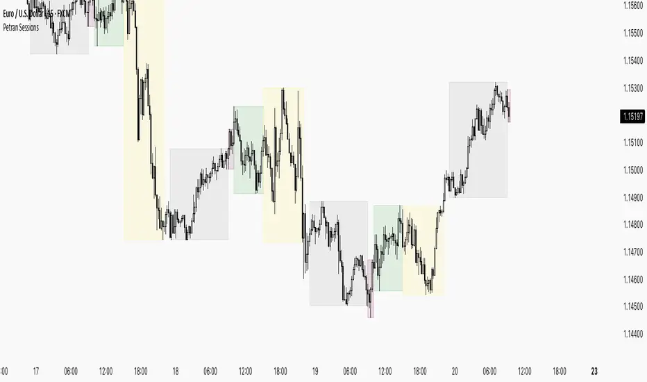
Sessions By petranThis indicator highlights the key trading sessions on the chart: Asian, Frankfurt, London, and New York. It helps traders visually track when each session begins and ends, making it easier to analyze price action, volume, and volatility during specific times of the day.
Key features:
Customizable session start and end times
Up to 4 major sessions highlighted
Best used on intraday timeframes (1-minute to 1-hour)
Clean, minimal design with adjustable colors and transparency
No repainting – reliable for both live trading and backtesting
Ideal for intraday traders and anyone who wants to better understand market dynamics during different trading sessions.
RSI Divergence by BAPI MONDALPure RSI Divergence indicator which tells you in the chart buy and sell position immediately
