Auto Fib Extension with alert (golden rentry zone)Ideal for:
Traders who want an objective, auto-updating Fibonacci framework to identify potential continuation, or reaction zones after significant highs. The “Golden zone” highlights an area of particular interest for bounces, reactions, or consolidations. Once, price renters the Golden zone, 40% of the time, it will lead to 1.68 and 2.68 levels, making 80 to 200% once all time high is broken!!
This script automatically detects major swing points (all-time high and following swing low) using the last 1 year or 6 months of data, then draws Fibonacci retracement and extension levels from the all-time high (ATH) down to the lowest low after that high.
What it does:
Detects All-Time High (ATH) within your chosen lookback window (default: 1 year, falls back to 6 months if insufficient bars).
Finds the lowest low after ATH within the lookback period (ensures swing low always comes after swing high).
Plots Fibonacci retracement levels (0, 0.236, 0.382, 0.5, 0.618, 0.786, 1) from ATH to the swing low.
Issues an alert if price enters the Golden zone (between 0.236 and 0.382).
Pesquisar nos scripts por "zone"

Naked Liquidation Zones - Multi-Leverage Risk VisualizationNaked Liquidation Zones - Multi-Leverage Risk Visualization
This indicator calculates and displays liquidation price levels for leveraged trading positions across up to 40 different leverage ratios, incorporating adjustable maintenance margin requirements for enhanced accuracy in risk assessment and position planning.
Mathematical Foundation
The indicator uses standard leveraged trading liquidation formulas with maintenance margin integration:
Long Position Liquidation Price = Entry Price × (1 - 1/Leverage + Maintenance Margin Rate)
Short Position Liquidation Price = Entry Price × (1 + 1/Leverage - Maintenance Margin Rate)
The calculation process involves two steps: first determining theoretical entry prices by reverse-calculating from a 100x liquidation reference point, then applying the liquidation formula across all selected leverage ratios. This approach ensures mathematical consistency and prevents calculation errors that can occur with direct price-to-liquidation conversions.
Core Functionality and Originality
Unlike basic liquidation calculators that show fixed leverage levels, this indicator provides comprehensive customization with 20 configurable long leverage levels and 20 configurable short leverage levels.
Each level can be individually enabled or disabled, allowing traders to focus on relevant leverage ratios for their specific trading strategies.
The maintenance margin system distinguishes this tool from simplified liquidation calculators. Users can adjust the maintenance margin percentage from 0.1% to 100% to match specific exchange requirements, providing more realistic liquidation estimates than zero-margin calculations commonly found in basic tools.
Reference Point System
Auto Mode: Automatically calculates liquidation levels from the current price or a specified bar offset. The "Auto Reference Offset" setting allows analysis of liquidation zones from historical price points, useful for back testing position scenarios.
Manual Mode: Enables precise coordinate selection with user-defined price and time reference points. This mode includes an optional vertical projection feature that creates localized liquidation zones around the reference point, ideal for analysing how specific historical events would have affected leveraged positions.
Visual Design and Interpretation
The indicator employs a color-coded system with varying line thickness and transparency based on leverage risk levels:
Low leverage (1x-5x): Light colours with higher transparency
Medium leverage (6x-15x): Moderate colours with medium transparency
High leverage (16x-30x): Darker colours with increased thickness
Extreme leverage (31x+): Dark colours with maximum thickness and low transparency
Price labels can be displayed alongside each liquidation level, showing the exact price and leverage ratio. Label positioning, size, and offset distance are fully customizable to prevent chart clutter while maintaining readability.
Practical Trading Applications
Position Size Planning: Visualize liquidation distances before entering trades to determine appropriate position sizes that align with risk management rules.
Multi-Scenario Analysis: Compare liquidation zones across different leverage ratios simultaneously to optimize risk-reward ratios for specific market conditions.
Historical Risk Assessment: Use manual mode to analyse how past price movements would have affected leveraged positions at key support or resistance levels.
Stop Loss Placement: Identify safe stop loss zones that account for leverage-specific liquidation risks, helping prevent premature position closure due to insufficient margin.
Market Structure Analysis: Understand where large liquidation clusters might occur during significant price movements, providing insight into potential support and resistance zones created by leveraged position clustering.
Configuration Options
Leverage Customization: Each of the 40 leverage levels (20 long, 20 short) includes individual toggle controls and adjustable leverage values from 1x to 1000x, though practical ranges typically stay within 1x-100x.
Display Controls: Toggle liquidation lines, price labels, and reference markers independently. Adjust label offset distance, label size, and line length to optimize chart presentation.
Reference Settings: Choose between Auto and Manual modes, set auto reference offsets, and configure lookback distances for both modes. Manual mode includes vertical projection width controls for targeted analysis.
Maintenance Margin: Adjustable from 0.1% to 100% with 0.1% increments, allowing precise matching to specific exchange requirements or conservative risk modelling.
Usage Instructions
Select Reference Mode: Choose Auto for current price analysis or Manual for specific coordinate targeting.
Configure Leverage Levels: Enable relevant leverage ratios and adjust values to match your trading requirements. Disable unused levels to reduce chart complexity.
Set Maintenance Margin: Input your exchange's maintenance margin requirement. Common values range from 0.5% to 2.0% depending on the exchange and instrument.
Adjust Display Settings: Enable price labels if exact values are needed, adjust label positioning to prevent overlap, and set appropriate line length for your analysis timeframe.
Interpret Results: Liquidation lines show where positions would be automatically closed. Distance from current price to liquidation levels indicates position safety margins.
Limitations and Important Considerations
Simplified Model: Calculations assume isolated margin mode and do not account for cross-margin scenarios, unrealized PNL from other positions, or dynamic margin adjustments that some exchanges implement.
Exchange Variations: Maintenance margin requirements vary significantly between exchanges and may change based on position size, market volatility, or account tier. Always verify current requirements with your specific exchange.
Additional Costs: The indicator does not factor in funding rates, trading fees, or borrowing costs that can affect actual liquidation levels in live trading environments.
Market Conditions: Extreme market volatility, low liquidity, or exchange system issues can cause actual liquidations to occur at prices different from calculated levels.
Historical Analysis Limitation: When using manual mode for historical analysis, results assume past margin requirements and do not account for exchange policy changes over time.
Technical Implementation
Built using Pine Script v6 for optimal performance and compatibility with TradingView's latest features. The indicator uses efficient conditional plotting to minimize chart rendering impact while displaying multiple leverage levels simultaneously.
Label management systems prevent overlapping displays while maintaining readability across different timeframes and chart scales. All calculations use TradingView's native precision handling to ensure accurate price computations across various instruments and price ranges.
The plotting system dynamically adjusts based on reference mode and projection settings, ensuring clean chart presentation whether analysing current levels or historical scenarios.
Educational Value
This indicator helps traders develop intuitive understanding of leverage mechanics and liquidation risk. By visualizing multiple scenarios simultaneously, users can observe how leverage changes affect risk profiles and make more informed decisions about position sizing and risk management.
The tool serves as a practical education platform for understanding the mathematical relationships between leverage, margin requirements, and liquidation distances, concepts that are crucial for successful leveraged trading.
Risk Disclaimer: This indicator is designed for educational and analytical purposes only. Liquidation calculations are estimates based on simplified mathematical models and may not reflect actual liquidation prices due to exchange-specific policies, market conditions, and additional fees. Always verify liquidation levels with your exchange and consider consulting with qualified financial professionals before making leveraged trading decisions. Trading leveraged instruments involves substantial risk of loss and may not be suitable for all investors. Past performance does not guarantee future results.
This indicator is compatible with all TradingView chart types and timeframes. It works with any tradeable instrument but is most relevant for assets that support leveraged trading.

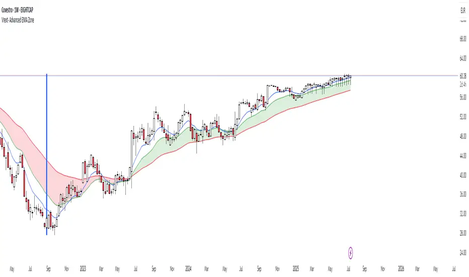
Vrext- Advanced EMA ZoneThe indicator highlights an area between two manually adjustable EMA-s to visibly mark a zone. A zone where the larger EMA is bellow the smaller one (indicating an uptrend) is marked green. On the opposite hand where higher EMA is above the lower the zone (indicating a downtrend) is marked red.
For correct zone marking enter EMA-s in descending order.
The indicator also allows you to add further additional EMA-s, which do not have a zone drawn between them and are just stand alone EMA-s. They are fully customisable in terms of colour, width. etc.
Additionally the indicator allows you to plot a vertical line ''xyz'' candles in the past. The idea behind it is that if you want to only focus on the previous 150 candles, there will be a clear line at the 150th candle for easier navigating.
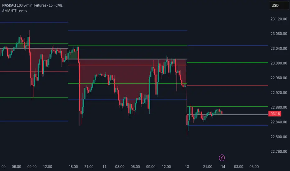
AMV HTF LevelsThe AMV HTF Levels indicator is a custom-built structure tool designed to help traders align with institutional-level zones across multiple timeframes. It auto-plots Fibonacci-based levels from the previous day and dynamically tracks the current session’s opens, highs, and lows across daily, weekly, and monthly timeframes.
What it does:
Uses previous day’s high and low to calculate Fibonacci retracement levels, drawing precise zone boxes that act as support/resistance or trend filters.
Tracks and updates the current high and low of the day/week/month in real time using floating boxes that extend through each respective session.
Plots static open levels at the beginning of each day, week, or month, with optional visual fills that indicate whether price is trading above (bullish) or below (bearish).
Lets you toggle on/off individual level groups or presets (e.g., 50%, key levels, power levels) to tailor what’s shown based on your trading style.
📈 Use case:
This tool is designed for traders who want to anchor their intraday or swing decisions around high-probability reference levels.
It can be used to:
Identify trend conditions
Trending above the upper green line (e.g. 78.6% or 100%) indicates strength.
Ranging between green lines often signals consolidation or balance.
Trending below the lower green line (e.g. 0% or 23.6%) shows bearish pressure.
Use opens as bias filters
Daily/Weekly/Monthly Opens act as key session pivot points.
Price holding above the open = bullish structure.
Price rejecting the open = potential reversal or shift.
React to dynamic highs/lows
Monitor where liquidity is building or being swept.
Use real-time high/low tracking for breakout/reversal triggers.
This is not a signal generator — it's a market context enhancer. Use it alongside your entry system to sharpen your timing, filter bad trades, and align with the bigger picture.
LTHB & HTLB Zones with AlertsIn price action trading, the Lowest Tick of the Highest Bar (LTHB) and the Highest Tick of the Lowest Bar (HTLB) are important concepts for support/resistance identification, trend exhaustion, and reversal confirmation. Here's what they mean and why they matter:
🔹 Definitions
1. Lowest Tick of the Highest Bar (LTHB):
The lowest price (tick) of the bar (candlestick) with the highest high in a recent price swing.
Significance: It marks the support inside an upward swing. If price breaks below this, it often indicates loss of upward momentum or reversal.
2. Highest Tick of the Lowest Bar (HTLB):
The highest price of the bar with the lowest low in a swing.
Significance: It acts as a resistance inside a downward swing. If price moves above this, it can signal a bullish reversal.
🔸 Why Are They Significant?
Concept LTHB HTLB
Trend Reversal - Break below LTHB → possible bearish reversal Break above HTLB → possible bullish reversal
Swing Confirmation -Holding above LTHB → continuation of uptrend Holding below HTLB → continuation of downtrend
Trap Detection - Stop hunts often occur just below LTHB Stop hunts often occur just above HTLB
Risk Management -Acts as logical stop-loss in long trades Acts as logical stop-loss in short trades
🔸 Uses in Strategy
1. Breakout Traders use these levels as entry triggers.
2. Reversal Traders look for price failing to hold these levels for early reversal signs.
3. Structure-Based Traders use them to confirm higher highs/lower lows.
4. Stop Placement: Tight stops just beyond LTHB/HTLB help manage risk in swing trades.
🔔 How to Set Alerts in TradingView:
Add the script to your chart.
Open the "⚠️ Alerts" tab.
Click "Create Alert".
In the "Condition" dropdown, select one of:
Enter LTHB Zone
Exit LTHB Zone
Enter HTLB Zone
Exit HTLB Zone
Set desired alert frequency (e.g., once per bar or once).
Click Create.

Enhanced Zones with Volume StrengthEnhanced Zones with Volume Strength
Your reliable visual guide to market zones — now with Multi-Timeframe (MTF) power!
What you get:
Clear visual zones on your chart — color-coded boxes that highlight important price areas.
Blue Boxes for neutral zones — easy to spot areas of indecision or balance.
Gray Boxes to show normal volume conditions, giving you context without clutter.
Green Boxes highlighting bullish zones where strength is showing.
Red Boxes marking bearish zones where weakness might be in play.
Multi-Timeframe Support:
Seamlessly visualize these zones from higher timeframes directly on your current chart for a bigger-picture view, helping you make smarter trading decisions.
How to use it:
Adjust the box width (in bars) to fit your trading style and timeframe.
Customize colors and opacity to suit your chart theme.
Toggle neutral blue and gray volume boxes on/off to focus on what matters most to you.
Set the maximum number of boxes to keep your chart clean and performant.
Why you’ll love it:
This indicator cuts through the noise by visually marking zones where volume and price action matter the most — without overwhelming your chart. The MTF feature means you’re always aligned with higher timeframe trends without switching views.
Pro tip:
Use these boxes as dynamic support/resistance areas or to confirm trade setups alongside your favorite indicators.
No complicated formulas here, just crisp, actionable visuals designed for clarity and confidence.

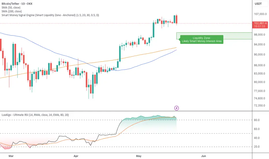
Smart Money Signal Engine (Smart Liquidity Zone - Anchored)🧭 Smart Liquidity Zone Indicator – Simple Guide
✅ What This Does
This tool helps you spot:
1. Smart Money Buy Zones (green box)
2. Fake Breakouts (trap alerts)
3. Real Breakouts (momentum alerts)
⸻
1. 🟩 Liquidity Zone (Green Box)
What it means:
Where big players (smart money) are likely interested in buying.
What you do:
• If price enters the box and holds → consider buying
• If price drops through fast → wait or look for short setups
⸻
2. 🔴 Trap Alert (Smart Money Trap)
What it means:
Price goes up fast with volume…
But no real buying power underneath = likely fakeout
On chart:
You’ll see a red label that says “Trap”
What you do:
• ❌ Don’t chase the pump
• ✅ Wait for reversal or short entry
⸻
3. 🟢 Breakout Alert
What it means:
Price breaks above a key level with strong volume
Smart money is likely behind the move
On chart:
You’ll see a green label that says “Breakout”
What you do:
• ✅ You can enter a momentum trade
• ✅ Place stop below previous structure
⸻
🔔 How to Turn on Alerts
Go to:
• TradingView > Alerts > Condition
• Choose:
• Smart Money Trap Alert
• Breakout Confirmed Alert
This way, TradingView notifies you instantly when:
• A fakeout is happening
• A real breakout begins
Pivot ATR Zones [v6]🟩 Pivot ATR Zones
Overview:
The Pivot ATR Zones indicator plots dynamic support and resistance zones based on pivot highs and lows, combined with ATR (Average True Range) volatility levels. It helps traders visually identify potential long and short trade areas, along with realistic target and stop loss zones based on market conditions.
Features:
Automatically detects pivot highs and lows
Draws ATR-based entry zones on the chart
Plots dynamic take-profit and stop-loss levels using ATR multipliers
Color-coded long (green) and short (red) zones
Entry arrow markers for clearer trade visualization
Real-time alerts when new zones form
Best For:
Scalpers, intraday traders, and swing traders who want a visual, volatility-aware way to mark potential trade areas based on key pivot structures.
How to Use:
Look for newly formed green zones for long opportunities and red zones for short setups.
Use the dashed lines as dynamic take-profit and stop levels, tuned to the current ATR value.
Combine with other confirmation tools or indicators for optimal results.
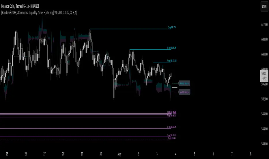
[Pandora's Chambers] Liquidity Zones F[attr_rep] V1The Liquidity Zones F V1 indicator merges visual liquidity‐zone analysis with a mathematical model that quantifies opposing market forces. It scans a historical lookback window to compute average volume (avgVol), aggregates cumulative buy/sell volumes, detects significant wicks, and renders main and dotted lines plus background fills to show pressure at each price level. After constructing these graphic elements, it scores each signal (up to 130 points) and converts it into a percentage (0–100%) mapped onto a five‑domain polar scale:
0–50: Negative dominance
50–60: Initial equilibrium
60–75: Positive momentum build‑up
75–80: Decay of positive effect
80–100: Positive overextension with reversal potential
1. How It Works
Lookback & avgVol:
– Computes a simple moving average of volume over lookback bars.
cumBuy / cumSell:
– Adds volume to cumBuy when bar close > open; to cumSell when close < open.
Wick Detection:
– Flags bars whose wick length exceeds body length; records creation price, wickFactor, and volume.
Line Creation:
– For each strong wick, draws a solid “main” line and a dotted “secondary” line, with placeholder labels.
Scoring & Chance%:
– On each new bar, computes volume delta since creation, applies weighted scoring (wickFactor, volume ratio, proximity, leverage, imbalance) up to 130 points.
– Converts score to chancePerc (0–100%).
Style & Label Updates:
– ≥76%: dashed line; 50–76%: solid or dotted by classification; <50%: dotted “F_attr.”
– Labels show “F_rep …” or “F_attr X%.”
Magnet Lines:
– Identifies lowest bullish‐main price and highest bearish‐main price, computes midPrice and relative fraction, then calculates targetPrice A/B.
– Draws dotted magnet lines and labels “liquidity force (+)/(–)” beside price chart.
Background Fill:
– Fills area between midPrice and bullishTarget in bullish color; between midPrice and bearishTarget in bearish color.
2. Settings & Inputs
Parameter Default Description
lookback 200 Number of bars to calculate average and cumulative volumes.
offsetDot 0.0002 Vertical spacing between dotted lines.
ratioLineLength 8 Length (in bars) of the magnet line.
ratioLineOffset 8 Horizontal offset (bars) for magnet placement.
ratioLineWidth 1 Width of magnet lines (1–10).
bullish_line_color #00BCD4 Color for bullish main and dotted lines.
bearish_line_color #BA68C8 Color for bearish main and dotted lines.
Advanced Tweaks:
Adjust the number of dotted “grade” lines per wick or modify the scoring thresholds for custom classification.
3. Interpretation & Polar Scale
The x value (chancePerc) is interpreted across five polar domains for concise force balance reading:
0 ≤ x < 50: Selling dominance – consider exit or avoidance.
50 ≤ x < 60: Early balance – await confirmation.
60 ≤ x < 75: Rising buy pressure.
75 ≤ x < 80: Slowing bullish momentum.
80 ≤ x ≤ 100: Overextended bullish – watch for potential reversal.
Deep Crab Harmonic Pattern [TradingFinder] Reversal Zones🔵 Introduction
The Deep Crab pattern is a 5-point extension harmonic structure (X-A-B-C-D) used in technical analysis to identify potential reversal points in financial markets. Like the original Crab pattern, it heavily relies on a 1.618 XA projection to form the Potential Reversal Zone (PRZ).
However, the key difference lies in the B point, which must be an 0.886 retracement of the XA leg. The D point in this pattern typically extends beyond the X point, signaling a strong potential reversal in price movement.
Bullish Deep Crab :
The Bullish Deep Crab is a pattern used in technical analysis to spot potential trend reversals. It signals a shift from a downtrend to an uptrend. Traders enter a buy position at the D point and set a stop-loss below point X, anticipating a price increase.
Bearish Deep Crab :
The Bearish Deep Crab is a reversal pattern that indicates the potential end of an uptrend. Traders enter a sell position at point D and set a stop-loss above point X, expecting the price to fall afterward.
🟣 Crab Vs Deep Crab
The Crab and Deep Crab patterns are both used to identify reversal points in technical analysis, but they differ in terms of correction depth :
Crab : The B point retraces between 38.2% to 61.8% of the XA leg, and point D extends beyond X, indicating a price reversal after a smaller correction.
Deep Crab : The B point retraces more deeply, around 88.6% of the XA leg, and point D has a stronger extension, signaling a reversal after a deeper correction.
The Deep Crab is more suited for identifying stronger price movements.
🔵 How to Use
To effectively use the Deep Crab pattern, it’s essential to correctly identify its five key points (X, A, B, C, and D) based on Fibonacci retracements and extensions. Traders look for a deep retracement at point B, followed by an extended move to point D, which typically signals a strong price reversal.
Once these points are established, traders can strategically enter positions at point D with appropriate stop-loss and take-profit levels, capitalizing on the anticipated market reversal. Proper use of Fibonacci tools is crucial for accurate pattern identification.
🟣 Bullish Deep Crab
To use the Bullish Deep Crab pattern, a trader identifies point D as the key price reversal point in a downtrend. Using Fibonacci tools, points X, A, B, and C are identified, with point B showing an 88.6% retracement of XA, and CD extending 1.618% of XA.
The trader enters a buy position at point D and sets a stop-loss below X, expecting a reversal from a downtrend to an uptrend.
🟣 Bearish Deep Crab
In the Bearish Deep Crab pattern, point D acts as the reversal point in an uptrend. After identifying points X, A, B, and C, D extends 1.618% of XA. Point B retraces 88.6% of XA. Traders enter a sell position at point D and place a stop-loss above X, anticipating a drop in price.
🔵 Setting
🟣 Logical Setting
ZigZag Pivot Period : You can adjust the period so that the harmonic patterns are adjusted according to the pivot period you want. This factor is the most important parameter in pattern recognition.
Show Valid Forma t: If this parameter is on "On" mode, only patterns will be displayed that they have exact format and no noise can be seen in them. If "Off" is, the patterns displayed that maybe are noisy and do not exactly correspond to the original pattern.
Show Formation Last Pivot Confirm : if Turned on, you can see this ability of patterns when their last pivot is formed. If this feature is off, it will see the patterns as soon as they are formed. The advantage of this option being clear is less formation of fielded patterns, and it is accompanied by the latest pattern seeing and a sharp reduction in reward to risk.
Period of Formation Last Pivot : Using this parameter you can determine that the last pivot is based on Pivot period.
🟣 Genaral Setting
Show : Enter "On" to display the template and "Off" to not display the template.
Color : Enter the desired color to draw the pattern in this parameter.
LineWidth : You can enter the number 1 or numbers higher than one to adjust the thickness of the drawing lines. This number must be an integer and increases with increasing thickness.
LabelSize : You can adjust the size of the labels by using the "size.auto", "size.tiny", "size.smal", "size.normal", "size.large" or "size.huge" entries.
🟣 Alert Setting
Alert : On / Off
Message Frequency : This string parameter defines the announcement frequency. Choices include: "All" (activates the alert every time the function is called), "Once Per Bar" (activates the alert only on the first call within the bar), and "Once Per Bar Close" (the alert is activated only by a call at the last script execution of the real-time bar upon closing). The default setting is "Once per Bar".
Show Alert Time by Time Zone : The date, hour, and minute you receive in alert messages can be based on any time zone you choose. For example, if you want New York time, you should enter "UTC-4". This input is set to the time zone "UTC" by default.
🔵 Conclusion
The Deep Crab pattern is a valuable reversal tool in technical analysis, known for its deep retracement and extended price movements.
Unlike other harmonic patterns, it emphasizes identifying critical points where price action is likely to reverse sharply. This pattern works well in both bullish and bearish market scenarios, offering clear signals for entry and exit points.
However, successful application requires a deep understanding of market behavior and precise use of technical tools like Fibonacci retracement. Overall, mastering this pattern can enhance trading strategies and risk management.

Pressure Zones with MA [SYNC & TRADE]Description:
The "Pressure Zones with MA " indicator is designed to analyze the pressure of buyers and sellers on the market, as well as to identify areas of increased activity. When designing it, the main task was to see manipulations on the market, when the power of sellers or the power of buyers is in a sideways trend or falling, and the opposite is growing.
Here is a good example. The power of sellers is in a narrow sideways trend, and sales are increasing very aggressively. The power of buyers is in a gray block with the inscription "range". Then we see the fading of the power of sellers and buyers furiously pounce on the asset that has fallen in price.
Here are the main aspects of its operation and use:
First, turn off the moving averages in the indicator settings, on the "style" tab. Choose your favorite asset, which you understand well and know all its ups and downs. I want you to see a clean chart, so that you can be imbued with a new idea, you need to watch it. This is a proprietary indicator and I understand that it does not have the inscription “buy” / “sell”, but believe me, if you pay attention, you will see its strength. I usually add functionality later, but the light code and visualization remain preferable in the first version.
Purpose:
The indicator helps to determine the strength of buyers and sellers in the market.
It visualizes zones where the pressure of buyers or sellers prevails.
Additionally displays moving averages (MA) for data smoothing.
Main components:
Buyer strength chart (blue line)
Seller strength chart (red line)
Moving averages for buyer and seller strength
Threshold line for defining zones
Indicator settings:
Period: defines the base period for calculations (default 89)
Threshold: sets the level for defining pressure zones (from 0 to 2, default 0.8)
MA type for purchases and sales: select the type of moving average (SMA, EMA, RMA, WMA, VWMA, HMA)
MA length for purchases and sales: period for calculating moving averages
Colors for uptrends and downtrends of MA
Moving averages:
Help smooth out data and identify trends
The direction of the MA (up or down) further confirms the current trend
The color of the MA changes depending on the direction (blue for up, red for down)
Now you can turn them on and see how they help in understanding where one or another force is weakening. It is in this case that we see the intersection of forces and the sellers' force is moving aggressively upward. Also, according to the moving average, we see the weakening of the sellers' force. The buyers' force was in the sideways range and then switched on to buy out and also according to the moving average, it is clear where the main interest in purchases disappeared.
Use:
Observe the strength of buyers and sellers relative to each other. They can move simultaneously in one direction, this is regarded as balance
can move in different directions and this will strengthen the upward force of sellers or buyers
You may also notice that the movement of one of the forces will be in a narrow range and the second will grow strongly - this is manipulation or trading without resistance.
You can also play with the threshold line, but it is not the main thing here. I disabled this function in the code.
// Display zones
//bgcolor(buy_zone ? color.new(color.blue, 90) : na)
//bgcolor(sell_zone ? color.new(color.red, 90) : na)
If you want to enable it, copy it instead
// Display zones
bgcolor(buy_zone ? color.new(color.blue, 90) : na)
bgcolor(sell_zone ? color.new(color.red, 90) : na)
Pay attention to the intersection of forces.
Use crossovers of force lines and their moving averages as potential signals
Combine the indicator signals with other technical analysis tools for confirmation
Limitations:
Requires customization of parameters for a specific trading instrument and timeframe
The indicator should not be used as the only tool for making trading decisions
Remember that this indicator provides additional information for market analysis, but is not a guarantee of successful trades. Always combine it with other analysis methods and follow risk management rules.
Описание:
Индикатор "Pressure Zones with MA " предназначен для анализа давления покупателей и продавцов на рынке, а также для определения зон повышенной активности. При его проектировании основная задача была увидеть манипуляции на рынке, когда сила продавцов или сила покупателей стоит в боковике или падает, а противоположная растет.
Вот хороший пример. Сила продавцов стоит в узком боковике, а продажи очень агрессивно усиливаются. Сила покупателей в сером блоке с надписью “range”. Потом мы видим затухание силы продавцов и покупателей яростно накидываются на подешевевший актив.
Вот основные аспекты его работы и использования:
Для начала отключите средние скользящие в настройках индикатора, на закладке “стиль”. Выберите свой любимый актив, в котором вы хорошо разбираетесь и знаете его все взлеты и падения. Я хочу чтобы вы увидели чистый график, для того чтобы вы могли проникнутся новой идеей нужно понаблюдать за ним. Это авторский индикатор и я понимаю что на нем нет надписи “купить” / “продать”, но поверьте уделив свое внимание вы увидите его силу. Я обычно потом добавляю функционал но легкий код и визуализация, в первом варианте остается предпочтительней.
Назначение:
Индикатор помогает определить силу покупателей и продавцов на рынке.
Он визуализирует зоны, где преобладает давление покупателей или продавцов.
Дополнительно отображает скользящие средние (MA) для сглаживания данных.
Основные компоненты:
График силы покупателей (синяя линия)
График силы продавцов (красная линия)
Скользящие средние для силы покупателей и продавцов
Пороговая линия для определения зон
Настройки индикатора:
Период (Period): определяет базовый период для расчетов (по умолчанию 89)
Порог (Threshold): устанавливает уровень для определения зон давления (от 0 до 2, по умолчанию 0.8)
Тип MA для покупок и продаж: выбор типа скользящей средней (SMA, EMA, RMA, WMA, VWMA, HMA)
Длина MA для покупок и продаж: период для расчета скользящих средних
Цвета для восходящего и нисходящего трендов MA
Скользящие средние:
Помогают сглаживать данные и выявлять тренды
Направление MA (вверх или вниз) дополнительно подтверждает текущий тренд
Цвет MA меняется в зависимости от направления (синий для восходящего, красный для нисходящего)
Теперь вы можете их включить и посмотреть как они помогают в понимании где ослабевает та или иная сила. Именно в этом случае мы видим пересечение сил и сила продавцов идет агрессивно вверх. Также по средней скользящей мы видим затухание силы продавцов. Сила покупателей стояла в боковике потом включилась на откуп и также по средней скользящей видно где пропал основной интерес к покупкам.
Использование:
Наблюдайте за силой покупателей и продавцов относительно друг друга. Они могут двигаться одновременно в одном направлении это расценивается как баланс
могут двигаться в разных направлениях и это будет усиливать восходящую силу продавцов или покупателей
также возможно вы заметите что движение одной из силы будет в узком диапазоне а вторая будет сильно расти - это манипуляция или торговля без сопротивления.
Также можете поиграть с пороговой линией, но она совершенно не главная здесь. В коде я отключил эту функцию.
// Display zones
//bgcolor(buy_zone ? color.new(color.blue, 90) : na)
//bgcolor(sell_zone ? color.new(color.red, 90) : na)
Если захотите включить скопируйте вместо нее
// Display zones
bgcolor(buy_zone ? color.new(color.blue, 90) : na)
bgcolor(sell_zone ? color.new(color.red, 90) : na)
Обращайте внимание на пересечение сил.
Используйте пересечения линий силы и их скользящих средних как потенциальные сигналы
Комбинируйте сигналы индикатора с другими инструментами технического анализа для подтверждения
Ограничения:
Требуется настройка параметров под конкретный торговый инструмент и таймфрейм
Не следует использовать индикатор как единственный инструмент для принятия торговых решений
Помните, что этот индикатор предоставляет дополнительную информацию для анализа рынка, но не является гарантией успешных сделок. Всегда сочетайте его с другими методами анализа и соблюдайте правила управления рисками.

Time Zone Box & Alerts (Simplified)### Description
This Pine Script indicator is designed for TradingView and provides functionality for drawing time-based boxes on the chart, as well as generating alerts and labels. It is particularly useful for visualizing specific time ranges within each trading day and managing alerts based on those time intervals.
#### **Features:**
1. **Box Drawing for Specific Time Ranges**:
- **Time Interval Customization**: Allows users to specify the start and end times for the box using inputs (e.g., from 9:30 AM to 12:30 PM). The box will automatically adjust based on these times.
- **Historical Data**: The script calculates the high and low prices within the specified time range and draws a box accordingly. This box will be created for each trading day, capturing all relevant historical data within the defined time interval.
2. **Dynamic Alerts**:
- **Custom Alerts**: Users can define custom alert messages for specific times within the trading day (e.g., before and after the trading range). Alerts are triggered once per bar close at the specified times.
3. **Labels for Key Time Points**:
- **Customizable Labels**: Labels can be added at specific times to indicate important trading actions (e.g., "No Trade," "Open Trade," and "Close Trade"). The text, color, and size of these labels are customizable.
- **Label Display**: Labels appear on the chart at defined times to provide visual cues for trading decisions.
4. **Visual Customization**:
- **Box and Label Colors**: Users can choose colors for the box and labels to match their preferences or trading setup.
- **Box Transparency**: The box can be customized with varying levels of transparency to enhance chart visibility.
#### **Usage:**
1. **Set Up Time Intervals**: Define the start and end times for the box using the input fields. Adjust these settings to fit your trading strategy and time zones.
2. **Adjust Alerts and Labels**: Customize the alert messages and label text to fit your trading plan.
3. **Apply to Chart**: Add the script to your TradingView chart to visualize the time-based boxes, receive alerts, and see the labels.
This script helps traders visually identify significant time ranges within the trading day and receive timely alerts and labels, enhancing their decision-making process.

Holding Zone Input Parameters
The script has three input parameters:
· length: an integer input with a default value of 20, likely used for calculating moving averages or other indicators.
· zoneSize: a decimal input with a default value of 1.5, likely used to define the size of the "holding zone".
· entryZone: an integer input with a default value of 50, likely used to define the entry point for the strategy.
Calculate Holding Zone
The script calculates two values:
· highs: the highest high over the last length bars.
· lows: the lowest low over the last length bars.
Then, it calculates the zoneHigh and zoneLow values by subtracting/adding a fraction of the difference between highs and lows from/to highs and lows, respectively. This creates a "holding zone" between zoneHigh and zoneLow.
Plot Holding Zone
Finally, the script plots two lines:
· zoneHigh with a blue color and a linewidth of 2.
· zoneLow with a blue color and a linewidth of 2.
________________________________________________________________
For the 15 min timeframe I use the parameters 10 for the length, 0.5 for the zone size and 20 for the entry zone. this makes it more sensitive to price

Multi Timeframe Supply & Demand ZonesIntroduction
Hello fellow traders and coders, I’d like to introduce the multi time-frame supply and demand indicator that you’ve been looking for, its a dynamic script encompassing a lot of features however it is merely a tool to be used in conjunction with your own market analysis.
Features
A maximum of 2 time-frames that can be customized independently.
The ability to change individual swing lengths that create the supply and demand boxes, all time-frames will come set at 7, you can however set this to whatever you are comfortable with.
Supply and demand functionality for both time-frames.
The ability to either use (highs and lows) or closes for mitigation of supply and demand zones, meaning that if set to close the zones will be mitigated if a close is above the top for supply and bottom from demand, the same will apply when the high and low flag is used.
The ability to customize box colors, border type, border width and text size.
The ability to prevent lower time frame structure from showing on higher time frames which I don’t advice as it will provide you with an inaccurate perception of the lower time frame structure hence I’ve made the feature available but set it to false.
The script also has a section called general settings that will allow you to hide all the supply and demand zones on the chart.
The ability to choose the number of supply or demand zones to display per time-frame.
General Settings Functionality.
Input 1 allows you to hide all the demand zones on the chart.
Input 2 allows you to hide all the supply zones on the chart.
Input 3 if false will show lower time frame structure on a higher time frame. Default is true to prevent inaccurate results on higher time-frames.

VWAP Balance ZonesVWAP Balance Zones (VBZ) Is based on 3 concepts.
Many Traders use VWAP to help determine Price Trends.
Trends are typically identified by new Highs or new Lows.
Balanced is found when Supply and Demand are mostly Equal.
VBZ tracks the daily, weekly, and monthly highs and lows; Then plots the average (50%) between the VWAP and the respective extremes.
50% VWAP Zones can be considered significant since they attempt to identify the equilibrium between market participants within the current trend, serving as key reference points to consider for decision making. >While in an uptrend, Buyers may see price falling to the Hi 50% as an attractive value entry for the continuation upwards.
>While ALSO in an uptrend, Sellers may see price falling to the Hi 50% as a change in sentiment with more downwards movement on the way.
Because of these conflicting mindsets, these zones are thought to display areas of balance between buyers and sellers, which can serve as potential decision points throughout the day.
VBZ Draws Zones from the Daily (High/Low/Close) VWAPs and the Day's (High/Low/Close) extremes as seen below.
Technically speaking, an average between vwap and extreme is a single point, to make these into zones I am using multiple sources for vwap and tracking different points of the bar throughout the day (ex. Close VWAP & Daily Highest Close)
Weekly and Monthly are only displaying the Average Price between the VWAP and the (Weekly or Monthly) High/Low.
These hold up as important levels for speculation; however, since most action will be discovered at the daily zones, I am not displaying the zones for the Weekly and Monthly to keep noise to a minimum.
Unique Behaviors:
- Weekly values are hidden on the first day of the week since they are similar to the daily values on the first day of the week.
- Monthly values are hidden in the first week of the month for the same reason.

TDI - with power zonesTDI with power zones for divergences. Should divergences happen in the right zone you short or long the price for an easy win

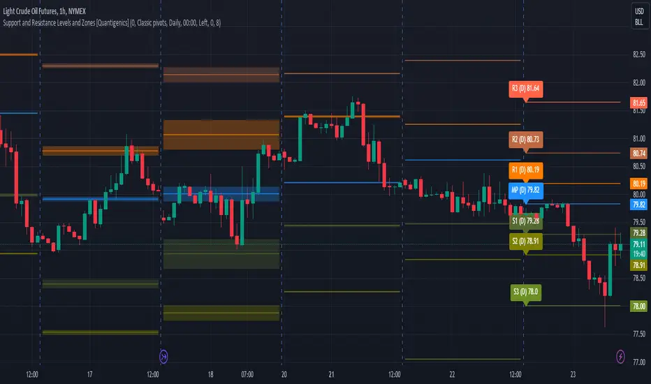
Support and Resistance Levels and Zones [Quantigenics]Support and Resistance Levels and Zones Indicator is an enhanced support and resistance indicator in that typical support and resistance levels are crucial concepts in technical analysis representing price levels where selling or buying momentum tends to halt, typically leading to a price reversal.
The Support and Resistance Levels and Zones Indicator goes beyond static levels by identifying dynamic 'zones'. These zones, depicted as shaded areas, offer more nuanced insights, acknowledging that markets are not rigid but fluctuating entities. Traders can leverage these zones, alongside the standard levels that the indicator plots, to better time their entries and exits, maximizing potential profitability and minimizing risk.
This is a "must-see on your charts" indicator and while scrolling back looking at historical data shows the amazing power of this indicator, it's even better in realtime LIVE price action and the price can tend to hit the Support and Resistance Levels and Zones multiple times intrabar.
TVC:GOLD 1HR
NYMEX:CL1! 15MIN
Enjoy!
Volume Zone Oscillator by [VanHelsig]Volume Zone Oscillator
How volume zone oscillator work:
Like other VZO it uses the same principle of calculation Volume direction divided on total volume and then scaled to 100 and -100.
When we have positive momentum close > close we have value of positive Volume, other way we have -volume negative one. <- this called a volume direction
Total volume is simply moving average with source of volume
And then MA with source of volume direction divided on MA of total colume and scaled it from 100 to -100
Basically we have few signals what VZO can show:
-Strong buy in oversold zone and strong sell in overbought zone. (Triangles at the top red and at the bottom green)
-Local Buy and Sell (Green and red Robustnesses)
-Posibility of trend change (Blue robustness)
Also you can webhook alerts to your spread sheet that sends values 1 for buys signals and -1 for sell signals in a range of 1 to 10 days
Here you can see marked signals on the chart
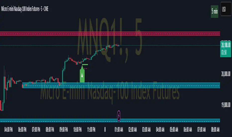
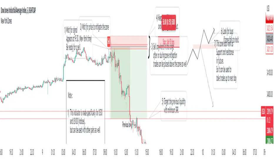
New York ZonesHello traders, here is a indicator which is based on a strategy I found on a forum. I hope you will find it useful.
Rules to Follow:
1) Wait for signal . Signal appears at 9:30. (New York time)
2) Wait for price to mitigate the zone
3) Sell anywhere in this range after or during zone mitigation.
4) Keep stop Wide to avoid getting stopped out.
5) Target the previous liquidity with minimum 3RR.
6) Look for opposite trade if zone fails to hold , with proper analysis
Note :
1) This Indicator is made specifically for US30 and US100 (Indices) but can be used with other pairs as well (need back testing)
2) I would not recommend to place the trade right away as soon as signal appears , wait for liquidity to be taken out and place a trade after confirmation.
3) Trades can be placed below the zone as well but the probability of entry may decrease ,while increasing the accuracy.
4) Use timeframe <= 5 min to take entries.
Trade scenarios
Perfect trade :
Price failed to hold, you got stopped out and market changes direction :
Price respect zone in future:
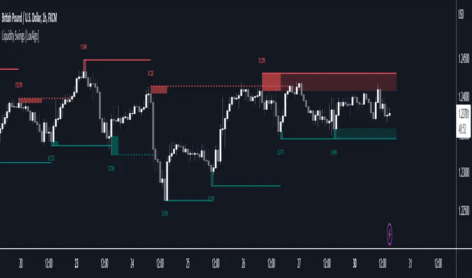
Liquidity Swings [LuxAlgo]The liquidity swings indicator highlights swing areas with existent trading activity. The number of times price revisited a swing area is highlighted by a zone delimiting the swing areas. Additionally, the accumulated volume within swing areas is highlighted by labels on the chart. An option to filter out swing areas with volume/counts not reaching a user-set threshold is also included.
This indicator by its very nature is not real-time and is meant for descriptive analysis alongside other components of the script. This is normal behavior for scripts detecting pivots as a part of a system and it is important you are aware the pivot labels are not designed to be traded in real-time themselves.
🔶 USAGE
The indicator can be used to highlight significant swing areas, these can be accumulation/distribution zones on lower timeframes and might play a role as future support or resistance.
Swing levels are also highlighted, when a swing level is broken it is displayed as a dashed line. A broken swing high is a bullish indication, while a broken swing low is a bearish indication.
Filtering swing areas by volume allows to only show significant swing areas with an higher degree of liquidity. These swing areas can be wider, highlighting higher volatility, or might have been visited by the price more frequently.
🔶 SETTINGS
Pivot Lookback : Lookback period used for the calculation of pivot points.
Swing Area : Determine how the swing area is calculated, "Wick Extremity" will use the range from price high to the maximum between price close/open in case of a swing high, and the range from price low to the minimum between price close/open in case of a swing low. "Full Range" will use the full candle range as swing area.
Intrabar Precision : Use intrabar data to calculate the accumulated volume within a swing area, this allows obtaining more precise results.
Filter Areas By : Determine how swing areas are filtered out, "Count" will filter out swing areas where price visited the area a number of time inferior to the user set threshold. "Volume" will filter out swing areas where the accumulated volume within the area is inferior to the user set threshold.
🔹 Style
Swing High : Show swing highs.
Swing Low : Show swing lows.
Label Size : Size of the labels on the chart.
Note that swing points are confirmed after Pivot Lookback bars, as such all elements are displayed retrospectively.
Volume profile zonesHi all!
This script calculates and shows the volume profile for the range of a higher timeframe candle. It then shows support or resistance (/supply or demand) zones based on the volume profiles with the most volume. The defaults are just my preferred settings so feel free to play with them! Also feel free to let me know about bugs and features. I already have a list of features to make, e.g.:
base on pivots
more info zone calculations, e.g. breaks and retests, virgin point of control etc.
add alerts
get rid of getPriceLevels()
get rid of _barVolumeProfile prefix
handle realtime
...
Best of trading luck!

Simple OHLC Custom Range Interactive█ OVERVIEW
This indicator show lines of OHLC which can be commonly used as support and resistance zones.
OHLC can be shown table with candlestick visual.
Color of candlestick depends on direction of bullish / bearish of the chosen candlestick.
█ INSPIRATION
Inspired by design, code and usage of CAGR . Basic usage of custom range / interactive, pretty much explained here . Credits to TradingView .
█ FEATURES
Table can positioned by any position and font size can be resized.
OHLC can be in full or simple name.
Lines can be extend either right, left, both or none.
█ HOW TO USE
Only 1 point is required.
Dont worry about magnet, point will attached depends on High or Low of the candle.
█ USAGE / TIPS EXAMPLES (Description explained in each image)
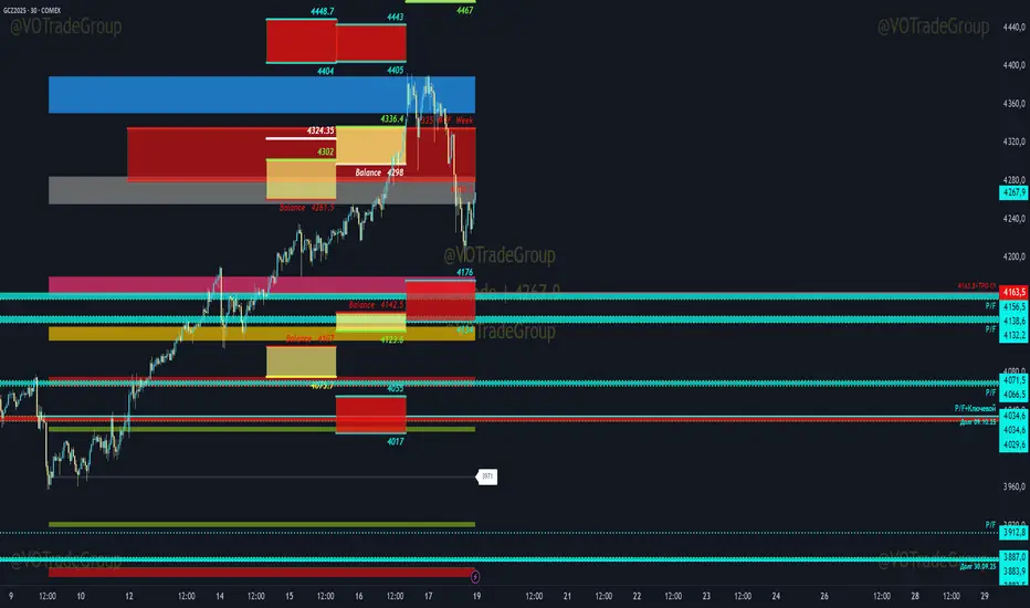
VOTrade Margin Zones CME/ICE/МОЕХ AUTO 2.0
Margin zones are zones that are strong support and resistance levels and on the basis of which further movement of a trading instrument can be assumed. Margin zones are built based on the levels of margin requirements for futures of the Chicago Mercantile Exchange ( CME ), which corresponds to a specific trading instrument on the spot market. The margin requirement levels form a certain amount of the futures move (and therefore the corresponding currency pair), conditionally this can be called the volatility that the market maker sets for the trading instrument.
Margin zones in trading are the areas to which the price reacts, and the closing of the day (the American trading session) below or above a certain level signals to us about the potential of a further trend (this is one of the classic rules based on observation and statistics collection, but you can use the zones as a kind of volatility move in other ways).
Differences from the basic version of VOTrade Margin Zones CME:
1) In this version of the script, it is implemented to save the display of margin zones on all assets where they were built.
2) Displaying the construction of margin zones according to the author's TS "VOTrade"
3) Adding tools for building margin zones for the assets you need through contact with the author.
4) Support for instruments from the world's largest exchanges CME / ICE / MOEX with up-to-date margin data.
5) Display of constructions of margin zones in both directions of movement.
6) Cross-currency support.
Supported tools:
CME future - 6E, 6B, 6C, 6A,6S, 6C, 6N, 6J,ES, NQ,YM, GC , SI, NG , HG, WTI (add according to interest)
Ice future -DXY, Brent (add according to interest)
MOEX future - Ri, Si (add according to interest)
FOREX - EURUSD , AUDUSD , GBPUSD , NZDUSD , XAUUSD , XAGUSD , WTI, SP500 , Nasdaq, US30 (add according to interest cross-currency support.)