Uptrick: FVG Market Zones**Uptrick: FVG Market Zones**
---
### Introduction
**Uptrick: FVG Market Zones** is a cutting-edge technical analysis tool designed to identify and visualize Fair Value Gaps (FVGs) within financial markets. This indicator focuses on pinpointing critical price levels where significant gaps occur, which can act as potential support and resistance zones. By integrating advanced volatility analysis and user-configurable parameters, the **Uptrick: FVG Market Zones** provides traders with a robust framework for understanding market dynamics and making informed trading decisions.
### Purpose and Functionality
The primary purpose of the **Uptrick: FVG Market Zones** indicator is to detect and highlight Fair Value Gaps, which are areas on a price chart where there is a significant price movement without any trading activity in between. These gaps can provide critical insights into market behavior, as they often indicate areas where the market has not fully accounted for the supply and demand dynamics. Traders use these zones to anticipate potential reversals, breakouts, or consolidations, making this tool highly valuable for both short-term and long-term trading strategies.
### Unique Features and Originality
The **Uptrick: FVG Market Zones** indicator is distinguished by its focus on FVGs and its ability to integrate this concept into a broader market analysis framework. Unlike other indicators that may offer generalized support and resistance levels, this tool specifically identifies and visualizes gaps based on volatility-adjusted criteria. This precision allows traders to focus on the most relevant market zones, improving their ability to anticipate market movements.
One of the standout features of this indicator is its user-configurable settings, which provide a high degree of customization. This flexibility ensures that traders can tailor the indicator to suit their specific trading style and the particular market they are analyzing. Additionally, the indicator's visualization capabilities are enhanced with customizable colors and gap-filling options, making it easier for traders to interpret and act on the information presented.
### Inputs and Configurations
**Uptrick: FVG Market Zones** comes with several user inputs that allow traders to customize the indicator's behavior and appearance. Each input plays a crucial role in determining how the indicator identifies and visualizes FVGs on the chart. Here’s a detailed breakdown of each input:
1. **FVG Analysis Period (fvgPeriod):**
- **Description:** This input determines the period over which the indicator analyzes the chart for identifying FVGs. By adjusting this value, traders can control how far back in time the indicator looks to detect significant gaps.
- **Default Value:** 25
- **Purpose:** A shorter period may focus on more recent market activity, making the indicator more sensitive to recent price movements. In contrast, a longer period allows the indicator to identify gaps that have remained unfilled for an extended time, potentially acting as stronger support or resistance levels.
2. **Analysis Mode (mode):**
- **Description:** The Analysis Mode input allows traders to choose between different methods of analyzing the chart for FVGs.
- **Options:** "Recent Gaps" and "Extended View"
- **Default Option:** "Recent Gaps"
- **Purpose:**
- **Recent Gaps:** Focuses on the latest significant gaps, providing traders with up-to-date information on the most relevant market zones.
- **Extended View:** Considers a broader range of gap patterns, which can be useful in markets where historical gaps may still influence current price action.
3. **Volatility Sensitivity (volatilityFactor):**
- **Description:** This input adjusts the sensitivity of the indicator to market volatility. It is used in calculating the threshold for identifying FVGs.
- **Default Value:** 0.3
- **Step Size:** 0.1
- **Purpose:** A higher sensitivity will cause the indicator to detect smaller gaps, which might be more frequent but less significant. Lower sensitivity focuses on larger, more impactful gaps, which are less frequent but potentially more powerful in predicting market behavior.
4. **Highlight Market Gaps (showGaps):**
- **Description:** A boolean input that determines whether the identified FVGs should be highlighted on the chart.
- **Default Value:** True
- **Purpose:** This input allows traders to toggle the visualization of FVGs. When enabled, the indicator highlights gaps using colored boxes, making them visually prominent on the chart.
5. **Bullish Highlight Color (bullColor):**
- **Description:** Sets the color used to highlight bullish FVGs (gaps that may indicate support).
- **Default Value:** #00FF7F (a shade of green)
- **Purpose:** The color choice is crucial for quickly distinguishing bullish zones from bearish ones. Green is typically associated with upward price movement, making it intuitive for traders to identify potential support areas.
6. **Bearish Highlight Color (bearColor):**
- **Description:** Sets the color used to highlight bearish FVGs (gaps that may indicate resistance).
- **Default Value:** #FF4500 (a shade of red)
- **Purpose:** Red is commonly associated with downward price movement, making it easy for traders to identify potential resistance areas. This color coding helps in quickly assessing the chart.
7. **Fill Gap Areas (fillGaps):**
- **Description:** A boolean input that determines whether the FVGs should be filled with a color on the chart.
- **Default Value:** True
- **Purpose:** Filling the gap areas provides a more solid visual cue for traders. It enhances the visibility of the gaps, making it easier to spot these zones during fast-paced trading sessions.
8. **Hidden Color (hidden):**
- **Description:** A color input that is used when certain elements should be hidden from the chart.
- **Default Value:** color.rgb(0,0,0,100) (a semi-transparent black)
- **Purpose:** This input is useful for controlling the visibility of certain plots or elements on the chart, ensuring that the indicator remains clean and uncluttered.
### Market Gap Detection
The core functionality of the **Uptrick: FVG Market Zones** indicator lies in its ability to detect Fair Value Gaps. These gaps occur when the price makes a significant jump from one level to another without any trading activity in between. The indicator uses a combination of price action analysis and volatility thresholds to identify these gaps.
- **Volatility Measurement:** The indicator begins by measuring market volatility using the Average True Range (ATR). This volatility measurement is then adjusted by the user-defined sensitivity factor, which determines the threshold for identifying significant gaps.
- **Gap Identification:** The indicator checks for instances where the current low is higher than the high two bars ago (bullish gap) or where the current high is lower than the low two bars ago (bearish gap). These conditions signify a potential FVG.
- **Gap Storage and Management:** Once a gap is identified, it is stored in an array. The indicator also manages the size of these arrays based on the selected analysis mode, ensuring that only the most relevant gaps are considered in the analysis.
### Visualization
Visualization is a key component of the **Uptrick: FVG Market Zones** indicator. By providing clear and customizable visual cues, the indicator ensures that traders can quickly and easily interpret the information it provides.
- **Gap Highlighting:** When enabled, the indicator highlights the identified FVGs on the chart using colored boxes. Bullish gaps are highlighted in green, while bearish gaps are highlighted in red. This color coding helps traders instantly recognize potential support and resistance zones.
- **Gap Filling:** The indicator can also fill the identified gaps with a semi-transparent color. This option enhances the visibility of the gaps, making them more prominent on the chart. Filled gaps are particularly useful for traders who want to keep track of these zones over multiple trading sessions.
- **Gap Averages:** The indicator calculates the average level of the identified gaps and plots these averages as lines on the chart. These lines represent the general area of support or resistance based on the detected gaps, providing traders with a reference point for setting their stop losses or profit targets.
- **Text Labels:** The indicator also labels each FVG with the text "FVG" inside the highlighted area. This feature ensures that traders can easily identify these zones even in charts with dense price action.
### Practical Applications
The **Uptrick: FVG Market Zones** indicator is versatile and can be applied to a wide range of trading strategies across different markets and timeframes. Here are a few examples of how this indicator can be used in practice:
1. **Support and Resistance Trading:**
- Traders can use the identified FVGs as dynamic support and resistance levels. By placing their trades based on these levels, they can take advantage of potential reversals or continuations at key market zones.
2. **Gap Filling Strategy:**
- Some traders focus on the concept of gap filling, where the market eventually returns to "fill" the gap created by rapid price movements. The **Uptrick: FVG Market Zones** indicator can
help identify such gaps and anticipate when the market might return to these levels.
3. **Breakout Trading:**
- The indicator can be used to identify breakouts from significant gaps. When the price moves beyond the identified FVGs, it may signal a strong trend continuation, providing an opportunity for breakout traders.
4. **Reversal Trading:**
- By monitoring the signals generated by the indicator, traders can identify potential market reversals. A sell signal after a prolonged uptrend or a buy signal after a downtrend may indicate a reversal, allowing traders to position themselves accordingly.
5. **Risk Management:**
- The average levels of the FVGs can be used to set stop-loss and take-profit levels. By aligning these levels with the FVG zones, traders can improve their risk management practices and enhance their trading discipline.
### Customization and Flexibility
One of the standout features of the **Uptrick: FVG Market Zones** indicator is its high level of customization. Traders can adjust various parameters to tailor the indicator to their specific needs and preferences.
- **Customizable Colors:** The indicator allows traders to choose their preferred colors for highlighting bullish and bearish gaps. This flexibility ensures that the indicator can be integrated seamlessly into any trading setup, regardless of the trader's color scheme preferences.
- **Adjustable Periods and Sensitivity:** By allowing traders to adjust the analysis period and volatility sensitivity, the indicator can be fine-tuned to suit different market conditions. For example, a trader might use a shorter analysis period and higher sensitivity in a volatile market, while opting for a longer period and lower sensitivity in a more stable market.
- **Toggling Visual Elements:** Traders can choose to enable or disable various visual elements of the indicator, such as gap highlighting, gap filling, and text labels. This level of control allows traders to declutter their charts and focus on the information that is most relevant to their trading strategy.
### Advantages and Benefits
The **Uptrick: FVG Market Zones** indicator offers several key advantages that make it a valuable tool for traders:
1. **Precision:** By focusing on Fair Value Gaps, the indicator provides highly precise levels of support and resistance, which are often more reliable than traditional horizontal levels.
2. **Clarity:** The clear visual representation of FVGs, along with the text labels and color coding, ensures that traders can quickly interpret the indicator's signals and incorporate them into their trading decisions.
3. **Adaptability:** The indicator's customizable settings allow it to be adapted to different markets, timeframes, and trading styles. Whether you are a day trader, swing trader, or long-term investor, this indicator can be tailored to meet your needs.
4. **Enhanced Decision-Making:** The trading signals generated by the indicator provide actionable insights that can help traders make more informed decisions. By aligning their trades with the identified FVG zones, traders can improve their chances of success.
5. **Risk Management:** The use of FVG zones as reference points for stop-loss and take-profit levels enhances risk management practices, helping traders protect their capital while maximizing their profit potential.
### Conclusion
The **Uptrick: FVG Market Zones** indicator is a powerful and versatile tool for traders seeking to enhance their market analysis and improve their trading outcomes. By focusing on Fair Value Gaps and providing a high level of customization, this indicator offers a unique blend of precision, clarity, and adaptability. Whether you are looking to identify key market zones, generate trading signals, or improve your risk management practices, the **Uptrick: FVG Market Zones** indicator is a valuable addition to any trader's toolkit.
With its innovative approach to market analysis and user-friendly design, **Uptrick: FVG Market Zones** stands out as an essential tool for traders who want to stay ahead of the market and make more informed trading decisions. Whether you are trading stocks, forex, commodities, or cryptocurrencies, this indicator provides the insights you need to navigate the markets with confidence and success.
Pesquisar nos scripts por "zone"

SMC Fake Zones + InsideBarThis indicator is useful for whom trade with "Smart Money Concept (SMC)" strategy.
It helps SMD traders to identify fake or weak zones in the chart, So they can avoid taking position in this zones.
This indicator marks "Asia session" as well as "London and New York's Lunch Time (one hour before London and NY session starts)" zones.
It also marks Inside Bar candles which SMC trades consider as order flow. You can mark every Inside Bar or only those with opposite color via setting options.
*** As we know in SMC rules
1- Supply and Demand zones in "Asia session and Lunch Times" are fake zones for SMC trading and price will engulf them in most of times.
2- "Asia session high and low" has huge liquidity and usually price sweep that in London session.
This indicator will helps traders to visually identify those Fake zones and Asia session liquidity.
* You can change session times based on your time zone in settings.
* You can set options to show all Inside Bars or only with Opposite color in settings.

Institutional Supply and Demand ZonesThis indicator aims to identify price levels where institutional investors have positioned their buy or sell orders. These buy orders establish "demand zones," while sell orders create "supply zones." Identifying these zones enables us to anticipate potential reversals in price trends, allowing us to profitably engage in these significant market movements alongside major institutions. These zones are formed when price action goes from balanced to imbalanced. These zones are based on orders. Unlike standard support and resistance levels, when price breaks below a demand zone or above a supply zone, these zones disappear from the chart.
Supply is formed by a green candle followed by a major red candle that is at least double the size of previous green candle. The zone is then charted from the open of the green candle to the highest point in the candle. Vice versa for a demand zone (red into green).
These zones are traded by:
1. Look for a volume spike in a zone
2. A trend/trendline break out of the zone

Price Strength Index + RSI Buy/Sell ZonesThe Price Strength Index + RSI Buy/Sell Zones indicator is a technical analysis tool designed to evaluate the strength of a financial asset's price movement by comparing it with a series of Volume Weighted Moving Averages (VWMAs) of different lengths calculated from historical data.
Hypothesis :
The core hypothesis behind this indicator is that assessing the relationship between the current price and a range of VWMAs with varying lengths can provide valuable insights into the strength and direction of a price trend. Additionally, it incorporates Relative Strength Index (RSI) conditions to further refine potential buy and sell signals.
How It Works :
Multiple VWMA Calculation: The indicator calculates multiple VWMAs, each with a different length, using historical price data and volume. These VWMAs represent weighted moving averages over various periods, helping to capture different aspects of the price trend.
Comparison with Current Price : For each of these VWMAs, the indicator compares the current bar's price with the VWMA value. This comparison is crucial in understanding how the current price relates to historical averages, shedding light on the strength and direction of the prevailing trend.
SMA of Percentage Above VWMA : The indicator calculates the Simple Moving Average (SMA) of the percentage of prices above the various VWMAs over a specified period. This moving average smoothens out the percentage data, providing a clearer trend signal.
Buy and Sell Zones : User-defined upper and lower thresholds for the percentage of prices above the VWMAs are used to define buy and sell zones. When the percentage falls below the lower threshold, it signals a potential buy zone, suggesting a weakening trend. Conversely, when it exceeds the upper threshold, it signifies a potential sell zone, indicating a strengthening trend.
RSI Integration : The RSI is calculated for the selected price source with a specified length. When the SMA of the percentage above VWMAs falls within the buy zone and the RSI is below the lower RSI threshold, it indicates an oversold condition, potentially signaling a buy opportunity. Conversely, when the SMA falls within the sell zone and the RSI is above the upper RSI threshold, it suggests an overbought condition, possibly signaling a sell opportunity.
Color Coding : The indicator employs color-coding to visually represent the buy and sell zones, as well as extreme RSI conditions. Green color denotes the buy zone, red represents the sell zone, and orange lines indicate the median and potential reversal points.
In summary, the Price Strength Index + RSI Buy/Sell Zones indicator leverages multiple VWMAs of different lengths to assess the relationship between current prices and historical moving averages. This comprehensive analysis, coupled with RSI conditions, aids traders in identifying potential buy and sell zones, as well as extreme RSI points within those zones, enhancing the evaluation of price strength and potential trend reversals.

Smooth Trail V1Please, enjoy your new game changing tradingview indicator, may I present you: the Smooth Trail (first version).
The Smooth Trail is an indicator that works just like a super trend, but it has a completely different usage and potential.
The super trend works following the price and displaying a line that uses the ATR to determine how far it has to be from the actual price, and many new trader like to use the indicator thanks to his easy readability and the buy sell signals that it shows, unfortunately this is not the best usage of the indicator and it often leads to lose money on the markets.
The main characteristics that this indicator has is that, not like the normal super trend, it follow the trend the better adapting itself in the retracement phases.
The second feature that dictate the best usage of this indicator, is that it shows a zone in which to buy or sell to have the best risk to reward ratio.
The indicator also works as dynamic level of support and resistance and can be used the best for trend following strategies to maximize the profits.
The first input, the multiplier, is used to determine how many times the ATR has to be added or subtracted in order to plot the indicator.
The second input, the length, is used to determine how many candle the indicator and the ATR have to consider for the calculation.
The third and last input, the zone width, is used to calculate the width of the zone displayed by the indicator, and is the factor that will be multiplied to the ATR, this means that if you leave the settings as default, the zone will be 1 ATR or 34 candle width.
This indicator is great to use in confluence with other indicator or with various candlestick pattern.
VWAP Supply and Demand ZonesThis is my 1st indicator enjoy.
Description of the VWAP Supply and Demand Zones indicator:
This indicator uses the Volume Weighted Average Price (VWAP) to identify potential supply and demand zones in the market. The VWAP is a popular indicator that shows the average price of a security weighted by volume over a specified period of time. It can be used as a benchmark to measure the efficiency of trading and to identify trends and price levels.
The indicator plots the VWAP as a blue line on the chart, and also plots two other lines above and below it, which represent the upper and lower bounds of the supply and demand zones. The width of these zones can be adjusted by changing the “Zone Width” input parameter.
The indicator also plots shapes on the chart to mark when a supply or demand zone is formed. A supply zone is formed when the price crosses above the VWAP and then falls back below it, indicating that there is more selling pressure than buying pressure at that level. A red triangle is plotted above the bar where this happens, and a red zone is drawn between the previous close and previous VWAP values.
A demand zone is formed when the price crosses below the VWAP and then rises back above it, indicating that there is more buying pressure than selling pressure at that level. A green triangle is plotted below the bar where this happens, and a green zone is drawn between the previous close and previous VWAP values.
The supply and demand zones can be used as potential areas of support and resistance, where traders can look for reversal or continuation signals. For example, if the price enters a supply zone from below, it may indicate that sellers are willing to sell at higher prices, which could lead to a bearish reversal. Conversely, if the price enters a demand zone from above, it may indicate that buyers are willing to buy at lower prices, which could lead to a bullish reversal.
The indicator can be applied to any timeframe or market, but it may work better on higher timeframes where volume data is more reliable. It can also be combined with other indicators or tools to confirm or filter signals.

Market Interest ZoneGeneral description
The Market Interest Zone (MI Zone) indicator is designed to facilitate market analysis and meet the needs of most traders by building zones that can act as support or resistance.
The logic of each MI Zone is based on the culminating increase in volume (the analysis of such volume is done by comparing the volume of each candle with the SMA plotted for a certain period with the input volume data). This logic is not very useful in the middle of a pulse, so by comparing the OHLC of candles, the indicator builds such zones only on local pulse extremes. The indicator also has a built-in super trend indicator that acts as a trend filter. We have compared many technical indicators that can help filter zones, but in our opinion, super trend shows the best results due to more flexible settings compared to moving average. Each drawn Japanese candlestick is an independent zone from which you can open a position with a limit order and close a position, depending on the trader's usual risk management.
In this version of the indicator, only the D1 timeframe is available, but it is enough for long-term trades
The indicator has two modes:
Trend/Reversal - in which absolutely all zones are displayed;
Trend - which displays only those zones that have passed the filter in the direction of the current trend;
Opening a position with a market order when a zone of interest appears is not part of the strategy's logic, as it increases the commission and limits the trading potential. However, if you understand the market context, then such an entry with a market order can be realized.
In cases when the candle that formed the zone is quite volatile and has a large spread, it is permissible to place a limit order for 50% of this zone.
Examples of using a trading strategy
As we wrote earlier, each Japanese candlestick drawn is an independent zone that can be worked with without additional conditions and understanding of the context. The MI Zone appears under certain conditions, when the second candlestick closes after the zone itself. After that, you can place a limit order at the high/low of this zone (depending on the direction) + a protective stop order on the opposite side of the zone.
Simple Limit Entry in Trend/Reverse Mode:
Simple Limit Entry in Trend Mode:
Retest Limit Entry in Trend/Reverse Mode:
Mirror Retest Limit Entry in Trend/Reverse Mode:
Risk management strategy
Fixing positions is recommended when the RR reaches 1:3 to 1:5. It is also possible to split a position, the second part of which will be fixed at more global levels.
In the above examples, position fixation is shown exclusively at global levels. In real trading, we recommend closing part of the position when local levels are reached.
Also, when RR 1:1 is reached, it is recommended to move the stop loss to breakeven.
Conclusion
It is important to understand that this logic can have different meanings depending on the financial instrument used. Therefore, we recommend performing a basic backtest of the methods of use and risk management parameters before using the indicator directly.

Support Resistance Channels/Zones Multi Time FrameHello All,
For long time I have been getting a lot of requests for Support/Resistance Multi Time Frame script. Here ' Support Resistance Channels/Zones Multi Time Frame ' is in your service.
This script works if the Higher Time Frame you set is higher than the chart time frame. so the time frame in the options should be higher than the chart time frame.
The script checks total bars and highest/lowest in visible part of the chart and shows all S/R zones that fits according the highest/lowest in visible part. you can see screenshots below if it didn't make sense or if you didn't understand
Let see the options:
Higher Time Frame : the time frame that will be used to get Support/Resistance zones, should be higher than chart time frame
Pivot Period : is the number to find the Pivot Points on Higher time frame, these pivot points are used while calculating the S/R zones
Loopback Period : is the number of total bars on higher time frame which is used while finding pivot points
Maximum Channel Width % : is the percent for maximum width for each channel
Minimum Strength : each zone should contain at least a 1 or more pivot points, you set it here. (Open/High/Low/Close also are considered while calculating the strength)
Maximum Number of S/R : the number of maximum Support/Resistance zones. there can be less S/Rs than this number if it can not find enough S/Rs
Show S/R that fits the Chart : because of we use higher time frame, you should enable this option then the script shows only S/Rs that fits the current chart. if you disable this option, all S/R zones are shown and it may shrink the chart. also you may not see any S/R zone if you don't choose the higher time frame wisely ;)
Show S/R channels in a table : if you enable this option (by default it's enabled) then lower/upper bands of all S/R zones shown in a table ( even if it doesn't fit the chart ). you can change its location. zones are sorted according to their strengths. first one is the strongest.
and the other options is about colors and transparency.
Screenshots before and after zoom-out:
after zoom-out number of visible bars and highest/lowest change and it shows more S/R zones that fits the current chart!
if you see Support Resistance zone like below then you should decrease ' Maximum Channel Width ' or you should set higher time frame better:
You can change colors and transparency:
You can change Table location:
Alerts added :)
P.S. I haven't tested it so much, if you see any issue please drop a comment or send me message
Enjoy!
ATRvsDTR + ADR Zone + SSS50%This Script is to be used for intra day as far as the adr zones. The adr zones are used as support and resistance but also can be used to determine whether the stock is breaking out or not. Also being that the adr zones are calculated using a 5 or 10 day period unless you change the settings, and are set when price opens. It does really help you know whether a stock is moving more than it does on average to me it just signifies its directional. So I added the atr vs dtr so you can see what a stock moves on average versus what it has moved today.
The atr period is calculated based on the daily period unless you change the settings. I added to the original script 3 more percentages the atr vs dtr will change as it goes higher so that you can be aware when the stock is getting closer to moving 100% of its atr. Even though a stock breaks above or below the adr that doesn't mean it has moved more than it normally moves.
I also have the weekly open on the script as I trade the strat and I want to know, at what price the the week will change from bearish to bullish and vice versa. So that I can understand the trend when I am trading intraday.
The 50% lines were added for Sara strat snipers 50% rule and you can change the timeframes on them. This is used to know whether a candle will go 3. This also can help with retracements vs reversals, because in traditional technical analysis 50% is around where people start think its a reversal more so than a retracement.
I believe the script will be very help as it can show you price being directional but can also let you know when the stock is getting close to moving more than it normally has or if it has moved more than it normally has. As well as being able to see if something is a retracement vs a reversal. I trade TheStrat strategy so this can be very helpful in that regard
The 50% retracement levels are default 1h and daily. You can change them and whether or not they show
In the example chart you can see we are below weekly open which is bearish and you can also see where price reverses out of the upper adr zone. As well as how much of the atr we have moved on this day in time.
MTF Order Block FinderAn Order Block is a special type of pivot point that satisfies the following requirement:
A Bull/Bear candle followed by X consecutive candles in the opposite direction.
Order Blocks are interesting areas that are frequently revisited and can be treated as Support/Resistance levels.
Often, you can see explosive price rejection of these areas via long wicks, high volume, and rapid price change.
Features
Choose from two themes:
- LIGHT: a classic Red and Green representing Bearish and Bullish OBs, respectively
- DARK: a clean Blue and White scheme
Choose from two drawing styles:
- LINE: three lines representing the High, Low, and Mid price levels of the OB candle
- BOX: a bounded area similar to the "rectangle" tool
Chose a custom timeframe:
- From 1 Minute (useful for Seconds interval) up to 1 Month
Note, this setting is experimental and choosing a timeframe that is extraordinarily large may not function properly.
Filter order blocks with two settings:
- Number of consecutive bars
- Minimum % change of the potential OB bar (default 0.25%)
Keep your charts clean and show only relevant OBs
- Maximum number of Bullish zones to show
- Maximum number of Bearish zones to show
FAQ
Q: How do I trade with this indicator?
A:Personally, I use a fast entry indicator to confirm Long/Short position when price is rejected. I set my SL and TP based on the current Zone and the next one, if available.
Q: Does this repaint?
A:Yes and this is okay! The "Bear" and "Bull" signals are not meant for taking positions, only showing which candle reveals the Order Block. The Zone is much more useful to us and can result in several successful trades in the near future when treated as a support/resistance area.
Q What's the winrate?
A:Hard to say - this isn't a standalone strategy and I haven't been able to properly backtest it quite yet.

00,25,50,75,00 - RND/LVL00,25,50,75,00 - RND/LVL
This concept is very simple..
Use round numbers as support and resistance, target the (.25 - .50 - .75) levels for take profit..
Basically, the rounds numbers are high liquidity zone (psychological and banks levels)
You can clearly see the price moving between those zones.
Recommanded timeframe : M30-H1-H4 (M15-M30) for entry..
I usually look at rejection at those levels for short or buy depend of the context.
You can place SL on the next .25 pips over the hard round numbers resistance-support.
Good Luck and if you have any comments, write bellow.
Thanks!
Here some example :

Sideways Zone Breakout 📘 Sideways Zone Breakout – Indicator Description
Sideways Zone Breakout is a visual market-structure indicator designed to identify low-volatility consolidation zones and highlight potential breakout opportunities when price exits these zones.
This indicator focuses on detecting periods where price trades within a tight range, often referred to as sideways or consolidation phases, and visually marks these zones directly on the chart for clarity.
🔍 Core Concept
Markets often spend time moving sideways before making a directional move.
This indicator aims to:
Detect price compression
Visually highlight the sideways zone
Signal when price breaks above or below the zone boundaries
Instead of predicting direction, it simply reacts to range expansion after consolidation.
⚙️ How the Indicator Works
1️⃣ Sideways Zone Detection
The indicator looks back over a user-defined number of candles
It calculates the highest high and lowest low within that window
If the total price range remains within a defined percentage of the current price, the market is considered sideways
This helps filter out trending and highly volatile conditions.
2️⃣ Visual Zone Representation
When a sideways condition is detected:
A clear price zone is drawn between the recent high and low
The zone is displayed using a soft gradient fill for better visibility
Outer borders are added to enhance zone clarity without cluttering the chart
This makes consolidation areas easy to spot at a glance.
3️⃣ Breakout Identification
Once a sideways zone is active:
A bullish breakout is marked when price closes above the upper boundary
A bearish breakout is marked when price closes below the lower boundary
Directional arrows and labels are plotted directly on the chart to indicate these events.
📊 Visual Elements Included
Sideways consolidation zones with gradient fill
Upper and lower zone boundaries
Buy and Sell arrows on breakout
Optional text labels for clear interpretation
All visuals are designed to remain lightweight and readable on any chart theme.
🔧 User Inputs
Sideways Lookback (candles): Controls how many past candles are used to define the range
Max Range % (tightness): Determines how tight the range must be to qualify as sideways
Adjusting these inputs allows users to adapt the indicator to different instruments and timeframes.
📈 Usage Guidelines
Can be applied to any market or timeframe
Works well as a context or confirmation tool
Best used alongside volume, trend, or risk management tools
Signals should be validated with proper trade planning
⚠️ Disclaimer
This indicator is provided as open-source for educational and analytical purposes only.
It does not generate trade recommendations or guarantee outcomes.
Market conditions vary, and users are responsible for their own trading decisions.

Madd Monkey Pro MKDx Leg and Zone Mapping EngineMadd Monkey Pro MKDx is a structure and zone mapping tool for intraday traders who prefer clear, rule-based legs and focused entry areas instead of constantly redrawing levels by hand.
The script was developed and tested mainly on XAUUSD (Gold) using 15-minute and 5-minute charts. You can apply it to other symbols and timeframes at your own discretion, but you should always test and adapt settings for each market.
Purpose
MKDx is designed to help answer three practical questions:
Where is the current impulsive leg in price?
Where is the main pullback or entry zone inside that leg?
How do trades taken from those zones behave over time, according to your own rules?
Core components (high-level logic)
MKDx combines several modules:
Leg detection engine – tracks clear bullish and bearish displacement moves and maintains the currently active leg as new bars confirm structure.
Zone engine – defines a focused “entry band” within each leg, using a premium/discount style layout rather than shading the entire range.
Trend and momentum filters – optional filters to help you stay aligned with broader direction and avoid trading every leg blindly.
Confluence checks – additional conditions that a leg must pass before being considered valid by the indicator.
Optional SL / TP references – tools that can mark guideline stop and target areas relative to each leg and zone.
These components are displayed as leg markers, shaded or outlined zones, optional horizontal reference lines, and simple long/short markers where your chosen filters agree.
Key features
Automatic mapping of bullish and bearish legs that updates as new highs or lows are confirmed.
Highlighted entry zones inside each active leg, instead of persistent bands that cover the entire chart.
Configurable filters for trend, momentum and confluence so you can adjust how selective or permissive the signals are.
Optional status panel showing approximate counts of outcomes (for example, how many legs would have reached a rough target or stop under your interpretation).
Independent toggles for leg lines, zones, markers, labels and the panel so you can keep charts clean.
Suggested usage
Timeframes: Originally tuned for XAUUSD on the 15m and 5m charts. Other timeframes and instruments require your own forward testing.
Use MKDx to:
Identify the current active leg and its direction.
Watch for price returning into the mapped zone.
Combine that context with your own entry logic (price action, candlestick patterns, sessions, etc.) and risk rules.
MKDx does not open or manage trades. Position sizing, stop placement, targets and daily limits are entirely your responsibility.
Notes and limitations
Closed bars are not repainted, but leg and zone definitions can change as structure develops. This is expected behavior for any structure-based approach.
All arrows, zones and counts are context tools only. They are not trade recommendations or performance guarantees.
Past behavior of any configuration does not imply similar results in the future.
Risk disclaimer
This script is provided for informational and educational purposes only. It does not constitute financial advice or a recommendation to buy or sell any financial instrument. Trading and investing involve significant risk, and you can lose more than your initial investment. Past performance and historical behavior do not guarantee future results.
By using Madd Monkey Pro MKDx, you accept full responsibility for your own trading decisions and outcomes. The author is not liable for any loss or damage arising from the use of this script.

Zaka Pro: Clear Structure (HH/LL) + MSS ZonesCertainly! Here is a description of the Pine Script indicator you provided, focusing on its main functions and trading strategy, written in English.
---
## Zaka Pro: Clear Structure (HH/LL) + MSS Zones
This is a technical analysis indicator developed in Pine Script (`//@version=5`) designed to automatically identify and plot key price action structural elements based on the **Zig Zag** method, while incorporating a simplified **Market Structure Shift (MSS)** concept, often used in Smart Money Concepts (SMC) or Wyckoff trading.
### Key Features:
1. **Pivot-Based Structure Identification:**
* The indicator uses the standard **`ta.pivothigh`** and **`ta.pivotlow`** functions, determined by the user-defined `Pivot Length` (`prd`). This forms the foundation of the price "swing" structure.
2. **Structural Labeling (HH/LL/LH/HL):**
* It automatically labels the resulting swing points to clearly show the prevailing trend:
* **HH (Higher High):** Continuation of an uptrend.
* **LL (Lower Low):** Continuation of a downtrend.
* **LH (Lower High):** A potential reversal or weakening of an uptrend.
* **HL (Higher Low):** A potential reversal or weakening of a downtrend.
3. **Zig Zag Plotting:**
* The indicator connects the identified pivot points with a **gray line** to visually represent the market swings.
4. **Market Structure Shift (MSS) Strategy:**
* The core strategy detects a potential **trend reversal** when the price breaks the most recent structural pivot:
* **Buy MSS Trigger:** Detected when the price breaks **above the last High** (`last_high`) while the market was in a confirmed **downtrend** (forming Lower Lows).
* **Sell MSS Trigger:** Detected when the price breaks **below the last Low** (`last_low`) while the market was in a confirmed **uptrend** (forming Higher Highs).
5. **Order Block / Entry Zone Plotting:**
* Upon detection of a confirmed MSS (reversal), the indicator plots a colored **Box** representing a potential re-entry zone:
* **BUY ZONE (Green Box):** Plotted after a Buy MSS (breakout to the upside). The zone is defined by the **High and Low of the two candles preceding the last swing Low** (`ob_low_top`, `ob_low_btm`). This acts as a simplified "Order Block" for potential long entries.
* **SELL ZONE (Red Box):** Plotted after a Sell MSS (breakout to the downside). The zone is defined by the **High and Low of the two candles preceding the last swing High** (`ob_high_top`, `ob_high_btm`). This acts as a simplified "Order Block" for potential short entries.
6. **Alerts:**
* Custom alerts are included to notify the user immediately when a Buy or Sell MSS (Market Structure Shift) is detected.
In summary, the indicator is a visual tool that simplifies price action analysis by drawing structure and highlights potential reversal points (MSS) by painting corresponding re-entry zones (Order Blocks) on the chart.

Opposite Candle Zone Identifier Opposite Candle Zone Identifier
This indicator automatically detects candles that form potential Supply and Demand zones based on a simple but effective institutional pattern.
It identifies any central candle (bullish or bearish) that is surrounded by a defined number of opposite candles before and after, helping traders highlight key turning points, absorption zones, and areas of imbalance in the market.
How It Works
The script looks for two specific structures:
🔴 Bearish Central Candle Zone (Potential Supply)
The central candle is bearish
It is preceded by N bullish candles
It is followed by N bullish candles
This structure often appears at the origin of bearish impulses and can mark institutional Supply zones.
🟢 Bullish Central Candle Zone (Potential Demand)
The central candle is bullish
It is preceded by N bearish candles
It is followed by N bearish candles
This pattern frequently forms before strong bullish expansions and may indicate Demand zones or accumulation points.
Inputs
Number of candles before (left side of the central candle)
Number of candles after (right side of the central candle)
You can increase or decrease the sensitivity of the pattern according to your style or timeframe.
What It Draws
The indicator places:
A red label above bearish zone candles
A green label below bullish zone candles
These labels help you visually identify where institutional footprints and price imbalances may exist.
Best Use Cases
Supply & Demand mapping
Institutional trading / Smart Money Concepts
Swing points and zone detection
Filtering high-quality reversal points
Locating strong origin candles before price expansions
Notes
This script does not repaint, does not use future data, and works on all timeframes and all markets.

Crypto Liquidation Zones & Order Clusters This PineScript v6 indicator was specifically designed for crypto traders and displays estimated liquidation zones as well as probable order clusters on the chart. Since TradingView has no direct access to real order book data, stop-loss positions, or internal exchange liquidation levels, the indicator works with intelligent estimations based on historical volume data and market behavior.
The indicator identifies three main types of critical price zones: First, it marks psychological levels – round numbers like $100,000 or $50,000, where limit orders typically accumulate. Second, it highlights high-volume zones, areas with unusually high trading volume that indicate many traders have opened positions there. Third, the indicator calculates estimated liquidation zones for long and short positions by assuming typical leverage levels (default 10x) and projecting the probable liquidation prices.
The mechanism is based on analyzing volume spikes combined with volatility: When a strong price increase occurs with high volume, the indicator stores this level as a probable long-entry point and calculates the corresponding liquidation zone below the current price. During price declines with high volume, short positions are tracked and their liquidation zones are drawn above the price. Red zones mark long liquidations, green zones mark short liquidations, blue boxes show high-volume areas, and yellow dashed lines indicate psychological levels.
All settings are fully customizable: You can adjust the lookback period (default 100 bars), sensitivity for volume spikes, assumed average leverage, and toggle individual display elements. An info panel in the top-right corner shows you live how many long and short entry levels are currently being tracked and how current volume compares to the average. It's important to understand that all displayed zones are estimates – the indicator cannot see actual orders from other traders, but it provides valuable insights into areas where many positions are likely at risk and liquidation cascades could occur.

LiquidityPulse Multi-Timeframe Volume Zones/ LevelsLiquidityPulse Multi-Timeframe Volume Zones/ Levels
Non-repainting: levels appear on bar close and do not change.
What This Indicator Does
This indicator scans lower-timeframe price action to identify bars where volume and candle behaviour suggest that a notable price interaction occurred. When all conditions align, the script extracts a precise price level from that bar, plots it on your higher-timeframe chart, and extends it forward so you can observe whether the market interacts with it again later.
Each selected timeframe is processed independently. For every timeframe you enable, the script looks for the following criteria:
1. A shift in candle direction between the previous bar and the current bar
2. A close-to-open body alignment , helping filter out irregular or noisy movement
3. A volume increase relative to the recent average , based on a user-selected multiplier
If these conditions are met, the script marks the corresponding price level on the chart. You can enable up to seven lower timeframes at once, each with its own independent settings, colours, strength filters, and display capacity. This allows you to build a layered, multi-timeframe view of the levels/ zones.
How It Works
1. Candle Behaviour Shift
The script checks whether the previous bar and the current bar show opposing directional behaviour. This helps highlight moments that may reflect a shift in directional behaviour or a change in price movement characteristics.
2. Body Alignment
The previous bar’s close must closely align with the current bar’s open. This requirement reduces random noise and focuses detection on areas where structure between candles is unusually clean.
3. Volume Requirement
The combined volume of the current bar and the previous bar must exceed the recent average by a multiplier you choose.
Lower multiplier - more levels
Higher multiplier - only the most significant activity spikes qualify
This filters for bars with above-average participation (volume).
4. Price Level Identification
If all conditions are met, a price edge is defined:
Bearish pressure: upper edge
Bullish pressure: lower edge
This edge marks the price level where the qualifying candle behaviour occurred.
5. Zone Drawing
Each qualifying event produces:
A horizontal line marking the level
A (optional) shaded box around the level
A label showing the timeframe and the exact volume multiplier amount detected
The level then extends forward so you can monitor future interactions.
Key Settings
Zone Strength (Volume Multiplier)
Determines how selective the volume filter is.
Lower settings show more frequent activity
Higher settings restrict detection to only the strongest activity (volume) increases
Multi-Timeframe Framework
Enable/disable per timeframe
Custom source timeframe (e.g., 1m, 5m, 15m, etc.)
Strength threshold per timeframe
How many recent levels to display per timeframe (Show Last N Zones.)
You can display a single timeframe or stack several to highlight clustering.
How traders can use this indicator
This script is not a buy/sell signal generator. It is best used as a structural overlay that helps you identify:
Where candle behaviour abruptly shifted with increased volume
Whether multiple timeframes highlight similar levels
Comparing how frequently these conditions appear across different timeframes
How price behaves when revisiting areas of prior activity (levels)
Why this type of detection can be informative
Higher-timeframe charts compress a large amount of lower-timeframe activity. By identifying where the script found notable changes in direction, structure, and relative volume on a lower timeframe, it provides a way to reference points in the price history where behaviour differed from nearby bars. Displaying these levels on a higher timeframe allows traders to see how these conditions align with their broader analysis.
Disclaimer
This indicator does not measure true liquidity or order flow. It uses candle structure and relative-volume comparisons as interpretive tools, and the plotted levels do not represent signals or predictions. All analysis is user-interpreted, and past behaviour does not imply future behaviour.
BETA ZONES v1.0BETA ZONES v1.0 Indicator
Overview
BETA ZONES v1.0 is a comprehensive technical analysis tool designed for TradingView, combining an EMA-based ribbon with dynamic glow zones, structural pivot detection, and real-time ATR visualization. This overlay indicator helps traders identify trends, support/resistance zones, and potential breakout points by blending moving averages, volatility-based shading, and pivot structures. It's particularly useful for trend-following strategies, swing trading, and confirming market reversals on any timeframe or asset, including those using Heikin Ashi candles (as it incorporates real close data to bypass transformations).
The indicator emphasizes visual clarity with color-coded elements: bullish trends in shades of green/lime and bearish in red/maroon. It includes customizable toggles for each component, allowing users to focus on specific features without cluttering the chart.
Key Features
• EMA Ribbon & Glow System:
o Displays a ribbon formed by three EMAs (5, 20, and 50 periods) with gradient fills between them, colored based on trend strength.
o A dynamic "glow" zone around the 50-period EMA, calculated using ATR (Average True Range), acts as a volatility-based support (bullish) or resistance (bearish) band. The glow expands/contracts with market volatility, providing a visual buffer for potential price reactions.
o Real Close Dot: A small circle plotted at the actual closing price of each bar (sourced from standard candles), aiding in precise data verification even on transformed charts like Heikin Ashi.
• Structural Pivots:
o Automatically detects and labels confirmed pivot highs and lows using customizable symbols (e.g., arrows, dots, or curves).
o Draws breakout lines connecting pivots to the bar where structure is broken (Break of Structure - BOS), highlighting bullish (green) or bearish (red) shifts.
o Pivots are trend-aware: In uptrends, it tracks higher highs/lows until a downside break; in downtrends, lower highs/lows until an upside break.
• Real ATR Display:
o A compact table at the bottom-center of the chart showing the current 14-period ATR value (calculated on real data), useful for gauging volatility and setting stop-losses or targets.
How It Works
• EMA Ribbon Logic: The fast EMA (5) is compared to the mid (20), and mid to slow (50), to determine sub-trends. Price relative to the slow EMA sets the overall bullish/bearish bias. Fills create a "ribbon" effect, with colors intensifying in strong trends.
• Glow Zone: Uses a user-defined ATR length and multiplier to create upper/lower bands around the slow EMA. The glow is one-sided: below for bullish (support) and above for bearish (resistance), with semi-transparent shading for easy price overlay.
• Pivot Detection: Tracks the current trend direction (up or down) and reference high/low from the last confirmed pivot. A breakout (close crossing the reference level) confirms a new pivot, labels it, and optionally draws a line to the breakout bar. Bar coloring (yellow) highlights breakout candles.
• Data Handling: All calculations use real close prices via request.security to ensure accuracy on non-standard chart types.
Settings and Customization
The indicator is divided into intuitive input groups for easy configuration:
1. EMA Ribbon & Glow:
o Show EMA Ribbon & Glow: Master toggle to enable/disable the entire ribbon and glow (default: true). Note: Real Close Dot is independent.
o ATR Length (Glow): Lookback for ATR calculation (default: 3; higher = smoother glow).
o ATR Multiplier (Glow Size): Scales the glow width (default: 0.15; higher = wider zone).
o Show Real Close Dot: Toggle for the orange dot at real closes (default: true).
o Real Close Dot Color: Customize the dot's color (default: orange).
2. Structural Pivots:
o Show Pivot Labels: Toggle visibility of high/low symbols (default: true).
o Pivot Symbol Style: Choose from pairs like "︽ ︾" (low/high) or "•" (dots) (default: "•").
o Label Size: Adjust symbol size (Tiny to Huge; default: Normal).
o Pivot High/Low Label Colors: Set colors for labels (default: white).
o Show Breakout Lines: Toggle lines from pivot to breakout (default: true).
o Line Width: Thickness of breakout lines (default: 2).
o Line Style: Solid, Dashed, or Dotted (default: Solid).
o Resistance Break Line (Bullish): Color for upside breaks (default: green).
o Support Break Line (Bearish): Color for downside breaks (default: red).
No additional inputs are required for the ATR table, as it's always displayed on the last bar for quick reference.
Usage Tips
• Trend Identification: Use the EMA ribbon colors to gauge momentum—full green for strong bulls, red for bears. The glow zone can act as a dynamic entry/exit area (e.g., buy near bullish glow support).
• Breakout Trading: Watch for pivot labels and BOS lines as signals for trend reversals. Combine with volume or other indicators for confirmation.
• Volatility Awareness: The displayed ATR(14) helps in position sizing; for example, set stops at 1-2x ATR from entry.
• Chart Compatibility: Works best on candlestick or Heikin Ashi charts. For lower timeframes, reduce ATR length for faster reactivity; increase for higher timeframes.
• Limitations: Pivots are reactive and may lag in ranging markets. Glow is based on historical ATR, so it doesn't predict future volatility.
This indicator is in beta (v1.0) and open to feedback for improvements. Add it to your chart via TradingView's indicator search and experiment with settings to fit your strategy!

Fixed-Range Volume-Profile ZonesFixed Range Volume Profile Zones (with Dynamic Percentile Buffers)
This indicator calculates a fixed‑range volume profile over a user‑defined lookback period and identifies three key zones:
– VAL (Value Area Low)
– POC (Point of Control)
– VAH (Value Area High)
Volume is grouped into user‑selected price bins to create a profile of where the most trading activity occurred.
The script then splits the distribution into three zones and highlights the extremes (VAL/VAH) and the highest‑volume price (POC).
Dynamic Percentile Buffers
Instead of static offsets, this version computes the 10th and 90th percentile prices (user‑adjustable) of recent closes over the same lookback window.
These percentiles are used to create adaptive buffers above VAH and below VAL.
The buffers automatically expand or contract with market volatility and recent price distribution, filtering out weak or noisy touches.
Visual Elements:
– Green/orange/red horizontal lines = VAL / VAH / POC
– Green shading below VAL = buy zone
– Red shading above VAH = sell zone
– Down arrows above bars = closes above VAH + buffer
– Up arrows below bars = closes below VAL – buffer
Inputs:
– Lookback Days: number of bars used to build the profile
– Number of Bins: controls resolution of the volume profile
– VAH Percentile and VAL Percentile: choose which percentile levels to use for dynamic buffers
Use Cases:
– Quickly identify areas of high participation (POC) and potential support/resistance (VAL/VAH)
– Filter out weak breakouts using dynamic buffers
– Combine with other signals to improve entries/exits
⚠️ Disclaimer:
This script is for educational and informational purposes only.
It does not constitute financial advice or a recommendation to buy or sell any security.
Past performance or historical data does not guarantee future results.
Always perform your own analysis and use risk management when trading.

Supply Zone & Demand M15Supply Zone & Demand M15
This indicator automatically detects and plots supply and demand zones based on 15-minute pivots and impulse strength.
🔎 Features
Multi-timeframe visibility: Zones are detected on M15 pivots but can be viewed on any lower timeframe (M1, M5, etc.).
Zone validation: Zones appear only after a strong impulsive move, measured against ATR.
Retest counting: Each time price retests a zone, a counter is displayed.
Retests can be merged by time window (No merge, 30 minutes, or 1 hour).
Zone merging: Nearby overlapping zones are automatically combined with a tolerance setting.
Configurable display: Choose between immediate display of zones or only after N retests.
Customizable style: Full control over colors, extension to the left, and max number of zones kept.
⚙️ Settings
Pivot strength: Minimum bars for swing highs/lows.
Impulse filter: Require ATR-based momentum before validating a zone.
Zone width: Defined as a multiple of ATR.
Retest merge: Select None, 30 minutes, or 1 hour.
Invalidation: Option to remove zones once broken.
Display mode: Show zones immediately or only after the required number of retests.
✅ Use Cases
Identify high-probability reversal areas.
Track how many times a zone has been retested.
Spot confluence when historical zones align with current price action.
⚠️ Disclaimer: This indicator is a technical tool, not financial advice. Always combine with proper risk management.

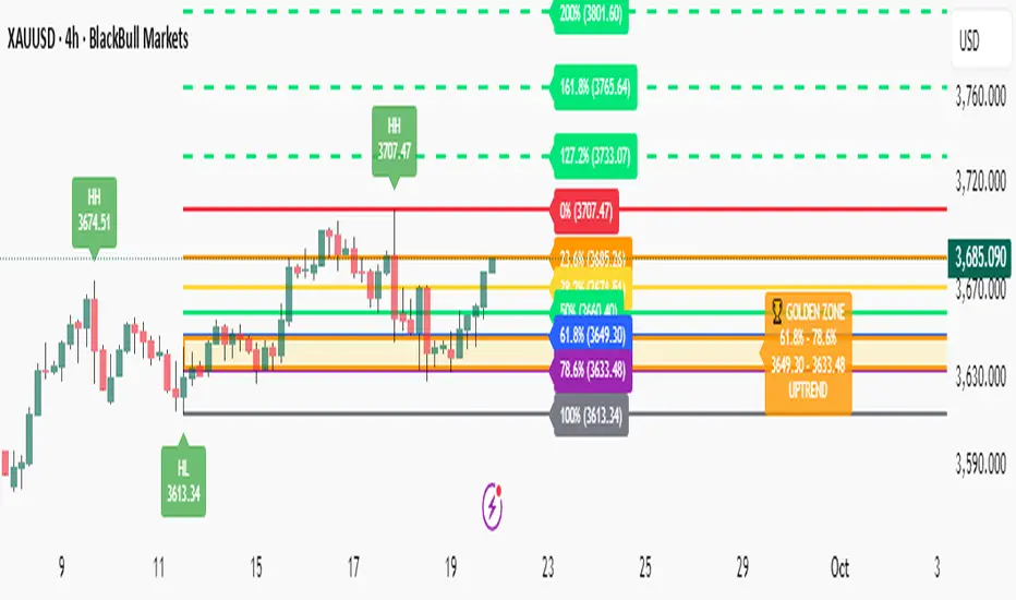
Fibonacci with Golden Zone - Trend Aware🎯 What This Indicator Does:
This advanced Fibonacci tool automatically detects trend direction and adapts Golden Zone calculations accordingly, providing dynamic support/resistance levels with market structure analysis.
✨ Key Features:
🔄 Trend-Aware Golden Zone: Automatically adjusts 61.8%-78.6% zone based on market direction
📈 Market Structure Labels: Shows HH, HL, LH, LL patterns with price levels
🎯 Smart Fibonacci Levels: Retracements (0%, 23.6%, 38.2%, 50%, 61.8%, 78.6%, 100%)
🚀 Extension Targets: 127.2%, 161.8%, 200%, 261.8% projections
📊 Pivot Points: Optional daily/weekly pivot levels
🔔 Smart Alerts: Golden Zone entry and extension target alerts
🧠 How It Works:
Uptrend: Golden Zone acts as support (retracement from swing high)
Downtrend: Golden Zone acts as resistance (retracement from swing low)
Auto-Detection: Uses trend MA to determine market direction
Structure Analysis: Identifies swing patterns for better entries
⚙️ Settings:
Lookback Period: Swing detection sensitivity (5-50)
Trend Period: Moving average for trend detection (20-200)
Golden Zone: Toggle 61.8%-78.6% zone display
Market Structure: Show HH/HL/LH/LL labels
Pivot Points: Optional daily pivot levels
📋 Best Use Cases:
🥇 Gold/Forex Trading: Perfect for XAUUSD analysis
📈 Swing Trading: Identify key reversal zones
🎯 Target Setting: Extension levels for profit taking
📊 Trend Following: Align trades with market direction
🎨 Visual Features:
🟡 Golden Zone Box: Highlighted support/resistance area
🏷️ Price Labels: Exact levels on all Fibonacci lines
🎨 Color Coding: Green for uptrend, Red for downtrend
📱 Clean Interface: Professional, non-cluttered design
🔔 Alert System:
🏆 Price entering Golden Zone
🎯 Approaching extension targets (127.2%, 161.8%)
📊 Includes trend direction in alerts
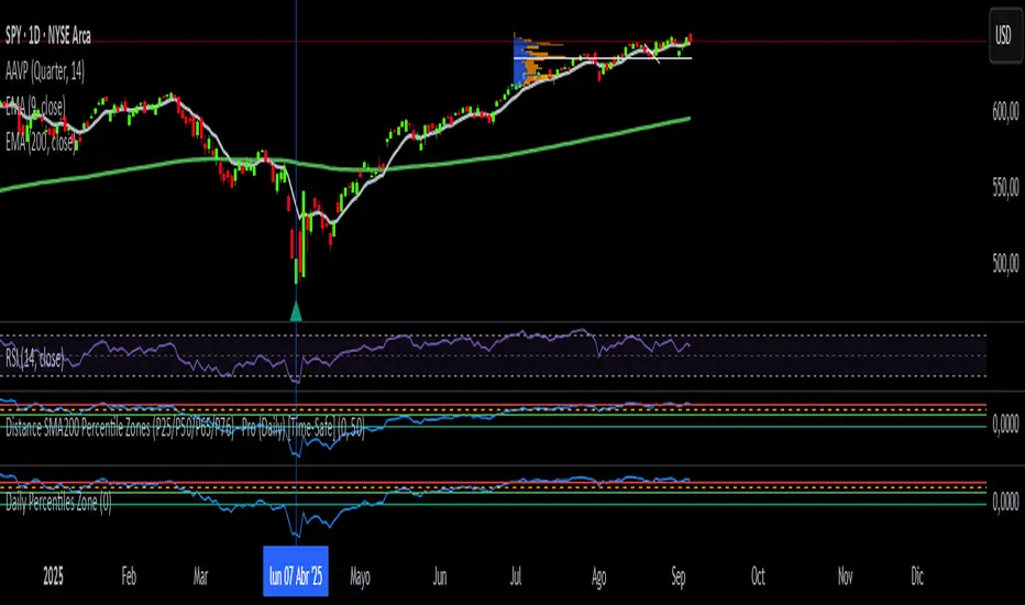
Daily SMA200 Distance – Percentile Zones PROIndicator Description — Weekly/Daily SMA200 Distance – Percentile Zones
The SMA200 Distance – Percentile Zones indicator measures the percentage distance between the price and its 200-period Simple Moving Average (SMA200), and classifies it into historical percentile zones.
This tool helps traders and investors understand the market context of an asset relative to its long-term trend:
Cheap Zone (< P25): price at historically low levels compared to SMA200.
Value Zone (P25–P50): neutral range, where price trades around its long-term average.
Acceptable Zone (P50–P65): moderately high levels, still reasonable within an uptrend.
Not Recommended Zone (P65–P76): overextended territory, with increasing correction risk.
Very Expensive Zone (≥ P76): extreme levels, historically linked to overvaluation and potential market tops.
Percentiles are calculated dynamically from the entire historical dataset (since the SMA200 becomes available), providing a robust and objective statistical framework for decision-making.
✅ In summary:
This indicator works as a quantitative valuation map — showing whether the asset is cheap, fairly valued, acceptable, risky, or very expensive relative to its historical behavior against the SMA200.
Buyer/Seller Zone (Simplified Version)📌 Indicator: Buyer/Seller Zone (Simplified Version)
This indicator is designed to highlight potential areas of strong buyer or seller activity based on advanced volume and volatility analysis. It identifies key candles that exhibit anomalous behavior — those standing out from typical market noise — and marks them as potential interest zones.
🔍 What it does:
Detects candles with unusually high volume (anomalies).
Filters them further based on strong price movement (volatility).
Marks bullish and bearish zones using customizable visuals: area, circle, or diamond.
Provides optional alerts when a buyer/seller signal is detected.
💡 How to use:
Use this tool to identify potential reversal or continuation zones.
Zones may act as strong support/resistance areas.
Some levels are more significant than others — do not trade every level blindly. Combine with your own analysis or wait for a retest/confirmation before entry.
⚙️ Customization:
Volume filter threshold
Volatility sensitivity
Visualization type, size, and transparency
🚨 Alerts: Set alerts for bullish, bearish, or any signal type.
