TSI in Dynamic Zones with Divergence and Pivot PointsTrue Strength Index , or TSI is considered a "leading indicator" - in contrast to a "lagging indicator" just as Moving Averages it does not show a confirmation what already happened, but it shows what can happen in the future. For example: The chart is climbing while the TSI oscillator is slowly declining, gets weaker and weaker, maybe even prints bearish divergences? That means that a reversal might be occurring soon. Leading indicators are best paired with Stop and Resistance Lines, General Trendlines , Fib Retracements etc. Your chart is approaching a very important Resistance Trendline but the TSI shows a very positive signal? That means there is a high probability that the Resistance is going to be pushed through and becomes Support in the future.
What are those circles?
-These are Divergences. Red for Regular-Bearish. Orange for Hidden-Bearish. Green for Regular-Bullish. Aqua for Hidden-Bullish.
What are those triangles?
- These are Pivots . They show when the TSI oscillator might reverse, this is important to know because many times the price action follows this move.
What are these blue or orange areas?
- Those are dynamic zones. For the analysis of the TSI its important to know if the indicator is in a state of oversold or overbought to filter out ranging price movement. Normally those zones are static, in this version of the TSI oscillator dynamic zones were added to show a dynamic calculation whether the TSI oscillator is oversold, overbought or ranging.
Please keep in mind that this indicator is a tool and not a strategy, do not blindly trade signals, do your own research first! Use this indicator in conjunction with other indicators to get multiple confirmations.
Pesquisar nos scripts por "zone"

Fib Convection Zone88Labeled Auto Fibonacci Retracament Levels. The color of fibo levels is green when the trend is upward and the color of fibo levels is red when the trend is downward. Also, you can see the highest and lowest values related with your period.
Added the Convection Zone 886 the banks sweet spot.
Source @borserman
Mod @LaMonicaRobinson
PT Crypto Kill ZonesVersion 1.0 of our PT Crypto Kill Zones indicator helps create a visual of specific times throughout the trading day, which we can expect volatility. The market moves within particular sessions. These sessions are broken up as such in three segments, NY, London & Asia.
Toggles -
Market Open highlights the opening of each market.
Daily Zone – highlights a period around the daily crypto candle close.
NY Open Zone – highlights a period around the NY market open.
NY Close Zone – highlights a period around the NY market close.
London Open Zone – highlights a period around the London market open.
London Open Zone – highlights a period around the London market close.
Asia Zone – highlights a period around the Asia market open.
Preferred zones are settings we came up with by running backtests to figure out which periods are close to the kill zones, which offer a better reaction.
Strategy: Use the sub 1h time-frame (30m is ideal) and scalp the London & NY zones with the PT Liquidity & PT Buy/Sell indicator.
This Oscillator was built around our buy sell & Liquidity indicator for scalping. It is included as part of the library. Just message us for access!

Price Action - Level/Zone (Expo)Price Action - Level/Zone (Expo) indicator identifies buying and selling pressure that has an impact on the price movement. This is visualized by a Zone, or Levels or with Barcolors depending on which settings are used.
Depending on the selected settings the indicator can identify buying and selling pressure which pushes the price further in the trend direction and it can show exhausted buyers/sellers which is seen in reversal points.
HOW TO USE
1. Use the indicator to identify buying and selling pressure.
2. Use the indicator to identify exhausted buyers and sellers.
3. Use the indicator to identify reversal points, pullbacks, or trend shifts.
4. Use the indicator to buy/short-sell breakouts of the zones.
5. Use the indicator to buy/short-sell when the price re-test the zones.
-> Try the indicator on Heikin Ashi Candles , but it works as good at any type of candlestick, bars, Renko, or line break.
INDICATOR IN ACTION
4 hour chart
4 hour chart
I hope you find this indicator useful , and please comment or contact me if you like the script or have any questions/suggestions for future improvements. Thanks!
I will continually work on this indicator, so please share your experience and feedback as it will enable me to make even better improvements. Thanks to everyone that has already contacted me regarding my scripts. Your feedback is valuable for future developments!
ACCESS THE INDICATOR
• Contact me on TradingView or use the links below
-----------------
Disclaimer
Copyright by Zeiierman.
The information contained in my scripts/indicators/ideas does not constitute financial advice or a solicitation to buy or sell any securities of any type. I will not accept liability for any loss or damage, including without limitation any loss of profit, which may arise directly or indirectly from the use of or reliance on such information.
All investments involve risk, and the past performance of a security, industry, sector, market, financial product, trading strategy, or individual’s trading does not guarantee future results or returns. Investors are fully responsible for any investment decisions they make. Such decisions should be based solely on an evaluation of their financial circumstances, investment objectives, risk tolerance, and liquidity needs.
My scripts/indicators/ideas are only for educational purposes!
KBL PLAY-ZONE PLOTTERHow to Use This Indicator ?
1 : When a price candle closes above the RED zone indicated on the chart, then it is considered as a Break Out Buy with target and stoploss points same
as the difference between the top and bottom of the Red Zone.
Or When a price candle closes below the GREEN zone indicated on the chart, then it is considered as a Break Out Sell with target and stoploss points
same as the difference between the top and bottom of the Green Zone.
2 : When Price candle enters the green zone from upside down and then again when it go out above the green zone, then at that point we put a buy
order with target and stoploss points same as the difference between the top and bottom of the Green Zone.
Or When Price candle enters the Red zone from downside to up and then again when it go out below the Red zone, then at that point we put a Sell
order with target and stoploss points same as the difference between the top and bottom of the Red Zone.
PM us to obtain access.

AO and AC Zones (Bill Williams)The colored Zones is the combination of the Awesome Oscillator (AO) and Accelerator Oscillator (AC) indicator by Bill Williams.
If both AO and AC bars are uptrending, the zone is blue
If both AO and AC bars are downtrending, the zone is red
If AO and AC have different colors, the zone is gray
Blue and red zones
This zones allows you to trade more aggressively, you could also add to current positions
Gray zone
You should avoid those flat (or choppy) market and don't open new positions or add to your current ones
You could use this indicator also in combination with MACD.
Please always remember, there is no holy grail indicator!
Multi-Confirmation Fib Zones This indicator combines **dynamic Fibonacci-style price zones** with a **multi-signal confirmation layer** to highlight areas where reactions are more likely to matter.
Core purpose
* Map out **contextual price areas** derived from recent market ranges.
* Provide a structured way to read potential **reaction / continuation zones** without relying on a single input.
Zone framework
* The tool continuously tracks the market’s recent extremes and builds **adaptive reference zones** around them.
* It can display both **bullish-context** and **bearish-context** zones, depending on the current market behavior.
Confirmation layer (confluence concept)
Instead of treating any zone touch as a signal, it evaluates **multiple market perspectives**, such as:
* momentum pressure,
* momentum shifts,
* short-term oscillation balance,
* participation / activity confirmation.
Signals are intended to be interpreted only when **several views align**, helping reduce false positives.
Practical use
* Useful for traders who want **structured levels + confirmation** in one visual workflow.
* Can support both **trend continuation** and **reaction-based setups**, depending on broader context.
* Best treated as a **decision support system** (a “dashboard”), not a standalone trade trigger.
Best conditions
* Works best when markets are **respecting ranges and reacting at obvious areas**.
* In extremely noisy, thin, or news-driven spikes, confirmations may desync and require more discretion.
*For educational and analytical purposes only. Always validate across different instruments and timeframes.*
Bank Zone by TheRealWealthVision V2The Bank Zone indicator is designed to help traders identify key price areas where institutions, banks, and large market participants are likely active. It highlights potential zones of accumulation, distribution, liquidity grabs, and high-value reaction levels.
This tool automatically detects structural shifts, dynamic zones, and real-time market behavior to support more accurate decision-making. It is suitable for scalping, intraday trading, and swing trading across all markets including Forex, Indices, Crypto, Stocks, Commodities, and more.
Main Features
Automatic detection of potential institutional zones
Real-time dynamic updates
Clear visual highlights on the chart
Designed to work on all timeframes
Fully compatible with the latest TradingView Pine Script engine
Best For
Identifying high-probability reaction areas
Understanding where big players may enter or exit
Improving trade timing and precision
Building a cleaner, more structured market view
Important Notice
This indicator does not repaint historical zones improperly, does not generate unrealistic signals, and follows all TradingView guidelines for script behavior.

ZynIQ Order Block Master Pro v2 - (Pro Plus Pack)Overview
ZynIQ Order Block Master Pro v2 identifies areas where price showed strong displacement and left behind significant zones of interest. It highlights potential reaction areas, continuation blocks and mitigation zones based on structural behaviour and directional flow.
Key Features
• Automatic detection of bullish and bearish order block zones
• Optional refinement filters for higher-quality zones
• Displacement-aware logic to reduce weak signals
• Optional mitigation markers when price revisits a zone
• Configurable sensitivity for different markets and timeframes
• Clean labels and minimal chart clutter
• Complements structure, liquidity and FVG tools
Use Cases
• Highlighting key reaction areas based on previous strong moves
• Tracking potential continuation or reversal zones
• Combining order blocks with BOS/CHOCH and liquidity mapping
• Building confluence with breakout or volume tools
Notes
This tool provides contextual price zones based on displacement and structural movement. It is not a standalone trading system. Use with your own confirmation and risk management.

Traffic Lights - BETA ZONESTraffic Lights - BETA ZONES
Overview
The Traffic Light indicator is a simple, visual tool designed to help traders gauge market bias, trend strength, and momentum at a glance. It displays three rows of colored dots (like a traffic light) in a separate pane below your chart:
• Green: Bullish signal (go/buy bias).
• Red: Bearish signal (stop/sell bias).
• Orange: Neutral or caution (mixed/uncertain conditions).
This indicator combines price action (via EMA positioning), trend direction (via RSI), and momentum expansion (via RSI + MACD histogram) to provide a layered view of the market. When all three rows align as green or red, it generates Buy or Sell labels on the main chart for potential entry signals.
It's non-repainting in its core logic (Row 2 uses delayed RSI comparison to avoid noise), making it reliable for live trading. Best used on trending markets like forex, stocks, or crypto on timeframes from 15M to Daily.
How It Works
The indicator evaluates three independent "rows" of conditions, each represented by a colored dot:
1. Row 1: Price Action Signal (EMA Touch) This row assesses the overall trend bias based on price's position relative to a slow EMA (default: 50-period).
o Green: Price is cleanly above the EMA (bullish bias).
o Red: Price is cleanly below the EMA (bearish bias).
o Orange: Price is "touching" or within a volatility buffer around the EMA (neutral/caution). The "touch zone" is defined by ATR padding, which can be toggled off for a stricter (green/red only) mode.
2. Row 2: Buyers/Sellers Trend (RSI) This row tracks the underlying trend of buyer/seller strength using RSI (default: 14-period on close). To reduce noise and repainting, it uses a delayed comparison (RSI vs. RSI ):
o Green: RSI is rising (buyers gaining strength).
o Red: RSI is falling (sellers gaining strength). No orange here—it's purely directional.
3. Row 3: Buyers/Sellers Signal (RSI + MACD Histogram) This row focuses on momentum expansion, requiring alignment across RSI zones and MACD histogram:
o Green: RSI > 50 (bull zone), MACD hist > 0 (positive), and histogram is expanding upward.
o Red: RSI < 50 (bear zone), MACD hist < 0 (negative), and histogram is expanding downward.
o Orange: Any mismatch (e.g., pullbacks, consolidations, or weak momentum). MACD defaults: Fast=12, Slow=26, Signal=9.
Signals
• Buy Signal: Triggers a "Buy" label below the bar when all three rows turn green for the first time (crossover from non-aligned).
• Sell Signal: Triggers a "Sell" label above the bar when all three rows turn red for the first time. These are conservative signals—use them for trend confirmation or entries in alignment with your strategy. They don't repaint once fired.
Inputs & Customization
All inputs are grouped for easy tweaking:
• Row 1: Price Action Signal
o Slow EMA Length (default: 50): Adjusts the trend baseline.
o EMA Timeframe (default: empty/current): Use a higher timeframe (e.g., "240" for 4H) for multi-timeframe analysis.
o Enable Orange 'Touch' Zone (default: true): Toggle for strict (green/red only) vs. touch mode.
o ATR Length (default: 3): Volatility period for touch padding.
o Touch Padding (ATR mult, default: 0.15): Widens the orange buffer; set to 0 for wick-touch only.
• Row 2: Buyers/Sellers Trend (RSI)
o RSI Length (default: 14): Period for RSI calculation.
o RSI Source (default: close): Change to high/low/open for different sensitivities.
• Row 3: Buyers/Sellers Signal (RSI + MACD hist)
o MACD Fast/Slow/Signal Lengths (defaults: 12/26/9): Standard MACD settings.
Usage Tips
• Trend Trading: Wait for all-green for long entries or all-red for shorts. Use in conjunction with support/resistance.
• Scalping/Intraday: Enable orange touch zone for more nuance in choppy markets; disable for cleaner signals in trends.
• Multi-Timeframe: Set Row 1 EMA to a higher TF for "big picture" bias while keeping others on current.
• Risk Management: Always combine with stop-losses (e.g., below recent lows for buys). Backtest on your asset/timeframe.
• Limitations: In ranging markets, orange dots may dominate—pair with volatility filters like ADX. Not a standalone system; use as a confirmation tool.
If you have feedback or suggestions, drop a comment below! Happy trading 🚦

Institutional Volume Flow (IVF) with VWAP & Zones. Accumulation Zone (Green Background)Logic: Signals potential institutional buying at the low.Conditions: The current close price is below VWAP $\text{(close} < \text{VWAP)}$, AND there has been at least one Aggressive Buy (IVF) bar within the last $\text{N}$ bars.2. Manipulation Zone (Red Background)Logic: Signals a Stop Hunt or False Breakout where the market briefly takes out a previous extreme before reversing with institutional conviction.Conditions:False Break High: Current high is a new 2-bar high, immediately followed by an Aggressive Sell (IVF) bar.False Break Low: Current low is a new 2-bar low, immediately followed by an Aggressive Buy (IVF) bar.3. Compression Zone (Purple Background)Logic: Signals a period of low volatility where price is "coiling up" for a large move.Conditions: The bar's range $\text{(high} - \text{low)}$ is consistently small (less than a multiplier of the Average True Range (ATR)) for a specific number of bars.The zones are plotted using bgcolor() for a visual area on the chart and plotshape() to mark the specific bar where the condition is met. Manipulation is given the highest plotting priority to ensure it's visible over other zones if conditions overlap.Would you like me to elaborate on the typical trading strategy associated with any of these three zones (Accumulation, Manipulation, or Compression)?

RSI with Zone ColorsRSI with zone cooler highlight for everyone
🔹 Short description (for the “Description” box)
RSI with Zone Colors
This indicator plots a classic RSI and highlights the overbought / oversold zones with clear colors.
The RSI line changes color when it enters each zone, the zones are softly filled in the RSI pane, and the price candles on the main chart are recolored whenever RSI is overbought or oversold.
It’s designed to make momentum shifts easy to see at a glance on any symbol or timeframe.
⸻
🔹 What the script does (explanation)
1. Custom RSI calculation
• Uses the price source you choose (close by default) and the RSI length you set.
• Calculates average up-moves and down-moves, then builds a classic RSI value from 0–100.
2. Configurable levels
• Overbought Level (default 70)
• Oversold Level (default 30)
• Midline at 50 is drawn automatically.
3. RSI line color by zone
• Above OB level → RSI line becomes red (overbought zone).
• Below OS level → RSI line becomes green (oversold zone).
• Between the two levels → blue (normal zone).
4. Zone lines
• Horizontal lines at Overbought, Oversold, and 50 are plotted to clearly mark each region.
5. Zone fills
• The space around the overbought area is filled with a soft red background.
• The space around the oversold area is filled with a soft green background.
• Transparency is used so the RSI line stays visible.
6. Candle colors on the main chart
• When RSI is overbought, price candles are colored red.
• When RSI is oversold, price candles are colored green.
• In the normal zone, candles keep their default color.
→ This lets you see RSI conditions directly on the price chart without looking down at the indicator pane all the time.
⸻
🔹 How to use (for “How to use / Strategy idea” section)
You can copy-paste and tweak this:
How to use
• Apply this indicator to any symbol and timeframe.
• Adjust RSI Length, Overbought Level, and Oversold Level to match your trading style (for example 14 / 80 / 20 for stronger filters).
• Use the red overbought zone to look for potential exhaustion after strong up moves.
• Use the green oversold zone to look for potential exhaustion after strong down moves.
• Candle colors on the main chart help you see when RSI is extended without taking your eyes off price.
• This script is meant as a visual aid, not a complete trading system. Combine it with your own trend, structure, and risk-management rules.
⸻
🔹 Optional disclaimer (short)
This script is for educational and informational purposes only and is not financial advice. Always test any idea on a demo account before using it with real capital.

Order-Flow Proxy (VWAP Deviation Zones)Order-Flow Proxy (VWAP Deviation Zones) helps traders visualize when market price moves unusually far away from its Volume-Weighted Average Price (VWAP) — a key fair-value level used by institutional participants.
When price stretches too far above or below VWAP, it often signals temporary imbalance between buying and selling pressure.
This tool highlights those moments using simple color zones and an optional statistical Z-Score filter for deeper precision.
In short: it’s a clean, minimal mean-reversion indicator showing when price is statistically “too far” from fair value.
Red zone → Price extended above VWAP → possible buyer exhaustion or short setup.
Green zone → Price extended below VWAP → possible seller exhaustion or long setup.
VWAP line → Acts as a dynamic fair-value anchor.
Concept:
VWAP combines both price and traded volume to define where most transactions occurred.
Deviations from it — measured either by a fixed distance (1%) or by Z-Score — can reveal overvaluation or undervaluation zones used by professional traders for contrarian setups.
How to use:
Apply the indicator to any intraday chart (1m–1h recommended).
Watch for background color shifts — red or green.
Optionally enable the Z-Score filter to focus only on statistically extreme deviations.
Combine with volume spikes, liquidity sweeps, or your own order-flow tools for confirmation.
Tip:
Best used as a visual overlay for detecting stretched markets and potential reversals.

Fair Value Levels H4 — Institutional Balance ZonesDescription:
This indicator automatically plots the Fair Value (50%) of every 4-hour candle, highlighting the institutional balance zones in price.
Each level represents the midpoint between the high and low of the H4 block — a common area where price seeks equilibrium before continuing its trend.
📌 Main Features:
• Displays all historical H4 Fair Values automatically.
• Option to extend lines infinitely or only until the next H4 block.
• Real-time Fair Value line for the current H4 candle.
• Fully customizable colors, widths, and number of displayed levels.
• Works on any market (indices, forex, gold, crypto, stocks).
⚙️ Use Cases:
• Identify institutional balance points within market structure.
• Validate premium/discount areas in Smart Money Concepts (SMC).
• Confluence tool for price action and structure-based strategies.
💡 Recommended for: traders focusing on institutional concepts, market structure, or equilibrium zones.

Liquidity sweep zone [Liquidation heatmap]Liquidity Sweep Zone : Capturing Liquidity Hotspots with Multi-OI Data and Volume
Overview:
The "Liquidity Sweep Zone " indicator comprehensively analyzes changes in Open Interest (OI) and volume data from major cryptocurrency exchanges to visualize potential liquidity sweep areas in real-time. This script identifies price levels where long or short positions are heavily liquidated or new liquidity enters the market, marking these as 'liquidity hotspots'. It assists traders in identifying these critical price levels to predict potential market reversals or trend accelerations. As its name suggests, it effectively illustrates market liquidity flows in a manner similar to a liquidation heatmap.
Features and Originality:
Multi-OI Data Source Integration and OI Delta Analysis:
Multi-Exchange Data: Utilizes integrated real-time Open Interest (OI) data from five major exchanges: Binance, Bybit, OKX, Bitget, and HTX. This approach reduces market bias that might arise from relying on single-exchange data, providing a more comprehensive understanding of overall market position changes.
Accurate Data Requests: Employs the request.security() function to fetch OI data for the current timeframe. Crucially, it uses lookahead=barmerge.lookahead_off and gaps=barmerge.gaps_on settings to entirely eliminate potential lookahead bias during data requests, ensuring the integrity and accuracy of historical data.
OI Delta Calculation: Accurately calculates the change in OI (delta) for each exchange and sums them to derive the total OI delta. This total OI delta represents the net change in market participants' positions, strongly indicating significant liquidity inflow or outflow at specific price levels, especially when coinciding with price movements.
Smart Volume-Based Liquidity Zone Identification:
Filtered Volume: Considers a trade as 'filtered significant trade' when the current bar's volume (volume) is higher than its 14-period Simple Moving Average volume (ta.sma(volume, 14)). This identifies significant large-scale trading activities that genuinely impact market movements, rather than just any volume spike.
Price-Specific Liquidity Marking: When such filtered volume spikes occur, potential buy or sell liquidity lines are drawn on the chart based on the bar's close and open prices. If the close is higher than the open, a line is drawn near the low, indicating long liquidation liquidity. If the close is lower than the open, a line is drawn near the high, indicating short liquidation liquidity.
Dynamic Visualization and Strength-Based Coloring/Thickness:
Gradient Coloring: Utilizes a custom color.from_gradient() method to apply a gradient effect to liquidity lines. This gradient visually represents the 'strength' (volume or OI delta value) of the liquidity zone, with stronger liquidity areas displayed in deeper colors, enabling intuitive perception of strength.
Strength-Based Line Thickness and Color:
Liquidity lines with maximum strength are displayed as the thickest and most prominent using highLevelColor (default yellow), emphasizing them as the most crucial liquidity areas.
Second maximum strength lines are also highlighted with additional thickness and secondHighLevelColor (default yellow).
Lines with above-average strength are shown with medium thickness and lowLevelColor or midLevelColor, while below-average lines are thinner, creating a visual hierarchy based on liquidity strength.
Line Persistence and Updates: Liquidity lines extend horizontally until the current bar closes via the updateVolumeLiquidityLine and updateOILiquidityLine methods, suggesting that these price levels remain valid liquidity areas for a certain period.
Customizable Multi-Timeframe Support:
Timeframe Filtering: Allows individual selection of whether to display liquidity lines on various timeframes, ranging from 1 minute to 2 hours. This enables users to focus liquidity information on their timeframes of interest.
Timeframe-Specific Line Thickness: The thickness of liquidity lines can be individually set for each timeframe. This allows for customization based on user preference, such as thinner lines for longer timeframes and thicker lines for shorter ones.
Liquidity Position Type Filtering:
The "Liquidity positions" option allows filtering to display liquidity for 'All' positions, 'Long' positions, or 'Short' positions only. This is useful when wanting to focus solely on liquidity hotspots for a specific direction.
Alert Functionality:
Provides a feature to alert users when new high-strength volume-based liquidity zones (isNewHighVolumeLongZone, isNewHighVolumeShortZone) and OI-based liquidity zones (isNewHighOILongZone, isNewHighOIShortZone) are formed. This enables traders to react instantly to significant market changes and seize opportunities.
How to Use:
Add Indicator: Add the "Liquidity Sweep Zone " indicator to your TradingView chart.
Select OI Data Sources: In the "OI Data Sources" group, select the exchanges whose Open Interest (OI) data you wish to include in the analysis.
Display and Visualization Settings:
In the "Display" group, you can customize the visual representation by adjusting the Liquidity multiplier, Liquidity positions type, and the colors for low, mid, and high-level liquidity lines (Low level, Mid level, High level, 2nd High level).
In the "Display Liquidity on Timeframes" group, select whether to display liquidity lines on the currently used timeframe.
In the "Line Thickness by Timeframe" group, set the thickness of liquidity lines for each timeframe to adjust visual density.
In the "OI Line Display" group, you can set the visibility of OI liquidity lines, colors for OI Long and Short positions, and the OI line width.
Alert Settings (Optional): In the "Alerts" group, enable the alert function and customize the alert messages for each type of liquidity.
Chart Analysis:
Pay close attention to the liquidity lines displayed on the chart. Especially, the thickest and brightest lines indicate major liquidity hotspots where large amounts of long or short positions are concentrated.
When the price approaches or reaches these liquidity zones, anticipate potential buy/sell pressure, stop-loss triggers, position liquidations, leading to price reversals or trend accelerations in that area. This indicator effectively serves as a heatmap visually representing potential liquidation levels in the market.
Analyze OI liquidity lines and volume liquidity lines together to understand the overall market liquidity flow and the strength of specific positions.
Conceptual Background:
This script is based on the market structure principle that "smart money" or "large traders" tend to drive prices towards areas where significant liquidity (liquidations and unfulfilled orders) is concentrated. These liquidity sweeps often serve as triggers for price reversals or accelerators for existing trends.
Volume Liquidity: Abnormally high volume at specific price levels indicates that many participants previously traded at those prices. This suggests that liquidity pools, which can act as critical support or resistance levels in the future, still exist.
Open Interest (OI) Liquidity: A sharp increase in OI signifies a large build-up of new positions, while a decrease indicates the liquidation of existing positions. Particularly, when OI delta changes significantly along with price movements, it strongly suggests a large influx or liquidation of long/short positions at specific price levels. This can trigger potential liquidation cascades and effectively acts as a 'liquidation heatmap'.
By integrating these liquidity metrics, this indicator helps traders visually identify the 'hidden' order flow and potential liquidation levels in the market. It empowers them to proactively understand critical price areas that could influence market direction. This is particularly useful for enhancing short-term trading and scalping strategies in futures and margin trading.

Mean Reversion Probability Zones [BigBeluga]🔵 OVERVIEW
The Mean Reversion Probability Zones indicator measures the likelihood of price reverting back toward its mean . By analyzing oscillator dynamics (RSI, MFI, or Stochastic), it calculates probability zones both above and below the oscillator. These zones are visualized as histograms, colored regions on the main chart, and a compact dashboard, helping traders spot when the market is statistically stretched and more likely to revert.
🔵 CONCEPTS
Mean Reversion : The tendency of price to return to its average after significant extensions.
Oscillator-Based Analysis : Uses RSI, MFI, or Stochastic as the base signal for detecting overextension.
Probability Model : The probability of reversion is computed using three factors:
Whether the oscillator is rising or declining.
Whether the oscillator is above or below user-defined thresholds.
The oscillator’s actual value (distance from equilibrium).
Dual-Zone Output :
Upper histogram = probability of downward mean reversion.
Lower histogram = probability of upward mean reversion.
Historical Extremes : The dashboard highlights the recent maximum probability values for both upward and downward scenarios.
🔵 FEATURES
Oscillator Choice : Switch between RSI, MFI, and Stochastic.
Customizable Zones : User-defined upper/lower thresholds with independent colors.
Probability Histograms :
Above oscillator → down reversion probability.
Below oscillator → up reversion probability.
Colored Gradient Zones on Chart : Visual overlays showing where mean reversion probabilities are strongest.
Probability Labels : Percentages displayed next to histogram values for clarity.
Dashboard : Compact table in the corner showing the recent maximum probabilities for both upward and downward mean reversion.
Overlay Compatibility : Works in both chart pane and sub-pane with oscillators.
🔵 HOW TO USE
Set Oscillator : Choose RSI, MFI, or Stochastic depending on your strategy style.
Adjust Zones : Define upper/lower bounds for when oscillator values indicate strong overbought/oversold conditions.
Interpret Histograms :
Orange (upper) histogram → higher chance of a pullback/downward mean reversion.
Green (lower) histogram → higher chance of upward reversion/bounce.
Watch Gradient Zones : On the main chart, shaded areas highlight where probability of mean reversion is elevated.
Consult Dashboard : Use the “Recent MAX” values to understand how strong recent reversion probabilities have been in either direction.
Confluence Strategy : Combine with support/resistance, order flow, or trend filters to avoid counter-trend trades.
🔵 CONCLUSION
The Mean Reversion Probability Zones provides traders with an advanced way to quantify and visualize mean reversion opportunities. By blending oscillator momentum, threshold logic, and probability calculations, it highlights when markets are statistically stretched and primed for reversal. Whether you are a contrarian trader or simply looking for exhaustion signals to fade, this tool helps bring structure and clarity to mean reversion setups.

Elite Zone Master Pro - Advanced Multi-Session Trading System🚀 Elite Zone Master Pro - Advanced Multi-Session Trading System
🎯 ORIGINALITY & UNIQUE VALUE PROPOSITION
Elite Zone Master Pro is NOT a simple mashup of existing indicators. It's a proprietary trading system that combines three distinct methodologies into a unified, synergistic approach:
Multi-Session Zone Analysis - Original algorithm for tracking global market sessions
Dynamic Opening Range Breakout (ORB) - Enhanced ORB with bias-aware signal filtering
Advanced Fair Value Gap Detection - Proprietary FVG identification with smart mitigation tracking
🔧 Why This Combination Works
The power lies in how these components work together, not separately:
Session zones provide market context and volatility windows
ORB system identifies key breakout levels during optimal timeframes
FVG detection pinpoints precise entry locations within the ORB framework
Integrated bias system filters signals based on range direction momentum
🧠 DETAILED METHODOLOGY & CALCULATIONS
🌍 1. Multi-Session Zone Framework
What it does: Tracks and visualizes three major global trading sessions simultaneously.
How it works:
Dynamic zone tracking algorithm that calculates session highs/lows in real-time
Adaptive box rendering that expands/contracts based on actual price movement
Session overlap detection for identifying high-volatility periods
Time-weighted zone positioning using custom timezone calculations
Original concepts:
Simultaneous multi-session visualization (not found in standard session indicators)
Dynamic zone expansion based on volatility, not fixed time periods
Cross-session momentum analysis for bias determination
🎯 2. Enhanced Opening Range Breakout System
What it does: Identifies breakout opportunities from predefined session ranges with intelligent bias filtering.
How it works:
Multi-session ORB calculation: Supports US (16:30-16:45), EU (10:00-10:15), Asian (03:00-03:15), and custom sessions
Dynamic range establishment: Range is built in real-time during active session periods
Bias-aware signal filtering: Two-tier breakout system based on range midpoint momentum
Range direction analysis: Compares current range midpoint to previous session's midpoint
Original methodology:
Range Bias Calculation:
- If Current_Midpoint > Previous_Midpoint = Bullish Bias (+1)
- If Current_Midpoint < Previous_Midpoint = Bearish Bias (-1)
- If Current_Midpoint = Previous_Midpoint = Neutral Bias (0)
Signal Logic:
- Bullish Bias: Standard breakout above range high
- Bearish Bias: Enhanced breakout (range_high + 0.5 * range_width) for bullish signals
- Neutral Bias: Standard breakouts both directions
⚡ 3. Advanced Fair Value Gap (FVG) Detection
What it does: Identifies and tracks fair value gaps with automatic mitigation detection.
How it works:
Three-bar gap analysis: Compares current bar relationships to identify true gaps
Dynamic threshold calculation: Auto-adjusting sensitivity based on market volatility
Smart mitigation tracking: Automatically removes filled gaps from display
Directional bias integration: Color-codes gaps based on their directional implication
Proprietary algorithms:
Bullish FVG Criteria:
- Current_Low > High (gap condition)
- Close > High (confirmation)
- (Current_Low - High ) / High > Threshold (significance filter)
Bearish FVG Criteria:
- Current_High < Low (gap condition)
- Close < Low (confirmation)
- (Low - Current_High) / Current_High > Threshold (significance filter)
Mitigation Logic:
- Bullish FVG: Mitigated when Close < FVG_Low
- Bearish FVG: Mitigated when Close > FVG_High
📈 4. Session-Based Moving Average System
What it does: Calculates moving averages that reset and adapt to session boundaries.
How it works:
Session-aware length calculation: Effective length = min(bars_since_session_start, user_length)
Multiple MA types: EMA, SMA, RMA, WMA, VWMA with session-specific calculations
Dynamic smoothing: Adapts to session length for consistent signals across different session durations
🔄 INTEGRATED SYSTEM SYNERGY
🎯 How Components Work Together
Context Layer: Session zones provide market timing context
Setup Layer: ORB system identifies breakout opportunities within optimal timeframes
Entry Layer: FVG detection pinpoints precise entry levels
Filter Layer: Bias system ensures alignment with momentum direction
Confirmation Layer: Session MA provides trend confirmation
🧭 Signal Generation Process
Step 1: Session Analysis
- Identify active trading session
- Calculate session volatility metrics
- Establish range boundaries
Step 2: Range Bias Calculation
- Compare current vs previous range midpoints
- Assign directional bias (-1, 0, +1)
- Adjust breakout thresholds accordingly
Step 3: Breakout Detection
- Monitor price interaction with range boundaries
- Apply bias-specific breakout criteria
- Generate preliminary signals
Step 4: FVG Confirmation
- Scan for fair value gaps within range
- Validate gap significance using dynamic thresholds
- Provide entry refinement opportunities
Step 5: Signal Validation
- Cross-reference with session MA direction
- Ensure alignment with overall bias
- Output final trading signals
📊 PRACTICAL IMPLEMENTATION
🎯 Trading Strategy Framework
Setup Phase:
Configure session times for your timezone
Enable preferred sessions (US/EU/Asian)
Adjust FVG sensitivity based on instrument volatility
Execution Phase:
Wait for range establishment during active session
Monitor for bias-aligned breakouts
Look for FVG retest opportunities
Enter trades with ORB-based stop losses
Risk Management:
Stop loss placement: Outside ORB range boundaries
Position sizing: Based on range width volatility
Trade direction: Must align with calculated range bias
🎨 UNIQUE VISUAL IMPLEMENTATION
📊 Advanced Visualization Features
Multi-layered zone rendering with transparency controls
Dynamic range boxes that adapt to price movement
Smart label positioning to avoid chart clutter
Color-coded bias indication through range fills
Progressive FVG display with automatic cleanup
🔧 TECHNICAL SPECIFICATIONS
⚙️ Performance Optimizations
Efficient array management for FVG tracking
Memory optimization through historical data cleanup
Smart rendering to prevent chart overload
Error handling for edge cases and invalid timeframes
📈 Compatibility
All timeframes under 1 day
All instruments (Forex, Stocks, Crypto, Futures)
All chart types with overlay capability
Mobile and desktop platform support
🏆 WHAT MAKES THIS DIFFERENT FROM OTHER INDICATORS
❌ Standard ORB indicators: Only show basic range breakouts without bias consideration
❌ Basic FVG indicators: Don't integrate with session analysis or range systems
❌ Session indicators: Simply highlight time periods without actionable trading signals
❌ Moving average indicators: Don't adapt to session dynamics
✅ Elite Zone Master Pro: Combines all elements with proprietary logic for a complete trading system
📋 USE CASES & MARKET APPLICATION
🎯 Primary Applications
Forex day trading during major session overlaps
Index futures scalping using session-specific ranges
Cryptocurrency swing trading with 24/7 session analysis
Stock market opening range breakout strategies
📊 Performance Characteristics
Best performance: During high-volatility session transitions
Optimal timeframes: 1m to 4H for intraday trading
Risk-reward ratios: Typically 1:2 to 1:4 based on range width
Win rate: Higher probability when all components align
This indicator represents months of development combining institutional trading concepts with retail accessibility. It's not just another indicator - it's a complete trading methodology in one comprehensive tool.
HTF POC with Zones & AlertsPlots a Point of Control (POC) per candle from a timeframe you choose (MTF). Because TradingView doesn’t expose true footprint data, the POC here is a proxy (choose: Body Mid, Range Mid, or Typical Price HLC3). The script draws the POC line and an optional POC zone (±% of that candle’s range), then alerts when price retests the zone (wick touches count).
Use it to:
Mark key levels inside candles that often act as magnets or reaction zones
Track retests of strong bars (imbalance) across higher timeframes
Add clean confluence with S/R, FVGs, or trend tools
Features: Selectable TF, zone width, extend lines/zones, historical caps, alerts, and info panel.
Note: This is an estimate of POC from OHLC, not real bid/ask volume. Use as context, not a standalone signal.
Institutional Momentum Zones (ADX+ROC+DI+MACD+Filters)Institutional Momentum Zones (ADX + ROC + DI + MACD + Filters)
This indicator is designed to help traders visually identify Bullish, Neutral, and Bearish momentum zones on Nifty, indices, or any liquid asset, using a rules-based, institutional-style approach.
It combines multiple professional-grade momentum and trend filters into a single framework:
ADX (Average Directional Index) – Measures trend strength, filters out choppy conditions.
Directional Indicators (+DI / –DI) – Confirms whether bulls or bears are in control.
ROC (Rate of Change) – Quantifies momentum speed and direction.
MACD (optional) – Adds confirmation by checking multi-timeframe momentum alignment.
EMA Filters (optional) – Ensures price is in alignment with long-term trend bias.
Supertrend (optional) – Can be enabled for additional trend confirmation.
How it works:
Bullish Zone (Green) → Strong trend (ADX > threshold) + upward momentum (ROC > 0, +DI > –DI) + optional EMA/MACD/Supertrend confirmation.
Bearish Zone (Red) → Strong trend (ADX > threshold) + downward momentum (ROC < 0, –DI > +DI) + optional EMA/MACD/Supertrend confirmation.
Neutral Zone (Yellow) → Low trend strength (ADX < threshold) or mixed momentum signals.
Features:
Automatic background coloring for zone detection.
On-chart labels marking new zone changes.
EMA50 / EMA200 and Supertrend overlay options.
Signal markers for bullish/bearish entries.
Info panel with live ADX, ROC, DI values, and MACD histogram.
Alert conditions for zone changes (Bull, Bear, Neutral).
Best used for:
Index momentum tracking (e.g., Nifty, Bank Nifty, Dow, S&P500)
Swing trading & positional trading strategies
Filtering trades to avoid entering during low-momentum chop
Tip: For Nifty positional trading, use Daily or 4H charts with EMA & MACD filters enabled for cleaner, high-confidence signals.

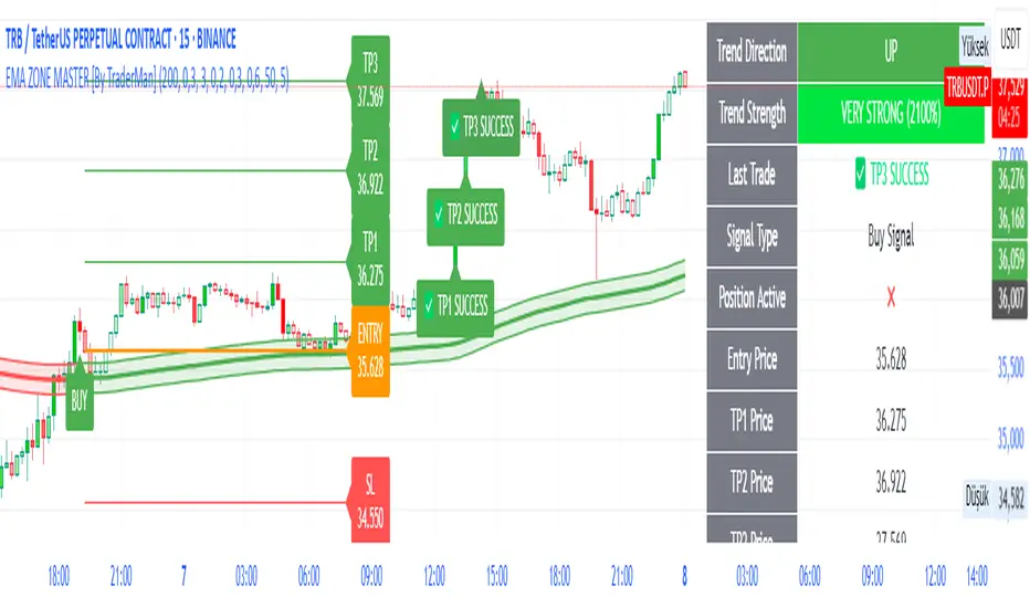
EMA ZONE MASTER [By TraderMan]🟢 EMA Zone Master Indicator Explanation 🚀
🌟 What is the EMA Zone Master?
The EMA Zone Master is a powerful TradingView Pine Script indicator designed to help traders identify trends, entry points, and manage trades with precision. It leverages a 200-period EMA (Exponential Moving Average) to create a dynamic zone for spotting bullish 📈 and bearish 📉 trends. The indicator provides clear buy/sell signals, take-profit (TP) levels, and stop-loss (SL) levels, making it ideal for both novice and experienced traders! 💪
🔍 How Does It Work?
The indicator uses the 200-period EMA as its core, surrounded by a zone defined by a percentage offset (default 0.3%). Here's how it operates:
Trend Detection 🧠:
The price's position relative to the EMA zone determines the trend:
Above the zone (with tolerance and minimum distance) signals a bullish trend (BUY 📈).
Below the zone signals a bearish trend (SELL 📉).
A neutral trend occurs when the price is within the zone or lacks momentum.
A trend is confirmed after a set number of bars (default 3) to filter out noise. 🔎
Trade Signals 🚦:
Buy Signal: Triggered when the price breaks above the EMA zone with confirmation.
Sell Signal: Triggered when the price breaks below the EMA zone with confirmation.
Signals are visualized with labels ("BUY" or "SELL") on the chart for clarity. ✅
Position Management 🎯:
Entry Price: Set at the closing price when a signal is triggered.
Take-Profit Levels: Three TP levels (TP1, TP2, TP3) are calculated based on a Risk/Reward Ratio (default 0.7).
Stop-Loss: Calculated using the ATR (Average True Range) with a multiplier (default 6.0) for volatility-based protection. 🛡️
Lines and labels for entry, TP, and SL are drawn on the chart for easy tracking.
Trend Strength 💪:
The indicator calculates trend strength (0-100%) and categorizes it as Very Strong, Strong, Moderate, Weak, or Very Weak. This helps gauge the reliability of the trend. 🌡
Analysis Comment 📝:
A dynamic comment provides professional insights based on trend strength, guiding traders on whether to act or wait. 🧑💼
Visuals & Alerts 🔔:
The EMA, zone boundaries, and candlestick colors change based on the trend (green for bullish, red for bearish, gray for neutral).
A table in the top-right corner summarizes key data: trend direction, strength, entry price, TP/SL levels, and success rate.
Alerts are generated with detailed trade information when a new signal appears.
🛠 How to Use It?
Setup on TradingView ⚙️:
Add the EMA Zone Master to your chart via the TradingView Pine Script editor.
Customize settings like EMA Length (default 200), Zone Width (0.3%), ATR Period (50), and Risk/Reward Ratio (0.7) to suit your trading style. 🛠
Interpreting Signals 📊:
Buy Signal (AL): Look for a "BUY" label and green candlesticks when the price breaks above the EMA zone. 📈
Sell Signal (SAT): Look for a "SELL" label and red candlesticks when the price breaks below the EMA zone. 📉
Check the table for trend strength and analysis comments to confirm the signal's reliability.
Opening a Position 💸:
Long Position: Enter a buy trade when a "BUY" signal appears. Set your take-profit at TP1, TP2, or TP3 and stop-loss at the SL level shown on the chart.
Short Position: Enter a sell trade when a "SELL" signal appears. Use the TP and SL levels provided.
The indicator automatically plots these levels as lines and labels for easy reference. 🎯
Managing Trades 🕒:
Monitor the trade's progress via the table and labels.
The indicator tracks if TP1, TP2, or TP3 is hit or if the trade stops out, updating the Last Result in the table (e.g., "✅ TP1 SUCCESS" or "❌ STOPPED OUT").
Use the Success Rate (displayed in the table) to gauge historical performance (75% for BUY, 65% for SELL, 50% for NEUTRAL).
Using Alerts 🔔:
Set up alerts in TradingView to receive notifications when a buy or sell signal is triggered.
The alert message includes the trend, strength, entry price, TP/SL levels, success rate, and analysis comment for quick decision-making.
📈 How to Open a Position?
Wait for a Signal: Ensure a "BUY" or "SELL" label appears, and the trend strength is at least Moderate (40%+) for higher confidence. ✅
Check the Table: Review the trend direction, strength, and analysis comment to confirm the trade setup. 📊
Enter the Trade:
For a Buy: Enter at the entry price shown, set TP1/TP2/TP3 and SL as indicated by the lines/labels.
For a Sell: Same process, but for a short position.
Monitor: Watch for TP or SL hits. The indicator will update the table with the result (e.g., "✅ TP3 SUCCESS"). 🕒
Risk Management: Always adhere to the stop-loss level to limit losses, and consider partial profit-taking at TP1 or TP2 for safer trading. 🛡️
🎉 Why Use EMA Zone Master?
Clear Signals: Easy-to-read buy/sell signals with visual cues. 🚦
Automated Levels: Pre-calculated TP and SL levels save time and reduce errors. 🧮
Trend Strength Insight: Helps avoid weak trends and focus on high-probability setups. 💪
Professional Analysis: Dynamic comments guide your trading decisions. 🧑💼
Customizable: Adjust settings to match your trading style or market conditions. ⚙️
Alert System: Stay informed with detailed alerts for timely action. 🔔
⚠️ Tips for Success
Confirm with Other Tools: Use additional indicators (e.g., RSI, MACD) to validate signals. 🔍
Test First: Backtest the indicator on your preferred market/timeframe to understand its performance. 📉
Risk Management: Always use proper position sizing and respect stop-loss levels. 🛑
Higher Timeframes: The indicator works best on higher timeframes (e.g.,15MİN, 1H, 4H, Daily) for stronger signals. ⏰
Happy trading with EMA Zone Master! 🚀 Let it guide you to smarter, more confident trades. 💰 Feel free to tweak settings and share your results! 😊
Parabolic SAR Buy Zone📈 Parabolic SAR Buy Zone — Early Trend Reversal Indicator
This script highlights bullish reversals based on the Parabolic SAR (Stop and Reverse) indicator.
🧠 Key Features:
Uses SAR parameters: Start: 0.02, Increment: 0.005, Max: 0.2
Visually marks the Buy Zone when SAR falls below the price
Background is light blue to show accumulation or early reversal zones
Yellow SAR dots help identify trend direction and potential exits
Includes alerts when SAR flips from bearish to bullish, signaling potential entry points
✅ Best Used For:
Identifying early trend reversals
Swing trading setups on daily or weekly charts
Combining with volume, RSI, or support zones for confirmation
🛎️ Customize alert to stay notified when new buy zones appear on your favorite stocks or cryptos.

Daily Engulfing Zones Visually appear Daily Engulfing Zones on the chart. Combine with your favorite oscillator indicator to create a solid setup. Bullish EZ is marked by green arrow/zone. Bearish EZ is marked by red arrow/zone.

Realistic Trader Volume, Consolidation, Zones v.2Realistic Trader Volume, Consolidation, Zones v.2
This volume-focused indicator gives you a clean, high-resolution view of market momentum and consolidation, without relying on a traditional volume panel.
A more intuitive volume tool that highlights relative volume conditions directly on candles
Surge bars color-coded based on context:
→ Green = Bullish Volume
→ Red = Bearish Volume
→ Gray = Continuation / Decline
Consolidation zones shown with white candles, identifying both currently forming and historical bases
Yellow arrows indicate consolidation breaks with volume surges, suggesting key shifts in momentum
Can help confirm when the market is likely to accelerate during a session
Useful for spotting early signs of reversals: Green after selloffs = potential buyers stepping in; Red after rallies = potential sellers stepping in
Zones can be manually drawn around a yellow arrow and its preceding white candle for more visual clarity
The bigger the green or red surge bar following a yellow arrow, the more powerful the zone
Works across all timeframes
Best used in combination with:
Realistic Trader Prior Days Levels & Zones
Realistic Trader Intraday Dynamic Zones & Levels
Realistic Trader Early Price Breaks & Confirmation (15min Only)
Realistic Trader Directional Bias
Pro Tip:
Yellow arrows mark key moments when consolidation ends and volume spikes begin. The taller the breakout candle that follows the yellow arrow, the stronger and more reliable the resulting zone is likely to be.