️Omega RatioThe Omega Ratio is a risk-return performance measure of an investment asset, portfolio, or strategy. It is defined as the probability-weighted ratio, of gains versus losses for some threshold return target. The ratio is an alternative for the widely used Sharpe ratio and is based on information the Sharpe ratio discards.
█ OVERVIEW
As we have mentioned many times, stock market returns are usually not normally distributed. Therefore the models that assume a normal distribution of returns may provide us with misleading information. The Omega Ratio improves upon the common normality assumption among other risk-return ratios by taking into account the distribution as a whole.
█ CONCEPTS
Two distributions with the same mean and variance, would according to the most commonly used Sharpe Ratio suggest that the underlying assets of the distribution offer the same risk-return ratio. But as we have mentioned in our Moments indicator, variance and standard deviation are not a sufficient measure of risk in the stock market since other shape features of a distribution like skewness and excess kurtosis come into play. Omega Ratio tackles this problem by employing all four Moments of the distribution and therefore taking into account the differences in the shape features of the distributions. Another important feature of the Omega Ratio is that it does not require any estimation but is rather calculated directly from the observed data. This gives it an advantage over standard statistical estimators that require estimation of parameters and are therefore sampling uncertainty in its calculations.
█ WAYS TO USE THIS INDICATOR
Omega calculates a probability-adjusted ratio of gains to losses, relative to the Minimum Acceptable Return (MAR). This means that at a given MAR using the simple rule of preferring more to less, an asset with a higher value of Omega is preferable to one with a lower value. The indicator displays the values of Omega at increasing levels of MARs and creating the so-called Omega Curve. Knowing this one can compare Omega Curves of different assets and decide which is preferable given the MAR of your strategy. The indicator plots two Omega Curves. One for the on chart symbol and another for the off chart symbol that u can use for comparison.
When comparing curves of different assets make sure their trading days are the same in order to ensure the same period for the Omega calculations. Value interpretation: Omega<1 will indicate that the risk outweighs the reward and therefore there are more excess negative returns than positive. Omega>1 will indicate that the reward outweighs the risk and that there are more excess positive returns than negative. Omega=1 will indicate that the minimum acceptable return equals the mean return of an asset. And that the probability of gain is equal to the probability of loss.
█ FEATURES
• "Low-Risk security" lets you select the security that you want to use as a benchmark for Omega calculations.
• "Omega Period" is the size of the sample that is used for the calculations.
• “Increments” is the number of Minimal Acceptable Return levels the calculation is carried on. • “Other Symbol” lets you select the source of the second curve.
• “Color Settings” you can set the color for each curve.
Volatilidade

Linear Moments█ OVERVIEW
The Linear Moments indicator, also known as L-moments, is a statistical tool used to estimate the properties of a probability distribution. It is an alternative to conventional moments and is more robust to outliers and extreme values.
█ CONCEPTS
█ Four moments of a distribution
We have mentioned the concept of the Moments of a distribution in one of our previous posts. The method of Linear Moments allows us to calculate more robust measures that describe the shape features of a distribution and are anallougous to those of conventional moments. L-moments therefore provide estimates of the location, scale, skewness, and kurtosis of a probability distribution.
The first L-moment, λ₁, is equivalent to the sample mean and represents the location of the distribution. The second L-moment, λ₂, is a measure of the dispersion of the distribution, similar to the sample standard deviation. The third and fourth L-moments, λ₃ and λ₄, respectively, are the measures of skewness and kurtosis of the distribution. Higher order L-moments can also be calculated to provide more detailed information about the shape of the distribution.
One advantage of using L-moments over conventional moments is that they are less affected by outliers and extreme values. This is because L-moments are based on order statistics, which are more resistant to the influence of outliers. By contrast, conventional moments are based on the deviations of each data point from the sample mean, and outliers can have a disproportionate effect on these deviations, leading to skewed or biased estimates of the distribution parameters.
█ Order Statistics
L-moments are statistical measures that are based on linear combinations of order statistics, which are the sorted values in a dataset. This approach makes L-moments more resistant to the influence of outliers and extreme values. However, the computation of L-moments requires sorting the order statistics, which can lead to a higher computational complexity.
To address this issue, we have implemented an Online Sorting Algorithm that efficiently obtains the sorted dataset of order statistics, reducing the time complexity of the indicator. The Online Sorting Algorithm is an efficient method for sorting large datasets that can be updated incrementally, making it well-suited for use in trading applications where data is often streamed in real-time. By using this algorithm to compute L-moments, we can obtain robust estimates of distribution parameters while minimizing the computational resources required.
█ Bias and efficiency of an estimator
One of the key advantages of L-moments over conventional moments is that they approach their asymptotic normal closer than conventional moments. This means that as the sample size increases, the L-moments provide more accurate estimates of the distribution parameters.
Asymptotic normality is a statistical property that describes the behavior of an estimator as the sample size increases. As the sample size gets larger, the distribution of the estimator approaches a normal distribution, which is a bell-shaped curve. The mean and variance of the estimator are also related to the true mean and variance of the population, and these relationships become more accurate as the sample size increases.
The concept of asymptotic normality is important because it allows us to make inferences about the population based on the properties of the sample. If an estimator is asymptotically normal, we can use the properties of the normal distribution to calculate the probability of observing a particular value of the estimator, given the sample size and other relevant parameters.
In the case of L-moments, the fact that they approach their asymptotic normal more closely than conventional moments means that they provide more accurate estimates of the distribution parameters as the sample size increases. This is especially useful in situations where the sample size is small, such as when working with financial data. By using L-moments to estimate the properties of a distribution, traders can make more informed decisions about their investments and manage their risk more effectively.
Below we can see the empirical dsitributions of the Variance and L-scale estimators. We ran 10000 simulations with a sample size of 100. Here we can clearly see how the L-moment estimator approaches the normal distribution more closely and how such an estimator can be more representative of the underlying population.
█ WAYS TO USE THIS INDICATOR
The Linear Moments indicator can be used to estimate the L-moments of a dataset and provide insights into the underlying probability distribution. By analyzing the L-moments, traders can make inferences about the shape of the distribution, such as whether it is symmetric or skewed, and the degree of its spread and peakedness. This information can be useful in predicting future market movements and developing trading strategies.
One can also compare the L-moments of the dataset at hand with the L-moments of certain commonly used probability distributions. Finance is especially known for the use of certain fat tailed distributions such as Laplace or Student-t. We have built in the theoretical values of L-kurtosis for certain common distributions. In this way a person can compare our observed L-kurtosis with the one of the selected theoretical distribution.
█ FEATURES
Source Settings
Source - Select the source you wish the indicator to calculate on
Source Selection - Selec whether you wish to calculate on the source value or its log return
Moments Settings
Moments Selection - Select the L-moment you wish to be displayed
Lookback - Determine the sample size you wish the L-moments to be calculated with
Theoretical Distribution - This setting is only for investingating the kurtosis of our dataset. One can compare our observed kurtosis with the kurtosis of a selected theoretical distribution.

Historical Volatility EstimatorsHistorical volatility is a statistical measure of the dispersion of returns for a given security or market index over a given period. This indicator provides different historical volatility model estimators with percentile gradient coloring and volatility stats panel.
█ OVERVIEW There are multiple ways to estimate historical volatility. Other than the traditional close-to-close estimator. This indicator provides different range-based volatility estimators that take high low open into account for volatility calculation and volatility estimators that use other statistics measurements instead of standard deviation. The gradient coloring and stats panel provides an overview of how high or low the current volatility is compared to its historical values.
█ CONCEPTS We have mentioned the concepts of historical volatility in our previous indicators, Historical Volatility, Historical Volatility Rank, and Historical Volatility Percentile. You can check the definition of these scripts. The basic calculation is just the sample standard deviation of log return scaled with the square root of time. The main focus of this script is the difference between volatility models.
Close-to-Close HV Estimator: Close-to-Close is the traditional historical volatility calculation. It uses sample standard deviation. Note: the TradingView build in historical volatility value is a bit off because it uses population standard deviation instead of sample deviation. N – 1 should be used here to get rid of the sampling bias.
Pros:
• Close-to-Close HV estimators are the most commonly used estimators in finance. The calculation is straightforward and easy to understand. When people reference historical volatility, most of the time they are talking about the close to close estimator.
Cons:
• The Close-to-close estimator only calculates volatility based on the closing price. It does not take account into intraday volatility drift such as high, low. It also does not take account into the jump when open and close prices are not the same.
• Close-to-Close weights past volatility equally during the lookback period, while there are other ways to weight the historical data.
• Close-to-Close is calculated based on standard deviation so it is vulnerable to returns that are not normally distributed and have fat tails. Mean and Median absolute deviation makes the historical volatility more stable with extreme values.
Parkinson Hv Estimator:
• Parkinson was one of the first to come up with improvements to historical volatility calculation. • Parkinson suggests using the High and Low of each bar can represent volatility better as it takes into account intraday volatility. So Parkinson HV is also known as Parkinson High Low HV. • It is about 5.2 times more efficient than Close-to-Close estimator. But it does not take account into jumps and drift. Therefore, it underestimates volatility. Note: By Dividing the Parkinson Volatility by Close-to-Close volatility you can get a similar result to Variance Ratio Test. It is called the Parkinson number. It can be used to test if the market follows a random walk. (It is mentioned in Nassim Taleb's Dynamic Hedging book but it seems like he made a mistake and wrote the ratio wrongly.)
Garman-Klass Estimator:
• Garman Klass expanded on Parkinson’s Estimator. Instead of Parkinson’s estimator using high and low, Garman Klass’s method uses open, close, high, and low to find the minimum variance method.
• The estimator is about 7.4 more efficient than the traditional estimator. But like Parkinson HV, it ignores jumps and drifts. Therefore, it underestimates volatility.
Rogers-Satchell Estimator:
• Rogers and Satchell found some drawbacks in Garman-Klass’s estimator. The Garman-Klass assumes price as Brownian motion with zero drift.
• The Rogers Satchell Estimator calculates based on open, close, high, and low. And it can also handle drift in the financial series.
• Rogers-Satchell HV is more efficient than Garman-Klass HV when there’s drift in the data. However, it is a little bit less efficient when drift is zero. The estimator doesn’t handle jumps, therefore it still underestimates volatility.
Garman-Klass Yang-Zhang extension:
• Yang Zhang expanded Garman Klass HV so that it can handle jumps. However, unlike the Rogers-Satchell estimator, this estimator cannot handle drift. It is about 8 times more efficient than the traditional estimator.
• The Garman-Klass Yang-Zhang extension HV has the same value as Garman-Klass when there’s no gap in the data such as in cryptocurrencies.
Yang-Zhang Estimator:
• The Yang Zhang Estimator combines Garman-Klass and Rogers-Satchell Estimator so that it is based on Open, close, high, and low and it can also handle non-zero drift. It also expands the calculation so that the estimator can also handle overnight jumps in the data.
• This estimator is the most powerful estimator among the range-based estimators. It has the minimum variance error among them, and it is 14 times more efficient than the close-to-close estimator. When the overnight and daily volatility are correlated, it might underestimate volatility a little.
• 1.34 is the optimal value for alpha according to their paper. The alpha constant in the calculation can be adjusted in the settings. Note: There are already some volatility estimators coded on TradingView. Some of them are right, some of them are wrong. But for Yang Zhang Estimator I have not seen a correct version on TV.
EWMA Estimator:
• EWMA stands for Exponentially Weighted Moving Average. The Close-to-Close and all other estimators here are all equally weighted.
• EWMA weighs more recent volatility more and older volatility less. The benefit of this is that volatility is usually autocorrelated. The autocorrelation has close to exponential decay as you can see using an Autocorrelation Function indicator on absolute or squared returns. The autocorrelation causes volatility clustering which values the recent volatility more. Therefore, exponentially weighted volatility can suit the property of volatility well.
• RiskMetrics uses 0.94 for lambda which equals 30 lookback period. In this indicator Lambda is coded to adjust with the lookback. It's also easy for EWMA to forecast one period volatility ahead.
• However, EWMA volatility is not often used because there are better options to weight volatility such as ARCH and GARCH.
Adjusted Mean Absolute Deviation Estimator:
• This estimator does not use standard deviation to calculate volatility. It uses the distance log return is from its moving average as volatility.
• It’s a simple way to calculate volatility and it’s effective. The difference is the estimator does not have to square the log returns to get the volatility. The paper suggests this estimator has more predictive power.
• The mean absolute deviation here is adjusted to get rid of the bias. It scales the value so that it can be comparable to the other historical volatility estimators.
• In Nassim Taleb’s paper, he mentions people sometimes confuse MAD with standard deviation for volatility measurements. And he suggests people use mean absolute deviation instead of standard deviation when we talk about volatility.
Adjusted Median Absolute Deviation Estimator:
• This is another estimator that does not use standard deviation to measure volatility.
• Using the median gives a more robust estimator when there are extreme values in the returns. It works better in fat-tailed distribution.
• The median absolute deviation is adjusted by maximum likelihood estimation so that its value is scaled to be comparable to other volatility estimators.
█ FEATURES
• You can select the volatility estimator models in the Volatility Model input
• Historical Volatility is annualized. You can type in the numbers of trading days in a year in the Annual input based on the asset you are trading.
• Alpha is used to adjust the Yang Zhang volatility estimator value.
• Percentile Length is used to Adjust Percentile coloring lookbacks.
• The gradient coloring will be based on the percentile value (0- 100). The higher the percentile value, the warmer the color will be, which indicates high volatility. The lower the percentile value, the colder the color will be, which indicates low volatility.
• When percentile coloring is off, it won’t show the gradient color.
• You can also use invert color to make the high volatility a cold color and a low volatility high color. Volatility has some mean reversion properties. Therefore when volatility is very low, and color is close to aqua, you would expect it to expand soon. When volatility is very high, and close to red, you would it expect it to contract and cool down.
• When the background signal is on, it gives a signal when HVP is very low. Warning there might be a volatility expansion soon.
• You can choose the plot style, such as lines, columns, areas in the plotstyle input.
• When the show information panel is on, a small panel will display on the right.
• The information panel displays the historical volatility model name, the 50th percentile of HV, and HV percentile. 50 the percentile of HV also means the median of HV. You can compare the value with the current HV value to see how much it is above or below so that you can get an idea of how high or low HV is. HV Percentile value is from 0 to 100. It tells us the percentage of periods over the entire lookback that historical volatility traded below the current level. Higher HVP, higher HV compared to its historical data. The gradient color is also based on this value.
█ HOW TO USE If you haven’t used the hvp indicator, we suggest you use the HVP indicator first. This indicator is more like historical volatility with HVP coloring. So it displays HVP values in the color and panel, but it’s not range bound like the HVP and it displays HV values. The user can have a quick understanding of how high or low the current volatility is compared to its historical value based on the gradient color. They can also time the market better based on volatility mean reversion. High volatility means volatility contracts soon (Move about to End, Market will cooldown), low volatility means volatility expansion soon (Market About to Move).
█ FINAL THOUGHTS HV vs ATR The above volatility estimator concepts are a display of history in the quantitative finance realm of the research of historical volatility estimations. It's a timeline of range based from the Parkinson Volatility to Yang Zhang volatility. We hope these descriptions make more people know that even though ATR is the most popular volatility indicator in technical analysis, it's not the best estimator. Almost no one in quant finance uses ATR to measure volatility (otherwise these papers will be based on how to improve ATR measurements instead of HV). As you can see, there are much more advanced volatility estimators that also take account into open, close, high, and low. HV values are based on log returns with some calculation adjustment. It can also be scaled in terms of price just like ATR. And for profit-taking ranges, ATR is not based on probabilities. Historical volatility can be used in a probability distribution function to calculated the probability of the ranges such as the Expected Move indicator. Other Estimators There are also other more advanced historical volatility estimators. There are high frequency sampled HV that uses intraday data to calculate volatility. We will publish the high frequency volatility estimator in the future. There's also ARCH and GARCH models that takes volatility clustering into account. GARCH models require maximum likelihood estimation which needs a solver to find the best weights for each component. This is currently not possible on TV due to large computational power requirements. All the other indicators claims to be GARCH are all wrong.

Relative Strength Heatmap [BackQuant]Relative Strength Heatmap
A multi-horizon RSI matrix that compresses 20 different lookbacks into a single panel, turning raw momentum into a visual “pressure gauge” for overbought and oversold clustering, trend exhaustion, and breadth of participation across time horizons.
What this is
This indicator builds a strip-style heatmap of 20 RSIs, each with a different length, and stacks them vertically as colored tiles in a single pane. Every tile is colored by its RSI value using your chosen palette, so you can see at a glance:
How many “fast” versus “slow” RSIs are overbought or oversold.
Whether momentum is concentrated in the short lookbacks or spread across the whole curve.
When momentum extremes cluster, signalling strong market pressure or exhaustion.
On top of the tiles, the script plots two simple breadth lines:
A white line that counts how many RSIs are above 70 (overbought cluster).
A black line that counts how many RSIs are below 30 (oversold cluster).
This turns a single symbol’s RSI ladder into a compact “market pressure gauge” that shows not only whether RSI is overbought or oversold, but how many different horizons agree at the same time.
Core idea
A single RSI looks at one length and one timescale. Markets, however, are driven by flows that operate on multiple horizons at once. By computing RSI over a ladder of lengths, you approximate a “term structure” of strength:
Short lengths react to immediate swings and very recent impulses.
Medium lengths reflect swing behaviour and local trends.
Long lengths reflect structural bias and higher timeframe regime.
When many lengths agree, for example 10 or more RSIs all above 70, it suggests broad participation and strong directional pressure. When only a few fast lengths stretch to extremes while longer ones stay neutral, the move is more fragile and more likely to mean-revert.
This script makes that structure visible as a heatmap instead of forcing you to run many separate RSI panes.
How it works
1) Generating RSI lengths
You control three parameters in the calculation settings:
RS Period – the base RSI length used for the shortest strip.
RSI Step – the amount added to each successive RSI length.
RSI Multiplier – a global scaling factor applied after the step.
Each of the 20 RSIs uses:
RSI length = round((base_length + step × index) × multiplier) , where the index goes from 0 to 19.
That means:
RSI 1 uses (len + step × 0) × mult.
RSI 2 uses (len + step × 1) × mult.
…
RSI 20 uses (len + step × 19) × mult.
You can keep the ladder dense (small step and multiplier) or stretch it across much longer horizons.
2) Heatmap layout and grouping
Each RSI is plotted as an “area” strip at a fixed vertical level using histbase to stack them:
RSI 1–5 form Group 1.
RSI 6–10 form Group 2.
RSI 11–15 form Group 3.
RSI 16–20 form Group 4.
Each group has a toggle:
Show only Group 1 and 2 if you care mainly about fast and medium horizons.
Show all groups for a full spectrum from very short to very long.
Hide any group that feels redundant for your workflow.
The actual numeric RSI values are not plotted as lines. Instead, each strip is drawn as a horizontal band whose fill color represents the current RSI regime.
3) Palette-based coloring
Each tile’s color is driven by the RSI value and your chosen palette. The script includes several palettes:
Viridis – smooth green to yellow, good for subtle reading.
Jet – strong blue to red sequence with high contrast.
Plasma – purple through orange to yellow.
Custom Heat – cool blues to neutral grey to hot reds.
Gray – grayscale from white to black for minimalistic layouts.
Cividis, Inferno, Magma, Turbo, Rainbow – additional scientific and rainbow-style maps.
Internally, RSI values are bucketed into ranges (for example, below 10, 10–20, …, 90–100). Each bucket maps to a unique colour for that palette. In all schemes, low RSI values are mapped to the “cold” or darker side and high RSI values to the “hot” or brighter side.
The result is a true momentum heatmap:
Cold or dark tiles show low RSI and oversold or compressed conditions.
Mid tones show neutral or mid-range RSI.
Warm or bright tiles show high RSI and overbought or stretched conditions.
4) Bull and bear breadth counts
All 20 RSI values are collected into an array each bar. Two counters are then calculated:
Bull count – how many RSIs are above 70.
Bear count – how many RSIs are below 30.
These are plotted as:
A white line (“RSI > 70 Count”) for the overbought cluster.
A black line (“RSI < 30 Count”) for the oversold cluster.
If you enable the “Show Bull and Bear Count” option, you get an immediate reading of how many of the 20 horizons are stretched at any moment.
5) Cluster alerts and background tagging
Two alert conditions monitor “strong cluster” regimes:
RSI Heatmap Strong Bull – triggers when at least 10 RSIs are above 70.
RSI Heatmap Strong Bear – triggers when at least 10 RSIs are below 30.
When one of these conditions is true, the indicator can tint the background of the chart using a soft version of the current palette. This visually marks stretches where momentum is extreme across many lengths at once, not just on a single RSI.
What it plots
In one oscillator window, the indicator provides:
Up to 20 horizontal RSI strips, each representing a different RSI length.
Color-coded tiles reflecting the current RSI value for each length.
Group toggles to show or hide each block of five RSIs.
An optional white line that counts how many RSIs are above 70.
An optional black line that counts how many RSIs are below 30.
Optional background highlights when the number of overbought or oversold RSIs passes the strong-cluster threshold.
How it measures breadth and pressure
Single-symbol breadth
Breadth is usually defined across a basket of symbols, such as how many stocks advance versus decline. This indicator uses the same concept across time horizons for a single symbol. The question becomes:
“How many different RSI lengths are stretched in the same direction at once?”
Examples:
If only 2 or 3 of the shortest RSIs are above 70, bull count stays low. The move is fast and local, but not yet broadly supported.
If 12 or more RSIs across short, medium and long lengths are above 70, the bull count spikes. The move has broad momentum and strong upside pressure.
If 10 or more RSIs are below 30, bear count spikes and you are in a broad oversold regime.
This is breadth of momentum within one market.
Market pressure gauge
The combination of heatmap tiles and breadth lines acts as a pressure gauge:
High bull count with warm colors across most strips indicates strong upside pressure and crowded long positioning.
High bear count with cold colors across most strips indicates strong downside pressure and capitulation or forced selling.
Low counts with a mixed heatmap indicate neutral pressure, fragmented flows, or range-bound conditions.
You can treat the strong-cluster alerts as “extreme pressure” signals. When they fire, the market is heavily skewed in one direction across many horizons.
How to read the heatmap
Horizontal patterns (through time)
Look along the time axis and watch how the colors evolve:
Persistent hot tiles across many strips show sustained bullish pressure and trend strength.
Persistent cold tiles across many strips show sustained bearish pressure and weak demand.
Frequent flipping between hot and cold colours indicates a choppy or mean-reverting environment.
Vertical structure (across lengths at one bar)
Focus on a single bar and read the column of tiles from top to bottom:
Short RSIs hot, long RSIs neutral or cool: early trend or short-term fomo. Price has moved fast, longer horizons have not caught up.
Short and long RSIs all hot: mature, entrenched uptrend. Broad participation, high pressure, greater risk of blow-off or late-entry vulnerability.
Short RSIs cold but long RSIs mid to high: pullback in a higher timeframe uptrend. Dip-buy and continuation setups are often found here.
Short RSIs high but long RSIs low: countertrend rallies within a broader downtrend. Good hunting ground for fades and short entries after a bounce.
Bull and bear breadth lines
Use the two lines as simple, numeric breadth indicators:
A rising white line shows more RSIs pushing above 70, so bullish pressure is expanding in breadth.
A rising black line shows more RSIs pushing below 30, so bearish pressure is expanding in breadth.
When both lines are low and flat, few horizons are extreme and the market is in mid-range territory.
Cluster zones
When either count crosses the strong threshold (for example 10 out of 20 RSIs in extreme territory):
A strong bull cluster marks a broadly overbought regime. Trend followers may see this as confirmation. Mean-reversion traders may see it as a late-stage or blow-off context.
A strong bear cluster marks a broadly oversold regime. Downtrend traders see strong pressure, but the risk of sharp short-covering bounces also increases.
Trading applications
Trend confirmation
Use the heatmap and breadth lines as a trend filter:
Prefer long setups when the heatmap shows mostly mid to high RSIs and the bull count is rising.
Avoid fresh shorts when there is a strong bull cluster, unless you are specifically trading exhaustion.
Prefer short setups when the heatmap is mostly low RSIs and the bear count is rising.
Avoid aggressive longs when a strong bear cluster is active, unless you are trading reflexive bounces.
Mean-reversion timing
Treat cluster extremes as exhaustion zones:
Look for reversal patterns, failed breakouts, or order flow shifts when bull count is very high and price starts to stall or diverge.
Look for reflexive bounce potential when bear count is very high and price stops making new lows or shows absorption at the lows.
Use the palette and counts together: hot tiles plus a peaking white line can mark blow-off conditions, cold tiles plus a peaking black line can mark capitulation.
Regime detection and risk toggling
Use the overall shape of the ladder over time:
If upper strips stay warm and lower strips stay neutral or warm for extended periods, the market is in an uptrend regime. You can justify higher risk for long-biased strategies.
If upper strips stay cold and lower strips stay neutral or cold, the market is in a downtrend regime. You can justify higher risk for short-biased strategies or defensive positioning.
If colours and counts flip frequently, you are likely in a range or choppy regime. Consider reducing size or using more tactical, short-term strategies.
Multi-horizon synchronization
You can think of each RSI length as a proxy for a different “speed” of the same market:
When only fast RSIs are stretched, the move is local and less robust.
When fast, medium and slow RSIs align, the move has multi-horizon confirmation.
You can require a minimum bull or bear count before allowing your main strategy to engage.
Spotting hidden shifts
Sometimes price appears flat or drifting, but the heatmap quietly cools or warms:
If price is sideways while many hot tiles fade toward neutral, momentum is decaying under the surface and trend risk is increasing.
If price is sideways while many cold tiles climb back toward neutral, selling pressure is decaying and the tape is repairing itself.
Settings overview
Calculation Settings
RS Period – base RSI length for the shortest strip.
RSI Step – the increment added to each successive RSI length.
RSI Multiplier – scales all generated RSI lengths.
Calculation Source – the input series, such as close, hlc3 or others.
Plotting and Coloring Settings
Heatmap Color Palette – choose between Viridis, Jet, Plasma, Custom Heat, Gray, Cividis, Inferno, Magma, Turbo or Rainbow.
Show Group 1 – toggles RSI 1–5.
Show Group 2 – toggles RSI 6–10.
Show Group 3 – toggles RSI 11–15.
Show Group 4 – toggles RSI 16–20.
Show Bull and Bear Count – enables or disables the two breadth lines.
Alerts
RSI Heatmap Strong Bull – fires when the number of RSIs above 70 reaches or exceeds the configured threshold (default 10).
RSI Heatmap Strong Bear – fires when the number of RSIs below 30 reaches or exceeds the configured threshold (default 10).
Tuning guidance
Fast, tactical configurations
Use a small base RS Period, for example 2 to 5.
Use a small RSI Step, for tight clustering around the fast horizon.
Keep the multiplier near 1.0 to avoid extreme long lengths.
Focus on Group 1 and Group 2 for intraday and short-term trading.
Swing and position configurations
Use a mid-range RS Period, for example 7 to 14.
Use a moderate RSI Step to fan out into slower horizons.
Optionally use a multiplier slightly above 1.0.
Keep all four groups enabled for a full view from fast to slow.
Macro or higher timeframe configurations
Use a larger base RS Period.
Use a larger RSI Step so the top of the ladder reaches very slow lengths.
Focus on Group 3 and Group 4 to see structural momentum.
Treat clusters as regime markers rather than frequent trading signals.
Notes
This indicator is a contextual tool, not a standalone trading system. It does not model execution, spreads, slippage or fundamental drivers. Use it to:
Understand whether momentum is narrow or broad across horizons.
Confirm or filter existing signals from your primary strategy.
Identify environments where the market is crowded into one side.
Distinguish between isolated spikes and truly broad pressure moves.
The Relative Strength Heatmap is designed to answer a simple but powerful question:
“How many versions of RSI agree with what I am seeing on the chart?”
By compressing those answers into a single panel with clear colour coding and breadth lines, it becomes a practical, visual gauge of momentum breadth and market pressure that you can overlay on any trading framework.

MFM – Light Context HUD (Minimal)Overview
MFM Light Context HUD is the free version of the Market Framework Model. It gives you a fast and clean view of the current market regime and phase without signals or chart noise. The HUD shows whether the asset is in a bullish or bearish environment and whether it is in a volatile, compression, drift, or neutral phase. This helps you read structure at a glance.
Asset availability
The free version works only on a selected list of five assets.
Supported symbols are
SP:SPX
TVC:GOLD
BINANCE:BTCUSD
BINANCE:ETHUSDT
OANDA:EURUSD
All other assets show a context banner only.
How it works
The free version uses fixed settings based on the original MFM model. It calculates the regime using a higher timeframe RSI ratio and identifies the current phase using simplified momentum conditions. The chart stays clean. Only a small HUD appears in the top corner. Full visual phases, ratio logic, signals, and auto tune are part of the paid version.
The free version shows the phase name only. It does not display colored phase zones on the chart.
Phase meaning
The Market Framework Model uses four structural phases to describe how the market
behaves. These are not signals but context layers that show the underlying environment.
Volatile (Phase 1)
The market is in a fast, unstable or directional environment. Price can move aggressively with
stronger momentum swings.
Compression (Phase 2)
The market is in a contracting state. Momentum slows and volatility decreases. This phase
often appears before expansion, but it does not predict direction.
Drift (Phase 3)
The market moves in a more controlled, persistent manner. Trends are cleaner and volatility
is lower compared to volatile phases.
No phase
No clear structural condition is active.
These phases describe market structure, not trade entries. They help you understand the conditions you are trading in.
Cross asset context
The Market Framework Model reads markets as a multi layer system. The full version includes cross asset analysis to show whether the asset is acting as a leader or lagger relative to its benchmark. The free version uses the same internal benchmark logic for regime detection but does not display the cross asset layer on the chart.
Cross asset structure is a core part of the MFM model and is fully available in the paid version.
Included in this free version
Higher timeframe regime
Current phase name
Clean chart output
Context only
Works on a selected set of assets
Not included
No forecast signals
No ratio leader or lagger logic
No MRM zones
No MPF timing
No auto tune
The full version contains all features of the complete MFM model.
Full version
You can find the full indicator here:
payhip.com
More information
Model details and documentation:
mfm.inratios.com
Momentum Framework Model free HUD indicator User Guide: mfm.inratios.com
Disclaimer
The Market Framework Model (MFM) and all related materials are provided for educational and informational purposes only. Nothing in this publication, the indicator, or any associated charts should be interpreted as financial advice, investment recommendations, or trading signals. All examples, visualizations, and backtests are illustrative and based on historical data. They do not guarantee or imply any future performance. Financial markets involve risk, including the potential loss of capital, and users remain fully responsible for their own decisions. The author and Inratios© make no representations or warranties regarding the accuracy, completeness, or reliability of the information provided. MFM describes structural market context only and should not be used as the sole basis for trading or investment actions.
By using the MFM indicator or any related insights, you agree to these terms.
© 2025 Inratios. Market Framework Model (MFM) is protected via i-Depot (BOIP) – Ref. 155670. No financial advice.

[CT] Donchian Histogram w/Candle ColorsDonchian Histogram, originally created by RafaelZioni and enhanced with optional price bar coloring, is a momentum-style oscillator that shows where the current close sits inside a dynamic Donchian channel and how that position is evolving over time. The script calculates a rolling high and low over a multi-session lookback period based on your chosen Donchian timeframe, then normalizes the close within that range to create a percentage position between the recent high and low. This normalized value is smoothed with a signal length and plotted as a histogram around a zero line, making it easy to see whether price is pressing toward the upper side of its recent range, the lower side, or oscillating near the middle. Positive values indicate that price is trading closer to the Donchian high, negative values indicate price is closer to the Donchian low, and the magnitude of the histogram reflects how strongly price is favoring one side of the range. The color logic highlights this state visually: stronger positive conditions can be shown in teal, moderate positive conditions in lime, stronger negative conditions in red, and neutral or transitional states in orange. The script also includes an option to color the actual chart candles with the same colors as the histogram, so traders can see Donchian-based pressure directly on the main price chart without constantly looking down at the lower pane. The indicator works on completed bars using standard highest/lowest and moving average functions, so it behaves like a normal oscillator and does not use any lookahead tricks. It is best used as a contextual tool to gauge whether price is pushing to the edges of its recent range or reverting toward balance, and to visually synchronize that information with candle colors when desired.

Regime MapRegime Map — Volatility State Detector
This indicator is a PineScript friendly approximation of a more advanced Python regime-analysis engine.
The original backed identifies market regimes using structural break detection, Hidden-Markov Models, wavelet decomposition, and long-horizon volatility clustering. Since Pine Script cannot execute these statistical models directly, this version implements a lightweight, real-time proxy using realised volatility and statistical thresholds.
The purpose is to provide a clear visual map of evolving volatility conditions without requiring any heavy offline computation.
________________________________________
Mathematical Basis: Python vs Pine
1. Volatility Estimation
Python (Realised Volatility):
RVₜ = √N × stdev( log(Pₜ) − log(Pₜ₋₁) )
Pine Approximation:
RVₜ = stdev( log(Pₜ) − log(Pₜ₋₁), lookback )
Rationale:
Realised volatility captures volatility clustering — a key characteristic of regime transitions.
________________________________________
2. Regime Classification
Python (HMM Volatility States):
Volatility is modelled as belonging to hidden states with different means and variances:
State μ₁, σ₁
State μ₂, σ₂
State μ₃, σ₃
with state transitions determined by a probability matrix.
Pine Approximation (Z-Score Regimes):
Zₜ = ( RVₜ − mean(RV) ) / stdev(RV)
Regime assignment:
• Regime 0 (Low Vol): Zₜ < Zₗₒw
• Regime 1 (Normal): Zₗₒw ≤ Zₜ ≤ Zₕᵢgh
• Regime 2 (High Vol): Zₜ > Zₕᵢgh
Rationale:
Z-scores provide clean statistical boundaries that behave similarly to HMM state separation but are computable in real time.
________________________________________
3. Structural Break Detection vs Rolling Windows
Python (Bai–Perron Structural Breaks):
Segments the volatility series into periods with distinct statistical properties by minimising squared error over multiple regimes.
Pine Approximation:
Rolling mean and rolling standard deviation of volatility over a long window.
Rationale:
When structural breaks are not available, long-window smoothing approximates slow regime changes effectively.
________________________________________
4. Multi-Scale Cycles
Python (Wavelet Decomposition):
Volatility decomposed into long-cycle (A₄) and short-cycle components (D bands).
Pine Approximation:
Single-scale smoothing using long-horizon averages of RV.
Rationale:
Wavelets reveal multi-frequency behaviour; Pine captures the dominant low-frequency component.
________________________________________
Indicator Output
The background colour reflects the active volatility regime:
• Low Volatility (Green): trending behaviour, cleaner directional movement
• Normal Volatility (Yellow): balanced environment
• High Volatility (Red): sharp swings, traps, mean-reversion phases
Regime labels appear on the chart, with a status panel displaying the current regime.
________________________________________
Operational Logic
1. Compute log returns
2. Calculate short-horizon realised volatility
3. Compute long-horizon mean and standard deviation
4. Derive volatility Z-score
5. Assign regime classification
6. Update background colour and labels
This provides a stable, real-time map of market state transitions.
________________________________________
Practical Applications
Intraday Trading
• Low-volatility regimes favour trend and breakout continuation
• High-volatility regimes favour mean reversion and wide stop placement
Swing Trading
• Compression phases often precede multi-day trending moves
• Volatility expansions accompany distribution or panic events
Risk Management
• Enables volatility-adjusted position sizing
• Helps avoid leverage during expansion regimes
________________________________________
Notes
• Does not repaint
• Fully configurable thresholds and lookbacks
• Works across indices, stocks, FX, crypto
• Designed for real-time volatility regime identification
________________________________________
Disclaimer
This script is intended solely for educational and research purposes.
It does not constitute financial advice or a recommendation to buy or sell any instrument.
Trading involves risk, and past volatility patterns do not guarantee future outcomes.
Users are responsible for their own trading decisions, and the author assumes no liability for financial loss.

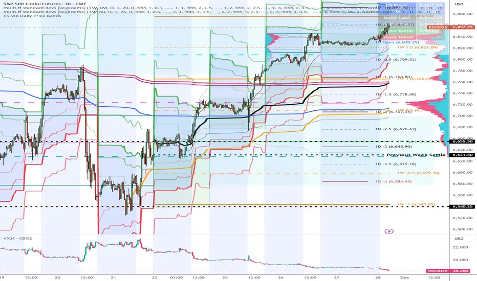
ES-VIX Daily Price Bands - Inner and OuterES-VIX Daily Price Bands
This indicator plots dynamic intraday price bands for ES futures based on real-time volatility levels measured by the VIX (CBOE Volatility Index). The bands evolve throughout the trading day, providing volatility-adjusted price targets.
Formulas:
Upper Band = Daily Low + (ES Price × VIX ÷ √252 ÷ 100)
Lower Band = Daily High - (ES Price × VIX ÷ √252 ÷ 100)
The calculation uses the square root of 252 (trading days per year) to convert annualized VIX volatility into an expected daily move, then scales it as a percentage adjustment from the current day's extremes.
Features:
Real-time band calculation that updates throughout the trading session
Upper band (green) extends from the current day's low
Lower band (red) contracts from the current day's high
Inner upper band (green) at 50% of expected move
Inner lower band (red) at 50% of expected move
Middle Inner upper band (green) at 80% of expected move
Middle Inner lower band (red) at 80% of expected move
Outer upper band (green) at 150% of expected move
Outer lower band (red) at 150% of expected move
Shaded zone between bands for visual clarity
Information table displaying:
Current ES price and VIX level
Running daily high and low
Current upper and lower band values
MFM - Light Context HUD (Free)Overview
MFM Light Context HUD is the free version of the Market Framework Model. It gives you a fast and clean view of the current market regime and phase without signals or chart noise. The HUD shows whether the asset is in a bullish or bearish environment and whether it is in a volatile, compression, drift, or neutral phase. This helps you read structure at a glance.
Asset availability
The free version works only on a selected list of five assets.
Supported symbols are
SP:SPX
TVC:GOLD
BINANCE:BTCUSD
BINANCE:ETHUSDT
OANDA:EURUSD
All other assets show a context banner only.
How it works
The free version uses fixed settings based on the original MFM model. It calculates the regime using a higher timeframe RSI ratio and identifies the current phase using simplified momentum conditions. The chart stays clean. Only a small HUD appears in the top corner. Full visual phases, ratio logic, signals, and auto tune are part of the paid version.
The free version shows the phase name only. It does not display colored phase zones on the chart.
Phase meaning
The Market Framework Model uses four structural phases to describe how the market behaves. These are not signals but context layers that show the underlying environment.
Volatile (Phase 1)
The market is in a fast, unstable or directional environment. Price can move aggressively with stronger momentum swings.
Compression (Phase 2)
The market is in a contracting state. Momentum slows and volatility decreases. This phase often appears before expansion, but it does not predict direction.
Drift (Phase 3)
The market moves in a more controlled, persistent manner. Trends are cleaner and volatility is lower compared to volatile phases.
No phase
No clear structural condition is active.
These phases describe market structure, not trade entries. They help you understand the conditions you are trading in.
Cross asset context
The Market Framework Model reads markets as a multi layer system. The full version includes cross asset analysis to show whether the asset is acting as a leader or lagger relative to its benchmark. The free version uses the same internal benchmark logic for regime detection but does not display the cross asset layer on the chart.
Cross asset structure is a core part of the MFM model and is fully available in the paid version.
Included in this free version
Higher timeframe regime
Current phase name
Clean chart output
Context only
Works on a selected set of assets
Not included
No forecast signals
No ratio leader or lagger logic
No MRM zones
No MPF timing
No auto tune
The full version contains all features of the complete MFM model.
Full version
You can find the full indicator here:
payhip.com
More information
Model details and documentation:
mfm.inratios.com
Disclaimer
The Market Framework Model (MFM) and all related materials are provided for educational and informational purposes only. Nothing in this publication, the indicator, or any associated charts should be interpreted as financial advice, investment recommendations, or trading signals. All examples, visualizations, and backtests are illustrative and based on historical data. They do not guarantee or imply any future performance. Financial markets involve risk, including the potential loss of capital, and users remain fully responsible for their own decisions. The author and Inratios© make no representations or warranties regarding the accuracy, completeness, or reliability of the information provided. MFM describes structural market context only and should not be used as the sole basis for trading or investment actions.
By using the MFM indicator or any related insights, you agree to these terms.
© 2025 Inratios. Market Framework Model (MFM) is protected via i-Depot (BOIP) – Ref. 155670. No financial advice.

2t's MA 50, MA 150, ATRThis indicator displays three key technical signals on the chart:
SMA 50 – Short-term trend direction
SMA 150 – Medium-term trend direction
ATR – Market volatility (Average True Range)
Line colors and lengths can be customized in the settings.
The ATR is plotted on the same chart for quick volatility reference without needing a separate panel.
This tool is designed for traders who want a clean, lightweight view of trend strength and volatility in a single indicator.

@Unwind Pressure Detector - AUDITED v3.0SQUEEZE → UNWIND PRESSURE DETECTOR v3.0
The first indicator that not only finds oversold squeezes… but tells you exactly when the move is exhausting and it’s time to take profits.
Fully audited, clean Pine Script v6, zero repainting, zero lag tricks.
WHAT IT DOES
• Detects high-probability squeeze setups (RSI + Volume + VIX + Trend confluence)
• Scores pressure from 0–115 with dynamic sensitivity (Low to Extreme)
• Identifies CRITICAL zones where explosive moves are most likely
• Most importantly → flags the UNWIND when trapped shorts are finally covering and the rally is running out of fuel (perfect profit-taking signal)
FEATURES
• Real-time pressure dashboard (top-right)
• Color-coded background zones (Critical = red, High = orange)
• Smart anti-spam labels with ATR offset
• Three alert conditions:
→ Squeeze Setup
→ Critical Squeeze
→ Unwind / Take Profit
• Works on all markets & timeframes (stocks, forex, crypto, futures)
WHY THIS VERSION IS DIFFERENT
- v3.0 completely rewrote the unwind logic (now requires rally + sharp pressure drop)
- No false unwinds during strong trends
- Built for real trading, not just pretty screenshots
100% Open Source • Fully commented • Free to modify & rep, I want this in the public library forever.
Created with love for the TradingView community
Drop a ♥ and follow if you find it useful!
#squeeze #ttmsqueeze #unwind #volatility #vix #takeprofits #smartmoney

ES-VIX Daily Price Bands - Inner bands (80% and 50%)ES-VIX Daily Price Bands
This indicator plots dynamic intraday price bands for ES futures based on real-time volatility levels measured by the VIX (CBOE Volatility Index). The bands evolve throughout the trading day, providing volatility-adjusted price targets.
Formulas:
Upper Band = Daily Low + (ES Price × VIX ÷ √252 ÷ 100)
Lower Band = Daily High - (ES Price × VIX ÷ √252 ÷ 100)
The calculation uses the square root of 252 (trading days per year) to convert annualized VIX volatility into an expected daily move, then scales it as a percentage adjustment from the current day's extremes.
Features:
Real-time band calculation that updates throughout the trading session
Upper band (green) extends from the current day's low
Lower band (red) contracts from the current day's high
Inner upper band (green) at 50% of expected move
Inner lower band (red) at 50% of expected move
Middle Inner upper band (green) at 80% of expected move
Middle Inner lower band (red) at 80% of expected move
Shaded zone between bands for visual clarity
Information table displaying:
Current ES price and VIX level
Running daily high and low
Current upper and lower band values

ES-VIX Daily Price Bands - Inner bandsES-VIX Daily Price Bands
This indicator plots dynamic intraday price bands for ES futures based on real-time volatility levels measured by the VIX (CBOE Volatility Index). The bands evolve throughout the trading day, providing volatility-adjusted price targets.
Formulas:
Upper Band = Daily Low + (ES Price × VIX ÷ √252 ÷ 100)
Lower Band = Daily High - (ES Price × VIX ÷ √252 ÷ 100)
The calculation uses the square root of 252 (trading days per year) to convert annualized VIX volatility into an expected daily move, then scales it as a percentage adjustment from the current day's extremes.
Features:
Real-time band calculation that updates throughout the trading session
Upper band (green) extends from the current day's low
Lower band (red) contracts from the current day's high
Inner upper band (green) at 50% of expected move
Inner lower band (red) at 50% of expected move
Shaded zone between bands for visual clarity
Information table displaying:
Current ES price and VIX level
Running daily high and low
Current upper and lower band values

ES-VIX Daily Price BandsES-VIX Daily Price Bands
This indicator plots dynamic intraday price bands for ES futures based on real-time volatility levels measured by the VIX (CBOE Volatility Index). The bands evolve throughout the trading day, providing volatility-adjusted price targets.
Formulas:
Upper Band = Daily Low + (ES Price × VIX ÷ √252 ÷ 100)
Lower Band = Daily High - (ES Price × VIX ÷ √252 ÷ 100)
The calculation uses the square root of 252 (trading days per year) to convert annualized VIX volatility into an expected daily move, then scales it as a percentage adjustment from the current day's extremes.
Features:
Real-time band calculation that updates throughout the trading session
Upper band (green) extends from the current day's low
Lower band (red) contracts from the current day's high
Shaded zone between bands for visual clarity
Information table displaying:
Current ES price and VIX level
Running daily high and low
Current upper and lower band values

@Complete Squeeze Cycle Detector v2.0 FINALDescription:
The Complete Squeeze Cycle Detector identifies and tracks the full lifecycle of squeeze formations, from pre-squeeze consolidation through active squeeze periods to squeeze completion. The indicator systematically detects the characteristic conditions that precede and accompany squeeze events.
The indicator monitors multiple factors associated with squeeze development including:
• Volatility compression relative to recent volume activity
• Elevated market stress conditions as measured by VIX levels
• Momentum compression through rate of change measurements across multiple time periods
• Alignment of multiple exponential moving averages indicating consolidation
The squeeze cycle is classified into three distinct phases: Pre-Squeeze Setup, Active Squeeze, and Squeeze Complete. Each phase is identified based on threshold levels of multiple compression metrics, with adjustable sensitivity settings to control the strictness of detection.
The indicator provides visual identification of each phase through labels, background coloring, and an optional dashboard, allowing users to distinguish between the preparation phase where volatility contracts, the active squeeze phase where compression reaches critical levels, and the completion phase where the squeeze releases and directional movement resumes.
This systematic approach enables users to identify squeeze formations throughout their complete development cycle rather than focusing only on the breakout phase.

Santhosh Zero lag Trend change AlertThis indicator alert whenever these is a change in trend direction. Change input to match with your Asset/Index. This works well in all time frame, I recommend this for Scalping and Position trading

ES-VIX Expected Daily MoveThis indicator calculates the expected daily price movement for ES futures based on current volatility levels as measured by the VIX (CBOE Volatility Index).
Formula:
Expected Daily Move = (ES Price × VIX Price) / √252 / 100
The calculation converts the annualized VIX volatility into an expected daily move by dividing by the square root of 252 (the approximate number of trading days per year).
Features:
Real-time calculation using current ES futures price and VIX level
Histogram visualization in a separate pane for easy trend analysis
Information table displaying:
Current ES futures price
Current VIX level
Expected daily move in points
Expected daily move as a percentage

Elite Energy Alpha MatrixThe Elite Energy Alpha Matrix indicator provides comprehensive analysis of the energy sector, focusing on the complex relationships between crude oil benchmarks, natural gas, energy-related ETFs, and the performance dynamics across various energy sub-sectors.
The indicator tracks multiple energy price data sources including WTI crude oil, Brent crude, natural gas, and oil ETFs, enabling detailed monitoring of price relationships and divergences within the energy complex.
Key analytical components include:
• Correlation analysis between major energy benchmarks
• Multi-timeframe examination of energy price relationships
• Sector rotation detection within energy sub-sectors including integrated oil majors, exploration and production companies, oilfield services, refiners, pipelines, and renewable energy
• Performance monitoring across different energy market segments
The indicator provides a structured framework for analyzing the internal dynamics of the energy sector, identifying periods of alignment or divergence between different energy price instruments, and monitoring relative performance across energy sub-sectors.
This approach enables users to assess the consistency of price movements across the energy complex and identify situations where different components of the energy market are exhibiting divergent behavior, which can provide insight into the underlying drivers affecting the sector.2.6s

Z-EMA Fusion BandsDesigned with crypto markets in mind, particularly Bitcoin , it builds on the concept that the 1-Week 50 EMA often serves as a long-term bull/bear market threshold — an area where institutional bias, momentum shifts, and cyclical rotations tend to occur.
🔹 Core Components & Synergies:
1. 1W 50 EMA (Higher Timeframe)
- This EMA is calculated on a weekly timeframe, regardless of your current chart.
- In crypto, price above the 1W 50 EMA typically aligns with long-term bull market phases, while extended periods below can signify bearish macro structure.
- The slope of the EMA is also analyzed to add directional confidence to trend strength.
2. ±1 Standard Deviation Bands
- Surrounding the 50 EMA, these bands visualize normal price dispersion relative to trend.
- When price consistently hugs or breaks outside these bands, it often reflects market expansion, volatility events, or mean-reversion opportunity.
3. Z-Score Gradient Fill
- The area between the bands is filled using a Z-score-based gradient, which dynamically adjusts color based on how far price is from the EMA (in terms of standard deviations).
- Color shifts from aqua (near EMA) to fuchsia (far from EMA) help you spot price compression, equilibrium, or overextension at a glance.
- The fill also uses transparency scaling, making it fade as price stretches further, emphasizing the core structure.
4. Directional EMA Coloring
- The EMA line itself is colored based on:
- The slope of the EMA (rising/falling)
- Whether the HTF candle is bullish or bearish
- This provides intuitive color-coded confirmation of momentum alignment or potential exhaustion.
5. Price/EMA Divergence Detection
- The script detects bullish and bearish divergence between price and the EMA (rather than using a traditional oscillator).
- Bullish Divergence: Price makes a lower low, EMA makes a higher low.
- Bearish Divergence: Price makes a higher high, EMA makes a lower high.
- These signals often mark transitional zones where momentum fades before a trend reversal or correction.
📊 Suggested Uses:
🔸 Swing and Position Trading:
- Use the 1W 50 EMA as a macro-trend anchor.
- Stay long-biased when price is above with positive slope, and short-biased when below.
- Consider entries near band edges for mean-reversion plays, especially if confluence forms with divergence signals.
🔸 Volatility-Based Filtering:
- Use the Z-score fill to identify volatility compression (near EMA) or expansion (edge of bands).
- Combine this with breakout strategies or dynamic position sizing.
🔸 Divergence Confirmation:
- Combine divergence markers with HTF EMA slope for high-probability setups.
- Bullish div + EMA flattening/rising can signal the start of accumulation after a macro dip.
🔸 Multi-Timeframe Analysis:
- Works well as a structural overlay on intraday charts (1H, 4H, 1D).
- Use this indicator to track long-term bias while executing lower timeframe trades.
⚠️ Disclaimer:
This indicator is designed for educational and informational purposes only. It does not constitute financial advice or a recommendation to buy or sell any asset.
Always use proper risk management, and combine with your own analysis, tools, and strategy. Performance in past market conditions does not guarantee future results.

Simple Price ChannelSimple Price Channel
This indicator plots a basic volatility-based channel around a moving average.
Features:
Midline using Simple Moving Average (SMA)
Upper & lower bands using ATR or true range
Channel fill for easy trend visualisation
This script is designed for educational and analytical purposes only.
It does not provide signals, alerts, or financial advice.

Bollinger Bands with ATR SL Hariss 369Bollinger Bands are a popular technical analysis tool developed by John Bollinger. They consist of three lines plotted on a price chart:
Middle Band – a simple moving average (usually 20 periods).
Upper Band – the middle band plus two standard deviations.
Lower Band – the middle band minus two standard deviations.
Key Features:
Volatility Indicator: The bands expand when volatility increases and contract when volatility decreases.
Trend Analysis: Prices near the upper band indicate overbought conditions, while prices near the lower band indicate oversold conditions.
Trading Signals: Traders often look for price touches, breaks, or rebounds from the bands to identify potential entries or exits.
To strengthen the trend quality RVOL has been considered. The ideal value of RVOL is 1.5
Higher Time Frame Trend filter gives trend clarity in higher time frame. One can select RVOL and HTF (Higher Time Frame) filter.
Bollinger bands indicator is basically a trend following indicator. We should go with the trend rather book profit @1:1 or 1:2 basis. In that case we might miss the long trend. The middle band is generally considered as stop loss. However, ATR based stop loss has been designed in the script in order to capture the volatility in decent way.
Break out signal is initiated on break out with volume taking higher time frame into consideration.
One can use this indicator in any time frame and any class of asset. To filter higher time frame eg. entry / exit 5 min chart, 15m/1h can be taken as higher time frame, for 1h entry/ exit, 4h can be taken as higher time frame trend filter.

APEX TREND: Macro & Hard Stop SystemAPEX TREND: Macro & Hard Stop System
The APEX TREND System is a composite trend-following strategy engineered to solve the "Whipsaw" problem inherent in standard breakout systems. It orchestrates four distinct technical theories—Macro Trend Filtering, Volatility Squeeze, Momentum, and Volatility Stop-Loss—into a single, hierarchical decision-making engine.
This script is not merely a collection of indicators; it is a rules-based trading system designed for Swing Traders (Day/Week timeframes) who aim to capture major trend extensions while strictly managing downside risk through a "Hard Stop" mechanism.
🧠 Underlying Concepts & Originality
Many trend indicators fail because they treat all price movements equally. The APEX TREND differentiates itself by applying an "Institutional Filter" logic derived from classic Dow Theory and Modern Volatility Analysis.
1. The Macro Hard Stop (The 200 EMA Logic)
Origin: Based on the institutional mandate that “Nothing good happens below the 200-day moving average.”
Function: Unlike standard super trends that flip constantly in sideways markets, this system integrates a 200-period Exponential Moving Average (EMA) as a non-negotiable "Hard Stop."
Synergy: This acts as the primary gatekeeper. Even if the volatility engine signals a "Buy," the system suppresses the signal if the price is below the Macro Baseline, effectively filtering out counter-trend traps.
2. The Volatility Engine (Squeeze Theory)
Origin: Derived from John Carter’s TTM Squeeze concept.
Function: The script identifies periods where Bollinger Bands (Standard Deviation) contract inside Keltner Channels (ATR). This indicates a period of potential energy build-up.
Synergy: The system only triggers an entry when this energy is released (Breakout) AND coincides with Linear Regression Momentum, ensuring the breakout is genuine.
3. Anti-Chop Filter (ADX Integration)
Origin: J. Welles Wilder’s Directional Movement Theory.
Function: A common failure point for trend systems is low-volatility chop. This script utilizes the Average Directional Index (ADX).
Synergy: If the ADX is below the threshold (Default: 20), the market is deemed "Choppy." The script visually represents this by painting candles GRAY, signaling a "No-Trade Zone" regardless of price action.
4. The "Run Trend" Stop Loss (Factor 4.0 ATR)
Origin: Adapted from the Turtle Trading rules regarding volatility-based stops.
Function: Standard Trailing Stops (usually Factor 3.0) are too tight for crypto or volatile equities on daily timeframes.
Optimization: This system employs a wider ATR Multiplier of 4.0. This allows the asset to fluctuate naturally within a trend without triggering a premature exit, maximizing the "Run Trend" potential.
🛠 How It Works (The Algorithm)
The script processes data in a specific order to generate a signal:
Check Macro Trend: Is Price > EMA 200? (If No, Longs are disabled).
Check Volatility: Is ADX > 20? (If No, all signals are disabled).
Check Volume: Is Current Volume > 1.2x Average Volume? (Confirmation of institutional participation).
Trigger: Has a Volatility Breakout occurred in the direction of the Macro Trend?
Execution: If ALL above are true -> Generate Signal.
🎯 Strategy Guide
1. Long Setup (Bullish)
Signal: Look for the Green "APEX LONG" Label.
Condition: The price must be ABOVE the White Line (EMA 200).
Execution: Enter at the close of the signal candle.
Stop Loss: Initial stop at the Green Trailing Line.
2. Short Setup (Bearish)
Signal: Look for the Red "APEX SHORT" Label.
Condition: The price must be BELOW the White Line (EMA 200).
Execution: Enter at the close of the signal candle.
Stop Loss: Initial stop at the Red Trailing Line.
3. Exit Rules (Crucial)
This system employs a Dual-Exit Mechanism:
Soft Exit (Profit Taking): Close the position if the price crosses the Trailing Stop Line (Green/Red line). This locks in profits during a trend reversal.
Hard Exit (Emergency): Close the position IMMEDIATELY if the price crosses the White EMA 200 Line against your trade. This prevents holding a position during a major market regime change.
⚙️ Settings
Momentum Engine: Adjust Bollinger Band/Keltner Channel lengths to tune breakout sensitivity.
Apex Filters: Toggle the EMA 200 or ADX filters on/off to adapt to different asset classes.
Risk Management: The ATR Multiplier (Default 4.0) controls the width of the trailing stop. Lower values = Tighter stops (Scalping); Higher values = Looser stops (Swing).
Disclaimer: This script is designed for trend-following on higher timeframes (4H, 1D, 1W). Please backtest on your specific asset before live trading.

ADR / $Volume DashboardSee 5 / 20 days ADR / Volume and price %age from low of day on top of the chart
