Volume Weighted LR Standard DeviationThis indicator analyzes market character by decomposing total volatility into three distinct, interpretable components based on a Linear Regression model.
Key Features:
Three-Component Volatility Decomposition: The indicator separates volatility based on the 'Estimate Bar Statistics' option.
Standard Mode (Estimate Bar Statistics = OFF): Calculates volatility based on the selected Source (dies führt hauptsächlich zu 'Trend'- und 'Residual'-Volatilität).
Decomposition Mode (Estimate Bar Statistics = ON): The indicator uses a statistical model ('Estimator') to calculate within-bar volatility. (Assumption: In this mode, the Source input is ignored, and an estimated mean for each bar is used instead). This separates volatility into:
Trend Volatility (Green/Red): Volatility explained by the regression's slope (Momentum).
Residual Volatility (Yellow): Volatility from price oscillating around the regression line (Mean-Reversion).
Within-Bar Volatility (Blue): Volatility from the high-low range of each bar (Noise/Choppiness).
Dual Display Modes: The indicator offers two modes to visualize this decomposition:
Absolute Mode: Displays the total standard deviation as a stacked area chart, partitioned by the variance ratio of the three components.
Normalized Mode: Displays the direct variance ratio (proportion) of each component relative to the total (0-1), ideal for identifying the dominant market character.
Calculation Options:
Normalization: An optional 'Normalize Volatility' setting calculates an Exponential Regression Curve (log-space), making the analysis suitable for growth assets.
Volume Weighting: An option (Volume weighted) applies volume weighting to all regression and volatility calculations.
Multi-Component Pivot Detection: Includes a pivot detector that identifies significant turning points (highs and lows) in both the Total Volatility and the Trend Volatility Ratio. (Note: These pivots are only plotted when 'Plot Mode' is set to 'Absolute').
Note on Confirmation (Lag): Pivot signals are confirmed using a lookback method. A pivot is only plotted after the Pivot Right Bars input has passed, which introduces an inherent lag.
Multi-Timeframe (MTF) Capability:
MTF Volatility Lines: The volatility lines can be calculated on a higher timeframe, with standard options to handle gaps (Fill Gaps) and prevent repainting (Wait for...).
Limitation: The Pivot detection (Calculate Pivots) is disabled if a Higher Timeframe (HTF) is selected.
Integrated Alerts: Includes 9 comprehensive alerts for:
Volatility character changes (e.g., 'Character Change from Noise to Trend').
Dominant character emerging (e.g., 'Bullish Trend Character Emerging').
Total Volatility pivot (High/Low) detection.
Trend Volatility pivot (High/Low) detection.
DISCLAIMER
For Informational/Educational Use Only: This indicator is provided for informational and educational purposes only. It does not constitute financial, investment, or trading advice, nor is it a recommendation to buy or sell any asset.
Use at Your Own Risk: All trading decisions you make based on the information or signals generated by this indicator are made solely at your own risk.
No Guarantee of Performance: Past performance is not an indicator of future results. The author makes no guarantee regarding the accuracy of the signals or future profitability.
No Liability: The author shall not be held liable for any financial losses or damages incurred directly or indirectly from the use of this indicator.
Signals Are Not Recommendations: The alerts and visual signals (e.g., crossovers) generated by this tool are not direct recommendations to buy or sell. They are technical observations for your own analysis and consideration.
Desvio Padrão

Volume Weighted Standard DeviationThis indicator calculates the Standard Deviation and decomposes total volatility into its core components, allowing to analyze the underlying character of the market.
Key Features:
Volatility Decomposition: The indicator separates volatility based on the 'Estimate Bar Statistics' option.
Standard Mode (Estimate Bar Statistics = OFF): Calculates a simple (Volume-Weighted) Standard Deviation of the selected Source.
Decomposition Mode (Estimate Bar Statistics = ON): The indicator uses a statistical model ('Estimator') to calculate within-bar volatility (choppiness, noise) and between-bar volatility (trending moves). (Assumption: In this mode, the Source input is ignored, and an estimated mean for each bar is used instead).
Dual Display Modes: The indicator offers two modes to visualize this information:
Absolute Mode: Plots the total standard deviation as a stacked area chart, showing the proportional contribution of the 'Between' and 'Within' components.
Normalized Mode: Plots the direct ratio of each component's variance (from 0 to 1), making it easy to identify which character is dominant.
Calculation Options: The volatility calculation can be optionally Volume weighted. An optional Normalize Volatility setting performs the calculation in logarithmic space, making volatility comparable across different price scales.
Volatility Pivot Detection: Includes a built-in pivot detector that identifies significant turning points (highs and lows) in the total volatility line. (Note: This is only visible in 'Absolute Mode').
Note on Confirmation (Lag): Pivot signals are confirmed using a lookback method. A pivot is only plotted after the Pivot Right Bars input has passed, which introduces an inherent lag.
Multi-Timeframe (MTF) Capability:
MTF Volatility Lines: The volatility lines can be calculated on a higher timeframe, with standard options to handle gaps (Fill Gaps) and prevent repainting (Wait for...).
Limitation: The Pivot detection (Calculate Pivots) is disabled if a Higher Timeframe (HTF) is selected.
Integrated Alerts: Includes 6 alerts for:
Volatility character changes (e.g., 'Trend Character Emerging', 'Character Change from Trend to Choppy').
Volatility pivot (high or low) detection.
DISCLAIMER
For Informational/Educational Use Only: This indicator is provided for informational and educational purposes only. It does not constitute financial, investment, or trading advice, nor is it a recommendation to buy or sell any asset.
Use at Your Own Risk: All trading decisions you make based on the information or signals generated by this indicator are made solely at your own risk.
No Guarantee of Performance: Past performance is not an indicator of future results. The author makes no guarantee regarding the accuracy of the signals or future profitability.
No Liability: The author shall not be held liable for any financial losses or damages incurred directly or indirectly from the use of this indicator.
Signals Are Not Recommendations: The alerts and visual signals (e.g., crossovers) generated by this tool are not direct recommendations to buy or sell. They are technical observations for your own analysis and consideration.

Volatility Cones **Volatility Cones - Interactive**
This indicator visualizes volatility cones based on historical or manual volatility and projects them up to 252 trading days into the future.
**Features:**
- Automatic start at the first trading day of the year (customizable)
- Volatility calculation from historical data or manual input
- Display of ±1σ, ±2σ, and ±3σ bands
- Projection of expected price movements based on volatility
**Use Case:**
Ideal for options traders and risk management to assess expected price movements over different time horizons.

Smart Levels V8 + Anomaly Detection CombinedTATANKA Smart Levels + Anomaly Detection
A comprehensive analysis tool combining manual level tracking with statistical anomaly detection for identifying high-probability trading opportunities.
CORE FEATURES:
Manual Level System:
• Plot custom support/resistance levels with automatic inflection point tracking
• Color-coded bull/bear level visualization with adjustable positioning
• Real-time level crossing alerts with directional confirmation
• Multi-timeframe pivot integration for additional context
Anomaly Detection Engine:
• Identifies statistical deviations from price equilibrium
• Generates scored signals based on multiple confirmation factors
• Visual threshold bands show deviation zones
• Horizontal projection lines from anomaly points until broken or session end
Session Management:
• RTH/OVN session filtering with multiple timezone support
• Enhanced scoring during key market hours (opening hour, power hour)
• Option to block signals outside regular trading hours
• Session-specific visual backgrounds for clarity
Signal Intelligence:
• Automated confluence scoring combining price action, volume, and momentum
• Multiple signal types: bounces, breakouts, reversals, exhaustion patterns
• RSI and ADX integration for regime awareness
• Customizable cooldown periods to reduce signal noise
• Quality thresholds to filter low-probability setups
Market Bias Panel:
• Real-time display of current market sentiment
• Shows distance to key levels and signal readiness
• Configurable positioning and visibility options
Visual Customization:
• Adjustable signal sizes, colors, and transparency
• Optional large circles for high-quality setups
• Directional arrows and score labels
• Clean interface with minimal chart clutter
BEST PRACTICES:
• Recommended for 1m-15m timeframes on liquid futures/forex markets
• Paste your key levels at session start or when levels update
• Adjust sensitivity based on asset volatility (lower multipliers = more signals)
• Use signals as reference points within your overall trading plan
• Combine with additional confirmation from order flow or other tools
IMPORTANT NOTES:
• This is an indicator, not an automated strategy
• Signals represent potential opportunities requiring discretionary analysis
• Past performance does not guarantee future results
• Adjust parameters through backtesting on your specific instruments
Statistical Price Deviation Index (MAD/VWMA)SPDI is a statistical oscillator designed to detect potential price reversal zones by measuring how far price deviates from its typical behavior within a defined rolling window.
Instead of using momentum or moving averages like traditional indicators, SPDI applies robust statistics - a rolling median and Mean Absolute Deviation (MAD) - to calculate a normalized measure of price displacement. This normalization keeps the output bounded (from −1 to +1 by default), producing a stable and consistent oscillator that adapts to changing volatility conditions.
The second line in SPDI uses a Volume-Weighted Moving Average (VWMA) instead of a simple price median. This creates a complementary oscillator showing statistically weighted deviations based on traded volume. When both oscillators align in their extremes, strong confluence reversal signals are generated.
How It Works
For each bar, SPDI calculates the median price of the last N bars (default 100).
It then measures how far the current bar’s midpoint deviates from that rolling median.
The Mean Absolute Deviation (MAD) of those distances defines a “normal” range of fluctuation.
The deviation is normalized and compressed via a tanh mapping, keeping the oscillator in fixed boundaries (−1 to +1).
The same logic is applied to the VWMA line to gauge volume-weighted deviations.
How to Use
The blue line (Price MAD) represents pure price deviation.
The green line (VWMA Disp) shows the volume-weighted deviation.
Overbought (red) zones indicate statistically extreme upward deviation -> potential short-term overextension.
Oversold (green) zones indicate statistically extreme downward deviation -> potential rebound area.
Confluence signals (both lines hitting the same extreme) often mark strong reversal points.
Settings Tips
Lookback length controls how much historical data defines “normal” behavior. Larger = smoother, smaller = more sensitive.
Smoothing (RMA length) can reduce noise without changing the overall statistical logic.
Output scale can be set to either −1..+1 or 0..100, depending on your visual preference.
Alerts and color fills are fully customizable in the Style tab.
Summary:
SPDI transforms raw price and volume data into a statistically bounded deviation index. When both Price MAD and VWMA Disp reach joint extremes, it highlights probable market turning points - offering traders a clean, data-driven way to spot potential reversals ahead of time.

TBR Pro+marks session ranges and standard deviation levels to help you calculate where price could go next. You could also use it to top and bottom tick entries for indicies and CFDs!
Double Median SD Bands | MisinkoMasterThe Double Median SD Bands (DMSDB) is a trend-following tool designed to capture market direction in a way that balances responsiveness and smoothness, filtering out excessive noise without introducing heavy lag.
Think of it like a house:
A jail (too restrictive) makes you miss opportunities.
No house at all (too unsafe) leaves you exposed to false signals.
DMSDB acts like a comfortable house with windows—protecting you from the noise while still letting you see what’s happening in the market.
🔎 Methodology
The script works in the following steps:
Standard Deviation (SD) Calculation
Computes the standard deviation of the selected price source (ohlc4 by default).
The user can choose whether to use biased (sample) or unbiased (population) standard deviation.
Raw Bands Construction
Upper Band = source + (SD × multiplier)
Lower Band = source - (SD × multiplier)
The multiplier can be adjusted for tighter or looser bands.
First Median Smoothing
Applies a median filter over half of the length (len/2) to both bands.
This reduces noise without creating excessive lag.
Second Median Smoothing
Applies another median filter over √len to the already smoothed bands.
This produces a balance:
Cutting the length → maintains responsiveness.
Median smoothing → reduces whipsaws.
The combination creates a fast yet clean band system ideal for trend detection.
📈 Trend Logic
The trend is detected based on price crossing the smoothed bands:
Long / Bullish (Purple) → when price crosses above the upper band.
Short / Bearish (Gold) → when price crosses below the lower band.
Neutral → when price remains between the bands.
🎨 Visualization
Upper and lower bands are plotted as colored lines.
The area between the bands is filled with a transparent zone that reflects the current bias:
Purple shading = Bullish zone.
Golden shading = Bearish zone.
This creates a visual tunnel for trend confirmation, helping traders quickly identify whether price action is trending or consolidating.
⚡ Features
Adjustable Length parameter (len) for dynamic control.
Adjustable Band Multiplier for volatility adaptation.
Choice between biased vs. unbiased standard deviation.
Double median smoothing for clarity + responsiveness.
Works well on cryptocurrencies (e.g., BTCUSD) but is flexible enough for stocks, forex, and indices.
✅ Use Cases
Trend Following → Ride trends by staying on the correct side of the bands.
Entry Timing → Use crossovers above/below bands for entry triggers.
Filter for Other Strategies → Can serve as a directional filter to avoid trading against the trend.
⚠️ Limitations & Notes
This is a trend-following tool, so it will perform best in trending conditions.
In sideways or choppy markets, whipsaws may still occur (although smoothing reduces them significantly).
The indicator is not a standalone buy/sell system. For best results, combine with volume, momentum, or higher-timeframe confluence.
All of this makes for a really unique & original tool, as it removes noise but keeps good responsitivity, using methods from many different principles which make for a smooth a very useful tool

Auto Hourly Deviations {Module+}Description
This indicator automatically calculates and visualizes the prior hour’s price structure and its deviation levels. By combining core reference lines (high, low, EQ, quarters, open) with dynamic deviation levels and shaded zones, it provides a framework for understanding intraday price behavior relative to the most recent hourly range.
The tool has three functional sections that work together:
Core Hourly Structure – Captures the prior hour’s high, low, EQ (50%), and quarter levels (25% and 75%), plus the current open.
Deviation Levels – Projects standardized deviation multiples (±0.33, ±0.5, ±0.66, ±1.0, ±1.33, ±1.66, ±2.0) above and below the prior hour’s range.
Shading & Anchoring – Fills zones between key deviation levels for visual emphasis, while allowing projection offsets and anchor line references for precise chart alignment.
Together, these layers give traders a structured map of price movement around hourly ranges, making it easier to track expansion, retracement, and trend continuation.
1. Core Hourly Structure
Plots the prior hour’s high and low as key reference points.
Automatically calculates EQ (midpoint), 25%, and 75% levels.
Tracks the open of the current hour for immediate orientation.
Optional anchor line marks the start of each hourly window for time alignment.
Use: Frames the “hourly box” and subdivides it for intraday structure analysis.
2. Deviation Levels
Uses the prior hour’s range as a baseline.
Projects deviation levels above and below: ±0.33, ±0.5, ±0.66, ±1.0, ±1.33, ±1.66, and ±2.0.
Each level can be individually toggled with full line/label styling.
Use: Quantifies how far price is moving relative to the last hour’s volatility — useful for spotting overextensions, retraces, and probable reaction zones.
3. Shading & Anchoring
Shaded zones between selected deviation bands (e.g., +0.33 to +0.66 or +1.33 to +1.66) highlight potential liquidity or reaction areas.
Projection offsets allow levels to extend forward into future bars for planning.
Labels and color controls make the chart highly customizable.
Use: Provides quick visual cues for potential trading ranges and deviations without clutter.
Intended Use
This is a visualization tool, not a buy/sell system. Traders can use it to:
Track how price interacts with the prior hour’s high/low.
Measure hourly expansion through deviation levels.
Spot retracements or continuation zones inside and beyond the prior hour’s range.
Limitations & Disclaimers
Levels are derived from completed hourly candles; they do not predict outcomes.
Deviations are static calculations and do not account for fundamentals or volatility shifts.
This indicator does not provide financial advice or trading signals.
For informational and educational purposes only.
Trading involves risk; always apply proper risk management.
Closed-source (Protected): Logic is accessible on charts, but the source code is hidden. A TradingView paid plan is required for protected indicators.

Implied Volatility RangeThe Implied Volatility Range is a forward-looking tool that transforms option market data into probability ranges for future prices. Based on the lognormal distribution of asset prices assumed in modern option pricing models, it converts the implied volatility curve into a volatility cone with dynamic labels that show the market’s expectations for the price distribution at a specific point in time. At the selected future date, it displays projected price levels and their percentage change from today’s close across 1, 2, and 3 standard deviation (σ) ranges:
1σ range = ~68.2% probability the price will remain within this range.
2σ range = ~95.4% probability the price will remain within this range.
3σ range = ~99.7% probability the price will remain within this range.
What makes this indicator especially useful is its ability to incorporate implied volatility skew. When only ATM IV (%) is entered, the indicator displays the standard Black–Scholes lognormal distribution. By adding High IV (%) and Low IV (%) values tied to strikes above and below the current price, the indicator interpolates between these inputs to approximate the implied volatility skew. This adjustment produces a market-implied probability distribution that indicates whether the option market is leaning bullish or bearish, based on the data entered in the menu:
ATM IV (%) = Implied volatility at the current spot price (at-the-money).
High IV (%) = Implied volatility at a strike above the current spot price.
High Strike = Strike price corresponding to the High IV input (OTM call).
Low IV (%) = Implied volatility at a strike below the current spot price.
Low Strike = Strike price corresponding to the Low IV input (OTM put).
Expiration (Day, Month, Year) = Option expiration date for the projection.
Once these inputs are entered, the indicator calculates implied probability ranges and, if both High IV and Low IV values are provided, adjusts for skew to approximate the option market’s distribution. If no implied volatility data is supplied, the indicator defaults to a lognormal distribution based on historical volatility, using past realized volatility over the same forward horizon. This keeps the tool functional even without implied volatility inputs, though in that case the output represents only an approximation of ATM IV, not the actual market view.
In summary, the Implied Volatility Range is a powerful tool that translates implied volatility inputs into a clear and practical estimate of the market’s expectations for future prices. It allows traders to visualize the probability of price ranges while also highlighting directional bias, a dimension often difficult to interpret from traditional implied volatility charts. It should be emphasized, however, that this tool reflects only the market’s expectations at a specific point in time, which may change as new information and trading activity reshape implied volatility.

CISD SDICT CISD SD – Manipulation Swing Standard Deviations for Change in State of Delivery
Overview:
The ICT CISD SD indicator is a professional ICT tool designed to define the Manipulation Swing and automatically plot its Standard Deviation levels. Focused on intraday ICT analysis, this script dynamically updates toward the current bar, giving traders precise visual guidance on key swing levels and projected targets.
Key Features:
Define ICT Manipulation Swing:
Set the start and end time to define the Manipulation Swing.
Choose your timezone for accurate ICT intraday tracking.
Automatically calculates the High, Low, and optional Equilibrium (EQ) level of the Manipulation Swing.
Dynamic ICT Manipulation Lines:
Plots High, Low, and optional EQ lines of the Manipulation Swing.
Lines update dynamically with each new bar.
Fully customizable line color, style (solid, dashed, dotted), and width.
Labels feature configurable text color, background color, transparency, size, and placement.
Optional left-side trimming keeps charts clean and readable.
Manipulation Swing Standard Deviation Levels:
Automatically plots Standard Deviation levels as multipliers of the Manipulation Swing range (0.5x to 4.5x by default).
Levels can be plotted up from the swing low or down from the swing high, giving probabilistic target areas or key support/resistance zones.
Customizable line and label styling for all Standard Deviation levels, including color, transparency, width, style, and size.
Optional Shading for Visual Clarity:
Shade areas between the Manipulation Swing and a chosen Standard Deviation level for easy visualization.
Customizable shading color and opacity.
Professional ICT Usability:
Designed for clarity and minimal chart clutter.
Stick labels to the right of the current bar for maximum readability.
Dynamically adjusts with new bars, keeping all Manipulation Swing lines and Standard Deviation levels up-to-date.
Ideal For:
ICT intraday traders analyzing Manipulation Swings for Change in State of Delivery.
Traders seeking visual Standard Deviation levels for breakout, reversal, or continuation strategies.
Analysts who want clean, professional charts with full control over Manipulation Swing and Standard Deviation visualization.
How It Works:
User defines the ICT Manipulation Swing time to identify the swing.
The script calculates the High, Low, and optional EQ of the swing.
Swing lines are drawn and dynamically updated.
Standard Deviation levels are plotted based on user-defined multipliers.
Optional shading can highlight areas from the Manipulation Swing to selected Standard Deviation levels.
Customization Options Include:
ICT Manipulation Swing time and timezone.
Line and label styling for Manipulation Swing and Standard Deviation levels.
Left-side trimming to reduce chart clutter.
Enable/disable EQ line, Standard Deviation levels, and shading.
Direction of Standard Deviation levels (up from low or down from high).
Multipliers and shading transparency for professional ICT charting.
Conclusion:
The ICT CISD StdDev indicator offers a complete, professional solution for ICT intraday analysis, allowing traders to define the Manipulation Swing and visualize its Standard Deviation levels dynamically, enhancing precision and clarity in real-time trading.

CandelaCharts - Projections 📝 Overview
Projections turns a hand-picked swing window into clean, forward price levels. You pick a time range and an anchor (wick or body); the tool finds that window’s reference extremes (Level 0 & Level 1) and then projects directional extensions (e.g., −1, −2, −2.5, −4) in the chosen bias (Auto / Bullish / Bearish). It draws flat lines across the chart with optional labels so you can plan targets, fade zones, or continuation levels at a glance.
📦 Features
This section highlights the core capabilities you’ll rely on most.
Window-based engine — Define a start/end time; the script records open/high/low/close inside that window and builds levels from those extremes.
Two anchor styles — Project from Wick extremes (Hi/Lo) or Body extremes (max/min of OHLC at the high/low bars).
Directional bias — Auto (up if net up; doji resolves by wick dominance), or force Bullish/Bearish for one-sided extensions.
Default & Custom levels — Toggle pre-sets (−1/−2/−2.5/−4) or enter your own comma-separated list (decimals supported).
Readable drawings — Per-level colors (defaults) or unified bull/bear color (custom), with label size, line style, and width controls.
⚙️ Settings
Use these controls to define the window, pick the projection style, and customize the visuals.
Settings (Core)
From / To — Start and end timestamps of the capture window (everything is computed from this segment).
Bias — Auto / Bullish / Bearish. Guides which way negative levels extend (up for bull, down for bear).
Anchor — Wick uses Hi/Lo; Body uses the body extremes at the high/low bars.
Levels
Levels = Default — Enable any of −1, −2, −2.5, −4 and set each color.
Levels = Custom — Provide your own list (e.g., “−0.5, −1, −1.5, −3”) and pick Bullish/Bearish colors. (Custom uses one color per side.)
Style
Labels — Show/Hide the numeric level tag at the line’s right edge; choose label size.
Lines — Pick solid/dashed/dotted and line width.
⚡️ Showcase
Bearish Projection
Bullish Projection
📒 Usage
Follow these steps to set the window, generate levels, and turn them into a trade plan.
1) Mark the window — Set From/To around the swing you want to project (e.g., prior day, news impulse, weekly move).
2) Choose bias — Auto adapts; or lock Bullish/Bearish if you only want upside or downside projections.
3) Pick anchor — Wick = raw extremes; Body = more conservative reference. Body helps when single-print wicks distort levels.
4) Select levels — Toggle defaults or add a custom list. Negative values (−1, −2, …) extend beyond the reference extreme in the bias direction. (Level 0 and 1 are always drawn as the reference pair.)
5) Style it — Turn labels on, adjust size, and set line style/width for visibility on your timeframe.
6) Trade plan — Treat projections as reaction/continuation zones: scale out into −1/−2/−2.5, watch for fades back into the band, or ride continuation when price accepts beyond a level.
🚨 Alerts
There are no built-in alerts in this version.
⚠️ Disclaimer
Trading involves significant risk, and many participants may incur losses. The content on this site is not intended as financial advice and should not be interpreted as such. Decisions to buy, sell, hold, or trade securities, commodities, or other financial instruments carry inherent risks and are best made with guidance from qualified financial professionals. Past performance is not indicative of future results.

@M5V | Standard Deviation (Basic) | GCTStandard Deviation (Basic) — Patch Notes
What’s new
• Two custom sessions (A & B) only—no presets.
• Timezone-aware sessions (IANA, e.g., America/New_York, Europe/London).
• Exact width matching: SD lines span exactly from the session’s first bar to its last bar
(same as the box).
• Start/End verticals control: None, Start only, End only, or Both.
• Anchor choice: Build ranges from either Wicks or Bodies.
• Deviation style: Full (1.0× steps) or Half (0.5× steps), with adjustable count.
• Optional Equilibrium (midline).
• Global line style and box visibility toggles.
How it works (under the hood)
1. Session tracking:
• At each session start (based on your Session + Timezone) the script stores the start bar and initializes hi/lo.
• While the session is active, it updates hi/lo using Wicks or Bodies (your choice) and extends the box to the current bar.
• On session end, it records the end bar.
2. Deviation drawing:
• Computes range = high − low.
• Draws symmetric SD bands above/below using your Full/Half setting and count.
• All SD lines are drawn from start bar → end bar so they match the box width exactly.
• If Equilibrium is on, the midline (avg of high/low) is drawn across the same width.
3. Start/End lines:
• According to Start/End Lines setting, verticals are drawn at the start bar, end bar, both, or not at all—each spanning from session low to high.
Quick use
• Pick Session windows for A/B and set each Timezone.
• Choose Wicks or Bodies, Full/Half deviations, Count, Color, and whether to show
Equilibrium and Boxes.
• Set Start/End Lines to control the vertical markers.
• Optional: change Line Style (solid/dotted/dashed).
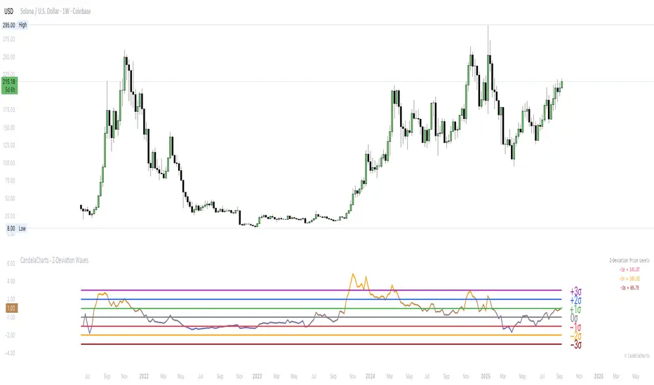
CandelaCharts - Z-Deviation Waves 📝 Overview
Volatility feels chaotic until you anchor it to statistics—then “stretch” and “snap-back” become measurable.
The CandelaCharts – Z-Deviation Waves turns your price source into a rolling Z-score (distance from its mean in standard deviations) and visualizes it as a color-graded wave with optional trend columns and labeled sigma lines. You can label pure σ levels, show the price at σ , or use a fixed “Price @ Z” grid for consistent visuals.
📦 Features
Designed to spotlight statistical extremes and make them tradable.
Rolling Z-score : Mean + stdev over a configurable window, with optional smoothing.
Three label modes :
Z-score (σ) — classic −3σ…+3σ lines/labels.
Price @ σ — converts each σ level into the live price.
Price @ Z — maps Z to a fixed numeric grid for legacy/visual consistency.
Trend columns : Subtle columns behind the wave to show rising vs. falling Z.
Gradient wave : Blue→orange scale tied to Z intensity (−3…+3).
Quick table : Optional on-chart prices for −1σ / −2σ / −3σ.
Polish : Font family/size controls and branding toggle.
⚙️ Settings
Pick your statistical lens, then choose how to display it.
Period : Rolling window for mean & stdev.
Source : Price input (Close by default).
Text Size : Label size for σ lines.
Smoothing (Z) : SMA on Z to calm noise.
Label Mode : Z-score (σ) / Price @ σ / Price @ Z.
Show Trend Columns : Rising/falling backdrop.
Show −2σ/−3σ Table : Quick downside prices (σ mode).
⚡️ Showcase
Mean-reversion extremes : Tag touches beyond ±2σ and subsequent reversions.
Price @ σ ladder : Show live price equivalents for −1σ/−2σ/−3σ as dynamic supports.
Smoothing on/off : Compare Z with smoothing 1 vs. 5 to demonstrate noise control.
📒 Usage
Treat σ as a “stretch gauge,” then layer your entries with structure and risk rules.
Read the tiers :
±1σ — routine fluctuation.
±2σ — statistically significant; watch for exhaustion or follow-through.
±3σ — extreme; look for mean-reversion triggers or parabolic blow-off risk.
Price @ σ for levels : Use −1σ/−2σ as dynamic pullback/mean targets; +1σ/+2σ as potential resistance in downtrends.
Trend columns as timing : Fade extremes only when Z momentum stalls (columns stop rising against you).
Calibrate window : Shorter Period = faster, noisier signals; longer = steadier, fewer extremes.
Confluence : Pair with RSI/MACD divergence or key S/R for higher-quality reversions.
🚨 Alerts
There are no built-in alerts; add simple manual ones.
Crosses of ±1σ / ±2σ / ±3σ (plot value vs. horizontal lines).
Z turning down after tagging +2σ/+3σ (or turning up after −2σ/−3σ ).
Re-entry into the −1σ…+1σ band after an extreme (cool-down).
⚠️ Disclaimer
These tools are exclusively available on the TradingView platform.
Our charting tools are intended solely for informational and educational purposes and should not be regarded as financial, investment, or trading advice. They are not designed to predict market movements or offer specific recommendations. Users should be aware that past performance is not indicative of future results and should not rely on these tools for financial decisions. By using these charting tools, the purchaser agrees that the seller and creator hold no responsibility for any decisions made based on information provided by the tools. The purchaser assumes full responsibility and liability for any actions taken and their consequences, including potential financial losses or investment outcomes that may result from the use of these products.
By purchasing, the customer acknowledges and accepts that neither the seller nor the creator is liable for any undesired outcomes stemming from the development, sale, or use of these products. Additionally, the purchaser agrees to indemnify the seller from any liability. If invited through the Friends and Family Program, the purchaser understands that any provided discount code applies only to the initial purchase of Candela's subscription. The purchaser is responsible for canceling or requesting cancellation of their subscription if they choose not to continue at the full retail price. In the event the purchaser no longer wishes to use the products, they must unsubscribe from the membership service, if applicable.
We do not offer reimbursements, refunds, or chargebacks. Once these Terms are accepted at the time of purchase, no reimbursements, refunds, or chargebacks will be issued under any circumstances.
By continuing to use these charting tools, the user confirms their understanding and acceptance of these Terms as outlined in this disclaimer.
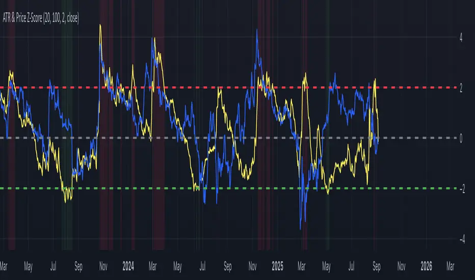
ATR & Price Z-ScoreThis indicator combines the ATR Z-Score and the Price Z-Score into a single framework for evaluating market conditions using statistical context. The ATR Z-Score standardizes volatility by comparing the current ATR value to its historical mean and standard deviation, allowing traders to see when volatility is unusually high (above +2) or unusually low (below –2). The Price Z-Score applies the same normalization process to price itself, showing how far the current close is from its moving average in standard deviation terms, which highlights statistically stretched conditions that often align with overbought or oversold states. By plotting both measures together, traders can identify when price moves are supported by volatility or when the two diverge. For example, a high Price Z paired with a high ATR Z can confirm the strength of a breakout, while a high Price Z with a low ATR Z may suggest an unsustainable move lacking volatility support. Conversely, a volatility spike without an extreme in price can point to shakeouts or regime shifts. Because both measures are normalized, they can be compared across different markets and timeframes, making the indicator useful for spotting breakouts, squeezes, reversals, and abnormal conditions in a statistically consistent way.
Extreme Zone Volume ProfileExtreme Zone Volume Profile (EZVP)
Originality & Innovation
The Extreme Zone Volume Profile (EZVP) revolutionizes traditional volume profile analysis by applying statistical zone classification to volume distribution. Unlike standard volume profiles that display raw volume data, EZVP segments the price range into statistically meaningful zones based on percentile thresholds, allowing traders to instantly identify where volume concentration suggests strong support/resistance versus areas of potential breakout.
Technical Methodology
Core Algorithm:
Distributes volume across user-defined bins (20-200) over a lookback period
Calculates volume-weighted price levels for each bin
Applies percentile-based zone classification to the price range (not volume ranking)
Zone B (extreme zones): Outer percentile tails representing potential rejection areas
Zone A (significant zones): Secondary percentile bands indicating strong interest levels
Center Zone: Bulk trading range where most price discovery occurs
Mathematical Foundation:
The script uses price-range percentiles rather than volume percentiles. If the total price range is divided into 100%, Zone B captures the extreme price tails (default 2.5% each end ≈ 2 standard deviations), Zone A captures the next significant bands (default 14% each ≈ 1 standard deviation), leaving the center for normal distribution trading.
Key Calculations:
POC (Point of Control): Price level with maximum volume accumulation
Volume-weighted mean price: Total volume × price / total volume
Median price: Geometric center of the price range
Rightward-projected bars: Volume bars extend forward from current time to avoid historical chart clutter
Trading Applications
Zone Interpretation:
Zone B (Red/Green): Extreme price levels where volume suggests strong rejection potential. Price reaching these zones often indicates overextension and possible reversal points.
Zone A (Orange/Teal): Significant support/resistance areas with substantial volume interest. These levels often act as intermediate targets or consolidation zones.
Center (Gray): Fair value area where most trading occurs. Price tends to return to this range during normal market conditions.
Strategic Usage:
Reversal Trading: Look for rejection signals when price enters Zone B areas
Breakout Confirmation: Volume expansion beyond Zone B boundaries suggests genuine breakouts
Support/Resistance: Zone A boundaries often provide reliable entry/exit levels
Mean Reversion: Price tends to gravitate toward the volume-weighted mean and POC lines
Unique Value Proposition
EZVP addresses three key limitations of traditional volume profiles:
Visual Clarity: Standard profiles can be cluttered and difficult to interpret quickly. EZVP's color-coded zones provide instant visual feedback about price significance.
Statistical Framework: Rather than relying on subjective interpretation of volume nodes, EZVP applies objective percentile-based classification, making support/resistance identification more systematic.
Forward-Looking Display: Rightward-projecting bars keep historical price action clean while maintaining current market structure visibility.
Configuration Guide
Lookback Period (10-1000): Controls the historical depth of volume calculation. Shorter periods for intraday scalping, longer for swing trading.
Number of Bins (20-200): Resolution of volume distribution. Higher values provide more granular analysis but may create noise on lower timeframes.
Zone Percentages:
Zone B: Extreme threshold (default 2.5% = ~2σ statistical significance)
Zone A: Significant threshold (default 14% = ~1σ statistical significance)
Visual Controls: Toggle individual elements (POC, median, mean, zone lines) to customize display complexity for your trading style.
Technical Requirements
Pine Script v6 compatible
Maximum bars back: 5000 (ensures sufficient historical data)
Maximum boxes: 500 (supports high-resolution bin counts)
Maximum lines: 50 (accommodates all zone and reference lines)
This indicator synthesizes volume profile theory with statistical zone analysis, providing a quantitative framework for identifying high-probability support/resistance levels based on volume distribution patterns rather than arbitrary price levels.
Time-Based Manipulation ProjectionsThis indicator automatically plots custom projection levels based on session and timeframe opening prices, utilizing the AMD/PO3 concept (Accumulation, Manipulation, Distribution / Power of Three). The theory suggests that price typically opens, creates an initial manipulation move to hunt liquidity, then reverses for distribution.
By measuring the distance from the open to the initial high/low manipulation, the indicator projects potential targets and reversal zones at customizable ratios, with the 2-2.5x and 4-4.5x extensions often serving as key areas.
Features:
Session-Based Projections: 4 custom session-based projections with full control over the opening time and the time when the projections stop updating with new manipulation highs/lows (Midnight, Daily, NY Open, etc)
Timeframe-Based Projections: 4 custom timeframe-based projections (H1, H4, Daily, Weekly, etc.)
Dynamic Anchoring: In line with AMD/PO3 logic, the indicator automatically locks to the correct manipulation leg (high or low) based on price position relative to the open
Custom Projections: Define your own projection levels
Custom Labels: Assign your own names to each projection, making it easy to identify and organize levels on the chart
Historical Levels: Option to display past projections
Styling Options: Choose line style, thickness, colors, label size, font, and positioning
Extend Lines: Option to extend projections forward to current price
Delayed Plotting: Set a delay (in minutes) after open before projections appear, useful to avoid false early swings
Note: These projections are most effective when the manipulation leg is clean and well-defined. If the manipulation is shallow, standard projections like 2–2.5x or 4–4.5x may not provide useful levels. In such cases, try experimenting with larger custom projections.
StdDev Supply/Demand Zone RefinerThis indicator uses standard deviation bands to identify statistically significant price extremes, then validates these levels through volume analysis and market structure. It employs a proprietary "Zone Refinement" technique that dynamically adjusts zones based on price interaction and volume concentration, creating increasingly precise support/resistance areas.
Key Features:
Statistical Extremes Detection: Identifies when price reaches 2+ standard deviations from mean
Volume-Weighted Zone Creation: Only creates zones at extremes with abnormal volume
Dynamic Zone Refinement: Automatically tightens zones based on touch points and volume nodes
Point of Control (POC) Identification: Finds the exact price with maximum volume within each zone
Volume Profile Visualization: Shows horizontal volume distribution to identify key liquidity levels
Multi-Factor Validation: Combines volume imbalance, zone strength, and touch count metrics
Unlike traditional support/resistance indicators that use arbitrary levels, this system:
Self-adjusts based on market volatility (standard deviation)
Refines zones through machine-learning-like feedback from price touches
Weights by volume to show where real money was positioned
Tracks zone decay - older, untested zones automatically fade
Realized Volatility (StdDev of Returns, %)📌 Realized Volatility (StdDev of Returns, %)
This indicator measures realized volatility directly from price returns, instead of the common but misleading approach of calculating standard deviation around a moving average.
🔹 How it works:
Computes close-to-close log returns (the most common way volatility is measured in finance).
Calculates the standard deviation of these returns over a chosen lookback period (default = 200 bars).
Converts results into percentages for easier interpretation.
Provides three key volatility measures:
Daily Realized Vol (%) – raw standard deviation of returns.
Annualized Vol (%) – scaled by √250 trading days (market convention).
Horizon Vol (%) – volatility over a custom horizon (default = 5 days, i.e. weekly).
🔹 Why use this indicator?
Shows true realized volatility from historical returns.
More accurate than measuring deviation around a moving average.
Useful for traders analyzing risk, position sizing, and comparing realized vs implied volatility.
⚠️ Note:
It is best used on the Daily Chart!
By default, this uses log returns (which are additive and standard in quant finance).
If you prefer, you can easily switch to simple % returns in the code.
Volatility estimates depend on your chosen lookback length and may vary across timeframes.
Fabian Z-ScoreFabian Z-Score — % Distance & Z-Scores for SPX / DJI / XLU
What it does
This indicator measures how far three market proxies are from a moving average and standardizes those distances into z-scores so you can spot stretch/mean-reversion and relative out/under-performance.
Universe: S&P 500 (SPX), Dow Jones (DJI) and Utilities (XLU). You can change any of these in Inputs.
Anchor MA: user-selectable MA type (SMA/EMA/RMA/WMA/VWMA/HMA/LSMA/ALMA) and length (default 39; a popular weekly anchor).
Outputs
% from MA: 100 × (𝐶𝑙𝑜𝑠𝑒 − 𝑀𝐴) / 𝑀𝐴
Time-series Z: z-score of the last N % distances (default 39) → “how stretched vs its own history?”
Cross-sectional Z: z-score of each % distance within the trio on this bar → “who’s strongest vs the others right now?”
A compact mini table (top-right) shows the latest values for each symbol: % from MA, Z(ts) and Z(xsec).
Panels & Visualization
Toggle what you want to see in View:
Plot % distance — raw % above/below the MA (0% line shown).
Plot time-series Z — standardized stretch with ±Threshold guides (default ±2σ).
Plot cross-sectional Z — relative z across SPX, DJI, XLU (0 = at the trio’s mean).
Smoothing — optional light MA on the plotted series (set to 1 for none).
A price-panel Moving Average is drawn with your chosen type/length for visual context.
Colors: SPX = teal, DJI = orange, XLU = purple.
Alerts
Two built-in alert conditions (time-series Z only):
“Z(ts) crosses up +Thr” — any of the three crosses above +Threshold.
“Z(ts) crosses down -Thr” — any crosses below −Threshold.
When enabled, the chart background tints faint green (up cross) or red (down cross) on those bars.
How to use (ideas, not advice)
On weekly charts, a 39-length MA/Z lookback often captures major risk-on/off swings. (Fabian Timing)
Deep negative Z(ts) (e.g., ≤ −2σ or −3σ) frequently accompanies panic and mean-reversion setups.
High positive Z(ts) suggests over-extension; watch for momentum fades.
Cross-sectional Z helps rank leadership today:
Z(xsec) > 0 → stronger than the trio’s mean this bar; Z(xsec) < 0 → weaker.
Utilities (XLU) turning positive x-sec while the others are negative can hint at defensive rotation.
If all 3 are above 0, go long, if below 0 go cash.
Combine: look for extreme Z(ts) aligning with lead/lag Z(xsec) to time entries/exits or hedges.
Inputs (quick reference)
Symbols: SPX / DJI / XLU (editable).
MA type & length: SMA, EMA, RMA, WMA, VWMA, HMA, LSMA, ALMA; default EMA(39).
Z-score lookback (ts): default 39.
Smoothing on plots: default 1 (off).
Z threshold (±): default 2.0 (guide lines & alerts).

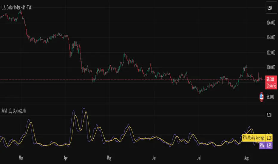
Relative Volatility Mass [SciQua]The ⚖️ Relative Volatility Mass (RVM) is a volatility-based tool inspired by the Relative Volatility Index (RVI) .
While the RVI measures the ratio of upward to downward volatility over a period, RVM takes a different approach:
It sums the standard deviation of price changes over a rolling window, separating upward volatility from downward volatility .
The result is a measure of the total “volatility mass” over a user-defined period, rather than an average or normalized ratio.
This makes RVM particularly useful for identifying sustained high-volatility conditions without being diluted by averaging.
────────────────────────────────────────────────────────────
╭────────────╮
How It Works
╰────────────╯
1. Standard Deviation Calculation
• Computes the standard deviation of the chosen `Source` over a `Standard Deviation Length` (`stdDevLen`).
2. Directional Separation
• Volatility on up bars (`chg > 0`) is treated as upward volatility .
• Volatility on down bars (`chg < 0`) is treated as downward volatility .
3. Rolling Sum
• Over a `Sum Length` (`sumLen`), the upward and downward volatilities are summed separately using `math.sum()`.
4. Relative Volatility Mass
• The two sums are added together to get the total volatility mass for the rolling window.
Formula:
RVM = Σ(σ up) + Σ(σ down)
where σ is the standard deviation over `stdDevLen`.
╭────────────╮
Key Features
╰────────────╯
Directional Volatility Tracking – Differentiates between volatility during price advances vs. declines.
Rolling Volatility Mass – Shows the total standard deviation accumulation over a given period.
Optional Smoothing – Multiple MA types, including SMA, EMA, SMMA (RMA), WMA, VWMA.
Bollinger Band Overlay – Available when SMA is selected, with adjustable standard deviation multiplier.
Configurable Source – Apply RVM to `close`, `open`, `hl2`, or any custom source.
╭─────╮
Usage
╰─────╯
Trend Confirmation: High RVM values can confirm strong trending conditions.
Breakout Detection: Spikes in RVM often precede or accompany price breakouts.
Volatility Cycle Analysis: Compare periods of contraction and expansion.
RVM is not bounded like the RVI, so absolute values depend on market volatility and chosen parameters.
Consider normalizing or using smoothing for easier visual comparison.
╭────────────────╮
Example Settings
╰────────────────╯
Short-term volatility detection: `stdDevLen = 5`, `sumLen = 10`
Medium-term trend volatility: `stdDevLen = 14`, `sumLen = 20`
Enable `SMA + Bollinger Bands` to visualize when volatility is unusually high or low relative to recent history.
╭───────────────────╮
Notes & Limitations
╰───────────────────╯
Not a directional signal by itself — use alongside price structure, volume, or other indicators.
Higher `sumLen` will smooth short-term fluctuations but reduce responsiveness.
Because it sums, not averages, values will scale with both volatility and chosen window size.
╭───────╮
Credits
╰───────╯
Based on the Relative Volatility Index concept by Donald Dorsey (1993).
TradingView
SciQua - Joshua Danford
Dollar Volume + SD [ZTD]### So, What's the Big Deal with SD Dollar Volume?
TL:DR
What you see:
1. $ Volume = (Price * Volume) / 1M (we divide it by 1M by default so you don't have to look at 12 digits but you can select between 100k/1M/10M)
2. User selected M.A. period with difference sources
3. Up to 4 Standard Deviation from that M.A.
4. Color coded (explained below)
That's it, no fancy useless multi color rainbows. Functional, bringing depth and clarity to your analysis based on reality not optical illusion.
--------------
The Long version
You know how we've always looked at volume? It's a classic, but it's got a blind spot. A million shares traded when a stock is at $10 is a completely different ballgame from a million shares traded when it's at $200. The first is $10M in action; the second is $200M. Traditional volume treats them the same, but they are not the same story.
That's the whole idea behind the **Dollar Volume Standard Deviation (SD $VVOLUME)** indicator. Instead of just counting shares, it tracks the **actual dollar amount** ( also refered as Dollar Volume) changing hands. This gives you a much clearer picture of the real financial power behind a price move. It helps you see when the "big money" is truly stepping in or backing off.
Think about it this way: after a 20% drop on earnings, you might see a 10% volume increase and think, "Wow, buyers are stepping in!" But if you look at the *value traded*, it might actually be lower than the day before because the share price is so much cheaper. This indicator cuts through that noise.
What about that smaller stock you bought that suddenly doubles in prices in a matter of months. Do you really thing the volume you are looking at carries any meaning anymore?
On longer time frame? Think about Volume traded vs Value Traded on NVDA for example. Looking at volume alone on those charts is absolutely meaningless. I even wonder why volume alone ever existed in the first place as an indicator.
### How to Use It in Your Trading
This isn't just theory; here’s how you can actually use it to make better decisions.
#### Reading the Indicator
The indicator is designed to be visual and intuitive. Here’s what you're looking at:
* **The Bars:** Each bar on the indicator represents the total dollar value traded during that period. Bigger bar, more money moved.
* **The White Line:** This is your baseline—the moving average of the value traded. It shows you the normal level of money flow for that stock.
* **Bar Colors (The Important Part):**
* **Direction:** **Green** means the stock closed higher in that period. **Red** means it closed lower. Simple enough.
* **Intensity:** This is the real magic. The brightness or intensity of the color tells you how significant that money flow was. A dull, faded bar means the value traded was pretty average. A **bright, intense bar** means the value was way above normal (usually 1 or 2 standard deviations away from the average). *That's* when you need to pay attention.
#### Actionable Signals for Your Strategy
* **Spotting High-Conviction Moves:** When you see a bright, intense red or green bar that towers over the others, that's a signal of major conviction. Big players are making a decisive move, either buying up everything in sight or dumping their positions. This is your cue that something significant is happening.
* **Confirming a Trend's Strength:** Are you in a strong uptrend? Look for a consistent pattern of bright green bars. This tells you that significant capital is flowing in to support the rising price. It's confirmation that the trend has legs.
* **Catching a Weakening Trend (Divergence):** This is a powerful one. Imagine the stock price is grinding out new highs, but on the SD
V
VOLUME
indicator, the bars are getting smaller and less intense. That's a major red flag. It shows that even though the price is inching up, the real money isn't following. There's no conviction, and the trend could be about to reverse.
* **Gauging Liquidity:** If the bars are consistently low and dull, it's a sign that interest in the stock is drying up. It's a good way to spot illiquid conditions and avoid getting trapped in a stock that's hard to get out of.
Ultimately, SD SEED_YASHALGO_NSE_BREADTH:VOLUME helps you see the market from a different angle. It's not just about the noise of shares being traded; it's about following the money.
BullTrading Easy Tops & BottomsTRADING TOOL OVERVIEW
The Easy Tops & Bottoms indicator identifies potential reversal points on intraday charts by analysing volatility patterns and momentum shifts during major trading sessions. It projects horizontal zones that may act as support or resistance, adapting dynamically to price behavior.
This indicator is designed for use on intraday timeframes from 1-minute to 15-minute charts only.
HOW THE INDICATOR WORKS
The indicator uses an adaptive algorithm to evaluate momentum exhaustion and volatility clusters within intraday sessions (aligned with New York local time). It generates time based zones when conditions indicate potential trend reversals, such as after volatility spikes followed by contraction. These zones extend horizontally until price breaks boundaries or a bar limit is reached.
- Support Zones : Formed during bullish sessions with tail volatility, suggesting potential bottoms.
- Resistance Zones : Formed during bearish sessions with wick volatility, suggesting potential tops.
Zones are filtered for significant sessions to focus on meaningful price action. Signals trigger based on price interaction with the zone, requiring a specific relationship between the candle's low, high, and close relative to the zone level—for example, engulfing the level but closing in the reversal direction.
Note that signals and zone behaviors will differ across timeframes (e.g., 1m, 5m, 15m) due to varying candle sizes affecting how closes relate to zone triggers. Shorter timeframes may show more frequent but noisier interactions, while longer ones capture broader momentum shifts.
USERS GUIDE
What the Indicator Does?
The indicator has two operating modes: Buy/Sell Signal Mode (suitable for beginners and trend-following traders—important note: trend-following traders must filter according to their own trend criteria) and Support/Resistance Mode, which is a full and complete trading system.
- Plots Dynamic Zones: Horizontal boxes appear at qualifying session ends, representing support (bottoms) or resistance (tops).
- Active zones use a semi-transparent colour (customisable) and extend rightward while valid.
- Expired zones (after break or timeout) shift to a historical colour for reference.
- Generates Signals (in Buy/Sell Signal Mode): Labels appear on zone interactions confirming reversal potential:
- "BUY" (green) for support zones.
- "SELL" (red) for resistance zones.
- Time Based Focus: Ties to intraday periods like Asian, London, and New York transitions. Use NY Local Time in your charts.
- Additional Elements: Includes a watermark with symbol, timeframe, and date; an optional NotePad table for notes.
How to Interpret Signals
- Zone Dynamics: Active zones indicate ongoing validity; expiration signals a potential shift (e.g., a support break may turn it into resistance).
- Signal Triggers: Require price to test the zone level with a closing bias toward reversal. These are suitable for beginners learning basic reversals or trend traders adding their own filters (e.g., moving averages for direction).
- Value for Users: Beginners can use zone height to set stop-loss (SL) below/above the box, enabling a 1:2 risk-reward ratio (RR) for take-profit (TP) at twice the zone distance.
- Timeframe Variations: Expect different signals on 1m vs. 15m, as smaller candles on lower frames may trigger more selectively based on close positions relative to zones.
- Note on Entries in Internal Range Zones: For all entries (the Internal Range inside range zones), when a big zone swallows smaller zones ahead, consider using the bigger zone or the SL price level as an entry level.
PRACTICAL TRADING SCENARIOS
Here, we expand on how to apply the indicator in real-world trading, with detailed examples for each mode. These scenarios assume a basic understanding of risk management, such as position sizing at 0.5-1.5% of account capital per trade. Always backtest these ideas on historical data for your specific instrument (e.g., forex pairs like EUR/USD or indices like US30).
Buy/Sell Signal Mode: Reversal and Trend-Following Applications
This mode is ideal for spotting reversal opportunities while allowing flexibility for trend filters. Signals appear as labels when price interacts with zones in a confirmatory way, making it beginner-friendly for learning entry points. Trend-following traders should overlay their preferred trend indicators (e.g., a 50-period EMA) to avoid counter-trend trades.
Important critical note: In this mode, the 1:2 RR is based and measured directly on the zone height (not on the actual distance from entry price to SL). The correct SL placement is at the far edge of the zone (e.g., zone bottom for buys, zone top for sells), and TP is set at twice the zone height from the signal level (the key trigger price where the label appears).
- Basic Reversal Scalping (Beginner-Friendly): On a 5-minute chart during the London session open, after a sharp down-move in EUR/USD, a support zone forms with signal level at 1.0850 (zone top) and height of 10 pips (zone bottom at 1.0840). Wait for a "BUY" signal when price dips to test the zone (low touches 1.0850) but closes above it. Enter long at the current price (e.g., 1.0855). Set SL at the zone bottom (1.0840), and TP at the signal level + 2x zone height (1.0850 + 20 pips = 1.0870). This ensures the 1:2 RR is measured purely on the zone (risk = 10 pips zone height, reward = 20 pips), regardless of exact entry. If volatility is high (filter enabled), this setup prioritizes stronger sessions for better win rates.
- Trend-Following with Filter: On a 15-minute chart of GBP/JPY during New York AM, the overall trend is upward (price above a 200-period SMA). A support zone appears with signal level at 185.20 (zone top) after a pullback, with a height of 20 pips (zone bottom at 185.00). Ignore any "SELL" signals as they counter the trend; instead, wait for a "BUY" when price tests the zone from above and closes bullishly. Enter long at the current price (e.g., 185.25). Set SL at the zone bottom (185.00), and TP at the signal level + 2x zone height (185.20 + 40 pips = 185.60). Add a trend filter like MACD histogram turning positive for confirmation, reducing whipsaws in ranging markets. The RR remains 1:2 based on the zone (risk = 20 pips height, reward = 40 pips).
- Range-Bound Day Trading: In a 1-minute chart of USD/JPY during Asian session consolidation, multiple zones form stacking as support/resistance. Monitor for "SELL" at a resistance zone with signal level at 147.80 (zone bottom) and height of 8 pips (zone top at 147.88) after an uptick. Enter short on the signal at the current price (e.g., 147.78). Set SL at the zone top (147.88), and TP at the signal level - 2x zone height (147.80 - 16 pips = 147.64). Shorter timeframes like 1m may produce more signals due to tighter candle closes, but use the volatility filter to avoid flat periods—test historically to see how 1m noise compares to 15m's smoother triggers. The RR is fixed at 1:2 on the zone (risk = 8 pips height, reward = 16 pips).
Support/Resistance Mode: Standalone Contrarian System for Fading Breaks
This mode hides signals and labels, turning the indicator into a complete contrarian trading system focused on fading zone breaks. It treats broken zones as "flips"—a broken support becomes potential resistance, and vice versa. Entries use limit orders at a distance equal to the zone height, with fixed 1:2 RR based on that height. No additional filters are required, but combining with session timing enhances edge. Alerts fire on new zone creation, allowing proactive setup.
When a setup results in a stop loss in Support/Resistance Mode, the original zone can be used for a "Stop & Reverse" trade with the same trading proportions. This means reversing the position direction upon hitting SL, using the original zone to set the new entry (at the box top/bottom trigger level), SL (at the opposite box edge), and TP (2x the height beyond entry)—effectively capturing momentum in the opposite direction while maintaining the 1:2 RR.
- Fading a Support Break (Short Setup): On a 5-minute chart of AUD/USD during NY PM, a support zone at 0.6650 (height 12 pips) breaks when low pierces below 0.6638. Consider the zone flipped to resistance. Place a sell limit order 12 pips above the broken zone (at 0.6662), SL 12 pips above entry (0.6674), and TP 24 pips below entry (0.6638, achieving 1:2 RR). This anticipates sellers re-entering on pullbacks to the former support. If the volatility filter is on, this only applies to significant breaks; historically, test on pairs with clear pip values to adjust for spreads.
Stop & Reverse Scenario: If the short position hits SL at 0.6674 (price rallies above), reverse to a long position. Use the original 12-pip zone: Place a buy limit order on the original broken support (now acting as flipped resistance, at 0.6650 box top), SL 12 pips below the new entry (0.6638 box bottom), and TP 24 pips above the new entry (0.6674, maintaining 1:2 RR). This captures potential upside momentum after the false break.
- Fading a Resistance Break (Long Setup): In a 15-minute chart of Nasdaq futures (NQ) during London close, a resistance zone at 18500 (height 50 points) breaks upward (high > 18550). Flip it to support. Place a buy limit order 50 points below the broken zone (at 18450), SL 50 points below entry (18400), TP 100 points above entry (18550). This catches pullbacks in uptrends. Longer timeframes like 15m may show fewer but more reliable breaks due to broader candle relationships—compare to 1m, where smaller candles might invalidate zones quicker.
Stop & Reverse Scenario: If the long position hits SL at 18400 (price drops below), reverse to a short position. Use the original 50-point zone: Place a sell limit order on the original broken resistance (now acting as flipped support, at 18500 box bottom), SL 50 points above the new entry (18550 box top), and TP 100 points below the new entry (18400, maintaining 1:2 RR). This captures potential downside momentum after the false break.
- Multi-Zone Contrarian Scalping in High-Volatility Sessions: On a 1-minute chart of Bitcoin (BTC/USD) during NY open, several zones form and break in quick succession. After a resistance at 65000 (height 200 USD) breaks, place buy limit 200 USD below (64800), SL at 64600, TP at 65200. Conversely, for a broken support at 64000 (height 150 USD), sell limit 150 USD above (64150), SL 64300, TP 63850. Use the max bars setting to limit zone lifespan in fast markets; enable volatility filter to focus on explosive sessions like news releases. This mode's standalone nature suits automated mindsets—backtest to quantify edge, noting 1m's frequent triggers vs. 15m's strategic ones.
Stop & Reverse Scenario: For the buy after resistance break, if it hits SL at 64600 (price falls below), reverse to short. Use the original 200 USD zone: Place a sell limit order on the original broken resistance (now acting as flipped support, at 65000 box bottom), SL 200 USD above the new entry (65200 box top), TP 400 USD below the new entry (64600, maintaining 1:2 RR). Similarly, for the sell after support break, if it hits SL at 64300 (price rallies above), reverse to buy: Use the original 150 USD zone: Place a buy limit order on the original broken support (now acting as flipped resistance, at 64000 box top), SL 150 USD below the new entry (63850 box bottom), TP 300 USD above the new entry (64300, maintaining 1:2 RR). This captures potential momentum after the false breaks.
- Risk Considerations for Both Modes: Always test scenarios historically and adjust for instrument specifics like pip/point values and spreads. For example, forex might use 1-2 pip buffers, while crypto needs larger due to volatility. This is not trading advice; users should evaluate independently and consult professionals.
KEY SETTINGS
- Indicator Mode: "Buy/Sell Signal Mode" for signals; "Support/Resistance Mode" for zones only.
- Show S/R Zones: Toggle box visibility.
- Colours: Customise active/historical zones, buy/sell labels.
- Max Bars for Signal: Zone extension limit (default: 288).
- Require Significant Volatility: Filter for notable sessions (default: true).
- Days to Keep Historical Zones: Retention period (default: 7).
- Show NotePad?: Toggle notes table.
ALERTS
- Signal Mode: On BUY/SELL triggers.
- S/R Mode: On new zone creation.
Backtest thoroughly before use.
Why Protected?
This script uses a proprietary zone detection method designed to highlight support/resistance zones in a clear, structured way. To maintain the integrity and unique utility of the algorithm, the code is closed-source.
Important Considerations
This tool does not guarantee profits and is not intended to replace sound trade management or risk discipline. It is designed to aid traders in visualiSing market structure. Use responsibly with appropriate risk measures.
Legal Disclaimer
This indicator is provided for educational and informational purposes only. It is not intended as financial, investment, or trading advice, and does not constitute a recommendation to buy, sell, or hold any financial instrument.
Trading financial markets involves substantial risk. Past performance of any trading strategy or indicator is not indicative of future results. Users of this indicator assume full responsibility for their trading decisions. No guarantees are made regarding the accuracy, reliability, or profitability of the signals generated by this tool.
This indicator is published as-is, without any express or implied warranties. The publishers shall not be held liable for any losses or damages, direct or indirect, arising from the use, misuse, or reliance on this tool.
All trading decisions should be made with consideration of your financial situation and risk tolerance. Consultation with a licensed financial advisor is strongly recommended before making any investment decisions.
By using this indicator, you acknowledge and agree to these terms. Your use constitutes acceptance of full responsibility and the understanding that trading is inherently risky and should be approached with caution and discipline.

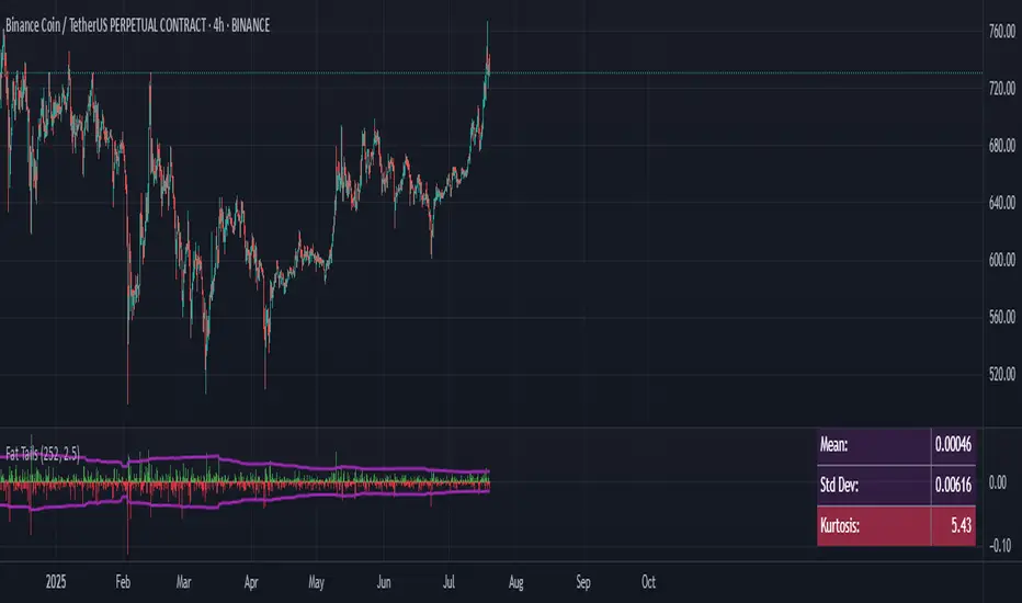
Fat Tails Analyzer🧠 Fat Tails Analyzer — Analysis of Anomalous ("Fat-Tailed") Movements
📌 Description
Fat Tails Analyzer is a tool for analyzing "fat tails" in the distribution of returns. Unlike normal distribution, financial markets often exhibit frequent extreme movements. This indicator identifies and visualizes such events by analyzing logarithmic returns, deviations from normal distribution, and excess kurtosis.
🔬 Methodology
Logarithmic returns (ln(Close / Close )) are calculated for accurate aggregation and symmetry.
Moving average and standard deviation of returns are computed over a specified period.
"Fat-tailed" events are identified when returns exceed μ ± k·σ, where k is user-defined.
Normal distribution bands (±2σ) and kurtosis (a measure of tail "heaviness") are displayed for clarity.
📊 What It Displays
📈 Histogram of Returns: Green for positive, red for negative.
🟣 Fat Tail Threshold Lines: Marking extreme events.
⚪ Silver Normal Distribution Bands: ±2σ boundaries.
🔵 Kurtosis Line: If enabled.
📋 Table with Key Metrics: Mean, σ, kurtosis.
⚙️ Parameters
Lookback Period (Bars): Analysis period (default: 252).
Fat Tail Threshold (Std Devs): Deviation for extreme events (k, default: 2.5).
Show Normal Distribution Bands: Toggle ±2σ boundaries.
Show Kurtosis: Enable kurtosis analysis mode.
📌 Interpretation
Excess Kurtosis > 0: More extreme events than predicted by normal distribution.
Returns beyond fat-tail thresholds: Potential signals of panic, shock, or exceptional news.
Consistently high kurtosis: Unstable or speculative asset.
🧪 Applications
📉 Identify extreme risks in assets (especially cryptocurrencies and derivatives).
🧠 Study market behavior and dispersion.
🛡 Support risk analysis, stop-loss settings, and systemic risk assessment.
🔎 Compare assets by the "normality" of their behavior.
🧭 Live Metrics Table
Displayed in the bottom-right corner:
Mean return
Standard deviation
Excess kurtosis (color-coded by value)
🧠 Good to Know
Normal distribution has kurtosis = 0.
> 0: "Fat tails" (more extreme values).
< 0: "Thin tails" (values close to the mean).