Time Anchored Intraday High/Low TrendlineOftentimes, intraday trendlines that are started at specific times, e.g. 8:00am or market open 9:30am, are well respected throughout the trading day.
This indicator draws up tp 3 intraday trendlines that are anchored at user defined times, respectively at the corresponding candle's high and low points.
From there, the line*s xy2 are connected in a way that all following candles are enclosed.
Pesquisar nos scripts por "TRENDLINES"
Wolfe Scanner (Multi - zigzag) [HeWhoMustNotBeNamed]Before getting into the script, I would like to explain bit of history around this project. Wolfe was in the back of my mind for some time and I had several attempts so far.
🎯Initial Attempt
When I first developed harmonic patterns, I got many requests from users to develop script to automatically detect Wolfe formation. I thought it would be easy and started boasting everywhere that I am going to attempt this next. However I miserably failed that time and started realising it is not as simple as I thought it would be. I started with Wolfe in mind. But, ran into issues with loops. Soon figured out that finding and drawing wedge is more trickier. I decided will explore trendline first so that it can help find wedge better. Soon, the project turned into something else and resulted in Auto-TrendLines-HeWhoMustNotBeNamed and Wolfe left forgotten.
🎯Using predefined ratios
Wolfe also has predefined fib ratios which we can use to calculate the formation. But, upon initial development, it did not convince me that it matches visual inspection of Wolfe all the time. Hence, I decided to fall back on finding wedge first.
🎯 Further exploration in finding wedge
This attempt was not too bad. I did not try to jump into Wolfe and nor I bragged anywhere about attempting anything of this sort. My target this time was to find how to derive wedge. I knew then that if I manage to calculate wedge in efficient way, it can help further in finding Wolfe. While doing that, ended up deriving Wedge-and-Flag-Finder-Multi-zigzag - which is not a bad outcome. I got few reminders on Wolfe after this both in comments and in PM.
🎯You never fail until you stop trying!!
After 2 back to back hectic 50hr work weeks + other commitments, I thought I will spend some time on this. Took less than half weekend and here we are. I was surprised how much little time it took in this attempt. But, the plan was running in my subconscious for several weeks or even months. Last two days were just putting these plans into an action.
Now, let's discuss about the script.
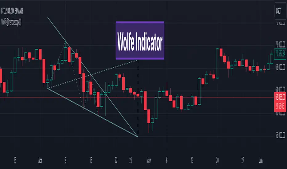
🎲 Wolfe Concept
Wolfe concept is simple. Whenever a wedge is formed, draw a line joining pivot 1 and 4 as shown in the chart below:
Converging trendline forms the stop loss whereas line joining pivots 1 and 4 form the profit taking points.
🎲 Settings
Settings are pretty straightforward. Explained in the chart below.
Auto Chart Patterns - Ultimate [Trendoscope]Here is an attempt to gather and present stats and probabilities of different chart patterns. Here, we challenge few traditional biases such as rising wedge is bearish, falling wedge is bullish etc. All the chart patterns identified in this script are bi-directional. Meaning they offer opportunities to trade in either direction.
This indicator is built on the base of two free scripts
🎯 Wedge-and-Flag-Finder-Multi-zigzag
🎯 Trendline-Pairs-Deep-Search
🎲 Following are the major highlights/updates in the present script
▶ Uses the similar deep search algorithm for finding patterns. Pattern identification logic has been optimised to provide more accurate patterns.
▶ Provides suggestion on how to trade these patterns - along with entry, stop and target suggestions.
▶ Advanced options available in setting such as 'Safe Repaint' - which enables repaint only when trade has not started.
▶ Option to run algorithm within specified time window
▶ Comprehensive stats on historical patterns which include win ratio, risk reward, trailing win ratio and trailing risk reward.
▶ Open Trades Stats widget which can help tracking trades easily.
▶ Fully customisable alerts - which can be used to plugin into bots.
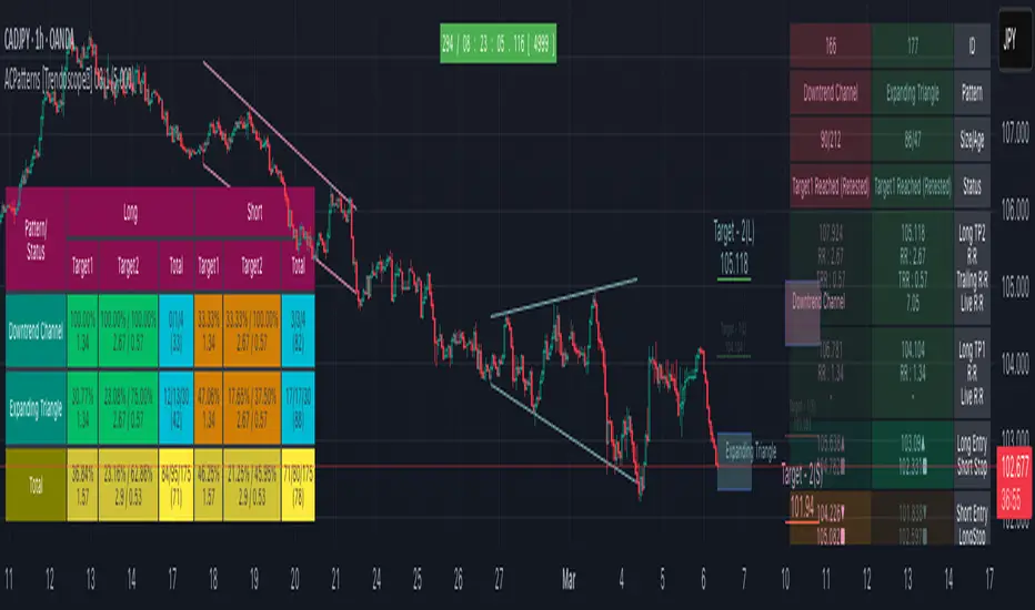
🎲 Chart Patterns Included
▶ Channel - Uptrend, Downtrend, Ranging
▶ Triangle - Expanding, Contracting
▶ Rising Wedge - Expanding, Contracting
▶ Falling Wedge - Expanding, Contracting
If unable to determine the type and yet pivots are inline to form two trend lines, then it goes to category - Indeterminate
🎲 Indicator Components
Below is a quick snapshot of indicator components.
Now, lets look at some of the individual components:
▶Open trade stats helps recognise trades in motion.
▶ Closed trade stats can either be shown with minimal stats or fully detailed stats.
🎲 Settings
▶ Generic Settings
▶ Zigzag and pattern selection
▶ Channel Settings
▶ Risk/Reward and Stats/Display Settings
🎲 Key Features
⬤ Safe Repaint :
This option allows redrawing pattern only if trade has not been taken. This increases accuracy of pattern detection. Example of impact of safe repaint is shows as below:
⬤ Trade Reversal or Breakout of Channels :
This option is useful to handle channels of different size. If the distance between channel trendlines are huge, then it is more advantageous to trade reversals. If the distance between trendlines of channel is small, it is more rewarding to trade the breakouts.
Here is an example of how this setting impacts the trade suggestions.
⬤ Detailed Closed Trade Stats :
Closed Stats settings give users option to see in depth details such as risk reward and win ratios for past patterns along with numbers.
⬤ Fully Customisable Alerts :
Alerts are implemented using alert method. Hence, users will not see text box in alert window where they can set alert format. To overcome this challenge, the indicator offers customisation of alerts through settings.
In the settings window, you notice below options for alerts
These settings allow users to enable/disable alerts for different status of patterns. The text box in the settings allows users to set customisable alert formats using specific placeholders.
Valid placeholders are:
{type} - Alert Type
{id} - Pattern id for which alert is generated
{ticker} - Ticker for which alert is generated
{timeframe} - Chart timeframe
{price} - Current close price
{pattern} - Name of the pattern
{longTrade} - Array containing stop, entry, target1 and target2 for long side of the trade for given pattern
{shortTrade} - Array containing stop, entry, target1 and target2 for short side of the trade for given pattern
{status} - Contains status of both long and short side of the trades as text
Default alert template set for all type of alerts is as below
{
"alert" : "{type}",
"id" : {id},
"ticker" : "{ticker}",
"timeframe" : "{timeframe}",
"price" : {price},
"pattern" : "{pattern}",
"long " : {longTrade},
"short " : {shortTrade},
"status" : "{status}"
}
An example alert looks like this:
If you just want to display pattern name and alert type, your alert message in the box should be something like this:
Type - {type}, Pattern - {pattern}
Will make a video on settings and usage when I get time :)
Script pago
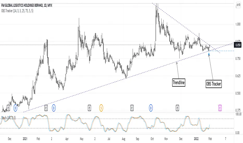
Overbought & Oversold TrackerAbout this indicator:
- This indicator is basically a stochastic indicator that shows to you the crossover in an Overbought or Oversold area DIRECTLY on the chart
How does it works:
- When Stochastic crosses at Oversold area, a Blue Triangle will appear below the candle with a Blue Dotted Line at the low of the current candle
- The Blue Triangle is to help you to see easily the candle where the crossover is occurring
- At the same time, the Blue Dotted Line will act as a minor Support for the current price
- If the current candle breaks the Blue Dotted Line (minor Support), the candle will be displayed in a red color
- Same things will occur if Stochastic crosses at the Overbought area, but at this time, a Red Triangle with Red Dotted Line will appear just to differentiate between Overbought and Oversold crossover
The advantage of using this indicator:
- You can easily see the point of stochastic crossover DIRECTLY on the chart without analyzing the stochastic indicator
- At the same time, it helps you to see clearly either the price is at the bottom / reversal by combining it with S&R / trendlines or other indicators
Personally, I will combine this indicator with:
a. Support and Resistance or Trendlines
b. Fibonacci retracement
c. Candlestick indicator (see my script list)
d. Ultimate MACD (see my script list)
e. Volume indicator
These combinations personally increase the possibility for me to buy exactly at the point of reversal in a pullback
- This indicator is preset at the value of 25 (oversold) and 75 (overbought) k line, it's my own preference. You can change these values at the setting menu to suit your trading style.
- Once again, I am opening the script for anyone to modify/alter it based on you own preference. Have a good day!
BE_CustomFx_LibraryLibrary "BE_CustomFx_Library"
A handful collection of regular functions, Custom Tools & Utility Functions could be used in regular Scripts. hope these functions can be understood by a non programmer like me too.
G_TextValOfNumber(ValueToConvert, RequiredDecimalPlaces, BeginingChar, EndChar) Function to return the String Value of Number with decimal precision with the prefix and suffix characters provided
Parameters:
ValueToConvert : = Number to Convert
RequiredDecimalPlaces : = No of Decimal values Required. supports to a max of 5 decimals else defaults to 2
BeginingChar : = Prefix character which is needed.
EndChar : = Suffix character which is needed.
Returns: Returns Out put with formated value of Given Number for the specified deicimal values with Prefix and suffix string
G_TradableValue(ValueToConvert, NeedCustomization, RequiredDecimalPlaces) Function to return the Tradable Value of Number
Parameters:
ValueToConvert : = Number to Convert
NeedCustomization : = set to 1 if you want to customize the decimal percision values. default is No customization needed, which provides output equalent to round_to_mintick
RequiredDecimalPlaces : = if NeedCustomization is set to 1 mention the decimal percision value required. max supported decimal is 5 else defaults to 2
Returns: Returns Out put with formated value of Given Number
G_TxtSizeForLables(SizeValue) Function to Get size Value for text values used in Lables
Parameters:
SizeValue : = auto, tiny, small, normal, large, huge. specify either of these values or default value Normal will be displayed as output
Returns: Returns Respective Text size
G_Reg_LineType(LineType) Function to Get Line Style Value for text values used in Lines
Parameters:
LineType : = 'solid (─)', 'dotted (┈)', 'dashed (╌)', 'arrow left (←)', 'arrow right (→)', 'arrows both (↔)' or default line style 'dotted (┈)' will be the output
Returns: Returns Respective Line style
G_ShapeTypeForLables(ShapeType) Function to Get Shape Style Value for text values used in plot shapes
Parameters:
ShapeType : = 'XCross', 'Cross', 'Triangle Up', 'Triangle Down', 'Flag', 'Circle','Arrow Up', 'Arrow Down','Lable Up', 'Lable Down' or default shpae style Triangle Up will be the output
Returns: Returns Respective Shape style
G_Indicator_Val(string, float, int, int) Gets Output of the technical analyis indicator which has length Parameter. RSI, ATR, EMA, SMA, HMA, WMA, VWMA, 'CMO', 'MOM', 'ROC','VWAP'
Parameters:
string : IndicatorName to be specified
float : SrcVal for the TA indicator default is close
int : Length for the TA indicator
int : DecimalValue optional to specify if required formatted output with decimal percision
Returns: Value with the given parameters
G_CandleInfo(string, bool, float, bool) function to get Candle Informarion such as both wicksize, top wick size , bottom wick size, full candle size and body size in default points
Parameters:
string : WhatCandleInfo, string input with either of these options "Wick" , "TWick" , "BWick" , "Candle", "Body" , "BearfbVal", "BullfbVal" , "CandleOpen" ,"CandleClose", "CandleHigh" , "CandleLow", "BodyPct"
bool : RepaintingVersion, set to true if required data on the realtime bar else default is set to false
float : FibValueOfCandle, set the fibo value to extract fibvalue of the candle else default is set to 38.2%
bool : AccountforGaps, set to true if required data on considering the gap between previous and current bar else default is set to false
Returns: Returns Respective values for the candles
G_BullBearBarCount(int, int) Counts how many green & red bars have printed recently (ie. pullback count)
Parameters:
int : HowManyCandlesToCheck The lookback period to look back over
int : BullBear The color of the bar to count (1 = Bull, -1 = Bear), Open = close candles are ignored
Returns: The bar count of how many candles have retraced over the given lookback with specific candles
BarToStartYourCalculation(Int) function to get candle co-ordinate in order to use it further for calculating your analysis work . "Heart full Thanks to 3 Pine motivators (LonesomeTheBlue, Myank & Sriki) who helped me cracking this logic"
Parameters:
Int : SelectedCandleNumber (default=450) How many candles you would need to anlysie in your script from the right.
Returns: A boolean - output is returned to say the starting point and continue to diplay true for the future candles
isHammer(float, bool, bool) Checks if the current bar is a hammer candle based on the given parameters
Parameters:
float : fib (default=0.382) The fib to base candle body on
bool : colorMatch (default=false) Does the candle need to be green? (true/false)
bool : NeedRepainting (default=false) Specify True if you need them to calculate on the realtime bars
Returns: A boolean - true if the current bar matches the requirements of a hammer candle
isStar(float, bool, bool) Checks if the current bar is a shooting star candle based on the given parameters
Parameters:
float : fib (default=0.382) The fib to base candle body on
bool : colorMatch (default=false) Does the candle need to be red? (true/false)
bool : NeedRepainting (default=false) Specify True if you need them to calculate on the realtime bars
Returns: A boolean - true if the current bar matches the requirements of a shooting star candle
isDoji(float, float, bool) Checks if the current bar is a doji candle based on the given parameters
Parameters:
float : _wickSize (default=1.5 times) The maximum allowed times can be top wick size compared to the bottom (and vice versa)
float : _bodySize (default= 5 percent to be mentioned as 0.05) The maximum body size as a percentage compared to the entire candle size
bool : NeedRepainting (default=false) Specify true if you need them to calculate on the realtime bars
Returns: A boolean - true if the current bar matches the requirements of a doji candle
isBullishEC(float, float, bool, bool) Checks if the current bar is a bullish engulfing candle
Parameters:
float : _allowance (default=0) How many POINTS to allow the open to be off by (useful for markets with micro gaps)
float : _rejectionWickSize (default=disabled) The maximum rejection wick size compared to the body as a percentage
bool : _engulfWick (default=false) Does the engulfing candle require the wick to be engulfed as well?
bool : NeedRepainting (default=false) Specify True if you need them to calculate on the realtime bars
Returns: A boolean - true if the current bar matches the requirements of a bullish engulfing candle
isBearishEC(float, float, bool, bool) Checks if the current bar is a bearish engulfing candle
Parameters:
float : _allowance (default=0) How many POINTS to allow the open to be off by (useful for markets with micro gaps)
float : _rejectionWickSize (default=disabled) The maximum rejection wick size compared to the body as a percentage
bool : _engulfWick (default=false) Does the engulfing candle require the wick to be engulfed as well?
bool : NeedRepainting (default=false) Specify True if you need them to calculate on the realtime bars
Returns: A boolean - true if the current bar matches the requirements of a bearish engulfing candle
Plot_TrendLineAtDegree(float, float, int, string, bool) helps you to plot the Trendlines based on the specified angle at the defined price to bar ratio
Parameters:
float : Degree (default=14) angle at which Trendline to be plot
float : price2bar_ratio (default=1e-10) The maximum rejection wick size compared to the body as a percentage
int : Bars2Plot (default=6) Does the engulfing candle require the wick to be engulfed as well?
string : LineStyle = 'solid (─)', 'dotted (┈)', 'dashed (╌)', 'arrow left (←)', 'arrow right (→)', 'arrows both (↔)' or default line style 'dotted (┈)' will be the output
bool : PlotOnOpen_Close (default=false) Specify True if you need them to calculate on the Open\Close Values
Returns: plot the Trendlines based on the specified angle at the defined price to bar ratio
Triple Colored Least Squares Moving Average + Crossover AlertsThis script is forked from the ‘ Double Colored Least Squares Moving Average + Crossover Alerts ‘ from @IronKnightmare.
First release & notes : 2021-11-03.
Overview:
The Least Squares Moving Average is used mainly as a crossover signal to identify bullish or bearish trends. When a shorter duration line cross a longer one a trend can be identified. When multiple lines or the price action cross a longterm trend the confirmation can be further validated. Tradingview contains already some indicators with 1 or two LSMA trendlines that can be configured and toggled.
The original script that I forked had two LSMA lines that could be plotted with other valuable functions, I added a third for further confirmation as some trading systems will use three lines or some combination of those for validation.
Usage:
In inputs
- You will see LSMA 1, LSMA 2 & LSMA 3. The default values are 40, 100 & 400 representing the number of periods plotted by that line : fast, medium and slow changing trendlines will be plotted. The offset value and source are standard for most scripts.
In Style
- You can toggle LSMA 1, 2 or 3 and any combination of those. There are much more possibilities this way.
- For each LSMA, Color 0 & Color 1 are for coloring the slope of the trendline,
- Color 0 for rising slope,
- Color 1 for descending slope.
- The script will automatically color the rise or fall of the trendline accordingly. You can also set one identical color in both slopes for one unique color.
- The ‘ Long Crossover 1 on 2 ’ is a signal for when the LSMA 1 cross over the LSMA 2, usually a shorter periods trendline, more volatile, climbing over the medium term one. A Signal will be traced on the chart at that crossing, you can configure this. The ‘Short Crossover 1 on 2’ is when the LSMA 1 cross under the LSMA 2, a signal will be traced on the chart accordingly.
- The Long Crossover 1 on 3 & Short Crossover 1 on 3 act on the same principle, although the crossing of the fast LSMA on the long / slow LSMA are used. Both can be toggled.
- The ‘ Background Coloring Line 1 : 0-Neutral, 1-Up, 2-Down ’ is an optional background coloring for the LSMA1 line. This can provide additional information at a quick glance, especially if you combine the two other lines backgrounds, the partial transparency will compound.
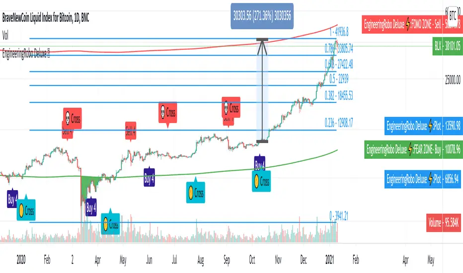
Robocan DeluxeThis script is equipped with
🔵 Robo 4
It offers strategic trading entry and exit points, so you can preserve capital before markets tumble, and take full advantage as they start to rebound. At a glance, market timing indicators tell investors whether market conditions are right or whether it’s safer on the sideline.
Truly unique tool for technical analysis for the financial market as it includes calculation of specific metrics like SAR + MACD + Price Movement.
You no longer have to worry about spending hours in front of the computer looking for a trade.You can use the indicator on every assets available on your broker.
🔵 Change Candle Color
You can change the colors depending on buy 4 and sell 4 signals. It helps traders a lot to see the direction clearly.
🔵 BB Signals
This strategy uses the MACD indicator together with the Bollinger Bands to sell when the price is above the upper Bollinger Band (and to buy when this value is below the lower band). This simple strategy only triggers when both the MACD and the Bollinger Band indicators are at the same time in a overbought or oversold condition.
Removed Upper & Lower bands & SMA20 from the charts.
To see bands, You can activate the Bollinger Bands on EngineeringRobo - not the Deluxe version.
If you are buying it with BB BUY, No need to wait for BB Sell to sell it. Vice versa.
They are not the opposite to each other. Get your profit at your target level and move on.
🔵 Ultimate MA crossover signals :
As a general guideline,the idea behind trading crossovers is that a short-term moving average above a long-term moving average is an indicator of upward momentum in a stock & crypto , and the opposite is true about a short-term average trading below a long-term average.
For this guideline to be of use, the moving average should have provided insights into trends and trend changes in the past.
Are the settings of SMA 50 & SMA 200 really the best for Golden Cross and Death Cross?
Have you ever tested ROI for MA cross strategies?
Do you think MA 20 and MA 50 are the best pair for traders?
Do you know that Exponential Moving Average ( EMA ) beats the Simple Moving Average ( SMA ) ?
In order to answer these questions we applied some brute mathematical force and tested 1830 different MA combination to find out the best pair through 50 years of data across stock / forex and 5 years of data across crypto markets . We have done the hard work and you get the benefits .
P.S. The oldest date is 1872 on SPCFD:SPX chart on tradingview . Almost 150 years of backtesting is possible from 1872 to 2020!;
🔵 Cloud Signals :
This is a strategy made from ichimoku cloud , together with MACD . Changed Ichimoku cloud formula. Based on that we have a long or a short entry.
it is an effective strategy when paired with a trailing stop loss. Removed standard line ( Kijun Sen ), turning line ( Tenkan Sen ), lagging line ( Chikou Span ) and senkou lines, added buy & sell signals. Traders can use EngineeringRobo's cloud to see the clouds on the chart.
This method doesn't work in sideways markets, only in volatile trending markets.
🔵 EMA TrendLines & Custom Moving Average
Moving averages help traders isolate the trend in a security or market, or the lack of one, and can also signal when a trend may be reversing. Two of the most common types are simple and exponential. We will look at the differences between these two moving averages, helping traders determine which one to use. Simple moving averages and the more complex exponential moving averages help visualize the trend by smoothing out price movements.
Each trader must decide which MA is better for his or her particular strategy. Many shorter-term traders use EMAs because they want to be alerted as soon as the price is moving the other way. Longer-term traders tend to rely on SMAs since these investors aren't rushing to act and prefer to be less actively engaged in their trades.
🟠50 And 200 Day Moving Average Rules
Trend reversal (downtrend to uptrend) - MA 50 crossover MA 200 from below.
Trend reversal (uptrend to downtrend) - MA 50 crossover MA 200 from above.
Weekly open –close above MA 20 ( bullish trend )
Weekly open –close below MA 50 ( Bearish trend )
Super Bullish : The candle is above MA 20 ( Daily )
Bullish : MA 50 Above MA 100 ( Daily )
Bearish : MA 50 below MA 100 ( Daily )
🔵 Fear & Greed Index
This strategy uses two unique EMA indicators in the formula.
1. Use the indicator to identify when investors are greedy.
2. Use the indicator to identify potential bottom levels
For best testing example:
This strategy finds the TOP AREA OF THE BULL MARKET AND THE BOTTOM AREA OF THE BEAR MARKET.
1. Use the indicator to identify when investors are greedy
2. Use the indicator to identify potential bottom levels
For a case study:
Open BLX Chart, pick 1D time frame, open only FEAR & Greed Index
🟢Exiting Green Area: Beginning of Bull Market🟢
🔴Exiting Red Area: Beginning of Bear Market🔴
Price crosses above red line= Entering overbought zone
Price crosses below red line= Exiting overbought zone
Price crosses below green line= Entering oversold zone
Price crosses above green line = Exiting oversold zone
BEST TIME TO SELL: When the candle is inside & exiting the Red Area
BEST TIME TO BUY: When the candle is in the Green Area
🔵 Automated Fibonacci Retracements
Automatic Fibonacci let you replace subjective manual analysis with objective automated analysis so you always get the best Fibonacci levels, this can really improve the quality of your trading decisions.
Fibonacci retracements are often used to identify the end of a correction or a counter-trend bounce. Corrections and counter-trend bounces often retrace a portion of the prior move. While short 23.6% retracements do occur, the 38.2-61.8% zone covers the most possibilities (with 50% in the middle). This zone may seem big, but it is just a reversal alert zone. One of the best ways to use the Fibonacci retracement tool is to spot potential support and resistance levels and see if they line up with Fibonacci retracement levels.
Even though Fibonacci levels are extremely popular among technical traders, one should not rely solely on Fibonacci retracement and extension levels in trading. Fibonacci tools return the best results when combined with other technical tools, such as trendlines , chart patterns, candlestick patterns, channels or technical indicators.
If you are following any Deluxe signals, you should always wait for the candle close before buying or selling.
The signal can come and go anytime during the live candle. ALL indicators do that, that is not considered repainting.
Repainting is when a signal appears, the candle is closed, and when you refresh the chart it disappeared. It is logical that until the candle is closed the signal is not decided yet, hence the alert setup as Once per bar Close.
Deluxe never repaints! Yes, you heard it right: you will never have to worry about signal changing after the candle is closed.
*** Added alarm system alerts for all signals.
________________________________________________________________________ Timeframes _____________________________________________________________________
Our recommendations to get the best results:
Swing Trading Crypto : Use 1D Time Frame Candles
Swing Trading Stocks : Use 1W Time Frame Candles
Swing Trading Commodities : Use 1W Time Frame Candles
Day Trading Crypto : Use 3H Time Frame Candles
Day Trading Stocks : Use 1D Time Frame Candles
Day Trading Commodities : Use 1D Time Frame Candles
Not recommended any other time frames.
What Is Risk-Reward Ratio RRR?
Your risk-reward ratio is how much you risk per trade, relative to how much you expect to make (reward).
When trading with Robo , you should always aim for a bigger reward compared to your risk per trade.
A good rule is only to risk 1% per trade for day traders and 5% per trade for swing trader . Robo follows strong risk management rules on the algorithm .
One of the biggest advantages of algo trading is removing human emotion from the financial markets,humans trading are susceptible to emotions that lead to irrational decisions. Robo doesn't have to think or feel good to make a trade. If conditions are met, it enters. When the trade goes the wrong way or hits a profit target, It exits. It doesn't get angry at the market or feel invincible after making a few good trades.
It gives you all the tools and information you need for day-to-day trading and investing, while also keeping a great buy and sell signals! No excuse to lose in any financial market anymore! Try now!
How can you add the algorithm into your chart?
1. Login to TradingView.com
2. From the homepage, click on ‘Chart’ in the top navigation bar
3. Select “Indicators” on the top-center-middle panel
4. In the indicator library, type "Robocan Deluxe "
5. Use the website link below to obtain access to this indicator
Prophit Ninja: KatanaCut through any price action and get clean trend readings with "Prophit Ninja: Katana".
Our master craftsmen traced back through the lineage of all the financial equations (you do and don't know and love) to their original essence, sourcing the finest bits and pieces of their logic, removing any radical minerals or surface imperfections- forging together pure fundamentals with fibonacci to create a new Katana never before seen to humans.
═════════════════════════════════════════════════════════════════════════
█ INTERPRETATION
Each sub-indicator in this package can be used as an above/below-bullish/bearish reading . If the current price/candle is above your chosen focus indicator the trend can be interpreted as bullish , if the current price/candle is below your chosen focus indicator the trend can be interpreted as bearish ; else the trend is neutral - quickly enabling you to filter for more favorable market moves. Paired with the in-depth coloring system you can easily spot strength/momentum gaining and fading helping you decide when to enter/exit, manage risk or just watch the market breathe- bright green/red being strong bullish/bearish, dark green/red being weak bullish/bearish and other colors bright/dark being bullish/bearish. This can be used as a standalone decision-maker, or used in confluence with other indicator packages in our Prophit Ninja bundle to get higher precision.
═════════════════════════════════════════════════════════════════════════
█ OVERVIEW
1 — Three customizable MA lengths with 12 formula variations and an average MA of the three; each one with the ability to toggle on or off not only itself- but an adaptive glow to filter out volatility, as well as a no lag feature that removes inherit lag that exists in all moving averages.
2 — A toggle-able fibonacci adapted formula based on ichimoku cloud .
3 — A toggle-able fibonacci adapted formula based on ssl channel.
4 — A toggle-able auto fibonacci retracement with a customizable golden pocket level.
5 — A fibonacci adapted formula based on bollinger bands .
6 — A fibonacci adapted formula based on keltner channel .
7 — Adaptive Pivot Point Labels .
8 — A fibonacci adapted formula based on chandelier exit .
9 — A fibonacci adapted formula based on parabolic stop and reverses .
10 — Fibonacci based auto support and resistance levels.
11 — Fibonacci based adaptive auto trendlines .
(“ Prophit Ninja: Katana Dojo ” signal and alert system included free .)
═════════════════════════════════════════════════════════════════════════
█ EASY CUSTOMIZATION
i.imgur.com
With a fully customizable and easy-to-use input menu , this indicator gives you the ability to tailor your trading experience to your needs and see as much (or as little) information as you want to; presented in the manner you deem most viable with the following options in just a few clicks:
Indicator Package- This option allows you to switch between the seven display modes available so in any moment you can completely change the metrics you’re reading in just two clicks. This allows you the ability to make decisions based on not only what you’re comfortable with; but also to find confirmation or disagreement with other systems instantly.
Color Theme- There are four color themes available which include original, colorful, monochrome and solid. These not only allow you a quick and easy way to change the colors to suit your style; they also make it so you can challenge your bias in an instant by viewing the data in a completely different way.
Attack Mode- Whether you’re a scalper, day trader, swing trader, or investor; this option allows you to see the chart based on four different risk tolerance/time expectancy mentalities in just two clicks. Investors can see what the scalpers are thinking and vice/versa to broaden their decision making and/or hone in when optimal.
Katana Sharpness- This algorithm allows the user to display the data on five different smoothness levels without suffering the inherent lag that accompanies most other indicators. Whether you like to see every tick of a choppy movement, or filter out the false signals into smooth readings, you can do so at any moment.
Pivot Source- Switch between trendlines, support and resistance, pivot points and fibonacci reversals that are based on highs and lows or closes ; or choose the one you prefer to stick too.
═════════════════════════════════════════════════════════════════════════
As you can see; this artisan blade has the ability to adapt to any wielder or adversary and give those in control of its power the upper hand. Any mode of battle, any opponent, any circumstance- "Prophit Ninja: Katana" was polished by our finest artists to fit any grip and make sure it's handler knows when to attack, defend or simply allow the fight to play out by it's easy-to-read coloring system. As long as you heed its direction you'll have a much better chance of defending yourself against the market than when you didn't.
This state-of-the-art on chart indicator is great for experienced traders, those who just started learning to trade, or anyone in between- truly made to suit the needs of any trader, in any moment, with any mindset (along with the other indicators in our Prophit Ninja bundle) you'll notice an immediate improvement in your trend detection after learning it.
═════════════════════════════════════════════════════════════════════════
*everything displayed is part of the Prophit Ninja indicator bundle; this is an otherwise blank chart*
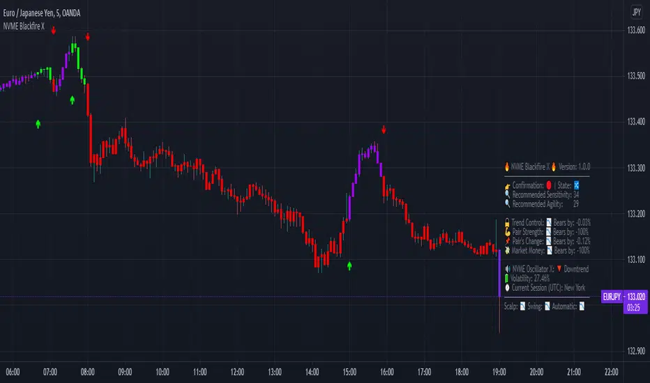
NVME Blackfire XNVME Blackfire X Indicator is a trend-confirmation indicator that includes Buy and Sell signals on the chart, Support & Resistance lines, Automatic Trendlines, Session Highs and Lows, Previous MTF Candle's Highs and Lows, Strategy Mode with Working Win/Loss Calculator, Built-In Position Size Calculator, Institutional Zones, Re-Entry Points and Filters, Customisable Market Dashboard and Alerts for Many Features.
The 2 main settings for the algorithm are 'Sensitivity' and 'Agility'. When you place Blackfire X onto your charts, you should be met automatically with the best settings we've found so far and don't worry if you are struggling to find settings because our system has an onboard system that provides you with an automatic "Best Settings" for the current pair that you are on. You can choose to enable this feature on the algorithm settings or simply see what is ideal on the dashboard too.
The 'Sensitivity' controls how quickly the algorithm responds to the market's trend changes. The higher the sensitivity, the less trades on the chart. The lower the sensitivity, the more trades you'll find on the chart.
The 'Agility' controls where the signals are placed within the trend change, a lower agility will give you signals closer to its reversal points and a higher agility will give you slower signals.
We also have the option to change the indicator to your trading style, there are four modes that heavily impacts the algorithm's calculations.
These are "default", "swing mode", "scalp mode", "strategy mode".
"Default" is our normal algorithm module that utilises the user's input to provide signals using a basic filtration system.
"Swing Mode" is our algorithm that has been modified to give signals that are more delayed for swing traders.
"Scalp Mode" is our algorithm that has been modified to give signals that are quick and fast for scalps.
"Strategy Mode" utilises our default mode but instead places the user in a mode where trades will only appear if a stop loss or a take profit area has been met by the price after the signal call.
Our third key option is our bar colour switches, there are multiple options such as "Cloud-Based", "Pivot Based", "S/R Based", "Change-Based" and "Two Colour Modes". NVME Blackfire X colours the candles in the direction of the trend and a green colour shows an uptrend, a purple colour shows an unconfirmed trend or often a ranging area and a red colour shows a downtrend.
We must let traders know that the signals should be used carefully and with a trader's strategy rather than following signals for the sake of it being printed there!
Since we want this algorithm to have necessary features and respond fast too, we have chosen only trend-following and analysis features that will be quick to use and easy to understand. We want this to be different from our Vanquisher X algorithm as that is a massive multi-tool full of features for traders to enjoy.
The first main feature is our 'Trend Cloud' system, it utilises two moving average plots that creates a cloud filling and with our algorithm you can customise both of the moving averages to any currently existing moving average in the PineScript Library.
The second feature is our 'Institutional Zones' system, which plots area of the market where the institutions have placed orders and these can be used as an extra support and resistance zone for trades. There is an input option that allows the user to get more or less zones and it is called "The Detection Strength", increasing this will show more zones whilst decreasing it will show less.
The third feature is our 'Automatic Trendlines' system, which utilises two input methods ('Trendline Period' and 'Trendline Detection Ratio'), the period controls how many bars of data to lookback to for the trend-lines and the detection ratio controls how many trend-lines are plotted onto the chart.
The fourth feature is our 'Session High and Lows' system, which plots the highest high and the lowest low of each session in the trading hours, these plots can be useful for breakout traders.
The fifth feature is our 'MTF Candle Info' system, which plots the candle's high and low or the candle's open and close for a timeframe and the previous candle of choice. This can also be used for breakout traders such as having a lower timeframe breakout for a higher timeframe plot.
The sixth feature is our 'Adaptive S/R Zones', which plots support and resistance zones into any market pair that are accurate points at which the market could react and reject from.
* Informative Market Dashboard *
Our simple panel on your chart displays the most relevant data from all of our features and calculations in real-time.
Confirmation
The confirmation simply tells the user what the previous signal was and this can be useful if the user may decide to have their signals turned off on the charts.
Market State
The market state informs the user the direction of the trend whether it be ranging, in an uptrend or downtrend, you'll see the emoji that corresponds to that.
Recommended Sensitivity
This feature will show the user what the recommended sensitivity is for the current pair that the user is on and the user may find this helpful if they don't know what settings to use.
Recommended Agility
This feature will show the user what the recommended agility is for the current pair that the user is on and the user may find this helpful if they don't know what settings to use.
Trend Control
The trend control feature calculates data using the user set bars back input and it determines all the factors within the trend to give you an informative response, an uptrend will have "Bulls by: " + percentage of control and a downtrend will have "Bears by" + percentage of control.
Pair Strength
The pair strength is measures the control of bulls or bears in the form of the market strength and it will give the same response as the trend control but the percentage will be based on the buying or selling pressure.
Pair's Change
The pairs change measures the change in price from point A to point B, if the change is greater than 0%, the dashboard will inform you that Bulls are in control, and if not the dashboard will inform you that Bears are in control.
Market Money
The market money measures the amount of volume and money that is going into the current asset and if the net change is greater than 0%, bulls will be in control, if not then bears are giving the market their money.
NVME Oscillator X
This is our very own oscillator that has been integrated into our dashboard, allowing the user to see the trend of our other indicator without having to fill their charts up with more noise. If the oscillator is in a downtrend then the dashboard will state that its in a downtrend and if it is in an uptrend then it will show an uptrend text.
Volatility
This feature measures the amount of volatility in any pair and provides user with the percentage value so they can see whether or not the market is extremely volatile at the current time.
Current Session
This feature will tell the user what session they are currently on such as London, Europe, New York, Asia, Australia.
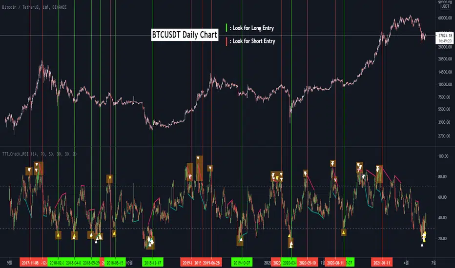
TTT_Crack_RSI_Ver_2.1.0Hello dear traders from all over the world!
It has been a while since our team started concentrating on the technical indicators that apply sources not only on the closed price but also on the high/low prices of the candlestick to overcome the limitations of existing indicators. As mentioned repeatedly before, most of widely adapted indicators in technical chart these days are generated only with the closed prices, not taking in consideration of the wicks or tails of the candlesticks. This crucially leads to a rapid decrease in the reliability especially in current financial market, where ignoring other portions within a candlestick structure and putting weights just on candle body often causes fatal trading outcome. Since phenomenons such as wide price fluctuation and non-ideal price momentum occur more frequently compared to the old days when TA used to perfectly work just as the images in a textbook, sourcing OHLC (Open, High, Low, Closed) prices from a candle structure is becoming more essential and practical.
Such revolutionary perceptions and insights could be easily acquired: by just adding high/low prices of the candlesticks when computing technical indicators, many more meaningful signals were observed. One of the popular indicators we have recently attempted to reflect this very idea was RSI (Relative Strength Index) that was published by the name of “RSI Cloud” months ago. As shown below, this groundbreaking index was to be comprehended as a band or a cloud rather than a single line. In fact, many unexpected methodologies, techniques, and insights were discovered through countless applications as our team went through series of experiments and back/forward tests. The results were quite shocking: Little did we know that drawing trendlines, parallel channels, and previous highs/lows etc. just like we do on the regular candlestick chart would also work decisively. Not only divergences were efficiently captured, but ‘SR Flip’ techniques also functioned as well.
Anyway, validation and verification process has been successful, ensuring that taking all of the candlestick into an account within the indicators provides much more meaningful signals than the indicators with ‘closed source’, the default setting. During thousands of our trials, we questioned to ourselves: If we are going to transform candlestick structure into an equation utilizing all of the prices, why don’t we just express the index with the same format, as another candlestick? The initial intention of the clouds or bands were to adapt the tails of the candle and to smooth them out. And this radical idea changed the whole game. By applying this candlestick format insights, even more significant signals were brought up on to the surface that surprised all of us.
Without a doubt, just like the cloud version, the candlestick version even works better when applying trendlines, pivots, channels, divergences and SR Flips, etc. As we were studying behaviors of the RSI candlestick indicator, a determinant and significant signal was detected that can be usefully referred to traders and this core element is why this update extremely so innovative. We spotted that the emergence of consecutive tails could be a valuable signal that could be weighted. Especially when the tails appeared in sequence in overbought and oversold zone, a strong preference of trend reversal was observed. It was only matter of time to search for the proper parameters and values that fits the market!
And here we are, presenting our newest indicator, “TTT_Crack_RSI_2.1.0” Just like the previous version, it catches regular and hidden divergences automatically and furthermore, we made it to detect appearance of sequential candle wicks in overbought/sold zone (70 and 30 as default) signaling some possibility of trend reversal. The default setting for the consecutive wick counting (Wick Count) is 4, meaning if candle wicks are formed (Top tail in the overbought zone and bottom tail in the oversold zone) four times in a row, a triangle will appear signaling potential trend reversal. As traders’ preferences, the settings can be customized. “Wick Length” setting let users to decide the minimum size of the wick that are to be considered as the proper criteria of candlestick wick. If one wishes to only imply candle wick that are longer than certain length, he or she can increase the “Wick Length” value. We recommend 30~40 for this parameter value. Moreover, if one wants the minimum number of consecutive wicks to that are to be counted to be greater or less, he or she can put in the minimum counting number value at “Wick Count”. For example, if more conservative trader wishes to consider minimum number of consecutive wicks as 6, then the logic will signal only if the wicks appear 6 times in a row in overbought/sold zone. Overbought and oversold zone can also be modified in the settings just like the regular RSI indicator.
How to effectively use this indicator to search for a decent entry point? First of all, do not just enter position only because a single signal has been appeared. The most reliable and strong entry sign would be when the trendline/channel breaks below/above at the overbought/sold zone and at the same time, consecutive wicks and divergence signals appear as well. If all of those signals have been observed, aim for the spot when RSI escape the overbought/sold zone. That would be a proper time to enter a position. As we emphasized many times, it is very reckless to make trading decisions only with technical indicator. It might defer a little bit depending on traders’ tendency, but indicators are to be considered as a side tool to identify macro level trends and signals of possible trend reversal. Always remember, traders that rely on TA must look for the confluent zone and thus the more technical factors that overlap price-wise and time-wise, the more reliability can be given.
If you wish to try our work, please comment below or send message to this account.
Thank you very much.
안녕하세요 트레이더 여러분. 토미 트레이딩 팀의 토미입니다.
최근 저희 개발팀은 캔들차트의 종가만으로 산출되는 기술적 지표들의 한계점을 극복하고자 캔들 고/저가까지 적용을 시켜 ‘요즘 장에 더 맞는’ 지표들을 만들기 위해 많은 노력을 해왔습니다. 저희 시장 분석/시황, 강의자료, 그리고 지표 개발 문서에서 누누이 언급 드렸듯, 근래 많은 트레이더 분들에게 널리 사용되고 있는 대부분의 지표들은 캔들의 종가만 고려하는 경우가 많습니다. 비상식적이고 두 눈으로 보고도 믿기지 않을 가격 모멘텀 및 변동성이 난무하는 요즘 21세기 금융시장에서는 예전처럼 교과서에나 볼 법한 뻔하고 예측 가능한 패턴 및 형국들을 찾아보기 힘들어졌습니다. 이렇게 급변하는 최근 시장 성향 상 기술적 분석에 캔들 꼬리를 배제하고 몸통만 고려하기에는 너무 치명적인 리스크가 뒤따라오기 마련입니다.
이런 궁극적인 목표로 개발에 착수한 저희 팀은 캔들의 OHLC(시, 고, 저, 종가)를 지표에 내포시켜 더 유의미한 신호들을 도출할 수 있다는 이론을 검증하였고 이를 반영해 몇 달 전 "RSI 클라우드"를 트레이딩뷰에 출시한 바 있습니다. 아래의 링크(이미지)에서 시사하는 바와 같이 RSI 역시 주가를 하나의 라인이 아닌 구조로 해석하여 밴드나 클라우드 형태로 표현해보니 실제로 더 높은 실용성과 활용성을 입증할 수 있었습니다. 또한 수많은 실험과 백/포워드 테스팅을 거치면서 사전에 전혀 예상치 못한 방법론 및 기법들을 응용시킬 수 있다는 사실까지 밝혀냈습니다. 일반 캔들 차트처럼 추세선, 평행채널, 피봇, 그리고 전 매물대 등의 작도법을 적용시킬 수 있을뿐더러 캔들의 종가가 아닌 고/저가를 활용해보니 더 효과적인 일반/히든 다이버전스 시그널을 찾아낼 수 있었습니다. 게다가 SR Flip (지지와 저항이 뚫리면 바뀌는 현상) 이론마저 잘 먹히는 현상을 인지한 저희는 개발 방향을 이쪽으로 더 깊고 세밀하게 발전시키는 쪽으로 잡았습니다.
여러 시행착오를 통해 이것저것 될 만한 건 다 시도해보던 와중, 저희는 어느 날 문득 이런 질문을 던지게 됩니다. ‘어차피 이왕 캔들의 OHLC 값을 지표화 시키는 거 차라리 지표마저 동일하게 캔들화시키는 게 낫지 않을까?’ 결과는 매우 충격적이면서도 동시에 저희에게 허탈감을 안겨줬습니다. 곰곰이 생각해보니 클라우드/밴드 형태의 지표는 적용시킨 캔들의 고/저가를 일련의 Smoothing out 프로세싱 작업을 입힌 거고 그럴 바엔 오히려 동일한 캔들 형태로 표현해버리면 더 직관적인 경향성과 규칙성을 파악할 수 있을 거란 저희의 예상은 적중했습니다. 클라우드/밴드 지표 형식의 모든 차별성과 장점은 그대로 유지하고 심지어 더 유의미한 신호들을 포착할 수 있었습니다.
해당 산출물에 추세선, 평행채널, 피봇, 전 매물대, 그리고 SR FLIP과 같은 작도법과 다이버전스 시그널 등을 더 세밀하고 효율적으로 적용시킬 수 있는 건 물론이고, 그 외 저희는 또 한가지 결정적이고 획기적인 시그널을 탐지했습니다. 사실 이 부분이 이번 업데이트의 가장 핵심 요소라고 볼 수 있습니다. 캔들스틱화된 RSI 지표의 경향성 및 규칙성 고찰 과정 중 캔들 꼬리가 연속적으로 출현하는 현상에 심상치 않은 기운을 감지한 저희 팀은 정말 소름이 돋을 정도로 용이한 추세 전환 시그널을 발견했습니다. 바로 과매도 구간에서는 아래꼬리, 과매수 구간에서는 위꼬리가 연달아 나올 경우 상당히 높은 확률로 변곡점이 출현하고 추세가 전환되는 경향성에 가중치를 부여해 이에 최적화된 파라미터 및 설정 값들을 찾아 로직화 시켜봤습니다. 결과는 아주 만족스러웠습니다.
이름하여 저희의 최신 지표인 "TTT_Crack_RSI_2.1.0"를 여러분께 소개 드립니다. 이전 버전인 “RSI Cloud”와 마찬가지로, 종가가 아닌 고/저가의 일반/히든 다이버전스 시그널을 알아서 포착해주고, 더 나아가 과매매 구간(기본 값은 30/70이며 설정 변경 가능)에서 RSI 캔들 꼬리의 연속성을 자동으로 감지해 표시(삼각형)를 해주게 끔 만들었습니다. 과매매 구간에서 연이어 출현하는 캔들 꼬리 카운팅의 최소 값은 4으로 디폴트 값 설정을 해 놨습니다. 더 보수적/공격적으로 접근하고 싶으신 분들은, 즉 최소 카운팅 값을 4이 아닌 다른 값으로 변경하고 싶으신 분들은 설정에 들어가셔서 “Wick Count” 항목에 원하는 값을 기재하시면 됩니다.
캔들 꼬리라는 게 어떻게 보면 상대적이고 주관적인 개념일 수 있습니다. 캔들꼬리가 조금만 나와도 의미 부여를 할 수 있는가 하면 특정 이상 길이 아니면 의미 부여를 하지 않을 수 있습니다. 저희는 유저들에게 최대한 높은 유동성을 제공하고자 본 메커니즘이 정의하는 캔들 꼬리 길이를 변경할 수 있도록 만들어 놨습니다. ‘Wick Length” 설정 값을 통해 해당 로직이 간주하는 최소 캔들꼬리 길이를 정할 수 있습니다. 기본 설정 값은 30으로 되어 있고, 경험상 30~40 정도가 적당하다고 보고 있습니다.
마지막으로 해당 지표로 효과적인 진입 타점을 찾는 법을 간략히 알려드리겠습니다. 우선 절대로 아무 시그널 하나 툭 떴다고 무조건 바로 진입하는 건 절대 삼가해주세요. 가급적이면 과매매 구간에서 추세선/채널 이탈, 연속 캔들 꼬리 신호, 그리고 다이버전스가 동시에 떴을 상황을 예의주시하시면 됩니다. 이렇게 비교적 비슷한 시간에 유의미한 신호들이 포착되었다면 또 바로 진입하지 마시고 조금 더 기다리셨다가 과매매 구간을 벗어나는 타이밍을 노리시면 됩니다. 항상 강조드리지만 기술적 지표 하나만 가지고 트레이딩 의사결정을 하는 건 정말 무모한 행위입니다. 개인의 매매성향 마다 다르겠지만 기술적 지표는 항상 큰 추세와 변곡 출현 가능성을 파악하는데 참고하는 용도로 사용 하셔야지 그렇지 않으면 캔들차트는 아예 꺼버리고 지표만 보고 매매하는 꼴이 됩니다.
해당 지표를 사용하고 싶으신 분들은 아래에 댓글 혹은 본 계정으로 메시지(DM) 보내주시면 감사하겠습니다.
감사합니다. 여러분들의 구독, 좋아요, 댓글은 저희에게 정말 큰 힘이 됩니다^^
EMA cloudsCredits to Ripster47
5-12 ema cloud
34-50 ema cloud
72-89 ema cloud
1H is actually very important on swings + Daily/Weekly Level
5-12 EMA clouds on 1H Tell Trend
34-50 EMA clouds on 1H act as Dynamic Trendlines
72-89 EMA clouds on 3min acts as Dynamic Trendlines
EngineeringRobo DeluxeToday we are releasing the EngineeringRobo Deluxe!
New advanced trading tools for traders and investors. The new Robo 4 is extremely powerful !
It works perfectly with other existing strategies as an add-on feature. EngineeringRobo Deluxe has seen major improvements in accuracy of levels, speed and intelligence to detect the best possible trade setups.
This script is equipped with
🔵 EngineeringRobo 4
It offers strategic trading entry and exit points, so you can preserve capital before markets tumble, and take full advantage as they start to rebound. At a glance, market timing indicators tell investors whether market conditions are right or whether it’s safer on the sideline.
Truly unique tool for technical analysis for the financial market as it includes calculation of specific metrics like SAR + MACD + Price Movement.
You no longer have to worry about spending hours in front of the computer looking for a trade.You can use the indicator on every assets available on your broker.
🔵 Change Candle Color
You can change the colors depending on buy 4 and sell 4 signals. It helps traders a lot to see the direction clearly.
🔵 BB Signals :
This strategy uses the MACD indicator together with the Bollinger Bands to sell when the price is above the upper Bollinger Band (and to buy when this value is below the lower band). This simple strategy only triggers when both the MACD and the Bollinger Band indicators are at the same time in a overbought or oversold condition.
Removed Upper & Lower bands & SMA20 from the charts.
To see bands, You can activate the Bollinger Bands on EngineeringRobo - not the Deluxe version.
If you are buying it with BB BUY, No need to wait for BB Sell to sell it. Vice versa.
They are not the opposite to each other. Get your profit at your target level and move on.
🔵 Ultimate MA crossover signals :
As a general guideline,the idea behind trading crossovers is that a short-term moving average above a long-term moving average is an indicator of upward momentum in a stock & crypto , and the opposite is true about a short-term average trading below a long-term average.
For this guideline to be of use, the moving average should have provided insights into trends and trend changes in the past.
Are the settings of SMA 50 & SMA 200 really the best for Golden Cross and Death Cross?
Have you ever tested ROI for MA cross strategies?
Do you think MA 20 and MA 50 are the best pair for traders?
Do you know that Exponential Moving Average ( EMA ) beats the Simple Moving Average ( SMA ) ?
In order to answer these questions we applied some brute mathematical force and tested 1830 different MA combination to find out the best pair through 50 years of data across stock / forex and 5 years of data across crypto markets . We have done the hard work and you get the benefits .
P.S. The oldest date is 1872 on SPCFD:SPX chart on tradingview . Almost 150 years of backtesting is possible from 1872 to 2020!
🔵 Cloud Signals :
This is a strategy made from ichimoku cloud , together with MACD . Changed Ichimoku cloud formula. Based on that we have a long or a short entry.
it is an effective strategy when paired with a trailing stop loss. Removed standard line ( Kijun Sen ), turning line ( Tenkan Sen ), lagging line ( Chikou Span ) and senkou lines, added buy & sell signals. Traders can use EngineeringRobo's cloud to see the clouds on the chart.
This method doesn't work in sideways markets, only in volatile trending markets.
🔵 EMA TrendLines & Custom Moving Average :
Moving averages help traders isolate the trend in a security or market, or the lack of one, and can also signal when a trend may be reversing. Two of the most common types are simple and exponential. We will look at the differences between these two moving averages, helping traders determine which one to use. Simple moving averages and the more complex exponential moving averages help visualize the trend by smoothing out price movements.
Each trader must decide which MA is better for his or her particular strategy. Many shorter-term traders use EMAs because they want to be alerted as soon as the price is moving the other way. Longer-term traders tend to rely on SMAs since these investors aren't rushing to act and prefer to be less actively engaged in their trades.
🟠50 And 200 Day Moving Average Rules
Trend reversal (downtrend to uptrend) - MA 50 crossover MA 200 from below.
Trend reversal (uptrend to downtrend) - MA 50 crossover MA 200 from above.
Weekly open –close above MA 20 ( bullish trend )
Weekly open –close below MA 50 ( Bearish trend )
Super Bullish : The candle is above MA 20 ( Daily )
Bullish : MA 50 Above MA 100 ( Daily )
Bearish : MA 50 below MA 100 ( Daily )
🔵 Fear & Greed Index
This strategy uses two unique EMA indicators in the formula.
1. Use the indicator to identify when investors are greedy.
2. Use the indicator to identify potential bottom levels
For best testing example:
Open BLX Chart, pick 1D time frame, open only FEAR & Greed Index
🟢Green Area : Ready to buy a lot of cryptocurrencies
🔴Red Area : Ready to sell a lot of cryptocurrencies
Price crosses above red line = Entering overbought zone
Price crosses below red line = Exiting overbought zone
Price crosses below green line = Entering oversold zone
Price crosses above green line = Exiting oversold zone
🔵 Automated Trend Channel Lines
It’s 2020 and you are still drawing lines?
The automated trend lines helps you find the best trend lines and you can stop re-drawing over and over. You don't need to flip back and forth between different timeframes. You can let your robo advisor do the work for you.
🔵 Dynamic Support and Resistance Levels
On the most fundamental level, support and resistance are simple concepts. The price finds a level that it’s unable to break through, with this level acting as a barrier of some sort. In the case of support, price finds a “floor,” while in the case of resistance, it finds a “ceiling.”
Basically, you could think of support as a zone of demand and resistance as a zone of supply.
While more traditionally, support and resistance are indicated as lines, the real-world cases are usually not as precise. Bear in mind; the markets aren’t driven by some physical law that prevents them from breaching a specific level. This is why it may be more beneficial to think of support and resistance as areas. You can think of these areas as ranges on a price chart that will likely drive increased activity from traders.
🔵 Automated Fibonacci Retracements
Automatic Fibonacci let you replace subjective manual analysis with objective automated analysis so you always get the best Fibonacci levels, this can really improve the quality of your trading decisions.
Fibonacci retracements are often used to identify the end of a correction or a counter-trend bounce. Corrections and counter-trend bounces often retrace a portion of the prior move. While short 23.6% retracements do occur, the 38.2-61.8% zone covers the most possibilities (with 50% in the middle). This zone may seem big, but it is just a reversal alert zone. One of the best ways to use the Fibonacci retracement tool is to spot potential support and resistance levels and see if they line up with Fibonacci retracement levels.
Even though Fibonacci levels are extremely popular among technical traders, one should not rely solely on Fibonacci retracement and extension levels in trading. Fibonacci tools return the best results when combined with other technical tools, such as trendlines , chart patterns, candlestick patterns, channels or technical indicators.
If you are following any EngineeringRobo Deluxe signals, you should always wait for the candle close before buying or selling.
The signal can come and go anytime during the live candle. ALL indicators do that, that is not considered repainting.
Repainting is when a signal appears, the candle is closed, and when you refresh the chart it disappeared. It is logical that until the candle is closed the signal is not decided yet, hence the alert setup as Once per bar Close.
Deluxe never repaints! Yes, you heard it right: you will never have to worry about signal changing after the candle is closed.
*** Added alarm system alerts for all signals.
________________________________________________________________________ Timeframes _____________________________________________________________________
Our recommendations to get the best results:
Swing Trading Crypto : Use 1D Time Frame Candles
Swing Trading Stocks : Use 1W Time Frame Candles
Swing Trading Commodities : Use 1W Time Frame Candles
Day Trading Crypto : Use 3H Time Frame Candles
Day Trading Stocks : Use 1D Time Frame Candles
Day Trading Commodities : Use 1D Time Frame Candles
Not recommended any other time frames.
What Is Risk-Reward Ratio RRR?
Your risk-reward ratio is how much you risk per trade, relative to how much you expect to make (reward).
When trading with Robo , you should always aim for a bigger reward compared to your risk per trade.
A good rule is only to risk 1% per trade for day traders and 5% per trade for swing trader . Robo follows strong risk management rules on the algorithm .
One of the biggest advantages of algo trading is removing human emotion from the financial markets,humans trading are susceptible to emotions that lead to irrational decisions. Robo doesn't have to think or feel good to make a trade. If conditions are met, it enters.When the trade goes the wrong way or hits a profit target, It exits. It doesn't get angry at the market or feel invincible after making a few good trades.
EngineeringRobo gives you all the tools and information you need for day-to-day trading and investing, while also keeping a great buy and sell signals! No excuse to lose in any financial market anymore! Try now!
How can you add the algorithm into your chart?
1. Login to TradingView.com
2. From the homepage, click on ‘Chart’ in the top navigation bar
3. Select “Indicators” on the top-center-middle panel
4. In the indicator library, type "EngineeringRobo Deluxe "
5. Use the website link below to obtain access to this indicator
The indicator will be added to your chart after It is approved.
Adaptive Trend (Expo)Adaptive Trend (Expo)
DESCRIPTION
This Adaptive Trend (Expo) indicator is used to detect trends as well as to adapt to the trend characteristic in order to filter-out trend noise. Having an indicator like this enables professional traders to stay longer in trends. The indicator is also equipped with upper- and lower boundaries as well as a mid-line.
Positive trend
If the two trendlines (positive & negative trendline) emerges into one single line, it’s regarded as a positive trend. If a green cloud is painted in the indicator it’s a sign that the indicator is categorizing that price move as noise, and thus the professional trader should keep their long position, or enter Long.
Negative trend
If the two trendlines (positive & negative trendline) separates and become two lines as well as a red cloud is painted in the indicator, this is regarded as a negative trend.
As a general rule, if the ‘positive & negative trendline’ is above the midline there is a positive trend. If the ‘positive & negative trendline’ is below the midline there is a negative trend.
You have the possibility to change the ‘trendvalue’, a shorter length is more sensitive than a longer length.
HOW TO USE
1. Use the indicator to identify trends.
2. Use the indicator as a trend following strategy.
INDICATOR IN ACTION
EURUSD
EURUSD
EURUSD
BTCUSD
The indicator works with RENKO, HEIKIN ASHI and with KAGI charts as well.
I hope you find this indicator useful, and please comment or contact me if you like the script or have any questions/suggestions for future improvements. Thanks!
I will continue to work on this indicator, so please share your experience and feedback with me so that I can continuously improve it. Thanks to everyone that have contacted me regarding my scripts. Your feedback is valuable for future developments!
ACCESS THE INDICATOR
• Contact me on TradingView or use the links below
-----------------
Disclaimer
Copyright by Zeiierman.
The information contained in my scripts/indicators/ideas does not constitute financial advice or a solicitation to buy or sell any securities of any type. I will not accept liability for any loss or damage, including without limitation any loss of profit, which may arise directly or indirectly from use of or reliance on such information.
All investments involve risk, and the past performance of a security, industry, sector, market, financial product, trading strategy, or individual’s trading does not guarantee future results or returns. Investors are fully responsible for any investment decisions they make. Such decisions should be based solely on an evaluation of their financial circumstances, investment objectives, risk tolerance, and liquidity needs.
My scripts/indicators/ideas are only for educational purposes!

[Coingrats] Trading strategie v1 [BETA]//=================================================================================================
THIS IS A BETA VERSION AND FREE TO USE FOR EVERYONE.
BECOME BETA TESTER, PLACE A COMMENT. FEEDBACK IS VALUED.
WHEN THE BETA PERIOD IS EXPIRED THIS SCRIPT WILL BE ADAPTED TO A FREE VERSION
FOR THE BETA TESTERS (DON'T FORGET YOUR COMMENT) THERE IS A LIFETIME OFFER FOR THE PREMIUM
I DEVELOPED THIS STRATEGY TO QUICKLY DISCOVER TREND CHANGES OR WHERE INDECISION IS PRESENT
DO NOT TRADE BLINDLY, BUT CHECK THE FINDINGS THAT YOU SEE ON THE CHART
USE WITH HOLLOW CANDLES ONLY!!!!
ALL PROCESSED IN ONE INDICATOR, ALSO WITH A FREE TRADINGVIEW ACCOUNT YOU CAN USE HIM.
FOR CONFIRMTION YOU CAN ADD THE INDICATORS RSI AND MACD
WE ARE ALSO DEVELOPING OUR OWN CRYPTORADAR THAT CAN GIVE YOU VARIOUS SIGNALS ON TELEGRAM.
CHECK THE WEBSITE MYCRYPTORADAR.COM
//=================================================================================================
//INFO DIVERGENCE STRATEGIE
- When there is a line visible the bull(green)/bear(red) divergence is legit. Go long or short
- When there is a green triangle above a candle, take some profits on the bull divergence
- When there is a red triangle below a candle, take some profits on the bear divergence
- You can play with the settings but i think this are the best settings.
- Standard settings work best on higher timeframe (4H or higher)
//INFO PIVOT REVERSAL STRATEGIE
- When there is a green cross under a candle = possible signal to go long
- When there is a red cross above a candle = possible signal to go short
//INFO S/R LINES AND TRENDLINES
- Automatic set S/R levels on the timeframe on your chart
- In the settings you can enable trendlines on your chart
- Calculation mode = strict. You get a clean chart with major S/R lines
- Calculation mode = loose. You get a chart with more S/R lines. It helps to find orderblocks
- Top and bottom fractal source. Choose what you like for setting the S/R lines
//INFO CANDLE STRATEGIE
- Paints outside candles green
- Paints inside candles blue
- Paints highwave candles purple
- Paints morning star patterns red
- Paints evening star patterns grey
- Marked bullish engulfing with a green BE mark
- Marked bearish engulfing with a red BE mark
//INFO EMA - SMA
- You have the choice of 5x EMA and 3X SMA lines
- Including crossover alerts for all crossovers
- Standard only crossover EMA8 - EMA21, Golden cross & Death cross (SMA) signals are enabled
- Signal// EMA8 - EMA21 crossover marked a bleu/purple dot on the crossover
- Signal// Golden cross marked a golden cross on the crossover
- Signal// Death cross marked a red cross on the crossover
- In the settings you can set your own crossover alerts
[AN] Traders Magic OscilatorsOscillator that determines the current trend and signals possible trend reversals.
Best used alongside Gaussian Trendlines ()

Rolling Midpoint of Price & VWAP with ATR BandsThe Rolling Midpoint of Price & VWAP with ATR Bands indicator is a dual-equilibrium concept that fuses price-range structure and traded-volume flow into one continuously updating hybrid model. Traditional VWAPs reset each session and reflect where trading occurred by volume, while midpoints used here reveal where price has structurally balanced between extremes. This script merges both ideas into a cohesive, dynamic system. The Rolling Price Midpoint (50 % of range) represents the structural fair-value line, calculated as the average of the highest high and lowest low over a selected window. The Rolling VWAP (Volume-Weighted Window) tracks the flow-based fair-value line by weighting each bar’s typical price by its volume. Together, these components form the Hybrid Equilibrium — the adaptive center of gravity that shifts as price and volume evolve. Surrounding this equilibrium, ATR Bands at ± 2.226 ATR and ± 5.382 ATR define volatility envelopes that expand and contract with market energy. The result is a living cloud that breathes with the market: compressing during phases of balance and widening during impulsive movements, offering traders a clear visual framework for understanding equilibrium, volatility, and directional bias in real time.
➖
⚙️ Auto-Preset System
The Auto-Preset System intelligently adjusts lookback windows for both the Price Midpoint and VWAP calculations according to the active chart timeframe.
This ensures that the indicator automatically adapts to any trading style — from scalping on 1-minute charts to swing trading on daily or weekly charts — without manual tuning.
🔹 How It Works
When Auto-Preset mode is enabled, the script dynamically selects the most effective lookback lengths for each timeframe.
These presets are optimized to balance responsiveness and stability, maintaining consistent real-world coverage (e.g., the same approximate duration of price data) across all intervals.
📊 Preset Mapping Table
| Chart Timeframe | Price Midpoint Lookback | VWAP Lookback |
|:----------------:|:-----------------------:|:--------------:|
| 1–3m | 13 bars | 21 bars
| 5–10m | 21 bars | 34 bars
| 15–30m | 34 bars | 55 bars
| 1–2 hr | 55 bars | 89 bars
| 4 hr-1D | 89 bars | 144 bars
| 1W | 144 bars | 233 bars
| 1M | 233 bars | 377 bars
⚡ Notes & Customization
- Manual Override: Turn off Auto-Preset Mode to specify your own custom lookback lengths.
- Consistency Across Scales: These adaptive values keep the indicator visually coherent when switching between timeframes — avoiding distortions that can occur with static lengths.
- Practical Benefit: Traders can maintain a single chart layout that self-tunes seamlessly, removing the need to manually recalibrate settings when shifting from short-term to long-term analysis.
In short, the Auto-Preset System is designed to make this hybrid equilibrium tool timeframe-aware — automatically scaling its logic so that the cloud behaves consistently, regardless of chart resolution.
➖
🌐 Hybrid Equilibrium Envelope
The core hybrid midpoint acts as the mean of structural (price) and volumetric (VWAP) balance.
ATR-based bands project natural expansion zones:
🔸+2.226 / –2.226 ATR → inner equilibrium (controlled trend)
*🔸+5.382 / –5.382 ATR → outer volatility extension (over-stretch / reversion zones)
Color-coded fills show regime strength:
* 🟧 Upper Outer (+5.382) – strong bullish expansion
* 🟩 Upper Inner (+2.226) – trending equilibrium
* 🔴 Lower Inner (–2.226) – mild bearish control
* 🟣 Lower Outer (–5.382) – volatility exhaustion
➖
🧭 Higher-Timeframe Framework
Two macro anchors — Price length of 144 and VWAP length of 233 — outline higher-timeframe bias zones. These help confirm when local momentum aligns with (or fades against) long-term structure.
Labels on the right show active lookback values for quick readout:
`$(13) V(21)` → current rolling pair
`$144 / V233` → macro anchors
➖
🧩 Chart Examples
**AMD 15m (Equilibrium Expansion)**
Price steadily rides above the hybrid midpoint as teal and orange (bullish) ATR zones widen, confirming a phase of controlled bullish volatility and healthy trend expansion.
BTCUSD 1m (Volatility Compression)
Bitcoin coils tightly inside the teal-to-maroon equilibrium bands before breaking out.
The hybrid midpoint flattens and ATR envelopes contract, signaling a state of balance before volatility expansion.
ETHUSD 15m (Transition from Compression → Impulse)
Ethereum transitions from purple-zone compression into a clear upper-band expansion.
The hybrid midpoint breaks above the macro VWAP 233, confirming the shift from equilibrium to directional momentum.
SOFI 1m (Micro Bias Reversal)
SOFI’s intraday structure flips as price reclaims the hybrid midpoint.
The macro VWAP 233 flattens, signaling a transition from oversold lower bands back toward equilibrium and early trend recovery.
➖
🎯 How to Use
1. Bias Detection – Price > Hybrid Midpoint → bullish; < → bearish.
2. Volatility Gauge – Watch band spacing for compression / expansion cycles.
3. Confluence Checks – Align Hybrid Midpoint with HTF 233 VWAP for strong continuation signals.
4. Mean Reversion Zones – Outer bands highlight areas where probability of snap-back increases.
➖
🔧 Inputs & Customization
Auto Presets toggle
🔸Manual Lookback Overrides** for fine-tuning
🔸Plot Window Length** (show recent vs full history)
🔸ATR Sensitivity & Fill Opacity** controls
🔸Label Padding / Font Size** for cleaner overlay visuals
➖
🧮 Formula Highlights
➖Rolling Midpoint = (highest(high,N) + lowest(low,N)) / 2
➖Rolling VWAP = Σ(Typical Price×Vol) / Σ(Vol)
➖Hybrid = (PriceMid + VWAP) / 2
➖Upper₂ = Hybrid + ATR×2.226
➖Lower₂ = Hybrid − ATR×2.226
➖Upper₅ = Hybrid + ATR×5.382
➖Lower₅ = Hybrid − ATR×5.382
➖
🎯 Ideal For
➡️ Traders who want adaptive fair-value zones that evolve with both price and volume.
➡️ Analysts who shift between scalping, swing, and position timeframes, and need a tool that self-adjusts.
➡️ Those who rely on visual structure clarity to confirm setups across changing volatility conditions.
➡️ Anyone seeking a hybrid model that unites structural range logic (midpoint) and flow-based balance (VWAP).
➖
🏁 Final Word
This script is more than a visual overlay — it’s a complete trend and structure framework built to adapt with market rhythm. It helps traders visualize equilibrium, momentum, and volatility as one cohesive system. Whether you’re seeking clean trend alignment, dynamic support/resistance, or early warning signs of reversals, this indicator is tuned to help you react with confidence — not hindsight.
➖
Remember — no single indicator should ever stand alone. For best results, pair it with price action context, higher-timeframe structure, and complementary tools such as moving averages or trendlines. Use it to confirm setups, not define them in isolation.
💡 Turn logic into clarity, structure into trades, and uncertainty into confidence.

Guppy EMA Promax V 2.1 [NMTUAN] TradingView Indicator: A Comprehensive Market Analysis Tool
Authored by NMTUAN, this all-in-one indicator is designed to provide traders with a holistic and actionable view of the market. Instead of relying on a dozen different tools, this single indicator consolidates the most crucial aspects of technical analysis to help you make more informed and confident trading decisions.
Key Features:
Smart Money Concepts (SMC) Levels: Our indicator automatically identifies key support and resistance levels based on the principles of Smart Money Concepts. This helps you spot where institutions and large players are likely to enter or exit the market, giving you a strategic edge.
Trend and Trendline Analysis: Gain a clear understanding of the market's direction with integrated trend identification and automated trendlines. This feature helps you quickly visualize the prevailing market momentum and potential areas of interest.
Volatility and Volume Insights: We've included Average True Range (ATR) to measure market volatility and Volume analysis to confirm the strength of price movements. These two metrics are essential for validating potential breakouts and reversals.
💎💎💎 We are the Masters- by edegrano-Donna-Leah 2How to Use the "💎💎💎 We are the Masters" Script
1. Set Your Timeframes
EMA Timeframes (emaTF1, emaTF2, emaTF3):
Choose 3 different chart timeframes on which you want to analyze the EMA bias. These timeframes will determine how the script evaluates the market trend via EMAs.
Trendline Timeframes (tf1, tf2, tf3):
Choose 3 timeframes for the linear regression trendlines. These smooth out price action and indicate the trend slope.
2. Set Linear Regression Length (regLen)
This controls the length (number of bars) the linear regression trendline uses to calculate the trend.
Smaller values make the trendline more sensitive; higher values smooth out noise but react slower.
3. Interpret the Output
EMA Bias per Timeframe:
Bullish if EMA 50 > EMA 200 on that timeframe.
Bearish if EMA 50 < EMA 200.
Trendline Slope per Timeframe:
Bullish if current regression value > previous regression value (price is trending up).
Bearish if current regression value ≤ previous regression value.
Special Buy Signal:
When all 3 EMA biases are bullish AND all 3 trendline slopes are bullish → Strong Buy Signal (blue dot below bar).
Special Sell Signal:
When all 3 EMA biases are bearish AND all 3 trendline slopes are bearish → Strong Sell Signal (red dot above bar).
EMA Crosses:
The script plots vertical lines and labels on the current timeframe when EMA 50 crosses above (bullish) or below (bearish) EMA 200.
Information Table:
Shows EMA bias and trendline slope status for all timeframes, last EMA cross info, and final overall suggestion.
4. How to Use in Trading
Confirm Trend: Use the EMA bias and trendline slope confluences to confirm the overall trend across multiple timeframes.
Trade Entry: Consider entering long when the special buy signal appears; enter short when the special sell signal appears.
EMA Crosses: Use crosses as secondary confirmation or to detect early momentum shifts.
Trendline Slope: Helps confirm if the price is gaining or losing strength on different timeframes.
Monitor Table: Quickly glance to understand current market bias and confluence.
Suggested Parameters for Different Trading Styles
Style EMA Timeframes Trendline Timeframes Linear Regression Length (regLen)
Scalping 1 min, 3 min, 5 min 1 min, 3 min, 5 min 15 - 20 (responsive, fast)
Day Trading 5 min, 15 min, 30 min 5 min, 15 min, 30 min 20 - 30 (balanced responsiveness)
Swing Trading 1 hr, 4 hr, Daily 1 hr, 4 hr, Daily 30 - 50 (smoother, slower trend)
Position Trading 4 hr, Daily, Weekly 4 hr, Daily, Weekly 50 - 100 (very smooth)
Tips
When using short timeframes, keep the regression length smaller for quicker reaction to price changes.
For longer timeframes, increase regression length to reduce noise and false signals.
Use this script alongside volume or other indicators to improve entry quality.
Avoid trading against the overall confluence bias (e.g., don’t enter longs if final suggestion is “Strong Bearish”).
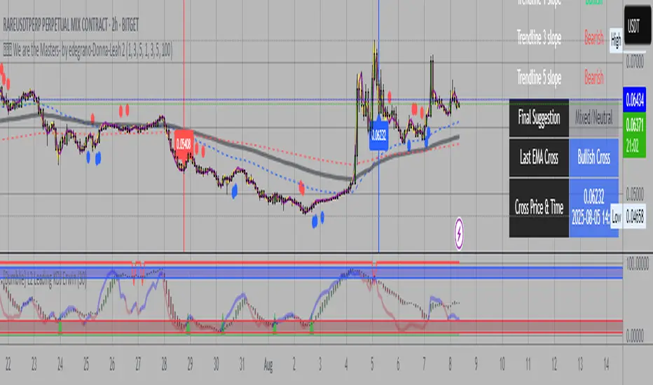
WT + Stoch RSI Reversal ComboOverview – WT + Stoch RSI Reversal Combo
This custom TradingView indicator combines WaveTrend (WT) and Stochastic RSI (Stoch RSI) to detect high-probability market reversal zones and generate Buy/Sell signals.
It enhances accuracy by requiring confirmation from both oscillators, helping traders avoid false signals during noisy or weak trends.
🔧 Key Features:
WaveTrend Oscillator with optional Laguerre smoothing.
Stochastic RSI with adjustable smoothing and thresholds.
Buy/Sell combo signals when both indicators agree.
Histogram for WT momentum visualization.
Configurable overbought/oversold levels.
Custom dotted white lines at +100 / -100 levels for reference.
Alerts for buy/sell combo signals.
Toggle visibility for each element (lines, signals, histogram, etc.).
✅ How to Use the Indicator
1. Add to Chart
Paste the full Pine Script code into TradingView's Pine Editor and click "Add to Chart".
2. Understand the Signals
Green Triangle (BUY) – Appears when:
WT1 crosses above WT2 in oversold zone.
Stoch RSI %K crosses above %D in oversold region.
Red Triangle (SELL) – Appears when:
WT1 crosses below WT2 in overbought zone.
Stoch RSI %K crosses below %D in overbought region.
⚠️ A signal only appears when both WT and Stoch RSI agree, increasing reliability.
3. Tune Settings
Open the settings ⚙️ and adjust:
Channel Lengths, smoothing, and thresholds for both indicators.
Enable/disable visibility of:
WT lines
Histogram
Stoch RSI
Horizontal level lines
Combo signals
4. Use with Price Action
Use this indicator in conjunction with support/resistance zones, chart patterns, or trendlines.
Works best on lower timeframes (5m–1h) for scalping or 1h–4h for swing trading.
5. Set Alerts
Set alerts using:
"WT + Stoch RSI Combo BUY Signal"
"WT + Stoch RSI Combo SELL Signal"
This helps you catch setups in real time without watching the chart constantly.
📊 Ideal Use Cases
Reversal trading from extremes
Mean reversion strategies
Timing entries/exits during consolidations
Momentum confirmation for breakouts
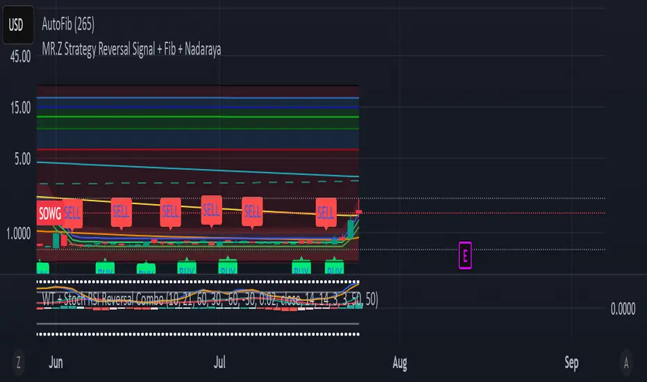
Linear Regression Trendline on Close
This indicator draws a linear regression trendline that connects the closing prices of the last N candles, where N is a user-defined input.
🔹 Key Features:
Uses least-squares linear regression to fit a straight line to recent closes
Automatically adapts to any timeframe (5min, 1h, daily, etc.)
Input lets you select how many recent candles to include
Helps identify short-term trend direction and momentum
🔸 How to Use:
Set the "Number of Candles" input to choose how far back the regression line should look
The line updates in real time as new candles form
Use it to gauge short-term bias, or combine with support/resistance/zones for confirmation
🧠 Tip: Increase the number of candles for smoother trends; decrease for more reactive trendlines.
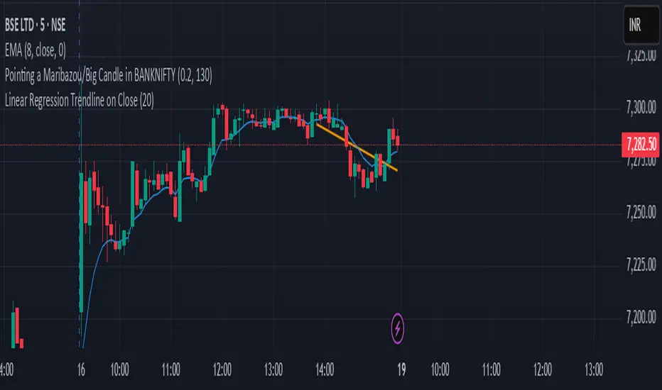
Base Detector Pro [AletheiaTradeLab]This custom Trading View indicator combines William O’Neal “Base” patterns with several complementary tools—David Ryan’s ANT indicator, key pivot‐based price levels, index and earnings lines, relative strength (RS) line, and moving averages—to help you pinpoint base formations and validate whether each one merits a trade.
1. Bases (William O'Neal)
A “base” is simply a period of price consolidation following a significant run-up. During this phase, a stock moves mostly sideways within a defined trading range, forming clear support and resistance lines.
Key Criteria for a Valid Base
- Prior Uptrend
Before a base begins, the stock should already have a healthy advance—typically at least a 30% gain.
- Shapes of Bases
Bases can form in several distinct geometric patterns, each signaling a different kind of consolidation and potential breakout:
Flat Base
Shape : A horizontal rectangle bounded by nearly parallel support (bottom) and resistance (top) trendlines.
Minimum Length : 5 weeks
Maximum Length : 65 weeks
Depth : < 15%
Pivot Point : Left-side high of base
i.ibb.co i.ibb.co
Cup Base
Shape : A smooth, rounded “U” curve.
Minimum Length : 6 weeks
Maximum Length : 65 weeks
Minimum Depth : 8%
Maximum Depth : 50%
Pivot Point : Left-side high of base
i.ibb.co i.ibb.co
Sauce Base
Shape : A very gradual, broad “U” curve, often taking more length than cup bases.
Minimum Length : 6 weeks
Maximum Length : 65 weeks
Minimum Depth : 8%
Maximum Depth : 50%
Pivot Point : Left-side high of base
i.ibb.co i.ibb.co
Cup with Handle Base
Shape : A “U”‐shaped cup followed by a smaller downward-sloping flag or channel (the handle).
Minimum Length : 6 weeks
Maximum Length : 65 weeks
Minimum Depth : 8%
Maximum Depth : 50%
Pivot Point : High of the handle
i.ibb.co i.ibb.co
Saucer with Handle Base
Shape : Similar to cup with handle, but cup looks like the saucer base.
Minimum Length : 6 weeks
Maximum Length : 65 weeks
Minimum Depth : 8%
Maximum Depth : 50%
Pivot Point : High of the handle
i.ibb.co
Ascending Base
Shape : An upward-sloping channel or wedge with 3 pullbacks. Each pullback low should be higher than the previous one. It needs around 20% increase from a base to the other.
Minimum Length : 8 weeks
Maximum Length : 16 weeks
Minimum Depth : 8%
Maximum Depth : 50%
Pivot Point : Left-side high of third base
i.ibb.co i.ibb.co
Consolidation Base
Shape : Similar to flat base, but wider and fails to form any of the above bases.
Minimum Length : 8 weeks
Maximum Length : 16 weeks
Minimum Depth : 8%
Maximum Depth : 50%
Pivot Point : Left-side high of base
i.ibb.co i.ibb.co
- Base Stages
Once a stock has completed its initial 30% run-up and formed its first base, that pattern is labeled Stage 1.
After a breakout from Stage N, the stock must rally at least 20% above the Stage N pivot (the base’s resistance point). If it does, the next valid base becomes Stage N + 1.
When a breakout fails to advance at least 20% a base on base forms. This is considered an extension for the current base stage, and a letter is assigned after the stage number.
When a breakout fails and the price undercuts the low for the previous base, the base stages reset, and a rally of 30% will be needed to form a new stage 1 base.
Note that for IPO stocks, a 30% increase is not required to form the first base. As soon as it meets any of the shape of any of the available bases, it will be drawn.
- Base statistics
To help you determine how healthy is a base, some statistics are available when you hover on the small dot shown above the high-left side of each base.
i.ibb.co
Base : The specific pattern type (Flat, Cup, Sauce, etc.).
Stage : The stage number of the base (1, 2, 3 …) and, in parentheses, how many distinct bases have formed since the very first base (including base-on-base like 1a, 1b, etc.).
Pivot : The resistance level that defines the top of the base. A close above this price often signals a valid breakout and a potential entry point.
Length : The number of bars (days on a daily chart; weeks on a weekly chart) between the start of the base and the bar immediately before breakout. (The initial bar and the breakout bar themselves are not counted.)
Depth : How far, in percentage terms, the low of the base has fallen below its left-side high.
Prior Uptrend : The percent gain from the pivot of the previous base up to the start of the current base.
Blue/Red Count : The number of up days (Blue) and down days (Red) during the base where volume was above the 50-period moving average.
Price % : The percent change from the close at the end of the base to the close at the breakout bar.
Volume % : The percent difference between the volume on the breakout bar and the 50-period average volume at the end of the base.
2. ANT Indicator (David Ryan)
The ANT indicator, developed by David Ryan, is a momentum-based signal used to identify high-potential breakout candidates during a stock’s run-up phase. It complements the base patterns by flagging moments of unusually strong price and volume activity within an uptrend, helping confirm emerging strength before or during a base formation.
i.ibb.co
3. Key Price Levels (Pivots)
Plots recent pivot-based support and resistance levels.
i.ibb.co
4. Index Line Overlay
Overlays a chosen index (e.g. SPX) on the top portion of the chart to compare relative performance.
i.ibb.co
5. Relative Strength (RS) Line
Plots the price ratio of the symbol vs. an index (e.g. SPX) to identify outperformance.
i.ibb.co
6. Moving Averages (SMA & RS-MA)
Allows up to four simple (or exponential) moving averages on price (daily/weekly) and three on the RS line.
7. Earnings Line & EPS Change
Marks earnings events on daily/weekly charts and optionally plots YoY EPS change in a lower portion of the chart. The earnings line also shows a projection to estimated earnings. To maintain alignment with the price chart, the line and YoY EPS data are limited to the most recent 28 quarters on weekly charts and 8 quarters on daily charts. For analyzing older data, you can use the replay feature.
i.ibb.co
8. Bars
Since Trading View displays very thin bars when zoomed out, I added 2-pixel-wide vertical lines over the bars to make them easier to see.
9. Dark Theme
I added this for a quick workaround to adapt colors for dark theme. Enabling this overrides any custom settings. Uncheck to customize colors.
i.ibb.co

Volume Profile With HVN & LVN detectorVolume Profile Indicator
Based on the works of tradeforopp
Overview
The Volume Profile Indicator is a powerful technical analysis tool that visually represents the distribution of trading volume over price levels within a specified timeframe. It helps traders identify key support and resistance zones, high-volume trading areas, and low-volume rejection zones. The indicator includes customizable settings for Volume Point of Control (VPOC), High Volume Nodes (HVNs), and Low Volume Nodes (LVNs), making it a versatile tool for price action analysis and volume-based decision-making.
Key Features
🔹 Customizable Volume Profile
Adjustable number of rows to define the resolution of the volume profile.
Configurable timeframe aggregation for profile calculation (e.g., Daily, Weekly).
Selectable price resolution timeframe for precise profile construction.
Extendable volume profile for future sessions.
Fully customizable profile color and transparency settings.
🔹 Volume Point of Control (VPOC)
Displays the most traded price level within the selected timeframe.
Option to extend multiple VPOCs across the chart.
Adjustable VPOC line width and color customization.
Option to display VPOC labels when working with higher timeframe profiles.
🔹 High Volume Nodes (HVNs)
Identifies high-volume price levels where significant trading activity has occurred.
Configurable HVN strength to adjust detection sensitivity.
Two display modes:
Lines: Plots HVN levels as horizontal lines.
Areas: Highlights HVN regions with colored boxes.
Separate bullish and bearish HVN color settings.
🔹 Low Volume Nodes (LVNs)
Identifies low-volume price levels, which often act as rejection zones.
Configurable LVN strength to fine-tune detection.
Two display modes:
Lines: Marks LVN levels as horizontal lines.
Areas: Highlights LVN regions with shaded boxes.
Separate bullish and bearish LVN color settings.
🔹 Optimized for Performance
Efficient use of arrays for data storage and retrieval.
Global functions for HVN and LVN detection.
Uses security calls to access lower timeframe price and volume data.
Use Cases
✅ Identify Support & Resistance Levels
The indicator highlights key price levels where significant buying or selling interest exists.
✅ Detect Breakout & Reversal Zones
Low-volume areas (LVNs) often indicate price rejection zones, while high-volume areas (HVNs) suggest strong price acceptance zones.
✅ Improve Trade Entries & Exits
Traders can use the Volume Point of Control (VPOC) and volume clusters to refine entry and exit points.
✅ Enhance Price Action Strategies
By incorporating volume-based analysis, this indicator provides deeper market insights beyond traditional support/resistance and trendlines.
Customization & Settings
📌 Volume Profile Settings:
Rows: Defines the granularity of the volume profile.
Profile Timeframe: Specifies the aggregation period (e.g., Daily, Weekly).
Resolution Timeframe: Determines the price resolution for volume analysis.
Profile Extend %: Controls how much the profile extends into the next session.
📌 Volume Point of Control (VPOC):
Enable/Disable VPOC visualization.
Extend past VPOC levels to the right.
Display VPOC labels for higher timeframe profiles.
Adjustable VPOC line width and color.
📌 High Volume Nodes (HVNs):
Enable/Disable HVN detection.
Define HVN strength (volume threshold).
Choose between Line Mode or Area Mode.
Configure bullish and bearish HVN colors.
📌 Low Volume Nodes (LVNs):
Enable/Disable LVN detection.
Define LVN strength (volume threshold).
Choose between Line Mode or Area Mode.
Configure bullish and bearish LVN colors.

Valid Pullbacks Tradinghub 3This script helps identify valid pullbacks. Based on the marked pullbacks, it can draw both internal and external structure trendlines.
A pullback is marked with a small triangle above or below the candle that created the local high or low.
A new local high is marked with a red triangle above the candle if at least one subsequent candle has a low lower than the low of the candle that created the new local high.
A new local low is marked with a green triangle below the candle if at least one subsequent candle has a high higher than the high of the candle that created the new local low.
Based on the marked local highs and lows, the internal structure trendline is created by simply connecting all highs and lows with a line.
The external structure is drawn in a similar way, but only highs and lows that have broken the previous structure are connected. This helps focus on important pivots and better understand the market structure.