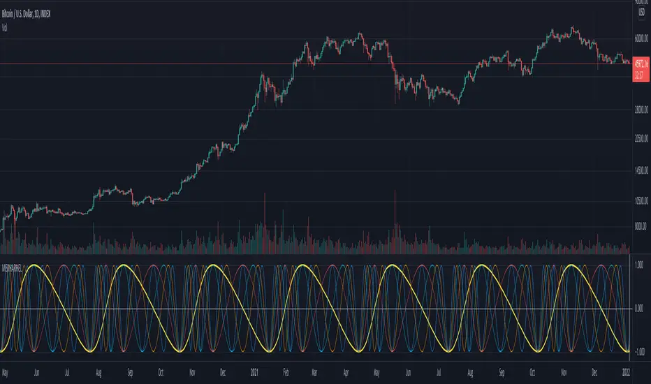
Market Emotion Cycle DetectorThis indicator estimates emotional phases in price behavior by measuring how far price deviates from its dynamic mean.
It uses an adaptive Z-Score normalization with volatility-aware scaling and optional higher-timeframe blending.
Each candle is color-coded according to its deviation level, creating a clear visual map of market sentiment, from extreme panic (MAX FEAR) to euphoric exhaustion (MAX EUPHORIA).
The tool helps identify accumulation and distribution phases inside cyclical or mean-reverting markets.
🧩 Core Logic
Z-Score of EMA-smoothed price: measures standardized distance from the mean.
ATR regime scaling: adjusts sensitivity across volatility environments.
Optional higher-TF fusion: smooths sentiment transitions without lookahead.
Phase classification: seven discrete emotion zones (MAX FEAR → MAX EUPHORIA).
Non-repainting signals: phase changes confirmed on bar close only.
⚙️ Setup Instructions
To allow full color rendering by the Emotion Candles:
Open Chart Settings → Symbol → Candles
• Uncheck “Color bars based on previous close”
• Clear all Body, Wick, and Border colors
On the chart, right-click any overlay element (coin label, MTX, indicator tag …)
• Choose Hide from the ⋮ menu to keep the view clean
Ensure background contrast makes emotion colors visible.
🎯 Usage Notes
Designed for contextual sentiment analysis, not automated entries.
Works best when combined with independent trend or structure confirmation.
Webhook-ready alerts are available for LONG / SHORT / FLAT transitions.
Default parameters are calibrated for daily and 4-hour charts; shorter TFs may require reduced lookback.
📘 Classification Reference
MAX FEAR:
Capitulation & panic; potential deep-value accumulation zones
FEAR:
Negative bias but stabilizing volatility
CONCERN:
Early recovery interest; risk-reward starts improving
NEUTRAL:
Balanced sentiment, transition zone
MILD GREED:
Optimism emerges, trend continuation possible
GREED:
Late-stage rally; profit-taking often begins
MAX EUPHORIA:
Emotional climax, exhaustion and distribution signals
This publication is an original implementation of an adaptive sentiment model - not a mash-up or derivative of existing indicators.
Created by geokat
Pesquisar nos scripts por "Cycle"

Perpetual Swing [HCR]The Perpetual Swing is a fully automated swing-direction indicator designed to help traders visualize long-term trend regimes and smooth out noise in volatile markets.
It combines:
• Hash Adaptive CCI – a dynamically tuned Commodity Channel Index that adapts to volatility conditions.
• Regime-based SMMA – a Smoothed Moving Average model used to define bullish and bearish environments.
The indicator continuously monitors both momentum and structural trend, switching bias automatically between long and short conditions.
It can be used on any asset or timeframe to identify directional bias, trend transitions, and potential swing entries.
How it works:
– When the adaptive CCI confirms bullish strength above the SMMA regime, the indicator signals a long bias.
– When momentum and regime flip bearish, it switches to short bias.
– The system remains continuously engaged to capture multi-cycle swings.

Sessions [Trade Tribe HQ]Color-coded session ranges with ADR% labels to help you trade smarter, not harder.
This tool marks New York, London, Tokyo, and Sydney sessions, showing their ranges, highs/lows, VWAPs, and ADR%.
🔹 Key Features
Colored session boxes (NY, London, Tokyo, Sydney)
Session highs & lows, VWAP, and trendlines
Dashboard showing active sessions, volume, and %ADR
ADR% labels at session close
🔹 How It Helps
Spot session traps, moves, and reversals faster
Manage expectations using ADR% (no chasing over-extended moves)
Identify overlap zones (London → NY) for volatility spikes
Simplify cycle tracking across global markets
Market Sessions Marker—making it easy to see where the energy has been spent and where opportunity is building next.
Created with ❤️ by TraderChick – part of the Trade Tribe HQ community.
If you found this tool useful, check out my profile for more strategies, classes, and resources.

Predicted Funding RatesOverview
The Predicted Funding Rates indicator calculates real-time funding rate estimates for perpetual futures contracts on Binance. It uses triangular weighting algorithms on multiple different timeframes to ensure an accurate prediction.
Funding rates are periodic payments between long and short position holders in perpetual futures markets
If positive, longs pay shorts (usually bullish)
If negative, shorts pay longs (usually bearish)
This is a prediction. Actual funding rates depend on the instantaneous premium index, derived from bid/ask impacts of futures. So whilst it may imitate it similarly, it won't be completely accurate.
This only applies currently to Binance funding rates, as HyperLiquid premium data isn't available. Other Exchanges may be added if their premium data is uploaded.
Methods
Method 1: Collects premium 1-minunute data using triangular weighing over 8 hours. This granular method fills in predicted funding for 4h and less recent data
Method 2: Multi-time frame approach. Daily uses 1 hour data in the calculation, 4h + timeframes use 15M data. This dynamic method fills in higher timeframes and parts where there's unavailable premium data on the 1min.
How it works
1) Premium data is collected across multiple timeframes (depending on the timeframe)
2) Triangular weighing is applied to emphasize recent data points linearly
Tri_Weighing = (data *1 + data *2 + data *3 + data *4) / (1+2+3+4)
3) Finally, the funding rate is calculated
FundingRate = Premium + clamp(interest rate - Premium, -0.05, 0.05)
where the interest rate is 0.01% as per Binance
Triangular weighting is calculated on collected premium data, where recent data receives progressively higher weight (1, 2, 3, 4...). This linear weighting scheme provides responsiveness to recent market conditions while maintaining stability, similar to an exponential moving average but with predictable, linear characteristics
A visual representation:
Data points: ──────────────>
Weights: 1 2 3 4 5
Importance: ▂ ▃ ▅ ▆ █
How to use it
For futures traders:
If funding is trending up, the market can be interpreted as being in a bull market
If trending down, the market can be interpreted as being in a bear market
Even used simply, it allows you to gauge roughly how well the market is performing per funding. It can basically be gauged as a sentiment indicator too
For funding rate traders:
If funding is up, it can indicate a long on implied APR values
If funding is down, it can indicate a short on implied APR values
It also includes an underlying APR, which is the annualized funding rate. For Binance, it is current funding * (24/8) * 365
For Position Traders: Monitor predicted funding rates before entering large positions. Extremely high positive rates (>0.05% for 8-hour periods) suggest overleveraged longs and potential reversal risk. Conversely, extreme negative rates indicate shorts dominance
Table:
Funding rate: Gives the predicted funding rate as a percentage
Current premium: Displays the current premium (difference between perpetual futures price and the underlying spot) as a percentage
Funding period: You can choose between 1 hour funding (HyperLiquid usually) and 8 hour funding (Binance)
APR: Underlying annualized funding rate
What makes it original
Whilst some predicted funding scripts exist, some aren't as accurate or have gaps in data. And seeing as funding values are generally missing from TV tickers, this gives traders accessibility to the script when they would have to use other platforms
Notes
Currently only compatible with symbols that have Binance USDT premium indices
Optimal accuracy is found on timeframes that are 4H or less. On higher timeframes, the accuracy drops off
Actual funding rates may differ
Inputs
Funding Period: Choose between "8 Hour" (standard Binance cycle) or "1 Hour" (divides the 8-hour rate by 8 for granular comparison)
Plot Type: Display as "Funding Rate" (percentage per interval) or "APR" (annualized rate calculated as 8-hour rate × 3 × 365)
Table: Toggle the information table showing current funding rate, premium, funding period, and APR in the top-right corner
Positive Colour: Sets the colour for positive funding rates where longs pay shorts (default: #00ffbb turquoise)
Negative Colour: Sets the colour for negative funding rates where shorts pay longs (default: red)
Table Background: Controls the background colour and transparency of the information table (default: transparent dark blue)
Table Text Colour: Sets the colour for all text labels in the information table (default: white)
Table Text Size: Controls font size with options from Tiny to Huge, with Small as the default balance of readability and space

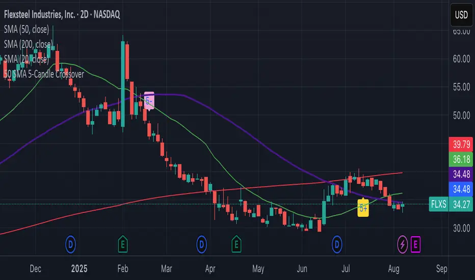
50 SMA 5-Candle Crossovercatching the cycle using very simple method. at your descrtion.
must know what you are doing.
this will work if you do not follow bindly.
Super-Elliptic BandsThe core of the "Super-Elliptic Bands" indicator lies in its use of a super-ellipse mathematical model to create dynamic price bands around a central Simple Moving Average (SMA). Here's a concise breakdown of its essential components:
Central Moving Average (MA):
A Simple Moving Average (ta.sma(close, maLen)) serves as the baseline, anchoring the bands to the average price over a user-defined period (default: 50 bars).
Super-Ellipse Formula:
The bands are generated using the super-ellipse equation: |y/b| = (1 - |x/a|^p)^(1/p), where:
x is a normalized bar index based on a user-defined cycle period (periodBase, default: 64), scaled to range from -1 to +1.
a = 1 (fixed semi-major axis).
b is the volatility-based semi-minor axis, calculated as volRaw * mult, where volRaw comes from ta.stdev, ta.atr, or ta.tr (user-selectable).
p (shapeP, default: 2.0) controls the band shape:
p = 2: Elliptical bands.
p < 2: Pointier, diamond-like shapes.
p > 2: Flatter, rectangular-like shapes.
This formula creates bands that dynamically adjust their width and shape based on price volatility and a cyclical component.
enjoy....

Wave1234 Flip tp Betawave1234 flip tp
A Trend-Following Indicator Powered by Elliott Wave & SMC – Know Where the Price Will Rise, Peak, and Reverse
Wave1234 Flip TP is a technical indicator built on the foundations of Elliott Wave Theory combined with insights from Smart Money Concepts (SMC). It's designed to help traders clearly identify:
✅ Where the price will start rising (precise entry after a confirmed reversal)
✅ Where the rally is likely to end (shows psychological Take Profit zones after Wave 4)
✅ And where the price is most likely to reverse down (based on key structural resistance)
🧠 How It Works:
The core mechanism of Wave1234 Flip TP is simple but powerful.
📈 Once a Buy signal appears — this marks the beginning of a new uptrend (confirmed by structure and reversal patterns).
➡️ From there, the system lets the trend run naturally, tracking the price through its impulsive movement (Wave 1 to 3) and its first meaningful correction (Wave 4).
✅ After Wave 4 forms, the indicator begins tracking potential reversal zones — based on both market psychology and institutional order flow.
🔹 This is when the green TP line appears — a projected take-profit zone where the rally may end.
💥 When price hits this zone and confirms exhaustion, the green TP line turns blue, signaling:
✅ Success – the trend has completed its cycle
🚨 Caution – momentum may reverse soon
This allows traders to exit at strength, or prepare for a potential short when structure shifts again.
หลักการของ Wave1234 Flip TP คือ “ปล่อยให้เทรนด์รันอย่างเป็นธรรมชาติ แล้วไปโฟกัสจุดกลับตัวที่สำคัญที่สุด”
📈 เมื่อเกิดสัญญาณ Buy — นั่นคือจุดเริ่มต้นของเทรนด์ขาขึ้นรอบใหม่ (ยืนยันโดยโครงสร้างราคาและแท่งกลับตัว)
จากนั้นเราจะ ปล่อยให้เทรนด์วิ่งไป โดยไม่ต้องรีบทำอะไร
…รอจนเข้าสู่ช่วงคลื่น 3 → 4 (Wave 3-4)
เพราะนั่นคือช่วงที่ “แรงซื้อเริ่มหมด”
✅ หลังจาก Wave 4 จบลง
อินดิเคเตอร์จะเริ่ม “คาดการณ์จุดกลับตัว” โดยใช้ทั้งพฤติกรรมจิตวิทยาตลาด และระดับราคาเชิงโครงสร้างที่สถาบันมองเห็น
🟩 เส้น TP สีเขียวจะปรากฏขึ้น — นี่คือโซนที่ควร เริ่มทยอยปิดกำไร
📉 และถ้าราคาวิ่ง ชนเส้นนี้จริง พร้อมมีสัญญาณยืนยัน
เส้นเขียวจะ เปลี่ยนเป็นสีฟ้า ทันที
💡 แปลว่า:
เทรนด์รอบนี้ “ไปถึงเป้าหมายแล้ว”
ความเสี่ยงที่จะกลับทิศกำลังสูงขึ้น
ถึงเวลาที่ต้อง “หยุดโลภ แล้วป้องกันกำไร”

Alt Szn Oracle - Institutional GradeThe Alt Szn Oracle is a macro-level indicator built to help traders front-run altseason by tracking liquidity, dominance rotation, sentiment, and capital flows—all in one signal. It’s designed for those who don’t just chase pumps, but want to understand when the tide is turning and why. This tool doesn't predict specific coin breakouts—it tells you when the market as a whole is gearing up to rotate into higher beta assets like altcoins, including memes and microcaps.
The index consolidates ten macro inputs into a normalized, smoothed score from 0–100. These include Bitcoin and Ethereum dominance, ETH/BTC, altcoin market cap (Total3), relative volume flows, and stablecoin supply (USDT, USDC, DAI)—which act as proxies for risk-on appetite and dry powder entering the system. It also incorporates manually updated sentiment metrics from Google Trends and the Fear & Greed Index, giving it a behavioral edge that most indicators lack.
The logic is simple but powerful: when BTC dominance is falling, ETH/BTC is rising, altcoin volume increases relative to BTC/ETH, and stablecoins start moving—you're likely in the early innings of rotation. The index is also filtered through a volatility threshold and smoothed with an EMA to eliminate chop and fakeouts.
Use this indicator on macro charts like TOTAL3, TOTAL2, or ETHBTC to gauge market health, or overlay it on specific coins like PEPE, DOGE, or SOL to confirm if the tide is in your favor. Interpreting the score is straightforward: readings above 80 suggest euphoria and signal it’s time to de-risk, 60–80 indicates expansion and confirms altseason is underway, 40–60 is neutral, and 20–40 is a capitulation zone where smart money accumulates.
What sets this apart is that it doesn’t just track price—it reflects the flow of capital, the positioning of liquidity, and the sentiment of the crowd. Most altseason indicators are lagging, overfitted, or too simplistic. This one is modular, forward-looking, and grounded in real capital rotation theory.
If you're a trader who wants to time the cycle, not guess it, this is your tool. Refine it, fork it, or expand it to your niche—DeFi, NFTs, meme coins, or L1s. It’s a framework for reading the macro winds, not a signal service. Use it with discipline, and you’ll catch the wave while others drown in noise.
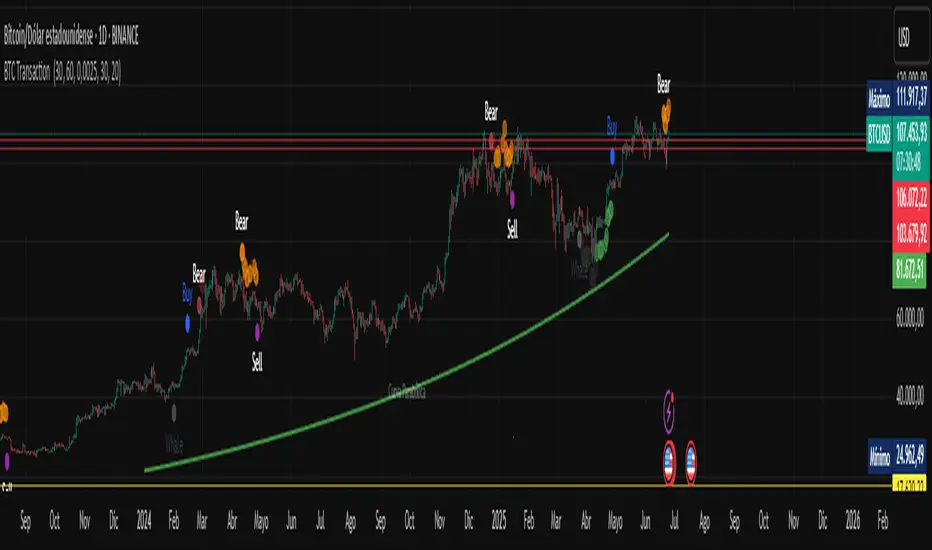
BTC Transaction Indicator Name: "Bitcoin On-Chain Volume & Dynamic Parabolic Curve Signals"
Purpose:
This indicator is designed for Bitcoin traders and long-term holders. It combines the analysis of Bitcoin's on-chain transaction volume with price action to generate "Whale" and "Bear" signals. Additionally, it features a unique dynamic parabolic curve that acts as a visual support line, adapting its visibility based on price interaction with a key Exponential Moving Average (EMA).
Key Components:
On-Chain Volume Analysis:
Utilizes Estimated Transaction Volume (ETRAV) data from the Bitcoin blockchain.
Calculates fast and slow Simple Moving Averages (SMAs) of this volume.
Identifies volume trends (up/down) and significant volume increases/decreases.
Employs fixed thresholds (2,500,000 for low volume and 25,000,000 for high volume) to define key activity levels, similar to how historical on-chain analysis defined accumulation and distribution zones.
Price Action Analysis:
Calculates fast and slow SMAs of the price.
Detects price trends (up/down), recoveries, and declines based on these price SMAs.
"Whale" and "Bear" Signals:
Whale Signals (Buy-side): Generated when there's an upward volume trend, significant volume increase, and a downward price trend followed by price recovery. These indicate potential accumulation phases.
Bear Signals (Sell-side): Generated when there's a downward volume trend, significant volume decrease, and an upward price trend followed by price decline. These indicate potential distribution phases.
Visuals: Both types of signals are plotted as small, colored circles directly on the price chart, with corresponding text labels ("Whale," "Buy," "Bear," "Sell," "Price Recovering," "Price Declining").
Dynamic Parabolic Curve:
Concept: A green parabolic (exponential) curve that serves as a dynamic visual support line.
Activation: The curve starts drawing automatically only when the price crosses over the EMA 500 (Exponential Moving Average of 500 periods). The curve's starting point is set at a user-defined percentage below the EMA 500 value at that exact crossover point.
Visibility: The curve remains visible and continues its trajectory only as long as the price stays above the EMA 500.
Deactivation: The curve disappears instantly if the price falls below or equals the EMA 500. It will only reappear if the price crosses above the EMA 500 again.
Customization: The curve's steepness (Tasa Crecimiento Curva) and its initial distance from the EMA 500 (Inicio Curva % por debajo de EMA500) are adjustable.
Dynamic Label: A "Parabólico" text label is plotted near the center of the active curve segment, with an adjustable vertical offset to ensure it stays visually appealing below the curve.
What is PLOTTED on the chart:
The small, colored circle signals for Whale/Buy and Bear/Sell activity.
The green dynamic parabolic curve.
What is NOT PLOTTED:
EMA 200, EMA 500 lines (though they are calculated internally for logic).
Raw volume data or volume Moving Averages (these are only used for signal calculation, not plotted).
Ideal for:
Bitcoin traders and investors focused on long-term trends and cycle analysis, who want visual cues for accumulation/distribution phases based on on-chain activity, complemented by a unique, dynamically appearing parabolic support curve.
Important Notes:
Relies on the availability of external on-chain data (QUANDL:BCHAIN) within TradingView.
Functions best on a daily timeframe for optimal on-chain data relevance.
Price to Bar Ratio - Scale / Scales / ScalingPrice to Bar Ratio - Scaling
The Price to Bar Ratio - Scaling indicator for TradingView is designed for traders who utilize Gann-based techniques, Michael Jenkins methodologies, or geometric market analysis. It calculates the relationship between price movement and time (bars), providing a bar-to-price ratio that traders can use to align their charts with structured scaling methods.
Key Features:
• Geometry-Based Scaling – Designed for traders using market geometry, time/price balancing, or cycle analysis.
• Automatic Ratio Calculation – Computes a bar-to-price ratio based on price movement and time.
• Square & Rectangle Modes – Provides different scaling approaches to suit various analytical methods.
• Balanced Chart Structure – Helps maintain a proportional relationship between price and time.
• Customizable Inputs – Adjustable parameters for flexibility across different markets, assets, and timeframes.
How to Use:
1. Apply the Price to Bar Ratio - Scaling indicator to your TradingView chart.
2. Enable Magnet Mode in TradingView to help anchor points snap accurately to price levels.
3. Manually select your range using the four anchor points to define the area for calculation.
4. The indicator will generate a table displaying the calculated bar-to-price ratio.
5. Copy the recommended value from the table.
6. Open the chart settings in TradingView.
7. Locate the "Lock Price to Bar Ratio" input field.
8. Paste the copied ratio value into the input field and apply the changes.
9. Due to TradingView's limitations on the magnet option for anchor points, it is recommended to add a new instance of the indicator rather than dragging the anchor points to a new range. This prevents unwanted snapping behavior and ensures accurate recalculations.
Will be adding more formulas in the future.
Indicator in use:

G. Santostasi's Bimodal Regimes Power Law G. Santostasi's Bimodal Regimes Power Law Model
Invite-Only TradingView Indicator
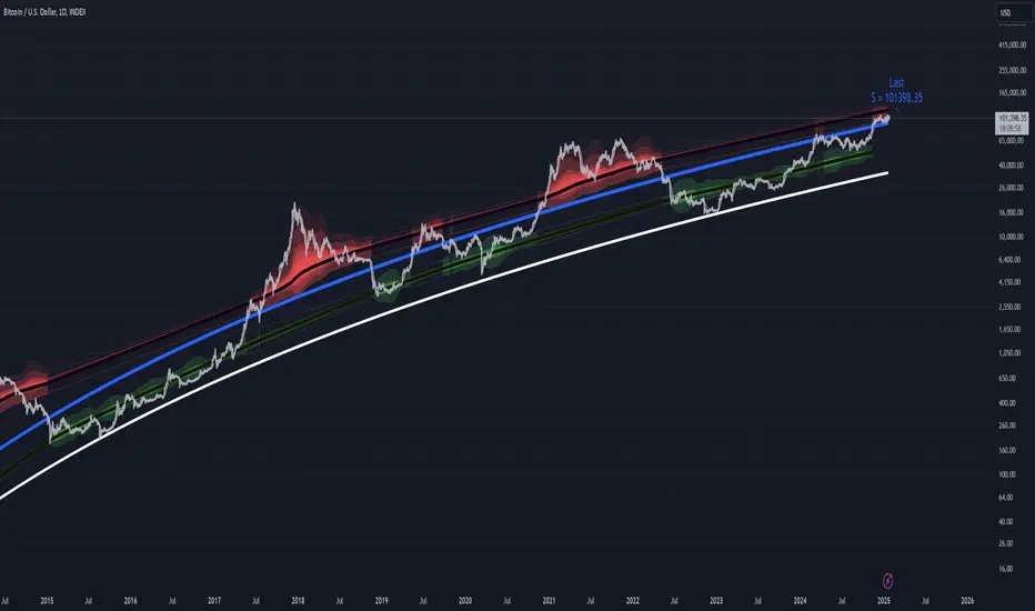
The Bimodal Power Law Model is a powerful TradingView indicator that provides a detailed visualization of Bitcoin's price behavior relative to its long-term power law trend. By leveraging volatility-normalized deviations, this model uncovers critical upper and lower bounds that govern Bitcoin’s price dynamics.
Key Features:
Power Law Support Line:
The model highlights the power law support line, a natural lower bound that has consistently defined Bitcoin's price floor over time. This line provides a crucial reference point for identifying accumulation zones.
Volatility-Normalized Upper Bound:
The indicator introduces a volatility-normalized upper channel, dynamically defined by the deviations from the power law. This bound represents the natural ceiling for Bitcoin’s price action and adjusts in real time to reflect changes in market volatility.
Color-Shaded Volatility Bounds:
The upper and lower bounds are visualized as color-shaded regions that represent the range of current volatility relative to the power law trend. These shaded regions dynamically expand or contract based on the level of market volatility, providing an intuitive view of Bitcoin’s expected price behavior under normalized conditions.
Two Regime Analysis:
Using a Gaussian Hidden Markov Model (HMM), the indicator separates Bitcoin's price action into two distinct regimes:
Above the power law:
Bullish phases characterized by overextensions.
Below the power law:
Bearish or accumulation phases where price consolidates below the trend.
Dynamic Bounds with Standard Deviations:
The model plots 2 standard deviation bands for both regimes, offering precise insights into the natural limits of Bitcoin’s price fluctuations. Peaks exceeding these bounds are contextualized as anomalies caused by historically higher volatility, emphasizing the consistency of normalized deviations.
Enhanced Visualization and Analysis:
The indicator integrates running averages calculated using deviations from the power law trend and smoothed volatility data to ensure a visually intuitive representation of Bitcoin’s price behavior. These insights help traders and researchers identify when price action is approaching statistically significant levels.
Use Cases:
Support and Resistance Identification:
Use the power law support line and upper volatility bounds to identify critical levels for buying or taking profit.
Cycle Analysis:
Distinguish between sustainable trends and speculative bubbles based on deviations from the power law.
Risk Management:
The shaded volatility regions provide a dynamic measure of risk, helping traders gauge when Bitcoin is overbought or oversold relative to its historical norms.
Market Timing: Understand Bitcoin’s cyclical behavior to time entries and exits based on its position within the shaded bounds.
Note:
This indicator is designed for long-term Bitcoin investors, researchers, and advanced traders who seek to leverage statistical regularities in Bitcoin’s price behavior. Available by invitation only.
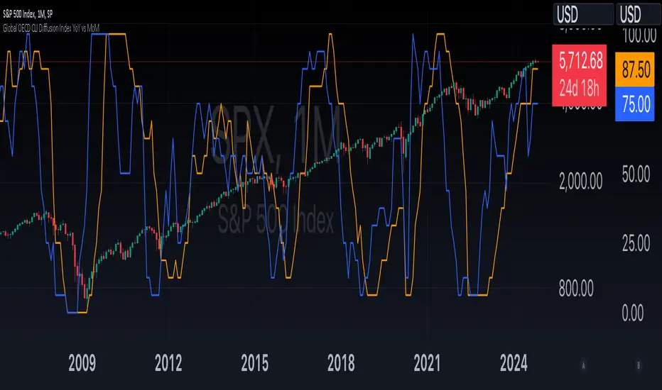
Global OECD CLI Diffusion Index YoY vs MoMThe Global OECD Composite Leading Indicators (CLI) Diffusion Index is used to gauge the health and directional momentum of the global economy and anticipate changes in economic conditions. It usually leads turning points in the economy by 6 - 9 months.
How to read: Above 50% signals economic expansion across the included countries. Below 50% signals economic contraction.
The diffusion index component specifically shows the proportion of countries with positive economic growth signals compared to those with negative or neutral signals.
The OECD CLI aggregates data from several leading economic indicators including order books, building permits, and consumer and business sentiment. It tracks the economic momentum and turning points in the business cycle across 38 OECD member countries and several other Non-OECD member countries.
Payday Anomaly StrategyThe "Payday Effect" refers to a predictable anomaly in financial markets where stock returns exhibit significant fluctuations around specific pay periods. Typically, these are associated with the beginning, middle, or end of the month when many investors receive wages and salaries. This influx of funds, often directed automatically into retirement accounts or investment portfolios (such as 401(k) plans in the United States), temporarily increases the demand for equities. This phenomenon has been linked to a cycle where stock prices rise disproportionately on and around payday periods due to increased buy-side liquidity.
Academic research on the payday effect suggests that this pattern is tied to systematic cash flows into financial markets, primarily driven by employee retirement and savings plans. The regularity of these cash infusions creates a calendar-based pattern that can be exploited in trading strategies. Studies show that returns on days around typical payroll dates tend to be above average, and this pattern remains observable across various time periods and regions.
The rationale behind the payday effect is rooted in the behavioral tendencies of investors, specifically the automatic reinvestment mechanisms used in retirement funds, which align with monthly or semi-monthly salary payments. This regular injection of funds can cause market microstructure effects where stock prices temporarily increase, only to stabilize or reverse after the funds have been invested. Consequently, the payday effect provides traders with a potentially profitable opportunity by predicting these inflows.
Scientific Bibliography on the Payday Effect
Ma, A., & Pratt, W. R. (2017). Payday Anomaly: The Market Impact of Semi-Monthly Pay Periods. Social Science Research Network (SSRN).
This study provides a comprehensive analysis of the payday effect, exploring how returns tend to peak around payroll periods due to semi-monthly cash flows. The paper discusses how systematic inflows impact returns, leading to predictable stock performance patterns on specific days of the month.
Lakonishok, J., & Smidt, S. (1988). Are Seasonal Anomalies Real? A Ninety-Year Perspective. The Review of Financial Studies, 1(4), 403-425.
This foundational study explores calendar anomalies, including the payday effect. By examining data over nearly a century, the authors establish a framework for understanding seasonal and monthly patterns in stock returns, which provides historical support for the payday effect.
Owen, S., & Rabinovitch, R. (1983). On the Predictability of Common Stock Returns: A Step Beyond the Random Walk Hypothesis. Journal of Business Finance & Accounting, 10(3), 379-396.
This paper investigates predictability in stock returns beyond random fluctuations. It considers payday effects among various calendar anomalies, arguing that certain dates yield predictable returns due to regular cash inflows.
Loughran, T., & Schultz, P. (2005). Liquidity: Urban versus Rural Firms. Journal of Financial Economics, 78(2), 341-374.
While primarily focused on liquidity, this study provides insight into how cash flows, such as those from semi-monthly paychecks, influence liquidity levels and consequently impact stock prices around predictable pay dates.
Ariel, R. A. (1990). High Stock Returns Before Holidays: Existence and Evidence on Possible Causes. The Journal of Finance, 45(5), 1611-1626.
Ariel’s work highlights stock return patterns tied to certain dates, including paydays. Although the study focuses on pre-holiday returns, it suggests broader implications of predictable investment timing, reinforcing the calendar-based effects seen with payday anomalies.
Summary
Research on the payday effect highlights a repeating pattern in stock market returns driven by scheduled payroll investments. This cyclical increase in stock demand aligns with behavioral finance insights and market microstructure theories, offering a valuable basis for trading strategies focused on the beginning, middle, and end of each month.

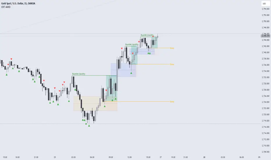
CRT AMD indicatorThis indicator is based on the Power of three (Accumulation Manipulation Distribution) Cycle, by marking the candle that Sweep the low or high of the previous candle and then closed back inside the range of the previous candle, indicating a possibility of a Manipulation or Reversal.
Combining the indicator with HTF Array and LTF Setup Entry will significantly improve the accuracy.
VX DailyCycle PD Table (Levang)**Futures trading dependent**
QT Theory dependent (Daye) --> VX Theory DailyCycle with 3 ranges using detailing extreme premium range to mean range to extreme discount range *ONLY* 15min timeframe that start at 7:30am every trading day. This data table compares 3 triads (default qt triads as inputs) detailing what range each asset is currently in.
**continuous contracts are default as inputs but monthly contracts works best.**
Overview
This indicator creates a dynamic table showing the current market position of multiple assets across three major market segments: Equity Index futures, Currency futures, and Bond futures. Each asset's position is analyzed using VX Daily Cycle levels and displayed with intuitive color-coding and symbols.
Assets Tracked
Equity Triad: ES1!, NQ1!, YM1!
Currency Triad: DXY (Capital.com), 6E1!, 6B1!
Bond Triad: ZB1!, TN1!, ZF1!
Visual Interpretation
The table uses three main colors to indicate market positioning:
Green: Asset is trading at a discount
Yellow: Asset is trading in the mean range
Red: Asset is trading at a premium
Symbols (▲▲, ▲, △, ▽, ▼, ▼▼) provide additional detail about position within each range:
Double symbols (▲▲, ▼▼): Extreme levels
Solid symbols (▲, ▼): Strong moves
Hollow symbols (△, ▽): Moderate moves
Updates
The table updates every 15 minutes
Works on all timeframes while maintaining consistency
Position calculations are based on recent price action
Usage
This indicator is particularly useful for:
Cross-market analysis
Identifying relative value opportunities
Multi-timeframe market analysis
Understanding market correlations
Spotting potential reversals or continuations
Note
The indicator requires access to all listed symbols for full functionality. Some brokers may not provide access to all market
Legend:
VX Levels Color and Symbol Cheat Sheet
Upper Extension Range (Red)
▲▲ : (Extreme Premium)
▲ : (High Premium)
△ : (Moderate Premium)
Mean Range (Yellow)
△ : (Upper Mean)
▽ : (Lower Mean)
Lower Extension Range (Green)
▽ : (Moderate Discount)
▼ : (High Discount)
▼▼ : (Extreme Discount)

BTC x M2 Divergence (Weekly)### Why the "M2 Money Supply vs BTC Divergence with Normalized RSI" Indicator Should Work
IMPORTANT
- Weekly only indicator
- Combine it with BTC Halving Cycle Profit for better results
The "M2 Money Supply vs BTC Divergence with Normalized RSI" indicator leverages the relationship between macroeconomic factors (M2 money supply) and Bitcoin price movements, combined with technical analysis tools like RSI, to provide actionable trading signals. Here's a detailed rationale on why this indicator should be effective:
1. **Macroeconomic Influence**:
- **M2 Money Supply**: Represents the total money supply, including cash, checking deposits, and easily convertible near money. Changes in M2 reflect liquidity in the economy, which can influence asset prices, including Bitcoin.
- **Bitcoin Sensitivity to Liquidity**: Bitcoin, being a digital asset, often reacts to changes in liquidity conditions. An increase in money supply can lead to higher asset prices as more money chases fewer assets, while a decrease can signal tightening conditions and lower prices.
2. **Divergence Analysis**:
- **Economic Divergence**: The indicator calculates the divergence between the percentage changes in M2 and Bitcoin prices. This divergence can highlight discrepancies between Bitcoin's price movements and broader economic conditions.
- **Market Inefficiencies**: Large divergences may indicate inefficiencies or imbalances that could lead to price corrections or trends. For example, if M2 is increasing (indicating more liquidity) but Bitcoin is not rising proportionately, it might suggest a potential upward correction in Bitcoin's price.
3. **Normalization and Smoothing**:
- **Normalized Divergence**: Normalizing the divergence to a consistent scale (-100 to 100) allows for easier comparison and interpretation over time, making the signals more robust.
- **Smoothing with EMA**: Applying Exponential Moving Averages (EMAs) to the normalized divergence helps to reduce noise and identify the underlying trend more clearly. This double-smoothed divergence provides a clearer signal by filtering out short-term volatility.
4. **RSI Integration**:
- **RSI as a Momentum Indicator**: RSI measures the speed and change of price movements, indicating overbought or oversold conditions. Normalizing the RSI and incorporating it into the divergence analysis helps to confirm the strength of the signals.
- **Combining Divergence with RSI**: By using RSI in conjunction with divergence, the indicator gains an additional layer of confirmation. For instance, a bullish divergence combined with an oversold RSI can be a strong buy signal.
5. **Dynamic Zones and Sensitivity**:
- **Good DCA Zones**: Highlighting zones where the divergence is significantly positive (good DCA zones) indicates periods where Bitcoin might be undervalued relative to economic conditions, suggesting good buying opportunities.
- **Red Zones**: Marking zones with extremely negative divergence, combined with RSI confirmation, identifies potential market tops or bearish conditions. This helps traders avoid buying into overbought markets or consider selling.
- **Peak Detection**: The sensitivity setting for detecting upside down peaks allows for early identification of potential market bottoms, providing timely entry points for traders.
6. **Visual Cues and Alerts**:
- **Clear Visualization**: The plots and background colors provide immediate visual feedback, making it easier for traders to spot significant conditions without deep analysis.
- **Alerts**: Built-in alerts for key conditions (good DCA zones, red zones, sell signals) ensure traders can act promptly based on the indicator's signals, enhancing the practicality of the tool.
### Conclusion
The "M2 Money Supply vs BTC Divergence with Normalized RSI" indicator integrates macroeconomic data with technical analysis to offer a comprehensive view of Bitcoin's market conditions. By analyzing the divergence between M2 money supply and Bitcoin prices, normalizing and smoothing the data, and incorporating RSI for momentum confirmation, the indicator provides robust signals for identifying potential buying and selling opportunities. This holistic approach increases the likelihood of capturing significant market movements and making informed trading decisions.

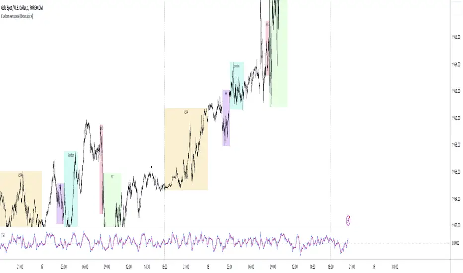
Sessions ALL + 5 Custom (Redcrabice)I created a simple script that show the most 5 important sessions. i know that there are many other "sessions" scripts out there but most of them doesnt do what i want and some even lag alot because of the amount of codes. so i decided to create a simple browser friendly script that show 5 most important sessions. asia , frankfurt, london , newyork open and newyork along with 5 custom session for your own liking.
this is 1/3 series and indicator that i use along with my other indicators.
this code is based on my 90min cycle indicator and not a "repaint" as some people might say.
have a lovely trading journey.
sign
REDCRABICE
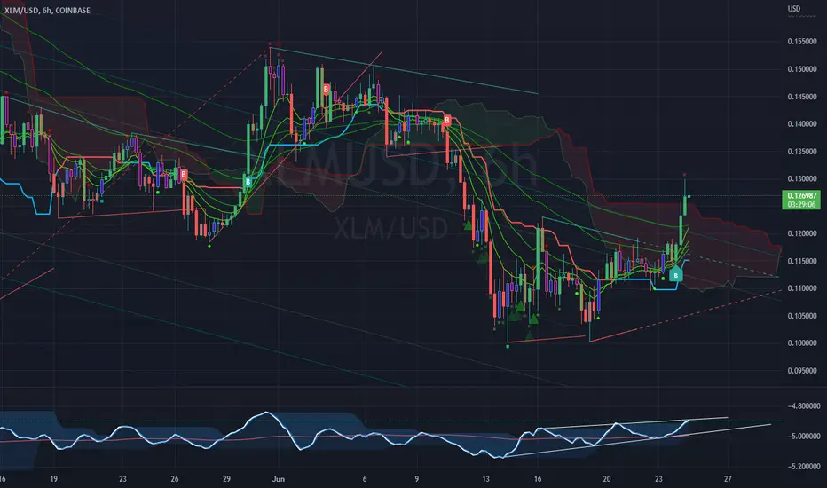
RVL Unreal Edge (concept build)Designed with a purpose, this script was intended for use by bots automating trading of XLM using a 6hr timeframe.
However the script has turned out to be a fantastic indicator on its own, and much of the power behind it is derived from John Ehler's incredible CG oscillator.
John Ehler was an electrical engineer, a Raytheon employee who began trading in the 1970's. He is best known for his work creating super-smoothing algorithms and methods of analysing cycle length and behaviour in price action, and his work in the field of zero-lag indicators - indicators that don't follow the price action, but are in fact capable of leading it actionably, and responding with essentially zero lag.
By approaching the price action as a sine wave with demonstrably a fractal nature, Ehler's makes a number of important advancements. His CG indicator is derived from calculations typically used to derive the centre of gravity in a physical object. It effectively works as a band-pass filter and is possibly one of the very best leading indicators avaliable.
Financial Astrology Mercury Helio HarmonicsMercury Helio Harmonics indicator represent the tropical zodiac energy forces that develop through the course of Mercury in the heliocentric zodiac wheel. The waves indicates the strength of cardinal energy (initiator) and it's harmonics. In Financial Astrology, Mercury represents the commerce, negotiations, transactions and trading, is very important cycle for trading.
Note: The Mercury Helio Harmonics indicator is based on an ephemeris array that covers years 2010 to 2030, prior or after this years the data is not available, this daily ephemeris are based on UTC time so in order to align properly with the price bars times you should set UTC as your chart timezone.
Financial Astrology Jupiter DeclinationJupiter moving from South declination minima toward the North maxima and during all the travel from North maxima to zero declination produced the strong bullish long term trend, this coincide with other planets declinations observations, in general, we noted that when a planet is in North declination (above zero boundary) this strengthen the planet force and produces more strong price effects.
This Jupiter declination pattern needs more research in others markets, will be great to get the participation from more financial astrologers that could research this declination cycle in other markets and share feedback with us.
Note: The Jupiter declination indicator is based on an ephemeris array that covers years 2010 to 2030, prior or after this years the declination is not available, this daily ephemeris are based on UTC time so in order to align properly with the price bars times you should set UTC as your chart reference timezone.
Financial Astrology Sun DeclinationExtreme Sun declinations occurs at the solstices of summer and fall which correspond to the entry of Sun into Cancer and Capricorn respectively. At this extreme points we can observe that many markets tend to produce corrections. Is very interesting to see that when Sun reach the lowest and highest declination extremes. this events correlates very close to price corrections, is not an infalible rule, don't repeat for all observations but in many occurrences during all the historical data that we have of BTCUSD since 2010 have happened.
Is very likely that this same pattern repeats in others markets so will be great to get the participation of other financial astrologers that could research this cycle and share feedback with us.
Note: The Sun declination indicator is based on an ephemeris array that covers years 2010 to 2030, prior or after this years the declination is not available, this daily ephemeris are based on UTC time so in order to align properly with the price bars times you should set UTC as your chart reference timezone.

Retrograde Planets█ OVERVIEW
Retrograde Planets is a TradingView script that highlights the retrograde cycles for all the planets including : Mercury, Venus, Mars, Jupiter, Saturn, etc etc..
A lot of Time-Theory/Gann traders use these cycles to gauge volatility and trend of the market. This script can highlight all the previous retrograde cycles of any planet of your choice.
The settings are easy and simple, you will just need to select the planet and activate it from the setting. And of course, you can change the color of the highlighted area.
Retrograde Planets can also project the future retrograde cycles and highlights them for you a year in advance ( 365 days ).
█ Future Plans and upgrades to this script may include :
1. Advance labeling.
2. Statistics box.
And more! Feel free to contact me with any feature that you would like to see in this script
█ How to use :
1. Open the settings.
2. Choose the planet.
3. Enable the Cycles using the checkbox.
Give the script a few seconds and you should be set.
This script is coded as an addon to the Gann ToolBox package/scripts.

Cyclical volatility index v1This indicator is used to measure the volatility of the cycle in question.
It is very useful for clearly reading impulsive phases or corrective phases
Calculate average volatility and current volatility
The labels improve the visualization.
It is fully customizable in shapes and colors
C and the ability to disable labels
For any bugs contact the creators
