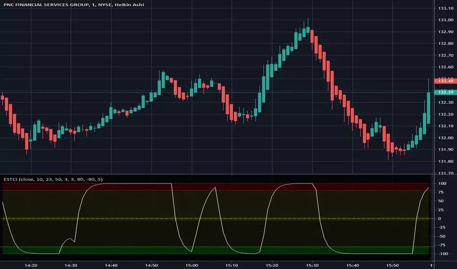
Enhanced Schaff Trend Cycle IndicatorThis is an "Enhanced Schaff Trend Cycle Indicator" variant that I heavily modified. Yes, almost 3 decades old and it's now even better. I thought this had decent characteristics to it, and maybe members out there may find a good use for it. Surely let me know if you do appreciate it in the comments below with any suggestions, settings modifications, whatever... Modifications included are rescaling the range from 0 /100 to -100/100 yielding a zero mean indicator with perfect balance on the vertical axis. 30/70, 20/80, and 15/85. Who wants to remember all those settings? This one is set to -80/80, nothing significant about those about those numbers at all, be forewarned! It seems reactive and takes mostly full swings from -100 to 100 without exceeding those numbers. The indicator itself has a multitude of adjustments you may fiddle with, as many as I can pack into it. I also included a centered medial zone that you may adjust for an additional set of thresholds. If I was to receive a 100 comments requesting to add multiple time frames, I would most likely consider that, given I have some spare time available in the future to get around to it, probably converting it into a DUAL multi time frame indicator. Like it if you like it, enjoy!
Pesquisar nos scripts por "Cycle"
DFT - Dominant Cycle Period 8-50 bars - John EhlerThis is the translation of discret cosine tranform (DCT) usage by John Ehler for finding dominant cycle period (DC).
The price is first filtered to remove aliasing noise(bellow 8 bars) and trend informations(above 50 bars), then the power is computed.
The trick here is to use a normalisation against the maximum power in order to get a good frequency resolution.
Current limitation in tradingview does not allow to display all of the periods, still the DC period is plot after beeing computed based on the center of gravity algo.
The DC period can be used to tune all of the indicators based on the cycles of the markets. For instance one can use this (DC period)/2 as an input for RSI.
Hope you find this of some interrest.
Short-Only Cycle IndicatorThis script is a follow-up to my previous 60-day Cycle, Long-Only Indicator.
The "Short-Only Cycle Indicator" is designed to help traders navigate optimal shorting opportunities by analyzing cyclical price behavior over a defined period. It focuses on recognizing distribution phases (ideal for shorting) and accumulation phases (where shorting should be avoided). It should be used with assets that the trader has an existing thesis for downward price movement.
Key Features:
1. Cycle Length: The indicator uses a 60-day cycle to identify high and low points in price, which are then used to determine the current market phase.
2. Distribution Phase: When the price is near the cycle high, the indicator signals a distribution phase, indicating potential shorting opportunities.
3. Accumulation Phase: When the price is near the cycle low, the indicator signals an accumulation phase, advising traders to avoid shorting.
4. Short Signal: A short signal is triggered when the price crosses below the cycle high, which is visually marked on the chart for easy identification.
This indicator is particularly useful for traders who prefer a short-only strategy, as it helps them time their entries and avoid shorting during unfavorable market conditions.

Ehlers Cycle Amplitude [CC]The Cycle Amplitude was created by John Ehlers (Trend Modes and Cycle Modes) and this indicator wasn't meant to give buy and sell signals by itself but I'm publishing this open source script in case someone comes up with a cool way to use this indicator for buy and sell signals. This indicator essentially tells you the distance between the peaks from the Cycle BandPass Filter and I will be including the last script tomorrow most likely. I'm reusing the same exact buy and sell signals from the cycle bandpass filter so if you have any questions then feel free to refer to the link I posted.
Let me know if there are any other scripts you would like to see me publish!

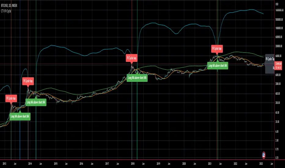
CT Reverse Pi Cycle Bitcoin Top IndicatorIntroducing the Reverse BTC Pi Market Cycle Top indicator
Much respect to Philip Swift the original creator of this idea and big thanks to Tradingview author Ninorigo for sharing the script which this indicator is based on.
Philip Swift has noted that:
Using the x2 multiple of the 350 day moving average along with the 111 day moving average provides an interesting market cycle indicator.
Over the past three market cycles, when the 350DMA x2 crosses below the 111DMA, Bitcoin price peaks in its market cycle, this has been accurate to within three days of Bitcoin price topping out.
Here I have modified an existing script by Tradingview author @Ninorigo which shows the moving averages and gives signals upon crossover by adding the following features:
A function which shows the price at which the 350DMA will Cross Below the 111DMA.
(This is calculated from the prior bar closing data and does not repaint)
An “anticipated cross” function which may give a 1 bar advanced warning of a cross.
(this is calculated from current bar values and may change and repaint)
The crossover levels are shown in an info label to the right of the current price.
When there is a BTC Pi Market Cycle Top anticipated cross on the next bar there will be an orange background signal.
When there is an actual BTC Pi Market Cycle Top cross there will be a red background signal
When there is an anticipated cross back there will be a blue background signal
When there is an actual cross back there will be a green background signal
This indicator will show the appropriate moving averages and crossover information from the daily timeframe regardless of the timeframe you are using.
This should be helpful in more accurately identifying the price level where the Pi Market Cycle moving averages will cross denoting a possible market cycle top.
It is interesting to note:
350 / 111 = 3.153
Which is the closest we can get to Pi when dividing 350 by another whole number.
This is a script to give another view and metric on an interesting experimental idea. This is not financial advice.
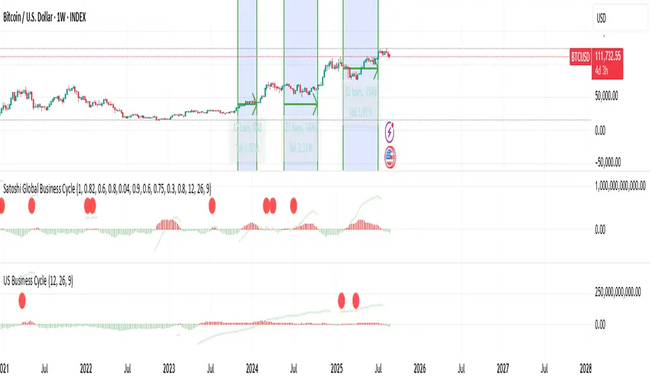
Liquidity-Weighted Business Cycle (Satoshi Global Base)🌍 BTC-Affinity Global Liquidity Business Cycle (MACD Model)
This indicator models Bitcoin’s macroeconomic business cycle using a BTC-weighted global liquidity index as its foundation. It adapts a MACD-based framework to visualize expansions and contractions in fiat liquidity across major economies with high Bitcoin affinity.
🔍 What It Does:
🧠 Constructs a Global M2 Liquidity Index from the top 10 most BTC-relevant fiat currencies
(USD, EUR, JPY, GBP, INR, CNY, KRW, BRL, CAD, AUD)
— each weighted by its Bitcoin adoption score and FX-converted into USD.
📊 Applies a MACD (Moving Average Convergence Divergence) signal to the index to detect macro liquidity trends.
🟢 Plots a histogram of business cycle momentum (red = expansion, green = contraction).
🔴 Marks potential cycle peaks, useful for macro trading alignment.
⚖️ BTC Affinity-Weighted Countries:
🇺🇸 United States
🇪🇺 Eurozone
🇯🇵 Japan
🇬🇧 United Kingdom
🇮🇳 India
🇨🇳 China
🇰🇷 South Korea
🇧🇷 Brazil
🇨🇦 Canada
🇦🇺 Australia
Weights are user-adjustable to reflect evolving capital controls, regulation, and real-world BTC adoption trends.
✅ Use Cases:
Confirm macro risk-on vs risk-off regimes for BTC and crypto.
Identify ideal entry and exit zones in macro pair trades (e.g., MSTR vs MSTY).
Monitor how global monetary expansion feeds into BTC valuations.

US Liquidity-Weighted Business Cycle📈 BTC Liquidity-Weighted Business Cycle
This indicator models the Bitcoin macro cycle by comparing its logarithmic price against a log-transformed liquidity proxy (e.g., US M2 Money Supply). It helps visualize cyclical tops and bottoms by measuring the relative expansion of Bitcoin price versus fiat liquidity.
🧠 How It Works:
Transforms both BTC and M2 using natural logarithms.
Computes a liquidity ratio: log(BTC) – log(M2) (i.e., log(BTC/M2)).
Runs MACD on this ratio to extract business cycle momentum.
Plots:
🔴 Histogram bars showing cyclical growth or contraction.
🟢 Top line to track the relative price-to-liquidity trend.
🔴 Cycle peak markers to flag historical market tops.
⚙️ Inputs:
Adjustable MACD lengths
Toggle for liquidity trend line overlay
🔍 Use Cases:
Identifying macro cycle tops and bottoms
Timing long-term Bitcoin accumulation or de-risking
Confirming global liquidity's influence on BTC price movement
Note: This version currently uses US M2 (FRED:M2SL) as the liquidity base. You can easily expand it with other global M2 sources or adjust the weights.
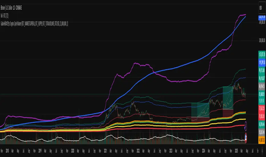
Gabriel's Crypto Cycle Master [Multi-Asset]🧠 Gabriel's Crypto Cycle Master
Gabriel’s Crypto Cycle Master is a comprehensive macro valuation tool designed to identify long-term accumulation and distribution zones for any crypto asset using custom on-chain and price-based models.
🔹 Fully Multi-Asset Support
Manually input full tickers from COINMETRICS, GLASSNODE, or INDEX to track:
Realized Market Cap
On-chain Supply
Total Transaction Volume
USD-denominated Price
🔹 Core Metrics Modeled
This script computes major macroeconomic valuation layers based on widely researched concepts:
Realized Price – Network's cost basis
Top Cap – 35× average historical cap
Delta Top – Gap between Realized Price and Average Cap
CVDD – Cumulative Value Days Destroyed
Terminal Price – Network floor based on age and velocity
Balanced Price – Realized minus Terminal (via regression)
🔹 Advanced Bands for Over/Undervaluation
Around Realized Price, this tool dynamically plots:
Golden Ratio Band (×φ) — "Warm Zone" undervaluation
Euler's e Band (×e) — "Caution Zone" deeper value
Pi Band (×π) — "Overheated" zone when crossed upward
🔹 Built-in Alerts
Alerts fire when:
Price crosses below or above any band
Price drops under Terminal Price
Price recovers above the network floor
🔹 Ideal For
Long-term crypto cycle investors
On-chain analysts
DCA accumulation and distribution timing
Macro-level Bitcoin or ETH valuation zones
⚙️ Setup
Manually enter tickers for Market Cap, Supply, Volume, and Price for your preferred crypto asset.
Adjust CVDD cap (21M for BTC, ~120M for ETH) if analyzing a different coin.
Enable/disable specific valuation layers and alert bands via checkboxes.
Built by OneWallStreetQuant | Dynamic adaptation by Gabriel
Published for educational and cycle analysis use — not financial advice.
Ideal for Daily Charts, since the estimate formula was created on that timeframe.
Enhanced Commodity Channel Index(CCI) Cycle Indicator - MTFThis is a heavily modified and enhanced version of CCI Cycle and my first indicator released using Pine Script version 4.0, something I contributed to often in a small role, and will continue to do, in my free time. This indicator is highly reactive and does a magnificent job of identifying fluctuations in market cycles when they are not trending. Compared to my free "Enhanced Schaff Trend Cycle Indicator" presented above along side this indicator, CCI Cycle is superior in it's own way, but a superb companion for providing a more accurate signals analysis. I packed as much tech as I could into this indicator along with astounding color and agility, and I'm unsure if there is any room for major improvements in the near future.
Features List Includes:
I.P.O.C.S.(Initial Public Offering Clean Start) Technology - plotting from day one, minute one of IPO
Fully adjustable M.T.F. ( Multiple Time Frame ) is enable/disable capable
Enable/disable dark background for enhanced visibility
"Source" Selection
Multiple CCI Cycle adjustments
Moving average selection
Ranges and thresholds are enable/disable capable
Upper threshold adjustment
Red/green secondary range that adjusts +/- from the upper/lower thresholds
Lower threshold adjustment
Adjustable centered medial zone
Highlighting is enable/disable capable
Normalized zero mean to +/-1
This is not a freely available indicator, FYI. To witness my Pine poetry in action, properly negotiated requests for unlimited access, per indicator, may ONLY be obtained by direct contact with me using TV's "Private Chats" or by "Message" in my member name above. The comments section below is solely just for commenting and other remarks, ideas, compliments, etc... If you do have any questions or comments regarding this indicator, I will consider your inquiries, thoughts, and ideas presented below in the comments section, when time provides it. As always, "Like" it if you like it, and also return to my scripts list occasionally for additional postings. Have a profitable future everyone!

Missile RSI (RSI of momentum w/ Dominant Cycle length + Fisher)This is a predictive indicator that looks for explosions in momentum of the cycles in price and large shifts in Momentum (Fisher turns the Bimodal PDF into Guassian like) as statistically unlikely events, showing points to exit or reverse positions.
You can adjust the lowpass frequency cuttoff (Aka what cycles you want to remove from the calculations through the super smoother filter).
To be honest you can monkey trade the direction of the Signal if you'd like but the Divergences and Maxing of the values is whats most useful.
Let me know if you guys want me to add anything else.

The Perfect RSI (Ehler's Cycle RSI Modified with Discriminator)This is the RSI indicator that I use. It combines two concepts of John Ehler. It integrates the idea of Highpass filtering the Price data, along with the the idea of automatically determining the Dominant price cycle through a Homodyne Discriminator, and using half of a cycle length as the input for the RSI. Not only determines the most effective range for the RSI by setting it based on the cycle, but also makes the RSI PDF(Probability Distribution Function) adjustable as shown in John Ehler's papers. Still needs some tweaking on determining the best calculations for cycles, and whether or not to better filter the price data into the discriminator.
Works just like a normal RSI, but should have less false signals, and also has the option for super smoothing. Play around it and see if theres any new indications or signals that come from it ;)
Let me know if there's any concerns or additions!

Wave Cycle StochasticThis is based of a modified stochastic numbers. The settings come from Barry Burn's foundation and advanced courses.
There are two stochastic indicators one on top of another. at the same time, you can turn off the lines and show the moving averages of percent D and percent K, this is something I added personally to farther investigate if they can be helpful or not.
Those who went through Barry's courses know that is oscillator is being used to find cycle high and cycle low in waves. Also Barry teaches what he calls mini-divergence and for that he uses this same oscillator. If you switch to weekly chart, the settings will automatically switch to those Barry teach for non 1 to 3 ratio situations so you don't need to worry about that. If seeing the higher time frame cycle indicator on the same oscillator is bothering you, you can again add another copy and only keep that one and turn off the rest.

Pi Cycle Bottom IndicatorBack in June 2021, I was able to find two moving averages that crossed when Bitcoin reached it's cycle bottom, similar to Philip Swift's Pi-Cycle Top indicator.
The moving average pair used here was the x0.475 multiple of the 471 MA and the 150 EMA ( EMA to take into account of short term volatility ).
I have a more in-depth analysis and explanation of my findings on my medium page .
Trader Dončić.

Mercury Retrograde Cycles V2 [Moon]Plots Mercury Retrograde cycles from start to end.
What is Mercury Retrograde?
Mercury Retrograde is when the planet Mercury appears to be traveling in reverse or backwards across the night sky with respect to the stars, the zodiac, and other bodies in the celestial canopy.
It happens when Mercury goes in between the Earth and the Sun. Basically, Mercury is lapping or passing Earth during this period.
An illusion created by the way that Earth and Mercury orbit around the sun. In reality, this is both planets perpetually orbiting in the same uniform direction.
In ancient Roman mythology Mercury is supposed to rule all types of communication including - buying, selling, speaking, reading or contractual agreements.
Does this work or mean anything
I don't hold the answers to the universe you'll have to go looking for yourself.
Works best right now on the Daily (D) timeframe.
Send me a DM if interested.

Pi Cycle Bitcoin top indicatorThe Pi Cycle Top Indicator has historically been effective in picking out the timing of market cycle highs to within 3 days.
It uses the 111 day moving average (111DMA) and a newly created multiple of the 350 day moving average, the 350DMA x 2.
Note: The multiple is of the price values of the 350DMA not the number of days.
For the past three market cycles, when the 111DMA moves up and crosses the 350DMA x 2 we see that it coincides with the price of Bitcoin peaking.
It is also interesting to note that 350 / 111 is 3.153, which is very close to Pi = 3.142. In fact, it is the closest we can get to Pi when dividing 350 by another whole number.
It once again demonstrates the cyclical nature of Bitcoin price action over long time frames. Though in this instance it does so with a high degree of accuracy over the past 7 years.
Full Credit to PositiveCrypto
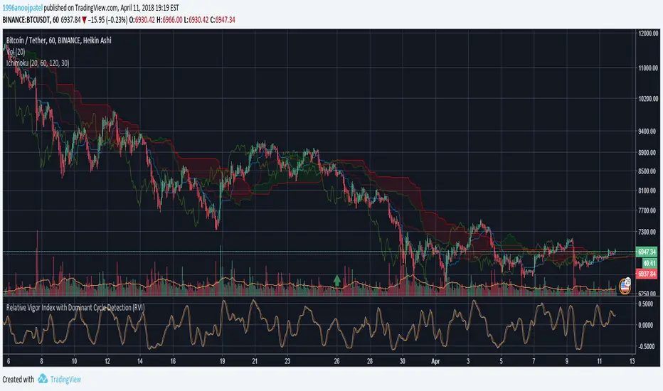
Relative Vigor Index with Dominant Cycle Detection (RVI)Relative Vigor Index with Dominant Cycle Detection. As Ehler's mentioned, fixed length look back is inherently flawed when it is possible to extract a length from a dominant price cycle. may be less effective if signal to noise ratio is greater than 2, but that usually would not happen at >5m candles, and honestly shouldn't be looking at RV(igor)I when price is moving sideways.
Read just like an RVGI, but adjusted to the current time frame. To reduce noise, changing to heiken ashi will help with signals as well. Let me know if there are improvements!
Made for JD, the OG.
TSP Cycles DoubleDouble Cycles
You can setup higher timeframe cycle period's as argument, default is M30
6 MAs, BMSB, Pi Cycle TopThis indicator has 6 Moving averages that are highly customizable and visible on multiple time frames, it also includes the Bull Market Support Band (BMSB) and the Pi Cycle Top indicator which has been very good at predicting Cycle Tops for Bitcoin (BTC). You can customize all the moving averages, as well as using simple or exponential, you can also easily customize colors and line weights.
Created by: Dan Heilman

Hybrid, Zero lag, Adaptive cycle MACD Backtest (Simple) [Loxx]Simple backtest for Hybrid, Zero lag, Adaptive cycle MACD Backtest (Simple) found here:
What this backtest includes:
-Customization of inputs for MACD calculation
-Take profit 1 (TP1), and Stop-loss (SL), calculated using standard RMA-smoothed true range
-Activation of TP1 after entry candle closes
-Zero-cross entry signal plots
-MACD-Signal cross entry continuations
-Longs and shorts
Happy trading!

Ehlers Dominant Cycle Tuned Bypass Filter [CC]The Dominant Cycle Tuned Bypass Filter was created by John Ehlers (Stocks & Commodities V. 26:3 (16-22)) and this is a particularly unique indicator because this does a pretty good job at predicting the future stock movements. If the blue line crosses over the red then a few bars from now the stock price will most likely go up and if the blue line crosses below the red then a few bars from now the stock price should go down. Since this is such a unique indicator to use with entry and exit points, I don't have them color coded but try this out and let me know what you think.
This was a special request so let me know what other scripts you would like to see me publish or if you want anything custom done!
Note: I'm republishing this because the original script couldn't be found in searches so this will fix that.

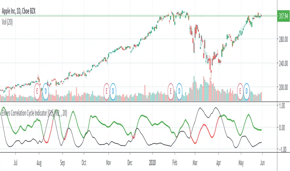
Ehlers Correlation Cycle IndicatorThe Correlation Cycle Indicator was created by John Ehlers (Stocks & Commodities V. 38:06 (8–15)) and this is technically part of three indicators in one so I'm splitting each one to a separate script. This particular indicator was designed for trend direction and trend strength and simply buy when it is green and sell when it turns red. Also keep in mind that the higher the indicator is above the signal then the stronger the trend and when they are close together, conditions get choppy.
Let me know if you would like to see me publish other scripts or if you want something custom done!

Ehlers Simple Cycle Indicator [LazyBear]One of the early cycle indicators from John Ehlers.
Ehlers suggests using this with ITrend (see linked PDF below). Osc/signal crosses identify entry/exit points.
Options page has the usual set of configurable params.
More info:
- Simple Cycle Indicator: www.mesasoftware.com
List of my public indicators: bit.ly
List of my app-store indicators: blog.tradingview.com
