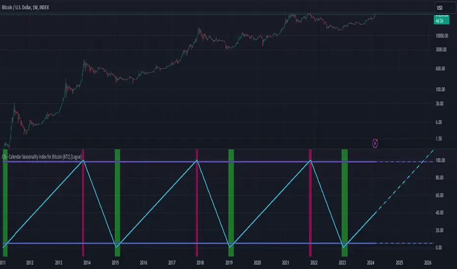
CSI - Calendar Seasonality Index for Bitcoin (BTC) [Logue]Calendar Seasonality Index (CSI) for Bitcoin (BTC) - The CSI takes advantage of the consistency of BTC cycles. Past cycles have formed macro tops every four years near November 21st, starting from in 2013. Past cycles have formed macro bottoms every four years near January 15th, starting from 2011. Therefore, a linear "risk" curve can be created between the bottom and top dates to measure how close BTC might be to a bottom or a top. The default triggers are at 98% risk for tops and 5% risk for bottoms. Extensions are also added as defaults to allow easy identification of the dates of the next top or bottom according to the CSI.
Pesquisar nos scripts por "Cycle"
Triple Ehlers Market StateClear trend identification is an important aspect of finding the right side to trade, another is getting the best buying/selling price on a pullback, retracement or reversal. Triple Ehlers Market State can do both.
Three is always better
Ehlers’ original formulation produces bullish, bearish and trendless signals. The indicator presented here gate stages three correlation cycles of adjustable lengths and degree thresholds, displaying a more refined view of bullish, bearish and trendless markets, in a compact and novel way.
Stick with the default settings, or experiment with the cycle period and threshold angle of each cycle, then choose whether ‘Recent trend weighting’ is included in candle colouring.
John Ehlers is a highly respected trading maths head who may need no introduction here. His idea for Market State was published in TASC June 2020 Traders Tips. The awesome interpretation of Ehlers’ work on which Triple Ehlers Market State’s correlation cycle calculations are based can be found at:
DISCLAIMER: None of this is financial advice.

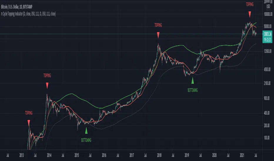
π Cycle Market Tops & Bottoms Performante IndicatorWhy is it called the Pi Cycle Tops & Bottoms Indicator?
When the 111-Day moving average crosses over the (350-Day moving average X 2), we've seen the price come to a key top or bottom within the Bitcoin market for the past 3 cycles.
350 divided by 111 is very close to π - hence the name the Pie cycle!
Yes, we are selecting arbitrary numbers initially, but through the use of proper back-testing, we are able to find key cycle shifts using mathematical numbers (fibs, Pi, etc)
We use this topping & bottoming signal when things look overbought over oversold within the market.
The "topping" label turns on as soon as we see the 111-Day moving average cross above the 350-Day moving average.
The "bottoming" signal turns on as soon as we see the 111-day moving average cross below the 350-Day moving average.
This indicator should only be used on the daily timeframe!
Historically speaking, we've seen this indicator become impressively accurate.
GeoWave v1.0See what other traders can't. GeoWave is the most sophisticated geometric indicator ever built for TradingView - a real-time pattern recognition engine that transforms raw price action into precise harmonic measurements and time cycle projections.
Advanced XABCD Pattern DNA
Automatically detects and measures the last 4 swings, calculating 6 critical harmonic ratios that reveal the hidden mathematical relationships governing market movements:
BcD Ratio (CD/BC) - Classic retracement relationships that predict reversal zones
AB/CD Ratio (CD/AB) - Primary harmonic structure defining complete market cycles
X1 Ratio (AD/BC) - Diagonal extensions that extend beyond traditional boundaries
X2 Ratio (AD/XC) - Complex cross relationships uncovering multi-dimensional patterns
XcD Ratio (CD/XC) - Extended retracements that capture prolonged market phases
XaD Ratio (AD/XA) - Time-space intersections where temporal and spatial forces converge
Precision Targeting Engine
Projects multiple target zones simultaneously with unprecedented accuracy:
Retracement Targets: BcD-based levels (0.382, 0.618, 1.618, 2.618) that pinpoint exact reversal points
Extension Targets: AbCd projections beyond pattern completion that anticipate future movements
Cross Targets: AdBc & AdXc harmonic intersections that identify high-probability convergence zones
Time Cycle Mastery
Don't just predict price. Predict time. GeoWave projects historical swing durations forward, identifying when turning points are statistically likely to occur. Project time cycles at 50%, 100%, and 200% (and more) of historical durations to anticipate market rhythm.
Multi-Level Geometric Analysis
Scans across 18 swing levels simultaneously, revealing nested harmonic structures that single-level indicators completely miss. Each level uses advanced adaptive filtering for precision detection of market's fractal nature.
Square the Range Integration
Implements W.D. Gann's "Square the Range" theory, creating geometric boxes where price and time vectors intersect at critical confluence zones that define major market turning points.
Intelligent Signal Scoring
Proprietary scoring algorithm weighs Fibonacci proximity, ratio type importance, and multi-level confluence. Color-coded signals highlight high-probability setups with detailed breakdown tooltips revealing the mathematical strength of each opportunity.
Adaptive Noise Cancellation
Proprietary filtering technology eliminates insignificant market noise, focusing only on structurally meaningful swing points that actually drive price direction and determine market fate.
Stop guessing. Start measuring. GeoWave doesn't draw pretty lines - it quantifies market geometry with mathematical precision, giving you the edge that institutional traders pay millions to develop.
Join the elite traders who've discovered the hidden geometric order behind every market move.

350DMA bands + Z-score (V2)This script extends the classic 350-day moving average (350DMA) by building dynamic valuation bands and a Z-Score framework to evaluate how far price deviates from its long-term mean.
Features
350DMA Anchor: Uses the 350-day simple moving average as the baseline reference.
Fixed Multipliers: Key bands plotted at ×0.625, ×1.0, ×1.6, ×2.0, and ×2.5 of the 350DMA — historically significant levels for cycle analysis.
Z-Score Mapping: Price is converted into a Z-Score on a scale from +2 (deep undervaluation) to –2 (extreme overvaluation), using log-space interpolation for accuracy.
Custom Display: HUD panel and on-chart label show the current Z-Score in real time.
Clamp Option: Users can toggle between raw Z values or capped values (±2).
How to Use
Valuation Context: The 350DMA is often considered a “fair value” anchor; large deviations identify cycles of under- or over-valuation.
Z-Score Insight:
Positive Z values suggest favorable accumulation zones where price is below long-term average.
Negative Z values highlight zones of stretched valuation, often associated with distribution or profit-taking.
Strategic Application: This is not a standalone trading system — it works best in confluence with other indicators, cycle models, or macro analysis.
Originality
Unlike a simple DMA overlay, this script:
Provides multiple cycle-based bands derived from the 350DMA.
Applies a logarithmic Z-Score mapping for more precise long-term scaling.
Adds an integrated HUD and labeling system for quick interpretation.

Moon Phase & Celestial Events TrackerMoon Phase & Celestial Events Tracker
Overview
A comprehensive astronomical and celestial event indicator that tracks and projects major cosmic events from 2011 to 2040. This indicator overlays important astronomical phenomena directly on your charts, allowing traders and researchers to analyze potential correlations between celestial events and market movements.
Key Features
Eclipse Tracking 🌑
Blood Moons (Total Lunar Eclipses) including 2014-2015 tetrad
Partial Lunar Eclipses with distinctive yellow markers
Solar Eclipses: Total, Annular, Partial, and Hybrid types with unique symbols
Optional eclipse season background highlighting
Moon Cycles 🌕
Supermoons at perigee (closest Earth approach)
Regular moon phases: New, First Quarter, Full, Last Quarter
Adjustable phase marking with day-offset capability
Mercury Retrograde ☿
Start and end dates clearly marked
Optional period highlighting for entire retrograde duration
Complete cycle tracking through 2040
Seasonal Transitions ✨
Spring Equinox, Summer Solstice, Autumn Equinox, Winter Solstice
Precise astronomical season changes
Future Projections 📊
Event forecasting up to 5 years ahead
Customizable projection range (30-1825 days)
Selective projection by event type
Adjustable visual styles and transparency
Interpretation Guide
Blood Moons
Total lunar eclipses where Earth's atmosphere creates the red appearance. In financial astrology, these are often watched as potential reversal or volatility periods, though correlations vary significantly.
Eclipse Seasons
Twice-yearly windows when Sun-Earth-Moon alignment allows eclipses. Some market practitioners note increased volatility during these periods, though empirical evidence remains debated.
Mercury Retrograde
The apparent backward motion of Mercury occurs 3-4 times yearly. In trading folklore, it's associated with communication issues, technical problems, and false signals. Many practitioners suggest extra caution with new positions during these periods.
Supermoons
Full or new moons at closest Earth approach. Some traders track these for potential short-term highs/lows, particularly in commodities and currencies, though effects are subtle if present.
Seasonal Markers
Astronomical season changes have been incorporated into various market timing systems, with some analysts noting clustering of trend changes around these dates.
Use Cases
Historical pattern analysis
Event-based research
Educational astronomy tracking
Market cycle studies
Long-term planning and observation
Technical Details ⚙️
Data Coverage: 2011-2040 (30 years of precise astronomical events)
Compatibility: All timeframes with smart filtering (Weekly/Monthly show only major events)
Performance: Lightweight with efficient calculations and minimal chart impact
Data Source: Based on NASA ephemeris data for precise event timing
Customization Options 🎨
Individual colors for each event type
Transparency controls for projections
Event visibility toggles
Optional date labels on events
Alert Options 🔔
Set custom alerts for any tracked event including all eclipse types, moon phases, Mercury retrograde start/end, and seasonal transitions.
⚠️ Important Note
This indicator displays astronomical events for research and educational purposes. Any perceived correlations with market movements should be thoroughly backtested. Financial astrology interpretations are included for historical context only and should not be considered trading advice. Always use proper risk management and multiple forms of analysis in trading decisions.
Best Suited For
Market researchers and analysts
Students of market cycles
Those interested in astronomical timing
Educational and observational purposes
Long-term pattern analysis

HHT Signal Analyzer (Refined)HHT Signal Analyzer
The HHT Signal Analyzer provides a real-time, smoothed approximation of the Hilbert-Huang Transform (HHT), designed to reveal adaptive cycles and phase changes in price action. It emulates Intrinsic Mode Functions (IMFs) using a double exponential moving average (EMA) filter to extract short-term oscillatory signals from price.
This indicator is helpful for identifying subtle shifts in market behavior, such as when a trend is transitioning or weakening, and is especially effective when paired with trend-based tools like GRJMOM.
How it works:
Applies a double EMA to the price (EMA of EMA)
Calculates the difference between the fast and slow EMA to emulate IMF behavior
Amplifies the signal for clear visual feedback
Highlights cycle slope changes with background coloring (green = rising, red = falling)
Use Cases:
Use slope direction to detect early phase shifts in the market
Combine with trend indicators to confirm or fade moves
Helps visualize when the market is entering a cycle crest or trough
Best for:
Traders looking to capture short-term reversals, cycle timing, or divergence with smooth and adaptive signals
Can be used on any timeframe

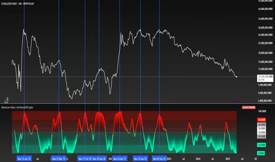
Altseason Index | AlchimistOfCrypto
🌈 Altseason Index | AlchimistOfCrypto – Revealing Bitcoin-Altcoin Dominance Cycles 🌈
"The Altseason Index, engineered through advanced mathematical methodology, visualizes the probabilistic distribution of capital flows between Bitcoin and altcoins within a multi-cycle paradigm. This indicator employs statistical normalization principles where ratio coefficients create mathematical boundaries that define dominance transitions between cryptographic asset classes. Our implementation features algorithmically enhanced rainbow visualization derived from extensive market cycle analysis, creating a dynamic representation of value flow with adaptive color gradients that highlight critical phase transitions in the cyclical evolution of the crypto market."
📊 Professional Trading Application
The Altseason Index transcends traditional sentiment models with a sophisticated multi-band illumination system that reveals the underlying structure of crypto sector rotation. Scientifically calibrated across different ratios (TOTAL2/BTC, OTHERS/BTC) and featuring seamless daily visualization, it enables investors to perceive capital transitions between Bitcoin and altcoins with unprecedented clarity.
- Visual Theming 🎨
Scientifically designed rainbow gradient optimized for market cycle recognition:
- Green-Blue: Altcoin accumulation zones with highest capital flow potential
- Neutral White: Market equilibrium zone representing balanced capital distribution
- Yellow-Red: Bitcoin dominance regions indicating defensive capital positioning
- Gradient Transitions: Mathematical inflection points for strategic reallocation
- Market Phase Detection 🔍
- Precise zone boundaries demarcating critical sentiment shifts in the crypto ecosystem
- Daily timeframe calculation ensuring consistent signal reliability
- Multiple ratio analysis revealing the probabilistic nature of market capital flows
🚀 How to Use
1. Identify Market Phase ⏰: Locate the current index relative to colored zones
2. Understand Capital Flow 🎚️: Monitor transitions between Bitcoin and altcoin dominance
3. Assess Mathematical Value 🌈: Determine optimal allocation based on zone location
4. Adjust Investment Strategy 🔎: Modulate position sizing based on dominance assessment
5. Prepare for Rotation ✅: Anticipate capital shifts when approaching extreme zones
6. Invest with Precision 🛡️: Accumulate altcoins in lower zones, reduce in upper zones
7. Manage Risk Dynamically 🔐: Scale portfolio allocations based on index positioning
Smart Trend Tracker Name: Smart Trend Tracker
Description:
The Smart Trend Tracker indicator is designed to analyze market cycles and identify key trend reversal points. It automatically marks support and resistance levels based on price dynamics, helping traders better navigate market structure.
Application:
Trend Analysis: The indicator helps determine when a trend may be nearing a reversal, which is useful for making entry or exit decisions.
Support and Resistance Levels: Automatically marks key levels, simplifying chart analysis.
Reversal Signals: Provides visual signals for potential reversal points, which can be used for counter-trend trading strategies.
How It Works:
Candlestick Sequence Analysis: The indicator tracks the number of consecutive candles in one direction (up or down). If the price continues to move N bars in a row in one direction, the system records this as an impulse phase.
Trend Exhaustion Detection: After a series of directional bars, the market may reach an overbought or oversold point. If the price continues to move in the same direction but with weakening momentum, the indicator records a possible trend slowdown.
Chart Display: The indicator marks potential reversal points with numbers or special markers. It can also display support and resistance levels based on key cycle points.
Settings:
Cycle Length: The number of bars after which the possibility of a reversal is assessed.
Trend Sensitivity: A parameter that adjusts sensitivity to trend movements.
Dynamic Levels: Setting for displaying key levels.
Название: Smart Trend Tracker
Описание:
Индикатор Smart Trend Tracker предназначен для анализа рыночных циклов и выявления ключевых точек разворота тренда. Он автоматически размечает уровни поддержки и сопротивления, основываясь на динамике цены, что помогает трейдерам лучше ориентироваться в структуре рынка.
Применение:
Анализ трендов: Индикатор помогает определить моменты, когда тренд может быть близок к развороту, что полезно для принятия решений о входе или выходе из позиции.
Определение уровней поддержки и сопротивления: Автоматически размечает ключевые уровни, что упрощает анализ графика.
Сигналы разворота: Индикатор предоставляет визуальные сигналы о возможных точках разворота, что может быть использовано для стратегий, основанных на контртрендовой торговле.
Как работает:
Анализ последовательности свечей: Индикатор отслеживает количество последовательных свечей в одном направлении (вверх или вниз). Если цена продолжает движение N баров подряд в одном направлении, система фиксирует это как импульсную фазу.
Выявление истощения тренда: После серии направленных баров рынок может достичь точки перегрева. Если цена продолжает двигаться в том же направлении, но с ослаблением импульса, индикатор фиксирует возможное замедление тренда.
Отображение на графике: Индикатор отмечает точки потенциального разворота номерами или специальными маркерами. Также возможен вывод уровней поддержки и сопротивления, основанных на ключевых точках цикла.
Настройки:
Длина цикла (Cycle Length): Количество баров, после которых оценивается возможность разворота.
Фильтрация тренда (Trend Sensitivity): Параметр, регулирующий чувствительность к трендовым движениям.
Уровни поддержки/сопротивления (Dynamic Levels): Настройка для отображения ключевых уровней.

Triad QT - BetaQT Profiler is the ultimate tool for Quarterly Theory traders. It's great both for trading and backtesting purposes.
The indicator includes the following features:
- accurate plotting of quarters for cycles from micro to quadrennial, consistent across different markets
- plotting previous quarter high and previous quarter low with possibility of projecting it into next quarters
- plotting DFR for each cycle in convenient, clear way
- plotting True Opens with possibility of looking up higher cycle quarters on lower timeframe charts (you can look up even TYO on micro cycle!) in consistent manner
- plotting SSMTs both for present, as well as historical charts in vey fast fashion - priceless for backtesting and trading purposes
- 3 SSMT detection ways : wick above previous quarter high, close above previous quarter's high, close above previous quarter's highest close (vice versa for lows)
- possibility of choosing the triad you're using from drop down list, as well as setting up your custom triad
- fast performance due to unique coding solutions
------
Brought to you by Triad Trading Community
EmKa

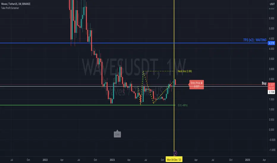
Take Profit ScreenerI'm going to introduce you to the Take Profit Screener tool.
It allows you to manually scan your watchlist to determine at a glance the assets that have the best profitability potential.
It is a 2 in 1 tool that allows you to :
identify where your Take Profit ratios are located whether you are in SHAD or Cycle Strategy
identify the potential reward percentages when approaching the key Fibonacci levels
Before you start using it, you need to:
sort your watchlist according to the price (Last) in order to have price ranges more or less close to each other when jumping from a symbol to another
disable the Auto Scale and Magnet feature
select your first symbol
display the tool (the indicator more exactly)
The settings dialog box is organised in 3 sections:
Strategy : By setting this section, you will answer the question " Where do my Take Profit ratios stand in relation to my entry price, and according to Risk Management Strategy adopted (SHAD or Cycle)? "
Fibonacci : By setting this section, you will answer the question " What percentage gain can I expect as I approach one of the key Fibonacci levels? "
Layout : This is the settings for the look and feel
Strategy Section
Active : This part of the indicator won't display on your chart if unchecked
Type : Choose between SHAD or Cycle Strategy. When choosing SHAD, you can select 2, 4, 8 or 16 SHAD Levels. When choosing Cycle, you can enter whatever ratio value you wish in the Strategy Ratio (Cycle only) input.
SHAD xNN : When choosing SHAD Strategy, you should select at least one level and more if need be.
Strategy Ratio (Cycle only) : When choosing Strategy Type Cycle, you can enter whatever ratio value you wish there.
Freeze Entry Price & Value : Leave it unchecked whenever the current price of the asset is located within your desired area (i.e. Reload Zone) while attempting to estimate its potential reward. Conversely, keep it checked whenever the current price of the asset is outside your desired area, but you need to anticipate the potential reward of this asset if its price reaches a certain level, your Entry price. Enter this price there and check the box.
Show price : If checked, both Take Profit ratio and Price are displayed. If unchecked, then price is hidden.
Extend Line : If checked, then lines showing Take Profit levels extend to the left.
Label Offset : If checked, then the label that displays Take Profit ratio and price shift to the right by a value that ranges from 0 to 100 candles.
Label Style : You can choose between Right or Top. This will determine the orientation of the label.
Fibonacci Section
Active : This part of the indicator won't display on your chart if unchecked
Type : Choose between SHAD or Cycle Strategy. When choosing SHAD, you can select 2, 4, 8 or 16 SHAD Levels. When choosing Cycle, you can enter whatever ratio value you wish in the Strategy Ratio (Cycle only) input.
SHAD xNN : When choosing SHAD Strategy, you should select at least one level and more if need be.
Strategy Ratio (Cycle only) : When choosing Strategy Type Cycle, you can enter whatever ratio value you wish there.
Freeze Entry Price : Leave it unchecked whenever the current price of the asset is located within your desired area (i.e. Reload Zone) while attempting to estimate its potential reward. Conversely, keep it checked whenever the current price of the asset is outside your desired area, but you need to anticipate the potential reward of this asset if its price reaches a certain level, your Entry price. Enter this price there and check the box.
Color : You can define the color of Fibonacci line levels
Cyclic Smoothed RSI MTFAdaptive cyclic smoothed Relative Strength Indicator (csRSI MTF)
The cyclic smoothed RSI MTF indicator is an enhancement of the RSI , adding zero-lag smoothing, adaptive oversold/overbought bands and period color highlighting from higher timeframe to filter signals.
Providing the following advanced features:
using the current dominant cycle length as input for the indicator to ensure more accurate change in trends,
additional smoothing without introducing lag and maintaining clear sharp turns for signal generation,
adaptive upper and lower bands to avoid whipsaw trades and adapt the indicator to trending/cyclic conditions,
using higher time-frame csRSI oversold/overbought conditions to automatically highlight time windows with green/red backgrounds on the indicator panel for signal filtering and/or alert rules,
can be used to trigger alerts on your key symbols to get informed when a red/green windows are reached.
The following common problems with standard indicators are solved by this indicator:
First, normal indicators introduce a lot of false signals due to their noisy signal line. Second, to compensate for the noise, one would normally try to add some smoothing. But this only results in adding more delay to the indicator, which makes it almost useless. Third, oscillators contain static threshold levels to define oversold/overbought conditions. However, the market is not static and changes between trending and cycling periods. In trending periods, these static oversold/overbought levels are useless ore will trigger too much whipsaw trades. Finally, indicators don't take their state from other timeframes into account to filter signals.
All four problems described above are solved by the developed adaptive cyclic RSI with embedded MTF period highlighting.
Examples
S&P500 EMini Futures - csRSI 2H chart / 1D filter example signals
S&P E-Mini Futures 2h chart with daily higher time-frame filtering period for the csRSI, showing the standard RSI in the lower panel for signal comparison, signals from the csRSI are marked on the price chart
Bitcoin BTC /USD - csRSI 2H chart / 1D filter example signals
Bitcoin BTC /USD 2h chart with daily higher time-frame filtering period for the csRSI, signals marked
EUR/USD Forex - csRSI 20min chart / 2h filter example signals
EUR/USD 20min chart with 2H higher time-frame filtering period for the csRSI, signals marked
Info:
All three examples are setup with the basic standard settings and no additional parameter adjustments. The placed arrows on the price/indicator panel and the projection price areas have been added manually to visualize the signals for an discretionary trading approach. They are derived based on standard technical indicator oscillator readings (signal turn above/below bands). Due to the nature of the indicator (ultra-smooth, sharp curves, dynamic bands), these signals are easy to spot, and will help to avoid whipsaw trades in volatile conditions.
Settings & Parameter
The Inputs section allows you to select the time frame for the indicator signals. We recommend keeping the indicator time-frame according to your chart time frame ("Same as chart"). The cycle length allows to improve the signals by entering the dominant cycle length of the analyzed dataset. This parameter is optional if the current dominant cycle is not known. In that case, leave it at 20. The dominant cycle length can even improve the indicator signal generation. The examples above have not been optimized by using the dominant cycle length and just used the standard setting of 20.
The MTF CYCLE FILTER area is used to set the time-frame used as filter to plot the colored indicator background in red and green areas when the higher time-frame indicator is above (red) or below (green) the dynamic bands. These indicate the period of time with high probability to look for signals on the main indicator line.
The MTF Resolution parameter input is important for generating the highlighted red/green areas on the indicator panel. You must enter a higher time-frame than your indicator time-frame in order to get the reliable highlighting. We recommend the following combinations of trading time-frame and filter time-frame resolutions:
Chart Timeframe | MTF Indicator Highlighting Resolution
------------------------------------------------------------------------
20 min | 2 h
2 h | 1 d
You can enter the current dominant cycle length on the chosen higher time-frame resolution to even further optimize the indicator accuracy in the field "MTF CYCLE FILTER - Cycle Length".
The Style sections allows to active/de-active individual plots. The standard setting disables the higher time-frame csRSI indicator which is only used to indicate the colored areas. If required, you can also enable the MTF indicator and adaptive bands to be plotted in the same indicator panel. The values shown in the style section also indicate which values are available for individual alert generation.
Automatic Signals & Alerts
It is possible to create your own automatic signals with the csRSI MTF indicator using the TradingView alert function. Click on the three dots "More" beside the indicator name label and select "Add Alert on csRSI ..." from the context menu. For example, if you want to receive an alert when the high probability periods (red/green highlighted areas) have been reached for a symbol without manually watching the indicator panel, you can set up a custom alert. The csRSI indicator provides the raw values necessary to set up your alarm conditions. Set the "CSRSI MTF" as the value for the "Out of Channel" condition and select the "HigBand MTF" and "LowBand MTF" indicator values as the upper and lower limit parameters in the alarm's dialog box. Once you have set up this alarm, you will not need to monitor your charts manually. The TradingView alert will inform you as soon as an important time zone is reached. These are the situations when you would open the chart and watch for trigger signals on the indicator line. If you set up this alert as an email, you can even focus on other things and let the csRSI MTF highlighter condition alert you when you should pay attention to the trading chart.
Usage & Trade Signals
Classic rules apply as with every technical oscillator. In addition use this indicator to identify the following conditions:
Indicator turns above/below the adaptive upper and lower bands (expected trend reversals)
Indicator crosses below upper band / crossed above lower band (start of trend reversal)
Indicator crosses above upper band / crossed below lower band (trend continuation/confirmation)
Divergence between price / indicator indicate strong signal confidence
Hidden divergences between price/indicator indicate string signal confidence
After strong price movements, wait for the second signal confirmed by a divergence
Use the mentioned conditions in the highlighted red/green periods indicated by the MTF settings
Purpose & Disclaimer
This indicator is not designed for use as an automated trading strategy. This is an improved technical indicator using the dominant cycle to provide its advanced features. The basic applications of technical analysis for using oscillators apply. The script is intended for use in discretionary trading and can be used as a part of automated systems. Indicator signal failures will occur as you should expect with every technical indicator. If you are not sure if this indicator might help your trading style, please try and check our open source public version which will give you basic understanding upfront.
Basic open-source public version
This indicator is an advanced version of our public available open-source cyclic smoothed RSI indicator named "RSI cyclic smoothed v2". The advanced invite-only version provides fully automatic time frame highlighting by using a cyclically smoothed RSI from a higher time frame to indicate time frames with high probability signals. These high probability windows are highlighted when the indicator from the higher time frame is in dynamic overbought or oversold territory. You will find the basic open-source public version here below for your own review:
How to get access
Please check the "authors instructions" section for further details.
Script pago

Quarterly Theory IndicatorQuarterly Theory Indicator (from Daye's Theory)
Functionalities:
1) Monthly Quarterly Cycles (division with vertical lines) & the latest Monthly True Open- only visible in the weekly TF (horizontal line).
2) Weekly Quarterly Cycles (division with vertical lines) & the latest Weekly True Open (horizontal line).
3) Daily Quarterly Cycles (division with vertical lines) & the latest Daily True Open (horizontal line).
4) 90Min "Sessional" Quarterly Cycles (division with vertical lines) & the four 90Min cycle True Open lines of the latest day (horizontal lines).

FLD 3DFLD 3D - Future Lines of Demarcation Indicator
═══════════════════════════════════════════════════
THEORETICAL FOUNDATION
═══════════════════════════════════════════════════
This indicator implements Future Lines of Demarcation (FLD), a key concept from J.M. Hurst's cyclic analysis theory. FLDs are price-based lines displaced forward in time by half the wavelength of a dominant cycle, creating a predictive framework for price movement analysis.
The core principle: when price crosses an FLD line, it indicates a potential change in the current cycle phase. FLDs act as dynamic support/resistance levels that "anticipate" where price should be based on the dominant cycle's rhythm.
═══════════════════════════════════════════════════
CALCULATION METHODOLOGY
═══════════════════════════════════════════════════
The indicator calculates three FLD lines:
1. FLD HIGH: Takes the bar's high price and shifts it forward by offset bars
2. FLD LOW: Takes the bar's low price and shifts it forward by offset bars
3. FLD MEDIAN: Calculates a median price using the selected method, then shifts forward
The offset is calculated as: offset = Period / 2
This displacement represents the half-cycle concept: if a cycle has a period of 48 bars, the FLD will be displaced 24 bars into the future. This creates a "lead" indicator that shows where price should theoretically be based on the cycle's wave pattern.
PRICE METHODS AVAILABLE:
- HL2: (High + Low) / 2 - Simple midpoint
- HLC3: (High + Low + Close) / 3 - Weighted with close
- HLCC4: (High + Low + Close + Close) / 4 - Close has double weight
- OHLC4: (Open + High + Low + Close) / 4 - Full bar average
- VWAP-like: Volume-weighted high/low average
- True Range: Uses previous close for range calculation
═══════════════════════════════════════════════════
AUTO-PERIOD ADJUSTMENT FEATURE
═══════════════════════════════════════════════════
The indicator includes multi-timeframe adaptation logic. When "Auto Period" is enabled:
1. Detects current chart timeframe (minutes, hours, days, weeks)
2. Compares it to the reference timeframe setting
3. Calculates adjustment ratio: Reference TF / Current TF
4. Applies ratio to base period: Adjusted Period = Base Period × Ratio
Example: If Base Period = 48, Reference TF = 60min, Current chart = 15min
→ Ratio = 60/15 = 4
→ Adjusted Period = 48 × 4 = 192 bars
This ensures the indicator tracks the same real-time cycle length across different chart timeframes, maintaining consistency in cycle analysis.
═══════════════════════════════════════════════════
VISUAL COMPONENTS
═══════════════════════════════════════════════════
- RED LINE: FLD High (upper boundary)
- BLUE LINE: FLD Low (lower boundary)
- ORANGE LINE: FLD Median (centerline)
- GRAY AREA: Fills between High and Low FLDs
- RIGHT LABEL: Shows FLD identifier and period used (asterisk indicates auto-adjustment)
All lines extend into the future by the calculated offset, creating a "projection zone" ahead of current price.
═══════════════════════════════════════════════════
ACKNOWLEDGMENTS
═══════════════════════════════════════════════════
This work is inspired by the Italian cyclic analysis community and dedicated educators. Due to TradingView's House Rules on promotional content, I cannot mention specific names or groups, but my gratitude goes to those who know they contributed to this development through their teaching and guidance. Thank Emiliano!

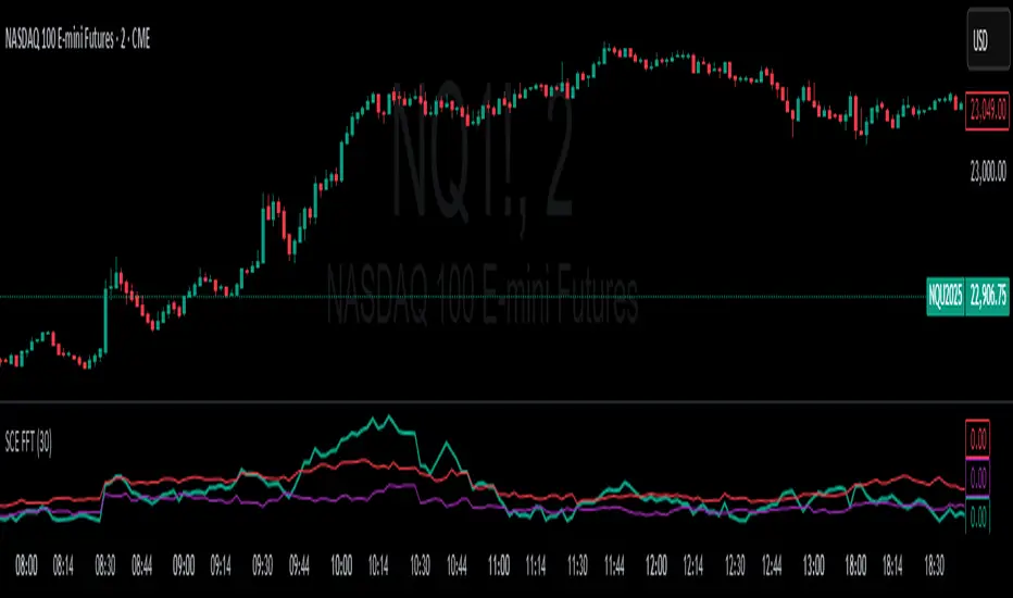
Fast Fourier Transform [ScorsoneEnterprises]The SCE Fast Fourier Transform (FFT) is a tool designed to analyze periodicities and cyclical structures embedded in price. This is a Fourier analysis to transform price data from the time domain into the frequency domain, showing the rhythmic behaviors that are otherwise invisible on standard charts.
Instead of merely observing raw prices, this implementation applies the FFT on the logarithmic returns of the asset:
Log Return(𝑚) = log(close / close )
This ensures stationarity and stabilizes variance, making the analysis statistically robust and less influenced by trends or large price swings.
For a user-defined lookback window 𝑁:
Each frequency component 𝑘 is computed by summing real and imaginary projections of log-returns multiplied by complex exponential functions:
𝑒^−𝑖𝜃 = cos(𝜃)−𝑖sin(𝜃)
where:
θ = 2πkm / N
he result is the magnitude spectrum, calculated as:
Magnitude(𝑘) = sqrt(Real_Sum(𝑘)^2 + Imag_Sum(𝑘)^2)
This spectrum represents the strength of oscillations at each frequency over the lookback period, helping traders identify dominant cycles.
Visual Analysis & Interpretation
To give traders context for the FFT spectrum’s values, this script calculates:
25th Percentile (Purple Line)
Represents relatively low cyclical intensity.
Values below this threshold may signal quiet, noisy, or trendless periods.
75th Percentile (Red Line)
Represents heightened cyclical dominance.
Values above this threshold may indicate significant periodic activity and potential trend formation or rhythm in price action.
The FFT magnitude of the lowest frequency component (index 0) is plotted directly on the chart in teal. Observing how this signal fluctuates relative to its percentile bands provides a dynamic measure of cyclical market activity.
Chart examples
In this NYSE:CL chart, we see the regime of the price accurately described in the spectral analysis. We see the price above the 75th percentile continue to trend higher until it breaks back below.
In long trending markets like NYSE:PL has been, it can give a very good explanation of the strength. There was confidence to not switch regimes as we never crossed below the 75th percentile early in the move.
The script is also usable on the lower timeframes. There is no difference in the usability from the different timeframes.
Script Parameters
Lookback Value (N)
Default: 30
Defines how many bars of data to analyze. Larger N captures longer-term cycles but may smooth out shorter-term oscillations.
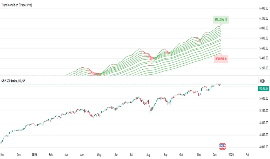
Trend Condition [TradersPro]
OVERVIEW
The Trend Condition Indicator measures the strength of the bullish or bearish trend by using a ribbon pattern of exponential moving averages and scoring system. Trend cycles naturally expand and contract as a normal part of the cycle. It is the rhythm of the market. Perpetual expansion and contraction of trend.
As trend cycles develop the indicator shows a compression of the averages. These compression zones are key locations as trends typically expand from there. The expansion of trend can be up or down.
As the trend advances the ribbon effect of the indicator can be seen as each average expands with the price action. Once they have “fanned” the probability of the current trend slowing is high.
This can be used to recognize a powerful trend may be concluding. Traders can tighten stops, exit positions or utilize other prudent strategies.
CONCEPTS
Each line will display green if it is higher than the prior period and red if it is lower than the prior period. If the average is green it is considered bullish and will score one point in the bullish display. Red lines are considered bearish and will score one point in the bearish display.
The indicator can then be used at a quick glance to see the number of averages that are bullish and the number that are bearish.
A trader may use these on any tradable instrument. They can be helpful in stock portfolio management when used with an index like the S&P 500 to determine the strength of the current market trend. This may affect trade decisions like possession size, stop location and other risk factors.
Phase-Accumulation Adaptive EMA w/ Expanded Source Types [Loxx]Phase-Accumulation Adaptive EMA w/ Expanded Source Types is a Phase Accumulation Adaptive Exponential Moving Average with Loxx's Expanded Source Types. This indicator is meant to better capture trend movements using dominant cycle inputs. Alerts are included.
What is Phase Accumulation?
The phase accumulation method of computing the dominant cycle is perhaps the easiest to comprehend. In this technique, we measure the phase at each sample by taking the arctangent of the ratio of the quadrature component to the in-phase component. A delta phase is generated by taking the difference of the phase between successive samples. At each sample we can then look backwards, adding up the delta phases.When the sum of the delta phases reaches 360 degrees, we must have passed through one full cycle, on average.The process is repeated for each new sample.
The phase accumulation method of cycle measurement always uses one full cycle’s worth of historical data.This is both an advantage and a disadvantage.The advantage is the lag in obtaining the answer scales directly with the cycle period.That is, the measurement of a short cycle period has less lag than the measurement of a longer cycle period. However, the number of samples used in making the measurement means the averaging period is variable with cycle period. longer averaging reduces the noise level compared to the signal.Therefore, shorter cycle periods necessarily have a higher out- put signal-to-noise ratio.
Included:
-Toggle on/off bar coloring
-Alerts

even_better_sinewave_mod
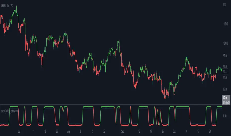
Description:
Even better sinewave was an indicator developed by John F. Ehlers (see Cycle Analytics for Trader, pg. 159), in which improvement to cycle measurements completely relies on strong normalization of the waveform. The indicator aims to create an artificially predictive indicator by transferring the cyclic data swings into a sine wave. In this indicator, the modified is on the weighted moving average as a smoothing function, instead of using the super smoother, aim to be more adaptive, and the default length is set to 55 bars.
Sinewave
smoothing = (7*hp + 6*hp_1 + 5*hp_2+ 4*hp_3 + 3*hp_4 + 2*hp5 + hp_6) /28
normalize = wave/sqrt(power)
Notes:
sinewave indicator crossing over -0.9 is considered to beginning of the cycle while crossing under 0.9 is considered as an end of the cycle
line color turns to green considered as a confirmation of an uptrend, while turns red as a confirmation of a downtrend
confidence of using indicator will be much in confirmation paired with another indicator such dynamic trendline e.g. moving average
as cited within Ehlers book Cycle Analytic for Traders, the indicator will be useful if the satisfied market cycle mode and the period of the dominant cycle must be estimated with reasonable accuracy
Other Example
Regime MapRegime Map — Volatility State Detector
This indicator is a PineScript friendly approximation of a more advanced Python regime-analysis engine.
The original backed identifies market regimes using structural break detection, Hidden-Markov Models, wavelet decomposition, and long-horizon volatility clustering. Since Pine Script cannot execute these statistical models directly, this version implements a lightweight, real-time proxy using realised volatility and statistical thresholds.
The purpose is to provide a clear visual map of evolving volatility conditions without requiring any heavy offline computation.
________________________________________
Mathematical Basis: Python vs Pine
1. Volatility Estimation
Python (Realised Volatility):
RVₜ = √N × stdev( log(Pₜ) − log(Pₜ₋₁) )
Pine Approximation:
RVₜ = stdev( log(Pₜ) − log(Pₜ₋₁), lookback )
Rationale:
Realised volatility captures volatility clustering — a key characteristic of regime transitions.
________________________________________
2. Regime Classification
Python (HMM Volatility States):
Volatility is modelled as belonging to hidden states with different means and variances:
State μ₁, σ₁
State μ₂, σ₂
State μ₃, σ₃
with state transitions determined by a probability matrix.
Pine Approximation (Z-Score Regimes):
Zₜ = ( RVₜ − mean(RV) ) / stdev(RV)
Regime assignment:
• Regime 0 (Low Vol): Zₜ < Zₗₒw
• Regime 1 (Normal): Zₗₒw ≤ Zₜ ≤ Zₕᵢgh
• Regime 2 (High Vol): Zₜ > Zₕᵢgh
Rationale:
Z-scores provide clean statistical boundaries that behave similarly to HMM state separation but are computable in real time.
________________________________________
3. Structural Break Detection vs Rolling Windows
Python (Bai–Perron Structural Breaks):
Segments the volatility series into periods with distinct statistical properties by minimising squared error over multiple regimes.
Pine Approximation:
Rolling mean and rolling standard deviation of volatility over a long window.
Rationale:
When structural breaks are not available, long-window smoothing approximates slow regime changes effectively.
________________________________________
4. Multi-Scale Cycles
Python (Wavelet Decomposition):
Volatility decomposed into long-cycle (A₄) and short-cycle components (D bands).
Pine Approximation:
Single-scale smoothing using long-horizon averages of RV.
Rationale:
Wavelets reveal multi-frequency behaviour; Pine captures the dominant low-frequency component.
________________________________________
Indicator Output
The background colour reflects the active volatility regime:
• Low Volatility (Green): trending behaviour, cleaner directional movement
• Normal Volatility (Yellow): balanced environment
• High Volatility (Red): sharp swings, traps, mean-reversion phases
Regime labels appear on the chart, with a status panel displaying the current regime.
________________________________________
Operational Logic
1. Compute log returns
2. Calculate short-horizon realised volatility
3. Compute long-horizon mean and standard deviation
4. Derive volatility Z-score
5. Assign regime classification
6. Update background colour and labels
This provides a stable, real-time map of market state transitions.
________________________________________
Practical Applications
Intraday Trading
• Low-volatility regimes favour trend and breakout continuation
• High-volatility regimes favour mean reversion and wide stop placement
Swing Trading
• Compression phases often precede multi-day trending moves
• Volatility expansions accompany distribution or panic events
Risk Management
• Enables volatility-adjusted position sizing
• Helps avoid leverage during expansion regimes
________________________________________
Notes
• Does not repaint
• Fully configurable thresholds and lookbacks
• Works across indices, stocks, FX, crypto
• Designed for real-time volatility regime identification
________________________________________
Disclaimer
This script is intended solely for educational and research purposes.
It does not constitute financial advice or a recommendation to buy or sell any instrument.
Trading involves risk, and past volatility patterns do not guarantee future outcomes.
Users are responsible for their own trading decisions, and the author assumes no liability for financial loss.

ACE SqueezeACE Squeeze - Advanced Momentum Oscillator with Squeeze Detection
WHAT IT DOES
This is my take on a squeeze momentum indicator that I've been refining over time. At its core, it detects periods when volatility contracts (the squeeze) and measures momentum direction when the market breaks out. Think of it like a coiled spring - when price compresses into a tight range, it often leads to explosive moves once it breaks free.
The indicator plots a histogram oscillator that ranges from -100 to +100, with several visual elements to help you gauge signal strength and market conditions.
KEY FEATURES
Market Regime Detection - The indicator automatically adjusts its sensitivity based on whether the market is trending, ranging, choppy, or volatile. This helps reduce false signals in different market environments.
Hilbert Transform - Uses advanced cycle detection to identify the dominant market rhythm. You can toggle this on/off if you prefer the simpler calculation method.
Volume Analysis - Incorporates volume delta and footprint analysis to confirm momentum signals. Strong moves with volume confirmation get priority.
Statistical Filtering - Filters out low-quality signals by analyzing signal persistence and deviation from the mean. This helps focus on the high-probability setups.
Visual Enhancements - Three-tier glow system shows building momentum, heat maps at extreme levels, and cycle phase indicator to track market rhythm.
HOW TO USE IT
The Squeeze - When you see the purple background, that's a squeeze condition. The market is compressing and building energy. Wait for the squeeze to release (background disappears) and watch which direction the histogram breaks.
Histogram Direction - Green bars mean bullish momentum, red bars mean bearish momentum. The stronger the color and the larger the glow effect, the stronger the signal.
Zero Line - Think of this as the battleground. When the histogram crosses above zero with strong momentum, that's a buy signal. When it crosses below with conviction, that's a sell signal.
Extreme Levels - The +90/-90 zones are overbought/oversold areas. The heat map bands intensify as the signal reaches these extremes, warning you that a reversal or consolidation might be coming.
Signal Quality - The indicator has built-in quality filtering. The alerts are set to only fire when signal quality is high (above 70-80%), which helps avoid the junk trades.
BEST PRACTICES
Don't trade every signal. Wait for the high-quality setups where multiple factors align - squeeze release, strong momentum, volume confirmation, and good signal quality.
Use higher timeframes for confirmation. A squeeze on the 1-hour chart hitting at the same time as the daily chart is much more powerful than isolated signals.
Pay attention to the cycle phase line. When momentum aligns with the cycle direction, the move tends to have more follow-through.
The glow effects are your friend. When you see the tier 3 extreme glow, the market is really moving - consider trailing stops or scaling out.
PROS
Highly customizable - You can adjust almost everything from sensitivity to visual appearance.
Multi-faceted analysis - Combines volatility, momentum, volume, and cycle analysis in one indicator.
Smart filtering - The regime detection and statistical filtering help adapt to different market conditions.
Visual clarity - The glow effects and color gradients make it easy to see signal strength at a glance.
Good alert system - Alerts are filtered for quality, so you're not getting pinged on every minor wiggle.
CONS
Can be complex for beginners - There are a lot of settings and concepts to understand. Start with defaults and adjust gradually.
Lags on fast markets - Like any indicator, it's based on past data. In extremely fast-moving markets, you might get late entries.
Works best in volatile markets - In super tight, low-volatility ranges, you might see fewer signals. That's by design, but it means patience is required.
Computational load - With all the enhancements turned on, it's doing a lot of calculations. On lower-end devices, you might notice some lag.
Not a holy grail - No indicator is. This is a tool to help you make better decisions, not a replacement for proper risk management and trading discipline.
SETTINGS BREAKDOWN
Core Settings - Adjust the base cycle length (10 is good for most timeframes) and sensitivity (0.65 is balanced, lower for fewer signals, higher for more).
Enhancement Settings - Toggle the advanced features. If you're getting too many signals, try turning off RRED. If you want cleaner signals, keep statistical filtering on.
Visual Settings - Customize the appearance. The glow effects look cool but you can disable them if you prefer a cleaner chart.
Elite Settings - Market regime detection is powerful but you can disable it if you want consistent behavior across all market conditions.
TIPS FROM MY TESTING
The indicator shines best on the 15-minute to 4-hour timeframes. It works on lower timeframes but expect more noise.
Use it alongside support/resistance or supply/demand zones. When a squeeze fires near a key level, the probability increases significantly.
Don't ignore the small signals in trending markets. Sometimes the modest +30 to +40 readings in a strong uptrend are your best continuation entries.
The squeeze can last longer than you expect. Don't try to predict when it will fire - let the indicator tell you.
This indicator represents a lot of testing and refinement. It's not perfect, but it's been useful in my trading. I hope it helps you spot better setups and avoid some of the false signals that plague simpler momentum indicators.

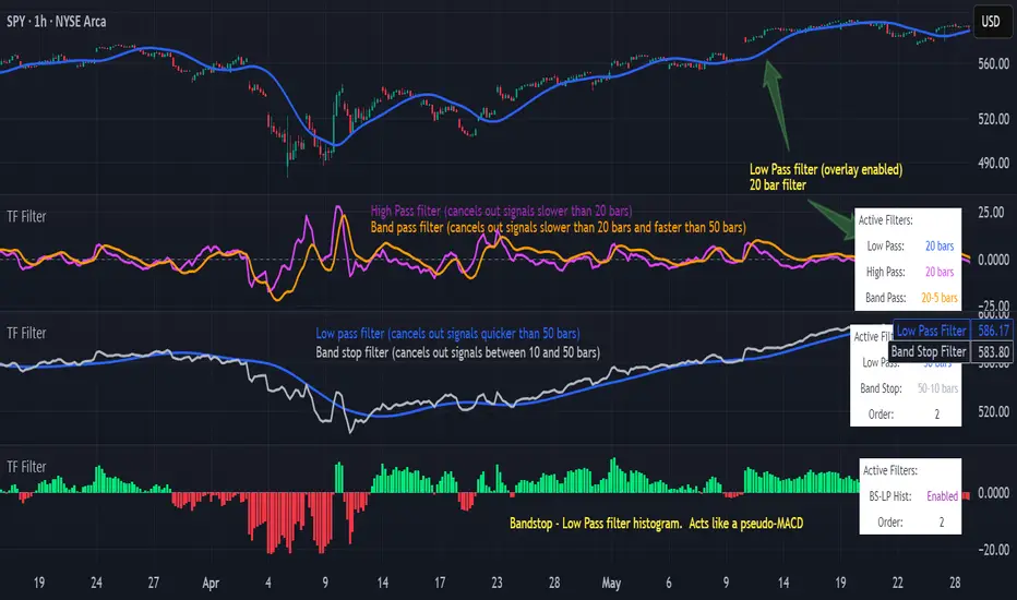
Transfer Function Filter [theUltimator5]The Transfer Function Filter is an engineering style approach to transform the price action on a chart into a frequency, then filter out unwanted signals using Butterworth-style filter approach.
This indicator allows you to analyze market structure by isolating or removing different frequency components of price movement—similar to how engineers filter signals in control systems and electrical circuits.
🔎 Features
Four Filter Types
1) Low Pass Filter – Smooths price data, highlighting long-term trends while filtering out short-term noise. This filter acts similar to an EMA, removing noisy signals, resulting in a smooth curve that follows the price of the stock relative to the filter cutoff settings.
Real world application for low pass filter - Used in power supplies to provide a clean, stable power level.
2) High Pass Filter – Removes slow-moving trends to emphasize short-term volatility and rapid fluctuations. The high pass filter removes the "DC" level of the chart, removing the average price moves and only outputting volatility.
Real world application for high pass filter - Used in audio equalizers to remove low-frequency noise (like rumble) while allowing higher frequencies to pass through, improving sound clarity.
3) Band Pass Filter – Allows signals to plot only within a band of bar ranges. This filter removes the low pass "DC" level and the high pass "high frequency noise spikes" and shows a signal that is effectively a smoothed volatility curve. This acts like a moving average for volatility.
Real world application for band pass filter - Radio stations only allow certain frequency bands so you can change your radio channel by switching which frequency band your filter is set to.
4) Band Stop Filter – Suppresses specific frequency bands (cycles between two cutoffs). This filter allows through the base price moving average, but keeps the high frequency volatility spikes. It allows you to filter out specific time interval price action.
Real world application for band stop filter - If there is prominent frequency signal in the area which can cause unnecessary noise in your system, a band stop filter can cancel out just that frequency so you get everything else
Configurable Parameters
• Cutoff Periods – Define the cycle lengths (in bars) to filter. This is a bit counter-intuitive with the numbering since the higher the bar count on the low-pass filter, the lower the frequency cutoff is. The opposite holds true for the high pass filter.
• Filter Order – Adjust steepness and responsiveness (higher order = sharper filtering, but with more delay).
• Overlay Option – Display Low Pass & Band Stop outputs directly on the price chart, or in a separate pane. This is enabled by default, plotting the filters that mimic moving averages directly onto the chart.
• Source Selection – Apply filters to close, open, high, low, or custom sources.
Histograms for Comparison
• BS–LP Histogram – Shows distance between Band Stop and Low Pass filters.
• BP–HP Histogram – Highlights differences between Band Pass and High Pass filters.
Histograms give the visualization of a pseudo-MACD style indicator
Visual & Informational Aids
• Customizable colors for each filter line.
• Optional zero-line for histogram reference.
• On-chart info table summarizing active filters, cutoff settings, histograms, and filter order.
📊 Use Cases
Trend Detection – Use the Low Pass filter to smooth noise and follow underlying market direction.
Volatility & Cycle Analysis – Apply High Pass or Band Pass to capture shorter-term patterns.
Noise Suppression – Deploy Band Stop to remove specific choppy frequencies.
Momentum Insight – Watch the histograms to spot divergences and relative filter strength.
BigNuts MacroScript that overlays key events that are coming up as the US economy shifts into fiscal dominance and global liquidity may peak. The specified dates were cross referenced from many cycle theories including Benner and Kondratieff key cycle dates as well work of Michel Howell for Global liquidity cycles and Luke Gromen analysis for Marco. The script also then cross references all these dates with any key celestial events that have had previous historical significance for market timing. The celestial events are key dates to watch but can be toggled on and off.

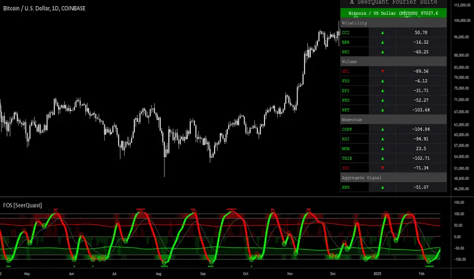
Fourier Oscillator Suite [SeerQuant]| Fourier Oscillator Suite |
WHY THE FOURIER TRANSFORM?
The Discrete Fourier Transform (DFT) extracts dominant cyclical patterns from market price data. Fourier analysis allows for the decomposition of price movements into frequency components, distinguishing trend-driven behaviour from noise and identifying oscillatory cycles within the market. This approach is effective in detecting dominant cycles in data, filtering out random fluctuations, and providing insights into price behaviour beyond conventional indicators.
This indicator applies a Fourier transform to the selected price source, converting it into a frequency-based signal. Instead of directly working with raw price data, the transformed signal acts as a smoothed and cycle-adjusted input for multiple technical indicators, enhancing their ability to adapt to market conditions dynamically.
Once the Fourier transform is applied, the extracted signal is processed through a suite of technical indicators, which are then normalized and aggregated into a single, actionable metric.
FEATURES AND BENEFITS
✅ Multi-Factor Aggregation:
By blending volatility, momentum, and volume-based oscillators, this indicator provides a comprehensive view of market conditions.
✅ Enhanced Signal Clarity:
Fourier transformation filters noise, revealing more reliable trading signals.
✅ Adaptive Market Sensitivity:
Unlike static oscillators, the Fourier-enhanced input dynamically adjusts to price shifts.
INDICATOR COMPONENTS
The Fourier Oscillator Suite aggregates the output of the transformed signal into three primary market components:
1. Volatility-Based Metrics
Commodity Channel Index (CCI) – Measures price deviation from a moving average.
Bollinger Band %B (BB%) – Evaluates price positioning within the Bollinger Bands.
Relative Volatility Index (RVI) – Identifies periods of heightened or subdued volatility.
2. Momentum Indicators
Relative Strength Index (RSI) – Gauges trend momentum and overbought/oversold levels.
Coppock Curve – A long-term momentum oscillator, often used for detecting major trend shifts.
Momentum (MOM), TRIX, and Stochastic Momentum Index (SMI) – Further refine momentum analysis.
3. Volume-Based Oscillators
Money Flow Index (MFI) – Measures price strength relative to volume.
Volume Zone Oscillator (VZO) – Detects accumulation and distribution phases.
Elder's Force Index (EFI) & Klinger Volume Oscillator (KVO) – Assess money flow strength.
These individual metrics are first normalized within a defined period and then smoothed using the selected moving average type. The final composite signal is derived from a weighted combination of the volatility, momentum, and volume components, each of which can be customized by the user.
SETTINGS
The indicator includes an extensive set of options for users to tailor its performance:
📌 Fourier Transform Parameters
Source Selection – Choose which price input (e.g., HLC3) is used for Fourier analysis.
Fourier Period – Defines the number of cycles analyzed for signal extraction.
📌 Aggregation Settings
Normalization Period – Controls how indicator values are scaled.
Smoothing Length – Adjusts the sensitivity of moving averages applied to oscillators.
Weight Adjustments – Fine-tune the impact of volatility, momentum, and volume-based inputs on the final signal.
📌 White Noise Control
White Noise Amplitude & Period – Filters out excessive market noise to improve signal clarity.
Enable/Disable White Noise Overlay – Provides optional visualization of filtered noise levels.
📌 Custom Styling & Visual Enhancements
Selectable Color Schemes – Choose from Default, Modern, Cool, or Monochrome.
Bull & Bear Color Customization – Define custom colors for positive/negative momentum shifts.
Adaptive Gradient Fills – Highlights market conditions dynamically based on oscillator movements.
The Fourier Oscillator Suite is designed for advanced traders seeking a noise-reduced, multi-dimensional view of market dynamics. By incorporating Fourier-transformed signals into a broad range of oscillators, this tool offers a highly adaptive, filter-enhanced, and customizable approach to momentum and trend analysis. Whether you are a trend follower, mean reversion trader, or volume analyst, this suite provides actionable insights with enhanced clarity.