Weekend GapsIdentify unfilled gaps between the close of one candle and the opening of the next. Optimised for weekends by highlighting friday gaps with a triangle and bold horizontal ray. Depending on the price action required to fill it, they are marked in red or green.
Multitimeframe

Tristan's Multi-Indicator Reversal StrategyMulti-Indicator Reversal Strategy - Buy Low, Sell High
A comprehensive reversal detection system that combines multiple proven technical indicators to identify high-probability entry points for catching reversals at market extremes.
📊 Strategy Overview
This strategy is designed for traders who want to buy at lows and sell at highs by detecting when stocks are overextended and ready to reverse. It works by requiring multiple technical indicators to align before generating a signal, significantly reducing false entries.
Best Used On:
Timeframe: 1-hour charts (also works on 15min, 30min, 4hour)
Session: NY Trading Session (9:30 AM - 4:00 PM ET)
Assets: Stocks, ETFs, Crypto (particularly volatile tech stocks like ZM, TSLA, AAPL)
Trading Style: Swing trading, Intraday reversals
🔧 Technical Components
The strategy combines FIVE powerful technical indicators:
1. RSI (Relative Strength Index)
2. MACD (Moving Average Convergence Divergence)
3. Williams %R
4. Bollinger Bands
5. Volume Analysis
6. Divergence Detection (Optional)
🎨 Visual Signals
Entry Signals:
🟢 Green Triangle (below candle) = BUY LONG signal
🔴 Red Triangle (above candle) = SELL SHORT signal
Exit Signals:
🟣 Purple Label = Position closed (shows "x2", "x3" if multiple entries)
Additional Indicators:
💎 Aqua Diamond = Bullish divergence detected
💎 Fuchsia Diamond = Bearish divergence detected
🔵 Blue Background = NY Session active
🟡 Yellow Bar Tint = Volume spike detected
⚪ Small Circles = Near-signal conditions (2+ indicators aligned)
Live Counter:
Top corner shows: "Bull: X/4" and "Bear: X/4"
Indicates how many indicators currently align
⚙️ How to Use This Strategy
For Beginners (More Signals):
Set "Min Indicators Aligned" to 2
Turn OFF "Require Divergence"
Turn OFF "Require Volume Spike"
Turn OFF "Require Reversal Candle Pattern"
Keep "Allow Multiple Entries" OFF
This gives you more frequent signals to learn from.
For Advanced Traders (High Probability):
Set "Min Indicators Aligned" to 3 or 4
Turn ON "Require Divergence"
Turn ON "Require Volume Spike"
Turn ON "Require Reversal Candle Pattern"
Adjust stop loss to your risk tolerance
This filters for only the highest-quality setups.
Recommended Settings for 1-Hour Charts:
Min Indicators Aligned: 3
Stop Loss: 2.5%
Take Profit: 5.0%
RSI Length: 14
Williams %R Length: 14
Volume Multiplier: 1.5x
Session: NY only (for stocks)
BUY SIGNAL generated when:
2-4 indicators show oversold/bullish conditions:
RSI < 30 and turning up
MACD crossing bullish or histogram positive
Williams %R < -80 and turning up
Price at/below lower Bollinger Band
Optional confirmations (if enabled):
Bullish divergence detected
Volume spike present
Bullish reversal candle pattern
Session filter: Signals only during NY trading hours
SELL SIGNAL Generated When:
2-4 indicators show overbought/bearish conditions:
RSI > 70 and turning down
MACD crossing bearish or histogram negative
Williams %R > -20 and turning down
Price at/above upper Bollinger Band
Optional confirmations (if enabled):
Bearish divergence detected
Volume spike present
Bearish reversal candle pattern
🛡️ Risk Management Features
Automatic Stop Loss: Protects capital (default 2.5%)
Take Profit Target: Locks in gains (default 5.0%)
Pyramiding Control: Toggle to prevent position stacking
Session Filter: Avoids overnight risk and low-liquidity periods
Position Flipping: Automatically reverses when opposite signal appears
💡 Best Practices
✅ DO:
Wait for candle close before entering (built into strategy)
Use on volatile assets with clear trends
Combine with your own analysis and risk management
Backtest on your specific assets and timeframes
Start with paper trading to learn the signals
Adjust indicator requirements based on market conditions
❌ DON'T:
Use on very low timeframes (<5 min) without adjustment
Ignore the session filter on stocks
Use maximum leverage - these are reversal trades
Trade during major news events or earnings
Expect 100% win rate - focus on risk/reward ratio
📊 Performance Notes
This strategy prioritizes quality over quantity. With default settings, you may see:
2-5 signals per week on 1-hour charts
Higher win rate with stricter settings (3-4 indicators aligned)
Best performance during trending markets with clear reversals
Reduced performance in choppy, sideways markets
Tip: Adjust "Min Indicators Aligned" based on market conditions:
Trending markets: Use 3-4 (fewer but stronger signals)
Range-bound markets: Use 2 (more signals, but watch for false breakouts)

Custom Session Background Highlighter (Asia / London / NY)This was something i am used to using with Motivewave, and did not see a good one with TV. You can set any time frame, and change the background color to any color you want. I like to have a lightly different color background for Asia (6pm to 3am),, London, (3am to 9:30 am) and NY (9:30am to 5 pm). You can set your time as you wish, and change the colors as you like. This was created with the help of ChatGPT and seems to be working perfectly fine, but if you encounter any issues copy and paste the code to chatgpt and ask to revise it as needed.

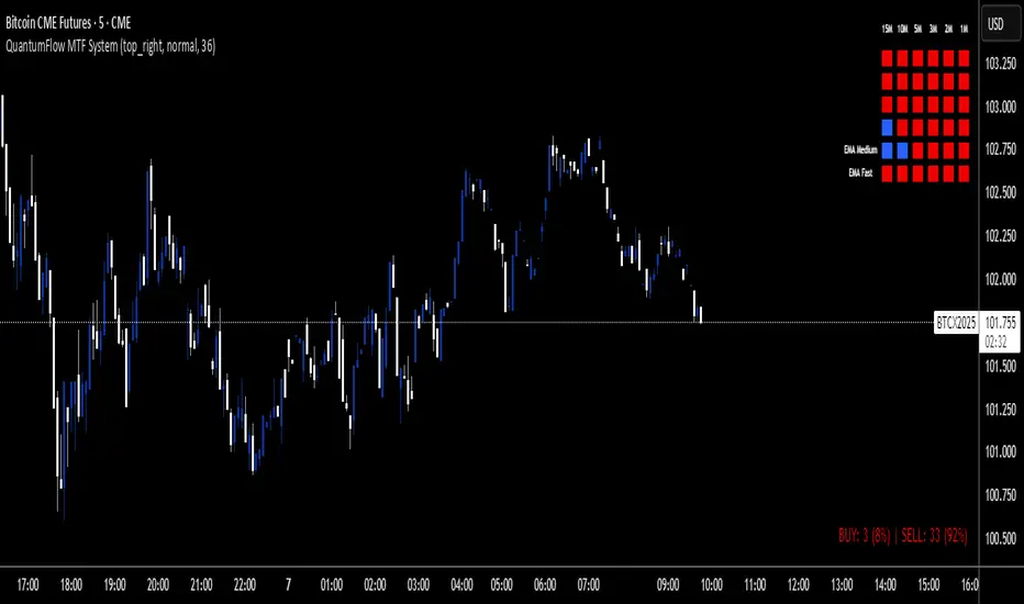
QuantumFlow MTF SystemQuantumFlow MTF System © 2025
Multi-Timeframe Directional Flow & Volatility Alignment Engine
QuantumFlow MTF System is designed to synchronize volatility- and trend-based signals from multiple timeframes into a single, structured view of market flow.
Concept
The system evaluates confirmed Supertrend directions from several lower timeframes, then aggregates them into normalized bullish/bearish values. These values are combined with dual-layer EMA momentum filters to verify directional strength. The resulting matrix provides a precise snapshot of alignment across short- to medium-term market structures.
Unlike classical ATR-based systems, QuantumFlow employs multiple ATR layers with multiple deviation factors that have been extensively tested over the years.
This multi-ATR framework acts as an adaptive volatility filter, allowing each asset class to respond dynamically to its intrinsic volatility profile.
The result is a robust and consistent analytical engine capable of adapting to varying market conditions across assets and timeframes.
How It Works
- Confirmed Multi-Timeframe Supertrend:
Each timeframe calculates a close-confirmed Supertrend direction, preventing repainting and ensuring signal reliability.
- Multi-ATR Volatility Model:
Several ATR instances with distinct deviation multipliers define volatility thresholds that adjust sensitivity across market conditions.
- Dual EMA Structure:
Two independent EMA layers act as momentum validators to confirm or filter each Supertrend direction.
- Flow Totals Engine:
The script sums all directional states into a real-time ratio of bullish vs bearish conditions, visualized through color-coded totals.
- Adaptive Alerts:
Optional thresholds allow traders to receive alerts when directional imbalance reaches predefined intensity levels.
Use Cases
- Identify when multiple timeframes align in the same trend direction.
- Quantify the relative dominance of bullish or bearish pressure.
- Filter trades using adaptive multi-ATR volatility filters per asset type.
- Confirm entries by validating multi-timeframe directional consensus.
Chart Display
QuantumFlow displays a structured table showing the state of each analyzed timeframe and the current flow balance. Works seamlessly on any instrument and timeframe.
This invite-only indicator provides a systematic way to analyze directional flow alignment using a multi-ATR volatility engine combined with momentum synchronization across multiple timeframes.
---
Author’s Instructions:
To request access, please contact the author privately through the TradingView profile.
All-in-One: EMA, ORB, PM, and Anchored VWAPAll-in-One: EMA, ORB, PM, and Anchored VWAP... ema 9/20/50/100/20 + opening range break + premarket high and lows + vwap all in one indicator enjoy.. all these can be turned on and off if you only want vwap and ema or pm and orb etc..

Day Range Divider DTSCopied it for DTS purposes to ensure proper tracking, testing, and verification within the DTS workflow. This copy is intended for reference, analysis, and any required adjustments without affecting the original version.

Probability H1/H4/D/W (Confirmations + Heatmap + Trend)Probability H1/H4/D/W (Confirmations + Heatmap + Trend) is a multi-timeframe market scanner that combines key confirmation signals and a robust trend heatmap to boost your trading decision-making.
What it does:
- Calculates bullish and bearish probabilities for every candle using five weighted factors: market structure shifts (BOS/CHOCH), RSI, MACD, volume changes, and price vs EMA position.
- Displays a real-time table with bullish/bearish probability scores, current trend (H1/H4/D/W), and a color-coded heatmap to instantly gauge market momentum.
- Confirms long/short entries with divergence detection and probability filters, showing clear signals on the chart.
- Customizable weighting lets you prioritize the signals that matter most to your strategy.
Core features:
• Multi-timeframe scan (H1, H4, Daily, Weekly)
• Visual probability table and heatmap
• Confirmation labels and builtin alerts for long/short signals
• Trend detection across four timeframes
• Flexible weighting of structural, momentum, and volume factors
Ideal for traders seeking a complete, rule-based confirmation toolkit that aligns trend, probability, and actionable alerts—all in a single glance. This indicator works for breakout, momentum, and swing traders needing clarity across multiple timeframes.

Red/Green Trend MAs (20/50/200)A simple multi moving average indicator. MA lines change red/green based on direction.

Multi-Timeframe SMA + AlertsThis indicator displays the Simple Moving Average (SMA) across multiple timeframes simultaneously on your chart. It helps traders quickly visualize trend direction across different intervals without switching charts.
Features:
Multi-Timeframe SMA: Shows SMA for multiple timeframes (1m, 3m, 5m, 15m, 30m by default; visibility customizable).
Customizable SMA Length: Choose any SMA length to suit your trading strategy.
Colored SMAs: Each timeframe is represented with a distinct color for easy differentiation.
Price vs SMA Table: Displays SMA values and whether the current price is Above, Below, or At the SMA for each timeframe.
Chart Labels: Marks the last SMA values on the chart for quick reference.
Alerts: Set alerts when price crosses above or below any timeframe’s SMA, with clear messages indicating the timeframe and price.
Customizable Inputs: Select which SMAs to display and define the SMA length.
Use Cases:
Identify short-term vs. longer-term trend alignment.
Spot potential entry or exit points when price crosses the SMA on multiple timeframes.
Keep track of SMA relationships without constantly switching timeframes.
How to Use:
Add the indicator to any chart.
Choose which timeframes’ SMAs to display.
Set the SMA length according to your strategy.
Optionally, set alerts for crossovers or crossunders.
Use the table and labels to monitor SMA levels at a glance.
Tips:
Combine with other indicators for confirmation of trend direction.
Use alerts to avoid constantly watching the chart.

Session Highs and LowsShows the current and previous session highs and lows for the New York, London and Asian sessions

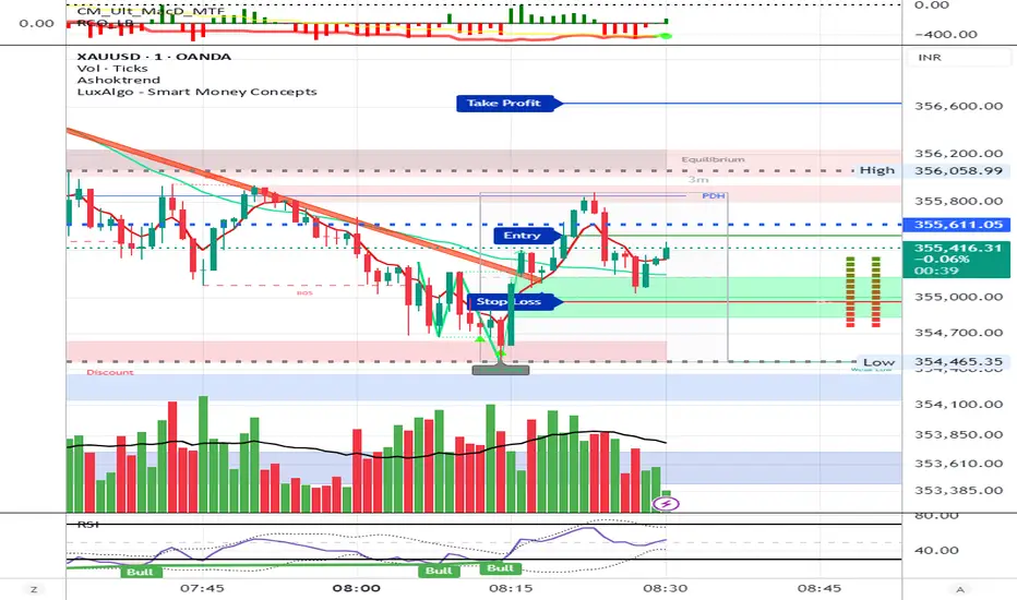
AshokTrendThe AshokTrend indicator uses a combination of trendline logic and pivot high/low detection to signal possible BUY and SELL trades based on price action and structural breakouts.
### Buy/Sell Signal Logic
- **Buy Trade Signal**: It identifies local pivot lows using a lookback period, then checks multiple conditions comparing current and previous pivot values to validate a breakout. If conditions are met, triangle-up shapes are plotted below bars to indicate a possible long trade, and trendlines are drawn connecting pivots for visual confirmation.
- **Sell Trade Signal**: It locates pivot highs, applies similar multi-point checks, and confirms breakdowns in structure. Upon a valid signal, triangle-down shapes are plotted above bars to indicate a possible short trade, with corresponding trendlines marking pivot connections.
### Structural Confirmation
- Both buy and sell signals require the breakout/breakdown to be visually confirmed via the movement and steepness (slope) of custom lines that represent price momentum between pivots. Lines are updated or deleted if price fails the required strength, ensuring signals are filtered for validity.
### Alert and Analysis Details
- **Alerts**: Plotted shapes (triangle up for buy, triangle down for sell) can be used for automated alerts, integrating with platform alert conditions for strategy automation.
- **Analysis**: The indicator incorporates logic for cleaning up invalid signals and pruning trendlines when a reversal is detected, increasing reliability of entries and exits for both buy and sell trades.
### Key Settings for Customization
- Lookback period, padding, and color settings allow the user to tune signal frequency and visual appearance according to specific trading needs.
### Summary Table
| Signal Type | Visual Mark | Pivot Reference | Trendline Confirmation | Filtering Logic |
|----------------------|--------------|-----------------|-----------------------|-------------------------------|
| BUY | Triangle Up | Pivot Low | Slope & multi-point | Valid breakout only |
| SELL | Triangle Down| Pivot High | Slope & multi-point | Valid breakdown only |
This approach ensures that only structurally strong breakout-based trades are considered, pruning false signals in real-time for improved consistency in automated or manual trade analysis
Follow me for more updates...
Disclaimer - This post is created for only Learning Purpose. Every Charts, Trade Ideas, Buy & Sell Levels and Updates are Provided For Learning Purpose Only . We Do Not Provide Any Buy And Sell Signals Tips. We are Not SEBI Registered .Do Always Calculate Your risk Before Taking the Trade And consult your Financial Advisor Before taking any Trade. Thank You
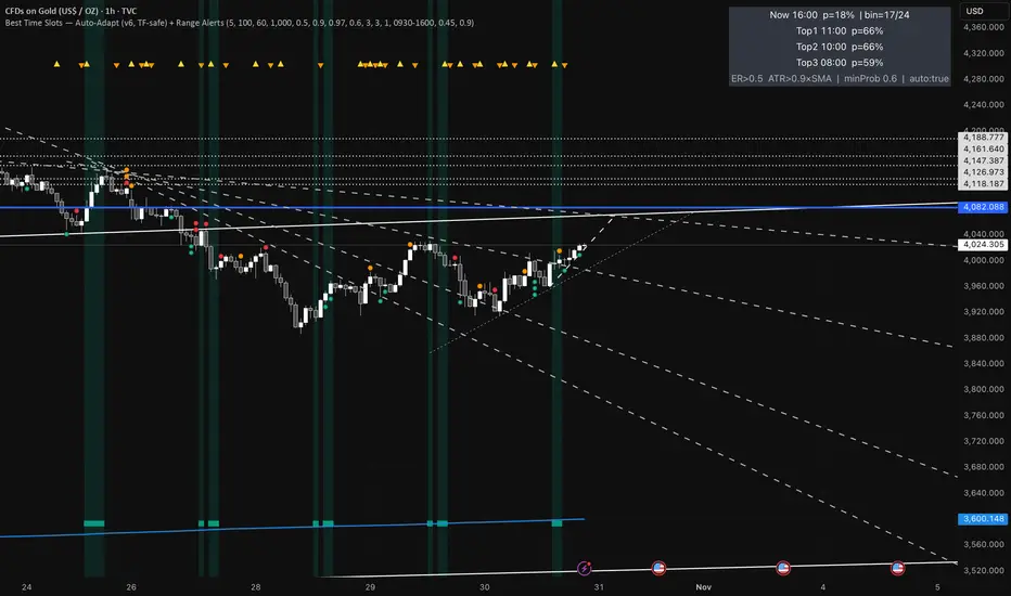
Best Time Slots — Auto-Adapt (v6, TF-safe) + Range AlertsTime & binning
Auto-adapt to timeframe
Makes all time windows scale to your chart’s bar size (so it “just works” on 1m, 15m, 4H, Daily).
• On = recommended. • Off = fixed default lengths.
Minimum Bin (minutes)
The size of each daily time slot we track (e.g., 5-min bins). The script uses the larger of this and your bar size.
• Higher = fewer, broader slots; smoother stats. • Lower = more, narrower slots; needs more history.
• Try: 5–15 on intraday, 60–240 on higher TFs.
Lookback windows (used when Auto-adapt = ON)
Target ER Window (minutes)
How far back we look to judge Efficiency Ratio (how “straight” the move was).
• Higher = stricter/smoother; fewer bars qualify as “movement”. • Lower = more sensitive.
• Try: 60–120 min intraday; 240–600 min for higher TFs.
Target ATR Window (minutes)
How far back we compute ATR (typical range).
• Higher = steadier ATR baseline. • Lower = reacts faster.
• Try: 30–120 min intraday; 240–600 min higher TFs.
Target Normalization Window (minutes)
How far back for the average ATR (the baseline we compare to).
• Higher = stricter “above average range” check. • Lower = easier to pass.
• Try: ~500–1500 min.
What counts as “movement”
ER Threshold (0–1)
Minimum efficiency a bar must have to count as movement.
• Higher = only very “clean, one-direction” bars count. • Lower = more bars count.
• Try: 0.55–0.65. (0.60 = balanced.)
ATR Floor vs SMA(ATR)
Requires range to be at least this many × average ATR.
• Higher (e.g., 1.2) = demand bigger-than-usual ranges. • Lower (e.g., 0.9) = allow smaller ranges.
• Try: 1.0 (above average).
How history is averaged
Recent Days Weight (per-day decay)
Gives more weight to recent days. Example: 0.97 ≈ each day old counts ~3% less.
• Higher (0.99) = slower fade (older days matter more). • Lower (0.95) = faster fade.
• Try: 0.97–0.99.
Laplace Prior Seen / Laplace Prior Hit
“Starter counts” so early stats aren’t crazy when you have little data.
• Higher priors = probabilities start closer to average; need more real data to move.
• Try: Seen=3, Hit=1 (defaults).
Min Samples (effective)
Don’t highlight a slot unless it has at least this many effective samples (after decay + priors).
• Higher = safer, but fewer highlights early.
• Try: 3–10.
When to highlight on the chart
Min Probability to Highlight
We shade/mark bars only if their slot’s historical movement probability is ≥ this.
• Higher = pickier, fewer highlights. • Lower = more highlights.
• Try: 0.45–0.60.
Show Markers on Good Bins
Draws a small square on bars that fall in a “good” slot (in addition to the soft background).
Limit to market hours (optional)
Restrict to Session + Session
Only learn/score inside this time window (e.g., “0930-1600”). Uses the chart/exchange timezone.
• Turn on if you only care about RTH.
Range (chop) alerts
Range START if ER ≤
Triggers range when efficiency drops below this level (price starts zig-zagging).
• Higher = easier to call “range”. • Lower = stricter.
Range START if ATR ≤ this × SMA(ATR)
Also triggers range when ATR shrinks below this fraction of its average (volatility contraction).
• Higher (e.g., 1.0) = stricter (must be at/under average). • Lower (e.g., 0.9) = easier to call range.
Alerts on bar close
If ON, alerts fire once per bar close (cleaner). If OFF, they can trigger intrabar (faster, noisier).
Quick “what happens if I change X?”
Want more highlighted times? ↓ Min Probability, ↓ ER Threshold, or ↓ ATR Floor (e.g., 0.9).
Want stricter highlights? ↑ Min Probability, ↑ ER Threshold, or ↑ ATR Floor (e.g., 1.2).
Want recent days to matter more? ↑ Recent Days Weight toward 0.99.
On 4H/Daily, widen Minimum Bin (e.g., 60–240) and maybe lower Min Probability a bit.
5 Moving Averages (Fully Customizable)I couldn't find any indicators that you could fully customize multiple moving average lines, so I made one.
You can change the color, line type, thickness, length, and opacity. Also make a custom color if you want.
You can make them SMA, EMA, WMA, HMA, VWMA.
Hope you enjoy!
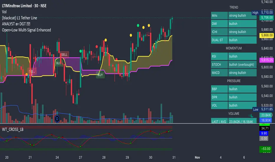
Open=Low Multi-Signal EnhancedPower your trades with all new Open = Low with tolerance added in the price. This script will give Open = Low and also if slight deviation in the Open = Low with rising volume and rising momentum in the price.
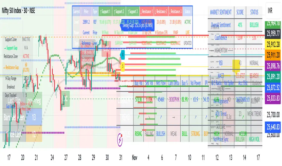
MARKET SCANNER Core Components:
1. Market Structure & Pivot Points
Multi-timeframe Pivots: Daily, Weekly, Monthly pivot points
Central Pivot Range (CPR): For all timeframes
N-Day High/Low Tracking: Dynamic support/resistance based on recent price action
2. Volume Analysis
Institutional Volume Metrics: Buy/Sell pressure, Net flow, Volume Power
Cumulative Delta: Tracks order flow imbalance
Volume Profile: Right-side profile with POC (Point of Control) and Value Area
Volume Strikes: Identifies significant volume absorption/breakout levels
3. Price Action & Patterns
Fibonacci-based Candlestick Recognition: Green/Red candles with specific Fibonacci conditions
Support/Resistance Zones: Dynamic boxes based on Fibonacci retracements
Breakout Detection: Tracks breakouts above N-day high/low with retracement levels
4. Moving Averages & VWAP
VWAP with multiple moving averages (20, 50, 250 periods)
MVWAP Sign Detection: Tracks flips in VWAP momentum
5. Market Sentiment Analysis
Composite Sentiment Score: Combines RSI, MACD, Stochastic, Moving Averages, ADX
Confidence Scoring: Measures signal reliability
Conflict Detection: Identifies when volume and price signals disagree
6. Advanced Features
Dynamic Gap Calculations: Measures distance to support/resistance zones
Swing Analysis: Identifies swing highs/lows with gap measurements
Volume-Price Confirmation: Validates moves with volume
Professional Tables: Multiple tables displaying pivot levels, differences, sentiment, and volume metrics
Key Trading Concepts Implemented:
Institutional Order Flow: Tracks smart money activity
Volume-Weighted Price Levels: Identifies significant price zones
Multi-timeframe Analysis: Correlates daily, weekly, monthly levels
Fibonacci Retracement Strategies: For entries and exits
Market Microstructure: Through volume profile and delta analysis
Visual Outputs:
Dynamic support/resistance boxes
Volume profile histogram
Multiple information tables
Real-time sentiment scoring
Retracement lines and zones
This is essentially a professional-grade trading suite that combines price action, volume analysis, market structure, and sentiment into one comprehensive tool suitable for both discretionary and systematic trading approaches.

VWAP + EMA shows the VWAP + EMA 9/20/50/100/200 all in one indicator... you can adjust VWAP's calculation method + color + the outer bands or remove them.. can remove fill as well.. personally i just keep the VWAP

Camarilla Trading - D/W/M, Alerts, TP/SL, ADX, VWAP/EMA, VolumeCamarilla Trading System
Overview
This advanced Pine Script indicator implements a comprehensive Camarilla trading system with multiple filtering mechanisms, position management, and real-time statistics. It's designed for day traders and swing traders using Camarilla pivot levels with enhanced confirmation filters.
Key Features
🎯 Core Components
- Camarilla Levels: Calculates H3, H4, H5, L3, L4, L5 pivot levels from previous period data
- Multi-Timeframe Support: Daily (D), Weekly (W), and Monthly (M) timeframe options
- Smart Position Management: Automated entry/exit with take profit and stop loss levels
📊 Advanced Filtering System
- ADX Filter**: Optional trend strength filter using Average Directional Index
- Volume Filter**: High-volume confirmation with customizable multiplier
- Trend Filter**: VWAP or EMA-based trend direction confirmation
💹 Trading Signals
Long Entries:
- Condition 1: Open crosses above H4 (below H5)
- Condition 2: Open crosses above L3 (below H3)
Short Entries:
- Condition 1: Open crosses below L4 (above L5)
- Condition 2: Open crosses below H3 (above L3)
📈 Visual Features
- Level Display: Clear plotting of all Camarilla levels
- Signal Markers: Visual entry/exit signals on chart
- Volume Coloring: Bars colored lime/purple during high-volume periods
- Trend Indicators: Colored VWAP/EMA lines based on ADX trend direction
- Real-time Statistics: Performance table with win rate, P&L, and trade metrics
⚙️ Customization Options
- Toggle individual filters on/off
- Adjustable parameters for all indicators
- Customizable display options
- Flexible timeframe selection
🔔 Alert System
- Buy/Sell signal alerts
- Position exit alerts
- Customizable alert conditions
📊 Performance Tracking
- Automatic trade statistics
- Win rate calculation
- Average profit per trade
- Total P&L tracking
- Trade history from start date
Input Parameters
Timeframe & Levels
- Timeframe levels: D/W/M selection for pivot calculations
- Show levels labels: Toggle level price labels
Filter Settings
- ADX filter: Enable/disable trend strength filter
- ADX length/treshold: Customize ADX parameters
- Volume filter: High-volume confirmation
- Volume length/multiplier: Volume MA settings
- Trend filter: VWAP/EMA trend confirmation
- EMA length: EMA period for trend filter
Display Options
- Show signals: Display entry/exit markers
- Show TP/SL: Show take profit/stop loss levels
- Show statistics: Performance table display
- Colored bars: Volume-based bar coloring
Usage Notes
- Non-repainting: Signals are fixed at bar open price
- Multi-timeframe: Uses security calls for accurate previous period data
- Position Management: Automated TP/SL based on Camarilla levels
- Risk Management: Built-in trading time restrictions
This system provides institutional-grade Camarilla trading with professional risk management features suitable for both manual trading and strategy development.

PDH/PDL- [CT]Private Algorithm that is invite only. It is only spread through word of mouth and is not available on any website.
This algorithm will give you the best chance at being green and is even better when following specific plays of someone or yourself.
This is not supposed to guarantee profit and the team are not financial advisors. Please always manage your own risk according to your risk tolerance .
PDH/PDL –
by calmstrades
Description:
The PDH/PDL – indicator automatically plots the Previous Day’s High (PDH) and Previous Day’s Low (PDL) levels directly on your chart — essential reference points for Smart Money Concepts (SMC) and intraday traders.
It also detects and highlights liquidity sweeps when price takes out the prior day’s highs or lows, helping identify potential reversal or continuation zones.
🔍 Features:
Automatic PDH/PDL Levels:
Draws dynamic lines for the previous day’s high and low with customizable styles, colors, and widths.
Smart Money Sweep Detection:
Marks PDH or PDL sweeps using visual labels whenever liquidity is taken.
Clean Visual Customization:
Choose line style (Solid, Dashed, Dotted), color themes, label display, and toggle visibility for all components.
Lightweight & Efficient:
Optimized for smooth performance even on lower timeframes (1m–15m).
⚙️ Settings:
✅ Show PDH / Show PDL
🏷️ Show Labels on Lines
💧 Show Liquidity Sweeps
🎨 Line Style, Width, and Color Controls
💡 How to Use:
Use PDH/PDL as key liquidity levels where price often reacts.
Watch for sweeps (liquidity grabs) followed by structure shifts to identify potential trade setups.
Combine with other SMC tools, such as Order Blocks, FVGs, or BOS/CHoCH indicators, for confirmation.

Custom Two Sessions H/L/50% LevelsTrack high/low/midpoint levels across two customizable time sessions. Perfect for monitoring H4 blocks, session ranges, or any custom time periods as reference levels for lower timeframe trading.
What This Indicator Does:
Tracks and projects High, Low, and 50% Midpoint levels for two fully customizable time sessions. Unlike fixed-session indicators, you define EXACTLY when each session starts and ends.
Key Features:
• Two independent sessions with custom start/end times (hour and minute)
• High/Low/50% midpoint tracking for each session
• Visual session boxes showing calculation periods
• Horizontal lines projecting levels into the future
• Historical session levels remain visible for reference
• Works on any chart timeframe (M1, M5, M15, H1, H4, etc.)
• Full visual customization (colors, line styles, widths)
• DST timezone support
Common Use Cases:
H4 Candle Tracking - Set sessions to 4-hour blocks (e.g., 6-10am, 10am-2pm) to track individual H4 highs/lows
H1 Candle Tracking - 1-hour blocks for scalping reference levels
Session Trading - ETH vs RTH, London vs NY, Asian session, etc.
Custom Time Periods - Any time range you want to monitor
How to Use:
The indicator identifies key price levels from higher timeframe periods. Use previous session H/L/50% as reference levels for:
Identifying sweep and reclaim setups
Lower timeframe structural flip confirmations
Support/resistance zones for entries
Delivery targets after breaks of structure
Settings:
Configure each session's start/end times independently. The indicator automatically triggers at the first bar crossing into your specified time, making it compatible with all chart timeframes.
No-Trade Zones UTC+7This indicator helps you visualize and backtest your preferred trading hours. For example, if you have a 9-to-5 job, you obviously can’t trade during that time — and when backtesting, you should avoid those hours too. It also marks weekends if you prefer not to trade on those days.
By highlighting no-trade periods directly on the chart, you can easily see when you shouldn’t be taking trades, without constantly checking the time or date by hovering over the chart. It makes backtesting smoother and more realistic for your personal schedule.

Fixed High Timeframe Moving AveragesFixed High Timeframe Moving Averages (W/D/4H)
Summary
This indicator plots essential, high-timeframe (HTF) Moving Averages onto your chart, **no matter which timeframe you are currently viewing**.
It is designed for traders who need multi-timeframe context at a glance. Stop switching charts to see where the 200-Week or 50-Day MA is—now you can see all critical HTF levels directly on your 5-minute (or any other) chart.
---
Who it’s for
Traders who rely on moving averages but like to work on lower chart timeframes while keeping higher timeframe context in sight. If you scalp on 1–15m yet want Weekly/Daily/4H MAs always visible, this is for you.
---
What it shows
Pinned (“fixed”) moving averages from higher timeframes—Weekly (20/100/200) , Daily (50/100/200/365) and 4H (200) —rendered on any chart timeframe. Your favorite HTF MAs stay on screen no matter what TF you’re currently analyzing.
---
Features
* **MA types:** SMA, EMA, VWMA, Hull.
* **Fully configurable:** toggle each line, set periods, colors, and thickness.
* **Two alert modes (see below):** intrabar vs confirmed HTF close.
* **Works on any symbol & chart TF** using `request.security` to fetch HTF data.
---
Alerts & Modes
This indicator solves the biggest problem with MTF alerts: false signals. You can choose one of two modes:
1. **Intrabar mode** — compares current chart price to the HTF MA. Triggers as soon as price crosses the HTF line; great for early signals but may update until the HTF bar closes.
2. **Confirmed mode** — checks HTF close vs HTF MA. Signals only on the higher-TF bar close; fewer false starts, no intrabar repainting on that TF.
Per-line *Cross Above / Cross Below* conditions are provided for all enabled MAs (e.g., “20W — Cross Above”, “365D — Cross Below”, etc.).
**How to use alerts:** add the script → “Create Alert” → pick any condition from the script’s list.
---
Why this helps
* Keeps Weekly/Daily structure visible while you execute on LTF.
* Classic anchors (e.g., 200D, 20W/100W/200W) are popular for trend bias, dynamic support/resistance, and pullback context.
* Lets you standardize MA references across all your lower-TF playbooks.
---
Notes on confirmation & repainting
* Intrabar signals can change until the higher-TF bar closes (that’s expected with multi-TF data).
* Confirmed mode waits for the HTF close—cleaner, but later. Choose what fits your workflow.
---
Quick setup
1. Pick `MA Type` (SMA/EMA/VWMA/Hull).
2. Enable the HTF lines you want (Weekly 20/100/200; Daily 50/100/200/365; 4H 200).
3. Choose `Alert Mode` (Intrabar vs Confirmed).
4. Style colors/widths to taste and set alerts on the lines you care about.
---
Good practice
* Combine HTF MAs with price action (swings, structure, liquidity grabs) rather than using them in isolation.
* Always validate signals in your execution TF and use a risk plan tailored to volatility.
* Protect your capital: position sizing, stops, and disciplined risk management matter more than any single line on the chart.
---
Disclaimer
For educational/informational purposes only; not financial advice. Trading involves risk—manage it responsibly.

[AS] MACD-v & Hist [Alex Spiroglou | S.M.A.R.T. TRADER SYSTEMS] MACD-v & MACD-v Histogram
=======================================
Volatility Normalised Momentum 📈
Twice Awarded Indicator 🏆
=======================================
=======================================
✅ 1. INTRODUCTION TO THE MACD-v ✅
=======================================
I created the MACD-v in 2015,
as a way to deal with the limitations
of well known indicators like the Stochastic, RSI, MACD.
I decided to publicly share a very small part of my research
in the form of a research paper I wrote in 2022,
titled "MACD-v: Volatility Normalised Momentum".
That paper was awarded twice:
1. The "Charles H. Dow" Award (2022),
for outstanding research in Technical Analysis,
by the Chartered Market Technicians Association (CMTA)
2. The "Founders" Award (2022),
for advances in Active Investment Management,
by the National Association of Active Investment Managers (NAAIM)
=======================================
===================================================
❌ 2. WHY CREATE THE MACD-v ?
THE LIMITATIONS OF CONVENTIONAL MOMENTUM INDICATORS
====================================================
Technical Analysis indicators focused on momentum,
come in two general categories,
each with its own set of limitations:
(i) Range Bound Oscillators (RSI, Stochastics, etc)
These usually have a scaling of 0-100,
and thus have the advantage of having normalised readings,
that are comparable across time and securities.
However they have the following limitations (among others):
1. Skewing effect of steep trends
2. Indicator values do not adjust with and reflect true momentum
(indicator values are capped to 100)
(ii) Unbound Oscillators (MACD, RoC, etc)
These are boundless indicators,
and can expand with the market,
without being limited by a 0-100 scaling,
and thus have the advantage of really measuring momentum.
They have the main following limitations (among others):
1. Subjectivity of overbought / oversold levels
2. Not comparable across time
3. Not comparable across securities
=======================================
=======================================
💡 3. THE SOLUTION TO SOLVE THESE LIMITATIONS
=======================================
In order to deal with these limitations,
I decided to create an indicator,
that would be the "Best of two worlds".
A unique & hybrid indicator,
that would have objective normalised readings
(similar to Range Bound Oscillators - RSI)
but would also be able to have no upper/lower boundaries
(similar to Unbound Oscillators - MACD).
This would be achieved by "normalising" a boundless oscillator (MACD)
=======================================
==================================================
⛔ 4. DEEP DIVE INTO THE 5 LIMITATIONS OF THE MACD
==================================================
A Bloomberg study found that the MACD
is the most popular indicator after the RSI,
but the MACD has 5 BIG limitations.
Limitation 1: MACD values are not comparable across Time
The raw MACD values shift
as the underlying security's absolute value changes across time,
making historical comparisons obsolete
e.g S&P 500 maximum MACD was 1.56 in 1957-1971,
but reached 86.31 in 2019-2021 - not indicating 55x stronger momentum,
but simply different price levels.
Limitation 2: MACD values are not comparable across Assets
Traditional MACD cannot compare momentum between different assets.
S&P 500 MACD of 65 versus EUR/USD MACD of -0.5
reflects absolute price differences, not momentum differences
Limitation 3: MACD values cannot be Systematically Classified
Due to limitations #1 & #2, it is not possible to create
a momentum level classification scale
where one can define "fast", "slow", "overbought", "oversold" momentum
making systematic analysis impossible
Limitation 4: MACD Signal Line gives false crossovers in low-momentum ranges
In range-bound, low momentum environments,
most of the MACD signal line crossovers are false (noise)
Since there is no objective momentum classification system (limitation #3),
it is not possible to filter these signals out,
by avoiding them when momentum is low
Limitation 5: MACD Signal Line gives late crossovers in high momentum regimes.
Signal lag in strong trends not good at timing the turning point
— In high-momentum moves, MACD crossovers may come late.
Since there is no objective momentum classification system (limitation #3),
it is not possible to filter these signals out,
by avoiding them when momentum is high
===================================================================
===================================================================
🏆 5. MACD-v : THE SOLUTION TO THE LIMITATIONS OF THE MACD , RSI, etc
====================================================================
MACD-v is a volatility normalised momentum indicator.
It remedies these 5 limitations of the classic MACD,
while creating a tool with unique properties.
Formula: × 100
MACD-V enhances the classic MACD by normalizing for volatility,
transforming price-dependent readings into standardized momentum values.
This resolves key limitations of traditional MACD and adds significant analytical power.
Core Advantages of MACD-V
Advantage 1: Time-Based Stability
MACD-V values are consistent and comparable over time.
A reading of 100 has the same meaning today as it did in the past
(unlike traditional MACD which is influenced by changes in price and volatility over time)
Advantage 2: Cross-Market Comparability
MACD-V provides universal scaling.
Readings (e.g., ±50) apply consistently across all asset classes—stocks,
bonds, commodities, or currencies,
allowing traders to compare momentum across markets reliably.
Advantage 3: Objective Momentum Classification
MACD-V includes a defined 5-range momentum lifecycle
with standardized thresholds (e.g., -150 to +150).
This offers an objective framework for analyzing market conditions
and supports integration with broader models.
Advantage 4: False Signal Reduction in Low-Momentum Regimes
MACD-V introduces a "neutral zone" (typically -50 to +50)
to filter out these low-probability signals.
Advantage 5: Improved Signal Timing in High-Momentum Regimes
MACD-V identifies extremely strong trends,
allowing for more precise entry and exit points.
Advantage 6: Trend-Adaptive Scaling
Unlike bounded oscillators like RSI or Stochastic,
MACD-V dynamically expands with trend strength,
providing clearer momentum insights without artificial limits.
Advantage 7: Enhanced Divergence Detection
MACD-V offers more reliable divergence signals
by avoiding distortion at extreme levels,
a common flaw in bounded indicators (RSI, etc)
====================================================================
=======================================
⚒️ 5. HOW TO USE THE MACD-v: 7 CORE PATTERNS
HOW TO USE THE MACD-v Histogram: 2 CORE PATTERNS
=======================================
>>>>>> BASIC USE (RANGE RULES) <<<<<<
The MACD-v has 7 Core Patterns (Ranges) :
1. Risk Range (Overbought)
Condition: MACD-V > Signal Line and MACD-V > +150
Interpretation: Extremely strong bullish momentum—potential exhaustion or reversal zone.
2. Retracing
Condition: MACD-V < Signal Line and MACD-V > -50
Interpretation: Mild pullback within a bullish trend.
3. Rundown
Condition: MACD-V < Signal Line and -50 > MACD-V > -150
Interpretation: Momentum is weakening—bearish pressure building.
4. Risk Range (Oversold)
Condition: MACD-V < Signal Line and MACD-V < -150
Interpretation: Extreme bearish momentum—potential for reversal or capitulation.
5. Rebounding
Condition: MACD-V > Signal Line and MACD-V > -150
Interpretation: Bullish recovery from oversold or weak conditions.
6. Rallying
Condition: MACD-V > Signal Line and MACD-V > +50
Interpretation: Strengthening bullish trend—momentum accelerating.
7. Ranging (Neutral Zone)
Condition: MACD-V remains between -50 and +50 for 20+ bars
Interpretation: Sideways market—low conviction and momentum.
The MACD-v Histogram has 2 Core Patterns (Ranges) :
1. Risk (Overbought)
Condition: Histogram > +40
Interpretation: Short-term bullish momentum is stretched—possible overextension or reversal risk.
2. Risk (Oversold)
Condition: Histogram < -40
Interpretation: Short-term bearish momentum is stretched—potential for rebound or reversal.
=======================================
=======================================
📈 6. ADVANCED PATTERNS WITH MACD-v
=======================================
Thanks to its volatility normalization,
the MACD-V framework enables the development
of a wide range of advanced pattern recognition setups,
trading signals, and strategic models.
These patterns go beyond basic crossovers,
offering deeper insight into momentum structure,
regime shifts, and high-probability trade setups.
These are not part of this script
=======================================
===========================================================
⚙️ 7. FUNCTIONALITY - HOW TO ADD THE INDICATORS TO YOUR CHART
===========================================================
The script allows you to see :
1. MACD-v
The indicator with the ranges (150,50,0,-50,-150)
and colour coded according to its 7 basic patterns
2. MACD-v Histogram
The indicator The indicator with the ranges (40,0,-40)
and colour coded according to its 2 basic ranges / patterns
3. MACD-v Heatmap
You can see the MACD-v in a Multiple Timeframe basis,
using a colour-coded Heatmap
Note that lowest timeframe in the heatmap must be the one on the chart
i.e. if you see the daily chart, then the Heatmap will be Daily, Weekly, Monthly
4. MACD-v Dashboard
You can see the MACD-v for 7 markets,
in a multiple timeframe basis
=======================================
=======================================
🤝 CONTRIBUTIONS 🤝
=======================================
I would like to thank the following people:
1. Mike Christensen for coding the indicator
@TradersPostInc, @Mik3Christ3ns3n,
2. @Indicator-Jones For allowing me to use his Scanner
3. @Daveatt For allowing me to use his heatmap
=======================================
=======================================
⚠️ LEGAL - Usage and Attribution Notice ⚠️
=======================================
Use of this Script is permitted
for personal or non-commercial purposes,
including implementation by coders and TradingView users.
However, any form of paid redistribution,
resale, or commercial exploitation is strictly prohibited.
Proper attribution to the original author is expected and appreciated,
in order to acknowledge the source
and maintain the integrity of the original work.
Failure to comply with these terms,
or to take corrective action within 48 hours of notification,
will result in a formal report to TradingView’s moderation team,
and will actively pursue account suspension and removal of the infringing script(s).
Continued violations may result in further legal action, as deemed necessary.
=======================================
=======================================
⚠️ DISCLAIMER ⚠️
=======================================
This indicator is For Educational Purposes Only (F.E.P.O.).
I am just Teaching by Example (T.B.E.)
It does not constitute investment advice.
There are no guarantees in trading - except one.
You will have losses in trading.
I can guarantee you that with 100% certainty.
The author is not responsible for any financial losses
or trading decisions made based on this indicator. 🙏
Always perform your own analysis and use proper risk management. 🛡️
=======================================
