Volume

HMA+RVOL Strategy Hariss 369The Hull Moving Average (HMA) is a smooth, fast, and highly responsive moving average created by Alan Hull. It reduces lag significantly while still maintaining smoothness, making it one of the most popular tools for trend detection and entries. It is widely used for trend filter. Hull Moving Average(HMA) with RVOL strengthens the trend as volume is prime factor of price movement.
Trading with HMA: Simple method is buy when price closes above HMA , stop less below the low of last candle and target is 1.5 or 2 times of stop loss. The reverse is for sell. The HMA automatically turns to green on bull trend and red on bear trend for better visual confirmation.
Adding RVOL to HMA is better method of trading. Buy signal is initiated when price closes above HMA and RVOL is greater than 1.2. Sell signal is initiated when price closes below 89 HMA and rovl is greater than 1.2. One can change the value of RVOL according to trading style and type asset being traded.
It is a back tested strategy.

Alos Volume Profile Candles (SVP)ALOS Volume Profile Candles (SVP)
Summary
IMPORTANT: This indicator is designed to be used only with TradingView's 'Session Volume Profile' chart type. It will not work correctly with standard candle charts.
This indicator powerfully visualizes intra-session price action by dividing a single session profile into a specific number of equal-sized synthetic candles.
Instead of viewing a session as one single block, you can now break it down into parts (like quarters or thirds) to see how price behaved during each segment of the profile.
Key Features
Custom Session Slicing: Set "Candles per session" to 4 to see the session in quarters, 6 to see it in sixths, or any number you choose.
Full Session Control: Works perfectly with any custom session time, including complex overnight sessions (like '1800-1700' for CME crypto futures)
Accurate OHLC Calculation: Each synthetic candle correctly calculates and displays its own Open, High, Low, and Close for its specific time slice.
Clean Charting: Use the "Keep last sessions" input to control how many old sessions are drawn, preventing chart clutter and keeping your analysis focused on recent price action.
How to Use
On your TradingView chart, change the chart type to "Session Volume Profile".
Add the "ALOS Volume Profile Candles (SVP)" indicator to your chart.
Set your desired Session time in the indicator settings (or keep the default).
Choose the number of Candles per session you want to divide it into.
Adjust Keep last sessions to control how much history is displayed.
This tool is ideal for traders who want to analyze price behavior during the opening, middle, and closing parts of a session, or for breaking down long 24-hour crypto sessions into more manageable chunks.

Mizan v5 - L-Score (Minimal)DESCRIPTION:
The Architecture of Market Probability
Mizan v5 is not just another technical indicator; it is a quantitative implementation of the "Ontological Probability" philosophy. It is designed to decipher the market's hidden intent by analyzing the relationship between Balance, Order, and Harmony (DDU Principles).
Unlike standard oscillators that blindly follow price action, Mizan v5 operates on a multi-dimensional logic structure to separate "Market Noise" from "True Momentum."
CORE LOGIC & FEATURES
1. The L-Score Engine (Composite Momentum)
The heart of this algorithm is the "L-Score," a weighted composite index that answers the question: "Is the move supported by energy and mass?"
It fuses three distinct market dimensions into a single actionable score (0-100):
Volume Flow (45% Weight): Uses customized Chaikin Money Flow (CMF) logic to detect "Smart Money" accumulation before price reacts.
Velocity (35% Weight): Uses CCI to measure the speed of the breakout.
Saturation (20% Weight): Uses RSI as a limiter to identify overextended conditions.
2. Adaptive Regime Detection (The Histogram Logic)
Markets are not linear; they switch between "Global" and "Local" realities. Mizan v5 calculates statistical Price Density Zones (similar to Market Profile logic) to find the "Fair Value."
Global Mode: Analyzes the long-term balance (70 bars).
Local Mode: Automatically switches focus to short-term volatility (20 bars) when a "Regime Change" (high deviation) is detected.
HOW TO USE
1. The L-Score Line (Signal):
🟢 GREEN Line (> 65): Bullish Phase. Volume and Momentum are aligned. High probability of continuation.
🔴 RED Line (< 45): Bearish/Neutral Phase. Lack of energy. Avoid long positions ("Don't catch a falling knife").
🟠 ORANGE Line: Indecision/Transition zone.
2. Background Zones (Valuation):
🟩 Green Background: "Statistical Cheap Zone." Price is below the density band. Potential for Mean Reversion (Dip Buying).
🟥 Red Background: "Statistical Expensive Zone." Price is extended above the density band. High risk of Distribution (Selling).
PHILOSOPHY
"Chaos is merely order waiting to be deciphered." This tool is the visual manifestation of the "Cosmic Architect" project, aiming to bridge the gap between abstract philosophy and algorithmic trading.
Disclaimer: This tool is for educational and analytical purposes only. It is not financial advice.
© MuratKavak | Idea Architect

QuantMotions - FVG with Volume TrackingFair Value Gap Detector with Dynamic Shrinking & Volume Analysis
Overview
Advanced Fair Value Gap (FVG) detection indicator with real-time box shrinking and volume delta analysis. Automatically identifies price inefficiencies and tracks institutional volume flow within each gap.
What are Fair Value Gaps?
Fair Value Gaps occur when price moves so rapidly that a "gap" is left between three consecutive candles, creating an inefficiency where no trading occurred. These gaps often act as support/resistance zones that price tends to revisit.
Detection:
- Bullish FVG: When low > high (upward price inefficiency)
- Bearish FVG: When high < low (downward price inefficiency)
Key Features
Dynamic Box Shrinking
FVG boxes automatically shrink as price enters them:
- Bullish FVGs shrink from top as price moves down into the gap
- Bearish FVGs shrink from bottom as price moves up into the gap
- Provides precise visualization of remaining unfilled gap area
Volume Delta Analysis
Tracks volume characteristics for the 3-candle FVG formation:
- Total Volume: Sum of volume from all three FVG candles
- Up/Down Split: Separates buying vs selling pressure
- Delta %: Shows directional bias of volume flow
- Color Coding: Green/Red when volume confirms direction, Orange when it doesn't
Smart Filtering
- ATR-based minimum gap size - Filters out insignificant noise gaps
- Auto-cleanup - Removes fully filled FVGs automatically
- Maximum display limit - Keeps charts clean by limiting visible FVGs
Live Statistics
Real-time stats table showing:
- Active bullish/bearish FVG count
- Average volume delta for each direction
- Fill progress tracking
Settings
Min Gap Size (ATR): Minimum gap size as multiple of ATR(14). Default: 0.3
- Lower values (0.1-0.3): More sensitive, shows smaller gaps
- Higher values (0.5-1.0): More selective, only significant gaps
Max FVGs: Maximum number of FVG boxes to display (5-100)
Remove Fully Filled: Automatically remove FVGs when price completely fills them
Shrink on Partial Fill: Enable dynamic box shrinking as price enters gaps
Show Volume Info: Display volume delta labels at box edges
How to Use
1. Confluence Trading: Look for FVGs that align with your support/resistance levels
2. Volume Confirmation: Check volume delta - strong directional volume increases probability
3. Partial Fills: Watch for price reactions at shrinking FVG boundaries
4. Multiple Timeframes: Use on higher timeframes (4H+) for swing trading, lower timeframes for scalping
Best Practices
- Combine with trend analysis - FVGs in trend direction have higher fill rates
- Pay attention to volume delta - gaps with confirming volume are more reliable
- Use on liquid markets for accurate volume data
- Higher timeframe FVGs typically carry more significance
Notes
- Works on all timeframes and instruments
- Volume data accuracy depends on your data provider
- FVGs are not guaranteed support/resistance - use proper risk management
- This indicator shows historical inefficiencies, not future predictions
Disclaimer: This indicator is for educational purposes only. Past performance does not guarantee future results. Always use proper risk management.

ULTIMATE ORDER FLOW SYSTEM🔥 ULTIMATE ORDER FLOW SYSTEM
Overview
This comprehensive order flow analysis tool combines **Volume Profile**, **Cumulative Delta**, and **Large Order Detection** to identify high-probability trading setups. The script analyzes institutional order flow patterns and volume distribution to pinpoint key levels where price is likely to react.
📊 Core Components & Methodology
🔥 ULTIMATE ORDER FLOW SYSTEM
Overview
This comprehensive order flow analysis tool combines Volume Profile, Cumulative Delta, and Large Order Detection to identify high-probability trading setups. The script analyzes institutional order flow patterns and volume distribution to pinpoint key levels where price is likely to react.
________________________________________
📊 Core Components & Methodology
1. Volume Profile Analysis
The script constructs a horizontal volume profile by:
• Dividing the price range into configurable rows (default: 20)
• Accumulating volume at each price level over a lookback period (default: 50 bars)
• Separating buy volume (green bars close > open) from sell volume (red bars)
• Identifying three critical levels:
o POC (Point of Control): Price level with highest traded volume - acts as a strong magnet
o VAH/VAL (Value Area High/Low): Contains 70% of total volume - defines fair value zone
o HVN (High Volume Nodes): Resistance zones where institutions accumulated positions
o LVN (Low Volume Nodes): Thin zones that price moves through quickly - ideal targets
Why This Matters: Institutional traders leave footprints through volume. HVN zones show where large players defended levels, making them reliable support/resistance.
________________________________________
2. Cumulative Delta (Order Flow)
Tracks the running total of buying vs selling pressure:
• Bar Delta: Difference between buy and sell volume per candle
• Cumulative Delta: Sum of all bar deltas - shows net directional pressure
• Delta Moving Average: Smoothed delta (20-period) to identify trend
• Delta Divergences:
o Bullish: Price makes lower low, but delta makes higher low (absorption at bottom)
o Bearish: Price makes higher high, but delta makes lower high (exhaustion at top)
How It Works: When cumulative delta trends up while price consolidates, it signals accumulation. Delta divergences reveal when smart money is positioned opposite to retail expectations.
________________________________________
3. Large Order Detection
Identifies institutional-sized orders in real-time:
• Compares current bar volume to 20-period moving average
• Flags orders exceeding 2.5x average volume (configurable multiplier)
• Distinguishes bullish (green circles below) vs bearish (red circles above) large orders
Rationale: Sudden volume spikes at key levels indicate institutional participation - the "fuel" needed for breakouts or reversals.
________________________________________
🎯 Trading Signal Logic
Combined Setup Criteria
The script generates SHORT and LONG signals when multiple conditions align:
SHORT Signal Requirements:
1. Price reaches an HVN resistance zone (within 0.2%)
2. Large sell order detected (volume spike + red candle)
3. Cumulative delta is bearish OR bearish divergence present
4. 10-bar cooldown between signals (prevents overtrading)
LONG Signal Requirements:
1. Price reaches an HVN support zone
2. Large buy order detected (volume spike + green candle)
3. Cumulative delta is bullish OR bullish divergence present
4. 10-bar cooldown enforced
________________________________________
🔧 Customization Options
Setting - Purpose - Recommendation
Volume Profile Rows - Granularity of level detection - 20 (balanced)
Lookback Period - Historical data analyzed - 50 bars (intraday), 200 (swing)
Large Order Multiplier - Sensitivity to volume spikes - 2.5x (standard), 3.5x (conservative)
HVN Threshold - Resistance zone detection - 1.3 (default)
LVN Threshold - Target zone identification - 0.6 (default)
Divergence Lookback - Pivot detection period - 5 bars (responsive)
________________________________________
📈 Dashboard Indicators
The real-time panel displays:
• POC: Current Point of Control price
• Location: Whether price is at HVN resistance
• Orders: Current large buy/sell activity
• Cumulative Δ: Net order flow value + trend direction
• Divergence: Active bullish/bearish divergences
• Bar Strength: % of candle volume that's directional (>65% = strong)
• SETUP: Current trade signal (LONG/SHORT/WAIT)
________________________________________
🎨 Visual System
• Yellow POC Line: Highest volume level - primary pivot
• Blue Value Area Box: Fair value zone (VAH to VAL)
• Red HVN Zones: Resistance/support from institutional accumulation
• Green LVN Zones: Low-liquidity targets for quick moves
• Volume Bars: Green (buy pressure) vs Red (sell pressure) distribution
• Triangles: LONG (green up) and SHORT (red down) entry signals
• Diamonds: Divergence warnings (cyan=bullish, fuchsia=bearish)
________________________________________
💡 How This Script Is Unique
Unlike standalone volume profile or delta indicators, this script:
1. Synthesizes three complementary methods - volume structure, order flow momentum, and liquidity detection
2. Requires multi-factor confirmation - signals only trigger when price, volume, and delta align at key zones
3. Adapts to market regime - delta filters ensure you're trading with the dominant order flow direction
4. Provides context, not just signals - the dashboard helps you understand why a setup is forming
________________________________________
⚙️ Best Practices
Timeframes:
• 5-15 min: Scalping (use 30-50 bar lookback)
• 1-4 hour: Swing trading (use 100-200 bar lookback)
Risk Management:
• Enter on signal candle close
• Stop loss: Beyond nearest HVN/LVN zone
• Target 1: Next LVN level
• Target 2: Opposite value area boundary
Filters:
• Avoid signals during major news events
• Require bar delta strength >65% for aggressive entries
• Wait for delta MA cross confirmation in ranging markets
________________________________________
🚨 Alerts Available
• Long Setup Trigger
• Short Setup Trigger
• Bullish/Bearish Divergence Detection
• Large Buy/Sell Order Execution
________________________________________
📚 Educational Context
This methodology is based on principles used by professional order flow traders:
• Market Profile Theory: Volume distribution reveals fair value
• Tape Reading: Large orders show institutional intent
• Auction Theory: Price seeks areas of liquidity imbalance (LVN zones)
The script automates pattern recognition that discretionary traders spend years learning to identify manually.
________________________________________
⚠️ Disclaimer
This indicator is a trading tool, not a trading system. It identifies high-probability setups based on order flow analysis but requires proper risk management, market context, and trader discretion. Past performance does not guarantee future results.
________________________________________
Version: 6 (Pine Script)
Type: Overlay + Separate Pane (Delta Panel)
Resource Usage: Moderate (500 bars history, 500 lines/boxes)
________________________________________
For questions or support, please comment below. If you find this script valuable, please boost and favorite! 🚀
1. Volume Profile Analysis
The script constructs a horizontal volume profile by:
- Dividing the price range into configurable rows (default: 20)
- Accumulating volume at each price level over a lookback period (default: 50 bars)
- Separating buy volume (green bars close > open) from sell volume (red bars)
- Identifying three critical levels:
- POC (Point of Control): Price level with highest traded volume - acts as a strong magnet
- VAH/VAL (Value Area High/Low): Contains 70% of total volume - defines fair value zone
- HVN (High Volume Nodes): Resistance zones where institutions accumulated positions
- LVN (Low Volume Nodes): Thin zones that price moves through quickly - ideal targets
Why This Matters: Institutional traders leave footprints through volume. HVN zones show where large players defended levels, making them reliable support/resistance.
---
2. Cumulative Delta (Order Flow)
Tracks the running total of buying vs selling pressure:
- **Bar Delta**: Difference between buy and sell volume per candle
- **Cumulative Delta**: Sum of all bar deltas - shows net directional pressure
- **Delta Moving Average**: Smoothed delta (20-period) to identify trend
- **Delta Divergences**:
- **Bullish**: Price makes lower low, but delta makes higher low (absorption at bottom)
- **Bearish**: Price makes higher high, but delta makes lower high (exhaustion at top)
**How It Works**: When cumulative delta trends up while price consolidates, it signals accumulation. Delta divergences reveal when smart money is positioned opposite to retail expectations.
---
### 3. **Large Order Detection**
Identifies **institutional-sized orders** in real-time:
- Compares current bar volume to 20-period moving average
- Flags orders exceeding 2.5x average volume (configurable multiplier)
- Distinguishes bullish (green circles below) vs bearish (red circles above) large orders
**Rationale**: Sudden volume spikes at key levels indicate institutional participation - the "fuel" needed for breakouts or reversals.
---
## 🎯 Trading Signal Logic
### Combined Setup Criteria
The script generates **SHORT** and **LONG** signals when multiple conditions align:
**SHORT Signal Requirements:**
1. Price reaches an HVN resistance zone (within 0.2%)
2. Large sell order detected (volume spike + red candle)
3. Cumulative delta is bearish OR bearish divergence present
4. 10-bar cooldown between signals (prevents overtrading)
**LONG Signal Requirements:**
1. Price reaches an HVN support zone
2. Large buy order detected (volume spike + green candle)
3. Cumulative delta is bullish OR bullish divergence present
4. 10-bar cooldown enforced
---
## 🔧 Customization Options
| Setting | Purpose | Recommendation |
|---------|---------|----------------|
| **Volume Profile Rows** | Granularity of level detection | 20 (balanced) |
| **Lookback Period** | Historical data analyzed | 50 bars (intraday), 200 (swing) |
| **Large Order Multiplier** | Sensitivity to volume spikes | 2.5x (standard), 3.5x (conservative) |
| **HVN Threshold** | Resistance zone detection | 1.3 (default) |
| **LVN Threshold** | Target zone identification | 0.6 (default) |
| **Divergence Lookback** | Pivot detection period | 5 bars (responsive) |
---
## 📈 Dashboard Indicators
The real-time panel displays:
- **POC**: Current Point of Control price
- **Location**: Whether price is at HVN resistance
- **Orders**: Current large buy/sell activity
- **Cumulative Δ**: Net order flow value + trend direction
- **Divergence**: Active bullish/bearish divergences
- **Bar Strength**: % of candle volume that's directional (>65% = strong)
- **SETUP**: Current trade signal (LONG/SHORT/WAIT)
---
## 🎨 Visual System
- **Yellow POC Line**: Highest volume level - primary pivot
- **Blue Value Area Box**: Fair value zone (VAH to VAL)
- **Red HVN Zones**: Resistance/support from institutional accumulation
- **Green LVN Zones**: Low-liquidity targets for quick moves
- **Volume Bars**: Green (buy pressure) vs Red (sell pressure) distribution
- **Triangles**: LONG (green up) and SHORT (red down) entry signals
- **Diamonds**: Divergence warnings (cyan=bullish, fuchsia=bearish)
---
## 💡 How This Script Is Unique
Unlike standalone volume profile or delta indicators, this script:
1. **Synthesizes three complementary methods** - volume structure, order flow momentum, and liquidity detection
2. **Requires multi-factor confirmation** - signals only trigger when price, volume, and delta align at key zones
3. **Adapts to market regime** - delta filters ensure you're trading with the dominant order flow direction
4. **Provides context, not just signals** - the dashboard helps you understand *why* a setup is forming
---
## ⚙️ Best Practices
**Timeframes:**
- 5-15 min: Scalping (use 30-50 bar lookback)
- 1-4 hour: Swing trading (use 100-200 bar lookback)
**Risk Management:**
- Enter on signal candle close
- Stop loss: Beyond nearest HVN/LVN zone
- Target 1: Next LVN level
- Target 2: Opposite value area boundary
**Filters:**
- Avoid signals during major news events
- Require bar delta strength >65% for aggressive entries
- Wait for delta MA cross confirmation in ranging markets
---
## 🚨 Alerts Available
- Long Setup Trigger
- Short Setup Trigger
- Bullish/Bearish Divergence Detection
- Large Buy/Sell Order Execution
---
## 📚 Educational Context
This methodology is based on principles used by professional order flow traders:
- **Market Profile Theory**: Volume distribution reveals fair value
- **Tape Reading**: Large orders show institutional intent
- **Auction Theory**: Price seeks areas of liquidity imbalance (LVN zones)
The script automates pattern recognition that discretionary traders spend years learning to identify manually.
---
## ⚠️ Disclaimer
This indicator is a **trading tool, not a trading system**. It identifies high-probability setups based on order flow analysis but requires proper risk management, market context, and trader discretion. Past performance does not guarantee future results.
---
**Version**: 6 (Pine Script)
**Type**: Overlay + Separate Pane (Delta Panel)
**Resource Usage**: Moderate (500 bars history, 500 lines/boxes)
---
*For questions or support, please comment below. If you find this script valuable, please boost and favorite!* 🚀

ai cruhsera pullback strategy to donchain lower and upperbands.. best for cypro lower timeframe scalping..
[algsc][14STOCH][MTF][Price+CVD]**algsc 14-STOCH Confluence Engine**
A powerful multi-timeframe momentum confluence indicator that combines two independent, high-resolution stochastic systems:
- One based on price action (filtered through adaptive Renko logic)
- One based on real Cumulative Volume Delta (CVD) order flow
Across 14 timeframes (1S to 8min including 45s), the indicator continuously monitors alignment strength and displays a clean, dual-score label:
- **Green label below bar** → Bullish confluence (Price / CVD scores)
- **Red label above bar** → Bearish confluence
Large green/red arrows appear only when **both systems agree** with significant momentum (configurable threshold), giving you high-probability, low-noise entries backed by both price and volume.
Designed for scalping, day trading, and swing setups — works on any instrument and any chart timeframe.
**Minimalist. Institutional-grade. No repainting.**
Perfect for traders who want to see when price momentum and order flow are truly in sync — without clutter or false signals.
Enjoy the edge.
— algsc

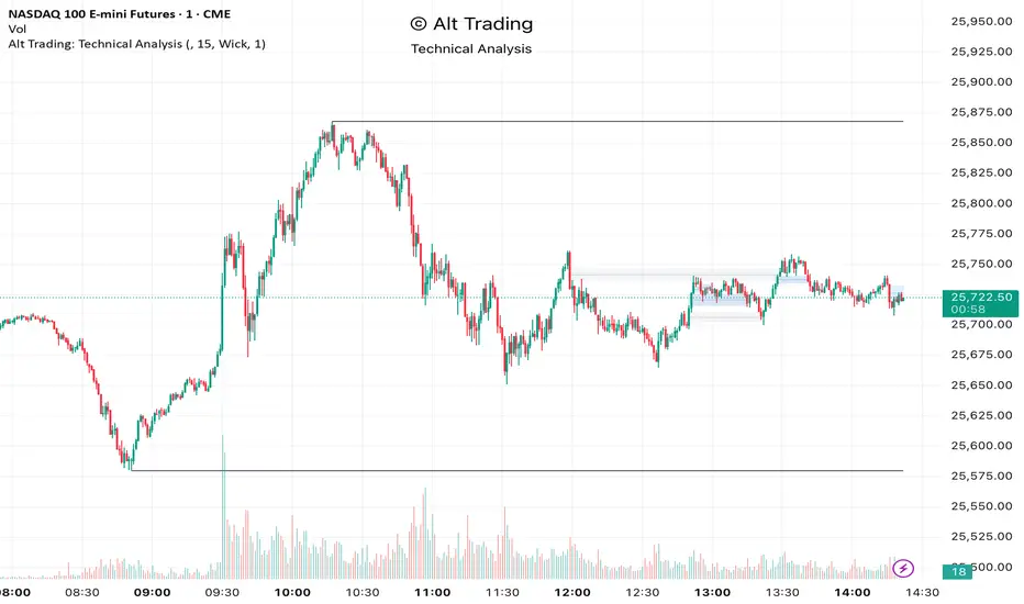
Alt Trading: Technical Analysis
A streamlined, high-quality indicator that displays the essential intraday levels. It highlights the Current Day High/Low (CDH/CDL), Previous Day High/Low (PDH/PDL), Current Week High/Low (CWH/CWL), and the most recent Fair Value Gaps (FVGs or iFVGs) on any selected timeframe—providing clear structural context for informed intraday decision-making.
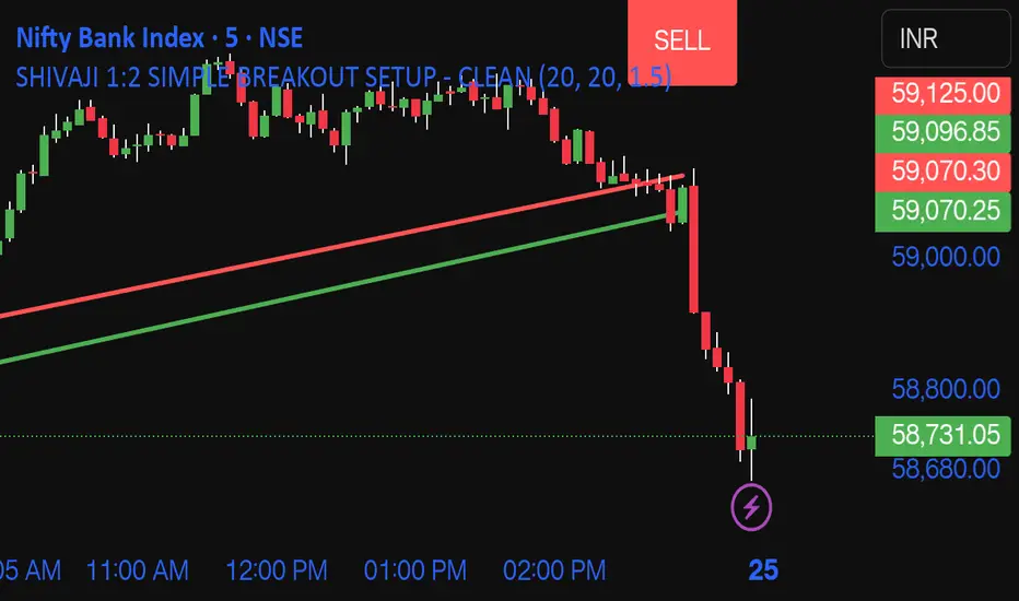
SHIVAJI 1:2 SIMPLE BREAKOUT SETUP - CLEANManage risk reward and use this indicator
Breakout structure auto correct
Volume consider in break out
Daily POC Lines - Clustered
Overview
This indicator automatically plots horizontal lines at the Point of Control (POC) for each daily candle, intelligently clustering nearby levels to reduce visual noise and highlight the most significant price zones where volume concentration occurred.
What Makes This Original
Unlike standard volume profile indicators that show static profiles for the entire chart, this script:
Calculates individual POC levels for each daily candle within a user-defined lookback period
Implements an intelligent clustering algorithm that merges POC levels within a customizable percentage threshold, preventing chart clutter from redundant lines
Dynamically highlights high-significance clusters (multiple days sharing the same POC level) with customizable visual styling
Provides granular control over line extension, label positioning, and visual appearance
How It Works
The script divides each daily candle's price range into configurable bins (default 20) and distributes the day's volume across these levels to approximate the POC. When multiple days produce POC levels within the specified clustering threshold (default 2%), they merge into a single line with a counter showing how many days share that level.
Key Features
Adjustable lookback period (1-500 candles)
Intelligent clustering with customizable threshold percentage
Separate styling controls for regular POCs vs. high-count clusters
Toggle visibility for lines and labels independently
Configurable line colors, widths, styles (solid/dashed/dotted), and extension
Date labels with cluster count indicators
Adjustable label positioning and offset
Use Cases
Traders can use clustered POC levels to:
Identify key support and resistance zones based on historical volume concentration
Recognize high-significance price levels where multiple days' POCs converge
Reduce chart clutter while maintaining visibility of important volume-based levels
Combine with other technical analysis methods for confluence
Settings
The indicator organizes inputs into four logical groups:
General Settings - Lookback period, cluster threshold, volume bins
Line Settings - Visibility, color, width, style, and extension options
Label Settings - Visibility, position, offset, and color
Cluster Highlights - Threshold and custom styling for high-count clusters
Important Notes
This script uses an approximation method for POC calculation by dividing each candle's range into bins. For maximum accuracy, use on daily timeframe charts. The clustering feature is particularly useful when analyzing longer lookback periods where many POC levels may naturally converge around similar price zones.
Technical Details
Written in Pine Script v5
Maximum 500 lines on chart
Requests daily timeframe data using security function
Uses arrays to store and manage POC data efficiently
Redraws all lines on the last bar for optimal performance

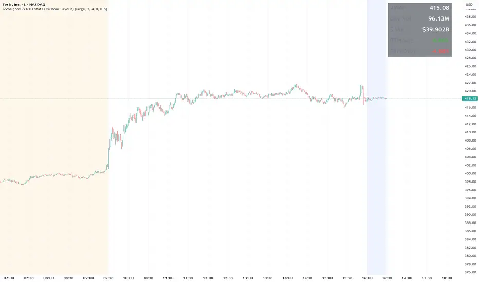
VWAP, Vol & RTH Stats (Custom Layout)VWAP, Volume & RTH Stats Box This indicator displays a data table in the top-right corner of the chart designed for intraday liquidity analysis. It fetches the true "Daily" volume to ensure accuracy regardless of the timeframe used. It specifically isolates Regular Trading Hours (RTH) to calculate the daily range performance (Max Squeeze % and Max Drop %), filtering out pre-market noise to show the true strength of the move. Includes full customization for dimensions, margins, and colors.
ATR Safe/Danger Volatility Filter50EMA on ATR, red shows spikes
The indicator uses a ATR and ads a 50EMA. The red is a volatility spike.

Accumulation And Distribution Zones (Zeiierman)█ Overview
Accumulation And Distribution Zones (Zeiierman) is a structural zone indicator that highlights where the market has recently been absorbing sell pressure (Accumulation) or releasing buy pressure (Distribution).
The indicator tracks a refined sequence of swing highs and lows and measures how these swings tighten, expand, or step directionally. When they form staircase-style structures such as higher lows with compressing highs for Accumulation or lower highs with compressing lows for Distribution, the script marks these areas as shifts in market control.
Once the full pattern completes, the indicator converts it into an Accumulation or Distribution zone. Each zone is based on a confirmed structural sequence rather than a single point, making it more reliable and reflective of actual market behavior.
The indicator can also display a mini-volume profile within each zone and extend POC levels forward, showing where trading activity clustered most. Combined, these features reveal areas where price has recently shown acceptance, absorption, or rejection, helping you understand whether current price action is reacting to, breaking from, or retesting these important structural regions.
█ How It Works
⚪ Swing Structure
The indicator builds its foundation by detecting swing highs and lows using a configurable Swing Detection Window. Each confirmed swing is stored with its price, time, bar index, and direction. If two consecutive swings share the same direction, only the more extreme one is kept. This produces a clean structural sequence that removes noise and keeps only meaningful turning points.
⚪ Accumulation vs Distribution Pattern Logic
Using the refined swing sequence, the script looks for staircase-style formations that signal shifts in control:
Accumulation (bottoming): higher lows combined with compressing highs.
Distribution (topping): lower highs combined with compressing lows.
Two detection modes are available:
Quick for compact 4-swing formations
Slow for broader 6-swing structures
When a full structural pattern completes, the indicator marks the zone and resets the swing buffer for the next formation.
⚪ Volume Profile Construction
The price range between the zone’s upper and lower boundary is divided into several Rows. For every bar within the zone’s swing range, the bar’s volume is added to the appropriate price row.
Volume is classified as:
Bullish volume when close > open
Bearish volume when close < open
Each row is drawn as two horizontal segments (bull and bear), colored with smooth gradients based on your bull/bear color settings. This creates a compact profile that reveals where trading activity is concentrated inside the zone and whether buyers or sellers dominate those price levels.
█ How to Use
The indicator is designed to provide context and confluence, not raw buy/sell signals.
⚪ Spot Fresh Accumulation & Distribution
Use newly printed zones as a map of where the market has recently:
Absorbed selling and formed a floor (Accumulation below price).
Absorbed buying and formed a cap (Distribution above price).
In a trending environment, fresh accumulation zones below price are often areas to watch for pullbacks, while distribution zones above price can act as sell zones or targets.
⚪ Volume Profile
Longer horizontal bars show where the market traded the most volume inside the zone.
Bull-leaning rows inside an accumulation zone often signal strong buying interest during the formation.
Bear-leaning rows inside a distribution zone highlight concentrated selling pressure.
By combining this volume distribution with the zone label and the broader trend context, you can judge whether the structure is more likely to hold, break, or retest as the price approaches it again.
⚪ POC (Point of Control) Trading
Extended POC zones (Regular or Faded) can be treated as dynamic support/resistance rails:
When price revisits a prior accumulation POC and rejects it from above, the level may act as support. When price retests a distribution POC from below and fails to break through, it can act as resistance.
⚪ Combine with Your Own Strategy
The script does not decide direction for you. You get the most value by combining it with:
Your own trend filters (moving averages, higher timeframe structure, volatility measures).
Your preferred entry models (reversal candles, momentum breaks, liquidity grabs, etc.).
Higher-timeframe mapping.
Think of this tool as a map of where the market did meaningful business. You decide how to trade around those areas.
█ Settings
Acc/Dist Ranges – Master switch for drawing all Accumulation and Distribution zones. Turn this off to temporarily hide boxes while leaving supporting logic active.
Pattern – Shows or hides the swing-based pattern outline that formed each zone. Good for structural debugging and education.
Pattern Sensitivity
Quick – more responsive, detects smaller compact structures.
Slow – stricter, focuses on wider and more established zones.
Swing Detection Window – Pivot width used to confirm swing highs and lows. Larger values filter noise and produce bigger zones; smaller values pick up more minor structures.
Volume Profile – Enables the embedded volume profile inside each zone.
Rows – Number of price slices used to aggregate volume in the zone. Higher values give more detail but increase visual density.
Switch Order – Flips the horizontal order of bull vs bear volume segments within each row.
Extend Zones – Behaviour of POC and zone extension:
None – No forward extension.
Faded Zones – Store and draw up to four past POC zones as faded horizontal levels.
Regular Zones – Extend POC boxes forward until price breaks out.
-----------------
Disclaimer
The content provided in my scripts, indicators, ideas, algorithms, and systems is for educational and informational purposes only. It does not constitute financial advice, investment recommendations, or a solicitation to buy or sell any financial instruments. I will not accept liability for any loss or damage, including without limitation any loss of profit, which may arise directly or indirectly from the use of or reliance on such information.
All investments involve risk, and the past performance of a security, industry, sector, market, financial product, trading strategy, backtest, or individual's trading does not guarantee future results or returns. Investors are fully responsible for any investment decisions they make. Such decisions should be based solely on an evaluation of their financial circumstances, investment objectives, risk tolerance, and liquidity needs.

Momentum + Volume Percentile
This advanced momentum indicator combines smoothed momentum analysis with percentile-based volume filtering to identify high-quality trading opportunities backed by significant market participation.
How It Works:
The indicator calculates momentum (rate of change) over a customizable period and applies multiple smoothing techniques to reduce noise. It then filters price action by highlighting only periods where volume exceeds a specified percentile threshold.
The algorithm:
Calculates raw momentum based on price changes over the specified period
Applies customizable smoothing (SMA, EMA, WMA, or HMA) to the momentum values
Computes a moving average of the smoothed momentum as a trend reference
Analyzes volume over a lookback period to establish percentile rankings
Highlights candles where volume exceeds the percentile threshold with color-coded backgrounds
Distinguishes between bullish (green) and bearish (red) high-volume events

Pso VP 2.0This indicator provides an advanced volume analysis tool that visualizes trading activity across different price levels and automatically identifies key support and resistance zones.
How It Works:
The Volume Profile analyzes historical price and volume data within a specified lookback period, distributing volume across horizontal price levels. Unlike traditional volume indicators that show volume over time, this tool displays volume at price, revealing where the most significant trading activity has occurred.
The algorithm:
Divides the price range into customizable horizontal bars (bins)
Calculates and accumulates volume for each price level
Identifies high-volume nodes that often act as support or resistance levels
Uses percentile filtering to highlight the most significant trading areas
Key Features:
Automatic S/R Detection: Uses volume percentile filtering to identify the most significant price levels
Dynamic Support/Resistance Lines: Automatically draws horizontal black lines at high-volume areas that typically act as price magnets or barriers
Customizable Parameters: Full control over lookback period, number of price bars, percentile thresholds, profile width, opacity, and line projections
Clean Aesthetic: Monochrome design for professional chart presentation

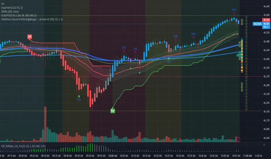
DeltaFlow Volume Dr.Ryan [Beluga Port]This is a delta volume profile copy I have made for tracking volume flow.
Volume weighted average price band strategy [Kevin-Patrick]VWAP Bands strategy, Credit
VWAP Machine Learning Bands is an advanced indicator designed to enhance trading analysis by integrating VWAP with a machine learning-inspired adaptive smoothing approach. This tool helps traders identify trend-based support and resistance zones, predict potential price movements, and generate dynamic trade signals.
Key Features
Adaptive ML VWAP Calculation: Uses a dynamically adjusted SMA-based VWAP model with volatility sensitivity for improved trend analysis.
Forecasting Mechanism: The 'Forecast' parameter shifts the ML output forward, providing predictive insights into potential price movements.
Volatility-Based Band Adjustments: The 'Sigma' parameter fine-tunes the impact of volatility on ML smoothing, adapting to market conditions.
Multi-Tier Standard Deviation Bands: Includes two levels of bands to define potential breakout or mean-reversion zones.
Dynamic Trend-Based Colouring: The VWAP and ML lines change colour based on their relative positions, visually indicating bullish and bearish conditions.
Custom Signal Detection Modes: Allows traders to choose between signals from Band 1, Band 2, or both, for more tailored trade setups.
+ Strategy setting by Kevin-Patrick

GRAM SCALP_PDH/PDL/P.POC/P.VAL/P.VAH_9/21EMA)This is a simple scalping strategy for futures markets (e.g., MNQ/ES), designed for prop firm challenges that require consistency and good R/R. It focuses on intraday trades during NY session (9:30 ET onward), using bias, EMAs, and key levels from prior Globex session (18:00–17:00 ET).
Goal: Set-and-forget limit orders in bias direction, aiming for small, consistent wins.
Daily Bias (Trend Detection):
Based on the first 15-min candle (9:30–9:45 ET).
If close > open (green): LONG ONLY bias – background shades green, label says "LONG ONLY".
If close < open (red): SHORT ONLY bias – background shades red, label says "SHORT ONLY".
Trade only in bias direction to avoid counter-trend risks. No bias? Sit out.
EMAs for Entries/Confirmation:
9 EMA (orange): Fast line for short-term trend/pullbacks.
21 EMA (purple): Slower line for overall direction.
Entry idea: Wait for price to pull back to 9/21 EMA in bias direction, then enter on bounce/break (e.g., long above EMA on green bias).
Use as dynamic support/resistance – don't trade if price is far from EMAs.
Key Levels from Prior Session (Globex 18:00–17:00 ET):
PDH (Previous Day High): Gray line – potential resistance/target for longs.
PDL (Previous Day Low): Gray line – potential support/target for shorts.
Volume Profile (VP):
POC (Point of Control, orange): Highest volume price – strong magnet; price often returns here.
VAH (Value Area High, fuchsia circles): Top of 70% volume range – resistance; break above = bullish.
VAL (Value Area Low, fuchsia circles): Bottom of 70% volume range – support; break below = bearish.
Use levels for entries (e.g., bounce off VAL for long), stops (behind level), or targets (e.g., aim for POC/VAH).
Trading Rules:
Session: NY open (9:30 ET) to close (16:00 ET). Avoid news/high volatility.
Bias Only: After 9:45 ET, check label/color – trade longs on green, shorts on red.
Entries: Set limit orders at key levels/EMAs in bias direction. E.g., long bias: Buy limit at VAL or EMA pullback.
Risk Management:
Stop Loss: Behind nearest level (e.g., below VAL for long) or fixed 10-20 ticks.
Take Profit: 1:2 risk-reward or at next level (e.g., PDH/POC).
Position Size: 1-2% risk per trade; max 5 trades/day for prop rules.
Exits: Trail with EMAs or exit at EOD. No overnight holds.
Avoid: Choppy markets, gaps through levels, or no clear bias.
Why It Works:
Bias filters bad trades; EMAs confirm momentum; VP/PDH/PDL provide high-probability zones based on where volume/price settled overnight.
Simple, mechanical – ideal for prop challenges (rules on drawdown, consistency).
Backtest on 2-min charts; aim for 60%+ win rate on small scalps (5-20 ticks).
Customize in indicator settings (e.g., VP bin size, line colors). Test on demo before live. Not financial advice – trade at own risk.10 web pages

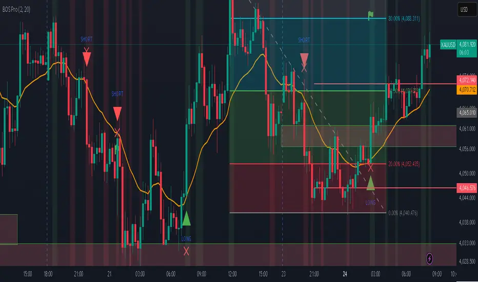
Professional BOS IndicatorThis is a trend following indicator that focuses on BOS, pullback and entry
BTC Future CME Cross-Market DetectorProject Spec: BTC CME Cross-Market Detector
1. Project Overview
Indicator Name
CME Cross-Market Detector
Objective
To identify high-probability trade setups by detecting and confirming "smart money" activity across two distinct market venues simultaneously: a primary crypto exchange (e.g., Bybit, Binance) and the institutional CME futures market.
Core Philosophy
Price movements are often preceded by the positioning of large, institutional players ("smart money"). While their activity can be seen on any single exchange, the signal becomes exceptionally reliable when the same footprint appears at the same time in both the broader crypto derivatives market and the highly regulated institutional futures market. This dual-market confirmation acts as a powerful noise filter, isolating signals that have a higher probability of follow-through.
2. Key Concepts & Signal Logic
The indicator's entire foundation rests on confirming that specific conditions are met on two datasets at the same time: (1) The user's current chart (e.g., BYBIT:BTCUSDT) and (2) The CME Bitcoin Futures chart (CME:BTC1!).
Smart Volume Analysis
To gauge buying vs. selling pressure, the total volume of a single candle is algorithmically split. This is not a perfect science but an effective estimation based on the candle's structure.
Buying Pressure is considered proportional to the distance the price closed from the low. Buying Pressure ≈ Total Volume × ((Close - Low) / (High - Low))
Selling Pressure is considered proportional to the distance the price closed from the high. Selling Pressure ≈ Total Volume × ((High - Close) / (High - Low))
Signal Trigger Conditions
For a potential signal to be identified on each market independently, two conditions must be met:
Volume Spike: The volume of the current candle must be significantly higher than the recent average volume (e.g., >150% of the 20-period moving average). This shows a sudden, high level of interest.
Pressure Imbalance: The estimated buying pressure must overwhelm the selling pressure by a certain factor (e.g., 3x), or vice versa for a sell signal. This indicates a clear directional intent.
The Final Confirmed Signal
A signal is only considered valid and plotted on the chart when the Signal Trigger Conditions (both Volume Spike and Pressure Imbalance) are met on both the primary chart and the CME chart on the very same candle.
3. Signal Strength Calculation
The percentage shown on the chart is a Signal Strength Score (0-100%), which rates the quality and conviction of the confirmed signal.
The score is calculated as follows:
Base Score Calculation (0-100 points): A base score is calculated for each market (primary and CME) by combining two factors:
Volume Component (0-50 pts): Measures the intensity of the volume spike. A 300% volume spike will score higher than a 150% spike.
Imbalance Component (0-50 pts): Measures the intensity of the buy/sell pressure ratio. A 5x imbalance will score higher than a 3x imbalance.
Advanced Modifiers (Bonus Points): The base score is then enhanced with bonus points for favorable conditions:
Trend Alignment (+10 pts): A buy signal that occurs during a clear uptrend receives extra points.
Candle Structure (+10 pts): A buy signal on a candle with a long lower wick (indicating rejection of lower prices) receives extra points.
Final Averaged Score: The final percentage you see is the average of the two individual strength scores calculated for the primary exchange and the CME market.
4. Visualization
Energy Waves: Signals are displayed as circles. Green for Buy Signals (below the candle) and Red for Sell Signals (above the candle).
Dynamic Sizing: The size of the circle directly reflects the Signal Strength Score, categorized into four distinct levels (e.g., 10%+, 40%+, 60%+, and 80%+) for at-a-glance interpretation.
Percentage Labels: Each signal is plotted with its precise, final strength score for clear analysis.
5. Summary: Steps to Replicate the Logic
To recreate this indicator, follow these high-level steps for each candle on the chart:
Gather Data: Fetch the Open, High, Low, Close, and Volume data for the primary chart asset AND for the corresponding CME Bitcoin Futures symbol (CME:BTC1!).
Calculate Buy/Sell Pressure: For both datasets, use the "Smart Volume Analysis" formula to estimate the buying and selling pressure for the current candle.
Check for Volume Spikes: For both datasets, calculate a simple moving average of the volume. Check if the current candle's volume exceeds this average by a set threshold (e.g., 150%).
Check for Pressure Imbalance: For both datasets, check if the buying pressure is greater than the selling pressure by a set multiplier (e.g., 3.0), or vice versa.
Confirm the Signal: A final signal is only valid if the conditions from both Step 3 and Step 4 are true for both datasets on the same candle.
Calculate Strength: If a signal is confirmed, compute a strength score (0-100) for each dataset based on the intensity of the volume spike and pressure imbalance. Add bonus points for confluence factors like trend alignment.
Finalize and Plot: Average the two strength scores from each market. Plot a colored, sized circle on the chart that visually represents this final averaged score, and display the score as a text label.
Last but not least, the idea of the indicator is inspired by 52SIGNAL

Distância Preço vs VWAPIt calculates the distance from the price to the VWAP. The idea is to make it easier to observe when the price might return to the VWAP.

BTC ETF Flow Monitor🚀 Bitcoin ETF Flow Monitor - Track Institutional Money Flows
Monitor real-time dollar flows across major Bitcoin ETFs with this professional-grade indicator inspired by Dune Analytics. Perfect for tracking institutional sentiment and Bitcoin adoption trends.
📊 Key Features: • Real Dollar Flows : Display actual estimated flows in millions USD, not abstract indices
• 5 Major ETFs : IBIT (BlackRock), FBTC (Fidelity), ARKB (ARK), BITB (Bitwise), GBTC (Grayscale)
• Dune Analytics Style : Clean, professional visualization with meaningful thresholds
• Smart Alerts : Get notified of significant flow changes and BTC price divergences
• Enhanced Summary Table : Live stats including total flows, trends, and market sentiment
💡 How It Works: Combines volume, price action, and momentum to estimate institutional dollar flows. Positive values = inflows (buying pressure), negative values = outflows (selling pressure). Scale shows millions of USD for easy interpretation.
🎯 Perfect For:
- Tracking institutional Bitcoin adoption
- Identifying accumulation/distribution phases
- Spotting divergences between ETF flows and BTC price
- Understanding market sentiment shifts
⚡ Professional Grade: Built with advanced Pine Script techniques, optimized performance, and real-world trading applications in mind.
