Multi-Layer Volume Profile [BigBeluga]A powerful multi-resolution volume analysis tool that stacks multiple profiles of historical trading activity to reveal true market structure.
This indicator breaks down total and delta volume distribution across time at four adjustable depths — enabling traders to spot major POCs, volume shelves, and zones of price acceptance or rejection with unmatched clarity.
🔵 KEY FEATURES
Multi-Layer Volume Profiles:
Up to 4 separate volume profiles are stacked on the chart:
- Profile 1: Full period
- Profile 2: Half-length
- Profile 3: Quarter-length
- Profile 4: One-eighth-length
This layering helps traders assess confluence across different time horizons.
Custom Bin Resolution:
Each profile uses a customizable number of bins to control visual precision.
More bins = higher granularity, fewer bins = smoother profile.
Precise POC Highlighting:
The price level with the maximum traded volume in each profile is highlighted with a thick blue POC line.
This key level shows the most accepted price for each period.
Total and Delta Volume Labels:
- Total Volume: Displays cumulative volume over the profile period at the top of the profile box.
- Delta Volume: The difference between bullish and bearish volume is labeled at the base, showing directional pressure.
Positive delta = buyer dominance, negative delta = seller dominance.
Range Levels:
Each profile includes horizontal reference lines showing its high, low, bounds.
These edges often align with price reaction zones and become future resistance/support.
🔵 HOW IT WORKS
For each active profile, the indicator:
- Collects price range (highs/lows) across the selected `length`
- Divides this range into equal bins
- Assigns volume into bins based on candle close location
- Aggregates volume per bin to form the profile (polylines)
Separately tracks:
- Total volume (sum of all candles in range)
- Delta volume (sum of candle volumes: positive for bullish, negative for bearish closes)
Highlights the bin with maximum volume (POC)
and marks it with a thick blue line.
Adds auxiliary lines for high/low of each profile box
and total/delta volume tags with tooltips.
🔵 USAGE
Spot Acceptance Zones:
Thick, flat areas on the profile show where price stayed longest — ideal for building positions.
Identify Rejection Zones:
Thin volume areas signal price rejection and are often used for stop placement or entries.
Delta Confirmation:
Use strong positive/negative delta readings as directional bias confirmation for breakout trades.
Confluence Detection:
Watch for overlapping POCs between layers to identify extremely strong support/resistance zones.
🔵 CONCLUSION
Multi-Layer Volume Profile equips traders with a deeply layered market structure view.
Whether you're scalping intraday levels or analyzing macro support zones, the ability to stack volume perspectives, visualize directional delta, and anchor POCs provides an edge in anticipating market moves.
Use this tool to validate entries, confirm structure, and make more informed, volume-aware trading decisions.
Volume

Volume MAs Supertrend | Lyro RS📊 Volume MAs Supertrend | Lyro RS is an advanced trading tool that combines volume-adjusted moving averages with a dynamic Supertrend system. This indicator provides a robust framework for identifying market trends and entry/exit points.
✨ Key Features :
📈 Volume-Weighted Moving Averages (VWMA): Integrates price and volume data to provide a more accurate moving average, allowing for better trend analysis.
🔧 Multiple MA Types: Choose from SMA, EMA, WMA, VWMA, DEMA, TEMA, RMA, HMA, ALMA to suit your preferred trading strategy.
📊 Dual-Multiplier Supertrend System: Uses ATR to dynamically calculate upper and lower bands for long and short trends, with distinct multipliers for each.
🎨 Customizable Color Schemes: Choose from Classic, Mystic, Accented, and Royal color palettes or customize your own colors for bullish and bearish trends.
🔍 Visual Enhancements: Color-coded Supertrend lines, candlesticks, and bars for quick trend identification.
⏰ Alert System: Alerts for long and short signals based on trend changes.
🔧 How It Works :
The Supertrend line is calculated using ATR over a user-defined period, with separate multipliers for long and short positions.
📈 A bullish trend is signaled when the price crosses above the upper band, and a bearish trend is signaled when the price crosses below the lower band.
🎨 The Supertrend line changes color to reflect trend direction, with candlesticks and bars matching the trend's color for visual clarity.
⚙️ Customization Options :
🛠️ Moving Average Settings: Select your preferred moving average type (SMA, EMA, VWMA, etc.) and adjust the length for smoother or more responsive trend signals.
📐 Supertrend Parameters: Define the ATR period and adjust multipliers to fine-tune sensitivity for long and short signals.
🎨 Color Configuration: Choose from predefined color palettes or create your own custom scheme for trend signals.
📈 Use Cases :
✅ Confirm market trends before entering trades.
🚪 Identify potential entry/exit points as trend directions shift.
👀 Visually analyze market conditions with color-coded candlesticks and bars.
⚠️ Disclaimer :
This indicator should not be used as a standalone tool for making trading decisions. Always combine with other forms of analysis and risk management practices.

Forex Session + Volume Profile [RunRox]📊 Forex Session + Volume Profile is built especially for traders who work with intra-session liquidity concepts or any strategy that needs a clear visual of trading sessions and the liquidity inside them.
Our team created this indicator to give you better session visibility, flexible session styling, and extra tools that help you navigate the market more easily.
📌 Features:
6 fully customizable sessions
Kill Zone (the high-impact trading window)
Volume Profile for each session
POC / VAL / VAH / LVN levels (Point of Control, Value Area Low, Value Area High, Low Volume Node)
PDH / PDL levels (Previous Day High / Low)
PWH / PWL levels (Previous Week High / Low)
NYM level (New York Market level)
Active sessions table
5 style options for each session
All of this gives you the flexibility to set up exactly the layout you need for your trading. Below, you’ll find a more detailed look at each feature.
🗓️ 6 CUSTOMIZABLE SESSION
The indicator includes six sessions that you can fully customize to fit your needs—everything from naming each session and choosing line colors to adjusting opacity, showing the volume profile, or even turning off a session entirely if you don’t need it.
Plus, you can pick different display styles for each session. As shown in the screenshot below, there are five style options you can apply individually to every session.
5 Style Options for Sessions
BOX
AREA
ZONES
LINES
CURVED
These styles can be customized for each session individually to help you highlight the sessions you care about on your chart. Example below
📢 VOLUME PROFILE
We’ve also integrated a Volume Profile into the indicator to pinpoint important levels on the chart. On top of that, we’ve added extra volume-based levels. Below, you’ll find the settings and a visual demo of how it appears on your chart.
To identify optimal entry points, you can use the following key reference levels:
POC (Point of Control)
VAL (Value Area Low)
VAH (Value Area High)
LVN (Low Volume Node)
You can also customize colors and line styles, or hide any levels you don’t need on your chart.
📐 ADDITIONAL LEVELS
You can display the following levels on your chart:
NYM (New York Market)
PDH (Previous Day High)
PDL (Previous Day Low)
PWH (Previous Week High)
PWL (Previous Week Low)
All of these are fully customizable with color selection and the option to extend lines into the next period.
💹 ACTIVE SESSION TABLE
The active sessions table helps you quickly identify the trading times for the sessions you care about. It’s fully customizable, with options to choose border and background colors for the table itself.
🟠 USAGE
This indicator is highly versatile: use it to simply mark trading sessions on your chart, set up the Kill Zone at your chosen time, or identify the context of the previous session by its most traded range levels. All of this makes the indicator an invaluable tool for any trader!

Order Block Matrix [Alpha Extract]The Order Block Matrix indicator identifies and visualizes key supply and demand zones on your chart, helping traders recognize potential reversal points and high-probability trading setups.
This tool helps traders:
Visualize key order blocks with volume profile histograms showing liquidity distribution.
Identify high-volume price levels where institutional activity occurs.
rank historical order blocks and analyze their strength based on volume.
Receive alerts for potential trading opportunities based on price-block interactions.
🔶 CALCULATION
The indicator processes chart data to identify and analyze order blocks:
Order Block Detection
Inputs:
Price action patterns (consolidation areas followed by breakouts).
Volume data from current and lower timeframes.
User-defined lookback periods and thresholds.
Detection Logic:
Identifies consolidation areas using a dynamic range comparison.
Confirms breakout patterns with percentage threshold validation.
Maps volume distribution across price levels within each order block.
🔶Volume Analysis
Volume Profiling:
Divides each order block into configurable grid segments.
Maps volume distribution across price segments within blocks.
Highlights zones with highest volume concentration.
Strength Assessment:
Calculates total block volume and relative strength metrics.
Compares block volume to historical averages.
Determines probability of reversal based on volume patterns.
isConsolidation(len) =>
high_range = ta.highest(high, len) - ta.lowest(high, len)
low_range = ta.highest(low, len) - ta.lowest(low, len)
avg_range = (high_range + low_range) / 2
current_range = high - low
current_range <= avg_range * (1 + obThreshold)
🔶 DETAILS
Visual Features
Volume Profile Histograms:
Color-coded bars showing volume concentration within order blocks.
Gradient coloring based on relative volume (high volume = brighter colors).
Bull blocks (green/teal) and bear blocks (red) with varying opacity.
Block Visualization:
Dynamic box sizing based on volume concentration.
Optional block borders and background fills.
Volume labels showing total block volume.
Screener Table:
Real-time analysis of order block metrics.
Shows block direction, proximity, retest count, and volume metrics.
Color-coded for quick reference.
Interpretation
High Volume Areas: Zones with institutional interest and potential reversal points.
Block Direction: Bullish blocks typically support price, bearish blocks typically resist price.
Retests: Multiple tests of an order block may strengthen or weaken its influence.
Block Age: Newer blocks often have stronger influence than older ones.
Volume Concentration: Brightest segments within blocks represent the highest volume areas.
🔶 EXAMPLES
The indicator helps identify key trading opportunities:
Bullish Order Blocks
Support Zones: Identify strong support levels where price is likely to bounce.
Breakout Confirmation: Validate breakouts with volume analysis to avoid false moves.
Retest Strategies: Enter trades when price retests a bullish order block with high volume.
Bearish Order Blocks
Resistance Zones: Identify strong resistance levels where price is likely to reverse.
Distribution Areas: Detect zones where smart money is distributing to retail.
Short Opportunities: Find optimal short entry points at high-volume bearish blocks.
Combined Strategies
Order Block Stacking: Multiple aligned blocks create stronger support/resistance zones.
Block Mitigation: When price breaks through a block, it often indicates a strong trend continuation.
Volume Profile Applications: Higher volume segments provide more precise entry and exit points.
🔶 SETTINGS
Customization Options
Order Block Detection:
Consolidation Lookback: Adjust the period for consolidation detection.
Breakout Threshold: Set minimum percentage for breakout confirmation.
Historical Lookback Limit: Control how far back to scan for historical order blocks.
Maximum Order Blocks: Limit the number of visible blocks on the chart.
Visual Style:
Grid Segments: Adjust the number of volume profile segments.
Extend Blocks to Right: Enable/disable extending blocks to current price.
Show Block Borders: Toggle border visibility.
Border Width: Adjust thickness of block borders.
Show Volume Text: Enable/disable volume labels.
Volume Text Position: Control placement of volume labels.
Color Settings:
Bullish High/Low Volume Colors: Customize appearance of bullish blocks.
Bearish High/Low Volume Colors: Customize appearance of bearish blocks.
Border Color: Set color for block outlines.
Background Fill: Adjust color and transparency of block backgrounds.
Volume Text Color: Customize label appearance.
Screener Table:
Show Screener Table: Toggle table visibility.
Table Position: Select positioning on the chart.
Table Size: Adjust display size.
The Order Block Matrix indicator provides traders with powerful insights into market structure, helping to identify key levels where smart money is active and where high-probability trading opportunities may exist.

Linear Regression Volume | Lyro RSLinear Regression Volume | Lyro RS
⚠️Disclaimer⚠️
Always combine this indicator with other forms of analysis and risk management. Please do your own research before making any trading decisions.
The LR Volume | 𝓛𝔂𝓻𝓸 𝓡𝓢 indicator blends linear regression with volume-adjusted moving average s to dynamically outline price equilibrium and trend intensity. By integrating volume into its regression model, it highlights meaningful price movement relative to trading activity.
📌 How It Works:
Volume-Weighted Regression Baseline
Price is filtered through one of four volume-adjusted moving averages (SMA, RMA, HMA, ALMA) before being passed through a linear regression model, forming a dynamic fair value line.
Deviation Bands
The indicator plots 1x, 2x, and 3x standard deviation zones above and below the baseline, helping identify potential extremes, volatility spikes, and mean reversion areas.
Slope-Based Color Logic
The baseline and fill areas are dynamically colored:
- 🟢 Green for positive slope (uptrend)
- 🔴 Red for negative slope (downtrend)
- ⚪ Gray for neutral movement
⚙️ Inputs & Options:
Regression Length – Controls how many bars are used in the moving average and regression calculation.
Deviation Multiplier – Adjusts the width of the bands surrounding the regression baseline.
MA Type – Choose from 4 types:
SMA (Simple Moving Average)
RMA (Relative Moving Average)
HMA (Hull Moving Average)
ALMA (Arnaud Legoux Moving Average)
Band Colors – Customizable upper/lower band colors to match your visual style.
🔔 Alerts:
Long Signal – Triggers when the regression slope turns positive.
Short Signal – Triggers when the regression slope turns negative.

OBV by readCrypto
-------------------------------------
OBV is used as a leading indicator to predict stock price movements by measuring changes in trading volume.
Reflecting the cumulative value of trading volume,
- When the price rises, if the trading volume increases, OBV rises,
- When the price falls, if the trading volume decreases, OBV falls.
Therefore, the movement of the OBV indicator must be checked along with the price movement, and it has the disadvantage of being unreliable for coins (tokens) with low trading volume.
---------------------------------------
(First interpretation method)
By adding a signal line for the OBV indicator,
- If the OBV indicator moves above the signal line, it is likely to show an upward trend,
- If the OBV indicator moves beyond the signal line, it is likely to show a downward trend.
This interpretation method is difficult to use in actual trading strategies because the OBV indicator often moves up and down repeatedly based on the signal line.
Therefore, it is recommended to use this interpretation method as reference when analyzing charts.
-------------------------------
(Second interpretation method)
Draw support and resistance lines based on the high and low points of the OBV indicator
- If the OBV indicator breaks through the previous high point, it is likely to show an upward trend,
- If the OBV indicator breaks through the previous low point, it is likely to show a downward trend.
This interpretation method is a bit more reliable than the first interpretation method, but it has the disadvantage of having to consider support and resistance lines separately based on the high and low points.
-
To compensate for this, a High line for the high point and a Low line for the low point were added.
- If the OBV indicator shows an upward breakout of each line (Low, HL2, High), the price is likely to rise,
- If the OBV indicator shows a downward breakout of each line (Low, HL2, High), the price is likely to fall.
-
Also, the Low and High lines can be interpreted like Bollinger Bands.
That is, if the Low and High lines show a contraction, the price is likely to move sideways, and if they show an expansion, the price is likely to show a trend.
Therefore, if the High line breaks upward in a contracted state,
- It is likely to show an upward trend,
- If the Low line breaks downward, it is likely to show a downward trend.
In an expanded state, you should focus on finding the point to realize profits rather than conducting new transactions.
--------------------------------
It is not easy to interpret the change in actual transaction volume and use it to create a trading strategy.
In particular, it is more difficult in the coin market where multiple exchanges are linked to show movements for one coin (token).
Therefore, the coin market is actively conducting transactions without referring to trading volume at all by following trends.
However, I think that if you interpret the change in trading volume and use it to find a trading point, it can help you find a more accurate trading point.
In that sense, I think that an indicator that adds the High and Low lines of the OBV indicator can be used as meaningful reference material.
-----------------------------------------------------------------
-------------------------------------
OBV는 거래량의 변화를 측정하여 주가 움직임을 예측하는 선행 지표로 활용됩니다.
거래량의 누적값을 반영하여
- 가격이 상승할 때 거래량이 증가면 OBV가 상승하고,
- 가격이 하락할 때 거래량이 줄면 OBV가 하락하게 됩니다.
따라서, 가격의 움직임과 함께 OBV 지표의 움직임을 확인하여야 하고 거래량이 적은 코인(토큰)에서는 신뢰성이 떨어지는 단점도 가지고 있습니다.
---------------------------------------
(첫번째 해석 방법)
OBV 지표에 대한 Signal선을 추가하여
- OBV 지표가 Signal선 이상에서 이동하게 되면 상승세를 보일 가능성이 높고,
- OBV 지표가 Signal선 이항에서 이동하게 되면 하락세를 보일 가능성이 높습니다.
이러한 해석 방법은 Signal선을 기준으로 OBV 지표가 반복적으로 위아래로 움직임을 보이는 경우가 많기 때문에 실제 거래 전략에 활용되기가 어려운 면이 있습니다.
따라서, 이러한 해설 방법은 차트 분석을 할 때 참고 자료로 활용하는 것이 좋습니다.
-------------------------------
(두번째 해석 방법)
OBV 지표의 고점과 저점을 기준하여 지지와 저항선을 그려
- OBV 지표가 이전 고점을 상향 돌파하면 상승세를 보일 가능성이 높고,
- OBV 지표가 이전 저점을 하향 돌파하면 하락세를 보일 가능성이 높습니다.
이러한 해석 방법은 첫번째 해석 방법보다 좀 더 신뢰성이 있는 방법이지만, 고점과 저점을 기준으로 지지와 저항선을 나누어 생각해야 하는 단점이 있습니다.
-
이를 보완하고자 고점에 대한 High선과 저점에 대한 Low선을 추가하였습니다.
- OBV 지표가 각 선(Low, HL2, High)을 상향 돌파하는 모습을 보이면 가격이 상승할 가능성이 높고,
- OBV 지표가 각 선(Low, HL2, High)을 하향 돌파하는 모습을 보이면 가격이 하락할 가능성이 높습니다.
-
또한, Low선과 High선을 볼린저밴드와 같이 해석할 수 있습니다.
즉, Low선과 High선이 수축하는 모습을 보이면 가격은 횡보할 가능성이 높고, 확장하는 모습을 보이면 가격은 추세를 나타낼 가능성이 높습니다.
따라서, 수축한 상태에서
- High선을 상향 돌파하게 되면 상승세를 나타낼 가능성이 높고,
- Low선을 하향 돌파하게 되면 하락세를 나타낼 가능성이 높습니다.
확장된 상태에서는 신규 거래를 진행하기 보다 수익 실현할 시점을 찾는데 집중해야 합니다.
--------------------------------
실제 거래량의 변화를 해석하여 거래 전략을 만드는데 활용하기가 쉽지 않습니다.
특히, 하나의 코인(토큰)에 대해서 여러 개의 거래소가 연동되어 움직임을 나타내는 코인 시장에서는 더욱 어려움이 있습니다.
따라서, 코인 시장은 추세 추종으로 아예 거래량을 참고하지 않고 거래를 진행하는 방법이 활성화되어 있기도 합니다.
하지만, 거래량의 변화를 해석하여 거래 시점을 찾는데 활용한다면 보다 정확한 거래 시점을 찾는데 도움을 받을 수 있다고 생각합니다.
그러한 의미에서 OBV 지표의 High선과 Low선을 추가한 지표가 의미 있는 참고 자료로 활용될 수 있다고 생각합니다.
-------------------------------------------------------------------

Technical Signal Master📘 **Technical Signal Master** - Multi-Indicator Signal Table (50+ indicators)
This script integrates over 50 technical indicators and outputs Buy / Sell / Neutral signals into a dual-column table, helping traders evaluate market conditions at a glance.
---
🔍 **Included Indicators**
- Oscillators: RSI, MACD, Stochastic, Momentum, ADX, CCI, Williams %R, Awesome Oscillator
- Trend Tools: EMA (20/50/75/100/200), Supertrend, PSAR, HMA, KAMA, DMI
- Volume-Based: OBV, MFI, CMF, Chaikin Oscillator, VFI, Force Index, Acc/Dist
- Composite: TDI, Aroon, KST, Coppock, TSI, DPO, ROC, PPO
---
🧠 **What This Script Does**
- Each indicator outputs a numeric value and a signal (Buy = green, Sell = red, Neutral = gray)
- A total score is calculated to summarize the market sentiment (Bullish / Bearish / Neutral)
- All signals are shown in a fixed table at the top-right (overlay = false)
---
🎯 **Use Case**
This tool is designed for:
- Discretionary traders to make informed decisions
- Streamers or instructors to visually show signal summaries
- Anyone needing a unified signal dashboard
---
📝 **日本語説明(for JP users)**
このスクリプトは、50種類以上のテクニカル指標を統合し、それぞれの買い/売り/中立の判定をテーブル形式で表示します。チャート上には描画せず、右上に固定テーブルを表示するのみです。裁量判断や配信補助ツールとして活用できます。
---
✅ No repaint / No overlay plots / Fully open source

AlgoRanger Fibonacci Synthesis📘 AlgoRanger Fibonacci Synthesis
Author:
🔍 What It Does:
The AlgoRanger Fibonacci Synthesis is a powerful technical analysis tool that automatically draws dynamic Fibonacci retracement levels between algorithmically detected swing highs and lows. It combines price action structure, retracement theory, and trend confirmation in one seamless indicator.
This tool is ideal for traders looking to enter on pullbacks, confirm trend reversals, or identify key price reaction zones without having to manually draw Fibonacci levels.
🛠️ How It Works:
Auto Swing Detection: The indicator uses recent price pivots to define a high-low range and draws Fibonacci levels within it (0% to 100%).
Key Fib Levels: The classic 23.6%, 38.2%, 50%, 61.8%, and 78.6% retracement levels are plotted to show areas of potential support/resistance.
Color-Coded Zones: Each level is clearly color-coded to help you visually assess risk/reward and decision zones.
Trend Mapping: Works in conjunction with AlgoRanger Smart Signal and Trend Dashboard for market structure confirmation.
Dynamic Support Line: A red stepped baseline highlights trailing support or trend-following strength zones.
📈 How to Use It:
Entry Zones: Look to enter long trades during pullbacks to the 38.2%–61.8% retracement in an uptrend. Enter shorts in the same range during a downtrend.
Confirmation: Use trend context (e.g. green/red structure lines or other AlgoRanger tools) to confirm the dominant direction.
Stops and Targets:
Place stops near 78.6%–100% levels (end of retracement).
Use 0% or new swing highs/lows as initial profit targets.
Reversal Watching: If price hits 78.6%–100%, monitor for rejection candles or divergences for potential reversal entries.
✅ Best For:
Day trading (15m–1h charts)
Swing trading
Trend-following and countertrend strategies
⚙️ Settings You Can Customize (If Included):
Lookback length for pivot calculation
Visibility of individual Fib levels
Alert options when price crosses Fib zones (optional)
Style and color preferences

Harmony in Havoc - The Entropy of VoVix Harmony in Havoc – The Entropy of VoVix
There are moments in the market when chaos and order are not opposites, but partners in a dance.
Harmony in Havoc is not just an indicator—it’s a window into that dance.
Most tools try to tame the market by smoothing it, boxing it in, or chasing after what’s already happened. This script does the opposite: it listens for the music beneath the noise, the rare moments when volatility and unpredictability align, and the market’s next movement is about to begin.
What is Harmony in Havoc?
VoVix Spike:
The pulse of volatility-of-volatility. Not just how much the market is moving, but how violently its own heartbeat is changing.
Entropy:
A real-time measure of surprise. When entropy is high, the market is not just moving—it’s breaking its own patterns, rewriting its own rules.
Progression Bar & Status:
The yellow bar is your visual gauge of tension. As it fills, the market is winding up.
Wait: The world is calm.
Get ready!: The storm is building.
Take Action!!: The probability of a regime eruption is at its peak.
Yellow Background:
When the background glows, the market is at its most unstable—this is not a buy or sell signal, but a quant alert: the next chapter is about to be written.
How does it work?
Every tick, Harmony in Havoc measures the distance between the market’s current volatility and its own unpredictability.
When the VoVix spike approaches or exceeds the entropy threshold, the system knows:
“ This is the moment when the improbable becomes possible. ”
Why is this different?
It doesn’t tell you what to do.
It doesn’t chase price.
It doesn’t care about trends, bands, or the past.
Instead, it gives you a quantitative sense of anticipation—a way to see when the market is most likely to break from its own history, and when the edge is at its sharpest.
How to use it:
Watch for the yellow background and “ Take Action!! ” status.
Use it as a regime filter, a volatility dashboard, or a warning system for your own strategies.
Tune the inputs for your asset and timeframe—make it your own.
Inputs—explained for you:
VoVix Fast/Slow ATR & Stdev:
Control how sensitive the system is to volatility shocks. Lower = more signals, higher = only the rarest events.
Entropy Window & Bins:
Control how “surprised” the entropy engine is by current volatility. Shorter window = more responsive, more bins = finer detail.
Show/Hide Controls:
Toggle the VoVix spike, entropy line, and their glows to customize your visual experience.
Bottom line:
This is not a buy or sell script.
This is a quant regime detector for those who want to feel the market’s tension—to sense when harmony and havoc are about to collide.
Disclaimer:
Trading is risky. This script is for research and informational purposes only, not financial advice. Backtest, paper trade, and know your risk before going live. Past performance is not a guarantee of future results.
*I've only tested this on 1 and 5 min frames.
To TradingView mods and serious users:
This is not just another indicator. This is a quant instrument for the next era. If flagged, we’ll keep adapting and republishing until real quant tools get their place.
Use with discipline. Trade your edge.
— Dskyz, for DAFE Trading Systems

Smoothed Momentum Signal (15-Bar Window)Price up 12 out of 15 days
Price up 25% in 15 days
Volume up 25% in 15 Days
David Ryan Institutional Volume Parameters. Can be used as Entry and Exit Basis.

Supply Contraction IndicatorATR 14 decreasing in conjunction with 20MA volume, Supply contracting due to lessening volatility combined with lessening average volume.

Hassan Zig ZagDisplay ZigZag with volume value. This will help to indicate the support and resistance levels based on the top and bottom created by the zigzag when the price is moving. also, the volume will support in taking decision to buy or sill

ADX and DI - Trader FelipeADX and DI - Trader Felipe
This indicator combines the Average Directional Index (ADX) and the Directional Indicators (DI+ and DI-) to help traders assess market trends and their strength. It is designed to provide a clear view of whether the market is in a trending phase (either bullish or bearish) and helps identify potential entry and exit points.
What is ADX and DI?
DI+ (Green Line):
DI+ measures the strength of upward (bullish) price movements. When DI+ is above DI-, it signals that the market is experiencing upward momentum.
DI- (Red Line):
DI- measures the strength of downward (bearish) price movements. When DI- is above DI+, it suggests that the market is in a bearish phase, with downward momentum.
ADX (Blue Line):
ADX quantifies the strength of the trend, irrespective of whether it is bullish or bearish. The higher the ADX, the stronger the trend:
ADX > 20: Indicates a trending market (either up or down).
ADX < 20: Indicates a weak or sideways market with no clear trend.
Threshold Line (Gray Line):
This horizontal line, typically set at 20, represents the threshold for identifying whether the market is trending or not. If ADX is above 20, the market is considered to be in a trend. If ADX is below 20, it suggests that the market is not trending and is likely in a consolidation phase.
Summary of How to Use the Indicator:
Trend Confirmation: Use ADX > 20 to confirm a trending market. If ADX is below 20, avoid trading.
Long Entry: Enter a long position when DI+ > DI- and ADX > 20.
Short Entry: Enter a short position when DI- > DI+ and ADX > 20.
Avoid Sideways Markets: Do not trade when ADX is below 20. Look for other strategies for consolidation phases.
Exit Strategy: Exit the trade if ADX starts to decline or if the DI lines cross in the opposite direction.
Combine with Other Indicators: Use additional indicators like RSI, moving averages, or support/resistance to filter and confirm signals.
US Net Liquidity Tracker with Sentiment & OffsetU.S. Net Liquidity Tracker with Sentiment & Offset - Documentation
This document explains the rationale behind the Pine Script indicator "U.S. Net Liquidity Tracker with Sentiment & Offset" and why it provides an accurate representation of liquidity in the U.S. financial system.
The indicator leverages data from the Federal Reserve's Economic Data (FRED) to calculate net liquidity, offering traders and analysts a tool to assess market conditions influenced by monetary policy.
Purpose of the Indicator
The U.S. Net Liquidity Tracker is designed to measure the amount of liquidity available in the U.S. financial system by accounting for both liquidity injections and drains. Liquidity is a critical factor in financial markets: high liquidity often supports rising asset prices, while low liquidity can signal potential market downturns. This indicator helps users anticipate market trends by providing a clear, data-driven view of net liquidity dynamics.
! raw.githubusercontent.com
Rationale Behind the Indicator
What is U.S. Net Liquidity?
Net liquidity represents the money available in the financial system after subtracting liquidity-draining factors from the total liquidity provided by the Federal Reserve. The indicator calculates this by combining key data points that reflect both the creation and removal of liquidity.
Data Sources
The indicator uses the following FRED datasets:
Fed Balance Sheet (WALCL): Total assets held by the Federal Reserve, including securities from quantitative easing (QE). An expanding balance sheet adds liquidity, while a shrinking one (quantitative tightening, QT) reduces it.
Treasury General Account (WTREGEN): The U.S. Treasury’s cash balance at the Fed. A high balance drains liquidity, while spending releases it into the system.
Overnight Reverse Repurchase Agreements (RRPONTSYD): Short-term operations where the Fed borrows cash from institutions, temporarily reducing available liquidity.
Earnings Remittances (RESPPLLOPNWW): Payments from the Fed to the Treasury, which remove liquidity from circulation.
These components are chosen because they collectively represent the primary sources and drains of liquidity in the U.S. economy, providing a comprehensive view of net liquidity.
Calculation
The core formula for net liquidity is:
global_balance = fed_balance - us_tga_balance - overnight_rrp_balance - earnings_remittances_balance
fed_balance: Total Fed assets (WALCL).
us_tga_balance: Treasury General Account (WTREGEN).
overnight_rrp_balance: Reverse repo operations (RRPONTSYD).
earnings_remittances_balance: Fed remittances to Treasury (RESPPLLOPNWW).
This subtraction isolates the liquidity remaining after accounting for major drains, offering a net perspective on funds available to influence markets.
Additional Features
Smoothing: A Simple Moving Average (SMA) is applied to the net liquidity value to reduce noise and emphasize longer-term trends.
Sentiment Coloring: An Exponential Moving Average (EMA) determines market sentiment:
Bullish (Green): Smoothed liquidity is above the EMA, indicating improving liquidity conditions.
Bearish (Red): Smoothed liquidity is below the EMA, signaling deteriorating conditions.
Offset: Users can shift the liquidity plot forward or backward in time to align it with market data (e.g., S&P 500) for correlation analysis.
Rate of Change (ROC): A plot of the Fed balance sheet’s ROC highlights the pace of monetary policy shifts.
Why This is an Accurate Picture of U.S. Liquidity
The indicator accurately reflects U.S. liquidity for several reasons:
Comprehensive Data:
It incorporates all major liquidity-affecting factors: the Fed’s balance sheet (source) and TGA, reverse repos, and remittances (drains). This holistic approach ensures no significant component is overlooked.
Real-Time Insights:
By pulling data directly from FRED, the indicator reflects current economic conditions, making it relevant for timely decision-making.
Customizability:
Features like toggling components, adjusting smoothing periods, and offsetting the plot allow users to tailor the indicator to their specific analytical needs, enhancing its practical accuracy.
Visual Clarity:
Sentiment coloring and the ROC plot provide intuitive cues about liquidity trends and monetary policy impacts, making complex data actionable.
Conclusion
The "U.S. Net Liquidity Tracker with Sentiment & Offset" is a robust tool for understanding liquidity dynamics in the U.S. financial system. By combining key FRED datasets into a net liquidity calculation, smoothing the results, and adding sentiment and offset features, it delivers an accurate and user-friendly picture of liquidity. This makes it invaluable for traders and analysts seeking to correlate liquidity with market movements and anticipate economic shifts.
Source Code
The source code for this indicator is available on GitHub: ebasurtop/Macro
Disclaimer
All codes and indicators provided by Enrique Basurto are 100% free and open for public use. If you find this work valuable, please consider donating to The Brain Foundation through the Autism Research Coalition to support critical translational research for individuals with autism.
Your contributions help fund vital research initiatives.
Donation Link: Autism Research Coalition
Follow Enrique Basurto on X: @EnriqueBasurto

Hidden Gap`s VSA Volume Auto-TimeframeHidden Gap's VSA Volume with Auto-Timeframe Adaptation
Enhanced Version of Classic Volume Spread Analysis Indicator
Description:
This evolved version of the original "Hidden Gap's VSA Volume" indicator introduces intelligent timeframe adaptation while preserving its core Volume Spread Analysis (VSA) logic. The key enhancement automatically synchronizes volume calculations with your chart's current timeframe, eliminating manual resolution adjustments.
New Features:
✅ Auto-Timeframe Detection
Dynamically adjusts to any chart timeframe (1M/5M/1H/4H/D/W/M)
✅ Smart Resolution Switching
Seamlessly works across multiple timeframes without parameter changes
✅ Manual Override Option
Retains custom resolution input for multi-timeframe analysis (e.g., view weekly volume on daily charts)
✅ Modernized Engine
Upgraded to Pine Script v6 for optimal TradingView performance
Core Functionality Preserved:
• Multi-layer volume analysis using 40/20/2-period comparisons
• Color-coded histogram detecting:
Black: 40-period high volume
Gray: 20-period low volume
Purple: 2-period volume contraction
Blue/Red: Immediate volume changes
• Integrated 20-period SMA reference line
Usage Scenarios:
Intraday Trading: Auto-adjusts from 1-minute to 4-hour charts
Multi-Timeframe Analysis: Compare current volume against higher timeframe patterns
Swing Trading: Maintain consistent analysis across D/W/M timeframes
Money Flow Index + VWAP Trend FilterThis indicator combines the volume-weighted momentum analysis of the Money Flow Index (MFI) with the trend-filtering capabilities of the Volume Weighted Average Price (VWAP) to generate reliable buy and sell signals. By requiring MFI overbought/oversold conditions to align with the trend direction relative to VWAP, this indicator reduces false signals, making it ideal for trading on timeframes like 5-minute to 4-hour charts.
How It Works
The indicator uses two technical components to produce signals:
Money Flow Index (MFI) for Momentum Extremes:
The MFI, calculated over a default 14-period length, measures buying and selling pressure using price and volume data. A buy signal is triggered when MFI crosses above the oversold level (default: 20), indicating potential buying pressure, while a sell signal occurs when MFI crosses below the overbought level (default: 80), suggesting selling pressure.
Volume Weighted Average Price (VWAP) for Trend Direction:
The VWAP calculates the average price of an asset, weighted by volume, resetting at the start of each trading session (e.g., daily for stocks). It acts as a dynamic support/resistance level. A bullish trend is confirmed when the price is above the VWAP, and a bearish trend when the price is below the VWAP. This ensures MFI signals are filtered to align with the broader trend direction, plotted as a purple line on the chart.
Signal Generation
Signals are generated using the previous bar’s values to prevent repainting:
Buy Signal: The MFI crosses above the oversold level, and the price is above the VWAP (bullish trend). Displayed as a green upward triangle below the bar.
Sell Signal: The MFI crosses below the overbought level, and the price is below the VWAP (bearish trend). Displayed as a red downward triangle above the bar.

Bull vs Bear Volume (Overlay Histogram)This script overlays estimated bullish and bearish volume directly on the price chart, making it easy to spot buying vs. selling pressure without switching to a separate volume pane.
🔍 Features:
📈 Bullish volume markers appear as green triangles below the candle.
📉 Bearish volume markers appear as red triangles above the candle.
🔄 Optional smoothing to reduce noise using simple moving average (SMA).
⚠️ Volume spike highlights: Bullish spikes turn lime green, bearish spikes turn bright red.
🔢 Toggle labels to see estimated volume values above/below each candle.
🔄 Works on all timeframes, from intraday to weekly/monthly charts.
📐 Methodology:
Bullish and bearish volume are estimated using the candle's range:
More bullish volume when the close is near the high.
More bearish volume when the close is near the low.
This is a visual proxy, not true order flow data.

Bull vs Bear Volume on Price ChartThis script overlays estimated bullish and bearish volume directly on the price chart, making it easy to spot buying vs. selling pressure without switching to a separate volume pane.
🔍 Features:
📈 Bullish volume markers appear as green triangles below the candle.
📉 Bearish volume markers appear as red triangles above the candle.
🔄 Optional smoothing to reduce noise using simple moving average (SMA).
⚠️ Volume spike highlights: Bullish spikes turn lime green, bearish spikes turn bright red.
🔢 Toggle labels to see estimated volume values above/below each candle.
🔄 Works on all timeframes, from intraday to weekly/monthly charts.
📐 Methodology:
Bullish and bearish volume are estimated using the candle's range:
More bullish volume when the close is near the high.
More bearish volume when the close is near the low.
This is a visual proxy, not true order flow data.

Bull vs Bear Volume (Enhanced)Bull vs Bear Volume (Enhanced) is a custom volume histogram that separates and visualizes estimated buying vs. selling volume within each candle. This allows traders to better understand market sentiment and detect imbalances in demand and supply.
🔍 What It Does:
Plots bullish volume (green) above the x-axis and bearish volume (red) below.
Estimates bull/bear volume by analyzing the close location within the candle's range.
Highlights volume spikes with lime (bullish) or maroon (bearish) when volume exceeds a user-defined threshold.
Includes an optional total volume line for added context.
Supports smoothing via simple moving average (SMA) to reduce noise.
🛠️ Inputs:
Toggle smoothing and set its length.
Enable/disable threshold spike highlighting.
Show/hide the total volume overlay.
Adjust the threshold multiplier for spike detection.
⚠️ Important:
This script uses a proxy method based on candle structure to estimate volume split — it does not use real-time order flow or trade direction data.
Works best on liquid assets with consistent volume.

TLC sessionA Professional Intraday Session Tracker with VWAP and Economic Event Integration
Description
This indicator provides visual tracking of major trading sessions (Asian, London, New York) combined with VWAP calculations and macroeconomic event zones. It's designed for intraday traders who need to monitor session overlaps, liquidity periods, and high-impact news events.
The basic script of trading sessions was taken as a basis and refined for greater convenience.
Key Features:
Customizable Session Tracking: Visualize up to 3 trading sessions with adjustable time zones (supports IANA & GMT formats)
Dynamic VWAP Integration: Built-in Volume-Weighted Average Price calculation
Macro Event Zones: Highlights key economic announcement windows (adjustable for summer/winter time)
Price Action Visualization: Displays open/close prices, session ranges, and average price levels
Automatic DST Adjustment: Uses IANA timezone database for daylight savings awareness
How It Works
1. Trading Session Detection
Three fully configurable sessions (e.g., Asia, London, New York)
Each session displays:
Colored background zone
Opening price (dashed line)
Closing price (dashed line)
Average price (dotted line)
Optional label with session name
2. VWAP Calculation
Standard Volume-Weighted Average Price plotted as circled line
Helps identify fair value within each session
3. Macro Event Zones
Special highlighted period for economic news releases
Automatically adjusts for summer/winter time
Default set to 1000-1200 (summer) or 0900-1100 (winter) GMT-5 (US session open)
Why This Indicator is Unique
Multi-Session Awareness
Unlike simple session indicators, this tool:
Tracks price development within each session
Shows session overlaps (critical for volatility periods)
Maintains separate VWAP calculations across sessions
Professional-Grade Features
IANA timezone support (automatic DST handling)
Customizable visual elements (toggle labels, ranges, averages)
Object-based architecture (clean, efficient rendering)
News event integration (helps avoid trading during high-impact releases)
Usage Recommendations
Best Timeframes
1-minute to 1-hour charts (intraday focus)
Not recommended for daily+ timeframes
Trading Applications
1. Session Breakout Strategy: Trade breakouts when London/New York sessions open
2. VWAP Reversion: Fade moves that deviate too far from VWAP
3. News Avoidance: Reduce position sizing during macro event windows
Visual Example
Asian session (red)
London session (blue)
New York session (purple)
Macro event zone (white)
VWAP line (gold circles)
The basic script of trading sessions was taken as a basis and refined for greater convenience.

Moving Volume-Weighted Avg Price, % Channel, BBsThis script includes:
- Moving Volume-Weighted Average Price line.
- User-defined % band above and below, very useful for "breakout" signals, and mentally adjusting to the magnitude of price swings when viewing an automatic scale on the price axis.
- Volume-Weighted Bollinger Bands, which are more sensitive to volume.
More detail:
- This is like TV's basic VWAP in concept, except the major flaw in that is that it has reset periods that you can't override, and the volume is cumulative until the next hard reset. The 'reset' is OK for securities trading, that resets every day anyway. But not for crypto - and not if/when securities trading goes 24/7. Also, the denominator accumulating over the entire period is also *not* OK, because then what is shown means something different as the day progresses - which kind of makes it useless. In other words, it starts out very sensitive to volume, and gets progressively more numb to it as they day progresses, and starts flattening out.
- This fixes both problems, by using a user-definable moving window for the average. Essentially combining SMA with volume-weighting.
- You may also find an invaluable trading aid, in the % bands above and below.
- What can optionally be shown is standard deviation bands, aka Bollinger bands. The advantage over regular BB is that it's volume-weighted. Since it is already calculated on a moving average, the period for the standard deviation has been shortened by default, and the magnitude increased, to better approximate regular Bollinger Bands - but it's still more responsive to volume.

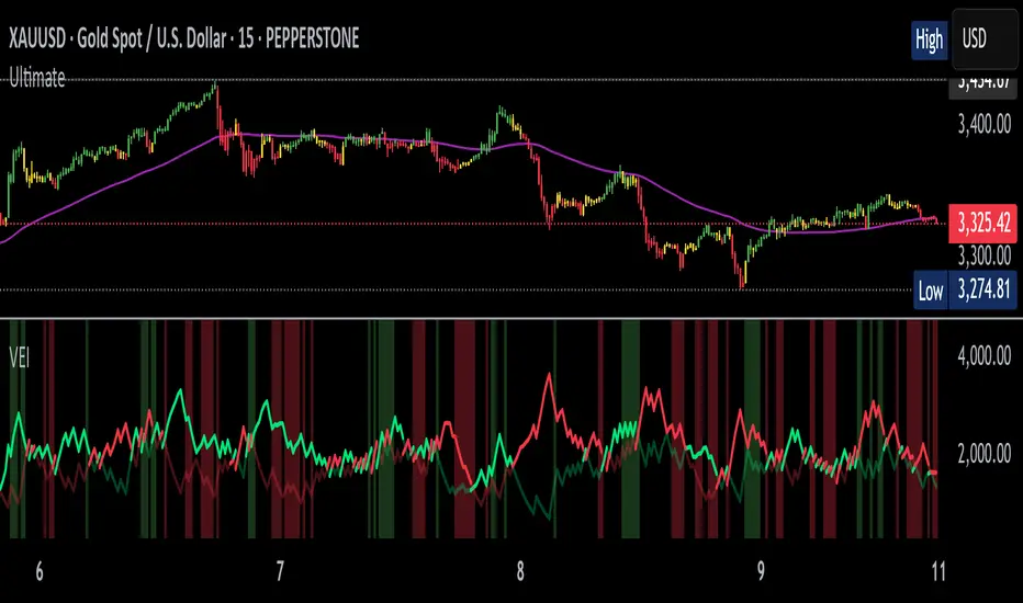
Volumetric Entropy IndexVolumetric Entropy Index (VEI)
A volume-based drift analyzer that captures directional pressure, trend agreement, and entropy structure using smoothed volume flows.
---
🧠 What It Does:
• Volume Drift EMAs : Shows buy/sell pressure momentum with adaptive smoothing.
• Dynamic Bands : Bollinger-style volatility wrappers react to expanding/contracting drift.
• Baseline Envelope : Clean structural white rails for mean-reversion zones or trend momentum.
• Background Shading : Highlights when both sides (up & down drift) are in agreement — green for bullish, red for bearish.
• Alerts Included : Drift alignment, crossover events, net drift shifts, and strength spikes.
---
🔍 What Makes It Different:
• Most volume indicators rely on bars, oscillators, or OBV-style accumulation — this doesn’t.
• It compares directional EMAs of raw volume to isolate real-time bias and acceleration.
• It visualizes the twisting tension between volume forces — not just price reaction.
• Designed to show when volatility is building inside the volume mechanics before price follows.
• Modular — every element is optional, so you can run it lean or fully loaded.
---
📊 How to Use It:
• Drift EMAs : Watch for one side consistently dominating — sharp spikes often precede breakouts.
• Bands : When they tighten and start expanding, it often signals directional momentum forming.
• Envelope Lines : Use as high-probability reversal or continuation zones. Bands crossing envelopes = potential thrust.
• Background Color : Green/red backgrounds confirm volume agreement. Can be used as a filter for other signals.
• Net Drift : Optional smoothed oscillator showing the difference between bullish and bearish volume pressure. Crosses above or below zero signal directional bias shifts.
• Drift Strength : Measures pressure buildup — spikes often correlate with large moves.
---
⚙️ Full Customization:
• Turn every layer on/off independently
• Modify all colors, transparencies, and line widths
• Adjust band width multiplier and envelope offset (%)
• Toggle bonus plots like drift strength and net baseline
---
🧪 Experimental Tools:
• Smoothed Net Drift trace
• Drift Strength signal
• Envelope lines and dynamic entropy bands with adjustable math
---
Built for signal refinement. Made to expose directional imbalance before the herd sees it.
Created by @Sherlock_Macgyver
Koncorde Simplificado🔍 KONKORDE Indicator – Smart Volume Analysis
It detects activity from smart money (institutions) and retail traders, combining volume, trend, and oscillators to highlight accumulation, distribution, and potential market traps.
📊 Perfect for traders looking to confirm entries or exits using volume behavior and smart money movement.
✅ Features:
Visual detection of institutional buying/selling.
Retail trader activity tracking.
Noise filtering with smooth signal processing.
Works across all timeframes.
⚠️ Reminder: No indicator guarantees results. Use it as a supporting tool within a well-defined strategy.
💬 If you find it useful, leave a comment or share it!
🔍 Indicador KONKORDE – Análisis de Volumen Inteligente
Detecta la actividad de las manos fuertes (institucionales) y las manos débiles (retail) combinando volumen, tendencia y osciladores para identificar zonas de acumulación, distribución y posibles engaños del mercado.
📊 Ideal para traders que buscan confirmar entradas o salidas basándose en la acción del volumen y el comportamiento del dinero inteligente.
✅ Funciones:
Detección visual de compras/ventas institucionales.
Comportamiento de minoristas (retail).
Filtrado de ruido con suavizado inteligente.
Compatible con cualquier marco temporal.
⚠️ Recuerda: ningún indicador garantiza resultados. Úsalo como complemento dentro de una estrategia bien definida.
💬 Si te resulta útil, ¡déjame un comentario o compártelo!

Money Flow Index with MAsMoney Flow Index (MFI) indicator with configurable Fast MA Length (default 2) and Slow MA Length (default 7). Both MAs are plotted on top of the MFI line, and you can change their lengths from the settings panel.
Crossovers can be used as 'BUY' & 'SELL' conditions with structural analysis.
Cheers..
