Arbitrage Detector [LuxAlgo]The Arbitrage Detector unveils hidden spreads in the crypto and forex markets. It compares the same asset on the main crypto exchanges and forex brokers and displays both prices and volumes on a dashboard, as well as the maximum spread detected on a histogram divided by four user-selected percentiles. This allows traders to detect unusual, high, typical, or low spreads.
This highly customizable tool features automatic source selection (crypto or forex) based on the asset in the chart, as well as current and historical spread detection. It also features a dashboard with sortable columns and a historical histogram with percentiles and different smoothing options.
🔶 USAGE
Arbitrage is the practice of taking advantage of price differences for the same asset across different markets. Arbitrage traders look for these discrepancies to profit from buying where it’s cheaper and selling where it’s more expensive to capture the spread.
For begginers this tool is an easy way to understand how prices can vary between markets, helping you avoid trading at a disadvantage.
For advanced traders it is a fast tool to spot arbitrage opportunities or inefficiencies that can be exploited for profit.
Arbitrage opportunities are often short‑lived, but they can be highly profitable. By showing you where spreads exist, this tool helps traders:
Understand market inefficiencies
Avoid trading at unfavorable prices
Identify potential profit opportunities across exchanges
As we can see in the image, the tool consists of two main graphics: a dashboard on the main chart and a histogram in the pane below.
Both are useful for understanding the behavior of the same asset on different crypto exchanges or forex brokers.
The tool's main goal is to detect and categorize spread activity across the major crypto and forex sources. The comparison uses data from up to 19 crypto exchanges and 13 forex brokers.
🔹 Forex or Crypto
The tool selects the appropriate sources (crypto exchanges or forex brokers) based on the asset in the chart. Traders can choose which one to use.
The image shows the prices and volumes for Bitcoin and the euro across the main sources, sorted by descending average price over the last 20 days.
🔹 Dashboard
The dashboard displays a list of all sources with four main columns: last price, average price, volume, and total volume.
All four columns can be sorted in ascending or descending order, or left unsorted. A background gradient color is displayed for the sorted column.
Price and volume delta information between the chart asset and each exchange can be enabled or disabled from the settings panel.
🔹 Histogram
The histogram is excellent for visualizing historical values and comparing them with the asset price.
In this case, we have the Euro/U.S. Dollar daily chart. As we can see, the unusual spread activity detected since 2016, with values at or above 98%, is usually a good indication of increased trader activity, which may result in a key price area where the market could turn around.
By default, the histogram has the gradient and smoothing auto features enabled.
The differences are visible in the chart above. On top is an adaptive moving average with higher values for unusual activity. At the bottom is an exponential moving average with a length of 9.
The differences between the gradient and solid colors are evident. In the first case, the colors are in sync with the data values, becoming more yellow with higher values and more green with lower values. In the second case, the colors are solid and only distinguish data above or below the defined percentiles.
🔶 SETTINGS
Sources: Choose between crypto exchanges, forex brokers, or automatic selection based on the asset in the chart.
Average Length: Select the length for the price and volume averages.
🔹 Percentiles
Percentile Length: Select the length for the percentile calculation, or enable the use of the full dataset. Enabling this option may result in runtime errors due to exceeding the allotted resources.
Unusual % >: Select the unusual percentile.
High % >: Select the high percentile.
Typical % >: Select the typical percentile.
🔹 Dashboard
Dashboard: Enable or disable the dashboard.
Sorting: Select the sorting column and direction.
Position: Select the dashboard location.
Size: Select the dashboard size.
Price Delta: Show the price difference between each exchange and the asset on the chart.
Volume Delta: Show the volume difference between each exchange and the asset on the chart.
🔹 Style
Unusual: Enable the plot of the unusual percentile and select its color.
High: Enable the plot of the high percentile and select its color.
Typical: Enable the plot of the typical percentile and select its color.
Low: Select the color for the low percentile.
Percentiles Auto Color: Enable auto color for all plotted percentiles.
Histogram Gradient: Enable the gradient color for the histogram.
Histogram Smoothing: Select the length of the EMA smoothing for the histogram or enable the Auto feature. The Auto feature uses an adaptive moving average with the data percent rank as the efficiency ratio.
Análise de Tendência

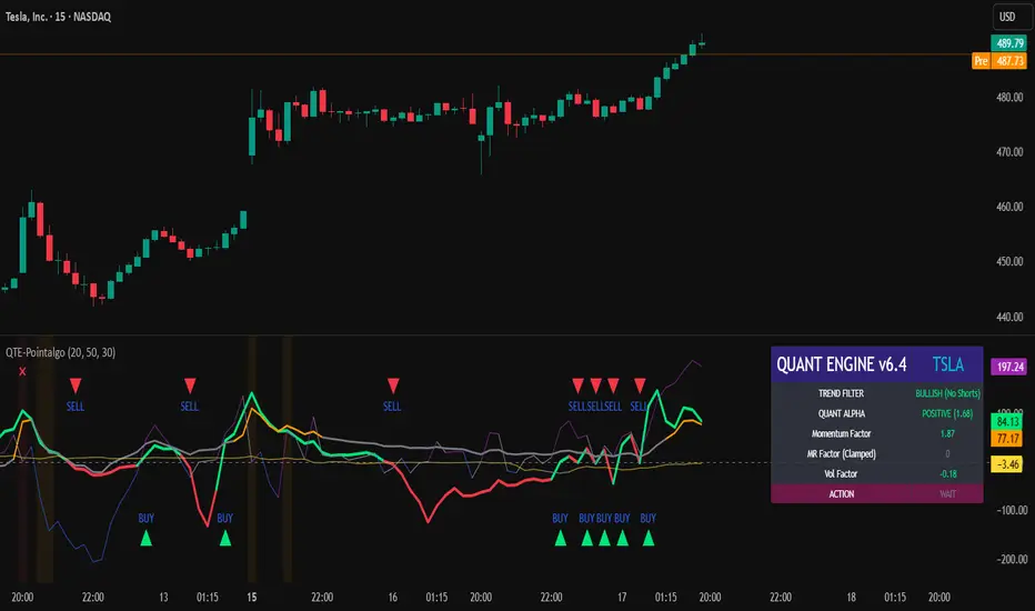
QUANT TRADING ENGINE [PointAlgo]Quant Trading Engine is a quantitative market-analysis indicator that combines multiple statistical factors to study trend behavior, mean reversion, volatility, execution efficiency, and market stability.
The indicator converts raw price behavior into standardized signals to help evaluate directional bias and risk conditions in a systematic way.
This script focuses on factor alignment and regime awareness, not prediction certainty.
Design Philosophy
Markets move through different regimes such as trending, ranging, volatile expansion, and instability.
This indicator attempts to model these regimes by blending:
Momentum strength
Mean-reversion pressure
Volatility risk
Trend filtering
Execution context (VWAP)
Correlation structure
Each component is normalized and combined into a single Quant Alpha framework.
Factor Construction
1. Momentum Factor
Measures directional strength using percentage price change over a rolling window.
Standardized using mean and standard deviation.
Represents trend continuation pressure.
2. Mean Reversion Factor
Measures deviation from a longer moving average.
Standardized to identify stretched conditions.
Designed to capture counter-trend behavior.
Directional Clamping
Mean-reversion signals are dynamically restricted:
No counter-trend buying during downtrends.
No counter-trend selling during uptrends.
Allows both sides only in neutral regimes.
This prevents conflicting signals in strong trends.
3. Volatility Factor
Uses realized volatility derived from price changes.
Penalizes environments where volatility deviates significantly from its norm.
Acts as a risk adjustment rather than a directional driver.
4. Composite Quant Alpha
The final Quant Alpha is a weighted blend of:
Momentum
Mean reversion (trend-clamped)
Volatility risk
The composite is standardized into a Z-score, allowing consistent interpretation across instruments and timeframes.
Signal Logic
Buy signal occurs when Quant Alpha crosses above zero.
Sell signal occurs when Quant Alpha crosses below zero.
Zero-cross logic is used to represent shifts from negative to positive statistical bias and vice versa.
Signals reflect statistical regime change, not trade instructions.
Volatility Smile Context
Measures price deviation from its statistical distribution.
Identifies skewed conditions where upside or downside volatility becomes dominant.
Highlights extreme deviations that may imply elevated derivative risk.
Exotic Risk Conditions
Detects sudden price expansion combined with volatility spikes.
Highlights environments where execution and risk become unstable.
Visual background cues are used for awareness only.
Execution Context (VWAP)
Measures price distance from VWAP.
Used to assess execution efficiency rather than direction.
Helps identify stretched conditions relative to average traded price.
Correlation Structure
Evaluates short-term return correlations.
Detects when price behavior becomes less predictable.
Flags structural instability rather than trend direction.
Visualization
The indicator plots:
Quant Alpha (scaled) with directional coloring
Volatility smile deviation
Price vs VWAP distance
Correlation structure
Signal markers indicate Quant Alpha zero-cross events and risk conditions.
Dashboard
A compact dashboard summarizes:
Trend filter state
Quant Alpha polarity and value
Individual factor readings
Current action state (Buy / Sell / Wait / Risk)
The dashboard provides a real-time snapshot of internal model conditions.
Usage Notes
Designed for analytical interpretation and research.
Best used alongside price action and risk management tools.
Factor behavior depends on instrument liquidity and volatility.
Not optimized for illiquid or irregular markets.
Disclaimer
This script is provided for educational and analytical purposes only.
It does not provide financial, investment, or trading advice.
All outputs should be independently validated before making any trading decisions.
Options SL/TP Price Projection Sim + Day Trading/Scalping Toolwww.tradingview.com
📌 What this indicator does
This indicator projects what your option contract will be worth when the stock reaches your Stop Loss or Take Profit — before price gets there.
Instead of guessing:
“How much will this option be worth if price hits my stop?”
“Is this move actually worth the risk in option dollars?”
You get instant, realistic option price estimates at your exact stock levels.
⚙️ How it works (simple but powerful)
The script uses a local delta + gamma approximation to estimate option price changes:
Delta → linear price sensitivity
Gamma → curvature for fast moves
Optional execution friction → realistic fills
Automatic Call / Put detection via delta sign
Enforced $0.01 minimum option price (real market behavior)
This is not a slow academic options model — it’s a trader-grade approximation designed for speed and clarity.
🚀 Designed specifically for DAY TRADING
This tool is optimized for:
Options scalping
Momentum trades
Breakouts & flushes
0DTE / weekly options
Holding times ~3–15 minutes
Why it excels here:
Delta + gamma dominate option pricing on fast moves
IV and theta usually don’t have time to fully reprice
You get actionable numbers, not theoretical noise
This is exactly the environment most option day traders operate in.
🧠 Key Features
✅ Projects option price at BOTH SL and TP
✅ Works for calls & puts automatically
✅ Enter any two stock levels — script assigns SL/TP correctly
✅ Clean, black HUD table (no clutter, no moving drawings)
✅ Non-draggable, stable price levels
✅ Minimal inputs — no overengineering
✅ Built for speed under pressure
🎯 Why this is effective
Most traders manage risk in stock points , but trade options .
This indicator bridges that gap.
It lets you:
Judge true risk/reward in option dollars
Avoid “looks good on the chart, bad on the premium”
Compare setups objectively
Size trades more intelligently
Make faster, more confident decisions
It’s especially useful when spreads, gamma, and fast tape make intuition unreliable.
🧼 Philosophy: Clean > Complicated
This script intentionally avoids:
Full Black-Scholes modeling
IV forecasting
Overloaded settings
Visual clutter
Instead, it focuses on what matters for day traders:
“If price gets here quickly, what should my option be worth?”
⚠️ Important Notes
Best accuracy for fast, clean moves
Not intended for multi-hour holds or swing trading
Assumes relatively stable IV over short horizons
Execution friction is configurable to match real fills
Used correctly, this becomes a powerful decision-support tool, not a prediction engine.
✅ Who this indicator is for
Options day traders
Scalpers
Momentum traders
Anyone trading options off stock price levels
If you trade options intraday and manage risk using stock levels, this tool was built exactly for you.

Dolar MEP Implicito de CEDEARs y ADRs**Implicit USD Exchange Rate from CEDEARs and ADRs**
This indicator calculates the implicit ARS/USD exchange rate using CEDEAR pairs traded on the Argentine stock exchange (BYMA). It compares the ARS price of a CEDEAR against its USD MEP version (D-suffix ticker) to derive the implicit dollar rate.
**How it works:**
Divide the ARS ticker price by the D-suffix ticker price. Example: AAPL / AAPLD = Implicit rate.
**Features:**
• Top 10 CEDEARs ranked by 30-day average volume
• AL30/AL30D bond benchmark as white reference line
• Filter: Top 5, Top 10, or All
• Custom ticker input field
• Info box with best buy and best sell rates
• Colored labels for each ticker
**Default Tickers:** PAMP, GGAL, AMZN, IBIT, GOOGL, NVDA, MELI, VIST, NFLX, GLD
**Usage:** Apply to any chart. Works independently of chart symbol.
**Disclaimer:** For informational and educational purposes only. Eco Valores S.A. does NOT provide investment advice. Consult a qualified financial advisor before investing.
Eco Valores S.A. - ALyC 109/CNV

50-Point Psych Levels (Multiples of 50)50-Point Psychological Levels (Multiples of 50)
This indicator plots static psychological price levels at fixed point intervals (default every 50 points) across the chart. These levels are commonly watched by traders as natural areas of reaction, balance, support, and resistance, especially on index futures such as NQ, ES, YM, and RTY.
The script automatically centers the levels around the current market price and draws them across a configurable range above and below price. All levels extend across the entire chart and are drawn once only, keeping the display clean and preventing redraw lag.
Key Features
Plots horizontal levels at fixed point spacing (default: 50 points)
Automatically anchors around the latest price
Configurable range above and below price
Customizable line color, width, and style
Lightweight, non-repainting, static reference levels
Best Use Cases
Identifying psychological support and resistance
Confluence with VWAP, EMA structure, ORB levels, and volume
Futures trading (NQ, ES, YM, RTY), indexes, and large-tick instruments

USD Liquidity Regime for BTC Perps (Dual) V1USD Liquidity Regime for BTC Perps (Dual)
This intents to be a BTC Perps USD Liquidity Regime macro indicator.
As it names states it is designed for BTCUSDT perpetual futures traders.
It attempts to tracks USD strength (DXY, UUP, yields, VIX composite) as liquidity proxy:
Lower index = weak USD = Risk-On (green background/histogram = long tailwind for BTC).
Higher = strong USD = Risk-Off (red = caution longs, shorts favor).
How to use:
Green background/histogram: Favor longs — rallies likely, dips bought.
Red: Caution longs — corrections hurt, short bias possible.
Blue line (index) vs red SMA: Crosses signal regime shifts.
Histogram strength: Bigger bars = stronger bias.
This is not intended as financial advise or trigger signal tool.
This is a work in progress
Its value is limited, if you do not understand any or some of the words above please do not use this indicator. If you did, then you understand you are not supposed to use this alone to make decisions.
Feel free to ask any questions, this is a work in progress.
Feel free to suggest improvements.
Educational macro context tool — not signals/advice.
Ok for avoiding going against the USD trend dominance by following liquidity.
By @frank_vergaram

RSI For Loop | PWRSI For Loop – True Dominance Oscillator
RSI For Loop – True Momentum Dominance Through Historical Comparison
The Relative Strength Index (RSI) is excellent at measuring recent price change intensity, but a reading of 70 or 30 has completely different implications depending on the market regime. RSI For Loop removes this ambiguity by transforming RSI into a clean, zero-centered dominance / percentile-rank oscillator that always tells you exactly how strong or weak the current momentum is compared to recent history.
How it works
- Standard RSI is calculated normally (default length 46).
- A simple for-loop compares the current RSI value against the actual RSI value of every previous bar inside the user-defined lookback window (default 1 to 99 bars ≈ one full quarter on daily charts).
- Current RSI higher → +1 point
- Current RSI lower → –1 point
The resulting score ranges from –99 to +99 and is naturally centered around zero:
1. +40 = current momentum beats ~70 % of the last 99 bars (approximation)
2. –60 = current momentum is weaker than ~80 % of the last 99 bars (approximation)
3. Near zero = balanced or ranging market
Additional statistical layers
- A very long rolling median of the score (default 240 periods) serves as a slow, robust dynamic centerline
- Upper and lower 3σ bands are calculated from the standard deviation of the underlying RSI median (default length 60) to highlight truly rare extreme-dominance phases
- Asymmetric trend thresholds (default Long +15 / Short –28) reflect the empirical observation that downside momentum is usually sharper and faster
Origin and development
The core idea of using a for-loop on RSI was originally introduced by @viResearch in his invite-only “RSI For Loop” script.
While studying that concept I realised I needed an even more regime-robust strength gauge that looks back far enough to capture full market cycles (2–4 months). Therefore I completely rewrote the loop to compare against actual historical RSI values instead of fixed levels, added a 240-period median centerline, 3σ extreme bands, asymmetric thresholds, and visual signals. All parameters were extensively tested across dozens of major assets (BTC, ETH, SOL, SUI, BNB, XRP, TRX, DOGE, LINK, PAXG, CVX, HYPE, VIRTUAL + 20+ more cryptos; Magnificent 7 stocks, QQQ, SPX, XAUUSD) with the goal of achieving consistent profitability, high Sortino ratio and low drawdown in simple trend-following setups.
The final defaults represent the most robust compromise found — they keep you in real trends for dozens or hundreds of bars while staying almost silent in choppy, ranging markets.
Important Note
The optimization process is tailored to MY needs and have to be adjusted to you prefered timeframe!
I was mainly looking for an indicator that shows the underlying strength of an asset, the trend componant was only a bonus in my eyes.
How to use it
1. Green triangle below bar → score crosses above +15 → new bullish regime confirmed → enter or add to longs
2. Magenta triangle above bar → score crosses below –28 → exit longs or go cash/short
While score stays clearly positive → bullish bias hold
3. Score touching or breaking the 3σ bands → extreme conviction zone (add to winners or prepare for exhaustion)
Strength
Recommended defaults (My preference)
RSI length 46
Loop range 1–99
Long threshold +15
Short threshold –28
Median length 240
SD length 60
Recommended Universal Settings (Tested for low Max-Drawdown, high Sortino)
RSI length 44
Loop range 1–60
Long threshold +14
Short threshold –10
Median length 180
SD length 28
Works on every asset class, but the current settings are tuned for major liquid markets.
Disclaimer: This is not financial advice. Backtests are based on past results and are not indicative of future performance.

SMC Academy [PhenLabs]📊 SMC Academy
Version: PineScript™ v6
📌 Description
The SMC Academy indicator is a comprehensive educational tool designed to demystify Smart Money Concepts (SMC) for traders of all levels. Unlike standard indicators that simply print signals, this script uses a “Learning Phase” system that allows users to toggle between individual concepts—such as Market Structure, Liquidity, Imbalances, and Order Blocks—or view them all simultaneously. It lets you focus on one piece of the puzzle at a time.
🚀 Points of Innovation
Progressive Learning Modes: Toggle between 5 distinct phases to master concepts individually before using the Full Strategy Mode.
Educational Tooltips: Hover over labels to read detailed explanations of why a BOS, MSS, or Liquidity zone was identified.
Smart Filtering: Uses ATR and Volume integration to filter out low-quality Fair Value Gaps and weak Order Blocks.
HTF Dashboard: A built-in panel analyzes Higher Timeframe (4H) data to ensure you are trading in alignment with the broader trend.
🔧 Core Components
Market Structure Engine: Automatically detects Swing Highs and Lows to map out market direction using configurable swing lengths.
Liquidity Manager: Identifies unmitigated swing points that serve as Buy-Side (BSL) and Sell-Side (SSL) liquidity magnets.
Imbalance Detector: Highlights Fair Value Gaps (FVG) where price inefficiencies exist, using ATR thresholds to ignore noise.
Order Block Identifier: Locates the specific candles responsible for structure breaks, validated by volume analysis.
🔥 Key Features
Break of Structure (BOS): Automatically marks trend continuation signals with solid lines and color-coded labels.
Market Structure Shift (MSS): Identifies potential trend reversals when significant swing points are breached.
Dashboard Context: Displays the current trend direction and the 4H context directly on your chart.
Custom Alerts: Built-in alert conditions for structure breaks and new Order Blocks allow for automated tracking.
🎨 Visualization
Structure Lines: Solid lines indicate confirmed breaks (Green for Bullish, Red for Bearish).
Liquidity Zones: Dotted lines extending rightward indicate resting liquidity levels that price may target.
FVG Boxes: Shaded boxes highlight imbalance zones, automatically extending for a user-defined number of bars.
Dashboard: A clean, non-intrusive table in the top-right corner displays trend status and active mode.
📖 Usage Guidelines
Setting Categories
Learning Mode: Select from ‘1. Market Structure’ through ‘5. Full Strategy Mode’ to filter what appears on the chart.
Swing Detection Length: Default (5). Determines the sensitivity of the swing high/low detection.
Structure Break Type: Options (Close/Wick). Choose whether a candle close or just a wick is required to confirm a break.
Min FVG Size: Default (0.5 ATR). Filters out gaps smaller than this multiplier to reduce noise.
Filter Weak OBs by Volume: Default (True). Only highlights Order Blocks where volume exceeds the 20-period average.
✅ Best Use Cases
Educational Study: Isolate “Phase 1: Market Structure” to practice identifying trend changes without distraction.
Trend Following: Use “Phase 3: Imbalances” to find entry points within an established trend.
Reversal Trading: Combine “Phase 2: Liquidity” and “Phase 4: Order Blocks” to catch reversals at key levels.
⚠️ Limitations
Subjectivity: Market structure can be interpreted differently depending on the swing length settings used.
Ranging Markets: Like all trend-following concepts, false BOS/MSS signals may generate during choppy, sideways price action.
Repainting: While the signals are non-repainting once confirmed, the live candle may flash a signal before the close if “Close” mode is selected.
💡 What Makes This Unique
Interactive Learning: The inclusion of tooltip explanations transforms this from a simple tool into an active mentor.
Phase-Based Workflow: The ability to strip the chart back to basics at the click of a button is unique to the PhenLabs ecosystem.
🔬 How It Works
Swing Analysis: The script calculates pivot highs and lows based on your length input to define the structural landscape.
Break Validation: It checks if price crosses these pivot points to trigger BOS (Continuation) or MSS (Reversal) logic.
Volume Confirmation: For Order Blocks, it looks back inside the swing leg to find the specific candle responsible for the move, verifying it has significant volume.
💡 Note:
For the best experience, start in Phase 1 to calibrate your Swing Detection Length to the specific volatility of the asset you are trading before enabling Full Strategy Mode.

RS High Beta Exposure | QuantLapseRS High Beta Exposure | QuantLapse
Conceptual Foundation and Innovation
The RS High Beta Exposure indicator from QuantLapse is a comprehensive multi-asset allocation and momentum-ranking system that integrates beta and trend analysis, pairwise relative strength comparison, and volatility-adjusted filtering.
Its objective is to identify dominant crypto assets while dynamically reallocating High Beta exposure based on a calculated relative strength. The objective is to integrate trend analysis along with volatility filtering to these pairs to determine its relative strength.
At its core, RS High Beta Exposure indicator measures the systematic (β) performance of each asset relative to other assets provided combining these measures with inter-asset ratio trends to determine which assets exhibit superior strength and momentum relative to the other assets.
This integration of relative strength comparison, and trend and filtering analysis represents a quantitative evolution of traditional relative strength analysis, designed for adaptive asset rotation across major cryptocurrencies.
Technical Composition and Calculation
The indicator is structured around three major analytical layers:
1. Beta and Alpha Analysis
-Each asset’s return is decomposed into systematic components relative to the other assets by using a trend based, volatility filtering model.
-Assets with the highest point on a relative strength basis above the median are considered outperformers and eligible for allocation.
2. Pairwise Ratio Momentum
-Every asset is compared against all others through a ratio-trend, where momentum based trend scores quantify the directional momentum between each pair.
-In addition, we filter any false signals with volatility adjusted trends in which ensure high quality signals.
3. High Confidence Ranking
-Using the Pairwise Momentum signals, the RS High Beta Exposure scores them. If the asset comparison is given a signal, the RS High Beta Exposure scores points for each asset.
-If the total points of an asset is 5, its given the rank the dominant asset and is most likely to outperform.
By combining these layers, RS High Beta Exposure determines not only which assets is the strongest but also which assets to be invested.
User Inputs and Feature Adaptability
The indicator includes set of customizable parameters to support portfolio and risk management preferences:
Start Date Filter – Defines the beginning of live strategy evaluation.
Display Options – Able to change the location of the RS Table, Background and equity color.
Asset Selection – Modify or replace up to six crypto assets in the ranking matrix
asset1 = input.symbol("CRYPTO:XRPUSD", title ="Asset 1")
asset2 = input.symbol("CRYPTO:BNBUSD", title ="Asset 2")
asset3 = input.symbol("CRYPTO:ADAUSD", title ="Asset 3")
asset4 = input.symbol("CRYPTO:DOGEUSD", title ="Asset 4")
asset5 = input.symbol("CRYPTO:XLMUSD", title ="Asset 5")
asset6 = input.symbol("CRYPTO:LINKUSD", title ="Asset 6")
Each module operates cohesively to maintain analytical transparency while allowing user-level control over system sensitivity and behavior.
Real World, Practical Applications
The RS High Beta Exposure indicator is designed for systematic traders and quantitative portfolio managers who seek a disciplined framework for dynamic crypto asset rotation.
Key applications include:
High-Beta Asset Identification: Systematically identify crypto assets exhibiting relative dominance and stronger momentum characteristics versus peers within the comparison set.
Rule-Based Portfolio Rotation: Reallocate exposure toward leading assets using objective pairwise signals, reducing emotional decision-making and FOMO-driven trades.
Trend-Aligned Risk Participation: Employ the pairwise relative strength model to maintain exposure only during favorable momentum conditions, helping avoid prolonged participation in weak or deteriorating trends.
By combining relative strength comparisons with trend-aware filtering, this framework bridges quantitative finance and market regime analysis, providing a structured, data-driven approach to crypto asset allocation.
Advantages and Strategic Value
RS High Beta Exposure goes beyond conventional relative strength tools by integrating multi-asset comparison, ratio-based dominance scoring, and volatility-aware regime filtering into a single coherent framework.
By employing a three-layer confluence model — combining trend integrity, relative performance attribution, and volatility-state confirmation — the system improves the reliability of rotation and trend-following decisions.
The model is particularly valuable for traders seeking to:
Mitigate drawdowns while participating in higher-beta assets through regime-aware exposure control.
Identify persistent outperformers early in emerging market trends.
Maintain capital exposure only when statistical and momentum conditions signal elevated confidence.
The inclusion of visual allocation tables and a dynamic alert system makes RS High Beta Exposure both transparent and actionable, supporting discretionary analysis as well as systematic or automated trading workflows.
Alerts and Visualization
The script delivers clear, intuitive visual cues and alert-based feedback to support real-time decision-making:
Color-coded background states visually indicate the current allocation regime.
Allocation labels and summary tables display the dominant asset and its relative strength in real time.
An integrated alert system automatically notifies users whenever allocation states change (e.g., “100% XRP” or “100% CASH”).
Together, these visualization and alert features make RS High Beta Exposure both analytically rigorous and easy to interpret, even in fast-moving live market conditions.
Summary and Usage Tips
RS High Beta Exposure is an advanced interpretation of relative strength analysis, blending pairwise momentum comparisons, multi-asset dominance scoring, and adaptive volatility filters into a disciplined framework for crypto asset rotation.
By combining cross-asset selection with systematic allocation logic, the indicator helps traders determine when to be exposed, which asset demonstrates leadership, and when to step aside during unfavorable conditions. The model is best applied on the 1D timeframe, where its structure is optimized for identifying sustained leadership rather than short-term price noise. For broader context and confirmation, it can be used alongside other QuantLapse systematic models at the portfolio level.
Note: Past performance does not guarantee future results. This indicator is intended for research and educational use within TradingView.

Intermarket SSMT Table [Pogiest]General
Intermarket Sequential Smart Money Technique (IMSSMT) is a Quarterly Theory concept that identifies divergences (extreme highs/lows) when comparing different market triads to another market triad in two consecutive quarters.
SSMT involves identifying divergences in a correlated asset triad that occurs consecutively from the previous quarter to the current quarter to predict new phases of price, a shift in market sentiment, and also potential trend reversals. An SSMT divergence occurs when one or two assets makes a new high or low, but the other asset or assets does not, signaling a potential shift in market direction. A Hidden SSMT Divergence occurs when one or two assets’ closing price closes higher or lower than the other one or two assets’ closing price. However, with potential gaps in price, an opening price can also be the extreme when comparing assets for divergences. Hidden SSMT divergence compares the candle bodies while a Standard SSMT divergence compares the highs and lows. Both types of SSMTs are considered to be cracks in correlation and can be used to identify potential new phases of price whether it be a reversal, retracement, consolidation, and continuation.
Credit of concepts/ideas: ICT & TraderDaye
What Makes This Indicator Unique
The indicator table is designed to be used on any symbol the trader is viewing. For example, the indicator is shown on an NQ chart while selecting three symbols in the Forex triad in settings. The indicator will request the separate data from the symbols selected and display the data within the table. The table does not rely on data on the chart being viewed. Instead of switching charts, the table is used to track other market triads for SSMTs (standard & hidden) while viewing other markets simultaneously.
The indicator has the ability to display Standard SSMTs, Hidden SSMTs, or both simultaneously in real-time, tick by tick in the time period selected in a correlated asset triad within the table. Toggle modes for each type of SSMT will run independently (runs when enabled) and therefore, optimizes performance. The user is able to select three different tickers in settings instead of limiting to pairs. In addition, the indicator has “Invert” toggle options to track both Standard and Hidden SSMTs for assets with negative correlations.
How the Indicator Table Works
The indicator functions to track any divergences from the previous quarter to the current quarter. In addition, the indicator tracks the current status even when there are no divergences (see phase column below).
Timeframe Column:
1. Displays up to two different timeframes to monitor.
Asset Columns:
1. Display up to three different assets to monitor.
2. Cells display “Bull” in green background color or “Bear” in red background color showing the current state of each candle and updates in real-time tick by tick.
Phase Column:
Displays the current status from the previous quarter to the current quarter. The status updates in real-time tick by tick.
1. “F/S” indicates there are no current SSMT divergences between the previous quarter to the current quarter and all assets have not swept the previous quarter, a “failure swing”.
2. “HH” is displayed when all assets have swept the previous quarter’s extreme high. (Higher High)
3. “LL” is displayed when all assets have swept the previous quarter’s extreme low. (Lower Low) See screenshot with drawings below.
4. SSMT indicates there is an SSMT from the previous quarter to the current quarter. Red background is a bearish SSMT (divergence at the highs) or green background is a bullish SSMT (divergence at the lows). If the SSMT becomes invalid (i.e. the last asset sweeps the extreme high/low), then the table will update to display either “HH” or “LL” depending on the extreme it swept. See screenshot with drawings below.
5. “Both” indicates there are SSMT divergences at both the extremes highs and lows. If an SSMT on one side gets deleted, then the cell will automatically update to display the SSMT that is still intact. See screenshot with drawings below.
Invert Toggle Option:
When this setting is turned on, the asset column cells will display the inverted color of the live chart to show assets are in-sync. It will track the inverted swing points for SSMTs, higher highs, lower lows, etc. For example, if EUR and GBP are making lower highs, while DXY (Inverted toggle on), makes a lower low on the actual live chart, it will display “SSMT”.
NOTE:
Scanning function per timeframe to detect SSMTs:
Weekly HTF: Scans 4HR bars
Daily HTF: Scans 1HR bars
6HR/4HR HTF: Scans 15m bars
1HR HTF: Scans 5m bars
5m HTF: Scans 1m bars
The script has fixed lookback periods for bars to ensure the appropriate data is being captured. The higher the timeframe the user selects in settings while viewing on an extremely lower timeframe, the indicator may give inaccurate readings:
Recommended Chart Timeframes:
For best performance and accuracy, view your chart on a timeframe close to or lower than the scan timeframe:
Weekly HTF → View on 1H-4H chart
Daily HTF → View on 1H-4H chart
6HR/4HR HTF → View on 5m-15m chart
90M HTF → View on 3m-15m chart
1H HTF → View on 1m-15m chart
The indicator will attempt to scan further back if needed, but extremely low chart timeframes (e.g., 1m) with high HTF (e.g., Weekly) may still have limitations.
In addition, the indicator bases the SSMT off the previous quarter’s time range to the current quarter’s time range. If there are discrepancies in the time ranges (start to end of higher timeframe period selected), the SSMTs may display differently than what is viewed on the chart. For example, indices open at 18:00 est on a new trading day, so the time ranges matches throughout the day. However, in Forex, EUR and GBP opens at 17:00 est while DXY opens later, so the time ranges may be off (i.e. 6 hour timeframe). For best use, select time periods that matches throughout the day.
Usage
Traders can use both types of SSMT divergences to anticipate potential reversals in points of interest such as higher timeframe swing points, supply/demand zones, higher timeframe imbalances, key levels, etc. This indicator can also be beneficial in identifying cracks in correlation via Hidden SSMT when there are no divergences off the highs and lows. Divergences can come in different forms relating to Intermarket SSMT. For example, if one market triad is all making lower lows while the other market triad is making higher highs, this can be deemed a divergence between the two markets. Another example would be one market triad all makes lower lows while another market triad makes a bullish SSMT. This can potentially signal a bullish move up. SSMT divergences (standard and hidden) can be used as a confirmation tool with other confluences to identify trend direction with respect to points of interest, higher timeframe order-flow, lower timeframe order-flow, etc. In addition, having both a Standard SSMT and Hidden SSMT divergence display could potentially signal a reversal. It is up to the trader to gauge the price action at the time.
Settings
1. Choose up to three different assets to monitor.
Note: If only two are selected, the indicator will only display the two selected and compare the two assets for divergences. If one is selected, a warning sign will be displayed to select at least two assets.
2. Choose up to two different timeframes. Option to deselect timeframes.
3. Enable/disable standard or hidden SSMT.
4. Option to enable alerts. Alerts include the different phases in the table (i.e. SSMT, HH, LL, and Dual SSMT [both standard & hidden) for each timeframe.
5. Toggle option to show/hide the table. Toggle option to show/hide the “Title Row” which is the first row at the top of the table.
6. Adjust the table positioning to be displayed on the chart.
7. Option to change text size in the table cells. This will also increase/decrease the size of the table.
Risk Disclaimer
This indicator is for educational and informational purposes only and does not constitute financial advice. All trading and investment decisions remain solely the responsibility of the user.
Trading involves a high degree of risk, and past performance is not indicative of future results.
Always conduct your own research and consult with a qualified financial professional before making any trading decisions.
By using this indicator, users acknowledge they understand these risks and accept full responsibility for their trading decisions and outcomes.

Advance SMC (Milad Tayefi)Smart money indicator which recognizes market structure and produces buy/sell signals.

Trend + Liquidity Master Trend & Liquidity Master
A Professional All-in-One Trading System combining Dynamic Trend Analysis with Smart Money Liquidity Zones
---
## 🎯 Overview
The Trend & Liquidity Master is a comprehensive trading indicator that merges institutional-grade trend detection with smart money liquidity mapping. Designed for traders who want to align with market structure while identifying high-probability entry zones, this system provides clear visual signals backed by multi-layered confirmation filters.
## ⚡ Core Features
### 📊 **Adaptive Trend Cloud**
- Multi-Algorithm Support: Choose between EMA, SMA, HMA, or RMA for trend calculation
- Volatility-Based Bands: Dynamic ATR bands that expand/contract with market conditions
- Anti-Chop Filter: Maintains trend state during consolidation to reduce false signals
- Visual Clarity: Color-coded cloud system (Green = Bullish, Red = Bearish - customisable)
### 🧱 **Smart Liquidity Zones**
- Supply & Demand Boxes: Automatically identifies institutional support/resistance levels
- Pivot-Based Detection: Uses swing high/low analysis to map liquidity pools
- Dynamic Mitigation: Zones auto-delete when price invalidates them
- Clean Visual Design: Semi-transparent boxes that don't clutter your chart
### 🎯 **Multi-Filter Signal System**
- Volume Confirmation: Optional filter to ensure signals occur on above-average volume
- RSI Screening: Avoid overbought buys and oversold sells (toggleable)
- Trend Alignment: Signals only trigger on confirmed trend changes
- Clear Entry Labels: BUY/SELL markers appear directly on the chart
### 🖥️ **Professional HUD Dashboard**
Real-time market intelligence display showing:
- Trend Bias: Current market direction (Bullish/Bearish)
- Momentum Status: Strength classification (Strong/Neutral/Weak)
- Volume State: Current volume relative to average (High/Low)
- Customizable Position & Styling: Place anywhere on your chart
---
## 🛠️ Customization Options
### **Trend Engine**
- Adjustable MA type and length
- Volatility multiplier for band sensitivity
- Source selection (Close, Open, HL2, etc.)
### **Liquidity Detection**
- Pivot lookback period (sensitivity control)
- Zone extension bars
- Toggle zones on/off independently
### **Signal Filters**
- Enable/disable volume filter
- Enable/disable RSI filter
- Fine-tune to match your trading style
### **Visual Design**
- Custom colors for bullish/bearish/neutral states
- Candle coloring option
- Dashboard styling and positioning
- Adjustable text and UI sizing
---
## 📈 How to Use
1. Identify the Trend: Wait for price to break above the upper band (Bullish) or below the lower band (Bearish)
2. Watch for Signals: BUY labels appear when trend turns bullish with confirmation; SELL labels for bearish turns
3. Confirm with Liquidity: Use Supply/Demand zones as potential entry refinement or profit targets
4. Monitor the HUD: Check momentum and volume states for additional confluence
5. Set Alerts: Built-in alert conditions for automated notifications
---
## 💡 Best Practices
- **Higher Timeframes**: Works best on 15m+ charts for reduced noise
- **Trend Following**: This is a trend-following system—avoid counter-trend trades
- **Multiple Confirmations**: Combine signals with liquidity zones for highest probability setups
- **Risk Management**: Always use proper position sizing and stop losses
---
## 🔔 Alert System
Pre-configured alerts for:
- Long entry signals (Apex Buy Alert)
- Short entry signals (Apex Sell Alert)
- Automatic ticker symbol insertion
---
## 📝 Notes
- Maximum 50 boxes and lines for optimal performance
- Liquidity zones automatically manage themselves (old zones removed)
- All components can be toggled independently
- Compatible with all markets (Forex, Crypto, Stocks, Indices)
---
## 🎨 What Makes This Different?
You get the best of both worlds: smart money zones that show where liquidity sits, combined with clear trend signals that tell you when to act.
---
Ready to trade with institutional-grade market intelligence? Add the Trend & Liquidity Master to your chart today.
---
*Disclaimer: This indicator is for educational and informational purposes only. Past performance does not guarantee future results. Always conduct your own analysis and practice proper risk management.*

All-in-One Momentum Composite The Four Components (and Why They're Chosen)
RSI (Relative Strength Index) – Classic overbought/oversold oscillator (14-period default). Measures speed and change of price movements.
Stochastic (%D line) – Smoothened momentum indicator that compares closing price to the price range over a period. Excellent at spotting reversals in ranging markets.
WaveTrend – Very popular in crypto and forex communities (originally by LazyBear). It’s essentially a momentum oscillator based on overbought/oversold channels, similar to a faster, smoother RSI/Stochastic hybrid. Known for early divergence signals and clean crossovers.
MACD Histogram – Captures momentum changes and trend strength via the difference between fast and slow EMAs. The histogram shows acceleration/deceleration.

XAU Multi-Timeframe Market Context FrameworkOverview
XAU Multi-Timeframe Market Context Framework is designed as a visual market structure and environment analysis framework.
It focuses on providing contextual awareness, structural alignment, and volatility conditions across multiple timeframes, rather than generating trade signals.
This script is intended for traders who already operate with their own execution logic and wish to enhance market reading and risk context visualization.
Methodology Overview
This script identifies market structure by detecting relative swing highs and lows, which are projected as extended structural reference levels.
Multi-timeframe context is derived by comparing price positioning and directional bias across predefined timeframes (15m, 30m, 1H, 4H, 1D).
Market environment conditions are evaluated using a combination of price momentum behavior, volume participation, and ATR-based volatility regimes.
These components are integrated into a unified framework for observing overall market context and structural conditions.
The script does not provide entry or exit rules and is intended solely for contextual market analysis.
Core Components
LLR Structure Levels (current + previous)
Swing-based structural reference levels projected to visualize recent market structure transitions.
Multi-Timeframe Context Engine
Directional and positional alignment across 15m / 30m / 1H / 4H / 1D timeframes.
Market Environment Classification
Contextual evaluation using momentum behavior, volume participation, and ATR volatility ranges.
Structural State Markers (Normal / Strong)
Visual state markers derived from the interaction of structure, momentum, and volatility.
(These are environment states, not trade signals.)
Volatility-Based Projection Zones (TP1 / TP2 / TP3)
ATR-derived reference zones used purely for visual context when observing potential price extension behavior.
Risk Framework Visualization
Dynamic stop reference ranges and ATR-based trailing behavior for contextual risk visualization.
Market State Summary Panel
Consolidated view of trend, pullback, and no-trade environments.
Exit Context Panel
Distance, percentage movement, and R-multiple visualization relative to a user-defined entry reference.
User Interface Language Note
Some input labels and on-chart texts are displayed in Chinese.
An English explanation of these inputs and visual elements is provided below for reference.
LLR Left Length: Defines the number of bars used to evaluate swing structure on the left side.
LLR Right Buffer: Defines the number of bars reserved on the right side to confirm structural points.
Disclaimer
This script provides visual market structure and market environment analysis only.
It does not include strategy logic, trade execution rules, recommendations, or educational content.
中文說明(補充)
本腳本為一套多週期市場結構與環境分析框架,
透過擺動高低點辨識結構位置,並比較不同時間週期的價格相對位置,
結合動能、量能與 ATR 波動區間,用於觀察市場情境與風險結構。
本工具僅提供視覺化分析,不構成任何交易建議或操作指引。

CRT - Candle Range TheoryCRT - Candle Range Theory is an indicator that identifies CRT patterns based on the concept of liquidity sweeps and price rejection.
WHAT IS CRT?
A CRT (Candle Range Theory) pattern occurs when:
- A "Parent" candle establishes a range (High/Low)
- The next candle sweeps beyond one side of that range (liquidity grab)
- But closes back INSIDE the parent range (rejection)
This creates a potential reversal signal as liquidity has been taken and price rejected continuation.
PATTERN TYPES
BEARISH CRT
- CRT candle sweeps above Parent High
- Does NOT sweep below Parent Low
- Closes inside Parent range
BULLISH CRT
- CRT candle sweeps below Parent Low
- Does NOT sweep above Parent High
- Closes inside Parent range
ALERT TYPES
The indicator offers three alert filters based on the strength of rejection:
1. Close NOT Reach 50%
Strongest rejection - Close doesn't even retrace to the 50% level of the parent range.
Bearish: Close > 50% | Bullish: Close < 50%
2. Price NOT Reach 50%
Price (wick) doesn't reach the 50% level at all.
Bearish: Low > 50% | Bullish: High < 50%
3. Basic CRT
Any valid CRT pattern without the 50% filter.
VISUAL ELEMENTS
- PH / PL lines: Parent candle High and Low
- 50% line: Middle of the parent range
- 25% / 75% lines: Quarter levels of the parent range
- Labels: Appear on CRT candle showing pattern type and conditions met
HOW TO USE
1. Set your preferred chart timeframe
2. Enable the alert types you want to monitor
3. Create alerts via the TradingView alert menu
4. Labels will automatically appear when conditions are met
SETTINGS
Visual Settings
- Colors for PH/PL, 50%, and 25%/75% lines
- Line widths for each level type
- Toggle visibility for 50% and quarter lines
CRT Alerts
- Show/hide labels on chart
- Customize bearish/bullish label colors
- Enable/disable each alert type independently
NOTES
- This indicator works on any timeframe
- Multiple conditions can be displayed in one label if enabled
- Outside bars (sweep both sides) are excluded from CRT detection
- Close must be inside parent range for valid pattern

CRT+ Advance Engulfing | @stefandimovCRT+ Lite implements institutional-style Candle Range Theory logic to identify displacement-driven engulfing structures with precision.
The script focuses on wick-based liquidity grabs, strict body closes, and optional higher-timeframe confirmation to highlight structurally valid bullish and bearish reversals.
Includes a Daily-only multi-market scanner and a compact dashboard for fast top-down analysis.
Designed for traders who prioritize structure, execution precision, and HTF alignment.

STOC DMA Ribbon, Trend, Volume & Structure Dashboard v1.5This indicator is the intellectual property of Systematic Traders Club.
Distribution, modification, or commercial use without permission is prohibited.
This indicator is provided for educational and informational purposes only.
It does not constitute financial advice, investment recommendations, or trade signals.
The creator and Systematic Traders Club are not responsible for any financial losses resulting from the use of this indicator.
Trading and investing involve risk. Always do your own analysis and use proper risk management.

UT3T Stratejisi (Ugur Tufan Trend ve Trade Takip Stratejisi)UT3T Strategy (Trend & Trade Tracking System)
UT3T Strategy is a comprehensive, hybrid trading system designed to capture both long-term trends and short-term trade opportunities. It combines smart cost averaging (DCA), dynamic profit-taking, and Fibonacci-based trade levels into a single, powerful indicator.
This script is ideal for traders looking for a structured approach to managing positions in both trending and ranging markets.
Key Features:
Dual Strategy Engine:
Strategy 1 (Trend Following): Uses EMA crossovers (EMA9/EMA50) to identify trend direction. It includes a smart DCA (Dollar Cost Averaging) mechanism labeled as ADD-LONG to optimize entry prices during corrections.
Strategy 2 (Trade Tracking): Utilizes custom Fibonacci channels to identify potential reversal zones (LONG / SHORT) based on price action and support/resistance levels.
Smart Position Management:
Dynamic Take Profit (TP): Offers an optional "Progressive TP" mode where profit targets increase by 50% after each successful hit (e.g., 10% -> 15% -> 22.5%), allowing you to ride strong trends.
Custom Exit Logic: The SHORT signal is triggered only if a minimum profit threshold (defined by the user) is met, preventing premature exits in small pullbacks.
Visual Clarity:
Clear Labels: Distinguishes between initial entries (LONG) and averaging entries (ADD-LONG) directly on the chart.
Alert System: Includes a fully customizable alert system for every signal type (Trend Entry, DCA, Stop Loss, Take Profit, and Fib Levels).
How to Use:
Symbol Settings: Input your preferred tickers and customize TP/Cost percentages in the settings menu.
Fib Levels: Define custom High/Low prices for Strategy 2 to generate Fib channels automatically.
Alerts: Set alerts based on your trading style (Per Bar Close for trends, Once Per Bar for TP levels).

Momentum Engine: Stage AnalysisOverview: This dashboard is a comprehensive momentum analysis tool designed for the Indian stock market (adaptable to others). It evaluates a stock's health by analyzing its trend structure, relative strength against a benchmark, volume activity, and price volatility.
Dashboard Metrics & Interpretation: Each row in the dashboard provides a specific diagnostic check for the stock.
Trend Structure: Identifies the current phase of the stock's life cycle.
✅ Power Trend (Stage 2): The strongest bullish signal. The stock is in a confirmed uptrend indicating powerful momentum.
⚠️ Stage 2 (Developing): The stock price is rising, but the momentum alignment is not yet perfect. It is positive but may be in the early stages or correcting.
❌ Mixed / Stage 4: The stock is either in a downtrend (falling price) or moving sideways without clear direction. It is technically weak.
RS vs BenchmarkCompares the stock's performance against a selected market index (e.g., Nifty 50, Sensex, Smallcap).
💪 Beating : The stock is outperforming the market. Even if the market is flat, this stock is rising. This indicates market leadership.
⚠️ Lagging : The stock is underperforming. It is weaker than the general market, suggesting a lack of institutional interest.
Tightness (VCP) Checks if the price action is "tightening" (Volatility Contraction Pattern).
✅ Tight (VCP): The price swings are getting smaller and calmer. This "calm before the storm" often precedes a major breakout.
❌ Loose: The price action is wide and choppy. The stock is "noisy," making it difficult to manage risk effectively.
The Final Verdict: The "Verdict" synthesizes all metrics into a single actionable status.Verdict 🚀 A+ BREAKOUT🟩 Green: The Perfect Setup. The stock is in a Power Trend, beating the market, has tightened up (VCP), and is sitting just below the breakout point. High probability.
💪 VOL MOMENTUM🟦 Blue High Velocity. The stock has strong trend and volume but might be imperfect (e.g., a bit loose or volatile). Suitable for aggressive traders riding momentum.👀
WATCH LIST🟧 Orange Getting Ready. The stock has a great structure but is not ready to buy yet (e.g., price is too far from the pivot). Keep it on your radar.
WAIT⬜ Gray No Setup. The stock is weak, lagging, or broken. Ignore it for now.
⚠️ WARNING & DISCLAIMER
Trading involves substantial risk of loss. This tool is a technical analysis aid only and does not guarantee future performance.
No Guarantees: A "Power Trend" or "A+ Breakout" signal does not ensure the stock will rise. Market conditions can change instantly due to news, earnings, or global events.
Not Financial Advice: This script is for educational and analytical purposes only. It is not a recommendation to buy or sell any specific security.
Use Caution: Always perform your own research (DYOR) and use strict risk management (Stop Losses) regardless of what the indicator says. The indicator is based on historical data, which may not predict future movements.

Smart MA Zone Crossover [HMA-EMA]Smart MA Zone Crossover is a trend-following indicator designed to capture early momentum shifts using the crossover between Hull Moving Average (HMA) and Exponential Moving Average (EMA).
The indicator visually highlights trend direction using a dynamic colored zone, making it easy to identify bullish and bearish market phases at a glance.
🔸 Step 1: Moving Average Calculation
HMA (Hull Moving Average) → Faster, smoother, reacts quickly to price
EMA (Exponential Moving Average) → Stable trend reference
Both MA lengths are **fully adjustable** from the settings panel.
🔸 Step 2: Trend Detection
Bullish Trend: HMA is above EMA
Bearish Trend: HMA is below EMA
The area between the two averages is filled with color to visually represent the current trend state.
Step 3: Signal Generation (Non-Repainting)
Signals are generated **only on confirmed crossovers**:
✅ BUY Signal- HMA crosses above EMA
❌ SELL Signal-HMA crosses belowEMA
Signals do **not repaint** and appear only once per crossover.
🔸 Step 4: Visual Customization
Users can enable or disable:
* Moving average lines
* Colored MA zone fill
* Buy/Sell arrows
* Buy/Sell text labels
This allows the indicator to remain **minimal or detailed**, depending on user preference.
🔹 Key Features
✔ Non-repainting logic
✔ Clean crossover-based signals
✔ Customizable HMA & EMA lengths
✔ Optional MA zone fill
✔ Buy/Sell arrows & labels
✔ Works on all timeframes
✔ Beginner-friendly & scalper-ready
🔹 Best Use Cases
* Trend confirmation
* Momentum trading
* Scalping & intraday trading
* Swing trend filtering
For best results, combine with:
* Support & resistance
* Volume
* Higher-timeframe trend
🔹 Disclaimer
This indicator is provided for **educational purposes only**.
It is **not financial advice**. Always backtest and use proper risk management before trading live markets.

Trend Core Strategy v1.0 - GUMROADLog Regression Channel Pro Strategy
This is a trend-following pullback strategy built for TradingView (Pine Script v6).
It uses logarithmic regression channels to define the market’s primary trend, and looks for low-risk pullback entries within strong trending conditions.
Momentum and trend strength filters are applied to avoid ranging or weak markets.
This strategy is designed to be used when the market is clearly trending, not during choppy or sideways price action.
Best Used When
Strong uptrend or downtrend is present
Price is pulling back toward the regression channel
Volatility is sufficient (ADX confirms trend strength)
Suitable for 1H / 4H timeframes
Commonly used on BTC, ETH, and major crypto pairs
Key Characteristics
Non-repainting logic
Volatility-based risk management (ATR)
Designed for realistic backtesting
No martingale, no grid, no over-optimization
Gumroad Disclaimer (3 Lines)
This strategy is provided for educational purposes only and is not financial advice.
Trading involves risk, and losses may occur.
You are fully responsible for your own trading decisions.

UT Bilgi Paneli (Ugur TUFAN) English Description
UT Info Panel (Advanced Performance & Correlation Dashboard)
UT Info Panel is a comprehensive dashboard designed to help traders analyze the performance of an asset over multiple timeframes and compare it instantly with other assets or benchmark indices.
This tool overlays on the main chart, providing critical data in a clean, organized table located at the top-right corner without cluttering your workspace.
Key Features:
Detailed Performance Analysis:
Displays percentage returns for Daily, Weekly, Monthly, 3-Month, 6-Month, and 1-Year periods.
High & Low Distance Metrics:
Calculates the percentage distance to the 52-week (1 Year) High and Low levels.
Shows the distance to the All-Time High (ATH), helping to visualize potential recovery or growth margins.
Smart Dual Mode:
Mode 1 (Index Harmony): If no comparison symbols are entered, it compares the current asset with a benchmark index (e.g., XU100). It visually indicates directional correlation (Harmony) with checkmarks (✔) or crosses (✖).
Mode 2 (Multi-Asset Comparison): By adding up to 5 different symbols in the settings, the table automatically expands to show a side-by-side performance comparison of all selected assets.
Localized Visualization:
Data is presented with clear color coding (Green for positive, Red for negative) for easy reading.
How to Use:
When added, it defaults to the harmony mode with the benchmark index.
Open settings to input up to 5 different symbols you wish to compare.
The table automatically adjusts its size and positions itself at the top right.

Percentage Change Multi-Symbol Screener with Sorting featureThis indicator displays percentage price change (% change over previous candle) for up to 40 user-defined symbols in a dynamic table format. Each symbol can be customized through inputs, allowing users to monitor multiple instruments from a single chart.
A key feature of this script is Automatic Sorting . The table continuously updates in real time and rearranges symbols in ascending or descending order based on their % change values, making it easy to quickly identify relative performance across symbols.
The table refreshes automatically as market data updates, providing a clear and organized view without requiring manual interaction.
This script is intended as a market monitoring and visualization tool.
All examples, charts, scripts, indicators, or market discussions are strictly for demonstration, learning, and analytical purposes. No warranties or guarantees are made regarding accuracy, completeness, or future performance.
Feel free to share suggestions over improvements or report any issues you may encounter.
