TTrail| Trade Trail‴What does it do?
This indicator suggests buy and sell signals with a third indicator as a confirmation indicator.
What is it composed of?
This indicator has three buy or sell signals:
SAR (Stop And Reverse): dotted line above and below the candles;
VR (Volatility Range): green and red line above and below the candles;
SR (Spread Range) ): blue and pink line above and below the candles.
How does it work?
The SAR indicator is a tracker and confirms the movement of VR and SR. The VR indicator is a more conservative Buy/Sell flag, tolerating more price fluctuation. The SR indicator is a less conservative Buy/Sell flag, not tolerating much price fluctuation. The balanced use of these 3 indicators helps the trader to be more coherent in making a decision to open or close a trade.
Some of the characteristics of this indicator are:
it is possible to change the colors of the signaling lines and box;
it is possible to adjust the greater or lesser tolerance of the 3 indicators according to the volatility of the asset;
it is possible to activate/deactivate the indicators and their attributes;
the respective gray boxes refer to countertrend Buy/Sell signals (open/close position against MA20).
How to get access to it?
If you wish to lease this indicator, please contact me by DM, do not use the comment area.
Tradewiserpro

TMFlow‴ | Trend Momentum Flow‴Code Version
@4
What does it do?
Converts MACD indicator into a powerfull long and short term trend momentum indicator. This is a 3in1 indicator, you have a (1) MACD or a (2) Long or (3) Short Termo Trend TMFlow indicator.
The chart presents a top TMFlow, this is the Long Term Trend TMFlow. The chart presents a bottom TMFlow, this is the Short Term Trend TMFlow, which provides you with pullback or long term trend reversal.
How does it work?
You can choose to use the TMFlow as a long term indicator that provides you with a long trend monitoring. If you choose to use the TMFlow as a short term momentum indicador, it will provide you with movement advance followed with a pullback movement, but this pullback could end up being a trend reversal in case it crosses the zero line which, in this case, will revert also the long term momentum trend (Long Term TMFlow mentioned above).
What's my filling?
definitively this is an indicator that MUST BE part of any trading system.
Indicator features:
- original MACD indicator;
- Long Term Trend TMFlow top/bottom wave reversal after a movement advance suggests long term trend reversal (signaled by bar color change);
- Short Term Trend TMFlow top/bottom wave reversal after a movement advance suggests pullback (signaled by bar color change) that could end up being a trend reversal in case it crosses under/above the zero line;
- TMFlow Moving Average Line that suggests 1st buy/sell sign once crossed by bar uptrend/downtrend, which is signaled by a blue/red bar;
- light green and red background bar provides with the histogram bar crossing above/under the TMFlow Moving Average Line, respectively;
- bar gradiant color to indicate acceleration or slowdown bars development;
To have access to this indicator, please DM me.
Don't contact me in the comment area.
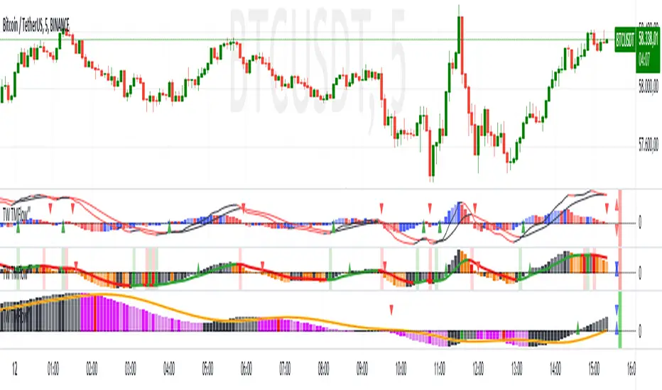
DMH‴ | Directional Movement Histogram‴What does it do?
Converts all DMI lines into one line and represents the line behaviour in a histogram format, which provides more understanding of this indicator movement.
How does it work?
The better sell signal is given when the line crosses under the zero line (providing the 3of3 signal), but an antecipation of the selling opportunity is given when the line crosses under the top of its closest histrogram bar (providing the 1of3 signal). And vice-verse for the by signal.
When the line goes under the oversold zone, it won't take to long to move out of that zone providing us with the 2of3 signal), and vice-verse for the overbought zone.
You won't provided with all 3 signals at all time, once it depends on the line move, but the more signs you get, the earlier you can keep your eyes on a potential opportunity.
What's my filling?
Gives you a quick perception of the direction of the price move. When all indicators are showing the same direction and the DMH shows the other direction, I'd wait to see the DMH joining all other indicators. Until that happens, the price seams to get stuck.
Indicator features:
- red arrow above the histogram provides the line crossing under the top of its closest histogram bar, and a green arrow under the histogram provides the line crossing above the negative top of iths closest histogram bar
- Trend Color Bar: let the candlesticks show you the trend and its reversal
- Momentum Power: besides to the above features, you can add a momentum power indicator with arrow and/or moving average lines crossing
To have access to this indicator, please DM me.
Don't contact me in the comment area.
VPBar‴ | Volume & Volatility Power Bar‴What does it do?
Draws the volume demand into the candlestick in order for you to identify the volume power in during candle formation.
How does it work?
Super easy. It's not too obvious how the volume power affects the market movement by just looking at the volume bars. This indicator transfere to the candlesticks the volume power demand which helps the trader understand the more/less probability of the market moving foward or reverting.
What's my filling?
Gives you a quick perception of the lastes market demand over the market movement. It makes total sence seeing the volume in such a very obvious format.
Indicator features:
- Volume Power (1): green and red gradient volume power (5 green gradients and 5 red gradients)
- Volume Power (2): market standard gradient for positive and negative candles (only 5 colors for both market directions - doesn't help allot, reason why I created this indicator)
- Trend Color Bar: let the candlesticks show you the trend and its reversal
- Momentum Power: besides to the above features, you can add a momentum power indicator with arrow and/or moving average lines crossing
To have access to this indicator, please DM me.
Don't contact me in the comment area.

SRLevel‴ | Support & Resistance Level‴What does it do?
Draws the most important/relevant support and resistence levels for you with just one click.
How does it work?
Super easy. Once installed, it draws the most important support and resistence levels for you without polluting your chart.
What's my filling?
Gives you a quick perception of the last important levels so you don't have to keep an eye on them every time.
Indicator attributes:
- choose the line style
- choose the line color
- choose if support or resistence should not be shown
- choose the the timeframe to be shown in the chart (lets say you are on the 2min chart but wish to see the 15min support and resistence lines, there you go)
- extend the lines to the present date
To have access to this indicator, please DM me.
Don't contact me in the comment area.

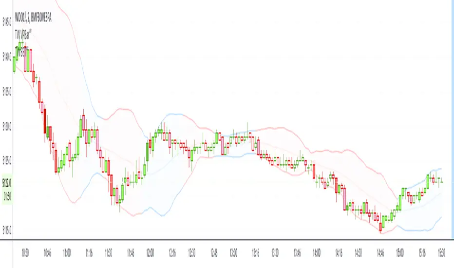
BBT‴ | Bollinger Band Trend Zone‴What does it do?
Makes available to you the BB (Bollinger Bands) in a colored format and provies signal on the right side bar according to a Short, Mid or Long period.
If the candles are going out of the Bands too often, then use the Extended Bollinger Band atributes available to create an extra band around the original ones.
How does it work?
The BB drawing is the exact same as the ordinary one. The big deal here is that the BB shade can be represented by a Short, Mid or Long MA period (7, 20 or 55 period), that you want it to be presented in the shade, which is the same as the MA lines you regularly use. When the MA goes down you have a given color and when the MA goes up you have another given color. This way you don't need to keep looking the MA lines, just perceive the current shade color.
What's my filling?
Makes the quick perception very easy, just look to the chart.
Indicator attributes:
- BB shade color acording to trend
- BB band line colors acording to trend
- right side bar signals color acording to trend
- BB shade can be darker, just drop the box and choose the darker version of it
- Extended Bollinger Band to create an extra band around the original ones
To have access to this indicator, please DM me.
Don't contact me in the comment area.
RocH‴ | Rate of Change Histogram‴What does it do?
Makes available to you the RoC (Rate of Change) in a histogram format and provies signals on the right side bar and arrows.
How does it work?
The RoC line is the exact same as the ordinary one. The big deal here is that the RoC line is too wild to understand the small move, so a histogram version of the RoC line makes it smooth to read and understand its behavior.
What's my filling?
I don't like the original indicators that have just a line and that it goes up and down as the wind changes, giving you only the big picture view. With the histogram and the right side signals, you have a nice, easy and smooth feeling of what's going on.
Indicator attributes:
- ordinary RoC line
- RoC in a histogram bar version
- right side bar signals
- histogram expantion and contraction arrow signals
To have access to this indicator, please DM me.
Don't contact me in the comment area.

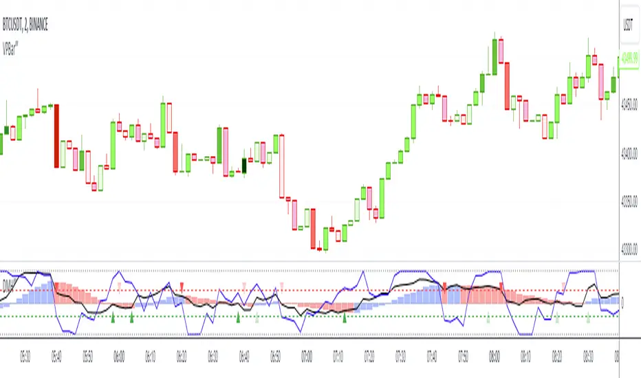
DI-OBV‴ | Divergence Indicator OBV‴What does it do?
Does the same as the ordigary OBV, but it has embeeded the 4TC indicator that provides trending channels that helps understand the strength of direction changing and divergencies with the price.
How does it work?
Works the exact same way as the ordinary OBV, but trending channels are drawn in order for you to see the OBV movement and potential reversal movements. Only 2 channels are drawn but you can activate the other 2 and also change their timeframes.
All channel directions are plotted in triangles on the top of the indicator frame which shows their direction (up or down).
The light red background shade signals that Volatility is activated and that price spread and volume are to be expected
What's my filling?
Helps confirm the volume movement and potential reversal and/or direction, as well as the divergency with price.
To have access to this indicator, please DM me.
Don't contact me in the comment area.
Candle# | Candle Bar Counter‴What does it do?
It allows the analyst to add candle counting in order to make it easy to chat with other analyst to which candle bar you are referencing to.
You are able to position the candle on TOP, BOTTOM or AUTO. AUTO positions the candle number on top or on the bottom of the candle bar whenever it crosses over or under the 20 period moving average.
What's my filling?
Can't be any better.
To have access to this indicator?
Please DM me.
Don't contact me in the comment area.

4TC‴ | Four Trend Channels‴What does it do?
Imagin being able to watch a channels with different periods following the price move and showing you their current trend? This is what this indicator is all about!
You are able to see 4 channels (20, 55, 100, 200 - all customizable) and a fift channel open for further customization.
And whats better, you don't need to see all channels, but you'll still have their information through the top/bottom triangles.
What's my filling?
I tested this indicator for a while and I'm sure it helps figure out the price next move, specially if you use a 5 second timeframe chart with you usual timeframe charts.
What does it do?
This indicator allows you to identify possible trend move or trend continuation (with a pullback within the move).
To have access to this indicator?
Please DM me.
Don't contact me in the comment area.

MktCurves‴ | Market Curves‴What does it do?
Imagin being able to watch the money flow between markets and figure out when it's time to make your own move. This is what this my proposal and this is what the Market Curves (MktCurves) indicator is all about!
You are able to see the money flowing into Core Commodities, T-Bonds (2, 5, 10, 20 and 30 years), High Yield Corporate Bonds, Gold, Silver, Bitcoin and Dollar.
Don't let the big guys get you off guard, know their moves and move with them.
How does it work?
By analysing the current curve data it is possible to notice that one or more of the curves start an up trend while others move sideway or a down trend, this is how you can have a guess where the smart money is moving from and to.
Curves available:
. Core Commodities
. T-Bond 2 Years
. T-Bond 5 Years
. T-Bond 10 Years
. T-Bond 20 Years
. T-Bond 30 years
. High Yield Corporate Bonds
. Gold
. Silver
. Bitcoin
. Dollar
What's my filling?
I'm still testing this indicator for only a week and so far still trying to understand its signs. I'm using it in conjunction with Volume Wave (VolWave) and Price Spread Wave (PSWave).
What does it do?
This indicator allows you to identify possible asset top and bottom reversals by having a prior Volatility acting among the price movement with a sequential positive (top reversal) or negative (bottom reversal) waves.
How does it work?
Everytime the wave starts showing a curved top movement (ascending price movment) or a curved bottom movement (descending price movment), it might be signing that a price reversal is on its way. It is possible to adjust the wave shape by increasing/decreasing its gradient value analysis, but it's so easy to use that most of the times no reconfiguration is needed, just add it and let it guide you.
Important to mention that the positive wave band, histogram bars and moving average line are calculate totally separete from the the negative wave.
What's my filling?
It definitely gives me a great insight into the smart money moves, which gives me the confidence to make my own moves.
To have access to this indicator,
Please DM me.
Don't contact me in the comment area.

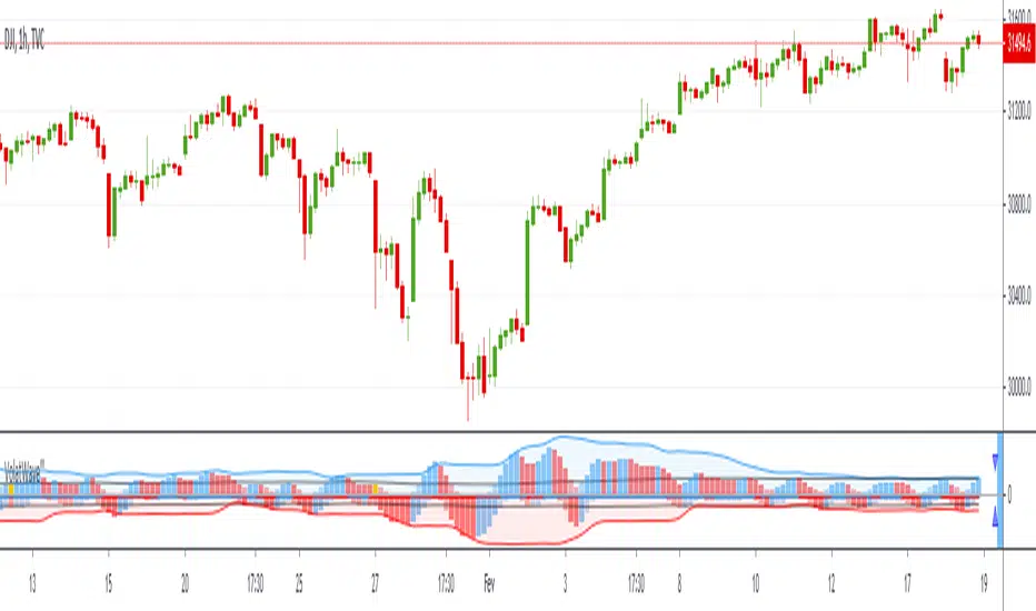
VolatWave‴ | Volatility Wave‴What does it do?
This indicator allows you to identify possible asset top and bottom reversals by having a prior Volatility acting among the price movement with a sequential positive (top reversal) or negative (bottom reversal) waves.
How does it work?
Everytime the wave starts showing a curved top movement (ascending price movment) or a curved bottom movement (descending price movment), it might be signing that a price reversal is on its way. It is possible to adjust the wave shape by increasing/decreasing its gradient value analysis, but it's so easy to use that most of the times no reconfiguration is needed, just add it and let it guide you.
Important to mention that the positive wave band, histogram bars and moving average line are calculate totally separete from the the negative wave.
What's my filling?
I'm still testing this indicator for only a week and so far still trying to understand its signs. I'm using it in conjunction with Volume Wave (VolWave) and Price Spread Wave (PSWave).
Indicator attributes:
- generally waves formation makes a symmetrical arc
- when the second half of a wave is elongated (compared to its first half), it suggests a lack of directional force of the current movement
- peak / bottom formation suggests reversal of the current movement
- smaller amplitude of a wave (compared to the previous wave) suggests loss of power, and vice-verse
- indicates divergence indication between peaks / bottoms
- when the volatility bar touches the volatility wave band, it suggests imminent reversal of the current movement
- wave band opening suggests movement increasing strength in that direction
- wavelengths (distance between two peaks / bottoms) tend to be similar
- subsequent wave rarely occurs
Technical information:
- the calculation of the positive movement is independent of the calculation of the positive movement
- the black line in the upper and lower zone is the average of the wave that is overcome, suggests strength in movement
- bands suggest delimitation of a wave's peak / bottom
To have access to this indicator, please DM me.
Don't contact me in the comment area.
PSWave‴ | Price Spread Wave‴What does it do?
This indicator allows you to identify possible top and bottom reversals by having a prior Spread Price Volume reversal identifiable by positive (top reversal) and negative (bottom reversal) waves.
How does it work?
Everytime the wave starts ending its movement by shrinking the size of the histogram bars, it might be signing that a price reversal is on its way. It is possible to adjust the wave shape by increasing/decreasing its gradient value analysis, but it's so easy to use that most of the times no reconfiguration is needed, just add it and let it guide you.
What's my filling?
I've been testing this indicator for weeks and so far with incredible reversal signals specially if working in conjunction with Volume Wave (VolWave).
Indicator attributes:
- generally waves formation makes a symmetrical arc
- when the second half of a wave is elongated (compared to its first half), it suggests a lack of directional force of the current movement
- peak / bottom formation suggests reversal of the current movement
- smaller amplitude of a wave (compared to the previous wave) suggests loss of power, and vice-verse
- indicates divergence indication between peaks / bottoms
- when the volume bar touches the volume wave band, it suggests imminent reversal of the current movement
- band opening suggests movement increasing strength in that direction
- wavelengths (distance between two peaks / bottoms) tend to be similar
- subsequent wave rarely occurs
Technical information:
- the calculation of the positive movement is independent of the calculation of the positive movement
- the black line in the upper and lower zone is the average of the wave that is overcome, suggests strength in movement
- bands suggest delimitation of a wave's peak / bottom
To have access to this indicator, please DM me.
Don't contact me in the comment area.

STOM‴ | Stochastic Momentum‴The STOM or Stochastic Momentum is just like the original STO one but this allows you to have a better understanding and interpretation of its behavior once you are able to:
1. see colored lines when it changes its direction;
2. see a second %D line with several other levels.
Used for Day Trade and Scalper Trade.
To have access to this indicator, please DM me.
Don't contact me in the comment area.

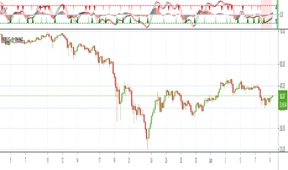
STOH‴ | Stocastic HistogramSTOH‴ our Stochastic Histogram is a Stochastic oscillator as the original one but this one that allows you to have a better understanding and interpretation of its behavior once you are able to:
1. see colored lines when it changes its direction;
2. see colored arrow upward/downward when the %K line crossover/crossunder the %D line;
3. see colored histogram, and additional sign as of in the MACDH indicator;
4. see the indicator with Ordinary or Directional Momentum OHLC values;
5. far right side of the indicator shows bars to that provides the buy/sell signal status:
- the right side bar shows if the indicator is on an upward (green color) or downward (red color) full trend for both lines and histogram;
- the left side bar shows if the indicator's trend is being threatened (yellow color).
- a par of arrows provide the trader the sense of histogram current bar Expansion bias (point top-up and bottom-down) or Contraction bias (point top-down and bottom-up)
p.s.: notice that this version of the indicator has different overbought/oversold zone levels due to the histogram that fluctuates the zero line.
Believe me, this indicator will make your life much easier!
To have access to this indicator, please contact DM me.
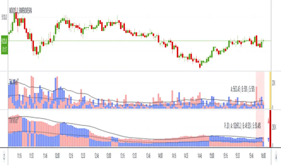
MVolume‴ | Multi Volume Indicator‴Hello Traders!
This simple but yet efficient indicator view presents the Volume with the following benefits:
1. both buyer and seller volume are shown separately and above zero line, this way its possible to see which side is dominant;
2. both buyer and seller volume are shown separately, with buyers above the zero line and sellers bellow the zero line. The dominant side is shown in its darker color version;
3. 20 period Moving Average line is calculated separately and plotted for each side (buyer/seller);
4. 50% of the 20 period Moving Average line is calculated separately and plotted for each side (buyer/seller);
5. possibility to apply Directional OHLC values to enhance the buyer/seller movement interpretation.
p.s.: the chart presents two MVol indicators to let you see the different possible views.
To request access to this invite-only script, please DM me.
STORSIH‴ | StochRSI Histogram‴Hello Traders!
This simple but yet efficient indicator view presents the STORSI with the following benefits:
1. the STORSI lines are plotted in a Histogram format, which allows you a totally new experience view and that is very helpful;
2. an upward and downward arrow is plotted to identify the indicator crossover/crossunder, with ON/OFF checkbox;
3. colored lines indicates if each line (STORSI and/or signal line) did a reversal move, which could be a early crossover/crossunder warning;
4. far right side bars to show the indicators status:
- the right side bar shows if the indicator is on an upward (green color) or downward (red color) full trend for both lines and histogram;
- the left side bar shows if the indicator's trend is being threatened (yellow color).
- a par of arrows provide the trader the sense of histogram current bar Expansion bias (point top-up and bottom-down) or Contraction bias (point top-down and bottom-up)
To request access to this invite-only script, please DM me.

BuySell Trend‴ | Buy and Sell TrendsBuySell Trend‴ is a Moving Average oscillator that allows you to have a better understanding and interpretation trend as it goes and then reverses with or without pressure.
If the black line crosses up the red line it will indicate possible up trend. But if both lines cross up the blue line, than you have a strong up trend going on.
What is the best is that you can use it with any kind of graphic that it will always considere the real open, close, high and low trading values.
To have access to this indicator, please contact me at: contato @ moneywise . com . br
Believe me, this indicator will make your life much easier!

MACDH‴ | MACD Colored HistogramMACDH‴ is a Moving Average Convergence Divergence oscillator that allows you to have a better understanding and interpretation of its behavior once you are able to see different colored lines when it changes its direction.
It is interpreted as per the standard MACDH.
What is the best is that you can use it with any kind of graphic that it will always considere the real open, close, high and low trading values.
To have access to this indicator, please contact me at: contato @ moneywise . com . br
Believe me, this indicator will make your life much easier!

Price Spread Momentum‴ | Price Spread Momentum HistogramPrice Spread Momentum‴ is a Price Spread oscillator that allows you to have a better understanding and interpretation of its behavior once you are able to see it through an histrogram.
It has extreme zones such as overspreaded and underspreaded, but these zones start, respectively, from above 100% and from under -100%, with a mid line at 0%.
What is the best is that you can use it with any kind of graphic that it will always considere the real open, close, high and low trading values.
To have access to this indicator, please contact me at: contato @ moneywise . com . br
Believe me, this indicator will make your life much easier!

RSIH‴ | RSI Histogram MomentumRSIH‴ is a Relative Strength Index oscillator that allows you to have a better understanding and interpretation of its behavior once you are able to see it through an histrogram.
As per the standard RSI, RSIH ‴ has extreme zones such as overbought and oversold, but these zones start, respectively, from 20% (similar to 80% on RSI) and from -20% (similar to 20% on RSI), with a mid line at 0% (similar to 50% on RSI).
What is the best is that you can use it with any kind of graphic that it will always considere the real open, close, high and low trading values.
To have access to this indicator, please contact me at: contato @ moneywise . com . br
Believe me, this indicator will make your life much easier!
