Indicador Pine Script®
Pesquisar nos scripts por "entry"

Entry / TP / SL Alert Bands (Simple & Stable)
Get an alert before you reach your take profit or stop loss. Set as a percentage over the distance to your stop loss and take profit and improve your Money Management
Indicador Pine Script®

Raeinex Momentum Liquidity IndexEntry arrow signals with volumetric momentum (buying and selling pressure) and the possibility to use all entry signals as liquidity area for price retest.
Indicador Pine Script®

ENTRY CONFIRMATION V2An indicator from candle man. Helps determine whether supply and demand zone are truly supply or demand.
Indicador Pine Script®
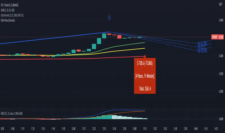
Entry Percent: EssamThis Pine Script code is designed to perform the task of computing and showcasing the profit percentage, profit value, and the duration for which a specific asset is held, all in real-time. The script effectively leverages the built-in resources to provide a seamless and robust experience, as it presents the calculated figures in an easily readable format on the chart, without causing any lag or disruptions to the chart.
Indicador Pine Script®
Indicador Pine Script®
[MV] %B with SMA + Volume Based Colored Bars
Entry Signal when %B Crosses with SMA and this is more meaningful if it supports colored bars.
Black Bar when prices go down and volume is bigger than 150% of its average, that indicates us price action is supported by a strong bearish volume
Blue Bar when prices go up and volume bigger than 150% of its average, that indicates us price action is supported by a strong bullish volume
VBC author @KIVANCfr3762
Indicador Pine Script®
FX Sniper: T3-CCI Strategy - With 100 IndicatorsEntry signal when moving above -100, sell signal when going below 100
Indicador Pine Script®
Amazing Crossover SystemEntry Rules
BUY when the 5 EMA crosses above the 10 EMA from underneath and the RSI crosses above the 50.0 mark from the bottom.
SELL when the 5 EMA crosses below the 10 EMA from the top and the RSI crosses below the 50.0 mark from the top.
Make sure that the RSI did cross 50.0 from the top or bottom and not just ranging tightly around the level.
How to setup Alert:
1) Add the Amazing Crossover System to your chart via Indicators
2) Find your currency pair
3) Set the timeframe on the chart to 1 hour
4) Press 'Alt + A' (create alert shortcut)
5) Set the following criteria for the alert:
Condition = 'Amazing Crossover System', Plot, ' BUY Signal'
The rest of the alert can be customized to your preferences
5) Repeat steps 1 - 4, but set the Condition = 'Amazing Crossover System', Plot, ' SELL Signal'
Indicador Pine Script®

Directional Movement Index - DMI | TR🎯 Overview
Directional Movement Index - DMI | TR is a comprehensive trend strength and direction indicator that measures the strength and direction of price movement. Developed by Tiagorocha1989, this enhanced version of Welles Wilder's classic DMI system offers multiple visualization modes, customizable moving averages, and comprehensive visual features to help traders identify trend direction, measure trend strength, and generate clear entry and exit signals.
🔧 How It Works
The DMI system consists of three key components: the Positive Directional Indicator (+DI), the Negative Directional Indicator (-DI), and the Average Directional Index (ADX). The relationship between +DI and -DI determines trend direction, while ADX measures trend strength regardless of direction.
Core Calculation Logic:
The indicator calculates directional movement by comparing current price highs and lows with previous periods to determine:
+DI (Positive Directional Indicator): Measures upward price pressure
-DI (Negative Directional Indicator): Measures downward price pressure
ADX (Average Directional Index): Smoothed average of the directional movement, indicating trend strength
The relationship between +DI and -DI creates the primary signals:
When +DI crosses above -DI → Bullish trend developing
When -DI crosses above +DI → Bearish trend developing
The spread between them indicates trend strength
Additionally, the indicator calculates DMI as the difference between +DI and -DI (+DI minus -DI), creating an oscillator that oscillates around zero:
Positive DMI values → Bullish momentum ( +DI above -DI)
Negative DMI values → Bearish momentum (-DI above +DI)
✨ Key Features
🔹 Multiple Display Modes
DMI Average Mode: Shows the DMI oscillator (+DI minus -DI) with signal line, providing a clean, oscillator-style view of directional balance
Normal DMI Mode: Displays the classic +DI and -DI lines for traditional analysis
ADX Mode: Shows the Average Directional Index for trend strength measurement
All modes can be combined for comprehensive analysis
🔹 Dual Operating Modes for Signals
Zero Line Mode: Signals occur when the DMI oscillator crosses above or below the zero line
DMI MA Mode: Enhanced mode where signals occur when DMI crosses its own moving average, providing filtered entries
🔹 Flexible Moving Average Selection
Choose from six MA types for the DMI MA mode:
EMA, SMA, RMA, WMA, VWMA, and HMA
🔹 Customizable DMI Parameters
Length: Lookback period for DMI calculation (default 8)
ADX Smoothing: Additional smoothing for ADX calculation (default 1)
🔹 Customizable Color Themes
Eight distinct color schemes to match your charting preferences:
Classic – Green for bullish, Red for bearish
Modern – White for bullish, Purple for bearish
Robust – Amber for bullish, Maroon for bearish
Accented – Violet for bullish, Pink for bearish
Monochrome – Light gray for bullish, Dark gray for bearish
Moderate – Green for bullish, Red for bearish
Aqua – Blue for bullish, Orange for bearish
Cosmic – Pink for bullish, Purple for bearish
🔹 Comprehensive Visual Feedback
DMI Oscillator: Colored line showing the difference between +DI and -DI
Signal Line: Yellow line for MA-based signals
Gradient Fill Zones: Clear visualization of extreme readings
Dynamic Zone Fills: Semi-transparent fills showing when DMI is above or below the signal line
+DI and -DI Lines: Optional display of classic directional indicators
ADX Line: Optional blue line showing trend strength
Color-Coded Candles: Bars reflect current trend direction based on +DI/-DI relationship
Signal Markers: Triangle up/down symbols at crossover points
Live Value Display: Floating labels showing current values for each enabled component
Trend Table: Bullish/Bearish status displayed on the chart
🔹 Ready-to-Use Alerts
Built-in alert conditions trigger LONG signals when +DI crosses above -DI, and SHORT signals when +DI crosses below -DI.
⚙️ Settings Summary
Color Choice: Select from eight visual themes (Default: Classic)
DMI Display: Toggle to show the DMI Average oscillator (Default: Enabled)
Length: Lookback period for DMI calculation (Default: 8)
Entry/Exit Signal: Choose between zero line or DMI MA mode (Default: Zero Line)
Length MA: Moving average period for DMI MA mode (Default: 365)
DMI MA Type: Moving average method for signal line (Default: EMA)
Normal DMI: Toggle to show classic +DI and -DI lines (Default: Disabled)
ADX Smoothing: Toggle to show ADX with adjustable smoothing (Default: Disabled)
📈 Practical Applications
🔹 Trend Direction Identification
The primary use of the DMI system is identifying trend direction:
+DI above -DI → Bullish trend
-DI above +DI → Bearish trend
The wider the separation, the stronger the trend
🔹 Trend Strength Measurement
The ADX component quantifies trend strength regardless of direction:
ADX below 20 → Weak or non-trending market
ADX between 20-40 → Trending market with moderate strength
ADX above 40 → Strong trend (can signal trend exhaustion in some cases)
🔹 Crossover Signals
Crossovers between +DI and -DI provide classic entry signals:
+DI crosses above -DI → Potential LONG entry
-DI crosses above +DI → Potential SHORT entry
🔹 DMI Oscillator Analysis
The DMI oscillator (+DI minus -DI) offers additional insights:
Positive values indicate bullish dominance
Negative values indicate bearish dominance
Crossovers of the zero line confirm trend changes
Crossovers of the moving average provide filtered signals
🔹 Trend Exhaustion Detection
When ADX reaches very high levels (above 50-60) after a prolonged trend, it may indicate trend exhaustion and potential reversal. Combined with a narrowing spread between +DI and -DI, this can signal trend weakening.
🔹 Multiple Timeframe Confirmation
Compare DMI readings across different timeframes:
Higher timeframe DMI confirms primary trend direction
Lower timeframe DMI identifies entry timing
🎯 Ideal For
✅ Trend Traders seeking to identify and follow established trends
✅ Swing Traders wanting to capture medium-term directional moves
✅ System Developers needing reliable trend direction signals
✅ Multi-Timeframe Analysts comparing trend strength across periods
✅ Risk Managers assessing whether markets are trending or ranging
📌 Key Takeaways
Comprehensive Trend Analysis: Combines direction (+DI/-DI), strength (ADX), and oscillator views in one indicator
Multiple Display Modes: Choose between classic +DI/-DI lines, DMI oscillator, or ADX based on your analysis style
Dual-Mode Signal Generation: Zero line crossovers for classic signals or MA-smoothed signals for filtered entries
Rich Visual Feedback: Color themes, gradient fills, candles, and floating labels provide immediate market awareness
Alert-Ready: Built-in alerts for trend change signals when +DI crosses -DI
⚠️ Important Notes
The DMI system works best in trending markets and can produce false signals in ranging conditions. ADX does not indicate direction, only strength; always use it in conjunction with +DI/-DI. The 365-day MA default in DMI MA mode is designed for longer-term trend context on daily charts. Consider using ADX above 20-25 to filter for trending conditions before taking crossover signals. Always combine with proper risk management and additional confirmation for best results.
Disclaimer: This indicator is provided for educational and informational purposes only. Past performance is not indicative of future results. Always conduct thorough testing and align with your risk management strategy before live deployment.
Indicador Pine Script®

Commodity Channel Index - CCI | TR🎯 Overview
Commodity Channel Index - CCI | TR is a versatile momentum oscillator that measures the current price level relative to an average price over a specified period. Developed by Tiagorocha1989, this enhanced version of Donald Lambert's classic CCI indicator offers dual-mode operation with moving average customization and comprehensive visual features, helping traders identify overbought and oversold conditions, detect trend strength, and generate clear entry and exit signals.
🔧 How It Works
The CCI measures the deviation of a typical price (usually the average of high, low, and close) from its statistical mean, normalized by the mean deviation. Values oscillate above and below zero, with extreme readings suggesting potential reversals.
Core Calculation Logic:
The indicator calculates the CCI using the standard formula:
Typical Price = (High + Low + Close) / 3
SMA of Typical Price over the specified period
Mean Deviation = Average of absolute differences between Typical Price and its SMA
CCI = (Typical Price - SMA) / (0.015 × Mean Deviation)
The resulting oscillator typically fluctuates between +300 and -300, with:
Readings above +100 suggesting overbought conditions (potential reversal down)
Readings below -100 suggesting oversold conditions (potential reversal up)
Zero line representing the average level
The indicator compares CCI to a reference line that can be either:
The traditional zero level
A user-defined moving average of the CCI itself (CCI MA mode)
✨ Key Features
🔹 Dual Operating Modes
Zero Line Mode: Classic CCI implementation where signals occur when CCI crosses above or below the zero line
CCI MA Mode: Enhanced version where signals occur when CCI crosses its own moving average, providing smoother, filtered entries
🔹 Flexible Moving Average Selection
Choose from six MA types for the CCI MA mode:
EMA (Exponential Moving Average) for responsive signals
SMA (Simple Moving Average) for smoother readings
RMA (Rolling Moving Average) for weighted recent data
WMA (Weighted Moving Average) for customizable weighting
VWMA (Volume-Weighted Moving Average) incorporating volume
HMA (Hull Moving Average) for reduced lag
🔹 Customizable CCI Parameters
Length CCI: Lookback period for CCI calculation (default 55)
Source CCI: Price source for calculations (default Close)
🔹 Customizable Color Themes
Eight distinct color schemes to match your charting preferences:
Classic – Green for bullish, Red for bearish
Modern – White for bullish, Purple for bearish
Robust – Amber for bullish, Maroon for bearish
Accented – Violet for bullish, Pink for bearish
Monochrome – Light gray for bullish, Dark gray for bearish
Moderate – Green for bullish, Red for bearish
Aqua – Blue for bullish, Orange for bearish
Cosmic – Pink for bullish, Purple for bearish
🔹 Comprehensive Visual Feedback
Colored CCI Line: Changes color based on position relative to the reference line
Signal Line: Yellow line showing zero or MA reference
Gradient Fill Zones: Clear visualization of overbought (above +300) and oversold (below -300) conditions
Dynamic Zone Fills: Semi-transparent fills showing when CCI is above or below the reference line
Color-Coded Candles: Bars reflect current CCI bias (above or below 50)
Signal Markers: Triangle up/down symbols at crossover points
Live Value Display: Current CCI value shown in a floating label
Trend Table: Bullish/Bearish status displayed on the chart
🔹 Ready-to-Use Alerts
Built-in alert conditions trigger LONG signals when CCI is above zero/bullish, and SHORT signals when CCI is below zero/bearish.
⚙️ Settings Summary
Color Choice: Select from eight visual themes (Default: Classic)
Length CCI: Lookback period for CCI calculation (Default: 55)
Source CCI: Price source for calculations (Default: Close)
Entry/Exit Signal: Choose between zero line or CCI MA mode (Default: Zero Line)
Length MA: Moving average period for CCI MA mode (Default: 365)
CCI MA Type: Moving average method for signal line (Default: EMA)
📈 Practical Applications
🔹 Overbought/Oversold Detection
Traditional CCI usage identifies extreme conditions:
Readings above +100 suggest overbought conditions and potential reversal down
Readings below -100 suggest oversold conditions and potential reversal up
The indicator provides gradient fills in these zones for visual clarity
The 300-level fills provide even more extreme zone visualization
🔹 Zero Line Crossovers
In Zero Line mode, crossovers provide momentum signals:
Crossover above zero → Bullish momentum strengthening
Crossunder below zero → Bearish momentum strengthening
These signals often align with trend direction changes
🔹 Signal Line Crossovers
In CCI MA mode, crossovers between CCI and its moving average provide filtered signals that reduce whipsaws in ranging markets while maintaining sensitivity in trends.
🔹 Divergence Trading
CCI is excellent for spotting divergences:
Bullish Divergence: Price makes lower low, CCI makes higher low → Potential upside reversal
Bearish Divergence: Price makes higher high, CCI makes lower high → Potential downside reversal
Divergences are most significant when occurring at extreme levels (+100/-100)
🔹 Centerline Confirmation
The 50 level (used for candle coloring) provides additional context:
CCI above 50 → Stronger bullish bias
CCI below 50 → Stronger bearish bias
This can be used as a filter for other signals
🔹 Trend Strength Assessment
The magnitude of CCI readings indicates trend strength:
Readings consistently above +100 suggest strong uptrend
Readings consistently below -100 suggest strong downtrend
Fluctuations around zero suggest ranging conditions
🔹 Multiple Timeframe Analysis
The normalized nature of CCI makes it suitable for comparing readings across different timeframes, helping identify confluence for stronger trade setups.
🎯 Ideal For
✅ Mean Reversion Traders seeking overbought and oversold opportunities
✅ Divergence Traders looking for hidden reversal signals
✅ Momentum Traders wanting to identify trend strength and direction
✅ Swing Traders capturing medium-term momentum shifts
✅ Commodity and Forex Traders (originally designed for commodities but works across all markets)
📌 Key Takeaways
Dual-Mode Flexibility: Choose between classic zero-line crossovers for traditional signals or MA-smoothed signals for filtered entries
Comprehensive Visualization: Color themes, gradient fills for overbought/oversold zones, candles, and labels provide immediate market awareness
Divergence Capability: Excellent for spotting both regular and hidden divergences that signal trend reversals or continuations
Extended Range Visualization: The 300-level gradient fills provide clear identification of extreme conditions
Alert-Ready: Built-in alerts for both LONG and SHORT signals
⚠️ Important Notes
In strong trends, CCI can remain in overbought or oversold territory for extended periods, so traditional overbought/oversold signals should be used with caution. The default length of 55 is longer than traditional CCI settings (typically 20), making this version more suitable for medium to longer-term trend identification. The 365-day MA default in CCI MA mode is designed for longer-term trend context on daily charts. Divergences are most reliable when they occur at extreme readings (above +100 or below -100). Always combine with proper risk management and additional confirmation for best results.
Disclaimer: This indicator is provided for educational and informational purposes only. Past performance is not indicative of future results. Always conduct thorough testing and align with your risk management strategy before live deployment.
Indicador Pine Script®

Relative Strength Index - RSI | TR🎯 Overview
Relative Strength Index - RSI | TR is a sophisticated momentum oscillator that measures the speed and magnitude of recent price changes to evaluate overbought and oversold conditions. Developed by Tiagorocha1989, this enhanced version of Welles Wilder's classic RSI offers dual-mode operation with moving average customization and comprehensive visual features, helping traders identify potential reversals, confirm trends, and generate clear entry and exit signals with greater precision.
🔧 How It Works
The RSI compares the magnitude of recent gains to recent losses, creating an oscillator that ranges from 0 to 100. Traditional interpretation suggests that readings above 70 indicate overbought conditions (potential for reversal downward), while readings below 30 indicate oversold conditions (potential for reversal upward).
Core Calculation Logic:
The indicator calculates the RSI using the standard formula:
Average gain over the specified period divided by average loss over the same period
This ratio is normalized to create a value between 0 and 100
The RSI is then compared to a reference line that can be either:
The traditional 50 level (centerline)
A user-defined moving average of the RSI itself
When the RSI crosses above the reference line, it generates a bullish signal. When it crosses below, it generates a bearish signal.
✨ Key Features
🔹 Dual Operating Modes
50 Level Mode: Classic RSI implementation where signals occur when the RSI crosses above or below the 50 centerline, indicating momentum shifts
RSI MA Mode: Enhanced version where signals occur when the RSI crosses its own moving average, providing smoother, filtered entries
🔹 Flexible Moving Average Selection
Choose from six MA types for the RSI MA mode:
EMA (Exponential Moving Average) for responsive signals
SMA (Simple Moving Average) for smoother readings
RMA (Rolling Moving Average) for weighted recent data
WMA (Weighted Moving Average) for customizable weighting
VWMA (Volume-Weighted Moving Average) incorporating volume
HMA (Hull Moving Average) for reduced lag
🔹 Customizable RSI Parameters
Length RSI: Lookback period for RSI calculation (default 14)
Source RSI: Price source for calculations (default Close)
🔹 Customizable Color Themes
Eight distinct color schemes to match your charting preferences:
Classic – Green for bullish, Red for bearish
Modern – White for bullish, Purple for bearish
Robust – Amber for bullish, Maroon for bearish
Accented – Violet for bullish, Pink for bearish
Monochrome – Light gray for bullish, Dark gray for bearish
Moderate – Green for bullish, Red for bearish
Aqua – Blue for bullish, Orange for bearish
Cosmic – Pink for bullish, Purple for bearish
🔹 Comprehensive Visual Feedback
Colored RSI Line: Changes color based on position relative to the reference line
Gradient Fill Zones: Clear visualization of overbought (above 80) and oversold (below 20) conditions
Dynamic Zone Fills: Semi-transparent fills showing when RSI is above or below the reference line
Color-Coded Candles: Bars reflect current RSI bias
Signal Markers: Triangle up/down symbols at crossover points
Live Value Display: Current RSI value shown in a floating label
Trend Table: Bullish/Bearish status displayed on the chart
🔹 Ready-to-Use Alerts
Built-in alert conditions trigger LONG signals on bullish crossovers and SHORT signals on bearish crossunders across both operating modes.
⚙️ Settings Summary
Color Choice: Select from eight visual themes (Default: Classic)
Length RSI: Lookback period for RSI calculation (Default: 14)
Source RSI: Price source for calculations (Default: Close)
Entry/Exit Signal: Choose between 50 level or RSI MA mode (Default: 50)
Length RSI MA: Moving average period for RSI MA mode (Default: 365)
RSI MA Type: Moving average method for signal line (Default: EMA)
📈 Practical Applications
🔹 Overbought/Oversold Detection
Traditional RSI usage identifies extreme conditions:
Readings above 70-80 suggest overbought conditions and potential reversal down
Readings below 20-30 suggest oversold conditions and potential reversal up
The indicator provides gradient fills in these zones for visual clarity
🔹 Centerline Crossovers
In 50 Level mode, crossovers provide momentum signals:
Crossover above 50 → Bullish momentum strengthening
Crossunder below 50 → Bearish momentum strengthening
These signals often align with trend direction
🔹 Signal Line Crossovers
In RSI MA mode, crossovers between RSI and its moving average provide filtered signals that reduce whipsaws in ranging markets while maintaining sensitivity in trends.
🔹 Divergence Trading
One of the most powerful RSI applications is spotting divergences:
Bullish Divergence: Price makes lower low, RSI makes higher low → Potential upside reversal
Bearish Divergence: Price makes higher high, RSI makes lower high → Potential downside reversal
🔹 Failure Swings
Look for RSI moves above 70 (or below 30), a pullback, and then a move beyond the previous extreme:
Bullish Failure Swing: RSI falls below 30, rises above 30, pulls back without crossing below 30, then breaks above its recent high
Bearish Failure Swing: RSI rises above 70, falls below 70, rallies without crossing above 70, then breaks below its recent low
🔹 Trend Confirmation
In trending markets, RSI can confirm strength:
Uptrend: RSI tends to stay above 40-50, with pullbacks finding support at these levels
Downtrend: RSI tends to stay below 60-50, with rallies finding resistance at these levels
🎯 Ideal For
✅ Mean Reversion Traders seeking overbought and oversold opportunities
✅ Divergence Traders looking for hidden reversal signals
✅ Trend Traders wanting momentum confirmation
✅ Swing Traders capturing medium-term momentum shifts
✅ System Developers needing reliable crossover logic for automated strategies
📌 Key Takeaways
Dual-Mode Flexibility: Choose between classic 50-level crossovers for traditional signals or MA-smoothed signals for filtered entries
Comprehensive Visualization: Color themes, gradient fills for overbought/oversold zones, candles, and labels provide immediate market awareness
Divergence Capability: Excellent for spotting both regular and hidden divergences that signal trend reversals or continuations
Multiple Timeframe Application: Works effectively across all timeframes, from intraday to weekly charts
Alert-Ready: Built-in alerts for both LONG and SHORT signals across both operating modes
⚠️ Important Notes
In strong trends, RSI can remain in overbought or oversold territory for extended periods, so traditional overbought/oversold signals should be used with caution. The 365-day MA default in RSI MA mode is designed for longer-term trend context on daily charts. Divergences are most reliable when they occur at extreme readings (above 70 or below 30). Always combine with proper risk management and additional confirmation for best results.
Disclaimer: This indicator is provided for educational and informational purposes only. Past performance is not indicative of future results. Always conduct thorough testing and align with your risk management strategy before live deployment.
Indicador Pine Script®

Awesome Oscillator - AO | TR🎯 Overview
Awesome Oscillator - AO | TR is a sophisticated momentum indicator that measures market momentum by calculating the difference between two moving averages of different lengths. Developed by Tiagorocha1989, this enhanced version of Bill Williams' classic Awesome Oscillator offers dual-mode operation, extensive moving average customization, and comprehensive visual features to help traders identify momentum shifts, divergences, and potential trend reversals with greater precision.
🔧 How It Works
The Awesome Oscillator measures market momentum by comparing short-term and long-term price action, creating a histogram that oscillates above and below a zero line. When the short-term moving average is above the long-term moving average, the oscillator is positive (bullish), and when it's below, the oscillator is negative (bearish).
Core Calculation Logic:
The indicator calculates the difference between two moving averages applied to the same price source. The first moving average uses a shorter period (default 22) to capture recent price action, while the second uses a longer period (default 49) to establish the broader trend context.
The resulting value creates a histogram where:
Positive values (above zero or the signal line) indicate bullish momentum
Negative values (below zero or the signal line) indicate bearish momentum
The slope and direction of the oscillator reveal momentum acceleration or deceleration
In standard mode, signals are generated based on crossovers of the zero line. In AO MA mode, signals are based on crossovers between the oscillator and a smoothed moving average line, providing filtered entries.
✨ Key Features
🔹 Dual Operating Modes
Zero Line Mode: Classic Awesome Oscillator implementation where signals occur when the oscillator crosses above or below the zero line
AO MA Mode: Enhanced version where signals occur when the oscillator crosses a user-defined moving average, providing smoother, more filtered signals
🔹 Flexible Moving Average Selection
Choose from six MA types for both the oscillator calculation and the signal line:
EMA (Exponential Moving Average) for responsive signals
SMA (Simple Moving Average) for smoother readings
RMA (Rolling Moving Average) for weighted recent data
WMA (Weighted Moving Average) for customizable weighting
VWMA (Volume-Weighted Moving Average) incorporating volume
HMA (Hull Moving Average) for reduced lag
🔹 Dual Period Settings
First AO Length: Shorter period for the fast moving average (default 22)
Second AO Length: Longer period for the slow moving average (default 49)
🔹 Customizable Color Themes
Eight distinct color schemes to match your charting preferences:
Classic – Green for bullish, Red for bearish
Modern – White for bullish, Purple for bearish
Robust – Amber for bullish, Maroon for bearish
Accented – Violet for bullish, Pink for bearish
Monochrome – Light gray for bullish, Dark gray for bearish
Moderate – Green for bullish, Red for bearish
Aqua – Blue for bullish, Orange for bearish
Cosmic – Pink for bullish, Purple for bearish
🔹 Comprehensive Visual Feedback
Dual Visualization Modes: Line style or column histogram based on user preference
Gradient Fill Zones: Clear visualization of overbought and oversold conditions
Color-Coded Candles: Bars reflect current momentum direction
Signal Markers: Triangle up/down symbols at crossover points
Live Value Display: Current AO value shown in a floating label
Trend Table: Bullish/Bearish status displayed on the chart
🔹 Ready-to-Use Alerts
Built-in alert conditions trigger LONG signals on bullish crossovers and SHORT signals on bearish crossunders across both operating modes.
⚙️ Settings Summary
Color Choice: Select from eight visual themes (Default: Classic)
AO Display: Toggle between line style or column histogram (Default: Line)
First AO Length: Short-term moving average period (Default: 22)
Second AO Length: Long-term moving average period (Default: 49)
AO Source: Price source for calculations (Default: Close)
AO Moving Average Type: MA method for oscillator calculation (Default: EMA)
Entry/Exit Signal: Choose between zero line or AO MA mode (Default: AO MA)
Length AO MA: Signal line moving average period (Default: 730)
AO MA Type: Moving average method for signal line (Default: EMA)
📈 Practical Applications
🔹 Momentum Shift Detection
The primary use of the Awesome Oscillator is identifying when momentum is changing. When the histogram crosses from negative to positive, it suggests bullish momentum is building. Crosses from positive to negative indicate bearish momentum is emerging.
🔹 Divergence Trading
One of the most powerful applications is spotting divergences between price and the oscillator:
Bullish Divergence: Price makes a lower low while AO makes a higher low, suggesting upcoming upside reversal
Bearish Divergence: Price makes a higher high while AO makes a lower high, warning of potential downside reversal
🔹 Zero Line Crossovers
In Zero Line mode, crossovers provide clear entry signals:
Crossover above zero → LONG signal
Crossunder below zero → SHORT signal
🔹 Signal Line Crossovers
In AO MA mode, crossovers between the oscillator and its moving average provide filtered signals that reduce whipsaws in choppy markets.
🔹 Twin Peaks Strategy
Look for two consecutive peaks in the same direction:
Bullish Twin Peaks: Two lows below zero, with the second low higher than the first, followed by a crossover above the signal line
Bearish Twin Peaks: Two highs above zero, with the second high lower than the first, followed by a crossunder below the signal line
🔹 Saucer Pattern
When the histogram changes from red to green (or vice versa) with a smooth, rounded shape, it suggests a gradual momentum shift that often leads to sustainable moves.
🎯 Ideal For
✅ Momentum Traders seeking to identify when momentum is accelerating or decelerating
✅ Divergence Traders looking for hidden reversal signals before they appear on price
✅ Swing Traders wanting to capture medium-term momentum shifts
✅ System Developers needing reliable crossover logic for automated strategies
✅ Multi-Timeframe Analysts comparing momentum across different periods
📌 Key Takeaways
Dual-Mode Flexibility: Choose between classic zero-line crossovers for maximum sensitivity or MA-smoothed signals for cleaner entries
Customizable Calculation: Six MA types for both oscillator and signal line allow fine-tuning for any market condition
Comprehensive Visualization: Color themes, gradient fills, candles, and labels provide immediate momentum awareness
Divergence Capability: Excellent for spotting both regular and hidden divergences that signal trend reversals or continuations
Alert-Ready: Built-in alerts for both LONG and SHORT signals across both operating modes
⚠️ Important Notes
The Awesome Oscillator works best in trending markets and can produce false signals in ranging conditions. Consider combining with trend filters or using the AO MA mode for smoother signals in choppy markets. The 730-day MA default in AO MA mode is designed for longer-term trend context on daily charts. Always combine with proper risk management and additional confirmation for best results.
Disclaimer: This indicator is provided for educational and informational purposes only. Past performance is not indicative of future results. Always conduct thorough testing and align with your risk management strategy before live deployment.
Indicador Pine Script®

Scalp Trend Engine v2 (Alerts + TP/SL)Scalp Trend Engine: Methodology & Trading Rules
1. Core Philosophy
The Scalp Trend Engine is designed for high-frequency, precision execution on lower timeframes (1m, 3m, 5m). Unlike swing trading systems that rely on confirmed structure (which lags), this engine prioritizes immediate momentum aligned with the dominant trend, filtered by volatility.
"Trade the Ripple, Filter the Chop."
2. Technical Components
Component Setting Purpose
Fast EMA 9 Immediate price momentum direction.
Slow EMA 50 Dominant trend baseline.
ATR 14 Measures current market "noise" / volatility.
Spread Filter 0.25x ATR Ensures trend is strong enough to trade (avoids flat markets).
3. Trade Logic
The "Go/No-Go" Gauge (The Filter)
Before any trade is considered, the Spread Condition must be met:
Distance between EMA 9 and EMA 50 > 0.25 * ATR
Why? If the lines are touching or tangled (less than 25% of an ATR candle apart), the market is "chopping." NO TRADE.
Long Setup (Buy)
Trend: EMA 9 is ABOVE EMA 50.
Filter: Spread is valid (Market is expanding).
Trigger: Price closes ABOVE the EMA 9 (Pullback recovery).
Logic: Price dipped, touched/broke EMA 9, and is now reclaiming it in the direction of the uptrend.
Short Setup (Sell)
Trend: EMA 9 is BELOW EMA 50.
Filter: Spread is valid.
Trigger: Price closes BELOW the EMA 9.
Logic: Price rallied, failed, and is now breaking back down with the downtrend.
4. Risk Management (The "Engine" Settings)
This system uses ATR-based targets to adapt to market speed.
Stop Loss (SL): 1.0x ATR from Entry.
Theory: If price moves 1 full average candle against you, the immediate momentum is likely gone. Get out.
Take Profit (TP): 1.5x ATR from Entry.
Theory: Aim for a quick burst of continuation. This offers a 1:1.5 Risk/Reward Ratio.
5. Execution Workflow
Check Context: Is the macro trend (1H/4H) matching your scalp direction? (Optional but recommended).
Wait for Alert: Let the script ding you. Don't chase.
Verify Visuals:
Are the EMA lines clearly separated?
Is the "Target" dot feasible (not right into a huge resistance level)?
Execute: Enter at the close of the signal candle.
Set Orders: Place your OCO (One-Cancels-Other) bracket orders at the prices shown by the indicator dots.
6. Comparison to Bill Williams
Feature Bill Williams (Chaos) Scalp Trend Engine
Trigger Fractal Breakout (5 bars) EMA Crossover (Instant)
Best For Swing Trends (4H+) Scalping (1m-5m)
Lag High (Confirmation based) Low (Momentum based)
Filter Alligator Mouth ATR Spread
This system is built for speed and efficiency in fast-moving markets.
Indicador Pine Script®

DullerCloud69 SniperWe are using a 0.2% and 0.3% deviation from the 15 min 200 SMA with a market cipher 1/15 dot/money flow setup for entry confirmation. The RR of the trade has to be constructed within the vehicle you are using to trade. Hint: not all instruments even for the same underlying can achieve the same RR on the same trade setup. My average trade with this is a 1:7 RR with a 70% win rate backtested on the SPX from 1970 until today on the 15 min timeframe. That should help some get started if they are willing to spend the time looking at all the methods available to trade the S&P 500 index.
Indicador Pine Script®

[ReForge] Trend Indicator🔷 Trend Indicator – Hybrid Volatility Regime Framework
The ReForge Trend Indicator is a closed-source adaptive regime model designed to identify structural trend transitions using a hybrid volatility boundary and state-based persistence logic.
It is not a moving average crossover, ATR trail, or derivative of a standard trailing indicator. The core engine is a blended volatility regime framework that combines absolute and relative distance modelling, band memory mechanics, confirmation validation, and structural participation filters into a unified system.
🔹 Core Regime Construction
The trend boundary is derived from a hybrid volatility calculation:
• A smoothed absolute volatility component (True Range or High–Low)
• A relative percent-of-price volatility component
• A blended “Hybrid” mode averaging both representations
The percent-of-price component allows the boundary to scale naturally across instruments with different price magnitudes (e.g., crypto vs metals), while the absolute component preserves structural stability.
This blended distance is multiplied by a configurable factor and applied above and below price to form dynamic regime bands.
🔹 Band Memory & Regime Persistence
Unlike freely recalculating envelopes, the bands use state-based persistence:
• In a bullish regime, the lower boundary can only rise.
• In a bearish regime, the upper boundary can only fall.
A regime transition occurs only when price decisively breaches the active boundary and optional confirmation bars validate persistence.
This prevents oscillation and reduces regime noise during compression phases.
🔹 Multi-Layer Validation Architecture
The regime engine can optionally require alignment across several structural conditions before signals are issued.
These include:
• Volatility expansion threshold (Bollinger width used as a volatility state measurement)
• Higher timeframe alignment (computed using the same internal regime logic)
• Regression slope direction (measured as percent change per bar over a configurable window)
• Directional volume slope validation (see below)
These elements are not independent bundled indicators; they are contextual state filters applied to the core regime model to validate structural conditions before entries are confirmed.
🔹 Directional Volume Modelling
Volume is decomposed into directional components based on candle structure.
Linear regression slopes of bullish and bearish volume flows are compared to determine whether participation supports price direction.
Trend-quality dots reflect this internal participation model.
Signals may optionally be gated or delayed (“arming”) until directional participation aligns with the regime.
This differs from simple volume averaging or threshold filters.
🔹 Continuation Structure
After a confirmed regime transition, the system can wait for a structural pullback to the active boundary and require a reclaim condition before issuing continuation entries.
This pullback-reclaim logic is tied directly to the regime boundary rather than to a moving average or oscillator signal.
🔹 Exit Architecture
Exit models are modular and structurally independent from the entry logic. These include:
• Regime boundary violation with ATR buffer
• Anchored VWAP reclaim failure (VWAP anchored at regime transition)
• Volatility contraction after expansion
• Volume divergence at structural extremes
• MACD structural momentum break
• Opposite regime transition
RSI and MACD calculations are used as internal momentum state conditions within this framework, not as standalone signal generators.
Each exit module can be enabled or disabled independently.
🔹 Mode & Adaptation
Aggressive, Balanced and Strict modes adjust:
• Volatility multiplier
• Confirmation persistence
• Expansion thresholds
Auto profile dynamically adapts core parameters based on timeframe and instrument type.
🔹 Structural Distinction
This framework differs materially from:
• Fixed ATR-multiple trails
• Static moving-average systems
• Single-factor volatility envelopes
Its distinguishing elements include:
• Blended absolute/relative volatility modelling
• State-persistent band memory
• Confirmation-bar regime validation
• Regression-based slope gating
• Directional volume slope modelling
• Pullback-reclaim continuation logic
• Modular structural exit architecture
These components operate as an integrated regime framework rather than as discrete indicator overlays.
🔹 Closed-Source Disclosure
This script is published as closed-source because its hybrid volatility blending, state-persistent regime logic, and directional volume regression modelling form a composite framework developed specifically for expansion-phase regime trading.
Indicador Pine Script®

Stable stocks EMA extension SMHIDENTIFY 8/34 EMA CROSSOVERS. Green arrow when 8 EMA crosses the 34 EMA and 2 consecutive green candles ( HH) as BUY entry. The reverse indication with red candles ( SELL) Exit. The bands represent % moves from 34ema. in this case 10%, 25% and 35%. Enables identification of exits ( trim) on extensions and ( buy entries) on pullbacks that typically reverse based on character of the stock - easily visualied when scrolling back
Indicador Pine Script®

Nef33 Forex & Crypto Trading Signals PRO
1. Understanding the Indicator's Context
The indicator generates signals based on confluence (trend, volume, key zones, etc.), but it does not include predefined SL or TP levels. To establish them, we must:
Use dynamic or static support/resistance levels already present in the script.
Incorporate volatility (such as ATR) to adjust the levels based on market conditions.
Define a risk/reward ratio (e.g., 1:2).
2. Options for Determining SL and TP
Below, I provide several ideas based on the tools available in the script:
Stop Loss (SL)
The SL should protect you from adverse movements. You can base it on:
ATR (Volatility): Use the smoothed ATR (atr_smooth) multiplied by a factor (e.g., 1.5 or 2) to set a dynamic SL.
Buy: SL = Entry Price - (atr_smooth * atr_mult).
Sell: SL = Entry Price + (atr_smooth * atr_mult).
Key Zones: Place the SL below a support (for buys) or above a resistance (for sells), using Order Blocks, Fair Value Gaps, or Liquidity Zones.
Buy: SL below the nearest ob_lows or fvg_lows.
Sell: SL above the nearest ob_highs or fvg_highs.
VWAP: Use the daily VWAP (vwap_day) as a critical level.
Buy: SL below vwap_day.
Sell: SL above vwap_day.
Take Profit (TP)
The TP should maximize profits. You can base it on:
Risk/Reward Ratio: Multiply the SL distance by a factor (e.g., 2 or 3).
Buy: TP = Entry Price + (SL Distance * 2).
Sell: TP = Entry Price - (SL Distance * 2).
Key Zones: Target the next resistance (for buys) or support (for sells).
Buy: TP at the next ob_highs, fvg_highs, or liq_zone_high.
Sell: TP at the next ob_lows, fvg_lows, or liq_zone_low.
Ichimoku: Use the cloud levels (Senkou Span A/B) as targets.
Buy: TP at senkou_span_a or senkou_span_b (whichever is higher).
Sell: TP at senkou_span_a or senkou_span_b (whichever is lower).
3. Practical Implementation
Since the script does not automatically draw SL/TP, you can:
Calculate them manually: Observe the chart and use the levels mentioned.
Modify the code: Add SL/TP as labels (label.new) at the moment of the signal.
Here’s an example of how to modify the code to display SL and TP based on ATR with a 1:2 risk/reward ratio:
Modified Code (Signals Section)
Find the lines where the signals (trade_buy and trade_sell) are generated and add the following:
pinescript
// Calculate SL and TP based on ATR
atr_sl_mult = 1.5 // Multiplier for SL
atr_tp_mult = 3.0 // Multiplier for TP (1:2 ratio)
sl_distance = atr_smooth * atr_sl_mult
tp_distance = atr_smooth * atr_tp_mult
if trade_buy
entry_price = close
sl_price = entry_price - sl_distance
tp_price = entry_price + tp_distance
label.new(bar_index, low, "Buy: " + str.tostring(math.round(bull_conditions, 1)), color=color.green, textcolor=color.white, style=label.style_label_up, size=size.tiny)
label.new(bar_index, sl_price, "SL: " + str.tostring(math.round(sl_price, 2)), color=color.red, textcolor=color.white, style=label.style_label_down, size=size.tiny)
label.new(bar_index, tp_price, "TP: " + str.tostring(math.round(tp_price, 2)), color=color.blue, textcolor=color.white, style=label.style_label_up, size=size.tiny)
if trade_sell
entry_price = close
sl_price = entry_price + sl_distance
tp_price = entry_price - tp_distance
label.new(bar_index, high, "Sell: " + str.tostring(math.round(bear_conditions, 1)), color=color.red, textcolor=color.white, style=label.style_label_down, size=size.tiny)
label.new(bar_index, sl_price, "SL: " + str.tostring(math.round(sl_price, 2)), color=color.red, textcolor=color.white, style=label.style_label_up, size=size.tiny)
label.new(bar_index, tp_price, "TP: " + str.tostring(math.round(tp_price, 2)), color=color.blue, textcolor=color.white, style=label.style_label_down, size=size.tiny)
Code Explanation
SL: Calculated by subtracting/adding sl_distance to the entry price (close) depending on whether it’s a buy or sell.
TP: Calculated with a double distance (tp_distance) for a 1:2 risk/reward ratio.
Visualization: Labels are added to the chart to display SL (red) and TP (blue).
4. Practical Strategy Without Modifying the Code
If you don’t want to modify the script, follow these steps manually:
Entry: Take the trade_buy or trade_sell signal.
SL: Check the smoothed ATR (atr_smooth) on the chart or calculate a fixed level (e.g., 1.5 times the ATR). Also, review nearby key zones (OB, FVG, VWAP).
TP: Define a target based on the next key zone or multiply the SL distance by 2 or 3.
Example:
Buy at 100, ATR = 2.
SL = 100 - (2 * 1.5) = 97.
TP = 100 + (2 * 3) = 106.
5. Recommendations
Test in Demo: Apply this logic in a demo account to adjust the multipliers (atr_sl_mult, atr_tp_mult) based on the market (forex or crypto).
Combine with Zones: If the ATR-based SL is too wide, use the nearest OB or FVG as a reference.
Risk/Reward Ratio: Adjust the TP based on your tolerance (1:1, 1:2, 1:3)
Indicador Pine Script®
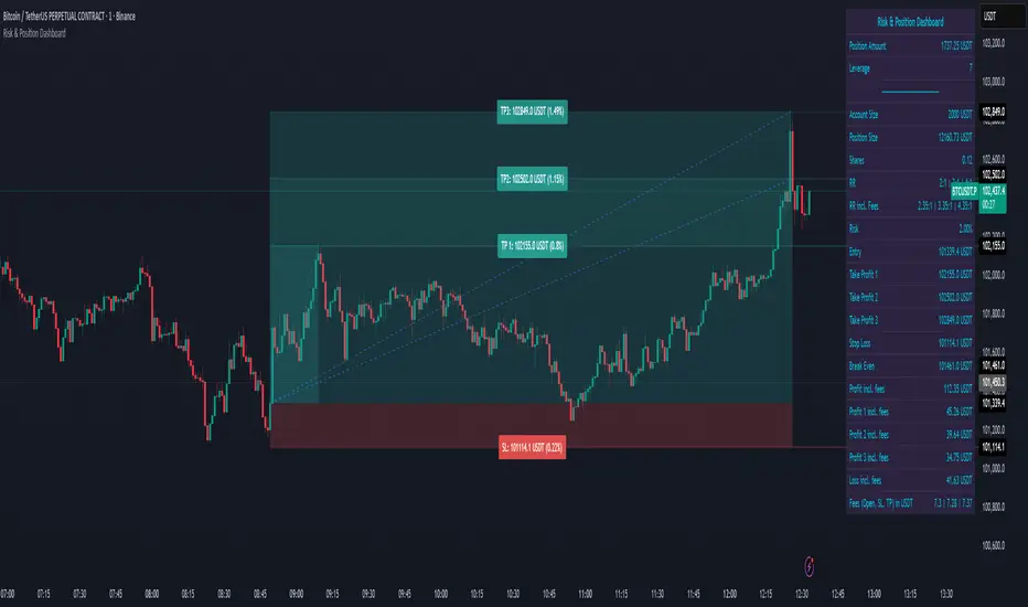
Risk & Position DashboardRisk & Position Dashboard
Overview
The Risk & Position Dashboard is a comprehensive trading tool designed to help traders calculate optimal position sizes, manage risk, and visualize potential profit/loss scenarios before entering trades. This indicator provides real-time calculations for position sizing based on account size, risk percentage, and stop-loss levels, while displaying multiple take-profit targets with customizable risk-reward ratios.
Key Features
Position Sizing & Risk Management:
Automatic position size calculation based on account size and risk percentage
Support for leveraged trading with maximum leverage limits
Fractional shares support for brokers that allow partial share trading
Real-time fee calculation including entry, stop-loss, and take-profit fees
Break-even price calculation including trading fees
Multi-Target Profit Management:
Support for up to 3 take-profit levels with individual portion allocations
Customizable risk-reward ratios for each take-profit target
Visual profit/loss zones displayed as colored boxes on the chart
Individual profit calculations for each take-profit level
Visual Dashboard:
Clean, customizable table display showing all key metrics
Configurable label positioning and styling options
Real-time tracking of whether stop-loss or take-profit levels have been reached
Color-coded visual zones for easy identification of risk and reward areas
Advanced Configuration:
Comprehensive input validation and error handling
Support for different chart timeframes and symbols
Customizable colors, fonts, and display options
Hide/show individual data fields for personalized dashboard views
How to Use
Set Account Parameters: Configure your account size, maximum risk percentage per trade, and trading fees in the "Account Settings" section.
Define Trade Setup: Use the "Entry" time picker to select your entry point on the chart, then input your entry price and stop-loss level.
Configure Take Profits: Set your desired risk-reward ratios and portion allocations for each take-profit level. The script supports 1-3 take-profit targets.
Analyze Results: The dashboard will automatically calculate and display position size, number of shares, potential profits/losses, fees, and break-even levels.
Visual Confirmation: Colored boxes on the chart show profit zones (green) and loss zones (red), with lines extending to current price levels.
Reset Entry and SL:
You can easily reset the entry and stop-loss by clicking the "Reset points..." button from the script's "More" menu.
This is useful if you want to quickly clear your current trade setup and start fresh without manually adjusting the points on the chart.
Calculations
The script performs sophisticated calculations including:
Position size based on risk amount and price difference between entry and stop-loss
Leverage requirements and position amount calculations
Fee-adjusted risk-reward ratios for realistic profit expectations
Break-even price including all trading costs
Individual profit calculations for partial position closures
Detailed Take-Profit Calculation Formula:
The take-profit prices are calculated using the following mathematical formula:
// Core variables:
// risk_amount = account_size * (risk_percentage / 100)
// total_risk_per_share = |entry_price - sl_price| + (entry_price * fee%) + (sl_price * fee%)
// shares = risk_amount / total_risk_per_share
// direction_factor = 1 for long positions, -1 for short positions
// Take-profit calculation:
net_win = total_risk_per_share * shares * RR_ratio
tp_price = (net_win + (direction_factor * entry_price * shares) + (entry_price * fee% * shares)) / (direction_factor * shares - fee% * shares)
Step-by-step example for a long position (based on screenshot):
Account Size: 2,000 USDT, Risk: 2% = 40 USDT
Entry: 102,062.9 USDT, Stop Loss: 102,178.4 USDT, Fee: 0.06%
Risk per share: |102,062.9 - 102,178.4| + (102,062.9 × 0.0006) + (102,178.4 × 0.0006) = 115.5 + 61.24 + 61.31 = 238.05 USDT
Shares: 40 ÷ 238.05 = 0.168 shares (rounded to 0.17 in display)
Position Size: 0.17 × 102,062.9 = 17,350.69 USDT
Position Amount (with 9x leverage): 17,350.69 ÷ 9 = 1,927.85 USDT
For 2:1 RR: Net win = 238.05 × 0.17 × 2 = 80.94 USDT
TP1 price = (80.94 + (1 × 102,062.9 × 0.17) + (102,062.9 × 0.0006 × 0.17)) ÷ (1 × 0.17 - 0.0006 × 0.17) = 101,464.7 USDT
For 3:1 RR: TP2 price = 101,226.7 USDT (following same formula with RR=3)
This ensures that after accounting for all fees, the actual risk-reward ratio matches the specified target ratio.
Risk Management Features
Maximum Trade Amount: Optional setting to limit position size regardless of account size
Leverage Limits: Built-in maximum leverage protection
Fee Integration: All calculations include realistic trading fees for accurate expectations
Validation: Automatic checking that take-profit portions sum to 100%
Historical Tracking: Visual indication when stop-loss or take-profit levels are reached (within last 5000 bars)
Understanding Max Trade Amount - Multiple Simultaneous Trades:
The "Max Trade Amount" feature is designed for traders who want to open multiple positions simultaneously while maintaining proper risk management. Here's how it works:
Key Concept:
- Risk percentage (2%) always applies to your full Account Size
- Max Trade Amount limits the capital allocated per individual trade
- This allows multiple trades with full risk on each trade
Example from Screenshot:
Account Size: 2,000 USDT
Max Trade Amount: 500 USDT
Risk per Trade: 2% × 2,000 = 40 USDT per trade
Stop Loss Distance: 0.11% from entry
Result: Position Size = 17,350.69 USDT with 35x leverage
Total Risk (including fees): 40.46 USDT
Multiple Trades Strategy:
With this setup, you can open:
Trade 1: 40 USDT risk, 495.73 USDT position amount (35x leverage)
Trade 2: 40 USDT risk, 495.73 USDT position amount (35x leverage)
Trade 3: 40 USDT risk, 495.73 USDT position amount (35x leverage)
Trade 4: 40 USDT risk, 495.73 USDT position amount (35x leverage)
Total Portfolio Exposure:
- 4 simultaneous trades = 4 × 495.73 = 1,982.92 USDT position amount
- Total risk exposure = 4 × 40 = 160 USDT (8% of account)
Indicador Pine Script®
PivotBoss VWAP Bands (Auto TF) - FixedWhat this indicator shows (high level)
The indicator plots a VWAP line and three bands above (R1, R2, R3) and three bands below (S1, S2, S3).
Band spacing is computed from STD(abs(VWAP − price), N) and multiplied by 1, 2 and 3 to form R1–R3 / S1–S3. The script is timeframe-aware: on 30m/1H charts it uses Weekly VWAP and weekly bands; on Daily charts it uses Monthly VWAP and monthly bands; otherwise it uses the session/chart VWAP.
VWAP = the market’s volume-weighted average price (a measure of fair value). Bands = volatility-scaled zones around that fair value.
Trading idea — concept summary
VWAP = fair value. Price above VWAP implies bullish bias; below VWAP implies bearish bias.
Bands = graded overbought/oversold zones. R1/S1 are near-term limits, R2/S2 are stronger, R3/S3 are extreme.
Use trend alignment + price action + volume to choose higher-probability trades. VWAP bands give location and magnitude; confirmations reduce false signals.
Entry rules (multiple strategies with examples)
A. Momentum breakout (trend-following) — preferred on trending markets
Setup: Price consolidates near or below R1 and then closes above R1 with above-average volume. Chart: 30m/1H (Weekly VWAP) or Daily (Monthly VWAP) depending on your timeframe.
Entry: Enter long at the close of the breakout bar that closes above R1.
Stop-loss: Place initial stop below the higher of (VWAP or recent swing low). Example: if price broke R1 at ₹1,200 and VWAP = ₹1,150, set stop at ₹1,145 (5 rupee buffer below VWAP) or below the last swing low if that is wider.
Target: Partial target at R2, full target at R3. Trail stop to VWAP or to R1 after price reaches R2.
Example numeric: Weekly VWAP = ₹1,150, R1 = ₹1,200, R2 = ₹1,260. Buy at ₹1,205 (close above R1), stop ₹1,145, target1 ₹1,260 (R2), target2 ₹1,320 (R3).
B. Mean-reversion fade near bands — for range-bound markets
Setup: Market is not trending (VWAP flatish). Price rallies up to R2 or R3 and shows rejection (pin bar, bearish engulfing) on increasing or neutral volume.
Entry: Enter short after a confirmed rejection candle that fails to sustain above R2 or R3 (prefer confirmation: close back below R1 or below the rejection candle low).
Stop-loss: Just above the recent high (e.g., 1–2 ATR or a fixed buffer above R2/R3).
Target: First target VWAP, second target S1. Reduce size if taking R3 fade as it’s an extreme.
Example numeric: VWAP = ₹950, R2 = ₹1,020. Price spikes to ₹1,025 and forms a bearish engulfing candle. Enter short at ₹1,015 after the next close below ₹1,020. Stop at ₹1,035, target VWAP ₹950.
C. Pullback entries in trending markets — higher probability
Setup: Price is above VWAP and trending higher (higher highs and higher lows). Price pulls back toward VWAP or S1 with decreasing downside volume and a reversal candle forms.
Entry: Long when price forms a bullish reversal (hammer/inside-bar) with a close back above the pullback candle.
Stop-loss: Below the pullback low (or below S2 if a larger stop is justified).
Target: VWAP then R1; if momentum resumes, trail toward R2/R3.
Example numeric: Price trending above Weekly VWAP at ₹1,400; pullback to S1 at ₹1,360. Enter long at ₹1,370 when a bullish candle closes; stop at ₹1,350; first target VWAP ₹1,400, second target R1 ₹1,450.
Exit rules and money management
Basic exit hierarchy
Hard stop exit — when price hits initial stop-loss. Always use.
Target exit — take partial profits at R1/R2 (for longs) or S1/S2 (for shorts). Use trailing stops for the remainder.
VWAP invalidation — if you entered long above VWAP and price returns and closes significantly below VWAP, consider exiting (condition depends on timeframe and trade size).
Price action exit — reversal patterns (strong opposite candle, bearish/bullish engulfing) near targets or beyond signals to exit.
Trailing rules
After price reaches R2, move stop to breakeven + a small buffer or to VWAP.
After price reaches R3, trail by 1 ATR or lock a defined profit percentage.
Position sizing & risk
Risk per trade: commonly 0.5–2% of account equity.
Determine position size by RiskAmount ÷ (EntryPrice − StopPrice).
If the stop distance is large (e.g., trading R3 fades), reduce position size.
Filters & confirmation (to reduce false signals)
Volume filter: For breakouts, require volume above short-term average (e.g., >20-period average). Breakouts on low volume are suspect.
Trend filter: Only take breakouts in the direction of the higher-timeframe trend (for example, use Daily/Weekly trend when trading 30m/1H).
Candle confirmation: Prefer entries on close of the confirming candle (not intrabar noise).
Multiple confirmations: When R1 break happens but RSI/plotted momentum indicator does not confirm, treat signal as lower probability.
Special considerations for timeframe-aware logic
On 30m/1H the script uses Weekly VWAP/bands. That means band levels change only on weekly candles — they are strong, structural levels. Treat R1/R2/R3 as significant and expect fewer, stronger signals.
On Daily, the script uses Monthly VWAP/bands. These are wider; trades should allow larger stops and smaller position sizes (or be used for swing trades).
On other intraday charts you get session VWAP (useful for intraday scalps).
Example: If you trade 1H and the Weekly R1 is at ₹2,400 while session VWAP is ₹2,350, a close above Weekly R1 represents a weekly-level breakout — prefer that for swing entries rather than scalps.
Example trade walkthrough (step-by-step)
Context: 1H chart, auto-mapped → Weekly VWAP used.
Weekly VWAP = ₹3,000; R1 = ₹3,080; R2 = ₹3,150.
Price consolidates below R1. A large bullish candle closes at ₹3,085 with volume 40% above the 20-bar average.
Entry: Buy at close ₹3,085.
Stop: Place stop at ₹2,995 (just under Weekly VWAP). Risk = ₹90.
Position size: If risking ₹900 per trade → size = 900 ÷ 90 = 10 units.
Targets: Partial take-profit at R2 = ₹3,150; rest trailed with stop moved to breakeven after R2 is hit.
If price reverses and closes below VWAP within two bars, exit immediately to limit drawdown.
When to avoid trading these signals
High-impact news (earnings, macro announcements) that can gap through bands unpredictably.
Thin markets with low volume — VWAP loses significance when volumes are extremely low.
When weekly/monthly bands are flat but intraday price is volatile without clear structure — prefer session VWAP on smaller timeframes.
Alerts & automation suggestions
Alert on close above R1 / below S1 (use the built-in alertcondition the script adds). For higher-confidence alerts, require volume filter in the alert condition.
Automated order rules (if you automate): use limit entry at breakout close plus a small slippage buffer, immediate stop order, and OCO for TP and SL.
Indicador Pine Script®

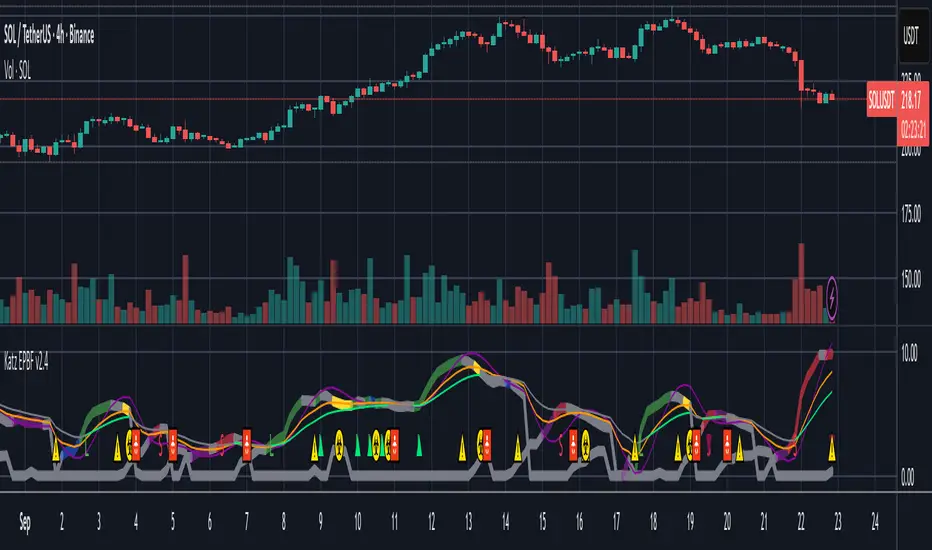
Katz Exploding PowerBand FilterUnderstanding the Katz Exploding PowerBand Filter (EPBF) v2.4
1. Indicator Overview
The Katz Exploding PowerBand Filter (EPBF) is an advanced technical indicator designed to identify moments of expanding bullish or bearish momentum, often referred to as "power." It operates as a standalone oscillator in a separate pane below the main price chart.
Its primary goal is to measure underlying market strength by calculating custom "Bull" and "Bear" power components. These components are then filtered through a versatile moving average and a dual signal line system to generate clear entry and exit signals. This indicator is not a simple momentum oscillator; it uses a unique calculation based on exponential envelopes of both price and squared price to derive its values.
2. On-Chart Lines and Components
The indicator pane consists of five main lines:
Bullish Component (Thick Green/Blue/Yellow/Gray Line): This is the core of the indicator. It represents the calculated bullish "power" or momentum in the market.
Bright Green: Indicates a strong, active long signal condition.
Blue: Shows the bull component is above the MA filter, but the filter itself is still pointing down—a potential sign of a reversal or weakening downtrend.
Yellow: A warning sign that bullish power is weakening and has fallen below the primary signal lines.
Gray: Represents neutral or insignificant bullish power.
Bearish Component (Thick Red/Purple/Yellow/Gray Line): This line represents the calculated bearish "power" or downward momentum.
Bright Red: Indicates a strong, active short signal condition.
Purple: Shows the bear component is above the MA filter, but the filter itself is still pointing down—a sign of potential trend continuation.
Yellow: A warning sign that bearish power is weakening.
Gray: Represents neutral or insignificant bearish power.
MA Filter (Purple Line): This is the main filter, calculated using the moving average type and length you select in the settings (e.g., HullMA, EMA). The Bull and Bear components are compared against this line to determine the underlying trend bias.
Signal Line 1 (Orange Line): A fast Exponential Moving Average (EMA) of the stronger power component. It acts as the first level of dynamic support or resistance for the power lines.
Signal Line 2 (Lime/Gray Line): A slower EMA that acts as a confirmation filter.
Lime Green: The line turns lime when it is rising and the faster Signal Line 1 is above it, indicating a confirmed bullish trend in momentum.
Gray: Indicates a neutral or bearish momentum trend.
3. On-Chart Symbols and Their Meanings
Various characters are plotted at the bottom of the indicator pane to provide clear, actionable signals.
L (Pre-Long Signal): The first sign of a potential long entry. It appears when the Bullish Component rises and crosses above both signal lines for the first time.
S (Pre-Short Signal): The first sign of a potential short entry. It appears when the Bearish Component rises and crosses above both signal lines for the first time.
▲ (Post-Long Signal): A stronger confirmation for a long entry. It appears with the 'L' signal only if the momentum trend is also confirmed bullish (i.e., the slower Signal Line 2 is lime green).
▼ (Post-Short Signal): A stronger confirmation for a short entry. It appears with the 'S' signal only if the momentum trend is confirmed bullish.
Exit / Take-Profit Symbols:
These symbols appear when a power component crosses below a line, suggesting that momentum is fading and it may be time to take profit.
⚠️ (Exit Signal 1): The Bull/Bear component has crossed below the main MA Filter. This is the first and most sensitive take-profit signal.
☣️ (Exit Signal 2): The Bull/Bear component has crossed below the faster Signal Line 1. This is a moderate take-profit signal.
🚼 (Exit Signal 3): The Bull/Bear component has crossed below the slower Signal Line 2. This is the slowest take-profit signal, suggesting the trend is more definitively exhausted.
4. Trading Strategy and Rules
Long Entry Rules:
Initial Signal: Wait for an L to appear at the bottom of the indicator. This confirms that bullish power is expanding.
Confirmation (Recommended): For a higher-probability trade, wait for a green ▲ symbol to appear. This confirms the underlying momentum trend aligns with the signal.
Entry: Enter a long (buy) position on the opening of the next candle after the signal appears.
Short Entry Rules:
Initial Signal: Wait for an S to appear at the bottom of the indicator. This confirms that bearish power is expanding.
Confirmation (Recommended): For a higher-probability trade, wait for a maroon ▼ symbol to appear. This confirms the underlying momentum trend aligns with the signal.
Entry: Enter a short (sell) position on the opening of the next candle after the signal appears.
Take Profit (TP) Rules:
The indicator provides three levels of take-profit signals. You can choose to exit your entire position or scale out at each level.
For a long trade, exit when you see ⚠️, ☣️, or 🚼 appear below the Bullish Component.
For a short trade, exit when you see ⚠️, ☣️, or 🚼 appear below the Bearish Component.
Stop Loss (SL) Rules:
The indicator does not provide an explicit stop loss. You must use your own risk management rules. Common methods include:
Swing High/Low: For a long position, place your stop loss below the most recent significant swing low on the price chart. For a short position, place it above the most recent swing high.
ATR-Based: Use an Average True Range (ATR) indicator to set a volatility-based stop loss.
Fixed Percentage: Risk a fixed percentage (e.g., 1-2%) of your account on the trade.
5. Disclaimer
This indicator is a tool for technical analysis and should not be considered financial advice. All trading involves significant risk, and past performance is not indicative of future results. The signals generated by this indicator are probabilistic and can result in losing trades. Always use proper risk management, such as setting a stop loss, and never risk more than you are willing to lose. It is recommended to backtest this indicator and use it in conjunction with other forms of analysis before trading with real capital. The indicator should only be used for educational purposes.
Indicador Pine Script®
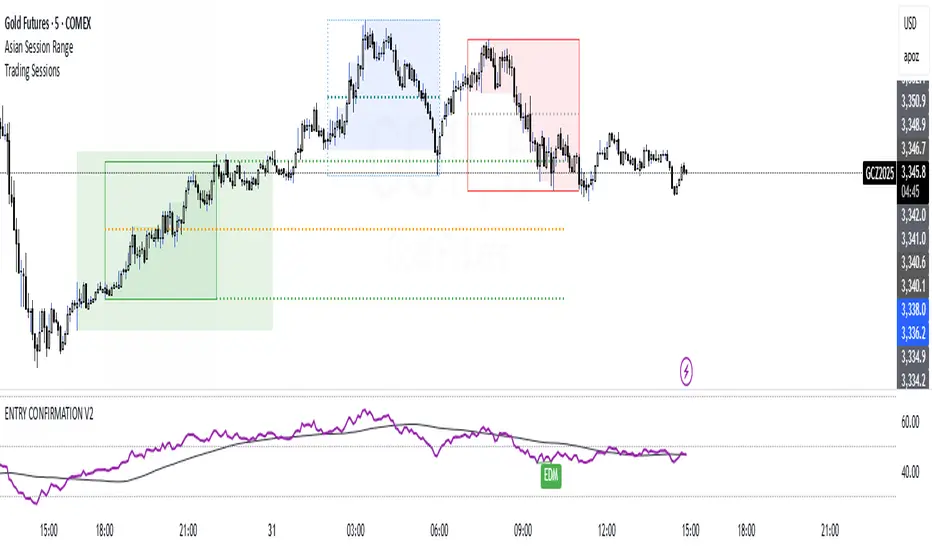
EAOBS by MIGVersion 1
1. Strategy Overview Objective: Capitalize on breakout movements in Ethereum (ETH) price after the Asian open pre-market session (7:00 PM–7:59 PM EST) by identifying high and low prices during the session and trading breakouts above the high or below the low.
Timeframe: Any (script is timeframe-agnostic, but align with session timing).
Session: Pre-market session (7:00 PM–7:59 PM EST, adjustable for other time zones, e.g., 12:00 AM–12:59 AM GMT).
Risk-Reward Ratios (R:R): Targets range from 1.2:1 to 5.2:1, with a fixed stop loss.
Instrument: Ethereum (ETH/USD or ETH-based pairs).
2. Market Setup Session Monitoring: Monitor ETH price action during the pre-market session (7:00 PM–7:59 PM EST), which aligns with the Asian market open (e.g., 9:00 AM–9:59 AM JST).
The script tracks the highest high and lowest low during this session.
Breakout Triggers: Buy Signal: Price breaks above the session’s high after the session ends (7:59 PM EST).
Sell Signal: Price breaks below the session’s low after the session ends.
Visualization: The session is highlighted on the chart with a white background.
Horizontal lines are drawn at the session’s high and low, extended for 30 bars, along with take-profit (TP) and stop-loss (SL) levels.
3. Entry Rules Long (Buy) Entry: Enter a long position when the price breaks above the session’s high price after 7:59 PM EST.
Entry price: Just above the session high (e.g., add a small buffer, like 0.1–0.5%, to avoid false breakouts, depending on volatility).
Short (Sell) Entry: Enter a short position when the price breaks below the session’s low price after 7:59 PM EST.
Entry price: Just below the session low (e.g., subtract a small buffer, like 0.1–0.5%).
Confirmation: Use a candlestick close above/below the breakout level to confirm the entry.
Optionally, add volume confirmation or a momentum indicator (e.g., RSI or MACD) to filter out weak breakouts.
Position Size: Calculate position size based on risk tolerance (e.g., 1–2% of account per trade).
Risk is determined by the stop-loss distance (10 points, as defined in the script).
4. Exit Rules Take-Profit Levels (in points, based on script inputs):TP1: 12 points (1.2:1 R:R).
TP2: 22 points (2.2:1 R:R).
TP3: 32 points (3.2:1 R:R).
TP4: 42 points (4.2:1 R:R).
TP5: 52 points (5.2:1 R:R).
Example for Long: If session high is 3000, TP levels are 3012, 3022, 3032, 3042, 3052.
Example for Short: If session low is 2950, TP levels are 2938, 2928, 2918, 2908, 2898.
Strategy: Scale out of the position (e.g., close 20% at TP1, 20% at TP2, etc.) or take full profit at a preferred TP level based on market conditions.
Stop-Loss: Fixed at 10 points from the entry.
Long SL: Session high - 10 points (e.g., entry at 3000, SL at 2990).
Short SL: Session low + 10 points (e.g., entry at 2950, SL at 2960).
Trailing Stop (Optional):After reaching TP2 or TP3, consider trailing the stop to lock in profits (e.g., trail by 10–15 points below the current price).
5. Risk Management per Trade: Limit risk to 1–2% of your trading account per trade.
Calculate position size: Account Size × Risk % ÷ (Stop-Loss Distance × ETH Price per Point).
Example: $10,000 account, 1% risk = $100. If SL = 10 points and 1 point = $1, position size = $100 ÷ 10 = 0.1 ETH.
Daily Risk Limit: Cap daily losses at 3–5% of the account to avoid overtrading.
Maximum Exposure: Avoid taking both long and short positions simultaneously unless using separate accounts or strategies.
Volatility Consideration: Adjust position size during high-volatility periods (e.g., major news events like Ethereum upgrades or macroeconomic announcements).
6. Trade Management Monitoring :Watch for breakouts after 7:59 PM EST.
Monitor price action near TP and SL levels using alerts or manual checks.
Trade Duration: Breakout lines extend for 30 bars (script parameter). Close trades if no TP or SL is hit within this period, or reassess based on market conditions.
Adjustments: If the market shows strong momentum, consider holding beyond TP5 with a trailing stop.
If the breakout fails (e.g., price reverses before TP1), exit early to minimize losses.
7. Additional Considerations Market Conditions: The 7:00 PM–7:59 PM EST session aligns with the Asian market open (e.g., Tokyo Stock Exchange open at 9:00 AM JST), which may introduce higher volatility due to Asian trading activity.
Avoid trading during low-liquidity periods or extreme volatility (e.g., major crypto news).
Check for upcoming events (e.g., Ethereum network upgrades, ETF decisions) that could impact price.
Backtesting: Test the strategy on historical ETH data using the session high/low breakouts for the 7:00 PM–7:59 PM EST window to validate performance.
Adjust TP/SL levels based on backtest results if needed.
Broker and Fees: Use a low-fee crypto exchange (e.g., Binance, Kraken, Coinbase Pro) to maximize R:R.
Account for trading fees and slippage in your position sizing.
Time zone Adjustment: Adjust session time input for your time zone (e.g., "0000-0059" for GMT).
Ensure your trading platform’s clock aligns with the script’s time zone (default: America/New_York).
8. Example Trade Scenario: Session (7:00 PM–7:59 PM EST) records a high of 3050 and a low of 3000.
Long Trade: Entry: Price breaks above 3050 (e.g., enter at 3051).
TP Levels: 3063 (TP1), 3073 (TP2), 3083 (TP3), 3093 (TP4), 3103 (TP5).
SL: 3040 (3050 - 10).
Position Size: For a $10,000 account, 1% risk = $100. SL = 11 points ($11). Size = $100 ÷ 11 = ~0.09 ETH.
Short Trade: Entry: Price breaks below 3000 (e.g., enter at 2999).
TP Levels: 2987 (TP1), 2977 (TP2), 2967 (TP3), 2957 (TP4), 2947 (TP5).
SL: 3010 (3000 + 10).
Position Size: Same as above, ~0.09 ETH.
Execution: Set alerts for breakouts, enter with limit orders, and monitor TPs/SL.
9. Tools and Setup Platform: Use TradingView to implement the Pine Script and visualize breakout levels.
Alerts: Set price alerts for breakouts above the session high or below the session low after 7:59 PM EST.
Set alerts for TP and SL levels.
Chart Settings: Use a 1-minute or 5-minute chart for precise session tracking.
Overlay the script to see high/low lines, TP levels, and SL levels.
Optional Indicators: Add RSI (e.g., avoid overbought/oversold breakouts) or volume to confirm breakouts.
10. Risk Warnings Crypto Volatility: ETH is highly volatile; unexpected news can cause rapid price swings.
False Breakouts: Breakouts may fail, especially in low-volume sessions. Use confirmation signals.
Leverage: Avoid high leverage (e.g., >5x) to prevent liquidation during volatile moves.
Session Accuracy: Ensure correct session timing for your time zone to avoid misaligned entries.
11. Performance Tracking Journaling :Record each trade’s entry, exit, R:R, and outcome.
Note market conditions (e.g., trending, ranging, news-driven).
Review: Weekly: Assess win rate, average R:R, and adherence to the plan.
Monthly: Adjust TP/SL or session timing based on performance.
Indicador Pine Script®
