Avg Candle Size Table (Ticks) The average of the last N candles in ticks shown on a table in the top right of the chart
Pesquisar nos scripts por "Table"


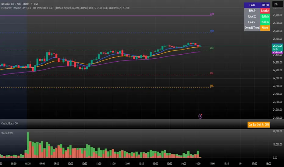
Premarket, Previous Day H/L + EMA Trend Table + ATHPremarket, Previous Day H/L + EMA Trend Table + ATH
Customizable Dashboard (SIMPLE)This is a custom table where you can track any ticker and it's daily change. color coded to make things easy.

Bias Table-manualIt is just at tabular column to manually update Bullish/Bearish for multiple timeframes. Provided date option which is also manual, to denote when the analysis was done and table updated. This will be helpful for multiple stocks/securities analysis on regular basis

Relative Volume Table with PressureDisplay relative Volume as a table in the top right corner. Turns green when volume is high and price is increasing and red when volume is high and price is decreasing. I use this on D timeframe at the open to screen for stocks breaking out.
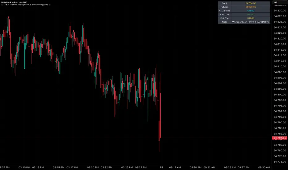
ATM & ITM Strike Table (NIFTY & BANKNIFTY)This script is like a cheat sheet for option traders.
When you put it on your chart, it shows you a small table with:
The current spot price (the real market price).
The futures price (another version of the same index that sometimes trades a bit higher or lower).
The ATM strike (the strike price closest to the market price).
Which call option and put option are “in the money” and most relevant right now.
A little note to remind you if you’re looking at the right chart.
In short:
It saves you from doing mental math every time by automatically pointing out the key option strike prices you should be aware of.
Stocks Sessions TableThe stock market open session table is a great way to keep an eye on the market's open and close. This is aimed at the UK traders working with the BST timezone
Strategy Sheet — Customizable 4x8 Table📖 Script Description
The Strategy Sheet — 4 Columns / 8 Rows is a compact and highly customizable table-based tool for traders who want to keep their trading plan, rules, and session settings directly visible on the chart.
🔹 Features:
• Up to 4 fully configurable columns and 8 rows
• Compact UI with per-column color overrides
• Dark / Light / Custom theme modes
• Support for zebra row backgrounds (alternating colors)
• Adjustable position, padding, spacing, and alignment
• Clean layout with borders and header styling
• Perfect for trade plans, ORB setups, session notes, or risk rules
🔹 Use cases:
• Documenting strategy rules directly on chart
• Displaying ORB session times and risk management
• Creating a structured overview of trading setups
• Quick reference without leaving the chart
This script does not generate signals – it’s a visual aid designed to organize and display trading information in a clear and professional way.

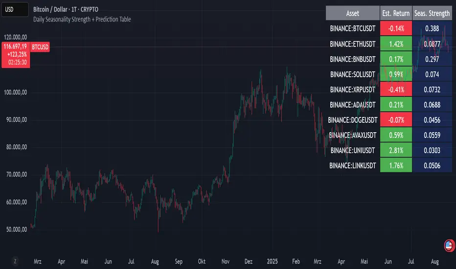
Daily Seasonality Strength + Prediction TableDaily Seasonality Strength + Prediction Table
Return Estimates:
This indicator uses historical price data to calculate average returns for each day (of the week or month) and uses these to predict the next day’s return.
Seasonality Strength:
It measures seasonality strength by comparing predicted returns with actual returns, using the inverse of MSE (higher values mean stronger seasonality).
supports up to 10 assets
This script is for informational and educational purposes only. It does not constitute financial, investment, or trading advice. I am not a financial advisor. Any decisions you make based on this indicator are your own responsibility. Always do your own research and consult with a qualified financial professional before making any investment decisions.
Past performance is no guarantee of future results. The value of the instruments may fluctuate and is not guaranteed
U Table • LITEA compact, educational version of my workflow that combines trend, momentum, trend strength, and a clean trigger:
Trend: EMA Fast vs EMA Slow (auto-lengths by chart TF)
Momentum: RSI > 50 for longs / < 50 for shorts
Strength: ADX above a user-set threshold (fallback implementation; can be replaced by ta.adx() when available)
Trigger: price crosses the Bollinger basis (center line)
Signals
LONG: crossover(close, BB basis) while EMA Fast > EMA Slow, RSI > 50, ADX > threshold
SHORT: crossunder(close, BB basis) while EMA Fast < EMA Slow, RSI < 50, ADX > threshold
Visuals
EMA Fast / EMA Slow / BB basis
Markers “L” / “S” on triggers
Latest confirmed pivot high/low (broken line style)
Small diagnostics table (ADX, EMA relation, RSI, last pivots) on the last bar
Inputs
Pivot length: pivot confirmation window (default 5)
ADX threshold: minimum trend strength to allow signals (default 20)
Notes
Signals are intended to be evaluated on bar close. Intrabar values may change until the bar closes.
Pivot lines appear after confirmation; they do not repaint once confirmed.
No external data or security() calls are used.
This LITE build focuses on clarity and speed (few calculations, overlay-friendly). It can be used as a stand-alone study or as a scaffold for your own research and risk management.

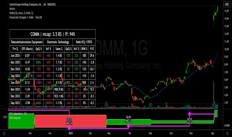
Financial Change % Table - ToluFinancial Change % Table which includes revenue , operating profit and earning per share . compares the financial data with previous quarter QoQ and previous year YoY . and shows the change in %.
Position Sizing Risk TablePosition Sizing Risk Table - swing trading. Allowing for a 0,25; 0,5 and 1% risk based on NAV

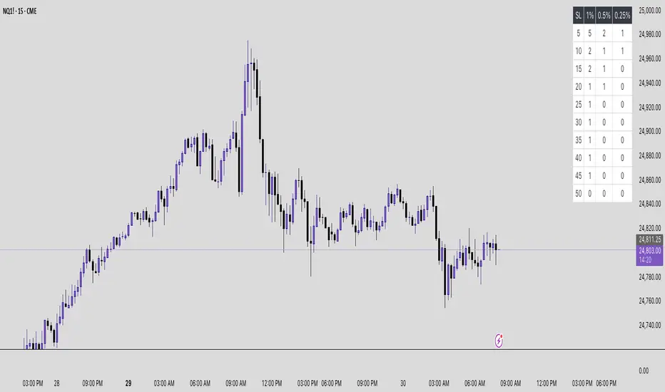
Futures Risk Contract TableFutures risk table for NQ MNQ YM MYM ES and MES
changeable capital and risk percentage along with points.
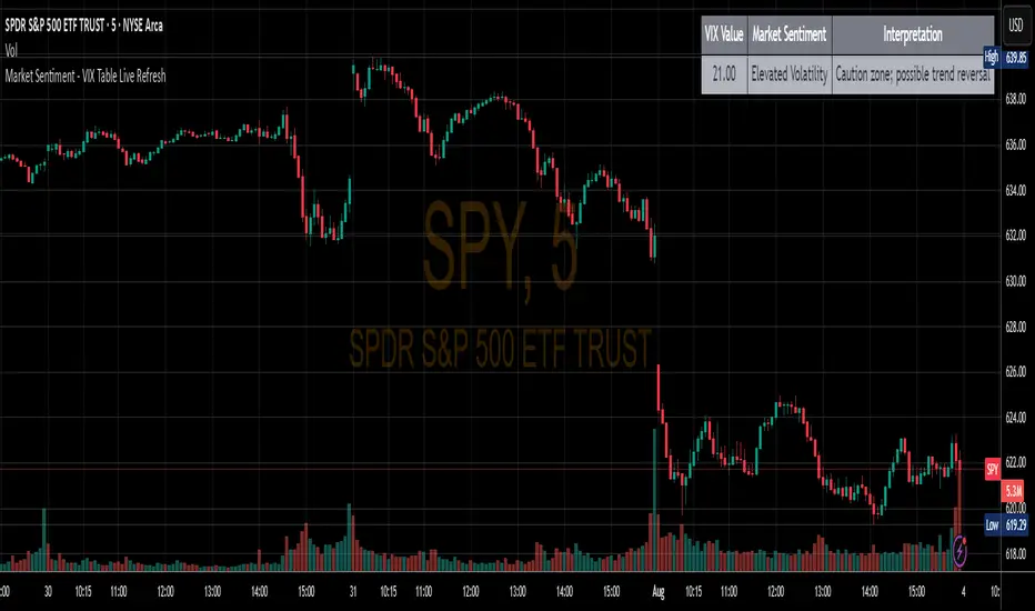
Market Sentiment - VIX Table Live RefreshProvides Market sentiment visual representation for easy understanding - using CBOE:VIX values
The VIX Sentiment Table provides an at-a-glance assessment of market mood by visualizing live data from the CBOE Volatility Index (VIX). Updated in sync with your chart’s resolution, this intuitive tool breaks down the current VIX level into clear sentiment zones—ranging from “Complacency” to “Panic”—paired with concise interpretations to guide your trading decisions.
EMA Ribbon with TableThis indicator plots multiple EMAs (5, 8, 13, 21, 34, 55, 89, 144, 233, 377) based on Fibonacci levels. Each line has a distinct color, and a clean table displays their real-time values. Great for spotting trend direction, crossovers, and momentum at a glance.

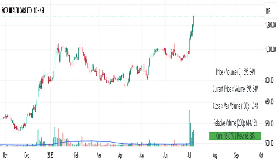
Price × Volume TableIt creates a table showing:
1- Daily Close × Daily Volume
2- Current Close × Current Volume
3- Close × Highest Volume (last 360 candles)
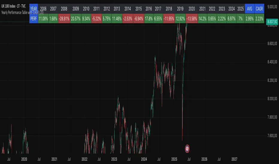
Yearly Performance Table with CAGROverview
This Pine Script indicator provides a clear table displaying the annual performance of an asset, along with two different average metrics: the arithmetic mean and the geometric mean (CAGR).
Core Features
Annual Performance Calculation:
Automatically detects the first trading day of each calendar year.
Calculates the percentage return for each full calendar year.
Based on closing prices from the first to the last trading day of the respective year.
Flexible Display:
Adjustable Period: Displays data for 1-50 years (default: 10 years).
Daily Timeframe Only: Functions exclusively on daily charts.
Automatic Update: Always shows the latest available years.
Two Average Metrics:
AVG (Arithmetic Mean)
A simple average of all annual returns. (Formula: (R₁ + R₂ + ... + Rₙ) ÷ n)
Important: Can be misleading in the presence of volatile returns.
GEO (Geometric Mean / CAGR)
Compound Annual Growth Rate. (Formula: ^(1/n) - 1)
Represents the true average annual growth rate.
Fully accounts for the compounding effect.
Limitations
Daily Charts Only: Does not work on intraday or weekly/monthly timeframes.
Calendar Year Basis: Calculations are based on calendar years, not rolling 12-month periods.
Historical Data: Dependent on the availability of historical data from the broker/data provider.
Interpretation of Results
CAGR as Benchmark: The geometric mean is more suitable for performance comparisons.
Annual Patterns: Individual year figures can reveal seasonal or cyclical trends.
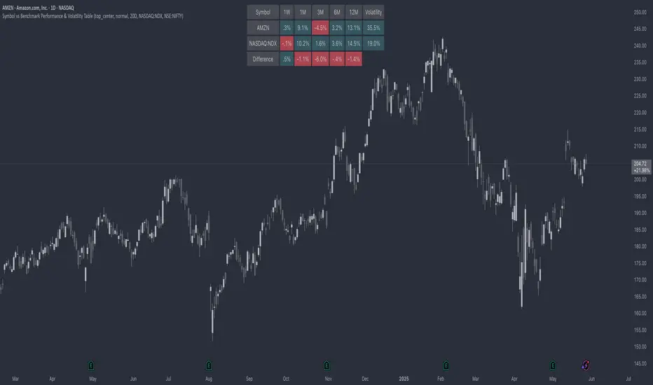
Symbol vs Benchmark Performance & Volatility TableThis tool puts the current symbol’s performance and volatility side-by-side with any benchmark —NASDAQ, S&P 500, NIFTY or a custom index of your choice.
A quick glance shows whether the stock is outperforming, lagging, or just moving with the market.
⸻
Features
• ✅ Returns over 1W, 1M, 3M, 6M, 12M
• 🔄 Benchmark comparison with optional difference row
• ⚡ Volatility snapshot (20D, 60D, or 252D)
• 🎛️ Fully customizable:
• Show/hide rows and timeframes
• Switch between default or custom benchmarks
• Pick position, size, and colors
Built to answer a simple, everyday question — “How’s this really doing compared to the broader market?”
Thanks to @BeeHolder, whose performance table originally inspired this.
Hope it makes your analysis a little easier and quicker.
Abusuhil Bullish Candles (Label + Table)Abusuhil Bullish Candles is a pattern recognition indicator designed to identify key bullish reversal candlestick formations including Hammer, Bullish Engulfing, Morning Star, Piercing Line, Three White Soldiers, and Three Inside Up.
The script includes optional filters such as Stochastic and Volume Confirmation, providing more precise signal detection.
Each pattern and filter is fully customizable via settings. Alerts are also included to support active trading workflows.
This script was written originally and does not copy open-source indicators. It's ideal for traders seeking visual clarity on bullish opportunities with professional-grade logic.
مؤشر الشموع الصعودية هو مؤشر احترافي يكتشف أبرز نماذج الانعكاس الصعودي في الشموع اليابانية مثل: Hammer، Bullish Engulfing، Morning Star، Piercing Line، Three White Soldiers، و Three Inside Up.
يوفر المؤشر فلاتر إضافية مثل فلتر Stochastic وفلتر الفوليوم لتعزيز دقة الإشارات. جميع الإعدادات قابلة للتعديل بما يتناسب مع احتياج كل متداول.
يحتوي المؤشر أيضًا على تنبيهات تلقائية لدعم استراتيجيات التداول اللحظي. تمت برمجة المؤشر من الصفر ويعتمد على منطق خاص غير منسوخ من سكربتات مفتوحة المصدر.
--------------------------------------------------------------------------------------------------------------------
🇸🇦 التحديثات – النسخة الجديدة (Abusuhil Bullish Candles)
✅ تم تغيير الملصقات بشكل أوضح: باستخدام دوائر ملونة أسفل الشموع بدلًا من المربعات لتفادي التراكب.
🟦 إضافة جدول تفاعلي على الشارت يعرض أسماء النماذج وألوانها المخصصة.
🎨 إمكانية تغيير ألوان كل نموذج من الإعدادات حسب رغبة المستخدم.
🧩 تفعيل/تعطيل كل نموذج على حدة من خلال إعدادات منفصلة.
🔔 إضافة تنبيه احترافي واحد يتم تفعيله عند تحقق أي نموذج نشط من النماذج المحددة.
📋 توافق كامل مع سياسة TradingView:
لا يحتوي على أكواد منسوخة أو مبنية على مؤشرات داخلية.
لا تكرار للوظائف أو العناوين.
وصف واضح مع تحكم كامل للمستخدم.
🇬🇧 Updates – Latest Version (Abusuhil Bullish Candles)
✅ Clearer Signal Labels: Now uses colored circles under candles instead of labels to avoid overlapping.
🟦 Interactive Table showing pattern names and user-defined colors.
🎨 Customizable colors for each candlestick pattern from the settings menu.
🧩 Toggle each pattern independently using dedicated checkboxes.
🔔 Single professional alert condition that triggers only when any enabled pattern is detected.
📋 Fully compliant with TradingView's publishing policy:
No reused or built-in indicator code.
No duplicated logic or misleading titles.
Clean and modular design with full user customization.

ATR Percentage TableSimple ATR shows the average price change per candle. In order to enter a trade, I need to know how much percent I will win.
I should enter the game for the cross with the highest percentage change. I created a table by entering a cross name in each line in the list and made it possible to follow the changes in the active window.
I sorted the ATR change percentages from largest to smallest. Being able to see the highest percentage change is an answer to the question of which crosses I should choose to open a trade.

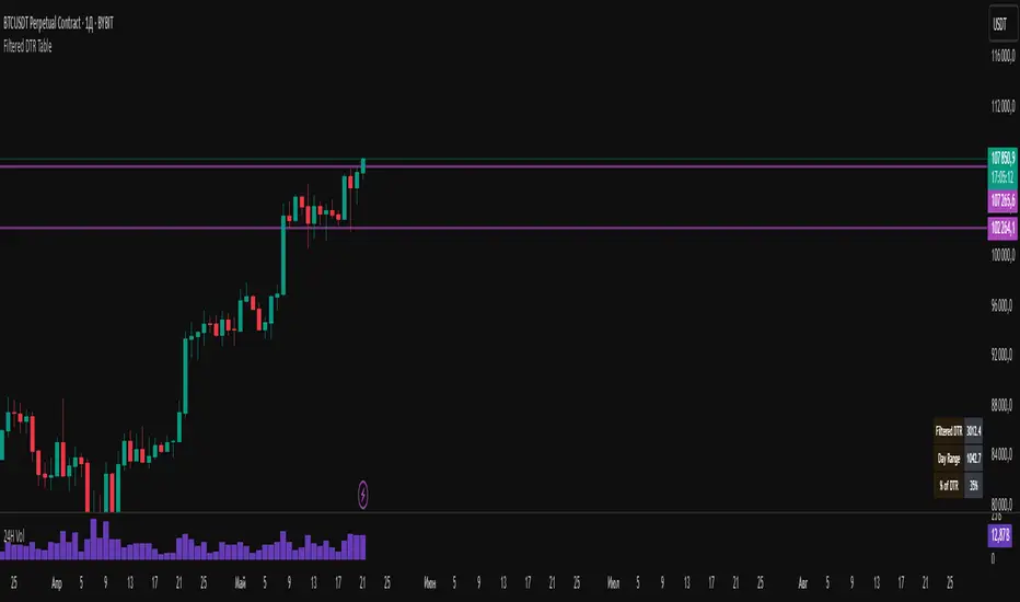
Filtered DTR Table📊 Filtered Daily True Range (DTR) Indicator
This indicator calculates and displays a filtered version of the Daily True Range (DTR) over the last 14 trading days, using high and low prices of each day.
It filters out extreme values by excluding any daily range that is:
Less than 0.5× the average range
Greater than 2× the average range
The indicator shows a table in the bottom-right corner of the main chart, containing:
Filtered ATR – The average of valid (filtered) daily ranges over the past 14 days, based on the high-low difference.
Current Day's Range – The high-low range of the current trading day.
% of ATR – How much of the filtered ATR has been covered by today's range, expressed as a whole number percentage.