QMF- Market Structure & Signal Suite [BullByte]QUANTUM MOMENTUM FUSION - Market Structure and Signal Suite
OVERVIEW
Quantum Momentum Fusion is a comprehensive market analysis framework built around a multi-dimensional momentum oscillator. This indicator was designed to give traders a complete analytical workspace in a single tool, combining momentum measurement, market structure identification, trendline analysis, divergence detection, and multi-timeframe context into one unified system.
The core philosophy behind QMF is that successful trading decisions come from understanding multiple aspects of market behavior simultaneously, not from relying on any single indicator or signal. The oscillator serves as the analytical foundation, and every other component builds upon it to create a complete picture of current market conditions.
This description will walk through each component of the indicator, explaining what it measures, why that information matters, and how to interpret what you see on the chart. Whether you are an experienced trader familiar with oscillator analysis or newer to technical indicators, each section aims to make the concepts accessible and practical.
THE QUANTUM ENGINE: UNDERSTANDING THE CORE OSCILLATOR (why its original and not a mashup)
At the heart of this indicator is the Quantum Momentum Fusion oscillator, displayed in its own pane below the price chart. Unlike traditional oscillators that measure a single aspect of price behavior, the QMF oscillator synthesizes four distinct market dimensions into one unified reading.
WHAT IS AN OSCILLATOR
For those less familiar with the term, an oscillator is a technical indicator that fluctuates between defined boundaries, typically showing whether an asset is experiencing strong buying pressure, strong selling pressure, or neutral conditions. The QMF oscillator moves between 0 and 100, with 50 representing the neutral midpoint.
When the oscillator is high (above 70), it suggests the market has experienced significant upward momentum and may be approaching exhaustion. When low (below 30), it suggests the market has experienced significant downward momentum and may be due for a bounce. The space between these extremes represents normal market fluctuation.
THE FOUR DIMENSIONS
What makes the QMF oscillator different from standard momentum indicators is that it combines four separate measurements into its calculation. Each dimension captures a different aspect of market behavior:
VELOCITY DIMENSION
This measures how quickly momentum itself is changing. Think of it like acceleration in a car. Knowing the car is moving forward (direction) is useful, but knowing whether the driver is pressing the accelerator or the brake (acceleration) tells you what is likely to happen next. The velocity dimension calculates the rate of change of the rate of change, providing early warning when momentum is about to shift direction. In practical terms, this can show momentum weakening before price actually reverses.
Why it matters: Price can continue in one direction for a while even after the underlying momentum starts to fade. By measuring acceleration, you can identify potential turning points earlier than with simple momentum indicators.
How it appears: This dimension is calculated internally and combined with the others. You do not see it separately, but its effect shows in the oscillator responding earlier to momentum shifts.
VOLUME DIMENSION
This measures price movement weighted by trading volume. A price move accompanied by high volume has different significance than the same price move on low volume. High volume suggests conviction and participation from larger traders. Low volume suggests the move may lack follow-through.
The volume dimension multiplies price change by a volume ratio (current volume compared to average volume), giving greater weight to moves that have volume confirmation behind them.
Why it matters: Volume often precedes price. Strong volume on a move suggests institutional participation and increases the probability that the move will continue. Weak volume on a move suggests it may be easily reversed.
How it appears: Moves with strong volume conviction will push the oscillator more definitively, while low-volume moves will have muted effect on the reading.
VOLATILITY DIMENSION
This normalizes price movement against the current volatility environment. Markets go through periods of high volatility (large price swings) and low volatility (small price swings). A 1% move during a low volatility period is more significant than a 1% move during a high volatility period.
The volatility dimension divides price change by Average True Range (ATR), which measures typical price range. This tells you whether current movement is significant relative to what is normal for this market right now.
Why it matters: Without volatility normalization, the oscillator would react the same way to all price moves regardless of context. By adjusting for volatility, the oscillator identifies moves that are genuinely significant versus normal noise within the current regime.
How it appears: During quiet markets, smaller price moves can still register as significant if they exceed normal volatility. During volatile markets, the oscillator will not overreact to moves that are within expected range.
SESSION DIMENSION
This tracks where price is positioned relative to the session Volume Weighted Average Price (VWAP). VWAP represents the average price at which trading has occurred during the session, weighted by volume. Institutional traders often use VWAP as a benchmark for fair value.
When price is consistently above VWAP, it suggests buyers are willing to pay above average prices, indicating accumulation. When price is consistently below VWAP, it suggests sellers are accepting below average prices, indicating distribution.
Why it matters: VWAP positioning provides insight into whether institutional traders are likely accumulating or distributing. Price repeatedly returning to and bouncing from VWAP can indicate support, while price repeatedly failing at VWAP can indicate resistance.
How it appears: The session dimension contributes bullish readings when price maintains above VWAP and bearish readings when price maintains below VWAP.
ADAPTIVE WEIGHTING
The four dimensions are combined using configurable weights, and the system can operate in Adaptive Mode. When Adaptive Mode is enabled, the indicator automatically adjusts its sensitivity based on the current volatility regime. During high volatility periods, sensitivity increases to capture larger moves. During low volatility periods, sensitivity decreases to filter out noise.
This means the oscillator adapts to changing market conditions without requiring manual adjustment.
READING THE OSCILLATOR: DISPLAY MODES AND ZONES
The QMF oscillator can be displayed in four different visual formats. Each shows the same underlying data but presents it differently based on trader preference.
ENERGY CANDLES
This mode displays the oscillator as candlestick-style candles. Just as price candles show open, high, low, and close for price, energy candles show these values for the QMF oscillator.
Green candles indicate the oscillator closed higher than it opened (bullish momentum). Red candles indicate the oscillator closed lower than it opened (bearish momentum). The body size shows how much the oscillator moved during the period. Larger bodies indicate stronger momentum conviction.
This format is useful for traders who are comfortable reading candlestick patterns and want to apply similar visual analysis to the oscillator.
QMF LINE
This mode displays the oscillator as a traditional line chart with a signal line overlay. The main QMF line shows current momentum. The signal line is a smoothed average of the QMF that helps identify direction changes.
When the QMF line is above the signal line, momentum is bullish. When below, momentum is bearish. Crossovers between the two lines can indicate momentum shifts.
This format is familiar to traders who use indicators like MACD and prefer clean line-based visualization.
IMPULSE BARS
This mode displays the oscillator as a histogram centered on the 50 midline. Bars above 50 indicate bullish momentum, bars below 50 indicate bearish momentum. Bar height shows momentum strength.
The color intensity changes based on momentum direction. Bars that are increasing in the bullish direction show brighter color. Bars that are decreasing show muted color. This makes it easy to see momentum acceleration and deceleration at a glance.
HEIKIN FLOW
This mode applies Heikin-Ashi smoothing to the energy candles. Heikin-Ashi is a Japanese technique that averages price data to create smoother trends with fewer reversals.
The result is cleaner visual trends that are easier to follow, though with slightly more lag than standard energy candles. This format is useful for identifying sustained momentum moves without getting distracted by minor fluctuations.
OSCILLATOR ZONES
Regardless of display mode, the oscillator pane includes horizontal reference lines that define important zones:
Midline at 50: The neutral point. When the oscillator is above 50, overall momentum is bullish. When below 50, overall momentum is bearish.
Overbought level at 70: When the oscillator crosses above this level, the market is showing strong bullish momentum. However, this also means prices have risen significantly and bearish reversal probability increases the longer the oscillator stays elevated.
Oversold level at 30: When the oscillator crosses below this level, the market is showing strong bearish momentum. However, this also means prices have fallen significantly and bullish reversal probability increases.
Extreme overbought at 85: Maximum bullish exhaustion. At this level, almost all short-term buying pressure has been expended. Reversal probability is high.
Extreme oversold at 15: Maximum bearish exhaustion. At this level, almost all short-term selling pressure has been expended. Reversal probability is high.
Understanding these zones helps you assess the current market condition before looking at any other indicator components.
MARKET STRUCTURE: DYNAMIC SUPPORT AND RESISTANCE
The second major component of the indicator is market structure analysis through dynamic support and resistance levels. Unlike price-based support and resistance, these levels are calculated directly on the oscillator.
WHAT ARE OSCILLATOR-BASED S/R LEVELS
When the QMF oscillator reaches a high point and then reverses lower, that high point becomes a resistance level on the oscillator. When the oscillator reaches a low point and then reverses higher, that low point becomes a support level.
These levels represent momentum thresholds that the market has previously found difficult to exceed. They answer the question: At what momentum reading has the oscillator historically reversed?
WHY THIS MATTERS
Oscillator support and resistance provides different information than price support and resistance. Price S/R tells you where buyers and sellers have previously entered the market. Oscillator S/R tells you what level of momentum the market has been able to sustain.
If the oscillator approaches its resistance level, it suggests momentum is reaching the upper bounds of what has been achievable recently. Either momentum will break through (indicating unusually strong conditions) or it will reverse (indicating normal mean reversion).
Similarly, if the oscillator approaches support, it suggests momentum is reaching exhaustion levels that have previously triggered bounces.
HOW IT APPEARS ON THE CHART
Resistance is displayed as a horizontal red line with a RES label on the oscillator pane. Support is displayed as a horizontal cyan line with a SUP label. These lines update dynamically as new pivots form.
When the oscillator breaks through these levels, markers appear:
R with up arrow: Resistance level broken, indicating unusually strong bullish momentum
S with down arrow: Support level broken, indicating unusually strong bearish momentum
R with checkmark: Resistance held, price rejected at this level
S with checkmark: Support held, price bounced from this level
The dashboard also shows current S/R status: whether the oscillator recently broke resistance, broke support, is currently at resistance, is currently at support, or is in clear space between levels.
AUTOMATED TRENDLINES: MOMENTUM TREND STRUCTURE
The third major component is automated trendline detection on the oscillator. This identifies trending behavior in momentum itself, separate from price trends.
WHAT ARE OSCILLATOR TRENDLINES
Just as you can draw trendlines on a price chart connecting swing lows (uptrend) or swing highs (downtrend), the indicator draws trendlines on the oscillator connecting pivot points.
Support trendlines connect oscillator pivot lows and project forward with a flat or rising slope. These show upward trending momentum where each pullback finds support at a higher level.
Resistance trendlines connect oscillator pivot highs and project forward with a flat or falling slope. These show downward trending momentum where each rally faces resistance at a lower level.
WHY THIS MATTERS
Price trends and momentum trends do not always align. Price can continue making higher highs while momentum makes lower highs, a condition called bearish divergence. Momentum trendlines help visualize this behavior.
When momentum is making higher lows (rising support trendline), it suggests underlying strength even if price is consolidating. When momentum is making lower highs (falling resistance trendline), it suggests underlying weakness even if price is holding.
Breaks of these trendlines often precede price moves. If a falling momentum resistance trendline breaks upward, it suggests bearish pressure is releasing and bullish momentum may follow. If a rising momentum support trendline breaks downward, it suggests bullish pressure is failing and bearish momentum may follow.
HOW IT APPEARS ON THE CHART
Support trendlines appear in blue/cyan, resistance trendlines appear in pink/magenta. Lines extend forward from the most recent pivot point to show projected levels.
Small circle markers can optionally appear at each pivot point used to construct the trendlines, helping you verify the anchor points.
When the oscillator breaks through a trendline, markers appear:
TL with up arrow: Resistance trendline broken upward (bullish breakout)
TL with down arrow: Support trendline broken downward (bearish breakdown)
Trendline strength is calculated based on three factors: how many pivot points validate the line, how recently it formed, and the angle of the slope. Stronger trendlines have more touches, formed recently, and have moderate slopes. You can filter trendlines by strength to show only the most significant ones.
Optional trendline zones can display a shaded area around each trendline rather than just a single line, showing a zone of influence rather than a precise level.
DIVERGENCE: WHEN PRICE AND MOMENTUM DISAGREE
The fourth major component is divergence detection, which identifies discrepancies between price action and oscillator behavior.
WHAT IS DIVERGENCE
Divergence occurs when price makes a new high or low, but the oscillator fails to confirm it. This disagreement between price and momentum often precedes reversals.
There are four types of divergence:
REGULAR BULLISH DIVERGENCE
Price makes a lower low (new low point below the previous low), but the oscillator makes a higher low (its low point is above its previous low). This suggests that despite price going lower, selling momentum is actually weakening. The implication is that sellers are losing conviction and a bounce or reversal may be approaching.
Visual example: Imagine price drops from 100 to 95, bounces to 97, then drops again to 93. At the same time, the oscillator drops to 25, bounces to 35, then drops only to 30. Price made a lower low (93 vs 95) but the oscillator made a higher low (30 vs 25). This is regular bullish divergence.
REGULAR BEARISH DIVERGENCE
Price makes a higher high (new high point above the previous high), but the oscillator makes a lower high (its high point is below its previous high). This suggests that despite price going higher, buying momentum is actually weakening. The implication is that buyers are losing conviction and a pullback or reversal may be approaching.
HIDDEN BULLISH DIVERGENCE
Price makes a higher low (its low point is above its previous low), but the oscillator makes a lower low (new low below its previous low). This occurs during uptrends and suggests the trend will continue. Price is holding higher but momentum briefly dipped further, indicating a temporary pullback within a larger uptrend.
HIDDEN BEARISH DIVERGENCE
Price makes a lower high (its high point is below its previous high), but the oscillator makes a higher high (new high above its previous high). This occurs during downtrends and suggests the trend will continue. Price is staying lower but momentum briefly spiked higher, indicating a temporary bounce within a larger downtrend.
Regular divergence suggests reversal. Hidden divergence suggests continuation.
HOW IT APPEARS ON THE CHART
When divergence is confirmed, labels appear on the oscillator:
BULL DIV: Regular bullish divergence confirmed
BEAR DIV: Regular bearish divergence confirmed
H-BULL: Hidden bullish divergence confirmed
H-BEAR: Hidden bearish divergence confirmed
Dotted lines connect the pivot points on the oscillator to show the divergence pattern. Regular divergence uses solid colored lines, hidden divergence uses dashed lines.
The dashboard shows divergence status in real-time:
CHECKING BULL: A potential bullish divergence pattern is forming but not yet confirmed
CHECKING BEAR: A potential bearish divergence pattern is forming but not yet confirmed
BULL CONFIRMED: Bullish divergence has been validated
BEAR CONFIRMED: Bearish divergence has been validated
NONE: No divergence currently active
Divergence strength is calculated from the magnitude of the oscillator discrepancy. Only divergences meeting the minimum strength threshold are displayed to filter out minor, less significant patterns.
FLOW RIBBONS: VISUALIZING MOMENTUM ALIGNMENT
The fifth major component is the Flow Ribbon system, which displays multiple moving averages of the QMF oscillator to visualize momentum trend and alignment.
WHAT ARE FLOW RIBBONS
Flow ribbons consist of three Exponential Moving Averages (EMAs) applied to the QMF oscillator values. Think of them as smoothed versions of the oscillator at different speeds:
Fast Ribbon : Responds quickly to momentum changes, showing recent momentum direction
Medium Ribbon: Balances responsiveness with smoothness, showing intermediate momentum
Slow Ribbon: Moves slowly and shows longer-term momentum context
When these three lines are plotted together with filled area between them, they create a visual ribbon that expands and contracts based on momentum conditions.
WHY RIBBON ALIGNMENT MATTERS
The relationship between these three averages tells you about momentum structure:
BULLISH ALIGNMENT (Fast above Medium above Slow)
When the ribbons are stacked with fast on top, medium in middle, and slow on bottom, momentum is aligned bullishly across multiple timeframes. Short-term momentum leads, with medium and long-term momentum confirming. This is the strongest bullish configuration.
BEARISH ALIGNMENT (Fast below Medium below Slow)
When the ribbons are inverted with fast on bottom, medium in middle, and slow on top, momentum is aligned bearishly across multiple timeframes. Short-term momentum leads downward, with medium and long-term momentum confirming. This is the strongest bearish configuration.
MIXED/TRANSITIONING
When the ribbons are not properly stacked, momentum is in transition. This often occurs during consolidation, trend changes, or choppy conditions. Trading during mixed ribbon states carries higher uncertainty.
RIBBON EXPANSION AND CONTRACTION
Beyond alignment, the distance between the fast and slow ribbon provides additional information:
EXPANDING RIBBON
When the gap between fast and slow ribbon is increasing, momentum is accelerating. In a bullish alignment with expansion, upward momentum is strengthening. In a bearish alignment with expansion, downward momentum is strengthening. Expansion confirms trend conviction.
CONTRACTING RIBBON
When the gap between fast and slow ribbon is decreasing, momentum is decelerating. The current trend may be losing steam. Contraction often precedes consolidation or reversal. It serves as an early warning that the current move may be exhausting.
HOW IT APPEARS ON THE CHART
The fast ribbon appears as a thicker line, the slow ribbon as a thinner line. The area between them fills with color:
Green fill: Bullish ribbon alignment
Red fill: Bearish ribbon alignment
Gray fill: Neutral or transitioning state
The dashboard shows ribbon state as BULL, BEAR, or NEUT, and indicates whether ribbons are expanding (EXP) or contracting (CON).
Ribbon crossovers occur when the fast ribbon crosses the slow ribbon, signaling potential momentum shifts. These crossovers are confirmed only after the bar closes to prevent false signals from intrabar movement.
REVERSAL CLOUDS: PROBABILITY ZONES
The sixth major component is the Reversal Cloud system, which visualizes zones where momentum reversals have elevated probability.
WHAT ARE REVERSAL CLOUDS
Reversal clouds are shaded areas around the QMF oscillator that indicate probability zones for mean reversion. They answer the question: How far from average has momentum extended, and what is the probability it will revert?
When the oscillator moves far from its normal range, it creates stretched conditions. Like a rubber band pulled to its limit, the probability increases that it will snap back toward center. Reversal clouds visualize these stretched conditions.
CLOUD CALCULATION METHODS
Five different calculation methods are available, each with different characteristics:
DYNAMIC BOLLINGER
Uses statistical standard deviation to create bands that adapt to oscillator volatility. When the oscillator is volatile, bands widen. When the oscillator is calm, bands narrow. This method identifies moves that are statistically significant relative to recent oscillator behavior.
GOLDEN RATIO
Applies Fibonacci proportions (0.214 and 0.786) to the oscillator range. These ratios appear throughout nature and markets. Some traders believe these proportions have psychological significance in market behavior.
ADAPTIVE HALO
Scales cloud width based on price ATR rather than oscillator volatility. This connects cloud width to actual price volatility, making the clouds wider during volatile price action and narrower during calm periods.
VOLATILITY SQUEEZE
Uses short-term standard deviation to create bands that contract during low volatility and expand during high volatility. This method is particularly useful for identifying potential breakout conditions when volatility is compressed.
ICHIMOKU RSI
Applies concepts from Ichimoku Kinko Hyo equilibrium theory to create balanced zones. Uses multiple lookback periods to establish equilibrium levels where the oscillator tends to find balance.
HOW TO READ THE CLOUDS
The oscillator moves through the cloud area as momentum fluctuates:
When QMF enters the upper cloud region, it indicates extended bullish momentum. The higher into the cloud, the greater the probability of bearish reversal through mean reversion.
When QMF enters the lower cloud region, it indicates extended bearish momentum. The deeper into the cloud, the greater the probability of bullish reversal through mean reversion.
Cloud opacity adjusts based on reversal probability. More opaque coloring indicates higher reversal probability. Subtle coloring indicates lower reversal probability.
IMPORTANT UNDERSTANDING
Clouds show probability zones, not certainty. Price can remain in extreme zones longer than expected, particularly during strong trends. Clouds are most useful when combined with other components like divergence, S/R breaks, and ribbon alignment rather than used in isolation.
MULTI-TIMEFRAME ANALYSIS: SEEING THE BIGGER PICTURE
The seventh major component is Multi-Timeframe (MTF) analysis, which calculates QMF values across multiple timeframes to assess momentum alignment at different time perspectives.
WHY MULTIPLE TIMEFRAMES MATTER
The timeframe you trade on shows only one perspective of market momentum. A bullish signal on a 15-minute chart may occur within a larger bearish trend on the 4-hour chart. Understanding momentum context from higher timeframes helps you assess whether you are trading with or against the larger flow.
When multiple timeframes align in the same direction, the probability of a successful trade increases. When timeframes conflict, the situation is more uncertain and requires additional caution.
HOW MTF ANALYSIS WORKS
The indicator calculates the full QMF oscillator independently on four configurable timeframes. By default, these are set to 5-minute, 15-minute, 60-minute (1 hour), and 240-minute (4 hour), but you can configure them to any timeframes that suit your trading style.
For each timeframe, the system determines the current momentum bias:
OB - Overbought: QMF above 70, indicating extended bullish momentum that may reverse
B+ - Strong Bullish: QMF above 55 and above its signal line, indicating solid bullish momentum
B - Bullish: QMF above its signal line, indicating mild bullish momentum
N - Neutral: QMF near 50 with no clear direction
S - Bearish: QMF below its signal line, indicating mild bearish momentum
S+ - Strong Bearish: QMF below 45 and below its signal line, indicating solid bearish momentum
OS - Oversold: QMF below 30, indicating extended bearish momentum that may reverse
ALIGNMENT SCORING
The dashboard displays an alignment score showing how many of the four timeframes agree with each directional bias. This appears as a fraction like 3/4 or 2/4.
4/4 Bullish: All four timeframes show bullish readings - maximum bullish alignment
3/4 Bullish: Three timeframes bullish, one diverging - strong bullish alignment
2/4: Split between bullish and bearish - no clear alignment, use caution
3/4 Bearish: Three timeframes bearish, one diverging - strong bearish alignment
4/4 Bearish: All four timeframes show bearish readings - maximum bearish alignment
Higher alignment scores indicate more reliable momentum context. Trading with 3/4 or 4/4 alignment in your favor provides better odds than trading against alignment or during mixed conditions.
NON-REPAINTING MTF DATA
The multi-timeframe data uses proper request.security settings with lookahead disabled and gaps handled correctly. This ensures the MTF readings you see in backtesting match what you would see in real-time trading, with no future data leakage that could create misleading results.
LIVE MOMENTUM SCORING: REAL-TIME MARKET ASSESSMENT
The eighth major component is the Live Momentum Scoring system, which provides continuous real-time feedback on current market conditions.
WHAT IS LIVE MOMENTUM SCORING
Unlike signals which only appear when specific patterns complete, live momentum scores update every bar to show the current balance between bullish and bearish factors. This answers the question: Right now, how do the bullish factors compare to the bearish factors?
The system evaluates six categories for each direction and adds up points:
ZONE POSITION (0-25 points)
Rewards positioning in favorable oscillator zones. Deep oversold positioning adds points to the bullish score. Deep overbought positioning adds points to the bearish score. Extreme zones receive maximum points, moderate zones receive partial points, neutral zones receive zero.
DIVERGENCE (0-20 points)
Rewards active or forming divergence patterns. Confirmed divergence receives full points. Forming (checking) divergence receives partial credit. No divergence receives zero points.
TREND ALIGNMENT (0-20 points)
Rewards proper EMA stacking and trend MA positioning. Full bullish EMA stack (fast above medium above slow above trend MA) receives maximum bullish points. Partial alignment receives partial points.
MOMENTUM DIRECTION (0-15 points)
Rewards current momentum direction and acceleration. Accelerating momentum in the favorable direction receives maximum points. Simple directional momentum receives moderate points. Histogram turning (early reversal signs) receives partial points.
RIBBON STATE (0-10 points)
Rewards proper ribbon alignment and expansion. Aligned and expanding ribbons receive maximum points. Aligned but contracting ribbons receive moderate points. Mixed ribbons receive zero points.
MULTI-TIMEFRAME (0-10 points)
Rewards higher timeframe alignment. 4/4 alignment receives maximum points, scaling down as alignment decreases.
READING THE LIVE SCORES
The dashboard displays current scores for both directions:
BULL: Shows bullish score as percentage (0-100) and letter grade (A through D)
BEAR: Shows bearish score as percentage (0-100) and letter grade (A through D)
BIAS: Shows which direction currently dominates (BULL, BEAR, or NEUTRAL if close)
Grade thresholds:
A Grade: 70% or higher - Strong momentum factors aligned
B Grade: 50-69% - Moderate momentum factors present
C Grade: 30-49% - Some momentum factors but incomplete
D Grade: Below 30% - Weak or missing momentum factors
The dominant bias shows which direction currently has stronger factors. When one side leads by more than 10 points, it shows that direction. Otherwise, it shows NEUTRAL indicating balanced or mixed conditions.
WHY LIVE SCORING MATTERS
Live scores help you understand current market conditions even when no signal has fired. You can see momentum building or fading in real-time. A rising bullish score suggests conditions are improving for potential long opportunities. A rising bearish score suggests conditions are deteriorating.
This continuous feedback helps with:
- Anticipating potential signals before they fire
- Assessing whether to act on signals that do fire
- Understanding why a signal did or did not appear
- Monitoring open positions for changing conditions
THE DASHBOARD: YOUR ANALYSIS CONTROL CENTER
The dashboard provides a comprehensive real-time summary of all indicator components in one organized table. It displays on the price chart using force overlay so it remains visible regardless of which pane you are focused on.
DASHBOARD LAYOUT
The dashboard can be configured in three detail levels:
COMPACT MODE
Shows only essential information: QMF value, zone status, S/R status, and volume. Uses minimal screen space for traders who want the indicator to remain unobtrusive.
STANDARD MODE
Shows balanced detail including QMF values, zone status, last signal information, grade statistics, divergence status, S/R and volume status, live momentum scores, and MTF panel. Suitable for most traders.
FULL MODE
Shows maximum detail including everything in Standard mode plus EMA structure, ribbon state, volatility regime, signal statistics breakdown, and trendline counts. For traders who want complete information access.
DASHBOARD ROWS EXPLAINED
Row 1 - HEADER
Shows indicator name for identification.
Row 2 - QMF VALUES
Displays three values:
- QMF with directional arrow showing current oscillator value and whether it is rising, falling, or unchanged
- SIG showing the signal line value
- Histogram value with plus or minus sign showing the difference between QMF and signal line
Row 3 - PROGRESS BAR
Visual representation of oscillator position from 0 to 100 using text characters. Provides quick visual reference without needing to look at the oscillator pane.
Row 4 - ZONE STATUS
Text classification of current zone with color coding:
- EXTREME OB (red): Oscillator at or above extreme overbought level
- OVERBOUGHT (light red): Oscillator in overbought zone
- BULLISH (light green): Oscillator above 55 but below overbought
- NEUTRAL (gray): Oscillator between 45 and 55
- BEARISH (light red): Oscillator below 45 but above oversold
- OVERSOLD (light blue): Oscillator in oversold zone
- EXTREME OS (blue): Oscillator at or below extreme oversold level
Row 5 - LAST SIGNAL (Standard and Full mode)
Shows information about the most recent signal:
- Direction and grade (LONG A, SHORT B, etc.)
- Bars ago since signal fired
- Entry price when signal fired
- Current profit/loss from that price level
This helps track performance of recent signals and manage any open positions based on them.
Row 6 - GRADE STATISTICS (Standard and Full mode)
Running count of signals generated:
- A: Count of Grade A signals
- B: Count of Grade B signals
- C: Count of Grade C signals
- T: Total signal count
This provides perspective on signal frequency and grade distribution over the visible chart period.
Row 7 - DIVERGENCE STATUS (Standard and Full mode)
Current state of divergence detection:
- CHECKING BULL: Bullish divergence pattern forming, not yet confirmed
- CHECKING BEAR: Bearish divergence pattern forming, not yet confirmed
- BULL CONFIRMED: Bullish divergence validated
- BEAR CONFIRMED: Bearish divergence validated
- NONE: No divergence currently active
Row 8 - S/R AND VOLUME
Two pieces of information:
- S/R status: Shows R BROKEN (resistance broken upward), S BROKEN (support broken downward), AT RES (testing resistance), AT SUP (testing support), or CLEAR (between levels)
- Volume status: Shows HIGH (volume 1.5x or more above average), MID (volume near average), or LOW (volume below average)
Row 9 - LIVE MOMENTUM (Standard and Full mode)
Real-time momentum scoring:
- BULL: Bullish percentage and letter grade
- BEAR: Bearish percentage and letter grade
- Dominant bias indicator
Row 10-11 - MTF PANEL (when enabled, Standard and Full mode)
Multi-timeframe status:
- Top row shows the four timeframe labels
- Bottom row shows the status code for each timeframe (OB, B+, B, N, S, S+, OS)
- Final cell shows alignment score as X/4
FULL MODE ADDITIONAL ROWS
Structure row: Shows EMA stack status (BULL STACK, BEAR STACK, or relationship between fast and slow) and trend MA position (ABOVE MA or BELOW MA)
Stats row: Shows count of long signals, short signals, and active trendlines
Ribbon row: Shows ribbon state (BULL, BEAR, NEUT), expansion status (EXP or CON), and volatility regime (H-VOL for high volatility, L-VOL for low volatility, N-VOL for normal)
DASHBOARD POSITIONING AND SIZING
Position options: Top Left, Top Center, Top Right, Middle Left, Middle Right, Bottom Left, Bottom Center, Bottom Right
Size options: Tiny (minimal space), Small (balanced), Normal (maximum readability)
Choose a position that does not obscure important price action on your chart and a size that balances readability with space efficiency.
HOW SIGNALS EMERGE FROM CONFLUENCE
After understanding all the individual components, it becomes clear how signals are generated. Signals in QMF are not arbitrary triggers based on single conditions. They emerge when multiple independent factors align to create confluence.
THE PATTERN-BASED APPROACH
The signal system uses a hierarchical pattern-based approach. Rather than calculating a score from random factors and labeling it, the system actively hunts for specific predefined pattern combinations.
The system first checks for Grade A patterns. If none are found, it checks for Grade B patterns. If none are found, it checks for Grade C patterns. Each grade represents specific combinations of factors that must be present together.
GRADE A REQUIREMENTS
Grade A patterns require multiple strong factors aligned. Examples of Grade A pattern combinations:
Pattern A1 - Perfect Storm Reversal:
- Extreme zone positioning (deeply oversold or overbought)
- Confirmed regular divergence
- Structural break (resistance broken or support broken or trendline broken)
- Strong volume conviction (1.3x or higher)
- High MTF alignment (3 or more timeframes agreeing)
Pattern A2 - Breakout Conviction:
- Resistance or support broken
- Accelerating momentum in the breakout direction
- Full EMA stack aligned
- Ribbon aligned and expanding
- Strong volume conviction (1.4x or higher)
- Good MTF alignment (2 or more timeframes)
Pattern A3 - Zone Reversal Multi-Confirmation:
- Extreme or standard zone positioning
- Regular or hidden divergence confirmed
- Active bounce from zone
- EMA crossover or MA break in reversal direction
- Good MTF alignment (2 or more timeframes)
- Volume conviction present (1.2x or higher)
All factors in the pattern must be present simultaneously. Missing any single factor disqualifies the Grade A pattern.
GRADE B REQUIREMENTS
Grade B patterns require fewer but still meaningful confirmations. These patterns fire only when no Grade A pattern is detected:
Pattern B1 - Zone with Confirmation:
- Oversold or overbought zone positioning
- Momentum in reversal direction
- Hidden divergence, EMA crossover, or trendline break present
- Minimum MTF alignment met
Pattern B2 - Divergence with Structure:
- Regular or hidden divergence confirmed
- Structural break (S/R or trendline or MA)
- Momentum confirming direction
- Volume at least average
Pattern B3 - Clean Trend Continuation:
- Above or below trend MA
- Ribbon aligned in direction
- Oscillator crossed signal line
- EMA stack complete
GRADE C REQUIREMENTS
Grade C patterns require basic confirmations. These patterns fire only when no Grade A or Grade B pattern is detected:
Pattern C1 - Early Zone Entry:
- Zone positioning or approaching zone
- Momentum in expected direction
- Oscillator or EMA crossover present
Pattern C2 - Momentum Shift:
- Histogram turning in expected direction
- Oscillator crossover confirmed
- Oscillator on expected side of midline
SIGNAL QUALITY CONTROLS
Beyond pattern detection, several quality controls must be satisfied:
COOLDOWN
A minimum number of bars must pass between any two signals. This prevents signal clustering during volatile conditions and ensures each signal represents a distinct opportunity.
DIRECTION ALTERNATION
When enabled, signals must alternate between LONG and SHORT. After a LONG signal, only SHORT signals can fire until direction changes. This prevents multiple consecutive signals in the same direction.
PULLBACK REQUIREMENT
After a signal fires, the oscillator must retrace a minimum percentage before another same-direction signal can fire. This ensures re-entry signals occur after meaningful pullbacks rather than immediately after the first signal.
VOLUME CONFIRMATION (Optional)
When enabled, volume must meet minimum threshold relative to average. This filters out signals during low-volume periods when moves may lack follow-through.
BAR CONFIRMATION
All signals require barstate.isconfirmed, meaning they only fire after the bar closes. This prevents signals from appearing and disappearing during live bar formation, ensuring backtest results match live behavior.
A comprehensive example that combines signal generation logic, grading system, with all elements clearly annotated for easy understanding.
SETTINGS REFERENCE
This section provides a reference for the main configurable settings organized by category.
QUANTUM ENGINE SETTINGS
Sensitivity (5-50): Primary lookback period for momentum calculations. Lower values respond faster but may include more noise. Higher values smooth the oscillator but increase lag. Default 14 balances responsiveness with stability.
Smoothing (1-10): Exponential smoothing applied to final QMF value. Higher values reduce noise, lower values preserve detail. Default 3 provides good noise reduction.
Adaptive Mode: When enabled, automatically adjusts sensitivity based on volatility regime. Increases sensitivity during high volatility, decreases during low volatility.
Dimension Toggles: Enable or disable each of the four dimensions (Velocity, Volume, Volatility, Session) individually. Useful for customizing the oscillator for specific instruments or conditions.
Dimension Weights: Adjust relative contribution of each dimension. Weights are normalized so they do not need to sum to 1.0. Higher weight means that dimension has more influence on the final value.
Signal Length: EMA period for the signal line. Lower values make signal line more responsive, higher values make it smoother.
DISPLAY SETTINGS
Display Mode: Choose between Energy Candles, QMF Line, Impulse Bars, or Heikin Flow visualization.
Candle Glow: Adds luminous glow effect around energy candles based on momentum strength. Visually striking but can impact performance on slower systems.
Glow Layers: Number of glow layers when candle glow is enabled. More layers create smoother gradient but use more resources.
VISUAL SETTINGS
Theme: Choose between Tokyo Night (dark blue with vibrant accents), Dracula (purple-grey with high contrast), or Nord (muted arctic tones). Each theme is designed for extended trading sessions.
Glow Intensity: Controls transparency of glow effects. Lower values create more visible glows, higher values more subtle.
Enable Glow Effects: Master toggle for all glow effects around candles and levels.
REVERSAL CLOUD SETTINGS
Enable Reversal Clouds: Toggle cloud display on or off.
Cloud Style: Choose calculation method (Dynamic Bollinger, Golden Ratio, Adaptive Halo, Volatility Squeeze, Ichimoku RSI).
Cloud Transparency: Higher values make clouds more transparent, lower values more visible.
Cloud Width: Multiplier for cloud width. Higher values create wider reversal zones.
FLOW RIBBON SETTINGS
Enable Ribbons: Toggle ribbon display.
Fast/Medium/Slow Ribbon: Period for each ribbon EMA. Faster periods respond quicker, slower periods show longer-term trend.
DIVERGENCE SETTINGS
Enable Divergence: Toggle divergence detection.
Pivot Sensitivity: Bars required on each side to confirm pivot point. Higher values detect more significant pivots but may miss shorter-term divergences.
Confirmation Bars: Bars to wait after pivot detection before confirming divergence.
Min Strength Pct: Minimum divergence strength percentage to display. Higher values filter out weaker divergences.
Show Lines: Draw connecting lines between divergence pivots.
Min/Max Distance: Range of bars between pivots for valid divergence.
SIGNAL SYSTEM SETTINGS
Enable Signals: Toggle signal generation.
Show Signals: Filter by grade (A Only, A and B, All Grades).
Cooldown Bars: Minimum bars between signals.
Pullback Required Pct: Percentage pullback needed before same-direction signal.
Require Direction Alternation: Force signals to alternate LONG and SHORT.
Fast/Slow EMA: Periods for EMA crossover analysis.
Trend MA: Period for trend-defining moving average.
Min MTF Alignment: Minimum timeframes that must align for higher grades.
Require Volume Confirmation: Make volume threshold mandatory for signals.
Min Volume Ratio: Minimum volume relative to average when required.
TRENDLINE SETTINGS
Enable Trendlines: Toggle automated trendline detection.
Pivot Left/Right: Bars for pivot detection.
Extension Bars: How far to extend lines into future.
Min Touch Points: Minimum pivots to validate line.
Enable Strength Filter: Filter by calculated strength.
Minimum Strength: Threshold for strength filter.
Show Trendline Zones: Display shaded zones around lines.
Zone Width StdDev: Standard deviation multiplier for zone width.
Line Style: Solid, Dashed, or Dotted.
Line Width: Thickness in pixels.
Show Touch Points: Display circle markers at pivots.
Show Strength Labels: Display strength percentage at line end.
SUPPORT RESISTANCE SETTINGS
Enable S/R: Toggle dynamic S/R display.
Pivot Lookback: Period for detecting S/R pivots.
DASHBOARD SETTINGS
Enable Dashboard: Toggle dashboard display.
Position: Screen position (8 options).
Size: Tiny, Small, or Normal.
Style: Compact, Standard, or Full detail level.
MTF Panel: Include or exclude multi-timeframe panel.
MTF 1-4: Timeframe selections for MTF analysis.
LEVEL SETTINGS
Overbought/Oversold: Standard zone thresholds.
Extreme OB/OS: Extreme zone thresholds.
PRACTICAL EXAMPLE: READING THE COMPLETE PICTURE
This example walks through analyzing a chart using all the indicator components together.
SCENARIO: You are analyzing a 15-minute chart looking for trading opportunities.
STEP 1: ASSESS OSCILLATOR ZONE
You look at the QMF oscillator and see it reading 24, which is in the oversold zone. The dashboard confirms this showing OVERSOLD in the zone status. The progress bar shows the oscillator is in the lower portion of its range.
Initial assessment: The market has experienced significant selling pressure and is in territory where bullish reversals have elevated probability.
STEP 2: CHECK STRUCTURE
You look at the dynamic S/R levels. The oscillator recently touched its support level at 22 and bounced. You see an S with checkmark marker indicating support held. The dashboard shows AT SUP status.
Assessment update: The oscillator found support at a level that has held before. This adds to the bullish case.
STEP 3: EXAMINE TRENDLINES
You notice a resistance trendline connecting recent oscillator highs that has been declining. The oscillator is currently approaching this trendline from below. No break has occurred yet.
Assessment update: There is overhead resistance that will need to be cleared. A break above would be significant.
STEP 4: CHECK DIVERGENCE
The dashboard shows BULL CONFIRMED in the divergence status. Looking at the oscillator, you see a BULL DIV label with a dotted line connecting two pivot lows. The oscillator made a higher low while price made a lower low.
Assessment update: Confirmed bullish divergence suggests selling momentum is weakening despite price continuing lower. This is a meaningful signal of potential reversal.
STEP 5: EVALUATE RIBBONS
The ribbons are currently mixed with fast below medium but both above slow. Ribbon fill is gray indicating transitioning state. However, you notice the fast ribbon is turning upward and approaching the medium ribbon from below.
Assessment update: Ribbons are not yet aligned bullish, but appear to be transitioning. A bullish crossover may be approaching.
STEP 6: CHECK MTF ALIGNMENT
The dashboard MTF panel shows: 5m is B+, 15m is B, 1H is N, 4H is S. The alignment shows 2/4 bullish.
Assessment update: Lower timeframes support bullish bias, but higher timeframes are neutral or bearish. This is mixed alignment, suggesting caution. Any bullish move may face resistance from higher timeframe sellers.
STEP 7: REVIEW LIVE MOMENTUM SCORES
Dashboard shows BULL at 52% Grade B, BEAR at 28% Grade D. Dominant bias shows BULL.
Assessment update: Bullish factors currently outweigh bearish factors. The score suggests moderate bullish conditions, not yet strong.
STEP 8: SYNTHESIS
Putting it together:
- Oversold zone positioning (bullish factor)
- Support held (bullish factor)
- Bullish divergence confirmed (strong bullish factor)
- Ribbons transitioning but not yet aligned (neutral)
- MTF alignment mixed at 2/4 (caution factor)
- Live score favors bullish moderately (supporting factor)
- Resistance trendline overhead (risk factor)
Conclusion: Conditions favor a bullish reversal but with caution warranted due to mixed MTF alignment and overhead resistance. This would not qualify for a Grade A signal due to insufficient MTF alignment. If a signal fires, it would likely be Grade B.
STEP 9: SIGNAL FIRES
Several bars later, the oscillator crosses above its signal line while still in oversold territory. The EMA fast crosses above EMA slow. A LONG B signal appears at 85% confluence.
The signal represents: Oversold positioning plus confirmed divergence plus momentum crossover, meeting Grade B pattern requirements.
STEP 10: MONITORING
After entry, you monitor the dashboard for changing conditions. Live momentum scores continue rising. The resistance trendline breaks (TL up arrow marker appears). Ribbons align bullish. MTF alignment improves to 3/4 as the 1H turns bullish.
The improving conditions confirm the trade thesis. You hold the position as conditions strengthen.
ALERTS AVAILABLE
28 alert conditions are available covering all major events. To set up alerts, click the alert icon in TradingView, select this indicator, and choose the desired condition.
SIGNAL ALERTS
- A-Grade LONG Signal: Highest probability bullish entry
- A-Grade SHORT Signal : Highest probability bearish entry
- B-Grade LONG Signal: Solid bullish entry
- B-Grade SHORT Signal: Solid bearish entry
- Any LONG Signal: Any bullish signal regardless of grade
- Any SHORT Signal: Any bearish signal regardless of grade
DIVERGENCE ALERTS
- Regular Bullish Divergence: Classic bullish reversal pattern
- Regular Bearish Divergence: Classic bearish reversal pattern
- Hidden Bullish Divergence: Bullish continuation pattern
- Hidden Bearish Divergence: Bearish continuation pattern
- Any Bullish Divergence: Either regular or hidden bullish
- Any Bearish Divergence: Either regular or hidden bearish
STRUCTURE ALERTS
- Trendline Break Up : Resistance trendline broken
- Trendline Break Down: Support trendline broken
- Resistance Broken: S/R resistance level broken
- Support Broken: S/R support level broken
CROSSOVER ALERTS
- EMA Cross Up : Fast EMA crossed above slow EMA
- EMA Cross Down : Fast EMA crossed below slow EMA
- Trend MA Break Up: Oscillator crossed above trend MA
- Trend MA Break Down: Oscillator crossed below trend MA
ZONE ALERTS
- Entered Overbought Zone: Oscillator entered overbought
- Entered Oversold Zone: Oscillator entered oversold
- Entered Extreme Overbought: Oscillator reached extreme overbought
- Entered Extreme Oversold: Oscillator reached extreme oversold
RIBBON ALERTS
- Ribbon Cross Up: Fast ribbon crossed above slow ribbon
- Ribbon Cross Down: Fast ribbon crossed below slow ribbon
BOUNCE ALERTS
- Bounce From Oversold: Active reversal from oversold zone
- Bounce From Overbought : Active reversal from overbought zone
NON-REPAINTING Structure
All visual elements and signals in this indicator are non-repainting:
- Signals use barstate.isconfirmed to fire only after bar close
- Divergence confirmation waits for pivot validation
- Trendline breaks confirm after bar close
- S/R breaks confirm after bar close
- MTF data uses lookahead off setting
- No future data is used in any calculation
What you see in backtesting accurately represents what would have appeared in real-time trading.
RISK DISCLAIMER
This indicator is provided for educational and informational purposes only. It does not constitute financial advice, investment advice, or trading advice.
Trading financial instruments involves substantial risk of loss and is not suitable for all investors. Past performance is not indicative of future results. The analysis provided by this indicator should not be relied upon as the sole basis for any trading decision.
Before trading:
- Understand you may lose some or all of your investment
- Never trade with money you cannot afford to lose
- Conduct your own research and due diligence
- Consider consulting with a qualified financial advisor
- Practice with paper trading before risking real capital
- Implement proper risk management with recommended maximum 1-2% risk per trade
By using this indicator, you acknowledge that you have read and understood this disclaimer and accept full responsibility for your trading decisions.
Osciladores de Momentum

Flux Momentum Oscillator[BullByte]Flux Momentum Oscillator is a professional-grade momentum analysis system built on an original methodology called Momentum Flux Bars (MFB). Unlike conventional oscillators that measure momentum over fixed time periods, this indicator constructs synthetic momentum bars based on actual price movement, creating a pure representation of directional pressure independent of time-based noise.
This is NOT a mashup or combination of existing indicators. The entire system is built from the ground up around a single cohesive concept: measuring momentum through price-triggered synthetic bars rather than time-triggered calculations.
CORE INNOVATION: MOMENTUM FLUX BARS (MFB)
Traditional momentum indicators calculate values at fixed time intervals, which means a slow, grinding move receives the same measurement weight as a fast, explosive move occurring over the same number of bars. This creates distortion in momentum readings.
Momentum Flux Bars solve this problem by forming only when price travels a volatility-adjusted distance. Each MFB represents genuine directional commitment from market participants.
Key Properties of Momentum Flux Bars:
- Form based on price movement, not time passage
- Automatically adjust their formation threshold based on current volatility
- Capture the velocity of price movement (how quickly each bar forms)
- Record volume participation during formation
- Create a noise-filtered view of true market momentum
The oscillator then analyzes the pattern, velocity, and characteristics of recent MFB formations to produce its readings.
WHY THIS APPROACH MATTERS FOR TRADERS
Time-Based Problem: A 14-period RSI on a choppy day produces the same calculation structure as on a trending day, even though market behavior differs completely. The indicator cannot distinguish between meaningful moves and noise.
Flux-Based Solution: When price chops sideways, fewer MFBs form because price fails to travel the required distance. When price trends strongly, MFBs form rapidly in sequence. The oscillator inherently adapts to actual market behavior.
Practical Benefits:
- Cleaner signals during trending conditions
- Automatic noise reduction during consolidation
- Earlier detection of momentum shifts through velocity analysis
- Reduced false signals in choppy markets
- No manual adjustment needed across different market conditions
COMPLETE FEATURE BREAKDOWN
FEATURE 1: AUTO-OPTIMIZATION ENGINE
The indicator includes an optional auto-optimization system that continuously evaluates different sensitivity parameters and selects the configuration producing the cleanest momentum measurement for current conditions.
How It Works:
- Tests multiple ATR multiplier values against recent price history
- Scores each configuration based on trend capture efficiency
- Automatically applies the optimal setting
- Re-evaluates periodically to adapt to changing conditions
Trader Benefit: Eliminates the guesswork of parameter tuning. The indicator finds its own optimal settings.
FEATURE 2: MARKET REGIME CLASSIFICATION
The system classifies current market conditions into four distinct regimes based on MFB formation patterns:
EXPLOSIVE: Rapid MFB formation with strong directional bias and high volume participation. Indicates powerful trending conditions with high momentum.
STEADY: Consistent MFB formation in a primary direction with normal velocity. Represents healthy, sustainable trends suitable for trend-following approaches.
CONSOLIDATING: Mixed direction MFB formation with decreasing velocity. Suggests range-bound conditions where breakout strategies may be appropriate.
DEAD: Minimal MFB formation activity. Indicates extremely low volatility or market indecision. Often precedes significant moves.
Trader Benefit: Instantly understand current market character and adjust strategy accordingly.
FEATURE 3: VELOCITY DIVERGENCE DETECTION
This advanced feature monitors the formation speed of Momentum Flux Bars and compares it against price direction.
Velocity Divergence Bearish: Price making higher highs but MFBs forming progressively slower. Suggests buying pressure is weakening despite higher prices.
Velocity Divergence Bullish: Price making lower lows but MFBs forming progressively slower. Suggests selling pressure is weakening despite lower prices.
Trader Benefit: Early warning system for potential reversals before they appear on price charts.
FEATURE 4: MOMENTUM EXHAUSTION DETECTION
The system identifies when a trending move may be running out of energy by analyzing the duration pattern of consecutive same-direction MFBs.
Exhaustion Pattern: When each successive MFB in a trend takes progressively longer to form, it indicates diminishing momentum even though direction remains unchanged.
States Displayed:
- BUILDING: Momentum is increasing or stable
- PEAK: Maximum momentum velocity reached
- EXHAUSTING: Progressive slowdown detected
Trader Benefit: Know when a trend is losing steam before price reverses.
FEATURE 5: HIGHER TIMEFRAME ALIGNMENT
The indicator checks whether higher timeframe MFB direction supports or conflicts with current timeframe momentum.
ALIGNED BULL: Both timeframes showing bullish MFB direction
ALIGNED BEAR: Both timeframes showing bearish MFB direction
DIVERGENT: Timeframes showing opposing directions
NEUTRAL: Higher timeframe direction unclear
Trader Benefit: Trade with higher timeframe support for higher probability setups.
FEATURE 6: CHOPPY MARKET DETECTION
A dedicated algorithm analyzes recent MFB patterns to determine if the market is in a choppy, directionless state.
Detection Factors:
- Frequency of direction changes in recent MFBs
- Lack of consecutive same-direction formations
- Weak directional bias in the MFB sequence
Trader Benefit: Avoid trend-following strategies when market conditions do not support them.
FEATURE 7: TREND STRENGTH MEASUREMENT
A percentage-based strength reading derived from MFB pattern analysis.
Flux Momentum Oscillator Chart Example
Chart Overview: Bitcoin 15-Minute Chart (Dec 21, 2025)
BTCUSD Market Snapshot
Price: $88,854.53 | Oscillator: 77.38 | Direction: BULLISH | Regime: EXPLOSIVE
1. EXPLOSIVE REGIME DETECTION (Current State - Right Side)
2. MOMENTUM EXHAUSTION ZONE (Mid-Chart)
3. CHOP/CONSOLIDATION PERIOD (Before Breakout)
4. VELOCITY DIVERGENCE (Around 21:00 the previous day)
5. BULLISH MOMENTUM SHIFT (Around 09:00)
6. FORMATION PROGRESS BAR (Bottom of Oscillator)
7. TREND STRENGTH INDICATOR (Bottom Bar)
8. EXTREME ZONES (Top and Bottom Boundaries)
Reading Interpretation:
- Above 70%: Strong trending conditions
- 40% to 70%: Moderate trend or developing move
- Below 40%: Weak trend or choppy conditions
Visual representation provided via the strength bar at the bottom of the indicator panel.
HOW TO READ THE OSCILLATOR PLOT
OSCILLATOR LINE (Main Line):
- Ranges from -100 to +100
- Above zero indicates bullish momentum
- Below zero indicates bearish momentum
- Color intensity reflects momentum direction and strength
- Glow effect (optional) enhances visibility of the main reading
SIGNAL LINE (Secondary Line):
- Smoothed version of the oscillator
- Crossovers indicate momentum shifts
- Purple/accent colored for visual distinction
HISTOGRAM BARS:
- Represent the difference between oscillator and signal line
- Increasing histogram in direction of oscillator confirms momentum
- Decreasing histogram warns of potential momentum shift
- Bright colors indicate increasing momentum
- Faded colors indicate decreasing momentum
ZONE INTERPRETATION:
+75 to +100 (Extreme Bullish Zone):
Very strong bullish momentum. Price has moved significantly and rapidly. Watch for exhaustion patterns. Not ideal for new long entries. Consider profit-taking on existing longs.
+50 to +75 (Strong Bullish Zone):
Healthy bullish momentum. Good conditions for trend-following long strategies. Pullbacks to signal line often provide continuation opportunities.
0 to +50 (Mild Bullish Zone):
Positive but moderate momentum. Trend may be developing or maturing. Watch for strength building or fading.
0 to -50 (Mild Bearish Zone):
Negative but moderate momentum. Downtrend may be developing or maturing. Watch for weakness building or recovering.
-50 to -75 (Strong Bearish Zone):
Healthy bearish momentum. Good conditions for trend-following short strategies. Rallies to signal line often provide continuation opportunities.
-75 to -100 (Extreme Bearish Zone):
Very strong bearish momentum. Price has moved significantly and rapidly to downside. Watch for exhaustion patterns. Not ideal for new short entries. Consider profit-taking on existing shorts.
HOW TO READ THE DASHBOARD
The dashboard provides comprehensive market analysis at a glance. Each row displays specific information:
OSCILLATOR ROW:
Shows current oscillator value with directional icon.
indicates reading above +50 (High)
indicates reading below -50 (Low)
DIRECTION ROW:
Current MFB direction.
BULLISH: Recent MFB formed upward
BEARISH: Recent MFB formed downward
NEUTRAL: No recent MFB or unclear
REGIME ROW:
Current market regime classification.
EXPLOSIVE / STEADY / CONSOLIDATING / DEAD
Color coded for quick recognition.
MARKET ROW:
Trend state assessment.
TRENDING UP: Confirmed uptrend in progress
TRENDING DN: Confirmed downtrend in progress
CHOPPY: No clear trend, high direction changes
MIXED: Partial trend characteristics
STRENGTH ROW:
Visual bar showing trend strength percentage.
More filled bars indicate stronger trend.
Color shifts from red (weak) to yellow (moderate) to green (strong).
VELOCITY ROW:
MFB formation speed status.
ACCELERATING: MFBs forming faster over time
STEADY: Consistent formation speed
DECELERATING: MFBs forming slower over time
MOMENTUM ROW:
Momentum development status.
BUILDING: Momentum increasing
PEAK: Maximum momentum reached
EXHAUSTING: Momentum declining despite same direction
HTF ALIGN ROW:
Higher timeframe alignment status.
BULL: HTF supports bullish bias
BEAR: HTF supports bearish bias
DIVERGENT: HTF opposes current direction
NEUTRAL: HTF unclear
FORMING ROW:
Progress toward next MFB formation.
Visual bar fills as price approaches formation threshold.
Helps anticipate when next MFB will complete.
Additional rows (when not in Compact Mode):
- Flux Size: Current MFB formation threshold value
- ATR Mult: Current optimized ATR multiplier (when auto-optimization enabled)
- Regime %: Numerical regime score
FORMATION PROGRESS INDICATOR
The horizontal line near the bottom of the indicator panel shows progress toward the next MFB formation.
Reading the Progress Line:
- Starts at baseline after each MFB completion
- Rises as price moves toward formation threshold
- Higher position indicates imminent MFB formation
- Color changes from neutral to accent to warning as formation approaches
Practical Use:
- Anticipate when new momentum data will become available
- Gauge intra-bar momentum development
- Understand why signals occur when they do
TREND STRENGTH BAR
The horizontal bar at the very bottom of the indicator displays trend strength visually.
Components:
- Gray background bar represents full scale (0-100%)
- Colored fill represents current strength reading
- Label displays exact percentage value
Color Interpretation:
- Green fill: Strong trend (above 70%)
- Yellow fill: Moderate trend (40-70%)
- Red fill: Weak trend (below 40%)
RECOMMENDED USAGE GUIDELINES
TIMEFRAME RECOMMENDATIONS:
Scalping (1m to 5m):
- Use lower Flux Period (8-10) for faster response
- Focus on oscillator crossovers and histogram momentum
- Regime should be STEADY or EXPLOSIVE for best results
Day Trading (5m to 30m):
- Default settings work well
- Use HTF alignment with 1H or 4H for confirmation
- Avoid trading when regime shows DEAD
Swing Trading (1H to 4H):
- Consider higher Flux Period (18-21) for smoother signals
- Regime classification becomes very valuable
- Velocity divergence provides excellent early warnings
Position Trading (Daily and above):
- Higher Flux Period (21-30) recommended
- Focus on regime changes and exhaustion patterns
- HTF alignment less relevant, oscillator zones more important
ASSET CLASS NOTES:
Forex: Works well on major pairs. Consider slightly higher sensitivity on less volatile pairs.
Crypto: Higher volatility may require lower sensitivity multiplier. Regime detection particularly useful.
Stocks: Excellent for liquid stocks. Less effective on illiquid names due to gappy price action.
Indices: Very effective. Clean price action produces clean MFB patterns.
Commodities: Works well, especially on gold and oil. Adjust sensitivity for different volatility profiles.
SETTINGS OVERVIEW
MODE AND THEME:
- Trading Mode: Simple (clean), Pro (full data), Hybrid (balanced)
- Visual Theme: Dark, Light, Neon, Stealth
- Compact Dashboard: Reduces dashboard rows
FLUX ENGINE:
- Flux Calculation Method: Choose optimization approach
- Enable Auto-Optimization: Let indicator find optimal parameters
- Flux Period: Base volatility calculation period
- Sensitivity Multiplier: Adjust MFB formation threshold
- Optimization Lookback: Bars analyzed for optimization
- Optimization Frequency: How often to re-optimize
OSCILLATOR:
- Oscillator Smoothing: Main line smoothness
- Signal Line Length: Signal line responsiveness
- Momentum Depth: MFBs analyzed for oscillator
- Histogram Scale: Visual scaling of histogram
MARKET STATE:
- Chop Detection Window: MFBs analyzed for chop detection
- Chop Threshold: Sensitivity of chop classification
- Min Trend Confirmation: Consecutive bars for trend confirmation
ADVANCED ANALYSIS:
- Enable Regime Classification: Market regime detection
- Enable Velocity Divergence: Formation speed analysis
- Enable Exhaustion Detection: Trend exhaustion warnings
- Enable HTF Alignment: Higher timeframe checking
- Higher Timeframe: Which timeframe to check
VISUALS:
- Glow Effect: Visual enhancement on oscillator
- Show Zone Fills: Background zone coloring
- Show Formation Progress: Progress indicator display
- Show Trend Strength Bar: Bottom strength bar
- Show Dashboard: Information panel display
- Dashboard Position: Corner placement
SIGNAL INTERPRETATION GUIDELINES
BULLISH MOMENTUM SHIFT:
Oscillator crosses above signal line while not in extreme bearish territory.
Suggests emerging bullish momentum.
Stronger when occurring near zero line or in mild bearish zone.
BEARISH MOMENTUM SHIFT:
Oscillator crosses below signal line while not in extreme bullish territory.
Suggests emerging bearish momentum.
Stronger when occurring near zero line or in mild bullish zone.
STRONG TREND CONDITIONS:
Oscillator beyond +/-55, in direction of signal line, trend strength above 55%, not choppy.
Indicates conditions favorable for trend-following approaches.
EXTREME ZONES:
Oscillator beyond +/-75.
Diamond markers appear.
Exercise caution with new positions in trend direction.
Watch for exhaustion and divergence signals.
ALERT SYSTEM
The indicator includes comprehensive alerts for automated monitoring:
Momentum Alerts:
- Bullish Momentum Shift
- Bearish Momentum Shift
- Strong Uptrend Initiated
- Strong Downtrend Initiated
Zone Alerts:
- Extreme Bullish Zone Reached
- Extreme Bearish Zone Reached
Market State Alerts:
- Choppy Conditions Detected
- Choppy Conditions Cleared
- Explosive Regime Entered
- Dead Regime Entered
Advanced Alerts:
- Velocity Divergence Detected
- Exhaustion Warning Triggered
- HTF Aligned Bullish
- HTF Aligned Bearish
- HTF Divergence Detected
MFB Alerts:
- Bullish MFB Formed
- Bearish MFB Formed
WHAT THIS INDICATOR IS NOT
This indicator is NOT:
- A buy/sell signal generator (it provides momentum context, not trade signals)
- A standalone trading system (combine with price action and other analysis)
- A guarantee of profitability (no indicator can guarantee results)
- A replacement for risk management (always use proper position sizing and stops)
- A mashup of existing indicators (this is original methodology)
ORIGINALITY STATEMENT
The Momentum Flux Bars concept was designed specifically to address limitations of time-based momentum calculations.
Every component of this system serves the central MFB methodology:
- The oscillator measures MFB directional weight
- The regime classifier interprets MFB patterns
- The velocity analysis tracks MFB formation speed
- The exhaustion detector monitors MFB duration progression
- The HTF alignment checks MFB direction across timeframes
This is a unified analytical framework, not a collection of separate indicators.
TECHNICAL NOTES
Non-Repainting Confirmation:
All signal generation uses confirmed bar data only. MFB formations occur on bar close. Historical signals will not change after they appear.
Performance Considerations:
Auto-optimization runs periodically, not every bar, to maintain performance.
MFB history is trimmed to prevent memory issues on extended sessions.
Reduce Max MFB History if experiencing performance issues.
Symbol and Timeframe Handling:
The indicator resets its MFB history when symbol or timeframe changes.
This ensures clean analysis without carryover from previous contexts.
DISCLAIMER
This indicator is provided for educational and informational purposes only. It is not financial advice and should not be considered as such.
Trading involves substantial risk of loss. Past performance of any trading methodology or indicator does not guarantee future results. The author makes no representations regarding the profitability or suitability of this indicator for any particular purpose.
Users are solely responsible for their own trading decisions. Always use proper risk management, including appropriate position sizing and stop-loss orders. Never risk more than you can afford to lose.
Before using this or any indicator in live trading, thoroughly test it on historical data and in a demo environment. Understand its behavior across different market conditions.
The author is not liable for any losses incurred through the use of this indicator.
Developed by BullByte
Version 1.0.0

ALIEN WARP CORE [ULTIMATE] ALIEN WARP CORE is a multi-engine oscillator designed for chart analysis and visual clarity.
It lets you switch between several popular momentum engines and provides consistent visuals, optional filters, and clear signal markers.
What it includes
Multiple engines (selectable): Laguerre RSI, Connors RSI, Stochastic RSI, MFI, TDI, Standard RSI, and MACD (MT5-style).
Two-line systems: Signal line support in Stoch RSI / TDI / Standard RSI / MACD modes.
Trinity Color Logic: A dynamic gradient that helps visualize momentum bias (sell → neutral → buy).
Optional visual layers: “Nebula mist” bands and background warp color for easier reading.
Signals & markers: Buy/Sell labels, divergence markers, and midline retest markers (optional).
Filters (optional)
This script can apply extra confirmation filters:
EMA 200 trend filter
Momentum EMA filter (EMA 10 vs EMA 12)
ADX strength filter
RSI “safety” filter (blocks buys in extreme overbought, blocks sells in extreme oversold)
You can also enable Specific Signals for Standard RSI and MACD crossovers.
If Bypass Global Filters is enabled, those crossover signals can work independently from EMA/ADX filters.
How to use
Choose your preferred Engine in the settings.
Adjust lengths and visuals (line width, solid/gradient, mist opacity).
Enable filters if you want fewer signals and more confirmation.
Use divergence and retest markers as context, not as standalone trade triggers.
Important notes
This indicator is for educational and informational purposes only and does not provide financial advice.
Signals are not guaranteed and may repaint visually around pivot-based divergence detection.
Always backtest and combine with your own risk management.

CRSI-TSA Colored RSI Entry Exit Signals [TheScalpingAnt]
CRSI-TSA – Colored RSI Entry/Exit Signals
Credit: LuxAlgo (Original RSI Concept & Foundation)
Developed / Implemented by: The Scalping Ant
Overview
CRSI-TSA is a professional momentum-based trading tool designed to visually enhance RSI-based trading and simplify decision-making. Built for traders who want clear directional bias, clean entry/exit signals, and a premium institutional look, this indicator transforms traditional RSI into a structured, actionable trading system.
Whether you scalp, day trade, or swing trade, CRSI-TSA helps you quickly identify momentum shifts, trend continuation, and exhaustion points with intuitive visual cues and highly optimized design logic.
Concepts
This indicator is built on the enhanced RSI framework conceptualized by LuxAlgo, then strategically implemented and redesigned by The Scalping Ant to improve:
• Readability
• Practical trade execution usability
• Signal visual clarity
• Professional presentation quality
CRSI-TSA blends:
• RSI momentum evaluation
• Signal line smoothing
• Mid-zone structure analysis
• Visual confidence zones
• Entry/Exit trigger confirmations
The result: A clearer RSI designed for real trading, not just analysis.
Features
✔️ Advanced RSI Momentum Engine
✔️ Dynamic Signal Line with Multiple MA Options
✔️ Bull/Bear Ribbon Fill for Instant Bias Recognition
✔️ Clean Mid-Zone Structure for Market Phase Clarity
✔️ Entry & Exit Markers with Optimized Visibility
✔️ Optional Top/Bottom Panel Background
✔️ Fully Adaptive to Any Asset / Any Timeframe
✔️ Alerts for Bullish & Bearish Cross Conditions
✔️ Minimalistic Yet Highly Informative Design
Customization
CRSI-TSA is intentionally flexible while remaining structured.
You can customize:
• RSI Length
• Source Input
• Signal Method (EMA / SMA / RMA / TMA)
• Ribbon Colors (Bullish & Bearish)
• Background Panel Visibility & Colors
• Default Visual Preferences
This allows full personalization without breaking the core logic.
Usage
Recommendation for:
• Scalping
• Day Trading
• Swing Trading
• Trend Confirmation
• Momentum Trading
• Pullback Entries
• Reversal Timing
Bullish Bias
When RSI crosses above the Signal Line → Momentum Strengthening
Bullish background ribbon turns active → Buy Bias
Bearish Bias
When RSI crosses below Signal Line → Momentum Weakening
Bearish ribbon activates → Sell Bias
Use additional confluence such as:
• Price structure
• Key levels
• Market session behavior
• Trend direction
Example Trading Logic
Simple Strategy Concept
1️⃣ Wait for signal cross
2️⃣ Confirm ribbon color bias
3️⃣ Enter in direction of signal
4️⃣ Manage position per your own risk model
This indicator is NOT a “magic arrow”. It is a professional trading tool to support disciplined strategy execution.
Settings
Inputs
• RSI Length (default 21)
• Signal Length (default 14)
• Signal Type: EMA / SMA / RMA / TMA
Visual
• Bull Ribbon Color
• Bear Ribbon Color
• Optional Top/Bottom Panel Background
Alerts
• Bullish RSI Crossover
• Bearish RSI Crossunder
Conclusion
CRSI-TSA delivers:
• Simplicity
• Professional execution clarity
• Enhanced RSI visualization
• Powerful trading confidence
Built for traders who demand precision and a visually refined interface.
If you value structured charts, cleaner decision-making, and professional-grade trading tools, this indicator belongs in your toolkit.
Disclaimer
This tool does NOT guarantee profits. It is an analytical decision-support tool.
Trading involves risk. Past performance does not guarantee future results.
Always use risk management and proper trading discipline.
You alone are responsible for trading decisions.

Ultimate Confluence Oscillator PROUltimate Confluence Oscillator PRO
Multi-indicator momentum confluence with real-time bias, divergence, and expansion detection — all in one oscillator.
Ultimate Confluence Oscillator PRO is a professional-grade momentum indicator that combines RSI, Stochastic, MACD, divergence analysis, and higher-timeframe context into a single, clean oscillator designed for fast, confident decision-making.
Built for crypto, forex, futures, and equities, it helps traders identify when momentum conditions are aligned and when the market is transitioning from compression into expansion.
🔍 What This Indicator Does
Combines RSI, Stochastic, and MACD into a unified confluence framework
Highlights momentum agreement and disagreement across indicators
Detects momentum divergence using both RSI and MACD
Identifies compression → expansion conditions
Incorporates higher-timeframe trend context for directional awareness
📌 Real-Time Momentum HUD (Built-In)
The indicator includes a locked, on-chart information panel that updates in real time:
Current RSI value
Current Stochastic value
Automatic market state classification
Bullish
Bearish
Neutral
This allows traders to instantly evaluate momentum at any candle without switching indicators or performing manual checks.
Hover → Read → Decide.
📈 Signals & Alerts
Confluence-based BUY / SELL markers
Custom alert conditions for:
Strong momentum confluence
RSI divergence
MACD divergence
Alerts are informational and designed to support — not replace — a trading plan.
⚙️ Key Features
Non-repainting logic
Works on all timeframes
Clean visuals optimized for fast decision-making
Fully adjustable inputs
Suitable for scalping, intraday, and swing trading
🎯 Best Use Cases
Momentum confirmation before entries
Filtering low-quality setups in choppy markets
Identifying early expansion after consolidation
Aligning lower-timeframe trades with broader momentum context
⚠️ Disclaimer
This indicator is a technical analysis tool and does not provide financial advice. Always use proper risk management and your own trading plan.

QUANT TRADING ENGINE [PointAlgo]Quant Trading Engine is a quantitative market-analysis indicator that combines multiple statistical factors to study trend behavior, mean reversion, volatility, execution efficiency, and market stability.
The indicator converts raw price behavior into standardized signals to help evaluate directional bias and risk conditions in a systematic way.
This script focuses on factor alignment and regime awareness, not prediction certainty.
Design Philosophy
Markets move through different regimes such as trending, ranging, volatile expansion, and instability.
This indicator attempts to model these regimes by blending:
Momentum strength
Mean-reversion pressure
Volatility risk
Trend filtering
Execution context (VWAP)
Correlation structure
Each component is normalized and combined into a single Quant Alpha framework.
Factor Construction
1. Momentum Factor
Measures directional strength using percentage price change over a rolling window.
Standardized using mean and standard deviation.
Represents trend continuation pressure.
2. Mean Reversion Factor
Measures deviation from a longer moving average.
Standardized to identify stretched conditions.
Designed to capture counter-trend behavior.
Directional Clamping
Mean-reversion signals are dynamically restricted:
No counter-trend buying during downtrends.
No counter-trend selling during uptrends.
Allows both sides only in neutral regimes.
This prevents conflicting signals in strong trends.
3. Volatility Factor
Uses realized volatility derived from price changes.
Penalizes environments where volatility deviates significantly from its norm.
Acts as a risk adjustment rather than a directional driver.
4. Composite Quant Alpha
The final Quant Alpha is a weighted blend of:
Momentum
Mean reversion (trend-clamped)
Volatility risk
The composite is standardized into a Z-score, allowing consistent interpretation across instruments and timeframes.
Signal Logic
Buy signal occurs when Quant Alpha crosses above zero.
Sell signal occurs when Quant Alpha crosses below zero.
Zero-cross logic is used to represent shifts from negative to positive statistical bias and vice versa.
Signals reflect statistical regime change, not trade instructions.
Volatility Smile Context
Measures price deviation from its statistical distribution.
Identifies skewed conditions where upside or downside volatility becomes dominant.
Highlights extreme deviations that may imply elevated derivative risk.
Exotic Risk Conditions
Detects sudden price expansion combined with volatility spikes.
Highlights environments where execution and risk become unstable.
Visual background cues are used for awareness only.
Execution Context (VWAP)
Measures price distance from VWAP.
Used to assess execution efficiency rather than direction.
Helps identify stretched conditions relative to average traded price.
Correlation Structure
Evaluates short-term return correlations.
Detects when price behavior becomes less predictable.
Flags structural instability rather than trend direction.
Visualization
The indicator plots:
Quant Alpha (scaled) with directional coloring
Volatility smile deviation
Price vs VWAP distance
Correlation structure
Signal markers indicate Quant Alpha zero-cross events and risk conditions.
Dashboard
A compact dashboard summarizes:
Trend filter state
Quant Alpha polarity and value
Individual factor readings
Current action state (Buy / Sell / Wait / Risk)
The dashboard provides a real-time snapshot of internal model conditions.
Usage Notes
Designed for analytical interpretation and research.
Best used alongside price action and risk management tools.
Factor behavior depends on instrument liquidity and volatility.
Not optimized for illiquid or irregular markets.
Disclaimer
This script is provided for educational and analytical purposes only.
It does not provide financial, investment, or trading advice.
All outputs should be independently validated before making any trading decisions.
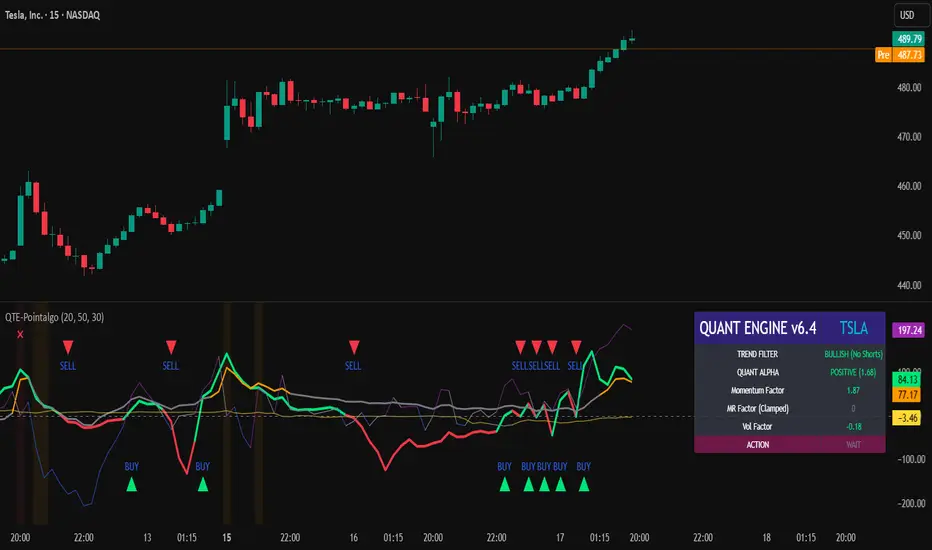
Reversal Signal by Vahid.jafarzadehReversal Signal by Vahid.j is a technical analysis tool designed to identify potential market turning points using a combination of Donchian channels, Fibonacci levels, and multi-oscillator divergences. This indicator calculates dynamic support and resistance levels based on recent highs and lows, applies key Fibonacci retracement zones, and evaluates divergences across multiple oscillators including RSI, MACD, Momentum, CCI, OBV, Stochastic, DI Oscillator, VWMA, CMF, and MFI.
Signals are displayed as bull 🐂 and bear 🐻 icons on the chart to indicate potential buy and sell zones. The indicator also tracks the cumulative divergence count, offering a quantitative perspective of market strength and trend reversal probability.
Alerts can be set for both bullish and bearish signals, enabling timely entries and exits based on divergence and Donchian-Fibonacci confluence.
-------
فارسی :
سیگنال بازگشت توسط Vahid.j یک ابزار تحلیل تکنیکال است که برای شناسایی نقاط احتمالی تغییر جهت بازار طراحی شده و از ترکیبی از کانالهای دونچیان، سطوح فیبوناچی و واگرایی چند نوسانگر استفاده میکند. این اندیکاتور سطوح حمایت و مقاومت پویا را بر اساس بالاترین و پایینترین قیمتهای اخیر محاسبه کرده، سطوح کلیدی فیبوناچی را اعمال میکند و واگراییها را در چندین نوسانگر شامل RSI، MACD، مومنتوم، CCI، OBV، استوکاستیک، DI اسیلاتور، VWMA، CMF و MFI ارزیابی میکند.
سیگنالها به صورت آیکون گاو 🐂 و خرس 🐻 روی چارت نمایش داده میشوند تا مناطق خرید و فروش احتمالی را نشان دهند. همچنین این اندیکاتور تعداد واگراییهای تجمعی را ردیابی میکند و دید کمی نسبت به قدرت بازار و احتمال بازگشت روند ارائه میدهد.
امکان فعالسازی آلارم برای سیگنالهای صعودی و نزولی وجود دارد تا بر اساس همگرایی واگرایی و سطوح دونچیان-فیبوناچی، ورود و خروجهای به موقع انجام شود

Rahul Prakash's BUY/SELL signal for momentum tradeBuy or Sell signal with just on one confirmation candle.
Show a Buy singal then wait for the confirmation candle, is a strong Buy signal.
Show a Sell singal then wait for the confirmation candle, is a strong Sell signal.
You can use as a free version and earn money. Please are taking lots of price for this type of indicator.

智能趋势-多周期动态信号 Smart Trend Oscillator MTF V1🚀 智能趋势-多周期动态信号 Smart Trend Oscillator MTF V1
—— 让交易像红绿灯一样简单直观 | Making Trading as Simple as Traffic Lights
告别复杂的参数设置,把市场噪音变成明确的信号。 Say goodbye to complex parameters. Turn market noise into clear signals.
🌟 它是做什么的? / What Does It Do?
“智能趋势管家” 就像您的私人交易副驾驶。它内置了一套先进的智能平滑算法,能够自动过滤掉市场中那些骗人的假动作,只把最核心的**“市场真实韵律”通过一条平滑的波浪线展示给您。它不只是一根线,它是一套会思考的系统**。
"Smart Trend Oscillator " is like your personal trading co-pilot. It features a built-in advanced smoothing algorithm that automatically filters out deceptive market "fake-outs," revealing the "true rhythm" of the market through a single, smooth wave. It’s not just a line; it’s a thinking system.
🔥 核心功能 / Core Features
1. 🌊 智能波浪引擎 / Smart Wave Engine
不要被K线的上蹿下跳迷惑。我们的引擎能识别市场内部的真实能量。 Don't be confused by erratic candlesticks. Our engine identifies the true internal energy of the market.
过滤噪音 (Filter Noise):自动忽略短暂的随机波动。
捕捉趋势 (Capture Trends):波浪上升代表买方主导,波浪下降代表卖方主导。
2. 🛡️ 自适应波动通道 / Adaptive Channels
市场有时候像乌龟(波动小),有时候像兔子(波动大)。指标拥有一个“弹性通道”,它会根据市场活跃度自动变宽或变窄,精准判断价格是否“过热”或“超卖”。 The market moves between low and high volatility. The indicator features an "elastic channel" that automatically widens or narrows, accurately judging if the price is "Overheated" or "Oversold."
3. 🌍 全局监控面板 / Global Dashboard
右上角的面板是您的战况指挥室。一眼看懂 6 个不同时间维度的状态。全绿代表多周期共振向上,全红代表多周期共振向下。 The panel in the top-right corner is your Command Center. Understand the status of 6 different time dimensions at a glance. All Green means upward resonance; All Red means downward resonance.
⚙️ 极致的个性化定制 / Ultimate Customization
v16 版本为您提供了前所未有的控制权,让指标完全适应您的交易风格。 Version 16 gives you unprecedented control to tailor the indicator to your trading style.
🕒 1. 时间周期,由你定义 (Customizable Timeframes)
不再局限于系统默认设置。您可以在设置面板中自由输入 6 个您最关心的周期(例如:5分钟、1小时、甚至 3天)。
短线手:设置为 1分/3分/5分/15分...
波段手:设置为 1小时/4小时/日线/周线...
Benefit: You can freely input the 6 timeframes that matter most to you in the settings panel, whether you are a scalper or a swing trader.
🎯 2. 灵敏度调节 (Adjustable Sensitivity)
想要更多交易机会?还是想要更稳健的信号?
高灵敏度:调高 Zone Sensitivity,捕捉每一次微小的回调(适合激进风格)。
低灵敏度:调低数值,过滤掉小波动,只抓大趋势(适合稳健风格)。
Benefit: Dial up the sensitivity to catch every minor pullback (Aggressive), or dial it down to filter noise and catch only big trends (Conservative).
📊 3. 两种平滑模式 (SMA vs. VWMA)
您可以选择通道的计算核心:
Standard (SMA):经典模式,适合大多数市场。
Volume Weighted (VWMA):成交量加权模式。在加密货币或股票市场,它能帮您过滤掉“无量空涨”或“无量空跌”的假信号。
Benefit: Choose Standard (SMA) for general markets, or Volume Weighted (VWMA) to filter out fake moves on low volume (great for Crypto/Stocks).
🚦 信号含义 / Signals Guide
我们把复杂的逻辑浓缩成了最简单的视觉标签: We have condensed complex logic into the simplest visual labels:
🟢 绿色 BUY 标签:市场“便宜”且能量向上。 (Market is "Cheap" & Energy is Up.)
🔴 红色 SELL 标签:市场“过热”且能量向下。 (Market is "Overheated" & Energy is Down.)
🔵 蓝色 HOLD 标签:趋势延续中,建议持仓。 (Trend is continuing, suggest holding position.)
📥 快速上手 / Quick Start
加载指标 (Load):添加到您的图表。
设置周期 (Set Timeframes):在输入选项里填入您习惯查看的 6 个时间周期。
选择模式 (Choose Mode):如果是成交量重要的资产,建议开启 VWMA 模式。
等信号 (Wait):等待带方框的 BUY 或 SELL 标签出现。
把复杂留给算法,把简单留给您。 Leave the complexity to the algorithms, and keep the simplicity for yourself.

Buyer-Seller Locomotive IndexBuyer-Seller Locomotive Index (BSLI)
An original indicator that measures buyer and seller pressure, momentum shifts, and structural control in the market.
Overview
The Buyer-Seller Locomotive Index evaluates candle-level positioning relative to an adaptive EMA-based reference price. It calculates bull vs bear strength percentages and Total Power momentum using fast and slow EMAs, providing insight into which side currently dominates market structure. By combining pressure analysis with momentum smoothing, BSLI highlights both the intensity and direction of market control.
Features
Bull/Bear Strength Percentages: Normalized 0–100 values showing current dominance and threshold-based high-strength alerts.
Total Power Momentum: Fast and slow EMA crossover signals with a histogram to visualize expansion or contraction of pressure.
Visual Markers: Optional fight diamonds highlight candles intersecting the reference price, while dynamic labels show the exact strength percentages.
Crossover Signals: Circles mark potential shifts in momentum, helping to identify early transitions in market control.
Customizable Display: Users can toggle labels, markers, and histogram visibility for a clean or detailed chart view.
How to Use
BSLI provides traders with a multi-layered view of market structure:
Observe shifts in buyer vs seller dominance.
Spot early momentum transitions before trends become obvious.
Confirm price structure with Total Power and strength percentages.
Highlight periods of compression, conflict, or indecision for additional context.
This indicator is intended as a supportive analysis tool. Traders should combine it with personal methodology, risk management, and other analysis techniques. It is not a standalone trade signal.
Important Notes
Measures relative pressure, not absolute volume.
Percentages reflect current structure, not predicted price direction.
Signals are contextual; do not rely solely on crossovers for trading decisions.
Uses no lookahead; all calculations are based on completed bars.
Results may vary by asset, timeframe, and market volatility.
Originality
BSLI uniquely combines adaptive pressure extraction, normalized strength percentages, dual-EMA power momentum, conflict detection, and integrated labeling. This multi-component approach provides a clear and actionable view of the evolving balance between buyers and sellers, supporting both short-term and structural analysis.
CSI Cycle Swing MomentumAdaptive Ultra-Smooth Momentum (Cycle-Swing Indicator – CSI)
The Cycle-Swing Indicator (CSI) is an advanced, adaptive momentum oscillator designed to extract clean, reliable signals from market data by focusing on the swing of the dominant market cycle rather than raw momentum. By identifying and aligning with the current dominant cycle, the CSI produces a momentum curve that is exceptionally smooth, responsive, and context-aware.
Key Advantages
The CSI offers several improvements over traditional momentum-based indicators:
Ultra-smooth signal line without sacrificing responsiveness
Zero-lag behavior, enabling timely entries and exits
Pronounced turning-point precision, enhancing signal clarity
Adaptive to real market cycles, automatically adjusting to changing conditions
Reliable deviation and divergence detection, even in noisy environments
Why Standard Indicators Fall Short
Conventional oscillators often struggle in real-world market conditions:
Excessive noise leads to frequent false signals.
Added smoothing reduces noise but introduces significant lag, delaying actionable insights.
Fixed-length parameters make indicators highly sensitive to user settings—you never truly know the "right" length.
The CSI solves all these challenges through its adaptive cyclic algorithm, which automatically aligns itself with the market’s dominant cycle—no manual tuning required.
Practical Example
In the example chart, the CSI highlights clear turning points and deviations with far less noise than the standard momentum indicator, demonstrating its superior clarity and responsiveness.
How to Use
The CSI is fully adaptive and requires no parameters. Simply apply it to any symbol and timeframe—the indicator automatically detects the dominant cycle and produces an ultra-smooth, cycle-aligned momentum curve.
Included features:
Adaptive upper and lower bands identifying extreme conditions
Automatic divergence detection (toggle on/off)
Works on any timeframe and any asset
Adaptive length - no input parameter required
How to Read the Indicator
The CSI functions similarly to a traditional momentum oscillator but with enhanced adaptive context:
Look for divergences between price and the CSI signal line — powerful early warnings of weakening trends or impending shifts.
Note on Divergence Signals:
The divergence markers displayed on the chart are generated using embedded pivot-based detection. Because pivots must be confirmed by price action, divergence signals can only be plotted after a pivot forms. For real-time monitoring on the latest bar, users should watch for early-forming divergences as they develop, since confirmed pivot-based divergences will always appear with a slight delay. Script parameters are available for precise adjustment of pivot detection behaviour.
Info: Legacy vs. Pro Version
This is the actively maintained and continuously enhanced edition of my free, open-source indicator “Cycle Swing Momentum”. The Pro Version will remain fully up to date with the latest Pine Script standards and will receive ongoing refinements and feature improvements, all while preserving the core logic and intent of the original tool. The legacy version will continue to be available for code review and educational purposes, but it will no longer receive updates. The legacy open-source version is always available in the public TV indicator repository.
Script pago

CSI Cycle Swing Momentum Indicator ProAdaptive Ultra-Smooth Momentum (Cycle-Swing Indicator – CSI)
The Cycle-Swing Indicator (CSI) is an advanced, adaptive momentum oscillator designed to extract clean, reliable signals from market data by focusing on the swing of the dominant market cycle rather than raw momentum. By identifying and aligning with the current dominant cycle, the CSI produces a momentum curve that is exceptionally smooth, responsive, and context-aware.
Key Advantages
The CSI offers several improvements over traditional momentum-based indicators:
Ultra-smooth signal line without sacrificing responsiveness
Zero-lag behavior, enabling timely entries and exits
Pronounced turning-point precision, enhancing signal clarity
Adaptive to real market cycles, automatically adjusting to changing conditions
Reliable deviation and divergence detection, even in noisy environments
Why Standard Indicators Fall Short
Conventional oscillators often struggle in real-world market conditions:
Excessive noise leads to frequent false signals.
Added smoothing reduces noise but introduces significant lag, delaying actionable insights.
Fixed-length parameters make indicators highly sensitive to user settings—you never truly know the "right" length.
The CSI solves all these challenges through its adaptive cyclic algorithm, which automatically aligns itself with the market’s dominant cycle—no manual tuning required.
Practical Example
In the example chart, the CSI highlights clear turning points and deviations with far less noise than the standard momentum indicator, demonstrating its superior clarity and responsiveness.
How to Use
The CSI is fully adaptive and requires no parameters. Simply apply it to any symbol and timeframe—the indicator automatically detects the dominant cycle and produces an ultra-smooth, cycle-aligned momentum curve.
Included features:
Adaptive upper and lower bands identifying extreme conditions
Automatic divergence detection (toggle on/off)
Works on any timeframe and any asset
Adaptive length - no input parameter required
How to Read the Indicator
The CSI functions similarly to a traditional momentum oscillator but with enhanced adaptive context:
Look for divergences between price and the CSI signal line — powerful early warnings of weakening trends or impending shifts.
Note on Divergence Signals:
The divergence markers displayed on the chart are generated using embedded pivot-based detection. Because pivots must be confirmed by price action, divergence signals can only be plotted after a pivot forms. For real-time monitoring on the latest bar, users should watch for early-forming divergences as they develop, since confirmed pivot-based divergences will always appear with a slight delay. Script parameters are available for precise adjustment of pivot detection behaviour.
Info: Legacy vs. Pro Version
This is the actively maintained and continuously enhanced edition of my free, open-source indicator “Cycle Swing Momentum”. The Pro Version will remain fully up to date with the latest Pine Script standards and will receive ongoing refinements and feature improvements, all while preserving the core logic and intent of the original tool. The legacy version will continue to be available for code review and educational purposes, but it will no longer receive updates. The legacy open-source version is always available in the public TV indicator repository.

Momentum Structural AnalysisMomentum Structural Analysis (MSA‑style Oscillator)
This indicator implements a simple, MSA‑style momentum oscillator that measures how far price has moved above or below its own long‑term trend on the active timeframe, expressed in percentage terms. Instead of looking at raw price, it "oscillates" price around a timeframe‑appropriate simple moving average (SMA) and plots the percentage distance from that SMA as an orange line around a zero baseline. Zero means price is exactly at its structural trend; positive values mean price is extended above trend; negative values mean it is trading below trend.
The script automatically selects the SMA length based on the chart timeframe:
On daily charts it uses the configurable Daily SMA Length (default 252 trading days, roughly 1 year).
On weekly charts it uses Weekly SMA Length (default 208 weeks).
On monthly charts it uses Monthly SMA Length (default 120 months).
This approach is inspired by the ideas behind Momentum Structural Analysis (MSA), which studies where a market trades relative to long‑term moving averages and then treats the momentum line (the oscillator) as the primary object of analysis. The goal is to highlight structural overbought/oversold conditions and regime changes that are often clearer on momentum than on the raw price chart.
--------------------------------------------------
What the script computes and how it works
For each bar, the indicator:
Chooses an SMA length based on the current timeframe (daily/weekly/monthly).
Calculates the SMA of the close.
Computes the percentage distance:
\text{Diff %} = \frac{\text{Close} - \text{SMA}}{\text{SMA}} \times 100
Plots this Diff % as an orange line, with a dashed horizontal zero line as the base.
This produces a momentum oscillator that oscillates around zero and reflects the "structural" position of price versus its own long‑term mean.
--------------------------------------------------
How to use it on index charts (e.g., NIFTY50)
On indices like NIFTY50, use the indicator to see how stretched the index is versus its structural trend.
Typical uses:
Identify extremes: a). Historically high positive readings can signal euphoric, late‑stage conditions where risk is elevated. b). Deep negative readings can highlight panic/capitulation zones where downside may be exhausted.
Draw structural levels: a). Mark horizontal bands on the oscillator where past turns have occurred (e.g., +15%, −10%, etc. specific to NIFTY50). b). Watch how price behaves when the oscillator revisits these zones: repeated rejections can validate them as structural bounds; clean breaks can indicate a change of regime.
This is not a buy/sell signal generator by itself; it is a framework to understand where the index sits within its long‑term momentum structure and to support risk‑management decisions.
--------------------------------------------------
How to use it on ratio charts
Apply the same indicator to ratio symbols such as NIFTY50/GOLD, BANKNIFTY/NIFTY50, sector vs index, or any spread you plot as a ratio.
On a ratio chart:
The oscillator now measures relative momentum: how far that ratio is above or below its own long‑term mean.
High positive readings = strong outperformance of the numerator vs the denominator (e.g., equities strongly outperforming gold).
Deep negative readings = strong underperformance (e.g., equities structurally lagging gold).
This is very much in the spirit of MSA’s work on spreads between asset classes: it helps visualize major rotations (equities → gold, financials → commodities, etc.) and whether a relative‑performance trend is stretched, reverting, or breaking into a new phase.
--------------------------------------------------
Using multiple timeframes for better decisions
You can stack information across timeframes to get a more robust view:
Monthly : a). Use monthly charts to see secular/structural phases. b). Long multi‑year stretches above or below zero, and large bases or trendline breaks on the monthly oscillator, can mark major bull or bear cycles and big rotations between asset classes.
Weekly : a). Use weekly charts for the primary trend. b). Weekly structures (multi‑month highs/lows, channels, or trendlines on the oscillator) are useful for medium‑term positioning and for confirming or rejecting signals seen on the monthly view.
Daily : a). Use daily charts mainly for timing entries/exits once the higher‑timeframe direction is clear. b). Short‑term extremes on the daily oscillator that align with the larger weekly/monthly structure can offer better‑timed opportunities, while signals that contradict higher‑timeframe momentum are more likely to be noise.
--------------------------------------------------

ASI Momentum CloudASI Momentum Cloud (AMC) — a scaled Accumulative Swing Index (ASI) momentum indicator with an EMA cloud for visual trend context, signal smoothing, and configurable scaling for any instrument.
---
## Overview
The ASI Momentum Cloud visualizes ASI-based momentum while providing a three-EMA cloud that highlights trend bias and momentum strength. The indicator scales ASI values for better visibility across different instruments and adds an SMA signal line for entry/exit clarity. Designed for traders who want a momentum oscillator with trend context and simple alertable signals.
## Key features
* Scaled ASI value (`ASI Multiplier`) for improved chart readability.
* Configurable `Daily Limit` to adapt the ASI calculation to different asset volatilities.
* SMA signal line to smooth ASI and provide clear cross signals.
* Three-EMA cloud (Fast / Mid / Slow) to show bullish/bearish bias and momentum shifts.
* Lightweight, low-latency computation — suitable for multiple timeframes.
* Built-in cloud coloring: green tint when Fast EMA > Slow EMA, red tint otherwise.
## How it works (brief)
1. ASI is calculated each bar using price movement components (high/low/close relationships) and normalized by the `Daily Limit`.
2. `ASI Multiplier` scales the values for visual clarity.
3. A short SMA (`Period Length`) acts as the indicator’s signal/smoother.
4. Three EMAs (Fast / Mid / Slow) form a cloud — their relative positions determine the cloud color and trend bias.
## Inputs (as shown in settings)
* **Daily Limit** — numeric; adjusts ASI normalization (default: `10000`). Tune to instrument volatility.
* **ASI Multiplier** — numeric; scales the ASI for visibility (default: `100`).
* **Period Length** — SMA length for the signal line (default: `14`).
* **EMA Cloud Fast Length** — fast EMA (default: `7`).
* **EMA Cloud Mid Length** — middle EMA (default: `14`).
* **EMA Cloud Slow Length** — slow EMA (default: `28`).
## How to interpret signals
* **Bullish bias:** EMA Fast > EMA Slow → cloud green (favour long bias).
* **Bearish bias:** EMA Fast < EMA Slow → cloud red (favour short bias).
* **Momentum entry:** ASI line crossing **above** the Signal SMA — momentum turning positive.
* **Momentum exit / short entry:** ASI line crossing **below** the Signal SMA — momentum turning negative.
* **Confirmation:** Prefer entries that align with cloud bias (e.g., take long crossovers when cloud is green).
* **Divergence:** Watch for price making new highs/lows while ASI fails to confirm — possible momentum exhaustion.
## Suggested alert messages (copy/paste)
* `ASI Momentum Cloud — ASI crossed above Signal (potential buy)`
* `ASI Momentum Cloud — ASI crossed below Signal (potential sell)`
* `ASI Momentum Cloud — Cloud turned bullish (EMA Fast > EMA Slow)`
* `ASI Momentum Cloud — Cloud turned bearish (EMA Fast < EMA Slow)`
Use these messages in TradingView alert conditions tied to the corresponding cross or condition.
## Recommended usage & timeframes
* Works on any timeframe; commonly useful on 1H, 4H, Daily for trend-following, and lower timeframes for intra-day momentum signals.
* Adjust **Daily Limit** and **ASI Multiplier** for low-volatility instruments (smaller limit, higher multiplier) or high-volatility instruments (larger limit, lower multiplier).
* Combine with price action, support/resistance, or higher-timeframe trend for better signal quality.
## Notes & credits
* Version: 1.0 — initial release.
* If you adapt or redistribute, please credit the original script.
* Built for clarity and practical trading signals — tweak the input values to match your instrument and trading style.
## Risk disclaimer
This indicator is a technical tool and not investment advice. Backtest and paper-trade any strategy before using real capital. Use proper risk management.

Sequential Exhaustion 9/13 [Crypto Filter] - PyraTimeConcept: The Exhaustion Meter
This indicator is a customized version of the Sequential count, a powerful tool used by institutional traders to measure buyer and seller exhaustion. It looks for a sequence of 9 (Setup) or 13 (Countdown) consecutive candles that satisfy specific price criteria.
The purpose is simple: To tell you when a trend has run out of fuel.
Key Differentiators (The Value)
Due to the high volatility of the crypto market, standard Sequential indicators print too many false signals ("13s") during a strong trend. This custom version solves that problem with two core filters:
1. Trend Filter (EMA 200): If enabled, the indicator will automatically hide all Sell signals when the price is above the 200 EMA, protecting the user from shorting an uptrend (and vice-versa).
2. Color Confirmation: It will not print a signal unless the closing candle color matches the direction (e.g., no Red 13 sell signals on Green Candles). This drastically cleans up the chart.
Understanding the Numbers
The numbers appearing above and below the candles are your exhaustion meter.
* The "9" (Setup): Indicates a short-term trend is nearing exhaustion.
* The "13" (Countdown): Indicates the trend is statistically complete and a reversal is highly probable.
The Actionable Strategy (The PyraTime Rule)
This indicator is designed to be your Exit Tool. Use it to determine when to take profit from an existing trade.
* Example: You enter Long at the GPM Time Line. When the PyraTD prints a Red 9 or Red 13, you take profit immediately.
Final Note
Use the integrated visibility settings to turn off signals (e.g., hide 9s or Sells) to customize the view to your preferred trading style.
Disclaimer: This tool measures mathematical exhaustion and is part of the PyraTime system. It is not financial advice.

NAMI Lite │ Zero-Repaint Momentum Wave + Reg Divergences (FREE)
NAMI Lite │ 100% Zero-Repaint Momentum Wave + Divergences (FREE)
The only zero-repaint, zero-lag momentum indicator that calls reversals hours early — even the free version beats all paid indicators.
No repainting on closed bars • Instant wave flips • Clean regular divergences • Money Flow confluence
Zero-Repaint Momentum Wave – CCI-based oscillator with real-time color flips (no lag, no lies)
Regular Bull/Bear Divergences – Faded lines on confirmed pivots only
Money Flow Oscillator – Volume-weighted filled areas for extra confirmation
This Lite version is intentionally limited — powerful enough to replace monthly subscriptions, but missing the pro features that make trading effortless.
Upgrade to Full NAMI Suite (One-Time Payment – Cancel Recurring Fees Forever):
Hidden Divergences with Divergence LABELS (catch 70% more massive moves)
200-Color Stochastic Heat Ribbon (gorgeous visual heatmaps)
True VWAP Oscillator + multi-source options
Buy/Sell Dots + Full Alerts (divergence, money flow, wave flips)
Full and Complete Customization (themes, lengths, colors)
Plus our other toolkits: TRAVIS, SMC Pro, and all future tools free
SEE IMAGE FOR COMPLETE NAMI VIEW
Over 800 traders already switched and saved thousands.
Reduced-Lag Chande Momentum Oscillator [BOSWaves]Reduced-Lag Chande Momentum Oscillator – Adaptive Momentum Geometry with Reduced-Latency Reversion Logic
Overview
The Reduced-Lag Chande Momentum Oscillator represents a sophisticated extension of the classical Chande Momentum Oscillator, preserving the foundational measurement of net directional pressure while addressing inherent limitations in lag, noise, and signal clarity. The traditional CMO provides reliable snapshots of upward versus downward force but reacts slowly to rapid market accelerations and can obscure meaningful momentum inflections with delayed readings. This iteration integrates a dual-stage reduced-lag filter, optional advanced smoothing, and acceleration-based analytics, producing a real-time, multi-dimensional representation of market momentum.
The design reframes classical momentum using a layered curvature and gradient structure - main, midline, and shadow - to show trajectory, velocity, and intensity in one view. Instead of the usual ±70/30 extremes, it uses ±50 as a statistically grounded threshold where one side of the market begins exerting true dominance. This captures structural imbalance more reliably, exposing exhaustion and actionable inflection without amplifying noise.
This visualization gives traders a continuous, responsive read on market structure, revealing not just direction but rate of change, acceleration alignment, and curvature behavior. The oscillator becomes a momentum map, expressing both probability and intensity behind directional shifts.
Where conventional oscillators mislabel short-lived swings as signals, the Reduced-Lag CMO separates baseline shifts from high-conviction transitions, enabling cleaner, more decisive signal interpretation.
Theoretical Foundation
The classical Chande Momentum Oscillator, created by Tushar Chande, calculates the normalized net difference between consecutive upward and downward price changes over a defined window, generating readings from –100 to +100. While effective for capturing basic directional pressure, the unmodified CMO suffers from signal latency and sensitivity to abrupt market swings, which can obscure actionable inflection points.
The Reduced-Lag CMO augments this foundation with three key mechanisms:
Reduced-Lag Filtering : A dual-EMA structure eliminates inertial lag, aligning the oscillator curve closely with real-time market momentum without producing overshoot artifacts.
Smoothing Architecture : Optional SMA, EMA, or WMA smoothing is applied post-filter, balancing noise reduction with trajectory fidelity. A multi-layer line system (shadow → midline → main) communicates depth, curvature, and gradient dynamics.
Acceleration Integration : First and second derivatives of the smoothed curve quantify velocity and acceleration, allowing the indicator to identify not only momentum flips but the force behind each shift, forming the basis for the strong-signal overlay.
The combination of these mechanisms produces an oscillator that respects the original CMO framework while delivering real-time, context-sensitive intelligence. The ±50 boundaries are selected as the statistically validated pressure zones where directional dominance exceeds neutral oscillation. Crosses and rejections at these boundaries are not arbitrary overbought/oversold events, but measurable imbalances with actionable significance.
How It Works
The Reduced-Lag CMO is constructed through a multi-stage process:
Momentum Estimation Core : Raw CMO values are calculated and then passed through a reduced-lag filter to remove delay, creating a curve that closely tracks instantaneous directional pressure.
Smoothing & Layered Representation : The filtered curve can be smoothed and split into three layers - shadow, midline, and main - giving visual depth, trajectory clarity, and curvature instead of a single-line oscillator.
Gradient-Based Pressure Mapping : Color gradients encode momentum strength and polarity. Green-yellow transitions highlight increasing upward dominance, while red-yellow transitions indicate weakening downward force.
Pressure-Zone Anchoring (±50) : The system defines statistically significant pressure zones at ±50. Moves beyond these levels reflect dominant directional control, and rejections inside the zone signal potential exhaustion.
Signal Generation : Momentum events are evaluated through velocity and acceleration. Standard signals appear as triangle markers indicating validated momentum flips. Strong signals appear as triangles with diamonds when acceleration confirms a high-conviction transition.
A cooldown rule spaces signals apart to reduce clutter and emphasize structurally meaningful events.
Interpretation
The Reduced-Lag CMO reframes momentum as a dynamic equilibrium between directional force and structural pressure:
Positive Momentum Phases : Curves above zero with green-yellow gradients indicate sustained upward pressure. Shallow retracements or midline tests denote controlled pullbacks.
Negative Momentum Phases : Curves below zero with red-yellow gradients show downward dominance. Rejections from –50 highlight potential exhaustion and reversal readiness.
Pressure-Zone Dynamics (±50) : Crosses beyond ±50 confirm dominant directional force. Meanwhile, rejections and rotations inside the zone signal structural fatigue.
Velocity & Acceleration Analysis : Rising momentum with decelerating velocity suggests fading force; acceleration alignment amplifies signal strength and forms the basis of strong signals.
Signal Architecture
The Reduced-Lag CMO produces a single event type with two intensities: a validated momentum inflection.
Standard Signals - Triangles:
Triggered by momentum flips confirmed by velocity.
Represent moderate-intensity directional changes.
Appear at zero-line crosses or ±50 rejections with aligned velocity.
Strong Signals Triangles + Diamonds:
Triggered when acceleration confirms the directional change.
Represent high-intensity, high-conviction shifts.
Rare by design; indicate robust momentum inflections.
Cooldown mechanics prevent repeated signals in short succession, emphasizing structural reliability over noise.
Strategy Integration
Trend Confirmation : Align zero-line flips with higher-timeframe directional bias.
Reversal Detection : Strong signals from ±50 zones highlight potential inflection points.
Volatility Assessment : Gradient transitions reveal strengthening or weakening momentum.
Pullback Timing : Multi-layer curvature identifies controlled retracements vs trend exhaustion.
Confluence Mapping : Pair with structure-based indicators to filter signals in context.
Technical Implementation Details
Core Engine : Classical CMO with Ehlers reduced-lag extension
Lag Reduction : Dual EMA filtering
Smoothing : Optional SMA/EMA/WMA post-filter
Multi-Layer Curve : Shadow, midline, main
Signal System : Two-tier momentum-acceleration framework
Pressure Zones : ±50 statistically validated thresholds
Cooldown Logic : Bar-indexed suppression
Gradient Mapping : Encodes magnitude and direction
Alerts : Standard and strong signals
Optimal Application Parameters
Timeframes:
1 - 5 min : Intraday momentum tracking
15 - 60 min : Trend rotations & volatility transitions
4H - Daily : Macro momentum exhaustion & re-accumulation mapping
Suggested Ranges:
CMO Length : 7 - 12
Reduced-Lag Length : 5 - 15
Smoothing : 10 - 20
Cooldown Bars : 5 - 15
Performance Characteristics
High Effectiveness:
Markets with directional pulses & clean pressure transitions
Trending phases with measurable pullbacks
Instruments with stable volatility cycles
Reduced Edge:
Choppy consolidations
Ultra-low volatility environments
Disclaimer
The Reduced-Lag Chande Momentum Oscillator is a professional-grade analytical tool. It is not predictive and carries no guaranteed profitability. Effectiveness depends on asset class, volatility regime, parameter selection, and disciplined execution. Any suggested application timeframes or recommended ranges are guidance only - they are not universally optimal and will not deliver consistent accuracy on every asset or market condition. BOSWaves recommends using it in conjunction with structure, liquidity, and momentum context.

Trapper Absolute PriceActionThe Trapper Absolute PriceAction (TAPA) indicator is a custom, momentum-based oscillator designed to help traders visually read shifts in bullish and bearish price strength — with no reliance on volume or external data.
TAPA calculates and smooths both bullish and bearish momentum using multiple methods (RSI, Stochastic, or ADX) and compares their relative strength in real time. The result is a clean dual-line oscillator with color-coded histograms that highlight which side of the market currently has control.
It was built to give traders a sniper-level precision tool for detecting early momentum shifts before they appear clearly on price charts, allowing confirmation or invalidation of setups faster than with lagging indicators.
How It Works
Momentum Strength Calculation
The script measures directional price movement across the chosen mode (RSI, Stochastic, or ADX).
These values are smoothed twice using a selectable moving average type (WMA, EMA, SMA, ALMA, HMA, etc.).
Bullish & Bearish Curves
The green line represents smoothed bullish momentum (SmthBulls).
The orange/red line represents smoothed bearish momentum (SmthBears).
Histogram Strength Visualization
The distance between the two curves forms a color-coded histogram.
Green/Lime bars indicate growing bullish control, while Orange/Red bars show bearish dominance.
A gray neutral zone reflects indecision or range-bound conditions.
Signal Triggers
BUY 🐂 appears when the green line crosses up through the orange — signaling a bullish momentum flip.
SELL 🐻 appears when the green line crosses down through the orange — signaling bearish control.
Alerts can be enabled directly in TradingView through the BUY (🐂) or SELL (🐻) alert conditions for automated notifications or integrations.
How to Use
1. Confirm Early Momentum Shifts
When a crossover appears, check that the histogram color supports the move (green shades for bullish, red/orange for bearish).
Avoid signals when both lines are tangled and the histogram alternates gray, that usually indicates consolidation or low volatility.
2. Validate with Higher-Timeframe Structure
TAPA is most powerful when aligned with trend structure from higher timeframes.
Example: A bullish crossover on the 1-hour timeframe, while the daily TAPA shows the green line already rising, can confirm momentum alignment before entry.
3. Combine with Support/Resistance
Mark your key support and resistance zones (manual or using your “Trapper S&R PRO” indicator).
Look for a TAPA bullish crossover occurring at a major support zone, that’s often the start of a reversal move.
4. Multi-Mode Analysis
Experiment with “Indicator Method” in the inputs:
RSI Mode - smoother and responsive for swing trading.
Stochastic Mode - better for short-term entries and exits.
ADX Mode - captures trending momentum on strong breakouts.
Examples
Bullish Example:
Price forms a higher low on the chart while TAPA’s green line crosses up through orange with a lime/green histogram. That’s a strong early signal that momentum is reversing before price confirms on structure.
Bearish Example:
Price rallies into resistance, then TAPA shows a red histogram and a bearish cross (green dropping under orange). That’s typically a high-probability short signal once structure breaks.
What Makes TAPA Different
No Volume Dependency: Focuses purely on price behavior, not volume spikes or anomalies.
Multi-Mode Engine: Switch between RSI, Stochastic, or ADX-style momentum math instantly.
Customizable Visuals: Editable histogram color layers (weak/strong bull/bear, neutral) and line color control.
Sniper Labeling System: Clean, minimal BUY/SELL cues at each verified crossover.
Alert-Ready: Built-in conditions allow for TradingView alerts, webhooks, or bot automation.
Modernized Core: Rebuilt in Pine v6 with optimized performance and compliance to TradingView standards.
TAPA is designed to filter out the noise and show what truly drives a move — the shift in control between buyers and sellers.
Best Pairing Indicators
To get maximum clarity and confluence:
Trapper Support & Resistance PRO
Helps identify key zones where momentum flips from TAPA have the most impact. A bullish crossover at a defined support level often marks an early trend reversal.
Trapper Volume Trigger
While TAPA doesn’t use volume internally, pairing it with a volume-based trigger confirms that momentum shifts have institutional participation.
Simple Moving Averages (5, 20, or 50)
Overlay short and mid-term SMAs on your chart to confirm directional bias. A bullish TAPA cross that aligns with SMA-5 crossing above SMA-20 increases reliability.
Disclaimer
This indicator is provided for educational and analytical purposes only.
It does not constitute financial advice or a recommendation to buy or sell any security.
Always conduct your own due diligence and practice proper risk management before trading any strategy.
© 2025 RAMS-offthecharts | “Read • Analyze • Mark • Snipe.”
TAPA is part of the RAMS ecosystem of tactical market tools, designed for traders who focus on precision, discipline, and momentum awareness.
Screener (MC) [AlgoAlpha]🟠 OVERVIEW
This script is a multi-symbol scanner that works as a companion to the "Momentum Concepts" indicator. It provides a comprehensive dashboard view, allowing traders to monitor the momentum signals of up to 18 different assets in real-time from a single chart. The main purpose is to offer a bird's-eye view of the market, helping you quickly identify assets with strong momentum confluence or potential reversal opportunities without having to switch between different charts.
The screener displays the status of all key components from the Momentum Concepts indicator, including the Fast Oscillator, Scalper's Momentum, Momentum Impulse Oscillator, and Hidden Liquidity Flow, organizing them into a clear and easy-to-read table.
🟠 CONCEPTS
The core of this screener is built upon the analytical framework of the "Momentum Concepts" indicator, which evaluates market momentum across multiple layers: short-term, medium-term, and long-term. This screener applies those complex, proprietary calculations to each symbol in your watchlist and visualizes the current state of each component.
Each column in the table represents a specific aspect of momentum analysis:
Fast Oscillator Columns: These columns reflect the short-term momentum. They show the immediate trend direction, whether the asset is in an overbought or oversold condition, and flag high-probability events like divergences, reversals, or diminishing momentum.
Scalper's Momentum Column: This column gives insight into medium-term momentum. It distinguishes between strong, sustained moves and weakening, corrective moves, which is useful for gauging the health of a trend.
Momentum Impulse Column: This column represents the dominant, long-term trend bias. It helps you understand the underlying market regime (bullish, bearish, or consolidating) to align your trades with the bigger picture.
Hidden Liquidity Flow Column: This column provides a unique view into the market's underlying liquidity dynamics. It signals whether there is net buying or selling pressure and uses special coloring to highlight periods of unusually high liquidity activity, which often precedes volatile price movements.
By combining these perspectives, the screener justifies its utility by enabling traders to make more informed decisions based on multi-layered signal confluence.
🟠 FEATURES
This screener organizes momentum data into several key columns. Here is a breakdown of each column and its possible values:
Asset: Displays the symbol for the asset being analyzed in that row.
Fast Oscillator Trend: Shows the immediate, short-term momentum direction.
▲: Indicates a bullish short-term trend.
▼: Indicates a bearish short-term trend.
–: Indicates a neutral or transitional state.
Fast Oscillator Valuation: Measures whether the asset is in a short-term overbought or oversold state.
OB: Signals an "Overbought" condition, often associated with bullish exhaustion.
OS: Signals an "Oversold" condition, often associated with bearish exhaustion.
Neutral: The asset is trading in a neutral zone, neither overbought nor oversold.
Scalper's Momentum: Assesses the strength and direction of medium-term momentum.
Strong▲: Strong bullish momentum.
Weak▲: Bullish momentum exists but is weakening or corrective.
Strong▼: Strong bearish momentum.
Weak▼: Bearish momentum exists but is weakening or corrective.
–: Neutral or no clear medium-term momentum.
Momentum Impulse: Identifies the dominant, long-term trend bias. A colored background indicates that the momentum is in a strong "impulse" phase.
▲: Indicates a bullish long-term bias.
▼: Indicates a bearish long-term bias.
0: Indicates a neutral or ranging market condition.
Hidden Liquidity Flow: Tracks underlying buying and selling pressure. The background color highlights periods of unusual liquidity activity.
▲: Positive liquidity flow, suggesting net buying pressure.
▼: Negative liquidity flow, suggesting net selling pressure.
–: Neutral liquidity flow.
Dim. Momentum: Provides an early warning that short-term momentum is beginning to fade.
● (Bullish Color): Bullish momentum is weakening.
● (Bearish Color): Bearish momentum is weakening.
–: No diminishing momentum detected.
Divergence: Flags classic or hidden divergences between price and the Fast Oscillator.
Div▲: A bullish divergence has been detected.
Div▼: A bearish divergence has been detected.
–: No active divergence signal.
Reversal: Signals a potential reversal when the Fast Oscillator crosses its trend line from an overbought or oversold zone.
Rev▲: A bullish reversal signal has occurred.
Rev▼: A bearish reversal signal has occurred.
–: No active reversal signal.
🟠 USAGE
The primary function of this screener is to quickly identify trading opportunities and filter setups based on momentum confluence across your watchlist.
1. Setup and Configuration:
Add the indicator to your chart.
Go into the script settings and populate the "Watchlist" group with the symbols you wish to monitor.
Adjust the settings for the various momentum components (Fast Oscillator, Scalper's Momentum, etc.) to align with your trading strategy. These settings will be universally applied to all symbols in the screener.
2. Interpreting the Columns for Trading Decisions:
Momentum Impulse & Hidden Liquidity Flow: Use these columns to establish a directional bias. A bullish "▲" in both columns on an asset suggests a strong underlying uptrend with supportive buying pressure, making it a good candidate for long positions.
Scalper's Momentum: Use this for entry timing and trend health. A "Strong▲" reading can confirm the strength of an uptrend, while a shift to "Weak▲" might suggest it's time to tighten stops or look for an exit.
Fast Oscillator Trend & Valuation: These are best for precise entry triggers. For a "buy the dip" strategy in an uptrend, you could wait for the Fast Oscillator to show "OS" (Oversold) and then enter when the "Trend" column flips back to "▲".
Dim. Momentum: This is an excellent take-profit signal. If you are in a long position and a bullish-colored "●" appears, it's a warning that the upward move is losing steam, and you might consider closing your trade.
Divergence & Reversal: These columns are for identifying potential turning points. A "Div▲" or "Rev▲" signal is a strong alert that a downtrend might be ending, making the asset a prime candidate to watch for a long entry.
3. Finding High-Probability Setups:
Trend Confluence: Look for assets where multiple components show alignment. For example, an ideal long setup might show a bullish "Momentum Impulse" (▲), a "Strong▲" reading in "Scalper's Momentum," and a bullish trend in the "Fast Oscillator." This indicates that the long-term, medium-term, and short-term momentums are all in agreement.
Reversal and Exhaustion: Use the "Divergence" and "Reversal" columns to spot potential turning points. A "Div▲" signal appearing in an asset that is in an oversold "Fast Oscillator Valuation" zone can be a strong indication of an upcoming bounce.
Script pago

Squeeze Go Momentum Pro [KingThies] █ OVERVIEW
The Squeeze Momentum Pro indicator identifies volatility compression phases and breakout opportunities by comparing Bollinger Bands to Keltner Channels. When price consolidates (squeeze), the bands contract inside the channels, signaling an imminent breakout. The momentum histogram shows directional bias, helping traders anticipate which way price will move when the squeeze releases.
This indicator displays in a separate panel below the price chart, providing clear visual signals without cluttering price action.
█ KEY FEATURES
Momentum Histogram
The histogram is the primary visual element, displaying momentum strength and direction with four distinct color states:
• Dark Green (#00C853) — Strong bullish momentum that is increasing. This signals strengthening upward pressure and potential continuation.
• Light Green (#26A69A) — Bullish momentum that is decreasing. Price remains in bullish territory but upward force is weakening.
• Dark Red (#D32F2F) — Strong bearish momentum that is increasing. This signals strengthening downward pressure and potential continuation.
• Light Red (#EF5350) — Bearish momentum that is decreasing. Price remains in bearish territory but downward force is weakening.
The color intensity provides immediate feedback on momentum strength and trend health.
Squeeze State Indicator
Colored dots on the zero line communicate the current volatility state:
• Orange Dots — Squeeze is ON. Bollinger Bands have contracted inside Keltner Channels, indicating consolidation and low volatility.
A breakout is building and traders should prepare for directional movement.
• Green Dots — Squeeze is OFF. Bollinger Bands have expanded outside Keltner Channels, indicating active momentum and higher volatility.
Price is moving with conviction in the current direction.
• Gray Dots — Neutral state. The bands are transitioning between squeeze states.
Release Triangles
Triangle shapes mark the exact bar when a squeeze releases, providing precise entry timing:
• Green Triangle Up — Bullish squeeze release. The squeeze has ended with positive momentum, suggesting a long setup opportunity.
• Red Triangle Down — Bearish squeeze release. The squeeze has ended with negative momentum, suggesting a short setup opportunity.
Information Panel
A compact dashboard in the top-right corner displays real-time trading intelligence:
• Squeeze Status — Current state: ON, OFF, or NEUTRAL with color coding
• Momentum Direction — Current bias: BULL or BEAR
• Momentum Value — Precise numerical reading of momentum strength
• Trading Signal — Actionable status: LONG SETUP, SHORT SETUP, WAIT, or MONITOR
Configurable Parameters
All calculation inputs are adjustable to match your trading style and timeframe:
• BB Length — Bollinger Bands period (default: 20)
• BB StdDev — Bollinger Bands standard deviation multiplier (default: 2.0)
• KC Length — Keltner Channels period (default: 20)
• KC ATR Multiplier — Keltner Channels range multiplier (default: 1.5)
• Momentum Length — Linear regression period for momentum calculation (default: 20)
Alert System
Four alert conditions notify you of critical trading opportunities:
• Bullish Squeeze Release — Squeeze has released with bullish momentum, indicating a potential long entry
• Bearish Squeeze Release — Squeeze has released with bearish momentum, indicating a potential short entry
• Squeeze Started — Volatility compression detected, prepare for upcoming breakout
• Squeeze Ended — Volatility expansion confirmed, breakout is active
█ TRADING METHODOLOGY
The indicator follows a clear four-step process for identifying and trading squeeze breakouts:
1 - Wait for Orange Dots . When orange dots appear on the zero line, a squeeze is building. This indicates price consolidation and declining volatility.
Do not enter trades during this phase. Instead, prepare by identifying key support and resistance levels and potential breakout directions.
2 - Watch for Release Triangle . When a triangle appears, the squeeze has released and a breakout is beginning. This is your entry signal.
The triangle color (green up or red down) combined with the histogram direction indicates the breakout direction.
3 - Confirm with Histogram Direction . Check the momentum histogram for directional confirmation:
• Green histogram + green triangle up = Go long. Bullish momentum supports upward breakout.
• Red histogram + red triangle down = Go short. Bearish momentum supports downward breakout.
4 - Monitor Momentum Intensity . Stay in the trade while histogram bars maintain their dark, intense color.
When colors lighten (dark green to light green, or dark red to light red), momentum is weakening and you should consider taking profits or tightening stops.
█ INTERPRETATION GUIDE
Squeeze Detection Logic
A squeeze occurs when Bollinger Bands contract inside Keltner Channels. This happens when:
• Standard deviation of price decreases (BB narrows)
• Price consolidates within a tight range
• Volatility compresses to unsustainable levels
The orange dots signal this condition, warning traders that explosive movement is imminent.
Squeeze Release Logic
A squeeze releases when Bollinger Bands expand outside Keltner Channels. This happens when:
• Price volatility increases sharply
• Price breaks out of consolidation
• Volume typically expands (check volume separately)
The green dots and release triangles signal this condition, indicating the direction and timing of the breakout.
Momentum Reading
The histogram uses linear regression to calculate momentum relative to the midpoint of the recent range:
• Above Zero : Price is trading above the range midpoint with bullish pressure
• Below Zero : Price is trading below the range midpoint with bearish pressure
• Increasing Bars : Momentum is strengthening in the current direction (darker color)
• Decreasing Bars : Momentum is weakening in the current direction (lighter color)
█ BEST PRACTICES
• Timeframe Selection — The indicator works on all timeframes but performs best on 15-minute to daily charts.
Lower timeframes may produce more false signals due to noise.
• Confluence Trading — Combine squeeze releases with support/resistance levels, trend lines, or other indicators for higher probability setups.
• Volume Confirmation — Check that squeeze releases occur with increasing volume. Low volume breakouts are more likely to fail.
• Multiple Timeframe Analysis — Check higher timeframes for overall trend direction. Trade squeeze releases that align with the larger trend.
• Parameter Adjustment — Increase BB and KC lengths for smoother signals on higher timeframes. Decrease for more sensitive signals on lower timeframes.
█ LIMITATIONS
• The indicator does not predict breakout direction before the squeeze releases. The momentum histogram provides bias but is not definitive until the breakout occurs.
• False breakouts can occur, particularly in choppy or low-volume market conditions. Always use proper risk management and stop losses.
• The indicator works best in trending markets. In deeply ranging markets with no clear direction, squeeze signals may be less reliable.
• Momentum calculations use linear regression which can lag during extremely fast price movements. Confirm signals with price action.
█ NOTES
This implementation uses linear regression for momentum calculation rather than simple moving averages, providing more responsive and accurate directional signals. The four-color histogram system gives traders nuanced feedback on momentum strength that binary color schemes cannot provide.
The indicator automatically adjusts to any symbol and timeframe without modification, making it suitable for stocks, forex, crypto, and futures markets.
█ CREDITS
Squeeze methodology inspired by John Carter's TTM Squeeze indicator. Momentum calculation and visual design optimized for modern trading workflows.

Smart Moving Average Dynamics [ChartNation]Smart Moving Average Dynamics (SMAD) — by Chart Nation
What it does:
SMAD maps how far price deviates from a chosen moving average and normalizes that distance into a bounded oscillator (−100…+100). It detects extreme expansions and prints non-repainting dots when the move exits an extreme. Price-level rails are drawn from those events (with optional fade/expiry) to highlight likely reaction zones. The MA line is colored by bias. A slim gauge summarizes the current oscillator percentile; a compact info panel shows TF, Trend, Volume rank, and Volatility rank.
How it works (high-level, closed-source)
Core signal: diff = price – MA(type, length) where MA can be SMA/EMA/RMA/WMA/VWMA.
Normalization (choose one):
Highest Abs (N): scales diff by the highest absolute excursion over N bars (fast, adaptive).
Z-Score: scales by stdev(diff, N) and maps ±σ to ±100 via a user factor.
ATR-Scaled: scales by ATR * k, relating deviation to current volatility.
Percent Rank: ranks the magnitude of |diff| over N bars and reapplies the original sign.
All methods clamp to −100…+100 to keep visuals consistent across assets/TFs.
Extremes & confirmation: Dots print only when an extreme exits ±100 (optionally on bar close) and can be filtered by linger bars and short-term slope flip, reducing one-bar spikes.
Rails: When an extreme confirms, a rail is anchored at the corresponding price swing and can soft-fade and/or expire after X bars.
Trend color: MA color = Up (green) when oscillator > threshold and MA slope > 0; Down (magenta) for the opposite; Neutral otherwise.
Context panels:
Slim Gauge: current oscillator bucket (0–20) with the exact normalized reading.
Info Panel: TF, Trend, and 0–100 percent-ranks of Volume and ATR-based volatility grouped as Low / Medium / High.
SMAD isn’t a collection of plots; it’s a single framework that integrates:
a deviation-from-MA engine,
four interchangeable normalization models (selected per market regime),
a gated extreme detector (linger + slope + confirm-on-close), and
time-aware rails with soft fade/expiry, presented with a minimal gauge and info panel so traders can compare regimes across TFs without recalibrating thresholds.
How to use (examples, not signals)
Mean-revert plays: When price exits an extreme and prints a dot, look for reactions near the new rail. Combine with your S/R and risk model.
Trend continuation: In strong trends the oscillator will spend more time above/below zero; the colored MA helps keep you aligned and avoid fading every push.
Regime switching: Try Percent Rank or ATR-Scaled on choppy/alts; Z-Score on majors; Highest Abs (N) when you want fastest adaptation.
Risk ideas: Rails can be used as partial-take or invalidate levels. Always backtest on your pair/TF.
Key settings
Normalization: Highest Abs / Z-Score / ATR-Scaled / Percent Rank (with N & factors).
Filters: Extreme threshold, linger bars, slope lookback, confirm on close.
Rails: Expire after X bars; soft-fade step.
Panels: Slim gauge (bottom-right), Info panel (middle-right).
Notes & limits
Prints confirm after the extreme exits ±100; nothing repaints retroactively.
Normalization can change sensitivity—choose the one matching your asset’s regime.

CCI [Hash Adaptive]Adaptive CCI Pro: Professional Technical Analysis Indicator
The Commodity Channel Index is a momentum oscillator developed by Donald Lambert in 1980. CCI measures the relationship between an asset's price and its statistical average, identifying cyclical turns and overbought/oversold conditions. The indicator oscillates around zero, with values above +100 indicating overbought conditions and values below -100 suggesting oversold conditions.
Standard CCI Formula: (Typical Price - Moving Average) / (0.015 × Mean Deviation)
This indicator transforms the traditional CCI into a sophisticated visual analysis tool through several key enhancements:
Implements dual exponential moving average smoothing to eliminate market noise
Preserves signal integrity while reducing false signals
Adaptive smoothing responds to market volatility conditions
Dynamic Color Visualization System
Continuous gradient transitions from red (bearish momentum) to green (bullish momentum)
Real-time color intensity reflects momentum strength
Eliminates discrete color jumps for fluid visual interpretation
Adaptive Intelligence Features
Dynamic overbought/oversold thresholds adapt to market conditions
Reduces false signals during high volatility periods
Maintains sensitivity during low volatility environments
Momentum Vector Analysis
Incorporates velocity calculations for early trend identification
Crossover detection with momentum confirmation
Advanced signal filtering reduces market noise
Extreme Level Analysis
Values above +100: Strong overbought conditions, potential reversal zones
Values below -100: Strong oversold conditions, potential buying opportunities
Zero-line crossovers: Momentum shift confirmation
Optimization Parameters
CCI Period (Default: 14)
Shorter periods (10-12): Increased sensitivity, more signals
Standard periods (14-20): Balanced responsiveness and reliability
Longer periods (21-30): Reduced noise, stronger signal confirmation
Smoothing Factor (Default: 5)
Lower values (1-3): Maximum responsiveness, suitable for scalping
Medium values (4-6): Balanced approach for swing trading
Higher values (7-10): Institutional-grade smoothness for position trading
Signal Sensitivity (Default: 6)
Conservative (7-10): High-probability signals, reduced frequency
Balanced (5-6): Optimal risk-reward ratio
Aggressive (1-4): Maximum signal generation, requires additional confirmation
Strategic Implementation
Oversold reversals in red zones with momentum confirmation
Zero-line breaks with sustained color transitions
Extreme readings followed by momentum divergence
Risk Management
Use extreme levels (+100/-100) for position sizing decisions
Monitor color intensity for momentum strength assessment
Combine with price action analysis for comprehensive market view
Market Context Application
Trending markets: Focus on momentum direction and extreme readings
Range-bound markets: Utilize overbought/oversold levels for mean reversion
Volatile markets: Increase smoothing parameters and signal sensitivity
Professional Advantages
Instantaneous momentum assessment through color visualization
Reduced cognitive load compared to traditional oscillators
Professional presentation suitable for client reporting
Adaptive Technology
Self-adjusting parameters reduce manual optimization requirements
Consistent performance across varying market conditions
Advanced mathematics eliminate common CCI limitations
The Adaptive CCI Pro represents the evolution of momentum analysis, combining Lambert's foundational CCI concept with modern computational techniques to deliver institutional-grade market intelligence through an intuitive visual interface.

MTF Advanced DMI [NexusSignals]The MTF Advanced DMI is a multi-timeframe (MTF) enhancement of the classic Directional Movement Index (DMI) and Average Directional Index (ADX) indicator. It provides traders with insights into trend strength, direction, and momentum across multiple timeframes simultaneously. This version of DMI extends the single-timeframe analysis by incorporating two higher timeframes, allowing for better alignment of trends (e.g., confirming a short-term signal with longer-term context). It includes visual plots, a customizable data table showing MTF data, and expanded alert conditions for trend changes, consolidations, and reversals. Ideal for multi-timeframe strategies, trend confirmation, or avoiding false signals in volatile markets.
Key features include:
Multi-Timeframe Analysis: Displays DMI/ADX data for the current chart timeframe, plus two user-defined higher timeframes (e.g., 4H and 1D).
A trend strength metric that quantifies bullish/bearish dominance on each timeframe.
A dynamic table summarizing real-time MTF values, with color-coded signals, arrows, and buy/sell pressure percentages.
Visual fills and arrows for intuitive trend reading.
Built-in alerts for key events, including MTF-specific conditions (note: higher TF alerts may repaint due to live candle calculations via request.security).
How It Works
The indicator calculates DMI/ADX on three timeframes: the current chart TF, a mid-higher TF (default: 4H), and a highest TF (default: 1D).
For each:
+DI (Plus Directional Indicator): Upward movement strength.
-DI (Minus Directional Indicator): Downward movement strength.
ADX: Overall trend strength.
Trend Strength: ((+DI - -DI) / (+DI + -DI)) * ADX – positive for bullish, negative for bearish.
Buy/Sell %: Percentage of buyer/seller control in the candle based on HLC.
Plots focus on the current TF:
Strength Histogram: Color-coded (green bullish, red bearish).
ADX Line: White, with direction arrows.
+DI/-DI Lines: Green/red, with fills above 15 for strong trends.
Horizontal lines at 15 (consolidation) and 25 (strong trend).
The table (optional) shows data for the current timeframe candle, previous current timeframe candle, and the two higher TFs (if different from current), enabling quick cross-TF comparisons.
Inputs
General Settings:
DMI Length (default: 14): Period for +DI/-DI.
ADX Smoothing (default: 14): ADX period.
ADX Consolidation Threshold (default: 15): Low ADX suggests sideways.
ADX Stronger Trend Threshold (default: 25): High ADX indicates strong trends.
Higher Timeframe (default: 240/4H): Mid-level TF for MTF analysis.
Highest Timeframe (default: 1D): Top-level TF for broader context.
Threshold for Strong Bullish/Bearish DMI Strength (defaults: 10 / -10): For strength alerts.
Table Settings:
Show Table? (default: true): Toggle table visibility
Table Text Color, Header Color, Text Size (default: small)
Position (default: middle_right): Customize for your chart
Interpretation
Bullish Alignment: +DI > -DI across TFs, rising +DI (↑), Strength > 0 (green), Buy% > Sell%. Stronger if ADX > 25 on higher TFs.
Bearish Alignment: -DI > +DI, rising -DI (↑), Strength < 0 (red), Sell% > Buy%. Confirm with rising ADX on MTF.
Consolidation: +DI/-DI < 20 and ADX ≤ 15 (blue fill). Check if higher TFs show the same for range-bound confirmation.
Crossovers: +DI above -DI for bullish; reverse for bearish. MTF agreement reduces false signals.
Fills: Highlight dominant trends above 15 (green bullish, maroon bearish).
MTF Insight: Use the table to spot divergences (e.g., bullish current TF but bearish on daily) for potential reversals.
Combine with support/resistance or other momentum oscillators like macd, rsi, stochastic for robust strategies. Test on various assets and TFs to find the best settings that suit your trading style.
Alerts
Includes 20 alert conditions, with MTF extensions (higher TF alerts may repaint – use with caution for live trading):
Strength crossing 0 or bullish/bearish thresholds (on current and higher TFs).
+DI/-DI crossovers (bullish/bearish) on current TF.
ADX above strong threshold.
+DI/-DI above 25 or below 15.
Consolidation detection.
MTF-specific: Strength changes on higher TFs (e.g., "Strength Above Bullish Threshold on TF1").
Configure in TradingView by selecting from the alert dropdown.
Usage Tips
Select higher TFs that suit your strategy (e.g., 1H chart with 4H and Daily for day trading).
Use the table for at-a-glance MTF alignment without switching charts.
Customize appearance to avoid clutter on busy setups.
Backtest thoroughly, especially noting potential repainting on higher TFs.