EMA 20+50 + MACD Strateji ( omerprıme)EASY BUY-SELL basitçe al -sat yapabileceğiniz macd indikatörü ve ema kullanılmış bir indikatördür unutmayın ki ne kadar basit o kadar verimli.
Moving Averages) to generate trading signals and trend confirmation.
Trend Identification with EMA
Two EMAs are used to determine the overall market trend (commonly a short-term EMA and a long-term EMA).
When the short EMA crosses above the long EMA, it indicates an uptrend.
When the short EMA crosses below the long EMA, it signals a downtrend.
Signal Confirmation with MACD
The MACD line and Signal line are analyzed to detect momentum shifts.
A bullish signal occurs when the MACD line crosses above the Signal line, especially if the EMAs confirm an uptrend.
A bearish signal occurs when the MACD line crosses below the Signal line, especially if the EMAs confirm a downtrend.
Trading Logic
Buy signals appear only when both the EMA trend is bullish and the MACD confirms momentum to the upside.
Sell signals appear only when both the EMA trend is bearish and the MACD confirms momentum to the downside.
Forecasting
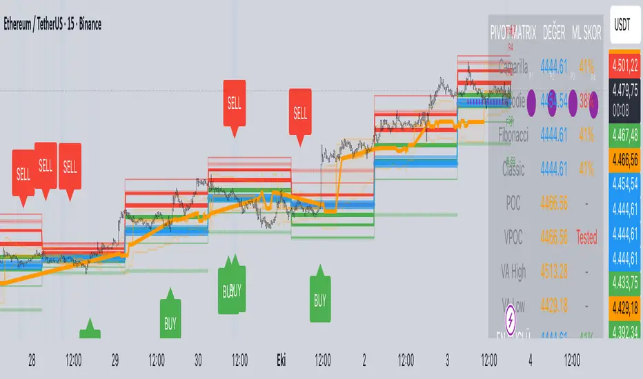
Predictive Pivot Matrix OHLC data, integrates volume profile for POC/Value Area tracking (including virgin POC), applies rule-based "ML" scoring to evaluate pivot strength via factors like proximity, volume, touches, trend, and confluence, monitors adaptive success rates, projects 5-day future pivots using trend/volatility, detects overlapping confluence zones, and generates visuals (lines, labels, table), alerts, and buy/sell signals on key crossings.
Brownian Motion Probabilistic Forecasting (Time Adaptive)Probabilistic Price Forecast Indicator
Overview
The Probabilistic Price Forecast is an advanced technical analysis tool designed for the TradingView platform. Instead of predicting a single future price, this indicator uses a Monte Carlo simulation to model thousands of potential future price paths, generating a cone of possibilities and calculating the probability of specific outcomes.
This allows traders to move beyond simple price targets and ask more sophisticated questions, such as: "What is the probability that this stock will increase by 5% over the next 24 hours?"
Core Concept: Geometric Brownian Motion
The indicator's forecasting model is built on the principles of Geometric Brownian Motion (GBM) , a widely accepted mathematical model for describing the random movements of financial asset prices. The core idea is that the next price step is a function of the asset's historical trend (drift), its volatility, and a random "shock."
The formula used to project each price step in the simulation is:
next_price = current_price * exp( (μ - (σ²/2))Δt + σZ√(Δt) )
Where:
μ (mu) represents the drift , which is the average historical return.
σ (sigma) represents the volatility , measured by the standard deviation of historical returns.
Z is a random variable from a standard normal distribution, representing the random "shock" or new information affecting the price.
Δt (delta t) is the time step for each projection.
How It Works
The indicator performs a comprehensive analysis on the most recent bar of the chart:
**Historical Analysis**: It first analyzes a user-defined historical period (e.g., the last 240 hours of price data) to calculate the asset's historical drift (μ) and volatility (σ) from its logarithmic returns.
**Monte Carlo Simulation**: It then runs thousands of simulations (e.g., 2000) of future price paths over a specified forecast period (e.g., the next 24 hours). Each path is unique due to the random shock (Z) applied at every step.
**Probability Distribution**: After all simulations are complete, it collects the final price of each path and sorts them to build a probability distribution of potential outcomes.
**Visualization and Signaling**: Finally, it visualizes this distribution on the chart and generates signals based on the user's criteria.
Key Features & Configuration
The indicator is highly configurable, allowing you to tailor its analysis to your specific needs.
Time-Adaptive Periods
The lookback and forecast periods are defined in hours , not bars. The script automatically converts these hour-based inputs into the correct number of bars based on the chart's current timeframe, ensuring the analysis remains consistent across different chart resolutions.
Forecast Quartiles
You can visualize the forecast as a "cone of probability" on the chart. The indicator draws lines and a shaded area representing the price levels for different quartiles (percentiles) of the simulation results. By default, this shows the range between the 25th and 95th percentiles.
Independent Bullish and Bearish Signals
The indicator allows you to set independent criteria for bullish and bearish signals, providing greater flexibility. You can configure:
A bullish signal for an X% confidence of a Y% price increase.
A bearish signal for a W% confidence of a Z% price decrease.
For example, you can set it to alert you for a 90% chance of a 2% drop, while simultaneously looking for a 60% chance of a 10% rally.
How to Interpret the Indicator
The Forecast Cone : The blue shaded area on the chart represents the probable range of future prices. The width of the cone indicates the expected volatility; a wider cone means higher uncertainty. The price labels on the right side of the cone show the calculated percentile levels at the end of the forecast period.
Green Signal Label : A green "UP signal" label appears when the probability of the price increasing by your target percentage exceeds your defined confidence level.
Red Signal Label : A red "DOWN signal" label appears when the probability of the price decreasing by your target percentage exceeds your confidence level.
This tool provides a statistical edge for understanding future possibilities but should be used in conjunction with other analysis techniques.

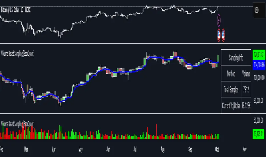
Volume Based Sampling [BackQuant]Volume Based Sampling
What this does
This indicator converts the usual time-based stream of candles into an event-based stream of “synthetic” bars that are created only when enough trading activity has occurred . You choose the activity definition:
Volume bars : create a new synthetic bar whenever the cumulative number of shares/contracts traded reaches a threshold.
Dollar bars : create a new synthetic bar whenever the cumulative traded dollar value (price × volume) reaches a threshold.
The script then keeps an internal ledger of these synthetic opens, highs, lows, closes, and volumes, and can display them as candles, plot a moving average calculated over the synthetic closes, mark each time a new sample is formed, and optionally overlay the native time-bars for comparison.
Why event-based sampling matters
Markets do not release information on a clock: activity clusters during news, opens/closes, and liquidity shocks. Event-based bars normalize for that heteroskedastic arrival of information: during active periods you get more bars (finer resolution); during quiet periods you get fewer bars (coarser resolution). Research shows this can reduce microstructure pathologies and produce series that are closer to i.i.d. and more suitable for statistical modeling and ML. In particular:
Volume and dollar bars are a common event-time alternative to time bars in quantitative research and are discussed extensively in Advances in Financial Machine Learning (AFML). These bars aim to homogenize information flow by sampling on traded size or value rather than elapsed seconds.
The Volume Clock perspective models market activity in “volume time,” showing that many intraday phenomena (volatility, liquidity shocks) are better explained when time is measured by traded volume instead of seconds.
Related market microstructure work on flow toxicity and liquidity highlights that the risk dealers face is tied to information intensity of order flow, again arguing for activity-based clocks.
How the indicator works (plain English)
Choose your bucket type
Volume : accumulate volume until it meets a threshold.
Dollar Bars : accumulate close × volume until it meets a dollar threshold.
Pick the threshold rule
Dynamic threshold : by default, the script computes a rolling statistic (mean or median) of recent activity to set the next bucket size. This adapts bar size to changing conditions (e.g., busier sessions produce more frequent synthetic bars).
Fixed threshold : optionally override with a constant target (e.g., exactly 100,000 contracts per synthetic bar, or $5,000,000 per dollar bar).
Build the synthetic bar
While a bucket fills, the script tracks:
o_s: first price of the bucket (synthetic open)
h_s: running maximum price (synthetic high)
l_s: running minimum price (synthetic low)
c_s: last price seen (synthetic close)
v_s: cumulative native volume inside the bucket
d_samples: number of native bars consumed to complete the bucket (a proxy for “how fast” the threshold filled)
Emit a new sample
Once the bucket meets/exceeds the threshold, a new synthetic bar is finalized and stored. If overflow occurs (e.g., a single native bar pushes you past the threshold by a lot), the code will emit multiple synthetic samples to account for the extra activity.
Maintain a rolling history efficiently
A ring buffer can overwrite the oldest samples when you hit your Max Stored Samples cap, keeping memory usage stable.
Compute synthetic-space statistics
The script computes an SMA over the last N synthetic closes and basic descriptors like average bars per synthetic sample, mean and standard deviation of synthetic returns, and more. These are all in event time , not clock time.
Inputs and options you will actually use
Data Settings
Sampling Method : Volume or Dollar Bars.
Rolling Lookback : window used to estimate the dynamic threshold from recent activity.
Filter : Mean or Median for the dynamic threshold. Median is more robust to spikes.
Use Fixed? / Fixed Threshold : override dynamic sizing with a constant target.
Max Stored Samples : cap on synthetic history to keep performance snappy.
Use Ring Buffer : turn on to recycle storage when at capacity.
Indicator Settings
SMA over last N samples : moving average in synthetic space . Because its index is sample count, not minutes, it adapts naturally: more updates in busy regimes, fewer in quiet regimes.
Visuals
Show Synthetic Bars : plot the synthetic OHLC candles.
Candle Color Mode :
Green/Red: directional close vs open
Volume Intensity: opacity scales with synthetic size
Neutral: single color
Adaptive: graded by how large the bucket was relative to threshold
Mark new samples : drop a small marker whenever a new synthetic bar prints.
Comparison & Research
Show Time Bars : overlay the native time-based candles to visually compare how the two sampling schemes differ.
How to read it, step by step
Turn on “Synthetic Bars” and optionally overlay “Time Bars.” You will see that during high-activity bursts, synthetic bars print much faster than time bars.
Watch the synthetic SMA . Crosses in synthetic space can be more meaningful because each update represents a roughly comparable amount of traded information.
Use the “Avg Bars per Sample” in the info table as a regime signal. Falling average bars per sample means activity is clustering, often coincident with higher realized volatility.
Try Dollar Bars when price varies a lot but share count does not; they normalize by dollar risk taken in each sample. Volume Bars are ideal when share count is a better proxy for information flow in your instrument.
Quant finance background and citations
Event time vs. clock time : Easley, López de Prado, and O’Hara advocate measuring intraday phenomena on a volume clock to better align sampling with information arrival. This framing helps explain volatility bursts and liquidity droughts and motivates volume-based bars.
Flow toxicity and dealer risk : The same authors show how adverse selection risk changes with the intensity and informativeness of order flow, further supporting activity-based clocks for modeling and risk management.
AFML framework : In Advances in Financial Machine Learning , event-driven bars such as volume, dollar, and imbalance bars are presented as superior sampling units for many ML tasks, yielding more stationary features and fewer microstructure distortions than fixed time bars. ( Alpaca )
Practical use cases
1) Regime-aware moving averages
The synthetic SMA in event time is not fooled by quiet periods: if nothing of consequence trades, it barely updates. This can make trend filters less sensitive to calendar drift and more sensitive to true participation.
2) Breakout logic on “equal-information” samples
The script exposes simple alerts such as breakout above/below the synthetic SMA . Because each bar approximates a constant amount of activity, breakouts are conditioned on comparable informational mass, not arbitrary time buckets.
3) Volatility-adaptive backtests
If you use synthetic bars as your base data stream, most signal rules become self-paced : entry and exit opportunities accelerate in fast markets and slow down in quiet regimes, which often improves the realism of slippage and fill modeling in research pipelines (pair this indicator with strategy code downstream).
4) Regime diagnostics
Avg Bars per Sample trending down: activity is dense; expect larger realized ranges.
Return StdDev (synthetic) rising: noise or trend acceleration in event time; re-tune risk.
Interpreting the info panel
Method : your sampling choice and current threshold.
Total Samples : how many synthetic bars have been formed.
Current Vol/Dollar : how much of the next bucket is already filled.
Bars in Bucket : native bars consumed so far in the current bucket.
Avg Bars/Sample : lower means higher trading intensity.
Avg Return / Return StdDev : return stats computed over synthetic closes .
Research directions you can build from here
Imbalance and run bars
Extend beyond pure volume or dollar thresholds to imbalance bars that trigger on directional order flow imbalance (e.g., buy volume minus sell volume), as discussed in the AFML ecosystem. These often further homogenize distributional properties used in ML. alpaca.markets
Volume-time indicators
Re-compute classical indicators (RSI, MACD, Bollinger) on the synthetic stream. The premise is that signals are updated by traded information , not seconds, which may stabilize indicator behavior in heteroskedastic regimes.
Liquidity and toxicity overlays
Combine synthetic bars with proxies of flow toxicity to anticipate spread widening or volatility clustering. For instance, tag synthetic bars that surpass multiples of the threshold and test whether subsequent realized volatility is elevated.
Dollar-risk parity sampling for portfolios
Use dollar bars to align samples across assets by notional risk, enabling cleaner cross-asset features and comparability in multi-asset models (e.g., correlation studies, regime clustering). AFML discusses the benefits of event-driven sampling for cross-sectional ML feature engineering.
Microstructure feature set
Compute duration in native bars per synthetic sample , range per sample , and volume multiple of threshold as inputs to state classifiers or regime HMMs . These features are inherently activity-aware and often predictive of short-horizon volatility and trend persistence per the event-time literature. ( Alpaca )
Tips for clean usage
Start with dynamic thresholds using Median over a sensible lookback to avoid outlier distortion, then move to Fixed thresholds when you know your instrument’s typical activity scale.
Compare time bars vs synthetic bars side by side to develop intuition for how your market “breathes” in activity time.
Keep Max Stored Samples reasonable for performance; the ring buffer avoids memory creep while preserving a rolling window of research-grade data.
Portfolio Simulator & BacktesterMulti-asset portfolio simulator with different metrics and ratios, DCA modeling, and rebalancing strategies.
Core Features
Portfolio Construction
Up to 5 assets with customizable weights (must total 100%)
Support for any tradable symbol: stocks, ETFs, crypto, indices, commodities
Real-time validation of allocations
Dollar Cost Averaging
Monthly or Quarterly contributions
Applies to both portfolio and benchmark for fair comparison
Model real-world investing behavior
Rebalancing
Four strategies: None, Monthly, Quarterly, Yearly
Automatic rebalancing to target weights
Transaction cost modeling (customizable fee %)
Key Metrics Table
CAGR: Annualized compound return (S&P 500 avg: ~10%)
Alpha: Excess return vs. benchmark (positive = outperformance)
Sharpe Ratio: Return per unit of risk (>1.0 is good, >2.0 excellent)
Sortino Ratio: Like Sharpe but only penalizes downside (better metric)
Calmar Ratio: CAGR / Max Drawdown (>1.0 good, >2.0 excellent)
Max Drawdown: Largest peak-to-trough decline
Win Rate: % of positive days (doesn't indicate profitability)
Visualization
Dual-chart comparison - Portfolio vs. Benchmark
Dollar or percentage view toggle
Customizable colors and line width
Two tables: Statistics + Asset Allocation
Adjustable table position and text size
🚀 Quick Start Guide
Enter 1-5 ticker symbols (e.g., SPY, QQQ, TLT, GLD, BTCUSD)
Make sure percentage weights total 100%
Choose date range (ensure chart shows full period - zoom out!)
Configure DCA and rebalancing (optional)
Select benchmark (default: SPX)
Analyze results in statistics table
💡 Pro Tips
Chart data matters: Load SPY or your longest-history asset as main chart
If you select an asset that was not available for the selected period, the chart will not show up! E.g. BTCUSD data: Only available from ~2017 onwards.
Transaction fees: 0.1% default (adjust to match your broker)
⚠️ Important Notes
Requires visible chart data (zoom out to show full date range)
Limited by each asset's historical data availability
Transaction fees and costs are modeled, but taxes/slippage are not
Past performance ≠ future results
Use for research and education only, not financial advice
Let me know if you have any suggestions to improve this simulator.


Hummingbird Probability Mapping IndicatorHummingbird Probability Mapping Indicator - A nature inspired indicator that utilizes combinations of the following trend patterns and projects a probability mapping with greater than 70% accuracy based on real-time analysis.
EMA Trend
MACD
RSI
VWAP Spread
Burst
Squeeze
Volatility (ATRp)
Qi Dass

Foxbrady D/G CrossFoxbrady D/G Cross - Golden Cross & Death Cross Indicator**
A clean and simple indicator that identifies Golden Cross and Death Cross events using the classic 50-day and 200-day simple moving averages.
Features:
- Blue line: 50-day SMA (fast moving average)
- Red line: 200-day SMA (slow moving average)
- Green "GC" label appears at the exact crossover point when a Golden Cross occurs (bullish signal)
- Red "DC" label appears at the exact crossover point when a Death Cross occurs (bearish signal)
- Built-in alert conditions for both events
- Customizable MA periods to suit your trading style
How to Use:
The Golden Cross (50 MA crossing above 200 MA) is traditionally viewed as a bullish long-term signal, while the Death Cross (50 MA crossing below 200 MA) is considered a bearish indicator. This indicator makes it easy to spot these events historically and receive alerts when they occur in real-time.
Perfect for swing traders and long-term investors looking to identify major trend changes.

ICT Macros - CorrigéThis indicator is designed to help traders apply the concepts of ICT (Inner Circle Trader) by providing a clear and accurate visualization of market macros directly on the chart. Instead of manually drawing levels or constantly switching between timeframes, the indicator automatically highlights the key reference points that form the backbone of ICT analysis.
Key Features:
Automatic Macro Visualization: identifies and displays market macros as defined in ICT concepts, making it easier to recognize institutional levels.
Timeframe Flexibility: adapts to different chart periods, allowing traders to align intraday setups with higher timeframe structures.
Clean and Efficient Display: focuses only on the most relevant information, avoiding clutter and making the chart more readable.
Strategic Decision Support: provides essential context for ICT-based strategies, including identifying market direction, liquidity pools, and potential reversal zones.
Why Use It?
This indicator is built for traders who follow ICT methodology and want a reliable tool to instantly spot macro structure without wasting time on repetitive manual work. By combining precision with clarity, it enhances situational awareness and supports better decision-making in both intraday and swing trading.


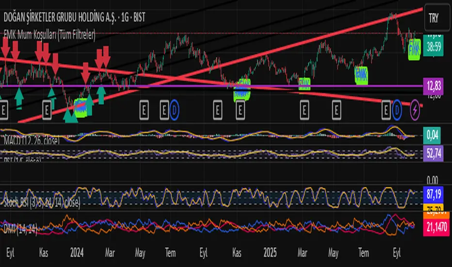
FMK Mum Koşulları (Tüm Filtreler)Yönü pozitife dönmüş ve alım fırsatı veren mumları bulmaya yarayan bir indikatör.
Wolfhis code is a Range Filter with entry signals.
How it works:
It calculates the average candle range (the difference between the price and its previous value) using EMA.
Based on this range, it builds a filter — a “smoothed line” (central level) along with upper and lower bands.
If the price moves above the filter → uptrend (green zone). If it moves below → downtrend (red zone).
Trade conditions:
longCondition (buy): price is above the filter and the filter has turned upward.
shortCondition (sell): price is below the filter and the filter has turned downward.
On the chart it displays:
the filter (line),
upper/lower bands,
colored candles (if enabled),
BUY/SELL labels and alerts.
In simple terms: it’s an indicator that filters out market noise and shows when the price changes trend direction, giving entry signals.

Advanced Directional Stoch RSIAdvanced Directional Stochastic RSI
Overview
The Advanced Directional Stochastic RSI (Adv Stoch RSI Dir) is a powerful oscillator that combines the classic Stochastic RSI with John Ehlers' SuperSmoother filter for ultra-smooth signals and reduced noise. Unlike traditional Stoch RSI, this indicator incorporates directional coloring based on price action relative to a smoothed trend line, helping traders quickly spot bullish or bearish momentum. It's designed for swing traders and scalpers looking for clearer overbought/oversold conditions in volatile markets.
Key Features
Directional Coloring: %K line turns green when price is above the trend MA (bullish) and red when below (bearish), providing instant visual bias.
Multi-Pass SuperSmoothing: Apply Ehlers' SuperSmoother filter up to 5 times for customizable noise reduction—dial in passes (default: 2) to balance responsiveness and smoothness.
Trend-Aware Baseline: Uses a cascaded smoothed moving average (default length: 20) to gauge overall direction, making the oscillator more context-aware.
Classic Stoch RSI Core: Built on RSI (default: 14) and Stochastic (default: 14), with SMA smoothing for %K (3) and %D (3).
Visual Aids: Includes overbought (80), oversold (20), and midline (50) levels, plus a subtle blue fill between OB/OS zones for easy reference.
How It Works
Source Smoothing: The input source (default: close) is passed through the SuperSmoother filter multiple times to create a trend MA.
Stoch RSI Calculation: Computes RSI on the source, then applies Stochastic to the RSI values, followed by SMA smoothing for base %K and %D.
Advanced Smoothing: Extra SuperSmoother layers are applied to %K and %D based on your chosen passes, minimizing whipsaws.
Directional Logic: Compares current close to the trend MA to color %K dynamically.
Plotting: %K (thick line, colored) and %D (thin orange) oscillate between 0-100, highlighting crossovers and divergences.
Usage Tips
Buy Signal: Green %K crosses above %D below 50, or bounces off oversold (20) in uptrends.
Sell Signal: Red %K crosses below %D above 50, or rejects overbought (80) in downtrends.
Customization: Increase smoothing passes (3-5) for choppy markets; reduce for faster signals. Pair with volume or support/resistance for confirmation.
Timeframes: Best on 1H-4H charts for stocks/crypto; adjust lengths for forex.
This open-source script is licensed under Mozilla Public License 2.0. Backtest thoroughly—past performance isn't indicative of future results. Enjoy trading smarter with less noise! 🚀
© HighlanderOne
Money Flow Index SignalsThis indicator in daily, weekly and monthly charts can be used to find strong Support, Resistance levels and reversal points. It can be used in lower time frame to find reversal points. When MFI reached 100 either in downside or upside in a candle, if the high is broken take it as a bullish breakout. If MFI is 0 or -0 and the low of the candle is broken take it as a downside breakout.

DX Fibonacci LevelsDX Fibonacci Levels Indicator
This Pine Script code implements a custom Fibonacci levels indicator that displays key Fibonacci retracement and extension levels on a price chart. The indicator helps traders identify potential support, resistance, and breakout areas by plotting significant Fibonacci levels based on the most recent high and low price range.
How to Use the Indicator:
Interpretation of Fibonacci Levels:
The indicator plots the following Fibonacci levels:
23.6% Retracement (Gray Line): This level represents a shallow retracement and is often considered a potential minor support or resistance area. It can signal a short-term price correction.
38.2% Retracement (Blue Line): One of the most widely used retracement levels. A price reversal at this level is seen as a potential indication of a strong move in the original direction.
50.0% Retracement (Gray Line): Although not a Fibonacci ratio itself, this level is a psychological midpoint. A 50% retracement often represents a neutral point where price could either reverse or continue in the original direction.
61.8% Retracement (Yellow Line): A key level for traders, as it is considered the "golden ratio" of Fibonacci. It is a critical area for determining the continuation of the trend or a potential reversal.
78.6% Retracement (Red Line): This level is closer to the 100% retracement and indicates a deeper pullback. It can represent an area of strong support or resistance.
100.0% (Purple Line): This level is equivalent to the recent low. It represents the full retracement or the lowest price point within the selected range.
127.2% Extension (Green Line): A Fibonacci extension level, indicating a potential area where price could extend beyond the previous high. This level often marks the beginning of a new trend or significant price movement.
161.8% Extension (Green Line): Another Fibonacci extension, marking an even further price projection. Traders use this level to forecast a continuation of the price movement in the direction of the prevailing trend.
Using the Indicator in Trading:
Identifying Support and Resistance: When the price approaches one of the key retracement levels (such as 38.2%, 50%, or 61.8%), traders often watch for signs of a reversal, like candlestick patterns or volume spikes, as these could indicate a potential entry or exit point.
Trend Continuation: If the price retraces to one of these levels and then continues in the direction of the trend, it can confirm that the trend is still intact. The extension levels (127.2% and 161.8%) help identify where the price may head next if the trend continues.
Breakout Zones: The extension levels can also act as breakout points. A price that surpasses the 100% level could indicate that the trend is gaining momentum, with potential for further movement beyond the 127.2% and 161.8% levels.
Chart Customization:
Color-Coded Fibonacci Levels: Each Fibonacci level is color-coded for easy identification:
Gray: 23.6% and 50.0% retracement levels
Blue: 38.2% retracement level
Yellow: 61.8% retracement level
Red: 78.6% retracement level
Purple: 100.0% level (the low of the range)
Green: 127.2% and 161.8% extension levels
The use of different colors allows for quick visual analysis, helping traders to distinguish between retracement and extension levels while identifying critical price zones on the chart.
Tips for Effective Use:
Monitor Price Action: Watch for price action signals like candlestick patterns, reversals, or trend-following indicators around these Fibonacci levels.
Combine with Other Indicators: To improve the reliability of the Fibonacci levels, combine them with other technical analysis tools such as moving averages, RSI, or MACD for confirmation of potential reversals or breakouts.
Adjust the Lookback Period: The lookback period can be adjusted to fit the time frame and asset being traded. A shorter lookback period may provide more sensitive levels, while a longer one may offer more reliable, long-term reference points.
This indicator is most useful when combined with your trading strategy to spot potential price points for reversals or continued movements.

Seasonal Pattern DecoderSeasonal Pattern Decoder
The Seasonal Pattern Decoder is a powerful tool designed for traders and analysts who want to uncover and leverage seasonal tendencies in financial markets. Instead of cluttering your chart with complex visuals, this indicator presents a clean, intuitive table that summarizes historical monthly performance, allowing you to spot recurring patterns at a glance.
How It Works
The indicator fetches historical monthly data for any symbol and calculates the percentage return for each month over a specified number of years. It then organizes this data into a comprehensive table, providing a clear, year-by-year and month-by-month breakdown of performance.
Key Features
Historical Performance Table: Displays monthly returns for up to a user-defined number of years, making it easy to compare performance across different periods.
Color-Coded Heatmap: Each cell is colored based on the performance of the month. Strong positive returns are shaded in green, while strong negative returns are shaded in red, allowing for immediate visual analysis of monthly strength or weakness.
Annual Summary: A "Σ" column shows the total percentage return for each full calendar year.
AVG Row: Calculates and displays the average return for each month across all the years shown in the table.
WR Row: Shows the "Win Rate" for each month, which is the percentage of time that month had a positive return. This is crucial for identifying high-probability seasonal trends.
How to Use
Add the "Seasonal Pattern Decoder" indicator to your chart. Note that it works best on Daily, Weekly, or Monthly timeframes. A warning message will be displayed on intraday charts.
In the indicator settings, adjust the "Lookback Period" to control how many years of historical data you want to analyze.
Use the "Show Years Descending" option to sort the table from the most recent year to the oldest.
The "Heat Range" setting allows you to adjust the sensitivity of the color-coding to fit the volatility of the asset you are analyzing.
This tool is ideal for confirming trading biases, developing seasonal strategies, or simply gaining a deeper understanding of an asset's typical behavior throughout the year.
## Disclaimer
This indicator is designed as a technical analysis tool and should be used in conjunction with other forms of analysis and proper risk management.
Past performance does not guarantee future results, and traders should thoroughly test any strategy before implementing it with real capital.

Cycle Indicator CS7This indicator visualizes cyclical structures (including inverse cycles) for financial instruments.
It is highly customizable and comes with a default configuration optimized for cryptocurrencies on a 45-minute timeframe, highlighting the following cycles:
• T-3: Daily cycles
• T-2: Approximately 2-day cycles
• T+1: Bi-weekly cycles
• T-1: Approximately 4-day cycles
• T: Weekly cycles
The same setup can also be applied effectively on a 24-hour timeframe, highlighting the following longer-term cycles:
• T+2: Monthly cycles
• T+3: Quarterly cycles
• T+4: Semi-annual cycles
• T+5: Annual cycles
• T+6: Bi-annual cycles
Users can customize the configurations to suit the specific characteristics of any financial instrument.
Additionally, the indicator includes a prediction system that approximates future cycles, marking them with a “?”.

MACD Forecast [Titans_Invest]MACD Forecast — The Future of MACD in Trading
The MACD has always been one of the most powerful tools in technical analysis.
But what if you could see where it’s going, instead of just reacting to what has already happened?
Introducing MACD Forecast — the natural evolution of the MACD Full , now taken to the next level. It’s the world’s first MACD designed not only to analyze the present but also to predict the future behavior of momentum.
By combining the classic MACD structure with projections powered by Linear Regression, this indicator gives traders an anticipatory, predictive view, redefining what’s possible in technical analysis.
Forget lagging indicators.
This is the smartest, most advanced, and most accurate MACD ever created.
🍟 WHY MACD FORECAST IS REVOLUTIONARY
Unlike the traditional MACD, which only reflects current and past price dynamics, the MACD Forecast uses regression-based projection models to anticipate where the MACD line, signal line, and histogram are heading.
This means traders can:
• See MACD crossovers before they happen.
• Spot trend reversals earlier than most.
• Gain an unprecedented timing advantage in both discretionary and automated trading.
In other words: this indicator lets you trade ahead of time.
🔮 FORECAST ENGINE — POWERED BY LINEAR REGRESSION
At its core, the MACD Forecast integrates Linear Regression (ta.linreg) to project the MACD’s future behavior with exceptional accuracy.
Projection Modes:
• Flat Projection: Assumes trend continuity at the current level.
• LinReg Projection: Applies linear regression across N periods to mathematically forecast momentum shifts.
This dual system offers both a conservative and adaptive view of market direction.
📐 ACCURACY WITH FULL CUSTOMIZATION
Just like the MACD Full, this new version comes with 20 customizable buy-entry conditions and 20 sell-entry conditions — now enhanced with forecast-based rules that anticipate crossovers and trend reversals.
You’re not just reacting — you’re strategizing ahead of time.
⯁ HOW TO USE MACD FORECAST❓
The MACD Forecast is built on the same foundation as the classic MACD, but with predictive capabilities.
Step 1 — Spot Predicted Crossovers:
Watch for forecasted bullish or bearish crossovers. These signals anticipate when the MACD line will cross the signal line in the future, letting you prepare trades before the move.
Step 2 — Confirm with Histogram Projection:
Use the projected histogram to validate momentum direction. A rising histogram signals strengthening bullish momentum, while a falling projection points to weakening or bearish conditions.
Step 3 — Combine with Multi-Timeframe Analysis:
Use forecasts across multiple timeframes to confirm signal strength (e.g., a 1h forecast aligned with a 4h forecast).
Step 4 — Set Entry Conditions & Automation:
Customize your buy/sell rules with the 20 forecast-based conditions and enable automation for bots or alerts.
Step 5 — Trade Ahead of the Market:
By preparing for future momentum shifts instead of reacting to the past, you’ll always stay one step ahead of lagging traders.
🤖 BUILT FOR AUTOMATION AND BOTS 🤖
Whether for manual trading, quantitative strategies, or advanced algorithms, the MACD Forecast was designed to integrate seamlessly with automated systems.
With predictive logic at its core, your strategies can finally react to what’s coming, not just what already happened.
🥇 WHY THIS INDICATOR IS UNIQUE 🥇
• World’s first MACD with Linear Regression Forecasting
• Predictive Crossovers (before they appear on the chart)
• Maximum flexibility with Long & Short combinations — 20+ fully configurable conditions for tailor-made strategies
• Fully automatable for quantitative systems and advanced bots
This isn’t just an update.
It’s the final evolution of the MACD.
______________________________________________________
🔹 CONDITIONS TO BUY 📈
______________________________________________________
• Signal Validity: The signal will remain valid for X bars .
• Signal Sequence: Configurable as AND or OR .
🔹 MACD > Signal Smoothing
🔹 MACD < Signal Smoothing
🔹 Histogram > 0
🔹 Histogram < 0
🔹 Histogram Positive
🔹 Histogram Negative
🔹 MACD > 0
🔹 MACD < 0
🔹 Signal > 0
🔹 Signal < 0
🔹 MACD > Histogram
🔹 MACD < Histogram
🔹 Signal > Histogram
🔹 Signal < Histogram
🔹 MACD (Crossover) Signal
🔹 MACD (Crossunder) Signal
🔹 MACD (Crossover) 0
🔹 MACD (Crossunder) 0
🔹 Signal (Crossover) 0
🔹 Signal (Crossunder) 0
🔮 MACD (Crossover) Signal Forecast
🔮 MACD (Crossunder) Signal Forecast
______________________________________________________
______________________________________________________
🔸 CONDITIONS TO SELL 📉
______________________________________________________
• Signal Validity: The signal will remain valid for X bars .
• Signal Sequence: Configurable as AND or OR .
🔸 MACD > Signal Smoothing
🔸 MACD < Signal Smoothing
🔸 Histogram > 0
🔸 Histogram < 0
🔸 Histogram Positive
🔸 Histogram Negative
🔸 MACD > 0
🔸 MACD < 0
🔸 Signal > 0
🔸 Signal < 0
🔸 MACD > Histogram
🔸 MACD < Histogram
🔸 Signal > Histogram
🔸 Signal < Histogram
🔸 MACD (Crossover) Signal
🔸 MACD (Crossunder) Signal
🔸 MACD (Crossover) 0
🔸 MACD (Crossunder) 0
🔸 Signal (Crossover) 0
🔸 Signal (Crossunder) 0
🔮 MACD (Crossover) Signal Forecast
🔮 MACD (Crossunder) Signal Forecast
______________________________________________________
______________________________________________________
🔮 Linear Regression Function 🔮
______________________________________________________
• Our indicator includes MACD forecasts powered by linear regression.
Forecast Types:
• Flat: Assumes prices will stay the same.
• Linreg: Makes a 'Linear Regression' forecast for n periods.
Technical Information:
• Function: ta.linreg()
Parameters:
• source: Source price series.
• length: Number of bars (period).
• offset : Offset.
• return: Linear regression curve.
______________________________________________________
______________________________________________________
⯁ UNIQUE FEATURES
______________________________________________________
Linear Regression: (Forecast)
Signal Validity: The signal will remain valid for X bars
Signal Sequence: Configurable as AND/OR
Table of Conditions: BUY/SELL
Conditions Label: BUY/SELL
Plot Labels in the graph above: BUY/SELL
Automate & Monitor Signals/Alerts: BUY/SELL
Linear Regression (Forecast)
Signal Validity: The signal will remain valid for X bars
Signal Sequence: Configurable as AND/OR
Table of Conditions: BUY/SELL
Conditions Label: BUY/SELL
Plot Labels in the graph above: BUY/SELL
Automate & Monitor Signals/Alerts: BUY/SELL
______________________________________________________
📜 SCRIPT : MACD Forecast
🎴 Art by : @Titans_Invest & @DiFlip
👨💻 Dev by : @Titans_Invest & @DiFlip
🎑 Titans Invest — The Wizards Without Gloves 🧤
✨ Enjoy!
______________________________________________________
o Mission 🗺
• Inspire Traders to manifest Magic in the Market.
o Vision 𐓏
• To elevate collective Energy 𐓷𐓏
🎗️ In memory of João Guilherme — your light will live on forever.

Gamma Exposure Levels by OMG (Oh My Gamma)OMG (Oh My Gamma) - Daily GEX Levels
An operational framework for Gamma analysis with daily data.
Indicator's Purpose & Demo Data
This indicator plots key strategic levels derived from Gamma Exposure (GEX) analysis. It showcases the operational logic of OhMyGamma analytical engine.
IMPORTANT: The levels plotted by this public script are based on a past date's snapshot for demonstration purposes. They are not valid for live trading and will not update automatically.
The real edge comes from using the fresh data structure provided daily.
How to Read the Levels
This indicator is designed to provide actionable intelligence, not just data. Here's how to read it:
The Levels: Each line represents a key strategic zone (Zero Gamma, Call/Put Walls, etc.) where a market reaction is statistically probable due to dealer hedging flows.
Line Thickness = Strategic Importance: The thickness of each line directly corresponds to its strategic rating. Thicker, solid lines represent higher-conviction zones.
Labels & Tooltips: Hover over a level's label on your chart to see its full description, confluences, and strategic rating.
Pro Tip: The Power of Confluence
This indicator is not a standalone "system". It's an institutional-grade intelligence layer. Its predictive power increases exponentially when used to find confluence with your own analysis.
The highest-probability trades occur when a key Gamma level aligns with:
Price Action: Key support/resistance zones, order blocks, or liquidity pools.
Volumetric Indicators: High/Low Volume Nodes (HVN/LVN) from Volume Profile, VWAP, and Anchored VWAP.
Use these levels to confirm your setups and gain the conviction to act.
How to Get the Daily Updated Script
This indicator requires a new Pine Script code each day to load the current session's data.
To get the daily updated code feel free to visit www.ohmygamma.com
Feedback & Suggestions
This tool is built for the community. Suggestions for improvements and new features are highly welcome and help the project evolve. Feel free to get in touch via the contact form on the website.
Disclaimer: This tool is for informational and educational purposes only. Trading involves significant risk. The authors assume no responsibility for any trading decisions.

DCA vs One-ShotCompare a DCA strategy by choosing the payment frequency (daily, weekly, or monthly), and by choosing whether or not to pay on weekends for cryptocurrency. You can add fees and the reference price (opening, closing, etc.).

MAs+Engulfing O caminho das Criptos
This indicator overlays multiple moving averages (EMAs 20/50/100/200 and SMA 200) and highlights bullish/bearish engulfing candles by dynamically coloring the candle body. When a bullish engulfing is detected, the candle appears as a strong dark green; for bearish engulfing, a more vivid red. Normal candles keep classic lime/red colors. Visual alerts and bar coloring make price-action patterns instantly visible.
Includes built-in alert conditions for both patterns, supporting both trading automation and education. The tool upgrades trend-following setups by combining structure with automatic price action insights.
Este indicador combina médias móveis (EMAs de 20/50/100/200 e SMA 200) com detecção de engolfo de alta/baixa, colorindo o candle automaticamente: engolfo de alta com verde escuro, engolfo de baixa com vermelho destacado. Inclui alertas automáticos para ambos os padrões, perfeito para análise visual, estratégia, ou ensino.

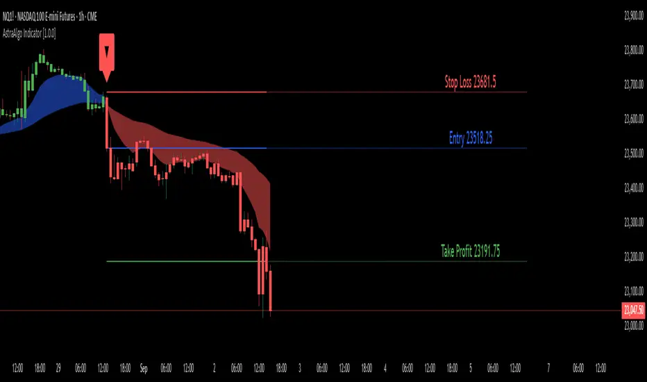
AstraAlgo IndicatorOVERVIEW
The AstraAlgo Indicator delivers precise, actionable trade signals on TradingView. With configurable signal modes, dynamic support and resistance, and a fully adjustable alerts system, it helps traders make informed decisions and manage risk effectively.
SIGNAL MODES
Signal Modes are the core of the AstraAlgo Indicator, providing users with proprietary trade signals tailored to their preferred complexity and style.
BAR COLORING
Bar Coloring provides a clear visual distinction between bullish and bearish candlesticks, allowing traders to interpret price action at a glance. This feature helps identify momentum and trend direction without analyzing raw price data.
ASTRA CLOUD
Astra Cloud is a dynamic support and resistance overlay that visually highlights key price zones on your TradingView charts. These zones adjust in real time to reflect market movements, helping traders identify areas of potential price reaction.
ALERTS
Alerts in the AstraAlgo Indicator are designed to keep traders informed of key market movements in real time. They notify you whenever a significant trading signal appears on your chart, ensuring you can act promptly even when you’re away from TradingView.
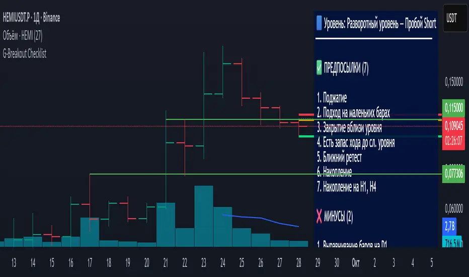
Breakout Levels Checklist# Description (EN)
## Breakout Levels Checklist — ATR (Classic shown, Active = 5-Day Median or Manual), D1-Fixed, Risk Position Sizing
This script is an on-chart checklist for breakout trades with a daily-fixed ATR core and a simple risk calculator. ATR values are latched on **D1**, so SL/TP remain stable when you switch timeframes. The UI (inputs and panel) is in Russian.
### What it does
- **Checklist**: three groups (Prerequisites, Negatives, Waiting). You tick items; the panel shows a clean list with counters.
- **Breakout calculations**: Entry, Stop-Loss, Take-Profit from your level price, **k × ATR** stop, and an RR preset. A built-in entry offset ≈ **12.5%** of the stop distance is applied.
- **ATR engine (D1)**:
- **Classic ATR** (period selectable; HL or True Range) — **always computed and displayed** for reference and daily progress.
- **Active ATR** = either **5-day median ATR** with optional *paranormal bar* filter (filters both too-big and too-small D1 ranges by percentage thresholds vs a blended reference), **or Manual ATR** if enabled.
- **Risk calculator**: given **Deposit** and **Risk %**, the script outputs the **entry notional (USD)** so an SL hit is approximately equal to your dollar risk; the panel also shows potential PnL to take-profit.
- **Stable visuals**: level / entry / SL / TP lines with automatic cleanup on a new day; panel can be placed in any corner (RU labels).
### How to use
1. Set **Direction** (Long/Short) and the **Level Price**.
2. Tick checklist items as the setup forms.
3. In **ATR**, leave Classic as reference (period + HL/TR), and choose the **Active ATR mode**: *5-day median* (with optional paranormal filter) **or** *Manual* (manual value overrides).
4. Pick **k** for **Stop = k × ATR**; TP is placed by the **RR** preset relative to stop size.
5. In **Calculator**, set **Deposit** and **Risk %** — the panel returns the **entry notional** aligned with your risk.
6. Show/hide panel sections (calculations / ATR / calculator) as needed.
### Quick notes
- Classic ATR is not selectable; it is always calculated and shown for context and D1 progress.
- Active ATR drives stop sizing: *5-day median (with filter)* or *Manual*.
- All ATR computations use **closed D1 bars**; values are cached per day.
---
# Описание (RU)
## Чек-лист уровней (Пробой) — ATR (классический показывается, Активный = медианный 5-дневный или Ручной), фиксация D1, расчёт позиции от риска
Скрипт для работы с пробойными сетапами: чек-лист на графике, фиксированный дневной ATR, расчёт ТВХ/SL/TP и простой калькулятор позиции от риска. Значения ATR фиксируются на **D1**, поэтому SL/TP не «плавают» при смене таймфреймов. Интерфейс (входы и панель) — на русском.
### Что делает
- **Чек-лист**: три группы (Предпосылки, Минусы, Ожидаю). Отмечаете галочки — панель выводит список и счётчики.
- **Расчёты пробоя**: ТВХ, Стоп-лосс, Тейк-профит от цены уровня; стоп как **k × ATR**; тейк задаётся пресетом **RR**; встроен люфт входа ≈ **12.5%** от дистанции стопа.
- **ATR (D1)**:
- **Классический ATR** (период, HL или True Range) — **всегда считается и показывается** как справочное значение и для прогресса дня.
- **Активный ATR** = **медианный за 5 дней** с опциональным фильтром *паранормальных* баров (одной галочкой отсекаются одновременно слишком большие и слишком маленькие дневные диапазоны по процентным порогам к смешанному референсу) **или** **Ручной ATR** (ручное значение имеет приоритет).
- **Калькулятор риска**: по **Депозиту** и **Риску %** отдаёт **сумму входа (USD)** так, чтобы убыток по стопу был близок к заданному риску; дополнительно показывает потенциальный PnL по тейку.
- **Стабильная отрисовка**: линии Уровень / ТВХ / SL / TP, авто-очистка на новый день; позиция панели выбирается (русские подписи углов).
### Как работать
1. Задайте **Направление** (Long/Short) и **Цену уровня**.
2. Отметьте пункты чек-листа под текущий контекст.
3. В **ATR** используйте **Классический** как справочный (период + HL/TR), а **Активный ATR** выберите как *медианный 5-дневный* (с фильтром при необходимости) **или** *Ручной* (ручное значение замещает активный).
4. Укажите **k** для **Стоп = k × ATR**; тейк выставляется пресетом **RR** относительно размера стопа.
5. В **Калькуляторе** задайте **Депозит** и **Риск %** — получите **сумму входа**, согласованную с риском.
6. В панели можно скрывать/показывать секции (расчёты / ATR / калькулятор).
### Важные примечания
- Классический ATR не выбирается пользователем — он всегда считается и отображается для контекста и прогресса по дню.
- Активный ATR используется для расчёта стопа: медианный 5D (с фильтром) или ручной.
- Все расчёты ATR делаются по **закрытым барам D1**; значения кэшируются на день.