Ultimate Squeeze & BreakoutTitle: Ultimate Squeeze & Breakout
Description: This indicator is a volatility analysis tool designed to identify periods of market compression ("The Squeeze") and validate subsequent breakouts using momentum logic. It builds upon the classic relation between Bollinger Bands and Keltner Channels but adds a directional filter to reduce false signals.
The Problem It Solves: Standard squeeze indicators often signal a breakout the moment price exits the bands, even if the underlying trend is weak or flat. This can lead to entering "wicks" or fakeouts. This script solves this by requiring the Basis Line Slope to align with the breakout direction before generating a signal.
How It Works:
1. Compression (The Setup) The script monitors the relationship between Bollinger Bands (Standard Deviation) and Keltner Channels (ATR).
Red Cloud: When the Bollinger Bands contract completely inside the Keltner Channels, it indicates a critical drop in volatility. The market is coiling and storing energy.
2. The Momentum Filter (The Validation) Unlike basic squeeze indicators, a breakout is not signaled solely by price closing outside the bands.
Logic: The script calculates the slope of the 20-period Basis Line (Simple Moving Average).
Bullish Validation: Price > Upper Band AND Basis Line is sloping UP.
Bearish Validation: Price < Lower Band AND Basis Line is sloping DOWN.
Visual Guide:
🟥 Red Cloud: Squeeze ON. Volatility is compressed. Do not trade; wait for expansion.
🟣 Fuchsia Cloud: Bullish Breakout (Price released upward + Positive Momentum).
🔵 Blue Cloud: Bearish Breakout (Price released downward + Negative Momentum).
⬜ Gray/Green Cloud: Standard Trending phase (Volatility is normal).
Features:
Precision Inputs: Multipliers for Standard Deviation and ATR can be adjusted in 0.01 increments for fine-tuning sensitivity.
Visual Toggles: Option to color the neutral trending cloud Green or Gray based on preference.
Alerts: Built-in alerts for "Squeeze Started" and validated "Bullish/Bearish Breakouts."
Credits: Core mechanics based on the TTM Squeeze concept popularized by John Carter. Momentum filtering logic added for enhanced signal reliability.
Bandas e Canais

MAJOR PA Zones + Structure + Targets (Gray/Purple)This script highlights major price-action structure (HH/HL/LH/LL), marks BOS/CHOCH events, and draws key supply/demand zones to help visualize trend shifts and potential targets.

RTH & ETH VWAPs (Unified Style)AVWAP indicator showing only the current session. Shows ETH VWAP even when RTH is turned on. Has standard deviation and fills for settings.

Momentum Gamma StraddleExact definition of what that script does
1) Purpose
The script is a decision aid for intraday expiry-day ATM straddle trades. It detects intraday structure breakouts and signals candidate long straddle entries for Nifty or Sensex using price structure, volume, RSI momentum, and a user-supplied combined ATM premium value (CE + PE). It draws support/resistance, shows an info box, and raises alerts.
2) Inputs the user can change
Trading time window: startHour, startMin, endHour, endMin.
Structure lookback: res_lookback (how many candles to use to compute resistance/support).
Minimum candle body as fraction of candle range: min_body_pct.
Volume multiplier threshold: vol_mult (breakout candle volume must exceed vol_mult * sma5).
RSI length and thresholds: rsi_len, rsi_bull_thresh, rsi_bear_thresh.
Combined premium source: choose Manual or Symbol. If Manual, set manual_combined. If Symbol, provide a TradingView symbol that returns CE+PE combined ATM premium.
Combined premium acceptable band: min_combined_ok and max_combined_ok.
Profit target percent and SL percent (target_pct and sl_pct).
Misc pattern heuristics: min_res_hits (min tests of resistance inside lookback), low_slope_min (used to detect rising lows).
Micro-confirmation toggle, micro timeframe, nonrepaint option, show_entry_label toggle (in the later fixed versions some of these were added, but the earlier fixed script had basic combined_symbol options and a lookahead fallback).
3) Data calculated on each bar
Safety check hasEnough: true when bar_index >= res_lookback.
resistance: the highest high over res_lookback bars.
support: the lowest low over res_lookback bars.
res_hits: count of bars within lookback whose high is within a tolerance of resistance. Tolerance is 10 percent of the range between resistance and support.
low_slope: simple slope of lows over res_lookback bars.
body_pct: the candle body as a fraction of its high-low range. strong_body true when body_pct >= min_body_pct.
bull_breakout: true if hasEnough and current close > resistance and strong_body and res_hits >= min_res_hits.
bear_breakout: true if hasEnough and current close < support and strong_body and res_hits >= min_res_hits.
vol_sma5 and vol_ok: vol_ok true when current volume > vol_mult * vol_sma5.
rsi and rsi checks: rsi_bull_ok true if rsi >= rsi_bull_thresh; rsi_bear_ok true if rsi <= rsi_bear_thresh.
combined_premium: either the manual_combined input or the value read from combined_symbol via request.security. The script attempted a fallback to manual when the symbol was not valid.
combined_ok: true if combined_premium lies between min_combined_ok and max_combined_ok.
final signals: bull_signal when in_time_window and bull_breakout and vol_ok and rsi_bull_ok and combined_ok. bear_signal similar for bearish breakout.
4) Visual output and alerts
Plots resistance and support lines on the chart.
Plots a label shape "STRADDLE BUY" below the bar for bull_signal and above the bar for bear_signal.
Creates an info label (on last bar) that shows TimeOK, VolOK and vol ratio, RSI, Combined premium and whether it is OK, ResHits and LowSlope.
Sets two alertcondition events: "Bull Straddle BUY" and "Bear Straddle BUY" with a short candidate message. The alerts fire when the corresponding signal is true.
5) Execution assumptions you must follow manually
The script does not place any orders or compute option strike-level prices or greeks. It only flags candidate entry bars.
When combined_source is Manual you must type CE+PE yourself. The indicator will only accept the manual number and treat it as the combined premium.
When combined_source is Symbol the script uses request.security to read that symbol. For historical bars the indicator may repaint depending on lookahead settings. The earlier fixed script attempted to use request.security inside a conditional which leads to runtime or compile errors. You experienced that exact error.
6) Known implementation caveats and bugs you encountered
Pine typing issue with low_slope. The earlier version set low_slope = na without explicit type. That triggers the Pine error: "Value with NA type cannot be assigned to a variable that was defined without type keyword". This required changing to float low_slope = na.
The earlier version attempted to call request.security() inside an if block or conditional. Pine prohibits request.security in conditional blocks unless allowed patterns are followed. That produced the error you saw: "Cannot use request.* call within loops or conditional structures" or similar. The correct pattern is to call request.security at top-level and decide later which value to use.
If combined_symbol is invalid or not available on your TradingView subscription, request.security can return na and the script must fall back to manual value. The earlier fixed script attempted fallback but compiled errors prevented reliable behavior.
The earlier script did not include micro-confirmation or advanced nonrepaint controls. Those were added in later versions. Because of that, the earlier script may have given signals that appear to repaint on historical bars or may have thrown errors when using combined_symbol.
7) Decision logic summary (exact)
Only operate if current chart time is inside user set time window.
Only consider trade candidates when enough history exists for res_lookback.
Identify a resistance level as the highest high in the lookback. Count how many times that resistance was tested. Ensure the breakout candle has a strong body and volume spike. Ensure RSI is aligned with breakout direction.
Require combined ATM premium to be inside a user preferred band. If combined_symbol is used the script tries to read that value and use it; otherwise it uses manual_combined input.
If all the above conditions are true on a confirmed bar, the script plots a STRADDLE BUY label and triggers an alertcondition.
8) What the script does not do
It does not calculate CE and PE prices by strike. It only consumes or accepts combined premium number.
It does not compute greeks, IV, or OI. OI and IV checks must be done manually.
It does not manage positions. No SL management or automatic exits are executed by the script.
It does not simulate fills or account for bid/ask spreads or slippage.
It cannot detect off-exchange block trades or read exchange-level auction states beyond raw volume bars.
It may repaint historical labels if the combined_symbol was read with lookahead_on or the script used request.security in a way that repainted. The corrected final version uses nonrepaint options.
9) Manual checks you must always perform even when the script signals BUY
Confirm the live combined ATM premium and the bid/ask for CE and PE.
Check ATM IV and recent IV movement for a potential IV crush risk.
Check option OI distribution and recent OI changes for strike pinning or large player exposure.
Confirm CE and PE liquidity and depth. Wide spreads make fills unrealistic.
Confirm there is no scheduled news or auction within the next few minutes.
Confirm margin and position sizing fits your risk plan.
10) Quick testing checklist you can run now
Add the script to a 5-minute chart with combined_source = Manual.
Enter manual_combined equal to the real CE+PE at the moment you test.
Set startHour and endHour so the in_time_window is true for current time.
Look for STRADDLE BUY label on confirmed bars. Inspect the info box to see why it did or did not signal.
If you set combined_source = Symbol, verify the symbol exists and that TradingView returns values for it. If you previously saw the request.security error, that was caused by placing the request inside a conditional. The correct behavior is to call request.security unconditionally at top-level like in the final fixed version.

Two individual BB - AxeThis indicator combines two Bollinger Bands into a single script, designed for traders who utilize dual-band strategies but want to keep their chart and indicator list clean.
Instead of adding two separate indicators, this script allows you to manage two Bollinger Bands within one interface. It maintains the full flexibility of the classic Bollinger Bands while adding independent toggles for better visibility control.

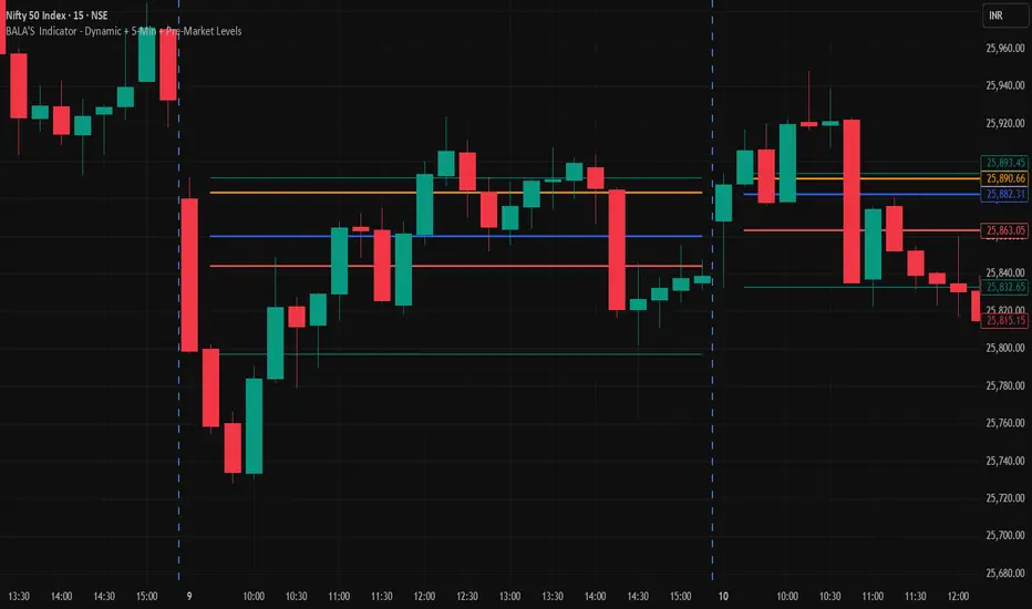
BALA'S Indicator - Dynamic + 5-Min + Pre-Market LevelsINTRADAY Strategy on Nifty with 15min Candle Setup.
Sayed Official SniperSniper and Trading best swing of the year no body knows i get it premium to share with you guyz

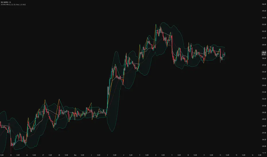
VD FRFS PRO
VD FRFS PRO
This trader centric, multi-functional indicator built on **Pine Script™ v6** that seamlessly integrates four of the most critical price and volatility tools into a single overlay. Designed for day traders, swing traders, and institutional analysts, this tool provides a comprehensive view of volatility, trend, volume-based pricing, and structure, all without chart clutter.
Overview & Concept
The VD FRFS PRO is engineered for efficiency and clarity. Instead of layering four separate indicators, which can lead to performance issues and confusion, this script combines the calculations into one, allowing traders to execute complex technical analysis rapidly.
It serves as a powerful foundation for strategies that require:
1. Volatility Assessment (Bollinger Bands)
2. Volume-Weighted Fair Value (VWAP)
3. Price Structure & Swings (Zig Zag)
4. Dynamic Trend Filtering (Configurable SMA)
Customization & Settings
All inputs are logically grouped for ease of use in the indicator's settings menu.
Bollinger Bands
BB Length: Period for the Basis SMA and StdDev calculation (default: 20).
BB Source: Price series for the calculation (default: `close`).
BB StdDev Multiplier: Multiplier for the Standard Deviation (default: 2.0).
BB Offset: Shifts the bands horizontally (default: 0).
VWAP Settings
VWAP Source: Price series for the VWAP calculation (default: `hlc3`).
Zig Zag Settings
Zig Zag High/Low Length: Lookback period for determining swing points (default: 3).
SMA Settings
SMA Period: Lookback period for the configurable SMA (default: 20).
Show SMA: Checkbox to toggle the visibility of this SMA (default: `true`).
Disclaimer
Feel free to reach out for suggestions and modification requests.
11-MA Institutional System (ATR+HTF Filters)11-MA Institutional Trading System Analysis.
This is a comprehensive Trading View Pine Script indicator that implements a sophisticated multi-timeframe moving average system with institutional-grade filters. Let me break down its key components and functionality:
🎯 Core Features
1. 11 Moving Average System. The indicator plots 11 customizable moving averages with different roles:
MA1-MA4 (5, 8, 10, 12): Fast-moving averages for short-term trends
MA5 (21 EMA): Short-term anchor - critical pivot point
MA6 (34 EMA): Intermediate support/resistance
MA7 (50 EMA): Medium-term bridge between short and long trends
MA8-MA9 (89, 100): Transition zone indicators
MA10-MA11 (150, 200): Long-term anchors for major trend identification
Each MA is fully customizable:
Type: SMA, EMA, WMA, TMA, RMA
Color, width, and enable/disable toggle
📊 Signal Generation System
Three Signal Tiers: Short-Term Signals (ST)
Trigger: MA8 (EMA 8) crossing MA21 (EMA 21)
Filters Applied:
✅ ATR-based post-cross confirmation (optional)
✅ Momentum confirmation (RSI > 50, MACD positive)
✅ Volume spike requirement
✅ HTF (Higher Timeframe) alignment
✅ Strong candle body ratio (>50%)
✅ Multi-MA confirmation (3+ MAs supporting direction)
✅ Price beyond MA21 with conviction
✅ Minimum bar spacing (prevents signal clustering)
✅ Consolidation filter
✅ Whipsaw protection (ATR-based price threshold)
Medium-Term Signals (MT)
Trigger: MA21 crossing MA50
Less strict filtering for swing trades
Major Signals
Golden Cross: MA50 crossing above MA200 (major bullish)
Death Cross: MA50 crossing below MA200 (major bearish)
🔍 Advanced Filtering System1. ATR-Based ConfirmationPrice must move > (ATR × 0.25) beyond the MA after crossover
This prevents false signals during low-volatility consolidation.2. Momentum Filters
RSI (14)
MACD Histogram
Rate of Change (ROC)
Composite momentum score (-3 to +3)
3. Volume Analysis
Volume spike detection (2x MA)
Volume classification: LOW, MED, HIGH, EXPL
Directional volume confirmation
4. Higher Timeframe Alignment
HTF1: 60-minute (default)
HTF2: 4-hour (optional)
HTF3: Daily (optional)
Signals only trigger when current TF aligns with HTF trend
5. Market Structure Detection
Break of Structure (BOS): Price breaking recent swing highs/lows
Order Blocks (OB): Institutional demand/supply zones
Fair Value Gaps (FVG): Imbalance areas for potential fills
📈 Comprehensive DashboardReal-Time Metrics Display: {scrollbar-width:none;-ms-overflow-style:none;-webkit-overflow-scrolling:touch;} ::-webkit-scrollbar{display:none}MetricDescriptionPriceCurrent close priceTimeframeCurrent chart timeframeSHORT/MEDIUM/MAJORTrend classification (🟢BULL/🔴BEAR/⚪NEUT)HTF TrendsHigher timeframe alignment indicatorsMomentumSTR↑/MOD↑/WK↑/WK↓/MOD↓/STR↓VolatilityLOW/MOD/HIGH/EXTR (based on ATR%)RSI(14)Color-coded: >70 red, <30 greenATR%Volatility as % of priceAdvanced Dashboard Features (Optional):
Price Distance from Key MAs
vs MA21, MA50, MA200 (percentage)
Color-coded: green (above), red (below)
MA Alignment Score
Calculates % of MAs in proper order
🟢 for bullish alignment, 🔴 for bearish
Trend Strength
Based on separation between MA21 and MA200
NONE/WEAK/MODERATE/STRONG/EXTREME
Consolidation Detection
Identifies low-volatility ranges
Prevents signals during sideways markets
⚙️ Customization OptionsFilter Toggles:
☑️ Require Momentum
☑️ Require Volume
☑️ Require HTF Alignment
☑️ Use ATR post-cross confirmation
☑️ Whipsaw filter
Min bars between signals (default: 5)
Dashboard Styling:
9 position options
6 text sizes
Custom colors for header, rows, and text
Toggle individual metrics on/off
🎨 Visual Elements
Signal Labels:
ST▲/ST▼ (green/red) - Short-term
MT▲/MT▼ (blue/orange) - Medium-term
GOLDEN CROSS / DEATH CROSS - Major signals
Volume Spikes:
Small labels showing volume class + direction
Example: "HIGH🟢" or "EXPL🔴"
Market Structure:
Dashed lines for Break of Structure levels
Automatic detection of swing highs/lows
🔔 Alert Conditions
Pre-configured alerts for:
Short-term bullish/bearish crosses
Medium-term bullish/bearish crosses
Golden Cross / Death Cross
Volume spikes
💡 Key Strengths
Institutional-Grade Filtering: Multiple confirmation layers reduce false signals
Multi-Timeframe Analysis: Ensures alignment across timeframes
Adaptive to Market Conditions: ATR-based thresholds adjust to volatility
Comprehensive Dashboard: All critical metrics in one view
Highly Customizable: 100+ input parameters
Signal Quality Over Quantity: Strict filters prioritize high-probability setups
⚠️ Usage Recommendations
Best for: Swing trading and position trading
Timeframes: Works on all TFs, optimized for 15m-Daily
Markets: Stocks, Forex, Crypto, Indices
Signal Frequency: Conservative (quality over quantity)
Combine with: Support/resistance, price action, risk management
🔧 Technical Implementation Notes
Uses Pine Script v6 syntax
Efficient calculation with minimal repainting
Maximum 500 labels for performance
Security function for HTF data (no lookahead bias)
Array-based MA alignment calculation
State variables to track signal spacing
This is a professional-grade trading system that combines classical technical analysis (moving averages) with modern institutional concepts (market structure, order blocks, multi-timeframe alignment).
The extensive filtering system is designed to eliminate noise and focus on high-probability trade setups.

CODEX OB + BBMA V1CODEX OB + BBMA is a multi-purpose Smart Money Concepts (SMC) indicator that automatically detects and visualizes key institutional trading elements such as Order Blocks, Fair Value Gaps, Rejection Blocks, Break of Structure, Pivots, High Volume Bars, and several qualitative SMC signals.
In addition to SMC tools, this indicator also incorporates multi-timeframe BBMA logic, allowing traders to view higher-timeframe momentum, trend direction, and volatility envelopes directly from the current chart. This makes it easier to align SMC setups—like OB, FVG, and BOS—with BBMA structure such as MA touches, re-entry zones, extreme candles, and volatility expansions.
This combination helps traders identify institutional footprints, multi-timeframe confluence, and displacement-based setups with high clarity.

Ichimoku + VWAP + OBV + ATR Full System (NQ Daytrade)This script provides optimized scalping signals for BTC, designed mainly for the 15-minute timeframe.
Long/short entries are generated using VWAP band position and trend confirmation logic.
OBV momentum is used as a secondary filter to validate breakout or reversal conditions.
Exit signals are displayed when volatility compression or mean-reversion conditions occur.
Simple visual markers (triangles and circles) are included for easy decision-making.
롱/숏 삼각형 시그널
동그라미 청산 시그널
VWAP 밴드 기반 방향성
OBV 보조지표
이름 (Name)
BTC Scalping Signal – VWAP + OBV
짧은 설명 (Short Description)
VWAP 밴드와 OBV를 기반으로 방향성, 진입·청산 시그널을 제공하는 스캘핑 지표입니다.
긴 설명 (Long Description)
이 지표는 BTC 단기 스캘핑을 위해 설계된 것으로, 특히 15분봉 환경에 최적화되어 있습니다.
VWAP 밴드의 위치와 추세 판별 로직을 기반으로 롱·숏 진입 신호를 제공합니다.
OBV 모멘텀을 보조 필터로 사용하여 돌파 및 되돌림 가능성을 판단합니다.
시장 변동성이 축소되거나 평균회귀 신호가 감지될 때 청산 시그널을 표시합니다.
삼각형(진입), 원형(청산) 등 직관적 시각 요소를 통해 빠른 의사결정을 지원합니다.

Regime EngineRegime Engine
Overview
Regime Engine is a market regime detection system that classifies price action into bullish, bearish, or neutral states using weighted exponential moving average analysis. Once the regime is identified, the indicator generates buy and sell signals based on Donchian channel breakouts, filtered by ADX trend strength and RSI momentum conditions.
The Money Line
The core of regime detection is the Money Line, a weighted combination of two exponential moving averages. By default, the short EMA (8 periods) receives 60% weight while the long EMA (24 periods) receives 40% weight. This weighting allows the Money Line to be more responsive than a simple long-period average while remaining smoother than a short-period average alone.
The Money Line changes color based on the current regime: green for bullish, red for bearish, and yellow for neutral. This provides immediate visual feedback about the market state.
Regime Classification
The indicator determines market regime by comparing the relative positions of the short and long EMAs while also considering RSI levels to avoid classifying overbought or oversold conditions as trend states.
Bullish regime is identified when the short EMA is above the long EMA and RSI is not in overbought territory. This combination suggests upward momentum that is not yet exhausted.
Bearish regime is identified when the short EMA is below the long EMA and RSI is not in oversold territory. This indicates downward momentum with room to continue.
Neutral regime applies when the EMAs are close together or RSI conditions prevent trend classification. The indicator provides two optional methods for enhanced neutral detection.
Neutral Zone Detection
Markets often transition through periods where trend direction is unclear. The indicator offers two complementary methods for detecting these neutral zones.
The slope method examines the rate of change of the Money Line relative to ATR. When the Money Line is moving slowly (slope below a tolerance threshold), the market is classified as neutral regardless of EMA positioning.
The EMA distance method calculates the percentage distance between the short and long EMAs. When they are within a specified percentage of each other, the EMAs are considered too close to reliably indicate direction.
Either or both methods can be enabled, and if either triggers, the regime is classified as neutral.
Donchian Channel Signals
Buy and sell signals are generated when price interacts with the Donchian channel boundaries. The Donchian channel plots the highest high and lowest low over a lookback period (default 20 bars), offset by one bar to prevent repainting.
Buy signals trigger when price touches or breaks below the lower Donchian band, indicating a potential support level. Sell signals trigger when price touches or breaks above the upper Donchian band, indicating potential resistance.
An optional setting requires the close to confirm the break rather than just the wick, providing more conservative signal generation.
ADX Trend Strength Filter
The Average Directional Index filters signals to ensure they occur during trending conditions. When enabled, signals only fire if ADX exceeds the threshold (default 24), confirming that the market has sufficient directional momentum for breakout trades to succeed.
The indicator uses Wilder's original smoothing method for ADX calculation, providing the traditional interpretation of trend strength values.
RSI Momentum Filter
RSI provides additional signal filtering to ensure entries occur at favorable momentum levels. Buy signals require RSI to be at or below the oversold threshold (default 30), indicating potential exhaustion of selling pressure. Sell signals require RSI to be at or above the overbought threshold (default 70), suggesting exhaustion of buying pressure.
These filters can be disabled for traders who prefer unfiltered Donchian breakout signals.
BBWP Volatility Monitoring
Bollinger Band Width Percentile measures current volatility relative to its historical range. The indicator calculates BB width and ranks it against the specified lookback period (default 252 bars, approximately one trading year).
BBWP above 70% indicates elevated volatility, which may signal trend acceleration or potential reversals. BBWP below 30% indicates compressed volatility, often preceding significant moves. The information panel displays the current BBWP reading with color coding to highlight these conditions.
Signal Cooldown
To prevent signal clustering during extended breakout periods, a configurable cooldown prevents new signals of the same type for a specified number of bars after each signal. This ensures each signal represents a distinct trading opportunity.
Visual Components
The Donchian channel can display shaded bands between the upper and lower boundaries. The shading color reflects the current regime: green for bullish, magenta for bearish, and blue for neutral. This provides at-a-glance context for where price is trading within its recent range.
An ADX strength bar at the bottom of the chart uses color coding: white for weak trend (ADX below 15), orange for ranging (ADX 15-24), and blue for trending (ADX above 24). This matches the trend strength display in the information panel.
Price labels appear at signal locations showing the signal type and entry price. Labels are automatically cleaned up after reaching a configurable history limit to maintain chart performance.
Signal candles are highlighted in blue, making it easy to identify exactly which bars generated signals when reviewing historical performance.
Information Panel
A compact table displays key metrics: current regime bias, trend strength classification, BBWP volatility reading, RSI level, and ADX value. Each metric is color-coded to highlight favorable or unfavorable conditions.
The panel can be positioned at any corner or middle edge of the chart. An alternative label-based display anchored to the chart is also available for those who prefer that format.
Trend Persistence Option
By default, the regime is recalculated on every bar. An optional persistence mode changes this behavior so that the regime only changes on EMA crossovers. This reduces regime flipping during choppy conditions but may delay regime recognition during gradual trend changes.
How to Use
Monitor the Money Line color and information panel for current regime. In bullish regimes, focus on buy signals at the lower Donchian band as potential pullback entries. In bearish regimes, focus on sell signals at the upper band as potential short entries or exit points.
Use the ADX strength indicator to gauge signal reliability. Signals during trending conditions (blue ADX bar) have historically higher success rates than signals during ranging conditions (orange bar) or weak trends (white bar).
Watch BBWP for volatility context. Low BBWP readings suggest a significant move may be developing, while high readings indicate the current move may be overextended.
The combination of regime awareness, Donchian breakout signals, and ADX/RSI filtering provides a structured approach to identifying trading opportunities across different market conditions.
Settings Guidance
The default settings work well for cryptocurrency and forex markets on intraday timeframes. For stocks or longer timeframes, consider increasing the EMA periods and Donchian lookback. The ADX threshold can be adjusted based on the typical ADX range for the traded instrument.
The RSI filter levels can be relaxed (higher oversold, lower overbought) for more signals or tightened for higher-quality but less frequent signals. The cooldown period should be adjusted based on timeframe, with shorter timeframes typically requiring longer cooldown periods.

Neural Fusion ProNeural Fusion Pro
Overview
Neural Fusion Pro is a multi-factor scoring system that combines numerous technical analysis methods into a single unified score. Rather than requiring traders to monitor multiple indicators separately, this system synthesizes trend strength, momentum oscillators, volume confirmation, price structure, and price action quality into one composite reading that adapts to current market conditions.
The Scoring System
At the heart of this indicator is a weighted scoring algorithm that produces a value between -1.0 and +1.0. Positive scores indicate bullish conditions across the measured factors, while negative scores suggest bearish conditions. The magnitude of the score reflects the strength of conviction across indicators.
The score is calculated from five distinct components, each capturing a different aspect of market behavior. Users can adjust the weight given to each component based on their trading style and market preferences.
Component 1: Trend Strength and Direction
This component uses the Average Directional Index to measure trend strength and the Directional Movement indicators to determine trend direction. When ADX exceeds the trending threshold, indicating a directional market, the component contributes a positive score if the positive directional indicator leads, or a negative score if the negative directional indicator leads. In ranging markets where ADX is low, this component contributes minimally to avoid false trend signals.
Component 2: Multi-Factor Momentum
Rather than relying on a single oscillator, this component synthesizes readings from RSI, MACD histogram, Stochastic, CCI, and Rate of Change. Each oscillator is normalized to a common scale and weighted according to its reliability characteristics. RSI readings are compared against dynamic thresholds that adjust based on trend state, making the indicator more forgiving in uptrends and more demanding in downtrends.
The component also includes divergence detection. When price makes a higher high but RSI makes a lower high (bearish divergence), or when price makes a lower low but RSI makes a higher low (bullish divergence), the divergence score adjusts the momentum component accordingly.
Component 3: Volume Confirmation
Volume provides crucial confirmation of price movements. This component analyzes On-Balance Volume relative to its moving average and measures the slope of OBV to determine whether volume is supporting the price trend. Additionally, it monitors relative volume by comparing current volume to its recent average, adding confirmation when volume spikes accompany price movements.
Component 4: Price Structure and Volatility
This component evaluates where price sits within the dynamic bands and considers the current volatility regime. When price is near the lower band, the component contributes a bullish score, suggesting potential support. When price is near the upper band, it contributes a bearish score, suggesting potential resistance.
The volatility regime assessment uses ATR percentile ranking. Low volatility periods often precede significant moves, while extremely high volatility may indicate unsustainable conditions.
Component 5: Price Action Quality
This component examines the character of recent candles by tracking the ratio of bullish to bearish candles over a lookback period. Consistent bullish price action contributes a positive score, while consistent bearish action contributes negatively. This helps filter signals by confirming that price behavior aligns with other factors.
Dynamic Bands
The indicator plots adaptive bands around a central basis line. The basis can be configured as either a simple or exponential moving average. Band width is determined by ATR multiplied by a dynamic factor that incorporates both ADX (expanding bands in trending markets) and the Chaikin Oscillator (expanding bands during strong accumulation or distribution).
These bands serve multiple purposes: they provide visual context for price position, they define signal trigger zones, and they help identify overextended conditions.
Trend State Detection
The indicator classifies market conditions into three states that affect signal generation and threshold levels.
Strong Uptrend is identified when ADX is rising, ADX exceeds the strong trend threshold, and the positive directional indicator exceeds the negative. This state triggers the most aggressive buy settings, allowing entries on shallow pullbacks.
Downtrend is identified when the negative directional indicator exceeds positive DI and ADX confirms directional movement. This state applies the most conservative buy settings, requiring deep oversold conditions before generating buy signals.
Neutral applies when neither trend condition is met, using moderate threshold settings appropriate for range-bound or transitional markets.
Dynamic RSI Thresholds
A key innovation is the automatic adjustment of RSI thresholds based on trend state. In a strong uptrend, the buy RSI threshold might be set to 50, allowing entries when RSI merely pulls back to neutral rather than requiring oversold conditions. The sell threshold rises to 72, keeping traders in positions longer during favorable conditions.
In downtrends, the buy RSI threshold drops to 25, ensuring buys only trigger on genuine capitulation. The sell threshold drops to 64, making exits easier to trigger.
In neutral markets, traditional oversold and overbought levels apply, with buy triggers around RSI 30 and sell triggers around RSI 68.
This adaptive approach prevents the common problem of indicators that work well in one market environment but fail in others.
Dynamic Cooldown
The signal cooldown period adjusts based on trend strength. During normal conditions, a standard cooldown prevents signal clustering. When ADX exceeds the strong trend threshold and is rising, indicating a powerful trend, the cooldown period extends. This helps traders stay in winning positions longer by reducing the frequency of counter-trend signals.
Cascade Protection
The indicator includes protection mechanisms to prevent overtrading and averaging down into losing positions.
The BBWP (Bollinger Band Width Percentile) monitor tracks current volatility relative to historical levels. When BBWP exceeds a threshold, indicating a volatility spike often associated with sharp moves, all buy signals are frozen. This protects against entering during panic selloffs or blow-off tops.
The consecutive buy counter tracks how many buy signals have occurred without an intervening sell. After reaching the maximum (default 3), no additional buy signals are generated until a sell occurs. This prevents the destructive pattern of repeatedly buying a declining asset.
Both protection mechanisms are displayed in the information panel, allowing traders to understand why signals may or may not be firing.
Signal Generation
Buy signals require price to touch or penetrate the lower band, RSI to be below the dynamic threshold, and the market to be in a trending state (when that filter is enabled). Additionally, the cooldown period must have elapsed and cascade protection must not be blocking buys.
Sell signals require price to touch or penetrate the upper band, RSI to be above the dynamic threshold, and the cooldown to have elapsed.
Signal labels display the entry price, signal type (shallow dip, capitulation, extended, bounce sell, or neutral), and the current position in the consecutive buy count.
Visual Components
The indicator provides multiple layers of visual feedback.
Cloud shading between the bands changes based on whether the composite score is in a buy zone or sell zone. Green clouds indicate bullish score readings, while red clouds indicate bearish readings.
Background coloring reflects the overall market regime. Green background indicates a bullish regime (positive DI leadership with volume confirmation), red indicates bearish regime, and white indicates neutral conditions.
An ADX bar at the bottom of the chart uses color coding: white for ranging (very low ADX), orange for flat, and blue for trending conditions.
The information panel displays the composite score with color coding, current trend state, active RSI thresholds, divergence status, BBWP freeze status, buy counter, market regime, ADX value with trend indicator, current cooldown setting, and live RSI reading color-coded against the active thresholds.
A debug panel can be enabled to show the individual component scores, helping users understand what is driving the composite reading.
How to Use
Monitor the composite score in the information panel. Readings above the buy threshold combined with price near the lower band represent potential long entries. Readings below the sell threshold with price near the upper band suggest exit opportunities.
Pay attention to the trend state. In strong uptrends, be more willing to buy dips and more patient with holding positions. In downtrends, require stronger confirmation before entering and be quicker to take profits on bounces.
Watch the cascade protection status. If BBWP shows frozen or the buy counter is approaching maximum, exercise additional caution regardless of other signals.
Use the dynamic RSI thresholds as context. When the panel shows buy RSI threshold at 50 (strong uptrend), even a pullback to RSI 45 is a potential entry. When the threshold shows 25 (downtrend), wait for genuine capitulation conditions.
Component Weight Adjustment
The relative importance of each scoring component can be adjusted through the settings. The default weights emphasize trend strength (30%) and momentum (25%), with volume (20%), price structure (15%), and price action (10%) providing confirmation.
For trend-following strategies, consider increasing trend and momentum weights. For mean-reversion approaches, increase the price structure weight to emphasize band position. The weights should sum to approximately 1.0 for proper score scaling.
Settings Guidance
The default settings are calibrated for cryptocurrency markets on lower timeframes. For traditional markets or longer timeframes, consider adjusting the ADX trending threshold (lower values for less volatile assets), the dynamic RSI levels for each trend state, and the cascade protection parameters.
The Heikin Ashi option for band calculation can provide smoother bands but may introduce slight lag. The default setting uses standard price data for better real-time accuracy.

Helix Protocol 7Helix Protocol 7
Overview
Helix Protocol 7 is a trend-adaptive signal engine that automatically adjusts its buy and sell criteria based on current market conditions. Rather than using fixed thresholds that work well in some environments but fail in others, Helix detects whether the market is in a strong uptrend, neutral consolidation, or downtrend, then applies the appropriate signal parameters for each state. This adaptive approach helps traders buy dips aggressively in confirmed uptrends while requiring much stricter conditions before buying in downtrends.
Core Philosophy
The fundamental insight behind Helix is that the same indicator readings mean different things in different market contexts. An RSI of 45 during a strong uptrend represents a healthy pullback and buying opportunity. That same RSI of 45 during a confirmed downtrend might just be a brief pause before further decline. Helix encodes this context-awareness directly into its signal logic.
The Money Line
At the center of the indicator is the Money Line, which can be configured as either a linear regression line or a weighted combination of exponential moving averages. Linear regression provides a mathematically optimal fit through recent price data, while the weighted EMA option offers more responsiveness to recent price action. The slope of the Money Line determines whether the immediate price trend is bullish, bearish, or neutral, which affects the color of the bands and cloud shading.
Dynamic Envelope Bands
Upper and lower bands are calculated using Average True Range multiplied by a dynamic factor. When ADX indicates trending conditions, the bands automatically widen to accommodate larger price swings. The Chaikin Accumulation/Distribution indicator also influences band width, with strong accumulation or distribution causing additional band expansion. This dual adaptation helps the bands remain relevant across different volatility regimes.
Trend State Detection
Helix classifies market conditions into four distinct states using a combination of ADX behavior and Directional Movement analysis.
Strong Uptrend requires ADX to be rising (gaining momentum), ADX value above a threshold (default 25), and the positive directional indicator exceeding the negative. This combination confirms not just that price is rising, but that the trend is strengthening.
Strong Downtrend uses the same ADX requirements but with the negative directional indicator dominant. This identifies accelerating downward momentum.
Weak Downtrend is detected when ADX is falling (trend losing steam) but negative DI still exceeds positive DI. This often represents the exhaustion phase of a decline.
Neutral applies when none of the above conditions are met, typically during consolidation or when directional indicators are close together.
Adaptive Signal Thresholds
The indicator uses Fisher Transform and RSI as its primary oscillators, but the trigger levels change based on trend state.
During Strong Uptrend, buy conditions are relaxed significantly. The Fisher threshold might be set to 1.0 (only slightly below neutral) and RSI to 50, allowing entries on minor pullbacks within the established trend. Sell conditions are tightened, requiring Fisher above 2.5 and RSI above 70, letting winning positions run longer.
During Neutral conditions, both buy and sell thresholds return to traditional oversold and overbought levels. Fisher must reach -2.0 for buys and +2.0 for sells, with RSI requirements around 30 and 65 respectively.
During Downtrend, buy conditions become very strict. Fisher must reach extreme oversold levels like -2.5 and RSI must drop below 25, ensuring buys only trigger on genuine capitulation. Sell conditions are loosened, allowing exits on any meaningful bounce.
This asymmetric approach embodies the trading principle of being aggressive when conditions favor you and defensive when they do not.
Band Touch Signals
In addition to oscillator-based signals, Helix generates signals when price touches the dynamic bands. A touch of the lower band indicates potential support and generates a buy signal. A touch of the upper band suggests potential resistance and generates a sell signal. These band-based signals work alongside the oscillator signals, providing entries even when Fisher and RSI have not reached their thresholds.
Extreme Move Detection
Sometimes price moves so violently that it penetrates the bands by an unusual amount. Helix measures this penetration depth as a percentage of ATR and can flag these as "extreme" signals. Extreme signals have special properties: they can fire intra-bar (before the candle closes) to catch wick entries, they can bypass normal cooldown periods, and they can optionally bypass volatility freezes. This allows the indicator to capture panic selling events that might be missed by waiting for candle closes.
Cascade Protection System
A critical feature for risk management is the built-in cascade protection that prevents averaging down into oblivion. The system has two components.
First, it tracks Bollinger Band Width Percentile, which measures current volatility relative to its historical range. When BBWP exceeds a threshold (default 92%), indicating a volatility spike often associated with sharp directional moves, all buy signals are temporarily frozen. This prevents entries during the most dangerous market conditions.
Second, it counts consecutive buy signals without an intervening sell. After reaching the maximum (default 3), no additional buy signals are generated until a sell occurs. This absolute limit prevents the common mistake of repeatedly buying a falling asset.
The protection status is displayed in the information panel, showing current BBWP level and the consecutive buy count.
RSI Divergence Detection
Helix includes automatic detection of RSI divergences, which often precede trend reversals. Regular bullish divergence occurs when price makes a lower low but RSI makes a higher low, suggesting weakening downside momentum. Regular bearish divergence is the opposite pattern at tops. Hidden divergences, which suggest trend continuation rather than reversal, are also detected and can be displayed optionally. Divergence lines are drawn directly on the price chart connecting the relevant pivot points.
Signal Cooldown
To prevent signal clustering and overtrading, a configurable cooldown period prevents new signals for a set number of bars after each signal. This ensures each signal represents a distinct trading opportunity.
Visual Components
The indicator provides comprehensive visual feedback. The Money Line changes color based on slope direction. The cloud shading between bands reflects trend bias. An ADX bar at the bottom of the chart uses color coding to show trend state at a glance: lime for strong uptrend, red for downtrend, white for ranging (very low ADX), orange for flat, and blue for trending but not yet strong.
Price labels appear at signal locations showing the entry or exit price, the trigger type (band touch, uptrend dip, capitulation, etc.), and the current position in the consecutive buy count.
The information panel displays current trend state, divergence status, BBWP freeze status, buy counter, ADX with direction arrow, DI spread, Fisher and RSI values, and the current active thresholds for buy and sell signals. A compact mode is available for mobile devices.
How to Use
In strong uptrends, look for buy signals on pullbacks to the Money Line or lower band. The relaxed thresholds will generate more frequent entries, which is appropriate when trend momentum is confirmed. Consider letting sell signals pass if the trend remains strong.
In neutral markets, treat signals more selectively. Both buy and sell signals require significant oscillator extremes, making them higher-probability but less frequent.
In downtrends, exercise extreme caution with buy signals. The strict requirements mean buys only trigger on major oversold conditions. Respect sell signals promptly, as the loosened thresholds are designed to protect capital.
Always monitor the cascade protection status. If BBWP shows frozen or the buy counter is at maximum, the indicator is warning you that conditions are dangerous for new long entries.
Settings Guidance
The default settings are calibrated for cryptocurrency markets on 5-minute timeframes. For other assets or timeframes, consider adjusting the ADX threshold for strong trend detection (lower for less volatile assets), the Fisher and RSI thresholds for each trend state, and the BBWP freeze level based on the asset's typical volatility profile.
The indicator includes a debug panel that can be enabled to show the detailed state of all conditions, useful for understanding why signals are or are not firing.

MoneyLine CipherMoneyLine Cipher
Overview
MoneyLine Cipher is a trend-following indicator designed to identify high-probability entry and exit points by combining multiple technical analysis methods into a unified signal system. The indicator adapts its behavior based on current market conditions, becoming more aggressive in strong trends and more conservative in choppy or uncertain markets.
Core Concept: The Money Line
At the heart of this indicator is the Money Line, a linear regression line that acts as a dynamic center of price action. Unlike a simple moving average, linear regression fits a straight line through recent prices using least-squares methodology, providing a smoother representation of the underlying trend direction. The slope of this line determines whether the market is in a bullish, bearish, or neutral state.
Dynamic Envelope Bands
The indicator plots upper and lower bands around the Money Line using Average True Range (ATR) as the volatility measure. What makes these bands unique is their adaptive multiplier system. When the ADX (Average Directional Index) indicates a strong trend, the bands automatically widen to accommodate larger price swings and avoid premature exits. In ranging or weak trend conditions, the bands contract to provide tighter entry and exit zones. This dynamic adjustment helps the indicator perform consistently across different market environments.
Trend State Detection
The indicator classifies market conditions into five distinct states: Strong Uptrend, Uptrend, Neutral, Downtrend, and Strong Downtrend. This classification uses three complementary methods working together.
First, the Directional Movement Index (DMI) measures the spread between positive and negative directional indicators. A large positive spread suggests bullish momentum, while a large negative spread indicates bearish pressure.
Second, On-Balance Volume (OBV) confirms whether volume supports the indicated trend direction. For a Strong Uptrend classification, OBV must be rising above its moving average, confirming that buying pressure backs the price movement.
Third, ADX must exceed a minimum threshold for Strong trend classifications, ensuring that only genuinely trending markets receive the Strong designation.
Signal Generation
Buy and sell signals are generated using Fisher Transform and Aroon indicators, but with a crucial enhancement: the trigger thresholds adjust dynamically based on the current trend state.
The Fisher Transform converts price data into a Gaussian normal distribution, making turning points easier to identify. In a Strong Uptrend, the buy threshold relaxes (making buys easier to trigger) while the sell threshold tightens (making sells harder to trigger). This allows traders to stay in winning positions longer during favorable conditions. The opposite applies in downtrends, where the system becomes quick to exit and reluctant to enter long positions.
The Aroon indicator measures how recently price made a new high or low within the lookback period. Combined with Fisher Transform, this dual-confirmation approach reduces false signals that might occur when using either indicator alone.
Band touches also generate signals. When price reaches the lower band, a potential buy zone is identified. When price reaches the upper band, a potential sell zone is flagged.
Cascade Protection System
A key feature is the built-in protection against averaging down into a losing position. The system tracks consecutive buy signals and limits them to a configurable maximum (default: 3). After reaching this limit, no additional buy signals are generated until a sell signal resets the counter. This prevents the common mistake of repeatedly buying during a sustained decline.
Additionally, the indicator monitors Bollinger Band Width Percentile (BBWP), which measures current volatility relative to historical volatility. When BBWP exceeds a threshold (indicating a volatility spike often associated with sharp moves), buy signals are temporarily frozen. This protects against entering during panic selloffs or blow-off tops.
Extreme Move Detection
Sometimes price moves so aggressively that it penetrates the bands by an unusual amount. The indicator detects these extreme moves and can generate signals even during normal cooldown periods. The logic is that an extreme band penetration represents a significant overextension that warrants attention regardless of recent signal history. These extreme signals are visually distinguished from regular signals.
RSI Divergence
The indicator includes RSI divergence detection as an additional confirmation tool. When price makes a lower low but RSI makes a higher low (bullish divergence), it suggests weakening downside momentum and a potential reversal. Bearish divergence (price higher high, RSI lower high) warns of potential tops. Both regular and hidden divergences are detected and marked on the chart.
Signal Cooldown
To prevent overtrading and signal clustering, a configurable cooldown period prevents new signals for a set number of bars after each signal. This spacing ensures that each signal represents a distinct trading opportunity rather than repeated triggers on the same price movement.
Visual Display
The indicator provides a comprehensive information panel showing current trend state, BBWP status, consecutive buy count, ADX reading, Fisher and Aroon values, cooldown status, and current dynamic thresholds. An ADX bar at the bottom of the chart provides quick visual reference for trend strength and direction using color coding.
Signal labels display the entry or exit price along with the current buy count (for buy signals), helping traders track their position sizing.
How to Use
In uptrending markets, look for buy signals near the lower band, particularly when the trend state shows Uptrend or Strong Uptrend. These represent pullback opportunities within an established trend.
In downtrending markets, the indicator naturally reduces buy signals and increases sell sensitivity, helping traders avoid catching falling knives.
In neutral or ranging conditions, signals from both directions are generated with moderate thresholds, suitable for mean-reversion trading within the bands.
Monitor the BBWP and consecutive buy counter in the info panel. If BBWP shows "FROZEN" or the buy counter approaches the maximum, exercise additional caution with new long entries.
Settings Guidance
The default settings are optimized for 5-minute cryptocurrency charts but can be adjusted for other timeframes and assets. Key parameters to consider adjusting include the Money Line length (shorter for more responsive, longer for smoother), ATR multiplier range (wider bands reduce signals but improve accuracy), and the various threshold values for trend classification.

TrendStrike: The Pullback EngineTrendStrike: The Pullback Engine - The Ultimate Pullback entry System
ApexFlow: Sniper Pro is a complete day-trading system designed to filter out market noise and identify high-probability entries. It combines institutional trend filters, structural support & resistance, and volatility checks to ensure you only trade when the odds are stacked in your favor.
🎯 How It Works:
The "King" Filter (EMA 200):
White Line: The script forces you to trade with the major trend.
Rule: If price is Above the White Line, it only looks for LONGS. If Below, it only looks for SHORTS.
The Trend Cloud (SMA 50 vs SMA 100):
🔵 Blue Cloud: Bullish Trend. Look for buys on dips.
🟠 Orange Cloud: Bearish Trend. Look for sells on rallies.
⛔ The "Chop" Safety (ADX Filter):
The system includes an ADX volatility filter. If the market is chopping sideways (ADX < 20), the dashboard will go gray and ALL signals are blocked to save you from fake-outs.
🌊 Structural Support & Resistance:
Purple Lines: Major Resistance zones.
Blue Lines: Major Support zones.
Use these to take profits.
🚀 The Signals (Entry Guide):
The script waits for a Pullback to the trend line (SMA 50) and only fires if the price bounces with strong momentum and volume.
🚀 LONG SIGNAL (Green Rocket):
Trend is UP, Price dipped to the 50 SMA, then bounced with a Green Candle + High Volume.
Exit: A red Stop Loss line is drawn automatically below the candle.
🩸 SHORT SIGNAL (Red Drop):
Trend is DOWN, Price rallied to the 50 SMA, then rejected with a Red Candle + High Volume.
Exit: A green Stop Loss line is drawn automatically above the candle.
📊 The Dashboard:
Located on the left, it gives you a live readout of the market health:
MAJOR TREND: Tells you if you are in an UPTREND or DOWNTREND.
VOLUME: Shows the current candle's volume. It lights up Green for buying pressure and Red for selling pressure.

Shannon Entropy (Quant Lab)🟦 Shannon Entropy = The level of "order" or "chaos" in the market.
This indicator gives you the answer to the question:
"Is the market currently orderly and understandable, or is it random and chaotic?"
No other classical indicator can accurately show this.
The value of Entropy is between 0 and 1:
⸻
🟩 1) Entropy = 0.0 – 0.3 → Structured, orderly, readable market
During these periods, the price:
• A trend forms • Ranges work clearly • Patterns (head & shoulders, flag, triangle) form smoothly • Systems like Z-score, VWAP, EMA work very cleanly • Data for modeling (algorithmic strategies, ML) is high quality
Think of this region as follows:
The market "works according to rules," it's easy to trade.
⸻
🟧 2) Entropy = 0.3 – 0.7 → Normal behavior region
In this region:
• Neither too orderly nor too chaotic
• Most systems operate at an average rate • We can say the market is healthy
It is tradable; however, the conditions are not perfect.
⸻
🟥 3) Entropy = 0.7 – 1.0 → Chaos / Noise / Manipulation region
This is the MOST DANGEROUS REGION OF THE MARKET.
What happens?
• Prices jump randomly left and right. • Wicks increase excessively. • Fake breakouts multiply. • The win rate of strategies decreases. • Trend-following systems constantly generate "false signals." • Even mean-reversion systems are caught off guard. • ML models learn junk data during these periods. • Generally, news, liquidation cascades, and manipulation periods increase entropy.
This period perfectly illustrates:
"There is no logic in this market right now — it's moving randomly."
Therefore, it's a period where you need to be very careful:
Reduce position size. • Trade less. • Avoid unnecessary risks. • Tighten stop losses. • Don't use leverage.
This is your risk alert panel.
⸻
🔥 The real superpower Entropy gives you: Trend selection and system selection
Entropy → Determines which strategy you will use.
✔ Low Entropy → Trend following or mean-reversion that works like a toy
✔ High Entropy → Even opening a trade is risky
✔ Normal Entropy → Most strategies work
Building a strategy without this information is unprofessional.
⸻
🧠 Critical summary (you can even copy and paste it as a description in TradingView):
Low entropy → market is structured, patterns & trends are reliable
High entropy → market is chaotic, noisy, unpredictable; avoid aggressive trading
Entropy tells you if your strategy has a high chance or low chance of working
⸻
🟦 Signals Entropy gives in practice:
🔹 Entropy is falling →
The market is stabilizing → A major trend or strong move is approaching.
🔹 Entropy is rising →
The market is becoming chaotic → Sudden spike, a period of trading in prayer mode, extra risk.
🔹 Low Entropy + VR > 1 + High ER → FULL TREND MARKET
A true “trend paradise” period.
🔹 Low Entropy + VR < 1 + High FDI → RANGE MARKET
A paradise of mean reversion.
🔹 High Entropy + High VoV → DANGEROUS PERIOD
Big explosions, news, and liquidations happen here.
⸻
⭐ IN SHORT:
Entropy = an indicator of how randomly the market behaves.
• 0–0.3 → regular, good, reliable market
• 0.3–0.7 → normal market
• 0.7–1.0 → chaotic, dangerous market
It tells you at a glance whether you should trade during this period or not.

Lead/Lag Correlation (Quant Lab)How to use it? (Briefly)
• otherSymbol: The asset you think could be the leader
• Example: If you are on a BTC chart → BINANCE:ETHUSDT, TOTAL3, USDT.D etc.
• lagBars:
• If you say 5: You are looking to see if there is a correlation between the movement of the other instrument 5 bars ago and your current movement. • In other words, is the other one leading?
• corr (green/red line):
• Close to +1 → strong positive correlation
• Close to -1 → strong negative correlation
• Close to 0 → no correlation
Lead/Lag interpretation:
• If the correlation is high for a specific lagBars (e.g., 0.7+):
➜ The otherSymbol you chose could be a strong "leader" for your current chart. In other words, its movement 5 bars ago is now explaining yours.

Rolling Skewness & Kurtosis (Quant Lab)🔹 Skewness (Asymmetric Risk)
• Skew > 0 (green) → Right tail heavier:
• More frequent positive extreme movements
• Higher probability of pump/sharp rally
• Skew < 0 (red) → Left tail heavier:
• Higher risk of crash, dump, liquidation
• Skew ≈ 0 → Distribution is symmetrical, neither right nor left side is dominant
🔹 Excess Kurtosis (Intensity of Extreme Movements)
• Kurt > 0 → Fat tails:
• More extreme movements compared to a normal distribution
• Increased risk of unexpected large spikes, flash moves
• Kurt < 0 → Thin tail:
• More “calm” distribution, fewer extreme movements
This pair tells you:
“Which direction could this instrument explode in right now?
and has the intensity of extreme movements increased?”

Fractal Dimension (Katz, Quant Lab)This indicator estimates the Katz Fractal Dimension of the price series over a rolling window.
It computes:
• L = sum of absolute price changes within the window
• d = maximum distance between any point and the first point in the window
• n = window length
Then applies Katz’s formula:
FDI = ln(n) / (ln(n) + ln(d / L))
The resulting Fractal Dimension typically lies between 1.0 and 2.0:
• FDI ≈ 1.0–1.3 → Strong, directional trend (low randomness)
• FDI ≈ 1.3–1.5 → Mixed / transitional behavior
• FDI ≈ 1.5–2.0 → Noisy, choppy, mean-reverting / range market

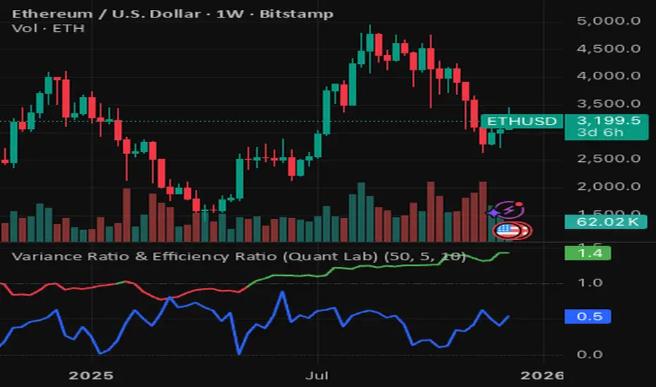
Variance Ratio & Efficiency Ratio (Quant Lab)1️⃣ Variance Ratio (VR)
Formula:
VR ≈ Var(q-step returns) / (q × Var(1-step returns))
Interpretation:
• VR ≈ 1 → The market is like a random walk; neither trend nor mean-reversion is dominant.
• VR > 1 → Trend behavior is dominant.
• Trend-following systems (EMA, Supertrend, breakout) work better.
• VR < 1 → Mean-reversion is dominant.
• Range/reversal strategies (Z-score, Bollinger fade, RSI reversal) work better.
In short:
• VR > 1 → Trending market
• VR < 1 → Mean-reverting market
This tells you:
“Should I build a trend system or a mean-reversion system for this instrument?”
⸻
2️⃣ Efficiency Ratio (ER)
Formula logic:
ER = |Close_now – Close_n-bars-ago| / Σ|Close_i – Close_{i+1}|
In other words:
• Numerator → Net movement over N bars
• Denominator → Total noise over N bars
Interpretation:
• ER ≈ 1 → The price has moved in almost a straight line in one direction.
→ The trend is very efficient, noise is low.
• ER ≈ 0 → The price has fluctuated a lot but hasn't gone anywhere definitively.
→ A complete noise/range market.
This tells you:
“How clear is the trend in this last N bars, and how much noise is there?”
⸻
🔥 The intelligence provided by both together:
• VR > 1 and ER is high (0.6–1.0) →
➜ Strong, high-quality trend. Golden age for trend-following.
• VR > 1 but ER is low (0.2–0.4) →
➜ Trend exists but there is a lot of noise, many fake movements. • VR < 1 and ER is low →
➜ Net range / sideways market. Ideal for mean-reversion.
Rolling Z-Score (Quant Lab)What does this Z-Score measure?
• src (default = close) → the value of the series you selected
• len → the window you are measuring based on the average of the last few bars
• Z ≈ 0 → price close to the average
• Z > 2 → price 2 standard deviations above the average (extremely positive deviation)
• Z < -2 → 2 standard deviations below the average (extremely negative deviation)
In modern mean-reversion strategies:
• Z > +2 → short / take profit candidate
• Z < –2 → long / dip buy candidate
