Keltner Channels - signal providerThis enhanced channel for pro traders visually indicates enhanced entry or exit signal based on the position of the underlying within the channel. Remember: EVERY TREND HAS ITS RETRACEMENTS - with this indicator you will avoid entering in full uptrend (bearing more downside risk than upside) or exiting (shorting) at max downtrend.
To be used together with the trend on higher timeframes (especially for the interpretation of the baseline)
Upper part = potential sell signal (especially in overall downtrends)
Lower part = potential buy signal (especially in overall uptrends)
Basis = potential buy signal (especially in strong uptrends)
= potential sell signal (especially in overall downtrends)
Análise de Ondas

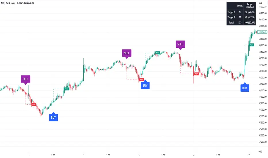
SoopAlgo — Premium Buy & Sell Targets (v6)SoopAlgo — Premium Targets (v6)
Description / Usage:
SoopAlgo — Premium Targets is a powerful trading tool designed to provide clear and actionable buy and sell signals directly on your chart. It highlights optimal entry points with distinct labels and automatically plots target levels, helping traders plan exits with precision.
Advantages:
Clear Visual Signals: Buy and sell opportunities are displayed prominently, reducing confusion and improving decision-making speed.
Integrated Target Levels: Automatic target lines allow traders to set realistic profit expectations without manual calculations.
Customizable Alerts: Receive alerts when signals occur, ensuring you never miss a trade opportunity.
Clean, Modern Display: Minimal clutter with intuitive color-coding (Buy in blue, Sell in purple) for easy chart readability.
Flexible Settings: Easily adjust target distances, label sizes, and indicator sensitivity to fit different trading styles.
Ideal For:
Traders who want a streamlined, easy-to-read tool for spotting market entries and exits with visual targets and alerts, while keeping the chart clean and focused.
Monitor Posición Bollinger Multi-TFThis indicator provides a comprehensive dashboard that allows you to monitor the price position relative to Bollinger Bands across 7 different timeframes simultaneously, without the need to switch charts.
It uses the %B (Percent B) logic to normalize the price position, giving you an instant "Heatmap" view of the market state (Overbought/Oversold) from the 1-minute chart up to the Weekly chart.
Key Features:
Multi-Timeframe Monitoring: Watch 1m, 5m, 15m, 1h, 4h, Daily, and Weekly timeframes in a single panel.
Dynamic Color Coding:
Dark Red: Price breaking above the Upper Band (>100%).
Light Red: Price near the Upper Band (Resistance zone).
Gray: Price in the neutral middle zone.
Light Green: Price near the Lower Band (Support zone).
Dark Green: Price breaking below the Lower Band (<0%).
Trend Arrows: Indicates momentum (▲ or ▼) based on the previous candle's position.
Current Timeframe Highlight: Automatically highlights the row corresponding to your current chart view in orange.
Fully Customizable: Adjust Bollinger settings (Length, Mult), choose your preferred timeframes, and change the table position/size.
Movable Panel: Includes X/Y offset settings to prevent the table from blocking price action or menu buttons.
How to Use:
Add the indicator to your chart.
Use the dashboard to spot confluence across timeframes.
Example: If 15m, 1H, and 4H are all showing Red, the asset is likely overextended to the upside.
Example: If the lower timeframes are turning Green while the higher timeframes remain Gray/Bullish, it might indicate a pullback opportunity.
Settings:
Bollinger Config: Length (20) and Multiplier (2.0) by default.
Timeframes: Select the 7 specific TFs you want to track.
Visuals: Change table position, text size, and offset coordinates.
This tool is essential for scalpers and day traders who need situational awareness across multiple fractals instantly.

Qosh GRC 3Qosh GRC 3
Comprehensive indicator for crypto market analysis with advanced correlation capabilities and wave strength assessment.
Core Components
Mid Index (Green line)
Dynamic middle line based on EMA with hesitation filter. Determines current market zone (Bull/Bear).
Settings:
• Length: 230 (default)
• Hesitation: 0.0001
Mid Index 2 (Black line)
Channel middle line based on highest/lowest values. Visibility depends on slope (>0.15% change over 4 bars).
Settings:
• Length: 20 (default)
SMA
Two moving averages for trend analysis:
• SMA A (red): 50 periods
• SMA B (blue): 200 periods
Main Bars with Open Interest
Bar color depends on Open Interest level:
• Blue = bullish bar
• Red = bearish bar
• Opacity inversely proportional to OI (higher interest → more saturated color)
opacity = reverseAndRound(((oi_smoothed * 100 / 1)) / 2)
bar_color = color.new(close >= open ? color.blue : color.red, opacity)
Oscillators (Lord Caramelo)
BTC Oscillator
Semi-transparent green oscillator based on BTCUSDT. Shows Bitcoin's base movement for comparison.
Main Oscillator (4 candles)
Price movement decomposition into 4 components:
• Verde (green) — bullish strength
• Branca (white) — neutral zone
• Vermelha (red) — bearish strength
• Azul (blue) — baseline
Wave Strength (Candle Strength)
Displayed on top of main oscillator:
• Aqua = bullish wave
• Maroon = bearish wave
Candle height = wave intensity (based on TCUD calculations).
Critical Levels
• 0.2 (green) — oversold zone
• 0.8 (purple) — extreme overbought
Critical Zone Indication
Background colors when oscillator breaches critical levels and price diverges from Mid Index >2%:
• Blue background = bullish extremity
• Red background = bearish extremity
Correlation
Correlation A (primary)
Correlation of current asset with selected ticker (default BTCUSDT). Displays scaled candles of correlating asset.
Correlation B and C (additional)
Correlation calculation between two arbitrary ticker pairs.
Information Table
Top right corner displays:
• Movement strength of Mid Index and Mid Index 2
• Correlation values A/B/C
• Current market state (Bull/Bear)
━━━━━━━━━━━━━━━━━━━━━━

Adaptive Trend Finder SatishThis indicator will help you to identify intraday trend.
Credit Goes to Julien_Eche (This indicator is replicate of Adaptive Trend Finder and created separately only because the actual Adaptive Trend Finder code was not good for intraday trader and this code with small tweak will help short and long term, i only tweaked in shortterm logic. )

MACD Divergence auto displayed on chart, with alertsMACD Pivot Divergence Detector
This tool identifies MACD histogram divergences based on confirmed pivot highs and lows.
Instead of comparing swing points on the MACD line, this script focuses specifically on the histogram, which measures momentum shifts between MACD and Signal.
How it works
The script detects confirmed pivots using a two-bar swing structure.
When price breaks above a previous pivot high, the script compares the MACD histogram value at that pivot to the current histogram value:
• If price makes a higher high while the histogram makes a lower high, a potential bearish divergence is marked.
The reverse logic is applied for bullish divergence when price breaks below a pivot low.
What makes this script unique
It uses pivot-confirmed histogram values, not lookback-based divergence.
It evaluates divergence only at actual highs/lows, reducing false positives.
It marks divergence directly on the candles for visual clarity.
Alert conditions are included for automated detection.
How to use
Bullish signals may highlight potential momentum loss in downtrends; bearish signals may highlight momentum loss near highs. Divergence does not guarantee reversal and should be combined with broader context, structure, or trend analysis.

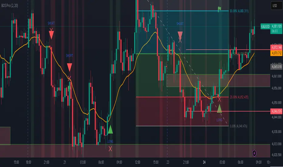
Professional BOS IndicatorThis is a trend following indicator that focuses on BOS, pullback and entry
Price Action - LegsRooted in Al Brooks' leg counting philosophy from "Trading Price Action Trends," this draws zigzag lines connecting swing points: green for up legs (until low < previous low), red for down legs (until high > previous high). Updates dynamically to new extremes, with optional count labels (0 resets on stronger pivots). Visualizes twists in channels or ranges—markets always test with two legs; use for pullback entries or reversals.

趋势波段型警报When to enter the market is important.
When to exit the market is even more important.
When to take profit is important.
When to stop loss is even more important.
This indicator has undergone 400 backtests with a basic win rate of approximately 65%, which can help people significantly improve their win rate in manual trading.
什么时候进场很重要
什么时候离场更重要
什么时候止盈很重要
什么时候止损更重要

Price Action - H/L BarBased on Al Brooks' "Bar by Bar" (Chapter 09A, p.45-50) and "Trends" (p.98-105), this marks H (higher high with close above mid) and L (lower low with close below mid) swings. Marking pauses after each, resuming on pullback. Labels "H" above and "L" below bars for swing counting in trends or ranges. Key: Markets form two legs—use for measured moves or failed breakouts, always in context of prior extremes.

S1XP4C Bear Klr 2.1.1BTC|USD 8d
Double EMA and SMA lines with a subtle offset to show bearish and bullish changes on an 8 day chart and a WMA to show extreme lows.

Supertrend Filtered SniperSupertrend + QQE MOD + DEMA + VWAP Multi-Confluence Strategy
A professional-grade indicator combining multiple technical confluences for high-probability trade signals
━━━━━━━━━━━━━━━━━━━━━━━━━━━━━━━━━━━━━━━━━━━
📊 OVERVIEW
This indicator combines 4 powerful technical systems into one comprehensive trading tool. It only generates signals when ALL confluences agree, resulting in fewer but higher-quality trade opportunities. Perfect for day traders, scalpers, and prop firm challenges.
✅ Signals only fire when ALL conditions align:
- Both Supertrends bullish/bearish
- Price on correct side of DEMA 200
- QQE MOD confirmation
- Optional: VWAP filter, ADX filter, RSI filter, Session filter
━━━━━━━━━━━━━━━━━━━━━━━━━━━━━━━━━━━━━━━━━━━
🔧 CORE COMPONENTS
1. Dual Supertrend System
- Supertrend #1: Primary trend identification (default: 10 period, 2.0 multiplier)
- Supertrend #2: Fast trend + exit signal (default: 1 period, 2.0 multiplier)
- Both must agree for entry signals
- ST2 flip triggers automatic exit signals
2. DEMA 200 Filter
- Double Exponential Moving Average for major trend direction
- Longs only: Price above DEMA
- Shorts only: Price below DEMA
- Gradient visualization shows trend strength
3. QQE MOD (Quantitative Qualitative Estimation)
- Advanced momentum oscillator with Bollinger Bands
- Identifies strong directional moves
- Filters out weak/choppy conditions
- Based on dual RSI calculations with dynamic thresholds
4. VWAP Filter (Optional)
- Volume Weighted Average Price for institutional flow
- Longs only: Above VWAP
- Shorts only: Below VWAP
- Ensures you trade with institutional momentum
━━━━━━━━━━━━━━━━━━━━━━━━━━━━━━━━━━━━━━━━━━━
⚙️ ADDITIONAL FILTERS
Session Filter
Choose which trading sessions to allow signals:
- Asian: 6PM - 3AM EST (Tokyo hours)
- London: 3AM - 8AM EST (London open)
- New York: 8AM - 4PM EST (US market hours)
- After Hours: 4PM - 6PM EST
- Enable multiple sessions or just one - your choice!
ADX Filter (Optional)
- Only take signals when ADX > threshold (default 18)
- Ensures strong trending conditions
- Filters out ranging/choppy markets
RSI Filter (Optional)
- Avoid overbought longs (>80 RSI)
- Avoid oversold shorts (<20 RSI)
- Prevents counter-trend entries at extremes
━━━━━━━━━━━━━━━━━━━━━━━━━━━━━━━━━━━━━━━━━━━
📈 HOW TO USE
Entry Signals:
- BUY: Green "BUY" label appears when all bullish confluences align
- SELL: Red "SELL" label appears when all bearish confluences align
- Signals only fire once per setup (no repetitive alerts)
Exit Signals:
- EXIT: Orange "X" appears when Supertrend #2 flips direction
- Automatic exit logic built-in
- Can also exit at predetermined R:R targets
Status Table:
- Real-time confluence dashboard
- Shows each indicator's current state
- Green checkmarks = conditions met
- Easy visual confirmation before entering
━━━━━━━━━━━━━━━━━━━━━━━━━━━━━━━━━━━━━━━━━━━
🎨 VISUAL FEATURES
- Gradient Supertrend lines with transparency
- Color-coded candles based on DEMA position
- Automatic highlighting of trend zones
- Clear BUY/SELL/EXIT labels
- Yellow VWAP line (toggleable)
- Professional status table with checkmarks
- Small circles mark Supertrend direction changes
━━━━━━━━━━━━━━━━━━━━━━━━━━━━━━━━━━━━━━━━━━━
🔔 ALERT SYSTEM
Pre-configured alerts for:
- BUY Signal Confirmed
- SELL Signal Confirmed
- EXIT Long Position
- EXIT Short Position
- Any Entry Signal (combined)
- Any Exit Signal (combined)
Set once-per-bar-close alerts for automated trading
━━━━━━━━━━━━━━━━━━━━━━━━━━━━━━━━━━━━━━━━━━━
⚠️ RISK DISCLAIMER
This indicator is a tool for analysis and should not be used as the sole basis for trading decisions. Always:
- Backtest thoroughly before live trading
- Use proper risk management (1% rule)
- Consider market conditions and fundamentals
- Practice on demo accounts first
- Never risk more than you can afford to lose
Past performance does not guarantee future results.
━━━━━━━━━━━━━━━━━━━━━━━━━━━━━━━━━━━━━━━━━━━
📝 CREDITS
Original concept inspired by UNITED's confluence strategy
Enhanced and coded by jaredskii with assistance from ChatGPT
QQE MOD calculations based on standard QQE indicator methodology

One Leg Scalper, Aren TradingOne Leg Scalper — Precision Buy/Sell Signals for Every Market:
One Leg Scalper is a clean, fast and lightweight signal-based indicator designed for traders who want simple, accurate, rule-based entries without noise or chart clutter.
This tool detects a unique three-point market formation and automatically generates Buy or Sell signals when price confirms the structure with momentum.
It works on all markets (Crypto, Forex, Indices, Commodities) and on all timeframes, including scalping charts such as 1s,5s, 15s, 1m, 5m....
No complicated settings.
No repainting beyond the natural pivot confirmation.
Just clear signals based on price structure.
Key Features
✔ Automatic Buy & Sell signals:
Signals appear only after the market completes a verified structure and confirms it with price action.
✔ Works on all timeframes (including seconds):
Ultra-fast reactions for scalpers + higher-timeframe confirmation for swing traders.
✔ Non-intrusive chart design:
No extra shapes or distracting drawings — only clean labels placed exactly where they matter.
✔ Multi-market support:
Crypto, Forex, Stocks, Indices, Metals, Futures — fully compatible with every chart on TradingView.
✔ Smart internal filtering (three filters):
Reduces noise and ignores weak structures to focus only on meaningful setups.
How it Works (Simple Version — No Mechanism Revealed)
The indicator continuously tracks price structure and identifies a specific pattern formed by three market swing points.
When this structure completes and price confirms it, the indicator prints:
Buy → when bullish validation occurs
Sell → when bearish validation occurs
This ensures signals are triggered only after confirmation, avoiding premature or fake setups.
🔥free trial is available
“A 3-day free trial is available upon request.
Message me to unlock temporary access and test the indicator in real market conditions.”
Repainting Notice
The indicator waits for confirmed swing points, which requires a few bars of confirmation.
This is normal behavior for all pivot-based tools and does not repaint after confirmation.
Version 1.0 — Initial Release
Added delay confirmation settings.
Added minimum distance & price-difference filters.
Added customizable labels and alerts.
Early-signal raw-bar system (no repaint).
Optimized pivot storage for performance.
Disclaimer:
This indicator is a tool for technical analysis. Trading involves risk. Always use proper risk management and never risk more than you can afford to lose.

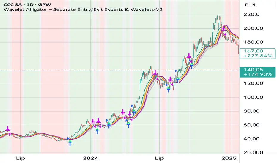
Wavelet Alligator – Separate Entry/Exit Experts & Wavelets-V2
Wavelet Alligator – Strategy Explanation & How to Use
1. Concept Overview
The Wavelet Alligator strategy combines:
- Wavelet transforms (Daubechies, Haar, Symlet, Mexican Hat, Morlet)
- Fractional calculus kernels: Caputo-Fabrizio (CF) and Atangana-Baleanu (AB)
- Three-layer “alligator-like” wavelet smoothing (soft → medium → strong)
- Expert-based entry/exit routing (RAW, CF, AB, or Majority vote)
- Independent wavelets for ENTRY and EXIT
- Main trend defined by AB wavelet ordering
This creates a multi-structure, multi-kernel trend engine capable of capturing extended moves with high signal quality.
2. Wavelet Alligator Structure
Each source (RAW, CF, AB) is transformed into three wavelet layers:
Soft = fastest reaction
Medium = mid smoothing
Strong = trend backbone
Wavelets:
- Daubechies: stable trend
- Haar: fast impulse detection
- Symlet: balanced
- Mexican Hat: curvature and reversal detection
- Morlet: cyclic, oscillatory
3. Entry Logic
Long entry occurs when:
- AB wavelet shows bullish structure (soft > medium > strong, medium rising)
- Selected entry expert approves (RAW / CF / AB / Majority)
- Wavelet condition: soft > strong AND medium crosses above strong
4. Exit Logic
Exit is independent from entry:
- Controlled by chosen exit expert
- Wavelet reversal condition: soft < strong AND medium crosses below strong
- Forced exit when AB trend turns neutral or bearish
5. Background Color (Regime)
- Green: bullish AB regime
- Red: bearish AB regime
- Gray: neutral/transition
6. How to Use
Step 1 – Choose entry wavelet
Daubechies: stable trend
Haar: breakout scalping
Mexican Hat: early reversals
Symlet: balanced
Morlet: cyclic markets
Step 2 – Choose exit wavelet
Mexican Hat: best precision
Daubechies: smooth exits
Haar: aggressive exits
Step 3 – Select entry/exit experts
CF only – fast fractional trend
AB only – stable long-memory trend
RAW only – pure price structure
Majority – safest, noise-filtered
Step 4 – Run the strategy
Entries occur only during AB bullish trend.
Exits occur on wavelet reversal or AB trend failure.
7. Why This Strategy Works
It fuses:
- Fractional calculus (memory)
- Wavelets (shape/curvature)
- Alligator ordering (trend hierarchy)
Result: high-quality entries, strong trend holding, noise-resistant signals.
Swing High-Low Line ConnectorSwing High-Low Line Connector is a simple and intuitive tool that automatically detects swing highs and swing lows using fractal-style pivot logic and connects them with clean, continuous lines. This indicator helps traders visualize market structure, trend shifts, and swing-based support/resistance levels at a glance.
The script identifies each confirmed swing point based on a user-defined lookback window (left/right bars). When a new swing is confirmed, the indicator updates the previous leg or creates a new one, effectively drawing the classic “zigzag-style” connections used in discretionary trading and price-action analysis.
A dynamic tail extension is included to show the most recent swing extending toward the current price. By default, the tail follows a ZigZag-style logic—extending upward after a swing low and downward after a swing high—but users can also anchor it to Close, High, Low, or HL2.
Features
Automatic detection of swing highs and swing lows
Clean line connections between swings (similar to discretionary market-structure mapping)
Proper consolidation handling: weaker highs/lows are ignored
Optional ZigZag-style dynamic tail extension
Fully customizable lookback window, line color, and line width
Works on any market and timeframe
Use Cases
Identifying market structure (HH, HL, LH, LL)
Visualizing trend transitions
Spotting breakout levels and swing-based support/resistance
Aiding discretionary swing trading, trend following, or pattern recognition
This indicator keeps the logic simple and visual—ideal for traders who prefer clean chart structure without unnecessary noise.

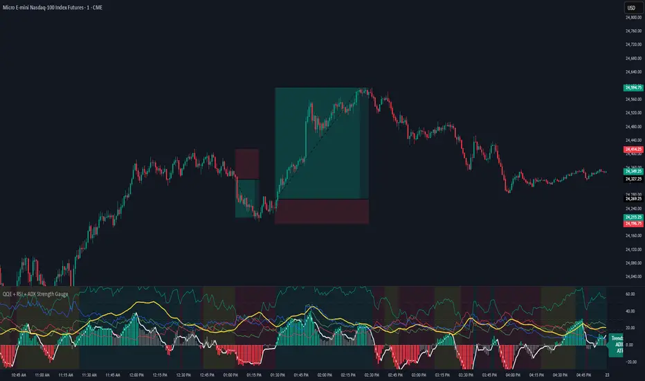
QQE + RSI + ADX Strength GaugeQQE + RSI + ADX Strength Gauge - Release Notes
A comprehensive multi-indicator oscillator combining QQE MOD momentum analysis with RSI, ADX, and ATR strength metrics for complete market analysis.
Features
+QQE MOD Oscillator
Primary & Secondary QQE calculations with Bollinger Band integration
Dynamic momentum-based column coloring (strong vs weak signals)
Clear bullish/bearish threshold zones
Strength Indicators
RSI (14) with overbought/oversold reference lines
ADX + DI lines for trend strength measurement
ATR for volatility context
Live trend gauge label (BULLISH/BEARISH/CHOP)
Visual Design
Clean, professional gradient aesthetic
Customizable colors for all indicators
Background coloring (oscillator pane + optional chart overlay)
Adjustable transparency settings
Settings
Fully adjustable QQE parameters (Primary/Secondary RSI, smoothing, factors)
Customizable Bollinger Bands (length, multiplier)
Adjustable indicator lengths (RSI, ADX, ATR)
ADX threshold control
Complete color customization
Credits
Original RSI + ADX + ATR Strength Gauge - Base structure and gauge concept - jaredskii
QQE MOD Indicator - QQE calculation logic - Mihkel00
Smart Cloud by Ilker (Custom Matriks)A Proprietary Hybrid Trend System for All Major Financial Assets
This indicator, originally developed for the Matriks platform, is a highly effective hybrid trend identification system designed for day-to-day analysis across all major asset classes, including Stocks, Forex, Indices, and Cryptocurrencies. It combines the forward-looking principle of the Ichimoku Kinko Hyo Cloud with heavily smoothed Moving Averages (MAs) to create a clear, visually guided trading signal. (Daily Timeframe recommended for optimal results).
📊 Algorithmic Structure and Parameters
The "Smart Cloud" utilizes six primary user-adjustable parameters that govern its sensitivity and shape, moving away from standard Ichimoku settings to provide a robust, customized trend view:
P1, P2, P3 (60, 56, 248): These long-term settings define the core structure and width of the cloud, acting as the primary dynamic support and resistance zone. The significantly longer P3 (Lagging Period) ensures the cloud reflects strong, deep market cycles.
P4 (Displacement 26): Maintains the traditional Ichimoku principle of projecting the cloud 26 periods forward to provide a predictive view of future trend support/resistance.
P5 (MA50 - Blue) & P6 (MA10 - Purple): These are the two primary Moving Averages plotted inside the cloud. They serve as fast-response momentum lines:
P5 (MA50): Represents the middle-term trend average.
P6 (MA10): Represents the short-term market momentum.
📈 Core Trend and Signal Interpretation
The indicator provides powerful trend identification based on three key components:
The Cloud (Kumo):
Green Cloud (Bullish): Indicates the dominant trend is up, suggesting dynamic support for price action.
Red Cloud (Bearish): Indicates the dominant trend is down, suggesting dynamic resistance.
The thickness and slope of the cloud are key indicators of trend strength.
MA Crossover Signal (Blue/Purple):
Buy Signal: When the faster Purple MA (P6=10) crosses above the slower Blue MA (P5=50).
Sell Signal: When the faster Purple MA (P6=10) crosses below the slower Blue MA (P5=50).
Price Action & Confirmation:
The most powerful signals occur when a MA Crossover is confirmed by price breaking out of the cloud in the same direction.
Price above the cloud and MA crossover to the upside suggests a strong buy entry.
Disclaimer: This tool is intended for analysis and decision-making support. It is not financial advice. Always use stop-loss orders and manage your risk accordingly.

Cumulative Volume Delta (HA Option)# **📘 Ultimate Guide to Trading With CVD Heikin Ashi (CVD+)**
## **🔍 What This Indicator Shows**
This tool plots **Cumulative Volume Delta (CVD)** as candlesticks—optionally transformed into **Heikin Ashi CVD candles**.
Instead of price, each candle represents the *battle between buyers and sellers* within your chosen timeframe.
**Volume Delta = Buying Volume – Selling Volume**
CVD takes all deltas and stacks them cumulatively, showing who is controlling the auction *over time*.
With Heikin Ashi smoothing layered on top, trend detection becomes cleaner, letting you see the “true pressure” behind price moves.
---
# **💡 Why CVD Is a Game Changer**
Most traders only see price.
Serious traders watch **pressure**.
CVD exposes what price hides:
* Absorption
* Hidden accumulation
* Seller exhaustion
* Fake breakouts
* True reversals
* Momentum strength / weakness
* Smart money footprint
When combined with Heikin-Ashi smoothing, you get delta trends with way less noise and fewer fake flips.
---
# **📈 How to Actually Use It (The Edge)**
## **1. Spot True Trend vs. Fake Trend**
If **price goes up** but **CVD goes down**, that’s:
* Passive sellers absorbing
* A weak rally
* High probability of reversal
If **price pulls back** but **CVD keeps rising**, that’s:
* Secret accumulation
* A continuation setup
* Great dip-buy opportunity
**Rule of thumb:**
🔹 *Follow the CVD trend, not the price noise.*
---
## **2. Catch Reversals Early**
Watch for:
### **🔻 Bearish Reversal Signals**
* CVD makes a **lower high**
* Heikin Ashi CVD prints **red bodies with rising upper shadows**
* Price makes one final push up on low delta
This is classic distribution → the drop usually follows fast.
### **🔹 Bullish Reversal Signals**
* CVD forms a **higher low**
* HA CVD flips from red to green with full bodies
* Price still looks weak = bottom forming
This is exactly how pros catch bottoms early.
---
## **3. Identify Absorption Levels**
If price hits a level multiple times but CVD keeps climbing (or falling), that level is being defended.
Example:
* Price stalls at support
* CVD keeps rising
= **Buyers absorbing sells → high-probability bounce**
Opposite works for resistance.
---
## **4. Validate Breakouts**
A breakout with *weak or negative CVD* is usually a trap.
A breakout with **strong, rising HA CVD** is real.
If CVD diverges from the breakout direction → fade it.
If CVD confirms → ride it.
---
## **5. Use Heikin Ashi to Stay in Trends**
HA smoothing removes the nasty chop of raw delta data.
Look for:
* Consecutive **full-body teal candles = strong buying wave**
* Consecutive **full-body red candles = strong selling wave**
* Small-bodied candles after a trend = momentum dying
This keeps you in winners longer and cuts losers faster.
---
# **🎯 Practical Trading Playbook**
### **A) Long Setup**
1. Price pullback into support
2. CVD stays bullish or makes a higher low
3. HA CVD flips green or prints a strong body
4. Enter long
5. Stop under CVD structural low
### **B) Short Setup**
1. Price pushes into resistance
2. CVD forms bearish divergence
3. HA CVD prints red bodies
4. Enter short
5. Stop above CVD swing high
### **C) Chop Filter**
No clear HA CVD trend = avoid trading → stop donating money to the market.
---
# **🧠 Tips for Mastery**
* Use lower timeframe delta (1m–5m) for scalping entries
* Use a higher anchor timeframe (1D) to define direction
* When price trends but CVD is flat → expect a fakeout
* When CVD trends but price is flat → expect a breakout
* Trade WITH delta, fade AGAINST delta
---
# **⚠️ Important Notes**
* Crypto = full tick-by-tick volume → CVD is extremely accurate
* Stocks = depends on your broker/data vendor
* Futures = best signal-to-noise ratio
* If your symbol has no volume → indicator will warn you
---
# **📥 Recommended Settings**
* **Anchor timeframe**: 1D or 4H
* **Lower timeframe**: 1m, 3m, or 5m
* **Heikin Ashi**: ON for trend filtering, OFF for raw delta
---
# **🔥 Final Word**
Price can lie.
Delta usually doesn’t.
CVD + Heikin Ashi gives you the closest thing to reading the market’s heartbeat in real time.
Use it to confirm breakouts, detect reversals early, identify real trend strength, and avoid getting caught in manipulation.
If you learn to read CVD well…
you stop trading price, and start trading the **intent** behind the price.

Eagle WavesEagle Waves is a precision trend-tracking and wave-reading system designed to help traders spot the real market direction early and stay aligned with momentum.
The indicator focuses on identifying clean waves, spotting trend shifts, and filtering out noise—giving you a clear view of where the market is likely heading next.
Eagle Waves highlights wave strength, trend continuation, exhaustion points, and momentum shifts so you can enter on strong legs and avoid weak or late positions.
What Eagle Waves Gives You
Clear wave visualization to read the market flow easily
Accurate trend direction with high-clarity color transitions
Wave strength indication to avoid weak or fading moves
Momentum confirmation before entering any wave
Reversal and exhaustion alerts when waves lose power
Smooth filters to reduce noise, especially on lower timeframes
Works on all markets: Forex, Crypto, Indices, Metals, and Stocks
Compatible with any strategy: scalping, intraday, or swing
Why Traders Use It
Helps you catch early trend legs
Keeps you out of choppy or uncertain zones
Makes wave reading visual and simple
Improves timing on entries and exits
Summary
Eagle Waves is built to make wave-based trading straightforward:
Clear waves. Clean trends. Better timing.

Wick-RSI-CandleBody_SEZERthis strategy is ideal to recognize peaks for both long and short positions in 1h and 4h periods. for quick response and faster trade, please use 15m period but keep in mind targeting lower profits. otherwise you may lose your profit.


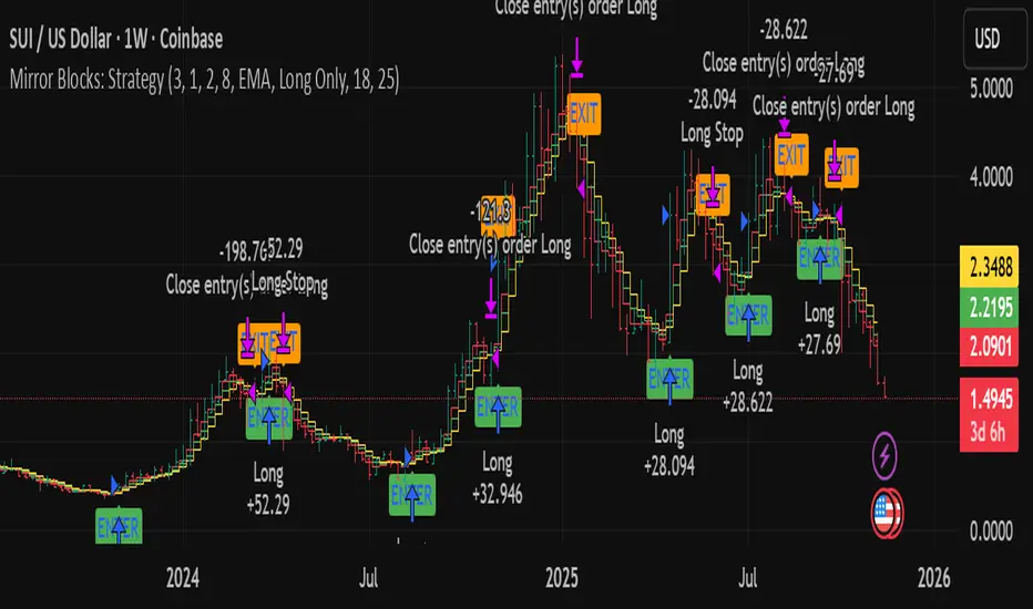
Mirror Blocks: StrategyMirror Blocks is an educational structural-wave model built around a unique concept:
the interaction of mirrored weighted moving averages (“blocks”) that reflect shifts in market structure as price transitions between layered symmetry zones.
Rather than attempting to “predict” markets, the Mirror Blocks framework visualizes how price behaves when it expands away from, contracts toward, or flips across stacked WMA structures. These mirrored layers form a wave-like block system that highlights transitional zones in a clean, mechanical way.
This strategy version allows you to study how these structural transitions behave in different environments and on different timeframes.
The goal is understanding wave structure, not generating signals.
How It Works
Mirror Blocks builds three mirrored layers:
Top Block (Structural High Symmetry)
Base Block (Neutral Wave)
Bottom Block (Structural Low Symmetry)
The relative position of these blocks — and how price interacts with them — helps visualize:
Compression and expansion
Reversal zones
Wave stability
Momentum transitions
Structure flips
A structure is considered bullish-stack aligned when:
Top > Base > Bottom
and bearish-stack aligned when:
Bottom > Base > Top
These formations create the core of the Mirror Blocks wave engine.
What the Strategy Version Adds
This version includes:
Long Only, Short Only, or Long & Short modes
Adjustable symmetry distance (Mirror Distance)
Configurable WMA smoothing length
Optional trend filter using fast/slow MA comparison
ENTER / EXIT / LONG / SHORT labels for structural transitions
Fixed stop-loss controls for research
A clean, transparent structure with no hidden components
It is optimized for educational chart study, not automated signals.
Intended Purpose
Mirror Blocks is meant to help traders:
Study structural transitions
Understand symmetry-based wave models
Explore how price interacts with mirrored layers
Examine reversals and expansions from a mechanical perspective
Conduct long and short backtesting for research
Develop a deeper sense of market rhythm
This is not a prediction model.
It is a visual and structural framework for understanding movement.
Backtesting Disclaimer
Backtest results can vary depending on:
Slippage settings
Commission settings
Timeframe
Asset volatility
Structural sensitivity parameters
Past performance does not guarantee future results.
Use this as a research tool only.
Warnings & Compliance
This script is educational.
It is not financial advice.
It does not provide signals.
It does not promise profitability.
The purpose is to help visualize structure, not predict price.
The strategy features are simply here to help users study how structural transitions behave under various conditions.
License
Released under the Michael Culpepper Gratitude License (2025).
Use and modify freely for education and research with attribution.
No resale.
No promises of profitability.
Purpose is understanding, not signals.
Test shift level strategyTesting this on all timelines where in it checks the candle color and takes call to buy or sell
