Volume ClusteringThis Volume Clustering script is a powerful tool for analyzing intraday trading dynamics by combining two key metrics: volume Z-Score and Cumulative Volume Delta (CVD). By categorizing market activity into distinct clusters, it helps you identify high-conviction trading opportunities and understand underlying market pressure.
How It Works
The script operates on a simple, yet effective, premise: it classifies each trading bar based on its statistical significance (volume Z-Score) and buying/selling pressure (CVD).
Volume Z-Score
The volume Z-Score measures how far the current bar's volume is from its average, helping to identify periods of unusually high or low volume. This metric is a powerful way to spot when institutional or large players might be entering the market. A high Z-Score suggests a significant event is taking place, regardless of direction.
Cumulative Volume Delta (CVD)
CVD tracks the net buying and selling pressure across different timeframes. The script uses a lower timeframe (e.g., 1-minute) and anchors it to a higher timeframe (e.g., 1-day) to capture intraday pressure. A positive CVD indicates more buying pressure, while a negative CVD suggests more selling pressure.
Cluster Categories
The script analyzes the confluence of these two metrics to assign a cluster to each bar, providing actionable insights. The clusters are color-coded and labeled to make them easy to interpret:
🟢 High Conviction Bullish: Unusually high volume (high Z-Score) combined with significant buying pressure (high CVD). This cluster suggests strong bullish momentum.
🔴 High Conviction Bearish: Unusually high volume (high Z-Score) coupled with significant selling pressure (low CVD). This cluster suggests strong bearish momentum.
🟡 Low Conviction/Noise: Low to moderate volume and mixed buying/selling pressure. This represents periods of indecision or consolidation, where market noise is more prevalent.
🟣 Other Clusters: The script also identifies other combinations, such as high volume with moderate CVD, or low volume with high CVD, which can provide additional context for understanding market dynamics.
Key Features & Customization
The script offers several customizable settings to tailor the analysis to your specific trading style:
Z-Score Lookback Length: Adjust the lookback period for calculating the average volume. A shorter period focuses on recent volume trends, while a longer period provides a broader context.
CVD Anchor & Lower Timeframe: Define the timeframes used for CVD calculation. You can anchor the analysis to a daily or weekly timeframe while using a lower timeframe (e.g., 1-minute) to capture granular intraday pressure.
High/Low Volume Mode: Toggle between "High Volume" mode (which uses 90th and 10th percentiles for clustering) and "Low Volume" mode (which uses 75th and 25th percentiles). This allows you to choose whether to focus on extreme events or more subtle shifts in market sentiment.
Statistics

Combined Cluster & Market StructureI barrowed code from the Mxwll Price Action Suite script as appreciated the structure in which the script defined structure, however I renamed variables and reduced the original script to define only the outer structure. I added volume and CVD clustering to define ranges and initiation market structures and add the ADX to assist with determining trend strength prior to labeling market structure breaks.
Combined Cluster & Market Structure indicator, a powerful and comprehensive tool for technical analysis. This script integrates two core concepts to provide a holistic view of market dynamics:
Z-Score Clustering & Volume Analysis: The indicator calculates Z-scores for both volume and Cumulative Volume Delta (CVD) to categorize market activity into six distinct clusters:
High-Conviction Bullish/Bearish: Signals of strong directional momentum based on high volume and corresponding CVD.
Effort vs. Result: High volume with moderate CVD, suggesting potential indecision or absorption.
Quiet Accumulation/Distribution: Low-volume periods with strong CVD, often preceding major moves.
Low Conviction/Noise: Represents periods of low market participation and weak signals.
These clusters are visually marked on the chart to provide real-time insight into market sentiment.
Market Structure Mapping: The indicator automatically detects and labels significant structural points to help you navigate price action. It identifies:
Higher Highs (HH) and Lower Lows (LL) to show the primary trend direction.
Breaks of Structure (BoS), indicating trend continuation.
Changes of Character (CHoCH), signaling a potential trend reversal.
Additionally, the script features consolidation box detection, which automatically highlights periods of low-conviction market activity, helping you avoid choppy, sideways markets. An integrated ADX filter ensures that structural breaks are only labeled during periods of strong trend strength, reducing false signals.
I want to thank Mxwll Capital for their contribution to the Combined Cluster & Market Structure indicator.

Lead Levels TP/SL v1.3 (close-only entries)Lead Levels — close-only signals, clean execution
Notice: Designed for BTC 15-minute charts only.
What it shows
Four reliability tiers: L1, L2, L3, L4.
A black “DON’T BET” marker for extreme conditions you should skip.
All triangles print only on bar close to avoid repaint.
How to read
▲ BUY L1–L4: higher level → stronger confidence.
▼ SELL L1–L4: higher level → stronger confidence.
DON’T BET (black): stand aside. No trade.
How to trade it
When a triangle prints, run a 1:1 target/stop:
Long: TP +1%, SL −1%.
Short: TP −1%, SL +1%.
Focus on normal conditions. Skip when the black marker appears.
One entry per signal. Keep sizing consistent.
Why traders like it
Close-only printing keeps charts honest.
Simple 1:1 playbook. No guesswork.
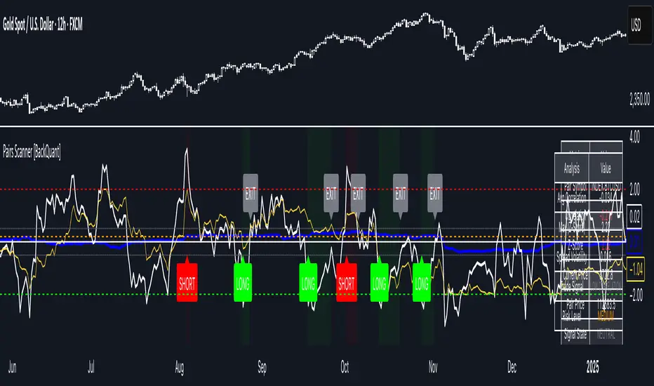
Pairs Trading Scanner [BackQuant]Pairs Trading Scanner
What it is
This scanner analyzes the relationship between your chart symbol and a chosen pair symbol in real time. It builds a normalized “spread” between them, tracks how tightly they move together (correlation), converts the spread into a Z-Score (how far from typical it is), and then prints clear LONG / SHORT / EXIT prompts plus an at-a-glance dashboard with the numbers that matter.
Why pairs at all?
Markets co-move. When two assets are statistically related, their relationship (the spread) tends to oscillate around a mean.
Pairs trading doesn’t require calling overall market direction you trade the relative mispricing between two instruments.
This scanner gives you a robust, visual way to find those dislocations, size their significance, and structure the trade.
How it works (plain English)
Step 1 Pick a partner: Select the Pair Symbol to compare against your chart symbol. The tool fetches synchronized prices for both.
Step 2 Build a spread: Choose a Spread Method that defines “relative value” (e.g., Log Spread, Price Ratio, Return Difference, Price Difference). Each lens highlights a different flavor of divergence.
Step 3 Validate relationship: A rolling Correlation checks if the pair is moving together enough to be tradable. If correlation is weak, the scanner stands down.
Step 4 Standardize & score: The spread is normalized (mean & variability over a lookback) to form a Z-Score . Large absolute Z means “stretched,” small means “near fair.”
Step 5 Signals: When the Z-Score crosses user-defined thresholds with sufficient correlation , entries print:
LONG = long chart symbol / short pair symbol,
SHORT = short chart symbol / long pair symbol,
EXIT = mean reversion into the exit zone or correlation failure.
Core concepts (the three pillars)
Spread Method Your definition of “distance” between the two series.
Guidance:
Log Spread: Focuses on proportional differences; robust when prices live on different scales.
Price Ratio: Classic relative value; good when you care about “X per Y.”
Return Difference: Emphasizes recent performance gaps; nimble for momentum-to-mean plays.
Price Difference: Straight subtraction; intuitive for similar-scale assets (e.g., two ETFs).
Correlation A rolling score of co-movement. The scanner requires it to be above your Min Correlation before acting, so you’re not trading random divergence.
Z-Score “How abnormal is today’s spread?” Positive = chart richer than pair; negative = cheaper. Thresholds define entries/exits with transparent, statistical context.
What you’ll see on the chart
Correlation plot (blue line) with a dashed Min Correlation guide. Above the line = green zone for signals; below = hands off.
Z-Score plot (white line) with colored, dashed Entry bands and dotted Exit bands. Zero line for mean.
Normalized spread (yellow) for a quick “shape read” of recent divergence swings.
Signal markers :
LONG (green label) when Z < –Entry and corr OK,
SHORT (red label) when Z > +Entry and corr OK,
EXIT (gray label) when Z returns inside the Exit band or correlation drops below the floor.
Background tint for active state (faint green for long-spread stance, faint red for short-spread stance).
The two built-in dashboards
Statistics Table (top-right)
Pair Symbol Your chosen partner.
Correlation Live value vs. your minimum.
Z-Score How stretched the spread is now.
Current / Pair Prices Real-time anchors.
Signal State NEUTRAL / LONG / SHORT.
Price Ratio Context for ratio-style setups.
Analysis Table (bottom-right)
Avg Correlation Typical co-movement level over your window.
Max |Z| The recent extremes of dislocation.
Spread Volatility How “lively” the spread has been.
Trade Signal A human-readable prompt (e.g., “LONG A / SHORT B” or “NO TRADE” / “LOW CORRELATION”).
Risk Level LOW / MEDIUM / HIGH based on current stretch (absolute Z).
Signals logic (plain English)
Entry (LONG): The spread is unusually negative (chart cheaper vs pair) and correlation is healthy. Expect mean reversion upward in the spread: long chart, short pair.
Entry (SHORT): The spread is unusually positive (chart richer vs pair) and correlation is healthy. Expect mean reversion downward in the spread: short chart, long pair.
Exit: The spread relaxes back toward normal (inside your exit band), or correlation deteriorates (relationship no longer trusted).
A quick, repeatable workflow
1) Choose your pair in context (same sector/theme or known macro link). Think: “Do these two plausibly co-move?”
2) Pick a spread lens that matches your narrative (ratio for relative value, returns for short-term performance gaps, etc.).
3) Confirm correlation is above your floor no corr, no trade.
4) Wait for a stretch (Z beyond Entry band) and a printed LONG / SHORT .
5) Manage to the mean (EXIT band) or correlation failure; let the scanners’ state/labels keep you honest.
Settings that matter (and why)
Spread Method Defines the “mispricing” you care about.
Correlation Period Longer = steadier regime read, shorter = snappier to regime change.
Z-Score Period The window that defines “normal” for the spread; it sets the yardstick.
Use Percentage Returns Normalizes series when using return-based logic; keep on for mixed-scale assets.
Entry / Exit Thresholds Set your stretch and your target reversion zone. Wider entries = rarer but stronger signals.
Minimum Correlation The gatekeeper. Raising it favors quality over quantity.
Choosing pairs (practical cheat sheet)
Same family: two index ETFs, two oil-linked names, two gold miners, two L1 tokens.
Hedge & proxy: stock vs. sector ETF, BTC vs. BTC index, WTI vs. energy ETF.
Cross-venue or cross-listing: instruments that are functionally the same exposure but price differently intraday.
Reading the cues like a pro
Divergence shape: The yellow normalized spread helps you see rhythm fast spike and snap-back versus slow grind.
Corr-first discipline: Don’t fight the “Min Correlation” line. Good pairs trading starts with a relationship you can trust.
Exit humility: When Z re-centers, let the EXIT do its job. The edge is the journey to the mean, not overstaying it.
Frequently asked (quick answers)
“Long/Short means what exactly?”
LONG = long the chart symbol and short the pair symbol.
SHORT = short the chart symbol and long the pair symbol.
“Do I need same price scales?” No. The spread methods normalize in different ways; choose the one that fits your use case (log/ratio are great for mixed scales).
“What if correlation falls mid-trade?” The scanner will neutralize the state and print EXIT . Relationship first; trade second.
Field notes & patterns
Snap-back days: After a one-sided session, return-difference spreads often flag cleaner intraday mean reversions.
Macro rotations: Ratio spreads shine during sector re-weights (e.g., value vs. growth ETFs); look for steady corr + elevated |Z|.
Event bleed-through: If one symbol reacts to news and its partner lags, Z often flags a high-quality, short-horizon re-centering.
Display controls at a glance
Show Statistics Table Live state & key numbers, top-right.
Show Analysis Table Context/risk read, bottom-right.
Show Correlation / Spread / Z-Score Toggle the sub-charts you want visible.
Show Entry/Exit Signals Turn markers on/off as needed.
Coloring Adjust Long/Short/Neutral and correlation line colors to match your theme.
Alerts (ready to route to your workflow)
Pairs Long Entry Z falls through the long threshold with correlation above minimum.
Pairs Short Entry Z rises through the short threshold with correlation above minimum.
Pairs Trade Exit Z returns to neutral or the relationship fails your correlation floor.
Correlation Breakdown Rolling correlation crosses your minimum; relationship caution.
Final notes
The scanner is designed to keep you systematic: require relationship (correlation), quantify dislocation (Z-Score), act when stretched, stand down when it normalizes or the relationship degrades. It’s a full, visual loop for relative-value trading that stays out of your way when it should and gets loud only when the numbers line up.
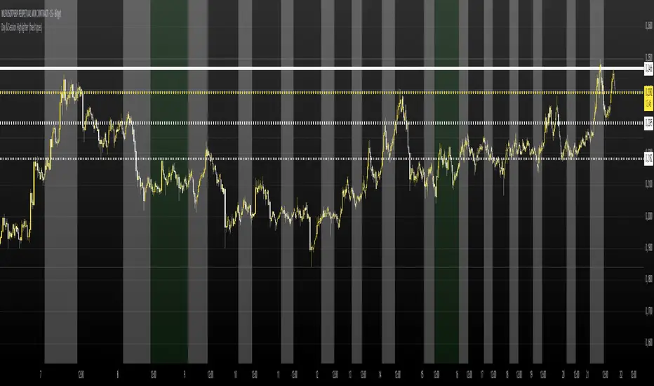
FRANJAS POR FECHAS - RSDescription:
This indicator allows you to highlight specific dates on your chart with vertical background stripes, similar to a session indicator.
Input your dates in the format DD.MM.YYYY (you can separate them with commas, spaces, line breaks, or semicolons).
The script automatically normalizes the format and applies a shaded vertical band for each matching day.
Works on daily and intraday charts: in intraday, the shading will cover the full trading day.
Options available to adjust the color and transparency of the stripes.
Optional dotted lines can be enabled at the start and end of each highlighted day.
This is useful for marking important events such as FOMC meetings, earnings releases, economic data announcements, or any custom list of key dates you want to track directly on your chart.

Japan Yen Carry Trade to Risk Ratio Sharpe Ratio By UncleBFMStep-by-Step Calculation in the ScriptFetch Rates:Pulls rates dynamically using request.security() from user-specified symbols (e.g., TVC:JP10Y for yen, TVC:US10Y for target). If unavailable (NA), uses fallback inputs (e.g., 0.25% for yen, 4.50% for target).
Converts rates to decimals: (target_rate - yen_rate) / 100.
Calculate Carry:Carry = (Target Rate - Yen Rate) / 100
Example: If US 10Y yield is 4.50% and Japan 10Y is 0.25%, carry = (4.50 - 0.25) / 100 = 0.0425 (4.25% annual yield).
Calculate Daily Log Returns:Log Returns = ln(Close / Close ), where Close is the current price of the pair (e.g., USDJPY) and Close is the previous day's price.
This measures daily percentage changes in a way suitable for volatility calculations.
Calculate Annualized Volatility:Volatility = Standard Deviation of Log Returns over a lookback period (default 63 days, ~3 months) × √252.
Example: If the standard deviation of USDJPY log returns is 0.005 (0.5% daily), annualized volatility = 0.005 × √252 ≈ 0.0794 (7.94%).
Compute the Ratio:Ratio = Carry / Volatility
Example: Using above, 0.0425 / 0.0794 ≈ 0.535.
If volatility is zero, the ratio is set to NA to avoid division errors.
Plot:Plots the ratio as a line, with optional thresholds (e.g., 0.2 for "high attractiveness") to guide interpretation.
NotesDynamic Rates: Using bond yields (e.g., TVC:JP10Y) or policy rates (e.g., ECONOMICS:JPINTR) makes the indicator responsive to historical and current rate changes, unlike static inputs.
Context: BIS reports use similar ratios to assess carry trade viability. For USDJPY in 2025, with Fed rates around 4.5% and BoJ at 0.25–0.5%, the carry is positive but sensitive to volatility spikes (e.g., during 2024 unwind events).
Usage: Apply to a yen pair chart (e.g., USDJPY, AUDJPY). Adjust symbols for the target currency (e.g., TVC:AU10Y for AUD). The ratio helps compare carry trade profitability across pairs or over time.

Shashwat Khurana (v6) – VWAP ±1SD + RSI + ATR Filter A multi-factor volatility-adjusted mean-reversion model integrating dynamic liquidity thresholds and higher-order momentum filters for asymmetric risk calibration

Probas target and touching (points)Probability of Touching Long or Short X nb of point in 10 mins, 20 mins, 30 mins, 60 mins

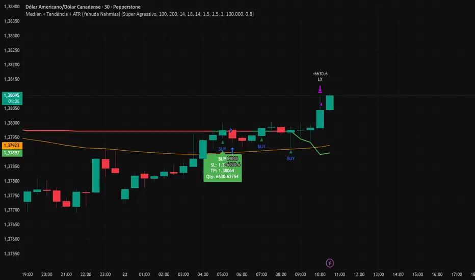
Median + Tendência + ATR (Yehuda Nahmias)📊 Median + Trend + ATR (By Yehuda Nahmias)
🚀 The indicator that combines Simplicity, Accuracy, and Risk Management
This script brings together three key pillars of professional trading:
✅ Dynamic Median → captures price midpoints and highlights reversal and breakout zones.
✅ Trend Filter (EMA) → ensures signals are aligned with the main market direction.
✅ Smart ADX + ATR → confirm trend strength and automatically calculate Stop Loss and Take Profit based on volatility.
🔔 How it works:
Buy/Sell Arrows: automatically appear when price crosses the median under valid trend and strength conditions (ADX).
Automatic Stops and Targets: SL and TP levels are plotted using ATR, ready for effective risk management.
3 Signal Modes:
🛡️ Conservative → fewer trades, stronger filtering.
⚖️ Standard → balance between frequency and accuracy.
⚡ Aggressive → more trades, captures shorter moves.
💡 Key Benefits:
Clear visuals: colored candles + BUY/SELL arrows.
Built-in risk management: position size is calculated based on % of equity.
Flexible: works on any asset (Forex, Crypto, Indices, Stocks).
🔑 Private access only.
If you’d like to use this strategy on your charts, contact me via my TradingView profile.
👉 Turn your analysis into objective signals and gain more confidence in your entries and exits!
Daniel.Yer BB EntryMy BB entry strategy.
need to improve a little the code, but for start, its look very good.
also need to check the statistic in 3 and 5 min range.
Great Job :)

Дни недели и торговые сесииIndicator for visual analysis by trading sessions and days.
Индикатор для наглядного анализа по торговым сесиям и дням.
Vol ForecastEGARCHVol ForecastEGARCH – Volatility Forecast Tool
Measuring volatility means not only predicting direction but also understanding the magnitude of risk. Vol ForecastEGARCH brings advanced GARCH-based models into TradingView, projecting volatility directly onto your chart.
Features
Model Selection: GARCH(1,1), EGARCH(1,1), GJR(1,1)
Dynamic Recalibration: Parameters recalibrated every 50 bars.
Z-Score Flexibility: Default Z=1.28 (~80% confidence) adjustable by user.
Multiple Horizons: 6, 12, 48, and 96 bars ahead forecasts.
Visualization: Upper/lower bands plotted with dynamic colors.
Mini Panel: Displays α, β, γ/ω parameters and 1-step volatility %.
Who Is It For?
Short-term traders: Define stop-loss / take-profit levels on a statistical basis.
Portfolio managers: Integrate volatility-based risk assessment into allocation decisions.
Technical analysts: Align momentum and price action with volatility dynamics.
Especially valuable for high-volatility markets like Borsa Istanbul, where understanding risk intensity is as critical as direction.

Dynamic Stop Loss Optimizer [BackQuant]Dynamic Stop Loss Optimizer
Overview
Stop placement decides expectancy. This tool gives you three professional-grade, adaptive stop engines, ATR, Volatility, and Hybrid. So your exits scale with current conditions instead of guessing fixed ticks. It trails intelligently, redraws as the market evolves, and annotates the chart with clean labels/lines and a compact stats table. Pick the engine that fits the trade, or switch on the fly.
What it does
Calculates three adaptive stops in real time (ATR-based, Volatility-based, and Hybrid) and keeps them trailed as price makes progress.
Shows exactly where your risk lives with on-chart levels, color-coded markers (long/short), and precise “Risk %” labels at the current bar.
Surfaces context you actually use - current ATR, daily volatility, selected method, and the live stop level—in a tidy, movable table.
Fires alerts on stop hits so you can automate exits or journal outcomes without staring at the screen.
Why it matters
Adaptive risk control: Stops expand in fast tape and tighten in quiet tape. You’re not punished for volatility; you’re aligned with it.
Consistency across assets: The same playbook works whether you’re trading indexes, FX, crypto, or equities, because the engine normalizes to each symbol’s behavior.
Cleaner decision-making: One chart shows your entry idea and its invalidation in the same breath. If price trespasses, you know it instantly.
The three methods (choose your engine)
1) ATR Based “Structure-aware” distance
This classic approach keys off Average True Range to set a stop just beyond typical bar-to-bar excursion. It adapts smoothly to changing ranges and respects swing structure.
Use when: you want a steady, intuitive buffer that tracks trend legs without hugging price.
See it in action:
2) Volatility Based “Behavior-aware” distance
This engine derives stop distance from current return volatility (annualized, then scaled back down to the session). It reacts to regime shifts quickly and normalizes risk across symbols with very different prices.
Use when: you want the stop to breathe with realized volatility and respond faster to heat-ups/cool-downs.
See it in action:
3) Hybrid “Best of both worlds”
The Hybrid blends the ATR and Volatility distances into one consensus level, then trails it intelligently. You get the structural common sense of ATR and the regime sensitivity of Vol.
Use when: you want robust, all-weather behavior without micromanaging inputs.
See it in action:
How it trails
Longs: The stop ratchets up with favorable movement and holds its ground on shallow pullbacks. If price closes back into the risk zone, the level refreshes to the newest valid distance.
Shorts: Mirror logic ratchets down with trend, resists noise, and refreshes if price reclaims the zone.
Hybrid trailing: Uses the blended distance and the same “no give-backs” principle to keep gains protected as structure builds.
Reading the chart
Markers: Circles = ATR stops, Crosses = Vol stops, Diamonds = Hybrid. Colors indicate long (red level under price) vs short (green level above price).
Lines: The latest active stop is extended with a dashed line so you can see it at a glance.
Labels: “Long SL / Short SL” shows the exact price and current risk % from the last close no math required.
Table: ATR value, Daily Vol %, your chosen Method, the Current SL, and Risk %—all in one compact block that you can pin top-left/right/center.
Quick workflow
Define the idea: Long or Short, and which engine fits the tape (ATR, Vol, or Hybrid).
Place and trail: Let the optimizer print the level; trail automatically as the move develops.
Manage outcomes: If the line is tagged, you’re out clean. If it holds, you’ve contained heat while giving the trade room to work.
Inputs you’ll actually touch
Calculation Settings
ATR Length / Multiplier: Controls the “structural” cushion.
Volatility Length / Multiplier: Controls the “behavioral” cushion.
Trading Days: 252 or 365 to keep the volatility math aligned with the asset’s trading calendar.
Stop Loss Method
ATR Based | Volatility Based | Hybrid : Switch engines instantly to fit the trade.
Position Type
Long | Short | Both : Show only what you need for the current strategy.
Visual Settings
Show ATR / Vol / Hybrid Stops: Toggle families on/off.
Show Labels: Print price + Risk % at the live stop.
Table Position: Park the metrics where you like.
Coloring
Long/Short/Hybrid colors: Set a palette that matches your theme and stands out on your background.
Practical patterns to watch
Trend-pullback continuation: The stop ratchets behind higher lows (long) or lower highs (short). If price tests the level and rejects, that’s your risk-defined continuation cue.
Break-and-run: After a clean break, the Hybrid will usually sit slightly wider than pure Vol, use it to avoid getting shaken on the first retest.
Range compression: When the ATR and Vol distances converge, the table will show small Risk %. That’s your green light to size up with the same dollar risk, or keep it conservative if you expect expansion.
Alerts
Long Stop Loss Hit : Notifies when price crosses below the live long stop.
Short Stop Loss Hit : Notifies when price crosses above the live short stop.
Why this feels “set-and-serious”
You get a single look that answers three questions in real time: “Where’s my line in the sand?”, “How much heat am I taking right now?”, and “Is this distance appropriate for current conditions?” With ATR, Vol, and Hybrid in one tool, you can run the exact same playbook across symbols and regimes while keeping your chart clean and your risk explicit.

RSI + Stoch + Bollinger — Tableau compact (coin sup. droit)RSI + Stoch + Bollinger — Tableau compact (coin sup. droit)

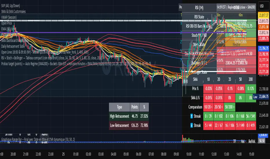
DashBoard 2.3.1📌 Indicator Name:
DashBoard 2.3 – Smart Visual Market Overlay
📋 Description:
DashBoard 2.3 is a clean, efficient, and highly informative market overlay, designed to give you real-time context directly on your chart — without distractions. Whether you're swing trading or investing long-term, this tool keeps critical market data at your fingertips.
🔍 Key Features:
Symbol + Timeframe + Market Cap
Shows the current ticker and timeframe, optionally with real-time market cap.
ATR 14 with Volatility Signal
Displays ATR with color-coded risk levels:
🟢 Low
🟡 Moderate
🔴 High
⚫️ Extreme
You can choose between Daily ATR or timeframe-based ATR (auto-adjusted to chart resolution).
Adaptive Labeling
The ATR label updates to reflect the resolution:
ATR 14d (daily)
ATR 14W (weekly)
ATR 14H (hourly), etc.
Moving Average Tracker
Instantly shows whether price is above or below your selected moving average (e.g., 150 MA), with green/red indication.
Earnings Countdown
Clearly shows how many days remain until the next earnings report.
Industry & Sector Info (optional)
Useful for thematic or sector-based trading strategies.
Fully Customizable UI
Choose positioning, padding, font size, and which data to show. Designed for minimalism and clarity.
✅ Smart Logic:
Color dots appear only in relevant conditions (e.g., ATR color signals shown only on daily when enabled).
ATR display automatically reflects your time frame, if selected.
Clean chart integration – the overlay sits quietly in a corner, enhancing your analysis without intruding.
🧠 Ideal for:
Swing traders, position traders, and investors who want fast, high-impact insights directly from the chart.
Anyone looking for a compact, beautiful, and informative dashboard while they trade.

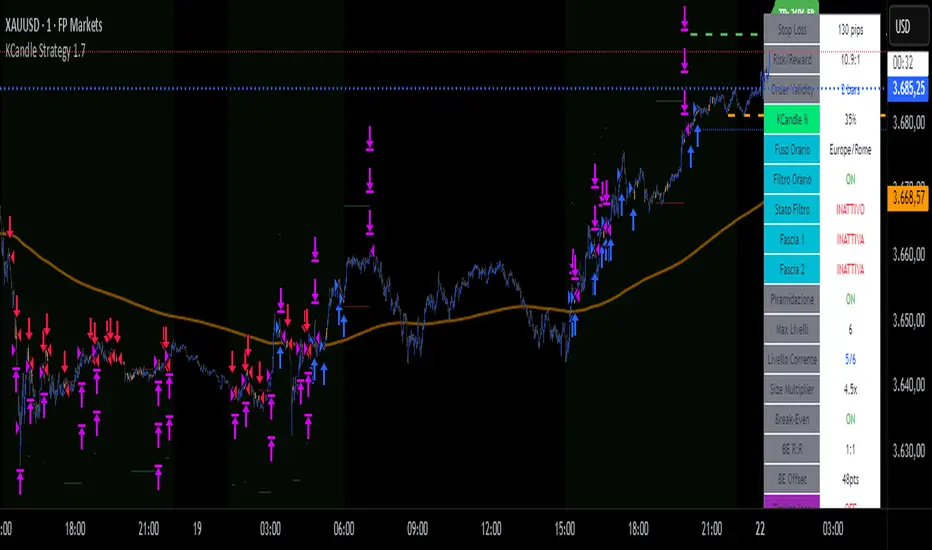
KCandle Strategy 1.0# KCandle Strategy 1.0 - Trading Strategy Description
## Overview
The **KCandle Strategy** is an advanced Pine Script trading system based on bullish and bearish engulfing candlestick patterns, enhanced with sophisticated risk management and position optimization features.
## Core Logic
### Entry Signal Generation
- **Pattern Recognition**: Detects bullish and bearish engulfing candlestick formations
- **EMA Filter**: Uses a customizable EMA (default 25) to filter trades in the direction of the trend
- **Entry Levels**:
- **Long entries** at 25% of the candlestick range from the low
- **Short entries** at 75% of the candlestick range from the low
- **Signal Validation**: Orange candlesticks indicate valid setup conditions
### Risk Management System
#### 1. **Stop Loss & Take Profit**
- Configurable stop loss in pips
- Risk-reward ratio setting (default 2:1)
- Visual representation with colored lines and labels
#### 2. **Break-Even Management**
- Automatically moves stop loss to break-even when specified R:R is reached
- Customizable break-even offset for added protection
- Prevents losing trades after reaching profitability
#### 3. **Trailing Stop System**
- **Activation Trigger**: Activates when position reaches specified R:R level
- **Distance Control**: Maintains trailing stop at defined distance from entry
- **Step Management**: Moves stop loss forward in incremental R steps
- **Dynamic Protection**: Locks in profits while allowing for continued upside
### Advanced Features
#### Position Management
- **Pyramiding Support**: Optional multiple position entries with size reduction
- **Order Expiration**: Pending orders automatically cancel after specified bars
- **Position Sizing**: Percentage-based allocation with pyramid level adjustments
#### Visual Interface
- **Real-time Monitoring**: Comprehensive information panel with all strategy metrics
- **Historical Tracking**: Visual representation of past trades and levels
- **Color-coded Indicators**: Different colors for break-even, trailing, and standard stops
- **Debug Options**: Optional labels for troubleshooting and optimization
## Key Parameters
### Basic Settings
- **EMA Length**: Trend filter period
- **Stop Loss**: Risk per trade in pips
- **Risk/Reward**: Target profit ratio
- **Order Validity**: Duration of pending orders
### Risk Management
- **Break-Even R:R**: Profit level to trigger break-even
- **Trailing Activation**: R:R level to start trailing
- **Trailing Distance**: Stop distance from entry when trailing
- **Trailing Step**: Increment for stop loss advancement
## Strategy Benefits
1. **Objective Entry Signals**: Based on proven candlestick patterns
2. **Trend Alignment**: EMA filter ensures trades align with market direction
3. **Robust Risk Control**: Multiple layers of protection (SL, BE, Trailing)
4. **Profit Optimization**: Trailing stops maximize winning trade potential
5. **Flexibility**: Extensive customization options for different market conditions
6. **Visual Clarity**: Complete visual feedback for trade management
## Ideal Use Cases
- **Swing Trading**: Medium-term positions with trend-following approach
- **Breakout Trading**: Capturing momentum from engulfing patterns
- **Risk-Conscious Trading**: Suitable for traders prioritizing capital preservation
- **Multi-Timeframe**: Adaptable to various timeframes and instruments
---
*The KCandle Strategy combines traditional technical analysis with modern risk management techniques, providing traders with a comprehensive tool for systematic market participation.*
Avg Candle Size (Ticks) – Last 9 Closed BarsWhat it does:
Shows the average candle size in ticks for the last N closed bars (defaults to 9). I built this so I can glance at a 5-min chart and instantly know the typical bar size in ticks, updating only after each bar closes (no intrabar wiggle).
How it works:
Measures each bar’s full range (High–Low), not ATR and not candle body.
Averages the last N closed bars, converts to ticks using syminfo.mintick.
Displays a simple line plus a small readout (e.g., “32 ticks”).
Why I built it:
Gives me a realistic sense of current volatility in ticks so I can size stops/targets quickly without doing mental math.
Extras:
Lookback is configurable (default 9).
Optional rounding (floor/nearest/ceil).
Works on any timeframe/instrument that has a defined tick size.
If you want it to match ATR exactly (in ticks), swap the range calc for ta.atr(len) / syminfo.mintick
Flux Power Dashboard (Updated and Renamed)Flux Power Dashboard is a compact market-state heads-up display for TradingView. It blends trend, momentum, and volume-flow into a single on-chart panel with color-coded cues and minimal lag. You get:
Clean visual trend via fast/slow MA with slope/debounce filters
MACD state and most recent cross (with “freshness” tint)
OBV confirmation and gating to reduce noise
Session awareness (Asia/London/New York + pre-sessions + overlap)
Optional HTF Regime row and regime gate to align signals to higher-timeframe bias
Context from VIX/VXN (volatility regime)
A single Flux Score (0–100) as a top-level read
It is deliberately “dashboard-first”: fast to read, consistent between symbols/timeframes, and designed to limit overtrading in chop.
What it can do (capabilities)
Signal gating: You can require multiple pillars to agree (Trend, MACD, OBV) before a “strong” bias is shown.
Debounced trend: Uses slope + confirmation bars to avoid flip-flopping.
Session presets: Auto-adjust the minimum confirmation bars by session (e.g., NY vs London vs Asia) to better match liquidity/volatility.
MACD presets: Quick switch between Scalp / Classic / Slow or roll your own custom speeds.
OBV confirmation: Volume flow must agree for trend/entries to “count” (optional).
HTF Regime awareness: Shows the higher-timeframe backdrop and (optionally) gates signals so you don’t fight the dominant trend.
Volatility context: VIX/VXN auto-colored cells based on your thresholds.
Top-center Session Title: Broadcasts the active session (or Overlap) with a matched background color.
Customizable UI: Column fonts, params font, transparency, dashboard corner, marker styles, colors, widths—tune it to your chart.
Practical use: Start with Flux Score + Summary for a snapshot, confirm with Trend & MACD, check OBV agreement (implicit in signal strength), glance at Regime to avoid counter-trend trades, and use Session + VIX/VXN for timing and risk context.
How it avoids common pitfalls
Repaint-aware: “Confirm on Close” can be enabled to read prior bar states, reducing intrabar noise.
Auto MA sanity: If fast ≥ slow length, it auto-swaps under the hood to keep calculations valid.
Debounce & confirm: Trend flips only after X bars satisfy conditions, cutting false flips in chop.
Freshness tint: New Cross/Signal rows tint slightly brighter for a few bars, so you can spot recency at a glance.
Every line of the dashboard (what it shows, how it’s colored)
Flux Score
What: Composite 0–100 built from three pillars: Trend (40%), MACD (30%), OBV (30%).
Read: ≥70 Bullish, ≤30 Bearish, else Neutral.
Use: Quick “state of play” gauge—stronger alignment pushes the score toward extremes.
Regime (optional row)
What: Higher-timeframe (your Regime TF) backdrop using the same MA pair with HTF slope/ATR buffer.
Values: Bull / Bear / Range.
Gate (optional): If Regime Gate is ON, Trend/Signals only go directional when HTF agrees.
Summary
What: One-line narrative combining the three pillars: MACD (up/down/flat), OBV (up/down/flat), Trend (up/down/flat).
Use: Human-readable cross-check; should rhyme with Flux Score.
Trend
What: Debounced MA relationship on the current chart.
Strict: needs fast > slow and slow rising (mirror for down) + slope debounce + confirmation bars.
Lenient: allows fast > slow or slow rising (mirror for down) with the same debounce/confirm.
Color: Green = UP, Red = DOWN, Gray = FLAT.
Use: Your structural bias on the trading timeframe.
MACD
What: Current MACD line vs signal, using your selected preset (or custom).
Values: Bull (line above), Bear (below), Flat (equal/indeterminate).
Color: Green/Red/Gray.
Cross
What: Most recent MACD cross and how many bars ago it occurred (e.g., “MACD XUP | 3 bars”).
Freshness: If the cross happened within Fresh Signal Tint bars, the cell brightens slightly.
Use: Timing helper for inflection points.
Signal
What: Latest directional shift (from short-bias to long-bias or vice versa) and age in bars.
Strength:
Strong = Trend + MACD + OBV all align
Weak = partial alignment (e.g., Trend + MACD, or Trend + OBV)
Color: Green for long bias, Red for short bias; fresh signals tint brighter.
Use: Action cue—treat Strong as higher quality; Weak as situational.
MA
What: Your slow MA type and length, plus slope direction (“up”/“down”).
Use: Context even when Trend is FLAT; slope often turns before full trend flips.
Session
What: Current market session by Eastern Time: New York / London / Asia, Pre- windows, Overlap, or Off-hours.
Logic: If ≥2 main sessions are active, shows Overlap (and grays the top title background).
Use: Timing and expectations for liquidity/volatility; also drives session-based confirmation presets if enabled.
VIX
What: Real-time CBOE:VIX on your chosen TF.
Auto-color (if on):
Calm (< Calm) → Green
Watch (< Watch) → Yellow
Elevated (< Elevated) → Orange
Very High (≥ Elevated) → Red
Use: Equity market–wide risk mood; higher = bigger moves, lower = quieter.
VXN
What: CBOE:VXN (Nasdaq volatility index) on your chosen TF.
Auto-color thresholds like VIX.
Use: Tech-heavy risk mood; helpful for growth/QQQ/NDX names.
Footer (params row, bottom-right)
What: Key live settings so you always know the context:
P= Trend Confirmation Bars
O= OBV Confirmation Bars
Strict/Lenient (trend mode)
MACD preset (or “Custom”)
swap if MA lengths were auto-swapped for validity
Regime gate if enabled
Candles for clarity
Use: Quick integrity check when comparing charts/screenshots or changing presets.
Recommended workflow
Start at Flux Score & Summary → snapshot of alignment.
Check Trend (color) and MACD (Bull/Bear).
Look at Signal (Strong vs Weak, and age).
Glance at Regime (and use gate if you’re trend-following).
Use Session + VIX/VXN to adjust expectations (breakout vs mean-revert, risk sizing, patience).
Keep Confirm on Close ON when you want stability; turn it OFF for faster (but noisier) reads.
Notes & limitations
Not advice: This is an informational tool; always combine with your own risk rules.
Repaint vs responsiveness: With “Confirm on Close” OFF you’ll see faster state changes but may get more churn intrabar.
Presets matter: Scalp MACD reacts fastest; Slow reduces whipsaw. Choose for your timeframe.
Session windows depend on the strings you set; adjust if your broker’s feed or DST handling needs tweaks.

Synthetic Point & Figure on RSIHere is a detailed description and user guide for the Synthetic Point & Figure RSI indicator, including how to use it for long and short trade considerations:
*
## Synthetic Point & Figure RSI Indicator – User Guide
### What It Is
This indicator applies classic Point & Figure (P&F) charting logic to the Relative Strength Index (RSI) instead of price. It transforms the RSI into synthetic “P&F candles” that filter out noise and highlight significant momentum moves and reversals based on configurable box size and reversal settings.
### How It Works
- The RSI is calculated normally over the selected length.
- The P&F engine tracks movements in the RSI above or below a defined “box size,” creating columns that switch direction only after a larger reversal.
- The synthetic candles connect these filtered RSI values visually, reducing false noise and emphasizing strong RSI trends.
- Optional EMA and SMA overlays on the synthetic P&F RSI allow smoother trend signals.
- Reference RSI levels at 33, 40, 50, 60, and 66 provide further context for momentum strength.
### How to Use for Trading
#### Long (Buy) Considerations
- The synthetic P&F RSI candle direction flips to *up (green candles)* indicating strength in momentum.
- Look for the RSI P&F value moving above the *40 or 50 level*, suggesting increasing bullish momentum.
- Confirmation is stronger if the synthetic RSI is above the EMA or SMA overlays.
- Ideal entries are after a reversal from a synthetic P&F downtrend (red candles) to an uptrend (green candles) near or above these levels.
#### Short (Sell) Considerations
- The candle direction flips to *down (red candles)*, showing weakening momentum or bearish reversal.
- Monitor if the synthetic RSI falls below the *60 or 50 level*, signaling momentum loss.
- Confirm bearish bias if the price is below the EMA or SMA overlays.
- Exit or short positions are signaled when the synthetic candle reverses from green to red near or below these threshold levels.
### Important RSI Levels to Watch
- *Level 33*: Lower bound indicating deep oversold conditions.
- *Level 40*: Early bullish zone suggesting momentum improvement.
- *Level 50*: Neutral midpoint; crossing above often signals bullish strength, below signals weakness.
- *Level 60*: Advanced bullish momentum; breaking below signals potential reversal.
- *Level 66*: Strong overbought area warning of possible pullback.
### Tips
- Use in conjunction with price action analysis and other volume/trend indicators for higher conviction.
- Adjust box size and reversal settings based on instrument volatility and timeframe for ideal filtering.
- The P&F RSI is best for identifying sustained momentum trends and avoiding false RSI whipsaws.
- Combine this indicator’s signals with stop-loss and risk management strategies.
*
This indicator converts RSI momentum analysis into a simplified, noise-filtered P&F chart format, helping traders better visualize and trade momentum shifts. It is especially useful when RSI signal noise can cause confusion in volatile markets.
Let me know if you want me to generate a shorter summary or code alerts based on these levels!
Sources
Relative Strength Index (RSI) — Indicators and Strategies in.tradingview.com
Indicators and strategies in.tradingview.com
Relative Strength Index (RSI) Indicator: Tutorial www.youtube.com
Stochastic RSI (STOCH RSI) in.tradingview.com
RSI Strategy docs.algotest.in
Stochastic RSI Indicator: Tutorial www.youtube.com
Relative Strength Index (RSI): What It Is, How It Works, and ... www.investopedia.com
rsi — Indicators and Strategies in.tradingview.com
Relative Strength Index (RSI) in.tradingview.com
Relative Strength Index (RSI) — Indicators and Strategies www.tradingview.com
Symbol Value TableIt allows us to see the key driving forces in the cryptocurrency market in real time.

Bar Statistics - DELTA/OI/TOTAL/BUY/SELL/LONGS/SHORTSBar Statistics - Advanced Volume & Open Interest Analysis
Overview
The Bar Statistics indicator is a comprehensive analytical tool designed to provide traders with detailed insights into market microstructure through advanced volume analysis, open interest tracking, and market flow detection. This indicator transforms complex market data into easily digestible visual information, displaying six key metrics in customizable colored boxes that update in real-time.
Unlike traditional volume indicators that only show basic volume data, this indicator combines multiple data sources to reveal the underlying forces driving price movement, including volume delta calculations from lower timeframes, open interest changes, and estimated market positioning.
What Makes This Indicator Unique
1. Multi-Timeframe Volume Delta Precision
The indicator utilizes lower timeframe data (default 1-second) to calculate highly accurate volume delta measurements, providing much more precise buy/sell pressure analysis than standard timeframe-based calculations. This approach captures intraday volume dynamics that are often missed by conventional indicators.
2. Real-Time Updates
Unlike many indicators that only update on bar completion, this tool provides live updates for the developing candle, allowing traders to see evolving market conditions as they happen.
3. Market Flow Analysis
The unique "L/S" (Long/Short) metric combines open interest changes with price/volume direction to estimate net market positioning, helping identify when participants are accumulating or distributing positions.
4. Adaptive Visual Intensity
The gradient color system automatically adjusts based on historical context, making it easy to identify when current values are significant relative to recent market activity.
5. Complete Customization
Every aspect of the display can be customized, from the order of metrics to individual color schemes, allowing traders to adapt the tool to their specific analysis needs.
6.All In One Solution
6 Metrics in one indicator no more using 5 different indicators.
Core Features Explained
DELTA (Volume Delta)
What it shows: Net difference between aggressive buy volume and aggressive sell volume
Calculation: Uses lower timeframe data to determine whether each trade was initiated by buyers or sellers
Interpretation:
Positive values indicate aggressive buying pressure
Negative values indicate aggressive selling pressure
Magnitude indicates the strength of directional pressure
OI Δ (Open Interest Change)
What it shows: Change in open interest from the previous bar
Data source: Fetches open interest data using the "_OI" symbol suffix
Interpretation:
Positive values indicate new positions entering the market
Negative values indicate positions being closed
Combined with price direction, reveals market participant behavior
L/S (Net Long/Short Bias)
What it shows: Estimated net change in long vs short market positions
Calculation method: Combines open interest changes with price/volume direction using configurable logic
Scenarios analyzed:
New Longs: Rising OI + Rising Price/Volume = Long position accumulation
Liquidated Longs: Falling OI + Falling Price/Volume = Long position exits
New Shorts: Rising OI + Falling Price/Volume = Short position accumulation
Covered Shorts: Falling OI + Rising Price/Volume = Short position exits
Result: Net bias toward long (positive) or short (negative) market sentiment
TOTAL (Total Volume)
What it shows: Standard volume for the current bar
Purpose: Provides context for other metrics and baseline activity measurement
Enhanced display: Uses gradient intensity based on recent volume history
BUY (Estimated Buy Volume)
What it shows: Estimated aggressive buy volume
Calculation: (Total Volume + Delta) / 2
Use case: Helps quantify the actual buying pressure in monetary/contract terms
SELL (Estimated Sell Volume)
What it shows: Estimated aggressive sell volume
Calculation: (Total Volume - Delta) / 2
Use case: Helps quantify the actual selling pressure in monetary/contract terms
Configuration Options
Timeframe Settings
Custom Timeframe Toggle: Enable/disable custom lower timeframe selection
Timeframe Selection: Choose the precision level for volume delta calculations
Auto-Selection Logic: Automatically selects optimal timeframe based on chart timeframe
Net Positions Calculation
Direction Method: Choose between Price-based or Volume Delta-based direction determination
Value Method: Select between Open Interest Change or Volume for position size calculations
Display Customization
Row Order: Completely customize which metrics appear and in what order (6 positions available)
Color Schemes: Individual color selection for positive/negative values of each metric
Gradient Intensity: Configurable lookback period (10-200 bars) for relative intensity calculations
Visual Elements
Box Format: Clean, professional box display with clear labels
Color Coding: Intuitive color schemes with customizable transparency gradients
Real-time Updates: Live updating for developing candles with historical stability
How to Use This Indicator
For Day Traders
Volume Confirmation: Use DELTA to confirm breakout validity - strong directional moves should show corresponding volume delta
Entry Timing: Watch for volume delta divergences at key levels to time entries
Exit Signals: Monitor when aggressive volume shifts against your position
For Swing Traders
Market Flow: Focus on the L/S metric to identify when participants are accumulating or distributing
Open Interest Analysis: Use OI Δ to confirm whether moves are backed by new money or position adjustments
Trend Validation: Combine multiple metrics to validate trend strength and sustainability
For Scalpers
Real-time Edge: Utilize the live updates to see developing imbalances before bar completion
Quick Decision Making: Focus on DELTA and BUY/SELL for immediate market pressure assessment
Volume Profile: Use TOTAL volume context for optimal entry/exit sizing
Setup Recommendations
Futures Markets: Enable OI tracking and use Volume Delta direction method
Crypto Markets: Focus on DELTA and volume metrics; OI may not be available
Stock Markets: Use Price direction method with volume value calculations
High-Frequency Analysis: Set lower timeframe to 1S for maximum precision
Technical Implementation
Data Accuracy
Utilizes TradingView's ta.requestVolumeDelta() function for precise buy/sell classification
Implements error checking for data availability
Handles missing data gracefully with fallback calculations
Performance Optimization
Efficient array management with configurable lookback periods
Smart box creation and deletion to prevent memory issues
Optimized real-time updates without historical data corruption
Compatibility
Works on all timeframes from seconds to daily
Compatible with futures, forex, crypto, and stock markets
Automatically adjusts calculation methods based on available data
Risk Disclaimers
This indicator is designed for educational and analytical purposes. It provides statistical analysis of market data but does not guarantee trading success. Users should:
Combine with other forms of analysis
Practice proper risk management
Understand that past performance doesn't predict future results
Be aware that volume delta and open interest data quality varies by market and data provider
Conclusion
The Bar Statistics indicator represents a significant advancement in retail trader access to professional-grade market analysis tools. By combining multiple data sources into a single, customizable display, it provides the depth of analysis needed for comprehensive market microstructure understanding while maintaining the simplicity required for effective decision-making.

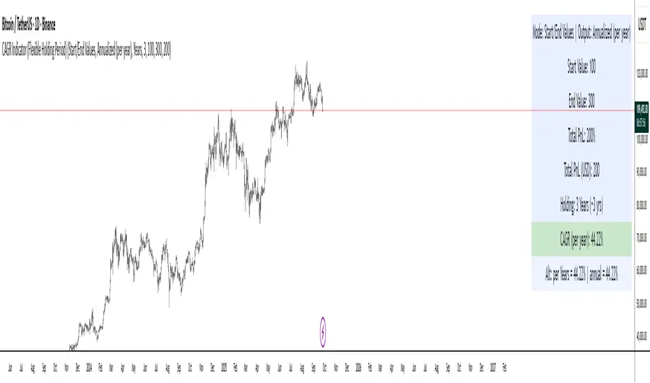
CAGR Indicator (Flexible Holding Period)CAGR Indicator (Flexible Holding Period)
The CAGR Indicator (Flexible Holding Period) is designed to convert any cumulative investment outcome into a standardized, annualized growth rate that can be compared across assets, strategies, and time horizons. Its core metric is the compound annual growth rate, which represents the constant yearly rate that, if compounded smoothly, transforms an initial value into a final value over a specified horizon. By annualizing returns, the indicator removes distortions caused by unequal test lengths and allows direct comparison with benchmarks such as index returns or risk-free rates.
Conceptually, the indicator proceeds in two stages: measuring growth and normalizing time. Growth is summarized by the growth multiple, which is the ratio of ending value to starting value when concrete values are provided, or equivalently 1 plus total percentage return divided by 100 when only a cumulative percent is known. Time is normalized by converting the user’s holding period into a year-equivalent, so that a 45-day, 30-week, 18-month, or multi-year interval can all be mapped onto a common annual scale. The conversions use widely accepted approximations: days divided by 365.25, weeks divided by approximately 52.1429, and months divided by 12, while years are used as entered.
Once growth and time are expressed in compatible units, the indicator applies the standard compounding identity: CAGR = (Growth Multiple)^(1/T) − 1, where T is the year-equivalent holding period. This transformation inverts the compounding process and yields the geometric mean rate of return per year. Because the geometric mean is path-independent, the CAGR summarizes start-to-finish performance without reference to the sequence of gains and losses. The output therefore reflects the constant annual rate that would have produced the observed terminal value from the initial value if returns had been smooth.
The indicator admits two data entry modes to accommodate common reporting practices. In Start/End Values mode, the user supplies initial and final portfolio values; the indicator computes the growth multiple as end divided by start and also displays absolute profit or loss in currency terms to aid practical interpretation. In Total PnL (%) mode, the user supplies a cumulative return percentage; the indicator converts this to a growth multiple and estimates a corresponding ending value for display, while the CAGR computation itself relies only on the multiple and the time horizon.
Validity checks ensure that reported numbers are meaningful. The growth multiple must be strictly positive; cumulative losses at or below minus one hundred percent make the multiple nonpositive and render the CAGR undefined. The holding period must be positive and convertible to a year-equivalent. In Start/End mode, the starting value must exceed zero to avoid division by zero and degenerate ratios. When these conditions are not met, the indicator withholds a numeric result and signals that the quantity is not well defined.
Interpreting the output requires recognizing both its strengths and its limits. The CAGR is a concise, comparable measure of long-run performance that abstracts from timing and volatility. It is particularly useful for benchmarking strategies of different durations, setting policy targets for funds, communicating results to stakeholders, and aligning outcomes with hurdle rates. However, because it is path-independent, the CAGR does not reflect interim drawdowns, variance, or tail risk. It also presumes a lump-sum investment with no intermediate cash flows; when deposits or withdrawals occur, internal rate of return methods such as IRR or XIRR are more appropriate.
Typical applications include comparing backtests with unequal sample lengths, reporting consolidated results from discrete projects on a common annual basis, and translating short-horizon event outcomes (for example, a multi-week campaign) into an annualized figure for decision-making. The indicator’s auxiliary displays, such as total profit or loss in currency and the explicit statement of the original holding period alongside its year-equivalent, improve transparency and auditability of the transformation.
Users should remain mindful of several caveats. Time conversions rely on conventional averages and may differ from calendar-exact counts by small amounts, which is usually immaterial but worth noting for edge cases. Selection bias can inflate reported CAGRs if intervals are cherry-picked; robust practice involves rolling windows, out-of-sample tests, and sensitivity analysis. Most importantly, the CAGR should be paired with risk and stability measures—such as maximum drawdown, Sharpe or Sortino ratios, downside deviation, or ulcer index—to form a complete assessment of a strategy’s quality.
In sum, the indicator operationalizes a simple but powerful idea: separate the measurement of growth from the normalization of time, then apply the compounding identity to express outcomes as a consistent per-year rate. By combining flexible period inputs with a rigorous geometric transformation, it enables fair, intelligible comparisons while encouraging the complementary use of risk diagnostics to avoid over-reliance on a single summary statistic.