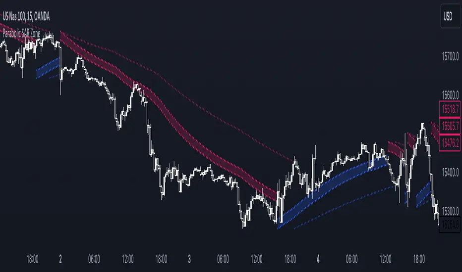
Parabolic SAR ZoneThe Parabolic SAR Zone indicator is a tool designed to help traders identify the best zone to enter in a position revisiting the usage of the standard Parabolic SAR indicator.
In the settings you can choose all the parameters of the standard indicator, and in addition to that you can also change the multiplier for the zone width.
This indicator provides two different Parabolic SAR indicators, the first one has the settings that you chose and displays the zone, meanwhile, the second one has half the parameters you have chosen and can be used to determine the long-term trend direction.
Pesquisar nos scripts por "zone"
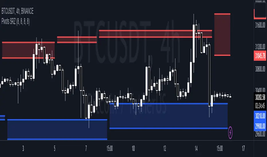
Pivots Support Resistance ZoneThis simple script base on function of Pivot High Low to plot Support and Resistance Zone on chart with detail as below:
1. Support Zone
+ New Pivot Low is plotted
+ New Pivot Low lower previous Pivot Low
+ Upper Line of Support Zone is previous Pivot Low
+ Lower Line of Support Zone is new Pivot Low
2. Resistance Zone
+ New Pivot High is plotted
+ New Pivot High higher previous Pivot High
+ Upper Line of Resistance Zone is new Pivot High
+ Lower Line of Resistance Zone is previous Pivot High
Stochastic Zone Strength Trend [wbburgin](This script was originally invite-only, but I'd vastly prefer contributing to the TradingView community more than anything else, so I am making it public :) I'd much rather share my ideas with you all.)
The Stochastic Zone Strength Trend indicator is a very powerful momentum and trend indicator that 1) identifies trend direction and strength, 2) determines pullbacks and reversals (including oversold and overbought conditions), 3) identifies divergences, and 4) can filter out ranges. I have some examples below on how to use it to its full effectiveness. It is composed of two components: Stochastic Zone Strength and Stochastic Trend Strength.
Stochastic Zone Strength
At its most basic level, the stochastic Zone Strength plots the momentum of the price action of the instrument, and identifies bearish and bullish changes with a high degree of accuracy. Think of the stochastic Zone Strength as a much more robust equivalent of the RSI. Momentum-change thresholds are demonstrated by the "20" and "80" levels on the indicator (see below image).
Stochastic Trend Strength
The stochastic Trend Strength component of the script uses resistance in each candlestick to calculate the trend strength of the instrument. I'll go more into detail about the settings after my description of how to use the indicator, but there are two forms of the stochastic Trend Strength:
Anchored at 50 (directional stochastic Trend Strength):
The directional stochastic Trend Strength can be used similarly to the MACD difference or other histogram-like indicators : a rising plot indicates an upward trend, while a falling plot indicates a downward trend.
Anchored at 0 (nondirectional stochastic Trend Strength):
The nondirectional stochastic Trend Strength can be used similarly to the ADX or other non-directional indicators : a rising plot indicates increasing trend strength, and look at the stochastic Zone Strength component and your instrument to determine if this indicates increasing bullish strength or increasing bearish strength (see photo below):
(In the above photo, a bearish divergence indicated that the high Trend Strength predicted a strong downwards move, which was confirmed shortly after. Later, a bullish move upward by the Zone Strength while the Trend Strength was elevated predicated a strong upwards move, which was also confirmed. Note the period where the Trend Strength never reached above 80, which indicated a ranging period (and thus unprofitable to enter or exit)).
How to Use the Indicator
The above image is a good example on how to use the indicator to determine divergences and possible pivot points (lines and circles, respectively). I recommend using both the stochastic Zone Strength and the stochastic Trend Strength at the same time, as it can give you a robust picture of where momentum is in relation to the price action and its trajectory. Every color is changeable in the settings.
Settings
The Amplitude of the indicator is essentially the high-low lookback for both components.
The Wavelength of the indicator is how stretched-out you want the indicator to be: how many amplitudes do you want the indicator to process in one given bar.
A useful analogy that I use (and that I derived the names from) is from traditional physics. In wave motion, the Amplitude is the up-down sensitivity of the wave, and the Wavelength is the side-side stretch of the wave.
The Smoothing Factor of the settings is simply how smoothed you want the stochastic to be. It's not that important in most circumstances.
Trend Anchor was covered above (see my description of Trend Strength). The "Trend Transform MA Length" is the EMA length of the Trend Strength that you use to transform it into the directional oscillator. Think of the EMA being transformed onto the 50 line and then the Trend Strength being dragged relative to that.
Trend Transform MA Length is the EMA length you want to use for transforming the nondirectional Trend Strength (anchored at 0) into the directional Trend Strength (anchored at 50). I suggest this be the same as the wavelength.
Trend Plot Type can transform the Nondirectional Trend Strength into a line plot so that it doesn't murk up the background.
Finally, the colors are changeable on the bottom.
Explanation of Zone Strength
If you're knowledgeable in Pine Script, I encourage you to look at the code to try to understand the concept, as it's a little complicated. The theory behind my Zone Strength concept is that the wicks in every bar can be used create an index of bullish and bearish resistance, as a wick signifies that the price crossed above a threshold before returning to its origin. This distance metric is unique because most indicators/formulas for calculating relative strength use a displacement metric (such as close - open) instead of measuring how far the price actually moved (up and down) within a candlestick. This is what the Zone Strength concept represents - the hesitation within the bar that is not typically represented in typical momentum indicators.
In the script's code I have step by step explanations of how the formula is calculated and why it is calculated as such. I encourage you to play around with the amplitude and wavelength inputs as they can make the zone strength look very different and perform differently depending on your interests.
Enjoy!
Walker

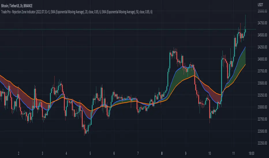
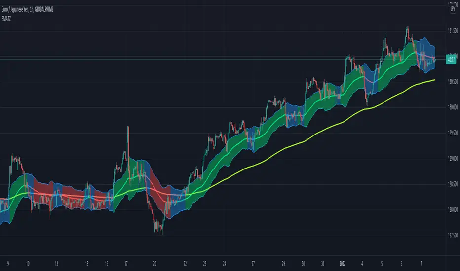
Trade Pro - Rejection Zone IndicatorThe Rejection Zone Indicator can be used to help trend following traders know when to buy dips in up trends, and when to sell pull backs in down trends.
The Rejection Zone Indicator is made up of the 20 and 50 period Exponential Moving Averages. This indicator has colored shading in between these two EMAs, which acts as a nice visual. When the 20 period Exponential Moving Average is below the 50 period Exponential Moving Average, the shaded cloud will be red, and when the 20 EMA is over the 50 EMA the cloud will be green. It is called the Rejection Zone indicator, because often in trends when price pulls back to the colored cloud, it will act as an area of support or resistance.
The suggested use of the Rejection Zone Indicator is to look for long trades when the cloud is green, and once price has pulled back into the green cloud. If the cloud is red one can look for short trading opportunity when price pulls back into the red cloud.
Chop Zone - SamXThis is my spin on the Chop Zone indicator. It was forked from the built-in TradingView Chop Zone indicator. There were several reasons for this effort...
The built-in indicator version had no real configuration options
It was hard-coded to use the 34-period EMA with fixed span sizes for identifying price range
There was no real context to the meaning of default color scheme
The separation points of the chop zone bars was at a fixed 1.43-degree scale
Note: If left at default settings, this indicator will exactly match the built-in Chop Zone indicator.
WARNING : Please be sure you understand the potential impact and implications before adjusting any of the settings in the "Advanced Configuration" section!!!
Chop Zone with discrete/standard coloring:
Chop Zone with gradient fill:
Moving Average angle plot with gradient fill:

[JL] EMA Trading ZoneI want to make a script to help catch pullback on a strong trend.
This script display colors based on EMAs' slope.
The trading zone is calculated from EMA short + - ATR
if 2 EMA lines' slope both are more than an angle, then the trading zone is green color, it can be considered to place long orders.
if 2 EMA lines' slope both are less than a negative angle, then the trading zone is red color, it can be considered to place short orders.
Otherwise the zone is blue color.
AO-ZoneThe Zone is mention in New Trading Dimensions by Bill Williams,PhD.
The Zone is used for Entry Signal
Green Zone are painting Green when Awesome Oscillator (AO) and Accelerater/Decelerator (AC) are both increasing.
Red Zone are painting Red when Awesome Oscillator (AO) and Accelerater/Decelerator (AC) are both decreasing.
Gray Zone are painting Gray when AO and AC in difference changing
Gray Zone are indicate the indecision between bulls and bears.
Bill Williams, PhD. mention that Green Zone or Red Zone usually happen 6-8 bars Continuously.
(in my opinion, it happen lower than in intraday time frame)
The First Bar that change to be Green or Red color is the Signal Bar.
Entry Signal is the second bar in the same color as the Signal bar happen with Volume
Price go higher the high of previous Green Bar is Buy Signal. Entry Buy (Long) and place Stop at 1 tick lower the Low of previous bar.
Price go lower the Low of previous Red Bars is Sell Signal. Entry Sell (Short) and place Stop at 1 tick higher the High of previous bar.
Can Entry from 2nd bar to 5th bar.
Do not Entry if Green Bars or Red Bars completed 5 bars continuously.
This indicator have AO , AC and Zone in 1 tools and there are counter to show the number of Green bar or Red bar.
Green counter will happen when AO >0 and Green zone because AO > 0 show uptrend condition.
Red Counter will happen when AO < 0 and Red Zone because AO <0 show downtrend condition.
When we entry , we should follow the trend. So I design to non-show the counter if zone is against the trend.
#WaveRiders
The Zone Trades v1.0The Zone v.1.0
The Zone is mention in New Trading Dimensions by Bill Williams,PhD. The Zone is used for Entry Signal of Both Long and Short side.
Green Zone are painting Green Bars when Awesome Oscillator (AO) and Accelerater/Decelerator (AC) are both increasing.
Red Zone are painting Red Bars when Awesome Oscillator (AO) and Accelerater/Decelerator (AC) are both decreasing.
Gray Zone are painting Gray Bars AO and AC in difference changing. Gray Zone are indicate the indecision between bulls and bears.
Bill Williams, PhD. mention that Green Zone or Red Zone usually happen 6-8 bars Continuously.
The First Bar that change to be Green or Red color is the Signal Bar.
Entry Signal is the second bar in the same color as the Signal bar happen with Volume
Price go higher the high of previous Green Bar is Buy Signal. Entry Buy (Long) and place Stop at 1 tick lower the Low of previous bar.
Price go ;ower the Low of previous Red Bars is Sell Signal. Entry Sell (Short) and place Stop at 1 tick higher the High of previous bar.
Do not Entry if Green Bars or Red Bars completed 5 bars continuously.

: Volume Zone Oscillator & Price Zone Oscillator LB Update JRMThis is a simple update of Lazy Bear's " Indicators: Volume Zone Indicator & Price Zone Indicator" Script. PZO plots on the same indicator. The horizontal plot lines are taken primarily from two articles by Wahalil and Steckler "In The Volume Zone" May 2011, Stocks and Commodities and "Entering The Price Zone"June 2011, Stocks and Commodities. With both indicators on the same plot it is easier to see divergences between the indicators. I did add a plot line at 80 and -80 as well because that is getting into truly extreme price/volume territory where one might contemplate a close your eyes and sell or cover particularly if confirmed at a higher time frame with the expectation of some type of corrective move..
The inputs and plot lines can be edited as per Lazy Bear's original script and follows the original format. Many thanks to Lazy Bear.


BTC -50% Crash to Recovery ZoneGeneral Overview This is a macro-analysis tool designed to visualize the true duration of Bitcoin’s "Suffering & Recovery Cycles." Unlike standard oscillators that only signal oversold conditions, this script highlights the entire timeline required for the market to flush out leverage and return to All-Time Highs (ATH).
Operational Logic The algorithm tracks Bitcoin’s historical All-Time High (ATH).
The Trigger: It activates automatically when the price drops 50% below the last recorded ATH.
The "Recovery Zone": Once triggered, the chart background turns red (indicating a "Drawdown" state). This zone remains active persistently, even during intermediate relief rallies.
The Reset: The zone deactivates only when the price breaks above the previous ATH, marking the official start of a new Price Discovery phase.
How to Read It
Red Background: We are officially in a Bear Market or Recovery Phase. The asset is technically "underwater." For the long-term investor with a low time preference, this visually defines the accumulation window.
Red Horizontal Line: Indicates the "Target." This is the exact price level of the old ATH that Bitcoin must reclaim to close the bearish cycle.
No Background Color: We are in Price Discovery. The market is healthy and pushing for new highs.
The Financial Lesson This indicator visually demonstrates a fundamental market truth: "Price takes the elevator down, but takes the stairs up." It shows that after a halving of value (-50%), Bitcoin may take months or years to recover previous levels, helping investors filter out the noise of short-term pumps that fail to break the macro-bearish structure.

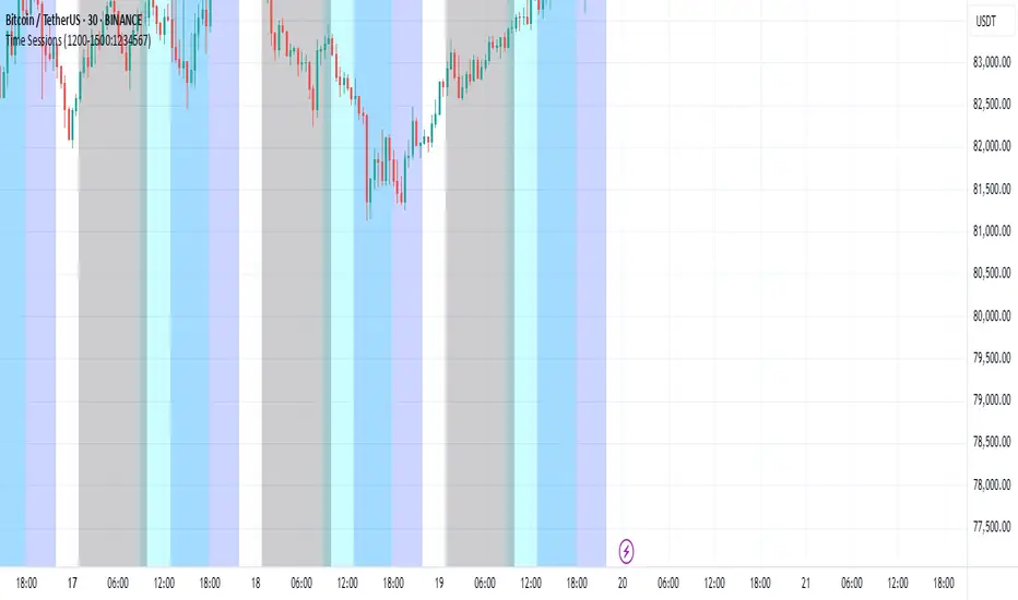
Kill Zone GridCaca Poo-Poo Kill Zone (12pm–4pm) — Avoid the Death Hours
This indicator highlights the worst trading window of the day — the midday chop zone where liquidity dies, algo volume disappears, spreads widen, and your account slowly bleeds out from boredom and paper cuts.
From 12pm to 4pm (New York Time) the script:
• Shades the background with a bold kill-zone color
• Adds red gridline stripes to visually scream “STOP TRADING, YOU DONKEY”
• Makes the entire chart look hostile so you avoid revenge trading, boredom trading, and all forms of midday stupidity
Perfect for scalpers and trend traders who only want the clean morning moves and want a visual reminder to step away, go outside, touch grass, eat lunch, or hit the gym instead of forcing trades in garbage hours.
If you trade futures, options, or zero-day anything — this script will save you money, sanity, and years off your life.

Multi-Symbol Fib Zone Signal Scanner NSEMulti-Symbol Fib Zone Signal Scanner NSE
this indicator will suggest to buy or sell basis fib retracement
it is for educational purpose only.

Awesome SuperTrend Zone Dynamic Alerts// created by © OmegaTools, upgrade to v6 and alert condition added
//@version=6
Awesome SuperTrend Zone Alerts with dynamic alerts

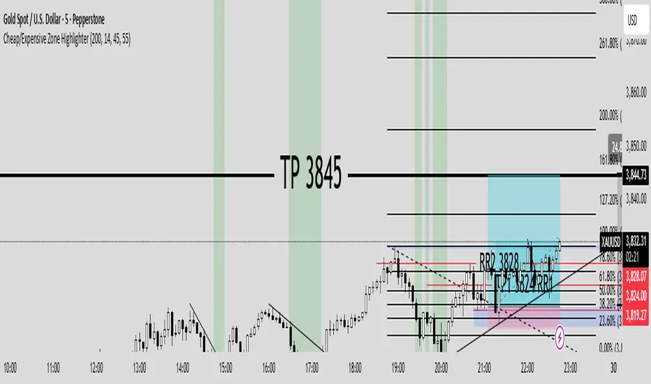
Cheap/Expensive Zone Highlighter V.2 Publicindicator Cheap/Expensive Zone Highlighter Ver2
Uptrend = Based on price> EMA200 (O+H+L+C)/4
Cheap zone = RSI<45
Dowtrend = Based on price< EMA200 (O+H+L+C)/4
Expensive Zone= RSI>55
Cheap/Expensive Zone Highlighter V.2 indicator Cheap/Expensive Zone Highlighter Ver2
Uptrend = Based on price> EMA200 (O+H+L+C)/4
Cheap zone = RSI<45
Dowtrend = Based on price< EMA200 (O+H+L+C)/4
Expensive Zone= RSI>55

RSI(7) + MACD ZoneTitle: RSI(7) + MACD Zone Combo
Description:
This indicator combines RSI (7) and MACD (12,26,9) into a single panel with a unified scale for easier analysis.
RSI (7) is plotted in white and automatically turns red when the market reaches overbought (>70) or oversold (<30) conditions.
MACD is normalized to align with the RSI scale (0–100).
A value of 50 represents MACD = 0.
Above 50 (teal) indicates positive momentum.
Below 50 (red) indicates negative momentum.
This combination allows traders to quickly identify when short-term RSI conditions align with overall momentum shifts from MACD.
How to use:
Look for potential buy opportunities when RSI is oversold (<30) and MACD is above 50 (positive momentum).
Look for potential sell opportunities when RSI is overbought (>70) and MACD is below 50 (negative momentum).
Use in conjunction with price action and risk management — not as a standalone signal.

UpDownBow + BullBear ZoneUpDownBow + BullBear UpDownBow + BullBear ZoneUpDoUpDownBow + BullBear ZoneUpDownBow + BullBear ZoneUpDownBow + BullBear ZoneUpDownBow + BullBear ZoneUpDownBow + BullBear ZonewnBow + BullBear ZoneUpDownBow + BullBear UpDownBow + BullBear ZoneUpDoUpDownBow + BullBear ZoneUpDownBow + BullBear ZoneUpDownBow + BullBear ZoneUpDownBow + BullBear ZoneUpDownBow + BullBear ZonewnBow + BullBear ZoneUpDownBow + BullBear UpDownBow + BullBear ZoneUpDoUpDownBow + BullBear ZoneUpDownBow + BullBear ZoneUpDownBow + BullBear ZoneUpDownBow + BullBear ZoneUpDownBow + BullBear ZonewnBow + BullBear ZoneUpDownBow + BullBear UpDownBow + BullBear ZoneUpDoUpDownBow + BullBear ZoneUpDownBow + BullBear ZoneUpDownBow + BullBear ZoneUpDownBow + BullBear ZoneUpDownBow + BullBear ZonewnBow + BullBear ZoneUpDownBow + BullBear UpDownBow + BullBear ZoneUpDoUpDownBow + BullBear ZoneUpDownBow + BullBear ZoneUpDownBow + BullBear ZoneUpDownBow + BullBear ZoneUpDownBow + BullBear ZonewnBow + BullBear ZoneUpDownBow + BullBear UpDownBow + BullBear ZoneUpDoUpDownBow + BullBear ZoneUpDownBow + BullBear ZoneUpDownBow + BullBear ZoneUpDownBow + BullBear ZoneUpDownBow + BullBear ZonewnBow + BullBear ZoneUpDownBow + BullBear UpDownBow + BullBear ZoneUpDoUpDownBow + BullBear ZoneUpDownBow + BullBear ZoneUpDownBow + BullBear ZoneUpDownBow + BullBear ZoneUpDownBow + BullBear ZonewnBow + BullBear ZoneUpDownBow + BullBear UpDownBow + BullBear ZoneUpDoUpDownBow + BullBear ZoneUpDownBow + BullBear ZoneUpDownBow + BullBear ZoneUpDownBow + BullBear ZoneUpDownBow + BullBear ZonewnBow + BullBear Zone

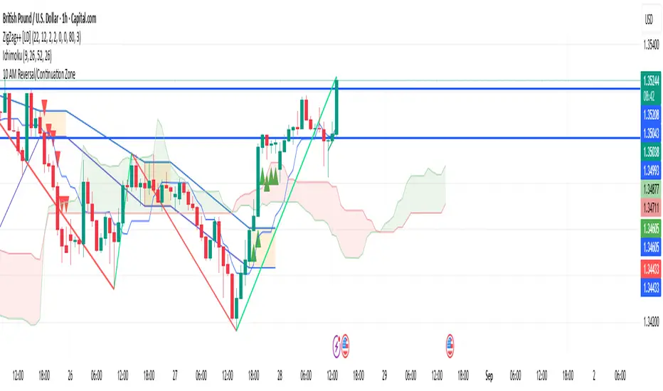
10 AM Reversal/Continuation Zone BY DAN GESPlots the high and low between 9.30 - 10:00am ET
Colours the zone between those two levels.
Highlights when price breaks above or below that zone after 10:00am
RSI (14) with Auto Zone Colors — Overbought/Oversold HighlighterThis indicator plots the Relative Strength Index (RSI 14) with dynamic color changes for instant visual clarity:
✅ Green line in overbought zone (≥70)
✅ Red line in oversold zone (≤30)
✅ White line in neutral range (30–70)
Includes reference lines at 70, 50, and 30 for quick decision-making. Perfect for spotting momentum extremes, divergences, and potential reversal points without squinting at numbers. Works on any timeframe.

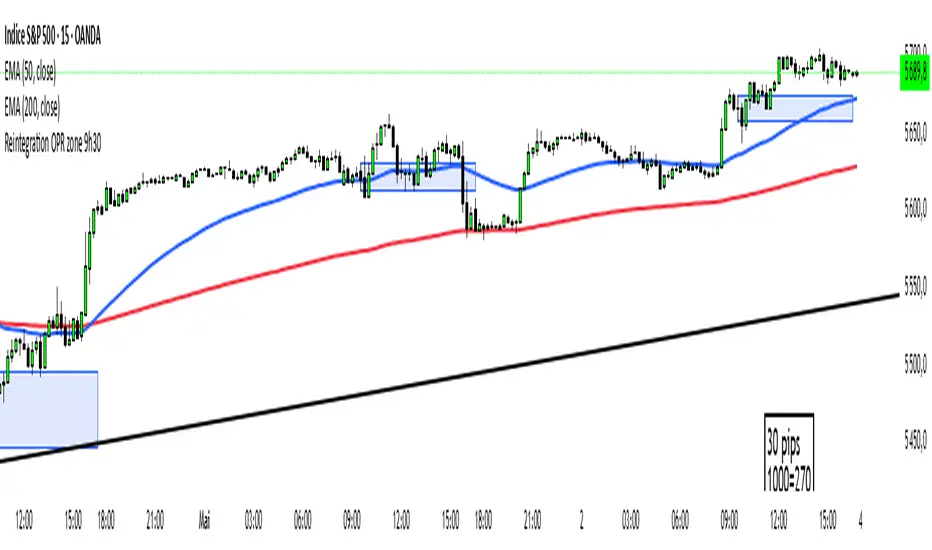
Reintegration OPR zone 9h30📝 Indicator Description (for TradingView):
Name: Reintegration OPR Zone – 9:30 AM EST (UTC-4)
Purpose:
This indicator is designed for US indices like NAS100, US30, or SPX500. It helps identify potential false breakouts or retests by tracking when the price re-enters the Opening Price Range (OPR) after an initial breakout.
🔍 How it works:
At 9:30 AM New York time (UTC-4), the script captures the high and low of the first 15-minute candle (which is key for the US session open).
It then draws a horizontal box (rectangle) from the high to the low of that candle.
The box extends horizontally for 7 hours (28 candles on a 15-minute chart).
The script tracks if price:
Breaks above or below the OPR zone
Then re-enters the zone (a potential "fakeout" or "retest" signal)
No label or text is displayed on the chart (you requested it to be hidden).
🕒 Timeframe:
Designed for the 15-minute chart (M15)
Assumes New York session open at 9:30 AM EST (UTC-4)
Ben Adaji Time Zone CheckerIf you are trading from Nigeria, you need to set your TradingView timezone to West Africa Time (WAT, UTC+1). This ensures that your charts, market sessions, and time-based indicators align correctly with your local time.
To set this up on TradingView:
Click on the gear icon (Chart Settings).
Navigate to the Time Zone section.
Select UTC+1:00 West Africa Time (WAT) from the list.
This adjustment helps you track market movements accurately in sync with your local trading hours.