ForceBar / @acardenas @ppinedasThis indicator is in its evaluation phase. It was specially designed to operate the SPX
Built-in parameters
- Periods
- Stop Loss
- Take Profit
-SL / TP activator
Pesquisar nos scripts por "spx"

Mansfield Relative Strength indicatorUse this indicator to compare how security is performing in compare with preferred index (SPX by default).
> 0 outperforming
< 0 underperforming
Works best for weekly, but can be applied to monthly and daily charts. It will be rather useless to use it in smaller timeframes
Apply it to SPX, industry index, sector index or other security in similar sector

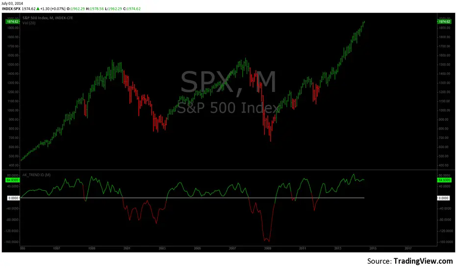
AK TREND ID v1.00Hello,
"Are we at the top yet ? "........ " Is it a good time to invest ? " ......." Should I buy or sell ? " These are the many questions I hear and get on the daily basis. 1000's of investors do not know when to go in and out of the market. Most of them rely on the opinion of "experts" on television to make their investment decisions. Bad idea.Taking a systematic approach when investing, could save you a lot of time and headache. If there was only a way to know when to get in and out of the market !! hmmmm. The good news is that there many ways to do that. The bad news is , are you disciplined enough to follow it ?
I coded the AK_TREND ID specifically to identified trends in the SPX or SPY only . How does it work ? very simply , I simply plot the spread between the 3 month and 8 month moving average on the chart.
If the spread > 0 @ month end = BUY
if the spread < 0 @ month end = SELL
The AK TREND ID is a LAGGING Indicator , so it will not get you in at the very bottom or get you out at the very top. I did a backtest on the SPX from 1984 to 7/2/2014 (yesterday), The rule was to buy only when the AK TREND ID was green. let's look at the result:
14 trades : 11 W 3 L , 78.75 % winning %
Biggest winner (%) = 108 %
Biggest loser (%) = -10.7 %
Average Return = 27 %
Total Return since 1984 = 351.3 %
You can see the result in detail here : docs.google.com
Although the backtesting results are good, the AK TREND ID is not to be used as a trading system. It is simply design to let you know when to invest and when to get out. I'm working a more accurate version of this Indicator , that will use both technical and fundamental data. In the mean time , I hope this will give some of you piece of mind, and eliminate emotions from your trading decision. Feel free to modify the code as you wish, but please share your finding with the rest of Trading View community.
All the best
Algo
Relative Strength Table📊 RRG Quadrant Scanner - Options Trading Market Direction Tool
A powerful Relative Rotation Graph/Table (RRG) dashboard designed to help OPTIONS TRADERS identify market direction, select optimal strikes, and time entries with precision. Track up to 8 symbols against any benchmark to determine bullish/bearish bias and rotation momentum.
---
🎯 WHY OPTIONS TRADERS NEED THIS
Unlike stock traders who can hold losing positions indefinitely, options traders face:
❌ Time decay (theta)
❌ Directional risk (delta)
❌ Volatility changes (vega)
❌ Limited time to be right
This indicator solves these challenges by showing you:
✅ Which direction momentum is flowing (calls vs puts)
✅ Which symbols/sectors have strongest trends (high probability setups)
✅ When rotation is happening (timing entries/exits)
✅ Market breadth for directional confirmation
---
🔥 HOW RRG QUADRANTS GUIDE OPTIONS TRADING
🟢 LEADING QUADRANT (Top Right) - BULLISH BIAS
What it means:
• Strong uptrend vs benchmark
• Accelerating momentum
• High relative strength
Options Strategies:
✅ BUY CALLS (ITM/ATM for safer, OTM for aggressive)
✅ SELL CASH-SECURED PUTS (collect premium on strong stocks)
✅ BULL CALL SPREADS (defined risk directional plays)
✅ LONG CALL DIAGONALS (capture continued uptrend)
Direction Signal: STRONG BULLISH
• Multiple symbols in Leading = broad market strength
• Index options: favor call side
• Stock options: bullish strategies on individual leaders
---
🔵 IMPROVING QUADRANT (Top Left) - EARLY BULLISH
What it means:
• Currently underperforming BUT gaining momentum
• Early reversal signal
• Rotation from weak to strong
Options Strategies:
✅ BUY CALLS with longer expiry (give time to develop)
✅ BULL PUT SPREADS (defined risk as support builds)
✅ SELL PUTS at support (premium collection on improving stocks)
✅ CALENDAR SPREADS (benefit from time and momentum shift)
Direction Signal: EMERGING BULLISH
• Symbols moving Lagging → Improving = early buy signal
• Best for patient options traders
• Use longer DTE (45-60 days) to allow rotation to complete
• Watch for move into Leading quadrant for confirmation
---
🔴 LAGGING QUADRANT (Bottom Left) - BEARISH BIAS
What it means:
• Weak relative strength
• Declining momentum
• Persistent underperformance
Options Strategies:
✅ BUY PUTS (directional bearish play)
✅ BEAR CALL SPREADS (defined risk on weakness)
✅ SELL COVERED CALLS (if stuck in position)
✅ PUT DEBIT SPREADS (cheaper than naked puts)
Direction Signal: STRONG BEARISH
• Multiple symbols in Lagging = market weakness
• Avoid bullish strategies entirely
• Index options: favor put side
• Exit existing long calls immediately
---
⚫ WEAKENING QUADRANT (Bottom Right) - EARLY BEARISH
What it means:
• Currently strong BUT losing momentum
• Topping signal
• Rotation from strong to weak
Options Strategies:
✅ SELL CALLS (initiate bearish bias)
✅ BEAR PUT SPREADS (cheaper than naked puts)
✅ CLOSE LONG CALLS (take profits before decay accelerates)
✅ PROTECTIVE PUTS (if holding stock positions)
✅ SHORT STRADDLES/STRANGLES (if expecting range-bound)
Direction Signal: EMERGING BEARISH
• Symbols moving Leading → Weakening = profit-taking signal
• Close bullish positions EARLY
• Initiate bearish strategies
• Watch for move into Lagging for confirmation of downtrend
---
🎯 MARKET DIRECTION CONFIRMATION FOR INDEX OPTIONS
Trading NIFTY/BANKNIFTY/SPX Options? Use this way:
📊 Track These Symbols Against Benchmark:
• Major sectors: Finance, IT, Energy, Auto, Pharma
• Top stocks: RELIANCE, HDFCBANK, INFY, TCS, etc.
• Benchmark: NIFTY or BANKNIFTY
🟢 BULLISH INDEX BIAS (Buy Calls/Sell Puts)
When you see:
• 60%+ symbols in Leading + Improving quadrants
• Financial sector in Leading (indicates BANKNIFTY strength)
• IT sector in Leading (indicates NIFTY strength)
• Few symbols in Lagging
Strategy: Aggressive call buying, put selling, bull spreads
🔴 BEARISH INDEX BIAS (Buy Puts/Sell Calls)
When you see:
• 60%+ symbols in Lagging + Weakening quadrants
• Key sectors rotating to Weakening
• Broad-based weakness across watchlist
Strategy: Put buying, bear spreads, avoiding new longs
⚖️ NEUTRAL/ROTATION PHASE (Iron Condors/Strangles)
When you see:
• Symbols evenly distributed across quadrants
• No clear cluster in any one quadrant
• Conflicting signals between sectors
Strategy: Range-bound strategies, avoid directional bets, reduce position size
---
💡 OPTIONS TRADING USE CASES
🎯 Case 1: Earnings Play Setup
Before earnings, check if stock is in:
• Leading = bullish bias, buy calls
• Improving = emerging strength, cautious calls
• Weakening = avoid or buy puts
• Lagging = strong puts
🎯 Case 2: Weekly Options Direction
Monday morning setup:
• Check sector quadrants vs benchmark
• Leading sectors = focus call trades there
• Weakening sectors = focus put trades
• Adjust delta exposure based on quadrant distribution
🎯 Case 3: Spread Selection
For credit spreads:
• Sell puts on Leading/Improving symbols (bullish)
• Sell calls on Weakening/Lagging symbols (bearish)
• Iron condors when symbols are scattered (no clear direction)
🎯 Case 4: Portfolio Hedging
If holding calls:
• Watch symbols move Leading → Weakening = add protective puts
• If 50%+ watchlist enters Weakening = hedge entire portfolio
If holding puts:
• Watch symbols move Lagging → Improving = close puts early
• If broad rotation to Improving = exit bearish positions
🎯 Case 5: Theta Decay Management
Leading quadrant = hold calls longer (trend supports you)
Weakening quadrant = close calls early (decay + downside risk)
Improving quadrant = be patient with calls (need time to develop)
Lagging quadrant = hold puts or exit quickly if rotation starts
---
📈 SECTOR ROTATION FOR OPTIONS STOCK SELECTION
Instead of trading index options, use quadrants to pick individual stocks:
Setup Example - NSE Options:
Symbols: RELIANCE, HDFCBANK, INFY, TCS, SBIN, ICICIBANK, TATAMOTORS, BAJFINANCE
Benchmark: NIFTY
Monday Strategy Session:
1. Check which stocks are in Leading quadrant
2. Focus call trades ONLY on Leading stocks
3. Check which stocks are in Weakening/Lagging
4. Focus put trades on those
5. Ignore stocks in unclear quadrants (save capital)
This approach:
✅ Increases win rate (trading with momentum)
✅ Reduces losses (avoiding weak stocks)
✅ Improves timing (catch early rotations)
---
🔥 REAL TRADING SCENARIOS FOR OPTIONS
📊 Scenario 1: Strong Bullish Market
Quadrant Status:
• Leading: 5 symbols
• Improving: 2 symbols
• Weakening: 1 symbol
• Lagging: 0 symbols
Options Action:
✅ Aggressive call buying on index
✅ Bull call spreads on leading stocks
✅ Sell puts on improving stocks
✅ Avoid bearish strategies
✅ Larger position sizes (conviction high)
---
📊 Scenario 2: Rotation/Choppy Market
Quadrant Status:
• Leading: 2 symbols
• Improving: 2 symbols
• Weakening: 2 symbols
• Lagging: 2 symbols
Options Action:
⚠️ AVOID directional bets
✅ Iron condors/strangles (profit from range)
✅ Calendar spreads (volatility plays)
✅ Smaller position sizes
✅ Wait for clearer rotation signal
---
📊 Scenario 3: Bearish Reversal
Quadrant Status:
• Leading: 1 symbol
• Improving: 0 symbols
• Weakening: 3 symbols
• Lagging: 4 symbols
Options Action:
✅ Buy puts on index
✅ Bear call spreads on weakening stocks
✅ CLOSE all long calls immediately
✅ Sell covered calls if stuck in stocks
✅ Increase hedge positions
---
📊 Scenario 4: Early Recovery
Quadrant Status:
• Leading: 1 symbol
• Improving: 4 symbols (moving from Lagging)
• Weakening: 1 symbol
• Lagging: 2 symbols
Options Action:
✅ Buy calls with 45-60 DTE (give time to develop)
✅ Bull put spreads on improving stocks
✅ Small position sizes initially
✅ Scale in as symbols move to Leading
✅ Close remaining bearish positions
---
🎯 TIMING ENTRY/EXIT WITH QUADRANTS
📍 BEST CALL ENTRIES:
1. Symbol moves Improving → Leading (momentum confirmed)
2. 70%+ watchlist in Leading/Improving (broad strength)
3. Key sector enters Leading (focused strength)
📍 BEST PUT ENTRIES:
1. Symbol moves Weakening → Lagging (downtrend confirmed)
2. 70%+ watchlist in Weakening/Lagging (broad weakness)
3. Leading symbols suddenly drop to Weakening (reversal)
📍 EXIT SIGNALS:
Calls: Close when symbol enters Weakening
Puts: Close when symbol enters Improving
Both: Take profits at 50-70% max gain if rotation unclear
---
⚙️ SETUP FOR OPTIONS TRADERS
For NIFTY Options Traders:
• Symbols: Top 8 NIFTY stocks (RELIANCE, HDFCBANK, INFY, etc.)
• Benchmark: NIFTY
• Window: 20 periods
• Timeframe: Daily chart
• Use: Gauge NIFTY direction
For BANKNIFTY Options Traders:
• Symbols: Banking stocks (HDFCBANK, ICICIBANK, SBIN, KOTAKBANK, AXISBANK)
• Benchmark: BANKNIFTY
• Window: 20 periods
• Use: Gauge BANKNIFTY direction
For Stock Options Traders:
• Symbols: Your watchlist of optionable stocks
• Benchmark: Relevant sector index
• Window: 10-20 periods
• Use: Pick strongest/weakest for directional trades
---
🎓 OPTIONS TRADING RULES USING QUADRANTS
✅ Rule 1: Only buy calls on Leading/Improving stocks
✅ Rule 2: Only buy puts on Weakening/Lagging stocks
✅ Rule 3: Exit calls when stock enters Weakening
✅ Rule 4: Exit puts when stock enters Improving
✅ Rule 5: Use longer DTE when trading Improving/Weakening (rotation takes time)
✅ Rule 6: Use shorter DTE when trading Leading/Lagging (established trends)
✅ Rule 7: If 70%+ watchlist in one side = strong directional bias
✅ Rule 8: If symbols scattered = reduce position sizes, play neutral
---
🏆 ADVANTAGES FOR OPTIONS TRADERS
✅ HIGHER WIN RATE
Trade only symbols with clear momentum direction
✅ BETTER TIMING
Catch rotations early = maximize profit potential
✅ REDUCED THETA DECAY LOSSES
Don't hold calls on weakening stocks (double loss)
✅ CLEARER MARKET BIAS
Know if market is bullish/bearish/neutral
✅ PORTFOLIO ALIGNMENT
Match your delta exposure to market direction
✅ EARLY WARNING SYSTEM
Spot rotations before price breaks down/up
✅ RISK MANAGEMENT
Exit positions before momentum shifts against you
---
📚 COMBINING WITH OTHER ANALYSIS
This indicator works best when combined with:
📊 Technical Analysis
• Support/Resistance for strike selection
• Chart patterns for entry timing
• Volume for confirmation
📈 Volatility Analysis
• IV Rank for premium selling decisions
• VIX/India VIX for overall market risk
⏰ Time Analysis
• Check quadrants before weekly expiry
• Align DTE with expected rotation speed
💰 Greeks Management
• High delta on Leading symbols (directional confidence)
• Low delta on Improving symbols (early, needs time)
• Negative delta on Weakening/Lagging (bearish bias)
---
⚠️ WHAT THIS INDICATOR DOESN'T DO
❌ Doesn't predict exact option prices
❌ Doesn't tell you which strike to buy
❌ Doesn't replace risk management
❌ Doesn't account for news/events
❌ Doesn't consider implied volatility
❌ Doesn't guarantee winning trades
It DOES give you:
✅ Market direction bias
✅ Symbol selection edge
✅ Rotation timing awareness
✅ Risk/reward framework
---
🎯 BOTTOM LINE FOR OPTIONS TRADERS
Stop fighting momentum. Stop buying calls on weakening stocks. Stop holding positions through rotations.
Instead:
• Check quadrants BEFORE entering trades
• Buy calls only on Leading/Improving
• Buy puts only on Weakening/Lagging
• Exit when rotation signals change
• Adjust position size based on breadth
This simple framework can dramatically improve your options trading win rate and reduce catastrophic losses from holding through momentum reversals.
---
⭐ START TRADING WITH THE TREND
Add this RRG Quadrant Scanner and align your options trades with market rotation - not against it!

Bull/Bear vs Base vs Index (% Change Spread)Visualizes the performance gap ("Beta Decay") between 3x Leveraged ETFs (SOXL/SOXS) and their underlying sector (SOXX), relative to the S&P 500 (SPY).
This indicator is designed for traders who trade leveraged products (like SOXL/SOXS, TQQQ/SQQQ) and need to see true relative strength beyond simple price action.
It calculates the percentage change over a user-defined lookback period for four instruments:
Base (1x): The sector benchmark (Default: SOXX).
Bull (3x): The leveraged long ETF (Default: SOXL).
Bear (-3x): The leveraged inverse ETF (Default: SOXS).
Index: The broad market zero-line (Default: SPY).
It then plots the Spread to reveal the health of the trend:
Bull Spread (Green Line): Bull % - Base %
Bear Spread (Red Line): Bear % - Base %
Base vs Index (Filled Area): Base % - SPY %
🧠 The Logic: Why Use Spreads?
In a perfectly efficient trending market, a 3x Bull ETF should move exactly 300% of the underlying asset. However, in choppy or volatile markets, volatility decay (beta slippage) causes leveraged ETFs to underperform mathematically.
Positive Spread: The leveraged ETF is successfully capturing momentum (The "Sweet Spot").
Negative Spread: The leveraged ETF is suffering from drag or the underlying asset is chopping.
📈 Recommended Trading Plan
Note: This indicator works best as a filter for entry conditions, not a standalone signal. Always use proper risk management.
Strategy A: The "Clean Trend" (Momentum)
Goal: Enter a 3x position only when volatility drag is minimal.
1. Bull Signal:
Condition 1: The Base vs Index (Area) is Green (Sector is outperforming SPY).
Condition 2: The Bull Spread (Green Line) is Positive (> 0).
Why: This confirms the sector is strong AND the 3x ETF is amplifying that move efficiently without decay eating the profits.
2. Bear Signal:
Condition 1: The Base vs Index (Area) is Red (Sector is lagging SPY).
Condition 2: The Bear Spread (Red Line) is Positive (> 0).
Why: This confirms the sector is crashing and the Bear ETF is successfully capturing the downside momentum.
Strategy B: The "Decay Avoidance" (Cash is King)
Goal: Avoid leveraged funds during chop.
Condition: If BOTH the Bull Spread and Bear Spread are Negative (< 0) (below the zero line).
Action: Stay in Cash or trade the 1x underlying (SOXX) only.
Why: When both spreads are negative, it mathematically proves that the market is too choppy for leverage. Both the Long and Short leveraged funds are losing value relative to the underlying asset.
Features:
Pine Script® v6: Updated for the latest engine performance and visuals.
Dashboard Table: Real-time percentage spreads displayed directly on the chart (customizable position).
Fully Customizable: Works on any sector (e.g., set inputs to QQQ/TQQQ/SQQQ for Tech).
Disclaimer:
Trading leveraged ETFs involves significant risk. This script is for educational purposes only.

Williams %RDescription
This is a modified version of the classic Williams %R oscillator, adapted for markets with defined trading sessions (e.g., FTSEMIB, DAX, US stocks, etc.). It adjusts the lookback period based on the actual trading session length, making it more accurate on intraday timeframes.
Key Features
Session Adjustment:
Automatically scales the period to trading days (default: 8.5 hours for FTSEMIB, DAX, CAC; customizable for any market).
Formula (classic Williams %R):
%R = 100 × (Close - Highest High) / (Highest High - Lowest Low)
over a user-defined period (default 14 days).
Standard Levels:
-20 (overbought)
-50 (middle line)
-80 (oversold)
Visual Enhancements:
- Customizable colors for the line, levels, and background fill
- Shaded overbought/oversold zone
How to Use:
Overbought (above -20):
Potential sell signal or reversal (especially after a prolonged uptrend).
Oversold (below -80):
Potential buy signal or reversal (especially after a downtrend).
Divergences:
Look for bullish/bearish divergences between price and %R for early reversal warnings.
Best Markets:
Indices (FTSEMIB, DAX, SPX), stocks, futures. For 24/7 markets (crypto), set session duration to 24 hours.
Timeframes:
Works on intraday (15m, 1h, etc.) and daily charts.
Customization Tips:
- Adjust the period (shorter = more sensitive, longer = smoother).
- Change session duration for different markets.
- Customize colors to match your chart theme.
Note: Williams %R is a momentum oscillator and should be used in combination with other tools (trendlines, support/resistance, volume). Always practice proper risk management.

Volume OscillatorDescription
The Volume Oscillator measures the momentum of trading volume by calculating the percentage difference between a fast and a slow Simple Moving Average (SMA) of daily volume. It helps traders identify periods of increasing or decreasing market participation, often signaling potential trend strength or exhaustion.
Key Features:
Adaptive to Trading Session:
Automatically adjusts SMA periods based on the actual trading session length (default: 8.5 hours for FTSEMIB, customizable for any market — e.g., 6.5h for US stocks, 24h for crypto).
Fast & Slow SMAs:
Compares a short-term SMA (default 10 days) with a longer-term SMA (default 25 days) of volume.
Oscillator Formula:
100 × (Fast SMA / Slow SMA - 1)
→ Positive values = increasing volume momentum (bullish)
→ Negative values = decreasing volume momentum (bearish)
Signal Line (optional):
A moving average of the oscillator (default 7 days) for smoother trend identification and crossover signals.
Overbought/Oversold Levels:
User-defined horizontal lines (default +40 / -40) to highlight extreme volume conditions.
Customizable Colors:
Change the oscillator and signal line colors to match your chart style.
How to Interpret:
Bullish Conditions:
Oscillator crosses above the zero line
Oscillator crosses above the signal line
Readings near or above +40 may indicate strong buying pressure (watch for possible exhaustion if too extreme)
Bearish Conditions:
Oscillator crosses below the zero line
Oscillator crosses below the signal line
Readings near or below -40 may indicate selling pressure or capitulation
Divergences:
Look for divergences between price and the Volume Oscillator (e.g., price makes new highs but oscillator fails to confirm with higher highs) — a classic sign of weakening momentum.
Best Use Cases:
Indices (FTSEMIB, DAX, CAC, SPX, etc.), stocks and futures with defined trading hours, crypto (set session duration to 24 hours).
Works well on intraday (e.g., 15m, 30m, 1h) and daily charts.
Customization Tips:
- Shorten fast/slow lengths for faster signals (more noise)
- Lengthen them for smoother, longer-term analysis
- Adjust session duration for non-standard market hours
- Enable/disable the signal line in the settings
Note: Volume data quality can vary by symbol and exchange. Always combine this indicator with price action and other tools. Use proper risk management.

Relative StrengthDescription
Relative Strength between a stock and a reference index (e.g., Intesa San Paolo vs. FTSEMIB).
This indicator calculates the Relative Strength (RS) as either a simple ratio of the base symbol's close to the comparative symbol's close, or as a normalized ratio over a lookback period. It helps identify the relative performance of a stock against an index, which can signal intermediate trends when the RS is above its moving average.
Key features:
- Input for comparative symbol (default: FTSEMIB).
- Option to toggle between simple ratio or ratio-over-time calculation.
- Adjustable lookback period for the ratio-over-time method.
- Optional display of a moving average on the RS line for trend analysis.
Use it to compare a stock's strength to the market—rising RS may indicate outperformance.
Script Overview
This is a Relative Strength (RS) indicator for TradingView (written in Pine Script version 5).
It compares the price performance of the current chart's symbol (e.g., a stock like Intesa San Paolo) against another symbol you choose (by default, the Italian index FTSEMIB).
The goal is to show whether the stock is outperforming or underperforming the reference index.
User Inputs (configurable in the settings panel)
Comparative Symbol Default: FTSEMIB
You can change it to any other ticker (e.g., SPX, DAX, etc.).
Calculate RS as simple ratio (true) or ratio over time (false)?
true (default): Simple ratio → current close of stock ÷ current close of index.
false: Ratio of returns over a lookback period (more normalized, less affected by absolute price levels).
Lookback Period (default 40 - weeks)
Only used when the above option is set to false.
Defines how many bars back to calculate the price change.
Show Moving Average (default off)
Optionally overlays a simple moving average on the RS line.
Moving Average Period (default 40 - weeks)
Length of the SMA when the MA is enabled.
Typical Use CaseTraders often look for:
Rising RS line → the stock is gaining strength vs. the index.
RS crossing above its moving average → potential bullish signal for relative performance.
Declining or falling RS → the stock is weakening vs. the broader market.
In summary, this is a clean and flexible relative strength comparator that lets you quickly visualize how strongly (or weakly) a stock is performing compared to a benchmark index, with two different calculation methods to suit different analytical preferences.

Global Net Liquidity w/offsetShows the value of Global Net Liquidity.
Currently defined as:
Fed + Japan + China + HK + UK + ECB - RRP - TGA
where the first six components are central bank assets.
This script has been heavily inspired by dharmatech 's Global Net Liquidity
Original script can be viewed here:
Special for this script:
Hong Kong assets added
Offset mode
Smooth vs stepped line in lower than 1D time frame
Switch between trillion USD or full number
Defaults to overlay mode when added to chart
For Bitcoin, 90 days, is a fitting offset.
For SPX, around 60-70 days, is a fitting offset.

RSI For Loop | PWRSI For Loop – True Dominance Oscillator
RSI For Loop – True Momentum Dominance Through Historical Comparison
The Relative Strength Index (RSI) is excellent at measuring recent price change intensity, but a reading of 70 or 30 has completely different implications depending on the market regime. RSI For Loop removes this ambiguity by transforming RSI into a clean, zero-centered dominance / percentile-rank oscillator that always tells you exactly how strong or weak the current momentum is compared to recent history.
How it works
- Standard RSI is calculated normally (default length 46).
- A simple for-loop compares the current RSI value against the actual RSI value of every previous bar inside the user-defined lookback window (default 1 to 99 bars ≈ one full quarter on daily charts).
- Current RSI higher → +1 point
- Current RSI lower → –1 point
The resulting score ranges from –99 to +99 and is naturally centered around zero:
1. +40 = current momentum beats ~70 % of the last 99 bars (approximation)
2. –60 = current momentum is weaker than ~80 % of the last 99 bars (approximation)
3. Near zero = balanced or ranging market
Additional statistical layers
- A very long rolling median of the score (default 240 periods) serves as a slow, robust dynamic centerline
- Upper and lower 3σ bands are calculated from the standard deviation of the underlying RSI median (default length 60) to highlight truly rare extreme-dominance phases
- Asymmetric trend thresholds (default Long +15 / Short –28) reflect the empirical observation that downside momentum is usually sharper and faster
Origin and development
The core idea of using a for-loop on RSI was originally introduced by @viResearch in his invite-only “RSI For Loop” script.
While studying that concept I realised I needed an even more regime-robust strength gauge that looks back far enough to capture full market cycles (2–4 months). Therefore I completely rewrote the loop to compare against actual historical RSI values instead of fixed levels, added a 240-period median centerline, 3σ extreme bands, asymmetric thresholds, and visual signals. All parameters were extensively tested across dozens of major assets (BTC, ETH, SOL, SUI, BNB, XRP, TRX, DOGE, LINK, PAXG, CVX, HYPE, VIRTUAL + 20+ more cryptos; Magnificent 7 stocks, QQQ, SPX, XAUUSD) with the goal of achieving consistent profitability, high Sortino ratio and low drawdown in simple trend-following setups.
The final defaults represent the most robust compromise found — they keep you in real trends for dozens or hundreds of bars while staying almost silent in choppy, ranging markets.
Important Note
The optimization process is tailored to MY needs and have to be adjusted to you prefered timeframe!
I was mainly looking for an indicator that shows the underlying strength of an asset, the trend componant was only a bonus in my eyes.
How to use it
1. Green triangle below bar → score crosses above +15 → new bullish regime confirmed → enter or add to longs
2. Magenta triangle above bar → score crosses below –28 → exit longs or go cash/short
While score stays clearly positive → bullish bias hold
3. Score touching or breaking the 3σ bands → extreme conviction zone (add to winners or prepare for exhaustion)
Strength
Recommended defaults (My preference)
RSI length 46
Loop range 1–99
Long threshold +15
Short threshold –28
Median length 240
SD length 60
Recommended Universal Settings (Tested for low Max-Drawdown, high Sortino)
RSI length 44
Loop range 1–60
Long threshold +14
Short threshold –10
Median length 180
SD length 28
Works on every asset class, but the current settings are tuned for major liquid markets.
Disclaimer: This is not financial advice. Backtests are based on past results and are not indicative of future performance.

Volatility Targeting: Single Asset [BackQuant]Volatility Targeting: Single Asset
An educational example that demonstrates how volatility targeting can scale exposure up or down on one symbol, then applies a simple EMA cross for long or short direction and a higher timeframe style regime filter to gate risk. It builds a synthetic equity curve and compares it to buy and hold and a benchmark.
Important disclaimer
This script is a concept and education example only . It is not a complete trading system and it is not meant for live execution. It does not model many real world constraints, and its equity curve is only a simplified simulation. If you want to trade any idea like this, you need a proper strategy() implementation, realistic execution assumptions, and robust backtesting with out of sample validation.
Single asset vs the full portfolio concept
This indicator is the single asset, long short version of the broader volatility targeted momentum portfolio concept. The original multi asset concept and full portfolio implementation is here:
That portfolio script is about allocating across multiple assets with a portfolio view. This script is intentionally simpler and focuses on one symbol so you can clearly see how volatility targeting behaves, how the scaling interacts with trend direction, and what an equity curve comparison looks like.
What this indicator is trying to demonstrate
Volatility targeting is a risk scaling framework. The core idea is simple:
If realized volatility is low relative to a target, you can scale position size up so the strategy behaves like it has a stable risk budget.
If realized volatility is high relative to a target, you scale down to avoid getting blown around by the market.
Instead of always being 1x long or 1x short, exposure becomes dynamic. This is often used in risk parity style systems, trend following overlays, and volatility controlled products.
This script combines that risk scaling with a simple trend direction model:
Fast and slow EMA cross determines whether the strategy is long or short.
A second, longer EMA cross acts as a regime filter that decides whether the system is ACTIVE or effectively in CASH.
An equity curve is built from the scaled returns so you can visualize how the framework behaves across regimes.
How the logic works step by step
1) Returns and simple momentum
The script uses log returns for the base return stream:
ret = log(price / price )
It also computes a simple momentum value:
mom = price / price - 1
In this version, momentum is mainly informational since the directional signal is the EMA cross. The lookback input is shared with volatility estimation to keep the concept compact.
2) Realized volatility estimation
Realized volatility is estimated as the standard deviation of returns over the lookback window, then annualized:
vol = stdev(ret, lookback) * sqrt(tradingdays)
The Trading Days/Year input controls annualization:
252 is typical for traditional markets.
365 is typical for crypto since it trades daily.
3) Volatility targeting multiplier
Once realized vol is estimated, the script computes a scaling factor that tries to push realized volatility toward the target:
volMult = targetVol / vol
This is then clamped into a reasonable range:
Minimum 0.1 so exposure never goes to zero just because vol spikes.
Maximum 5.0 so exposure is not allowed to lever infinitely during ultra low volatility periods.
This clamp is one of the most important “sanity rails” in any volatility targeted system. Without it, very low volatility regimes can create unrealistic leverage.
4) Scaled return stream
The per bar return used for the equity curve is the raw return multiplied by the volatility multiplier:
sr = ret * volMult
Think of this as the return you would have earned if you scaled exposure to match the volatility budget.
5) Long short direction via EMA cross
Direction is determined by a fast and slow EMA cross on price:
If fast EMA is above slow EMA, direction is long.
If fast EMA is below slow EMA, direction is short.
This produces dir as either +1 or -1. The scaled return stream is then signed by direction:
avgRet = dir * sr
So the strategy return is volatility targeted and directionally flipped depending on trend.
6) Regime filter: ACTIVE vs CASH
A second EMA pair acts as a top level regime filter:
If fast regime EMA is above slow regime EMA, the system is ACTIVE.
If fast regime EMA is below slow regime EMA, the system is considered CASH, meaning it does not compound equity.
This is designed to reduce participation in long bear phases or low quality environments, depending on how you set the regime lengths. By default it is a classic 50 and 200 EMA cross structure.
Important detail, the script applies regime_filter when compounding equity, meaning it uses the prior bar regime state to avoid ambiguous same bar updates.
7) Equity curve construction
The script builds a synthetic equity curve starting from Initial Capital after Start Date . Each bar:
If regime was ACTIVE on the previous bar, equity compounds by (1 + netRet).
If regime was CASH, equity stays flat.
Fees are modeled very simply as a per bar penalty on returns:
netRet = avgRet - (fee_rate * avgRet)
This is not realistic execution modeling, it is just a simple turnover penalty knob to show how friction can reduce compounded performance. Real backtesting should model trade based costs, spreads, funding, and slippage.
Benchmark and buy and hold comparison
The script pulls a benchmark symbol via request.security and builds a buy and hold equity curve starting from the same date and initial capital. The buy and hold curve is based on benchmark price appreciation, not the strategy’s asset price, so you can compare:
Strategy equity on the chart symbol.
Buy and hold equity for the selected benchmark instrument.
By default the benchmark is TVC:SPX, but you can set it to anything, for crypto you might set it to BTC, or a sector index, or a dominance proxy depending on your study.
What it plots
If enabled, the indicator plots:
Strategy Equity as a line, colored by recent direction of equity change, using Positive Equity Color and Negative Equity Color .
Buy and Hold Equity for the chosen benchmark as a line.
Optional labels that tag each curve on the right side of the chart.
This makes it easy to visually see when volatility targeting and regime gating change the shape of the equity curve relative to a simple passive hold.
Metrics table explained
If Show Metrics Table is enabled, a table is built and populated with common performance statistics based on the simulated daily returns of the strategy equity curve after the start date. These include:
Net Profit (%) total return relative to initial capital.
Max DD (%) maximum drawdown computed from equity peaks, stored over time.
Win Rate percent of positive return bars.
Annual Mean Returns (% p/y) mean daily return annualized.
Annual Stdev Returns (% p/y) volatility of daily returns annualized.
Variance of annualized returns.
Sortino Ratio annualized return divided by downside deviation, using negative return stdev.
Sharpe Ratio risk adjusted return using the risk free rate input.
Omega Ratio positive return sum divided by negative return sum.
Gain to Pain total return sum divided by absolute loss sum.
CAGR (% p/y) compounded annual growth rate based on time since start date.
Portfolio Alpha (% p/y) alpha versus benchmark using beta and the benchmark mean.
Portfolio Beta covariance of strategy returns with benchmark returns divided by benchmark variance.
Skewness of Returns actually the script computes a conditional value based on the lower 5 percent tail of returns, so it behaves more like a simple CVaR style tail loss estimate than classic skewness.
Important note, these are calculated from the synthetic equity stream in an indicator context. They are useful for concept exploration, but they are not a substitute for professional backtesting where trade timing, fills, funding, and leverage constraints are accurately represented.
How to interpret the system conceptually
Vol targeting effect
When volatility rises, volMult falls, so the strategy de risks and the equity curve typically becomes smoother. When volatility compresses, volMult rises, so the system takes more exposure and tries to maintain a stable risk budget.
This is why volatility targeting is often used as a “risk equalizer”, it can reduce the “biggest drawdowns happen only because vol expanded” problem, at the cost of potentially under participating in explosive upside if volatility rises during a trend.
Long short directional effect
Because direction is an EMA cross:
In strong trends, the direction stays stable and the scaled return stream compounds in that trend direction.
In choppy ranges, the EMA cross can flip and create whipsaws, which is where fees and regime filtering matter most.
Regime filter effect
The 50 and 200 style filter tries to:
Keep the system active in sustained up regimes.
Reduce exposure during long down regimes or extended weakness.
It will always be late at turning points, by design. It is a slow filter meant to reduce deep participation, not to catch bottoms.
Common applications
This script is mainly for understanding and research, but conceptually, volatility targeting overlays are used for:
Risk budgeting normalize risk so your exposure is not accidentally huge in high vol regimes.
System comparison see how a simple trend model behaves with and without vol scaling.
Parameter exploration test how target volatility, lookback length, and regime lengths change the shape of equity and drawdowns.
Framework building as a reference blueprint before implementing a proper strategy() version with trade based execution logic.
Tuning guidance
Lookback lower values react faster to vol shifts but can create unstable scaling, higher values smooth scaling but react slower to regime changes.
Target volatility higher targets increase exposure and drawdown potential, lower targets reduce exposure and usually lower drawdowns, but can under perform in strong trends.
Signal EMAs tighter EMAs increase trade frequency, wider EMAs reduce churn but react slower.
Regime EMAs slower regime filters reduce false toggles but will miss early trend transitions.
Fees if you crank this up you will see how sensitive higher turnover parameter sets are to friction.
Final note
This is a compact educational demonstration of a volatility targeted, long short single asset framework with a regime gate and a synthetic equity curve. If you want a production ready implementation, the correct next step is to convert this concept into a strategy() script, add realistic execution and cost modeling, test across multiple timeframes and market regimes, and validate out of sample before making any decision based on the results.

Daily Levels ImporterUser Guide: Daily Levels Importer
What This Indicator Does
This tool allows you to instantly draw multiple support and resistance lines on your TradingView chart by pasting a list of data. It avoids the need to manually draw lines one by one. It also features a dashboard to identify the ticker and filters to toggle specific line colors on or off.
1. The Data Format
The indicator reads text in a specific 3-column format (Comma Separated).
Format: \, \, \
* Ticker: The symbol name (used for the dashboard display).
* Price: The price level where the line will be drawn.
* Color Code:
r = Red
g = Green
y = Yellow
Example:
ES, 4150.25, r
ES, 4200.00, g
ES, 4175.50, y
2. How to Use It
3. Copy Your Data: Select your list of levels (from Excel, a text file, or a website) and copy them to your clipboard.
4. Open Settings: On your TradingView chart, hover over the indicator name and click the Settings (Gear Icon).
5. Paste Data:
* Find the "Paste Data Here" text box in the Inputs tab.
* Delete any existing text.
* Paste your new list.
6. Save: Click OK. The lines will instantly render on your chart.
7. Controls & Filters
You can customize the view without deleting data by using the checkboxes in the Settings menu:
* Line Filters:
* Show Red Levels: Uncheck to hide all red lines.
* Show Green Levels: Uncheck to hide all green lines.
* Show Yellow Levels: Uncheck to hide all yellow lines.
* Dashboard Location:
* Use the dropdowns to move the Ticker ID box to any corner of the screen (e.g., Top Right, Bottom Left) or change its size.
8. Troubleshooting
Lines aren't showing up?
* Ensure the prices match the asset you are viewing (e.g., don't paste SPX prices on an AAPL chart).
* Check if you accidentally unchecked the "Show " box in the settings.
"No Data" in Dashboard?
* The script reads the ticker name from the first row of your pasted data. Ensure the first row is not blank.
Is there a limit?
* Yes. TradingView allows approximately 4,000 characters in the text box. This is roughly 250 lines of price levels. If you need more, add a second instance of the indicator to the chart.

VX Levels and Ranch Ranges with Price ConverterThis is a indicator for all Vexly subscribers to plot the following:
1. Plot SPY/SPX levels on your ES chart. Or QQQ levels on your NQ chart
2. VX levels obtained from vx_levels command. SPY on ES chart and QQQ on NQ chart
3. Ranch Range levels from the discord channel for ES and NQ chart.
You can enable/disable any of them at your discretion.
CRS (2 symbols: Ratio or Normalized) + InverseMade for Crosrate comparison By Leo Hanhart
This script is made to do a comparison between two assets under your current chart.
For example if you want to compare SPX over Growth ETF's Below a current asset to find momentum in your stock trading above it

Macroeconomic Dashboard by DGTMacroeconomic Dashboard is a script tailored for traders and investors using top-down strategies to navigate global markets. It integrates key macroeconomic indicators, such as monetary policy, inflation, yields, and market sentiment, directly into financial charts.
By visualizing real-time macro data alongside asset price movements, this tool bridges the gap between traditional economic metrics and technical analysis. Whether analyzing crypto or traditional markets, users can better contextualize price action within broader economic cycles and trends.
Designed to support macro-informed decision-making, it helps identify shifts in liquidity, policy direction, and risk appetite, enhancing strategic trade entries and portfolio positioning.
KEY FEATURES
⯌ Macro Dashboard
The script provides a macro dashboard that tracks changes across key economic dimensions: monetary policy, inflation and growth, bond markets, and risk indicators. With built-in anomaly detection and trend analysis across short-, mid-, and long-term timeframes, it helps interpret market moves through a macroeconomic lens, whether analyzing equities, commodities, or digital assets.
⯌ Macro on Chart
By visualizing macro data such as M2 money supply, CPI, treasury yields, and volatility indices, users can more easily correlate economic developments with price action, enhancing situational awareness and decision-making.
MACRO METRICS
The script covers five core macroeconomic domains, each with key metrics:
Liquidity & Monetary Policy
Global M2 Money Supply
Federal Funds Rate
Reverse Repo Operations
Inflation & Economic Growth
Consumer Price Index (CPI)
Producer Price Index (PPI)
Real GDP Growth
Yields & Bond Markets
10-Year Treasury Yield
2-Year Treasury Yield
Yield Curve (10Y–2Y Spread)
Global Risk & Currency Indicators
U.S. Dollar Index (DXY)
Volatility Index (VIX)
Economic Policy Uncertainty Index
Equities, Commodities & Crypto
S&P 500 (SPX)
Nasdaq 100 (NDX)
Gold (XAU/USD)
Crude Oil (WTI)
Bitcoin (BTCUSD)
DISCLAIMER
This script is intended for informational and educational purposes only. It does not constitute financial, investment, or trading advice. All trading decisions made based on its output are solely the responsibility of the user.
Script pago

New Age US ORB═════════════════════════════════════════════════════════════
NEW AGE US ORB
Opening Range Breakout Strategy with Neon Glow Effect
═════════════════════════════════════════════════════════════
🔒 INVITE-ONLY ACCESS
This script requires an invitation to use.
To request access, please send me a private message.
═════════════════════════════════════════════════════════════
🎯 OVERVIEW
The New Age US ORB is a clean, professional Opening Range Breakout (ORB) strategy with a futuristic visual style featuring dynamic neon glow effects.
Designed for Crypto (BTC/USD) and Indices (US100, US30, SPX) trading.
Best results on 5-minute or 15-minute chart with Regular Candles.
The strategy captures the first 15 minutes of US market activity (9:30-9:45 NY) and trades breakouts in the direction of the initial move.
💎 WHAT MAKES THIS UNIQUE
Unlike standard ORB indicators, this strategy combines:
• Proprietary 3-layer Neon Glow visualization for enhanced box visibility
• Integrated US Session backgrounds for market context
• Smart Session Filter to avoid low-probability late entries
• Separate Long/Short TP management for asymmetric markets
• Automatic EOD position closure for overnight risk control
• Daily trade limiter to prevent overtrading
• Global Timezone Support - works correctly for traders worldwide
This combination of visual design and risk management features is not available in standard ORB scripts.
Trade Smarter, not Harder.
📦 WHAT IS ORB?
The Opening Range Breakout (ORB) strategy is based on the concept that the first 15 minutes of the US market session often sets the tone for the rest of the day. The High and Low established during this period act as key support/resistance levels.
• Price breaks ABOVE ORB High → Bullish momentum (LONG)
• Price breaks BELOW ORB Low → Bearish momentum (SHORT)
⚡ KEY FEATURES
📦 ORB BOX VISUALIZATION
• Automatically captures High/Low of 9:30-9:45 NY candle
• Dynamic color change:
→ Cyan: Price ABOVE ORB High (Bullish)
→ Red: Price BELOW ORB Low (Bearish)
• Extends throughout the trading session
✨ NEON GLOW EFFECT
• 3-layer glow effect around the ORB box
• Layered borders (8px → 5px → 3px) with gradient transparency
• Creates futuristic, high-visibility appearance
• Toggle on/off in settings
🕐 US SESSION BACKGROUNDS
• US Open (9:30-11:30 NY) - Blue
• Lunch Break (11:30-13:30 NY) - Orange
• Afternoon (13:30-16:00 NY) - Green
• Visual reference only - helps identify optimal trading windows
⏱️ SESSION FILTER
• Configurable trading window (default: until 11:50 NY)
• Prevents late entries when momentum fades
• EOD auto-close in YOUR selected timezone (default: 21:45)
🎚️ RISK MANAGEMENT
• ORB Box Stop Loss: SL at opposite ORB level + buffer
• Separate Take Profit settings for Long/Short
• Points or Percentage mode
• Daily trade limit (default: 6 trades max)
📊 INFO DASHBOARD
• Real-time status panel (top right)
• Shows: Timezone, Status, Session, Direction, Trades, SL/TP, EOD, ORB levels
⚙️ SETTINGS
TIMEZONE
└── Your Timezone: Select from 12 global timezones (Default: Europe/Zurich)
Available: UTC, New York, Chicago, Los Angeles, London, Berlin,
Zurich, Paris, Tokyo, Hong Kong, Singapore, Sydney
ORB BOX (9:30-9:45 NY)
├── Show ORB Box: true/false
└── Neon Glow Effect: true/false
US SESSION BACKGROUNDS
├── Show Session Background: true/false
├── US Open Color (9:30-11:30)
├── Lunch Color (11:30-13:30)
└── Afternoon Color (13:30-16:00)
SESSION FILTER
├── Enable Session Filter: true/false
├── Session End Hour (NY): 0-23
└── Session End Minute (NY): 0-59
DAILY CLOSE (Your Timezone)
├── Enable Daily Close: true/false
├── EOD Hour: 0-23
└── EOD Minute: 0-59
TRADE LIMITS
├── Enable Daily Limit: true/false
└── Max Trades per Day: 1-10
STOP LOSS
├── Enable ORB Box SL: true/false
└── SL Buffer: Points distance from ORB level
TAKE PROFIT - LONG
├── Enable TP Long: true/false
├── Mode: Points / Percent
├── TP Long Points: Distance in points
└── TP Long Percent: Distance in %
TAKE PROFIT - SHORT
├── Enable TP Short: true/false
├── Mode: Points / Percent
├── TP Short Points: Distance in points
└── TP Short Percent: Distance in %
COLORS
├── Bullish: Default #00ffbb (Cyan)
└── Bearish: Default #ff1100 (Red)
📈 HOW TO USE
1. Apply to BTC/USD or US100 on 5min or 15min timeframe
2. Use Regular Candles for realistic results
3. Go to Strategy Properties → Enable ☑️ "Recalculate On Bar Close"
4. Select your Timezone in settings (for correct EOD close time)
5. Wait for ORB box to complete (9:45 NY)
6. Strategy enters automatically on breakout:
→ LONG when price closes above ORB High
→ SHORT when price closes below ORB Low
7. Manage risk with ORB Box SL and TP settings
8. All positions close at EOD time (in your timezone)
🔔 ALERTS
• LONG Entry - Breakout above ORB High
• SHORT Entry - Breakout below ORB Low
• EOD Close - End of day position close
💡 BEST PRACTICES
• Most effective during US Open session (9:30-11:30 NY)
• Avoid Lunch session (11:30-13:30) - lower volatility
• ORB levels act as support/resistance all day
• Wider TP for trending days, tighter for ranging markets
• Use session filter to avoid late, low-probability entries
═════════════════════════════════════════════════════════════
© AL_R4D1 - New Age Style Trading Tools
═════════════════════════════════════════════════════════════

Smart Money Alpha Signals (Performance Dashboard) Smart Money Alpha Signals: Identifying Market Leaders & Generating Alpha
GMP Alpha Signals (Global Market Performance Alpha) is a specialized analysis tool designed not merely to find stocks that are rising, but to identify "Alpha" assets—Market Leaders that defend their price or rise even under adverse conditions where the market index falls or consolidates.
This indicator visualizes the concept of Comparative Relative Strength (RS) and Smart Money accumulation patterns, helping traders capture profit opportunities even during bearish market phases.
Key Objectives (Purpose)
Alpha Capture: Identifying assets generating 'excess returns' that outperform the market Beta.
Smart Money Tracking: Detecting traces of 'institutional buying' and 'accumulation' that defend prices during index plunges.
Decoupling Identification: Spotting assets moving on independent catalysts or momentum, regardless of the broader market direction.
Stop Hunt Filtering: Distinguishing 'fake drops' where price dips temporarily, but Relative Strength remains intact.
Dashboard Guide
Interpretation of the information panel (Table) displayed on the chart.
Rel. Performance: Shows the excess return compared to the index over the set period. (Positive/Green = Stronger than the market).
Decoupling Strength: The correlation coefficient with the index. Lower values (0 or negative) indicate movement independent of market risk.
Bullish: The count/rate of rising or limiting losses when the index drops sharply (e.g., < -0.5%). (Gold = Market Crash Leader).
Defended: The count/rate of holding support levels when the index shows mild weakness (e.g., < -0.05%). (Gold = Strong Accumulation).
Bench. Defense: The defense rate of the comparison benchmark (e.g., TSLA, ETH). Your target asset must be higher to be considered the sector leader.
Input Options & Settings Guide
You can optimize settings according to your trading style and asset class (Stocks/Crypto).
(1) Main Settings
Major Index: The baseline market index for comparison.
(US Stocks: NASDAQ:NDX or TVC:SPX / Crypto: BINANCE:BTCUSDT)
Benchmark Symbol: A competitor within the sector.
(e.g., Set NVDA when analyzing Semiconductor stocks).
Correlation Lookback: The lookback period for judging decoupling. (Default: 30)
Performance Lookback: The number of bars to calculate cumulative returns and defense rates. (Default: 60)
(2) Dashboard Thresholds
These settings define the criteria for what qualifies as "Defended" or "Bullish".
Performance (Max %): Used to find assets that haven't pumped yet. Signals trigger only when Alpha is below this value.
Defended Logic:
Index Drop Condition: The index must drop by at least this amount to start checking. (e.g., -0.05%)
Asset Buffer: How much the asset must outperform the index drop.
(Example: If Index drops -1.0% and Buffer is 0.2%, the asset must be at least -0.8% to count as 'Defended').
Bullish Logic: Measures resilience during steeper market dumps (e.g., -0.5% drop) compared to the Defended Logic.
Volume Settings: Decides whether to count Defended/Bullish instances only when accompanied by volume above the SMA.
(3) Signal Logic Settings (Crucial)
Customize conditions to trigger alerts. The choice between AND / OR is crucial.
AND: Condition must be met SIMULTANEOUSLY with other active conditions (Conservative/High Certainty).
OR: Condition triggers the signal INDEPENDENTLY (Aggressive/Opportunity Capture).
Performance: Is the relative performance within the threshold? (Basic Filter).
Decoupling: Has the correlation dropped? (Start of independent move).
Bullish Rate: Is the Bullish rate high during market dumps?
Defended Rate (High): (Recommended) Is there continuous price defense occurring? (Accumulation detection).
Defended Rate (Low): (Warning) Has the defense rate broken down? (For Stop Loss).
Defended > Benchmark: Is it stronger than the Benchmark (2nd tier)?
Volume Spike: Has volume surged compared to the average? (Institutional involvement).
RSI Oversold: Is it in oversold territory? (Counter-trend trading).
Decoupling Move: Does the current bar show the "Index Down / Asset Up" pattern?
Min USD Volume: Transaction value filter (To exclude low liquidity assets).

RSI Median DeviationRSI Median Deviation – Adaptive Statistical RSI for High-Probability Extremes
The Relative Strength Index (RSI) is a momentum oscillator developed by J. Welles Wilder in 1978 to measure the magnitude of recent price changes and identify potential overbought or oversold conditions. It calculates the ratio of upward to downward price movements over a specified period, scaled to 0-100. However, standard RSI often relies on fixed thresholds like 70/30, which can produce unreliable signals in varying market regimes due to their lack of adaptability to the actual distribution of RSI values.
This indicator was developed because I needed a reliable tool for spotting intermediate high-probability bottoms and tops. Instead of arbitrary horizontal lines, it uses the RSI’s own historical median as a dynamic centerline and measures how far the current RSI deviates from that median over a chosen lookback period. The main signals are triggered only at 2 standard deviation (2σ) extremes — statistically rare events that occur roughly 5 % of the time under a normal distribution. I selected 2σ because it is extreme enough to be meaningful yet frequent enough for practical trading. For oversold signals I further require RSI to be below 42, a filter that significantly improved results in my mean-reversion tests (enter on oversold, exit on the first bar the condition is no longer true).
The combination of percentile median + standard deviation bands is deliberate: the median is far more robust to outliers than a simple average, while the SD bands automatically adjust to the current volatility of the RSI itself, producing adaptive envelopes that work equally well in ranging and trending markets.
Underlying Concepts and Calculations
Base RSI: RSI = 100 − (100 / (1 + RS)), RS = average gain / average loss (default length 10).
Percentile Median: 50th percentile of the last "N" RSI values (default 28 = 4 weeks)
→ dynamic, outlier-resistant centerline.
Standard Deviation Bands: rolling stdev of RSI (default length 27 = = 4 weeks (almost))
→ bands = median ± 1σ / 2σ.
Optional Dynamic MA Envelopes: user-selectable moving average (TEMA, WMA, etc., default WMA length 37) for additional momentum context.
Trend Bias Coloring
Independent of the statistical extremes, the RSI line itself is colored green when above the user-defined Long Threshold (default 60) and red when below the Short Threshold (default 47). This provides an instant bullish/bearish bias overlay similar to classic RSI usage, without interfering with the main 2σ extreme signals.
Extremes are highlighted with background color (green for oversold 2σ + RSI<42, magenta for overbought 2σ) and small diamond markers for ultra-extremes (RSI <25 or >85).
Originality and Development Rationale
The indicator was built and refined through extensive testing on dozens of assets including major cryptocurrencies:
(BTC, ETH, SOL, SUI, BNB, XRP, TRX, DOGE, LINK, PAXG, CVX, HYPE, VIRTUAL and many more),
the Magnificent 7 stocks,, QQQ, SPX, and gold.
Default parameters were chosen to deliver consistent profitability in simple mean-reversion setups while maximizing Sortino ratio and minimizing maximum drawdown across this broad universe — ensuring the settings are robust and not overfitted to any single instrument or timeframe.
How to Use It
Ideal for swing / position trading on the 1h to daily charts (the same defaults work).
Oversold (high-probability long): RSI crosses below lower 2σ band AND RSI < 42
→ green background
→ enter long, exit the first bar the condition disappears.
Overbought (high-probability short): RSI crosses above upper 2σ band
→ magenta background
→ enter short, exit on opposite signal or at median. (Shorts were not tested, it's only an idea)
Use the green/red RSI line coloring for quick trend context and to avoid fighting strong momentum.
Always confirm with price action and manage risk appropriately.
This indicator is not a standalone trading system.
Disclaimer: This is not financial advice. Backtests are based on past results and are not indicative of future performance.

Pivots + MAs ISRSPivots + MAs ISRS is a complete market-structure tool designed for traders who want clear institutional levels combined with trend confirmation from moving averages and Fibonacci zones.
This indicator helps you identify breakouts, pullbacks, and reversal points with much higher accuracy.
It combines the best of three worlds:
🔹 1. Advanced Pivot Points (Standard TV Engine)
Includes every major professional pivot type:
Traditional
Fibonacci
Woodie
Classic
DM
Camarilla
You can choose pivot anchors such as:
Daily, Weekly, Monthly, Quarterly, Yearly, and extended periods (2, 3, 5, and 10 years).
✔ Fully customizable colors
✔ Show/hide each level individually
✔ Dynamic labels (left or right)
✔ Works with intraday + extended sessions
🔹 2. Built-in Moving Averages
The indicator includes:
3 EMAs to measure trend direction and momentum
A 5-period SMA for micro-structure and scalping precision
Great for identifying confluences between trend direction + pivot levels.
🔹 3. FiboISRS Zones
Fibonacci-based zones designed to enhance price-reaction detection:
Retracement levels
Liquidity zones
Confluences with EMAs + Pivot Points
Perfect for spotting high-probability reversal areas.
🎯 What This Indicator Helps You Do
✔ See active institutional levels on any timeframe
✔ Detect real breakouts (not fakeouts) using Pivots + MAs
✔ Identify clean pullbacks into key zones
✔ Spot reactions at S1/S2/S3 or R1/R2/R3
✔ Keep your chart clean with minimal noise
Works extremely well on:
Crypto with solid liquidity
Major indices (SPX, NASDAQ, Dow)
Forex
Gold and commodities
🧠 Pro Tip
The highest-probability setups occur when price touches:
👉 A Pivot Level
👉 An EMA (20, 50, or 200)
👉 A FiboISRS zone
When these three overlap, the market often reacts strongly.
⚡ Creator
Indicator created by Ismael Robles (ISRS) to bring a clean, institutional-grade structure to everyday traders.

IV vs Realised Volatility (VIX/HV Comparator)VIX / HV Comparator – Implied vs Realised Volatility
This indicator compares Implied Volatility (IV) from a volatility index (VIX, India VIX, etc.) with the Realised / Historical Volatility (HV) of the current chart symbol.
It helps you see whether options are pricing volatility as rich or cheap relative to what the underlying is actually doing.
What it does
Pulls IV from any user-selected vol index symbol (e.g. CBOE:VIX for SPX, NSEINDIA:INDIAVIX for Nifty).
Calculates realised volatility from the chart’s price data using returns over a user-defined lookback.
Annualises HV so IV and HV are displayed on the same percentage scale, on any timeframe (intraday or higher).
Optionally shows an IV/HV ratio in a separate pane to highlight when options are rich or cheap relative to realised volatility.
How to read it
Main panel:
Orange line – Implied Volatility (IV) from your chosen vol index.
Aqua line – Realised / Historical Volatility (HV) of the current chart symbol.
Fill between lines:
Green shading -> IV > HV -> options are priced richer than what the underlying is currently realising.
Red shading -> HV > IV -> realised vol is higher than the options market is implying.
Sub-panel (optional):
IV / HV ratio
- Above 1 -> IV > HV (vol rich).
- Below 1 -> IV < HV (vol cheap).
- Horizontal guides (for example 1.2 / 0.8) help frame “significantly rich/cheap” zones.
A small label on the latest bar displays the current IV, HV and their difference in vol points.
Inputs (key ones)
IV Index Symbol – choose the volatility index that corresponds to your underlying (VIX, India VIX, etc.).
Realised Vol Lookback – number of bars used to compute HV (for example 20).
Trading Days per Year and Active Hours per Day – used for annualising HV so it stays consistent across timeframes.
IV Scale Factor – adjust if your IV index is quoted in decimals (0.15) instead of points (15).
Practical uses
Context for options trades – Quickly see if current IV is high or low relative to realised volatility when deciding on strategies (premium selling vs buying, spreads, hedges).
Vol regime analysis – Track shifts where HV starts to rise above IV (real stress building) or IV spikes far above HV (fear premium / insurance bid).
Cross-timeframe checks – Use on intraday charts for short-term trading context, or on daily/weekly charts for bigger picture vol regimes.
This tool is not a stand-alone signal generator. It is meant to be a volatility dashboard you combine with your usual price action, trend, and options strategy rules to understand how the options market is pricing risk vs what the underlying is actually delivering.

NHNL Breadth Scanner [BIG]═══════════════════════════════════════════════════════════════════════════════
NVENTURES NHNL BREADTH SYSTEM v2.0
═══════════════════════════════════════════════════════════════════════════════
OVERVIEW
The NVentures NHNL Breadth System is an institutional-grade market breadth analysis framework designed for equity traders, portfolio managers, and market technicians who require comprehensive internal market structure visibility beyond price action alone. This system integrates New Highs - New Lows (NHNL) data across multiple exchanges with participation breadth metrics to identify market regime shifts, thrust conditions, divergences, and rotation dynamics between large-cap and small-cap equities.
Version 2.0 introduces the Participation Breadth Module , which monitors the percentage of stocks above their 50-day moving averages across S&P 500, Russell 2000, and NASDAQ 100 indices. This extension enables detection of Risk-On/Risk-Off rotations and narrow rally conditions—critical information for portfolio construction, sector allocation, and tactical hedging decisions.
The framework combines:
- Multi-exchange NHNL aggregation – NYSE, NASDAQ, AMEX breadth data integration
- McClellan Oscillator – Exponential moving average difference for trend momentum
- Thrust detection – Extreme breadth expansion/contraction identification
- Divergence analysis – Price vs. breadth non-confirmation patterns
- Participation breadth – Large-cap vs. small-cap rotation detection
- Composite signal scoring – Multi-factor quantitative breadth assessment
═══════════════════════════════════════════════════════════════════════════════
CORE METHODOLOGY
═══════════════════════════════════════════════════════════════════════════════
• NHNL Data Aggregation
The system retrieves daily New Highs and New Lows from three major U.S. exchanges:
- NYSE – INDEX:HIGN (New Highs), INDEX:LOWN (New Lows)
- NASDAQ – INDEX:HIGQ (New Highs), INDEX:LOWQ (New Lows)
- AMEX – INDEX:HIGA (New Highs), INDEX:LOWA (New Lows)
Users can toggle exchanges on/off to isolate specific market segments. All three exchanges are enabled by default for comprehensive market-wide breadth measurement.
Core Calculations :
- NHNL Raw = Total New Highs - Total New Lows
- NHNL % = (NHNL Raw / Total Issues) × 100
- NH/NL Ratio = New Highs / New Lows
These metrics quantify the internal strength or weakness of market advances/declines independent of price index levels.
• McClellan Oscillator
The McClellan Oscillator applies exponential moving average (EMA) logic to NHNL data:
Formula: McClellan Osc = EMA(NHNL, Fast) - EMA(NHNL, Slow)
Default parameters: Fast = 19, Slow = 39
Interpretation :
- Positive values = Breadth momentum favors bulls (more issues making new highs)
- Negative values = Breadth momentum favors bears (more issues making new lows)
- Zero-line crosses = Regime change signals (bullish above, bearish below)
- Extreme readings (>±100) = Overbought/oversold breadth conditions
The McClellan Oscillator is a standard institutional breadth tool used by market technicians since the 1960s. It smooths daily NHNL volatility while maintaining responsiveness to trend changes.
• Thrust Detection
Thrust conditions identify extreme breadth expansion or contraction that historically precedes sustained directional moves:
Bullish Thrust :
- NHNL % > Threshold (default +40%)
- Sustained for Confirmation Bars (default 2 bars)
- Context : Extreme positive breadth expansion. Historically associated with major rally initiations or continuation thrusts.
Bearish Thrust :
- NHNL % < -Threshold (default -40%)
- Sustained for Confirmation Bars (default 2 bars)
- Context : Extreme negative breadth contraction. Historically associated with panic selling, capitulation events, or major downtrend acceleration.
Thrust conditions are the highest-priority signals in the framework and override other conflicting indicators.
• Divergence Detection
The system identifies non-confirmation patterns between price action and breadth:
Bullish Divergence :
- Price makes lower low
- NHNL % makes higher low
- Context : Selling pressure exhausting despite lower prices. Potential reversal signal as fewer stocks participate in decline.
Bearish Divergence :
- Price makes higher high
- NHNL % makes lower high
- Context : Rally losing internal momentum despite higher prices. Potential reversal signal as fewer stocks participate in advance.
Divergences use pivot detection with configurable lookback periods (default 50 bars) and pivot strength (default 5 bars). Visual divergence lines are drawn directly on the price chart when detected.
• Participation Breadth Module (NEW in v2.0)
This module monitors the percentage of stocks trading above their 50-day moving average across three major indices:
- S&P 500 – INDEX:S5FI (Large-cap participation)
- Russell 2000 – INDEX:R2FI (Small-cap participation)
- NASDAQ 100 – INDEX:NDFI (Tech-cap participation)
Rotation Spread Calculation :
Rotation Spread = Russell 2000 % Above 50D - S&P 500 % Above 50D
Interpretation :
- Positive Spread (>+10%) = Risk-On Rotation
Small caps outperforming large caps. Broad market participation. Risk appetite expanding.
- Negative Spread (<-10%) = Risk-Off Rotation
Large caps outperforming small caps. Narrow rally / defensive positioning. Flight to quality or concentration risk.
- Neutral (-10% to +10%) = Balanced market, no clear rotation
This spread identifies critical regime changes between broad market participation (healthy) and narrow leadership (fragile). Risk-On rotations typically occur during economic expansion phases; Risk-Off rotations occur during uncertainty, recession fears, or late-cycle conditions.
• Composite Signal Score
The framework generates a quantitative breadth score (-100 to +100) by weighting five components:
1. Thrust Score (±40 points) – Active thrust condition
2. Trend Score (±30 points) – McClellan Oscillator above/below zero
3. Momentum Score (±20 points) – NHNL % magnitude
4. Ratio Score (±10 points) – NH/NL Ratio extremes
5. Participation Score (±15 points) – Risk-On/Risk-Off regime + participation health
The composite score is smoothed (EMA 5) and classified into five breadth states:
- +50 to +100 = Strong Bull
- +20 to +50 = Bullish
- -20 to +20 = Neutral
- -50 to -20 = Bearish
- -100 to -50 = Strong Bear
═══════════════════════════════════════════════════════════════════════════════
SIGNAL HIERARCHY & PRIORITY
═══════════════════════════════════════════════════════════════════════════════
The indicator generates multiple signal types with distinct priority levels:
Priority 1: Thrust Signals (Highest conviction)
- Green triangle below bar = Bullish Thrust (40%+ breadth expansion)
- Red triangle above bar = Bearish Thrust (40%+ breadth contraction)
- Chart background highlighted in green/red during active thrust
Priority 2: Rotation Signals (Regime identification)
- Cyan diamond below bar = Risk-On Rotation (small caps outperforming)
- Orange diamond above bar = Risk-Off Rotation (large caps outperforming)
- Chart background highlighted in cyan/orange during active rotation
Priority 3: Divergence Signals (Reversal warnings)
- Green label below bar = Bullish Divergence (price/breadth non-confirmation)
- Red label above bar = Bearish Divergence (price/breadth non-confirmation)
- Dashed lines connect divergence pivot points on price chart
Priority 4: Zero-Line Cross (Trend changes)
- Small circle below bar = McClellan crossing above zero (breadth turning positive)
- Small circle above bar = McClellan crossing below zero (breadth turning negative)
═══════════════════════════════════════════════════════════════════════════════
VISUAL COMPONENTS
═══════════════════════════════════════════════════════════════════════════════
• Comprehensive Information Panel
The top-right dashboard (position customizable) displays:
Section 1: Raw NHNL Data
- Total New Highs (green)
- Total New Lows (red)
- Exchange breakdown (NYSE, NASDAQ, AMEX) with individual deltas
Section 2: Core Metrics
- NHNL % with visual indicator (🔥 for thrusts, arrows for direction)
- NH/NL Ratio with strength bars
- McClellan Oscillator with directional arrows
Section 3: Participation Breadth (NEW)
- S&P 500 % above 50D MA with trend arrow
- Russell 2000 % above 50D MA with trend arrow
- NASDAQ 100 % above 50D MA with trend arrow
- Rotation Spread with regime icon (🚀 Risk-On, 🛡️ Risk-Off)
Section 4: Composite Assessment
- Signal Score (-100 to +100) with visual strength bars
- Market Status (large text): BULLISH THRUST, BEARISH THRUST, RISK-ON ROTATION, RISK-OFF ROTATION, or breadth state classification
• Chart Overlays
- Background color-coding for active regimes (thrust, rotation, extreme readings)
- Signal markers (triangles, diamonds, circles, labels) at key inflection points
- Divergence lines connecting pivot highs/lows on price chart
═══════════════════════════════════════════════════════════════════════════════
KEY FEATURES
═══════════════════════════════════════════════════════════════════════════════
- Multi-exchange breadth aggregation – NYSE, NASDAQ, AMEX with individual on/off toggles
- Institutional McClellan Oscillator – Standard market breadth momentum tool
- Automated thrust detection – Identifies extreme breadth conditions with confirmation logic
- Price-breadth divergence scanning – Non-confirmation pattern detection with visual lines
- Participation breadth integration – Risk-On/Risk-Off rotation detection via large-cap vs. small-cap analysis
- Composite signal scoring – Quantitative multi-factor breadth assessment
- No repainting – All signals confirm on bar close
- Comprehensive alerting – 12+ alert conditions for thrust, divergence, rotation, and confluence events
- Fully customizable parameters – EMA periods, thresholds, lookbacks, visual settings
- Professional dashboard – Real-time metrics with color-coded status indicators
═══════════════════════════════════════════════════════════════════════════════
HOW TO USE
═══════════════════════════════════════════════════════════════════════════════
1. Apply to any chart – The indicator pulls multi-security data; chart symbol does not matter (commonly applied to SPY, SPX, or QQQ for reference)
2. Monitor the dashboard :
• Focus on Market Status (bottom row) for current regime
• Check NHNL % and McClellan for breadth direction and momentum
• Watch Rotation Spread for large-cap vs. small-cap dynamics
• Review Signal Score for composite breadth strength
3. Interpret thrust signals (highest priority):
• Bullish Thrust → Major rally initiation or continuation likely. Consider adding long exposure or reducing hedges.
• Bearish Thrust → Major decline or capitulation event likely. Consider reducing exposure or adding hedges.
• Historical context: Thrust signals are rare (2-5 per year) but highly reliable for significant market moves.
4. Interpret rotation signals (regime identification):
• Risk-On Rotation → Broad market participation. Small caps outperforming. Healthy advance. Favor cyclical sectors, higher beta names.
• Risk-Off Rotation → Narrow rally or defensive positioning. Large caps outperforming. Caution—market leadership concentrating. Favor quality, defensives.
5. Interpret divergence signals (reversal warnings):
• Bullish Divergence → Selling exhaustion. Potential bottom formation. Wait for confirmation (zero-line cross, thrust) before aggressive positioning.
• Bearish Divergence → Rally losing momentum. Potential top formation. Consider profit-taking or hedging.
6. Combine signals for maximum conviction :
• Bull Confluence : Bullish Thrust + Risk-On Rotation + Positive McClellan = Maximum bullish alignment
• Bear Confluence : Bearish Thrust + Risk-Off Rotation + Negative McClellan = Maximum bearish alignment
• Alert system specifically flags these high-conviction confluences
7. Configure parameters for your style :
• Thrust Threshold : Default 40% catches major moves. Increase to 50%+ for extreme-only signals.
• Rotation Threshold : Default 10% spread. Tighten to 7.5% for earlier rotation detection.
• Divergence Lookback : Default 50 bars. Extend to 100+ for longer-term divergences.
8. Use alerts for proactive monitoring :
• Set TradingView alerts for Thrust, Rotation, Divergence, and Confluence conditions
• Receive notifications when critical breadth regime changes occur
═══════════════════════════════════════════════════════════════════════════════
LIMITATIONS
═══════════════════════════════════════════════════════════════════════════════
- U.S. equity markets only – NHNL data limited to NYSE, NASDAQ, AMEX. Does not cover international markets or other asset classes.
- Daily timeframe only – NHNL data is reported daily. Intraday trading requires alternative breadth measures.
- Lagging in fast reversals – McClellan Oscillator and participation metrics use EMAs, introducing lag during rapid regime shifts. Thrust signals respond faster but require extreme conditions.
- Equal-weighting assumption – All stocks within NHNL counts are equally weighted. Large-cap-dominated rallies (e.g., FANG-led advances) may show strong price performance despite mediocre breadth.
- False positives in sideways markets – Divergence signals can produce false positives during extended consolidation phases. Require confirmation from thrust or rotation signals.
- Participation data quality – S5FI, R2FI, NDFI data from TradingView may have occasional gaps or delays. Indicator includes data validation logic and falls back gracefully when data unavailable.
═══════════════════════════════════════════════════════════════════════════════
TECHNICAL SPECIFICATIONS
═══════════════════════════════════════════════════════════════════════════════
- Pine Script v5
- Non-repainting (signals confirmed on bar close)
- Multi-security data feeds (6 NHNL tickers + 3 participation tickers)
- Maximum 500 lines supported (divergence line drawing)
- Real-time dashboard table with 20+ rows
- 12+ alert conditions (thrust, divergence, rotation, ratio extremes, confluence)
- Fully customizable colors, thresholds, and visual elements
═══════════════════════════════════════════════════════════════════════════════
NOTES
═══════════════════════════════════════════════════════════════════════════════
This indicator is designed for experienced equity traders, portfolio managers, and market technicians familiar with:
- Market breadth analysis and internal market structure
- McClellan Oscillator interpretation
- New High - New Low dynamics and their correlation with market cycles
- Large-cap vs. small-cap rotation patterns
- Risk-On/Risk-Off regime identification
The framework provides objective breadth signals but does not account for:
- Fundamental catalysts (earnings, economic data, Fed policy)
- Sector-specific dynamics (may show broad weakness while certain sectors thrive)
- International market correlations
- Volatility regime changes (VIX dynamics)
Best used in combination with:
- Price action analysis (support/resistance, chart patterns)
- Volume analysis (accumulation/distribution)
- Volatility indicators (VIX, put/call ratios)
- Sentiment indicators (survey data, positioning)
Market breadth is a leading indicator of internal market health. Divergences between price and breadth often precede major reversals by weeks or months.
═══════════════════════════════════════════════════════════════════════════════
Developed for institutional market breadth analysis based on New Highs - New Lows methodology with extended participation breadth integration.

BIG Options Strategy Regime Scanner═══════════════════════════════════════════════════════════════════════════════
BIG OPTIONS STRATEGY REGIME SCANNER
═══════════════════════════════════════════════════════════════════════════════
OVERVIEW
The BIG Options Strategy Regime Scanner is a quantitative regime detection framework designed to identify optimal entry conditions for directional and convexity-based options strategies. This indicator analyzes market structure (trend), volatility environment (VIX), and momentum (RSI) to classify markets into distinct trading regimes and signal appropriate options deployment strategies.
The indicator was developed specifically for systematic options traders who require objective, rule-based regime identification rather than discretionary interpretation. It integrates institutional volatility metrics with technical momentum filters to produce high-probability entry signals for three core strategies: Call Tail Convexity , Put Tail Convexity , and Bull Put Income .
═══════════════════════════════════════════════════════════════════════════════
CORE METHODOLOGY
═══════════════════════════════════════════════════════════════════════════════
• Regime Detection Logic
The indicator operates on a three-factor regime classification system:
1. Trend Filter – Identifies directional bias using SMA 200 as the primary trend delimiter. Position relative to this level determines bull/bear regime classification.
2. Volatility Environment – Uses VIX (CBOE Volatility Index) thresholds to categorize market conditions:
• Low Vol: VIX < 17 (favors premium buying / convexity strategies)
• Mid Vol: VIX 17-22 (transition zone, tactical income strategies)
• High Vol: VIX ≥ 22 (risk-off, defensive positioning)
3. Momentum Confirmation – RSI(14) provides tactical entry timing to avoid premature signals and improve entry quality.
• Strategy Deployment Rules
Call Tail Entry (Bull Convexity)
Triggers when:
- Close > SMA 200 (bull trend confirmed)
- VIX < 17 (low volatility, cheap premium)
- RSI < 45 (tactical pullback for entry)
Context : This regime identifies periods where upside convexity is underpriced. Appropriate for OTM call buying or call spreads designed to capture trend acceleration during low-vol environments.
Put Tail Entry (Bear Convexity)
Triggers when:
- Close < SMA 200 (bear trend confirmed)
- VIX < 17 (low volatility, cheap premium)
- RSI > 65 (tactical bounce for entry)
Context : Signals opportunities to buy downside protection or OTM puts during complacent market conditions. Designed for convexity-seeking traders anticipating volatility expansion in bearish structures.
Bull Put Income
Triggers when:
- Close > SMA 200 (bull trend confirmed)
- VIX 17-20 (mid-range volatility, elevated premium)
- Close > SMA 50 (short-term strength)
Context : Identifies favorable conditions for selling OTM put spreads or cash-secured puts. Targets premium collection in constructive markets with sufficient volatility to generate income but not excessive tail risk.
═══════════════════════════════════════════════════════════════════════════════
VISUAL COMPONENTS
═══════════════════════════════════════════════════════════════════════════════
• Chart Signals
- Purple Triangle (below bar) = Call Tail Entry
- Red Triangle (above bar) = Put Tail Entry
- Green Triangle (below bar) = Bull Put Income
• Background Coloring
Chart background dynamically highlights active signals with semi-transparent overlays:
- Purple = Call Tail active
- Red = Put Tail active
- Green = Bull Put Income active
• Strategy Table
Top-right table displays real-time strategy status:
- Strategy name
- Condition Met (✅/❌)
- Color-coded for quick visual scan
• Moving Averages
- SMA 50 (Orange) – Short-term trend filter
- SMA 200 (Blue) – Primary trend delimiter
═══════════════════════════════════════════════════════════════════════════════
KEY FEATURES
═══════════════════════════════════════════════════════════════════════════════
- Multi-timeframe flexibility – Works on Daily, 4H, 1H timeframes for different deployment horizons
- No repainting – All signals confirm on bar close
- Institutional volatility integration – Uses VIX directly from CBOE data feed
- Clean visual hierarchy – Minimal clutter, maximum signal clarity
- Regime-aware strategy allocation – Matches strategy type to market environment
═══════════════════════════════════════════════════════════════════════════════
HOW TO USE
═══════════════════════════════════════════════════════════════════════════════
1. Apply to target underlying – Works on indices (SPX, NDX, RUT), equity ETFs (SPY, QQQ, IWM), or individual equities with liquid options markets.
2. Monitor regime table – Top-right table shows which strategies are currently valid based on real-time conditions.
3. Execute on signal confirmation – When triangle appears + table shows ✅, deploy corresponding options strategy.
4. Timeframe considerations :
• Daily = Swing options (30-60 DTE typical)
• 4H = Shorter-duration tactical (14-30 DTE)
• 1H = Ultra-short-term (0-7 DTE, requires precision execution)
5. Combine with position sizing rules – This indicator identifies when to deploy strategies, not how much . Use appropriate risk management and position sizing frameworks.
═══════════════════════════════════════════════════════════════════════════════
LIMITATIONS
═══════════════════════════════════════════════════════════════════════════════
- VIX dependency – Signals are calibrated for US equity volatility regimes. May require recalibration for other asset classes.
- No options-specific calculations – This indicator identifies favorable regimes but does not calculate Greeks, IV percentile, or specific strike selection. Traders must perform their own options analysis.
- Trend-following bias – The 200-day SMA filter creates a structural bias toward trend-following systems. May underperform in mean-reverting, range-bound markets.
- Signal frequency – Depending on market conditions, signals may be infrequent. This is by design to maintain signal quality over quantity.
═══════════════════════════════════════════════════════════════════════════════
TECHNICAL SPECIFICATIONS
═══════════════════════════════════════════════════════════════════════════════
- Pine Script v5
- Non-repainting (signals confirmed on close)
- Multi-security data feed (VIX via request.security() )
- Maximum 500 labels supported
- Real-time table updates with color-coded status indicators
═══════════════════════════════════════════════════════════════════════════════
NOTES
═══════════════════════════════════════════════════════════════════════════════
This indicator is designed as a decision-support tool for experienced options traders. It provides objective regime classification and timing signals but does not constitute financial advice or a complete trading system. Always perform independent analysis and risk assessment before deploying options strategies.
Appropriate for traders familiar with:
- Volatility term structure
- Options Greeks and pricing dynamics
- Position construction (spreads, naked positions, hedged structures)
- Capital allocation and risk management
═══════════════════════════════════════════════════════════════════════════════
Developed for systematic options deployment based on quantitative regime detection.

Smart Risk Meter (Adaptive v2)How it works
The Smart Risk Meter reads momentum, distance from the long-term trend, and drawdown pressure, then adapts those signals to the asset’s volatility. Low-vol assets get tighter scaling, high-vol assets get wider scaling, so the 0–1 risk score stays meaningful on anything from SPX to BTC.
How to use it
• 0.0–0.4: Accumulation zone. Market is calm or recovering — ideal for building positions.
• 0.4–0.6: Neutral. Trend can go either way — manage sizing.
• 0.6–0.8: Elevated risk. Momentum is stretched — tighten stops or reduce exposure.
• 0.8–1.0: Overheated. High risk of sharp pullbacks — avoid chasing.
Use it as a bias filter, a DCA timing tool, or a simple risk-on/risk-off read. It won’t predict tops or bottoms, but it keeps you aligned with the market’s temperature.
