Futures Risk Manager Pro (v6 stable)This indicator will allow you to calculate your risk management per position.
You must first enter your capital and your risk percentage. Then, when you specify your stop-loss size in ticks, the indicator will immediately tell you the number of contracts to use to stay within your risk percentage.
Gestão de carteira

Expected Move BandsExpected move is the amount that an asset is predicted to increase or decrease from its current price, based on the current levels of volatility.
In this model, we assume asset price follows a log-normal distribution and the log return follows a normal distribution.
Note: Normal distribution is just an assumption, it's not the real distribution of return
Settings:
"Estimation Period Selection" is for selecting the period we want to construct the prediction interval.
For "Current Bar", the interval is calculated based on the data of the previous bar close. Therefore changes in the current price will have little effect on the range. What current bar means is that the estimated range is for when this bar close. E.g., If the Timeframe on 4 hours and 1 hour has passed, the interval is for how much time this bar has left, in this case, 3 hours.
For "Future Bars", the interval is calculated based on the current close. Therefore the range will be very much affected by the change in the current price. If the current price moves up, the range will also move up, vice versa. Future Bars is estimating the range for the period at least one bar ahead.
There are also other source selections based on high low.
Time setting is used when "Future Bars" is chosen for the period. The value in time means how many bars ahead of the current bar the range is estimating. When time = 1, it means the interval is constructing for 1 bar head. E.g., If the timeframe is on 4 hours, then it's estimating the next 4 hours range no matter how much time has passed in the current bar.
Note: It's probably better to use "probability cone" for visual presentation when time > 1
Volatility Models :
Sample SD: traditional sample standard deviation, most commonly used, use (n-1) period to adjust the bias
Parkinson: Uses High/ Low to estimate volatility, assumes continuous no gap, zero mean no drift, 5 times more efficient than Close to Close
Garman Klass: Uses OHLC volatility, zero drift, no jumps, about 7 times more efficient
Yangzhang Garman Klass Extension: Added jump calculation in Garman Klass, has the same value as Garman Klass on markets with no gaps.
about 8 x efficient
Rogers: Uses OHLC, Assume non-zero mean volatility, handles drift, does not handle jump 8 x efficient
EWMA: Exponentially Weighted Volatility. Weight recently volatility more, more reactive volatility better in taking account of volatility autocorrelation and cluster.
YangZhang: Uses OHLC, combines Rogers and Garmand Klass, handles both drift and jump, 14 times efficient, alpha is the constant to weight rogers volatility to minimize variance.
Median absolute deviation: It's a more direct way of measuring volatility. It measures volatility without using Standard deviation. The MAD used here is adjusted to be an unbiased estimator.
Volatility Period is the sample size for variance estimation. A longer period makes the estimation range more stable less reactive to recent price. Distribution is more significant on a larger sample size. A short period makes the range more responsive to recent price. Might be better for high volatility clusters.
Standard deviations:
Standard Deviation One shows the estimated range where the closing price will be about 68% of the time.
Standard Deviation two shows the estimated range where the closing price will be about 95% of the time.
Standard Deviation three shows the estimated range where the closing price will be about 99.7% of the time.
Note: All these probabilities are based on the normal distribution assumption for returns. It's the estimated probability, not the actual probability.
Manually Entered Standard Deviation shows the range of any entered standard deviation. The probability of that range will be presented on the panel.
People usually assume the mean of returns to be zero. To be more accurate, we can consider the drift in price from calculating the geometric mean of returns. Drift happens in the long run, so short lookback periods are not recommended. Assuming zero mean is recommended when time is not greater than 1.
When we are estimating the future range for time > 1, we typically assume constant volatility and the returns to be independent and identically distributed. We scale the volatility in term of time to get future range. However, when there's autocorrelation in returns( when returns are not independent), the assumption fails to take account of this effect. Volatility scaled with autocorrelation is required when returns are not iid. We use an AR(1) model to scale the first-order autocorrelation to adjust the effect. Returns typically don't have significant autocorrelation. Adjustment for autocorrelation is not usually needed. A long length is recommended in Autocorrelation calculation.
Note: The significance of autocorrelation can be checked on an ACF indicator.
ACF
The multimeframe option enables people to use higher period expected move on the lower time frame. People should only use time frame higher than the current time frame for the input. An error warning will appear when input Tf is lower. The input format is multiplier * time unit. E.g. : 1D
Unit: M for months, W for Weeks, D for Days, integers with no unit for minutes (E.g. 240 = 240 minutes). S for Seconds.
Smoothing option is using a filter to smooth out the range. The filter used here is John Ehler's supersmoother. It's an advance smoothing technique that gets rid of aliasing noise. It affects is similar to a simple moving average with half the lookback length but smoother and has less lag.
Note: The range here after smooth no long represent the probability
Panel positions can be adjusted in the settings.
X position adjusts the horizontal position of the panel. Higher X moves panel to the right and lower X moves panel to the left.
Y position adjusts the vertical position of the panel. Higher Y moves panel up and lower Y moves panel down.
Step line display changes the style of the bands from line to step line. Step line is recommended because it gets rid of the directional bias of slope of expected move when displaying the bands.
Warnings:
People should not blindly trust the probability. They should be aware of the risk evolves by using the normal distribution assumption. The real return has skewness and high kurtosis. While skewness is not very significant, the high kurtosis should be noticed. The Real returns have much fatter tails than the normal distribution, which also makes the peak higher. This property makes the tail ranges such as range more than 2SD highly underestimate the actual range and the body such as 1 SD slightly overestimate the actual range. For ranges more than 2SD, people shouldn't trust them. They should beware of extreme events in the tails.
Different volatility models provide different properties if people are interested in the accuracy and the fit of expected move, they can try expected move occurrence indicator. (The result also demonstrate the previous point about the drawback of using normal distribution assumption).
Expected move Occurrence Test
The prediction interval is only for the closing price, not wicks. It only estimates the probability of the price closing at this level, not in between. E.g., If 1 SD range is 100 - 200, the price can go to 80 or 230 intrabar, but if the bar close within 100 - 200 in the end. It's still considered a 68% one standard deviation move.

️Omega RatioThe Omega Ratio is a risk-return performance measure of an investment asset, portfolio, or strategy. It is defined as the probability-weighted ratio, of gains versus losses for some threshold return target. The ratio is an alternative for the widely used Sharpe ratio and is based on information the Sharpe ratio discards.
█ OVERVIEW
As we have mentioned many times, stock market returns are usually not normally distributed. Therefore the models that assume a normal distribution of returns may provide us with misleading information. The Omega Ratio improves upon the common normality assumption among other risk-return ratios by taking into account the distribution as a whole.
█ CONCEPTS
Two distributions with the same mean and variance, would according to the most commonly used Sharpe Ratio suggest that the underlying assets of the distribution offer the same risk-return ratio. But as we have mentioned in our Moments indicator, variance and standard deviation are not a sufficient measure of risk in the stock market since other shape features of a distribution like skewness and excess kurtosis come into play. Omega Ratio tackles this problem by employing all four Moments of the distribution and therefore taking into account the differences in the shape features of the distributions. Another important feature of the Omega Ratio is that it does not require any estimation but is rather calculated directly from the observed data. This gives it an advantage over standard statistical estimators that require estimation of parameters and are therefore sampling uncertainty in its calculations.
█ WAYS TO USE THIS INDICATOR
Omega calculates a probability-adjusted ratio of gains to losses, relative to the Minimum Acceptable Return (MAR). This means that at a given MAR using the simple rule of preferring more to less, an asset with a higher value of Omega is preferable to one with a lower value. The indicator displays the values of Omega at increasing levels of MARs and creating the so-called Omega Curve. Knowing this one can compare Omega Curves of different assets and decide which is preferable given the MAR of your strategy. The indicator plots two Omega Curves. One for the on chart symbol and another for the off chart symbol that u can use for comparison.
When comparing curves of different assets make sure their trading days are the same in order to ensure the same period for the Omega calculations. Value interpretation: Omega<1 will indicate that the risk outweighs the reward and therefore there are more excess negative returns than positive. Omega>1 will indicate that the reward outweighs the risk and that there are more excess positive returns than negative. Omega=1 will indicate that the minimum acceptable return equals the mean return of an asset. And that the probability of gain is equal to the probability of loss.
█ FEATURES
• "Low-Risk security" lets you select the security that you want to use as a benchmark for Omega calculations.
• "Omega Period" is the size of the sample that is used for the calculations.
• “Increments” is the number of Minimal Acceptable Return levels the calculation is carried on. • “Other Symbol” lets you select the source of the second curve.
• “Color Settings” you can set the color for each curve.

Linear Moments█ OVERVIEW
The Linear Moments indicator, also known as L-moments, is a statistical tool used to estimate the properties of a probability distribution. It is an alternative to conventional moments and is more robust to outliers and extreme values.
█ CONCEPTS
█ Four moments of a distribution
We have mentioned the concept of the Moments of a distribution in one of our previous posts. The method of Linear Moments allows us to calculate more robust measures that describe the shape features of a distribution and are anallougous to those of conventional moments. L-moments therefore provide estimates of the location, scale, skewness, and kurtosis of a probability distribution.
The first L-moment, λ₁, is equivalent to the sample mean and represents the location of the distribution. The second L-moment, λ₂, is a measure of the dispersion of the distribution, similar to the sample standard deviation. The third and fourth L-moments, λ₃ and λ₄, respectively, are the measures of skewness and kurtosis of the distribution. Higher order L-moments can also be calculated to provide more detailed information about the shape of the distribution.
One advantage of using L-moments over conventional moments is that they are less affected by outliers and extreme values. This is because L-moments are based on order statistics, which are more resistant to the influence of outliers. By contrast, conventional moments are based on the deviations of each data point from the sample mean, and outliers can have a disproportionate effect on these deviations, leading to skewed or biased estimates of the distribution parameters.
█ Order Statistics
L-moments are statistical measures that are based on linear combinations of order statistics, which are the sorted values in a dataset. This approach makes L-moments more resistant to the influence of outliers and extreme values. However, the computation of L-moments requires sorting the order statistics, which can lead to a higher computational complexity.
To address this issue, we have implemented an Online Sorting Algorithm that efficiently obtains the sorted dataset of order statistics, reducing the time complexity of the indicator. The Online Sorting Algorithm is an efficient method for sorting large datasets that can be updated incrementally, making it well-suited for use in trading applications where data is often streamed in real-time. By using this algorithm to compute L-moments, we can obtain robust estimates of distribution parameters while minimizing the computational resources required.
█ Bias and efficiency of an estimator
One of the key advantages of L-moments over conventional moments is that they approach their asymptotic normal closer than conventional moments. This means that as the sample size increases, the L-moments provide more accurate estimates of the distribution parameters.
Asymptotic normality is a statistical property that describes the behavior of an estimator as the sample size increases. As the sample size gets larger, the distribution of the estimator approaches a normal distribution, which is a bell-shaped curve. The mean and variance of the estimator are also related to the true mean and variance of the population, and these relationships become more accurate as the sample size increases.
The concept of asymptotic normality is important because it allows us to make inferences about the population based on the properties of the sample. If an estimator is asymptotically normal, we can use the properties of the normal distribution to calculate the probability of observing a particular value of the estimator, given the sample size and other relevant parameters.
In the case of L-moments, the fact that they approach their asymptotic normal more closely than conventional moments means that they provide more accurate estimates of the distribution parameters as the sample size increases. This is especially useful in situations where the sample size is small, such as when working with financial data. By using L-moments to estimate the properties of a distribution, traders can make more informed decisions about their investments and manage their risk more effectively.
Below we can see the empirical dsitributions of the Variance and L-scale estimators. We ran 10000 simulations with a sample size of 100. Here we can clearly see how the L-moment estimator approaches the normal distribution more closely and how such an estimator can be more representative of the underlying population.
█ WAYS TO USE THIS INDICATOR
The Linear Moments indicator can be used to estimate the L-moments of a dataset and provide insights into the underlying probability distribution. By analyzing the L-moments, traders can make inferences about the shape of the distribution, such as whether it is symmetric or skewed, and the degree of its spread and peakedness. This information can be useful in predicting future market movements and developing trading strategies.
One can also compare the L-moments of the dataset at hand with the L-moments of certain commonly used probability distributions. Finance is especially known for the use of certain fat tailed distributions such as Laplace or Student-t. We have built in the theoretical values of L-kurtosis for certain common distributions. In this way a person can compare our observed L-kurtosis with the one of the selected theoretical distribution.
█ FEATURES
Source Settings
Source - Select the source you wish the indicator to calculate on
Source Selection - Selec whether you wish to calculate on the source value or its log return
Moments Settings
Moments Selection - Select the L-moment you wish to be displayed
Lookback - Determine the sample size you wish the L-moments to be calculated with
Theoretical Distribution - This setting is only for investingating the kurtosis of our dataset. One can compare our observed kurtosis with the kurtosis of a selected theoretical distribution.

Historical Volatility EstimatorsHistorical volatility is a statistical measure of the dispersion of returns for a given security or market index over a given period. This indicator provides different historical volatility model estimators with percentile gradient coloring and volatility stats panel.
█ OVERVIEW There are multiple ways to estimate historical volatility. Other than the traditional close-to-close estimator. This indicator provides different range-based volatility estimators that take high low open into account for volatility calculation and volatility estimators that use other statistics measurements instead of standard deviation. The gradient coloring and stats panel provides an overview of how high or low the current volatility is compared to its historical values.
█ CONCEPTS We have mentioned the concepts of historical volatility in our previous indicators, Historical Volatility, Historical Volatility Rank, and Historical Volatility Percentile. You can check the definition of these scripts. The basic calculation is just the sample standard deviation of log return scaled with the square root of time. The main focus of this script is the difference between volatility models.
Close-to-Close HV Estimator: Close-to-Close is the traditional historical volatility calculation. It uses sample standard deviation. Note: the TradingView build in historical volatility value is a bit off because it uses population standard deviation instead of sample deviation. N – 1 should be used here to get rid of the sampling bias.
Pros:
• Close-to-Close HV estimators are the most commonly used estimators in finance. The calculation is straightforward and easy to understand. When people reference historical volatility, most of the time they are talking about the close to close estimator.
Cons:
• The Close-to-close estimator only calculates volatility based on the closing price. It does not take account into intraday volatility drift such as high, low. It also does not take account into the jump when open and close prices are not the same.
• Close-to-Close weights past volatility equally during the lookback period, while there are other ways to weight the historical data.
• Close-to-Close is calculated based on standard deviation so it is vulnerable to returns that are not normally distributed and have fat tails. Mean and Median absolute deviation makes the historical volatility more stable with extreme values.
Parkinson Hv Estimator:
• Parkinson was one of the first to come up with improvements to historical volatility calculation. • Parkinson suggests using the High and Low of each bar can represent volatility better as it takes into account intraday volatility. So Parkinson HV is also known as Parkinson High Low HV. • It is about 5.2 times more efficient than Close-to-Close estimator. But it does not take account into jumps and drift. Therefore, it underestimates volatility. Note: By Dividing the Parkinson Volatility by Close-to-Close volatility you can get a similar result to Variance Ratio Test. It is called the Parkinson number. It can be used to test if the market follows a random walk. (It is mentioned in Nassim Taleb's Dynamic Hedging book but it seems like he made a mistake and wrote the ratio wrongly.)
Garman-Klass Estimator:
• Garman Klass expanded on Parkinson’s Estimator. Instead of Parkinson’s estimator using high and low, Garman Klass’s method uses open, close, high, and low to find the minimum variance method.
• The estimator is about 7.4 more efficient than the traditional estimator. But like Parkinson HV, it ignores jumps and drifts. Therefore, it underestimates volatility.
Rogers-Satchell Estimator:
• Rogers and Satchell found some drawbacks in Garman-Klass’s estimator. The Garman-Klass assumes price as Brownian motion with zero drift.
• The Rogers Satchell Estimator calculates based on open, close, high, and low. And it can also handle drift in the financial series.
• Rogers-Satchell HV is more efficient than Garman-Klass HV when there’s drift in the data. However, it is a little bit less efficient when drift is zero. The estimator doesn’t handle jumps, therefore it still underestimates volatility.
Garman-Klass Yang-Zhang extension:
• Yang Zhang expanded Garman Klass HV so that it can handle jumps. However, unlike the Rogers-Satchell estimator, this estimator cannot handle drift. It is about 8 times more efficient than the traditional estimator.
• The Garman-Klass Yang-Zhang extension HV has the same value as Garman-Klass when there’s no gap in the data such as in cryptocurrencies.
Yang-Zhang Estimator:
• The Yang Zhang Estimator combines Garman-Klass and Rogers-Satchell Estimator so that it is based on Open, close, high, and low and it can also handle non-zero drift. It also expands the calculation so that the estimator can also handle overnight jumps in the data.
• This estimator is the most powerful estimator among the range-based estimators. It has the minimum variance error among them, and it is 14 times more efficient than the close-to-close estimator. When the overnight and daily volatility are correlated, it might underestimate volatility a little.
• 1.34 is the optimal value for alpha according to their paper. The alpha constant in the calculation can be adjusted in the settings. Note: There are already some volatility estimators coded on TradingView. Some of them are right, some of them are wrong. But for Yang Zhang Estimator I have not seen a correct version on TV.
EWMA Estimator:
• EWMA stands for Exponentially Weighted Moving Average. The Close-to-Close and all other estimators here are all equally weighted.
• EWMA weighs more recent volatility more and older volatility less. The benefit of this is that volatility is usually autocorrelated. The autocorrelation has close to exponential decay as you can see using an Autocorrelation Function indicator on absolute or squared returns. The autocorrelation causes volatility clustering which values the recent volatility more. Therefore, exponentially weighted volatility can suit the property of volatility well.
• RiskMetrics uses 0.94 for lambda which equals 30 lookback period. In this indicator Lambda is coded to adjust with the lookback. It's also easy for EWMA to forecast one period volatility ahead.
• However, EWMA volatility is not often used because there are better options to weight volatility such as ARCH and GARCH.
Adjusted Mean Absolute Deviation Estimator:
• This estimator does not use standard deviation to calculate volatility. It uses the distance log return is from its moving average as volatility.
• It’s a simple way to calculate volatility and it’s effective. The difference is the estimator does not have to square the log returns to get the volatility. The paper suggests this estimator has more predictive power.
• The mean absolute deviation here is adjusted to get rid of the bias. It scales the value so that it can be comparable to the other historical volatility estimators.
• In Nassim Taleb’s paper, he mentions people sometimes confuse MAD with standard deviation for volatility measurements. And he suggests people use mean absolute deviation instead of standard deviation when we talk about volatility.
Adjusted Median Absolute Deviation Estimator:
• This is another estimator that does not use standard deviation to measure volatility.
• Using the median gives a more robust estimator when there are extreme values in the returns. It works better in fat-tailed distribution.
• The median absolute deviation is adjusted by maximum likelihood estimation so that its value is scaled to be comparable to other volatility estimators.
█ FEATURES
• You can select the volatility estimator models in the Volatility Model input
• Historical Volatility is annualized. You can type in the numbers of trading days in a year in the Annual input based on the asset you are trading.
• Alpha is used to adjust the Yang Zhang volatility estimator value.
• Percentile Length is used to Adjust Percentile coloring lookbacks.
• The gradient coloring will be based on the percentile value (0- 100). The higher the percentile value, the warmer the color will be, which indicates high volatility. The lower the percentile value, the colder the color will be, which indicates low volatility.
• When percentile coloring is off, it won’t show the gradient color.
• You can also use invert color to make the high volatility a cold color and a low volatility high color. Volatility has some mean reversion properties. Therefore when volatility is very low, and color is close to aqua, you would expect it to expand soon. When volatility is very high, and close to red, you would it expect it to contract and cool down.
• When the background signal is on, it gives a signal when HVP is very low. Warning there might be a volatility expansion soon.
• You can choose the plot style, such as lines, columns, areas in the plotstyle input.
• When the show information panel is on, a small panel will display on the right.
• The information panel displays the historical volatility model name, the 50th percentile of HV, and HV percentile. 50 the percentile of HV also means the median of HV. You can compare the value with the current HV value to see how much it is above or below so that you can get an idea of how high or low HV is. HV Percentile value is from 0 to 100. It tells us the percentage of periods over the entire lookback that historical volatility traded below the current level. Higher HVP, higher HV compared to its historical data. The gradient color is also based on this value.
█ HOW TO USE If you haven’t used the hvp indicator, we suggest you use the HVP indicator first. This indicator is more like historical volatility with HVP coloring. So it displays HVP values in the color and panel, but it’s not range bound like the HVP and it displays HV values. The user can have a quick understanding of how high or low the current volatility is compared to its historical value based on the gradient color. They can also time the market better based on volatility mean reversion. High volatility means volatility contracts soon (Move about to End, Market will cooldown), low volatility means volatility expansion soon (Market About to Move).
█ FINAL THOUGHTS HV vs ATR The above volatility estimator concepts are a display of history in the quantitative finance realm of the research of historical volatility estimations. It's a timeline of range based from the Parkinson Volatility to Yang Zhang volatility. We hope these descriptions make more people know that even though ATR is the most popular volatility indicator in technical analysis, it's not the best estimator. Almost no one in quant finance uses ATR to measure volatility (otherwise these papers will be based on how to improve ATR measurements instead of HV). As you can see, there are much more advanced volatility estimators that also take account into open, close, high, and low. HV values are based on log returns with some calculation adjustment. It can also be scaled in terms of price just like ATR. And for profit-taking ranges, ATR is not based on probabilities. Historical volatility can be used in a probability distribution function to calculated the probability of the ranges such as the Expected Move indicator. Other Estimators There are also other more advanced historical volatility estimators. There are high frequency sampled HV that uses intraday data to calculate volatility. We will publish the high frequency volatility estimator in the future. There's also ARCH and GARCH models that takes volatility clustering into account. GARCH models require maximum likelihood estimation which needs a solver to find the best weights for each component. This is currently not possible on TV due to large computational power requirements. All the other indicators claims to be GARCH are all wrong.

Single AHR DCA (HM) — AHR Pane (customized quantile)Customized note
The log-regression window LR length controls how long a long-term fair value path is estimated from historical data.
The AHR window AHR window length controls over which historical regime you measure whether the coin is “cheap / expensive”.
When you choose a log-regression window of length L (years) and an AHR window of length A (years), you can intuitively read the indicator as:
“Within the last A years of this regime, relative to the long-term trend estimated over the same A years, the current price is cheap / neutral / expensive.”
Guidelines:
In general, set the AHR window equal to or slightly longer than the LR window:
If the AHR window is much longer than LR, you mix different baselines (different LR regimes) into one distribution.
If the AHR window is much shorter than LR, quantiles mostly reflect a very local slice of history.
For BTC / ETH and other BTC-like assets, you can use relatively long horizons (e.g. LR ≈ 3–5 years, AHR window ≈ 3–8 years).
For major altcoins (BNB / SOL / XRP and similar high-beta assets), it is recommended to use equal or slightly shorter horizons, e.g. LR ≈ 2–3 years, AHR window ≈ 2–3 years.
1. Price series & windows
Working timeframe: daily (1D).
Let the daily close of the current symbol on day t be P_t .
Main length parameters:
HM window: L_HM = maLen (default 200 days)
Log-regression window: L_LR = lrLen (default 1095 days ≈ 3 years)
AHR window (regime window): W = windowLen (default 1095 days ≈ 3 years)
2. Harmonic moving average (HM)
On a window of length L_HM, define the harmonic mean:
HM_t = ^(-1)
Here eps = 1e-10 is used to avoid division by zero.
Intuition: HM is more sensitive to low prices – an extremely low price inside the window will drag HM down significantly.
3. Log-regression baseline (LR)
On a window of length L_LR, perform a linear regression on log price:
Over the last L_LR bars, build the series
x_k = log( max(P_k, eps) ), for k = t-L_LR+1 ... t, and fit
x_k ≈ a + b * k.
The fitted value at the current index t is
log_P_hat_t = a + b * t.
Exponentiate to get the log-regression baseline:
LR_t = exp( log_P_hat_t ).
Interpretation: LR_t is the long-term trend / fair value path of the current regime over the past L_LR days.
4. HM-based AHR (valuation ratio)
At each time t, build an HM-based AHR (valuation multiple):
AHR_t = ( P_t / HM_t ) * ( P_t / LR_t )
Interpretation:
P_t / HM_t : deviation of price from the mid-term HM (e.g. 200-day harmonic mean).
P_t / LR_t : deviation of price from the long-term log-regression trend.
Multiplying them means:
if price is above both HM and LR, “expensiveness” is amplified;
if price is below both, “cheapness” is amplified.
Typical reading:
AHR_t < 1 : price is below both mid-term mean and long-term trend → statistically cheaper.
AHR_t > 1 : price is above both mid-term mean and long-term trend → statistically more expensive.
5. Empirical quantile thresholds (Opp / Risk)
On each new day, whenever AHR_t is valid, add it into a rolling array:
A_t_window = { AHR_{t-W+1}, ..., AHR_t } (at most W = windowLen elements)
On this empirical distribution, define two quantiles:
Opportunity quantile: q_opp (default 15%)
Risk quantile: q_risk (default 65%)
Using standard percentile computation (order statistics + linear interpolation), we get:
Opp threshold:
theta_opp = Percentile( A_t_window, q_opp )
Risk threshold:
theta_risk = Percentile( A_t_window, q_risk )
We also compute the percentile rank of the current AHR inside the same history:
q_now = PercentileRank( A_t_window, AHR_t ) ∈
This yields three valuation zones:
Opportunity zone: AHR_t <= theta_opp
(corresponds to roughly the cheapest ~q_opp% of historical states in the last W days.)
Neutral zone: theta_opp < AHR_t < theta_risk
Risk zone: AHR_t >= theta_risk
(corresponds to roughly the most expensive ~(100 - q_risk)% of historical states in the last W days.)
All quantiles are purely empirical and symbol-specific: they are computed only from the current asset’s own history, without reusing BTC thresholds or assuming cross-asset similarity.
6. DCA simulation (lightweight, rolling window)
Given:
a daily budget B (input: budgetPerDay), and
a DCA simulation window H (input: dcaWindowLen, default 900 days ≈ 2.5 years),
The script applies the following rule on each new day t:
If thresholds are unavailable or AHR_t > theta_risk
→ classify as Risk zone → buy = 0
If AHR_t <= theta_opp
→ classify as Opportunity zone → buy = 2B (double size)
Otherwise (Neutral zone)
→ buy = B (normal DCA)
Daily invested cash:
C_t ∈ {0, B, 2B}
Daily bought quantity:
DeltaQ_t = C_t / P_t
The script keeps rolling sums over the last H days:
Cumulative position:
Q_H = sum_{k=t-H+1..t} DeltaQ_k
Cumulative invested cash:
C_H = sum_{k=t-H+1..t} C_k
Current portfolio value:
PortVal_t = Q_H * P_t
Cumulative P&L:
PnL_t = PortVal_t - C_H
Active days:
number of days in the last H with C_k > 0.
These results are only used to visualize how this AHR-quantile-driven DCA rule would have behaved over the recent regime, and do not constitute financial advice.

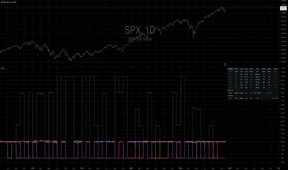
Mebane Faber GTAA 5In 2007, Mebane Faber published research that challenged the conventional wisdom of buy-and-hold investing. His paper, titled "A Quantitative Approach to Tactical Asset Allocation" and published in the Journal of Wealth Management, demonstrated that a simple timing mechanism could reduce portfolio volatility and drawdowns while maintaining competitive returns (Faber, 2007). This indicator implements his Global Tactical Asset Allocation strategy, known as GTAA5, following the original methodology.
The core insight of Faber's research stems from a century of market data. By analyzing asset class performance from 1901 onwards, Faber found that a ten-month simple moving average served as an effective trend filter across major asset classes. When an asset trades above its ten-month moving average, it tends to continue its upward trajectory; when it falls below, significant drawdowns often follow (Faber, 2007, pp. 12-16). This observation aligns with momentum research by Jegadeesh and Titman (1993), who documented that intermediate-term momentum persists across equity markets.
The GTAA5 strategy allocates capital equally across five diversified asset classes: domestic equities (SPY), international developed markets (EFA), aggregate bonds (AGG), commodities (DBC), and real estate investment trusts (VNQ). Each asset receives a twenty percent allocation when trading above its ten-month moving average. When an asset falls below this threshold, its allocation moves to short-term treasury bills (SHY), creating a dynamic cash position that scales with market risk (Cambria Investment Management, 2013).
The strategy's historical performance during market crises illustrates its function. During the 2008 financial crisis, traditional sixty-forty portfolios experienced drawdowns exceeding forty percent. The GTAA5 strategy limited losses to approximately twelve percent by reducing equity exposure as prices declined below their moving averages (Faber, 2013). This asymmetric return profile represents the strategy's primary characteristic.
This implementation uses monthly closing prices retrieved via request.security() to calculate the ten-month simple moving average. This distinction matters, as approximations using daily data (such as a 200-day moving average) can generate different signals during volatile periods. Monthly data ensures the indicator produces signals consistent with published academic research.
The indicator provides position monitoring, automatic rebalancing detection on either the first or last trading day of each month, and share calculations based on user-defined capital. A dashboard displays current trend status for each asset class, target versus actual weightings, and trade instructions for rebalancing. Performance metrics including annualized volatility and Sharpe ratio provide ongoing risk assessment.
Several limitations warrant acknowledgment. First, the strategy rebalances monthly, meaning it cannot respond to intra-month market crashes. Second, transaction costs and taxes from monthly rebalancing may reduce net returns for taxable accounts. Third, the ten-month lookback period, while historically robust, offers no guarantee of future effectiveness. As Ilmanen (2011) notes in "Expected Returns", all timing strategies face the risk of regime change, where historical relationships break down.
This indicator serves educational purposes and portfolio monitoring. It does not constitute financial advice.
References:
Cambria Investment Management (2013). Global Tactical Asset Allocation: An Introduction to the Approach. Research Report, Los Angeles.
Faber, M.T. (2007). A Quantitative Approach to Tactical Asset Allocation. Journal of Wealth Management, Spring 2007, pp. 9-79.
Faber, M.T. (2013). Global Asset Allocation: A Survey of the World's Top Asset Allocation Strategies. Cambria Investment Management, Los Angeles.
Ilmanen, A. (2011). Expected Returns: An Investor's Guide to Harvesting Market Rewards. John Wiley and Sons, Chichester.
Jegadeesh, N. and Titman, S. (1993). Returns to Buying Winners and Selling Losers: Implications for Stock Market Efficiency. Journal of Finance, 48(1), pp. 65-91.
DTR SL-TPDTR SL-TP is a simple risk-management indicator designed to automatically plot stop-loss and take-profit levels based on the current market price. It helps traders visualize their risk-to-reward setup directly on the chart, making trade planning faster and more consistent.
The indicator uses two main inputs: a Stop Loss Percentage and a Take Profit Multiplier. The stop loss is calculated by reducing the current price by the chosen percentage. The take profit level is set by multiplying that same percentage by the Take Profit Multiplier and adding it to the current price. This creates a dynamic stop-loss and take-profit pair that updates with every candle.
The stop-loss line is plotted in red, and the take-profit line is plotted in green for immediate visual clarity. Traders can adjust the percentage and multiplier to match their personal risk tolerance or strategy requirements.
DTR SL-TP is useful for any style of trading that requires predefined exit levels, including scalping, day trading, and swing trading. It helps maintain discipline, enforce consistent risk management, and quickly evaluate whether a potential trade offers an acceptable reward-to-risk ratio.

ZY Target TerminatorThe indicator generates trading signals. The profitability displayed on the signal at the time it is generated is the maximum profitability of the trade opened with the preceding signal. Therefore, avoid trading pairs and trends where this ratio is insufficient.

Position Sizing Calculator (Real-Time) - Futures Edition█ SUMMARY
The following indicator is a Position Sizing Calculator based on Average True Range (ATR), originally developed by market technician J. Welles Wilder Jr., intended for real-time trading.
This script utilizes the user's account size, acceptable risk percentage, and a stop-loss distance based on ATR to dynamically calculate the appropriate position size for each trade in real time.
█ BACKGROUND
Developed for use on the Micro E-mini Nasdaq-100 futures (MNQ), this script provides traders with continuously updated dynamic position sizes. It enables traders to instantly determine the exact number of contracts to use when entering a trade while staying within their acceptable risk tolerance.
This real-time position sizing tool helps traders make well-informed decisions when planning trade entries and calculating maximum stop-loss levels, ultimately enhancing risk management.
█ USER INPUTS
Trading Account Size: Total dollar value of the user's trading account.
Acceptable Risk (%): Maximum percentage of the trading account that the user is willing to risk per trade.
ATR Multiplier for Stop-Loss: Multiplier used to determine the distance of the stop-loss from the current price, based on the ATR value.
ATR Length: The length of the lookback period used to calculate the ATR value.
Show Target Risk Row: Toggle to hide/show the Target Risk Row
SL Levels Display: Option to see Both, Long Only, Short Only, or None of the Stop Loss Level Values.
Contract Point Value ($): Point value per contract. Tooltip highlights common values.
Tick Size: Minimum Price Movement (Default set to 0.25)
Minimum Contracts: Override the Minimum Contracts per trade to a user selected value.
(May Exceed User's Target Risk)

2-Year Real RateThe 2-year real rate is the inflation-adjusted yield on a 2-year U.S. Treasury—essentially the market’s expectation for short-term “true” interest rates after subtracting expected inflation (often approximated as nominal 2Y yield – breakeven inflation).
It matters because it reflects the actual cost of capital and is one of the cleanest gauges of the Fed’s effective stance: rising real rates mean tightening financial conditions, falling real rates mean loosening. In trading, the 2Y real rate is a powerful macro risk-on/risk-off indicator—equities, long-duration tech, crypto, and EM FX generally weaken when real rates rise, while USD and front-end rate-sensitive trades tend to strengthen. Watching inflections in the 2Y real rate helps you time shifts in liquidity, gauge how aggressively the market is pricing Fed moves, and position for cross-asset trends driven by changes in real funding conditions.

RS-Momentum Score (0–10) — v6 CleanWHAT THIS INDICATOR DOES
This code gives you:
✔ Full 0–10 RS-Momentum scoring system
Trend
Momentum
RS vs Nifty
Volume
✔ BUY / HOLD / SELL signals
BUY = Score ≥ 7
HOLD = 4–6.99
SELL = < 4

Myfxschool V1Introducing the MyFXSchool Leading Indicator™, a next-generation market prediction tool designed exclusively for traders who want accuracy, clarity, and early trend identification. Built using advanced price-action logic, institutional order-flow concepts, and dynamic volatility algorithms, this indicator gives you a true leading advantage—not just lagging signals.

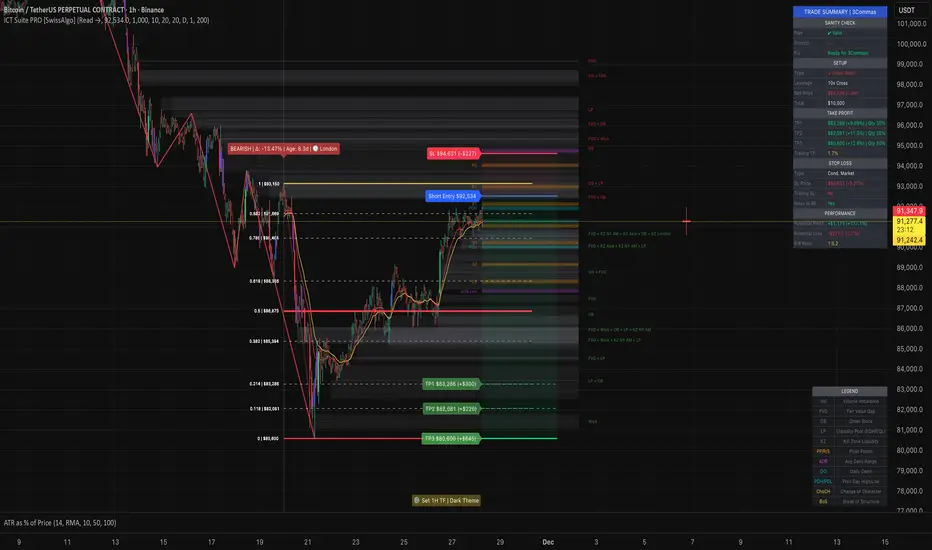
ICT Smart Money Trading Suite PRO [SwissAlgo]ICT SMC Trading Suite Pro
Structure Detection. Imbalance Tracking. Trade Planning. Contextual Alerts.
Why This Integrated System Was Built
The ICT/SMC methodology requires tracking multiple analytical components simultaneously - a process prone to manual errors, time inefficiency, and visual clutter . This indicator consolidates these elements into a single, unified system , providing rules-based validation for experienced ICT traders who may struggle with execution speed, consistency, and manual calculations.
-----------------------------------------------------------------
What This Indicator Does
ICT/SMC methodology involves tracking multiple analytical components simultaneously. This indicator consolidates them into a single system.
Common challenges when applying ICT manually:
1️⃣ Structure Identification
Determining which pivots qualify as external (macro) structure versus internal (micro) structure requires consistent rules. Inconsistent structure identification affects the detection of the relevant trading range for entries , Change of Character (ChoCH) , and Break of Structure (BoS) . Accurate structure identification is paramount ; a faulty reading invalidates the entire ICT thesis for the current swing. While no automated system can replace human judgment, the indicator provides you with a rules-based starting point for structural analysis. The key goal is to help you find and map the relevant structural leg to focus on.
2️⃣ Chart Organization
Drawing Fibonacci retracements, Fair Value Gaps, Order Blocks, and other imbalances manually creates visual complexity that can obscure the analysis. The indicator addresses this by striving to show all imbalances in a consistent, unified, and understandable visual way , using color coding and z-order layering to maintain clarity even when multiple components are active.
3️⃣ Imbalance Tracking
ICT methodology requires monitoring a vast array of institutional footprints : Fair Value Gaps (FVG), Order Blocks (OB), Breaker Blocks (BB), Liquidity Pools (LP), Volume Imbalances, Wick Imbalances, and Kill Zone ranges. Tracking all these simultaneously and manually monitoring their mitigation status is highly time-intensive and prone to oversight . The indicator constantly scans and tracks all key imbalance types for you, automatically updating their status and creating a dynamic, real-time visual heatmap of unmitigated institutional inefficiency.
4️⃣ Trade Calculation
Determining structure-based Stop Loss (SL) placement, calculating multiple Take Profit (TP) levels with accurate position-sizing splits, and computing the final blended Risk-to-Reward (R:R) ratio involves multiple time-sensitive, manual calculations per setup . The indicator automates this entire trade calculation process for you, instantly providing the necessary pricing (entry, SL, TP), sizing, and performance projections, and mitigating the risk of execution error .
5️⃣ Condition Monitoring
ICT setups often require specific technical conditions to align: price reaching discount Fibonacci levels (0.618-0.882 for shorts, 0.118-0.382 for longs), EMA crossovers confirming momentum, or structural shifts (ChoCH/BoS). Identifying these moments requires continuous chart observation across multiple assets and timeframes.
This indicator includes an alert system that monitors these technical conditions and sends notifications when they occur (real-time). The alert system is designed to minimize spam. This allows traders to review potential setups on demand rather than through continuous observation - particularly relevant for those monitoring multiple instruments or trading sessions outside their local timezone.
-----------------------------------------------------------------
Intended Use
This indicator is designed for traders who:
♦ Apply ICT/SMC methodology - Familiarity with concepts such as Fair Value Gaps, Order Blocks, Liquidity Pools, market structure, and discount/premium zones is assumed. The indicator does not teach these concepts but provides tools to apply them.
♦ Trade on intraday to swing timeframes - The structure detection and Fibonacci zone mapping work across multiple timeframes. Recommended primary timeframe: 1H (adjustable based on trading approach).
♦ Prefer systematic entry planning - The trade calculation feature computes stop loss, take profit levels, and risk-to-reward ratios based on structure and Fibonacci positioning. Suitable for traders who use defined entry criteria.
♦ Monitor multiple instruments or sessions - The alert functionality notifies when specific technical conditions occur (discount zone entries, EMA crossovers, structure changes), reducing the need for continuous manual monitoring.
♦ Use trade execution platforms - The trade summary table displays pre-formatted values (entry, SL, TP levels with quantity splits) that can be manually input into trading platforms or bot services like 3Commas.
-----------------------------------------------------------------
How To Use
Step 1: Structure Analysis
The indicator automatically detects external and internal market structure using pivot analysis. Structure lines are color-coded: red for bearish structure, green for bullish. External pivots are marked with larger triangles, internal pivots with smaller markers. The pivot length parameters (default: 20/20) can be adjusted in settings to align with your structural analysis approach and the asset you are analyzing.
Step 2: Define Your Trading Zone
Use the "Start Swing" and "End Swing" date inputs to mark the beginning and end of the (external) structural leg you wish to analyze. The indicator calculates Fibonacci retracement levels based on these points and color-codes the zones:
* Green zones: Discount area (0.618-0.882 for bearish / 0.118-0.382 for bullish)
* Yellow zones: Premium area (0.786-1.0 for bearish / 0.0-0.214 for bullish)
* Red zones: Extension area beyond structure (potential fake-out zones)
Step 3: Review Imbalances
The indicator identifies and displays multiple imbalance types:
🔥 Volume imbalances (from displacement candles based on PVSRA methodology)
🔥 Fair Value Gaps (FVG)
🔥 Order Blocks (OB) and Breaker Blocks (BB)
🔥 Liquidity Pools (LP) at equal highs/lows
🔥 Wick imbalances (exceptional wick formations)
🔥 Kill Zone liquidity from specific trading sessions (Asian, London, NY AM)
Volume Imbalances
Fair Value Gaps
Order Blocks
Liquidity Pools
Wick Imbalances
Kill Zone Imbalances
According to ICT methodology, imbalances act as price magnets - areas where price tends to return for mitigation. When multiple imbalances overlap at the same price level, this creates a confluence zone with a higher probability of price reaction .
Imbalances are displayed as gray boxes , creating a visual heatmap of institutional inefficiencies. When imbalances overlap, the zones appear darker due to layering, and labels combine to show confluence (e.g., "FVG + OB" or "Vol + LP").
Heatmap of Imbalances
User can view each type alone, or all together (heatmap)
Each imbalance type is tracked until mitigated by price according to ICT principles and can be toggled on/off independently in settings.
Step 4: Reference Levels & Sessions
The indicator displays additional reference data:
🔥 Daily Pivot Points (PP, R1-R3, S1-S3) calculated from previous day
🔥Average Daily Range (ADR) projected from the current day's extremes
🔥 Daily OHLC levels: Today's Open (DO), Previous Day High (PDH), Previous Day Low (PDL)
🔥Session backgrounds (optional): Color-coded boxes for Asian, London, NY AM, and NY PM sessions
Sessions
While these are not ICT-specific imbalances, they represent widely-watched price levels that often attract institutional activity and can act as additional reference points for support, resistance, and liquidity targeting.
All reference levels can be toggled independently in settings.
Step 5: Momentum Reference
EMA 14 and EMA 21 lines are displayed for momentum analysis. When EMA 14 enters discount zones and crosses EMA 21, a triangle marker appears on the chart. This indicates a potential alignment of structure and momentum conditions.
Step 6: Trade Planning
Input your intended entry price in the "Entry Price" field along with your margin and leverage parameters. The indicator automatically calculates all trade parameters:
* Stop loss level (based on Fibonacci structure - typically at 1.118 extension)
* Three take profit levels (TP1, TP2, TP3) with position quantity splits
* Risk-to-reward ratio (blended across all three targets)
* Projected profit/loss values in both dollars and percentage
All calculated values are displayed both visually on the chart (as horizontal lines with labels) and in a formatted Trade Summary table. The table organizes the information for quick reference: entry details, take profit levels with quantities, stop loss parameters, and performance projections.
This pre-calculated data can be manually copied into trading platforms or bot services (such as 3Commas Smart Trades) without requiring additional calculations.
Step 7: Alert Configuration
Create alerts using TradingView's alert system (select "Any alert() function call"). The indicator sends notifications when:
* Price reaches specific discount Fibonacci levels (0.618, 0.786, 0.882 for shorts / 0.382, 0.214, 0.118 for longs)
* EMA 14/21 crossovers occur within discount zones
* Change of Character (ChoCH) is detected
* Break of Structure (BoS) is detected
Note: Alerts require active TradingView alert functionality. Update alerts when changing your trading zone parameters.
-----------------------------------------------------------------
Key Features
Structure & Zone Analysis
* Automated structure detection with external/internal pivots and zig-zag visualization
* Fibonacci retracement mapping with color-coded discount/premium zones
* Visual zone classification: Green (optimal discount), Yellow (premium), Red (fake-out risk)
ICT Imbalances Heatmap
* Volume imbalances (PVSRA displacement candles)
* Fair Value Gaps (FVG)
* Order Blocks (OB) and Breaker Blocks (BB)
* Liquidity Pools (LP) at equal highs/lows
* Wick imbalances (exceptional wick formations)
* Kill Zone liquidity (Asian, London, NY AM sessions)
* Confluence detection with combined labels and visual layering
Reference Levels
* Daily Pivot Points (PP, R1-R3, S1-S3)
* Average Daily Range (ADR) projections
* Daily OHLC levels (DO, PDH, PDL)
* Session backgrounds for kill zones
Trade Planning Tools
* Automated stop loss calculation based on Fibonacci structure
* Three-tier take profit system with position quantity splits
* Risk-to-reward ratio calculation (blended across all targets)
* P&L projections in dollars and percentages
* Trade Summary table formatted for manual platform entry
Momentum & Signals
* EMA 14/21 overlay for momentum analysis
* Visual crossover markers (triangles) in discount zones
* Change of Character (ChoCH) detection and labels
* Break of Structure (BoS) detection and labels
Chart Enhancements
* Higher timeframe candle overlay (5m to Monthly)
* PVSRA candle coloring (volume-based)
* Symbol legend for quick reference
* Customizable visual elements (toggle all components independently)
Alert System
* Discount zone entry notifications (Fibonacci level monitoring)
* EMA crossover signals within discount zones
* Structure change alerts (ChoCH and BoS)
* Configurable via TradingView alert functionality
Alert Functionality
The indicator includes an alert system that monitors technical conditions continuously.
When configured, alerts notify users when specific events occur:
❗ Discount Zone Monitoring
When EMA 14 crosses into key Fibonacci levels (0.618, 0.786, 0.882 for bearish structure / 0.382, 0.214, 0.118 for bullish structure), an alert is triggered. Example: Trading BTC and ETH simultaneously - instead of monitoring both charts for zone entries, alerts notify when either asset reaches the specified level.
❗ Momentum Alignment
When EMA 14 crosses EMA 21 within discount zones, an alert is sent. Example: Monitoring setups across multiple timeframes (1H, 4H, Daily) - alerts indicate when momentum conditions align on any timeframe being tracked.
❗ Structure Changes
Change of Character (ChoCH) and Break of Structure (BoS) events trigger alerts. Example: Trading during the Asian session while located in a different timezone - alerts notify of structure changes occurring outside active monitoring hours.
Configuration
Alerts are set up through TradingView's native alert system. Select "Any alert() function call" when creating the alert.
⚠️ Note: Alert parameters are captured at creation time, so alerts must be updated when changing trading zone settings (Start/End Swing dates) or any other parameter.
How to Create Alerts
Step 1: Open Alert Creation
Click the "Alert" button (clock icon) in the top toolbar of TradingView, or right-click on the chart and select "Add Alert."
Step 2: Configure Alert Condition
* In the alert dialog, set the Condition dropdown to select this indicator
* Set the alert type to ⚠️ " Any alert() function call "
* This configuration allows the indicator to trigger alerts based on its internal logic
Step 3: Set Alert Timing
* Timeframe: Same as chart
* Expiration: Choose "Open-ended (when triggered)" to keep the alert active until conditions occur
* Message tab: choose a name for the alert
Step 4: Notification Settings
Configure how you want to receive notifications:
* Popup within TradingView
* Email notification
* Mobile app push notification (requires TradingView mobile app)
Step 5: Create
Important Notes:
* Alert parameters are captured at creation time . If you change your trading zone (Start/End Swing dates) or entry price, delete the old alert and create a new one .
* One alert per chart: Create separate alerts for each instrument and timeframe you're monitoring.
* TradingView alert limits apply based on your TradingView subscription tier.
What Triggers Alerts: This indicator sends alerts for four key event types:
1. Discount Zone Entry - EMA 14 crossing key Fibonacci levels
2. Momentum Crossover - EMA 14/21 crossovers within discount zones
3. Change of Character (ChoCH) - Structure reversal detected
4. Break of Structure (BoS) - Trend continuation confirmed
All four conditions are monitored by a single alert configuration .
-----------------------------------------------------------------
Recommended Settings
* Timeframe : 1H works well for most assets
* Theme : Dark mode recommended
* Structural Pivots : Default 20/20 captures reasonable structure; adjust to match your analysis
-----------------------------------------------------------------
Chart Elements Guide
♦ Structure Visualization
Zig-zag lines
Automated structure detection - green lines indicate bullish structure, red lines indicate bearish structure. Thick lines represent external structure , thin faded lines show internal structure .
Triangle markers
Large triangles mark external pivots (swing highs/lows), small triangles mark internal pivots.
Fibonacci Zones
* Green zones: Discount area - potential entry zones (0.618-0.882 for shorts / 0.118-0.382 for longs)
* Yellow zones: Premium area - higher extension zones (0.786-1.0 for shorts / 0.0-0.214 for longs)
* Red zones: Fake-out risk area - price beyond structural extremes (above 1.0 for shorts / below 0.0 for longs)
* White dashed lines: Individual Fibonacci levels (1.0, 0.882, 0.786, 0.618, 0.5, 0.382, 0.214, 0.118, 0.0)
♦ Imbalance Heatmap
Gray boxes with dotted midlines
Unmitigated imbalances create a visual heatmap. Overlapping imbalances appear darker due to layering.
Combined labels
When multiple imbalances overlap, labels show confluence (e.g., "FVG + OB", "Vol + LP + Wick")
Types displayed : Vol (Volume), FVG (Fair Value Gap), OB (Order Block), BB (Breaker Block), LP (Liquidity Pool), Wick, KZ (Kill Zone)
♦ Momentum Indicators
* Red line: EMA 14
* Yellow line: EMA 21
* Small triangles on price: Crossover signals - red triangle (bearish crossover), green triangle (bullish crossover) when occurring within discount zones
♦ Structure Change Markers
* Labels with checkmarks/crosses: ChoCH (Change of Character) and BoS (Break of Structure) events (Green label with ✓: Bullish ChoCH or BoS, Red label with ✗: Bearish ChoCH or BoS)
♦ Trade Planning Lines (when entry price is set)
* Blue horizontal line: Entry price
* Green dashed lines: TP1 and TP2
* Green solid line: TP3 (final target)
* Red horizontal line: Stop Loss level
TP levels and SL are calculated based on the structure range, entry price, and mapped trading zone, and aim to achieve a minimum risk: reward ratio of 1:1.5 (R:R)
♦ Colored background zones:
Green shading between entry and TP3 (profit zone), red shading between entry and SL (loss zone)
♦ Reference Levels
* Orange dotted lines with labels: Daily Pivot Points (PP, R1-R3, S1-S3)
* Purple dotted lines with labels: ADR High and ADR Low projections
* Cyan dotted lines with labels: DO (Daily Open), PDH (Previous Day High), PDL (Previous Day Low)
♦ Session Backgrounds (optional)
* Yellow shaded box: Asian session (19:00-00:00 NY time)
* Blue shaded box: London session (02:00-05:00 NY time)
* Green shaded box: NY AM session (09:30-11:00 NY time)
* Orange shaded box: NY PM session (13:30-16:00 NY time)
♦ Trade Summary Table (top-right corner)
Displays a complete trade plan with sections:
* Sanity Check: Plan validation status
* Setup: Trade type, leverage, entry price, position size
* Take Profit: TP1, TP2, TP3 with prices, percentages, and quantity splits
* Stop Loss: SL price and type
* Performance: Potential profit/loss, ROI, and risk-to-reward ratio
♦ HTF Candle Overlay (optional, displayed to the right of the current price)
* Larger candlesticks representing higher timeframe price action
* Green bodies: Bullish HTF candles
* Red bodies: Bearish HTF candles
* Label shows selected timeframe (e.g., "HTF→ D" for daily)
♦ Legend Table (bottom-right corner)
Quick reference guide explaining all symbol abbreviations and color codes used on the chart.
-----------------------------------------------------------------
Methodology & Calculation Details
This indicator consolidates multiple ICT/SMC analytical components into a single integrated system. While individual elements could be created separately, this integration provides automated coordination between components , consistency, and reduces chart complexity.
Structure Detection External and internal pivots
Are identified using fractal pivot analysis with configurable lookback periods (default: 20 bars for both). A pivot high is confirmed when the high at the pivot bar exceeds all highs within the lookback range on both sides. Pivot lows use inverse logic. Structure lines connect validated pivots, with color coding based on price direction (higher highs/higher lows = bullish, lower highs/lower lows = bearish).
Fibonacci Retracement Calculation
Users define two swing points via date/time inputs. The indicator calculates the price range between these points and applies standard Fibonacci ratios (0.0, 0.118, 0.214, 0.382, 0.5, 0.618, 0.786, 0.882, 1.0, plus extensions at 1.118, 1.272, -0.118, -0.272). Zone classification is based on ICT discount/premium principles: 0.618-1.0 range for bearish setups, 0.0-0.382 for bullish setups.
Imbalance Identification
Volume Imbalances : Detected using PVSRA (Price, Volume, Support, Resistance Analysis) methodology. Candles are classified based on the percentile ranking of volume and price range over a 1344-bar lookback period. Type 1 imbalances require ≥95th percentile in both volume and range; Type 2 requires ≥85th percentile. Additional filters include body-to-range ratio (≥50% for Type 1, ≥30% for Type 2) and ATR validation.
Fair Value Gaps (FVG) : Identified when a three-candle sequence shows a price gap: low > high for bullish FVG, high < low for bearish FVG. The middle candle must close beyond the gap edge. Mitigation occurs when the price retraces into the gap.
Order Blocks (OB) : Detected by identifying the last opposing candle before a significant price move. When price breaks a swing high/low, the algorithm scans backwards to find the candle with the highest high (bearish OB) or lowest low (bullish OB) before the breakout. When an OB is breached, it converts to a Breaker Block (BB).
Liquidity Pools (LP) : Identified by detecting equal highs or equal lows using a tolerance threshold based on ATR. Pivot highs/lows within this tolerance range are grouped. Equal highs create Buy-Side Liquidity (BSL) zones above the level; equal lows create Sell-Side Liquidity (SSL) zones below the level.
Wick Imbalances: Flagged when a candle's wick exceeds 1.0x ATR and comprises >50% of the total candle range. These represent rapid rejections or absorption events.
Kill Zone Liquidity: Tracks the high/low range during specific ICT-defined sessions (Asian: 19:00-00:00 NY, London: 02:00-05:00 NY, NY AM: 09:30-11:00 NY). At session close, BSL and SSL zones are created above/below the session range.
Change of Character (ChoCH) & Break of Structure (BoS)
ChoCH is detected when price breaks counter to the established structure (bearish structure broken upward = bullish ChoCH; bullish structure broken downward = bearish ChoCH). BoS occurs when price breaks in the direction of the established trend (bearish structure breaking lower = bearish BoS; bullish structure breaking higher = bullish BoS).
Trade Calculations
Stop Loss and Take Profit levels are calculated based on the entry position within the Fibonacci zone structure:
* Premium entries (0.786-1.0 for shorts / 0.0-0.214 for longs): SL at 1.118/-0.118 extension, TP structure weighted toward zone extremes
* Golden entries (0.618-0.786 for shorts / 0.214-0.382 for longs): SL at 1.0/0.0 boundary, TP structure balanced across range
Risk-to-reward ratios are calculated as blended values across all three take profit levels, weighted by position quantity splits.
Reference Level Calculations
* Pivot Points: Standard formula using previous day's high, low, and close: PP = (H + L + C) / 3
* Support/Resistance: R1 = 2×PP - L, S1 = 2×PP - H, with R2/S2 and R3/S3 calculated using range extensions
* ADR: 14-period simple moving average of daily high-low range, projected from current day's extremes
Momentum Analysis
EMA 14 and EMA 21 use standard exponential moving average calculations. Crossovers are detected when EMA 14 crosses EMA 21 within user-defined discount zones, with directional confirmation (cross under in bearish discount = short signal; cross over in bullish discount = long signal).
Why This Integration Matters
While components like EMA crossovers, pivot detection, or Fibonacci retracements exist as separate indicators, this system provides:
1. Coordinated Analysis : All components reference the same structural framework (user-defined trading zone)
2. Automated Mitigation Tracking : Imbalances are monitored continuously and removed when mitigated according to ICT principles
3. Contextual Alerts : Notifications are triggered only when conditions align within the defined structural context
4. Trade Parameter Automation : Stop loss and take profit calculations adjust dynamically based on entry positioning within the structure
5. Consistent Visual Display : All elements use a unified color scheme, labeling system, and z-order layering. This eliminates visual conflicts that occur when stacking multiple independent indicators (overlapping lines, label collisions, inconsistent transparency levels, conflicting color schemes).
This consolidation reduces the need to manually coordinate 8-10 separate indicators, eliminates redundant calculations across disconnected tools, and maintains visual clarity even when all components are displayed simultaneously.
-----------------------------------------------------------------
Disclaimer
1. Indicator Functionality and Purpose
This indicator is solely a technical analysis tool built upon established methodologies (Smart Money Concepts/ICT) and statistical calculations (Pivots, Fibonacci, EMAs). It is designed to assist experienced traders in visualizing complex data, streamlining the analytical workflow, and automating conditional alerting.
The indicator is NOT:
♦ Financial Advice: It does not provide personalized investment recommendations, solicited advice, or instruction on buying, selling, or holding any financial instrument.
♦ A Guarantee of Profit: The presence of a signal, alert, or trade plan output by this tool does not guarantee that any trade will be profitable.
♦ A Predictor of Future Prices: The tool calculates probabilities and potential scenarios based on historical data and current structure; it does not predict future market movements.
2. General Trading Risks and Capital Loss
♦ All trading involves substantial risk of loss. You may lose some or all of your initial capital. Leveraged products, such as futures, CFDs, and margin trading, carry a high degree of risk and are not suitable for all investors.
♦ Risk Acknowledgment: By using this indicator, you acknowledge and accept that you are solely responsible for all trading decisions, and you bear the full risk of any resulting profit or loss.
♦ Risk Management is Crucial: This indicator is an analytical tool only. You must employ independent risk management techniques (position sizing, stop-loss orders) tailored to your personal financial situation and risk tolerance.
3. Calculation Limitations and Non-Real-Time Data
The calculations performed by this indicator are based on the data provided by your charting platform (e.g., TradingView).
♦ Data Accuracy: The accuracy of the outputs (e.g., Price Delivery Arrays, Pivots, P&L projections) is dependent on the accuracy and real-time nature of the underlying market data feed.
♦ Latencies: Trade alerts and signals may be subject to minor delays due to server processing, internet connectivity, or charting platform performance. Do not rely solely on alerts for execution.
♦ Backtesting and Performance: Any depiction of past performance, including data visible on the chart, is not indicative of future results. Trading results will vary based on market conditions, liquidity, and execution speed.
4. Software and Platform Disclaimer
"As Is" Basis: The indicator is provided on an "as is" basis without warranties of any kind, whether express or implied. The author does not guarantee the script will be error-free or operate without interruption.
Third-Party Integration: This indicator is not affiliated with, endorsed by, or connected to TradingView, 3Commas, or any other broker or execution platform. All third-party names are trademarks of their respective owners. The formatting of the Trade Summary Table for 3Commas is for user convenience only.
5. Required Competency (User Responsibility)
This indicator is built on the assumption that the user is an experienced trader with a working understanding of the complex concepts being visualized (ICT/SMC, FVG, Order Blocks, Liquidity, etc.). The indicator does not teach these concepts.
You Must Always Do Your Own Research (DYOR) before making any trading decision based on signals or visualization provided by this tool.
By installing and using this indicator, you explicitly agree to these terms and assume full responsibility for all trading activity.
Multi-Mode Grid StrategyGrid Strategy (SIMPLE)
█ Overview
This script is a system trading tool designed to generate cash flow from market volatility without relying on short-term directional predictions. It operates on the principle of Grid Trading , creating a mesh of buy and sell orders within a user-defined price range.
The strategy automates the process of "buying the dip" and "selling the bounce" repeatedly. It is most effective in sideways markets or during accumulation phases where the price oscillates within a specific channel.
█ TRADING MINDSET & SETUP GUIDE
To use this tool effectively, you must shift your perspective from "Sniper" (trying to hit the perfect entry) to "Manager" (managing a zone). Here is the required mindset for setting up this strategy:
Shift from Prediction to Range Definition
Don't ask: "Will the price go up or down tomorrow?"
Ask instead: "What is the price range the asset is unlikely to break out of in the coming weeks?"
Your primary job is to define the Grid Top Price (Ceiling) and Grid Bottom Price (Floor). As long as the price stays within this "Arena," the strategy will continue to execute trades.
Embrace Volatility as Fuel
For a trend follower, chop/sideways action is a nightmare. For a Grid Trader, it is fuel. Every time the price crosses a grid line down, it builds inventory. Every time it crosses back up, it realizes profit. You want the price to wiggle as much as possible within your defined boundaries.
Capital Allocation & Survivability
The biggest risk in grid trading is the price crashing below your Grid Bottom Price .
Mindset Check: Before launching, assume the price WILL drop to your bottom price immediately. Can your account handle that drawdown?
The script includes leverage and capital percentage inputs to help you size your position correctly. Never allocate 100% of your capital to a tight range without understanding the liquidation risk.
█ HOW IT WORKS
Grid Construction:
The script divides the space between your Upper Border and Lower Border into specific levels based on the Grid Quantity .
- Arithmetic: Equal spacing between lines (Standard).
- Geometric: Spacing based on mathematical ratios (useful for wider ranges).
Execution Logic:
- Entry: When price crosses below a grid line, a Long position is opened.
- Exit: When price bounces back up by a specific number of grid levels (defined by "Distance of TP"), the specific position is closed for a profit.
Time & Backtesting:
You can set specific Start and End Times . This allows you to backtest how the grid would have performed during specific historical volatility events before deploying it on live markets.
█ VISUALIZATION DASHBOARD
To keep you informed without cluttering the chart, the script features an information table at the bottom right:
Cash Out: Total realized profit booked into the account.
Open Position: How many grid levels are currently active (holding bags) vs. total levels.
Open Trade: The current floating P/L of held positions (Unrealized).
Max Drawdown: The deepest drawdown the strategy experienced during the test period.
RISK DISCLAIMER
Grid trading involves significant risk, particularly in strong trending markets that break out of your range against your position. This strategy does not use a stop-loss per trade; it relies on the user defining a safe "Bottom Price" and allocating capital accordingly. Past performance in backtesting does not guarantee future results. This script is a tool for execution and analysis, not financial advice.

ATR Risk Manager v5.2 [Auto-Extrapolate]If you ever had problems knowing how much contracts to use for a particular timeframe to keep your risk within acceptable levels, then this indicator should help. You just have to define your accepted risk based on ATR and also percetage of your drawdown, then the indicator will tell you how many contracts you should use. If the risk is too high, it will also tell you not to trade. This is only for futures NQ MNQ ES MES GC MGC CL MCL MYM and M2K.

Multi-Ticker Anchored CandlesMulti-Ticker Anchored Candles (MTAC) is a simple tool for overlaying up to 3 tickers onto the same chart. This is achieved by interpreting each symbol's OHLC data as percentages, then plotting their candle points relative to the main chart's open. This allows for a simple comparison of tickers to track performance or locate relationships between them.
> Background
The concept of multi-ticker analysis is not new, this type of analysis can be extremely helpful to get a gauge of the over all market, and it's sentiment. By analyzing more than one ticker at a time, relationships can often be observed between tickers as time progresses.
While seeing multiple charts on top of each other sounds like a good idea...each ticker has its own price scale, with some being only cents while others are thousands of dollars.
Directly overlaying these charts is not possible without modification to their sources.
By using a fixed point in time (Period Open) and percentage performance relative to that point for each ticker, we are able to directly overlay symbols regardless of their price scale differences.
The entire process used to make this indicator can be summed up into 2 keywords, "Scaling & Anchoring".
> Scaling
First, we start by determining a frame of reference for our analysis. The indicator uses timeframe inputs to determine sessions which are used, by default this is set to 1 day.
With this in place, we then determine our point of reference for scaling. While this could be any point in time, the most sensible for our application is the daily (or session) open.
Each symbol shares time, therefore, we can take a price point from a specified time (Opening Price) and use it to sync our analysis over each period.
Over the day, we track the percentage performance of each ticker's OHLC values relative to its daily open (% change from open).
Since each ticker's data is now tracked based on its opening price, all data is now using the same scale.
The scale is simply "% change from open".
> Anchoring
Now that we have our scaled data, we need to put it onto the chart.
Since each point of data is relative to it's daily open (anchor point), relatively speaking, all daily opens are now equal to each other.
By adding the scaled ticker data to the main chart's daily open, each of our resulting series will be properly scaled to the main chart's data based on percentages.
Congratulations, We have now accurately scaled multiple tickers onto one chart.
> Display
The indicator shows each requested ticker as different colored candlesticks plotted on top of the main chart.
Each ticker has an associated label in front of the current bar, each component of this label can be toggled on or off to allow only the desired information to be displayed.
To retain relevance, at the start of each session, a "Session Break" line is drawn, as well as the opening price for the session. These can also be toggled.
Note: The opening price is the opening price for ALL tickers, when a ticker crosses the open on the main chart, it is crossing its own opening price as well.
> Examples
In the chart below, we can see NYSE:MCD NASDAQ:WEN and NASDAQ:JACK overlaid on a NASDAQ:SBUX chart.
From this, we can see NASDAQ:JACK was the top gainer on the day. While this was the case, it also fell roughly 4% from its peak near lunchtime. Unlike the top gainer, we can see the other 3 tickers ended their day near their daily high.
In the explanations above, the daily timeframe is used since it is the default; however, the analysis is not constrained to only days. The anchoring period can be set to any timeframe period.
In the chart below, you can observe the Daily, Weekly, and Monthly anchored charts side-by-side.
This can be used on all tickers, timeframes, and markets. While a typical application may be comparing relevant assets... the script is not limited.
Below we have a chart tracking COMEX:GCV2026 , FX:EURUSD , and COINBASE:DOGEUSD on the AMEX:SPY chart.
While these tickers are not typically compared side-by-side, here it is simply a display of the capabilities of the script.
Enjoy!
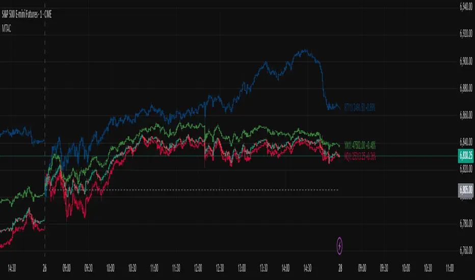
Trade Box Position Calculator (Pro-V2)Trade Box Position Calculator (Pro) is a visual risk management and position sizing tool that overlays a clean trade box directly on your chart. Instead of typing numbers in a calculator, you simply click on the chart to set your Entry, Target, and Stop levels, and the script builds a full trade map around them.
You define your Wallet Value and Risk % per trade, then the script automatically calculates:
Position size (Qty) based on distance from Entry to Stop
Total trade value
Monetary risk per trade
Potential profit and Risk:Reward ratio
Live open P&L as price moves
The trade is visualized as:
A green profit box between Entry and Target
A red risk box between Entry and Stop
Colored horizontal lines for Entry (blue), Target (green), and Stop (red)
Professional labels show detailed info:
Center label: P&L, Qty, Trade value, Risk $, R:R
Target label: distance to target, % move, potential profit $
Stop label: distance to stop, % risk, risk $
All label colors, text sizes, background transparency, and box width/offset can be customized from the settings, so you can adapt the tool to any chart style or theme.
The script also includes smart alerts that automatically follow your levels:
Entry Hit – when price touches your entry zone
Target Hit – when price touches your target
Stop Hit (3 closes) – when price has closed beyond your stop level for 3 consecutive bars (to avoid being faked out by a single wick)
You can either create separate alerts from the alertcondition() entries, or enable the “Use single combined alert()” option and set one alert with “Any alert() function call” so a single alert setup covers Entry, Target, and Stop events.
This tool is designed to help discretionary traders quickly plan trades, visualize risk vs reward on the chart, and keep position sizing consistent with their risk management rules.

Spot for ETH Multiple BuyIndicator Description (English)
This indicator combines SOPR-based on-chain signals, modified Stock-to-Flow zones, daily volume/price aggregation, and VWMA structure to identify potential market bottoms and tops.
It is specifically optimized for Ethereum and works best on the 1-day timeframe for spot buying decisions.
Buy signals appear when several independent conditions align, including SOPR undervaluation, S2F deviation, RSI sentiment, and price–volume inflection points.
Sell signals highlight potential overheated conditions using the same multi-factor framework.
Этот индикатор сочетает в себе сигналы на основе SOPR, модифицированные зоны Stock-to-Flow, ежедневную агрегацию объёма/цены и структуру VWMA для выявления потенциальных днов и вершин рынка.
Он специально оптимизирован для Ethereum и лучше всего работает на однодневном таймфрейме для принятия решений о спотовой покупке.
Сигналы покупки появляются, когда совпадают несколько независимых условий, включая занижение SOPR, отклонение S2F, настроение RSI и точки перегиба цена–объем.
Сигналы продажи подчёркивают потенциальные перегревающие условия с помощью той же многофакторной системы.

Asset Correlation Matrix [PEARSON|BETA|R2]The Market Dilemma: The Liquidity Trap and The Illusion of Diversification
One of the most expensive mistakes in modern trading is the assumption that holding different asset classes—such as Technology Stocks, Crypto, and Commodities—automatically provides safety. In stable economic times, this may be true. However, in environments defined by high liquidity stress or macroeconomic shocks, the correlations between these seemingly distinct assets tend to converge mathematically to 1.0. This phenomenon is known in quantitative finance as "Systemic Coupling." When this occurs, technical analysis on individual charts loses its predictive power because the asset is no longer trading on its own idiosyncratic fundamentals (e.g., earnings or user growth) but is merely acting as a high-beta proxy for global liquidity flows. This toolkit solves this problem by providing an institutional-grade framework to quantify exactly how much "independence" your assets truly possess at any given moment. It objectively separates a "Stock Picker's Market," where individual analysis works, from a "Macro Regime," where only the broader trend matters.
Scientific Foundation: Why Logarithmic Returns Matter
Standard retail indicators often calculate correlation based on simple percentage price changes. This approach is mathematically flawed over longer timeframes due to the compounding effect. This algorithm is grounded in Modern Portfolio Theory (MPT) and utilizes Logarithmic Returns (continuously compounded returns). As established in academic literature by Hudson & Gregoriou (2015), log returns provide time-additivity and numerical stability. This ensures that the statistical relationship measured over a rolling 60-day window is accurate and not distorted by volatility spikes, providing a professional basis for risk modeling.
The Three Pillars of Analysis: Understanding the Metrics
To fully understand market behavior, one must look at the relationship between an asset and a benchmark from three distinct mathematical angles. This indicator allows you to switch between these institutional metrics:
1. Pearson Correlation (Directional Alignment):
This is the classic measure of linear dependence, ranging from -1.0 to +1.0. Its primary value lies in identifying Regime Changes . When the correlation is high (above 0.8), the asset has lost its autonomy and is "locked" with the benchmark. When the correlation drops or turns negative, the asset is "decoupled." This mode is essential for hedging strategies. If you are long Bitcoin and short the Nasdaq to hedge, but their correlation drops to zero, your hedge has mathematically evaporated. This mode warns you of such structural breaks.
2. Beta Sensitivity (Volatility Adjusted Risk):
While Correlation asks "Are they moving together?", Beta asks "How violently are they moving together?". Beta adjusts the correlation by the relative volatility of the asset versus the benchmark. A Beta of 1.5 implies that for every 1% move in the S&P 500, the asset is statistically likely to move 1.5%. This is the single most important metric for Position Sizing . In high-beta regimes, you must reduce position size to maintain constant risk. This mode visualizes when an asset transitions from being a "Defensive Haven" (Beta < 1.0) to a "High Risk Vehicle" (Beta > 1.0).
3. Explained Variance / R-Squared (The Truth Serum):
This is the most advanced metric in the toolkit, rarely found in retail indicators. R-Squared ranges from 0% to 100% and answers the question of causality: "How much of the asset's price movement is purely explained by the movement of the benchmark?" If R2 is 85%, it mathematically proves that 85% of the price action is external noise driven by the market, and only 15% is driven by the asset's own news or chart pattern. Institutional traders use this to filter trades: They seek Low R-Squared environments for alpha generation (breakouts) and avoid High R-Squared environments where they would simply be trading the index with higher fees.
The Theory of "Invisible Gravity" and Macro Benchmarking
While comparing assets to the S&P 500 is standard, the theoretical value of this matrix expands significantly when utilizing Macro Benchmarks like US Treasury Yields (US10Y). According to Discounted Cash Flow (DCF) theory, the value of long-duration assets (like Tech Stocks or Crypto) is inversely related to the risk-free rate. By setting the benchmark to yields, this indicator makes this theoretical concept visible. A strong Negative Correlation confirms that asset appreciation is being driven by "cheap money" (falling yields). However, a sudden flip to Positive Correlation against yields signals a profound shift in market mechanics, often indicating that inflation fears are being replaced by growth fears or monetary debasement. This visualizes the "Denominator Effect" in real-time.
Visualizing Market Breadth and Internal Health
Beyond individual lines, the "Breadth Mode" aggregates the data into a histogram to diagnose the health of a trend. A healthy rally is supported by broad participation, meaning high correlation across risk assets. A dangerous, exhausted rally is characterized by Divergence : Price makes a new high, but the Correlation Breadth (the number of assets participating in the move) collapses. This is often the earliest warning signal of a liquidity withdrawal before a reversal occurs.
References
Markowitz, H. (1952). Portfolio Selection. The Journal of Finance.
Sharpe, W. F. (1964). Capital Asset Prices: A Theory of Market Equilibrium.
Hudson, R., & Gregoriou, A. (2015). Calculating and Comparing Security Returns: Logarithmic vs Simple Returns.
Disclaimer: This indicator is for educational purposes only. Past performance is not indicative of future results.

Journal Diario Manual [KEKG]📊 Daily Trading Journal – Manual Profit & Risk Tracker
This indicator is a clean, fully customizable daily trading journal designed to help traders manually track their performance directly on the chart.
✅ Features:
• Manual input for:
• Take Profits (TP)
• Stop Losses (SL)
• Total TP Pips
• Total SL Pips
• Automatic Profit (Pips) calculation:
• Shows + in green for positive results
• Shows − in red for negative results
• Customizable reset system:
• Reset by Day
• Reset by Week
• Manual reset
• Optional reset at a specific time (AM/PM)
• Each reset method can be turned ON or OFF
• Fully adjustable colors:
• Default TP color: #66BB6A
• Default SL color: #F23645
• Editable profit colors and panel background
• Movable panel position (any screen corner)
• Transparent background by default
• Clean, left-aligned professional layout
🎯 Purpose:
This tool is built for discipline, consistency, and performance tracking, helping traders stay aware of:
• Daily results
• Total risk
• Overall profitability
Perfect for Forex, Indices, Commodities, and Crypto traders who want a simple but powerful on-chart journal without automation or broker connection.

200 Week MA Extensions (Crypto Currently Strategy)Bitcoin 200 Week MA Extensions
The 200-week moving average has never been breached in Bitcoin's history, making it one of the most reliable indicators for identifying absolute market bottoms. This indicator plots the 200 Week MA along with percentage extensions above it to help identify potential cycle tops and key resistance levels during bull markets.
What is the 200 Week MA?
The 200-week simple moving average is the average closing price of Bitcoin over the past 200 weeks (approximately 3.8 years). It's a ultra-long-term trend indicator that:
Has never been broken to the downside in Bitcoin's entire history
Acts as the ultimate floor for Bitcoin price during bear markets
Rises steadily over time, reflecting Bitcoin's long-term growth trajectory
Moves slowly, making it a stable reference point for market cycles
Key Components:
200 Week MA - Blue Line (Base Level)
The foundation line that has historically marked absolute bottoms
Currently around $62,000 (and rising ~$500-800 per week)
Touching this level has historically represented generational buying opportunities
Last tested during the COVID crash (March 2020) and 2022 bear market
+50% Extension - Green Line (1.5x the 200 Week MA)
First major resistance zone above the base
Often acts as support during healthy bull market corrections
Historically a comfortable zone for accumulation in early bull markets
+100% Extension - Yellow Line (2.0x the 200 Week MA)
Double the 200 Week MA value
Represents a well-developed bull market
Often tested multiple times during mid-cycle consolidations
Can act as strong resistance when first approached
+150% Extension - Orange Line (2.5x the 200 Week MA)
Advanced bull market territory
Historically marks the acceleration phase of bull runs
Breaking above this level often signals euphoric market conditions approaching
+200% Extension - Red Line (3.0x the 200 Week MA)
Triple the 200 Week MA value
Extreme overextension zone
Historically near or beyond previous cycle tops
Suggests extreme caution and profit-taking considerations
Historical Context:
2020-2021 Bull Market:
March 2020: Price touched the 200 Week MA (~$5,000) - absolute bottom
Throughout 2020: Price traded between +50% and +100% extensions
Late 2020 - Early 2021: Price broke above +100%, accelerated to +150%
April 2021 & November 2021: Price reached +200% extension area, marking local/cycle tops
2022 Bear Market:
Price fell from +200% extension back toward the 200 Week MA
June 2022: Price came within 10% of the 200 Week MA ($18,000)
Bounce from near the 200 Week MA marked the bear market bottom
2023-2024 Recovery:
Price recovered from near 200 Week MA back through the extension levels
Each extension level acted as resistance, then support as bull market developed
Current position relative to extensions helps gauge cycle maturity
How to Use This Indicator:
For Long-Term Accumulation:
At 200 Week MA: Maximum conviction buying zone - historically has never failed
+0% to +50%: Excellent accumulation zone, low risk relative to reward
+50% to +100%: Good accumulation zone during bull market dips
Above +100%: Consider reducing accumulation, focus on holding or taking profits
For Profit Taking:
Approaching +100%: Consider taking initial profits (10-20% of position)
+100% to +150%: Take incremental profits as price advances
+150% to +200%: Increase profit-taking pace significantly
Above +200%: Maximum caution - historically unsustainable levels
For Risk Management:
Distance from 200 Week MA indicates market risk level
Further above = higher risk, more extended, closer to top
Closer to = lower risk, better value, closer to bottom
Use extensions as profit-taking targets in bull markets
Use extensions as re-entry targets during corrections
For Cycle Timing:
Bear Market: Price converges toward 200 Week MA
Early Bull: Price in +0% to +50% range, building base
Mid Bull: Price in +50% to +100% range, healthy growth
Late Bull: Price in +100% to +150% range, acceleration
Euphoric Top: Price at +150% to +200%+, extreme extension
Key Insights:
The 200 Week MA as Ultimate Support:
Bitcoin has touched or approached this level during every major bear market
It rises consistently (~$30,000 per year currently), creating a rising floor
Breaking below would be unprecedented and signal a fundamental market structure change
Provides enormous psychological and technical support
Extension Levels as Resistance/Support:
Bull markets often stall at each extension level before breaking through
Once broken, extensions often flip from resistance to support
Rejections from higher extensions can signal local or cycle tops
Corrections back to lower extensions offer re-entry opportunities
Diminishing Returns:
Each cycle's top has formed at progressively lower extension multiples
2013: ~10x the then-200WMA
2017: ~5x the then-200WMA
2021: ~3x the then-200WMA
Suggests future tops may not reach +200% extension (market maturation)
Best Practices:
Do:
Use the 200 Week MA as your ultimate risk-off level for long-term holdings
Scale into positions as price approaches the 200 Week MA
Take profits incrementally as price rises through extensions
View corrections back to lower extensions as opportunities
Combine with other on-chain metrics (MVRV, Realized Price) for confirmation
Don't:
Expect the 200 Week MA to provide perfect entry timing (you might be early)
Assume price will reach +200% extension every cycle
Sell all holdings at first extension level during bull markets
Ignore price action and volume when making decisions
Panic if price approaches the 200 Week MA (historically the best time to buy)
Why This Indicator Works:
The 200 Week MA represents nearly 4 years of price data, which:
Encompasses approximately one full Bitcoin halving cycle
Smooths out all short and medium-term volatility
Reflects Bitcoin's true long-term adoption and growth trend
Provides a slow-moving, stable reference that doesn't whipsaw
The extension levels work because:
They create objective profit-taking targets based on historical overextension
They account for the rising base (200 Week MA) over time
They've proven reliable across multiple market cycles
They help remove emotion from buy/sell decisions
Technical Notes:
Calculations performed on weekly timeframe data for consistency
The indicator displays correctly on any chart timeframe (Daily, 4H, etc.)
Uses lookahead_on to prevent repainting and show consistent historical values
All extension levels update automatically as the 200 Week MA rises
Best viewed on logarithmic scale for full historical perspective
Important Reminders:
Past performance does not guarantee future results - while the 200 Week MA has never been breached, future market conditions could differ
Market maturation - as Bitcoin matures, cycle dynamics may change
Black swan events - unexpected macro events could temporarily break historical patterns
Not financial advice - this is an educational tool, always do your own research
Recommended Usage:
Best Timeframes: Daily, Weekly, Monthly charts
Pair With: MVRV Ratio, Realized Price, Stock-to-Flow, Fear & Greed Index
Update Frequency: Weekly (the base 200 Week MA only changes weekly)
Chart Type: Logarithmic scale recommended for full historical view
Strategy Example:
Buy aggressively when price is within 20% of 200 Week MA
Hold and accumulate between 200WMA and +50% extension
Begin scaling out profits at +100% extension (20% of position)
Scale out more at +150% extension (40% of position)
Significant profit-taking at +200% extension (remaining position)
Wait for next cycle and repeat
This indicator provides a simple, objective, and historically reliable framework for navigating Bitcoin's market cycles. By respecting the 200 Week MA as the ultimate floor and using the extensions as profit-taking guides, investors can remove emotion and develop disciplined strategies for long-term success.

Relative Performance Analyzer [AstrideUnicorn]Relative Performance Analyzer (RPA) is a performance analysis tool inspired by the data comparison features found in professional trading terminals. The RPA replicates the analytical approach used by portfolio managers and institutional analysts who routinely compare multiple securities or other types of data to identify relative strength opportunities, make allocation decisions, choose the most optimal investment from several alternatives, and much more.
Key Features:
Multi-Symbol Comparison: Track up to 5 different symbols simultaneously across any asset class or dataset
Two Performance Calculation Methods: Choose between percentage returns or risk-adjusted returns
Interactive Analysis: Drag the start date line on the chart or manually choose the start date in the settings
Professional Visualization: High-contrast color scheme designed for both dark and light chart themes
Live Performance Table: Real-time display of current return values sorted from the top to the worst performers
Practical Use Cases:
ETF Selection: Compare similar ETFs (e.g., SPY vs IVV vs VOO) to identify the most efficient investment
Sector Rotation: Analyze which sectors are showing relative strength for strategic allocation
Competitive Analysis: Compare companies within the same industry to identify leaders (e.g., APPLE vs SAMSUNG vs XIAOMI)
Cross-Asset Allocation: Evaluate performance across stocks, bonds, commodities, and currencies to guide portfolio rebalancing
Risk-Adjusted Decisions: Use risk-adjusted performance to find investments with the best returns per unit of risk
Example Scenarios:
Analyze whether tech stocks are outperforming the broader market by comparing XLK to SPY
Evaluate which emerging market ETF (EEM vs VWO) has provided better risk-adjusted returns over the past year
HOW DOES IT WORK
The indicator calculates and visualizes performance from a user-defined starting point using two methodologies:
Percentage Returns: Standard total return calculation showing percentage change from the start date
Risk-Adjusted Returns: Cumulative returns divided by the volatility (standard deviation), providing insight into the efficiency of performance. An expanding window is used to calculate the volatility, ensuring accurate risk-adjusted comparisons throughout the analysis period.
HOW TO USE
Setup Your Comparison: Enable up to 5 assets and input their symbols in the settings
Set Analysis Period: When you first launch the indicator, select the start date by clicking on the price chart. The vertical start date line will appear. Drag it on the chart or manually input a specific date to change the start date.
Choose Return Type: Select between percentage or risk-adjusted returns based on your analysis needs
Interpret Results
Use the real-time table for precise current values
SETTINGS
Assets 1-5: Toggle on/off and input symbols for comparison (stocks, ETFs, indices, forex, crypto, fundamental data, etc.)
Start Date: Set the initial point for return calculations (drag on chart or input manually)
Return Type: Choose between "Percentage" or "Risk-Adjusted" performance.
