3 Red / 3 Green Strategy with Volatility CheckStrategy Name: 3 Red / 3 Green Strategy with Volatility Check by AlgoTradeKit
Overview
This long-only strategy is designed for daily bars on NASDAQ (or similar instruments) and combines simple price action with a volatility filter. It “tells it like it is” – enter when the market shows weakness, but only in sufficiently volatile conditions, and exit either on signs of a reversal or after a set number of days.
Entry Conditions
- Price Action :
Enter a long position when there are 3 consecutive red days (each day's close is below its open).
- Volatility Filter :
The entry is allowed only if the current ATR (Average True Range) calculated over the specified ATR Period (default 12) is greater than its 30-day simple moving average. This ensures the market has enough volatility to justify the trade.
Exit Conditions
- Reversal Signal :
Exit the long position when 3 consecutive green days occur (each day's close is above its open), signaling a potential reversal.
- Time Limit :
Regardless of market conditions, any open trade is closed if it reaches the Maximum Trade Duration (default 22 days). This helps limit exposure during stagnant or unfavorable market conditions.
- You can toggle the three-green-day exit if you want to isolate the time-based exit.
Input Parameters
- Maximum Trade Duration (days): Default is 22 days.
- ATR Period: Default is 12.
- Use 3 Green Days Exit: Toggle to enable or disable the three-green-day exit condition.
How It Works
1. Entry: The strategy monitors daily price action for 3 consecutive down days. When this occurs and if the market is volatile enough (current ATR > 30-day ATR average), it opens a long position.
2. Exit: The position is closed if the price action reverses with 3 consecutive up days or if the trade has been open for the maximum allowed duration - i.e. use it on daily chart.
Risk Management
- The built-in maximum trade duration prevents trades from lingering too long in a non-trending or consolidating market.
- The volatility filter helps ensure that trades are only taken when there is sufficient price movement, potentially increasing the odds of a meaningful move.
Disclaimer
This strategy is provided “as is” without any warranties. It is essential to backtest and validate the performance on your specific instrument and market conditions before deploying live capital. Trading involves significant risk, and you should adjust parameters to match your risk tolerance.
Test and tweak this strategy to see if it fits your trading style and market conditions. Happy trading!
Nasdaq

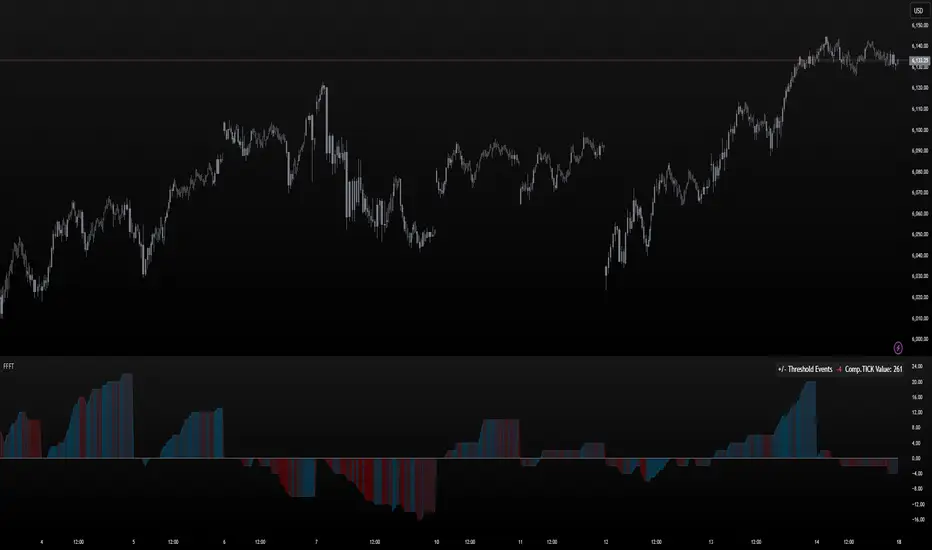
FoundryFutures Filtered Tick**Foundry Futures Filtered Tick (FFFT) – TradingView Indicator**
Overview
The Foundry Futures Filtered Tick (FFFT) is a market breadth indicator that filters out noise to track only significant tick events. Using a Custom Composite Cumulative Tick formula, it monitors buying and selling pressure during large events or waves of orders across exchanges. This gives traders a clearer view of market sentiment and momentum shifts throughout the trading day, without the distraction of minor tick movements.
Key Features
• Filters large tick events while ignoring minor fluctuations
• Tracks cumulative bullish/bearish threshold crossings ("Events") to highlight momentum shifts
• Uses dynamic color gradient visualization (red for selling, cyan for buying)
• Provides zero-line reference for directional bias
• Displays integrated real-time table for market context and large event tracking
How to Use
1. Add to favorites
2. Open chart, navigate to indicators tab > Favorites > Search "FoundryFutures Filtered Tick"
3. Apply to your chart
4. Select preferred market and begin using
Adjust Settings
• Set positive & negative thresholds to define meaningful tick events (Default +/-999)
• Customize line width and colors for better visibility if desired
• Interpret Signals above or below zero intraday as momentum shifts in sentiment across exchanges.
• Above zero & rising → Increasing bullish momentum
• Below zero & falling → Increasing selling pressure
• Frequent crossings → Potential market exhaustion or range bound activity
Risk Disclaimer & Release of Liability
Trading futures is highly speculative and involves substantial risk. The FFFT indicator does not predict market direction or guarantee profitability. It is for educational purposes only and should be used alongside proper risk management and independent analysis.
**By using this indicator, you acknowledge that:**
• You are solely responsible for your trading decisions
• Foundry Futures and its creator make no warranties or guarantees regarding accuracy or profitability
• You assume full responsibility for any financial losses incurred
• If you do not agree with these terms, do not use this indicator. Trade responsibly
FXC NQ Opening Range Breakout Strategy V2.4Mechanical Strategy that trades breakouts on NQ futures on the 15min timeframe during the NYSE session. It's designed to manage Apex and Top Step accounts with the lowest risk possible.
Risk Disclaimer:
Past results as well as strategy tester reports do not indicate future performance. Guarantees do not exist in trading. By using this strategy you risk losing all your money.
Important:
It only trades on Monday, Wednesday and Friday and takes usually only 1 trade per trading day.
It works on the 15min timeframe only.
The settings are optimised already for NQ but feel free to change them.
How it works:
Every selected trading day it measures the range of the first 15min candle after the NYSE open. As soon as price closes above on the 15min timeframe, it will trade the breakout targeting a set risk to reward ratio. SL on the opposite side of the range. It will trail the SL after a set amount of points and uses a buffer of the set amount of points to trail it.
Settings:
Opening Range Time : This is the time of the day in hours and minutes when the strategy starts looking for trades. It's in the EST/ NY Timezone and set to 9:30-09:45 by default
because that's the NYSE open.
Session Time : This is the time of the day in hours and minutes until the strategy trades. It's in the EST/ NY Timezone and set to 09:45-14:45 by default.
because that's what gave the best results in backtesting. Open trades will get closed automatically once the end of the session is reached. No matter if win or loss. This is just to prevent holding positions over night.
Session Border This setting is to select the border color in which the session box will be plotted.
Opening Range Box This setting is to select the fill color of the opening range box.
Opening Range Border This setting is to select the border color of the session box.
Trade Timeframe This setting determines on which timeframe candle has to close outside the opening range box in order to take a trade. It's set to 15min by default because this is what worked by far the best in backtests and live trading.
Stop Loss Buffer in Points: This is simply the buffer in points that is added to the SL for safety reasons. If you have it on 0, the SL will be at the exact price of the opposite side of the range. By default it's set to 0 pips because this is what delivered the best results in backtests.
Profit Target Factor: This is simply the total SL size in points multiplied by x.
Example: If you put 2, you get a 1:2 Risk to Reward Ratio. By Default it's set to 4 because this gave the best results in backtests, because trades always get closed either by trailing SL or because the end of the session is reached.
Use Trailing Stop Loss: This setting is to enable/ disable the trailing stop loss. It's enabled by default because this is a fundamental part of the strategy.
Trailing Stop Buffer: This setting determines after how many points in profit the trailing SL will be activated.
Risk Type: You can chose either between Fixed USD Amount, Risk per Trade in % or Fixed Contract Size. By default it's set to fixed contract size.
Risk Amount (USD or Contracts): This setting is to set how many USD or how many contracts you want to risk per trade. Make sure to check which risk type you have selected before you chose the risk amount.
Use Limit Orders If enabled, the strategy will place a pending order x points from the current price, instead of a market order. Limit orders are enabled by default for a better performance. Important: It doesn't actually place a limit order. The strategy will just wait for a pullback and then enter with a market order. It's more like a hidden limit order.
Limit Order Distance (points): If you have limit orders enabled, this setting determines how many points from the current price the limit order will be placed.
Trading Days: These checkboxes are to select on which week days the strategy has to trade. Thursday is disabled by default because backtests have shown that Thursday is the least profitable day
Backtest Settings:
For the backtest the commissions ere set to 0.35 USD per mini contract which is the highest amount Tradeovate charges. Margin was not accounted for because typically on Apex accounts you can use way more contracts than you need for the extremely low max drawdown. Margin would be important on personal accounts but even there typically it's not an issue at all especially because this strategy runs on the 15min timeframe so it won't use a lot of contracts anyways.
What makes it unique:
This script is unique because it's designed to be used on Apex and Top Step accounts with extremely strict drawdown rules.
The strategy is optimised to be traded with a fixed contract size instead of using % risk. The reason for that is that the drawdown rules of these Futures Prop Accounts are very strict and the fact that the smallest trade-able contract size is 1.
Why the source code is hidden:
The source code is hidden because I invested a lot of time and money into developing this strategy and optimising it with paid 3rd party software. Also since I use it myself on my Apex accounts and prop firms don't allow copy trading I don't want it to be used by too many traders.
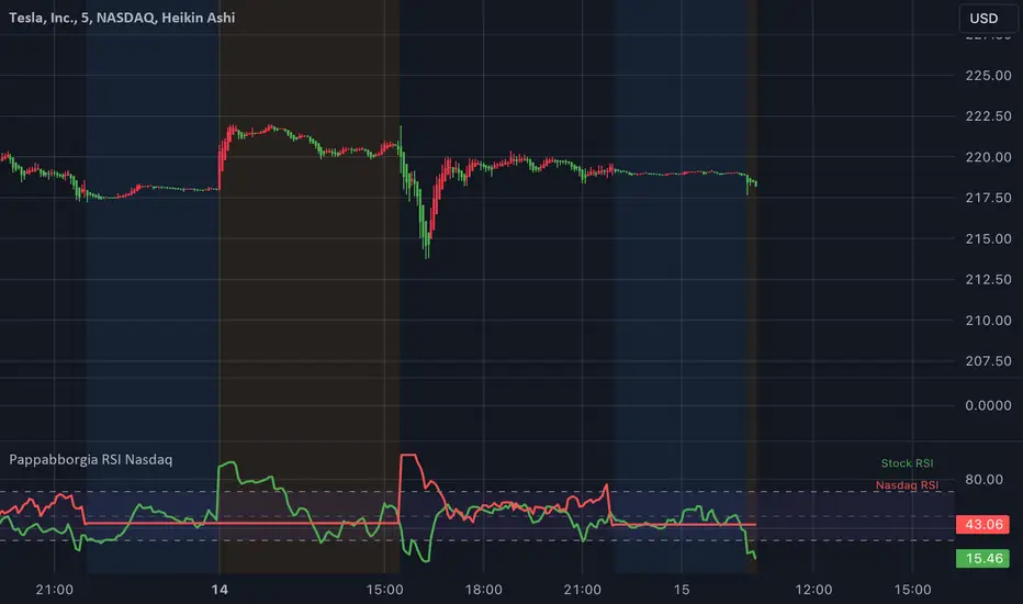
Pappabborgia Nasdaq RSI This script provides a custom Relative Strength Index (RSI) indicator that plots both the RSI of the selected stock and the Nasdaq (IXIC) on the same chart.
It offers a clear, side-by-side view to help traders better understand the stock's momentum relative to the overall market.
Key Features:
RSI Calculation for the Stock:
The script calculates the RSI for the chosen stock, with a default period of 14, adjustable to fit different timeframes.
The stock’s RSI is displayed in green 🟢, providing a direct view of its strength and momentum 📈.
RSI of the Nasdaq:
The script fetches the Nasdaq’s closing prices and calculates its RSI, which is shown in red for clear comparison 🔴.
Legend for Clarity:
A simple legend in the top-right corner identifies the green line as the stock’s RSI and the red line as the Nasdaq’s RSI, making it easy to interpret 📊.
Why Comparing the Stock's RSI to the Nasdaq Matters:
Broader Market Context:
Viewing both RSIs on the same chart helps you see whether the stock is moving in sync with the broader market or behaving independently. This provides valuable context for decision-making 📉.
Relative Strength Insights:
Comparing the stock’s RSI to the Nasdaq’s RSI highlights whether the stock is outperforming or underperforming the overall market, helping identify potential opportunities or risks 🟢🔴.
Improved Risk Management:
Monitoring overbought or oversold conditions in both the stock and Nasdaq RSIs can signal broader market trends and help avoid risky trades ⚠️.
Overall Benefit:
By tracking the RSI of both the stock and the Nasdaq, this script offers a powerful tool for understanding a stock's relative strength, providing essential context for smarter trading decisions 🎯.
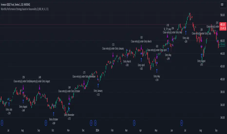
Unlock the Power of Seasonality: Monthly Performance StrategyThe Monthly Performance Strategy leverages the power of seasonality—those cyclical patterns that emerge in financial markets at specific times of the year. From tax deadlines to industry-specific events and global holidays, historical data shows that certain months can offer strong opportunities for trading. This strategy was designed to help traders capture those opportunities and take advantage of recurring market patterns through an automated and highly customizable approach.
The Inspiration Behind the Strategy:
This strategy began with the idea that market performance is often influenced by seasonal factors. Historically, certain months outperform others due to a variety of reasons, like earnings reports, holiday shopping, or fiscal year-end events. By identifying these periods, traders can better time their market entries and exits, giving them an advantage over those who solely rely on technical indicators or news events.
The Monthly Performance Strategy was built to take this concept and automate it. Instead of manually analyzing market data for each month, this strategy enables you to select which months you want to focus on and then executes trades based on predefined rules, saving you time and optimizing the performance of your trades.
Key Features:
Customizable Month Selection: The strategy allows traders to choose specific months to test or trade on. You can select any combination of months—for example, January, July, and December—to focus on based on historical trends. Whether you’re targeting the historically strong months like December (often driven by the 'Santa Rally') or analyzing quieter months for low volatility trades, this strategy gives you full control.
Automated Monthly Entries and Exits: The strategy automatically enters a long position on the first day of your selected month(s) and exits the trade at the beginning of the next month. This makes it perfect for traders who want to benefit from seasonal patterns without manually monitoring the market. It ensures precision in entering and exiting trades based on pre-set timeframes.
Re-entry on Stop Loss or Take Profit: One of the standout features of this strategy is its ability to re-enter a trade if a position hits the stop loss (SL) or take profit (TP) level during the selected month. If your trade reaches either a SL or TP before the month ends, the strategy will automatically re-enter a new trade the next trading day. This feature ensures that you capture multiple trading opportunities within the same month, instead of exiting entirely after a successful or unsuccessful trade. Essentially, it keeps your capital working for you throughout the entire month, not just when conditions align perfectly at the beginning.
Built-in Risk Management: Risk management is a vital part of this strategy. It incorporates an Average True Range (ATR)-based stop loss and take profit system. The ATR helps set dynamic levels based on the market’s volatility, ensuring that your stops and targets adjust to changing market conditions. This not only helps limit potential losses but also maximizes profit potential by adapting to market behavior.
Historical Performance Testing: You can backtest this strategy on any period by setting the start year. This allows traders to analyze past market data and optimize their strategy based on historical performance. You can fine-tune which months to trade based on years of data, helping you identify trends and patterns that provide the best trading results.
Versatility Across Asset Classes: While this strategy can be particularly effective for stock market indices and sector rotation, it’s versatile enough to apply to other asset classes like forex, commodities, and even cryptocurrencies. Each asset class may exhibit different seasonal behaviors, allowing you to explore opportunities across various markets with this strategy.
How It Works:
The trader selects which months to test or trade, for example, January, April, and October.
The strategy will automatically open a long position on the first trading day of each selected month.
If the trade hits either the take profit or stop loss within the month, the strategy will close the current position and re-enter a new trade on the next trading day, provided the month has not yet ended. This ensures that the strategy continues to capture any potential gains throughout the month, rather than stopping after one successful trade.
At the start of the next month, the position is closed, and if the next month is also selected, a new trade is initiated following the same process.
Risk Management and Dynamic Adjustments:
Incorporating risk management with this strategy is as easy as turning on the ATR-based system. The strategy will automatically calculate stop loss and take profit levels based on the market’s current volatility, adjusting dynamically to the conditions. This ensures that the risk is controlled while allowing for flexibility in capturing profits during both high and low volatility periods.
Maximizing the Seasonal Edge:
By automating entries and exits based on specific months and combining that with dynamic risk management, the Ultimate Monthly Performance Strategy takes advantage of seasonal patterns without requiring constant monitoring. The added re-entry feature after hitting a stop loss or take profit ensures that you are always in the game, maximizing your chances to capture profitable trades during favorable seasonal periods.
Who Can Benefit from This Strategy?
This strategy is perfect for traders who:
Want to exploit the predictable, recurring patterns that occur during specific months of the year.
Prefer a hands-off, automated trading approach that allows them to focus on other aspects of their portfolio or life.
Seek to manage risk effectively with ATR-based stop losses and take profits that adjust to market conditions.
Appreciate the ability to re-enter trades when a take profit or stop loss is hit within the month, ensuring that they don't miss out on multiple opportunities during a favorable period.
In summary, the Ultimate Monthly Performance Strategy provides traders with a comprehensive tool to capitalize on seasonal trends, optimize their trading opportunities throughout the year, and manage risk effectively. The built-in re-entry system ensures you continue to benefit from the market even after hitting targets within the same month, making it a robust strategy for traders looking to maximize their edge in any market.
Risk Disclaimer:
Trading financial markets involves significant risk and may not be suitable for all investors. The Monthly Performance Strategy is designed to help traders identify seasonal trends, but past performance does not guarantee future results. It is important to carefully consider your risk tolerance, financial situation, and trading goals before using any strategy. Always use appropriate risk management and consult with a professional financial advisor if necessary. The use of this strategy does not eliminate the risk of losses, and traders should be prepared for the possibility of losing their entire investment. Be sure to test the strategy on a demo account before applying it in live markets.
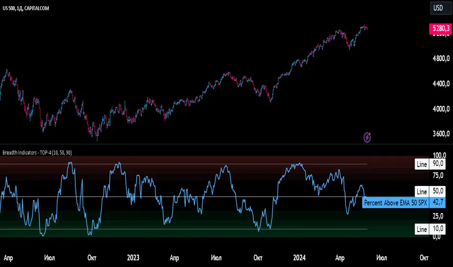
Breadth Indicators NYSE Percent Above Moving AverageBreadth Indicators NYSE - transmits the processed data from the Barchart provider
NYSE - Breadth Indicators
S&P 500 - Breadth Indicators
DOW - Breadth Indicators
RUSSEL 1000 - Breadth Indicators
RUSSEL 2000 - Breadth Indicators
RUSSEL 3000 - Breadth Indicators
Moving Average - 5, 20, 50, 100, 150, 200
The "Percentage above 50-day SMA" indicator measures the percentage of stocks in the index trading above their 50-day moving average. It is a useful tool for assessing the general state of the market and identifying overbought and oversold conditions.
One way to use the "Percentage above 50-day SMA" indicator in a trading strategy is to combine it with a long-term moving average to determine whether the trend is bullish or bearish. Another way to use it is to combine it with a short-term moving average to identify pullbacks and rebounds within the overall trend.
The purpose of using the "Percentage above 50-day SMA" indicator is to participate in a larger trend with a better risk-reward ratio. By using this indicator to identify pullbacks and bounces, you can reduce the risk of entering trades at the wrong time.
Bull Signal Recap:
150-day EMA of $SPXA50R crosses above 52.5 and remains above 47.50 to set the bullish tone.
5-day EMA of $SPXA50R moves below 40 to signal a pullback
5-day EMA of $SPXA50R moves above 50 to signal an upturn
Bear Signal Recap:
150-day EMA of $SPXA50R crosses below 47.50 and remains below 52.50 to set the bearish tone.
5-day EMA of $SPXA50R moves above 60 to signal a bounce
5-day EMA of $SPXA50R moves below 50 to signal a downturn
Tweaking
There are numerous ways to tweak a trading system, but chartists should avoid over-optimizing the indicator settings. In other words, don't attempt to find the perfect moving average period or crossover level. Perfection is unattainable when developing a system or trading the markets. It is important to keep the system logical and focus tweaks on other aspects, such as the actual price chart of the underlying security.
What do levels above and below 50% signify in the long-term moving average?
A move above 52.5% is deemed bullish, and below 47.5% is deemed bearish. These levels help to reduce whipsaws by using buffers for bullish and bearish thresholds.
How does the short-term moving average work to identify pullbacks or bounces?
When using a 5-day EMA, a move below 40 signals a pullback, and a move above 60 signals a bounce.
How is the reversal of pullback or bounce identified?
A move back above 50 after a pullback or below 50 after a bounce signals that the respective trend may be resuming.
How can you ensure that the uptrend has resumed?
It’s important to wait for the surge above 50 to ensure the uptrend has resumed, signaling improved breadth.
Can the system be tweaked to optimize indicator settings?
While there are various ways to tweak the system, seeking perfection through over-optimizing settings is advised against. It's crucial to keep the system logical and focus tweaks on the price chart of the underlying security.
RUSSIAN \ Русская версия.
Индикатор "Процент выше 50-дневной скользящей средней" измеряет процент акций, торгующихся в индексе выше их 50-дневной скользящей средней. Это полезный инструмент для оценки общего состояния рынка и выявления условий перекупленности и перепроданности.
Один из способов использования индикатора "Процент выше 50-дневной скользящей средней" в торговой стратегии - это объединить его с долгосрочной скользящей средней, чтобы определить, является ли тренд бычьим или медвежьим. Другой способ использовать его - объединить с краткосрочной скользящей средней, чтобы выявить откаты и отскоки в рамках общего тренда.
Цель использования индикатора "Процент выше 50-дневной скользящей средней" - участвовать в более широком тренде с лучшим соотношением риска и прибыли. Используя этот индикатор для выявления откатов и отскоков, вы можете снизить риск входа в сделки в неподходящее время.
Краткое описание бычьего сигнала:
150-дневная ЕМА на уровне $SPXA50R пересекает отметку 52,5 и остается выше 47,50, что задает бычий настрой.
5-дневная ЕМА на уровне $SPXA50R опускается ниже 40, сигнализируя об откате
5-дневная ЕМА на уровне $SPXA50R поднимается выше 50, сигнализируя о росте
Обзор медвежьих сигналов:
150-дневная ЕМА на уровне $SPXA50R пересекает уровень ниже 47,50 и остается ниже 52,50, что указывает на медвежий настрой.
5-дневная ЕМА на уровне $SPXA50R поднимается выше 60, сигнализируя о отскоке
5-дневная ЕМА на уровне $SPXA50 опускается ниже 50, что сигнализирует о спаде
Корректировка
Существует множество способов настроить торговую систему, но графологам следует избегать чрезмерной оптимизации настроек индикатора. Другими словами, не пытайтесь найти идеальный период скользящей средней или уровень пересечения. Совершенство недостижимо при разработке системы или торговле на рынках. Важно поддерживать логику системы и уделять особое внимание другим аспектам, таким как график фактической цены базовой ценной бумаги.
Что означают уровни выше и ниже 50% в долгосрочной скользящей средней?
Движение выше 52,5% считается бычьим, а ниже 47,5% - медвежьим. Эти уровни помогают снизить риски, используя буферы для бычьих и медвежьих порогов.
Как краткосрочная скользящая средняя помогает идентифицировать откаты или отскоки?
При использовании 5-дневной ЕМА движение ниже 40 указывает на откат, а движение выше 60 указывает на отскок.
Как определяется разворот отката или отскока?
Движение выше 50 после отката или ниже 50 после отскока сигнализирует о возможном возобновлении соответствующего тренда.
Как вы можете гарантировать, что восходящий тренд возобновился?
Важно дождаться скачка выше 50, чтобы убедиться в возобновлении восходящего тренда, сигнализирующего о расширении диапазона.
Можно ли настроить систему для оптимизации настроек индикатора?
Хотя существуют различные способы настройки системы, не рекомендуется стремиться к совершенству с помощью чрезмерной оптимизации настроек. Крайне важно сохранить логичность системы и сфокусировать изменения на ценовом графике базовой ценной бумаги.
Market Average TrendThis indicator aims to be complimentary to SPDR Tracker , but I've adjusted the name as I've been able to utilize the "INDEX" data provider to support essentially every US market.
This is a breadth market internal indicator that allows quick review of strength given the 5, 20, 50, 100, 150 and 200 simple moving averages. Each can be toggled to build whatever combinations are desired, I recommend reviewing classic combinations such as 5 & 20 as well as 50 & 200.
It's entirely possible that I've missed some markets that "INDEX" provides data for, if you find any feel free to drop a comment and I'll add support for them in an update.
Markets currently supported:
S&P 100
S&P 500
S&P ENERGIES
S&P INFO TECH
S&P MATERIALS
S&P UTILITIES
S&P FINANCIALS
S&P REAL ESTATE
S&P CON STAPLES
S&P HEALTH CARE
S&P INDUSTRIALS
S&P TELECOM SRVS
S&P CONSUMER DISC
S&P GROWTH
NAS 100
NAS COMP
DOW INDUSTRIAL
DOW COMP
DOW UTILITIES
DOW TRANSPORTATION
RUSSELL 1000
RUSSELL 2000
RUSSELL 3000
You can utilize this to watch stocks for dip buys or potential trend continuation entries, short entries, swing exits or numerous other portfolio management strategies.
If using it with stocks, it's advisable to ensure the stock often follows the index, otherwise obviously it's great to use with major indexes and determine holdings sentiment.
Important!
The "INDEX" data provider only supplies updates to all of the various data feeds at the end of day, I've noticed quite some delays even after market close and not taken time to review their actual update schedule (if even published). Therefore, it's strongly recommended to mostly ignore the last value in the series until it's the day after.
Only works on daily timeframes and above, please don't comment that it's not working if on other timeframes lower than daily :)
Feedback and suggestions are always welcome, enjoy!

Enhanced McClellan Summation Index
The Enhanced McClellan Summation Index (MSI) is a comprehensive tool that transforms the MSI indicator with Heikin-Ashi visualization, offering improved trend analysis and momentum insights. This indicator includes MACD and it's histogram calculations to refine trend signals, minimize false positives and offer additional momentum analysis.
Methodology:
McClellan Summation Index (MSI) -
The MSI begins by calculating the ratio between advancing and declining issues in the specified index.
float decl = 𝘐𝘯𝘥𝘪𝘤𝘦 𝘥𝘦𝘤𝘭𝘪𝘯𝘪𝘯𝘨 𝘪𝘴𝘴𝘶𝘦𝘴
float adv = 𝘐𝘯𝘥𝘪𝘤𝘦 𝘢𝘥𝘷𝘢𝘯𝘤𝘪𝘯𝘨 𝘪𝘴𝘴𝘶𝘦𝘴
float ratio = (adv - decl) / (adv + decl)
It then computes a cumulative sum of the MACD (the difference between a 19-period EMA and a 39-period EMA) of this ratio. The result is a smoothed indicator reflecting market breadth and momentum.
macd(float r) =>
ta.ema(r, 19) - ta.ema(r, 39)
float msi = ta.cum(macd(ratio))
Heikin-Ashi Transformation -
Heikin-Ashi is a technique that uses a modified candlestick formula to create a smoother representation of price action. It averages the open, close, high, and low prices of the current and previous periods. This transformation reduces noise and provides a clearer view of trends.
type bar
float o = open
float h = high
float l = low
float c = close
bar b = bar.new()
float ha_close = math.avg(b.o, b.h, b.l, b.c)
MACD and Histogram -
The Enhanced MSI incorporates MACD and histogram calculations to provide additional momentum analysis and refine trend signals. The MACD represents the difference between the 12-period EMA and the 26-period EMA of the MSI. The histogram is the visual representation of the difference between the MACD and its signal line.
Options:
Index Selection - Choose from TVC:NYA , NASDAQ:NDX , or TVC:XAX to tailor the MSI-HA to the desired market index.
MACD Settings - Adjust the parameters for the MACD calculation to fine-tune the indicator's responsiveness.
Ratio Multiplier - Apply scaling to the MSI to suit different market conditions and indices.
Benefits of Heikin-Ashi -
Smoothed Trends - Heikin-Ashi reduces market noise, providing a more apparent and smoothed representation of trends.
Clearer Patterns - Candlestick patterns are more distinct, aiding in the identification of trend reversals and continuations.
Utility and Use Cases:
Trend & Momentum Analysis - Utilize the tool's Heikin-Ashi visualization for clearer trend identification in confluence with it's MACD and histogram to gain additional insights into the strength and direction of trends, while filtering out potential false positives.
Breadth Analysis - Explore market breadth through the MSI's cumulative breadth indicator, gauging the overall health and strength of the underlying market.
- Alerts Setup Guide -
The Enhanced MSI is a robust indicator that combines the breadth analysis of the McClellan Summation Index with the clarity of Heikin-Ashi visualization and additional momentum insights from MACD and histogram calculations. Its customization options make it adaptable to various indices and market conditions, offering traders a comprehensive tool for trend and momentum analysis.
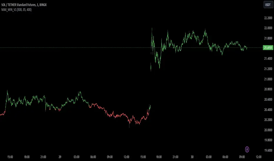
MAX_MIN_V1
Another simple indicator, maximum, minimum and average values. The point of imbalance in the price of an asset is sought.
It is used for any temporality and in almost any asset.
You can configure the visibility of the different elements.
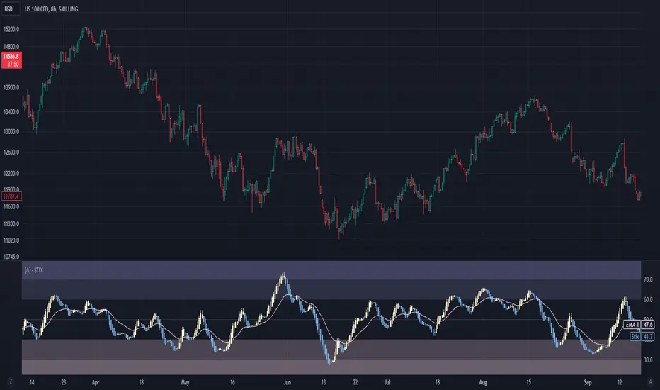
Short Term IndeXThe Short-Term Index (STIX) is a simple market indicator designed to assess short-term overbought or oversold conditions in the stock market. Leveraging a combination of advancing and declining issues, STIX provides valuable insights into market sentiment and potential reversals. To enhance its interpretability and reveal the underlying trend with greater clarity, STIX has been refined through a Heiken-Ashi transformation, ensuring a smoother representation of market dynamics.
Calculation and Methodology:
stix = ta.ema(adv / (adv + dec) * 100, len)
STIX is calculated by dividing the difference between the sum of advancing issues (ADV) by the total number of issues traded (ADV + DEC). This quotient is multiplied by 100 to express the result as a percentage. The STIX index ranges from 0 to 100, where extreme values indicate potential overbought (mainly above 60) or oversold (mainly below 40) market conditions.
Heiken-Ashi Transformation:
By applying a Heiken-Ashi transformation to STIX, the indicator gains improved visual clarity and noise reduction. This transformation enhances the ability to identify trend shifts and potential reversal points, making it an even more valuable tool for traders and investors.
Utility and Use Cases:
-The Short-Term Index (STIX) offers a range of practical applications-
1. Overbought/Oversold Conditions: STIX provides a clear indication of short-term overbought or oversold conditions, helping traders anticipate potential market reversals.
2. Reversal Points: STIX can help pinpoint potential reversal points in short-term market trends, providing traders with opportunities to enter or exit positions.
3. Trend Analysis: By observing STIX values over time, traders can assess the strength and sustainability of short-term trends, aiding in trend-following strategies.
The Short-Term Index (STIX), enhanced by its Heiken-Ashi transformation, equips traders and investors with a tool for assessing short-term market conditions, confirming price movements, and identifying potential reversal points. Its robust methodology and refined presentation contribute to a more comprehensive understanding of short-term market dynamics, enabling traders to make well-informed trading decisions.
See Also:
- Other Market Breadth Indicators-
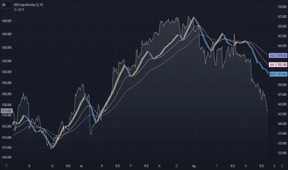
Bolton-Tremblay IndexThe Bolton-Tremblay Index (BOLTR) is a dynamic cumulative advance-decline indicator which incorporates the count of unchanged issues as a fundamental element. This index serves as a valuable tool for identifying shifts in market trends and gauging the overall strength or weakness of the market. To enhance its effectiveness and reveal underlying trends, BOLTR has been refined through a Heiken-Ashi transformation, resulting in a smoother and more insightful representation.
Calculation and Methodology:
r = (adv - dec) / unch
var float bt = na
bt := r > 0 ? nz(bt ) + math.sqrt(math.abs(r)) : nz(bt ) - math.sqrt(math.abs(r))
The BOLTR index is derived from a calculation involving three essential components: advancing issues (ADV), declining issues (DEC), and securities with unchanged closing prices (UNC). By formulating the ratio (ADV - DEC) / UNC, BOLTR captures the relationship between market movements and unchanged securities. This ratio then dictates whether the BOLTR index increases or decreases in the following period. If the ratio is positive, the index advances, and if negative, it retreats. This iterative process yields a cumulative index that reflects the evolving dynamics of market trends.
Heiken-Ashi Transformation:
The addition of a Heiken-Ashi transformation imparts a smoothing effect to the BOLTR index, revealing the underlying trend with greater clarity. This transformation diminishes noise and fluctuations, making it easier to identify meaningful shifts in market sentiment and overall market health.
Utility and Use Cases:
-The Bolton-Tremblay Index offers a range of applications that contribute to informed decision-making-
1. Trend Analysis: BOLTR provides insights into the changing trends of the market, helping traders and investors identify potential shifts in market sentiment.
2. Market Strength Assessment: By considering advancing, declining, and unchanged issues, BOLTR offers a comprehensive assessment of market strength and potential weaknesses.
3. Divergences: Traders can use BOLTR to detect divergences between price movements and the cumulative advance-decline dynamics, potentially signaling shifts in market direction.
The Bolton-Tremblay Index offers a versatile toolset for interpreting market trends, evaluating market health, and making better informed trading decisions.
See Also:
- Other Market Breadth Indicators-
Above/Below Average Index US Top 40 [Pt]█ Introduction
Introducing the "Above/Below Average Index US Top 40 ", a comprehensive market sentiment visualization tool. This powerful and easy-to-use indicator allows users to get a direct measure of market sentiment by analyzing the status of a chosen group of stocks (Top 10, Top 20, Top 30, or Top 40) in relation to their chosen moving average. The sum of stocks either above or below their respective moving averages can be an insightful indicator of the market's overall trend and bias.
The power of this tool lies in its ability to measure the net number of these top stocks either above or below their respective moving averages. A positive value, represented by green histogram bars, signifies a bullish bias among the Top 40 stocks, while a negative value, displayed as red histogram bars, suggests a bearish sentiment.
The indicator can be applied to both the NYSE and NASDAQ markets, offering users the flexibility to select their preferred stock exchange. The Top 40 stocks within these markets are customizable, ensuring you have full control over which companies are included in your market sentiment analysis.
The indicator also includes dual moving average lines representing the fast and slow moving averages of the sum of stocks above or below their chosen moving average. These lines serve as an invaluable trend analysis resource, providing a visual representation of short-term and long-term market trends, as well as potential trend reversals
█ Potential Uses
The indicator presents numerous application possibilities. Here are a few ways this tool can be utilized:
► Market Sentiment Gauge: Depending on the number of stocks chosen (Top 10, 20, 30, or 40), this tool can offer a broad or more focused gauge of overall market sentiment. A high positive value suggests strong bullish sentiment, while a high negative value can indicate bearish sentiment.
► Identification of Market Trends: By looking at the colors of the histogram bars and their corresponding values, users can identify whether the overall market trend is bullish (green) or bearish (red).
► Trend Confirmation and Reversal Identification: The dual moving average lines offer a powerful way to confirm market trends and identify potential trend reversals. For instance, a crossover of these lines (when the fast moving average line crosses the slow line) can signal a shift in market momentum, often indicating a possible trend reversal. Also, to confirm a bullish trend, for example, the fast moving average should be above the slow moving average line.
► Comparison of Different Markets: By switching between NYSE and NASDAQ, users can compare market sentiments across the two major stock exchanges. This could potentially highlight divergences or confirm similarities in market behavior.
► Customized Analysis: With the ability to customize the Top 40 stocks used in the calculation, users can refine their analysis to focus on the sectors or industries they are most interested in.
Remember, while this tool provides a visual representation of market sentiment, it is important to use it in conjunction with other forms of analysis to make informed trading decisions.
=====================================================================================================
█ Setting Highlights
Moving Average Type options:
◊ Simple Moving Average (SMA): The SMA is the average stock price over a certain period and gives equal weight to all price points, providing a clear view of overall trends but responding slower to recent price changes.
◊ Exponential Moving Average (EMA): The EMA gives more weight to recent prices and responds quicker to price changes than the SMA, making it more suitable for traders looking to capture short-term trends.
◊ Smoothed Moving Average (SMMA/RMA): The SMMA or RMA minimizes the impact of random price spikes and smoothens out the data, offering a balanced view of long-term and short-term trends.
◊ Weighted Moving Average (WMA): The WMA assigns more weight to recent data points, offering a faster response to recent price changes than SMA but slower than EMA.
◊ Volume Weighted Moving Average (VWMA): The VWMA takes into account both the closing price and volume of the stocks, offering insights into both price movement and trading activity.
◊ Hull Moving Average (HMA): The HMA is designed to reduce lag and improve smoothness, providing faster signals for trend changes, which is ideal for traders looking for quick entry and exit points.

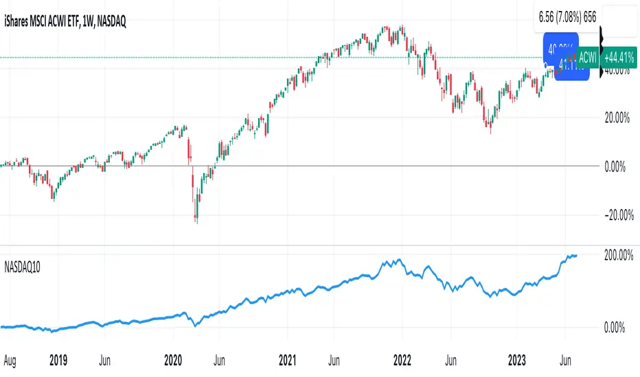
DrNon_NASDAQ10Title: NASDAQ 10 Index with TOP 10 Securities
Introduction:
TradingView offers traders and investors a powerful platform for technical analysis and trading. One of its notable features is the ability to create custom indices based on the values of multiple individual securities. In this blog post, we will explore how to build a custom index with 10 securities in TradingView using Pine Script, the platform's proprietary programming language.
Description:
Custom indices allow market participants to track the performance of a specific group of securities, providing valuable insights into the collective performance of the chosen assets. By leveraging Pine Script, traders can easily develop and deploy custom indicators and strategies to build their own indices.
The script provided focuses on creating a custom index with 10 securities. The selected securities include popular stocks such as AAPL (Apple Inc.), MSFT (Microsoft Corporation), GOOG (Alphabet Inc.), AMZN (Amazon.com Inc.), NVDA (NVIDIA Corporation), TSLA (Tesla Inc.), META (Facebook, Inc.), AVGO (Broadcom Inc.), PEP (PepsiCo, Inc.), and COST (Costco Wholesale Corporation).
Using the security() function in Pine Script, we retrieve the closing prices of each individual security to ensure accurate data for the index calculation.
The index value is then calculated by summing the closing prices of the 10 securities. This simple arithmetic operation captures the overall performance of the custom index.
To visualize the index, we use the plot() function to display the index value on the chart. Traders can observe the custom index alongside other technical indicators or price action, aiding in decision-making and market analysis.
By building a custom index with 10 securities in TradingView, traders gain a consolidated view of the performance of these chosen assets. This allows for easier tracking of sector trends, evaluation of specific strategies, and the ability to compare the performance of individual portfolios against the broader market.
Conclusion:
TradingView's Pine Script provides traders and investors with a flexible solution to build custom indices. By defining the 10 individual securities, calculating the index value, and plotting it on the chart, traders can monitor the collective performance of these chosen assets. Custom indices offer insights into sector performance, enable the evaluation of specific strategies, and provide a benchmark for comparing portfolio performance. By harnessing the power of custom indices in TradingView, traders can enhance their decision-making process and gain a competitive edge in the market.
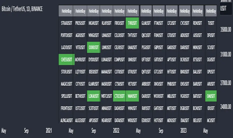
Heikin Ashi Master Buy Signal ScannerHeikin Ashi Master Buy Signal Scanner is an algorithm consisting of smoothed Heiken Ashi candles and moving averages.Moving averages use 5 basic moving averages. I preferably use ema for smoothing.In addition, the main purpose of this indicator is the preferred stock market and its shares, trading pairs, etc. scanning on a single screen and seeing the buy signals on a single screen.The buy signal appears on the screen as green.
With Column Width from the indicator properties, the width of the column of 30 symbols is adjusted, and the position of the column on the screen is adjusted with the Column Number.
With the indicator, a maximum of 30 symbols can be listed at once. However, this number can be increased according to your tradingview membership type. Especially if you are a premium member of tradingview, you can add as many indicators as you want to the chart without any limitation, and you can add as many symbols as your screen width to the chart. Heikin Ashi Master Buy signals you can see on a single screen.
In addition, the indicator gives you the opportunity to set the time zone you want and you can see the signals according to the time zone you want. All you need to do for this is to set the time zone from the indicator properties.
Now, if you wish, you can see examples of scans made on a single screen below.
Buy signals of 346 coins of Binance usdt trading pair on a single screen
Buy signals of 420 stocks of the Indian market on a single screen
Buy signals of 300 stocks of the NASDAQ on a single screen
Buy signals of 300 stocks of the BORSA ISTANBUL-BIST on a single screen
Buy signals on a single screen with 49 trading pairs in Forex
[TTI] Reversion Alert on Nasdaq📜 ––––HISTORY & CREDITS 🏦
This script, titled " Reversion Alert", was developed by TinTinTrading with the intention of creating an easy visual tool based on the relationship between the price and different Exponential Moving Averages (EMAs). It is something TinTinTrading has learned over the years from studying the Investor's Business Daily courses and materials, especially seminars held by William O'Neil.
🎯 ––––WHAT IT DOES 💡
The " Reversion Alert" script monitors the distance between the closing price and the 9-period EMA as well as the distance between the 9-period and 20-period EMAs. It generates an alert when the closing price is far enough away from the 9-period EMA relative to the distance between the two EMAs. The sensitivity of this alert can be adjusted by the user. The script also plots the 9-period and 20-period EMAs on the chart for visual reference. When the distance between the closing price and the 9-period EMA is more than the distance between the 9 and 20 period EMAs (and meets several other coded conditions), the price is likely extended and we can anticipate a pullback within next 1-3 days on the chart.
IMPORTANT - I only use this indicator on the NASDAQ Composite ( NASDAQ:IXIC ) and S&P500 ( SP:SPX ) and Dow Jones Composite ( TVC:DJI ). If you decide to use it for individual assets (equities, crypto or forex) make sure you toggle the sensitivity input so that it makes sense for the asset you are trading.
🛠️ ––––HOW TO USE IT 🔧
After adding the script to your chart, you will see two lines representing the 9-period and 20-period EMAs. You can adjust the sensitivity of the alert using the 'Sensitivity (%)' input in the settings panel. The default sensitivity is set at 18.5%. When an alert condition is met, a downward pointing red triangle with an exclamation mark will appear above the bar. This indicates a potential reversion scenario based on the relative positioning of the closing price and the two EMAs.
If the indicator shows an exclamation mark above the chart we can anticipate a pullback. Some techniques that yuo could apply could be:
👉 Tighten stops
👉 Reduce position size
👉 Harvest profits (or scale down)
👉 Be cautious to add new positions
Remember that this tool is meant to aid in your analysis and not to dictate trades. Always use in conjunction with other tools and your own analysis.

Autocorrelation - The Quant ScienceAutocorrelation - The Quant Science it is an indicator developed to quickly calculate the autocorrelation of a historical series. The objective of this indicator is to plot the autocorrelation values and highlight market moments where the value is positive and exceeds the attention threshold.
This indicator can be used for manual analysis when a trader needs to search for new price patterns within the historical series or to create complex formulas in estimating future prices.
What is autocorrelation?
Autocorrelation in trading is a statistical measure used to determine the presence of a relationship or pattern of dependence between values in a financial time series over time. It represents the correlation of past values in a series with its future values. In other words, autocorrelation in trading aims to identify if there are systematic relationships between the past prices or returns of a security or market and its future prices or returns. This analysis can be helpful in identifying patterns or trends that can be leveraged for informed trading decisions. The presence of autocorrelation may suggest that market prices or returns follow a certain pattern or trend over time.
Limitations of the model
It is important to note that autocorrelation does not necessarily imply a causal relationship between past and future values. Other variables or market factors may influence the dynamics of prices or returns, and therefore autocorrelation could be merely a random coincidence. Therefore, it is essential to carefully evaluate the results of autocorrelation analysis along with other information and trading strategies to make informed decisions.
How to use
The usage is very simple, you just need to add it to the current chart to activate the indicator.
From the user interface, you can manage two important features:
1. Lenght: the delay period applied to the historical series during the autocorrelation calculation can be managed from the user interface. By default, it is set to 20, which means that the autocorrelation ratio within the historical series is calculated with a delay of 20 bars.
2. Threshold: the threshold value that the autocorrelation level must meet can be managed from the user interface. By default, it is set to 0.50, which means that the autocorrelation value must be higher than this threshold to be considered valid and displayed on the chart.
3. Bar color: the color used to display the autocorrelation data and highlight the bars when autocorrelation is valid can be managed from the user interface.
To set up the chart
We recommend disabling the 'wick' and 'border' of the candlesticks from the chart settings for a high-quality user experience.

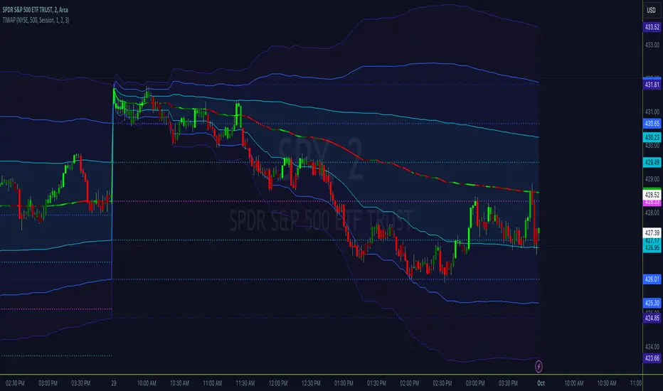
Tick Weighted Average PriceTick Weighted Average Price
"TiWAP" is an indicator that tracks the NYSE TICK by default and plots weighted average price on the charted security based only off of extreme TICK movement. NASDAQ TICK is also supported and future updates may add others if they provide value, or if requested.
What makes this different?
Quite simply there isn't another indicator that plots weighted average price based on TICK movement as done here, this is showing the correlation between the entire markets volatile price movement and the charted security. It provides a sense of established fair value given the entire NYSE/NASDAQ, given the automated nature of the markets there's a strong correlation between highly liquid ETFs/Indexes and the whole market.
How to use
Using this is similar to volume or time weighted average price, there is the average price line that is only adjusted when TICK movement breaches configured thresholds via sensitivity. Standard deviation bands are calculated and can be enabled up to 3rd deviation as per standard configuration, the further deviations being broken can serve as valuable signals for reversals.
As price is affected by market volatility look to see the weighted price adjust to actual price and combine with other trading strategies to take advantage of the data. Rejections and bounces near standard deviations as well as the weighted average price line can provide excellent trade setups, or they could be utilized in advanced options strategies such as straddles, strangles, iron condors, etc.
Anchor points can be utilized to track how the market is adjusting broad value for the week, month, quarter, etc. The higher timeframe based anchor points will need higher periods for the chart or a max bars lookback error may occur.
Sensitivity should be adjusted as changes in TICK occur, this is commonly correlated with NYSE adjustments but the tooltip provides some guidance on value selection based on current conventional wisdom.
Markets
TICK tracks the entire market and as such whatever the entire market is doing will most likely apply to any individual security charted so give this a shot with anything you trade and let me know your results :)
Usage Conditions
Currently I'm finding the most success with this weighted average price on various intra-day timeframes, but anchored on weekly or higher and utilizing other timeframes may net some interesting swing trading opportunities.
Tick LevelsTick Levels
This indicator is designed to be a companion to "MIT" .
It tracks the NYSE TICK by default and plots key levels on the charted security based off of extreme TICK movement. NASDAQ TICK is also supported and future updates may add others if they provide value, or if requested.
What makes this different?
Quite simply there isn't another indicator that plots levels based on TICK as done here, the signal and proximity sensing features added give context to which levels may provide the best entries, trims and exits for day traders.
How to use
Ensure adjustments are set for TICK, it changes over time but currently I've found the defaults to be best suited for me - your results may vary.
Watch price around the tick levels plotted on the chart to combine with other trading strategies. Use the proximity tolerance setting to ensure multiple TICK movements within the region as other movements are combined to lessen any possible noise, or disable this feature if each individual line is desired, though be warned extremely volatile days may produce noise.
Currently, the tick levels are reset on first new bar on regular sessions, but perhaps a future update will allow past sessions lines to stay with setting adjustment.
Diamonds above or below candles signify extreme highs and lows of TICK respectively, and triangles above or below candles signify extreme closures of TICK - if you're using this indicator in combination with "MIT" it may be redundant and you can disable the signals should you so choose.
Markets
TICK tracks the entire market and as such whatever the entire market is doing will most likely apply to any individual security charted so give this a shot with anything you trade and let me know your results :)
Usage Conditions
Currently I'm finding the most success with these levels on various intra-day timeframes, the more fine grained the more levels you can expect potentially but at key areas.
Market Internal TrendMIT - Market Internal Trend
I've developed what I consider to be the best market internals, market breadth indicator on Trading View to date :)
Market internals (sometimes referred to as Market Breadth) are built-in indicators of the market, there are the following main indicators:
TICK - Uptick or downtick transaction of market (NYSE/NASDAQ)
ADD - Advancing or declining issues/stocks of the market
VOLD - Up volume or down volume of the issues/stocks of the market
TRIN - Trend of market based on ADD and VOLD
VIX - Volatility of the market
PCN - Options market puts vs calls
What makes this different?
This single compact indicator delivers an "eyes on glass" style presentation to detail extreme movements of TICK, sentiment analysis of ADD and VOLD as well as their trends and report when the market is most likely balanced or an in imbalance. No need to study multiple clouds and amassing a ton of different charts all with similar indicator setups and candle analysis in the heat of the moment.
Use this to determine the overall initial trend at open, watching for imbalance and extreme movement on TICK as a signal to prepare for potential trades. The metrics table is useful to see where potential rejections/bounces may occur on the volatility index.
Extreme tick closures (see below) can provide excellent trim or exit signals for existing trades depending on the market structure of the day (trending or ranging).
How To Use
The main histogram represents the highs and lows of TICK, anything within the +/- $500 region is most likely normal movement while anything outside of that will brighten in color and indicates potential larger reactions. Extreme highs and lows will be represented by white diamonds by default, closures are indicated by bright colored crosses at $0. Price levels should be noted on the securities being traded during TICK extreme movement, these usually act as dynamic support and resistance from my observations but your results may vary (please share in comments your experiences!).
There is a smoothed trend line over the histogram, by default it's white in color, and this represents simply a trend of TICK closures - when it's trending down the market should be following in kind and vice versa; adjust the smoothing length in settings to suit your trading style.
The center line will have colored dots, by default yellow for balanced markets or white for imbalanced markets. When the market is in an imbalance that's when trending moves have been observed and balanced markets are usually choppy with sideways price action not suitable for quick scalp type trading styles.
The upper colored band represents the market overall advancing or declining issues/stocks within the market, by default green tones are bullish for a advancing market and red tones represent bearish market - the brighter the tone the strong the sentiment. There are triangles at all times above this band and that represents a smoothed trend status as compared to the current amount of stocks in advance or decline, if the smoothed trend is above then it's potentially a signal of reversal (red triangles over green band would be bearish reversal and vice versa).
The lower colored band works the exact same as the upper band but it tracks the up and down volume of the issues/stocks within the market, it utilizes the same color and triangle logics as the upper band.
Markets
Currently this will present internals data for NYSE and NASDAQ, I'm still researching other markets internals and their particulars.
The signals on this indicator will best apply to SPY, QQQ, ES, NQ or highly liquid ETFs largely affected by NYSE or NASDAQ - individual stocks may have mixed results depending on how they're moving with major indexes so keep that in mind when watching for sympathy moves with the indicator.
Usage Conditions
All of the market internals are fantastic indicators when day trading, I've had great success on 1-15 minute and even higher for scalps or intra-day swings. Observing the middle dots will save those of you that struggle in choppy markets from being too aggressive when opportunities don't exist.
Use the triangles, diamonds, dots and crosses to your advantage to manage your scalps and intra-day swings, or gain an edge in preparation for entering trades!
I hope this indicator is a benefit to all for day trading, provide any feedback or feature requests in the comments.

Market Breadth Ratio+ [Pt]This is a + version of my original Market Breadth Ratio Indicator
DESCRIPTION
The Market Breadth Ratio+ indicator is a tool that can help traders gain a more comprehensive understanding of market breadth by providing a ratio between Up volume (UVOL) and Down volume (DVOL).
While the VOLD indicator provides a straightforward measure of the difference between UVOL and DVOL, it doesn't account for the rate of change. The Market Breadth Ratio+ indicator, on the other hand, takes the rate of change into account, providing a plot line that is easier to interpret and understand.
The Up Volume vs Down Volume Ratios measure the strength of buying versus selling pressure in the market. A ratio greater than 1 indicates that there is more buying pressure, while a ratio less than -1 indicates more selling pressure. The ratio is calculated by dividing the total volume of stocks that closed up on the day by the total volume of stocks that closed down.
|| ------------------------------------------------------------------------------------------------------------------------------------------------------------------------------------||
This script includes the following premium unique features.
1) Custom Moving Average line for Breadth Ratio line. There are a few MA type to choose from: SMA, EMA, RMA, WMA, VWMA, HMA
- This feature provide a smoother plot for better interpretation of the market trend
- MA crossovers can also be used as trend reversal signals
2) Breadth Strength Index (BSI)
- This graph shows the relative strength of the Breadth Ratio. This is a momentum based oscillator that measure the rate of change of the Breadth Ratio. It shows the strength and weakness in the Breadth Ratio plot.
- A bar close to 1 means the market is very strong in the Bullish direction, conversely, a bar close to -1 means the market is very weak, but very strong in the Bearish direction
- Above 0 shows Bullish strength
- Below 0 shows Bearish strength
3) Two display modes for Breadth Strength Index
- Histogram
- Line
- These can be combined to show different markets together, such as NYSE and NASDAQ
4) Custom Moving Average can be applied to the BSI
- This will provide smoother graph for easier interpretation
5) Aggregated Market Strength
- This feature combines the BSI of multiple markets, such as NYSE and NASDAQ, to provide a more comprehensive view of the overall US market. Often time, one of these indices will have a stronger 'pull' on the entire market. By observing the dominant color (of your choosing), you can see which index is pulling the market. And by trading the market that has the bigger pull, traders can leverage on the possible higher volatility for greater trade opportunities.
6) Custom Moving Average can be applied to the Aggregated Market Strength
- This will provide smoother graph for easier interpretation
7) Show alternating trend colors on Aggregated Market Strength
- This provides an intuitive view of the market strength that's based on market breadth ratio
Market Breadth Ratio [Pt]The Market Breadth Indicator is a technical analysis tool that provides traders and investors with valuable insights into the overall health of the stock market. This particular version of the indicator plots the Up Volume vs Down Volume Ratios for three major U.S. stock exchanges - NYSE, NASDAQ and AMEX - on a single chart.
The Up Volume vs Down Volume Ratios measure the strength of buying versus selling pressure in the market. A ratio greater than 1 indicates that there is more buying pressure, while a ratio less than -1 indicates more selling pressure. The ratio is calculated by dividing the total volume of stocks that closed up on the day by the total volume of stocks that closed down.
By plotting the Up Volume vs Down Volume Ratios for all three exchanges, the Market Breadth Indicator provides a comprehensive view of the overall market sentiment. If all three ratios are above 1, it indicates that the market is in a bullish trend, while if all three ratios are below -1, it indicates a bearish trend. A divergence between the ratios can also signal potential shifts in market sentiment.
Traders can use the Market Breadth Indicator to confirm the direction of the market and identify potential buying or selling opportunities. For example, if the market is in a bullish trend and the NYSE ratio is consistently higher than the other two ratios, it may indicate that the NYSE is leading the market and traders may want to focus on buying stocks listed on the NYSE.
Overall, the Market Breadth Indicator is a valuable tool for traders and investors to assess the overall market health and make informed trading decisions based on market sentiment.
Bonus feature: there is an option to display data for ADD for the three exchanges as well on the data table.
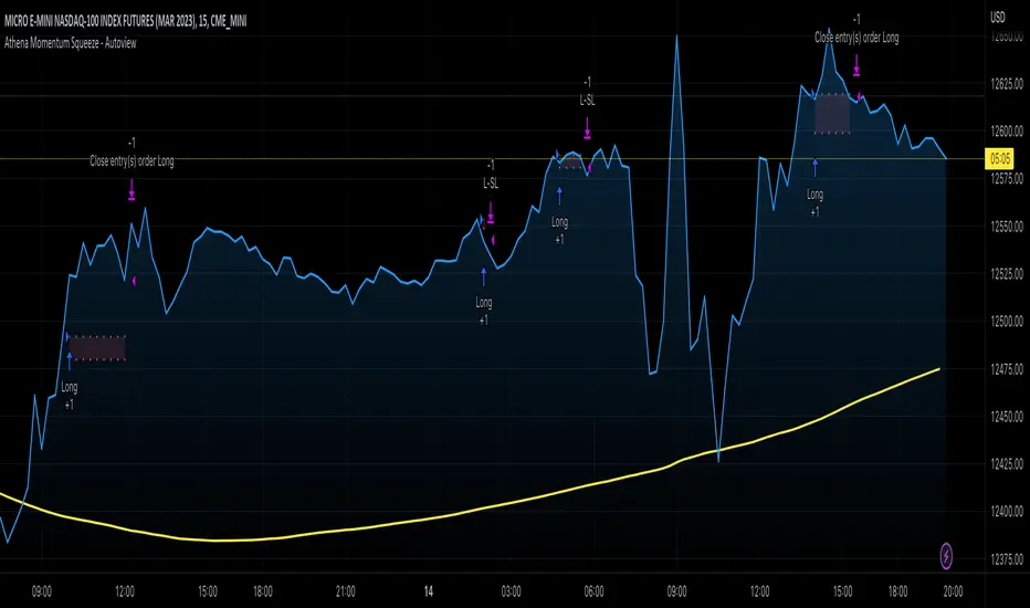
Athena Momentum Squeeze - Short, Lean, and Mean This is a very profitable strategy focusing on 15 minute intervals on the Micro Nasdaq Futures contracts. CME_MINI:MNQH2023
As this contract only keeps positions for on average about an hour risk is managed. At a profit factor of 3.382 with a max drawdown of $123 from January 1st to February 15. Looking back to Dec 2019 still maintains a profit factor of 1.3.
See backtesting: www.screencast.com
2019 backtesting: www.screencast.com
Based on the classic Lazy Bear Oscillator Squeeze with a number of modifications from ADX, MAs and adding fibonacci levels.
We like keeping strategies simple yet powerful, no completely where you can't understand your own trades.
Our team is always modifying and improving the strategy. Always open to collaborating on improving as there is no perfect strategy. www.screencast.com
RTH Levels Initial Balance Overnight 12-1 Opening types (IB)(ON)Made for ES/NQ.
CME_MINI:ES1!
CME_MINI:NQ1!
But it will most likely work for all USA futures. Default clock settings are set according to CST.
This Indicator automatically draws RTH levels, yesterday’s RTH levels, initial balance, overnight and 12-1 (lunch) levels.
In additionally, at RTH open, it shows opening type.
Also shows/alert works for 12-1 stat.
You may need to change the clock range settings for stocks.
Definitions of opening types.
If price opens the day above the previous day session high, it is considered Higher Outside Range. (HOR)
If price opens the day between the previous close and the previous high, it is considered Higher Inside Range. (HIR)
If price opens between the previous close and previous low, it is Lower Inside Range. (LIR)
If price opens below previous day session low, it is Lower Outside Range. (LOR)
Acronyms:
RTH : Regular Trading Hours
ON : Overnight
IBH : Initial Balance High
IBL : Initial Balance Low
IBMid: Initial Balance Mid
ONH : Overnight High
ONL : Overnight Low
ONMid : Overnight Session Midpoint Price
yRthO : Yesterday's rth open
yRthH : Yesterday's rth high
yRthL : Yesterday's rth low
yRthC : Yesterday's rth close
yRthMid : Yesterday's rth mid
12-1 : Lunch time for Chicago (12pm to 1pm) (CST)
rthmid (for rth session) : (high + low) / 2
