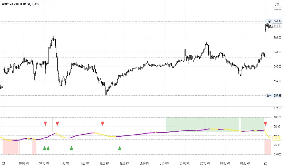
Percent of U.S. Stocks Above VWAPThis indicator plots a line reflecting the percentage of all U.S. stocks above or below their VWAP for the given candle. Horizontal lines have been placed at 40% (oversold), 50% (mid-line), and 60% (overbought). I recommend using this indicator as a market breadth indicator when trading individual stocks. In my experience, this indicator is best utilized while trading the major indices (SPX, SPY, QQQ, IWM) or their futures (ES, NQ, RTY) in the following manner:
- When the line crosses 50%, a green or red triangle is plotted indicating the majority of market momentum has turned bullish or bearish based on price positioning vs. VWAP. Look for longs when the line is rising (green) or above 50%, or shorts when the line is falling (red) or below 50%.
- When the line is below 40%, indicator shows red shading; I would not be long anything during this period. When the line exits this level, I begin looking for long entries. This line is adjustable in the indicator settings if you prefer to use a tighter or looser oversold level.
- When the line is above 60%, indicator shows green shading; I would not be short anything during this period. When the line exits this level, I begin looking for short entries. This line is adjustable in the indicator settings if you prefer to use a tighter or looser overbought level.
This indicator uses the TradingView ticker “PCTABOVEVWAP.US”, thus it only updates during NY market hours. If trading futures, I recommend applying VWAP to your chart and using that as the level to trade against in a similar manner, along with your personal price action analysis and other indicators you find useful.
Marketbreadth
Market Breadth - Secondary IndicatorMarket Breath is the equilibrium between number of stocks in advance to those in a decline, in other words a method to determine the current market environment. In a positive phase bullish setups will have improved probabilities and presence, whereas in a bearish phase the opposite would be true.
The primary indicator is the main tool used to identify whether the market is favorable for bullish- or bearish setups. The secondary indicator is complementary, with the purpose to calculate the intensity of each phase. In other words, overbought or oversold conditons.
The calculations are made based on the MMFI (% of stocks above 50 DMA).
- Red Column: Value below 21 would be considered oversold, where 10 < would be extreme / capitulation.
- Green Column: Value above 72 would be considered overbought, however in a stable bullish phase would on the contrary indicate positive acceleration.
There are also prints of dots that are created around / end of these extremes, which can indicate a reversal attempt. This will be printed when there is a countertrend move in the MMFI, VIX and SPY from an extreme value.
- Red Dots: Countertrend (down expansion) from a bullish phase.
- Green Dots: Countertrend (up expansion) from a bearish phase.
- Black Dots: Countertrend (up expansion) from an extreme / deep bearish phase.
How To Use
Use the primary indicator to note whether the market is more favorable for bullish- or bearish setups. Then look at the secondary breadth indicator and note whether there are extreme numbers and take that into account with a discretionary perspective. Example In case the market is in a bearish phase, have extended to the downside for several weeks and the primary breadth indicator is bearish. But he secondary show oversold levels with reversal prints, one should consider to be more careful on short side to risk of mean reversion. In simple terms these can be used to determine whether the current market is appropriate for selected setups.
Market Breadth - Primary IndicatorMarket Breath is the equilibrium between number of stocks in advance to those in a decline, in other words a method to determine the current market environment. In a positive phase bullish setups will have improved probabilities and presence, whereas in a bearish phase the opposite would be true.
The primary indicator measure the trend in SPY and correlation between different EMA's.
- Green Columns: Positive Breadth
- Red Columns: Negative Breadth
This indicator can be combined with the secondary breadth indicator to further note excessive movement and risk of mean reversion.
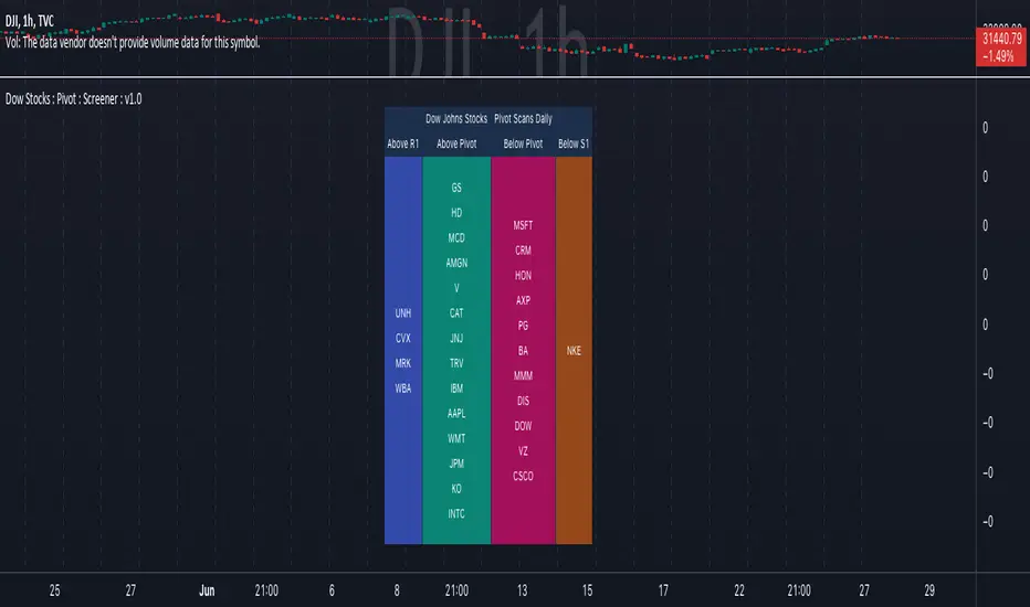
DOW 30 - Market BreadthDOW 30 indicator is intended for short-term intraday analysis and should not be used solely alone. Best to use this indicator in a combination with technical and fundamental analysis.
This indicator is calculated from all stocks in the DJI as of 8/9/2022;
- Evaluating VWAP,
- 9 EMA,
- 20 EMA.
Vwap Calculations;
Stock above Vwap = 1 (Vwap Bull),
Stock below Vwap = 1 (Vwap Bear),
As there are 30 stocks in the DJI, there is a max value of 30 Vwap Bulls/ Vwap Bears.
Ema Calculation;
Stock above 9 EMA = 0.5 (EMA Bulls),
Stock below 9 EMA = 0.5 (EMA Bears),
Stock above 20 EMA = 0.5 (EMA Bulls),
Stock below 20 EMA = 0.5 (EMA Bears),
For the EMA Bulls to reach 30 all stocks must be trading above both the 9 EMA and 20 EMA to reach a Max Value of 30.
The reasoning for this calculation is to suggest the current strength and speed of the current turn in the market.
Horizontal Lines:
There are three horizontal lines, MAX, MIN & Neutral;
MAX & MIN
Resides at the 30 & 0 levels suggesting the market is currently at an extreme. Representing all stocks are moving in the same direction together.
When the MAX or MIN are represented in the VWAP Line this represents directional conviction in the underlining DJI.
Neutral
Neutral resides at the 15 level and represents that the market is either about to make a decision or is choppy.
EXAMPLE
Below are some examples of how the DOW 30 indicator is able to represent the current market conditions.
Understand Current Market Conditions, either being Bullish, Neutral, or Bearish.
See live Market Mechanics, and understand the current market direction on a short-term timeframe.
DOW 30 indicator is intended for short-term intraday analysis and should not be used solely alone. Best to use this indicator in a combination with technical and fundamental analysis.
If there are any additional requests to the indicator feel free to leave a comment or privet message.
Best of luck trading.

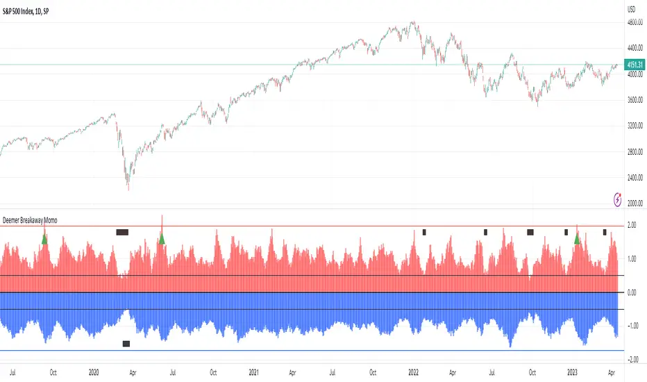
Walter Deemer Market Breadth Breakaway MomentumThis indicator is based on long time market analysts Walter Deemer's research. Below is a summary of what the indicator is used for. In short it can be used to spot market reversals.
In short, when the 10 day NYSE Advance:Decline ratio breaches 1.97, the market has achieved break away momentum. When the 20 day ratio achieves a 1.72 ratio this can be a "good" signal even if when the 10 day has not achieved a 1.97 ratio.
In addition to the NYSE, you can toggle NASDAQ, AMEX, or the average of the three.
You can read more about it here: walterdeemer.com
"Downside momentum usually peaks at the end of a decline, as prices cascade into a primary low. On the upside, though, momentum peaks at the beginning of an advance, then gradually dissipates as the advance goes on, and the more powerful the momentum at the move's beginning, the stronger the overall move; REALLY strong momentum is found only at the beginning of a REALLY strong move: a new bull market or a new intermediate leg up within a bull market. We coined the term "breakaway momentum" in the 1970's to describe this REALLY powerful upside momentum. The following is a review of what it is and how it is typically generated.
Breakaway momentum (some people call it a "breadth thrust") occurs when ten-day total advances on the NYSE are greater than 1.97 times ten-day total NYSE declines. It is a relatively uncommon phenomenon...24 times it has occurred since World War II (an average of once every 3 1/2 years). Cyclical bull markets, though, are traditionally heralded by breakaway momentum, so we are hopeful that it will be generated this time around, too.
....The real trick in generating breakaway momentum? It's not a lot of advances; it's a lack of declines."
Dow Jones Stocks : Pivot : ScreenerWith the Dow Jones Stocks Pivot Screener, you can scan a list of the 30 stocks / companies included in the Dow Jones Industrial Average index in real-time.
By using the indicator, you can monitor pivot breakouts and enter trades based on them.
As soon as the DJIA Index list is updated, I will update this List
The indicator includes three types of pivots . Classic, Fibonacci, and Standard.
You have the option to select between Daily, Weekly, and Monthly time frames as well
TradingCube : Crypto : Pivot ScreenerThe Crypto Pivot Screener is a real-time scanner of a list of top crypto assets.
You can use the indicator to monitor the pivots of about 40 crypto assets.
At least once a month, I will update the List of Crypto assets.
The indicator includes three types of pivots . Classic, Fibonacci, and Standard.
You have the option to select between Daily, Weekly, and Monthly time frames as well

Advance/Decline Line [IQ]Advance/Decline Line is a Market Breath indicator.
A/D line calculates a ratio between total number stocks advancing and total number of stocks in one day, providing another way to grasp the market breath at any moment.
We think the indicator covers the whole market, as we use data from the three main exchanges: NYSE, NASDAQ and AMEX.
The New York Stock Exchange (NYSE), nicknamed "The Big Board") is by far the world's largest stock exchange by market capitalization of its listed companies.
The Nasdaq Stock Market (NASDAQ) is ranked second on the list of stock exchanges by market capitalization of shares traded, behind the New York Stock Exchange.
The American Stock Exchange (AMEX) is the third largest stock exchange in the U.S. after the NYSE and the NASDAQ, and handles approximately 10% of all American trades.
How to interpret it:
Green columns mean more than 50% of NASDAQ stocks are advancing, red columns mean more than 50% of NASDAQ stocks are declining.
Green values above the top band mean correlation to the upside, red values bellow the low band mean correlation to the downside.
Correlation means rising probability of capitulation (to the upside or to the downside) and is market by a white bar (as signal).
Important:
For a better interpretation, the Advance/Decline Line indicator should be used in conjunction with other indicators (volatility, volume, etc.).

4C NYSE Market Breadth RatioThe NYSE Market Breadth Ratio is considered by some to be the “king” of market internals. It lets you know instantly how strong current buying or selling pressure is in the broad market, to eliminate guessing or opinion.
This indicator plots the Market Breadth Ratio values for the NYSE and the NASD exchanges in real time.
It also plots the NYSE Market Breadth Ratio in a histogram plot for visual reference.
The indicator dynamically changes colors between green and red depending on whether breadth is currently positive or negative.
This indicator divides the 'Up-Volume' ("UVOL") by 'Down-Volume' ("DVOL"), for each exchange.
It can be added to any chart, but is incredibly useful when added to other sources of market internals like the NYSE Advancers/Decliners Difference (ticker ADD) or with the NYSE UVOL / DVOL Difference (ticker VOLD ).
Credit goes to author=@auron9000 as the bulk of this code was from their Breadth Ratio Bubbles indicator.
---> The changes made to their indicator include: bug fixes where the values werent properly updating; fixed indicator to be a separate plot (not chart overlay), and added the histogram plot.

NYSE Advance/Decline Line 1.0NYSE Advance/Decline Line is a Market Breath indicator.
Brought to you by IQ-trading (Andrei Bogdan) via Trading View Pine script. If you find this helpful in anyway, please leave a like!
A/D line calculates a ratio between total number of NYSE stocks advancing and total number of NYSE stocks declining in one day, providing another way to grasp the market breath at any moment.
Green columns mean more than 50% of NYSE stocks are advancing, red columns mean more than 50% of NYSE stocks are declining.
Green values above the top band mean correlation to the upside, red values bellow the low band mean correlation to the downside.
Correlation means rising probability of capitulation (to the upside or to the downside).
For a better interpretation, NYSE Advance/Decline Line should be used in conjunction with other indicators (volatility, volume, etc.).

VOLD-MarketBreadth-RatioThis script provides NASDAQ and NYSE Up Volume (volume in rising stocks) and Down Volume (volume in falling stocks) ratio. Up Volume is higher than Down Volume, then you would see green label with ratio e.g 3.5:1. This means Up Volume is 3.5 times higher than Down Volume - Positive Market Breadth. If Down Volume is higher than Up Volume, then you would see red label with ratio e.g -4.5:1. This means Down Volume is 4.5 times higher than Up Volume.
For example, ratio is 1:1, then it is considered Market Breadth is Neutral.
PS: Currently TradingView provides only NASDAQ Composite Market volume data. I have requested them to provide Primary NASDAQ volume data. If they respond with new ticket for primary NQ data, I will update the script and publish the updated version. So if you have got similar table on ToS, you would see minor difference in NQ ratio.
Market Breadth EMAs V2Second version of Market Breadth EMAs for $SPY. Getting a little more complicated than V1 but removed noise.
Key:
Green line = % of stocks above their 20-period moving average, the "twitch line"
Red line = % of stocks above their 200-period moving average, the "long term trend"
White line = weighted average of the % of stocks above the 20/50/100/200 averages, the "general trend." Captures bursts that the 200 misses, and is more trustworthy than the 20.
Background colors = limits of the red/green/white where reversals have happened historically. The darker the color, the stronger the signal.
Histogram = the change in the white line over time, for different time periods: 1/4/10/20, the "trend strength/confidence." i.e. If the white line "General Trend" has been drifting lower for a month but started increasing the past 2 days, you might have 3 red histograms and 1 green one.
Techniques:
If the green, red, or white line is above 50%, then more than half the stocks are above that average. So, if they're in the top half, bullish market. Bottom half, bearish market.
If the green line is above the red, market has rising/bullish momentum. If red is above green, market has falling/bearish momentum.
If the white line is rising, bullish momentum. If it's falling, bearish momentum.
If the histograms are all green, there is strong momentum in that direction. The % of stocks above their important averages has been increasing each day for both the short term and long term.
If the histograms go from all green to a mix of green and red, be on the lookout for a reversal from one of the background levels. Usually initiates from the 20 (green line) first.
If price dips without the histogram changing, HODL.

Market Breadth EMAsThis is the combined market breadth tickers: S5TW, S5FI, S5OH, and S5TH representing the percentage of S&P 500 stocks above their 20, 50, 100, and 200 EMA respectively. The colors go from green (20) to red (200) because if 20 crosses above the 200, the market's bullish, and if the 20 crosses below the 200, the market is bearish. So if green is on top = bull market. If red is on top = bear market. In general the market sentiment is whichever color is highest up.
The background is colored in depending on a few historical extremes in the 200. The darker the color the more significant the buy/sell signal. These can be adjusted by changing the hline's in the code.
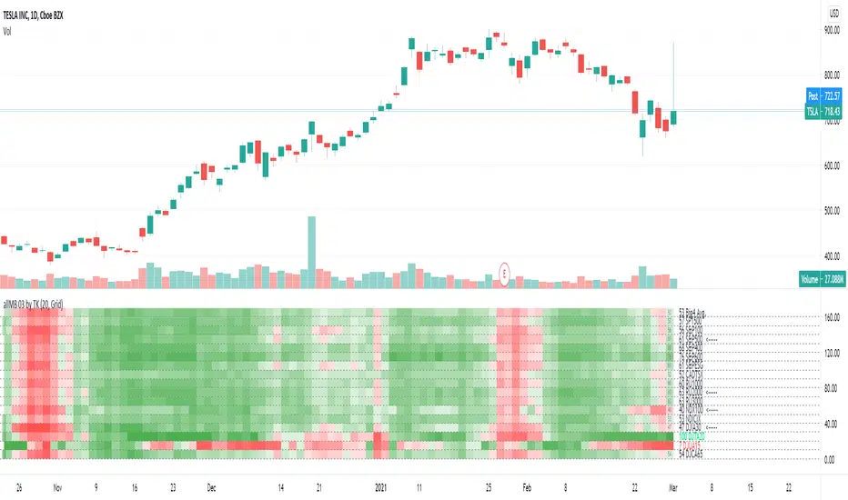
TradiKator 03 All Market BreadthTradiKator 03 All Market Breadth ( allMB 03 by TK ) is a visual indicator that plots All NA Market Breadth ( the percentage securities for all North American main stock exchange index's that is above a certain SMA line ).
Market breadth indicates the wave-induced motion of the whole market.
Q&A
Function and Setting
1. 15 index and 1 avg. or sum.
CADTSX = CANANDA TSX
S&P100 = S&P MEGA CAP 100
S&P500 = S&P LARGE CAP 500 *including S&P100
S&P400 = S&P MIDDLE CAP 400
S&P600 = S&P SMALL CAP 400
SP1500 = S&P 1500 * = S&P500 + S&P400 + S&P600
S&PESG = S&P ESG
NDX100 = NASDAQ 100
NDXCOM = NASDAQ COMPOSITE
RU2000 = RUSSELL 1000 * LARGE and MIDDLE CAP
RU2000 = RUSSELL 2000 * SMALL CAP
RU3000 = RUSSELL 3000 * = RUSSELL 1000 + RUSSELL 2000
DJIA30 = DOW JONES INDUSTRIAL AVERAGE 30
DJTA20 = DOW JONES TRANSPORTATION AVERAGE 20
DJUA15 = DOW JONES UTILITY AVERAGE 15
DJCA65 = DOW JONES COMPOSITE AVERAGE 65 *= DJIA30 + DJTA20 + DJUA15
You can open this indicator by multi times to check the different settings with "above ? SMA" in same time like the picture shows "above 50 days , above 20 days and above 20 days plot in lines"
Also, it is possible to combine this indicator with multiple setting to give the sum of the different "above? SMA"'s the result.
2. 6 choices for above ? SMA
Above 5 days, Above 20 days, Above 50 days, Above 100 days, Above 150 days or Above 200 days,
3. 2 methods to visualize the study result
Colorful grid, Green = more securities above ? SMA , Red = more securities below ? SMA
Line plot, High = more securities above ? SMA , Low = more securities below ? SMA
Market Breadth Indicator (percentage of US stocks above * SMA)This script is a revised version of jchang274's Multi-Sub script.
Add more feature from the original jchang274 script.
1.Compare 4 US STOCK INDEX ( Dowjones 30/NASDAQ100/RUSSELL2000/S&P500 ) in the same index of percentage of stocks above 20 /50/100/200 days simple moving average.
2. Use 4 index of percentage of stocks above 20 /50/100/200 days simple moving average,compare the same stock index ( Dowjones 30/NASDAQ100/RUSSELL2000/S&P500 )
How it begin?
Traders and investors use market breadth in order to assess the index’s overall health. Market breadth can be a reliable, if not an accurate, indicator of an upcoming price rise in the index. Similarly, it can also provide early warning signs for a future price decline.
What is it?
Market breadth indicators analyze the number of stocks advancing relative to those that are declining in a given index or on a stock exchange.
Market breadth refers to how many stocks are participating in a given move in an index or on a stock exchange. An index may be rising yet more than half the stocks in the index are falling because a small number of stocks have such large gains that they drag the whole index higher.
How it works?
Market breadth studies attempt to uncover strength or weakness in the movements of an index that are not visible simply by looking at a chart of the index.
