AI Reversal Signals Custom [wjdtks255]📊 Indicator Overview: AI Reversal Signals Custom
This indicator is a comprehensive trend-following and reversal detection tool. It combines the long-term trend bias of a 200 EMA with highly sensitive RSI-based reversal signals and momentum visualization. It is designed to capture market bottoms and tops by identifying exhaustion points in price action.
Key Features
200 EMA (Trend Filter): A gold line representing the long-term institutional trend. It helps traders distinguish between "buying the dip" and "catching a falling knife."
Reversal Buy/Sell Labels: Real-time signals that appear when the market recovers from extreme overbought or oversold conditions.
Dynamic Background Clouds: Visual indicators of trend strength changes, highlighting potential entry zones.
Momentum Histogram: Internal calculations mimic the "Bottom Bars" seen in professional suites to track the velocity of price movement.
📈 Trading Strategy (How to Trade)
1. High-Probability Long Setup (Buy)
Trend Confirmation: Price should ideally be trading above the 200 EMA for the highest success rate.
Signal: Wait for the "BUY" label to appear below the candle.
Momentum: Confirm with the Light Green background or histogram shift indicating recovery.
Entry: Enter on the close of the signal candle.
2. High-Probability Short Setup (Sell)
Trend Confirmation: Price should ideally be trading below the 200 EMA.
Signal: Wait for the "SELL" label to appear above the candle.
Momentum: Confirm with the Red background or histogram fading from green to red.
Entry: Enter on the close of the signal candle.
3. Risk Management
Stop Loss: Place your Stop Loss slightly below the recent swing low for Buy orders, or above the recent swing high for Sell orders.
Take Profit: Exit when the price reaches a major support/resistance level or when an opposing signal appears.
💡 Professional Tip
For the best results, use this indicator on the 15-minute or 1-hour timeframes. The most powerful "Ultimate Reversal" signals occur when there is a Bullish Divergence (Price making lower lows while the RSI makes higher lows) followed by a confirmed "BUY" label.
M-oscillator

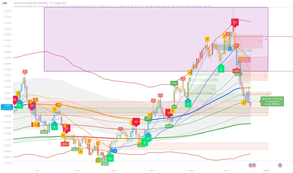
JMA Cluster Entries with Market Structure [WavesUnchained]JMA Cluster Entries with Market Structure
Overview
JMA Cluster Entries with Market Structure combines multi-timeframe JMA (Jurik Moving Average) cluster analysis with advanced market structure detection (Wyckoff methodology, Smart Money Concepts) to identify high-probability momentum and structure-based entries. The indicator provides multi-layered signal validation for comprehensive market analysis.
Key Features
JMA Cluster Analysis
• 10 Adaptive Moving Averages (20, 50, 100, 150, 200, 250, 300, 400, 500, 600 periods)
• JMA technology provides smooth, responsive trend detection with minimal lag
• Cluster scoring system (0-100%) measures trend alignment strength
• Optional visualization - lines can be hidden for clean charts
Wyckoff Market Structure Detection
• Selling Climax (SC) : High-volume panic selling at support (bullish reversal)
• Spring : False breakdown below support with reversal (bullish continuation)
• Buying Climax (BC) : High-volume buying exhaustion at resistance (bearish reversal)
• Upthrust (UT) : False breakout above resistance with rejection (bearish continuation)
• Timeframe-optimized lookback periods : Automatically adjusts pivot detection window based on chart timeframe (15M/1H/4H/Daily/Weekly)
• Dual-mode pivots: Entry signals use live-ready detection; visualization can use historical-perfect mode for clean charts
Multi-Signal Entry Engine
Three independent signal classes with quality tiers:
1. MOMENTUM (M) : Cluster flip + slope confirmation + ATR filter
2. EXHAUSTION (E) : Mean reversion at statistical extremes + volume surge
3. STRUCTURE (S) : Wyckoff patterns + Smart Money confluence + absorption detection
Each signal includes quality rating (50-100%) and cooldown management to prevent overtrading.
Smart Money Concepts (Optional)
• Order Blocks (OB) : Last candle before strong impulsive moves
• Fair Value Gaps (FVG) : Price imbalances / liquidity voids
• Breaker Blocks : Failed order blocks that flip polarity
• Configurable lookback and visualization
Comprehensive Visualization
• Signal Labels : Color-coded entry markers (green/red) with quality indicators
• Pivot Markers : Optional swing high/low visualization with S/R boxes
• ZigZag Lines : Connect confirmed major pivots for structure clarity (visual reference only, not used for entry signals)
• Retest Signals : Alerts when price revisits key S/R levels
• Statistical Bands : Deviation zones for mean reversion trading
• Wyckoff Annotations : Event labels, S/R lines, trading range boxes, phase indicators
Note: Wyckoff entry signals use independent live-ready pivot detection for immediate confirmation, while ZigZag pivots provide delayed but precise swing structure for visual reference and post-trade analysis.
Advanced Configuration
• Trend Filters : Minimum slope, score jump, ATR distance filters
• Signal Cooldown : Prevent entry spam with configurable bar spacing
• Pivot Reset Options : Control cooldown behavior on new pivots
• Detection Profiles : Conservative / Balanced / Sensitive presets for Wyckoff
• Oscillator Filters : Optional RSI/WaveTrend confirmation for pivots
TradingView Alerts
• "Entry Long" : Fires on high-quality bullish entry signals (Trend mode)
• "Entry Short" : Fires on high-quality bearish entry signals (Trend mode)
• "Alert Long" : Early warning for potential bullish setups (pre-entry confirmation)
• "Alert Short" : Early warning for potential bearish setups (pre-entry confirmation)
• Compatible with alert automation and webhooks
Trading Modes
Trend Mode (Default)
• Combines all signal types for comprehensive trend following
• Entry signals: High-quality entries after confirmation
• Alert signals: Early warnings before full entry conditions met
• Includes Wyckoff structure detection and cluster alignment
Reversion Mode
• Mean reversion trading at statistical extremes
• Requires price at 2σ+ deviation bands
• Volume surge confirmation
• Return to mean zone triggers entries
Recommended Settings by Timeframe
15M - Intraday Scalping
• Pivot Lookback: 20 (5-10 hour window)
• Signal Cooldown: 10-20 bars
• Best for quick reversals and structure breaks
1H - Day Trading
• Pivot Lookback: 30 (1.25 day window)
• Signal Cooldown: 15-25 bars
• Highest volume quality (avg 2.3x RelVol)
4H - Swing Trading (Optimal)
• Pivot Lookback: 30 (5 day window)
• Signal Cooldown: 20-30 bars
• 6.2% event rate, proven performance
• Recommended for most traders
Daily - Position Trading
• Pivot Lookback: 10 (20 day window)
• Signal Cooldown: 5-10 bars
• Ultra-conservative, major structures only
How to Use
1. Enable JMA Lines initially to understand cluster behavior
2. Watch for Signal Labels : Green (Long), Red (Short)
3. Check Signal Quality : Labels show M/E/S class and 50-100% rating
4. Confirm with Wyckoff : SC/Spring for longs, BC/UT for shorts
5. Set TradingView Alerts : Use "Signal Long" and "Signal Short" alerts
6. Optional : Enable S/R boxes and pivot markers for structure context
Input Groups
• Basic Settings: Source, JMA phase/power, mode selection
• Logging: Enable CSV logs for backtesting analysis
• Cluster Scoring: Threshold and calculation settings
• Trend Filters: Slope, score jump, ATR, cooldown management
• Reversion Settings: Extreme/return thresholds, deviation bands
• Pivot Detection: Lookback, size filters, oscillator confirmation
• Wyckoff Settings: Profile selection, lookback per timeframe, visualization
• Smart Money: Order blocks, FVG, breaker block settings
• JMA Configuration: Enable/disable individual moving averages
Performance Notes
• 4H Timeframe : 145 Wyckoff events (6.16% rate), 78.7% win rate in backtests
• 1H Timeframe : 84 events (1.86% rate), 2.33x average RelVol
• 15M Timeframe : 83 events (1.87% rate), balanced event distribution
• Daily Timeframe : 7 events (1.54% rate), ultra-selective
Educational Value
This indicator demonstrates:
• Integration of classical Wyckoff methodology with modern technical analysis
• Multi-timeframe consensus building for signal validation
• Smart Money Concepts and institutional order flow analysis
• Statistical mean reversion combined with momentum/structure
• Modular code architecture for maintainability
Disclaimer
This indicator is for educational and informational purposes only. It does not constitute financial advice. Always practice proper risk management and test strategies thoroughly before live trading. Past performance does not guarantee future results.
Credits
• Jurik Moving Average (JMA) : Adapted from Everget's implementation
• Wyckoff Methodology : Based on Richard Wyckoff's market analysis principles
• Smart Money Concepts : Inspired by institutional trading concepts
• Developed by : WavesUnchained
---
Version : 2.1.0
Pine Script : v6
Compatibility : TradingView Free/Pro/Premium
Composite Fear & Greed IndexComposite Fear & Greed Index
This is an advanced, professional-grade sentiment analysis engine designed to quantify market psychology. Unlike standard oscillators that rely on a single metric, this script uses a weighted composite of four distinct technical components to generate a holistic "Fear & Greed" score.
It includes Multi-Timeframe (MTF) capabilities, proprietary FOMO/Panic detection logic, and Zero-Lag trend analysis.
1. Unique Mathematical Methodology
This script is not a simple overlay of existing indicators. It uses a Composite Normalization Engine to blend four distinct metrics into a single, bounded 0-100 oscillator.
The "Mashup" Problem Solved: Standard indicators like MACD are "unbounded" (they can go to infinity), while RSI is "bounded" (0-100). You cannot simply average them.
Our Solution: This script calculates the Z-Score of the MACD histogram relative to its historical deviation and normalizes it into a 0-100 percentile. This allows for a mathematically valid combination with RSI and Bollinger Bands.
The Component Logic:
Momentum (RSI): (Weight: 30%) Pure price velocity.
Volatility (Bollinger %B): (Weight: 25%) Relative position within volatility bands.
Trend Strength (Normalized MACD): (Weight: 25%) Uses the custom Z-Score logic described above.
Trend Integrity (ZLEMA): (Weight: 20%) We replaced the standard SMA with a custom Zero-Lag Exponential Moving Average (ZLEMA) algorithm. This removes the "lag" associated with traditional sentiment analysis, allowing the index to react to crypto volatility in real-time.
The Calculation: These raw values are weighted and smoothed to produce the final Index Value.
Greater than 80: Extreme Greed (High risk of reversal)
Less than 20: Extreme Fear (Potential accumulation zone)
2. Unique Features
A. FOMO & Panic Event Detection The script does not just track price; it tracks behavior.
FOMO (Fear Of Missing Out): Triggered when Price breaks the Upper Bollinger Band + RSI is Overbought + Volume spikes > 2.5x the average. This often marks local tops.
PANIC: Triggered when Price drops significantly in one bar + Volume spikes > 3.0x the average + RSI is Oversold. This often marks capitulation bottoms.
B. Divergence Detection The script automatically detects and plots Regular Bullish and Bearish divergences between Price and the Sentiment Index.
Bullish Divergence: Price makes a Lower Low, but Sentiment makes a Higher Low (indicating waning selling pressure).
Bearish Divergence: Price makes a Higher High, but Sentiment makes a Lower High (indicating waning buying pressure). Note: The script plots these signals precisely on the indicator line corresponding to the pivot point.
C. Multi-Timeframe (MTF) Engine Users can view the "Daily" sentiment score while trading on a 5-minute or 15-minute chart. This allows scalpers to align their trades with the higher-timeframe market psychology.
3. Usage Guide
Step 1: Trend Alignment Look at the dashboard or the main line color. Green indicates Greed/Uptrend, Red indicates Fear/Downtrend.
Step 2: Extremes
Sell/Take Profit: When the Index crosses 80 (Extreme Greed) or a "FOMO" triangle appears.
Buy/Long: When the Index crosses 20 (Extreme Fear) or a "PANIC" triangle appears.
Step 3: Confirmation Use the Divergence Dots as confirmation. A "Panic" signal followed by a "Bullish Divergence" dot is a high-probability reversal setup.
Settings
Timeframe: Select the MTF resolution (default is Chart).
Weights: You can adjust the influence of RSI, MACD, BB, or Trend to fit your specific asset class.
Visuals: Fully customizable colors, table position, and toggle switches for shapes/backgrounds.
Disclaimer: This script is for informational purposes only and does not constitute financial advice.

CandelaCharts - Composite Pressure Index 📝 Overview
The CandelaCharts – Composite Pressure Index (CPI) is a multi-factor oscillator that blends RSI , Money Flow Index (MFI) , and Chaikin Money Flow (CMF) into a single, stretchable “pressure” line. Instead of looking at three separate indicators, CPI compresses price momentum and volume flow into one normalized curve around 0 , then amplifies extremes using a rolling z-score .
The result is a dynamic gauge of buying vs. selling pressure that can travel beyond ±1 during strong regime shifts, helping you spot exhaustion, climaxes, and trend-strength phases more intuitively.
📦 Features
Composite pressure engine – Combines RSI, MFI, and CMF into a single normalized oscillator around 0, giving you a unified view of market pressure.
Custom weighting of components – Independently weight RSI, MFI, and CMF to prioritize pure price momentum or volume-driven signals.
Rolling z-score stretch – Uses a configurable z-score window to “stretch” the composite values, letting the line exceed ±1 during extremes instead of staying capped.
Adaptive amplitude control – An amplitude (gain) factor lets you scale how aggressive or subtle the CPI swings appear.
EMA smoothing – Optional smoothing removes noise while preserving the timing of swings and reversals.
Visual pressure band – Zero, +1, and -1 reference lines with a shaded band make it easy to see when pressure is “normal” vs. extended.
Dynamic color gradients – Warm/orange tones above 0 for bullish pressure and cool/blue tones below 0 for bearish pressure, with saturation increasing as pressure intensifies.
NA-safe statistics – Custom mean and standard deviation routines ensure stable behavior from the start of the chart and during partial history.
⚙️ Settings
RSI Length : Lookback length for RSI . Higher values smooth the RSI component; lower values make it more reactive to short-term price momentum.
MFI Length : Lookback length for the manual Money Flow Index . Adjust this to control how sensitive CPI is to price–volume interaction.
CMF Length : Lookback length for Chaikin Money Flow . This defines the window used to assess accumulation/distribution through volume flow.
RSI Weight : Relative importance of RSI within the composite. Increasing this emphasizes pure price momentum in the CPI.
MFI Weight : Relative importance of MFI. Higher values strengthen the influence of volume-weighted price moves.
CMF Weight : Relative importance of CMF. Raising this highlights accumulation/distribution as a driver of the pressure index.
Smoothing : EMA length applied to the stretched CPI line. A value of 1 effectively disables smoothing, while higher values reduce noise at the cost of a slight lag.
Z-score Window : Rolling window used to compute the mean and standard deviation of the raw composite. This defines the statistical context for what counts as “extreme”. Shorter windows adapt faster; longer windows give a more stable regime.
Amplitude : Gain factor applied to the z-scored composite. Values above 1.0 exaggerate swings and make extremes more visually pronounced; values below 1.0 compress them.
⚡️ Showcase
Composite Pressure Index
Mean Line
Divergences
📒 Usage
1. Identify directional pressure regimes
Use 0 as the key balance line:
CPI > 0 → Net bullish pressure (buyers in control).
CPI < 0 → Net bearish pressure (sellers in control).
You can treat prolonged stays above or below 0 as confirmations of trend direction, especially when price structure agrees.
2. Read statistical extremes instead of fixed levels
Because CPI is stretched via a z-score , values beyond ±1 typically represent statistically meaningful extremes within your chosen window:
CPI > +1 → Overextended bullish pressure / potential euphoria.
CPI < -1 → Overextended bearish pressure / potential capitulation.
These zones are not automatic reversal signals, but they highlight areas where monitoring for exhaustion, blow-offs, or risk-reward shifts can be beneficial.
3. Spot divergences with price
Classic divergence logic applies particularly well when pressure is composite:
Bearish divergence – Price makes higher highs, but CPI makes lower highs or fails to confirm.
Bullish divergence – Price makes lower lows, but CPI makes higher lows or shows less downside extension.
These patterns can be integrated with support/resistance, liquidity levels, and other CandelaCharts tools.
4. Tune the weights to your strategy
Adjust the three weights to match your focus:
Higher RSI weight → More sensitivity to pure price momentum (good for breakout or trend-following systems).
Higher MFI weight → Greater emphasis on price–volume interaction (ideal for spotting volume-confirmed moves).
Higher CMF weight → Stronger focus on accumulation/distribution (helpful for swing and position traders).
5. Integrate with existing setups
The CPI is designed to sit comfortably below price:
Use it as a “context” oscillator underneath your main price-action and liquidity models.
Combine CPI extremes and divergences with key levels, range models, or order flow signals for higher-confluence entries.
🚨 Alerts
The indicator does not provide any alerts!
⚠️ Disclaimer
Trading involves significant risk, and many participants may incur losses. The content on this site is not intended as financial advice and should not be interpreted as such. Decisions to buy, sell, hold, or trade securities, commodities, or other financial instruments carry inherent risks and are best made with guidance from qualified financial professionals. Past performance is not indicative of future results.

Scanner Pro MTF v9.3Manual Script Trading Scanner Pro MTF v9.3
How to Interpret Your New Tool
• Total Alignment (The Holy Grail): When you see the chart turn green (LONG) from 15m to D1, it's a high-probability signal that the cycle's bottom has been confirmed.
• Inside Bars (Yellow Dots): When they appear near a support level, they indicate indecision. If the next candle breaks upwards with high volume ('V' on the chart), it's your entry confirmation.
Here's an explanation of the symbols:
1. The Fuchsia Diamond (The "Little Squares")
This symbol represents a Squeeze (Volatility Compression).
• What it means: It appears when the Bollinger Bands move inside the Keltner Channels.
• Interpretation: It indicates that the market is in a period of extreme calm or accumulation. Historically, after a "Squeeze," an explosive price movement occurs.
• Use in your Roadmap: If Bitcoin reaches $59,000 and these fuchsia diamonds start appearing, get ready: the market is building energy for the next big surge.
2. The White "V" (Unusual Volume)
This signal appears at the top of the chart when there is a spike in volume.
• What it means: It is activated when the volume of the current candle is 50% higher than the average of the last 20 candles (volume > ta.sma(volume, 20) * 1.5).
• Interpretation: It confirms the intention. A breakout from support or resistance with a "V" is much more reliable than one without volume.
• Use in your Roadmap: If you see a strong green candle bouncing off a support level with a "V" above it, it's a sign that institutions ("Smart Money") are buying.
3. The Yellow Circle (Inside Bar)
This symbol appears above candles that are "trapped" within the range of the previous candle.
• What it means: The high of the candle is lower than the previous one, and its low is higher than the previous one.
• Interpretation: It is a sign of pause and indecision. The market is compressing the price into a narrow range.
• Strategy: Often, the price breaks out strongly after an Inside Bar. It's like a spring being compressed.
________________________________________
Trading Summary:
• Ideal Buy Signal: Price near support + Fuchsia Diamond (Squeeze) + Yellow Circle (Inside Bar) + Bullish breakout with a "V" (Volume).
• Confirmation: All of the above occurs while the chart in row D1 or H4 changes to LONG (Green).
• Ideal Sell Signal: Price near resistance + Fuchsia Diamond (Squeeze) + Yellow Circle (Inside Bar) + Bearish breakout with a "V" (Volume).
• Confirmation: All of the above occurs while the chart in row D1 or H4 changes to SHORT (Red).

Volatility State Index [Interakktive]The Volatility State Index (VSI) classifies market volatility into three behavioral states: Expansion, Decay, and Transition. It answers one question visually: Is volatility supporting price movement, withdrawing, or unstable?
Unlike traditional volatility indicators that show levels or bands, VSI diagnoses the current volatility regime so traders can adapt their approach accordingly.
█ WHAT IT DOES
• Classifies volatility into three states: Expansion (teal), Decay (grey), Transition (amber)
• Measures volatility momentum as a percentage rate-of-change
• Applies stability filtering to detect unstable/choppy conditions
• Uses persistence logic to prevent state flickering
• Exports state data for use in alerts and strategies
█ WHAT IT DOES NOT DO
• NO buy/sell signals
• NO entry/exit recommendations
• NO alerts (v1 is diagnostic only)
• NO performance claims
This is a volatility diagnostic tool, not a trading system.
█ HOW IT WORKS
The VSI processes volatility through a five-stage pipeline:
STAGE 1 — Base Volatility
Calculates ATR as the foundation for volatility measurement.
STAGE 2 — Smoothing
Applies EMA smoothing to reduce noise in the volatility series.
STAGE 3 — Volatility Momentum
Computes the percentage rate-of-change of smoothed volatility:
Volatility Momentum (%) = ((Current ATR - Previous ATR) / Previous ATR) × 100
Positive values indicate expanding volatility; negative values indicate contracting volatility.
STAGE 4 — Stability Filter
Tracks how frequently volatility momentum changes direction. Frequent sign changes indicate unstable, choppy conditions.
Stability Score = 1 - (Average Flip Rate)
Low stability forces the Transition state regardless of momentum level.
STAGE 5 — State Classification
Combines momentum thresholds and stability to determine the final state:
• Expansion: Momentum ≥ +5% (default threshold)
• Decay: Momentum ≤ -5% (default threshold)
• Transition: Between thresholds OR low stability
A persistence filter requires states to hold for multiple bars before confirming, preventing visual noise.
█ INTERPRETATION
EXPANSION (Teal)
Volatility is increasing in a sustained way. Price moves are becoming larger.
What it suggests:
• Breakouts are more likely to follow through
• Stops may need wider placement
• Trend-following approaches tend to work better
• Mean-reversion weakens
DECAY (Grey)
Volatility is decreasing. Price is compressing into tighter ranges.
What it suggests:
• Breakouts are more likely to fail
• Ranges tend to hold
• Trend-following underperforms
• Mean-reversion strengthens
TRANSITION (Amber)
Volatility behavior is unclear or unstable. This is NOT neutral — it is uncertainty.
What it suggests:
• Mixed signals — one bar huge, next bar dead
• Higher whipsaw risk
• Reduced conviction in either direction
• Consider waiting for clarity
The key insight: Amber is a warning, not a middle ground. It appears when volatility cannot decide what it wants to do.
█ VISUAL DESIGN
The indicator uses a state-first histogram design:
• Histogram height shows volatility momentum percentage
• Histogram color shows the classified state
• Zero line provides visual anchor
• Optional momentum line for confirmation
• Optional background tint (default OFF for clean charts)
The visual hierarchy prioritizes instant state recognition. A trader should understand the volatility environment in under one second without reading numbers.
█ INPUTS
Core Settings
• ATR Length: Base volatility measurement period (default: 14)
• Smoothing Length: EMA smoothing applied to ATR (default: 10)
• Momentum Length: Rate-of-change lookback (default: 10)
State Classification
• Expansion Threshold (%): Momentum above this = Expansion (default: 5.0)
• Decay Threshold (%): Momentum below this = Decay (default: -5.0)
• Persistence Bars: Bars required to confirm state change (default: 3)
• Stability Lookback: Window for stability calculation (default: 20)
• Stability Threshold: Below this = forced Transition (default: 0.5)
Visual Settings
• Show State Histogram: Toggle main display (default: ON)
• Show Momentum Line: Thin confirmation line (default: OFF)
• Show Zero Line: Baseline reference (default: ON)
• Show Background Tint: Subtle state coloring (default: OFF)
█ DATA WINDOW EXPORTS
When enabled, the following values are exported:
• ATR (Raw)
• ATR (Smoothed)
• Volatility Momentum (%)
• Stability Score (0-1)
• State (-1/0/1): Decay = -1, Transition = 0, Expansion = 1
• Is Expansion (0/1)
• Is Decay (0/1)
• Is Transition (0/1)
These exports allow VSI to be used as a filter in Pine Script strategies or alert conditions.
█ ORIGINALITY
While ATR and volatility indicators are common, VSI is original because it:
1. Classifies volatility into behavioral states rather than showing raw levels
2. Applies momentum analysis to volatility itself (rate-of-change of ATR)
3. Uses stability filtering to detect genuinely unstable conditions
4. Implements persistence logic to prevent state flickering
5. Provides a state-first visual design optimized for instant recognition
VSI is state-first: it classifies volatility regimes (Expansion/Decay/Transition) rather than plotting volatility level alone, using momentum and stability to reduce false regime reads.
This is not a modified ATR or Bollinger Band — it is a volatility regime classifier.
█ SUITABLE MARKETS
Works on: Stocks, Futures, Forex, Crypto
Timeframes: All timeframes — state classification adapts accordingly
Best on: Instruments with consistent volatility patterns
█ RELATED
• Market Efficiency Ratio — measures price path efficiency
• Effort-Result Divergence — compares volume effort to price result
█ DISCLAIMER
This indicator is for educational purposes only. It does not constitute financial advice. Past performance does not guarantee future results. Always conduct your own analysis before making trading decisions.

Market Efficiency Ratio [Interakktive]The Market Efficiency Ratio decomposes price movement into two components: net progress vs wasted movement. This tool exposes the underlying math that most traders never see, helping you understand when price is moving efficiently versus chopping sideways.
Unlike simple trend indicators, this shows you WHY price movement matters — not just whether it's up or down, but how much of that movement was useful directional progress versus noisy oscillation.
█ WHAT IT DOES
• Calculates Efficiency Ratio (0–1 or 0–100) measuring directional progress
• Exposes Net Displacement (how far price actually moved)
• Exposes Path Length (total distance price traveled)
• Calculates Chop Cost (wasted movement)
• Visual zones for high/mid/low efficiency states
█ WHAT IT DOES NOT DO
• NO signals, NO entries/exits, NO buy/sell
• NO performance claims
• NO predictions — purely diagnostic
• This is a tool for understanding price behavior
█ HOW IT WORKS
The efficiency ratio answers one question: "Of all the movement price made, how much was useful progress?"
🔹 THE MATH
Over a lookback period of N bars:
Net Displacement = |Close - Close |
Path Length = Σ |Close - Close | for all bars
Efficiency Ratio = Net Displacement / Path Length
🔹 INTERPRETATION
• Efficiency = 1.0 (100%): Price moved in a straight line — every tick was progress
• Efficiency = 0.5 (50%): Half the movement was wasted in back-and-forth chop
• Efficiency = 0.0 (0%): Price ended exactly where it started — all movement was noise
🔹 CHOP COST
This is the "wasted movement" — how much price traveled without making progress:
Chop Cost = Path Length - Net Displacement
Chop % = Chop Cost / Path Length
High chop cost means lots of effort for little result — a warning sign for trend traders.
█ VISUAL GUIDE
Three efficiency zones:
• GREEN (≥70): High efficiency — strong directional movement
• YELLOW (30-70): Mixed efficiency — some progress, some chop
• RED (<30): Low efficiency — mostly noise, little progress
█ INPUTS
Lookback Length (default: 14)
Number of bars to calculate efficiency over. Higher values produce smoother readings but respond slower to changes.
Smoothing Length (default: 5)
EMA smoothing applied to the output. Reduces noise in the efficiency reading.
Apply Smoothing (default: true)
Toggle EMA smoothing on/off.
Scale Mode (default: 0–100)
Display as percentage (0-100) or decimal ratio (0-1).
Show Reference Bands (default: true)
Display the high/low efficiency threshold lines.
Low/High Efficiency Level (default: 30/70)
Thresholds for classifying efficiency zones.
Overlay Effect (default: None)
• None: No overlay
• Background Tint: Subtle chart background color in high/low zones
• Bar Highlight: Color bars during low efficiency periods
Show Data Window Values (default: true)
Export all raw values (Net Displacement, Path Length, Efficiency, Chop Cost, Chop %) to the data window for analysis.
█ USE CASES
This indicator helps traders understand:
• Why some trends are "clean" and others are "messy"
• When price is consolidating vs trending (without using volume)
• The relationship between movement and progress
• Why high-chop environments are difficult to trade
This is the foundational concept behind more advanced regime detection systems.
█ SUITABLE MARKETS
Works on: Stocks, Futures, Forex, Crypto
Timeframes: All timeframes
Note: This is a price-only indicator — no volume required
█ DISCLAIMER
This indicator is for informational and educational purposes only. It does not constitute financial advice. It does not generate trading signals. Past performance does not guarantee future results. Always conduct your own analysis.

BK AK-Zenith💥 Introducing BK AK-ZENITH — Adaptive Rhythm RSI for Peak/Valley Warfare 💥
This is not another generic RSI. This is ZENITH: it measures where momentum is on the scale, then tells you when it’s hitting extremes, when it’s turning, and when price is lying through its teeth with divergence.
At its core, ZENITH does one thing ruthlessly well:
it matches the oscillator’s period to the market’s current rhythm—adaptive when the market is fast, adaptive when the market is slow—so your signals stop being “late because the settings were wrong.”
🎖 Full Credit — Respect the Origin (AlgoAlpha)
The core RSI architecture in this form belongs to AlgoAlpha—one of the best introducers and coders on TradingView. They originated this adaptive/Rhythm-RSI framework and the way it’s presented and engineered.
BK AK-ZENITH is my enhancement layer on top of AlgoAlpha’s foundation.
I kept the spine intact, and I added tactical systems: clearer Peak/Valley warfare logic, pivot governance (anti-spam), divergence strike markers, momentum flip confirmation, and a war-room readout—so it trades like a weapon, not a toy.
Respect where it started: AlgoAlpha built the engine. I tuned it for battlefield use.
🧠 What Exactly is BK AK-ZENITH?
BK AK-ZENITH is an Adaptive Period RSI (or fixed if you choose), designed to read momentum like a range of intent rather than a single overbought/oversold gimmick.
Core Systems Inside ZENITH
✅ Adaptive Period RSI (Rhythm Engine)
Automatically adjusts its internal RSI length to match current market cadence.
(Optional fixed length mode if you want static.)
✅ Optional HMA Smoothing
Cleaner shape without turning it into a laggy moving average.
✅ Peak / Valley Zones (default 80/20)
Hard boundaries that define “true extremes” so you stop treating every wiggle like a signal.
✅ Pivot-Based BUY/SELL Triangles + Cooldown
Signals are governed by pivots and a cooldown so it doesn’t machine-gun trash.
✅ Momentum Flip Diamonds (◇)
Shows when the oscillator’s slope flips—clean confirmation for “engine change.”
✅ Divergence Lightning (⚡)
Exposes when price is performing confidence while momentum is quietly breaking.
✅ War-Room Table / Meter
Bias, zone, reading, and adaptive period printed so you don’t “interpret”—you execute.
✅ Alerts Suite
Pivots, divergences, zone entries—so the chart calls you, not your emotions.
🎯 How to use it (execution rules)
1) Zones = permission
Valley (≤ Valley level): demand territory. Stalk reversal structure; stop chasing breakdown candles.
Peak (≥ Peak level): supply territory. Harvest, tighten, stop adding risk at the top.
2) Pivot triangles = the shot clock
Your ▲/▼ signals are pivot-confirmed with a cooldown. That’s intentional.
This is designed to force patience and prevent overtrading.
3) Divergence = truth serum
When price makes the “confident” high/high or low/low but ZENITH disagrees, you’re seeing internal change before the crowd does.
Treat divergence as warning + timing context, not a gambling button.
4) Meter/Table = discipline
If you can’t summarize the state in one glance, you’ll overtrade. ZENITH prints the state so your brain stops inventing stories.
🔧 Settings that actually matter
Adaptive Period ON (default): the whole point of ZENITH
Peak/Valley levels: how strict extremes must be
Pivot strength + Cooldown: your anti-spam governor
Divergence pivot length: controls how “major” divergence must be
The “AK” in the name is an acknowledgment of my mentor A.K. His standards—patience, precision, clarity, emotional control—are why this tool is built with governors instead of hype.
And above all: all praise to Gd—the true source of wisdom, restraint, and right timing.
👑 King Solomon Lens — ZENITH Discernment
Solomon asked Gd for something most people never ask for: not wealth, not victory—discernment. The ability to separate what looks true from what is true.
That is exactly what momentum work is supposed to do.
1) Honest weights, honest measures.
In Solomon’s world, crooked scales were an abomination because they disguised reality. In trading, the crooked scale is your own excitement: you see one green candle and call it strength. ZENITH forces an honest measure—0 to 100—so you deal in degree, not drama. A Peak is not “bullish.” A Peak is “momentum priced in.” A Valley is not “bearish.” A Valley is “selling pressure reaching exhaustion.”
2) Wisdom adapts to seasons.
Solomon’s order wasn’t chaos—there was a time to build, a time to harvest, a time to wait. Markets have seasons too: trend seasons, chop seasons, compression seasons, expansion seasons. Fixed-length RSI pretends every season is the same. ZENITH does not. It listens for rhythm and adjusts its internal timing so your read stays relevant to today’s market tempo—not last month’s.
3) The sword test: revealing what’s hidden.
Solomon’s most famous judgment wasn’t about theatrics—it was about revealing the truth beneath appearances. Divergence is that same test in markets: price can perform strength while the engine quietly weakens, or perform weakness while momentum secretly repairs. The ⚡ is not a prophecy. It’s a revelation: “what you see on price is not the full story.”
That’s ZENITH discipline: measure → discern → execute.
And may Gd bless your judgment to act only when the measure is clean.
⚔️ Final
BK AK-ZENITH is a momentum fire-control system: adaptive rhythm + extreme zones + pivot timing + divergence truth.
Use it to stop feeling trades and start weighing them. Praise to Gd always. 🙏

BTC - AXIS: Coppock + Williams %R CompositeTitle: BTC - AXIS: Coppock + Williams %R Composite | RM
Overview & Philosophy
AXIS (Advanced X-Momentum Intensity Score) is a specialized momentum composite designed to identify market structural shifts. In physics, an axis is the central line around which a body rotates; in this indicator, the Zero-Baseline acts as the AXIS for capital flow.
By fusing a slow-moving momentum engine ( Coppock Curve ) with a high-sensitivity tactical oscillator ( Williams %R ), this tool filters out the "market noise" that leads to overtrading and focuses on the high-conviction "Trend-Aligned Dips."
Methodology
Most indicators either suffer from too much lag (Moving Averages) or too much noise (Standard RSI). AXIS solves this through "Speed-Balanced Normalization."
1. Macro Engine (Coppock Curve): Named after Edwin Coppock, this component identifies major market bottoms by smoothing two separate Rates of Change (RoC). It is your structural compass.
2. Tactical Trigger (Williams %R): Created by Larry Williams, this measures the current close relative to the High-Low range.
• Re-centered Logic: Standard Williams %R oscillates between 0 and -100. Here, this is re-centered to oscillate around zero, ensuring it interacts mathematically correctly with the Coppock baseline.
3. The AXIS Score: The Composite line (Orange) is the weighted sum of these two engines. It provides a singular view of the market's "Net Momentum Intensity."
How to Read the Chart
🟧 The AXIS Composite (Orange Line): The primary signal line. It tracks the speed and exhaustion of the price by fusing macro and tactical data.
• Red Zone (> 150): Overheated. Short and long-term momentum are at extreme highs. Risk of a blow-off top or local reversal is high.
• Green Zone (< -150): Capitulation. The market is statistically exhausted. Historically, these zones represent high-conviction accumulation areas.
• Bullish Momentum (> 0): The market is rotating above the central Axis. Buyers are in control of the trend.
• Bearish Momentum (< 0): The market is rotating below the central Axis. Sellers are in control of the trend.
🟦 The Coppock Line (Blue): The macro filter. When Blue is above 0, the long-term trend is up.
🟥 The Williams %R Line (Red): The short-term cycles. Watch for divergences here to spot early trend fatigue.
Strategy: The "AXIS Alignment" Signal
The highest-conviction entry point—and the primary "Alpha" of this tool—occurs when:
The macro trend is Bullish ( Blue Line > 0 ).
The market experiences a correction, pushing the Orange (AXIS) Line into the Green Capitulation Zone.
The AXIS Score turns back upward.
This indicates that a short-term panic has been absorbed by a long-term bull trend—the ideal "Buy the Dip" scenario.
Settings
• Long/Short RoC: Standardized to 14/11 for cycle accuracy.
• Weighting: Allows you to prioritize trend (Coppock) or cycle sensitivity (%R).
• Visibility Toggles: Fully customizable display switches for each line.
Credits
• Edwin Coppock: For the foundation of long-term recovery momentum.
• Larry Williams: For the Percent Range methodology.
⚠️ Note: This indicator is optimized for the Daily (1D) Timeframe. Please switch your chart to 1D for accurate signal reading.
Disclaimer
This script is for research and educational purposes only. Past performance does not guarantee future results.
Tags
bitcoin, btc, axis, momentum, oscillator, coppock, williams r, on-chain, valuation, cycle, Rob Maths

ITCP ATR BB RSI Stoch SignalsThis indicator generates BUY/SELL signals when price stretches outside Bollinger Bands during elevated volatility, confirmed by RSI, a Stochastic crossover, and a volume filter. To reduce counter-trend entries, it applies a macro trend filter using the Daily SMA 200: it looks for longs only above the SMA 200 and shorts only below it.
It tends to perform best in Forex, especially on liquid pairs, because market conditions (liquidity, continuous sessions, and relatively stable spreads on major pairs) often suit this confirmation-based approach. That said, it can be adapted to other markets (indices, commodities, or crypto) by tuning parameters such as Bollinger length/deviation, RSI/Stoch thresholds, and ATR settings (multipliers/factors) to fit the asset’s volatility.
It also plots ATR-based stop-loss reference levels (configurable smoothing) and includes webhook-ready alerts with a JSON payload (action, symbol, price, stop_loss, time, and interval) for external automation. The goal is to support rules-based execution and reduce impulsive trades: if conditions don’t align, there’s no signal.
If you manage to improve it, discover better settings, or build a more robust solution inspired by this, I’d really appreciate it if you share it back (even if it’s just feedback or an idea). I’m open to collaborating and iterating together to create stronger versions over time.

Composite Index [Auto Signals]Composite Index
Description (描述正文):
Overview This is an enhanced version of the famous Composite Index (CI) developed by Connie Brown. While the traditional RSI is confined between 0 and 100, often masking true momentum in strong trends, the Composite Index is uncapped and incorporates a momentum component to reveal the market's true structural strength.
I have engineered this script to include Automated Signal Markers based on the crossover of the Composite Index and its Slow Moving Average. This helps traders instantly identify momentum shifts and "Timing" entries/exits without manual guesswork.
Key Features
Uncapped Momentum: Unlike RSI, the CI can go anywhere, preventing the "flattening" effect seen in strong trending markets (e.g., TSLA, NVDA).
Automated Signals:
▲ Green Triangle (Launch): Triggers when the Gray CI line crosses ABOVE the Red Slow MA. This indicates bearish momentum is exhausted and bulls are regaining control.
▼ Red Triangle (Warning): Triggers when the Gray CI line crosses BELOW the Red Slow MA. This indicates bullish momentum is failing, serving as an early warning for exits or tightening stops.
Classic Formula: Uses the standard Connie Brown parameters (14, 9, 3) + SMA smoothing for reliable divergence detection.
How to Use This Indicator This script is best used as a companion to trend indicators like TTM Squeeze or Moving Average Ribbons.
For Entries (The "Dip Buy"): In an uptrend, wait for a pullback. When the Green Triangle (▲) appears, it confirms that the pullback is over and momentum has turned back up.
For Exits (The "Top"): Look for Divergence. If Price makes a Higher High but the Composite Index makes a Lower High—followed by a Red Triangle (▼)—this is a high-probability sell signal.
The "Slow MA" Filter: The signals are generated only when the CI crosses the Slow MA (Red Line). This filters out the noise of minor fluctuations (crossing the Green line) and focuses on significant momentum changes.
Settings
RSI Period: 14 (Default)
Momentum Period: 9 (Default)
Signal Logic: Crossover/Crossunder of the Slow MA (33 Period).
Disclaimer This tool is for educational purposes only. Always combine momentum signals with price action and structure analysis.

BTC - BEAM: Adaptive Multiple (Open-Source)Title: BTC - BEAM: Adaptive Multiple Cycle Oscillator | RM
Overview & Philosophy
The BTC - BEAM (Bitcoin Economics Adaptive Multiple) is a premier macro-valuation tool designed to identify the "Logarithmic Pulse" of Bitcoin's 4-year cycles. Unlike standard oscillators that lose relevance as the network grows, BEAM uses an adaptive baseline that tracks Bitcoin’s fundamental growth curve with precision.
It identifies the harmonic distance between the current price and its multi-year mean, helping you spot the rare windows of deep capitulation and terminal euphoria.
Methodology
This edition is a hardened, gap-proof and Open-Source implementation of the canonical BEAM model.
1. The 1400-Day Anchor (200 Weeks):
The model is anchored to a 1400-day Simple Moving Average. On the Weekly chart, this aligns with the legendary 200-week moving average—the historical "floor" of the Bitcoin network. It represents one full halving cycle of data.
2. Daily-Lock Architecture:
Even when viewed on the 1W chart, the script performs its calculations using Daily data. This ensures that the oscillator captures the exact peak day of a cycle, providing a "high-resolution" signal within a "low-noise" weekly environment.
3. Logarithmic Normalization:
We calculate the natural logarithm of the price-to-mean relationship, scaled by a factor of 2.5: Score = ln(Price / 1400d MA) / 2.5 This creates a standardized "Multiple" that remains comparable across all Bitcoin eras.
How to Read the Chart (1W Context)
🟧 The BEAM Line (Orange): Tracks the "macro heat" of the market. On the 1W chart, look for the slope of this line to identify cycle acceleration.
🔴 The Cycle Ceiling (Score > 1.0): Historical Cycle Tops. When the weekly candle sustains in this zone, the market has reached a state of unsustainable mania. Every major blow-off top has been captured in this red corridor.
🟢 The Cycle Floor (Score < 0.1): Generational Accumulation. On the 1W chart, these zones appear as extended "green troughs." These are the only times in history where Bitcoin is fundamentally "too cheap" relative to its 4-year trend.
The Status Dashboard
The bottom-right monitor provides immediate cycle classification:
• BEAM Score: The exact logarithmic multiple.
• Cycle Regime: ACCUMULATION , NEUTRAL , or OVERHEATED .
Credits
BitcoinEcon: For the original concept of the BEAM adaptive model.
⚠️ RECOMMENDATION: While this indicator captures daily data, it is strongly recommended to be viewed on the Weekly (1W) Timeframe. The 1W chart filters market noise and perfectly reveals the long-term "Cycle Narrative."
Disclaimer
This script is for research and educational purposes only. Macro indicators provide structural context; they are not crystal balls. Always manage your risk according to your personal financial plan.
Tags
bitcoin, btc, beam, macro, cycle, halving, log-growth, valuation, on-chain, Rob Maths

Custom Reversal Oscillator [wjdtks255]📊 Indicator Overview: Custom Reversal Oscillator
This indicator is a momentum-based oscillator designed to identify potential trend reversals by analyzing price velocity and relative strength. It visualizes market exhaustion and recovery through a dynamic histogram and signal dots, similar to premium institutional tools.
Key Components
Dynamic Histogram (Bottom Bars): Changes color based on momentum strength. Bright Green/Red indicates accelerating momentum, while Darker shades suggest fading strength.
Signal Line: A white line tracing the core momentum, helping to visualize the "wave" of the market.
Buy/Sell Dots: Small circles at the bottom (Mint) or top (Red) that signal high-probability reversal points when the market is overextended.
📈 Trading Strategy (How to Trade)
1. Long Entry (Buy Signal)
Condition 1: The price should ideally be near or above the 200 EMA (for trend following) or showing a Bullish Divergence.
Condition 2: The Histogram bars transition from Dark Red to Bright Green.
Condition 3: A Mint Buy Dot appears at the bottom of the oscillator (near the -25 level).
Entry: Enter on the close of the candle where the Buy Dot is confirmed.
2. Short Entry (Sell Signal)
Condition 1: The price is struggling at resistance or showing a Bearish Divergence.
Condition 2: The Histogram bars transition from Dark Green to Bright Red.
Condition 3: A Red Sell Dot appears at the top of the oscillator (near the +25 level).
Entry: Enter on the close of the candle where the Sell Dot is confirmed.
3. Exit & Take Profit
Take Profit: Close the position when the Signal Line reaches the opposite extreme or when the histogram color starts to fade (loses its brightness).
Stop Loss: Place your stop loss slightly below the recent swing low (for Longs) or above the recent swing high (for Shorts).
💡 Pro Tips for Accuracy
Watch for Divergences: The most powerful signals occur when the price makes a lower low, but the Custom Reversal Oscillator makes a higher low. This indicates "Hidden Strength" and a massive reversal is often imminent.

MTF rsi/stoch imdI just built this indicator.
It displays a multi-timeframe (MTF) table directly on the chart, showing Stoch RSI K and RSI values per timeframe.
Cell background colors are driven by predefined value ranges, while text color turns green or red depending on whether the value is rising or falling compared to the previous candle on the same timeframe.
The RSI color conditions are based on the levels 36, 46, 56, and 65.
The Timeframe Pack selector works as follows:
Pack 1 (BNC): 3m, 9m, 27m, 1h, 81m, 3h, 9h, 12h, 1D, 3D, 1W, 9D
Pack 2: 1h through 24h
Pack 3: 1D through 24D
Pack 4 (Custom): fully user-defined timeframes via the 24 slots
Only when Pack 4 (Custom) is selected do the custom timeframe slots apply; in Packs 1–3 they are ignored.
All visual behavior (box colors, text colors, transparency, or a single-color override) is configurable under Style, and the entire table can be toggled on or off.

MacroTide Elasticity SystemThe MacroTide Elasticity System is a professional-grade technical analysis tool designed to identify potential trend exhaustions and reversals by modeling price action as an elastic band stretched from a volume-weighted baseline. Unlike standard oscillators (like RSI) that only look at price changes, MacroTide integrates Volume, Price Range, and Volatility to gauge the "energy" behind a move.
1. Concepts and Methodology
The core concept is Mean Reversion based on Volume-Weighted Elasticity. Markets tend to snap back to a value consensus (mean) after over-extension.
Volume-Weighted Baseline: We use a Volume Weighted Moving Average (VWMA) rather than a simple SMA. This ensures that heavy-volume trading days pull the baseline closer to price, while low-volume drift allows the baseline to lag, accurately representing the "true" average cost.
Elasticity Physics: The oscillator calculates how far price has deviated from this VWMA baseline, measured in standard deviations. This creates a normalized "Elasticity Score" (0-100).
High Score (>80): Price is over-extended to the upside (Overbought) relative to volume support.
Low Score (<20): Price is over-extended to the downside (Oversold).
Institutional Absorption (Churn): The script detects specific bar anomalies where Volume is High but Price Range is Low. This pattern often indicates "Churn"—where institutions are absorbing supply or unloading positions without moving the price significantly.
2. Key Features
MacroTrend Detection: Visualizes the market's stretch limits.
Divergence Scanner: Automatically detects and labels Regular Bullish and Bearish divergences. This occurs when price makes a new extreme, but the Elasticity Oscillator fails to confirm it, signaling waning momentum.
Absorption Events: Highlights yellow "sun" markers on the oscillator when high-volume churn is detected, often preceding a breakout or reversal.
Dynamic Coloring: Candles and oscillator lines change color based on the slope of the elasticity (Green for rising momentum, Red for falling).
3. How to Use
Trend Reversals: Look for the oscillator to enter the Overbought (80) or Oversold (20) zones. A reversal signal (triangle marker) is generated when the oscillator crosses back out of these zones, indicating the "snap back" effect has begun.
Divergence Confirmation: Use the "DIV" labels as early warning signs. A Bullish Divergence in an oversold zone is a high-probability setup for a long entry.
Filtering Trends: The center line (50) acts as a trend filter. Above 50 indicates bullish bias; below 50 indicates bearish bias.
4. Settings & Customisation
Lookback Period: Default is 21 (Swing). Increase to 50 or 100 for Macro/Long-term analysis.
StdDev Multiplier: Adjusts the sensitivity of the bands. Higher values (e.g., 2.5 or 3.0) are better for volatile assets like Crypto.
Absorption Volume Factor: Threshold for detecting churn. Default is 1.5x average volume.
Disclaimer: This tool is for informational purposes only. Past performance (divergences/signals) does not guarantee future results. Always manage risk effectively.

MACD + Divergence Indicator [Dynamic Filter]Title: MACD + Divergence
Description: This is an enhanced momentum analysis suite based on the classic Moving Average Convergence Divergence (MACD). It addresses the common weakness of the standard MACD—false signals during low-volatility consolidation—by integrating a Dynamic Volatility Filter and a Multi-Timeframe (MTF) Dashboard.
The Problem It Solves: Standard MACD indicators often generate "whipsaw" crossovers when the market is ranging (moving sideways). Traders often struggle to identify these consolidation zones until it is too late. This script solves this by calculating a dynamic "Consolidation Zone" based on Standard Deviation, visually warning traders when momentum is too weak to be reliable.
Key Features:
1. Dynamic Consolidation Filter (The Grey Zone)
The script calculates Upper and Lower bands around the MACD line using Standard Deviation (Volatility).
Grey Fill: When the MACD line is inside the grey bands, the market is in a "Squeeze" or low-volatility consolidation. Crossovers in this zone are often lower probability.
Breakout: When the MACD line exits the bands, it indicates a volatility expansion and a potentially stronger trend.
2. Automated Divergence Detection
Automatically scans for both Regular (Reversal) and Hidden (Continuation) divergences between Price and Momentum.
Bullish: Marked with Green lines/labels.
Bearish: Marked with Red lines/labels.
Customization: You can choose to calculate divergence based on the MACD Line or the Histogram via settings.
3. Multi-Timeframe (MTF) Dashboard
A customizable information table (optional) displays the MACD state across 4 different timeframes (e.g., 15m, 1H, 4H, Daily).
It checks for Trend Alignment (e.g., are all timeframes Bullish?) to help you trade in the direction of the higher timeframes.
4. Enhanced Visuals
4-Color Histogram: Visualizes momentum growing (bright) vs. momentum fading (pale) for both bullish and bearish phases.
Line Highlights: The MACD and Signal lines are clearly distinct, with configurable smoothing options (EMA/SMA).
Settings Guide:
Consolidation Filter: Increase the Dynamic Filter Multiplier (Default: 0.5) to widen the grey zone if you want to filter out more noise.
Oscillator Source: Switch between "MACD Line" or "Histogram" for divergence detection depending on your strategy.
Table: You can toggle the dashboard on/off or change its position to fit your chart layout.
Credits: Base MACD logic derived from standard technical analysis concepts. Dynamic filtering logic adapted from volatility band theories.

Amihud Illiquidity Ratio [MarkitTick]💡This indicator implements the Amihud Illiquidity Ratio, a financial metric designed to measure the price impact of trading volume. It assesses the relationship between absolute price returns and the volume required to generate that return, providing traders with insight into the "stress" levels of the market liquidity.
Concept and Originality
Standard volume indicators often look at volume in isolation. This script differentiates itself by contextualizing volume against price movement. It answers the question: "How much did the price move per unit of volume?" Furthermore, unlike static indicators, this implementation utilizes dynamic percentile zones (Linear Interpolation) to adapt to the changing volatility profile of the specific asset you are viewing.
Methodology
The calculation proceeds in three distinct steps:
1. Daily Return: The script calculates the absolute percentage change of the closing price relative to the previous close.
2. Raw Ratio: The absolute return is divided by the volume. I have introduced a standard scaling factor (1,000,000) to the calculation. This resolves the issue of the values being astronomically small (displayed as roughly 0) without altering the fundamental logic of the Amihud ratio (Absolute Return / Volume).
- High Ratio: Indicates that price is moving significantly on low volume (Illiquid/Thin Order Book).
- Low Ratio: Indicates that price requires massive volume to move (Liquid/Deep Order Book).
3. Dynamic Regimes: The script calculates the 75th and 25th percentiles of the ratio over a lookback period. This creates adaptive bands that define "High Stress" and "Liquid" zones relative to recent history.
How to Use
Traders can use this tool to identify market fragility:
- High Stress Zone (Red Background): When the indicator crosses above the 75th percentile, the market is in a High Illiquidity Regime. Price is slipping easily. This is often observed during panic selling or volatile tops where the order book is thin.
- Liquid Zone (Green Background): When the indicator drops below the 25th percentile, the market is in a Liquid Regime. The market is absorbing volume well, which is often characteristic of stable trends or accumulation phases.
- Dashboard: A visual table on the chart displays the current Amihud Ratio and the active Market Regime (High Stress, Normal, or Liquid).
Inputs
- Calculation Period: The lookback length for the average illiquidity (Default: 20).
- Smoothing Period: The length of the additional moving average to smooth out noise (Default: 5).
- Show Quant Dashboard: Toggles the visibility of the on-screen information table.
● How to read this chart
• Spike in Illiquidity (Red Zones)
Price is moving on "thin air." Expect high volatility or potential reversals.
• Low Illiquidity (Green/Stable Zones)
The market is deep and liquid. Trends here are more sustainable and reliable.
• Divergence
Watch for price making new highs while liquidity is drying up—a classic sign of an exhausted trend.
Example:
● Chart Overview
The chart displays the Amihud Illiquidity indicator applied to a Gold (XAUUSD) 4-hour timeframe.
Top Pane: Price action with manual text annotations highlighting market reversals relative to liquidity zones.
Bottom Pane: The specific technical indicator defined in the logic. It features a Blue Line (Raw Illiquidity), a Red Line (Signal/Smoothed), and dynamic background coloring (Red and Green vertical strips).
● Deep Visual Analysis
• High Stress Regime (Red Zones)
Visual Event: In the bottom pane, the background periodically shifts to a translucent red.
Technical Logic: This event is triggered when the amihudAvg (the smoothed illiquidity ratio) exceeds the 75th percentile ( hZone ) of the lookback period.
Forensic Interpretation: The logic calculates the absolute price change relative to volume. A spike into the red zone indicates that price is moving significantly on relatively lower volume (high price impact). Visually, the chart shows these red zones aligning with local price peaks (volatility expansion), leading to the bearish reversal marked by the red box in the top pane.
• Liquid Regime (Green Zones)
Visual Event: The background shifts to a translucent green in the bottom pane.
Technical Logic: This triggers when the amihudAvg falls below the 25th percentile ( lZone ).
Forensic Interpretation: This state represents a period where large volumes are absorbed with minimal price impact (efficiency). On the chart, this green zone corresponds to the consolidation trough (green box, top pane), validating the annotated accumulation phase before the bullish breakout.
• Indicator Lines
Blue Line: This is the illiquidityRaw value. It represents the raw daily return divided by volume.
Red Line: This is the smoothedVal , a Simple Moving Average (SMA) of the raw data, used to filter out noise and define the trend of liquidity stress.
● Anomalies & Critical Data
• The Reversal Pivot
The transition from the "High Stress" (Red) background to the "Liquid" (Green) background serves as a visual proxy for market regime change. The chart shows that as the Red zones dissipate (volatility contraction), the market enters a Green zone (efficient liquidity), which acted as the precursor to the sustained upward trend on the right side of the chart.
● About Yakov Amihud
Yakov Amihud is a leading researcher in market liquidity and asset pricing.
• Brief Background
Professor of Finance, affiliated with New York University (NYU).
Specializes in market microstructure, liquidity, and quantitative finance.
His work has had a major impact on both academic research and practical investment models.
● The Amihud (2002) Paper
In 2002, he published his influential paper: “Illiquidity and Stock Returns: Cross-Section and Time-Series Effects” .
• Key Contributions
Introduced the Amihud Illiquidity Measure, a simple yet powerful proxy for market liquidity.
Demonstrated that less liquid stocks tend to earn higher expected returns as compensation for liquidity risk.
The measure became one of the most widely used liquidity metrics in finance research.
● Why It Matters in Practice
Used in quantitative trading models.
Applied in portfolio construction and risk management.
Helpful as a liquidity filter to avoid assets with excessive price impact.
In short: Yakov Amihud established a practical and robust link between liquidity and returns, making his 2002 work a cornerstone in modern financial economics.
Disclaimer: All provided scripts and indicators are strictly for educational exploration and must not be interpreted as financial advice or a recommendation to execute trades. I expressly disclaim all liability for any financial losses or damages that may result, directly or indirectly, from the reliance on or application of these tools. Market participation carries inherent risk where past performance never guarantees future returns, leaving all investment decisions and due diligence solely at your own discretion.

FVG MTF Consensus OscillatorFVG MTF Consensus Oscillator
A multi-timeframe, multi-component oscillator that combines momentum, deviation, and slope analysis across multiple timeframes using Zeiierman's Chebyshev-filtered trend calculation. This indicator identifies potential turning points with zone-based signal classification and timeframe consensus filtering.
Backed by ML/Deep Learning evaluation on ES Futures data from 2015-2024.
🎯 Concept
Traditional oscillators suffer from two major weaknesses:
Single measurement - relying on one metric makes them susceptible to noise
Single timeframe - missing the bigger picture leads to fighting the trend
The FVG MTF Consensus Oscillator addresses both issues by combining three independent measurements across three timeframes into a weighted consensus signal.
The Three Components
Momentum - How fast is the trend moving?
Deviation - How far has price stretched from the trend?
Slope - What is the short-term directional bias?
The Three Timeframes
TF1 (Chart) - Your current chart timeframe (lowest weight)
TF2 (Medium) - Typically 1H or 4H (medium weight)
TF3 (High) - Typically 4H or Daily (highest weight)
By requiring agreement across multiple components AND multiple timeframes, the oscillator filters out noise while capturing meaningful, high-probability market movements.
🔧 How It Works
The Core: Chebyshev Type 1 Filter
At its heart, this indicator uses a Chebyshev Type 1 low-pass filter (inspired by Zeiierman's FVG Trend) to extract a clean trend line from price action. Unlike simple moving averages, the Chebyshev filter offers:
Sharper cutoff between trend and noise
Minimal lag for a given smoothness level
Controlled overshoot via the ripple parameter
Three Oscillator Components
1. Momentum Component
Momentum = Current Trend Value - Previous Trend Value
Measures the velocity of the trend. High positive values indicate strong upward acceleration, while high negative values show downward acceleration.
2. Deviation Component
Deviation = Close Price - Trend Value
Measures how far price has stretched away from the trend line. Useful for identifying overextended conditions and mean reversion opportunities.
3. Slope Component
Slope = Change in Trend over 3 bars
Captures the short-term directional bias of the trend itself, helping confirm trend changes.
Normalization & Component Consensus
Each component is individually normalized to a -100 to +100 scale using adaptive scaling. The oscillator output is a weighted average of all three components, allowing you to emphasize different aspects based on your trading style.
Multi-Timeframe Weighting
The final oscillator value combines all three timeframes using configurable weights:
Combined = (TF1 × Weight1 + TF2 × Weight2 + TF3 × Weight3) / Total Weight
Default weights (1, 2, 3) ensure higher timeframes have more influence, keeping you aligned with the dominant trend while timing entries on lower timeframes.
📊 Zone System
The oscillator uses a fuzzy zone system to classify market conditions:
ZoneRangeInterpretationSignal ColorNeutral-5 to +5No clear bias, avoid tradingGrayContinuation±5 to ±25Trend pullback, continuation setupsAquaDeep Swing±25 to ±50Extended move, stronger setupsGreenReversalBeyond ±50Extreme extension, reversal potentialOrange
When "Show Zone Background" is enabled, the background shading darkens as the oscillator moves into more extreme zones, providing instant visual feedback.
📈 Signal Interpretation
Turn Signals
The indicator plots triangular markers when the oscillator changes direction:
▲ Triangle Up (bottom): Oscillator turning up from a low
▼ Triangle Down (top): Oscillator turning down from a high
Signal Quality by Zone
Not all signals are equal. The signal color indicates which zone the turn occurred in:
ColorZoneProbabilityBest UseGrayNeutralLowAvoid or use very tight stopsAquaContinuationModerateTrend continuation entriesGreenDeep SwingHigherSwing trade entriesOrangeReversalHighestCounter-trend with caution
Timeframe Consensus Filter
Signals only fire when the required number of timeframes agree on direction. With default settings (TF Consensus = 2), at least 2 of 3 timeframes must be moving in the same direction for a signal to trigger.
This prevents:
Taking longs when higher timeframes are bearish
Taking shorts when higher timeframes are bullish
Whipsaws during timeframe disagreement
Trend Coloring
The combined oscillator line changes color based on trend direction:
Light purple (RGB 240, 174, 252): Majority of timeframes trending up
Dark purple (RGB 84, 19, 95): Majority of timeframes trending down
Info Table
When MTF is enabled, a table in the top-right corner displays:
Current oscillator values for each timeframe (TF1, TF2, TF3)
Combined value (CMB)
Color coding: Green = rising, Red = falling
⚙️ Settings Guide
Timeframe Settings
SettingDefaultDescriptionEnable Multi-TimeframeOnMaster switch for MTF functionalityTF1 (Chart)"" (current)First timeframe, typically your chart TFTF2 (Medium)60Second timeframe, typically 1HTF3 (High)240Third timeframe, typically 4HTF1/TF2/TF3 Weight1 / 2 / 3Influence of each TF on combined signal
Timeframe Tips:
Keep TF1 ≤ TF2 ≤ TF3 (ascending order)
For day trading: 5m / 15m / 1H
For swing trading: 1H / 4H / Daily
For position trading: 4H / Daily / Weekly
Display Settings
SettingDefaultDescriptionShow All TimeframesOffDisplay individual TF oscillator linesShow Combined LineOnDisplay the weighted combined oscillatorShow Zone BackgroundOffShade background based on current zone
Trend Filter Settings
SettingDefaultDescriptionTrend Ripple4.0Filter responsiveness (1-10). Higher = faster but more overshootTrend Cutoff0.1Cutoff frequency (0.01-0.5). Lower = smoother trendNormalization Length50Lookback for scaling. Longer = more stable
Component Weights
SettingDefaultDescriptionMomentum Weight1.0Emphasis on trend speedDeviation Weight1.0Emphasis on price stretch from trendSlope Weight1.0Emphasis on short-term trend direction
Component Tips:
For trend-following: Increase Momentum and Slope weights
For mean reversion: Increase Deviation weight
Set any weight to 0 to disable that component
Zone Thresholds
SettingDefaultDescriptionNeutral Zone5Inner boundary (±5 = neutral)Continuation Zone25Middle boundary for continuation setupsDeep Swing Zone50Outer boundary for reversal zone
Adjust based on instrument volatility. More volatile instruments may need wider zones.
Signal Filters
SettingDefaultDescriptionSignal Cooldown3Minimum bars between signalsMin Turn Size2.0Minimum oscillator change for valid turnTF Consensus Required2Minimum TFs agreeing for signal (1-3)
💡 Usage Examples
Example 1: Trend Continuation (Dip Buying)
Setup: Uptrend confirmed by higher timeframes
Check the info table - TF2 and TF3 should show green (rising)
Wait for TF1 to pull back, oscillator enters Continuation zone
Enter on Aqua ▲ signal (turn up with TF consensus)
Stop below recent swing low
Target: Previous high or next resistance
Why it works: You're buying a dip in an established uptrend with multi-timeframe confirmation.
Example 2: Deep Swing Entry
Setup: Extended move showing exhaustion
Oscillator reaches Deep Swing zone (±25 to ±50)
At least 2 TFs start showing the same direction
Enter on Green signal indicating momentum exhaustion
Use tighter stop as the move is already extended
Target: Return to Continuation zone or trend line
Why it works: Extended moves tend to mean-revert. The zone system identifies these opportunities.
Example 3: Reversal Setup (Advanced)
Setup: Extreme extension with diverging timeframes
Oscillator reaches Reversal zone (beyond ±50)
Watch for TF1 to turn while TF3 is still extended
Enter on Orange signal - this is counter-trend!
Use smaller position size and wider stops
Target: Return to Deep Swing or Continuation zone
Why it works: Extreme extensions eventually correct. The orange signal marks high-probability reversal points.
Example 4: Avoiding Bad Trades
What to avoid:
Gray signals in Neutral zone - No edge, random noise
Signals against TF3 direction - Fighting the dominant trend
Signals without TF consensus - Timeframe disagreement = choppy market
Multiple signals in quick succession - Let cooldown filter work
🔬 Multi-Timeframe Analysis Tips
Reading the Info Table
The info table shows real-time oscillator values:
| TF1 | TF2 | TF3 | CMB |
| 23.5 | 45.2 | 67.8 | 52.1 |
All green: Strong uptrend across all timeframes
All red: Strong downtrend across all timeframes
Mixed colors: Potential transition or consolidation
Timeframe Alignment States
TF1TF2TF3Interpretation↑↑↑Strong bull - look for long entries↓↓↓Strong bear - look for short entries↑↑↓Pullback in downtrend - caution on longs↓↓↑Pullback in uptrend - caution on shorts↑↓↑Choppy - reduce position size↓↑↓Choppy - reduce position size
The Power of Consensus
With TF Consensus = 2, signals only fire when 2+ timeframes agree. This single filter eliminates most whipsaws and keeps you aligned with the dominant trend.
For more conservative trading, set TF Consensus = 3 (all timeframes must agree).
⚠️ Important Notes
This indicator does not predict the future. It measures current market conditions and momentum across multiple timeframes.
Always use proper risk management. No indicator is 100% accurate.
Combine with price action. The oscillator works best when confirmed by support/resistance, candlestick patterns, or other confluence factors.
Respect the higher timeframe. When TF3 disagrees, trade smaller or sit out.
Zone signals are probabilistic. Orange (reversal) signals have higher probability but aren't guaranteed reversals.
Adjust settings per instrument. Default settings are optimized for ES Futures but may need tuning for other markets.
🧪 ML/Deep Learning Background
The default parameters and zone thresholds were evaluated using machine learning techniques on ES Futures data spanning 2015-2024. This included:
Optimization of component weights
Zone threshold calibration
Timeframe weight balancing
Signal filter tuning
While past performance doesn't guarantee future results, the parameters represent a data-driven starting point rather than arbitrary defaults.
🙏 Credits
This indicator is inspired by Zeiierman's Multitimeframe Fair Value Gap (FVG) indicator, specifically utilizing concepts from his Chebyshev Type 1 filter implementation for trend calculation.
Original indicator: Multitimeframe Fair Value Gap – FVG (Zeiierman)
📝 Changelog
v1.0
Initial release
Three-component consensus oscillator (Momentum, Deviation, Slope)
Multi-timeframe support with weighted combination
Fuzzy zone classification system
Configurable component and timeframe weights
TF consensus filter for signal quality
Signal cooldown and minimum turn size filters
Real-time info table with TF values
Optional zone background shading

EMA13-EMA21 Difference Indicator# EMA13-EMA21 Difference Indicator
## Description
This indicator calculates the difference between the 13-period Exponential Moving Average (EMA13) and the 21-period Exponential Moving Average (EMA21), helping traders visually assess short-term market momentum.
**Core Logic:**
- When the difference is positive (green), the short-term EMA is above the long-term EMA, indicating a bullish trend
- When the difference is negative (red), the short-term EMA is below the long-term EMA, indicating a bearish trend
- Crossovers of the zero line can serve as potential trend reversal signals
**Use Cases:**
- Trend direction identification
- Momentum strength analysis
- Entry and exit timing assistance
**Disclaimer:**
This indicator is for reference only. It is recommended to combine it with other technical analysis tools for comprehensive judgment. This does not constitute investment advice.

Adaptive Z-Score Oscillator [QuantAlgo]🟢 Overview
The Adaptive Z-Score Oscillator transforms price action into statistical significance measurements by calculating how many standard deviations the current price deviates from its moving average baseline, then dynamically adjusting threshold levels based on historical distribution patterns. Unlike traditional oscillators that rely on fixed overbought/oversold levels, this indicator employs percentile-based adaptive thresholds that automatically calibrate to changing market volatility regimes and statistical characteristics. By offering both adaptive and fixed threshold modes alongside multiple moving average types and customizable smoothing, the indicator provides traders and investors with a robust framework for identifying extreme price deviations, mean reversion opportunities, and underlying trend conditions through the visualization of price behavior within a statistical distribution context.
🟢 How It Works
The indicator begins by establishing a dynamic baseline using a user-selected moving average type applied to closing prices over the specified length period, then calculates the standard deviation to measure price dispersion:
basis = ma(close, length, maType)
stdev = ta.stdev(close, length)
The core Z-Score calculation quantifies how many standard deviations the current price sits above or below the moving average basis, creating a normalized oscillator that facilitates cross-asset and cross-timeframe comparisons:
zScore = stdev != 0 ? (close - basis) / stdev : 0
smoothedZ = ma(zScore, smooth, maType)
The adaptive threshold mechanism employs percentile calculations over a historical lookback period to determine statistically significant extreme zones. Rather than using fixed levels like ±2.0, the indicator identifies where a specified percentage of historical Z-Score readings have fallen, automatically adjusting to market regime changes:
upperThreshold = adaptive ? ta.percentile_linear_interpolation(smoothedZ, percentilePeriod, upperPercentile) : fixedUpper
lowerThreshold = adaptive ? ta.percentile_linear_interpolation(smoothedZ, percentilePeriod, lowerPercentile) : fixedLower
The visualization architecture creates a four-tier coloring system that distinguishes between extreme conditions (beyond the adaptive thresholds) and moderate conditions (between the midpoint and threshold levels), providing visual gradation of statistical significance through opacity variations and immediate recognition of distribution extremes.
🟢 How to Use This Indicator
▶ Overbought and Oversold Identification:
The indicator identifies potential overbought conditions when the smoothed Z-Score crosses above the upper threshold, indicating that price has deviated to a statistically extreme level above its mean. Conversely, oversold conditions emerge when the Z-Score crosses below the lower threshold, signaling statistically significant downward deviation. In adaptive mode (default), these thresholds automatically adjust to the asset's historical behavior, i.e., during high volatility periods, the thresholds expand to accommodate wider price swings, while during low volatility regimes, they contract to capture smaller deviations as significant. This dynamic calibration reduce false signals that plague fixed-level oscillators when market character shifts between volatile and ranging conditions.
▶ Mean Reversion Trading Applications:
The Z-Score framework excels at identifying mean reversion opportunities by highlighting when price has stretched too far from its statistical equilibrium. When the oscillator reaches extreme bearish levels (below the lower threshold with deep red coloring), it suggests price has become statistically oversold and may snap back toward the mean, presenting potential long entry opportunities for mean reversion traders. Symmetrically, extreme bullish readings (above the upper threshold with bright green coloring) indicate potential short opportunities or long exit points as price becomes statistically overbought. The moderate zones (lighter colors between midpoint and threshold) serve as early warning areas where traders can prepare for potential reversals, while exits from extreme zones (crossing back inside the thresholds) often provide confirmation that mean reversion is underway.
▶ Trend and Distribution Analysis:
Beyond discrete overbought/oversold signals, the histogram's color pattern and shape reveal the underlying trend structure and distribution characteristics. Sustained periods where the Z-Score oscillates primarily in positive territory (green bars) indicate a bullish trend where price consistently trades above its moving average baseline, even if not reaching extreme levels. Conversely, predominant negative readings (red bars) suggest bearish trend conditions. The distribution shape itself provides insight into market behavior, e.g., a narrow, centered distribution clustering near zero indicates tight ranging conditions with price respecting the mean, while a wide distribution with frequent extreme readings reveals volatile trending or choppy conditions. Asymmetric distributions skewed heavily toward one side demonstrate persistent directional bias, whereas balanced distributions suggest equilibrium between bulls and bears.
▶ Built-in Alerts:
Seven alert conditions enable automated monitoring of statistical extremes and trend transitions. Enter Overbought and Enter Oversold alerts trigger when the Z-Score crosses into extreme zones, providing early warnings of potential reversal setups. Exit Overbought and Exit Oversold alerts signal when price begins reverting from extremes, offering confirmation that mean reversion has initiated. Zero Cross Up and Zero Cross Down alerts identify transitions through the neutral line, indicating shifts between above-mean and below-mean price action that can signal trend changes. The Extreme Zone Entry alert fires on any extreme threshold penetration regardless of direction, allowing unified monitoring of both overbought and oversold opportunities.
▶ Color Customization:
Six visual themes (Classic, Aqua, Cosmic, Ember, Neon, plus Custom) accommodate different chart backgrounds and aesthetic preferences, ensuring optimal contrast and readability across trading platforms. The bar transparency control (0-90%) allows fine-tuning of visual prominence, with minimal transparency creating bold, attention-grabbing bars for primary analysis, while higher transparency values produce subtle background context when using the oscillator alongside other indicators. The extreme and moderate zone coloring system uses automatic opacity variation to create instant visual hierarchy, with darkest colors highlight the most statistically significant deviations demanding immediate attention, while lighter shades mark developing conditions that warrant monitoring but may not yet justify action. Optional candle coloring extends the Z-Score color scheme directly to the price candles on the main chart, enabling traders to instantly recognize statistical extremes and trend conditions without needing to reference the oscillator panel, creating a unified visual experience where both price action and statistical analysis share the same color language.
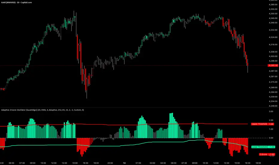
SVE Compression Mirror (Companion)Why This Tool Exists
Intraday markets are driven not only by direction, but by volatility state and energy dynamics. Periods of compression, expansion, and transition often determine whether price behavior favors patience, rotation, or acceleration.
The SVE Compression Mirror (Companion) was created to make volatility compression and release conditions visible in real time, helping traders understand what type of market environment is currently present before forming directional conviction.
This indicator displays a two-state compression condition consistent with that referenced by the SVE Volatility Engine, exposed here as a standalone lower-pane context display.
________________________________________
How the Indicator Is Intended to Be Used
This indicator is designed strictly as a context layer, independent of trade direction or bias.
It highlights:
• Volatility compression versus expansion
• Transitions between compressed and released states
• Momentum behavior as energy builds or dissipates
The purpose is to support environment awareness, not to predict outcomes or generate signals.
________________________________________
What Appears on the Chart
When applied, the indicator displays:
• A lower-pane histogram representing momentum behavior
• Visual markers indicating whether volatility is compressed or released
• A clean, uncluttered presentation optimized for intraday use
The display is intentionally minimal and designed to pair with other structural or decision-support tools.
________________________________________
Intended Users
This indicator is designed for:
• Intraday traders seeking clearer volatility context
• Discretionary traders who value regime awareness
• Professionals and advanced retail traders who prioritize environment over prediction
________________________________________
Disclaimer
This indicator is provided for informational and analytical purposes only and does not constitute investment advice.

USD Liquidity Regime for BTC Perps (Dual) V1USD Liquidity Regime for BTC Perps (Dual)
This intents to be a BTC Perps USD Liquidity Regime macro indicator.
As it names states it is designed for BTCUSDT perpetual futures traders.
It attempts to tracks USD strength (DXY, UUP, yields, VIX composite) as liquidity proxy:
Lower index = weak USD = Risk-On (green background/histogram = long tailwind for BTC).
Higher = strong USD = Risk-Off (red = caution longs, shorts favor).
How to use:
Green background/histogram: Favor longs — rallies likely, dips bought.
Red: Caution longs — corrections hurt, short bias possible.
Blue line (index) vs red SMA: Crosses signal regime shifts.
Histogram strength: Bigger bars = stronger bias.
This is not intended as financial advise or trigger signal tool.
This is a work in progress
Its value is limited, if you do not understand any or some of the words above please do not use this indicator. If you did, then you understand you are not supposed to use this alone to make decisions.
Feel free to ask any questions, this is a work in progress.
Feel free to suggest improvements.
Educational macro context tool — not signals/advice.
Ok for avoiding going against the USD trend dominance by following liquidity.
By @frank_vergaram

Buying Opportunity Score V2.1Overview
A composite scoring system (0-100) that identifies high-probability buying opportunities during market pullbacks. Validated through backtesting on SPY from 2010-2024.
How It Works
The indicator combines multiple fear and oversold signals into a single actionable score. When fear is elevated and the market is oversold, the score rises. Higher scores historically correlate with better forward returns.
Scoring Components
VIX Level (30 pts) - Market fear gauge
Drawdown (30 pts) - Distance from 52-week high
RSI 14 (12 pts) - Oversold confirmation
Bollinger Band (13 pts) - Statistical extreme
VIX Timing (15 pts) - Bonus when VIX declining from peak
Signal Levels
80+ = STRONG BUY (high conviction)
70-79 = BUY (consider entry)
60-69 = WATCH (monitor closely)
Below 60 = No signal
Backtest Results (SPY, 2010-2024)
70+ Signals: 85% win rate, 7.5% average 20-day return
80+ Signals: 100% win rate, 14% average 20-day return
Features
Statistics table showing 1Y, 3Y, 5Y rolling performance
Signal markers (green triangles) on buy signals
Outcome labels showing WIN/LOSS after measurement period
Multiple alert options
Works on SPY, QQQ, IWM (use VIX for all)
How To Use
Add to SPY, QQQ, or IWM (daily timeframe)
Wait for score to reach 70+ or 80+
Green triangle marks signal day
Check statistics table for recent performance
Set alerts for notifications
Alerts Available
STRONG BUY Signal (80+)
BUY Signal (70+)
Moderate Signal (60+)
Score Crossed 80/70
Score Dropped Below 70
Important Notes
Designed for daily timeframe on broad market ETFs
Signals confirm at end of day (bar close)
Statistics table shows rolling windows based on loaded data
Past performance does not guarantee future results