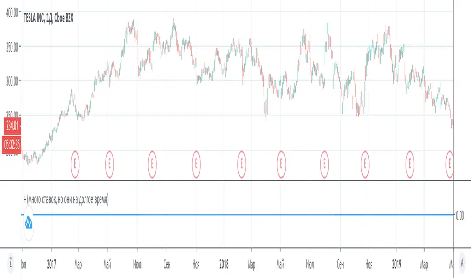
Rolling CAGR (Compound Annual Growth Rate)Simple and powerful Rolling CAGR (Compound Annual Growth Rate) script.
Works with daily, weekly, and monthly data. Do not work with data of hours, minutes, seconds, or customized time intervals.
You can change the rolling period, from the default (3 years) to any other period of years. Just change one value in the script.
Crescimento

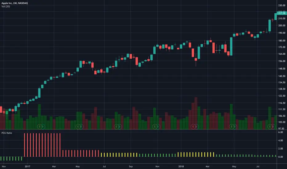
PEG Ratio (Most Accurate)Price Earnings To Growth (PEG) Ratio
PEG ratio is a stock's PE ratio divided by the growth rate of its earnings for a specified time period.
The PEG ratio is used to determine a stock's value while also factoring in the company's expected earnings growth, and it is thought to provide a more complete picture than the more standard P/E ratio.
PEG ratio 1 is fair value.
PEG ratio above > 2 is are generally considered overvalued.
PEG ratio below < 1 is Undervalued.
Negative PEG ratio indicate the company no growing in specified time period.
Example of How to Use the PEG Ratio
The PEG ratio provides useful information to compare competitive companies and see which stock might be the better choice for an investor's needs, as follows.
Google (13-Sep-2022) 👍
PEG ratio = 0.38%
P/E ratio = 19.17%
Meta (13-Sep-2022) 👎
PEG ratio = 0.63%
P/E ratio = 12.55%
Many investors may look at Meta and find it more attractive since it has a lower P/E ratio. But compared to Google, it doesn't have a high enough growth rate to justify its current P/E.
Google is trading at a discount to its growth rate and investors purchasing it are paying less per unit of earnings growth. Based on its lower PEG, Google may be relatively the better buy.

Blockchain Fundamentals - Active Address Sentiment Osc. [CR]Blockchain Fundamentals: Active Address Sentiment Oscillator AASO
Back with another script today, this one is a useful tool in helping to determine bitcoins value. We are looking at 2 data sources: the daily active addresses on the BTC blockchain, and the daily returns of BTC.
THIS INDICATOR WILL ONLY GIVE YOU THE CORRECT RESULTS ON THE DAILY TIMEFRAME
There is an interesting relationship that you can see by comparing the two timeseries. But for us to create a good indicator we first need to normalize the data. So we look at the percent change over the past 28 days for each metric (DAA and price).
THIS INDICATOR WILL ONLY GIVE YOU THE CORRECT RESULTS ON THE DAILY TIMEFRAME
We then calculate standard deviation bands around the DAA metric. We finalize them by averaging the bands over a 28 day period.
When the Price series (yellow line) is higher than the SD bands BTC is considered overvalued or price is overheated. A pullback could be expected soon. When the Price series is below the SD bands BTC is considered undervalued or price is oversold.
THIS INDICATOR WILL ONLY GIVE YOU THE CORRECT RESULTS ON THE DAILY TIMEFRAME
This tool doesnt give signals on the one minute chart or tell you exactly when to buy or sell. BUT what it does do is act as a convenient macro sentiment indicator that is not based completely upon price.
In an attempt to narrow down the really juicy areas, if you seen the background color highlights with white, that means its likely a top or bottom. At the very least on a local sense and many times in a cyclical macro sense as well. It also narrows down the signal to a generally more profitable area.
This indicator is not meant to be used on timeframes other than daily (did I mention that already?). I am lazy and did not code the calculations to be MTF (which is why you have to use on the daily chart). If you want to code this, please forward it on to me and I will post an update with a heartfelt credit to you.

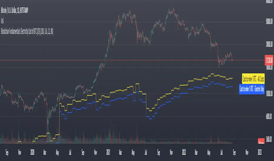
Blockchain Fundamentals: Electricity Cost of BTC [CR] Blockchain Fundamentals: Electricity Cost of BTC
After a hiatus, now a return to publishing tools and scripts for the community. This is my first script in over and year, and I have a number more coming soon as well! (so Stay Tuned!)
This is a simple calculator to estimate the cost of Bitcoin miners to mine one bitcoin. It works on all timeframes (doesnt have to be on daily).
By entering the inputs of total TH's, kWh used, cost of electricity per kWh (in USD cents) we can generate the electricity cost.
But miners also have other costs of operation including HVAC, maintenance, rent, etc. In light of that we include a multiplier that accounts for these extra costs. First, type in what percent of your total operating costs come from the electricity. Then check the enable total cost plot option and you will also see total costs in addition to electricity costs.
Its a simple model and gives anyone curious a starting point for their own testing and research.
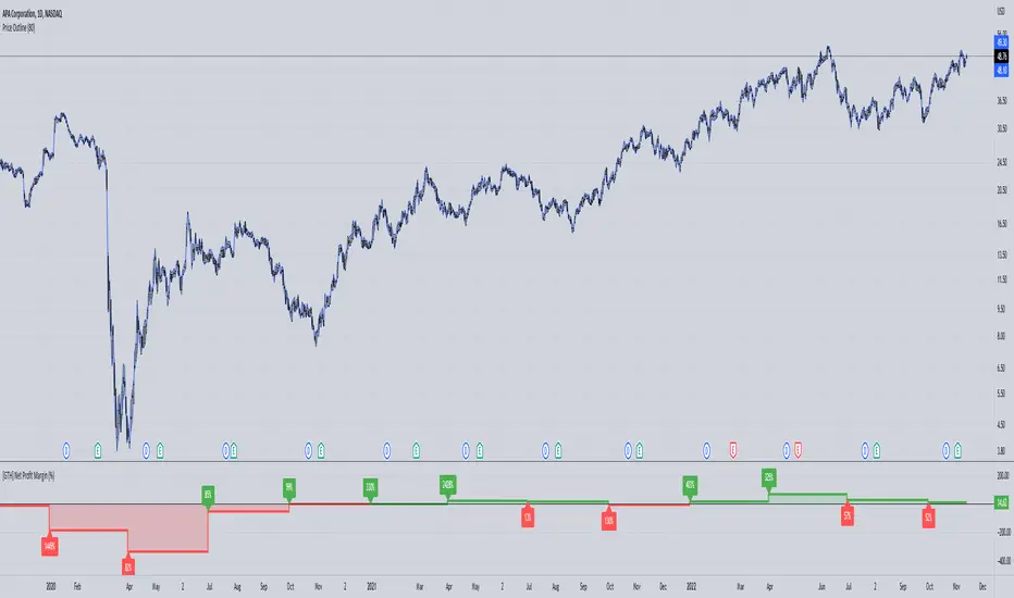
[GTH] Net Profit Margin (%)Displays the Net Profit Margin in a more "readable" fashion than the built-in TV Indicator.
This indicator concludes the series of 'Minervini-indicators', consisting of "GTH Earnings", "GTH Revenues" and "GTH Net Profit Margin (%)".
Famous trader Mark Minervini repeately describes rising earnings, revenues and net profit margin as the most important financials for finding superperformers.
In case of reporting a malfunction: Please be specific. Statements like "does not work" are useless. Thanks.
Growth Stock CyclicClick the chart below to see the "idea" associated with this script for documentation:

Growth Stock Arbitrage Indicator [@PierceARK]This indicator takes advantage of the fact that when the 10 and 5 year Treasury Constant Maturity Minus Federal Funds rates (T10YFF/T5YFF) go down sharply, investors tend to rotate into stocks. This arbitrage works great for growth stocks, since growth stocks are higher beta by virtue of their lower market cap and more speculative nature in general. This script identifies the moving-average convergence/divergence of the average of the 10y and 5y treasury rates and then finds the variance of that macd line. By averaging that variance with the macdline's inverse, an analog output of treasury -> stock rotation can be identified. The upper and lower thresholds bring buy and sell windows into focus.

EPS & SalesHi everyone,
I just adapted a little utility script to visualise EPS % increase (quarters vs Year -1) and sales.
I used the code from @ARUN_SAXENA and modified it to fix what I saw as issues.
(Using base 3M instead of 1M +
request.earnings(syminfo.tickerid, earnings.actual, ignore_invalid_symbol=true)
instead of
request.financial(syminfo.tickerid, "EARNINGS_PER_SHARE", "FQ")
Data will differ from MarketSmith because they use sometimes actual EPS sometimes standard, but think we can at least trust what we see in term of %
The tool is far from being perfect !


[dj]visible financial report
visible financial report
visible financial report (year-on-year) is a indicator for us market only, other market's data are wrong.
please check the "E" symbol's if the tradingview's data accurate.
this script using both request.financial and request.earnings. EARNINGS_ESTIMATE / earnings.estimate / TOTAL_REVENUE / TOTAL_OPER_EXPENSE
i share this script's for the purpose of tradingview staff will improve their financial data accuracy.
some stocks data are wrong, or missing such as NYSE:KR
i got many recommendations for improvemenet on tradingview ....but....
Relevant World GDP GroupedLooking at a basket of countries total GDP for comparing size of economy. Makes it easy to select your own groupings of countries for comparison. A country's GDP is the total of consumer spending (C) plus business investment (I) and government spending (G), plus net exports, which is total exports minus total imports (X – M). Alliances visualized was the original idea but wasn't quite sure for a lot of other countries where they stand so it is what it is; feel free to improve.

EPS DashboardThis script creates a little table in an indicator below your chart that allows you to view the earnings per share over the last year as well as calculates the year over year earnings per share growth. According to IBD, strong EPS growth is a great indicator of a potential super-performer stock so hopefully this will make it easier to keep an eye on this metric. Note it does not work on things without financial data like crypto, indexes, and ETFs.

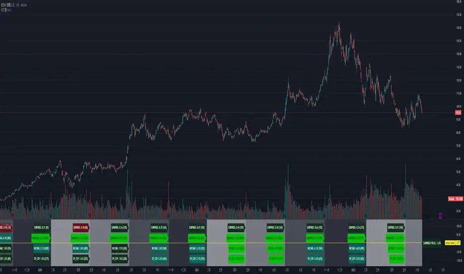
ds Revenue, Margins, Earnings TrendsPURPOSE: Looks for trends in Revenue, Margins, Earnings (RME) and provides a quick indication of where to focus your attention. Developed for educational purposes for my Investing Program Students at Everett Community College, Everett, WA.
WHAT IT DOES:
Based on the principle that fundamental trends support technical price trends this indicator intends to help swing and position trading students evaluate the income statement by exposing recent trends in the revenue, margins, and earnings looking at eight quarters of data. It requires three quarters to determine a trend therefore there is a heavy focus on the last three quarters of data. Tools and indicators should be used to "tell something useful" in this case it is specifically is revenue, margins, and earnings expanding, contracting, or flat? Is this movement accelerating or decelerating? Lastly some logic is used to interpret at glance whether this stock warrants a closer look into the fundamentals and technicals of this particular company.
HOW TO:
This is a brief description on how to use this tool
1. TOP ROW: This shows the symbol and then provides a summation indicator (Green Checkmark, Yellow caution triangle, Red X) for each section (Revenue, Margins, Earnings). At a glance shows strength/weakness/concerns.
2. TABLE: You will see 8 quarters of data assuming it is available broken into sections for Revenue, Margins, and Earnings.
3. COLUMNS: The text color red does not denote a negative number and the text color green does not denote a positive number. Rather in the column of data where it is displayed, the green text helps visually show a bullish trend when each value is greater than the prior value and the red text helps visually show a bearish trend when each value is less than the prior value. Yellow background in columns highlights values which should not normally be negative numbers.
4. 3Q TREND ROW: This row analyzes the last three quarters of data in the column to determine if the trend is rising, falling, or flat.
5. 3Q ROCK ROW: This row analyzes the last three quarters of data to determine if the trend is accelerating up, accelerating down, or momentum (MOM) is sideways.
6. BOTTOM ROW INDICATORS: Based on whether the numbers are negative or positive and the trend, This row shows one of the following results:
6a. Green Checkmark is considered acceptable performance.
6b. Yellow Caution Triangle indicates a closer inspection of this columns data is warranted.
6c. Orange Diamond is more serious than the Caution but not as bad as a Red Flag. Extra caution is required here.
6d. Red Flag indicates a warning that undesirable performance characteristics are associated with the data in this column.
3 Weeks Tight - Price Consolidation [LevelUp]3 Weeks Tight - Introduction
3 weeks tight is a bullish continuation pattern discovered by IBD's founder, William O'Neil.
The pattern can used as an opportunity to add to an existing position as it often occurs after a breakout above a cup with handle or other technical pattern.
The 3 weeks tight pattern forms when a stock closes within approximately 1% to 1.5% of the prior week's close for at least two weeks. The reason for the bullishness is that it indciates that investors who moved the stock upward in price since the breakout are not taking profits, the price is holding steady.
The buy point is just above the area of resistance formed at the highs of the three weeks plus 10 cents. The ten cent addition to the price is to ensure a push through the resistance at the high of the range.
Key Points:
It's preferred that closes for each week are in the upper half of the stock's range.
Ideally, volume will increase significantly as the stocks moves past the buy point.
This pattern generally performs best when the market is in an uptrend.
Features:
A configurable horizontal bar that spans the 3 week period.
A vertical band that highlights the tightness pattern.
A label to show the buy price after 3 week tight pattern.
Optional alert when the 3 weeks tight pattern is recognized.

the formation of an uptrendThe scenario adds up the maximum daily increases (i) and maximum daily decreases (l) over a certain period, and if the sum “i” exceeds a certain threshold, and above the sum “l”, then the indicator will work. We wait for a positive candle (1D), and after it we buy stocks (with a leverage of 1: 2), we wait for an increase of 50% (thanks to a positive trend), and sell.
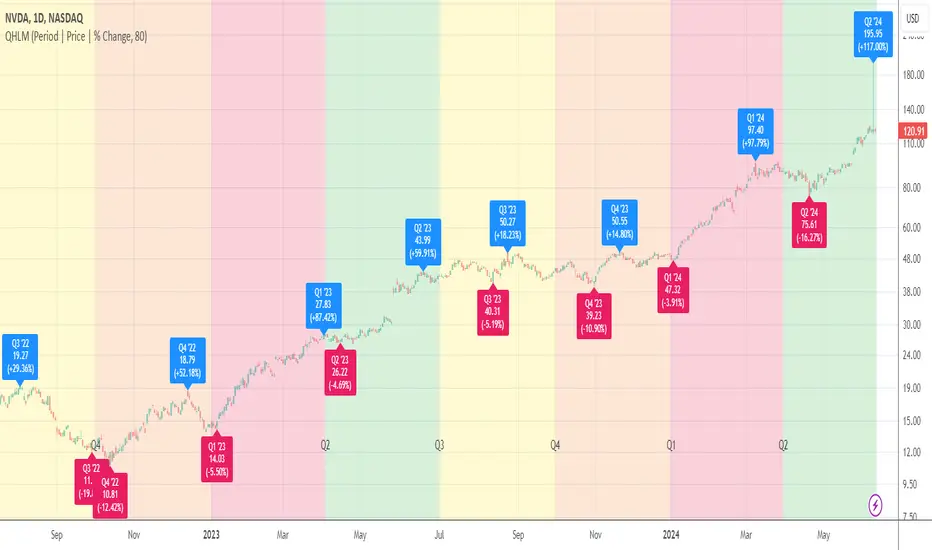
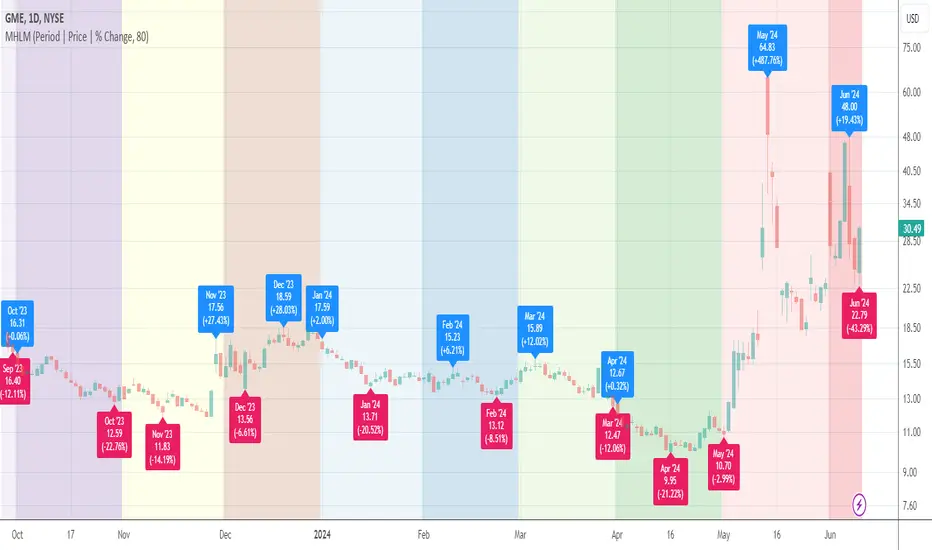
Quarterly High/Low MarksThis utility tool marks the highest and the lowest price of each quarter on the chart. Works everywhere and doesn't use any calls of built-in functions which are used for a data extraction.
Labels provide additional information about closing price and % change for a particular quarter and allow micro customizations.
Monthly High/Low MarksThis utility tool marks the highest and the lowest price of each month on the chart. Works everywhere and doesn't use any calls of built-in functions which are used for a data extraction.
Labels provide additional information about closing price and % change for a particular month and allow micro customizations.
Quarter Open Price LevelThis tool plots a dynamic level that represents the opening price of each quarter .
Labels provide additional information about the closing price and % change for a particular quarter and allow micro customizations.

Month Open Price LevelThis tool plots a dynamic level that represents the opening price of each month.
Labels provide additional information about closing price and % change for a particular month and allow micro customizations.

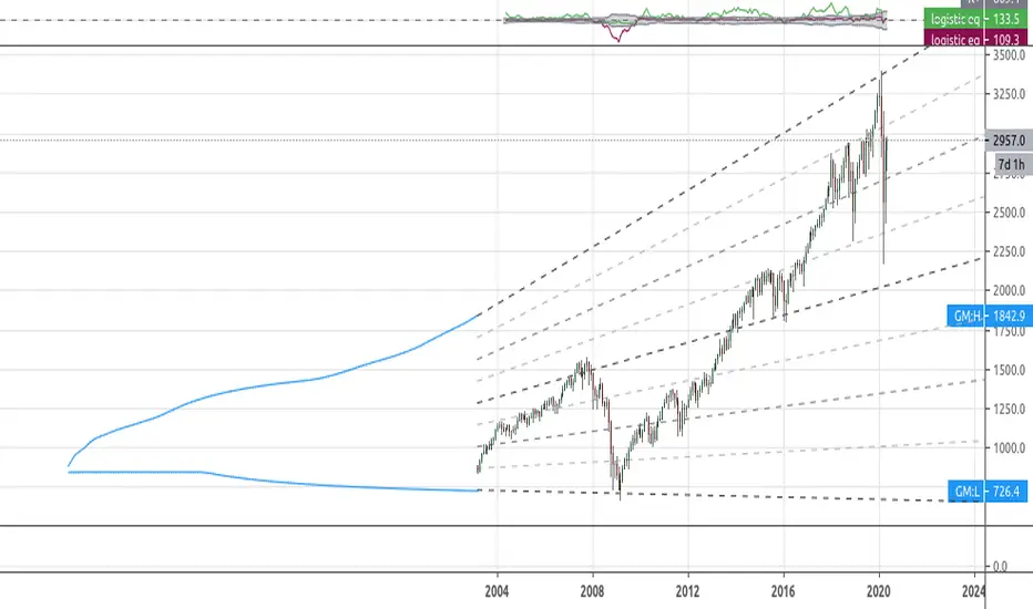
[RS]Simplistic Automatic Growth ModelsExperimental:
Automatic growth model generated from history..
note: you may need to scroll back to 1st bar to load data.
PEG RatioHello everyone,
Quick script to check the PEG Ratio.
What is PEG Ratio?
The price/earnings to growth ratio (PEG Ratio) is a stock's price-to-earnings (P/E) ratio divided by the growth rate of its earnings for a specified time period. The PEG ratio is used to determine a stock's value while also factoring in the company's expected earnings growth, and is thought to provide a more complete picture than the more standard P/E ratio.
A PEG Ratio greater than 1.0 means that the stock is overvalued, while below 1.0 means is is undervalued. When the PEG Ratio is exactly 1.0, then the stock is trading at fair valuation.
Formula:
PEG Ratio = (Price / EPS) / EPS Growth
Examples:
Company A:
Price per share = $46
EPS this year = $2.09
EPS last year = $1.74
Company B
Price per share = $80
EPS this year = $2.67
EPS last year = $1.78
Company A
P/E ratio = $46 / $2.09 = 22
Earnings growth rate = ($2.09 / $1.74) - 1 = 20%
PEG ratio = 22 / 20 = 1.1
Company B
P/E ratio = $80 / $2.67 = 30
Earnings growth rate = ($2.67 / $1.78) - 1 = 50%
PEG ratio = 30 / 50 = 0.6
The company A is overvalued whiled the B is undervalued.
In this script an overvalued stock is considered when the PEG Ratio is above 1.1, while it is 0.9 for an undervalued stock.
Only works with Stocks.
Happy trading,
Portfolio and Risk Management: Gold Based Net Growth CoefficientHello, if our topic is stocks, whatever signal we get, we have to divide and reduce the risk.
Apart from the risk, we need inflation-free figures to detect a clear growth.
Gold is one of the most successful tools to beat inflation in this regard in the historical context.
When the economy is good, we have to beat both commodities and inflation.
For this purpose, I found it appropriate to develop a net growth factor free from gold growth.
Investors need several stocks with a high growth rate and as much risk-free as possible.
Personally, I think that the science of portfolio and risk management will last a lifetime and should continue.
I think this subject is a research and development subject.(R & D)
My research and publications on this matter will continue publicly.
I wish everyone a good day.
NOTE : You can determine the return in the time period you want to look back by adjusting the period in the rate you want from the menu.
The standard value is 200 days. (1 year)
