Accumulation/Distribution Oscillator [MarkitTick]💡 This script presents a statistically normalized evolution of the classic Accumulation/Distribution (A/D) indicator, designed to transform unbounded volume flow into a bounded, actionable oscillator. By integrating Relative Volume (RVOL) weighting and Z-Score standardization, this tool isolates genuine institutional buying and selling pressure from market noise, offering a clear view of volume momentum regimes.
✨ Originality and Utility
The standard Accumulation/Distribution line is a cumulative total of volume flow, which often results in an unbounded line that drifts indefinitely with price trends. This makes it difficult for traders to identify overextended conditions or specific turning points.
This script solves that problem through a three-stage quantitative process:
Smart Volume Weighting: Instead of treating all volume equally, this indicator amplifies the impact of high-volume nodes using a Relative Volume (RVOL) filter. This ensures that significant institutional activity carries more weight than low-liquidity chopping.
Detrending: It subtracts a smoothed average (using ALMA, EMA, or others) from the raw A/D line to create a raw oscillator.
Normalization: Finally, it applies a Z-Score calculation to normalize the data. This bounds the oscillator around a zero mean, allowing for the application of Bollinger Bands to detect statistical extremes (2 or 3 standard deviations).
🔬 Methodology and Concepts
The calculation logic follows a strict quantitative pipeline:
● Money Flow Multiplier (MFM)
The core engine is the classic MFM calculation, which determines the location of the Close relative to the High-Low range. A Close near the High results in +1, while a Close near the Low results in -1.
● Advanced Volume Filtering
Before accumulation, the volume is processed through two filters:
RVOL Multiplier: If the current bar's volume exceeds its simple moving average (`rvol_len`), the volume is multiplied by a user-defined factor (`rvol_mult`). This emphasizes breakout candles.
Candle Strength (Optional): If enabled, weight is increased based on how close the price closes to the absolute high or low, rewarding decisive candle shapes.
● Z-Score Standardization
The script calculates the "Raw Oscillator" by subtracting a moving average (Signal Line) from the cumulative A/D Line. It then calculates the Z-Score of this raw value over a lookback period (`z_len`).
Formula: Z = (Value - Mean) / Standard Deviation
🎨 Visual Guide
The indicator renders a complex data set into an easy-to-read interface:
• The Oscillator (Line & Histogram)
The primary output is the Z-Score value.
Teal Histogram/Line: Represents Bullish momentum (Accumulation). Darker Teal indicates accelerating momentum (`osc > previous`), while lighter Teal indicates decaying momentum.
Red Histogram/Line: Represents Bearish momentum (Distribution). Darker Red indicates accelerating selling pressure, while lighter Red indicates exhaustion.
Gray: If the Trend Filter (200 EMA) or VWAP Filter is enabled and the signal opposes the trend, the histogram turns Gray to indicate a low-probability counter-trend signal.
• Bollinger Bands (Blue Bands)
These bands wrap around the oscillator line.
Upper Band: Usually set to +2 Standard Deviations. When the oscillator pierces this band, accumulation is statistically extreme (potential mean reversion or strong breakout).
Lower Band: Usually set to -2 Standard Deviations. Indicates statistically extreme distribution.
• Divergences
The script automatically detects and plots structural divergences:
Green Lines/Labels: Bullish Divergence. Price makes a Lower Low while the Oscillator makes a Higher Low.
Red Lines/Labels: Bearish Divergence. Price makes a Higher High while the Oscillator makes a Lower High.
• Multi-Timeframe (MTF) Dashboard
Located in the top right, this table displays the momentum status (BULL/BEAR) of the oscillator across three user-defined timeframes (default: 60min, 240min, Daily), allowing for fractal trend analysis.
📖 How to Use
This tool is best used for identifying trend exhaustion and hidden volume strength.
1. Trend Continuation
In a strong uptrend, look for the Histogram to remain Teal and above the Zero line. A pullback to the Zero line that bounces back up suggests buyers are stepping in to defend the trend.
2. Statistical Extremes
When the oscillator line breaks outside the Bollinger Bands, volume flow is significantly deviated from the norm.
If price is ranging, this often signals a reversal (Reversion to Mean).
If price is breaking out, this confirms strong impulse participation.
3. Divergence Reversals
A divergence is a leading signal. If price is pushing new highs but the A/D Oscillator fails to make a new high (Red Divergence Line), it indicates that the volume supporting the move is drying up, often preceding a correction.
⚙️ Inputs and Settings
● Oscillator Settings
Smoothing Type/Length: Choose between ALMA, EMA, SMA, etc., to smooth the A/D line. ALMA is default for its zero-lag properties.
ALMA Offset/Sigma: Fine-tune the responsiveness of the Arnaud Legoux Moving Average.
● Quant Filters
RVOL Lookback & Multiplier: Determines the threshold for "High Volume." Default is 1.5x average volume.
Z-Score Lookback: The period used to establish statistical significance (Default: 100).
Use VWAP/Trend Filter: Logical switches to gray out signals that contradict the macro trend (200 EMA) or the intraday mean (VWAP).
● Dashboard
Customize the three timeframes displayed in the MTF table to match your trading horizon (e.g., Scalpers might use 5m, 15m, 1h).
🔍 Deconstruction of the Underlying Scientific and Academic Framework
This indicator relies on the Law of Supply and Demand quantified through Standard Score (Z-Score) Statistics .
Standard Accumulation/Distribution is derived from the work of Marc Chaikin, positing that the proximity of the close to the high/low on high volume indicates the "smart money" flow. However, raw cumulative data suffers from heteroscedasticity (varying variance).
By applying Z-Score normalization:
Z = (x - μ) / σ
We transform the data into a standard normal distribution. This allows us to apply probability theory to volume analysis. A value of +2.0 is not merely "high"; it represents a volume flow intensity that falls within the top 2.2% of the data set (assuming normal distribution), providing a mathematically robust definition of "Overbought" or "Oversold" volume conditions.
⚠️ Disclaimer
All provided scripts and indicators are strictly for educational exploration and must not be interpreted as financial advice or a recommendation to execute trades. I expressly disclaim all liability for any financial losses or damages that may result, directly or indirectly, from the reliance on or application of these tools. Market participation carries inherent risk where past performance never guarantees future returns, leaving all investment decisions and due diligence solely at your own discretion.
Accumulationzone

Accumulation And Distribution Zones (Zeiierman)█ Overview
Accumulation And Distribution Zones (Zeiierman) is a structural zone indicator that highlights where the market has recently been absorbing sell pressure (Accumulation) or releasing buy pressure (Distribution).
The indicator tracks a refined sequence of swing highs and lows and measures how these swings tighten, expand, or step directionally. When they form staircase-style structures such as higher lows with compressing highs for Accumulation or lower highs with compressing lows for Distribution, the script marks these areas as shifts in market control.
Once the full pattern completes, the indicator converts it into an Accumulation or Distribution zone. Each zone is based on a confirmed structural sequence rather than a single point, making it more reliable and reflective of actual market behavior.
The indicator can also display a mini-volume profile within each zone and extend POC levels forward, showing where trading activity clustered most. Combined, these features reveal areas where price has recently shown acceptance, absorption, or rejection, helping you understand whether current price action is reacting to, breaking from, or retesting these important structural regions.
█ How It Works
⚪ Swing Structure
The indicator builds its foundation by detecting swing highs and lows using a configurable Swing Detection Window. Each confirmed swing is stored with its price, time, bar index, and direction. If two consecutive swings share the same direction, only the more extreme one is kept. This produces a clean structural sequence that removes noise and keeps only meaningful turning points.
⚪ Accumulation vs Distribution Pattern Logic
Using the refined swing sequence, the script looks for staircase-style formations that signal shifts in control:
Accumulation (bottoming): higher lows combined with compressing highs.
Distribution (topping): lower highs combined with compressing lows.
Two detection modes are available:
Quick for compact 4-swing formations
Slow for broader 6-swing structures
When a full structural pattern completes, the indicator marks the zone and resets the swing buffer for the next formation.
⚪ Volume Profile Construction
The price range between the zone’s upper and lower boundary is divided into several Rows. For every bar within the zone’s swing range, the bar’s volume is added to the appropriate price row.
Volume is classified as:
Bullish volume when close > open
Bearish volume when close < open
Each row is drawn as two horizontal segments (bull and bear), colored with smooth gradients based on your bull/bear color settings. This creates a compact profile that reveals where trading activity is concentrated inside the zone and whether buyers or sellers dominate those price levels.
█ How to Use
The indicator is designed to provide context and confluence, not raw buy/sell signals.
⚪ Spot Fresh Accumulation & Distribution
Use newly printed zones as a map of where the market has recently:
Absorbed selling and formed a floor (Accumulation below price).
Absorbed buying and formed a cap (Distribution above price).
In a trending environment, fresh accumulation zones below price are often areas to watch for pullbacks, while distribution zones above price can act as sell zones or targets.
⚪ Volume Profile
Longer horizontal bars show where the market traded the most volume inside the zone.
Bull-leaning rows inside an accumulation zone often signal strong buying interest during the formation.
Bear-leaning rows inside a distribution zone highlight concentrated selling pressure.
By combining this volume distribution with the zone label and the broader trend context, you can judge whether the structure is more likely to hold, break, or retest as the price approaches it again.
⚪ POC (Point of Control) Trading
Extended POC zones (Regular or Faded) can be treated as dynamic support/resistance rails:
When price revisits a prior accumulation POC and rejects it from above, the level may act as support. When price retests a distribution POC from below and fails to break through, it can act as resistance.
⚪ Combine with Your Own Strategy
The script does not decide direction for you. You get the most value by combining it with:
Your own trend filters (moving averages, higher timeframe structure, volatility measures).
Your preferred entry models (reversal candles, momentum breaks, liquidity grabs, etc.).
Higher-timeframe mapping.
Think of this tool as a map of where the market did meaningful business. You decide how to trade around those areas.
█ Settings
Acc/Dist Ranges – Master switch for drawing all Accumulation and Distribution zones. Turn this off to temporarily hide boxes while leaving supporting logic active.
Pattern – Shows or hides the swing-based pattern outline that formed each zone. Good for structural debugging and education.
Pattern Sensitivity
Quick – more responsive, detects smaller compact structures.
Slow – stricter, focuses on wider and more established zones.
Swing Detection Window – Pivot width used to confirm swing highs and lows. Larger values filter noise and produce bigger zones; smaller values pick up more minor structures.
Volume Profile – Enables the embedded volume profile inside each zone.
Rows – Number of price slices used to aggregate volume in the zone. Higher values give more detail but increase visual density.
Switch Order – Flips the horizontal order of bull vs bear volume segments within each row.
Extend Zones – Behaviour of POC and zone extension:
None – No forward extension.
Faded Zones – Store and draw up to four past POC zones as faded horizontal levels.
Regular Zones – Extend POC boxes forward until price breaks out.
-----------------
Disclaimer
The content provided in my scripts, indicators, ideas, algorithms, and systems is for educational and informational purposes only. It does not constitute financial advice, investment recommendations, or a solicitation to buy or sell any financial instruments. I will not accept liability for any loss or damage, including without limitation any loss of profit, which may arise directly or indirectly from the use of or reliance on such information.
All investments involve risk, and the past performance of a security, industry, sector, market, financial product, trading strategy, backtest, or individual's trading does not guarantee future results or returns. Investors are fully responsible for any investment decisions they make. Such decisions should be based solely on an evaluation of their financial circumstances, investment objectives, risk tolerance, and liquidity needs.

Edufx's Power of ThreeIndicator Overview
Name: Edufx's Power of Three
Purpose:
To highlight the high and low price ranges of specific hourly candles on a chart.
To visualize these ranges using rectangles.
Features
Visibility Toggle:
Users can enable or disable the visibility of the rectangles highlighting the high and low price ranges of the specified candles.
Customizable Rectangle Length:
Users can adjust the length of the rectangles that extend from the specified candle's high and low prices.
Price Range Tracking:
The high and low prices of the specified candles are tracked and stored.
Rectangle Drawing:
Rectangles are drawn from 5 bars before the end of the specified hour, highlighting the high and low price ranges.
How It Works
Price Range Tracking:
During each specified hour, the high and low prices are updated with the highest and lowest prices observed.
Rectangle Drawing:
At the end of each specified hour, the high and low prices are used to draw rectangles extending 5 bars backward from the end of the hour.
Rectangles are color-coded (red, green, and blue) for easy identification.
Usage
This indicator is useful for traders who want to monitor and react to key price levels at specific times of the day.
The visual rectangles help in identifying potential trading opportunities based on price action relative to these key levels.
Example
If the price moves above the high of the specified candle but fails to close above it, a visual rectangle will highlight this price range.
Similarly, if the price moves below the low of the specified candle but fails to close below it, the rectangle will indicate this range.
This indicator provides visual aids to assist traders in making informed decisions based on the behavior of price at specific key levels.

RSI Accumulation/Distribution [M]Hello everyone,
After my long tests, I observed that the rate of change of direction of the price was high after the periods when the RSI spent a long time outside the band. As a result of my observations, I prepared this indicator.
This indicator shows you the accumulation and distribution areas that occur outside the rsi band.
There are 3 different levels available.
Level 1 = 5 Bars
Level 2 = 7 Bars
Level 3 = 9 Bars
For example, if the RSI spends more than 9 bars below the 30 level or above the 70 level, it will paint that area red. Levels can be changed from the indicator settings. The rsi is smoothed with simple moving average to reduce fake signals.
Using the RSI A/D indicator with different indicators or patterns will increase your success rate.
Examples:

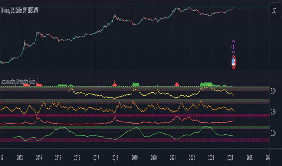
Accumulation/Distribution Bands & Signals (BTC, 1D, BITSTAMP) This is an accumulation/distribution indicator for BTC/USD (D) based on variations of 1400D and 120D moving averages and logarithmic regression. Yellow plot signals Long Term Accumulation, which is based on 1400D (200W) ALMA, orange plot signals Mid Term Accumulation and is based on 120D ALMA, and finally the red plot signals Long Term Distribution that's based on log regression. It should be noted that for red plot to work BTC 1D BITSTAMP graph must be used, because the function of the logarithmic regression was modified according to the x axis of the BITSTAMP data.
Signal bands have different coefficients; long term accumulation (yellow) and and the log regression (red) plots have the highest coefficients and mid term accumulation (orange) has the lowest coefficients. Coefficients are 6x, 3x and 1.5x for the red (sell) and yellow (buy) plots and 1x, 2x and 3x for the orange (buy) plot. Selling coefficient for the yellow and the orange plots are respectively 2x and 1x. Buy and sell signals are summed up accordingly and plotted at the top of the highest band.
Acknowledgement: Credits for the logarithmic regression function are due @memotyka9009 and Benjamin Cowen