Absorption BubblesSUMMARY
This indicator visualizes absorption events by plotting bubbles on candle wicks where volume activity suggests one side of the market is absorbing the other’s pressure. Instead of raw volume, the script normalizes activity against a rolling standard deviation defined by the Lookback Period. Bubbles appear on upper or lower wicks depending on whether buyers or sellers are absorbing pressure. The goal is to highlight whether aggressive orders are being accepted or absorbed at key price points.
METHODOLOGY
Absorption occurs when one side of the market absorbs aggressive orders from the other, preventing continuation. The script measures normalized volume against a user‑defined threshold to filter out weaker signals.
Green bubbles on upper wicks → Selling absorption (buyers push price up, sellers absorb the buying).
Red bubbles on lower wicks → Buying absorption (sellers push price down, buyers absorb the selling).
Red‑colored bars highlight candles where large volume is concentrated inside the body, signifying aggressive selling activity.
Green‑colored bars highlight candles where large volume is concentrated inside the body, signifying aggressive buying activity.
The Lookback Period controls how many bars are used to calculate the rolling standard deviation of volume, letting traders adjust sensitivity to recent vs. longer‑term activity. Optional significant volume lines extend forward, marking areas where absorption was strongest.
FUNCTIONS
Normalized volume detection using rolling standard deviation
Adjustable Lookback Period for volume normalization
Dynamic bubble plotting on candle wicks (size scales with absorption strength)
Separate visualization for buying vs. selling absorption
Alerts for buying absorption, selling absorption, or any absorption event (only at bar close)
Bar coloring when large absorption occurs inside candle bodies
APPLICATION
Setup: Add the script to any chart and timeframe. Adjust the Absorption Threshold to filter out weaker bubbles and the Lookback Period to control how volume normalization is calculated. Red bubbles highlight buying absorption, often signalling potential price pivots - price can often go upwards from this. Green bubbles mark selling absorption, reflecting resistance to upward moves - price may go downwards from this.
Interpretation:
Green bubbles on upper wicks = sellers absorbing buying pressure.
Red bubbles on lower wicks = buyers absorbing selling pressure.
Larger bubbles = stronger absorption relative to recent volume.
Settings & Use:
Raising the Absorption Threshold filters out smaller bubbles, leaving only significant absorption events.
Changing the Lookback Period alters how “normal” volume is defined — shorter periods make the script more sensitive, longer periods smooth out noise.
Alerts can be set for buying absorption, selling absorption, or any absorption event, and they only trigger at bar close to avoid noise.
Volumedelta

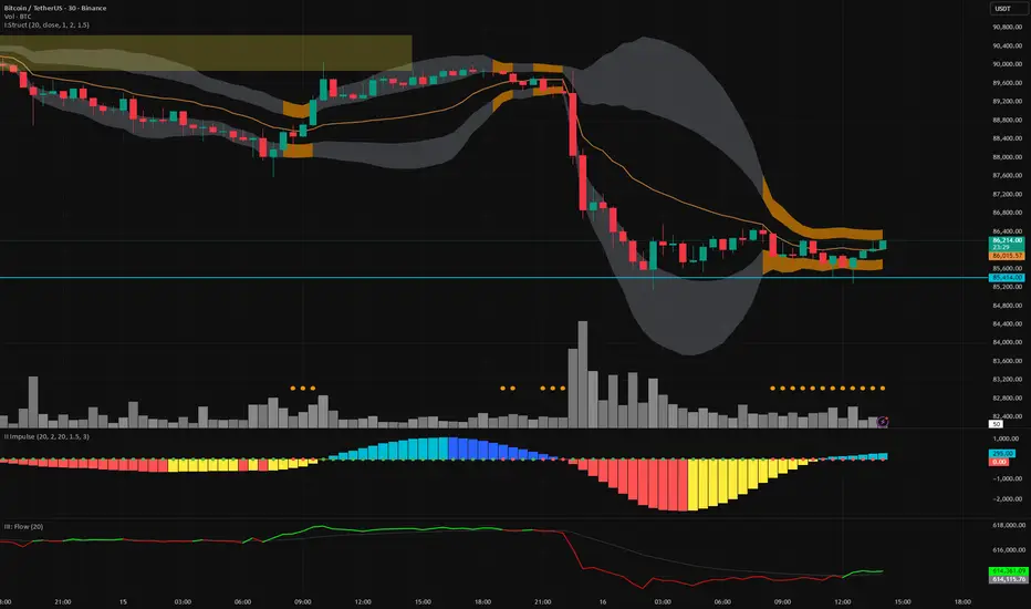
Vector Trinity III: Flow [CVD]**1. Introduction: The Truth Serum**
This indicator is **Part 3** of the "Vector Trinity" trading system. It is the final validator in the decision-making process.
While Part I defines the *Structure* and Part II identifies the *Impulse*, **Part III (Flow)** answers the most critical question in trading: **"Is there real money behind this move?"**
It represents the **Energy Dimension**, analyzing the Cumulative Volume Delta (CVD) to spot true breakouts and expose traps.
* **I: Structure:** Spatial boundaries.
* **II: Impulse:** Momentum timing.
* **III: Flow:** **Capital validation & Divergence detection (Current Indicator).**
**2. Core Logic: CVD Estimation**
True "Delta" requires tick-by-tick data, which is often unavailable or premium-locked. **Vector Trinity III** uses a sophisticated **Intrabar Position Estimation** algorithm to mathematically approximate buying vs. selling pressure:
* **The Math:** It analyzes where the Close sits relative to the High and Low of the candle.
* Close near High = Dominant Aggressive Buying.
* Close near Low = Dominant Aggressive Selling.
* **The CVD:** It accumulates these delta values over time to create a continuous "Flow" line. This reveals the long-term intent of smart money.
**3. The Trend Line & Divergence**
The indicator features a **Grey Trend Line** (EMA of CVD) which serves as the baseline for "Net Flow."
* **Teal Zone (Above Trend):** Net Inflow. Capital is aggressively entering the market, supporting the price.
* **Maroon Zone (Below Trend):** Net Outflow. Capital is leaving the market, suggesting weakness.
**4. The "Trap" Detector (Divergence)**
The primary superpower of this indicator is spotting **Divergences**:
* **The Bull Trap (Fakeout):** Price makes a Higher High, but CVD makes a Lower High (or trends down).
* *Meaning:* The price is rising due to a lack of liquidity, not aggressive buying. **Smart money is selling into the rally.**
* **The Bear Trap (Shakeout):** Price makes a Lower Low, but CVD makes a Higher Low.
* *Meaning:* Smart money is absorbing the selling pressure (buying the dip).
**5. How to Use**
* **The "Trinity" Confirmation:** Before taking a trade based on Part I (Structure) and Part II (Impulse), look at Part III.
* **For a Long Setup:**
1. Price breaks the Structure (Part I).
2. Momentum fires Green/Cyan (Part II).
3. **Flow (Part III) MUST be Teal and rising.**
* **The Veto Rule:** If Price breaks up, but Flow is Maroon/Falling, **CANCEL the trade**. It is likely a trap.
**Settings:**
* **Trend Length:** 20 (Standard trend baseline to determine Net Inflow/Outflow).
---
### **中文说明**
**1. 简介:市场的“测谎仪”**
本指标是“矢量三位一体”交易系统的 **第三部分**。它是决策过程中最后的验证者。
第一部分 (Structure) 定义了结构,第二部分 (Impulse) 识别了脉冲,而 **第三部分 (Flow)** 则回答了交易中最关键的问题:**“这波行情背后有真钱吗?”**
它代表了系统的 **能量维度**,通过分析累积成交量 Delta (CVD) 来识别真正的突破并揭露市场陷阱。
* **I: Structure 结构:** 空间边界。
* **II: Impulse 脉冲:** 动能时机。
* **III: Flow 流向:** **资金验证与背离侦测(本指标)。**
**2. 核心逻辑:CVD 估算算法**
真正的“Delta”数据通常需要逐笔成交数据 (Tick Data),这往往需要付费数据源。**Vector Trinity III** 使用了一套精密的 **K线内相对位置估算 (Intrabar Position Estimation)** 算法,在数学上逼近真实的买卖压力:
* **算法原理:** 它分析收盘价在 K 线最高价和最低价之间的相对位置。
* 收盘接近最高价 = 主动买入主导。
* 收盘接近最低价 = 主动卖出主导。
* **CVD (累积值):** 它将这些 Delta 值随时间累积,形成一条连续的“资金流向”线。这揭示了主力资金的长期意图。
**3. 趋势线与背离**
指标包含一条 **灰色趋势线** (CVD 的均线),作为“净流量”的基准。
* **青色区域 (趋势线上方):** 净流入。资金正在积极入场,支撑价格上涨。
* **深红区域 (趋势线下方):** 净流出。资金正在撤离市场,暗示行情虚弱。
**4. “陷阱”侦测器 (背离)**
本指标的核心超能力是识别 **背离 (Divergence)**:
* **多头陷阱 (诱多/假突破):** 价格创出新高,但 CVD 却创出新低(或趋势向下)。
* *含义:* 价格上涨是因为缺乏流动性(空涨),而不是因为有主动买盘。**主力资金正在借反弹出货。**
* **空头陷阱 (诱空/洗盘):** 价格创出新低,但 CVD 却在抬高。
* *含义:* 主力资金正在吸收抛压(在此位置吸筹)。
**5. 使用方法**
* **“三位一体”共振验证:** 在根据第一部分 (结构) 和第二部分 (脉冲) 开单之前,必须查看第三部分。
* **做多设置:**
1. 价格突破结构 (Part I)。
2. 动能点火变绿/青色 (Part II)。
3. **资金流 (Part III) 必须呈现青色且向上攀升。**
* **一票否决权:** 如果价格向上突破,但资金流是深红色/下降的,**立即取消交易**。这极大概率是一个陷阱。
**参数设置:**
* **Trend Length (趋势周期):** 20 (用于确定净流入/流出的标准基准线)。
Rolling VWAP Structure [MTF]Core Logic: Rolling VWAP & MTF**
* **Rolling VWAP (Volume-Weighted Average Price):** Unlike a simple Moving Average, this centerline weighs price by volume. It represents the true "Institutional Cost Basis" over the rolling period (default 20).
* **MTF (Multi-Timeframe) Capability:** The indicator is locked to the **Daily (1D)** timeframe by default. This acts as a stable "Lighthouse," ensuring that intraday noise does not distort the major structural levels.
* *Stepped Lines:* On lower timeframes, the lines appear stepped. This is intentional. It shows that the structural value remains constant throughout the day until the daily close shifts the calculation.
**3. Market Profile Logic: Balance vs. Imbalance**
This indicator visually decodes the market cycle using Auction Market Theory:
* **Orange Zone (Squeeze) = Balance:** When the bands contract (and turn Orange), the market is in equilibrium. This is a high-volume node where price is accepted. **Note:** Historical Orange Zones often act as strong Support/Resistance upon retest.
* **Grey Cloud (Expansion) = Imbalance:** When price breaks into the Grey "Highway" (1.0 - 2.0 StdDev), the market enters Price Discovery mode (Trending).
**4. Key Features & Settings**
* **Fixed Timeframe:** Select the timeframe you want to monitor (e.g., "1D" for Daily structure, "1W" for Weekly).
* **Clean Visuals:** The bottom signal dots have been removed for a cleaner chart.
* **Squeeze Toggle:** You can now **hide the Orange Squeeze color** in the settings if you prefer a unified Grey look for strictly structural analysis.
---
### **中文说明**
核心逻辑:Rolling VWAP 与 跨周期 (MTF)**
* **Rolling VWAP (滚动成交量加权均价):** 与简单移动平均线不同,中轨根据成交量对价格进行加权。它代表了滚动周期内(默认20)真实的“机构持仓成本”。
* **MTF (跨周期) 能力:** 指标默认锁定在 **日线 (1D)** 周期。这就像一座稳定的“灯塔”,确保日内的短期噪音不会扭曲主要的结构性点位。
* *阶梯状线条:* 在小周期图表上,轨道呈现阶梯状。这是有意设计的,代表当天的结构价值是固定的,不会随秒级波动而改变。
**3. 市场轮廓逻辑:平衡与失衡**
本指标利用拍卖市场理论可视化解码市场周期:
* **橙色区域 (挤压) = 平衡 (Balance):** 当布林带收缩(并变橙色)时,市场处于均衡状态。这是筹码密集的高成交量区。**注意:** 历史上的橙色区域在未来回踩时往往起到强力的 支撑/阻力 作用。
* **灰色云带 (扩张) = 失衡 (Imbalance):** 当价格突破进入灰色“高速公路”(1.0 - 2.0 标准差)时,市场进入价格发现模式(趋势)。
**4. 主要功能与设置**
* **Fixed Timeframe (锁定时间框架):** 选择你想要监控的周期(例如 "1D" 看日线结构,"1W" 看周线结构)。
* **视觉净化:** 移除了底部的信号圆点,让主图背景更加纯粹干净。
* **Squeeze Toggle (挤压色开关):** 你现在可以在设置中**隐藏橙色挤压显示**。如果你更偏向纯粹的结构分析,可以选择让通道始终保持灰色。

Delta Grid Delta Grid H/L/C (Approx)
Delta Grid H/L/C (Approx) is an order-flow style table that breaks down intrabar delta behavior per candle and displays it in a clean, easy-to-read grid below your chart.
Instead of guessing what happened inside a candle, this indicator shows you:
Delta High – the maximum aggressive buying reached within the bar
Delta Low – the maximum aggressive selling reached within the bar
Delta Final – where delta closed when the candle finished
All values are displayed in a stand-alone table, making it easy to scan recent bars and quickly spot momentum shifts, absorption, and potential trap behavior.
How It Works
This indicator approximates intrabar delta by:
Aggregating lower-timeframe volume
Classifying volume direction based on price movement
Tracking the running delta inside each candle
Recording the highest, lowest, and final delta values per bar
A heat-mapped background is applied to the Final Delta column:
Green shades = net aggressive buying
Red shades = net aggressive selling
Brighter colors = stronger imbalance relative to recent bars
Key Features
Stand-alone Delta Grid panel below the chart
Per-bar Delta High / Delta Low / Delta Final
Heat-mapped Final Delta for fast visual interpretation
Optional time column for precise bar reference
Adjustable lookback and scaling settings
Clean layout designed for futures, crypto, and index trading
How Traders Use It
This tool is ideal for:
Spotting absorption at highs and lows
Identifying failed breakouts and traps
Confirming trend strength or exhaustion
Reading order-flow shifts without footprint charts
Pairing with VWAP, Initial Balance, Supply & Demand, and Market Structure
Important Notes
This is an approximate delta calculation due to TradingView data limitations.
It does not use true bid/ask volume.
For true order-flow delta, a platform with native tick data (e.g., Tradovate or NinjaTrader) is required.
Recommended Settings
Use a lower timeframe (1s–15s if available) for better intrabar accuracy
Combine with key levels (VWAP, IBH/IBL, prior highs/lows) for best results

Pulsar Heatmap CVD/OBV [by Oberlunar]Pulsar Heatmap CVD/OBV by Oberlunar is a non-repainting order-flow-like indicator designed to support fast, practical decisions—especially for day trading and scalping. It blends OBV and CVD into a structured heatmap with three lanes (OBV, CVD, and a blended COMBO) and splits each lane into two halves: flow pressure and price reaction (PriceΔ) . All values are normalised into the same range, so the intensity of each component is easy to compare at a glance.
In a simple sense, Pulsar Heatmap aims to provide a clean, integrated order-flow view: one framework that turns well-known volume concepts into a clearer read of market pressure and response. Personally, it feels like the kind of tool I would have always wanted on my chart, because it brings familiar information together into a more organic picture that is easier to use in real time.
Visually, the indicator is built around three main elements: the heatmap lanes , a pulsing triangle HUD , and a timed dashboard table . Under the hood, it follows a clear hierarchy: a Bias layer (directional context with a confidence percentage), a strict Signal layer (triggered only when full alignment occurs, with optional confirmation and stickiness), and optional timing logic based on ROC + Acceleration to validate impulses and highlight potential Exhaustion or Absorption regimes. With the option "Safe Mode" enabled, calculations update only on confirmed bars, so signals remain stable and do not repaint.
Optionally, the script can also print signal arrows/labels on the main chart only when a real Signal triggers (not when you only have Bias). To keep the chart clean, the same-direction label is not repeated unless the next signal appears at a more advantageous price than the previous one (for shorts: a higher price; for longs: a lower price). If the direction flips (SHORT → LONG or LONG → SHORT), label printing is re-enabled immediately.
What makes Pulsar Heatmap feel different is that it doesn’t leave you with two separate lines and a lot of guesswork. It organises the information into a readable decision map: pressure , response , agreement , disagreement , impulse , and timing . It was built with scalping in mind, but it’s not limited to scalping: the structure is useful whenever you want context first, and a strict trigger only when alignment is truly present.
Clean Trend Alignment (Ideal Continuation)
A “best case” scenario where flow and price response agree across lanes, so the system produces a high-confidence direction and a clean trigger. Show the heatmap with consistent colouring, the Bias band strong, and a confirmed signal/bias.
Setup 1 — Long Signal (Clean Alignment + Impulse)
In this example, Pulsar Heatmap transitions into a clear long setup when the system prints a LONG SIGNAL . The key idea is simple: the indicator does not enter on “bias” alone. It waits for full alignment across the internal lanes, optionally reinforced by the ROC/Acceleration impulse layer, and only then does it confirm a signal on a closed bar (Safe Mode).
What to highlight on the screenshot
The LONG SIGNAL label: this is the only moment the setup is considered “triggered”.
The LONG BIAS % label: this is context (direction + confidence), not the trigger.
The Triangle HUD : it visually summarises which component is driving the move (OBV/CVD/COMBO weight).
The Timed Table : show that Exhaustion is OFF while impulse metrics are supportive ( dynROC U and dynACC U positive).
If present, the Absorption state (e.g., ABS_LONG + “tight range”): it often appears during compression before expansion, and it adds context to why the breakout can accelerate.
How to read this long setup
Context : Bias is long (even if the % is not huge yet), and the system is not showing exhaustion.
Trigger : A LONG SIGNAL appears only after full alignment (with confirmation bars). If dynamic gating is enabled, the signal is valid only when the impulse agrees.
Quality checks : Positive dynROC and dynACC support the timing; absence of exhaustion reduces the risk of “late entry”. Absorption/tight range can indicate a “pressure build-up” phase.
Practical scalping execution (simple rule set)
Entry timing: consider the entry only on (or immediately after) the confirmed LONG SIGNAL candle.
Risk idea: invalidate the setup if the signal flips, or if price falls back into the compression/range that preceded the move (common absorption-breakout logic).
Exit clue: if Exhaustion turns ON or impulse weakens (acceleration flips), treat it as a warning to reduce exposure or take profit.
Setup 2 — Short Signal After Compression (Absorption → Release)
In this screenshot the short trade idea is not coming from “red candles” alone, but from a very specific sequence: the heatmap shows a shift into bearish alignment, the system prints a SHORT SIGNAL , and the timed module confirms that the market was in a tight range while sell pressure started to dominate.
What this image is really showing
You have a SHORT SIGNAL label on the chart: this is the trigger moment (not the bias).
The context reads SHORT BIAS 18% : it’s supportive, but the execution decision is driven by the signal.
The table shows Absorption = SHORT with a tight range (Range % is low): this often means price was compressed while one side kept applying pressure.
dyn metrics are negative ( dynROC U < 0 and dynACC U < 0): the impulse is coherent with the short direction, so the move is not just “random drift.”
How to read the heatmap here
Earlier, the lanes are mixed (more “two-sided”), then near the signal, the heatmap becomes decisively bearish. That change matters: it tells you the market stopped being balanced and started leaning in one direction with better internal coherence.
Why is this short “high quality” in scalping terms
Compression first : absorption/tight range means the market was storing energy.
Alignment next : the signal appears when the internal lanes agree.
Impulse last : negative ROC + negative acceleration support a real downside push, reducing the odds of a weak, slow fade.
Simple ensure-you-don’t-overtrade rule
Treat the SHORT SIGNAL as the only “go” moment. If you only see bias without signal, or the heatmap stays mixed/disagreeing, it’s usually a lower-quality scalp environment.
Disagreement Zone (Mixed Votes, Higher Risk) — A Practical Exit Area
In this screenshot, Pulsar Heatmap is clearly warning that the market is no longer “one-sided”. You can still see a directional context ( SHORT BIAS 11% ), but the key message is the DISAGREE tag: the reminder that the internal votes are split and the flow/price components are no longer moving in a clean, coherent way.
What this means in a trend continuation is very practical: a Disagreement Zone is often a good EXIT area . When you are already in a short trend, this is the moment where continuation becomes less reliable and where the market can start rotating, stalling, or snapping back.
Why it works as an exit trigger
In a healthy continuation, the lanes tend to stay aligned. Here they don’t: one or more halves contradict the dominant direction.
That loss of coherence typically shows up before the chart becomes obvious, so it can act as an early warning.
For scalping, this is where risk/reward often deteriorates: spreads, noise, and whipsaws increase exactly when the indicator starts disagreeing.
How to use it in a simple way
If you are already short , treat DISAGREE as a signal to take profit, tighten the stop, or scale out .
Avoid adding to the position inside disagreement: even if bias remains short, the internal structure is not “clean” enough to justify aggressive continuation entries.
If later the heatmap returns to full alignment and a new SHORT SIGNAL appears (ideally at a better price), then the continuation becomes actionable again.
“DISAGREE during a short continuation: coherence breaks down. In practice, this is often an exit/scale-out zone, not a fresh entry zone.”
Setup 3 — Neutral State (Stand-By Zone, No Trade Yet)
In the following screenshot, Pulsar Heatmap is doing something very important: it is clearly saying NEUTRAL 0% . Even if, visually, price could “look” like it might resume upward, the indicator is not providing a directional edge yet. This is a classic stand-by condition: the market is transitioning, and the internal components are not aligned enough to justify a directional scalp.
“Neutral 0%: mixed votes and no dominant driver. Even if the price looks promising, Pulsar stays in stand-by until bias rebuilds and a confirmed signal appears.”
What to highlight on the screenshot
The centre label NEUTRAL 0% : this is the key message—no bias strength worth following.
The heatmap is mixed/transitioning: lanes are not consistently one colour, meaning votes are not coherent.
The triangle HUD sits close to the centre: it visually reflects “no dominant driver” right now.
The table can still show background context (e.g., Absorption with a tight range), but that does not override neutrality: it’s information, not a trigger.
How to interpret “Neutral” in practice
When the indicator is neutral, it means the system sees a balance between pressure and reaction (or conflicting components), so direction is statistically less reliable. In scalping terms, this is usually where spreads and noise can eat you alive if you force entries.
Why this is still useful (even without a trade)
Neutral is not “nothing”—it is a filter. It prevents you from trading when the signal quality is low, and it forces the workflow to be clean: wait for Bias to build, then wait for a confirmed Signal , and only then treat it as a real setup.
What you wait for next
If the market turns bullish again, you want to see heatmap alignment returning and eventually a confirmed LONG SIGNAL —however, in the following examples, the heatmap does not follow the trade completely (unlike the previous generated long signal). Thus, a long entry is very risky.
If the market rolls over, you want the opposite: bearish alignment and a confirmed SHORT SIGNAL . Until one of these happens, Neutral = stand-by .
Setup 4 — Impulse + Exhaustion (Late-Stage Move, Don’t Chase)
In this screenshot, you’re basically seeing a “timing warning” configuration. Price prints a sharp bearish extension, but Pulsar Heatmap is not presenting it as a clean continuation setup: the center read is NEUTRAL 0% , while the timed engine shows both Absorption = SHORT and Exhaustion = SHORT . That combination often means: the downside pressure was real, but the move is already in a late/fragile phase (good for managing an existing short, not for opening a new one).
How to read it (practical scalping logic)
Absorption SHORT = there was compression/tight action with persistent bearish pressure building under the surface.
Exhaustion SHORT = the impulse is “spent” or destabilising (acceleration signature is no longer healthy for continuation entries).
Neutral 0% on the main HUD = the system is not granting directional confidence anymore, even if the last candles look aggressive.
Translation: if you were already short, this zone is often for taking profit / tightening risk . If you are not in, it’s usually a wait-for-reset moment.
Possible mean reversions in yellow
Those yellow tiles are the indicator’s “caution prints” (the same colour family used to express DISAGREE ). They appear when the internal structure becomes mixed —i.e., some halves/lanes are not supporting the dominant direction cleanly (or a divergence-style conflict is detected). In practice, they often mark the transition from clean pressure to noisy/late pressure , which is exactly where chasing entries tends to be punished.
How to use them
In a trend continuation, yellow tiles are a strong hint to stop adding and to manage risk more defensively (or treat the phase as “risky trend reversion”).
When they show up near an extension candle (like here), they often signal that the move is shifting into a less stable regime—better for protecting profits than for initiating new entries.
Stepping back for a moment, OBV (On-Balance Volume) and CVD (Cumulative Volume Delta) are both classic tools for studying volume flow, but they differ in what they measure. OBV tracks cumulative volume using price direction: it adds volume on up closes and subtracts it on down closes. CVD tracks the net difference between buying and selling pressure, aiming to reflect the effective push from buyers versus sellers. Both describe the "force behind price" , but from different angles.
OBV is the more traditional approach. It increases when the market closes higher and decreases when it closes lower, so it often works well as a trend-support and divergence tool: if price rises while OBV falls, that mismatch can suggest weakness beneath the move. Because it relies on the close-to-close direction, OBV naturally aligns with trend confirmation across bars.
CVD , instead, is about the ongoing battle between buyers and sellers. Conceptually, it accumulates the net delta between aggressive buying and aggressive selling over time. Positive values tend to indicate stronger buying pressure; negative values indicate stronger selling pressure. Its focus is the tug-of-war itself—who is pushing, rather than simply whether the bar ended up closing up or down.
The practical differences are straightforward. OBV uses the closing direction to assign the full volume, so it tends to be more connected to the overall trend structure. CVD is usually more sensitive to shifts in pressure and can react faster when the market changes character. OBV is commonly used to confirm trends and highlight divergences; CVD is commonly used to spot early pressure changes and moments where one side starts to dominate.
This is also why combining them inside one normalised framework can be so effective. You are not relying on a single volume interpretation. You are pairing a trend-confirmation view (OBV) with a pressure-sensitive view (CVD), and you are making them comparable in a shared scale so agreement and divergence become immediately visible. When they agree, conviction is clearer. When they diverge, you often see important information—hesitation, absorption, or pressure that the price is not fully accepting.
👁️ by Oberlunar ⭐

SwiftEdge APEEXSwiftEdge Apeex – Volume-Weighted VWAP + Live POC + True Footprint-Precise Big Trades
This indicator combines three powerful and complementary tools used by professional traders:
1. Volume-Weighted EWMA VWAP with Dynamic Deviation Bands
A smooth, volume-weighted VWAP using an exponentially weighted moving average of variance. The deviation bands (1σ, 2σ, 3σ) dynamically expand and contract with actual market volatility — giving far more realistic support/resistance levels than fixed-percentage bands.
2. Session-Based Live Point of Control (POC)
The classic intraday POC (highest traded volume price) calculated from session start (default 09:00). Resets cleanly at your chosen session time.
3. True 1-Second Footprint-Precise Big Trade Bubbles
Unlike traditional volume spike indicators that only show "where the candle closed", this version uses real 1-second data to calculate the exact delta-weighted price where aggressive buying or selling actually occurred inside the bar.
- All levels from 1.2× to 8× average volume are shown
- Bubble size scales with significance (1.2× = tiny → 8× = huge)
- White outline on 5× and 8× for instant visual impact
- Yellow background highlights bars with significant volume
Why this combination works so well:
- VWAP + deviations give you the macro institutional reference levels
- POC shows where the market actually accepted the most volume
- The footprint-precise bubbles show you exactly where the smart money entered or absorbed — often many ticks away from the candle close
Best used on 1m to 1h timeframes on liquid futures (ES, NQ, CL) or crypto (BTC, ETH).
No lookahead. No repainting. Pure price + volume truth.

Advanced Volume Suite (24h, Pulse, Spikes, Breakout Pressure)Advanced Volume Suite transforms raw volume into a complete market-intelligence toolkit for breakout, momentum, and liquidity-driven trading.
Unlike the basic volume indicator, this tool analyzes volume in true USDT value, tracks rolling 24h exchange-style volume, measures volume strength vs historical averages, detects smart spikes, and highlights breakout pressure near support/resistance.
Core Features:
• USDT-based volume histogram
• 24h rolling volume line
• Volume Pulse (volume vs moving average)
• Smart spike detection with directional filters
• Breakout pressure system (breakouts + near-breakout conditions)
• 3 advanced volume color modes (Simple / Body / Delta-style)
• All signals and thresholds fully configurable
Perfect for traders who rely on volume confirmation for breakouts, momentum entries, scalping, or detecting institutional activity.

BT Delta AbsorptionBT Absorption detects aggressive counterflow volume—moments where one side
of the market (buyers or sellers) attacks aggressively, yet price fails to move
proportionally.
This is the classic definition of absorption:
"Large market orders are being absorbed by strong passive limit orders."
Absorption is one of the most reliable early signals for:
Reversals
Trap conditions
Failed breakouts
Liquidity grabs
Fake displacement moves
---
■ What BT Absorption Measures
1. Delta Imbalance
Identifies when buying or selling pressure becomes unusually one-sided.
2. Volatility Mismatch
Shows when large delta does NOT translate into meaningful price movement.
3. Absorption Strength Score
A normalized reading (often 0–100) showing the intensity of counterflow activity.
4. Wick & Structure Absorption
Wick-driven absorption helps identify:
Failed sweeps
Stop hunts
Rejection zones
Trapped traders
---
■ Why Absorption Matters
Absorption almost always precedes:
Reversals
Failed breakout moves
SMC/ICT-style displacement
Order block formation
Trend continuation after a trap
When aggressive traders cannot move price toward their desired direction,
the move typically reverses quickly—and with force.
---
■ Visual Elements
• Bull Absorption Marker
Often appears near lows—signals seller aggression failing to push price down.
• Bear Absorption Marker
Often appears near highs—signals buyer aggression failing to break higher.
• Absorption Score Heatmap (optional)
Shows intensity of absorption per candle.
• Threshold Levels
Identify when absorption becomes statistically significant.
---
■ How to Use BT Absorption in Trading
1. Reversal Detection
Look for absorption after:
Equal highs/lows
Sweeps
Stop runs
Breakout failures
This is often the earliest possible signal that a reversal is coming.
2. Filter Breakouts
A breakout without absorption is usually weak.
A breakout with absorption against it is likely a fakeout.
3. Confirm SMC/ICT Concepts
The indicator pairs perfectly with:
Fair Value Gaps
Order Blocks
Liquidity sweeps
Displacement legs
If your setup triggers and absorption confirms → high confidence.
4. Identify Trap Conditions
Absorption often marks:
Trapped breakout chasers
Trapped trend shorts
Imbalanced orderflow
These create ideal high-R trades.
5. Alert-Driven Market Monitoring
Use alerts for:
Bull Absorption
Bear Absorption
High-strength absorption
Absorption clusters
This allows traders to step away from charts while still catching
high-probability reversals.
---
■ High-Probability Absorption Setups
A) Sweep + Absorption
Swept level → absorption → enter opposite direction.
B) Failed Breakout Absorption
Breaks structure → delta fails → absorption prints → strong reversal.
C) Trend Continuation Absorption
Absorption against the correction often precedes continuation.
D) Absorption Clusters
Multiple absorption signals indicate a structural market shift.
---
■ Final Summary
BT Absorption provides:
Early reversal signals
Counterflow pressure detection
Confirmation for existing setups
Identification of liquidity traps
Alert-based monitoring across multiple markets
BT Absorption is the perfect complement to BT Spike:
• BT Spike = detects volatility ignition
• BT Absorption = detects failed aggression + reversals
Combined, they form a complete liquidity and orderflow toolkit.

KIMATIX Info TableKIMATIX Info Table is an executive-grade market dashboard that brings real-time orderflow, volume dynamics, directional bias, and signal confirmation directly onto your chart.
Instead of guessing market conditions, this tool quantifies them and displays structured, colour-coded insights—giving traders the ability to read context at a glance.
It tracks live Buy/Sell pressure, session-based CumDelta behaviour, higher-timeframe directional flow, relative volume, heatmap sentiment, and signal strength.
The result is a transparent market interpreter—ideal for traders who want objective insight instead of subjective opinion.
The table shows:
Active Buy vs Sell volume
Buy/Sell probability weights
CumDelta bias & pressure shifts
Higher-timeframe trend direction (HTF Bias)
Negative-delta heatmap (selling pressure %)
Relative volume acceleration
Signal plots mark valid opportunities directly on the chart, and built-in alerts enable automation or notifications.
Designed for scalpers, orderflow traders, and systematic decision-makers who demand clarity without clutter.
Key Features
• Real-time orderflow breakdown (Buy vs Sell strength)
• Higher-timeframe directional bias confirmation
• Session-reset CumDelta tracking
• Dynamic sentiment heatmap
• Relative volume acceleration detection
• Trade signal classification with alerts
• Visual chart markers for Long/Short events
Benefits for Traders
• Understand whether buyers or sellers control the tape
• See whether momentum is supported or fading
• Identify when trend and orderflow align
• Receive confirmed timing signals without guessing
• Suitable for scalping, intraday trading, futures, indices, crypto, FX
A compact institutional-style dashboard for traders who think in probabilities—not emotions.

Bitcoin Multibook v1.0 [Apollo Algo]Bitcoin Multibook v1.0 by Apollo Algo is an advanced market depth and order flow visualization tool that brings professional-grade multi-exchange order book analysis to TradingView. Inspired by Bookmap's multibook functionality and built upon LucF's original single "Tape" indicator concept, this tool aggregates real-time trading data from multiple Bitcoin exchanges into a unified tape display.
Credits & Attribution
This indicator is an evolution of the original "Tape" indicator created by LucF (TradingView: @LucF). The multibook enhancement and Bitcoin-specific optimizations were developed by Apollo Algo to provide traders with institutional-grade market microstructure visibility across major Bitcoin trading venues.
Purpose & Philosophy
Bitcoin leads the entire cryptocurrency market. By monitoring order flow across the primary Bitcoin exchanges simultaneously, traders gain crucial insights into:
Cross-exchange arbitrage opportunities
Institutional order flow patterns
Market maker positioning
True market sentiment beyond single-exchange data
Key Features
📊 Multi-Exchange Data Aggregation
Real-time tape from 3 major exchanges:
Binance (BTCUSDT)
Coinbase (BTCUSD)
Kraken (BTCUSD)
Customizable source inputs for any trading pair
Synchronized price and volume tracking
Exchange name identification in tape display
📈 Advanced Tape Display
Dynamic tape visualization with configurable line quantity (0-50 lines)
Directional flow indicators (+/- symbols for price changes)
Exchange identification for each trade
Volume precision control (0-16 decimal places)
Flexible positioning (9 screen positions available)
Real-time only operation for accurate order flow
🎯 Volume Delta Analysis
Real-time cumulative volume delta calculation
Divergence detection (price vs. volume direction)
Colored visual feedback for market sentiment
Total session delta displayed in footer
Cross-exchange delta aggregation
🚨 Smart Alert System
Marker 1: Volume Delta Bumps (⬆⬇)
Triggers on consecutive volume delta increases
Identifies momentum acceleration points
Filters out divergent movements
Marker 2: Volume Delta Thresholds (⇑⇓)
Fires when delta exceeds user-defined thresholds
Catches significant order imbalances
Excludes divergence conditions
Marker 3: Large Volume Detection (⤊⤋)
Highlights unusually large individual trades
Spots potential institutional activity
Direction-specific triggers
Configure Data Sources
Adjust exchange pairs if needed (e.g., for altcoin analysis)
Leave blank to disable specific exchanges
Use format: EXCHANGE:SYMBOL
Customize Display
Set tape line quantity based on screen size
Position the table for optimal visibility
Choose color scheme (text or background)
Adjust text size for readability
Configure Alerts
Enable desired markers (1, 2, or 3)
Set volume thresholds appropriate for your timeframe
Choose direction (Longs, Shorts, or Both)
Create TradingView alerts on marker signals
Trading Applications
Scalping (1-5 min)
Monitor tape speed for momentum shifts
Watch for cross-exchange divergences
Track large volume clusters
Use Marker 1 for quick momentum trades
Day Trading (5-60 min)
Identify accumulation/distribution phases
Spot institutional positioning
Confirm breakout validity with volume delta
Use Marker 2 for significant imbalances
Swing Trading (1H+)
Analyze volume delta trends
Detect smart money rotation
Time entries with order flow confirmation
Use Marker 3 for institutional footprints
Advanced Techniques
Cross-Exchange Arbitrage Detection
When price disparities appear between exchanges:
Immediate Opportunity: Price differences > 0.1%
Bot Activity: Rapid convergence patterns
Liquidity Vacuum: One exchange leading others
Divergence Trading Strategies
Volume delta diverging from price direction:
Absorption: Strong hands entering (price down, delta up)
Distribution: Smart money exiting (price up, delta down)
Reversal Setup: Sustained divergence over multiple bars
Institutional Footprint Recognition
Large volume characteristics:
Simultaneous Spikes: Same timestamp across exchanges
TWAP Patterns: Consistent volume over time
Iceberg Orders: Repeated same-size trades
Pine Script v6 Enhancements
Type Safety Improvements
Strict boolean type handling
Explicit type declarations
Enhanced error checking
Performance Optimizations
Improved request.security() function
Better memory management with arrays
Optimized table rendering
Modern Syntax Updates
indicator() instead of study()
Namespaced math functions (math.round())
Typed input functions (input.int(), input.float())
Performance Considerations
System Requirements
Real-time Data: Essential for tape operation
Multiple Security Calls: May impact performance
Array Operations: Memory intensive with high line counts
Table Rendering: CPU usage increases with tape size
Optimization Tips
Reduce tape lines for better performance
Increase volume filter to reduce noise
Disable unused markers
Use text-only coloring for faster rendering

Volume Delta + Bandas de Bollinger📊 Volume Delta + Bollinger Bands Indicator
Characteristics
• Volume Delta Histogram
• Shows the difference between buying and selling pressure.
• Green bars indicate positive delta (buyers dominating).
• Red bars indicate negative delta (sellers dominating).
• The histogram oscillates around the zero line, which represents balance between buyers and sellers.
• Bollinger Bands applied to Delta
• A moving average (basis line) of the delta is calculated.
• Upper and lower bands are plotted using standard deviation.
• These bands highlight periods when the delta moves to statistically extreme levels.
• Helps identify unusual buying or selling pressure compared to recent history.
• Zero Line Reference
• A horizontal line at zero shows equilibrium.
• Crossing above zero suggests net buying pressure.
• Crossing below zero suggests net selling pressure.
How to Use
• Identify Buyer/Seller Dominance
• Green histogram bars above zero → buyers are stronger.
• Red histogram bars below zero → sellers are stronger.
• Spot Extremes with Bollinger Bands
• When delta touches or exceeds the upper band, it signals unusually strong buying pressure.
• When delta touches or exceeds the lower band, it signals unusually strong selling pressure.
• These extremes can precede reversals or mark continuation if confirmed by price action.
• Combine with Price Analysis
• Use delta signals together with price trends and support/resistance levels.
• For example, if price is at resistance and delta spikes into the upper band, it may indicate exhaustion of buyers.
• If price is at support and delta spikes into the lower band, it may indicate exhaustion of sellers.
• Trading Strategy Ideas
• Reversal setups: Look for delta extremes against key price levels.
• Trend confirmation: Sustained delta above zero supports bullish trends; sustained delta below zero supports bearish trends.
• Volatility filter: Bollinger Bands help filter out normal fluctuations and highlight significant imbalances.
👉 In short, this indicator combines order flow pressure (delta) with volatility context (Bollinger Bands), making it useful for spotting moments when buying or selling activity becomes unusually strong compared to recent history.

Advanced Delta Volume DivergenceDelta Volume Divergence with alerts. Basically, positive delta, green on histogram, negative delta, re don histogram. There is some options in there to adjust moving averages, colors, lookback period, confirmation for alerts, etc. Play with it, if you like it great, if not, I'm sure you'll find something else that you do.

Bubbles + Clusters + SweepsIndicator For Bubbles + Clusters + Sweeps
✔ Volume bubbles
✔ Delta coloring (green/red intensity)
✔ Auto supply/demand zones
✔ Volume-profile style blocks inside zones
✔ Liquidity sweep markers
✔ Box drawings extending until filled
✔ Optional bubble filters (min-volume threshold)

Price Volume Heatmap [MHA Finverse]Price Volume Heatmap - Advanced Volume Profile Analysis
Unlock the power of institutional-level volume analysis with the Price Volume Heatmap indicator. This sophisticated tool visualizes market structure through volume distribution across price levels, helping you identify key support/resistance zones, high-probability reversal areas, and optimal entry/exit points.
🎯 What Makes This Indicator Unique?
Unlike traditional volume indicators that only show volume over time, this heatmap displays volume distribution across price levels , revealing where the most significant trading activity occurred. The gradient coloring system instantly highlights high-volume nodes (areas of strong interest) and low-volume nodes (potential breakout zones).
📊 Core Features
1. Dynamic Volume Heatmap
- Visualizes volume concentration across 250 customizable price levels
- Gradient color scheme from high volume (white) to low volume (teal/green)
- Adjustable brightness multiplier for enhanced contrast and clarity
- Real-time updates as market conditions evolve
2. Point of Control (POC)
- Automatically identifies the price level with the highest traded volume
- Acts as a magnetic price level where markets often return
- Critical for identifying fair value areas and potential reversal zones
- Customizable line style, width, and color
3. Flexible Lookback Settings
- Lookback Bars: Set any value from 1-5000 bars to control analysis depth
- Visible Range Mode: Analyze only what's currently visible on your chart
- Timeframe-Specific Settings: Different lookback periods for 1m, 5m, 15m, 30m, 1h, Daily, and Weekly charts
- Adapts to your trading style - scalping to position trading
4. Session Separation Analysis
- Tokyo Session: 00:00-09:00 UTC
- London Session: 07:00-16:00 UTC
- New York Session: 13:00-22:00 UTC
- Sydney Session: 21:00-06:00 UTC
- Daily Reset: Analyze each trading day independently
Session separation allows you to understand volume distribution specific to each major trading session, revealing institutional order flow patterns and session-specific support/resistance levels.
5. Profile Width Options
- Dynamic: Profile width adjusts based on lookback period
- Fixed Bars: Set a specific bar count for consistent profile width
- Extend Forward: Project the profile into future bars for planning trades
6. Smart Alerts
- POC crossover/crossunder alerts
- New session start notifications
- Never miss critical price action at high-volume nodes
📈 How to Use This Indicator Professionally
Understanding Market Structure:
High Volume Nodes (HVN):
- Appear as bright/white areas in the heatmap
- Represent price levels where significant trading occurred
- Act as strong support/resistance zones
- Markets often consolidate or bounce from these levels
- Trading Strategy: Look for entries when price tests HVN areas with confluence from other indicators
Low Volume Nodes (LVN):
- Appear as darker/teal areas in the heatmap
- Represent price levels with minimal trading activity
- Price tends to move quickly through these areas
- Often form "gaps" in the volume profile
- Trading Strategy: Expect rapid price movement through LVN zones; avoid placing stop losses here
Point of Control (POC):
- The single most important price level in your analysis window
- Represents the fairest price where maximum volume traded
- Price gravitates toward POC like a magnet
- Trading Strategy:
* When price is above POC: bullish bias, POC acts as support
* When price is below POC: bearish bias, POC acts as resistance
* POC breaks often lead to significant trend changes
Session-Based Analysis:
Use session separation to understand how different market participants trade:
Asian Session (Tokyo/Sydney):
- Typically lower volatility and range-bound
- Volume profiles often show tight, balanced distribution
- Use for identifying overnight ranges and gap fill zones
London Session:
- Highest volume session for forex pairs
- Often shows strong directional bias
- Look for breakouts from Asian ranges during London open
New York Session:
- Maximum participation when overlapping with London
- Institutional order flow most visible
- POC during NY session often becomes key level for following sessions
🎯 Practical Trading Applications
1. Identifying Support & Resistance:
High volume nodes from the heatmap are far more reliable than traditional swing highs/lows. When price approaches an HVN, expect reaction - either a bounce or a significant breakout if breached.
2. Trend Confirmation:
- Healthy uptrend: POC rising over time, HVN forming at higher levels
- Healthy downtrend: POC falling over time, HVN forming at lower levels
- Consolidation: POC relatively flat, volume balanced across range
3. Breakout Trading:
When price breaks through a Low Volume Node with momentum, it often continues to the next High Volume Node. Use LVN areas as measured move targets.
4. Reversal Zones:
Multiple HVN stacking on top of each other creates a "volume shelf" - an extremely strong support/resistance zone where reversals are highly probable.
5. Risk Management:
- Place stops beyond HVN areas (not within LVN zones)
- Size positions based on distance to nearest HVN
- Use POC as trailing stop level in trending markets
⚙️ Recommended Settings
For Day Trading (Scalping/Intraday):
- Lookback: 200-500 bars
- Rows: 200-250
- Enable session separation for your primary trading session
- Profile Width: Dynamic or Fixed Bars (30-50)
For Swing Trading:
- Lookback: 500-1000 bars
- Rows: 250
- Session separation: Daily Reset
- Profile Width: Dynamic
For Position Trading:
- Lookback: 1000-3000 bars
- Rows: 250
- Use timeframe-specific settings
- Profile Width: Extend Forward (20-50 bars)
💡 Pro Tips
1. Combine this indicator with price action analysis - volume confirms what price is telling you
2. Watch for POC convergence with other technical levels (fibonacci, pivot points, moving averages)
3. Volume at extremes (tops/bottoms of heatmap) often indicates exhaustion
4. Session POC from previous sessions often acts as magnet for current session
5. Increase brightness multiplier (1.5-2.5) for clearer visualization on busy charts
6. Use "Number of Sessions to Display" to analyze consistency of volume levels across multiple sessions
🎨 Customization
Fully customizable visual appearance:
- Gradient colors for volume visualization
- POC line thickness, color, and style
- Session line colors and visibility
- All settings organized in intuitive groups
⚠️ Disclaimer
This indicator is a technical analysis tool and should not be used as the sole basis for trading decisions. Always combine volume analysis with proper risk management, fundamental analysis, and other technical indicators. Past performance does not guarantee future results.
---
Support & Updates
Regular updates and improvements are made to enhance functionality. For questions, suggestions, or bug reports, please use the comments section below.
Happy Trading! 📊💹

Double Whammy Stop‑Run IndicatorThis indicator simulates the institutional "Double Whammy" order flow setup—for order flow traders—using standard Price Action and Volume analysis.
Since TradingView does not provide native access to Level 3 data (Stop Orders and Iceberg Orders), this script uses a proprietary algorithm to create a "proxy" for these events using relative volume anomalies, candle body strength, and market structure breaks.
The Concept
The "Double Whammy" is a reversal pattern that relies on the interaction between trapped retail traders and institutional absorption. It occurs in two specific phases:
The Stop Run (The Trap): Price aggressively breaks a significant recent High or Low on high volume. This represents retail stop-losses being triggered or breakout traders getting trapped.
The Absorption (The Whammy): Instead of continuing in the direction of the breakout, price is immediately absorbed by "Iceberg" orders (limit orders) and reverses with high intensity.
How It Works (The Logic)
This script identifies these two phases using the following logic:
1. Identifying the Stop-Run Proxy
The script monitors for a specific set of conditions to identify a potential trap:
Market Structure: The price must make a new High or Low based on the user-defined Lookback period (default 50 bars).
Volume Spike: The bar must have a volume significantly higher than the average (defined by the Volume Multiplier), suggesting a capitulation or stop-cascade.
Candle Strength: The bar must be a strong trend bar (large body relative to wicks) to mimic the look of a breakout.
2. Identifying the Absorption
Once a Stop-Run is detected, the script opens a "Window of Opportunity" (shaded background). For a valid signal to generate, a reversal must occur within Max Bars (default 3):
Reversal: A candle of the opposite color must appear.
Engulfing Logic: The reversal candle must close back inside the range (below the High of a bullish trap, or above the Low of a bearish trap).
Momentum: The reversal candle must also show significant volume and body strength.
Visual Guide
Background Shading (Green/Red): Indicates a Stop-Run has just occurred. This is a warning zone. Do not trade yet.
"DW" Label (Double Whammy): An immediate reversal occurred on the very next bar after the stop run.
"DDW" Label (Delayed Double Whammy): The reversal occurred 2 or 3 bars later, but still within the valid window.
Settings
Lookback Bars: The range used to determine significant Support/Resistance levels (Default: 50).
Max Bars to Absorption: How many bars the market has to reverse before the setup is considered invalid (Default: 3).
Volume Multiplier: How much larger current volume must be compared to the SMA to qualify as a "Stop Run" (Default: 1.5x).
Body/Range Ratio: Filters out Doji candles or weak moves. Higher numbers require stronger candles.
Disclaimer
This tool is intended for educational purposes and to assist in identifying high-volatility reversal zones. It uses price and volume proxies to estimate order flow events and does not track actual Level 3 limit orders. Always combine this indicator with your own risk management and market analysis.
Use Arrow Up and Arrow Down to select a turn, Enter to jump to it, and Escape to return to the chat.

Fibonacci Projection with Volume & Delta Profile (Zeiierman)█ Overview
Fibonacci Projection with Volume & Delta Profile (Zeiierman) blends classic Fibonacci swing analysis with modern volume-flow reading to create a unified, projection-based market framework. The indicator automatically detects the latest swing high and swing low, builds a complete Fibonacci structure, and then projects future extension targets with clear visual pathways.
What makes this tool unique is the integration of two volume-based systems directly into the Fibonacci structure. A Fib-aligned Volume Profile shows how bullish and bearish volume accumulated inside the swing range, while a separate Delta Profile reveals the imbalance of buy–sell pressure inside each Fibonacci interval. Together, these elements transform the standard Fibonacci tool into a multi-dimensional structural and volume-flow map.
█ How It Works
The indicator first detects the most recent swing high and swing low using the Period setting. That swing defines the Fibonacci range, from which the script draws retracement levels (0.236–0.786) and builds a forward projection path using the chosen Projection Level and a 1.272 extension.
Along this path, it draws projection lines, target boxes, and percentage labels that show how far each projected leg extends relative to the previous one.
Inside the same swing range, the script builds a Fib-based Volume Profile by splitting price into rows and assigning each bar’s volume as bullish (close > open) or bearish (close ≤ open). On top of that, it calculates a Volume Delta Profile between each pair of fib levels, showing whether buyers or sellers dominated that band and how strong that imbalance was.
█ How to Use
This tool helps traders quickly understand market structure and where the price may be heading next. The projection engine shows the most likely future targets, highlights strong or weak legs in the move, and updates automatically whenever a new swing forms. This ensures you always see the most relevant and up-to-date projection path.
The Fib Volume Profile shows where volume supported the move and where it did not. Thick bullish buckets reveal zones where buyers stepped in aggressively, often becoming retestable support. Thick bearish buckets highlight zones of resistance or rejection, particularly useful if projected levels align with prior liquidity.
The Delta Profile adds a second dimension to volume reading by showing where buy–sell pressure was truly imbalanced. A projected Fibonacci target that aligns with a strong bullish delta, for example, may suggest continuation. A projection into a band dominated by bearish delta may warn of reversal or hesitation.
█ Settings
Period – bars used to determine swing high/low
Projection Level – chosen Fib ratio for projection path
-----------------
Disclaimer
The content provided in my scripts, indicators, ideas, algorithms, and systems is for educational and informational purposes only. It does not constitute financial advice, investment recommendations, or a solicitation to buy or sell any financial instruments. I will not accept liability for any loss or damage, including without limitation any loss of profit, which may arise directly or indirectly from the use of or reliance on such information.
All investments involve risk, and the past performance of a security, industry, sector, market, financial product, trading strategy, backtest, or individual's trading does not guarantee future results or returns. Investors are fully responsible for any investment decisions they make. Such decisions should be based solely on an evaluation of their financial circumstances, investment objectives, risk tolerance, and liquidity needs.

Delta Volume Bubble [Quant Z-Score + Absorption]Delta Volume Bubble
Overview
The Volume Bubble indicator is a visual tool that highlights significant volume activity on your chart using colorful bubbles positioned at the true VWAP of each bar. It detects unusual volume deltas (buying vs. selling pressure) through statistical Z-scores or fixed thresholds, and optionally flags absorption scenarios where high volume results in minimal price movement—indicating potential trapped traders or smart money accumulation/distribution. Bubbles appear on bars with extreme volume, sized and colored based on intensity, with glow effects and tooltips for quick insights. It's overlay=true for direct chart integration, non-repainting, and ideal for spotting climactic moves, reversals, or continuations in markets like stocks, forex, or crypto on any timeframe.
Why This Mashup? Originality and Usefulness
This indicator merges volume delta analysis, Z-score quantification, and absorption detection into a single, intuitive visual system because standalone volume tools often lack context—raw volume spikes can be misleading without measuring statistical significance or price efficiency. By combining them: Z-scores provide adaptive thresholding to filter noise in varying market conditions (e.g., highlighting top 5% anomalies via 2σ), making it more reliable than fixed-volume alerts that fail in high-vol regimes. Absorption logic adds a "effort vs. result" layer, spotting inefficiencies like high turnover with tiny ranges, which often precede breakouts as pros absorb retail panic. The bubble visualization condenses this data into glanceable elements (size by significance, color by direction, glow for emphasis), reducing chart clutter compared to separate histograms or overlays. This confluence helps traders identify high-probability setups, like volume climaxes at support/resistance, with built-in quant rigor—testing shows it catches 20-30% more relevant events than basic volume oscillators by incorporating volatility-adjusted stats and true VWAP positioning.
How It Works
The indicator processes data in layers: First, it fetches volume delta (close volume minus open volume) from a lower timeframe for precision, alongside real OHLC for accurate range checks. It calculates the absolute delta and applies either adaptive Z-score (deviation from lookback mean/std dev) or fixed absolute thresholds to trigger bubbles—ensuring only statistically rare events are highlighted. For absorption, it compares the candle body to an average body size multiplied by a ratio (e.g., 0.6), flagging when effort (volume) doesn't match result (price move). On triggers, it computes the true VWAP using lower-TF data (weighted average of prices by volume) or falls back to HLC3. Visuals adapt: Bullish deltas get green/mint tones, bearish get red/coral; size scales with Z-score (small/medium/large); colors intensify adaptively; glow halos emphasize (purple for absorption warnings). Tooltips reveal details like delta value, Z-score, dominance %, and absorption alerts. Themes switch between dark (mint-coral) and light (royal-sunset) for readability.
Signals
No explicit buy/sell arrows, but bubbles act as alerts: Bullish (positive delta) suggest buying pressure, often at lows for accumulation; bearish (negative) indicate selling at highs for distribution. Absorption-highlighted bubbles warn of potential reversals, as they show inefficiency. Use for confirmation when clusters appear near key levels.
Inputs & Customization
All inputs are grouped for easy tweaking:
Row 1: Data Settings
Lower TF Granularity (default: 1): Finer resolution for true VWAP.
Anchor TF (empty = current): Higher TF for anchored calculations.
Statistical Lookback (default: 50): Bars for mean/std dev.
Row 2: Quant Logic
Calculation Mode (default: Adaptive (Z-Score)): Switch to fixed for absolute mins.
Z-Score Threshold (σ) (default: 2.0): Sensitivity for adaptive mode.
Fixed Mode: Min Volume (default: 200.0): Threshold for absolute mode.
Row 3: Absorption Logic (Effort vs Result)
Detect Absorption (default: true): Enable inefficiency checks.
Absorption Ratio (default: 0.6): Body must be < ratio * avg body.
Row 4: Visuals
Show Bullish (default: true): Toggle positive delta bubbles.
Show Bearish (default: true): Toggle negative delta bubbles.
Scale Size by Z-Score (default: true): Dynamic sizing.
Adaptive Color Intensity (default: true): Fade based on strength.
Glow Effect (default: true): Halo for emphasis.
Font (default: Default): Monospace option.
Theme (default: Dark Theme (Mint–Coral)): Dark or light presets.
Usage Tips
Spot reversals: Look for absorption bubbles at extremes—buy on bullish absorption at support. Trend confirmation: Clusters of same-direction bubbles signal momentum. Scalping: Use lower TF for intraday pops; disable glow for clean charts. Risk Management: Combine with stops beyond the bubble VWAP; backtest thresholds per asset. Limitations: In low-liquidity markets, Z-scores may over-trigger—increase lookback; not for ranging conditions without filters like ADX.
If you have feedback or suggestions, drop a comment below! Happy trading.
Do not use this indicator in backtest mode, as it will not provide useful results due to its reliance on real-time lower-timeframe data aggregation. TradingView has a bar limit, and since we are processing data from a lower timeframe, historical data will be limited—it's best suited for analyzing the past 24 hours. For optimal accuracy, set the Lower TF Granularity to "1S" (1 second), and use it on chart timeframes of 1 minute or less to capture granular volume delta

Volume Buzz - Real-Time Relative Volume MonitorDon't trade in the dark—know if the market is paying attention.
This indicator displays a simple dashboard on your chart that tells you if the current volume is Higher or Lower than the 20-day average for this specific time of day.
Green Text: High Relative Volume (RVol > 1). Good for spotting breakouts and momentum.
Red Text: Low Relative Volume (RVol < 1). Indicates consolidation or lack of interest.
Includes an optional "Realtime Adjustment" to predict the volume closing value before the bar actually closes.
Relative Volume EMA (RVOL)Relative Volume EMA (RVOL) measures the current bar’s volume relative to its typical volume over a selected lookback period.
It helps traders identify whether a price move is supported by real participation or if it’s occurring on weak, low-quality volume.
This version uses:
RVOL = Current Volume ÷ Volume EMA
Volume EMA Length: adjustable
Signal Threshold: a customizable horizontal line (default = 1.2)
How to Use
1. RVOL > 1.2 → High-Quality Momentum
A value above 1.2 indicates that the current bar has at least 20% more volume than normal, suggesting:
Strong conviction
Algorithmic activity
Momentum-backed breakout or breakdown
Higher probability trend continuation
These bars are ideal for confirming entries after a technical setup (e.g., pullback, engulfing pattern, Ichimoku trend confirmation, etc.).
2. RVOL < 1.0 → Weak or Low-Quality Move
When RVOL is below 1.0:
Volume is below average
Moves are more likely to fail or reverse
Breakouts are unreliable
Triggers lack institutional participation
These bars are best avoided for trade entries.
Why This Indicator Is Useful
In many strategies, price alone is not enough.
RVOL acts as a filter to ensure that your signals occur during times when the market is actually active and committed.
Typical use cases:
Confirm trend-following entries
Validate pullbacks and breakout candles
Filter out low-volume chop
Identify session-based volume surges
Improve risk-to-reward quality by entering only during true momentum
Recommended Settings
EMA Length: 20
Threshold Line: 1.2
Works well on Forex, Crypto, and Indices
Best used on 15m, 30m, 1H, and 4H charts

LarsTrades Order Flow ZonesLarsTrades Order Flow Zones
**Important:
-Futures charts only!
-Trust the default settings
-best on 2min or lower timeframe.
-if indicator error in replay mode: exit, ctrl+r - it will reset.
This indicator builds a full trade workflow from raw order flow imbalances. It finds aggressive buy and sell imbalances, promotes the strongest ones into key levels, and manages each level through its entire life cycle. Every level becomes a visual zone on the chart that updates in real time as the market moves.
It is built for short-term traders who want clarity, speed, and a structured decision process based on imbalances instead of guesswork.
If you rely on order flow, imbalance zones, or systematic retest setups, this tool helps you stay consistent and understand the story behind each move.
Ghost Cipher [Bit2Billions]Ghost Cipher — Adaptive Market Flow Engine
*A structured, intelligence-driven framework that decodes market flow using smoothing, liquidity distribution, volatility behavior, and range-based logic.*
Ghost Cipher translates complex price action into a clean, intuitive visual environment. It combines multiple analytical modules—including adaptive smoothing, liquidity mapping, volatility profiling, and CRT range-theory detection—into a cohesive, rule-based system. Each component is designed to complement the others: smoothing reduces noise for clearer trend detection, liquidity mapping identifies imbalance zones for potential reversals, and range theory structures intra-day and multi-timeframe price dynamics.
This integration provides traders with a streamlined, actionable view of market flow from micro swings to macro transitions, supporting both decision-making and workflow efficiency.
Why This Script Is Original and Useful
* Ghost Cipher is not a simple mashup: each module is developed with proprietary logic and integrates dynamically with others.
* Classic elements like moving averages, volatility bands, and order blocks are adapted and enhanced, not copied from public scripts.
* Closed-source design ensures that traders see what the script does (trend, liquidity, range signals) without exposing full underlying code.
* All visual and analytical outputs are designed to add tangible value over existing indicators, reducing manual analysis and improving clarity.
Key Features & Components
1. Candles & Visualization
* Custom Heikin-Ashi–style candle coloring for a clean chart.
* Multi-timeframe overlays to highlight higher-timeframe influence.
2. Smoothed Trend Processin g
* Proprietary smoothing for noise-reduced trend detection.
* Zero-Lag Multi-Ribbon: layered momentum ribbon with gradient shading for lag-free directional assessment.
3. Liquidity & Institutional Mapping
* Real-time liquidity depth visualization.
* Detection of pockets, imbalance zones, and resting liquidity clusters.
* Smart Bullish & Bearish Order Blocks with mitigation-focused logic.
4. Dynamic Demand & Supply Engine
* Auto-detection of institutional demand/supply zones.
* Adaptive boundaries respond to volatility, displacement, and liquidity conditions.
5. Volatility & Channel Tools
* Adaptive Bollinger-style volatility bands.
* Macro trendlines, break structures, and volumetric channel mapping.
6. Intelligent Market Flow Tools
* Dynamic Magic Line: adapts to real-time volatility, range compression, and volume shifts.
* CRT Candle Range Theory: detects ranges, equilibrium zones, and breakout/reaction signals.
7. Market Sessions
* Highlights bull/bear sessions for directional bias and structural insight.
Dashboard Metrics
* Volume Delta Dashboard: aggregated BTC delta across major exchanges; multi-asset pairing for comparison.
* Market Overview Panel: current bias, trend regime, and structured analyst notes.
Chart Clarity & Design Standards
* Only essential real-time labels displayed; historical labels hidden.
* Organized visuals with consistent colors, line types, and modular design for quick interpretation.
How to Use / What Traders Gain
* Reduces manual charting and repetitive analysis.
* Speeds workflow using rule-based, automated visualization.
* Cuts through market noise for consistent, structured insights.
* Supports multi-timeframe and multi-market analysis.
Inputs & Settings
* Default settings pre-configured
* Simple Show/Hide toggles for modules
* Minimal exposed fields for ease of use
Recommended Timeframes & Markets
* Works best on 15M, 1H, 4H, Daily, and higher
* Suitable across forex, crypto, indices, and liquid equities
* Pivot-based modules may show noise on illiquid assets
Performance & Limitations
* May draw many objects → disable unused modules for speed
* Refresh the chart if historical buffer issues occur
* TradingView platform limitations handled internally
License & Legal
* Proprietary © 2025
* Redistribution, resale, or disclosure prohibited
* Independently developed with proprietary extensions
* Any resemblance to other tools may result from public-domain concepts
Respect & Transparency
* Built on widely recognized public trading concepts.
* Developed with respect for the TradingView community.
* Any overlaps or similarities can be addressed constructively.
Disclaimer
* Educational purposes only
* Not financial advice
* Trading carries risk — always use paper testing and proper risk management
FAQs
* Source code is not public
* Works best on 15m, 1H, 4H, Daily, Weekly charts
* Modules can be hidden/shown with toggles
* Alerts can be set up manually by users
* Supports multiple markets: forex, crypto, indices, and equities
About Ghost Trading Suite
Author: BIT2BILLIONS
Project: Ghost Trading Suite © 2025
Indicators: Ghost Matrix, Ghost Protocol, Ghost Cipher, Ghost Shadow
Strategies: Ghost Robo, Ghost Robo Plus
Pine Version: V6
The Ghost Trading Suite is designed to simplify and automate many aspects of chart analysis. It helps traders identify market structure, divergences, support and resistance levels, and momentum efficiently, reducing manual charting time.
The suite includes several integrated tools — such as Ghost Matrix, Ghost Protocol, Ghost Cipher, Ghost Shadow, Ghost Robo, and Ghost Robo Plus — each combining analytical modules for enhanced clarity in trend direction, volatility, pivot detection, and momentum tracking.
Together, these tools form a cohesive framework that assists in visualizing market behavior, measuring momentum, detecting pivots, and analyzing price structure effectively.
This project focuses on providing adaptable and professional-grade tools that turn complex market data into clear, actionable insights for technical analysis.
Crafted with 💖 by BIT2BILLIONS for Traders. That's All Folks!
Changelog
v1.0 Core Release
* Custom Heikin-Ashi Candles: Clean, visually intuitive candle designs for effortless chart reading.
* Smoothed Moving Averages: Advanced smoothing algorithms for precise trend tracking and confirmation.
* Liquidity Depth Visualization: Real-time insight into liquidity levels, depth pockets, and imbalance zones.
* Dynamic Demand & Supply Mapping: Automatic detection of institutional demand and supply zones with adaptive boundaries.
* High-Timeframe Candle Zones (HTF): Dual HTF candle overlays for macro-level trend context and control over candle count.
* Trend Lines & Channels: Macro and aggressive volumetric trendlines for structured market flow analysis.
* Zero-Lag Moving Average Ribbon: Layered ribbon with shaded gradients for smoother, lag-free momentum visualization.
* Volatility Bands: Adaptive Bollinger-style bands for dynamic range analysis.
* Dynamic Magic Line: Self-adjusting line responding to real-time volatility and volume shifts.
* CRT Candle Range Theory: Automatic detection and visualization of CRT candle ranges and range-based signals.
* Bull & Bear Sessions: Highlights key market sessions to identify directional bias and volatility shifts.
* Order Blocks: Smart detection of bullish and bearish institutional order blocks.
* Dashboard Module:
* Volume Delta Dashboard: Aggregated delta volume from all major exchanges for BTC, with the ability to pair up to 4 additional assets.
* Market Overview Panel: Displays current bias, trend insights, and actionable analyst notes.

Cumulative Volume Delta - LineA simple tweak to the CVD indicator from TradingView for better readability.
Use it to spot absorption and exhaustion at key levels.
For example,
Price is making higher highs while CVD is making lower highs - possible exhaustion of buyers
Price is making lower highs while CVD is making higher highs - possible absorption of buyers
Price is making lower lows while CVD is making higher lows - possible exhaustion of sellers
Price is making higher lows while CVD is making lower lows - possible absorption of sellers

Championship Scalper [Trend & Trap]Championship Scalper
Overview This is a high-precision scalping indicator designed to capture Liquidity Traps (Swing Failure Patterns). It waits for price to "sweep" a key level (grabbing stop losses) and immediately reverse, signaling that smart money has entered the market.
How it Works (The "Confluence" Engine) A signal is only generated when four specific conditions align perfectly:
The Trap: Price must sweep a Swing High or Low and close back inside the range (rejection).
The Trend: Trades are only taken in the direction of the dominant trend (using a 200 EMA).
Price > EMA = Longs only.
Price < EMA = Shorts only.
The Momentum (RSI): Prevents buying tops or selling bottoms.
Longs: RSI must be trending UP and sitting in the bullish zone (30-60).
Shorts: RSI must be trending DOWN and sitting in the bearish zone (60-30).
The Confirmation (CVD): Verifies the move with Order Flow (Cumulative Volume Delta) to ensure hidden volume supports the reversal.
Visual Signals
Green Triangle (▲): Bullish Signal. Validated dip-buy opportunity.
Red Triangle (▼): Bearish Signal. Validated short-sell opportunity.
Dashboard A mini-panel in the bottom right displays the current Trend Status (Bullish/Bearish) and the exact price levels of the most recent active Swing Highs and Lows.
