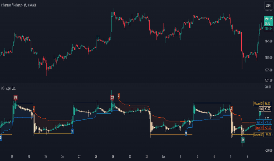
Volatility Squeeze Ignition [MarkitTick]💡 A multi-dimensional analytical engine designed to detect periods of extreme market consolidation and validate the subsequent directional expansion. By measuring the mathematical relationship between standard deviation and average true range, this tool identifies equilibrium zones where price action compresses and stores kinetic energy. Rather than reacting blindly to every volatility spike, the script employs a sophisticated filtration matrix that evaluates underlying volume delta, higher timeframe macro-trend alignment, directional movement strength, and immediate candlestick morphology. This creates a rigorous framework that authenticates breakout signals, ensuring that traders only focus on high-probability momentum ignitions supported by definitive market conviction.
✨ Originality and Utility
Standard volatility indicators often generate breakout signals without providing any insight into the underlying market participation or the structural validity of the move. This system distinguishes itself by integrating a state-tracking memory engine that monitors the cumulative buying and selling volume specifically during the compression phase. This continuous volume delta tracking allows the system to pre-assess the directional bias before the actual breakout materializes. Furthermore, it incorporates a dynamic risk-to-reward projection matrix mapped directly onto the chart. It calculates stop-loss zones and sequential take-profit levels based on the exact width of the preceding volatility squeeze. This creates a completely self-contained analytical environment that bridges the critical gap between signal generation and precise trade management, eliminating the need for discretionary target plotting and manual risk calculations.
🔬 Methodology and Concepts
● The Volatility Squeeze Engine
The core mechanics rely on the precise interplay between Bollinger Bands and Keltner Channels. A squeeze state is formally activated when the Bollinger Bands contract entirely within the boundaries of the Keltner Channels. This condition signifies that the market's standard deviation has fallen below its historical true range, indicating a profound period of low volatility and liquidity resting. The system mathematically locks in the exact width of the bands at the onset of this compression. An ignition signal is mathematically validated only when the price decisively breaks outside the Bollinger Bands, provided the bands have begun to expand.
● Volume Delta Profiling
While the squeeze state is active, the script meticulously aggregates the volume of up-closing bars versus down-closing bars. This builds a cumulative delta sum. When a breakout triggers, the system references this stored delta to ensure that the directional break is fully supported by the actual volume flow accumulated during the consolidation phase, preventing false breakouts engineered by low-liquidity spikes.
● Multi-Dimensional Filtering
The breakout validation process is governed by a rigorous confluence matrix:
Higher Timeframe Alignment: Evaluates a simple moving average on a higher resolution chart to ensure the breakout trades strictly in the direction of the macro trend, utilizing a secure, non-repainting data referencing architecture.
Trend Strength Evaluation: Integrates the Average Directional Index to demand a minimum trend strength threshold, actively filtering out choppy, sideways market noise.
Candlestick Morphology: Evaluates immediate, candle-by-candle price and momentum interaction. The real body of the breakout candle must constitute a specific percentage of the total high-to-low range, confirming definitive and immediate market conviction rather than relying on lagging divergences.
Volatility Expansion: Compares the current channel width against the locked width from the start of the squeeze, ensuring the breakout is accompanied by a genuine expansion in market volatility.
🎨 Visual Guide
● Chart Overlays
Active Squeeze Background: A subtle blue vertical background highlight appears when the volatility squeeze is actively compressing.
Breakout Backgrounds: A vibrant teal background signals a confirmed bullish squeeze ignition, while a vivid crimson background highlights a bearish squeeze ignition.
BB Basis Line: A solid blue line representing the central moving average of the standard deviation channel.
KC Lines: Muted, semi-transparent lines mapping the upper and lower boundaries of the true range channel.
● Trade Management UI
Entry Line: A dashed blue line marking the exact closing price of the validated breakout candle, accompanied by a dynamic price label.
Stop Loss (SL) Line: A solid, thick crimson line indicating the invalidation level. Depending on user settings, this is positioned either at the opposite channel edge or calculated via an ATR multiplier. A red translucent fill connects the Entry to the SL, visualizing the exact risk zone.
Take Profit (TP) Lines: Three distinct dashed teal lines representing sequential profit targets, derived from Fibonacci extensions of the locked squeeze width. A green translucent fill highlights the total reward zone from the Entry to TP3.
● Information Dashboard
A comprehensive heads-up display anchored to the chart corner providing real-time telemetry on the system's state:
Squeeze Status: Displays whether the compression is currently ACTIVE or OFF, alongside a graphical progress bar.
Sqz Bars: A numerical count of how long the current squeeze has been compressing.
BB Width %: A visual gauge showing the current width of the standard deviation channel relative to its basis.
Delta Bias: Highlights the dominant accumulated volume direction (BULLISH, BEARISH, or NEUTRAL) colored dynamically in teal or crimson.
R:R Metrics: Real-time calculation bars showing the exact risk-to-reward ratios for all three take-profit targets based on the current active signal.
Filter Diagnostics: Individual status readouts for HTF Trend, ADX, Body Strength, and Volume Confirmation, allowing traders to instantly see which filters are passing or failing.
📖 How to Use
● Identifying Setups
Traders should monitor the chart for the appearance of the blue active squeeze background. During this phase, direct your attention to the Dashboard to monitor the "Delta Bias" and "Sqz Bars" count. A longer squeeze accompanied by a strong, building Delta Bias indicates a high-probability impending breakout. Wait for a confirmed candle close that breaks the channel limits, triggering the vibrant teal or crimson background.
● Managing Trades
Once an ignition signal fires, the script automatically projects the entry, stop-loss, and three take-profit levels. Traders can use the SL line to place their initial protective stop. As price approaches TP1, traders may consider scaling out a portion of their position and trailing their stop loss to the Entry line to secure a risk-free trade. The graphical risk and reward fills visually assist in quickly assessing if the projected trade meets your personal risk parameters before execution.
⚙️ Inputs and Settings
● Core Parameters
BB Range: Defines the calculation range for the standard deviation channel.
BB Mult: The standard deviation multiplier determining the width of the outer bands.
KC Range: Defines the calculation range for the average true range channel.
KC Mult: The multiplier dictating the width of the Keltner Channels.
Min Squeeze Bars: The absolute minimum number of consecutive compressed bars required before a valid ignition can be fired.
● Filters
Require Volume Confirmation: Toggles the volume delta tracking engine.
HTF Trend Filter: Activates the macro-trend alignment requirement, preventing counter-trend breakout signals.
ADX Trend Strength Filter: Enables a strict momentum threshold requiring the market to be actively trending.
Candle Body Strength Filter: Enforces a structural rule where the breakout candle's body must meet a minimum size relative to its wicks.
● Trade Tools & Alerts
SL Mode: Allows traders to select between a structural stop loss at the opposite channel edge or a volatility-based ATR stop.
TP1, TP2, TP3 Fib: Customizable Fibonacci multipliers that project the profit targets based on the original width of the market squeeze.
Dashboard Settings: Toggles the visibility and positional anchoring of the telemetry table.
Alert Actions: Advanced JSON-formatted string inputs allowing traders to define precise webhook payloads for entries, exits, and target hits, enabling seamless automated execution.
🔍 Deconstruction of the Underlying Scientific and Academic Framework
● Volatility Compression Theory
The fundamental architecture of this script is rooted in the cyclical nature of market volatility, which oscillates continuously between periods of extreme contraction and aggressive expansion. By cross-referencing standard deviation against an absolute measure of true range, the algorithm quantitatively identifies the inflection points where liquidity providers pull back and the market reaches a state of unnatural equilibrium. The mathematical locking of the channel width captures the precise kinetic energy stored during this phase, applying principles of mean reversion and standard deviation expansion to project the statistical probability of the ensuing vector move.
● Order Flow and Delta Mechanics
To move beyond simple price derivatives, the system incorporates an approximated order flow model through its volume delta profiling. By segmenting traded volume into up-closing and down-closing aggregates during the compression state, the script builds a proxy for aggressive market participation. This mechanism relies on Auction Market Theory, assessing the imbalance between aggressive buyers lifting the offer and aggressive sellers hitting the bid. When the mathematical breakout aligns with the underlying delta accumulation, the script confirms that the price displacement is driven by genuine institutional or macroscopic participation, significantly reducing the statistical likelihood of a mean-reverting liquidity sweep.
⚠️ Disclaimer
All provided scripts and indicators are strictly for educational exploration and must not be interpreted as financial advice or a recommendation to execute trades. We expressly disclaim all liability for any financial losses or damages that may result, directly or indirectly, from the reliance on or application of these tools. Market participation carries inherent risk where past performance never guarantees future returns, leaving all investment decisions and due diligence solely at your own discretion. Indicador

Williams VIX Fix Elite [MarkitTick]💡 The Williams VIX Fix Elite is a comprehensive, overlay-based technical analysis system designed to bring the powerful volatility-tracking properties of the traditional Williams VIX Fix directly onto the main price chart. By synthesizing statistical volatility extremes with an array of multi-timeframe trend filters, volume confirmation parameters, and dynamic risk management plotting, this tool transcends basic observation. It provides traders with a complete, structured methodology for identifying high-probability exhaustion zones and potential market reversals while strictly managing risk.
✨ Originality and Utility
Standard volatility indicators are almost exclusively relegated to separate oscillator panes at the bottom of the chart. This traditional placement forces the user to constantly shift their visual focus, often leading to a disconnect between volatility metrics and actual price action. This indicator resolves that friction by mapping volatility exhaustion directly onto the candlesticks themselves through an intuitive color-coded heatmap.
Furthermore, the utility of this script lies in its holistic approach to signal generation. Rather than providing isolated volatility alerts, it acts as a confluence engine. It mandates that a volatility spike must be corroborated by higher timeframe trend alignment, adequate localized volume, directional momentum, and specific standard deviation thresholds before generating an actionable signal. This transforms a simple oscillator concept into a robust, chart-integrated trading framework complete with dynamically calculated risk-to-reward parameters, rendering it highly useful for both discretionary analysis and automated alert integrations.
🔬 Methodology and Concepts
● The Volatility Engine
• Williams VIX Fix (WVF)
At its core, the script calculates the Williams VIX Fix. It does this by measuring the percentage drawdown of the current bar's low from the highest closing price over a user-defined lookback period. This mathematical approach creates a synthetic volatility index that mirrors the behavioral characteristics of the CBOE VIX, where high values indicate market fear and potential bottoms.
• Statistical Bounds
To determine when the WVF has reached a statistically significant extreme, the script applies Bollinger Bands to the WVF data. It calculates a Simple Moving Average (SMA) of the WVF and plots standard deviation bands around it. A "Spike" is registered when the WVF value breaches the upper Bollinger Band or a percentile-based historical high threshold.
● Confluence Filtering
• Higher Timeframe (HTF) Alignment
The script extracts moving average data from a user-selected higher timeframe. It assesses whether the higher timeframe's closing price and dual-period EMAs exhibit a bullish or bearish hierarchy, ensuring signals are not taken against the macro-directional flow.
• Volatility and Volume Validation
A signal is only considered valid if the localized volatility, measured by the Average True Range (ATR), exceeds its historical average multiplied by a strict threshold. Additionally, the localized volume must exceed its moving average, confirming that the reversal is backed by market participation.
• Signal Execution and Risk Logic
When all conditions align (a volatility spike followed by a directional reversal candle, validated by all filters), the script locks in the signal upon the bar's close. It immediately calculates a Stop Loss utilizing an ATR multiplier and projects three Take Profit levels mathematically derived from user-defined Risk-to-Reward (R:R) ratios.
🎨 Visual Guide
● Chart Overlay Elements
• Candlestick Heatmap
The indicator repaints the standard chart candles to reflect the immediate signal bias. A confirmed Long signal colors the candlestick body, borders, and wicks in a distinct bullish hue (default teal). Conversely, a confirmed Short signal paints the candle in a bearish hue (default red). Neutral periods retain a standard gray tone.
• Dynamic Trade Levels
Upon signal confirmation, the script automatically plots horizontal lines detailing the trade parameters:
Stop Loss Line: A solid, thick line plotted below (for longs) or above (for shorts) the entry price, acting as the primary risk invalidation level.
Entry Line: A dashed line marking the exact closing price of the signal candle.
Take Profit Lines: Three sequential dashed lines representing TP1, TP2, and TP3, mapping out the reward targets.
The space between the Stop Loss and Entry is highlighted with a semi-transparent risk linefill, while the space extending toward the Take Profit targets is highlighted with a reward linefill, visually contrasting the risk against the potential payout.
● The Interactive Dashboard
A dedicated data panel is rendered on the chart (default top-right) providing real-time telemetry of the script's internal calculations.
WVF Value & Spike Level: Displays the raw volatility index number alongside a visual progress bar indicating how close the current value is to the historical threshold.
HTF & Trend Bias: Textually confirms the current macro and localized trend alignment (Bullish/Bearish).
Volume & ATR: Confirms whether current volume is above or below average and displays the exact ATR value.
R:R Ratio: A visual gauge of the current signal's risk-to-reward structure.
Cooldown Status: Displays the remaining bars before a new signal can be generated, preventing over-signaling during congested price action.
📖 How to Use
● Execution Protocol
• Step 1: Signal Identification
Wait for a colored signal candle to print on the chart. A teal candle signifies a Long opportunity, while a red candle signifies a Short opportunity. Always wait for the candle to fully close, as signals are only validated upon bar confirmation to ensure accuracy.
• Step 2: Dashboard Verification
Consult the on-chart dashboard. Ensure that the "Spike Level" gauge was heavily filled prior to the signal, and visually confirm that the "HTF Bias" and "Trend Bias" align with your intended trade direction. Verify that the "Volume" metric indicates "Above Avg" for optimal setup quality.
• Step 3: Risk Assessment
Observe the plotted trade levels. The visual linefills will immediately show you the required risk (the distance from the dashed Entry line to the solid Stop Loss line). Assess whether this required risk fits within your personal account parameters. If the ATR has expanded too aggressively, the stop loss may be too wide, and the setup should be skipped.
• Step 4: Trade Management
If the trade is entered, utilize the plotted TP1, TP2, and TP3 lines as scaling-out points. The script also includes automated JSON alert outputs designed for third-party execution platforms, allowing users to fully automate the Long, Short, and Take Profit hit actions.
⚙️ Inputs and Settings
● Core Settings
• WVF Lookback: Defines the historical period used to find the highest close for the volatility drawdown calculation.
• BB Length & BB Mult: Controls the Simple Moving Average length and the standard deviation multiplier applied to the WVF. Lowering the multiplier increases sensitivity to volatility spikes.
• Percentile HH Lookback & High % Threshold: An alternative absolute-threshold filter based on a percentage of the highest historical WVF values.
● Filters
• HTF Resolution: Select the specific higher timeframe used for the macro trend validation.
• ATR Length & Min Mult: Defines the lookback for the Average True Range and the multiplier required to validate adequate localized volatility.
• Min Spike Above BB %: A Z-score threshold ensuring the volatility spike is mathematically severe before triggering a signal.
• Volume Avg Length & Min Mult: Dictates the volume moving average parameters required for trade confirmation.
• Cooldown Bars: The mandatory resting period (in bars) between valid signals to eliminate redundant alerts.
● Trade Tools & Alerts
• SL ATR Mult: The multiplier applied to the current ATR to calculate the Stop Loss distance from the entry price.
• TP1, TP2, TP3 R-Multiple: Dictates the reward distance for target lines relative to the calculated Stop Loss risk.
• Alert Actions: String inputs allowing the user to customize the JSON payload commands sent to automated webhook services.
🔍 Deconstruction of the Underlying Scientific and Academic Framework
● Behavioral Finance and Volatility Asymmetry
The underlying architecture of this indicator is deeply rooted in the academic principles of behavioral finance, specifically the asymmetry of market participant reactions. Financial markets typically exhibit a "stealth" characteristic during uptrends (low volatility, steady buying) and a "panic" characteristic during downtrends (high volatility, aggressive selling). The Williams VIX Fix capitalizes on this behavioral asymmetry by focusing exclusively on drawdowns from peak closes. By quantifying this localized panic, the script provides a mathematical representation of capitulation—a state where sell-side liquidity is exhausted, and rational market equilibrium is poised to return.
● Gaussian Distribution and Standard Deviation Anomalies
To objectively define an "exhaustion point," the script relies on the statistical concept of normal distribution. By applying a Simple Moving Average to the raw volatility data, it establishes a baseline mean of market stress. The inclusion of Standard Deviation bands (Bollinger Bands) allows the system to measure dispersion from this mean. When the volatility index breaches the upper band, it represents an anomaly—an event occurring outside the expected standard deviation threshold. Statistically, extreme deviations from the mean are unsustainable, implying an imminent reversion. This indicator isolates these rare deviations to time market entries.
● The Role of True Range in Risk Normalization
Risk management within the script is governed by the Average True Range (ATR), a concept introduced by J. Welles Wilder. The True Range accounts for absolute price movement, including gap openings, providing a more comprehensive measure of market kinetic energy than standard percentage changes. By tying the Stop Loss and Take Profit levels dynamically to the ATR, the script automatically normalizes risk across different market environments. In a highly volatile state, the ATR expands, naturally widening the stop loss to avoid premature invalidation from market noise. In a compressed state, the ATR contracts, tightening the risk parameters. This dynamic adaptation ensures that the statistical risk profile of each trade setup remains proportional to the current localized market geometry.
⚠️ Disclaimer
All provided scripts and indicators are strictly for educational exploration and must not be interpreted as financial advice or a recommendation to execute trades. We expressly disclaim all liability for any financial losses or damages that may result, directly or indirectly, from the reliance on or application of these tools. Market participation carries inherent risk where past performance never guarantees future returns, leaving all investment decisions and due diligence solely at your own discretion. Indicador

NQ Chop FilterNQ Chop Filter is a volatility and trade-confidence meter built for short-term NQ trading, especially on the 30-second chart.
This indicator is not a buy/sell signal and it is not meant to replace a trading strategy. It is designed to help judge whether current market conditions are strong, normal, cautious, or dangerous before managing risk.
The meter studies recent candle range, fast range expansion/compression, net price movement, directional efficiency, and wider trend/grind movement.
The dashboard gives a simple reading:
HIGH
Strong volatility and movement. Full confidence conditions. Larger targets are more reasonable.
NORMAL
Conditions are acceptable. Trading is still okay, but avoid sizing up blindly.
CAUTION
Market is less clean. Trade smaller, be more selective, and manage risk tighter.
DANGER
Weak movement or poor follow-through. Reduce size or wait.
How to use:
1. Add the indicator to an NQ chart.
2. Best used on the 15-second to 2-minute timeframe. Best on 30s.
3. Watch the dashboard before taking a trade.
4. Use HIGH and NORMAL as cleaner environments.
5. Use CAUTION and DANGER as risk warnings, not automatic signals.
6. Do not use this indicator by itself for entries.
7. Combine it with your own entry model, stop loss, take profit, and daily risk rules.
The main purpose is to avoid blindly trading the same size in all market conditions. It helps identify when the market is moving cleanly versus when price is slow, compressed, or choppy.
This script is for educational and informational purposes only. It is not financial advice. Indicador

Advanced Volatility1. Normalized ATR (%) - The Blue Line
What it is: The standard Average True Range (ATR) divided by the current closing price.
Why it matters: It tells you exactly what percentage the asset moves on an average bar. If the nATR is 2.0%, you know the asset swings roughly 2% per candle. This is incredibly useful for setting dynamic stop losses and take profits that scale mathematically with the asset's price, rather than guessing arbitrary dollar amounts.
2. BB Width (%) - The Orange Line
What it is: The distance between the Upper and Lower Bollinger Bands, divided by the Middle Band.
Why it matters: This acts as a highly effective "Squeeze" proxy. Volatility is cyclical; it contracts, then it expands. When you see the Orange line drop to extremely low historical levels, it means the Bollinger Bands are pinching tight. This contraction indicates that energy is building up, and a massive breakout/expansion move is imminent.
3. Historical Volatility (%) - The Fuchsia Line
What it is: A strict statistical calculation heavily used in options pricing (often referred to as HV or Realized Volatility). It calculates the standard deviation of logarithmic returns over a period, and annualizes it (multiplying by √252 trading days).
Why it matters: It gives you the "true" statistical variance of the asset. A rising Fuchsia line means the market is becoming highly chaotic and unpredictable, while a falling line means the market is returning to a stable, directional grind.
By layering all three of these metrics on one panel, you can easily spot when a market has compressed to zero (all lines dropping near the Zero Base) right before a massive trend erupts! Indicador

Indicador

Volatility Reversion Bands Pro [JOAT]VOLATILITY REVERSION BANDS PRO
A two-layer reversion envelope: inner Bollinger band for the normal volatility envelope, outer ATR-extended band for the extreme envelope. Signals only fire when price has reached the outer ring — the inner band is context, the outer band is the trigger. The result is a clean mean-reversion engine that respects the difference between "stretched" and "actually stretched".
Two envelopes, one principle
Inner band — classic Bollinger: basis (SMA or EMA) ± stdev × multiplier. The familiar 20-period, 2-sigma defaults are preserved.
Outer reversion band — the outer envelope extends inner band ± ATR × multiplier . This is the band that triggers signals. Setting the ATR multiplier high makes signals rarer but deeper; setting it low makes them frequent and shallower.
Reversion bands using stdev alone collapse in low-volatility regimes (too many false signals) and explode in high-volatility regimes (signals come too late). The ATR extension on top of stdev fixes both: ATR adds a constant-floor protection in quiet markets and scales the outer band proportionally in loud ones.
Strong vs weak signals
Two signal tiers from a single channel-ratio read (close position within the outer band, normalised 0–1):
Strong signals — fire on the outer band itself (ratio ≤ 0 or ≥ 1). The high-conviction reversion read.
Weak signals — fire when ratio reaches a configurable near-band threshold (default 0.10 / 0.90). The "approaching outer band" read — useful for traders who want earlier hints. Easily disabled.
A signal cooldown suppresses same-side repetition; an exhaustion arrow prints when N consecutive bars (default 3) all live in the outer-band zone — a configurable escalating-glyph string ("^", "^^", "^^^"…) makes the run length visible at a glance.
Volatility regime classification
Independent of signals, the script classifies the current volatility regime by comparing current stdev to its own rolling average over a long lookback (default 100 bars):
Low regime — stdev / avgStdev below the low threshold (default 1.0×). Reversion is more reliable here.
High regime — above the high threshold (default 2.0×). Reversion is less reliable here; trends become dominant.
Normal regime — in between. Default mode.
Background tinting (toggleable, transparency-controlled) paints the chart by regime so the trader can see at a glance whether the current environment is suitable for reversion. This is the "do not fight the tape" filter — when the background is hot, every reversion signal is lower-conviction by definition.
Visual system
Bar gradient — bars are coloured by their position-in-band ratio (bull → mid → bear via plasma palette). At a glance you can see where price is sitting in the channel without reading the value.
Inner band fill — toggleable shoulder fill between BB and outer reversal bands with configurable transparency.
Inner BB lines and basis line are each independently toggleable for traders who want a minimalist or full envelope view.
Signal label style — Glyph (compact), Text (verbose), or Both.
A locked Plasma palette (yellow bull, magenta bear, violet mid) on a deep-void background gives the chart a distinctive look without competing with price action.
Dashboard
Monospaced table, positionable to any of nine corners, with togglable legend footer. Rows surface current basis, inner band values, outer reversion band values, channel ratio %, stdev / avgStdev ratio, regime label, last signal direction with age, and an exhaustion run counter.
Alerts
Four alert conditions, each independently controllable:
Strong Long / Short (outer band touch reversion)
Weak Long / Short (near-band threshold)
Vol Regime Change
Exhaustion Arrow (consecutive bars in outer-band zone)
How to read it
Two reads, in order of conviction:
Strong signal in a Low or Normal regime — the script's intended sweet spot. The outer band has been touched, price is statistically far from its mean, and the volatility environment supports the idea of mean-reversion.
Exhaustion arrow — when 3+ bars sit in the outer band, you usually have either a genuine breakout (the bands themselves will start to expand) or an exhaustion (the next reversal candle will be the signal). Either way, the next move is meaningful.
In a High regime, treat strong signals as cautionary at best — the bars are coloured by ratio for a reason; the gradient will tell you when one side is dominating.
Suggested settings
Defaults (length 20, stdev mult 2.0, ATR mult 1.5) are tuned to 1H–4H on liquid markets — the classical Bollinger settings plus a 1.5-ATR outer cushion. For 5m–15m, drop length to 14 and ATR multiplier to 1.0. For daily and above, raise length to 50 and ATR multiplier to 2.0. The regime thresholds (low 1.0×, high 2.0× of the long-run stdev average) are conservative — tighten the bands if your instrument is unusually quiet.
Originality / what's reused
Bollinger Bands and ATR are public-domain primitives. The implementation — the outer-band = inner-band ± ATR construction, the channel-ratio bar gradient, the regime classifier with auto-tinted background, the exhaustion-arrow consecutive-bar run logic, the weak/strong signal tiering, and the dashboard's monospaced regime-aware layout — is JOAT-original and tuned together. No third-party code reused.
Open source
Published open-source under the default Mozilla Public License 2.0. Section-headed source, tooltips on every input, helper functions documented inline. The band engine, the regime classifier, the exhaustion logic, and the dashboard are independent modules — fork or extend any single one without reading the whole file.
Limitations
Reversion bands are a counter-trend tool by construction. In sustained one-sided moves the outer band will be repeatedly touched without producing a profitable reversion — the High regime tint and the exhaustion-arrow run logic both exist to warn you when you are in this state. Signals are confirmed on bar close (non-repainting), so an intra-bar wick into the outer band that gets reabsorbed will not fire.
—
-made with passion by jackofalltrades
Indicador

Volatility Regime Compass [JOAT]Volatility Regime Compass
Introduction
Volatility Regime Compass is an open-source volatility state classifier that continuously measures where current ATR stands relative to its own historical distribution and maps it to one of four named regimes: Compressed, Normal, Elevated, and Extreme. The classification is not binary (high or low) — it uses a rolling percentile ranking against configurable lookback windows so the regime reflects where current volatility stands within its recent history, not against a fixed absolute threshold that becomes stale as market conditions evolve.
The practical value is in strategy switching: mean-reversion techniques tend to work in compressed regimes, breakout and momentum techniques in elevated ones. Knowing which regime is active before selecting a technique reduces category errors that produce losses.
Core Concepts
1. ATR Percentile Ranking
Rather than comparing ATR to a static multiplier, the indicator ranks the current ATR value within a rolling distribution of historical ATR values. This produces a percentile score from 0 to 100 that is self-normalizing across different instruments and timeframes:
float atrHi = ta.highest(atrVal, i_rankLen)
float atrLo = ta.lowest (atrVal, i_rankLen)
float atrPct = (atrHi - atrLo) > 0 ?
(atrVal - atrLo) / (atrHi - atrLo) * 100.0 : 50.0
A reading of 80 means current ATR is in the 80th percentile of its recent range — clearly elevated. A reading of 15 means ATR is near multi-period lows — compressed.
2. Four-State Regime Classification
The percentile score maps to four regimes with configurable boundary thresholds. Defaults are: Compressed (below 25th percentile), Normal (25th to 60th), Elevated (60th to 85th), Extreme (above 85th). Crossing a regime boundary triggers a transition event labeled on the chart.
3. Multi-Band Visualization
Five ATR bands project above and below close at configurable multiples (0.5×, 1×, 1.5×, 2×, 2.5× ATR). Each band is color-coded by regime — tighter bands in compressed regimes shade cooler, wider bands in extreme regimes shade hotter using a 5-stop gradient. This gives instant visual calibration of price's relationship to current volatility structure.
4. Volatility Trend
The rate of change of ATR is computed and smoothed. Positive volatility trend (ATR rising) is labeled differently from negative trend (ATR contracting). This distinguishes a currently-elevated but contracting regime from one that is expanding — the former is more likely to produce consolidation, the latter continuation.
Features
ATR percentile ranking: Self-normalizing volatility score relative to recent history
Four volatility regimes: Compressed, Normal, Elevated, Extreme with configurable boundaries
Regime transition labels: On-chart labels at every regime change event
Five ATR expansion bands: Projected above and below close, gradient-colored by regime
Volatility trend direction: Rising vs contracting ATR tracked independently of level
Candle coloring: Candles reflect current volatility regime in real time
Regime background shading: Chart background tint corresponds to current regime
Dashboard: Current ATR, percentile, regime, trend direction, and band levels
Input Parameters
ATR Settings:
ATR Period: ATR calculation length (default: 14)
Percentile Lookback: Rolling window for ATR percentile ranking (default: 100)
Regime Thresholds:
Compressed Below: Percentile below which regime is Compressed (default: 25)
Elevated Above: Percentile above which regime is Elevated (default: 60)
Extreme Above: Percentile above which regime is Extreme (default: 85)
How to Use This Indicator
Step 1: Check the Current Regime
Read the REGIME row in the dashboard. This tells you whether to expect range-bound or trending behavior in the near term.
Step 2: Watch for Regime Transitions
A transition from Compressed to Elevated is the setup for breakout strategies. A transition from Extreme back toward Normal may signal trend exhaustion.
Step 3: Use Bands as Structural Reference
The ATR bands define statistically reasonable price excursion limits for the current volatility state. Closes beyond the 2× or 2.5× band while in a Compressed regime are structurally significant events.
Step 4: Combine with Directional Indicators
This indicator classifies volatility magnitude, not direction. Pair it with a trend or momentum tool to apply regime context to directional decisions.
Indicator Limitations
Percentile ranking depends on lookback length; very short lookbacks can produce unstable regime classifications during sudden volatility spikes
The four-state classification is a simplification; volatility is continuous and regime boundaries are heuristic
Volatility expansion does not indicate direction — it only measures magnitude of movement
Originality Statement
The combination of a self-normalizing ATR percentile ranking, a four-state regime classifier with configurable percentile boundaries, gradient-coded multi-band projection, and a simultaneous volatility trend tracker in a single Pine Script v6 publication constitutes the original contribution. Standard ATR indicators display the raw value or a fixed-multiple band without regime classification or percentile normalization.
Disclaimer
This indicator is provided for educational and informational purposes only. It is not financial advice. Volatility regime classifications are statistical summaries of historical data and do not predict future price movement. Trading involves substantial risk of loss.
-Made with passion by jackofalltrades
Indicador

Volatility Bands Using t-Distribution & Prediction IntervalsThis indicator is a statistical tool designed to project a dynamic range where the next asset price is expected to fall within a specific level of confidence.
Unlike standard volatility bands, a prediction interval is a statistical range that estimates where a single future observation will fall, given a specific probability. Because predicting a single future outcome introduces more inherent uncertainty than predicting an average, these bands are wider and mathematically tighter for forecasting next-bar anomalies.
How it Works
This indicator uses a Student's t-distribution (or an optional z-distribution for performance) to calculate historical volatility thresholds.
Finding the Estimated t-distribution
When you select a 95% Confidence Level, the script sets an error alpha of 5% (1 - 0.95). Because asset price movement can deviate to either the upside or downside, it splits this error equally into both tails (a two-tailed test). The script normalizes this, targeting an exact area of 0.025 (2.5%) in the extreme tails of the curve.
To find where that target area lies, the script reconstructs the Probability Density Function (PDF) of the Student's t-distribution. The height of the curve depends heavily on the Degrees of Freedom (df = length - 1).
Because Pine Script doesn't have a native Gamma function, the script uses double factorials to calculate the complex math coefficients. If your sample size (length) is exceptionally high (>300), the t-distribution naturally mirrors a regular normal distribution, so it switches to a standard Gaussian curve equation to save some time.
// Calculate double factorial
double_fac(int n) =>
float res = 1.0
int curr = n
while curr > 1
res := res * curr
curr := curr - 2
res
// t-distribution formula
cur_dist(float x, int cur_df) =>
float res = 0.0
if cur_df > 300
res := 0.3989422804014326779 * math.exp(-x * x * 0.5)
else
float coeff = double_fac(cur_df - 1) / (math.sqrt(cur_df) * double_fac(cur_df - 2) * (cur_df % 2 == 0 ? 2.0 : math.pi))
res := coeff * math.pow(1.0 + x * x / cur_df, -0.5 * (cur_df + 1))
res
To find the approximate t-value that corresponds to our target tail area, the script performs numerical integration using the Trapezoid Rule (trapezoid_reverse). This is the most time consuming part.
// Reverse trapezoidal to calculate t-value from area
trapezoid_reverse(float p, int cur_df) =>
float max_p = 0.5
float max_stat = 300.0
float add_prec = 1.0
float result_i = 0.0
if p == max_p
result_i := 100000000.0 // Infinity
else
float trap_sum = 0.0
float gap_width = p / (add_prec * 1250.0)
float i = 0.0
float last_func = cur_dist(0.0, cur_df)
while trap_sum < (2500.0 * add_prec) and i < max_stat
i := i + gap_width
trap_sum := trap_sum + last_func
last_func := cur_dist(i, cur_df)
trap_sum := trap_sum + last_func
result_i := i
result_i
Calculating the Prediction Interval
Once the t-critical value is found, it is then put into the standard prediction interval formula. The script uses EMA instead of SMA to improve responsiveness to current trends.
float prediction_interval_top = mean + tCrit * stdev * math.sqrt(1 + 1/length)
float prediction_interval_bot = mean - tCrit * stdev * math.sqrt(1 + 1/length)
Because the calculations for the t-distribution estimates are computationally expensive, you can select the lookback window for using the t-distribution. You can also choose to use the faster z-score for historical bars.
Note 1: The larger the sample size, the smaller you may have to set your lookback window in order to fit within the execution time limits.
You can use this for:
Overbought/Oversold, Mean reversion signals
Dynamic Stop-loss/Take-profit (SL/TP)
1. Overbought/Oversold/Mean Reversion
The indicator creates a red background to indicate that the candlestick has broken above the top 95% prediction interval band. It can be interpreted as a potential reversal.
2. Dynamic Stop-loss/Take-profit (SL/TP)
You can utilize the plotted mean and the confidence interval as entry/exit points. For example, you could put a stop-loss at the bottom band, and a take profit at the top band.
Alerts:
Price Above Top PI (Close crossed out)
Price Below Bottom PI (Close crossed out)
High Above Top PI (Wick touched/pierced top)
Low Below Bottom PI (Wick touched/pierced bottom)
Settings:
Length: The size of the sample for the standard deviation & mean calculations. 30 is recommended.
Source: Used for standard deviation & mean calculations. For example: Changing the source to 'high' would make the indicator predict the range of the next 'high'.
Confidence Level: Dictates how wide the bands should be. A 95% confidence level is default. Must be entered as a decimal between 0 and 1.
Lookback Length: Used to limit the amount of bars to back calculate the prediction interval using the t-distribution. Default is 300.
Use z-score: Use the z-score to calculated past values. Note that this will introduce error. For example, for a sample size of 30 and a 95% confidence level, using a z-score instead of a t-score will introduce a ~4.2% error in your interval width, causing your actual prediction interval to drop from 95% down to ~94.0%.
Background Colors:
Green: The low/close of the candle breached the lower band. Potential bullish reversal.
Red: The high/close of the candle breached the upper band. Potential bearish reversal.
Limitations:
The indicator assumes that the data follows a bell curve, which the markets do not.
The indicator may lag behind actual price action.
The indicator may produce false signals.
The indicator does not predict future prices.
Disclaimer: All trading decisions and responsibilities rest solely on the user of the indicator. Indicador

Helios Volatility Forecast [JOAT]Helios Volatility Forecast
Helios Volatility Forecast is a Yang-Zhang volatility estimator with regime classification, a volatility cone (historical percentile bands), an HMA-smoothed forecast line, and a position-size suggestion. Volatility is classified into four regimes (LOW / NORMAL / ELEVATED / EXTREME) by percentile rank against its own history. Cross-pane elements paint a soft regime tint and a position-multiplier suggestion onto the price chart.
What makes it different
Most volatility indicators use a simple close-to-close standard deviation, which discards intraday range information and ignores overnight gaps. The Yang-Zhang estimator combines four components — overnight close-to-open variance, intraday open-to-close variance, and a Rogers-Satchell range term — into a single estimator that is more accurate than close-to-close for instruments that gap.
A 4-band volatility cone (5th, 25th, 50th, 75th, 95th percentile of the past 100 bars) is plotted around the current volatility, with gradient fills bracketing tails and the interquartile range.
A 4-regime classifier (LOW / NORMAL / ELEVATED / EXTREME by percentile thresholds at 25, 65, 90) drives a cross-pane tint on the price chart and a numeric position-size multiplier suggestion. The suggestion scales inversely with realized vol — wider sizes in low-vol regimes, halved sizes in extreme-vol regimes.
An HMA forecast line projects the smoothed vol trajectory ahead. Forecast-crossing-realized alerts fire when expansion or contraction is imminent.
How it works
Yang-Zhang formula combines overnight return, intraday return, and Rogers-Satchell range term, weighted by k = 0.34 / (1.34 + (len + 1) / (len - 1)).
Percentile rank of sigma_yz over a 100-bar history equals vol_pct.
Regime classification: LOW below 25, NORMAL 25 to 65, ELEVATED 65 to 90, EXTREME above 90.
HMA of sigma_yz equals the forecast. Forecast direction equals the sign of (forecast minus current).
Position-size multiplier equals clamp(1.5 minus vol_pct / 100, 0.3, 1.5).
Vol-of-vol (stdev of recent realized vol) feeds a regime stickiness indicator.
Reading the chart
In-pane : regime-tinted volatility line (vivid mint for LOW, neutral white for NORMAL, amber for ELEVATED, vivid red for EXTREME), HMA forecast line with direction-color flow, five vol-cone percentile lines.
Cross-pane : soft regime tint background on the price chart, plus a Size x0.50 EXTREME vol label updating each bar.
A vol-of-vol panel as a sub-strip at the top of the pane.
Five right-edge cone percentile labels (p5 / p25 / p50 / p75 / p95).
A current-vol percentile rank label.
Regime change timeline labels on the price chart at each regime transition.
Cross-pane vol-cone touch markers when vol crosses p95 (breakout) or p5 (contraction).
A regime stickiness indicator (how long the regime has been in its current state).
Forward expected-range lines on the price chart (close plus or minus forecast times ATR scalar).
Signals
Regime up / down (any percentile-bucket transition)
Extreme vol entry
Low vol entry
Vol breakout (sigma crosses above p95 of its own history)
Vol contract (sigma crosses below p5)
Vol Z-shock up / down (when vol z-score exceeds plus or minus 2)
Forecast cross up / down (forecast vs realized)
All gated on barstate.isconfirmed or barstate.ishistory. No future references. No lookahead_on.
Inputs
Volatility : Yang-Zhang window, regime percentile lookback, forecast HMA length.
Visual : bullish (low vol) color, bearish (extreme vol) color, elevated (amber) color, cone toggle, forecast toggle, cross-pane candles toggle, regime pulse toggle.
Dashboard : position, size.
How traders use this
Position sizing : scale entries inversely with the regime. Full size in LOW, default in NORMAL, half in ELEVATED, third in EXTREME. The multiplier label provides the suggested factor.
Volatility breakouts : vol crossing above p95 historically precedes large directional moves. Tighten trailing stops or reduce holding time.
Volatility contraction : vol crossing below p5 historically precedes range / chop. Reduce directional bias. Consider mean-reversion strategies.
Regime-aware stops : in ELEVATED or EXTREME regimes, ATR-based stops should be wider. In LOW regimes, tighter. The pos-mult label codifies this implicitly.
Limitations
Yang-Zhang assumes log-normal returns and lognormality breaks down during fat-tail events (it under-estimates vol in true crash regimes).
Percentile classification needs sufficient history. The default 100-bar lookback can be lengthened for stable instruments.
The position-size multiplier is a heuristic, not a portfolio-management recommendation. Combine with your own risk-management framework.
The HMA forecast lags slightly behind real-time changes. Treat as smoothed trend, not pinpoint prediction.
Compatibility
Pine Script v6 open-source indicator (pane plus cross-pane). Any symbol, any timeframe. Cross-pane elements use force_overlay=true. No request.security calls.
Defaults
20-bar Yang-Zhang window, 100-bar regime lookback, 5-bar HMA forecast, mint / red / amber palette, top-right medium dashboard.
Credits
Yang-Zhang estimator from D. Yang and Q. Zhang, Drift-Independent Volatility Estimation Based on High, Low, Open, and Close Prices , Journal of Business (2000).
Indicador

KNN Market Regime Engine [Dots3Red]█ OVERVIEW
Most market regime tools work in a pretty simple way: we set a threshold and call it a day. ADX above 25? Trending. Below 20? Ranging.
But that threshold is basically just our assumption baked into code. It doesn’t adapt, it doesn’t learn, and it’s treated the same whether we’re looking at Bitcoin, EUR/USD, or any other market — even though they behave completely differently.
This script takes a different approach . It uses a K-Nearest Neighbors (KNN) machine learning algorithm to estimate the probability that the current market is in one of three regimes: Trending , Ranging , or Volatile Trend . Rather than comparing today's readings against a fixed number, it searches the past 700 bars for the moments that looked most like right now - and asks what the market did after each of those moments. The result is a live probability for each regime, not a hard categorical label.
The output is three things simultaneously:
a background color telling you the dominant regime
a dashboard showing live probability bars for all three states
change markers appearing only when the classifier is genuinely confident a shift has occurred.
█ THE FOUR REGIMES
🔵 TRENDING — price is moving directionally with efficiency. Momentum strategies belong here. Mean reversion strategies get punished here.
🟣 RANGING — price is oscillating between levels with no net directional movement. Mean reversion strategies and fade-the-extreme setups have edge here. Trend-following generates whipsaws.
🟡 VOLATILE TREND — price is trending and ATR has expanded sharply beyond its baseline. This captures earnings gaps, macro shocks, and post-breakout expansion. It is a distinct fourth state — not simply "a strong trend." Reduce size or trail very tightly.
⬛ UNCERTAIN — the dominant probability did not clear the minimum confidence threshold. The market's character is genuinely ambiguous. The best action is observation, not engagement.
█ HOW IT WORKS — THE FULL PIPELINE
Step 1 — Six features, measured every bar
Each bar is described by six measurements, each capturing a different dimension of market character:
• ADX — trend strength. Not direction — only how strongly price is committed to any direction.
• ATR ratio — current ATR divided by its own long-term average. Measures whether volatility is elevated or compressed relative to its own history.
• Choppiness Index — measures how much of the price movement was wasted going sideways. Near 100 = pure chop. Near 38 = perfectly directional.
• Bollinger Band width — how expanded or compressed the bands are relative to price. A compression often precedes volatile expansion.
• Normalized slope — linear regression slope over N bars, divided by ATR. A scale-free measure of directional momentum.
• Kaufman Efficiency Ratio — how directly did price move from A to B? If price traveled 100 points total but only net-moved 20, ER is 0.20. High ER = trending cleanly. Low ER = zigzagging.
Step 2 — Z-score normalization
ADX runs 0–100. ATR ratio runs 0.5–3.0. BB width might be 0.01–0.08 on forex. Using raw values in a distance calculation means the largest-scale feature dominates by sheer magnitude. All six features are standardized: z = (value − rolling mean) / rolling stdev . This puts every feature on equal footing — a reading of +2.0 means " two standard deviations above normal " on any feature. Critically, the mean and stdev are computed on prior bars only ( src offset), which eliminates look-ahead bias from the normalization step.
Step 3 — Labeling historical bars
For every historical bar, the script evaluates what happened over the following Forward Bars window:
• If the net price move exceeded Trend Threshold × average ATR over the window → labeled TRENDING (1)
• If the ATR ratio exceeded Volatility Threshold → labeled VOLATILE TREND (3)
• If trending AND volatile simultaneously → labeled VOLATILE TREND (3), because risk context takes priority
• Otherwise → labeled RANGING (2)
This label is only ever read at an offset of at least Forward Bars bars into the past, so the current bar carries no label — there is no look-ahead in the training data.
Step 4 — KNN search and Gaussian-weighted voting
On each bar, the algorithm scans the historical window (default 700 bars) and computes the Minkowski distance between today's six Z-scored features and every historical bar's six features. The K nearest matches are selected. Closer neighbors receive exponentially higher voting weight via a Gaussian kernel : w = exp(−d² / 2σ²) . This means a bar at distance 0.1 vastly outweighs one at distance 0.5. The votes produce three probabilities — P(trending), P(ranging), P(volatile trend) — that always sum to 1.
Step 5 — Three-stage noise filtering
A single KNN output can flicker bar to bar. Three filters eliminate this:
• Mode filter — selects the most common regime over the last smooth_len bars. Removes 1-3 bar flickers entirely.
• Confirmation filter — the smoothed regime must hold steady for confirm_bars consecutive bars before being accepted. Kills false starts.
• Signal gap — regime change markers only appear once per signal_gap bars minimum, and only when the dominant probability exceeds 65%. This eliminates cluttered charts entirely.
█ DESIGN DECISIONS — WHAT WAS INITIALLY, WHAT CHANGED AND WHY
From 3 regimes to 4
The first idea used three regimes with a simple override: if volatility was high, VOLATILE replaced TRENDING regardless of whether price was actually moving directionally. Testing on stocks showed this caused problems — an earnings-day spike during a clear uptrend was collapsing the trend signal entirely. We realized volatile trending markets are qualitatively different from volatile ranging markets. A fast trend during an OPEC announcement is not the same as a gap-down in a sideways consolidation. VOLATILE TREND became its own regime, and the distinction turned out to be the most practically useful change in the entire script.
From stride = fwd_bars to stride = 3
The early idea for the script we had sampled the training window with a stride equal to Forward Bars (30 by default). This gave roughly 23 training samples — barely enough for KNN to make a meaningful comparison. Reducing the stride to 3 gives approximately 230 samples. The regime classification became dramatically more stable and consistent, especially in quieter markets where the 23-sample version frequently returned UNCERTAIN. The trade-off is slightly more computation, which Pine handles comfortably within its limits.
From a single volatile threshold to a combined trend + volatile check
Originally we labeled VOLATILE based purely on ATR ratio exceeding a threshold. This correctly flagged high-volatility periods but was labeling slow low-ATR trends as RANGING instead of TRENDING during prolonged low-volatility bull markets. The label logic was reworked to check directionality and volatility independently and then combine them: a trending move is TRENDING unless ATR is also elevated, in which case it becomes VOLATILE TREND. This made the label logic honest about what the market was actually doing.
The Efficiency Ratio addition
The original five features (ADX, ATR ratio, Choppiness, BB width, Slope) left a gap: two markets can have identical ADX and slope but very different directional efficiency — one moves in a clean staircase, the other zigzags the same distance. Kaufman's Efficiency Ratio fills this gap. ER = 0.85 on a bar means 85% of all price movement went in the net direction. ER = 0.20 means price was thrashing around and barely net-moved. It proved particularly valuable for distinguishing true trending from noisy ranging in crypto and high-beta stocks.
The regime change marker clutter problem
Early testing produced charts covered in triangles, circles, and diamonds — a new marker on almost every regime flicker. Three parameters were added to solve this: the mode filter, the confirmation bars requirement, and the signal gap. Together they ensure a marker only appears when (a) the majority of recent bars agree on the new regime, (b) it has held for at least N bars, and (c) the KNN confidence is above 65%. The result is 2–6 meaningful markers per year on a daily chart rather than dozens of noisy ones.
█ WHAT YOU SEE ON THE CHART
Background color — the dominant confirmed regime, colored continuously. Cyan = Trending. Magenta = Ranging. Amber = Volatile Trend. No color = Uncertain.
Bar coloring — individual bars colored by the same regime. Toggle off if you prefer your own candle coloring scheme.
Regime change markers — small shapes at confirmed, high-confidence regime transitions only. ▲ below bar = shift to Trending. ● below bar = shift to Ranging. ◆ above bar = shift to Volatile Trend.
Dashboard (top right) — shows the confirmed regime label, confidence percentage, three probability meters (▰▰▰▱▱▱ format), and six live feature readings. The bottom row shows Raw → Smooth (e.g. "T → R") so you can see what the raw KNN output is before the filters process it — useful for understanding when the classifier is about to change state.
█ SETTINGS REFERENCE
🧠 KNN Engine
• K Neighbors — how many historical bars vote. Lower = faster reaction, higher = more stable. Default 25.
• Lookback Window — how many bars to search for neighbors. Larger = more training data. Default 700.
• Minkowski p — distance exponent. 1 = Manhattan (robust to outliers), 2 = Euclidean (standard). Default 2.
• Gaussian bandwidth — how steeply neighbor weight falls with distance. Lower = only the closest neighbors matter. Default 1.5.
• Minimum confidence — probability threshold below which the regime shows as UNCERTAIN. Default 0.45.
🏷️ Labeling
• Forward bars — how many bars ahead define a historical bar's regime label. Match your typical hold time. Default 30.
• Trend threshold — net move must exceed this × avg ATR to label TRENDING. Lower = more bars labeled trending. Default 1.2.
• Volatility threshold — ATR ratio must exceed this to label VOLATILE TREND. Higher = only extreme events qualify. Default 1.5.
📐 Features
• ADX Length — period for the directional movement index. Longer = smoother. Default 20.
• ATR Length — period for average true range. Default 14.
• ATR Baseline — SMA period for the ATR ratio denominator. Longer = more stable baseline. Default 100.
• Choppiness / BB / Slope lengths — feature calculation periods. All default to 20–30.
• Efficiency Ratio Length — Kaufman ER lookback. Default 30.
🧹 Filtering
• Regime Smoothing Lookback — mode filter window. Higher = fewer false regime changes. Default 11.
• Bars to confirm regime — consecutive bars required before a new regime is accepted. Default 4.
• Min bars between signals — minimum spacing between regime change markers. Default 20.
█ SETTINGS BY ASSET CLASS
📈 Large-cap stocks — daily (AMZN, AAPL, NVDA)
Stocks trend slowly over weeks to months, with sharp one-day volatility spikes on earnings. All feature lengths should be longer to resolve the slower regime pace.
• Forward bars: 20–30 | Trend threshold: 0.8–1.2 | Volatility threshold: 2.0–2.5
• ATR Baseline: 100 | ADX / Chop / Slope lengths: 20 | BB length: 30 | EffR: 30
• Smoothing: 11 | Confirm bars: 4–5 | Signal gap: 20
• Note: use 0.8 trend threshold for slow defensive stocks (JNJ, KO), 1.2 for high-beta tech (NVDA, TSLA)
₿ Crypto — daily (BTC, ETH, large caps)
Crypto regimes flip in days, not months. ATR is 3–7× higher than stocks. Shorter windows, lower thresholds, less smoothing.
• Forward bars: 10–14 | Trend threshold: 1.5–2.5 | Volatility threshold: 1.5–2.0
• ATR Baseline: 50–70 | All feature lengths: 14 | EffR: 14–20
• Smoothing: 5–7 | Confirm bars: 2–3 | Signal gap: 7–10
• Note: for altcoins use trend threshold 2.0–2.5; for BTC use 1.5–2.0
💱 Forex — daily (EUR/USD, GBP/USD, USD/JPY)
Forex trends are driven by central bank divergence and last months. Daily ATR is tiny (0.4–0.7% of price). Everything needs to be longer and slower.
• Forward bars: 30–45 | Trend threshold: 0.6–0.8 | Volatility threshold: 2.5–3.0
• ATR Baseline: 120–150 | ADX length: 20–25 | Slope / EffR: 40–50
• Smoothing: 15–21 | Confirm bars: 5–7 | Signal gap: 30–45
• Note: exotic pairs (USD/TRY, USD/ZAR) behave like crypto — use crypto settings instead
🛢️ Commodities — daily (Gold XAU, Oil WTI)
Gold is slow and stable like equities. Oil is fast and event-driven like crypto. Use different profiles.
• Gold: Forward bars 20, Trend 0.8, Vol 2.5, ATR Base 100, Smooth 11, Confirm 4, Gap 20
• Oil: Forward bars 15, Trend 1.2, Vol 2.0, ATR Base 70, Smooth 7, Confirm 2–3, Gap 10
• Note: OPEC events and geopolitical shocks will correctly fire VOLATILE TREND on oil — this is intended behavior
🌐 Indices — daily (SPX, NDX, DAX)
Indices are the most regime-stable asset class. They trend 65–75% of the time and have the cleanest feature signals of any asset.
• Forward bars: 20–30 | Trend threshold: 0.8–1.0 | Volatility threshold: 2.0–2.5
• ATR Baseline: 120 | ADX length: 20 | Smoothing: 11–15 | Confirm bars: 4–5 | Signal gap: 20–30
• Note: NDX is ~30% more volatile than SPX — use trend threshold 1.0 for NDX, 0.8 for SPX
EXAMPLE
█ HOW TO USE WITH OTHER INDICATORS
This script does not generate buy or sell signals. It tells you which type of strategy has edge right now . The intended workflow:
1 — Add your momentum or mean reversion indicator alongside this one.
2 — Only take momentum / trend-following entries when the background is cyan (TRENDING) .
3 — Only take mean reversion / fade entries when the background is magenta (RANGING) .
4 — Reduce position size or step aside entirely when the background is amber (VOLATILE TREND) .
5 — Do nothing when there is no background color — the regime is UNCERTAIN.
Used this way, the classifier acts as a strategy mode selector rather than a signal generator. It is the foundation of a multi-strategy system where the same chart hosts different logic depending on detected conditions.
█ LIMITATIONS
• KNN is a lazy learner — it reflects patterns in its training window. If the current market regime has no historical analog in the lookback window (e.g. a once-in-a-decade crash), the classifier will misclassify or return UNCERTAIN.
• The script requires a warm-up period equal to Lookback Window + Forward Bars bars before producing output. On instruments with limited history this may delay the first valid reading.
• Computation scales with window size and stride. Very large windows (2000+) may slow chart rendering on lower-end machines.
• The reversion probability reflects historical frequency, not a guarantee of future behavior. All market regimes can and do fail.
Human vs Machine 🧠vs 🤖
And most importantly, checking the chart with the HUMAN EYE is different from using the raw ML KNN method - something we agreed on checking the charts, as we, traders-developers, had different opinions of the market regime for an asset price. But the Script might yield results we can all agree upon.
█ DISCLAIMER
This indicator is a decision-support tool, not a trading system. It does not constitute financial advice. Past regime patterns do not guarantee future behavior. Always apply proper risk management.
Algorithm: K-Nearest Neighbors (KNN)
Distance metric: Minkowski Distance (p=2, Euclidean default)
Kernel: Gaussian (distance-weighted voting)
Normalization: Z-Score (look-ahead free)
Regimes: Trending | Ranging | Volatile Trend | Uncertain Indicador

Apex Volatility Flow [Pineify]Apex Volatility Flow ATR Chandelier Oscillator
Apex Volatility Flow converts ATR-based Chandelier behavior into a normalized 0-100 oscillator. It tracks flow above or below 50, and marks ATR contraction when volatility falls below a longer baseline.
Key Features
Chandelier-style direction logic using extremes and ATR distance.
Bullish/bearish oscillator coloring around the 50-line bias filter.
Squeeze dots and alerts for compression and flow crosses.
How It Works
The script begins with Average True Range . A long reference uses recent highs minus ATR times the multiplier, while a short reference uses recent lows plus ATR times the multiplier. The anchors blend close-based and wick extremes to reduce one-bar distortion.
A close above the short reference is bullish; a close below the long reference is bearish.
The active level is tracked, then its range resets when direction changes.
The active level is normalized, smoothed with an SMA, and compared with 50.
A squeeze appears when ATR is below 80% of a longer ATR baseline.
How the Components Work Together
The Chandelier logic supplies trend context, while the oscillator scale helps compare charts. Squeeze dots stay separate because compression can break either way; read them with flow crosses, 50-line retests, and price structure.
Trading Ideas and Insights
Bullish continuation may be worth studying when flow holds above 50 and compression releases.
Bearish crosses below 50 can whipsaw in strong uptrends; follow-through matters.
During extended squeezes, confirm direction with structure, volume, or higher-timeframe trend.
Unique Aspects
It turns Chandelier-style stops into a compact oscillator instead of a price overlay.
Normalization resets on direction changes, avoiding stale values from the prior move.
How to Use
Add the indicator to a liquid market and timeframe.
Use 50 as the main bullish/bearish flow reference.
Treat squeeze dots as compression context, not standalone entries.
Use the built-in alert conditions for crosses or squeeze events.
Customization
Volatility Length (default: 22) - Controls ATR and anchors. Higher values smooth but react later.
ATR Multiplier (default: 3.0) - Sets stop distance. Higher values reduce flips but delay regime changes.
Oscillator Smoothing (default: 4) - Smooths the output. Higher values reduce noise but add lag.
Colors - Adjust bullish, bearish, and squeeze marker colors.
Conclusion
Apex Volatility Flow is for traders who want ATR and Chandelier-style context in one oscillator pane. It can help organize flow bias and compression, but should be combined with structure and risk management. It uses no higher-timeframe security calls; live-bar values may still change before close.
Indicador

Mercator Pressure [JOAT]Mercator Pressure
Introduction
Mercator Pressure is an open-source institutional-style pressure oscillator built to measure directional force using a blended model of candle pressure, close-location behavior, range expansion, optional volume impulse, and volatility-channel context. The goal is to capture not just whether momentum is positive or negative, but how forceful and structurally aligned that movement is.
The problem Mercator Pressure solves is shallow momentum interpretation. Many oscillators react to price movement but fail to distinguish between weak drift, strong displacement, location inside a volatility envelope, and divergence between price and internal force. Mercator Pressure combines those dimensions in one panel and adds confirmed divergence logic, threshold regimes, layered gradients, and a live dashboard.
Core Concepts
1. Weighted Candle Pressure Engine
The core model scores each bar using a weighted blend of body impulse, close location, range expansion, and optional relative volume impulse. This helps the oscillator react differently to high-conviction bars than to passive movement.
2. Volatility-Channel Context Engine
Pressure is not evaluated in isolation. The script also measures where price sits inside an adaptive volatility envelope and uses that context as part of the composite regime model.
3. Composite Regime and Signal Layer
The pressure and context models are blended into a smoothed composite oscillator and signal line. Regime state is then derived from threshold behavior and internal persistence.
4. Confirmed Divergence Detection
Both regular and hidden divergence are supported using pivot-confirmed logic, which keeps the divergence framework more stable than naive visual divergence methods.
5. Institutional Panel Styling
Mercator Pressure uses layered fills, gradient regime cues, restrained optional divergence markers, and a top-right dashboard rather than retail-style arrow spam.
Features
Multi-factor pressure engine: Body, close location, range expansion, and optional relative volume
Volatility envelope context: Internal force is blended with channel position
Composite oscillator and signal line: Regime interpretation is smoother and more stable
Regular and hidden divergence: Pivot-confirmed divergence conditions
Confirmed-bar event gating: Alerts and key events can be evaluated on closed bars
Layered gradient fills: Smooth panel depth instead of harsh histogram clutter
Regime background tint: Visual context in the panel
Top-right dashboard: Live state readout for regime, slope, context, and divergence
Optional divergence markers: Uses professional square and diamond markers, not arrows
Alertconditions: Regime flips, signal crosses, expansions, and divergences
How to Use This Indicator
Step 1: Read the Composite Line Versus Signal
When the composite line is above the signal and above key thresholds, internal pressure is supportive. The opposite applies during bearish pressure.
Step 2: Check Regime State
Use the dashboard and panel tint to determine whether the script sees a bullish, bearish, or neutral pressure regime.
Step 3: Watch Expansion Conditions
Expansion events are stronger than ordinary threshold crosses because they imply pressure is extending into a more forceful state.
Step 4: Use Divergence as Context
Divergence is best used as a warning or contextual signal, not as a blind reversal trigger.
Indicator Limitations
Divergence only confirms after pivots confirm, which introduces natural delay by design
Pressure is a proxy model derived from chart data, not exchange-level order flow
The composite engine is adaptive and may behave differently across very low-volatility versus very high-volatility symbols
This script is best used as a directional-quality filter or context tool, not a standalone trading system
Originality Statement
Mercator Pressure is original in the way it combines weighted candle pressure, volatility-envelope context, regime hysteresis, and pivot-confirmed divergence inside one coordinated panel. Its value comes from force measurement, contextualization, and divergence structure rather than from any one common oscillator formula.
Disclaimer
This indicator is provided for educational and informational purposes only. It is not financial advice. Pressure and divergence readings are derived from historical price and volume behavior and do not guarantee future results.
- Made with passion by jackofalltrades
Indicador

ATC Bollinger Band Percentile v1.1What It Is
The ATC Bollinger Band Percentile (ATC BBP) is a dual-layer oscillator that tells you two things simultaneously: where price sits inside its Bollinger envelope right now, and whether the current volatility environment is compressing, neutral, or expanding — measured against real historical data, not a hardcoded threshold.
Most Bollinger Band tools give you the bands. This one gives you the context behind the bands.
________________________________________
Who It's Built For
ATC BBP is designed for retail traders who already use Bollinger Bands or have tried them but found the raw %B reading too noisy or too vague to act on. If you've ever looked at a squeeze setup and wondered whether the bands were actually tight or just tighter than yesterday, this indicator was built to answer that question directly.
It works best for traders who use volatility as a filter before entering trend or breakout trades, want a cleaner and less reactive version of %B, or are building toward understanding normalized, statistically-grounded indicators.
________________________________________
Core Concept
Bollinger Bands place price in a dynamic envelope built from a moving average and standard deviation. The %B reading converts that envelope into a 0–100 scale: 100 means price is sitting on the upper band, 0 means price is on the lower band, and 50 means price is at the midpoint.
That's useful, but the raw reading is noisy and the bands themselves don't tell you whether they're wide or narrow relative to history. A band can look visually compressed on your chart and still be wider than it's been 75% of the time — or vice versa.
ATC BBP solves both problems. It smooths %B with a Hull Moving Average to reduce reactive noise, and it scores the current bandwidth as a percentile against a rolling window of its own history — so you always know objectively whether compression is real.
________________________________________
ATC Upgrades Over Standard %B
HMA Smoothing on %B The raw %B line reacts sharply to every candle. ATC BBP applies a Hull Moving Average to %B before it's plotted, cutting noise while preserving responsiveness. The raw %B is still available in the data window for comparison, but the smoothed version drives everything you see. You can adjust the smoothing length or disable it entirely.
Bandwidth Percentile Scoring This is the core ATC enhancement. Instead of asking "are the bands narrow?", ATC BBP asks "are the bands narrow relative to the last 125 bars of bandwidth history?" The bandwidth percentile is computed by ranking the current bandwidth against every value in the lookback window. A reading of 8% means the bands are tighter right now than they've been on 92% of recent bars. That's a real squeeze signal — not an eyeball call.
Empirical Zone Thresholds with Hysteresis The %B zone boundaries are not hardcoded round numbers. The defaults are set at empirically sensible levels and are fully adjustable. More importantly, every state transition — both the squeeze state and the %B zone — uses a configurable hysteresis band so the indicator doesn't flicker at the edges. Once a state is entered, it takes a meaningful move to exit it.
________________________________________
What's on the Chart
ATC BBP plots in a separate pane below your price chart.
The %B Line The smoothed %B oscillator on a 0–100 scale. The line changes color dynamically to reflect the current zone: green shades when price is in the lower portion of the bands, red shades in the upper portion, neutral grey for mid-range. When price tags or exceeds either band, the color deepens to full intensity. A fill between the %B line and the 50-level midline gives an immediate read on whether price is in the upper or lower half of the range.
Horizontal Reference Lines Five levels mark the key zones: lower extreme (0), lower quartile (20), midline (50), upper quartile (80), and upper extreme (100). Low-opacity colored background shading tints each zone — red above the upper quartile, green below the lower quartile, neutral in the middle.
Squeeze Pressure Bar Along the bottom of the pane, a colored bar marks the current squeeze state. Amber indicates a tight squeeze — bandwidth in the lowest percentile tier. Light yellow indicates a developing or loose squeeze. Blue indicates active volatility expansion. When no state is active, the bar disappears — the absence of color is meaningful. Diamond markers appear at the bar when a squeeze begins and again when expansion starts, so state transitions are never missed on a busy chart.
________________________________________
HUD Breakdown
The corner HUD (top right by default) gives you a live read of both indicator layers without having to inspect chart values:
Volatility — current squeeze state label: Tight Squeeze, Loose Squeeze, Expansion, or Neutral, color-coded to match the pressure bar
BW %-ile — the bandwidth percentile as a number, followed by a 10-block progress bar showing where current bandwidth sits on a visual scale from fully compressed to fully expanded
%B Zone — a text label for where price is in the envelope: Below Lower Band, Lower Quartile, Mid Range, Upper Quartile, or Above Upper Band
%B Reading — the smoothed %B value as a number
The HUD supports dark and light themes and can be repositioned to any corner of the pane.
________________________________________
Logic Layers
The indicator runs two independent state machines, each with its own hysteresis logic.
Squeeze State Machine Four states: Tight Squeeze (bandwidth percentile below the tight threshold), Loose Squeeze (between tight and loose thresholds), Neutral (mid-range bandwidth), and Expansion (above the expansion threshold). State transitions require the bandwidth percentile to move beyond the threshold by the hysteresis amount before the state flips. This prevents toggling at the boundary on marginal readings.
%B Zone State Machine Five zones tracking price location within the envelope: Below Lower Band, Lower Quartile, Mid Range, Upper Quartile, and Above Upper Band. The same hysteresis logic applies — once price enters a zone, it stays classified there until it moves decisively into the next zone.
The two machines run independently. You can be in a tight squeeze while price is in the upper quartile — which is a very different setup than a tight squeeze with price at the midline. The HUD shows both readings simultaneously so you always have the full picture.
________________________________________
Alerts
Seven alert conditions are built in.
BBP: Tight Squeeze Started — fires when the squeeze state first enters the tight tier. Use this to monitor compression setups across instruments before they break.
BBP: Tight Squeeze Released — fires when the tight squeeze breaks. This is the exit from compression, which may precede expansion or resolve back to neutral — both are meaningful.
BBP: Expansion Started — fires when bandwidth percentile crosses above the expansion threshold, confirming that volatility is breaking out of compression.
BBP: Price Above Upper Band — fires when %B reaches or exceeds 100, meaning price has tagged or broken through the upper band.
BBP: Price Below Lower Band — fires when %B reaches or falls below 0, meaning price has tagged or broken through the lower band.
BBP: %B Cross Above 50 — fires when smoothed %B crosses above the midline. Price location bias has shifted to the upper half of the envelope.
BBP: %B Cross Below 50 — fires when smoothed %B crosses below the midline. Price location bias has shifted to the lower half.
________________________________________
How to Trade With It
ATC BBP is a context indicator, not a signal generator. It tells you the volatility environment and price location so you can filter and frame your setups — it does not issue buy or sell signals on its own.
Step 1 — Check the Squeeze State First Before anything else, look at the HUD Volatility row and the pressure bar. Tight Squeeze means the market is coiling. Expansion means it's already moving. Neutral means neither is happening. This single read tells you what kind of market you're in before you look at anything else.
Step 2 — Use Squeeze Context to Filter Breakout Setups A tight squeeze is the setup condition for a potential expansion — it does not tell you which direction. When bandwidth is in the lowest 8–10 percentile of its history, start watching price action for the break, but wait for directional confirmation from your primary setup criteria before trading it. The squeeze tells you energy is building. Your edge tells you which way it breaks.
Step 3 — Use %B to Read Location Within the Setup Once you have a directional bias, %B tells you where price currently sits in the envelope. If you're looking for a long entry and %B is already above 80, price is extended toward the top of the range — it may be better to wait for a pullback toward the 50 midline. If %B is mid-range or lower quartile heading into a long setup, there's more room to run before hitting band resistance.
Step 4 — Look for Squeeze-Plus-Zone Confluence The highest-value reads come when both layers line up. A tight squeeze with %B at mid-range or lower quartile means compression is present and price has room to move higher if the break is bullish — watch for expansion to confirm with %B rising through 50. Expansion with %B crossing above 50 means volatility is moving and location bias is shifting bullish simultaneously — often the clearest confirmation that a breakout is real. Expansion with %B above 100 means price is already through the upper band in an expanding environment — valid in strong trends, a caution flag in range conditions.
Step 5 — Use Alerts for Multi-Instrument Monitoring If you're running ATC BBP across multiple instruments or timeframes, set the Tight Squeeze Started and Expansion Started alerts. These fire the moment a state changes so you're never watching the wrong chart while a setup develops elsewhere.
________________________________________
Settings Reference
Bollinger Bands BB Length (default 30) — period for the moving average and standard deviation calculation. Optimized default for QQQ. Increase for slower, more structural readings; decrease for more reactive readings on faster instruments.
BB StdDev Multiplier (default 1.6) — number of standard deviations for the band width. Optimized default for QQQ. Lower values tighten the bands and will increase the frequency of upper/lower extreme readings.
BB Source (default Close) — price source for the band calculation.
Smoothing %B HMA Smoothing (default 8) — Hull Moving Average length applied to %B. Set to 1 to disable smoothing and plot the raw %B line.
Squeeze Quality Bandwidth Percentile Window (default 125) — rolling lookback used to rank the current bandwidth. Larger windows produce more stable percentile readings against longer historical context.
Tight Squeeze Threshold (default 8) — bandwidth percentile below this level is classified as a tight squeeze.
Loose Squeeze Threshold (default 25) — bandwidth percentile between the tight threshold and this level is classified as a developing squeeze.
Expansion Threshold (default 75) — bandwidth percentile above this level is classified as active expansion.
State Hysteresis (default 3.0) — neutral band around each threshold. A state must be exceeded by this amount before the classification changes, preventing flicker on marginal readings.
%B Zones Upper Quartile (default 80) — %B above this is classified as Upper Quartile zone.
Lower Quartile (default 20) — %B below this is classified as Lower Quartile zone.
Upper Extreme (default 100) — %B at or above this is classified as Above Upper Band. Lower
Extreme (default 0) — %B at or below this is classified as Below Lower Band.
Visuals Shade %B Zones — toggles the background zone tinting on the oscillator pane. Show Squeeze Pressure Bar — toggles the colored state bar and diamond markers at the bottom of the pane. Color inputs for all states are fully adjustable if you prefer a different palette.
________________________________________
Recommended Instruments and Timeframes
ATC BBP is tested and validated on ES, NQ, CL, GC, SPY, QQQ, major equities, and major FX pairs. Recommended timeframes are 5m, 15m, 1h, 4h, and 1D. Default settings are optimized for QQQ. When applying to other instruments, the BB Length, StdDev Multiplier, and Bandwidth Percentile Window are the primary settings to adjust for the instrument's typical volatility profile.
________________________________________
Indicador

Estratégia

Bollinger Walk Quality [AGPro Series]📌 Bollinger Walk Quality
Bollinger Walk Quality is built for one specific question: when price starts walking the outer Bollinger Band, is that walk strong enough to support continuation, or is the structure beginning to fail?
Many Bollinger Band tools focus on band touches, volatility contraction, width percentiles, or squeeze-style expansion setups. This script takes a different approach. It studies the behavior that comes after expansion: persistent upper-band or lower-band walking, directional pressure around the outer lane, pullback quality inside the band structure, and the point where the walk begins to lose control.
The goal is to make Bollinger Band continuation easier to read directly on the chart. Instead of treating every band touch as meaningful, the script scores whether price is staying in the correct outer lane, whether the Bollinger basis supports the active direction, whether pressure is persisting across multiple bars, and whether a pullback is holding in a healthy continuation pocket.
🧭 What The Script Measures
1. Walk Side
The panel identifies whether the active environment is an Upper Walk, Lower Walk, Cooling Walk, or Neutral state.
Upper Walk means price is persistently operating near the upper Bollinger lane while the basis supports upward continuation pressure.
Lower Walk means price is persistently operating near the lower Bollinger lane while the basis supports downward continuation pressure.
Cooling states appear when a recent walk is no longer fully active, but the script is still monitoring pullback quality and failure risk for a limited memory window.
2. Band Pressure
Band Pressure is a quality score for the active or developing walk. It combines outer-lane position, persistence, band contact behavior, basis slope support, and candle direction. A higher score means the walk has stronger structural pressure. A lower score means price is no longer showing durable outer-band control.
This keeps the script focused on continuation quality instead of simple band interaction. The chart can show a band touch, but the panel helps separate a weak touch from a real band-walk environment.
3. Pullback Quality
Healthy band walks often reset toward the middle of the Bollinger structure before continuing. Bollinger Walk Quality tracks that reset through a concept-native pullback pocket.
The pullback pocket is not a generic support or resistance rectangle. It is projected from the current Bollinger structure and represents the area where a band walk can cool off while still keeping its continuation profile intact.
The panel can show states such as Awaiting Pullback, Testing Pocket, Clean Hold, or Weak Reset. This helps distinguish a controlled continuation reset from a walk that is losing quality.
4. Failure Risk
Failure Risk is designed to catch the moment when an active or recently active band walk starts to break down. It rises when price loses the outer lane, pressure falls, the basis slope weakens, or price begins to threaten the Bollinger basis.
The failure label is intentionally restrained. It appears only on fresh failure events, so the chart remains clean and readable instead of filling with repeated warnings.
🎯 Core Features
- Outer-band walk detection for upper and lower Bollinger continuation phases
- Band pressure scoring based on lane position, persistence, slope support, and band contact behavior
- Pullback-to-band quality state for continuation resets
- Projected pullback pockets that show where a healthy walk can reset without losing structure
- Failure warning labels when the active walk loses pressure or threatens the basis
- Clean AG Pro panel with walk side, band pressure, pullback quality, and failure risk
- Adjustable panel location, theme, font sizes, label spacing, label clearance, zone projection, and visual density
📊 Visual Design
The default view is designed for a clean public TradingView chart.
The script displays Bollinger Bands, highlights the active walk track, projects a limited number of pullback zones, and uses event labels with spacing controls. Labels are anchored outside the local candle envelope so they do not disappear inside candles or cover important price action.
The chart remains active enough to be visually informative, but the object count and label density are controlled by default. This keeps the indicator suitable for repeated use across different symbols and timeframes.
🧩 Panel
The AG Pro panel summarizes the current state in four compact rows:
- Walk Side
- Band Pressure
- Pullback Quality
- Failure Risk
Panel location, panel theme, panel font size, label font size, label spacing, label clearance, zone projection, zone opacity, and object limits are all adjustable from the settings menu.
🔎 How This Is Different
Bollinger Walk Quality is not a squeeze map and does not rely on compression logic. It does not use Keltner confirmation, volatility percentile ranking, or width contraction states.
Its lane is continuation after expansion:
- Is price walking the band?
- Which side controls the walk?
- Is the walk supported by pressure and basis slope?
- Is the pullback still healthy?
- Is the walk beginning to fail?
That makes it a separate Bollinger Band workflow from squeeze-focused tools. It is designed for traders who want to evaluate trend continuation rhythm, pullback behavior, and outer-band pressure in a more structured way.
✅ Best Use Cases
- Studying Bollinger Band walk continuation
- Reviewing trend pressure after expansion
- Identifying controlled pullbacks inside active band-walk environments
- Monitoring when a walk is cooling or losing quality
- Comparing upper-band and lower-band pressure across market phases
- Keeping Bollinger Band continuation analysis clean and visual
⚙️ Settings Overview
Engine settings control the Bollinger length, multiplier, source, basis slope lookback, and ATR normalization.
Band Walk Logic settings control the outer-lane depth, minimum walk persistence, minimum walk score, pullback memory, and failure warning threshold.
Visual settings control Bollinger Bands, walk highlight, pullback zones, event labels, label spacing, label count, label offset, label clearance, and label font size.
Pullback Zone settings control zone projection length, maximum visible zones, and opacity.
Panel settings control the information panel, location, theme, and font size.
🏁 Design Intent
Bollinger Walk Quality is designed to make Bollinger Band continuation more readable without turning the chart into a crowded signal dashboard.
The script focuses on structure, persistence, pullback quality, and failure behavior. It gives the chart a clear visual rhythm while keeping the panel concise and the labels controlled.
This makes the script useful as a premium public Bollinger continuation tool and keeps it clearly differentiated from Bollinger squeeze, compression, and volatility expansion maps.
Indicador

Volatility Managed Kelly LeverageThe Volatility Managed Kelly Leverage (VMKL) indicator is a tool that dynamically adjusts position sizing based on forecasted market volatility. It helps you to optimize leverage exposure by systematically reducing risk during high volatility periods and increasing exposure when markets are calm.
VMKL adapts in real-time to changing market conditions, potentially generating alpha while smoothing volatility and reducing maximum drawdown.
This indicator implements the Optimal Volatility Plus Mean Strategy (OVPMS) from one of my favorite leverage papers:
" Alpha Generation and Risk Smoothing using Managed Volatility " by Tony Cooper (2010)
These are the key findings from the paper, which this indicator translates to real life:
Volatility is predictable while returns are not
Dynamic leverage based on volatility forecasts can generate significant excess returns
The strategy reduces volatility of volatility (vovo), kurtosis, and maximum drawdown
Tested on 125+ years of market data across multiple global indices
The OVPMS strategy (translated into this indicator) returned 12.6% annual return vs 7.0% for buy-and-hold, with the same volatility as the underlying index. Outstanding.
The indicator calculates optimal leverage using a three-step process
1. Volatility Forecasting
Uses Exponential Weighted Moving Average (EWMA):
σ²(t) = λ·σ²(t-1) + (1-λ)·r²(t-1)
This predicts next-day volatility from recent price movements
2. Return Prediction
Expected Return = a × σ^(b+1)
Where:
a = Power coefficient (baseline return, default: 0.10)
b = Power exponent (return-volatility relationship, default: -1.76 for SPY)
σ = Forecasted volatility
The negative exponent means returns decrease as volatility increases - a well-documented market behaviour.
3. Optimal Leverage Calculation
Full Kelly Leverage = μ / σ²
Actual Leverage = Full Kelly × Kelly Fraction × Caps × Smoothing
The Kelly Criterion provides the theoretically optimal leverage, which is then reduced via:
Kelly Fraction: Safety margin (default 75% = three-quarter Kelly)
Leverage Caps: Hard maximum and minimum limits
Smoothing: SMA to reduce rebalancing frequency
The Core Insight: Volatility varies over time (volatility of volatility), and this variation is costly. By targeting consistent volatility through dynamic leverage:
Reduces volatility drag - Compounding works better with stable volatility
Reduces drawdowns - Automatically deleverages before crashes
Reduces kurtosis - Fewer extreme return events
Generates alpha - Exploits the return-volatility relationship
The indicator calculates optimal leverage in real-time using EWMA volatility forecasting and Kelly Criterion mathematics, automatically detecting market regimes from CASH to VERY AGGRESSIVE and respective leverages. The statistics table shows Full Kelly leverage, Kelly Fraction leverage, forecasted volatility, predicted returns, and current regime.
Settings Guide
Please check the informational "i" in setting to get a lot more info.
You can also use preset configurations:
Conservative (Safe)
Kelly Fraction: 0.50
Max Leverage: 2.0x
Lambda: 0.97
Sensitivity: Enhanced
Moderate (Balanced) ⭐ DEFAULT
Kelly Fraction: 0.75
Max Leverage: 3.0x
Lambda: 0.94
Sensitivity: Enhanced
Aggressive (Maximum)
Kelly Fraction: 1.0
Max Leverage: 5.0x
Lambda: 0.90
Sensitivity: Standard
Paper Replication (Academic)
Kelly Fraction: 1.0
Max Leverage: 3.0x
Lambda: 0.94
Sensitivity: Standard
Adaptive: ON
Smoothing: 1
Remember: LEVERAGE MAGNIFIES BOTH GAINS AND LOSSES
Let me know if you have questions!
By Henrique Centieiro Indicador

Trend Quality Band [EXCAVO]Volatility-Ranked SuperTrend That Tightens in Calm Markets and Widens in Volatile Ones
The Trend Quality Band is an adaptive trend-following indicator built on a
SuperTrend core whose band width is controlled entirely by ATR percentile rank. Instead
of a fixed multiplier, the band compresses when current volatility is historically
low and expands when it is historically high - giving the trend line room when it
needs it and keeping it tight when conditions allow.
This is not a standard SuperTrend with a different parameter. The driving mechanism
is a statistical rank: each bar, the current ATR is compared against its full
lookback history to produce a 0-100% rank, which then scales the band multiplier
non-linearly between configurable compress and expand factors.
━━━━━━━━━━━━━━━━━━━━━━━━━━━━━━━━━━━━━━━
▸ HOW TO USE
Step 1 → Add the indicator. The adaptive trend band appears immediately.
Blue band below price = bullish trend. Red band above price = bearish.
Step 2 → Watch for flip signals. Triangles mark the bar where the trend
changed direction. Bullish flip = triangle below bar. Bearish = above.
Step 3 → Read the ATR Rank in the dashboard. Below 35% = low volatility
(compressed band, trend holds tight). Above 65% = high volatility
(expanded band, wider room before a flip fires).
Step 4 → Use the Regime label. "Low Vol" means the band is near its
narrowest - trends confirmed here are high quality. "High Vol"
means the band is expanded to filter noise in choppy conditions.
Step 5 → Set alerts for Bullish or Bearish Trend Flip to be notified
on confirmed direction changes.
━━━━━━━━━━━━━━━━━━━━━━━━━━━━━━━━━━━━━━━
▸ HOW IT CALCULATES
◆ ATR Percentile Rank
On every bar, the indicator computes the ATR using the configured length, then
ranks it against its own history over the Rank Lookback period:
atr_rank = percentrank(ATR, lookback) / 100
This produces a value from 0 to 1. A rank of 0.1 means current ATR is lower
than 90% of recent history (unusually quiet). A rank of 0.9 means current ATR
exceeds 90% of recent history (unusually volatile).
◆ Non-Linear Multiplier Scaling
The rank is mapped to a scaling factor using three zones defined by the
Compress Below and Expand Above thresholds (default 0.35 / 0.65):
t = clamp((atr_rank - compress_thresh) / (expand_thresh - compress_thresh), 0, 1)
rank_scale = compress_factor + t x (expand_factor - compress_factor)
eff_mult = base_multiplier x rank_scale
When rank is below the compress threshold, rank_scale approaches the Compress
Factor (default 0.65). When rank exceeds the expand threshold, rank_scale
approaches the Expand Factor (default 1.55). Between the thresholds, the scale
interpolates linearly. The result: a multiplier that ranges from approximately
1.6x (base 2.5 x 0.65) to 3.9x (base 2.5 x 1.55) depending on regime.
◆ SuperTrend Ratchet Logic
The adaptive multiplier feeds a standard SuperTrend ratchet:
upper_raw = src + eff_mult x ATR
lower_raw = src - eff_mult x ATR
lower_band = close > lower_band ? max(lower_raw, lower_band ) : lower_raw
upper_band = close < upper_band ? min(upper_raw, upper_band ) : upper_raw
The ratchet means the active band can only move in the direction of the trend -
it never widens to catch a missed flip. A flip fires when price closes beyond
the active band. The direction variable tracks the current trend state.
◆ Regime Classification
The rank is compared against the two thresholds to produce a named regime:
Low Vol (rank < 0.35), Normal (0.35-0.65), or High Vol (rank > 0.65). This
regime label and the live multiplier value are shown in the dashboard so the
trader can see exactly why the band is positioned where it is.
━━━━━━━━━━━━━━━━━━━━━━━━━━━━━━━━━━━━━━━
▸ WHAT MAKES IT DIFFERENT
◆ ATR Percentile Rank as the Sole Driver
Most adaptive SuperTrend variants modulate bands using the Efficiency Ratio (a
directional momentum measure) or volatility ratios against a moving average.
This indicator uses a statistical rank: the current ATR is compared against its
entire recent history rather than a smoothed baseline. A rank of 80% means the
current bar is more volatile than 80% of recent bars - a precise, context-aware
signal that a fixed multiplier or a ratio cannot capture.
◆ Compress-and-Expand Band Behavior
The two-threshold system creates three distinct regimes. In the Low Vol regime
the band compresses toward the Compress Factor - trend flips require less
movement, keeping the indicator responsive during quiet trends. In the High Vol
regime the band expands toward the Expand Factor - preventing false flips during
breakouts and spike-heavy conditions. The Normal regime interpolates between
the two, creating a smooth transition rather than a step function.
◆ Live Multiplier Transparency
The dashboard shows the actual effective multiplier value on every bar. This
tells the trader exactly how wide the band currently is and why. When the
multiplier reads 1.6x the band is near its tightest. When it reads 3.8x the
band is near its widest. No guesswork about how the indicator is behaving.
◆ Non-Repainting by Default
Flip signals are gated by barstate.isconfirmed - they only fire on the closed
bar. The Allow Repainting input is available for users who prefer real-time
updates, but the default ensures historical flips on the chart are accurate.
━━━━━━━━━━━━━━━━━━━━━━━━━━━━━━━━━━━━━━━
▸ DASHBOARD
Real-time panel (top right by default) shows the current state:
Trend - BULLISH or BEARISH, colored by direction
ATR Rank - current ATR percentile rank as a percentage (0-100%)
Regime - Low Vol / Normal / High Vol based on rank thresholds
Multiplier - effective band multiplier currently in use
Band - current price level of the active trend band
Legend table (bottom left) identifies all visual elements on the chart:
━ (blue) - Bullish trend band
━ (red) - Bearish trend band
┅ (orange) - Midline EMA, color reflects volatility regime
▲ (blue) - Bullish trend flip
▼ (red) - Bearish trend flip
━━━━━━━━━━━━━━━━━━━━━━━━━━━━━━━━━━━━━━━
▸ SETTINGS
Core Settings
ATR Length - 14 (lookback for ATR calculation)
Base Multiplier - 2.5 (center-point multiplier at rank = 0.5)
Source - 0 = HL2, 1 = Close, 2 = HLC3
ATR Rank Settings
Rank Lookback - 200 bars (history used for percentile rank)
Compress Below - 0.35 (rank threshold for low volatility regime)
Expand Above - 0.65 (rank threshold for high volatility regime)
Compress Factor - 0.65 (multiplier scale at minimum rank)
Expand Factor - 1.55 (multiplier scale at maximum rank)
Visualization
Bullish Color - blue (customizable)
Bearish Color - red (customizable)
Signal Color - orange (customizable)
Show Band Fill - ON (semi-transparent fill between band and price)
Show Flip Signals - ON (arrow shapes at trend flip bars)
Show Background - OFF (chart background colored by trend)
Show Smooth Band - ON (EMA-smoothed band line, removes staircase appearance)
Smooth Length - 5 (EMA period for band smoothing)
Show Midline - ON (EMA of price colored by volatility regime)
Midline Length - 20 (EMA period for the midline)
Dashboard
Show Dashboard - ON
Show Legend - ON
Dashboard Position - Top Right
Alert Settings
Allow Repainting - OFF
JSON Alerts - OFF
━━━━━━━━━━━━━━━━━━━━━━━━━━━━━━━━━━━━━━━
▸ ALERTS
Bullish Trend Flip - trend changed from bearish to bullish on bar close
Bearish Trend Flip - trend changed from bullish to bearish on bar close
Trend Flip - any direction change
JSON payloads include action, direction, ticker, price, timeframe, and indicator.
━━━━━━━━━━━━━━━━━━━━━━━━━━━━━━━━━━━━━━━
Best regards,
EXCAVO
Disclaimer
Trading involves significant risk. This indicator is a technical analysis tool
and does not constitute financial advice, investment recommendations, or a
guarantee of future results. Past indicator behavior does not guarantee future
performance. Always use proper risk management and your own judgment.
Indicador

GARCH Volumetric Cloud [MarkitTick]💡 The GARCH Volumetric Cloud is a highly advanced, institutional-grade trend-following and volatility-tracking indicator designed to filter market noise and pinpoint high-probability trend reversals. By synergizing a dynamic volatility engine inspired by conditional heteroskedasticity models with the smoothing properties of synthetic Heikin-Ashi price action, this tool offers traders a multi-dimensional perspective on market dynamics. It goes beyond simple price crossovers by mathematically confirming that a structural shift in trend is supported by an underlying surge in market volatility. This dual-verification approach significantly reduces the likelihood of entering false breakouts or getting trapped in ranging, low-momentum environments.
✨ Originality and Utility
Standard technical indicators often rely on a single dimension of market data, such as moving averages for trend or the Average True Range for volatility. This script breaks the mold by calculating a real-time variance proxy based on squared logarithmic returns, effectively bridging the gap between academic quantitative finance and retail charting. The originality lies in its "Volatility Gatekeeper" mechanism. The system only validates trend signals when the market is experiencing a mathematically significant expansion in variance, preventing the underlying Heikin-Ashi cloud from signaling entries during dormant or strictly mean-reverting phases.
Furthermore, the script calculates synthetic Heikin-Ashi values internally without relying on secondary chart inputs or delayed security calls. This ensures seamless integration, zero lookahead bias, and absolute synchronization with the current timeframe. It combines this with a fully integrated JSON webhook alert system, making it an all-in-one solution for both manual discretionary traders and automated systematic execution.
🔬 Methodology and Concepts
The core methodology is divided into two distinct processing engines that operate in parallel and converge to generate actionable signals.
● Volatility Engine
The system first determines the period-over-period return, giving the user the option to utilize logarithmic returns for superior statistical normalization.
These returns are squared to calculate raw variance.
To model volatility clustering (the tendency for volatile periods to cluster together), the script applies an Exponentially Weighted Moving Average (EWMA) to the squared returns.
This EWMA acts as a dynamic variance proxy, prioritizing recent market shocks while retaining a memory of historical data, governed by the Lambda decay factor.
The square root of this variance proxy is taken to return the value to a standard volatility scale.
A localized volatility threshold is established by calculating a Simple Moving Average and Standard Deviation of this volatility proxy. A "High Volatility" state is triggered when the current volatility exceeds the moving average plus a user-defined multiple of the standard deviation.
● Trend Cloud Engine
The script derives mathematical Heikin-Ashi price points (Open, High, Low, Close) independently of the user's primary chart type.
Four distinct Exponential Moving Averages (EMAs) are applied sequentially to the synthetic Heikin-Ashi Close price.
The structural trend state is determined by the relationship between the Fast EMA and the Slow EMA.
When the Fast EMA crosses above the Slow EMA, the internal state shifts to Bullish. When it crosses below, the state shifts to Bearish.
🎨 Visual Guide
The visual interface of the indicator is designed to provide immediate situational awareness through color-coded elements and structural bands.
● Synthetic Heikin-Ashi Candles
The indicator plots custom candles directly on the chart, overriding the standard visual noise.
Bullish Theme: Colored in vivid Cyan (#00E5FF) when the underlying cloud structure is in an upward trend.
Bearish Theme: Colored in distinct Pink/Red (#FF3D71) when the underlying cloud structure shifts downward.
The bodies, borders, and wicks are synchronized to these specific themes to maintain a clean visual hierarchy.
● The Moving Average Cloud
Cloud L1 (Fast): Plotted as a solid line with 40 percent opacity.
Cloud L4 (Slow): Plotted as the foundational boundary line, also at 40 percent opacity.
Cloud Spine: A thicker, central moving average derived from the midpoint of the inner EMAs, drawn at 20 percent opacity to serve as a micro-support/resistance level within the broader cloud structure.
Gradient Fills: The space between the four EMA lines is filled with cascading color opacities (50 percent, 65 percent, and 78 percent), creating a three-dimensional visual depth that expands during strong trends and pinches during consolidation.
📖 How to Use
Applying this indicator requires an understanding of its dual-verification logic. It is not designed to trade every crossover, but rather to isolate structural shifts.
● Identifying Opportunities
A valid Long signal occurs when the Fast EMA crosses above the Slow EMA, but only if the previous candle was mathematically classified as being in a "High Volatility" state by the GARCH engine.
A valid Short signal occurs when the Fast EMA crosses below the Slow EMA under the exact same high-volatility prerequisite.
Visually, traders should look for a color shift in the cloud and candles, accompanied by a sharp widening of the cloud structure.
● Automation and Execution
The script calculates a dynamic Stop Loss based on the lowest low of the last 5 bars for long positions, and the highest high of the last 5 bars for short positions.
The Take Profit is mechanically projected using a strict 1:1.5 risk-to-reward ratio based on the calculated Stop Loss distance.
These parameters are packaged into a JSON payload and fired via webhook at the exact moment the signal bar closes and confirms, ensuring zero repainting and immediate execution for connected bots.
⚙️ Inputs and Settings
The indicator provides deep customization options, allowing traders to tune the engines to specific assets and timeframes.
● GARCH Volume Engine
Use EWMA: Toggles between the exponentially weighted variance model and a simple moving average of variance.
Log Returns: Enables logarithmic return calculations for more accurate financial time-series modeling.
Variance Length: Defines the lookback period for the initial variance baseline.
Threshold Lookback: Sets the window for the standard deviation bands applied to the final volatility proxy.
EWMA Lambda: The decay factor for the weighted average. A standard setting of 0.94 mirrors classic RiskMetrics methodology.
High Volatility Band: The standard deviation multiplier required to trigger a "High Volatility" validation state.
● Cloud & Trend Engine
Cloud Fast Length: The lookback for the primary reactive EMA.
Cloud Mid-Fast Length: The first internal structural EMA.
Cloud Mid-Slow Length: The second internal structural EMA.
Cloud Slow Length: The foundational EMA that determines the overall baseline trend.
● Webhook Actions (Automation)
Action Long: The string identifier sent in the JSON payload when a bullish setup is confirmed.
Action Short: The string identifier sent in the JSON payload when a bearish setup is confirmed.
🔍 Deconstruction of the Underlying Scientific and Academic Framework
The architectural foundation of this script is deeply rooted in quantitative financial theory, specifically drawing from time-series econometrics and signal processing. The volatility engine is a deterministic approximation of the Generalized Autoregressive Conditional Heteroskedasticity (GARCH) model. In standard financial mathematics, asset returns do not exhibit constant variance; instead, they experience periods of clustered turbulence and clustered calm.
By calculating the squared log returns, the script isolates the magnitude of price movement independently of directional drift. The application of an Exponentially Weighted Moving Average (EWMA) to these squared returns serves as the conditional variance estimator. The Lambda parameter acts as the memory decay coefficient. By setting this coefficient high (e.g., 0.94), the model ensures that the volatility proxy reacts aggressively to sudden market shocks (such as a macroeconomic data release or institutional block order) while slowly decaying back to the mean, perfectly mirroring the theoretical decay of implied volatility in options pricing.
Parallel to the econometric variance modeling, the script employs a cascaded digital filter design via the Heikin-Ashi EMA cloud. The Heikin-Ashi transformation modifies the standard Open-High-Low-Close data points to incorporate previous period averages, inherently introducing an autoregressive smoothing effect that diminishes high-frequency market noise. By passing this pre-smoothed data through a series of four Exponential Moving Averages, the system applies a multi-pole low-pass filter. The dispersion between the Fast EMA and Slow EMA represents the momentum vector of the trend. The final gating logic, which demands that a structural moving average crossover must be contemporaneous with a statistically significant deviation in the EWMA variance proxy, is a sophisticated method of reducing Type I errors (false positives) in algorithmic trend-following systems.
⚠️ Disclaimer
All provided scripts and indicators are strictly for educational exploration and must not be interpreted as financial advice or a recommendation to execute trades. I expressly disclaim all liability for any financial losses or damages that may result, directly or indirectly, from the reliance on or application of these tools. Market participation carries inherent risk where past performance never guarantees future returns, leaving all investment decisions and due diligence solely at your own discretion. Indicador

Adaptive Spectral Bands [JOAT]Adaptive Spectral Bands
Introduction
The Adaptive Spectral Bands indicator is a six-layer Hann Window FIR filter ribbon combined with volatility-adaptive ATR envelopes, a three-state regime classifier, and automated support/resistance zone discovery. The Hann window is a well-known digital signal processing technique that applies a raised cosine weighting function to price data, producing a filter with near-zero overshoot and a steep frequency rolloff. The result is a smoothed trend line that turns earlier at genuine inflection points without the lag spikes characteristic of exponential moving averages.
The core problem this solves: standard moving average ribbons use EMAs or SMAs which introduce phase lag proportional to their length, creating late entries. The Hann FIR ribbon resolves at the mathematically optimal balance between lag reduction and frequency separation — no other common moving average achieves this simultaneously.
Core Concepts
1. Hann Window FIR Filter
The filter applies raised cosine weights across a lookback window. Each weight is computed as:
hannFilt(src, length) =>
float filt = 0.0
float coef = 0.0
for i = 1 to length
float w = 1.0 - math.cos(2 * math.pi * i / (length + 1))
filt += src * w
coef += w
filt / coef
This produces a symmetric bell-shaped kernel. The six ribbon layers use progressively wider copies of this filter (base length, base + spacing, base + 2×spacing, etc.), creating a ribbon that visually encodes trend momentum — wide separations signal strong trends, compression signals consolidation.
2. Volatility-Adaptive ATR Bands
The outer bands expand and contract based on the current volatility percentile rank relative to a lookback period. This is not a fixed-multiplier Bollinger Band — the multiplier itself adapts:
float vol_rank = ta.percentrank(atr_14, i_adapt_len) / 100.0
float dyn_mult = i_base_mult * (1.0 + i_adapt_str * (vol_rank - 0.5) * 2.0)
float upper_band = h0 + dyn_mult * atr_14
float lower_band = h0 - dyn_mult * atr_14
During compression (low ADX, low ATR rank), bands tighten around the central Hann line. During expansion, bands widen, automatically containing breakout candles within the volatility envelope. This eliminates the problem of static bands that produce false breakouts in trending markets.
3. Three-State Volatility Regime Classifier
ADX is used as the regime signal, with two configurable thresholds:
Low Volatility / Compression: ADX below lower threshold. Ribbon layers are tightly stacked. Market is in accumulation or range contraction. Fade-the-band strategies may apply.
Transitional: ADX between thresholds. Directional conviction is building. Ribbon is beginning to separate.
Expansion / Trending: ADX above upper threshold. Ribbon layers are fully separated. Breakout confirmation. Momentum strategies applicable.
The background and candle colors change with regime, providing at-a-glance context without requiring a separate ADX panel.
4. Automated S/R Zone Discovery
When the leading Hann layer crosses the second layer, the local price extreme at that bar is recorded as a support or resistance level. These crossovers mark inflection points where trend direction is shifting — the price level at that bar frequently becomes a structural reference in subsequent sessions:
bool cross_up = ta.crossover(h0, h1)
bool cross_down = ta.crossunder(h0, h1)
if cross_up and bar_index - last_sr_bar >= i_sr_gap
sr_price := low
// create support zone box
Zones are spaced by a minimum bar count to avoid clustering. Old zones are managed by a shift-and-delete array pattern so the chart stays clean.
Features
Six-Layer Hann Ribbon: Progressively wider FIR filters creating a gradient ribbon from fast to slow
Adaptive ATR Bands: Volatility-rank-adjusted envelopes that breathe with market conditions
Three-State Regime Classifier: Low / Transitional / Expansion states with color coding
Auto S/R Zones: Ribbon crossover points recorded as support/resistance boxes with configurable spacing
Candle Coloring: Optional bar tinting by volatility regime (compression blue / expansion amber)
10-Row Dashboard: Displays regime label, ADX value, volatility rank, ribbon direction, band width, active S/R zone count, and more
Alerts: Ribbon crossover bullish, ribbon crossover bearish, regime change to expansion, regime change to compression
Input Parameters
Hann Filter:
Source: Price input for the filter (default: close)
Base Length: Core period of the Hann FIR filter (default: 20, range: 4–500). The six ribbon layers are derived from this.
Ribbon Spacing: Gap between each successive ribbon layer (default: 3). Larger values create a wider, more visible ribbon.
Show Ribbon: Toggle ribbon visibility (default: on)
Adaptive Bands:
Enable Adaptive Bands: Toggle ATR envelope rendering (default: on)
Base Multiplier: Core ATR distance for the bands (default: 2.0)
Volatility Lookback: Period for ATR percentile rank calculation (default: 50)
Adaptation Strength: 0 = fixed multiplier, 1 = maximum volatility adaptation (default: 0.4)
Volatility Regime:
ADX Length: Period for ADX computation (default: 14)
Low Threshold: ADX below this = Compression regime (default: 20)
High Threshold: ADX above this = Expansion regime (default: 35)
S/R Zones:
Auto S/R Zones: Enable ribbon-crossover-based zone discovery (default: on)
Min Zone Spacing: Minimum bar distance between consecutive S/R zones (default: 30)
Visualization:
Bullish / Bearish / Compression / Expansion colors: Fully customizable
Color Candles by Regime: Optional regime-based candle tinting (default: off)
Dashboard:
Position: Top Right, Top Left, Bottom Right, Bottom Left (default: Top Right)
How to Use This Indicator
Step 1: Identify the Regime
The dashboard shows the current regime label (Compression / Transitional / Expansion) and the ADX value. In compression, wait. In expansion, trade. The volatility rank shows where current ATR sits in its historical distribution — above 70th percentile is high volatility.
Step 2: Read the Ribbon Direction
When h0 (fastest layer) is above h1 and h1 above h2, the ribbon is bullish and fully aligned. A crossover of h0 over h1 is the initial signal; a full stack alignment is the confirmation.
Step 3: Respect the Adaptive Bands
Price touching the upper band in expansion often marks a continuation point — the band is expanding to contain the trend. The same touch during compression is a fade signal. The regime state determines which interpretation applies.
Step 4: Trade S/R Zone Retests
When price retraces to a recently discovered S/R zone, look for ribbon alignment in the same direction as the original break. The zone marks where the Hann crossover occurred, which is the most statistically significant structural inflection point available from the ribbon.
Originality Statement
This indicator is original in its combination of Hann Window FIR filter ribbons with adaptive ATR bands and regime-conditioned S/R zone discovery. Its use on TradingView is justified because:
The Hann FIR filter produces strictly lower phase lag at equivalent frequency cutoff than EMA or DEMA — a mathematically demonstrable property that common Pine implementations do not exploit
Volatility percentile rank as the band multiplier modulator creates self-regulating envelopes that require no manual retuning between high and low volatility periods
Combining ADX regime state with ribbon structure separates directional signals from noise — the same crossover signal carries different weight in compression versus expansion
Auto S/R zone discovery from FIR crossovers creates an objective level-finding method anchored to frequency-domain turning points, not arbitrary pivot lookbacks
Limitations
The Hann FIR filter is a causal, finite impulse response filter — it responds to all price history within its window equally weighted by the cosine kernel. It cannot predict future turning points; it identifies them as they occur.
ADX is a lagging indicator. Regime classification based on ADX will sometimes enter expansion state after the move has partially occurred.
Auto S/R zones are derived from ribbon crossovers, which means they lag the actual price turn by the filter's inherent smoothing delay. Zones mark inflection areas, not exact price pivots.
On very short timeframes (sub-5m), Hann filter smoothing may be excessive relative to the noise level, making regime signals less reliable.
Disclaimer
This indicator is provided for educational and informational purposes only. It does not constitute financial advice or a recommendation to buy or sell any instrument. All trading involves risk of loss. Past performance of structural patterns does not guarantee future results. Always use proper risk management.
-Made with passion by jackofalltrades
Indicador

Volatility Terrain Engine [JOAT]
Volatility Terrain Engine
Introduction
Volatility Terrain Engine is a pane-based oscillator that measures the current volatility regime using the ratio between a fast ATR and a slow ATR, combined with a percentile rank of current volatility within a historical window. The indicator classifies every bar into one of three states — Expansion, Compression, or Transition — and identifies squeeze conditions (volatility compressing well below its average) and expansion bursts (volatility accelerating rapidly). The oscillator, centered at zero, makes it immediately clear whether volatility is expanding or contracting relative to its baseline.
Volatility regime is one of the most underappreciated dimensions of market analysis. A trend-following strategy applied during volatility compression produces poor results because the market is not moving directionally with sufficient energy. A mean-reversion strategy applied during volatility expansion gets stopped out repeatedly because the market is generating outsized moves. Identifying the current volatility terrain before applying any strategy is a prerequisite for selecting the appropriate approach.
Core Concepts
1. Fast/Slow ATR Ratio
The primary oscillator compares a short-period ATR (default 14) against a long-period ATR (default 100). Their ratio, centered at 1.0, is shifted to center at 0.0 by subtracting 1. Values above 0 mean recent volatility is expanding relative to the longer-term baseline; values below 0 mean it is contracting. This ratio is more informative than ATR alone because it provides context — the same ATR value means different things in a historically volatile versus historically calm market.
2. Percentile Rank
The ATR percentile rank answers: where does today's volatility sit within its historical distribution? A 90th percentile reading means volatility is higher than 90% of observations in the lookback period. This is used to classify whether the current environment is historically extreme or within normal parameters.
3. Squeeze and Expansion Burst Detection
A squeeze is defined as fast ATR falling below 82% of slow ATR and also below its own 20-bar average. This double condition filters single-bar dips. A squeeze represents stored energy — the market is coiling. An expansion burst is defined as the ATR ratio exceeding 1.25 with the fast ATR making successive higher values. This marks the initial stages of a volatility explosion.
4. Signal Line and Histogram
The oscillator is triple-processed: EMA of ratio → SMA signal → histogram. The histogram shows the divergence between the oscillator and its signal, providing a leading read on whether volatility momentum is building or fading.
Features
Volatility Regime Oscillator: Gradient-colored histogram bars centered at zero
Squeeze Detection: Dashboard alert and dot marker when squeeze conditions are active
Expansion Burst Markers: Dot markers when volatility breaks out from compression
ATR Percentile Band: Normalized ATR rank plotted as a secondary line
Zone Fills: Expansion and compression zones filled with transparent color
8-Row Dashboard: Regime, ATR values, ratio, percentile rank, squeeze status, oscillator values
Input Parameters
Fast ATR Period: Short-term volatility measurement (default: 14)
Slow ATR Period: Long-term volatility baseline (default: 100)
Percentile Lookback: Historical window for rank calculation (default: 252)
Signal Smoothing: Signal line period (default: 9)
Expansion, Compression, and Transition color inputs
How to Use This Indicator
Compression → Expansion Transition
The most significant signal is when a squeeze resolves into an expansion burst. This represents a volatility state change — the market has been coiling and is now releasing energy. The direction of that release is not predicted by this indicator; it must be determined using price structure and other context.
Oscillator Zero Cross
The oscillator crossing from negative to positive territory indicates that short-term volatility has exceeded the long-term baseline. This is not a trade signal — it is a condition indicator confirming that the market is entering a higher-energy phase.
High Percentile + Expansion
When the oscillator is in expansion territory and the ATR percentile rank is above 80, the market is experiencing historically significant volatility. Stops must be sized accordingly.
Limitations
ATR is backward-looking. Sudden volatility spikes from news events will appear in the oscillator only after those bars close
The squeeze condition uses fixed multipliers (0.82 for the ATR ratio threshold). Markets with different typical volatility profiles may require adjustments to these thresholds
The percentile lookback of 252 bars requires approximately one year of daily data or equivalent for the rank to be historically meaningful. On shorter data sets the rank will be computed on whatever bars are available but will be less statistically robust
This indicator classifies current conditions only. It does not predict when a squeeze will resolve or in which direction
Originality Statement
The dual-ATR ratio approach combined with percentile ranking provides more contextual information than either measure alone. The squeeze detection using a double condition (ratio below threshold and below its own moving average) produces more reliable squeeze identification than a single-condition approach. The four-state histogram coloring (expanding positive, fading positive, expanding negative, fading negative) provides more nuanced momentum information than standard positive/negative coloring.
Disclaimer
This indicator is for educational and informational purposes only. Volatility regime classification does not predict price direction. A squeeze does not guarantee a subsequent expansion, and the direction of any expansion is unknowable from volatility data alone. Always use appropriate risk management.
-Made with passion by officialjackofalltrades
Indicador

Apex Volatility Squeeze & Breakout [Pineify]Apex Volatility Squeeze & Breakout
The Apex Volatility Squeeze & Breakout indicator is a dynamic volatility analysis tool that identifies market compression (squeeze) phases and highlights potential breakout opportunities in real time. Built on the well-established principles of Bollinger Bands and Keltner Channels, this indicator synthesizes both into a single, unified volatility channel with a clear three-state trend system — giving traders an intuitive and actionable view of market volatility conditions on any symbol and timeframe.
Key Features
Unified volatility channel combining Bollinger Band width and Keltner Channel (ATR) threshold
Three-state trend detection: Bullish, Bearish, and Squeeze (consolidation)
Smoothed bands using EMA to reduce noise and false signals
Color-coded volatility cloud with dynamic candle coloring
Built-in Buy and Sell breakout signal labels
Alert conditions for automated trading notifications
Fully customizable parameters for lookback period, multipliers, smoothing, and colors
How It Works
This indicator operates on a core concept: when volatility contracts, a breakout is imminent . Here is how the calculation pipeline works:
A Simple Moving Average (SMA) of the close price is calculated over the user-defined lookback period to establish the basis line.
Standard deviation of price is computed and scaled by a Band Multiplier to determine the upper and lower Bollinger-style volatility bands.
The Average True Range (ATR) is computed over the same period and scaled by a Squeeze Multiplier to establish the Keltner Channel threshold.
A squeeze state is detected when the Bollinger Band width (scaled standard deviation) is less than the Keltner Channel width (scaled ATR) — this means volatility has compressed below normal levels.
Both the upper band, lower band, and basis are smoothed using an Exponential Moving Average (EMA) to produce a clean, noiseless visual channel.
A trend state machine determines the current market phase: Bullish (+1) when price trades above the upper band outside a squeeze, Bearish (-1) when price trades below the lower band outside a squeeze, and Squeeze (0) when volatility is compressed.
Trading Ideas and Insights
The squeeze state is the most critical signal this indicator provides. When the bands contract and the channel turns orange (default squeeze color), the market is consolidating and building energy. Traders should watch closely for the following scenarios:
A bullish breakout occurs when price crosses above the upper smoothed band after a squeeze period, indicating upward momentum.
A bearish breakout occurs when price crosses below the lower smoothed band after a squeeze period, indicating downward momentum.
During the squeeze phase, traders may choose to reduce position sizes and wait for directional confirmation.
The color transition of the volatility cloud — from orange (squeeze) to green (bullish) or red (bearish) — provides a clear visual cue for trend changes.
How Multiple Indicators Work Together
This script merges two complementary volatility methodologies into a single coherent system:
Bollinger Bands (Standard Deviation) measure statistical volatility — how far price deviates from the mean. They expand during volatile markets and contract during quiet markets.
Keltner Channels (ATR) measure range-based volatility — the average true range of price movement. They provide a more stable, less reactive volatility baseline.
By comparing these two measures, the indicator identifies squeeze conditions: when the faster-reacting Bollinger Band width falls below the slower ATR threshold, it signals abnormal compression. This is the classic "squeeze" concept pioneered by John Carter's TTM Squeeze, adapted here with EMA smoothing for cleaner signals.
The EMA smoothing layer is applied on top of the raw bands to eliminate whipsaw noise. This creates a smoother channel that is easier to read and trade, especially on lower timeframes.
The trend state machine ties everything together by classifying the market into three clear phases, which then drive the dynamic coloring of the bands, cloud fill, and candle colors — creating a unified visual experience.
Unique Aspects
Unlike standard squeeze indicators that only display a binary squeeze/no-squeeze state, this indicator provides a full directional trend classification with three states, color-coded across all visual elements.
The EMA-smoothed volatility channel is visually cleaner than traditional Bollinger Bands or Keltner Channels, making it easier to identify trend direction at a glance.
The volatility cloud fill adapts its color in real time based on the current trend state, providing immediate visual feedback on whether the market is trending bullish, bearish, or consolidating.
Candle coloring is also driven by the volatility state, allowing traders to spot trend alignment without needing to inspect the bands directly.
How to Use
Add the indicator to your chart. It overlays directly on the price chart.
Watch for the orange squeeze zone — this indicates low volatility and a potential breakout ahead.
When the channel transitions from orange to green, the market is breaking out bullish. When it turns red, the breakout is bearish.
Use the BUY and SELL labels as entry signals when price escapes the squeeze zone and crosses the smoothed bands.
Set up alerts using the built-in alert conditions ("Bullish Volatility Breakout" and "Bearish Volatility Breakout") to receive notifications without watching the chart.
Combine with volume analysis or momentum oscillators for additional confirmation of breakout strength.
Customization
Lookback Length (default: 20) — The period for calculating the SMA, Standard Deviation, and ATR. Shorter periods make the indicator more reactive; longer periods produce smoother, more reliable signals.
Band Multiplier (StDev) (default: 2.0) — Controls the width of the volatility bands. Higher values create wider bands and fewer breakout signals.
Squeeze Multiplier (ATR) (default: 1.5) — Sets the threshold for squeeze detection. Lower values detect squeezes more aggressively; higher values require stronger compression.
Band Smoothing (default: 5) — The EMA smoothing period applied to the bands. Higher values produce smoother bands with more lag.
Color Settings — Fully customizable colors for bullish, bearish, and squeeze states.
Candle Coloring — Toggle on/off to color candles based on the current volatility trend state.
Conclusion
The Apex Volatility Squeeze & Breakout indicator offers traders a clean, intuitive way to identify low-volatility squeeze conditions and potential breakout points. By fusing Bollinger Band width analysis with Keltner Channel ATR thresholds and applying EMA smoothing, it delivers a unified volatility channel that is both visually elegant and analytically powerful. Whether you trade stocks, forex, crypto, or futures, this tool helps you spot the moments when the market is coiling for its next big move — and positions you to act on it with confidence. Indicador

Possible Reversal Zone DetectorThis indicator is a comprehensive tool designed to identify potential market reversal zones and mean-reversion opportunities. It utilizes a dynamic volatility channel to detect when the price becomes overextended and is likely to reverse its short-term direction.
To eliminate false signals during strong trends, it comes packed with multiple highly customizable technical filters, including RSI, Volume Spikes, and Price Action patterns. Furthermore, it visually assists traders by drawing automated Risk/Reward boxes directly on the chart upon signal generation.
Key Features & Mechanics:
Dynamic Volatility Channel: The core of the indicator relies on an EMA baseline and a Standard Deviation multiplier. It creates an envelope around the price action. Signals are generated when the price pierces these outer boundaries and shows rejection.
Volume Spike Filter (Default: ON): A reversal is much stronger when backed by heavy volume. This filter ensures that a signal is only valid if the current volume exceeds the moving average of the volume by a specified multiplier.
Automated Risk/Reward Boxes (Default: ON): Once a valid reversal signal is confirmed, the indicator instantly plots a customizable Risk/Reward box (Default 1:2 RR, 1% Stop Loss) on your chart. This allows you to visually plan your trade, target, and invalidation level effortlessly.
RSI Filter (Default: OFF): When enabled, it checks if the asset is mathematically overbought or oversold before confirming a reversal from the channel boundaries.
Price Action Filters (Default: OFF): For the ultimate "sniper" entry, you can require the indicator to look for specific candlestick patterns—such as a Pinbar (Wick Rejection) or an Engulfing pattern—at the exact moment the price tests the channel boundary.
How to Use:
Wait for the visual arrows (Yellow for Bullish, Red for Bearish) to appear. These indicate that the price has breached the volatility band and satisfied your selected filters (like volume spikes). Evaluate the automatically drawn Risk/Reward box to see if the setup matches your risk management strategy.
Customization:
Every aspect of this indicator is adjustable. You can tweak the channel sensitivity, volume requirements, RSI levels, and the exact dimensions of the Risk/Reward boxes to fit any timeframe or asset class.
Disclaimer: This script is for educational purposes only and does not constitute financial advice. Always use proper risk management. Indicador

Echelon Regime Gauge [JOAT]Echelon Regime Gauge
Introduction
The Echelon Regime Gauge is an open-source market regime detection and session awareness indicator built in Pine Script v6. It classifies the current market state into one of six regimes — Trend Up, Trend Down, Range, Volatile, Squeeze, or Mixed — using a combination of SMA alignment, VWAP slope analysis, and Bollinger Band volatility metrics. On top of regime detection, the indicator provides session identification (Asian, London, New York, Kill Zones, Power Hour), volatility state tracking (Expansion, Contraction, Squeeze), R-squared trend quality measurement, historical volatility percentile, Wyckoff effort/result analysis, and an institutional activity score that colors candles by multi-factor heatmap logic.
The core question this indicator answers is: "What kind of market am I in right now?" Knowing whether the market is trending, ranging, squeezing, or volatile changes everything about how you should trade — from entry type to stop placement to position sizing. This indicator provides that context in real-time with a confidence percentage and a comprehensive HUD dashboard.
Why This Indicator Exists
Most traders apply the same strategy regardless of market conditions. A breakout strategy in a ranging market produces whipsaws. A mean-reversion strategy in a trending market produces losses. This indicator solves the context problem by providing a clear, quantified regime classification:
Regime Detection: Six distinct market states, each requiring different trading approaches. The classification uses three independent inputs — SMA alignment, VWAP slope direction, and Bollinger Band percentile — to produce a robust, multi-factor regime reading.
Regime Confidence: A 0-100 score indicating how clearly the market fits the detected regime. High confidence means the classification is strong and reliable. Low confidence suggests transitional or ambiguous conditions.
Session Awareness: Identifies the current trading session (Asian, London, New York) and highlights Kill Zones (London 2-5am, NY 7-10am) and Power Hour (3-4pm) — the periods when institutional activity is highest and moves are most significant.
Volatility State: Tracks whether volatility is in Expansion, Contraction, Squeeze, or Normal state. Squeeze conditions (Bollinger width in the bottom 10th percentile) often precede explosive moves.
Trend Quality (R-Squared): Measures how linear and clean the current trend is on a 0-1 scale. R-squared above 0.6 indicates a clean, tradeable trend. Below 0.4 indicates choppy, random price action.
Institutional Activity Score: A multi-factor score (0-100) computed from body ratio, volume ratio, R-squared, Bollinger Band position, and VWAP distance. This score drives the candle heatmap coloring.
How Regime Detection Works
The regime engine combines three independent analytical dimensions:
Dimension 1 — SMA Alignment:
The indicator calculates three Simple Moving Averages (default 20, 50, 200). When all three are aligned in order (20 > 50 > 200), the market is in bull alignment. When reversed (20 < 50 < 200), bear alignment. Any other configuration is diverged/mixed.
Dimension 2 — VWAP Slope:
The VWAP (Volume Weighted Average Price) slope is calculated over a configurable lookback and normalized by ATR to make it comparable across instruments. A normalized slope above the threshold indicates upward momentum. Below the negative threshold indicates downward momentum. Within the threshold band indicates flat/ranging conditions.
Dimension 3 — Volatility Percentile:
Bollinger Band width percentile rank over 120 bars determines volatility state. Below the 10th percentile is a squeeze. Above the configurable expansion percentile (default 75th) is expansion. ATR percentile rank provides a secondary volatility measure.
These three dimensions combine into the regime classification:
Squeeze: BB width in bottom 10th percentile — volatility compression, potential breakout imminent
Trend Up: Bull SMA alignment AND positive VWAP slope — clear directional momentum upward
Trend Down: Bear SMA alignment AND negative VWAP slope — clear directional momentum downward
Volatile: ATR in expansion percentile WITHOUT SMA alignment — high volatility but no clear trend direction
Range: Flat VWAP slope WITHOUT SMA alignment — sideways, mean-reverting conditions
Mixed: Conditions do not clearly fit any category — transitional state
Regime Confidence Calculation
Each regime has its own confidence formula based on how strongly the inputs support the classification:
Trend Up/Down: SMA alignment (40pts) + slope direction (30pts) + slope magnitude (up to 30pts)
Range: Flat slope (40pts) + no alignment (30pts) + low ATR percentile (up to 30pts)
Squeeze: Low BB percentile (70%) + low ATR percentile (30%)
Volatile: High ATR percentile (70%) + high BB percentile (30%)
Mixed: Fixed at 25 — low confidence by definition
The confidence is displayed as both a number and a visual bar (||||......) in the HUD, making it easy to assess at a glance.
Session and Time-of-Day Analysis
The indicator identifies seven session states with configurable timezone (default America/New_York):
Asia (7pm-3am): Low volatility, range-building session. Quality: Low.
London (3am-9:30am): Increasing volatility, often sets the day's direction. Quality: Medium.
London Kill Zone (2-5am): Peak London institutional activity. Quality: High.
New York (9:30am-4pm): Highest volume session for US instruments. Quality: Medium.
NY Kill Zone (7-10am): Peak NY institutional activity, overlap with London. Quality: High.
Lunch (10am-12pm): Low conviction, choppy price action. Quality: Low.
Power Hour (3-4pm): End-of-day positioning, often produces strong moves. Quality: High.
Kill Zones are highlighted with a subtle gold background tint. Lunch hours receive a dark tint as a visual warning of low-quality conditions.
Institutional Signal System
The indicator detects and labels six types of institutional events using a priority-based system with cooldowns to prevent label stacking:
P1 — BULL/BEAR CONFLUENCE (highest priority): Full alignment of SMA, VWAP slope, R-squared trend quality, regime confidence > 70, and price vs VWAP. This is the strongest possible directional signal — all factors agree.
P2 — MAJOR GOLDEN/DEATH CROSS: Mid SMA (50) crosses the Slow SMA (200). These are rare, high-impact structural events that signal major trend shifts.
P2b — GOLDEN X / DEATH X: Fast SMA (20) crosses Mid SMA (50). More frequent than major crosses but still significant structural events.
P3 — REGIME CHANGE: The regime classification changes from one state to another. Labels show the new regime name.
P4 — SQZ BREAK: Squeeze releases into expansion with price above (bull) or below (bear) the fast SMA. These are high-energy breakout events.
P5 — VWAP RECLAIM/REJECT: Price crosses above VWAP with positive slope (reclaim) or below with negative slope (rejection). VWAP is the institutional benchmark — reclaiming or losing it is significant.
P6 — DISP (Displacement, lowest priority): Large-body candles (body > 70% of range, body > 2x average) indicating aggressive institutional order flow.
Each signal checks a cooldown counter before firing. Higher-priority signals suppress lower-priority ones within the cooldown window, ensuring the chart shows only the most important signal at any given time.
Candle Heatmap Coloring
When enabled, candles are colored based on the current regime and trend quality rather than simple bull/bear direction:
Bull Aligned + Clean Trend: Bright aurora lime (bullish candles) / aurora green (bearish candles)
Bull Aligned: Aurora green / aurora teal
Bear Aligned + Clean Trend: Aurora pink / aurora purple
Bear Aligned: Aurora purple / aurora pink
Squeeze: Aurora gold / warm orange
Neutral: Ice blue / arctic blue
This coloring scheme makes it immediately obvious what regime the market is in without looking at the HUD — the entire chart changes character with the regime.
Advanced Metrics
R-Squared Trend Quality: Calculated as the square of the correlation between close price and bar_index over a configurable period. Values above 0.7 indicate a clean, linear trend. Values below 0.4 indicate choppy, non-directional price action. This metric helps distinguish between trending markets that are tradeable and trending markets that are too choppy to trade reliably.
Historical Volatility: Annualized standard deviation of log returns, displayed as a percentage with percentile ranking over 252 bars. This provides a longer-term volatility context beyond the Bollinger-based squeeze detection.
Wyckoff Effort/Result: Volume divided by range — when this ratio is high (high volume, small range), institutional absorption is occurring. The indicator detects these events and displays them in the HUD.
Regime Duration: Counts how many bars the current regime has persisted. Long-duration regimes are more established. Short-duration regimes may be transitional.
Institutional Score: A 0-100 composite from body ratio, volume ratio, R-squared, BB position extremes, and VWAP distance. Higher scores indicate more institutional-quality price action.
HUD Dashboard
The HUD displays 12 metrics with color-coded values:
Regime State with regime-specific color
Confidence score with visual bar (||||......)
VWAP Slope direction (Rising/Falling/Flat)
Volatility state with squeeze duration counter
Current Session name
Session Quality rating (High/Medium/Low)
SMA Alignment (Bull Aligned/Bear Aligned/Diverged)
R-Squared trend quality (Clean/Moderate/Choppy)
Historical Volatility with percentile classification
Regime Duration in bars
Institutional Activity Score
Input Parameters
Regime Detection:
Fast/Mid/Slow SMA: Moving average periods (default: 20/50/200)
VWAP Slope Lookback: Period for slope calculation (default: 20)
Slope Threshold: Normalized slope threshold for trend detection (default: 0.12)
Volatility:
ATR Length: Period for ATR calculation (default: 14)
Bollinger Length/Multiplier: BB parameters (default: 20/2.0)
Squeeze Lookback: Percentile rank period (default: 120)
Expansion Percentile: ATR percentile threshold for expansion (default: 75)
Sessions:
Show Session Zones: Toggle session background highlighting
Timezone: Configurable timezone (default: America/New_York)
Highlight Kill Zones: Toggle kill zone emphasis
Visual:
Regime Background: Toggle regime-adaptive background tinting
SMA Trend Ribbon: Toggle ribbon fill between fast and mid SMA
Candle Heatmap Coloring: Toggle institutional activity-based candle colors
Show Prior Day H/L: Toggle PDH/PDL reference lines
HUD Panel: Toggle with configurable position
How to Use This Indicator
Step 1: Check the Regime
Before entering any trade, check what regime the market is in. Trend Up/Down = directional strategies. Range = mean-reversion. Squeeze = wait for breakout. Volatile = reduce size or stand aside.
Step 2: Verify Confidence
A regime reading with 80+ confidence is reliable. Below 50 suggests the market is in transition — be cautious.
Step 3: Check the Session
Kill Zones and Power Hour produce the most reliable moves. Lunch hour and Asian session moves are less reliable for most instruments.
Step 4: Watch for Signals
BULL/BEAR CONFLUENCE is the highest-conviction signal — all factors agree. SQZ BREAK signals high-energy breakouts. VWAP RECLAIM/REJECT provides key level context.
Step 5: Use Trend Quality for Filtering
R-squared above 0.6 means the trend is clean and tradeable. Below 0.4 means the trend is choppy — consider waiting for cleaner conditions.
Best Practices
The regime classification is most reliable on timeframes of 5 minutes and above
Session features are most relevant for instruments with clear session structures (equities, futures, major forex)
Squeeze conditions can persist for extended periods. Do not assume a squeeze will break immediately.
Regime transitions (Mixed state) are the most dangerous periods. Consider reducing exposure during transitions.
The institutional score is a heuristic — use it as one input among many, not as a standalone signal
SMA crosses are lagging by nature. They confirm trend changes rather than predict them.
Combine this indicator with structure or momentum tools for entry timing — this indicator provides context, not entries.
Limitations
Regime detection uses lagging indicators (SMAs, BB percentile). Regime changes are confirmed after they occur, not predicted in advance.
The six-regime classification is a simplification. Real markets exist on a continuum, not in discrete states.
Session times are hardcoded for EST timezone sessions. Instruments traded primarily in other timezones may need different session definitions.
R-squared measures linearity, not direction. A perfectly linear downtrend has the same R-squared as a perfectly linear uptrend.
The institutional activity score is estimated from available data (body ratio, volume, BB position). True institutional activity detection requires order flow data not available in Pine Script.
VWAP resets daily on most instruments. Intraday VWAP slope is most meaningful for day trading timeframes.
Kill Zone highlighting assumes EST-based session times. Adjust the timezone input for your local market.
Technical Implementation
Built with Pine Script v6 using:
Three-dimensional regime classification (SMA alignment + VWAP slope + BB volatility)
Regime confidence scoring with per-regime formulas
Session detection using time() with configurable timezone
R-squared trend quality via ta.correlation()
Annualized historical volatility with percentile ranking
Wyckoff effort/result absorption detection
Multi-factor institutional activity scoring
Priority-based signal system with 6 tiers and cooldown anti-overlap
Volatility-adaptive gradient background coloring
Aurora-themed SMA ribbon with alignment-responsive colors
10 alert conditions covering regime changes, SMA crosses, absorption, and clean trend detection
Originality Statement
This indicator is original in its comprehensive regime detection and session awareness integration. While SMA alignment and Bollinger squeeze are established concepts, this indicator is justified because:
The three-dimensional regime classification (SMA + VWAP slope + BB volatility) produces a more robust state detection than any single method
Regime confidence scoring quantifies how clearly the market fits the detected state, providing actionable uncertainty information
Session awareness with quality ratings integrates time-of-day context directly into the regime framework
R-squared trend quality measurement distinguishes between clean tradeable trends and choppy non-directional trends
The priority-based signal system with 6 tiers ensures only the most important events are displayed
Candle heatmap coloring driven by regime and trend quality provides immediate visual context
The Aurora Borealis theme with volatility-adaptive background creates a dynamic visual environment that changes character with market conditions
Squeeze duration tracking and regime duration counting provide temporal context for current conditions
Disclaimer
This indicator is provided for educational and informational purposes only. It is not financial advice or a recommendation to buy or sell any financial instrument. Regime detection classifies current market conditions based on historical data — it does not predict future regime changes. Markets can transition between regimes without warning. Squeeze conditions do not guarantee breakouts. Session quality ratings are generalizations that may not apply to all instruments or market conditions. Past regime patterns do not guarantee future behavior. Always use proper risk management and never risk more than you can afford to lose. The author is not responsible for any losses incurred from using this indicator.
-Made by officialjackofalltrades
Indicador