Ichimoku Cloud Strategy - 1H HyperliquidStategy for Hyperliquid 1hr time frame using Ichimoku's Cloud.
Volatilidade

Price Contraction / Expansion1. Introduction
The Price Contraction / Expansion indicator highlights areas of market compression and volatility release by analyzing candle body size and volume behavior. It provides a fast, color-coded visualization to identify potential breakout zones, accumulation phases, or exhaustion movements.
This tool helps traders recognize when price action is tightening before a volatility expansion — a common precursor to strong directional moves.
2. Key Features
Dynamic body analysis: Compares each candle’s body size with a moving average to detect contraction (small bodies) and expansion (large bodies).
Volume confirmation: Measures whether volume is unusually high or low compared to its recent average, helping filter false breaks.
Color-coded system for clarity:
Yellow: Contraction with high volume (potential accumulation or strong activity).
Blue: Contraction with normal volume or expansion with low volume (neutral/reduced participation).
Green: Expansion in bullish candle (buyer dominance).
Red: Expansion in bearish candle (seller dominance).
Customizable parameters: Adjust body and volume averaging periods and thresholds to fit different market conditions or timeframes.
3. How to Use
Identify contraction zones: Look for blue or yellow bars to locate areas of price compression — these often precede breakouts or large movements.
Wait for expansion confirmation: A shift to green or red bars with increasing volume indicates that volatility is expanding and momentum is building.
Combine with context: Use this indicator alongside trend tools, liquidity zones, or moving averages to confirm directional bias and filter noise.
Adapt thresholds: In highly volatile markets, increase the “Threshold multiplier” to reduce false contraction signals.
This indicator is most effective for traders who focus on volatility behavior, market structure, and timing potential breakout opportunities.

Butterworth Cloud + Squeeze (Upper)The Butterworth Squeeze Cloud – Simple Guide
The Butterworth Cloud is a volatility + trend structure indicator that shows when the market is contracting (coiling) or expanding (breaking out) using a smoothed trend line and dynamic volatility bands.
It is designed to be easy to read visually while giving very advanced information about volatility behavior.
1. What the Butterworth Cloud Actually Measures
The indicator builds three things:
1. A smoothed trend line (Butterworth line)
This filters out noise better than a normal moving average.
When price is above it → bullish bias
When price is below it → bearish bias
When it is flat → ranging market
2. Volatility bands around the trend line
These form the “cloud.”
The cloud expands or contracts depending on volatility.
3. Color signals that show what volatility is doing
Cyan → Contracting (squeezing)
Market energy is tightening. Moves become more likely.
Magenta → Expanding (releasing)
Market is breaking out or trending.
Gray → Neutral
No strong compression or expansion.
This gives a visual map of volatility shifts, similar in concept to Bollinger squeezes, but much smoother and more reactive.
2. How to Read the Cloud at a Glance
A. Contracting Cloud (Cyan)
This signals volatility compression:
Market is coiling
Price is getting tighter around the trend line
Breakouts often follow contraction periods
The longer the cloud stays cyan, the larger the potential move afterward.
B. Expanding Cloud (Magenta)
This signals volatility expansion:
Trend activity increases
Strong directional move is underway
Expansion often begins right after a squeeze ends
Great for:
Trend continuation entries
Avoiding counter-trend trades into strength
C. Neutral Cloud (Gray)
Mixed or unstable volatility.
Often a transition zone, early chop, or slowdown.
3. How Traders Use the Butterworth Cloud
1. Spotting Squeeze → Breakout Cycles
This is the most common use.
Look for cyan contraction
Then wait for a switch to magenta
Combine with price breaking above/below structure
This setup often predicts high-momentum moves.
2. Confirming Trend Strength
Longs are higher probability when cloud is magenta & expanding upward
Shorts are higher probability when cloud is magenta & expanding downward
Avoid trading against expansion unless mean-reverting intentionally
3. Avoiding Chop
If the cloud flips:
cyan → magenta → cyan → magenta
within a short period, the market is choppy.
This helps you stand aside and avoid unnecessary losses.
4. Using the Bands for Targets
The Butterworth Cloud also includes:
Upper band
Lower band
Midline (the Butter line)
Common usage:
Long take profit at upper band
Short take profit at lower band
Mean reversion take profit at midline
Because the bands track volatility, these targets adapt to market conditions.
4. Why Use Butterworth Instead of Standard Indicators?
The Butterworth Cloud has several advantages:
1. Noise filtering
It reduces random spikes better than an EMA or SMA.
2. Cleaner squeeze detection
Unlike Bollinger Bands, it avoids overreacting to single candles.
3. Earlier expansion recognition
Especially in “EARLY” mode, it detects momentum bursts as soon as they start.
4. Works on any timeframe including seconds
Crypto scalpers especially benefit from this.
Cyan = Squeeze (volatility contracting) → market building pressure
Magenta = Expansion (volatility releasing) → breakout or trend
Use cyan → magenta transitions to detect new moves
Use bands for natural take-profits (upper for longs, lower for shorts, midline for reversions)
Works on all markets and timeframes
Very clean representation of volatility behavior
RSI + Volume reversal This indicator designed on RSI reversal concept...For a better understanding of the indicator, please watch the videos

HC HighCrew Intelligent RSI Scout EditionHC HighCrew — Intelligent RSI (Scout Edition) is a multi-timeframe RSI analysis tool designed to interpret momentum, pressure, and control, not generate trade signals.
This indicator evaluates RSI behavior across 1-minute, 5-minute, and 15-minute timeframes and organizes that information into a clear on-chart terminal that explains market context, including:
• Which side (buyers or sellers) currently has structural control
• Whether short-term RSI movement represents continuation, pullback, or early counter-move
• When momentum is probing, stabilizing, or escalating
• How RSI pressure is behaving relative to price movement
• Current market mode (scalp-only vs expansion conditions)
Rather than displaying multiple RSI lines without context, this script interprets RSI relationships between timeframes to help traders understand what the market is attempting to do, not just what has already happened.
Key Features
• Multi-Timeframe RSI State Snapshot (1m / 5m / 15m)
• Control Detection (Bull Control, Bear Control, or Neutral)
• Counter-Move Identification
• Early reversal attempts
• Contained pullbacks
• Escalating momentum shifts
• Volatility & Participation Awareness
• ATR expansion/contraction
• Volume context (normal vs elevated)
• Color-Coded RSI Visualization
• Highlights pressure shifts, momentum changes, and regime transitions
• On-Chart Terminal Output
• Designed for fast readability without clutter
What This Script Is — and Is Not
• ✅ A contextual RSI intelligence tool
• ✅ A decision-support system for reading momentum behavior
• ❌ Not a buy/sell signal generator
• ❌ Not a prediction or guarantee of market outcome
This indicator is intended to assist with market awareness, structure recognition, and short-term decision context, especially for active traders and scalpers who rely on RSI behavior and momentum flow.
🔎 Intended Use
Best suited for:
• Intraday traders
• Scalpers
• Traders who already understand RSI and want interpretation, not signals
Works on any market and timeframe, with emphasis on lower-timeframe execution context.
⚠️ Disclaimer
This script is provided for educational and informational purposes only.
It does not constitute financial advice, trading recommendations, or guarantees of performance.
Users are responsible for their own trading decisions and risk management.

Black OPS Pro Edition (White Knight) v1.0Black OPS Pro Edition (White Knight) v1.0
Black OPS Pro Edition (White Knight) v1.0 is a professional-grade educational trading tool designed for trend analysis, volatility measurement, and intrabar signal detection. It combines ATR-based volatility tracking, Bollinger Bands, EMA bounces, and stochastic filtering to provide clear visual cues on market movements.
Features:
ATR & Volatility Analysis: Tracks market volatility and directional movement.
Bollinger Bands: Upper, lower, and midline bands with smoothing to identify breakouts and pullbacks.
Trend Detection: Automatically identifies bullish, bearish, and neutral trends.
EMA Bounces: Detects price interactions with multiple EMA levels (1- 200).
Stochastic Filter: Confirms trend signals and helps reduce false alerts.
Visual Signals: Up 🚀 and down 💥 arrows for trend flips, plus EMA bounce indicators ⚔️ 🕵️.
Dashboard: Displays current volatility and trend strength.
Background Coloring: Highlights bullish and bearish periods.
Screen-Fixed Disclaimer: Table at the bottom-right with a permanent educational disclaimer.
User Customization:
Adjust ATR length, volatility lookback, Bollinger Band parameters, EMA settings, and other thresholds to fit your trading style.
Disclaimer:
For educational purposes only. This script does NOT provide financial advice or guarantee profits. Users are fully responsible for their own trading decisions and risk management. Always perform your own analysis before making trades.

Market Efficiency Ratio [Interakktive]The Market Efficiency Ratio decomposes price movement into two components: net progress vs wasted movement. This tool exposes the underlying math that most traders never see, helping you understand when price is moving efficiently versus chopping sideways.
Unlike simple trend indicators, this shows you WHY price movement matters — not just whether it's up or down, but how much of that movement was useful directional progress versus noisy oscillation.
█ WHAT IT DOES
• Calculates Efficiency Ratio (0–1 or 0–100) measuring directional progress
• Exposes Net Displacement (how far price actually moved)
• Exposes Path Length (total distance price traveled)
• Calculates Chop Cost (wasted movement)
• Visual zones for high/mid/low efficiency states
█ WHAT IT DOES NOT DO
• NO signals, NO entries/exits, NO buy/sell
• NO performance claims
• NO predictions — purely diagnostic
• This is a tool for understanding price behavior
█ HOW IT WORKS
The efficiency ratio answers one question: "Of all the movement price made, how much was useful progress?"
🔹 THE MATH
Over a lookback period of N bars:
Net Displacement = |Close - Close |
Path Length = Σ |Close - Close | for all bars
Efficiency Ratio = Net Displacement / Path Length
🔹 INTERPRETATION
• Efficiency = 1.0 (100%): Price moved in a straight line — every tick was progress
• Efficiency = 0.5 (50%): Half the movement was wasted in back-and-forth chop
• Efficiency = 0.0 (0%): Price ended exactly where it started — all movement was noise
🔹 CHOP COST
This is the "wasted movement" — how much price traveled without making progress:
Chop Cost = Path Length - Net Displacement
Chop % = Chop Cost / Path Length
High chop cost means lots of effort for little result — a warning sign for trend traders.
█ VISUAL GUIDE
Three efficiency zones:
• GREEN (≥70): High efficiency — strong directional movement
• YELLOW (30-70): Mixed efficiency — some progress, some chop
• RED (<30): Low efficiency — mostly noise, little progress
█ INPUTS
Lookback Length (default: 14)
Number of bars to calculate efficiency over. Higher values produce smoother readings but respond slower to changes.
Smoothing Length (default: 5)
EMA smoothing applied to the output. Reduces noise in the efficiency reading.
Apply Smoothing (default: true)
Toggle EMA smoothing on/off.
Scale Mode (default: 0–100)
Display as percentage (0-100) or decimal ratio (0-1).
Show Reference Bands (default: true)
Display the high/low efficiency threshold lines.
Low/High Efficiency Level (default: 30/70)
Thresholds for classifying efficiency zones.
Overlay Effect (default: None)
• None: No overlay
• Background Tint: Subtle chart background color in high/low zones
• Bar Highlight: Color bars during low efficiency periods
Show Data Window Values (default: true)
Export all raw values (Net Displacement, Path Length, Efficiency, Chop Cost, Chop %) to the data window for analysis.
█ USE CASES
This indicator helps traders understand:
• Why some trends are "clean" and others are "messy"
• When price is consolidating vs trending (without using volume)
• The relationship between movement and progress
• Why high-chop environments are difficult to trade
This is the foundational concept behind more advanced regime detection systems.
█ SUITABLE MARKETS
Works on: Stocks, Futures, Forex, Crypto
Timeframes: All timeframes
Note: This is a price-only indicator — no volume required
█ DISCLAIMER
This indicator is for informational and educational purposes only. It does not constitute financial advice. It does not generate trading signals. Past performance does not guarantee future results. Always conduct your own analysis.

AKILLI ANALIZ TERMINALI (V20-REVIZE)SMART ANALYSIS TERMINAL (V20-ULTIMATE)
This indicator is a professional-grade analysis terminal designed for both strategic daily analysis (Swing Trade) and real-time intraday trading (Scalp/Day Trade). It allows you to perform a complete technical X-ray of the market on a single dashboard.
CORE FEATURES:
- Dual-Mode Hybrid Engine: Choose between "NIGHT (ANALYSIS)" or "IN-DAY (AGGRESSIVE)" modes in settings. Mathematical periods and target levels update automatically.
- Smart Scoring System: Blends RSI, MACD, EMA, ADX, and Volume data to produce 5 distinct signals from "VERY POSITIVE" to "VERY NEGATIVE."
- Symmetrical Visual Panel: Left panel displays Live Signal, Pivot Balance, Money Flow, and Target/Support; right panel focuses on RSI, Trend, Momentum, and Volume confirmation.
- Money Flow Algorithm: Detects institutional accumulation (Entry) or distribution (Exit) by analyzing price-volume correlation.
USER GUIDE:
1. NIGHT MODE: Use for evening analysis to plan for the next day. Based on EMA 20/50 and standard MACD values.
2. IN-DAY MODE: Use during live sessions on 5m and 15m charts. Catch instant momentum shifts with EMA 9/21 and aggressive settings.

Professional 3SD Institutional Rejection
This indicator identifies institutional "liquidity grab" and "momentum exhaustion" zones using the statistical extremes of 3 Standard Deviations (3SD) on Bollinger Bands. Unlike standard strategies, it doesn't just look for band touches; it confirms price "wicking" outside the 3SD and closing back inside the 2SD band (rejection), while ensuring the Money Flow Index (MFI) shows signs of exhaustion. It is highly effective on 1H, 4H, and Daily timeframes for mean-reversion setups targeting the median line.

Standard Deviation Vidya Moving Average | QuantLapseStandard Deviation Vidya MA by QuantLapse
Overview
The Standard Deviation Vidya MA indicator by QuantLapse is an dynamic and unique trend-following tool that leverages Variable Index Dynamic Average (VIDYA) along with a statistical measure of standard deviation to assess trend strength, direction and volatility. By utilizing adaptive smoothing and volatility adjustment this indicator provides a more responsive and robust signal framework for traders.
______
Technical Composition, Calculation, Key Components & Features
📌 VIDYA (Variable Index Dynamic Average)
An adaptive moving average that automatically adjusts its sensitivity based on prevailing market volatility.
Employs a volatility-weighted smoothing constant derived from standard deviation ratios, allowing the average to respond faster during high-momentum phases and slow down during consolidation.
Reduces lag during trend expansion while suppressing noise in low-volatility environments.
Provides clearer trend structure and regime awareness compared to fixed-length moving averages.
Serves as a dynamic baseline for volatility envelopes and trend-state classification within the system.
📌 Volatility Adjustment – Standard Deviation
The system constructs a volatility-adaptive envelope around the VIDYA baseline using standard deviation, allowing band width to expand and contract dynamically with changing market conditions.
VIDYA’s smoothing factor is adjusted by comparing short-term and longer-term standard deviation, increasing responsiveness during volatility expansion and dampening noise during compression.
Upper and lower bands are calculated by applying a configurable standard deviation multiplier to the VIDYA value, creating a proportional volatility boundary rather than a fixed offset.
Price movement beyond these bands confirms volatility-supported momentum, while price contained within the bands signals consolidation or transitional phases.
📌 Trend Signal Calculation
A bullish trend state is triggered when price closes above the upper standard deviation band, indicating sustained upward momentum with volatility confirmation.
A bearish trend state is triggered when price closes below the lower band, confirming downside momentum under expanding volatility.
Once established, the trend state persists until an opposing volatility break occurs, reducing whipsaw and improving regime stability.
Trend direction is visually reinforced through dynamic color-coding of the VIDYA line and its envelope, providing immediate directional context at a glance.
______
How It Works in Trading
✅ Trend Strength Detection – Evaluates cumulative price movement over a defined window to assess directional conviction.
✅ Noise Reduction – Applies adaptive smoothing techniques to minimize whipsaws during choppy conditions.
✅ Dynamic Thresholding – Utilizes volatility-aware bands to define customizable trend continuation and invalidation levels.
✅ Color-Coded Visualization – Enhances chart readability by clearly distinguishing bullish, bearish, and neutral states.
______
Visual Representation
Trend Signals on Moving Average and Background Color:
🟢 Green/Teal Moving Average – Strong Uptrend
🔴 Red/Pink Candles – Strong Downtrend
✅ Long & Short Labels can be turned on or off for trade signal clarity.
📊 Display of entry & exit points based on entry and exit criteria's.
📊 Display of Indicators equity and buy and hold equity to compare performance.
______
Features and User Inputs
The Standard Deviation Vidya MA framework incorporates a flexible set of user-defined inputs designed to balance adaptability, clarity, and analytical control.
VIDYA Configuration – Customize the Variable Index Dynamic Average length and price source to control trend responsiveness based on volatility-adjusted smoothing.
Volatility & Deviation Controls – Adjust standard deviation lookback periods and multipliers to fine-tune adaptive upper and lower thresholds used for trend qualification.
Backtesting & Date Filters – Define a start date for historical evaluation and enable range filtering to analyze performance during specific market periods.
Display & Visualization Options – Toggle labels, equity curves, and visual overlays to tailor the chart presentation to personal trading preferences.
Color Customization – Fully configurable buy/sell colors for both trend signals and equity curves, allowing intuitive visual differentiation between bullish and bearish phases.
______
Practical Applications
The Standard Deviation VIDYA MA is designed for traders seeking an adaptive trend-following framework that dynamically responds to changing market volatility. By combining VIDYA’s volatility-sensitive smoothing with standard deviation–based thresholds, the indicator offers a robust approach to directional analysis across multiple market conditions.
Key applications include:
Adaptive Trend Identification – Detect sustained bullish and bearish trends using a volatility-adjusted moving average that automatically accelerates or slows based on market activity.
Volatility-Aware Entry & Exit Signals – Utilize standard deviation bands to define dynamic breakout and invalidation zones, helping reduce false signals during low-volatility consolidation phases.
Noise-Filtered Trend Participation – Avoid whipsaws by requiring price expansion beyond adaptive deviation thresholds before confirming trend direction.
Systematic Backtesting & Evaluation – Analyze historical trend performance using built-in equity curves and date filters to assess effectiveness across different market regimes.
Visual Trend Confirmation – Leverage color-coded VIDYA lines, deviation zones, and optional labels to clearly interpret trend state and momentum strength in real time.
This framework bridges volatility analysis with adaptive trend logic, providing a disciplined and data-driven method for trend participation while maintaining clarity and interpretability in live trading environments.
______
Conclusion
The Standard Deviation VIDYA MA by QuantLapse represents a modern evolution of adaptive trend analysis, blending volatility-weighted smoothing with statistically driven deviation thresholds. By integrating VIDYA’s responsiveness with standard deviation-based confirmation, the system delivers clearer trend structure, reduced noise, and more reliable directional context across varying market regimes.
This indicator is particularly well-suited for traders who value adaptability, clarity, and rule-based decision-making over static moving average techniques.
🔹 Who should use Standard Deviation VIDYA MA:
📊 Trend-Following Traders – Identify and stay aligned with sustained directional moves while avoiding premature reversals.
⚡ Momentum Traders – Capture volatility-supported expansions when price breaks beyond adaptive deviation bands.
🤖 Systematic & Algorithmic Traders – Ideal as a volatility-aware trend filter for rule-based entries, exits, and portfolio frameworks.
🔹 Disclaimer: Past performance does not guarantee future results. All trading involves risk, and no indicator or methodology can ensure profitability.
🔹 Strategic Advice: Always backtest thoroughly, optimize parameters responsibly, and align settings with your personal risk tolerance, timeframe, and market conditions before deploying the indicator in live trading.

ORB Fusion ML AdaptiveORB FUSION ML - ADAPTIVE OPENING RANGE BREAKOUT SYSTEM
INTRODUCTION
ORB Fusion ML is an advanced Opening Range Breakout (ORB) system that combines traditional ORB methodology with machine learning probability scoring and adaptive reversal trading. Unlike basic ORB indicators, this system features intelligent breakout filtering, failed breakout detection, and complete trade lifecycle management with real-time visual feedback.
This guide explains the theoretical concepts, system components, and educational examples of how the indicator operates.
WHAT IS OPENING RANGE BREAKOUT (ORB)?
Core Concept:
The Opening Range Breakout strategy is based on the observation that the first 15-60 minutes of trading often establish a range that serves as support/resistance for the remainder of the session. Breakouts beyond this range have historically indicated potential directional moves.
How It Works:
Range Formation: System identifies high and low during opening period (default 30 minutes)
Breakout Detection: Monitors price for confirmed breaks above/below range
Signal Generation: Generates signals based on breakout method and filters
Target Projection: Projects extension targets based on range size
Why ORB May Be Effective:
Opening period often represents institutional positioning
Range boundaries historically act as support/resistance
Breakouts may indicate strong directional bias
Failed breakouts may signal reversal opportunities
Note: Historical patterns do not guarantee future occurrences.
SYSTEM COMPONENTS
1. OPENING RANGE DETECTION
Primary ORB:
Default: First 30 minutes of regular trading hours (9:30-10:00 AM ET)
Configurable: 5, 15, 30, or 60-minute ranges
Precision: Optional lower timeframe (LTF) data for exact high/low detection
LTF Precision Mode:
When enabled, system uses 1-minute data to identify precise range boundaries, even on higher timeframe charts. This may improve accuracy of breakout detection.
Session ORBs (Optional):
Asian Session: Typically 00:00-01:00 UTC
London Session: Typically 08:00-09:00 UTC
NY Session: Typically 13:30-14:30 UTC
These provide additional reference levels for 24-hour markets.
2. INITIAL BALANCE (IB)
The Initial Balance concept extends ORB methodology:
Components:
A-Period: First 30 minutes (9:30-10:00)
B-Period: Second 30 minutes (10:00-10:30)
IB Range: Combined high/low of both periods
IB Extensions:
System projects multiples of IB range (0.5×, 1.0×, 1.5×, 2.0×) as potential targets and key reference levels.
Historical Context:
IB methodology was popularized by traders observing that the first hour often establishes the day's trading range. Extensions beyond IB may indicate trend day development.
3. BREAKOUT CONFIRMATION METHODS
The system offers three confirmation methods:
A. Close Beyond Range (Default):
Bullish: Close > ORB High
Bearish: Close < ORB Low
Most balanced approach - requires bar to close beyond level.
B. Wick Beyond Range:
Bullish: High > ORB High
Bearish: Low < ORB Low
Most sensitive - any touch triggers. May generate more signals but higher false breakout rate.
C. Body Beyond Range:
Bullish: Min(Open, Close) > ORB High
Bearish: Max(Open, Close) < ORB Low
Most conservative - entire candle body must be beyond range.
Volume Confirmation:
Optional requirement that breakout occurs on above-average volume (default 1.5× 20-bar average). May filter weak breakouts lacking institutional participation.
4. MACHINE LEARNING PROBABILITY SCORING
The system's key differentiator is ML-based breakout filtering using logistic regression.
How It Works:
Feature Extraction:
When breakout candidate detected, system calculates:
ORB Range / ATR (range size normalization)
Volume Ratio (current vs. average)
VWAP Distance × Direction (alignment)
Gap Size × Direction (overnight gap influence)
Bar Impulse (momentum strength)
Probability Calculation:
pContinue = Probability breakout continues
pFail = Probability breakout fails and reverses
Calculated via logistic regression:
P = 1 / (1 + e^(-z))
where z = β₀ + β₁×Feature₁ + β₂×Feature₂ + ...
Coefficient Examples (User Configurable):
pContinue Model:
Intercept: -0.20 (slight bearish bias)
ORB Range/ATR: +0.80 (larger ranges favored)
Volume Ratio: +0.60 (higher volume increases probability)
VWAP Alignment: +0.50 (aligned with VWAP helps)
pFail Model:
Intercept: -0.30 (assumes most breakouts valid)
Volume Ratio: -0.50 (low volume increases failure risk)
VWAP Alignment: -0.90 (breaking away from VWAP risky)
ML Gating:
When enabled, breakout only signaled if:
pContinue ≥ Minimum Threshold (default 55%)
pFail ≤ Maximum Threshold (default 35%)
This filtering aims to reduce false breakouts by requiring favorable probability scores.
Model Training:
Users should backtest and optimize coefficients for their specific instrument and timeframe. Default values are educational starting points, not guaranteed optimal parameters.
Educational Note: ML models assume past feature relationships continue into the future. Market conditions may change in ways not captured by historical data.
5. FAILED BREAKOUT DETECTION & REVERSAL TRADING
A unique feature is automatic detection of failed breakouts and generation of counter-trend reversal setups.
Detection Logic:
Failure Conditions:
For Bullish Breakout that fails:
- Initially broke above ORB High
- After N bars (default 3), price closes back inside range
- Must close below (ORB High - Buffer)
- Buffer = ATR × 0.1 (default)
For Bearish Breakout that fails:
- Initially broke below ORB Low
- After N bars, price closes back inside range
- Must close above (ORB Low + Buffer)
Automatic Reversal Entry:
When failure detected, system automatically:
Generates reversal entry at current close
Sets stop loss beyond recent extreme + small buffer
Projects 3 targets based on ORB range multiples
Target Calculations:
For failed bullish breakout (now SHORT):
Entry = Close (when failure confirmed)
Stop = Recent High + (ATR × 0.10)
T1 = ORB High - (ORB Range × 0.5) // 50% retracement
T2 = ORB High - (ORB Range × 1.0) // Full retracement
T3 = ORB High - (ORB Range × 1.5) // Beyond opposite boundary
Trade Lifecycle Management:
The system tracks reversal trades in real-time through multiple states:
State 0: No trade
State 1: Breakout active (monitoring for failure)
State 2: Breakout failed (not used currently)
State 3: Reversal entry taken
State 4: Target 1 hit
State 5: Target 2 hit
State 6: Target 3 hit
State 7: Stopped out
State 8: Complete
Real-Time Tracking:
MFE (Maximum Favorable Excursion): Best price achieved
MAE (Maximum Adverse Excursion): Worst price against position
Dynamic Lines & Labels: Visual updates as trade progresses
Color Coding: Green for hit targets, gray for stopped trades
Visual Feedback:
Entry line (solid when active, dotted when stopped)
Stop loss line (red dashed)
Target lines (green when hit, gray when stopped)
Labels update in real-time with status
This complete lifecycle tracking provides educational insight into trade development and risk/reward realization.
Educational Context: Failed breakouts are a recognized pattern in technical analysis. The theory is that trapped traders may need to exit, creating momentum in the opposite direction. However, not all failed breakouts result in profitable reversals.
6. EXTENSION TARGETS
System projects Fibonacci-based extension levels beyond ORB boundaries.
Bullish Extensions (Above ORB High):
1.272× (ORB High + ORB Range × 0.272)
1.5× (ORB High + ORB Range × 0.5)
1.618× (ORB High + ORB Range × 0.618)
2.0× (ORB High + ORB Range × 1.0)
2.618× (ORB High + ORB Range × 1.618)
3.0× (ORB High + ORB Range × 2.0)
Bearish Extensions (Below ORB Low):
Same multipliers applied below ORB Low
Visual Representation:
Dotted lines until reached
Solid lines after price touches level
Color coding (green for bullish, red for bearish)
These serve as potential profit targets and key reference levels.
7. DAY TYPE CLASSIFICATION
System attempts to classify trading day based on price movement relative to Initial Balance.
Classification Logic:
IB Extension = (Current Price - IB Boundary) / IB Range
Day Types:
Trend Day: Extension ≥ 1.5× IB Range
- Strong directional movement
- Price extends significantly beyond IB
Normal Day: Extension between 0.5× and 1.5×
- Moderate movement
- Some extension but not extreme
Rotation Day: Price stays within IB
- Range-bound conditions
- Limited directional conviction
Historical Context:
Day type classification comes from market profile analysis, suggesting different trading approaches for different conditions. However, classification is backward-looking and may change throughout the session.
8. VWAP INTEGRATION
Volume-Weighted Average Price included as institutional reference level.
Calculation:
VWAP = Σ(Typical Price × Volume) / Σ(Volume)
Typical Price = (High + Low + Close) / 3
Standard Deviation Bands:
Band 1: VWAP ± 1.0 σ
Band 2: VWAP ± 2.0 σ
Usage:
Alignment with VWAP may indicate institutional support
Distance from VWAP factored into ML probability scoring
Bands suggest potential overbought/oversold extremes
Note: VWAP is widely used by institutional traders as a benchmark, but this does not guarantee its predictive value.
9. GAP ANALYSIS
Tracks overnight gaps and fill statistics.
Gap Detection:
Gap Size = Open - Previous Close
Classification:
Gap Up: Gap > ATR × 0.1
Gap Down: Gap < -ATR × 0.1
No Gap: Otherwise
Gap Fill Tracking:
Monitors if price returns to previous close
Calculates fill rate over time
Displays previous close as reference level
Historical Context:
Market folklore suggests "gaps get filled," though statistical evidence varies by market and timeframe.
10. MOMENTUM CANDLE VISUALIZATION
Optional colored boxes around candles showing position relative to ORB.
Color Coding:
Blue: Inside ORB range
Green: Above ORB High (bullish momentum)
Red: Below ORB Low (bearish momentum)
Bright Green: Breakout bar
Orange: Failed breakout bar
Gray: Stopped out bar
Lime: Target hit bar
Provides quick visual context of price location and key events.
DISPLAY MODES
Three complexity levels to suit different user preferences:
SIMPLE MODE
Minimal display focusing on essentials:
✓ Primary ORB levels (High, Low, Mid)
✓ Basic breakout signals
✓ Essential dashboard metrics
✗ No session ORBs
✗ No IB analysis
✗ No extensions
Best for: Clean charts, beginners, focus on core ORB only
STANDARD MODE
Balanced feature set:
✓ Primary ORB levels
✓ Initial Balance with extensions
✓ Session ORBs (Asian, London, NY)
✓ VWAP with bands
✓ Breakout and reversal signals
✓ Gap analysis
✗ Detailed statistics
Best for: Most traders, good balance of information and clarity
ADVANCED MODE
Full feature set:
✓ All Standard features
✓ ORB extensions (1.272×, 1.5×, 1.618×, 2.0×, etc.)
✓ Complete statistics dashboard
✓ Detailed performance metrics
✓ All visual enhancements
Best for: Experienced users, research, full analysis
DASHBOARD INTERPRETATION
Main Dashboard Sections:
ORB Status:
Status: Complete / Building / Waiting
Range: Actual range size in price units
Trade State:
State: Current trade status (see 8 states above)
Vol: Volume confirmation (Confirmed / Low)
Targets (when reversal active):
T1, T2, T3: Hit / Pending / Stopped
Color: Green = hit, Gray = pending or stopped
ML Section (when enabled):
ML: ON Pass / ON Reject / OFF
pC/pF: Probability scores as percentages
Setup:
Action: LONG / SHORT / REVERSAL / FADE / WAIT
Grade: A+ to D based on confidence
Status: ACTIVE / STOPPED / T1 HIT / etc.
Conf: Confidence percentage
Context:
Bias: Overall market direction assessment
VWAP: Above / Below / At VWAP
Gap: Gap type and fill status
Statistics (Advanced Mode):
Bull WR: Bullish breakout win rate
Bear WR: Bearish breakout win rate
Rev WR: Reversal trade win rate
Rev Count: Total reversals taken
Narrative Dashboard:
Plain-language interpretation:
Phase: Building ORB / Trading Phase / Pre-market
Status: Current market state in plain English
ML: Probability scores
Setup: Trade recommendation with grade
All metrics based on historical simulation, not live trading results.
USAGE GUIDELINES - EDUCATIONAL EXAMPLES
Getting Started:
Step 1: Chart Setup
Add indicator to chart
Select appropriate timeframe (1-5 min recommended for ORB trading)
Choose display mode (start with Standard)
Step 2: Opening Range Formation
During first 30 minutes (9:30-10:00 ET default)
Watch ORB High/Low levels form
Note range size relative to ATR
Step 3: Breakout Monitoring
After ORB complete, watch for breakout candidates
Check ML scores if enabled
Verify volume confirmation
Step 4: Signal Evaluation
Consider confidence grade
Review trade state and targets
Evaluate risk/reward ratio
Interpreting ML Scores:
Example 1: High Probability Breakout
Breakout: Bullish
pContinue: 72%
pFail: 18%
ML Status: Pass
Grade: A
Interpretation:
- High continuation probability
- Low failure probability
- Passes ML filter
- May warrant consideration
Example 2: Rejected Breakout
Breakout: Bearish
pContinue: 48%
pFail: 52%
ML Status: Reject
Grade: D
Interpretation:
- Low continuation probability
- High failure probability
- ML filter blocks signal
- Small 'X' marker shows rejection
Note: ML scores are mathematical outputs based on historical data. They do not guarantee outcomes.
Reversal Trade Example:
Scenario:
9:45 AM: Bullish breakout above ORB High
9:46 AM: Price extends to +0.8× ORB range
9:48 AM: Price reverses, closes back below ORB High
9:49 AM: Failure confirmed (3 bars inside range)
System Response:
- Marks failed breakout with 'FAIL' label
- Generates SHORT reversal entry
- Sets stop above recent high
- Projects 3 targets
- Trade State → 3 (Reversal Active)
- Entry line and targets display
Potential Outcomes:
- Stop hit → State 7 (Stopped), lines gray out
- T1 hit → State 4, T1 line turns green
- T2 hit → State 5, T2 line turns green
- T3 hit → State 6, T3 line turns green
All tracked in real-time with visual updates.
Risk Management Considerations:
Position Sizing Example:
Account: $25,000
Risk per trade: 1% = $250
Stop distance: 1.5 ATR = $150 per share
Position size: $250 / $150 = 1.67 shares (round to 1)
Stop Loss Guidelines:
Breakout trades: ORB midpoint or opposite boundary
Reversal trades: System-provided stop (recent extreme + buffer)
Never widen system stops
Target Management:
Consider scaling out at T1, T2, T3
Trail stops after T1 reached
Full exit if stopped
These are educational examples, not recommendations. Users must develop their own risk management based on personal tolerance and account size.
OPTIMIZATION SUGGESTIONS
For Stock Indices (ES, NQ):
Suggested Settings:
ORB Timeframe: 30 minutes
Confirmation: Close
Volume Filter: ON (1.5×)
ML Filter: ON
Display Mode: Standard
Rationale:
30-min ORB standard for equity indices
Close confirmation balances speed and reliability
Volume important for institutional participation
ML helps filter noise
Historical Observation:
Indices often respect ORB levels during regular hours.
For Individual Stocks:
Suggested Settings:
ORB Timeframe: 5-15 minutes
Confirmation: Close or Body
Volume Filter: ON (1.8-2.0×)
RTH Only: ON
Failed Breakouts: ON
Rationale:
Shorter ORB may be appropriate for volatile stocks
Volume critical to filter low-liquidity moves
RTH avoids pre-market noise
Failed breakouts common in stocks
For Forex:
Suggested Settings:
ORB Timeframe: 60 minutes
Session ORBs: ON (Asian, London)
Volume Filter: OFF or low threshold
24-hour mode: ON
Rationale:
Forex trades 24 hours, need session awareness
Volume data less reliable in forex
Longer ORB for slower forex movement
For Crypto:
Suggested Settings:
ORB Timeframe: 30-60 minutes
Confirmation: Body (more conservative)
Volume Filter: ON (2.0×+)
Display Mode: Advanced
Rationale:
High volatility requires conservative confirmation
Volume crucial to distinguish real moves from noise
24-hour market benefits from multiple session ORBs
ML COEFFICIENT TUNING
Users can optimize ML model coefficients through backtesting.
Approach:
Data Collection: Review rejected breakouts - were they correct to reject?
Pattern Analysis: Which features correlate with success/failure?
Coefficient Adjustment: Increase weights for predictive features
Threshold Tuning: Adjust minimum pContinue and maximum pFail
Validation: Test on out-of-sample data
Example Optimization:
If finding:
High-volume breakouts consistently succeed
Low-volume breakouts often fail
Action:
Increase pCont w(Volume Ratio) from 0.60 to 0.80
Increase pFail w(Volume Ratio) magnitude (more negative)
If finding:
VWAP alignment highly predictive
Gap direction not helpful
Action:
Increase pCont w(VWAP Distance×Dir) from 0.50 to 0.70
Decrease pCont w(Gap×Dir) toward 0.0
Important: Optimization should be done on historical data and validated on out-of-sample periods. Overfitting to past data does not guarantee future performance.
STATISTICS & PERFORMANCE TRACKING
System maintains comprehensive statistics:
Breakout Statistics:
Total Days: Number of trading days analyzed
Bull Breakouts: Total bullish breakouts
Bull Wins: Breakouts that reached 2.0× extension
Bull Win Rate: Percentage that succeeded
Bear Breakouts: Total bearish breakouts
Bear Wins: Breakouts that reached 2.0× extension
Bear Win Rate: Percentage that succeeded
Reversal Statistics:
Reversals Taken: Total failed breakouts traded
T1 Hit: Number reaching first target
T2 Hit: Number reaching second target
T3 Hit: Number reaching third target
Stopped: Number stopped out
Reversal Win Rate: Percentage reaching at least T1
Day Type Statistics:
Trend Days: Days with 1.5×+ IB extension
Normal Days: Days with 0.5-1.5× extension
Rotation Days: Days staying within IB
Extension Statistics:
Average Extension: Mean extension level reached
Max Extension: Largest extension observed
Gap Statistics:
Total Gaps: Number of significant gaps
Gaps Filled: Number that filled during session
Gap Fill Rate: Percentage filled
Note: All statistics based on indicator's internal simulation logic, not actual trading results. Past statistics do not predict future outcomes.
ALERTS
Customizable alert system for key events:
Available Alerts:
Breakout Alert:
Trigger: Initial breakout above/below ORB
Message: Direction, price, volume status, ML scores, grade
Frequency: Once per bar
Failed Breakout Alert:
Trigger: Breakout failure detected
Message: Reversal setup with entry, stop, and 3 targets
Frequency: Once per bar
Extension Alert:
Trigger: Price reaches extension level
Message: Extension multiple and price level
Frequency: Once per bar per level
IB Break Alert:
Trigger: Price breaks Initial Balance
Message: Potential trend day warning
Frequency: Once per bar
Reversal Stopped Alert:
Trigger: Reversal trade hits stop loss
Message: Stop level and original entry
Frequency: Once per bar
Target Hit Alert:
Trigger: T1, T2, or T3 reached
Message: Which target and price level
Frequency: Once per bar
Users can enable/disable alerts individually based on preferences.
VISUAL CUSTOMIZATION
Extensive visual options:
Color Schemes:
All colors fully customizable:
ORB High, Low, Mid colors
Extension colors (bull/bear)
IB colors
VWAP colors
Momentum box colors
Session ORB colors
Display Options:
Line widths (1-5 pixels)
Box transparencies (50-95%)
Fill transparencies (80-98%)
Momentum box transparency
Label Behavior:
Label Modes:
All: Always show all labels
Adaptive: Fade labels far from price
Minimal: Only show labels very close to price
Label Proximity:
Adjustable threshold (1.0-5.0× ATR)
Labels beyond threshold fade or hide
Reduces clutter on wide-range charts
Gradient Fills:
Optional gradient zones between levels:
ORB High to Mid (bullish gradient)
ORB Mid to Low (bearish gradient)
Creates visual "heatmap" of tension
FREQUENTLY ASKED QUESTIONS
Q: What timeframe should I use?
A: ORB methodology is typically applied to intraday charts. Suggestions:
1-5 min: Active trading, multiple setups per day
5-15 min: Balanced view, clearer signals
15-30 min: Higher timeframe confirmation
The indicator works on any timeframe, but ORB is traditionally an intraday concept.
Q: Do I need the ML filter enabled?
A: This is a user choice:
ML Enabled:
Fewer signals
Potentially higher quality (filters low-probability)
Requires coefficient optimization
More complex
ML Disabled:
More signals
Simpler operation
Traditional ORB approach
May include lower-quality breakouts
Consider paper trading both approaches to determine preference.
Q: How should I interpret pContinue and pFail?
A: These are probability estimates from the logistic regression model:
pContinue 70% / pFail 25%: Model suggests favorable continuation odds
pContinue 45% / pFail 55%: Model suggests breakout likely to fail
pContinue 60% / pFail 35%: Borderline, depends on thresholds
Remember: These are mathematical outputs based on historical feature relationships. They are not certainties.
Q: Should I always take reversal trades?
A: Reversal trades are optional setups. Considerations:
Potential Advantages:
Trapped traders may need to exit
Clear stop loss levels
Defined targets
Potential Risks:
Counter-trend trading
Original breakout may resume
Requires quick reaction
Users should evaluate reversal setups like any other trade based on personal strategy and risk tolerance.
Q: What if ORB range is very small?
A: Small ranges may indicate:
Low volatility session opening
Potential for expansion later
Less reliable breakout levels
Considerations:
Larger ranges often more significant
Small ranges may need wider stops relative to range
ORB Range/ATR ratio helps normalize
The ML model includes this via the ORB Range/ATR feature.
Q: Can I use this on stocks, forex, crypto?
A: System is adaptable:
Stocks: Designed primarily for stock indices and equities. Use RTH mode.
Forex: Enable session ORBs. Volume filter less relevant. Adjust for 24-hour nature.
Crypto: Very volatile. Consider conservative confirmation method (Body). Higher volume thresholds.
Each market has unique characteristics. Extensive testing recommended.
Q: How do I optimize ML coefficients?
A: Systematic approach:
Collect data on 50-100+ breakouts
Note which succeeded/failed
Analyze feature values for each
Identify correlations
Adjust coefficients to emphasize predictive features
Validate on different time period
Iterate
Alternatively, use regression analysis on historical breakout data if you have programming skills.
Q: What does "Stopped Out" mean for reversals?
A: Reversal trade hit its stop loss:
Price moved against reversal position
Original breakout may have resumed
Trade closed at loss
Lines and labels gray out
Trade State → 7
This is part of normal trading - not all reversals succeed.
Q: Can I change ORB timeframe intraday?
A: ORB timeframe setting affects the next day's ORB. Current day's ORB remains fixed. To see different ORB sizes, you would need to change setting and wait for next session.
Q: Why do rejected breakouts show an 'X'?
A: When "Mark Rejected Breakout Candidates" enabled:
Small 'X' appears when ML filter rejects a breakout
Shows where system prevented a signal
Useful for model calibration
Helps evaluate if ML making good decisions
You can disable this marker if it creates clutter.
ADVANCED CONCEPTS
1. Adaptive vs. Static ORB:
Traditional ORB uses fixed time windows. This system adds adaptability through:
ML probability scoring (adapts to current conditions)
Multiple session ORBs (adapts to global markets)
Failed breakout detection (adapts when setup fails)
Real-time trade management (adapts as trade develops)
This creates a more dynamic approach than simple static levels.
2. Confluence Scoring:
System internally calculates confluence (agreement of factors):
Breakout direction
Volume confirmation
VWAP alignment
ML probability scores
Gap direction
Momentum strength
Higher confluence typically results in higher grade (A+, A, B+, etc.).
3. Trade State Machine:
The 8-state system provides complete trade lifecycle:
State 0: Waiting → No setup
State 1: Breakout → Monitoring for failure
State 2: Failed → (transition state)
State 3: Reversal Active → In counter-trend position
State 4: T1 Hit → First target reached
State 5: T2 Hit → Second target reached
State 6: T3 Hit → Third target reached (full success)
State 7: Stopped → Hit stop loss
State 8: Complete → Trade resolved
Each state has specific visual properties and logic.
4. Real-Time Performance Attribution:
MFE/MAE tracking provides insight:
Maximum Favorable Excursion (MFE):
Best price achieved during trade
Shows potential if optimal exit used
Educational metric for exit strategy analysis
Maximum Adverse Excursion (MAE):
Worst price against position
Shows drawdown during trade
Helps evaluate stop placement
These appear in Narrative Dashboard during active reversals.
THEORETICAL FOUNDATIONS
Why Opening Range Matters:
Several theories support ORB methodology:
1. Information Incorporation:
Opening period represents initial consensus on overnight news and pre-market sentiment. Range boundaries may reflect this information.
2. Order Flow:
Institutional traders often execute during opening period, establishing supply/demand zones.
3. Behavioral Finance:
Traders psychologically anchor to opening range levels. Self-fulfilling prophecy may strengthen these levels.
4. Market Microstructure:
Opening auction establishes price discovery. Breaks beyond may indicate new information or momentum.
Academic Note: While ORB is widely used, academic evidence on its effectiveness varies. Like all technical analysis, it should be evaluated empirically for each specific application.
Machine Learning in Trading:
This system uses supervised learning (logistic regression):
Advantages:
Interpretable (can see feature weights)
Fast calculation
Probabilistic output
Well-understood mathematically
Limitations:
Assumes linear relationships
Requires feature engineering
Needs periodic retraining
Not adaptive to regime changes automatically
More sophisticated ML (neural networks, ensemble methods) could potentially improve performance but at cost of interpretability and speed.
Failed Breakouts & Market Psychology:
Failed breakout trading exploits several concepts:
1. Stop Hunting:
Large players may push price to trigger stops, then reverse.
2. False Breakouts:
Insufficient conviction leads to failed breakout and quick reversal.
3. Trapped Traders:
Those who entered breakout now forced to exit, creating momentum opposite direction.
4. Mean Reversion:
After failed directional attempt, price may revert to range or beyond.
These are theoretical frameworks, not guaranteed patterns.
BEST PRACTICES - EDUCATIONAL SUGGESTIONS
1. Paper Trade Extensively:
Before live trading:
Test on historical data
Forward test in real-time (paper)
Evaluate statistics over 50+ occurrences
Understand system behavior in different conditions
2. Start with Simple Mode:
Initial learning:
Use Simple or Standard mode
Focus on primary ORB only
Master basic breakout interpretation
Add features incrementally
3. Optimize ML Coefficients:
If using ML filter:
Backtest on your specific instrument
Note which features predictive
Adjust coefficients systematically
Validate on out-of-sample data
Re-optimize periodically
4. Respect Risk Management:
Always:
Define maximum risk per trade (1-2% recommended)
Use system-provided stops
Size positions appropriately
Never override stops wider
Keep statistics of your actual trading
b]5. Understand Context:
Consider:
Is it a trending or ranging market?
What's the day type developing?
Is volume confirming moves?
Are you aligned with VWAP?
What's the overall market condition?
Context may inform which setups to emphasize.
6. Journal Results:
Track:
Which setup types work best for you
Your execution quality
Emotional responses to different scenarios
Missed opportunities and why
Losses and lessons
Systematic journaling improves over time.
FINAL EDUCATIONAL SUMMARY
ORB Fusion ML combines traditional Opening Range Breakout methodology with modern
enhancements:
✓ ML Probability Scoring: Filters breakouts using logistic regression
✓ Failed Breakout Detection: Automatic reversal trade generation
✓ Complete Trade Management: Real-time tracking with visual updates
✓ Multi-Session Support: Asian, London, NY ORBs for global markets
✓ Institutional Reference: VWAP and Initial Balance integration
✓ Comprehensive Statistics: Track performance across breakout types
✓ Full Customization: Three display modes, extensive visual options
✓ Educational Transparency: Dashboard shows all relevant metrics
This is an educational tool demonstrating advanced ORB concepts.
Critical Reminders:
The system:
✓ Identifies potential ORB breakout and reversal setups
✓ Provides ML-based probability estimates
✓ Tracks trades through complete lifecycle
✓ Offers comprehensive performance statistics
Users must understand:
✓ No system guarantees profitable results
✓ Past performance does not predict future results
✓ All indicators require proper risk management
✓ Paper trading essential before live trading
✓ Market conditions change unpredictably
✓ This is educational software, not financial advice
Success requires: Proper education, disciplined risk management, realistic expectations, personal responsibility for all trading decisions, and understanding that indicators are tools, not crystal balls.
For Educational Use Only - ORB Fusion ML Development Staff
⚠️ FINAL DISCLAIMER
This indicator and documentation are provided strictly for educational and informational purposes.
NOT FINANCIAL ADVICE: Nothing in this guide constitutes financial advice, investment advice, trading advice, or any recommendation to buy or sell any security or engage in any trading strategy.
NO GUARANTEES: No representation is made that any account will or is likely to achieve profits or losses similar to those shown. The statistics, probabilities, and examples are from historical backtesting and do not represent actual trading results.
SUBSTANTIAL RISK: Trading involves substantial risk of loss and is not suitable for every investor. The high degree of leverage can work against you as well as for you.
YOUR RESPONSIBILITY: You are solely responsible for your own trading decisions. You should conduct your own research, perform your own analysis, paper trade extensively, and consult with qualified financial advisors before making any trading decisions.
NO LIABILITY: The developers, contributors, and distributors of this indicator disclaim all liability for any losses or damages, direct or indirect, that may result from use of this indicator or reliance on any information provided.
PAPER TRADE FIRST: Users are strongly encouraged to thoroughly test this indicator in a paper trading environment before risking any real capital.
By using this indicator, you acknowledge that you have read this disclaimer, understand the substantial risks involved in trading, and agree that you are solely responsible for your own trading decisions and their outcomes.
Educational Software Only | Trade at Your Own Risk | Not Financial Advice
Taking you to school. — Dskyz, Trade with insight. Trade with anticipation.

GME Warrant Tracker [theUltimator5]The GME Warrant Tracker was designed to be used for GME warrants tracking. The theory behind this indicator is that warrants are priced similarly to options and generally follow the same Greeks. With that assumption, we can break down the price of the warrants by using known Greeks to estimate either the theoretical price, or even estimate Implied Volatility (IV).
The base settings for this indicator plot the calculated IV, the theoretical price (there are multiple methods of calculation which I will discuss later) and the current warrant price.
You can toggle on or off all of these plots to display only what you want to track.
For example, you can simply track the difference between the theoretical price and the current price to see if warrants are trading at a premium or a discount vs what the indicator calculates it to be.
Calculating implied volatility is extremely difficult and must be approximated.
The theoretical warrant price produced by this indicator depends primarily on the volatility input (σ) used in the Black–Scholes pricing model.
This script supports five distinct methods for approximating σ, each extracting different information from the market.
1) Close-to-Close Historical Volatility
Close-to-Close computes the standard deviation of daily close-to-close returns and uses a lookback window scaled to time-to-expiry. As the expiration approaches, the lookback window tightens, giving a more responsive volatility approximation relative to time-to-expiry.
This option produces conservative approximations for volatility, and may lag actual volatility intraday.
2) Parkinson High-Low Volatility
Parkinson High-Low volatility uses daily high and low prices to calculate intraday trading range for a more responsive estimation to volatility. It ignores opening and close gaps, so overnight volatility is not accounted for.
This option produces higher theoretical volatility during choppy price action and can over estimate actual volatility.
3) Garman–Klass Volatility
Garman–Klass volatility is a way to estimate how much price is fluctuating by using the open, high, low, and close for each period. Because it draws on multiple intraperiod price points (not just the range or close-to-close moves), it typically produces a tighter, more informative volatility estimate than simpler approaches. It’s often most helpful when gaps occur and when the open and close carry meaningful information about the session’s trading.
4)Yang–Zhang Volatility
The Yang–Zhang volatility estimator is designed to account for both opening jumps and price drift. It estimates volatility by combining overnight (close-to-open) variance, intraday (open-to-close) variance, and a weighted Rogers–Satchell component using OHLC data, often yielding a more robust measure than simpler close-to-close style estimators.
5) Option price
By default, the indicator uses the call option strike dated closest to the warrant expiration date. Since the Greeks for both the warrants and the
options are assumed to be equivalent with a minor difference in theta (time-to-expiry), the theoretical price of the warrants closely matches the trade price of the call strike chosen.
There is a table that can be enabled (off by default because it is large and fills entire screen on mobile) which shows all the configuration settings and Greeks.
You can also manually adjust the "dilution" factor for the warrants, which shifts the number of active warrants and moves the count into the shares outstanding for the underlying (GME). The reason for this is that as warrants get exercised, the total quantity of warrants in circulation decreases and the the total quantity of shares outstanding increases.
Since this indicator was built around the single warrant, ticker NYSE: GME/W, it is only meant to be used with NYSE:GME. Any other ticker will not work properly with this indicator.

Trinity Moving Average SlopeThe Trinity Moving Average Slope indicator quantifies the steepness of a moving average's direction in a dedicated oscillator pane on TradingView. It normalizes this slope with ATR to ensure consistent readings across varying assets, volatilities, and timeframes, enabling traders to distinguish robust trends from sideways or choppy markets objectively.
Calculation Method
The process starts by calculating a primary moving average based on the selected type and length (default: 16-period HMA on ohlc4 source). It then determines the one-bar change in this MA value, divides it by the ATR (default length 10) for volatility normalization, applies the arctangent function, and converts the result to degrees. This produces a slope angle that typically oscillates between roughly -10° and +10°, with higher absolute values indicating steeper trends.
Visual Elements and Interpretation
The main slope line appears with dynamic coloring: bright green for values above the top threshold (default +2°), signifying a strong uptrend; red below the bottom threshold (default -2°), for strong downtrends; and gray in the neutral zone between them. Horizontal lines mark these thresholds, along with a dotted zero line for quick reference on trend direction changes.
Usage Guidelines
Traders primarily use this as a trend strength filter—favor long positions or continuations when the line sustains green, shorts or profit-taking in red, and stand aside during gray periods to avoid false trend signals in ranging conditions. Zero-line crosses serve as early warnings of momentum shifts, while the built-in alerts notify on strong trend activations or these crosses.
Highlight: Secondary Moving Average
An optional secondary MA (toggleable, default off) smooths the slope line itself, functioning like a signal line (default: 14-period EMA in yellow). Enabling it introduces crossover opportunities: the main slope crossing above the secondary MA suggests accelerating bullish momentum, while crossing below indicates potential bearish slowdowns or reversals. This adds confirmation and helps filter noise, especially useful in volatile markets.
Available Moving Average Types
Both the main (slope-generating) MA and the secondary MA offer the same six types, each with distinct characteristics for different trading styles:
SMA (Simple Moving Average): Equal weighting to all periods—smooth but with significant lag, ideal for identifying long-term trends.
EMA (Exponential Moving Average): Greater weight to recent prices—responsive with moderate lag, a balanced choice for most trend-following setups.
WMA (Weighted Moving Average): Linear weighting favoring newer data—faster than SMA but smoother than EMA, good for intermediate responsiveness.
HMA (Hull Moving Average): Engineered to reduce lag while maintaining smoothness—highly responsive, excellent for shorter timeframes or catching early trend changes (default in the main MA here).
RMA (Running Moving Average): Similar to EMA but with adjustable alpha—robust and less prone to overshooting in wild swings.
VWMA (Volume Weighted Moving Average): Weights by volume—useful in stock trading where volume confirms price moves, emphasizing high-activity periods.
Suggested Settings
For stocks (slower moves): Use longer main lengths like 30-50 with EMA or HMA on daily charts, or 20-34 on intraday, keeping thresholds around ±2° to ±3°.
For crypto (faster action): Opt for shorter lengths like 10-20 with HMA for responsiveness, ATR 10, and thresholds ±1.8° to ±2.5°; enable the secondary EMA for extra signal confirmation on 15-min to 4H charts. Experiment to match your risk tolerance.

BK AK-IED💥 Introducing BK AK-IED — Volatility Ignition / Expansion / Detonation 💥
A pressure-to-release weapon system for traders who want timing, not noise.
Markets don’t move clean because they “feel like it.” They load, they ignite, and then they detonate into expansion. BK AK-IED is built to expose that sequence in real time—so you stop trading randomness and start trading regime shifts.
⚔️ What BK AK-IED is
BK AK-IED is a 3-speed VWMA energy oscillator that blends price movement + volume into a single pressure readout:
Fast (5) = ignition energy (range-driven)
Medium (21) = core pressure engine
Slow (55) = structural volatility backdrop
It’s not a “direction oracle.” It’s an energy meter that tells you when the market is coiling, when it’s waking up, and when it’s breaking out with force.
🧠 Core Weapon Systems
✅ Dynamic Scaling
Keeps the oscillator readable across symbols (no ridiculous y-axis blowouts).
✅ Volatility State Bar (Bottom Strip) — Your War Room
🟨 CONTRACTION = VWMA convergence / coil / pressure loading
🟩 EXPANSION = energy spike begins
🟥 BREAKOUT = expansion without contraction (release phase)
⬜ NEUTRAL = dead zone, don’t force it
✅ Breakout Peak Icons (Crown markers)
Crowns print only when there’s true breakout energy and the move hits major peak territory versus recent extremes. Translation:
tighten risk, scale-out, stop getting greedy. These are exhaustion warnings—not automatic reversals.
Timeframe-adaptive peak filtering is built in:
< 1H: stricter peak requirement
≥ 1H: more realistic swing threshold
🧭 How to use it (execution, not opinions)
1) 🟨 Contraction = don’t bleed.
This is the chop factory. You wait. You map levels. You stalk.
2) 🟩 Expansion = prepare.
Start aligning with structure: trend framework, VWAP, key levels, HTF bias.
3) 🟥 Breakout = engage.
This is where moves pay. Trade the direction your structure supports and manage risk like a professional.
4) 👑 Peak during breakout = harvest / protect.
Scale. Tighten stops. Don’t turn winners into donations.
🧱 Inputs that matter (what you’re actually tuning)
Amplitude Multiplier = how aggressive the energy read is
VWMA Spread Contraction Threshold = how tight “coil” must be to count
Scale Lookback = how far back the dynamic scaling references
Peak Thresholds = how selective peaks are (auto-switches based on timeframe)
The “AK” in the name is an acknowledgment of my mentor A.K. His standards (patience, precision, clarity, and emotional control) are a major reason I build tools with structure instead of hype.
And above all: all praise to Gd — the true source of wisdom, restraint, and right timing.
👑 King Solomon Lens — ZENITH Discipline
Solomon didn’t build greatness by impulse. He built it by measure, order, and restraint.
When the Temple was built, the stones were prepared away from the site—so the structure went up with precision, not chaos. That is the market lesson: the decisive moment is loud, but the preparation is silent. If you only show up for the noise, you will always arrive late.
BK AK-IED is that Solomon blueprint on a chart:
🟨 Contraction is the quarry.
The market is cutting the stones in silence. This is where the undisciplined burn money “doing something.” The wise do the opposite: they reduce noise, define levels, and wait.
🟩 Expansion is the line being set.
Pressure starts to move. This is where you bring structure online—bias, levels, risk plan. Not excitement.
🟥 Breakout is the placement.
The stone drops into position. This is the only phase where aggression is righteous—because it’s backed by a real shift, not hope.
👑 Peak icons are ZENITH—crown-of-the-move logic.
Zenith is where force and momentum reach their highest point before decay begins. The crown is not “celebrate and add.” The crown is govern yourself: harvest, tighten, protect. Solomon’s edge wasn’t prediction—it was rule over the self. That’s what separates profit from punishment.
This is what wisdom looks like in trading: not guessing the future—governing your exposure when the present is telling you the truth. And may Gd bless your restraint as much as your entries, because restraint is where survival becomes power.
✅ Final
BK AK-IED is your volatility weapon for market warfare:
Load → Ignite → Detonate.
Use it with structure. Use it with discipline. And give praise to Gd for every protected loss, every clean entry, and every moment you didn’t force a trade. 🙏

TSIM Volatility Weather ModelThe Volatility Weather Model is an indicator that delivers a unified "weather report" on market volatility by averaging 10 specialized estimators into actionable insights. It helps traders gauge price swing intensity, anticipate regime shifts, and align strategies with current market conditions—turning volatile environments into opportunities rather than hazards.
How Traders Can Use This Indicator
Focus on volatility as a leading signal for risk and opportunity:
- Spotting Expansions and Compressions: High readings (>70% or Z>1) indicate expanding volatility—ideal for breakouts or trend-following in active regimes, but scale back positions to avoid whipsaws in ranging ones. Low readings (<30% or Z<-1) signal compression; accumulate positions gradually, as these often precede explosive moves (e.g., enter calls/puts pre-earnings when the dashboard predicts "major breakout setup").
- Risk Management: Rely on the risk filter and behavioral alerts to adjust sizing—cut leverage in "high risk" phases (e.g., implement trailing stops at 1-2% risk per trade) and increase it in "low risk" for higher conviction setups. The cycle behavior helps time cycles: "Late expansion" warns of reversals, prompting profit-taking.
- Regime-Based Strategies: In trending regimes (fast EMA > slow), use high volatility for momentum trades (e.g., buy dips on pullbacks with tight stops). In cash regimes, exploit mean reversion—short extremes when the expected behavior flags "volatility mean reversion likely imminent."
- Multi-Timeframe Application: Day traders: Short lookbacks (20-40 bars) for intraday swings, watching bar colors for quick entries/exits. Swing traders: Longer periods (50-200) to filter noise, combining with support/resistance. For portfolios, scan multiple assets; if averages cluster high, hedge overall exposure.
- Scenario Examples:
- Bull Market Rally: If structure behavior shows "Trending with expanding volatility," add to winners but watch for "extreme" statuses signaling pullback risks.
- Sideways Consolidation: Low volatility + ranging regime = patience mode; use "deep compression" alerts to position for volatility spikes.
- News/Event Trading: Pre-event, low readings build setups; post-event, monitor averages—if Z>1.5, fade overreactions per the predictive insights.
Key Features for Practical Use
- Dual Display Modes (Normalized or Z-Score): Switch between percentile rankings (0-100%) for quick intensity checks or standard deviation scores for spotting statistical extremes. Use Normalized for broad overviews (e.g., 80% signals "hot" markets) and Z-Score for precise deviation alerts (e.g., +2σ warns of overextension).
- Average Line and Regime Filters: The core trend line shows consensus volatility; overlay fast/slow EMAs to identify "ACTIVE" (trending, above slow EMA) vs. "CASH" (ranging, below). Risk flags color bars/backgrounds (purple for high risk, aqua for low) to signal when to dial up or down exposure.
- Dashboard Table: A customizable table (position/size adjustable) lists individual estimators with statuses (e.g., "Extreme," "Low") and five behavioral summaries: Volatility Phase, Structure, Risk, Cycle, and Expected Behavior. These narratives provide instant guidance, like "High risk phase—reduce exposure" or "Breakout setup developing."
- Visual Alerts: Gradient fills, reference lines (e.g., 50% midline, ±1σ), and optional plots highlight thresholds. Toggle smoothing and line widths for cleaner charts in real-time trading.

Trading Volatility Clock⏰ TRADING VOLATILITY CLOCK - Know When the Action Happens (Anywhere in the World)
A real-time session tracker with multi-timezone support for active traders who need to know when US market volatility strikes - no matter where they are in the world. Perfect for day traders, scalpers, and anyone trading liquid US markets.
══════════════════════════════════════════════════════
📊 WHAT IT DOES
This indicator displays a live clock showing:
- Current time in YOUR selected timezone (10 major timezones supported)
- Active US market session with color-coded volatility levels
- Countdown timer showing time remaining in current session
- Preview of the next upcoming session
- Optional alerts when entering high-volatility periods
══════════════════════════════════════════════════════
🌍 MULTI-TIMEZONE SUPPORT
SESSIONS ALWAYS TRACK US MARKET HOURS (Eastern Time):
No matter which timezone you select, the sessions always trigger at the correct US market times. Perfect for international traders who want to:
• See their local time while tracking US market sessions
• Know exactly when US volatility hits in their timezone
• Plan their trading day around US market hours
SUPPORTED TIMEZONES:
• America/New_York (ET) - Eastern Time
• America/Chicago (CT) - Central Time
• America/Los_Angeles (PT) - Pacific Time
• Europe/London (GMT) - Greenwich Mean Time
• Europe/Berlin (CET) - Central European Time
• Asia/Tokyo (JST) - Japan Standard Time
• Asia/Shanghai (CST) - China Standard Time
• Asia/Hong_Kong (HKT) - Hong Kong Time
• Australia/Sydney (AEDT) - Australian Eastern Time
• UTC - Coordinated Universal Time
EXAMPLE: A trader in Tokyo selects "Asia/Tokyo"
• Clock shows: 11:30 PM JST
• Session shows: "Opening Drive" 🔥 HIGH
• They know: US market just opened (9:30 AM ET in New York)
══════════════════════════════════════════════════════
🎯 WHY IT'S USEFUL
Whether you trade futures, high-volume stocks, or ETFs, volatility isn't constant throughout the day. Knowing WHEN to expect movement is critical:
🔥 HIGH VOLATILITY (Red):
• Opening Drive (9:30-10:30 AM ET) - Highest volume of the day
• Power Hour (3:00-4:00 PM ET) - Second-highest volume, final push
⚡ MEDIUM VOLATILITY (Yellow):
• Pre-Market (8:00-9:30 AM ET) - Building momentum
• Lunch Return (1:00-2:00 PM ET) - Traders returning
• Afternoon Session (2:00-3:00 PM ET) - Trend continuation
• After Hours (4:00-5:00 PM ET) - News reactions
💤 LOW VOLATILITY (Gray):
• Overnight Grind (12:00-8:00 AM ET) - Thin volume
• Mid-Morning Chop (10:30-11:30 AM ET) - Ranges form
• Lunch Hour (11:30 AM-1:00 PM ET) - Dead zone
• Evening Fade (5:00-8:00 PM ET) - Volume dropping
══════════════════════════════════════════════════════
⚙️ CUSTOMIZATION OPTIONS
TIMEZONE SETTINGS:
• Select from 10 major timezones worldwide
• Clock automatically displays in your local time
• Sessions remain locked to US market hours
SESSION TIME CUSTOMIZATION:
• Every session boundary is adjustable (in minutes from midnight ET)
• Perfect for traders who define sessions differently
• Advanced users can create custom volatility schedules
DISPLAY OPTIONS:
• Toggle next session preview on/off
• Enable/disable high volatility alerts
• Clean, unobtrusive table display in top-right corner
══════════════════════════════════════════════════════
💡 HOW TO USE
1. Add indicator to any chart (works on all timeframes)
2. Select your timezone in Settings → Timezone Settings
3. Set your chart to 1-minute timeframe for real-time updates
4. Customize session times if needed (Settings → Session Time Customization)
5. Watch the top-right corner for live session tracking
TRADING APPLICATIONS:
• Avoid trading during dead zones (lunch hour, mid-morning chop)
• Increase position size during high volatility windows
• Set alerts for Opening Drive and Power Hour
• Plan your trading day around US market volatility schedule
• International traders can track US sessions in their local time
══════════════════════════════════════════════════════
🎓 EDUCATIONAL VALUE
This indicator teaches traders:
• Market microstructure and volume patterns
• Why certain times produce better opportunities
• How institutional flows create intraday patterns
• The importance of timing in active trading
• How to adapt US market trading to any timezone
══════════════════════════════════════════════════════
⚠️ IMPORTANT NOTES
- Works best on 1-minute charts for frequent updates
- Sessions are ALWAYS based on US Eastern Time (ET)
- Timezone selection only changes the clock display
- Clock updates when new bar closes (not tick-by-tick)
- Alerts trigger once per bar when enabled
- Perfect for international traders tracking US markets
══════════════════════════════════════════════════════
📈 BEST USED WITH
- High-volume US stocks: TSLA, NVDA, AAPL, AMD, META
- Major US ETFs: SPY, QQQ, IWM, DIA
- US Futures: ES, NQ, RTY, YM, MES, MNQ
- Any liquid US instrument with clear intraday volume patterns
══════════════════════════════════════════════════════
🌏 FOR INTERNATIONAL TRADERS
This tool is specifically designed for traders outside the US who need to:
• Track US market sessions in their local timezone
• Know when to be at their desk for US volatility
• Avoid waking up for low-volatility periods
• Maximize trading efficiency around US market hours
No more timezone confusion. No more missing the opening bell. Just set your timezone and trade with confidence.
══════════════════════════════════════════════════════
This is an open-source educational tool. Feel free to modify and adapt to your trading style!
Happy Trading! 🚀
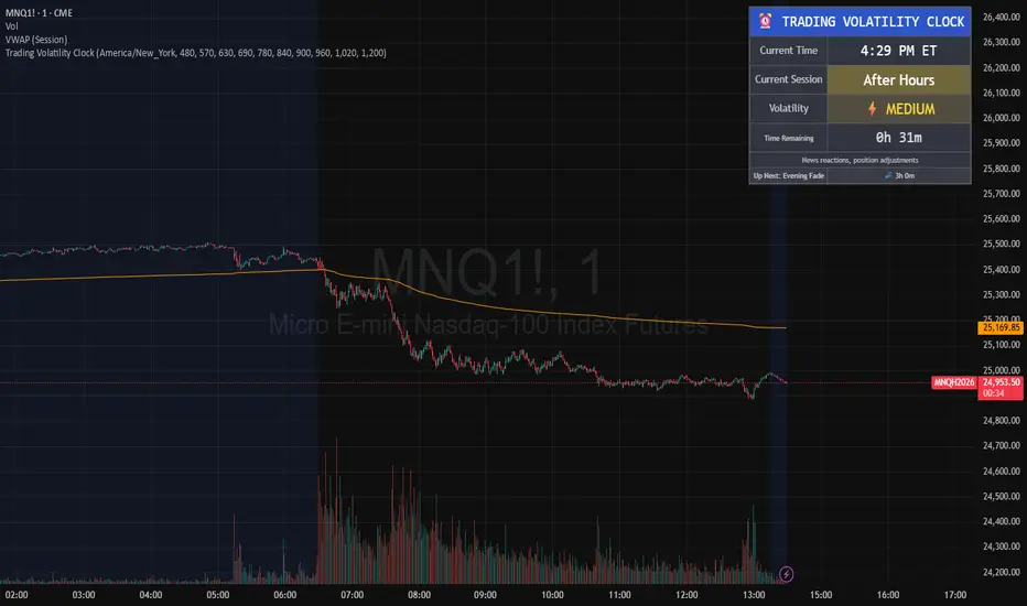
Kinetic Elasticity Reversion System - Adaptive Genesis Engine🧬 KERS-AGE - EVOLVED KINETIC ELASTICITY REVERSION SYSTEM
EDUCATIONAL GUIDE & THEORETICAL FOUNDATION
⚠️ IMPORTANT DISCLAIMER
This indicator and guide are provided for educational and informational purposes only. This is NOT financial advice, investment advice, or a recommendation to buy or sell any security.
Trading involves substantial risk of loss. Past performance does not guarantee future results. The performance metrics, win rates, and examples shown are from historical backtesting and do not represent actual trading results. Always conduct your own research, paper trade extensively, and never risk capital you cannot afford to lose.
The developers assume no responsibility for any trading losses incurred through use of this indicator.
INTRODUCTION
KERS-AGE (Kinetic Elasticity Reversion System - Adaptive Genetic Evolution) represents an educational exploration of adaptive trading systems. Unlike traditional indicators with fixed parameters, KERS-AGE demonstrates a dynamic, evolving approach that adjusts to market conditions through genetic algorithms and machine learning techniques.
This guide explains the theoretical concepts, technical implementation, and educational examples of how the system operates.
CONCEPTUAL FRAMEWORK
Traditional Indicators vs. Adaptive Systems:
Traditional Indicators:
Fixed parameters
Single strategy approach
Static behavior
Designed for specific conditions
Require manual optimization
Adaptive System Approach (KERS-AGE):
Dynamic parameters (adjust based on conditions)
Multiple strategies tested simultaneously
Pattern recognition (cluster analysis)
Regime-aware (speciation)
Automated optimization (genetic algorithms)
Transparent operation (detailed dashboard)
CORE CONCEPTS EXPLAINED
1. THE ELASTICITY ANALOGY 🎯
The indicator models price behavior as if connected to a moving average by an elastic band:
Price extends away → Elastic tension builds → Potential reversion point identified
Key Measurements:
STRETCH: Distance from price to equilibrium (MA)
TENSION: Normalized force calculation
THRESHOLD: Point where multiple factors align
Theoretical Foundation:
Markets have historically shown mean-reverting tendencies around fair value. This concept quantifies the deviation and identifies potential reversal zones based on multiple confluence factors.
Mathematical Approach:
text
Tension Score = (Price Distance from MA) / (Band Width) × Volatility Scaling
Signal Threshold = Multiple of ATR × Dynamic Volatility Ratio
Confluence = Tension Score + Additional Factors
2. THE 6 SIGNAL TYPES 📊
The system recognizes 6 distinct pattern categories:
A. ELASTIC SIGNALS
Pattern: Price reaches statistical band extremes
Theory: Maximum deviation from mean suggests potential reversion
Detection: Price touches outer zones (typically 2-3× ATR from MA)
Component: Mathematical band extension measurement
Historical Context: Often observed in markets with clear swing patterns
B. WICK SIGNALS
Pattern: Extended rejection wicks on candles
Theory: Failed breakout attempts may indicate directional exhaustion
Detection: Upper/lower wick exceeding 2× body size
Component: Real-time price rejection measurement
Historical Context: Common in volatile conditions with rapid reversals
C. EXHAUSTION SIGNALS
Pattern: Decelerating momentum despite price extension
Theory: Velocity and acceleration divergence may precede reversals
Detection: Decreasing velocity with negative acceleration
Component: Momentum derivative analysis
Historical Context: Often seen at trend maturity points
D. CLIMAX SIGNALS
Pattern: Volume spike at price extreme
Theory: Unusual volume at extremes historically correlates with turning points
Detection: Volume 1.5-2.5× average at band extreme
Component: Volume-price relationship analysis
Historical Context: Associated with institutional activity or capitulation
E. STRUCTURE SIGNALS
Pattern: Fractal pivot formations (swing highs/lows)
Theory: Market structure points have historically acted as support/resistance
Detection: 2-4 bar pivot patterns
Component: Classical technical analysis
Historical Context: Universal across timeframes and markets
F. DIVERGENCE SIGNALS
Pattern: RSI divergence versus price
Theory: Momentum divergence has historically preceded price reversals
Detection: Price makes new extreme but RSI does not
Component: Oscillator divergence detection
Historical Context: Considered a leading indicator in technical analysis
Pattern Confluence:
Historical testing suggests stronger signals when multiple types align:
Elastic + Wick + Volume = Higher confluence score
Elastic + Exhaustion + Divergence = Multiple confirmation factors
Any 3+ types = Increased pattern strength
Note: Past pattern performance does not guarantee future occurrence.
3. REGIME DETECTION 🌍
The system attempts to classify market conditions into three behavioral regimes:
📈 TREND REGIME
Detection Methodology:
text
Efficiency Ratio = Net Movement / Total Movement
Classification: Efficiency > 0.5 AND Volatility < 1.3 → TREND
Characteristics Observed:
Directional price movement
Relatively lower volatility
Defined higher highs/lower lows
Persistent directional momentum
System Response:
Reduces signal frequency
Prioritizes trend-specialist strategies
Applies additional filtering to counter-trend signals
Increases confluence requirements
Educational Note:
In trending conditions, counter-trend mean reversion signals historically have shown reduced reliability. Users may consider additional confirmation when trend regime is detected.
↔️ RANGE REGIME
Detection Methodology:
text
Classification: Efficiency < 0.5 AND Volatility 0.9-1.4 → RANGE
Characteristics Observed:
Oscillating price action
Defined support/resistance zones
Mean-reverting behavior patterns
Relatively balanced directional flow
System Response:
Increases signal frequency
Activates range-specialist strategies
Adjusts bands relative to volatility
Reduces confluence threshold
Educational Note:
Historical backtesting suggests mean reversion systems have performed better in ranging conditions. This does not guarantee future performance.
🌊 VOLATILE REGIME
Detection Methodology:
text
Classification: DVS (Dynamic Volatility Scaling) > 1.5 → VOLATILE
Characteristics Observed:
Erratic price swings
Expanded ranges
Elevated ATR readings
Often news or event-driven
System Response:
Activates volatility-specialist strategies
Widens bands automatically
Prioritizes wick rejection signals
Emphasizes volume confirmation
Educational Note:
Volatile conditions historically present both opportunity and increased risk. Wider stops may be appropriate for risk management.
4. GENETIC EVOLUTION EXPLAINED 🧬
The system employs genetic algorithms to optimize parameters - an approach used in computational finance research.
The Evolution Process:
STEP 1: INITIALIZATION
text
Initial State: System creates 4 starter strategies
- Strategy 0: Range-optimized parameters
- Strategy 1: Trend-optimized parameters
- Strategy 2: Volatility-optimized parameters
- Strategy 3: Balanced parameters
Each contains 14 adjustable parameters (genes):
- Band sensitivity
- Extension multiplier
- Wick threshold
- Momentum threshold
- Volume multiplier
- Component weights (elastic, wick, momentum, volume, fractal)
- Target percentage
STEP 2: COMPETITION (Shadow Trading)
text
Early Bars: All strategies generate signals in parallel
- Each tracks hypothetical performance independently
- Simulated P&L, win rate, Sharpe ratio calculated
- No actual trades executed (educational simulation)
- Performance metrics recorded for analysis
STEP 3: FITNESS EVALUATION
text
Fitness Calculation =
0.25 × Win Rate +
0.25 × PnL Score +
0.15 × Drawdown Score +
0.30 × Sharpe Ratio Score +
0.05 × Trade Count Score
With Walk-Forward enabled:
Fitness = 0.60 × Test Score + 0.40 × Train Score
With Speciation enabled:
Fitness adjusted by Diversity Penalty
STEP 4: SELECTION (Tournament)
text
Periodically (default every 50 bars):
- Randomly select 4 active strategies
- Compare fitness scores
- Top 2 selected as "parents"
STEP 5: CROSSOVER (Breeding)
text
Parent 1 Fitness: 0.65
Parent 2 Fitness: 0.55
Weight calculation: 0.65/(0.65+0.55) = 54%
For each parameter:
Child Parameter = (0.54 × Parent1) + (0.46 × Parent2)
Example:
Band Sensitivity: (0.54 × 1.5) + (0.46 × 2.0) = 1.73
STEP 6: MUTATION
text
For each parameter:
if random(0-1) < Mutation Rate (default 0.15):
Add random variation: -12% to +12%
Purpose: Prevents premature convergence
Enables: Discovery of novel parameter combinations
ADAPTIVE MUTATION:
If population fitness converges → Mutation rate × 1.5
(Encourages exploration when diversity decreases)
STEP 7: INSERTION
text
New strategy added to population:
- Assigned unique ID number
- Generation counter incremented
- Begins shadow trading
- Competes with existing strategies
STEP 8: CULLING (Selection Pressure)
text
Periodically (default every 100 bars):
- Identify lowest fitness strategy
- Verify not elite (protected top performers)
- Verify not last of species
- Remove from population
Result: Maintains selection pressure
Effect: Prevents weak strategies from diluting signals
STEP 9: SIGNAL GENERATION LOGIC
text
When determining signals to display:
If Ensemble enabled:
- All strategies cast weighted votes
- Weights based on fitness scores
- Specialists receive boost in matching regime
- Signal generated if consensus threshold reached
If Ensemble disabled:
- Single highest-fitness strategy used
STEP 10: ADAPTATION OBSERVATION
text
Over time: Population characteristics may shift
- Lower-performing strategies removed
- Higher-performing strategies replicated
- Parameters adjust toward observed optima
- Fitness scores generally trend upward
Long-term: Population reaches maturity
- Strategies become specialized
- Parameters optimized for recent conditions
- Performance stabilizes
Educational Context:
Genetic algorithms are a recognized computational method for optimization problems. This implementation applies those concepts to trading parameter optimization. Past optimization results do not guarantee future performance.
5. SPECIATION (Niche Specialization) 🐟🦎🦅
Inspired by biological speciation theory applied to algorithmic trading.
The Three Species:
RANGE SPECIALISTS 📊
text
Optimized for: Sideways market conditions
Parameter tendencies:
- Tighter bands (1.0-1.5× ATR)
- Higher sensitivity to elastic stretch
- Emphasis on fractal structure
- More frequent signal generation
Typically emerge when:
- Range regime detected
- Clear support/resistance present
- Mean reversion showing historical success
Historical backtesting observations:
- Win rates often in 55-65% range
- Smaller reward/risk ratios (0.5-1.5R)
- Higher trade frequency
TREND SPECIALISTS 📈
text
Optimized for: Directional market conditions
Parameter tendencies:
- Wider bands (2.0-2.5× ATR)
- Focus on momentum exhaustion
- Emphasis on divergence patterns
- More selective signal generation
Typically emerge when:
- Trend regime detected
- Strong directional movement observed
- Counter-trend exhaustion signals sought
Historical backtesting observations:
- Win rates often in 40-55% range
- Larger reward/risk ratios (1.5-3.0R)
- Lower trade frequency
VOLATILITY SPECIALISTS 🌊
text
Optimized for: High-volatility conditions
Parameter tendencies:
- Expanded bands (1.5-2.0× ATR)
- Priority on wick rejection patterns
- Strong volume confirmation requirement
- Very selective signals
Typically emerge when:
- Volatile regime detected
- High DVS ratio (>1.5)
- News-driven or event-driven conditions
Historical backtesting observations:
- Win rates often in 50-60% range
- Variable reward/risk ratios (1.0-2.5R)
- Opportunistic trade timing
Species Protection Mechanism:
text
Minimum Per Species: Configurable (default 2)
If Range specialists = 1:
→ Preferential spawning of Range type
→ Protection from culling process
Purpose: Ensures coverage across regime types
Theory: Markets cycle between behavioral states
Goal: Prevent extinction of specialized approaches
Fitness Sharing:
text
If Species has 4 members:
Individual Fitness × 1 / (4 ^ 0.3)
Individual Fitness × 0.72
Purpose: Creates pressure toward species diversity
Effect: Prevents single approach from dominating population
Educational Note: Speciation is a theoretical framework for maintaining strategy diversity. Past specialization performance does not guarantee future regime classification accuracy or signal quality.
6. WALK-FORWARD VALIDATION 📈
An out-of-sample testing methodology used in quantitative research to reduce overfitting risk.
The Overfitting Problem:
text
Hypothetical Example:
In-Sample Backtest: 85% win rate
Out-of-Sample Results: 35% win rate
Explanation: Strategy may have optimized to historical noise
rather than repeatable patterns
Walk-Forward Methodology:
Timeline Structure:
text
┌──────────────────────────────────────────────────────┐
│ Train Window │ Test Window │ Train │ Test │
│ (200 bars) │ (50 bars) │ (200) │ (50) │
└──────────────────────────────────────────────────────┘
In-Sample Out-of-Sample IS OOS
(Optimize) (Validate) Cycle 2...
TRAIN PHASE (In-Sample):
text
Example Bars 1-200: Strategies optimize parameters
- Performance tracked
- Not yet used for primary fitness
- Learning period
TEST PHASE (Out-of-Sample):
text
Example Bars 201-250: Strategies use optimized parameters
- Performance tracked separately
- Validation period
- Out-of-sample evaluation
FITNESS CALCULATION EXAMPLE:
text
Train Win Rate: 65%
Test Win Rate: 58%
Composite Fitness:
= (0.40 × 0.65) + (0.60 × 0.58)
= 0.26 + 0.35
= 0.61
Note: Test results weighted 60%, Train 40%
Theory: Out-of-sample may better indicate forward performance
OVERFIT DETECTION MECHANISM:
text
Gap = Train WR - Test WR = 65% - 58% = 7%
If Gap > Overfit Threshold (default 25%):
Fitness Penalty = Gap × 2
Example with 30% gap:
Strategy shows: Train 70%, Test 40%
Gap: 30% → Potential overfit flagged
Penalty: 30% × 2 = 60% fitness reduction
Result: Strategy likely to be culled
WINDOW ROLLING:
text
Example Bar 250: Test window complete
→ Reset both windows
→ Start new cycle
→ Previous results retained for analysis
Cycle Count increments
Historical performance tracked across multiple cycles
Educational Context:
Walk-forward analysis is a recognized approach in quantitative finance research for evaluating strategy robustness. However, past out-of-sample performance does not guarantee future results. Market conditions can change in ways not represented in historical data.
7. CLUSTER ANALYSIS 🔬
An unsupervised machine learning approach for pattern recognition.
The Concept:
text
Scenario: System identifies a price pivot that wasn't signaled
→ Extract pattern characteristics
→ Store features for analysis
→ Adjust detection for similar future patterns
Implementation:
STEP 1: FEATURE EXTRACTION
text
When significant move occurs without signal:
Extract 5-dimensional feature vector:
Feature Vector =
Example:
Observed Pattern:
STEP 2: CLUSTER ASSIGNMENT
text
Compare to existing cluster centroids using distance metric:
Cluster 0:
Cluster 1: ← Minimum distance
Cluster 2:
...
Assign to nearest cluster
STEP 3: CENTROID UPDATE
text
Old Centroid 1:
New Pattern:
Decay Rate: 0.95
Updated Centroid:
= 0.95 × Old + 0.05 × New
= Exponential moving average update
=
STEP 4: PROFIT TRACKING
text
Cluster Average Profit (hypothetical):
Old Average: 2.5R
New Observation: 3.2R
Updated: 0.95 × 2.5 + 0.05 × 3.2 = 2.535R
STEP 5: LEARNING ADJUSTMENT
text
If Cluster Average Profit > Threshold (e.g., 2.0R):
Cluster Learning Boost += increment (e.g., 0.1)
(Maximum cap: 2.0)
Effect: Future signals resembling this cluster receive adjustment
STEP 6: SCORE MODIFICATION
text
For signals matching cluster characteristics:
Base Score × Cluster Learning Boost
Example:
Base Score: 5.2
Cluster Boost: 1.3
Adjusted Score: 5.2 × 1.3 = 6.76
Result: Pattern more likely to generate signal
Cluster Interpretation Example:
text
CLUSTER 0: "High elastic, low volume"
Centroid:
Avg Profit: 3.5R (historical backtest)
Interpretation: Pure elastic signals in ranges historically favorable
CLUSTER 1: "Wick rejection, volatile"
Centroid:
Avg Profit: 2.8R (historical backtest)
Interpretation: Wick signals in volatility showed positive results
CLUSTER 2: "Exhaustion divergence"
Centroid:
Avg Profit: 4.2R (historical backtest)
Interpretation: Momentum exhaustion in trends performed well
Learning Progress Metrics:
text
Missed Total: 47
Clusters Updated: 142
Patterns Learned: 28
Interpretation:
- System identified 47 significant moves without signals
- Clusters updated 142 times (incremental refinement)
- Made 28 parameter adjustments
- Theoretically improving pattern recognition
Educational Note: Cluster analysis is a recognized machine learning technique. This implementation applies it to trading pattern recognition. Past cluster performance does not guarantee future pattern profitability or accurate classification.
8. ENSEMBLE VOTING 🗳️
A collective decision-making approach common in machine learning.
The Wisdom of Crowds Concept:
text
Single Model:
- May have blind spots
- Subject to individual bias
- Limited perspective
Ensemble of Models:
- Blind spots may offset
- Biases may average out
- Multiple perspectives considered
Implementation:
STEP 1: INDIVIDUAL VOTES
text
Example Bar 247:
Strategy 0 (Range): LONG (fitness: 0.65)
Strategy 1 (Trend): FLAT (fitness: 0.58)
Strategy 2 (Volatile): LONG (fitness: 0.52)
Strategy 3 (Balanced): SHORT (fitness: 0.48)
Strategy 4 (Range): LONG (fitness: 0.71)
Strategy 5 (Trend): FLAT (fitness: 0.55)
STEP 2: WEIGHT CALCULATION
text
Base Weight = Fitness Score
If strategy's species matches current regime:
Weight × Specialist Boost (configurable, default 1.5)
If strategy has recent positive performance:
Weight × Recent Performance Factor
Example for Strategy 0:
Base: 0.65
Range specialist in Range regime: 0.65 × 1.5 = 0.975
Recent performance adjustment: 0.975 × 1.13 = 1.10
STEP 3: WEIGHTED TALLYING
text
LONG votes:
S0: 1.10 + S2: 0.52 + S4: 0.71 = 2.33
SHORT votes:
S3: 0.48 = 0.48
FLAT votes:
S1: 0.58 + S5: 0.55 = 1.13
Total Weight: 2.33 + 0.48 + 1.13 = 3.94
STEP 4: CONSENSUS CALCULATION
text
LONG %: 2.33 / 3.94 = 59.1%
SHORT %: 0.48 / 3.94 = 12.2%
FLAT %: 1.13 / 3.94 = 28.7%
Minimum Consensus Setting: 60%
Result: NO SIGNAL (59.1% < 60%)
STEP 5: SIGNAL DETERMINATION
text
If LONG % >= Min Consensus:
→ Display LONG signal
→ Show consensus percentage in dashboard
If SHORT % >= Min Consensus:
→ Display SHORT signal
If neither threshold reached:
→ No signal displayed
Practical Examples:
text
Strong Consensus (85%):
5 strategies LONG, 0 SHORT, 1 FLAT
→ High agreement among models
Moderate Consensus (62%):
3 LONG, 2 SHORT, 1 FLAT
→ Borderline agreement
No Consensus (48%):
3 LONG, 2 SHORT, 1 FLAT
→ Insufficient agreement, no signal shown
Educational Note: Ensemble methods are widely used in machine learning to improve model robustness. This implementation applies ensemble concepts to trading signals. Past ensemble performance does not guarantee future signal quality or profitability.
9. THOMPSON SAMPLING 🎲
A Bayesian reinforcement learning technique for balancing exploration and exploitation.
The Exploration-Exploitation Dilemma:
text
EXPLOITATION: Use what appears to work
Benefit: Leverages observed success patterns
Risk: May miss better alternatives
EXPLORATION: Try less-tested approaches
Benefit: May discover superior methods
Risk: May waste resources on inferior options
Thompson Sampling Solution:
STEP 1: BETA DISTRIBUTIONS
text
For each signal type, maintain:
Alpha = Successes + 1
Beta = Failures + 1
Example for Elastic signals:
15 wins, 10 losses
Alpha = 16, Beta = 11
STEP 2: PROBABILITY SAMPLING
text
Rather than using simple Win Rate = 15/25 = 60%
Sample from Beta(16, 11) distribution:
Possible samples: 0.55, 0.62, 0.58, 0.64, 0.59...
Rationale: Incorporates uncertainty
- Type with 5 trades: High uncertainty, wide sample variation
- Type with 50 trades: Lower uncertainty, narrow sample range
STEP 3: TYPE PRIORITIZATION
text
Example Bar 248:
Elastic sampled: 0.62
Wick sampled: 0.58
Exhaustion sampled: 0.71 ← Highest this sample
Climax sampled: 0.52
Structure sampled: 0.63
Divergence sampled: 0.45
Exhaustion type receives temporary boost
STEP 4: SIGNAL ADJUSTMENT
text
If current signal is Exhaustion type:
Score × (0.7 + 0.71 × 0.6)
Score × 1.126
If current signal is other type with lower sample:
Score × (0.7 + sample × 0.6)
(smaller adjustment)
STEP 5: OUTCOME FEEDBACK
text
When trade completes:
If WIN:
Alpha += 1
(Beta unchanged)
If LOSS:
Beta += 1
(Alpha unchanged)
Effect: Shifts probability distribution for future samples
Educational Context:
Thompson Sampling is a recognized Bayesian approach to the multi-armed bandit problem. This implementation applies it to signal type selection. The mathematical optimality assumes stationary distributions, which may not hold in financial markets. Past sampling performance does not guarantee future type selection accuracy.
10. DYNAMIC VOLATILITY SCALING (DVS) 📉
An adaptive approach where parameters adjust based on current vs. baseline volatility.
The Adaptation Problem:
text
Fixed bands (e.g., always 1.5 ATR):
In low volatility environment (vol = 0.5):
Bands may be too wide → fewer signals
In high volatility environment (vol = 2.0):
Bands may be too tight → excessive signals
The DVS Approach:
STEP 1: BASELINE ESTABLISHMENT
text
Calculate volatility over baseline period (default 100 bars):
Method options: ATR / Close, Parkinson, or Garman-Klass
Example average volatility = 1.2%
This represents "normal" for recent conditions
STEP 2: CURRENT VOLATILITY
text
Current bar volatility = 1.8%
STEP 3: DVS RATIO
text
DVS Ratio = Current / Baseline
= 1.8 / 1.2
= 1.5
Interpretation: Volatility currently 50% above baseline
STEP 4: BAND ADJUSTMENT
text
Base Band Width: 1.5 ATR
Adjusted Band Width:
Upper: 1.5 × DVS = 1.5 × 1.5 = 2.25 ATR
Lower: Same
Result: Bands expand 50% to accommodate higher volatility
STEP 5: THRESHOLD ADJUSTMENT
text
Base Thresholds:
Wick: 0.15
Momentum: 0.6
Adjusted:
Wick: 0.15 / DVS = 0.10 (easier to trigger in high vol)
Momentum: 0.6 × DVS = 0.90 (harder to trigger in high vol)
DVS Calculation Methods:
text
ATR RATIO (Simplest):
DVS = (ATR / Close) / SMA(ATR / Close, 100)
PARKINSON (Range-based):
σ = √(∑(ln(H/L))² / (4×n×ln(2)))
DVS = Current σ / Baseline σ
GARMAN-KLASS (Comprehensive):
σ = √(0.5×(ln(H/L))² - (2×ln(2)-1)×(ln(C/O))²)
DVS = Current σ / Baseline σ
ENSEMBLE (Robust):
DVS = Median(ATR_Ratio, Parkinson, Garman_Klass)
Educational Note: Dynamic volatility scaling is an approach to normalize indicators across varying market conditions. The effectiveness depends on the assumption that recent volatility patterns continue, which is not guaranteed. Past volatility adjustment performance does not guarantee future normalization accuracy.
11. PRESSURE KERNEL 💪
A composite measurement attempting to quantify directional force beyond simple price movement.
Components:
1. CLOSE LOCATION VALUE (CLV)
text
CLV = ((Close - Low) - (High - Close)) / Range
Examples:
Close at top of range: CLV = +1.0 (bullish position)
Close at midpoint: CLV = 0.0 (neutral)
Close at bottom: CLV = -1.0 (bearish position)
2. WICK ASYMMETRY
text
Wick Pressure = (Lower Wick - Upper Wick) / Range
Additional factors:
If Lower Wick > Body × 2: +0.3 (rejection boost)
If Upper Wick > Body × 2: -0.3 (rejection penalty)
3. BODY MOMENTUM
text
Body Ratio = Body Size / Range
Body Momentum = Close > Open ? +Body Ratio : -Body Ratio
Strong bullish candle: +0.9
Weak bullish candle: +0.2
Doji: 0.0
4. PATH ESTIMATE
text
Close Position = (Close - Low) / Range
Open Position = (Open - Low) / Range
Path = Close Position - Open Position
Additional adjustments:
If closed high with lower wick: +0.2
If closed low with upper wick: -0.2
5. MOMENTUM CONFIRMATION
text
Price Change / ATR
Examples:
+1.5 ATR move: +1.0 (capped)
+0.5 ATR move: +0.5
-0.8 ATR move: -0.8
COMPOSITE CALCULATION:
text
Pressure =
CLV × 0.25 +
Wick Pressure × 0.25 +
Body Momentum × 0.20 +
Path Estimate × 0.15 +
Momentum Confirm × 0.15
Volume context applied:
If Volume > 1.5× avg: × 1.3
If Volume < 0.5× avg: × 0.7
Final smoothing: 3-period EMA
Pressure Interpretation:
text
Pressure > 0.3: Suggests buying pressure
→ May support LONG signals
→ May reduce SHORT signal strength
Pressure < -0.3: Suggests selling pressure
→ May support SHORT signals
→ May reduce LONG signal strength
-0.3 to +0.3: Neutral range
→ Minimal directional bias
Educational Note: The Pressure Kernel is a custom composite indicator combining multiple price action metrics. These weightings are theoretical constructs. Past pressure readings do not guarantee future directional movement or signal quality.
USAGE GUIDE - EDUCATIONAL EXAMPLES
Getting Started:
STEP 1: Add Indicator
Open TradingView
Add KERS-AGE to chart
Allow minimum 100 bars for initialization
Verify dashboard displays Gen: 1+
STEP 2: Initial Observation Period
text
First 200 bars:
- System is in learning phase
- Signal frequency typically low
- Population evolution occurring
- Fitness scores generally increasing
Recommendation: Observe without trading during initialization
STEP 3: Signal Evaluation Criteria
text
Consider evaluating signals based on:
- Confidence percentage
- Grade assignment (A+, A, B+, B, C)
- Position within bands
- Historical win rate shown in dashboard
- Train vs. Test performance gap
Example Signal Evaluation Checklist:
Educational Criteria to Consider:
Signal appeared (⚡ arrow displayed)
Confidence level meets personal threshold
Grade meets personal quality standard
Ensemble consensus (if enabled) meets threshold
Historical win rate acceptable
Test performance reasonable vs. Train
Price location at band extreme
Regime classification appropriate for strategy
If trending: Signal direction aligns with personal analysis
Stop loss distance acceptable for risk tolerance
Position size appropriate (example: 1-2% account risk)
Note: This is an educational checklist, not trading advice. Users should develop their own criteria based on personal risk tolerance and strategy.
Risk Management Educational Examples:
POSITION SIZING EXAMPLE:
text
Hypothetical scenario:
Account: $10,000
Risk tolerance: 1.5% per trade = $150
Indicated stop distance: 1.5 ATR = $300 per contract
Calculation: $150 / $300 = 0.5 contracts
This is an educational example only, not a recommendation.
STOP LOSS EXAMPLES:
text
System provides stop level (red line)
Typically calculated as 1.5 ATR from entry
Alternative approaches users might consider:
LONG: Below recent swing low
SHORT: Above recent swing high
Users should determine stops based on personal risk management.
TAKE PROFIT EXAMPLES:
text
System provides target level (green line)
Typically calculated as price stretch × 60%
Alternative approaches users might consider:
Scale out: Partial exit at 1R, remainder at 2R
Trailing stop: Adjust stop after profit threshold
Users should determine targets based on personal strategy.
Educational Note: These are theoretical examples for educational purposes. Actual position sizing and risk management should be determined by each user based on their individual risk tolerance, account size, and trading plan.
OPTIMIZATION BY MARKET TYPE - EDUCATIONAL SUGGESTIONS
RANGE-BOUND MARKETS
Suggested Settings for Testing:
Population Size: 6-8
Min Confluence: 5.0-6.0
Min Consensus: 70%
Enable Speciation: Consider enabling
Min Per Species: 2
Theoretical Rationale:
More strategies may provide better coverage
Moderate confluence may generate more signals
Higher consensus may filter quality
Speciation may encourage range specialist emergence
Historical Backtest Observations:
Win rates in testing: Varied, often 50-65% range
Reward/risk ratios observed: 0.5-1.5R
Signal frequency: Relatively frequent
Disclaimer: Past backtesting results do not guarantee future performance.
TRENDING MARKETS
Suggested Settings for Testing:
Population Size: 4-5
Min Confluence: 6.0-7.0
Consider enabling MTF filter
MTF Timeframe: 3-5× current timeframe
Specialist Boost: 1.8-2.0
Theoretical Rationale:
Fewer strategies may adapt faster
Higher confluence may filter counter-trend noise
MTF may reduce counter-trend signals
Specialist boost may prioritize trend specialists
Historical Backtest Observations:
Win rates in testing: Varied, often 40-55% range
Reward/risk ratios observed: 1.5-3.0R
Signal frequency: Less frequent
Disclaimer: Past backtesting results do not guarantee future performance.
VOLATILE MARKETS (e.g., Cryptocurrency)
Suggested Settings for Testing:
Base Length: 25-30
Band Multiplier: 1.8-2.0
DVS: Consider enabling (Ensemble method)
Consider enabling Volume Filter
Volume Multiplier: 1.5-2.0
Theoretical Rationale:
Longer base may smooth noise
Wider bands may accommodate larger swings
DVS may be critical for adaptation
Volume filter may confirm genuine moves
Historical Backtest Observations:
Win rates in testing: Varied, often 45-60% range
Reward/risk ratios observed: 1.0-2.5R
Signal frequency: Moderate
Disclaimer: Cryptocurrency markets are highly volatile and risky. Past backtesting results do not guarantee future performance.
SCALPING (1-5min timeframes)
Suggested Settings for Testing:
Base Length: 15-20
Train Window: 150
Test Window: 30
Spawn Interval: 30
Min Confluence: 5.5-6.5
Consider enabling Ensemble
Min Consensus: 75%
Theoretical Rationale:
Shorter base may increase responsiveness
Shorter windows may speed evolution cycles
Quick spawning may enable rapid adaptation
Higher confluence may filter noise
Ensemble may reduce false signals
Historical Backtest Observations:
Win rates in testing: Varied, often 50-65% range
Reward/risk ratios observed: 0.5-1.0R
Signal frequency: Frequent but filtered
Disclaimer: Scalping involves high frequency trading with increased transaction costs and slippage risk. Past backtesting results do not guarantee future performance.
SWING TRADING (4H-Daily timeframes)
Suggested Settings for Testing:
Base Length: 25-35
Train Window: 300
Test Window: 100
Population Size: 7-8
Consider enabling Walk-Forward
Cooldown: 8-10 bars
Theoretical Rationale:
Longer timeframe may benefit from longer lookbacks
Larger windows may improve robustness testing
More population may increase stability
Walk-forward may be valuable for multi-day holds
Longer cooldown may reduce overtrading
Historical Backtest Observations:
Win rates in testing: Varied, often 45-60% range
Reward/risk ratios observed: 2.0-4.0R
Signal frequency: Infrequent but potentially higher quality
Disclaimer: Swing trading involves overnight and weekend risk. Past backtesting results do not guarantee future performance.
DASHBOARD GUIDE - INTERPRETATION EXAMPLES
Reading Each Section:
HEADER:
text
🧬 KERS-AGE EVOLVED 📈 TREND
Regime indication:
Color coding suggests current classification
(Green = Range, Orange = Trend, Purple = Volatile)
POPULATION:
text
Pop: 6/6
Gen: 42
Interpretation:
- Population at target size
- System at generation 42
- May indicate mature evolution
SPECIES (if enabled):
text
R:2 T:3 V:1
Interpretation:
- 2 Range specialists
- 3 Trend specialists
- 1 Volatility specialist
In TREND regime this distribution may be expected
WALK-FORWARD (if enabled):
text
Phase: 🧪 TEST
Cycles: 5
Train: 65%
Test: 58%
Considerations:
- Currently in test phase
- Completed 5 full cycles
- 7% performance gap between train and test
- Gap under default 25% overfit threshold
ENSEMBLE (if enabled):
text
Vote: 🟢 LONG
Consensus: 72%
Interpretation:
- Weighted majority voting LONG
- 72% agreement level
- Exceeds default 60% consensus threshold
SELECTED STRATEGY:
text
ID:23
Trades: 47
Win%: 58%
P&L: +8.3R
Fitness: 0.62
Information displayed:
- Strategy ID 23, Trend specialist
- 47 historical simulated trades
- 58% historical win rate
- +8.3R historical cumulative reward/risk
- 0.62 fitness score
Note: These are historical simulation metrics
SIGNAL QUALITY:
text
Conf: 78%
Grade: B+
Elastic: ████████░░
Wick: ██████░░░░
Momentum: ███████░░░
Pressure: ███████░░░
Information displayed:
- 78% confluence score
- B+ grade assignment
- Elastic component strongest
- Visual representation of component strengths
LEARNING (if enabled):
text
Missed: 47
Learned: 28
Interpretation:
- System identified 47 moves without signals
- 28 pattern adjustments made
- Suggests ongoing learning process
POSITION:
text
POS: 🟢 LONG
Score: 7.2
Current state:
- Simulated long position active
- 7.2 confluence score
- Monitor for potential exit signal
Educational Note: Dashboard displays are for informational and educational purposes. All performance metrics are historical simulations and do not represent actual trading results or future expectations.
FREQUENTLY ASKED QUESTIONS - EDUCATIONAL RESPONSES
Q: Why aren't signals showing?
A: Several factors may affect signal generation:
System may still be initializing (check Gen: counter)
Confluence score may be below threshold
Ensemble consensus (if enabled) may be below requirement
Current regime may naturally produce fewer signals
Filters may be active (volume, noise reduction)
Consider adjusting settings or allowing more time for evolution.
Q: The win rate seems low compared to backtesting?
A: Consider these factors:
First 200 bars typically represent learning period
Focus on TEST % rather than TRAIN % for realistic expectations
Trend regime historically shows 40-55% win rates in backtesting
Different market conditions may affect performance
System emphasizes reward/risk ratio alongside win rate
Past performance does not guarantee future results
Q: Should I take all signals?
A: This is a personal decision. Some users may consider:
Taking higher grades (A+, A) in any regime
Being more selective in trend regimes
Requiring higher ensemble consensus
Only trading during specific regimes
Paper trading extensively before live trading
Each user should develop their own signal selection criteria.
Q: Signals appear then disappear?
A: This may be expected behavior:
Default requires 2-bar persistence
Designed to filter brief spikes
Confirmation delay intended to reduce false signals
Wait for persistence requirement to be met
This is an intentional feature, not a malfunction.
Q: Test % much lower than Train %?
A: This may indicate:
Overfit detection system functioning
Gap exceeding threshold triggers penalty
Strategy may be optimizing to in-sample noise
System designed to cull such strategies
Walk-forward protection working as intended
This is a safety feature to reduce overfitting risk.
Q: The population keeps culling strategies?
A: This is part of normal evolution:
Lower-performing strategies removed periodically
Higher-performing strategies replicate
Population quality theoretically improves over time
Total culled count shows selection pressure
This is expected evolutionary behavior.
Q: Which timeframe works best?
A: Backtesting suggests 15min to 4H may be suitable ranges:
Lower timeframes may be noisier, may need more filtering
Higher timeframes may produce fewer signals
Extensive historical testing recommended for chosen asset
Each asset may behave differently
Consider paper trading across multiple timeframes
Personal testing is recommended for your specific use case.
Q: Does it work on all asset types?
A: Historical testing suggests:
Cryptocurrency: Consider longer Base Length (25-30) due to volatility
Forex: Standard settings may be appropriate starting point
Stocks: Standard settings, possibly smaller population (4-5)
Indices: Trend-focused settings may be worth testing
Each asset class has unique characteristics. Extensive testing recommended.
Q: Can settings be changed after initialization?
A: Yes, but considerations:
Population will reset
Strategies restart evolution
Learning progress resets
Consider testing new settings on separate chart first
May want to compare performance before committing
Settings changes restart the evolutionary process.
Q: Walk-Forward enabled or disabled?
A: Educational perspective:
Walk-Forward adds out-of-sample validation
May reduce overfitting risk
Results may be more conservative
Considered best practice in quantitative research
Requires more bars for meaningful data
Recommended for those concerned about robustness
Individual users should assess based on their needs.
Q: Ensemble mode or single strategy?
A: Trade-offs to consider:
Ensemble approach:
Requires consensus threshold
May have higher consistency
Typically fewer signals
Multiple perspectives considered
Single strategy approach:
More signals (varying quality)
Faster response to conditions
Higher variability
More active signal generation
Personal preference and risk tolerance should guide this choice.
ADVANCED CONSIDERATIONS
Evolution Time: Consider allowing 200+ bars for population maturity
Regime Awareness: Historical performance varies by regime classification
Confluence Range: Testing suggests 70-85% may be informative range
Ensemble Levels: 80%+ consensus historically associated with stronger agreement
Out-of-Sample Focus: Test performance may be more indicative than train performance
Learning Metrics: "Learned" count shows pattern adjustment over time
Pressure Levels: >0.4 pressure historically added confirmation
DVS Monitoring: >1.5 DVS typically widens bands and affects frequency
Species Balance: Healthy distribution might be 2-2-2 or 3-2-1, avoid 6-0-0
Timeframe Testing: Match to personal trading style, test thoroughly
Volume Importance: May be more critical for stocks/crypto than forex
MTF Utility: Historically more impactful in trending conditions
Grade Significance: A+ in trend regime historically rare and potentially significant
Risk Parameters: Standard risk management suggests 1-2% per trade maximum
Stop Levels: System stops are pre-calculated, widening may affect reward/risk
THEORETICAL FOUNDATIONS
Genetic Algorithms in Finance:
Traditional Optimization Approaches:
Grid search: Exhaustive but computationally expensive
Gradient descent: Efficient but prone to local optima
Random search: Simple but inefficient
Genetic Algorithm Characteristics:
Explores parameter space through evolutionary process
Balances exploration (mutation) and exploitation (selection)
Mitigates local optima through population diversity
Parallel evaluation via population approach
Inspired by biological evolution principles
Academic Context: Genetic algorithms are studied in computational finance literature for parameter optimization. Effectiveness varies based on problem characteristics and implementation.
Ensemble Methods in Machine Learning:
Single Model Limitations:
May overfit to specific patterns
Can have blind spots in certain conditions
May be brittle to distribution shifts
Ensemble Theoretical Benefits:
Variance reduction through averaging
Robustness through diversity
Improved generalization potential
Widely used (Random Forests, Gradient Boosting, etc.)
Academic Context: Ensemble methods are well-studied in machine learning literature. Performance benefits depend on base model diversity and correlation structure.
Walk-Forward Analysis:
Alternative Approaches:
Simple backtest: Risk of overfitting to full dataset
Single train/test split: Limited validation
Cross-validation: May violate time-series properties
Walk-Forward Characteristics:
Continuous out-of-sample validation
Respects temporal ordering
Attempts to detect strategy degradation
Used in quantitative trading research
Academic Context: Walk-forward analysis is discussed in quantitative finance literature as a robustness check. However, it assumes future regimes will resemble recent test periods, which is not guaranteed.
FINAL EDUCATIONAL SUMMARY
KERS-AGE demonstrates an adaptive systems approach to technical analysis. Rather than fixed rules, it implements:
✓ Evolutionary Optimization: Parameter adaptation through genetic algorithms
✓ Regime Classification: Attempted market condition categorization
✓ Out-of-Sample Testing: Walk-forward validation methodology
✓ Pattern Recognition: Cluster analysis and learning systems
✓ Ensemble Methodology: Collective decision-making framework
✓ Full Transparency: Comprehensive dashboard and metrics
This indicator is an educational tool demonstrating advanced algorithmic concepts.
Critical Reminders:
The system:
✓ Attempts to identify potential reversal patterns
✓ Adapts parameters to changing conditions
✓ Provides multiple filtering mechanisms
✓ Offers detailed performance metrics
Users must understand:
✓ No system guarantees profitable results
✓ Past performance does not predict future results
✓ Extensive testing and validation recommended
✓ Risk management is user's responsibility
✓ Market conditions can change unpredictably
✓ This is educational software, not financial advice
Success in trading requires: Proper education, risk management, discipline, realistic expectations, and personal responsibility for all trading decisions.
For Educational Use
🧬 KERS-AGE Development Team
⚠️ FINAL DISCLAIMER
This indicator and documentation are provided strictly for educational and informational purposes.
NOT FINANCIAL ADVICE: Nothing in this guide constitutes financial advice, investment advice, trading advice, or any recommendation to buy, sell, or hold any security or to engage in any trading strategy.
NO GUARANTEES: No representation is made that any account will or is likely to achieve profits or losses similar to those shown in backtests, examples, or historical data. Past performance is not indicative of future results.
SUBSTANTIAL RISK: Trading stocks, forex, futures, options, and cryptocurrencies involves substantial risk of loss and is not suitable for every investor. The high degree of leverage can work against you as well as for you.
YOUR RESPONSIBILITY: You are solely responsible for your own investment and trading decisions. You should conduct your own research, perform your own analysis, and consult with qualified financial advisors before making any trading decisions.
NO LIABILITY: The developers, contributors, and distributors of this indicator disclaim all liability for any losses or damages, direct or indirect, that may result from use of this indicator or reliance on any information provided.
PAPER TRADE FIRST: Users are strongly encouraged to thoroughly test this indicator in a paper trading environment before risking any real capital.
By using this indicator, you acknowledge that you have read this disclaimer, understand the risks involved in trading, and agree that you are solely responsible for your own trading decisions and their outcomes.
Educational Software Only | Trade at Your Own Risk | Not Financial Advice
Taking you to school. — Dskyz , Trade with insight. Trade with anticipation.

ZAR Sentiment IndexOverview
The ZAR Sentiment Index (ZSI) is a composite macro-financial indicator designed to measure the prevailing risk and carry regime for the South African Rand (ZAR).
The South African Rand is a high-beta emerging market currency that is heavily influenced by:
Global risk sentiment
US dollar strength
Commodity dynamics
Interest-rate differentials
Sovereign risk perceptions
Rather than focusing on price momentum or technical patterns, the ZSI aggregates key macro drivers into a single normalised index, allowing traders and analysts to identify whether the environment is supportive, neutral, or hostile for ZAR exposure.
The indicator is intended as a regime filter, not a trade-entry signal.
Methodology
The ZSI combines six macro- and market-based components that have historically explained a large share of USDZAR and ZAR carry performance.
Each component is standardised using a rolling z-score, allowing variables with different units and frequencies to be combined consistently.
All macroeconomic series are sourced on a daily timeframe and forward-filled, ensuring the indicator functions correctly on daily, weekly, and monthly charts.
Components
1. US Dollar Strength (DXY)
A stronger US dollar is typically negative for emerging market currencies, including ZAR.
Contribution: Negative
Implementation: Negative z-score of DXY
2. Global Risk Sentiment (VIX)
The VIX index is used as a proxy for global risk aversion.
Rising volatility signals risk-off conditions and carry trade vulnerability
Contribution: Negative
Implementation: Negative z-score of VIX
3. Commodity Support (Gold)
South Africa retains a meaningful commodity linkage, particularly to gold.
Stronger gold prices tend to support ZAR through terms-of-trade effects
Contribution: Positive
Implementation: Positive z-score of XAUUSD
Implementation: Positive z-score of XAUUSD
4. Interest Rate Differential (SA 10Y – US 10Y)
The yield spread between South African and US government bonds proxies the compensation investors demand to hold South African assets.
Wider spreads are generally supportive for ZAR
Contribution: Positive
Implementation: Z-score of the SA 10-year minus US 10-year yield spread
5. Sovereign Risk Proxy (Government Debt-to-GDP)
Where sovereign CDS data is unavailable, South Africa Government Debt-to-GDP is used as a structural proxy for sovereign risk.
Rising debt ratios reflect deteriorating fiscal sustainability
Contribution: Negative
Implementation: Negative z-score of Debt-to-GDP
6. Monetary Policy Differential (SARB – Fed)
The carry attractiveness of ZAR is influenced by the policy rate differential between South Africa and the United States.
The South African interbank rate is used as a proxy for the SARB policy stance
The US policy rate is used as the Federal Reserve proxy
Contribution: Positive
Implementation: Z-score of the SARB–Fed rate gap
Index Construction
Each standardized component is weighted (equal weights by default) and aggregated into a single composite score:
Positive values indicate a supportive macro environment for ZAR
Negative values indicate deteriorating conditions
An optional exponential moving average is applied to reduce noise.
Regime Interpretation
Above 0 - Supportive - Macro tailwinds for ZAR; carry conditions favourable
0 to –0.5 - Neutral / Cautious - Range-bound conditions; reduced conviction
–0.5 to –1.0 - Warning - Rising risk; carry trades vulnerable
Below –1.0 - Stress - Elevated probability of sharp USDZAR upside moves
Background shading is used to visually highlight warning and stress regimes.
Practical Applications
USDZAR Analysis
Supportive regimes tend to align with sustained USDZAR downside trends
Warning and stress regimes often precede volatility spikes and sharp reversals
Carry Trade Risk Management
The index helps identify when ZAR carry trades are structurally supported versus vulnerable
Particularly useful for filtering exposure in ZARJPY and EM FX baskets
Macro Context
The ZSI provides macro confirmation or divergence relative to price action
It is most effective when combined with key technical levels and event risk
Timeframe Considerations
The indicator is designed to function across all chart timeframes
Macroeconomic inputs are sourced daily and forward-filled
Daily and weekly charts are recommended for regime analysis
Important Notes
This indicator is not predictive and does not generate trade signals
It measures prevailing macro conditions rather than forecasting price direction
ZAR can remain resilient in mildly negative regimes and volatile in neutral regimes
The strongest signals occur when extreme ZSI readings align with major macro events or key price levels.
Summary
The ZAR Sentiment Index (ZSI) provides a disciplined, transparent framework for understanding the macro forces driving the South African Rand.
By integrating global risk, US dollar dynamics, commodities, interest rate differentials, and sovereign risk into a single normalized measure, the indicator helps traders distinguish between supportive environments, neutral conditions, and genuine risk-off regimes.

FVG Heatmap [Hash Capital Research]FVG Map
FVG Map is a visual Fair Value Gap (FVG) mapping tool built to make displacement imbalances easy to see and manage in real time. It detects 3-candle FVG zones, plots them as clean heatmap boxes, tracks partial mitigation (how much of the zone has been filled), and summarizes recent “fill speed” behavior in a small regime dashboard.
This is an indicator (not a strategy). It does not place trades and it does not publish performance claims. It is a market-structure visualization tool intended to support discretionary or systematic workflows.
What this script detects
Bullish FVG (gap below price)
A bullish FVG is detected when the candle from two bars ago has a high below the current candle’s low.
The zone spans from that prior high up to the current low.
Bearish FVG (gap above price)
A bearish FVG is detected when the candle from two bars ago has a low above the current candle’s high.
The zone spans from the current high up to that prior low.
What makes it useful
Heatmap zones (clean, readable FVG boxes)
Bullish zones plot below price. Bearish zones plot above price.
Partial fill tracking (mitigation progress)
As price trades back into a zone, the script visually shows how much of the zone has been filled.
Mitigation modes (your definition of “filled”)
• Full Fill: price fully trades through the zone
• 50% Fill: price reaches the midpoint of the zone
• First Touch: price touches the zone one time
Optional auto-cleanup
Optionally remove zones once they’re mitigated to keep the chart clean.
Fill-Speed Regime Dashboard
When zones get mitigated, the script records how many bars it took to fill and summarizes the recent environment:
• Average fill time
• Median fill time
• % fast fills vs % slow fills
• Regime label: choppy/mean-revert, trending/displacement, or mixed
How to use
Use FVG zones as structure, not guaranteed signals.
• Bullish zones are often watched as potential support on pullbacks.
• Bearish zones are often watched as potential resistance on rallies.
The fill-speed dashboard helps provide context: fast fills tend to appear in more rotational conditions, while slow fills tend to appear in stronger trend/displacement conditions.
Alerts
Bullish FVG Created
Bearish FVG Created
Notes
FVGs are not guaranteed reversal points. Fill-speed/regime is descriptive of recent behavior and should be treated as context, not prediction. On realtime candles, visuals may update as the bar forms.

QUANT TRADING ENGINE [PointAlgo]Quant Trading Engine is a quantitative market-analysis indicator that combines multiple statistical factors to study trend behavior, mean reversion, volatility, execution efficiency, and market stability.
The indicator converts raw price behavior into standardized signals to help evaluate directional bias and risk conditions in a systematic way.
This script focuses on factor alignment and regime awareness, not prediction certainty.
Design Philosophy
Markets move through different regimes such as trending, ranging, volatile expansion, and instability.
This indicator attempts to model these regimes by blending:
Momentum strength
Mean-reversion pressure
Volatility risk
Trend filtering
Execution context (VWAP)
Correlation structure
Each component is normalized and combined into a single Quant Alpha framework.
Factor Construction
1. Momentum Factor
Measures directional strength using percentage price change over a rolling window.
Standardized using mean and standard deviation.
Represents trend continuation pressure.
2. Mean Reversion Factor
Measures deviation from a longer moving average.
Standardized to identify stretched conditions.
Designed to capture counter-trend behavior.
Directional Clamping
Mean-reversion signals are dynamically restricted:
No counter-trend buying during downtrends.
No counter-trend selling during uptrends.
Allows both sides only in neutral regimes.
This prevents conflicting signals in strong trends.
3. Volatility Factor
Uses realized volatility derived from price changes.
Penalizes environments where volatility deviates significantly from its norm.
Acts as a risk adjustment rather than a directional driver.
4. Composite Quant Alpha
The final Quant Alpha is a weighted blend of:
Momentum
Mean reversion (trend-clamped)
Volatility risk
The composite is standardized into a Z-score, allowing consistent interpretation across instruments and timeframes.
Signal Logic
Buy signal occurs when Quant Alpha crosses above zero.
Sell signal occurs when Quant Alpha crosses below zero.
Zero-cross logic is used to represent shifts from negative to positive statistical bias and vice versa.
Signals reflect statistical regime change, not trade instructions.
Volatility Smile Context
Measures price deviation from its statistical distribution.
Identifies skewed conditions where upside or downside volatility becomes dominant.
Highlights extreme deviations that may imply elevated derivative risk.
Exotic Risk Conditions
Detects sudden price expansion combined with volatility spikes.
Highlights environments where execution and risk become unstable.
Visual background cues are used for awareness only.
Execution Context (VWAP)
Measures price distance from VWAP.
Used to assess execution efficiency rather than direction.
Helps identify stretched conditions relative to average traded price.
Correlation Structure
Evaluates short-term return correlations.
Detects when price behavior becomes less predictable.
Flags structural instability rather than trend direction.
Visualization
The indicator plots:
Quant Alpha (scaled) with directional coloring
Volatility smile deviation
Price vs VWAP distance
Correlation structure
Signal markers indicate Quant Alpha zero-cross events and risk conditions.
Dashboard
A compact dashboard summarizes:
Trend filter state
Quant Alpha polarity and value
Individual factor readings
Current action state (Buy / Sell / Wait / Risk)
The dashboard provides a real-time snapshot of internal model conditions.
Usage Notes
Designed for analytical interpretation and research.
Best used alongside price action and risk management tools.
Factor behavior depends on instrument liquidity and volatility.
Not optimized for illiquid or irregular markets.
Disclaimer
This script is provided for educational and analytical purposes only.
It does not provide financial, investment, or trading advice.
All outputs should be independently validated before making any trading decisions.
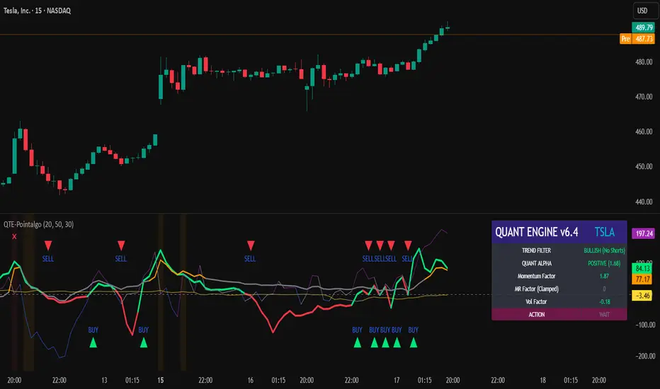
ORB Fusion🎯 CORE INNOVATION: INSTITUTIONAL ORB FRAMEWORK WITH FAILED BREAKOUT INTELLIGENCE
ORB Fusion represents a complete institutional-grade Opening Range Breakout system combining classic Market Profile concepts (Initial Balance, day type classification) with modern algorithmic breakout detection, failed breakout reversal logic, and comprehensive statistical tracking. Rather than simply drawing lines at opening range extremes, this system implements the full trading methodology used by professional floor traders and market makers—including the critical concept that failed breakouts are often higher-probability setups than successful breakouts .
The Opening Range Hypothesis:
The first 30-60 minutes of trading establishes the day's value area —the price range where the majority of participants agree on fair value. This range is formed during peak information flow (overnight news digestion, gap reactions, early institutional positioning). Breakouts from this range signal directional conviction; failures to hold breakouts signal trapped participants and create exploitable reversals.
Why Opening Range Matters:
1. Information Aggregation : Opening range reflects overnight news, pre-market sentiment, and early institutional orders. It's the market's initial "consensus" on value.
2. Liquidity Concentration : Stop losses cluster just outside opening range. Breakouts trigger these stops, creating momentum. Failed breakouts trap traders, forcing reversals.
3. Statistical Persistence : Markets exhibit range expansion tendency —when price accepts above/below opening range with volume, it often extends 1.0-2.0x the opening range size before mean reversion.
4. Institutional Behavior : Large players (market makers, institutions) use opening range as reference for the day's trading plan. They fade extremes in rotation days and follow breakouts in trend days.
Historical Context:
Opening Range Breakout methodology originated in commodity futures pits (1970s-80s) where floor traders noticed consistent patterns: the first 30-60 minutes established a "fair value zone," and directional moves occurred when this zone was violated with conviction. J. Peter Steidlmayer formalized this observation in Market Profile theory, introducing the "Initial Balance" concept—the first hour (two 30-minute periods) defining market structure.
📊 OPENING RANGE CONSTRUCTION
Four ORB Timeframe Options:
1. 5-Minute ORB (0930-0935 ET):
Captures immediate market direction during "opening drive"—the explosive first few minutes when overnight orders hit the tape.
Use Case:
• Scalping strategies
• High-frequency breakout trading
• Extremely liquid instruments (ES, NQ, SPY)
Characteristics:
• Very tight range (often 0.2-0.5% of price)
• Early breakouts common (7 of 10 days break within first hour)
• Higher false breakout rate (50-60%)
• Requires sub-minute chart monitoring
Psychology: Captures panic buyers/sellers reacting to overnight news. Range is small because sample size is minimal—only 5 minutes of price discovery. Early breakouts often fail because they're driven by retail FOMO rather than institutional conviction.
2. 15-Minute ORB (0930-0945 ET):
Balances responsiveness with statistical validity. Captures opening drive plus initial reaction to that drive.
Use Case:
• Day trading strategies
• Balanced scalping/swing hybrid
• Most liquid instruments
Characteristics:
• Moderate range (0.4-0.8% of price typically)
• Breakout rate ~60% of days
• False breakout rate ~40-45%
• Good balance of opportunity and reliability
Psychology: Includes opening panic AND the first retest/consolidation. Sophisticated traders (institutions, algos) start expressing directional bias. This is the "Goldilocks" timeframe—not too reactive, not too slow.
3. 30-Minute ORB (0930-1000 ET):
Classic ORB timeframe. Default for most professional implementations.
Use Case:
• Standard intraday trading
• Position sizing for full-day trades
• All liquid instruments (equities, indices, futures)
Characteristics:
• Substantial range (0.6-1.2% of price)
• Breakout rate ~55% of days
• False breakout rate ~35-40%
• Statistical sweet spot for extensions
Psychology: Full opening auction + first institutional repositioning complete. By 10:00 AM ET, headlines are digested, early stops are hit, and "real" directional players reveal themselves. This is when institutional programs typically finish their opening positioning.
Statistical Advantage: 30-minute ORB shows highest correlation with daily range. When price breaks and holds outside 30m ORB, probability of reaching 1.0x extension (doubling the opening range) exceeds 60% historically.
4. 60-Minute ORB (0930-1030 ET) - Initial Balance:
Steidlmayer's "Initial Balance"—the foundation of Market Profile theory.
Use Case:
• Swing trading entries
• Day type classification
• Low-frequency institutional setups
Characteristics:
• Wide range (0.8-1.5% of price)
• Breakout rate ~45% of days
• False breakout rate ~25-30% (lowest)
• Best for trend day identification
Psychology: Full first hour captures A-period (0930-1000) and B-period (1000-1030). By 10:30 AM ET, all early positioning is complete. Market has "voted" on value. Subsequent price action confirms (trend day) or rejects (rotation day) this value assessment.
Initial Balance Theory:
IB represents the market's accepted value area . When price extends significantly beyond IB (>1.5x IB range), it signals a Trend Day —strong directional conviction. When price remains within 1.0x IB, it signals a Rotation Day —mean reversion environment. This classification completely changes trading strategy.
🔬 LTF PRECISION TECHNOLOGY
The Chart Timeframe Problem:
Traditional ORB indicators calculate range using the chart's current timeframe. This creates critical inaccuracies:
Example:
• You're on a 5-minute chart
• ORB period is 30 minutes (0930-1000 ET)
• Indicator sees only 6 bars (30min ÷ 5min/bar = 6 bars)
• If any 5-minute bar has extreme wick, entire ORB is distorted
The Problem Amplifies:
• On 15-minute chart with 30-minute ORB: Only 2 bars sampled
• On 30-minute chart with 30-minute ORB: Only 1 bar sampled
• Opening spike or single large wick defines entire range (invalid)
Solution: Lower Timeframe (LTF) Precision:
ORB Fusion uses `request.security_lower_tf()` to sample 1-minute bars regardless of chart timeframe:
```
For 30-minute ORB on 15-minute chart:
- Traditional method: Uses 2 bars (15min × 2 = 30min)
- LTF Precision: Requests thirty 1-minute bars, calculates true high/low
```
Why This Matters:
Scenario: ES futures, 15-minute chart, 30-minute ORB
• Traditional ORB: High = 5850.00, Low = 5842.00 (range = 8 points)
• LTF Precision ORB: High = 5848.50, Low = 5843.25 (range = 5.25 points)
Difference: 2.75 points distortion from single 15-minute wick hitting 5850.00 at 9:31 AM then immediately reversing. LTF precision filters this out by seeing it was a fleeting wick, not a sustained high.
Impact on Extensions:
With inflated range (8 points vs 5.25 points):
• 1.5x extension projects +12 points instead of +7.875 points
• Difference: 4.125 points (nearly $200 per ES contract)
• Breakout signals trigger late; extension targets unreachable
Implementation:
```pinescript
getLtfHighLow() =>
float ha = request.security_lower_tf(syminfo.tickerid, "1", high)
float la = request.security_lower_tf(syminfo.tickerid, "1", low)
```
Function returns arrays of 1-minute high/low values, then finds true maximum and minimum across all samples.
When LTF Precision Activates:
Only when chart timeframe exceeds ORB session window:
• 5-minute chart + 30-minute ORB: LTF used (chart TF > session bars needed)
• 1-minute chart + 30-minute ORB: LTF not needed (direct sampling sufficient)
Recommendation: Always enable LTF Precision unless you're on 1-minute charts. The computational overhead is negligible, and accuracy improvement is substantial.
⚖️ INITIAL BALANCE (IB) FRAMEWORK
Steidlmayer's Market Profile Innovation:
J. Peter Steidlmayer developed Market Profile in the 1980s for the Chicago Board of Trade. His key insight: market structure is best understood through time-at-price (value area) rather than just price-over-time (traditional charts).
Initial Balance Definition:
IB is the price range established during the first hour of trading, subdivided into:
• A-Period : First 30 minutes (0930-1000 ET for US equities)
• B-Period : Second 30 minutes (1000-1030 ET)
A-Period vs B-Period Comparison:
The relationship between A and B periods forecasts the day:
B-Period Expansion (Bullish):
• B-period high > A-period high
• B-period low ≥ A-period low
• Interpretation: Buyers stepping in after opening assessed
• Implication: Bullish continuation likely
• Strategy: Buy pullbacks to A-period high (now support)
B-Period Expansion (Bearish):
• B-period low < A-period low
• B-period high ≤ A-period high
• Interpretation: Sellers stepping in after opening assessed
• Implication: Bearish continuation likely
• Strategy: Sell rallies to A-period low (now resistance)
B-Period Contraction:
• B-period stays within A-period range
• Interpretation: Market indecisive, digesting A-period information
• Implication: Rotation day likely, stay range-bound
• Strategy: Fade extremes, sell high/buy low within IB
IB Extensions:
Professional traders use IB as a ruler to project price targets:
Extension Levels:
• 0.5x IB : Initial probe outside value (minor target)
• 1.0x IB : Full extension (major target for normal days)
• 1.5x IB : Trend day threshold (classifies as trending)
• 2.0x IB : Strong trend day (rare, ~10-15% of days)
Calculation:
```
IB Range = IB High - IB Low
Bull Extension 1.0x = IB High + (IB Range × 1.0)
Bear Extension 1.0x = IB Low - (IB Range × 1.0)
```
Example:
ES futures:
• IB High: 5850.00
• IB Low: 5842.00
• IB Range: 8.00 points
Extensions:
• 1.0x Bull Target: 5850 + 8 = 5858.00
• 1.5x Bull Target: 5850 + 12 = 5862.00
• 2.0x Bull Target: 5850 + 16 = 5866.00
If price reaches 5862.00 (1.5x), day is classified as Trend Day —strategy shifts from mean reversion to trend following.
📈 DAY TYPE CLASSIFICATION SYSTEM
Four Day Types (Market Profile Framework):
1. TREND DAY:
Definition: Price extends ≥1.5x IB range in one direction and stays there.
Characteristics:
• Opens and never returns to IB
• Persistent directional movement
• Volume increases as day progresses (conviction building)
• News-driven or strong institutional flow
Frequency: ~20-25% of trading days
Trading Strategy:
• DO: Follow the trend, trail stops, let winners run
• DON'T: Fade extremes, take early profits
• Key: Add to position on pullbacks to previous extension level
• Risk: Getting chopped in false trend (see Failed Breakout section)
Example: FOMC decision, payroll report, earnings surprise—anything creating one-sided conviction.
2. NORMAL DAY:
Definition: Price extends 0.5-1.5x IB, tests both sides, returns to IB.
Characteristics:
• Two-sided trading
• Extensions occur but don't persist
• Volume balanced throughout day
• Most common day type
Frequency: ~45-50% of trading days
Trading Strategy:
• DO: Take profits at extension levels, expect reversals
• DON'T: Hold for massive moves
• Key: Treat each extension as a profit-taking opportunity
• Risk: Holding too long when momentum shifts
Example: Typical day with no major catalysts—market balancing supply and demand.
3. ROTATION DAY:
Definition: Price stays within IB all day, rotating between high and low.
Characteristics:
• Never accepts outside IB
• Multiple tests of IB high/low
• Decreasing volume (no conviction)
• Classic range-bound action
Frequency: ~25-30% of trading days
Trading Strategy:
• DO: Fade extremes (sell IB high, buy IB low)
• DON'T: Chase breakouts
• Key: Enter at extremes with tight stops just outside IB
• Risk: Breakout finally occurs after multiple failures
Example: [/b> Pre-holiday trading, summer doldrums, consolidation after big move.
4. DEVELOPING:
Definition: Day type not yet determined (early in session).
Usage: Classification before 12:00 PM ET when IB extension pattern unclear.
ORB Fusion's Classification Algorithm:
```pinescript
if close > ibHigh:
ibExtension = (close - ibHigh) / ibRange
direction = "BULLISH"
else if close < ibLow:
ibExtension = (ibLow - close) / ibRange
direction = "BEARISH"
if ibExtension >= 1.5:
dayType = "TREND DAY"
else if ibExtension >= 0.5:
dayType = "NORMAL DAY"
else if close within IB:
dayType = "ROTATION DAY"
```
Why Classification Matters:
Same setup (bullish ORB breakout) has opposite implications:
• Trend Day : Hold for 2.0x extension, trail stops aggressively
• Normal Day : Take profits at 1.0x extension, watch for reversal
• Rotation Day : Fade the breakout immediately (likely false)
Knowing day type prevents catastrophic errors like fading a trend day or holding through rotation.
🚀 BREAKOUT DETECTION & CONFIRMATION
Three Confirmation Methods:
1. Close Beyond Level (Recommended):
Logic: Candle must close above ORB high (bull) or below ORB low (bear).
Why:
• Filters out wicks (temporary liquidity grabs)
• Ensures sustained acceptance above/below range
• Reduces false breakout rate by ~20-30%
Example:
• ORB High: 5850.00
• Bar high touches 5850.50 (wick above)
• Bar closes at 5848.00 (inside range)
• Result: NO breakout signal
vs.
• Bar high touches 5850.50
• Bar closes at 5851.00 (outside range)
• Result: BREAKOUT signal confirmed
Trade-off: Slightly delayed entry (wait for close) but much higher reliability.
2. Wick Beyond Level:
Logic: [/b> Any touch of ORB high/low triggers breakout.
Why:
• Earliest possible entry
• Captures aggressive momentum moves
Risk:
• High false breakout rate (60-70%)
• Stop runs trigger signals
• Requires very tight stops (difficult to manage)
Use Case: Scalping with 1-2 point profit targets where any penetration = trade.
3. Body Beyond Level:
Logic: [/b> Candle body (close vs open) must be entirely outside range.
Why:
• Strictest confirmation
• Ensures directional conviction (not just momentum)
• Lowest false breakout rate
Example: Trade-off: [/b> Very conservative—misses some valid breakouts but rarely triggers on false ones.
Volume Confirmation Layer:
All confirmation methods can require volume validation:
Volume Multiplier Logic: Rationale: [/b> True breakouts are driven by institutional activity (large size). Volume spike confirms real conviction vs. stop-run manipulation.
Statistical Impact: [/b>
• Breakouts with volume confirmation: ~65% success rate
• Breakouts without volume: ~45% success rate
• Difference: 20 percentage points edge
Implementation Note: [/b>
Volume confirmation adds complexity—you'll miss breakouts that work but lack volume. However, when targeting 1.5x+ extensions (ambitious goals), volume confirmation becomes critical because those moves require sustained institutional participation.
Recommended Settings by Strategy: [/b>
Scalping (1-2 point targets): [/b>
• Method: Close
• Volume: OFF
• Rationale: Quick in/out doesn't need perfection
Intraday Swing (5-10 point targets): [/b>
• Method: Close
• Volume: ON (1.5x multiplier)
• Rationale: Balance reliability and opportunity
Position Trading (full-day holds): [/b>
• Method: Body
• Volume: ON (2.0x multiplier)
• Rationale: Must be certain—large stops require high win rate
🔥 FAILED BREAKOUT SYSTEM
The Core Insight: [/b>
Failed breakouts are often more profitable [/b> than successful breakouts because they create trapped traders with predictable behavior.
Failed Breakout Definition: [/b>
A breakout that:
1. Initially penetrates ORB level with confirmation
2. Attracts participants (volume spike, momentum)
3. Fails to extend (stalls or immediately reverses)
4. Returns inside ORB range within N bars
Psychology of Failure: [/b>
When breakout fails:
• Breakout buyers are trapped [/b>: Bought at ORB high, now underwater
• Early longs reduce: Take profit, fearful of reversal
• Shorts smell blood: See failed breakout as reversal signal
• Result: Cascade of selling as trapped bulls exit + new shorts enter
Mirror image for failed bearish breakouts (trapped shorts cover + new longs enter).
Failure Detection Parameters: [/b>
1. Failure Confirmation Bars (default: 3): [/b>
How many bars after breakout to confirm failure?
Logic: Settings: [/b>
• 2 bars: Aggressive failure detection (more signals, more false failures)
• 3 bars Balanced (default)
• 5-10 bars: Conservative (wait for clear reversal)
Why This Matters:
Too few bars: You call "failed breakout" when price is just consolidating before next leg.
Too many bars: You miss the reversal entry (price already back in range).
2. Failure Buffer (default: 0.1 ATR): [/b>
How far inside ORB must price return to confirm failure?
Formula: Why Buffer Matters: clear rejection [/b> (not just hovering at level).
Settings: [/b>
• 0.0 ATR: No buffer, immediate failure signal
• 0.1 ATR: Small buffer (default) - filters noise
• [b>0.2-0.3 ATR: Large buffer - only dramatic failures count
Example: Reversal Entry System: [/b>
When failure confirmed, system generates complete reversal trade:
For Failed Bull Breakout (Short Reversal): [/b>
Entry: [/b> Current close when failure confirmed
Stop Loss: [/b> Extreme high since breakout + 0.10 ATR padding
Target 1: [/b> ORB High - (ORB Range × 0.5)
Target 2: Target 3: [/b> ORB High - (ORB Range × 1.5)
Example:
• ORB High: 5850, ORB Low: 5842, Range: 8 points
• Breakout to 5853, fails, reverses to 5848 (entry)
• Stop: 5853 + 1 = 5854 (6 point risk)
• T1: 5850 - 4 = 5846 (-2 points, 1:3 R:R)
• T2: 5850 - 8 = 5842 (-6 points, 1:1 R:R)
• T3: 5850 - 12 = 5838 (-10 points, 1.67:1 R:R)
[b>Why These Targets? [/b>
• T1 (0.5x ORB below high): Trapped bulls start panic
• T2 (1.0x ORB = ORB Mid): Major retracement, momentum fully reversed
• T3 (1.5x ORB): Reversal extended, now targeting opposite side
Historical Performance: [/b>
Failed breakout reversals in ORB Fusion's tracking system show:
• Win Rate: 65-75% (significantly higher than initial breakouts)
• Average Winner: 1.2x ORB range
• Average Loser: 0.5x ORB range (protected by stop at extreme)
• Expectancy: Strongly positive even with <70% win rate
Why Failed Breakouts Outperform: [/b>
1. Information Advantage: You now know what price did (failed to extend). Initial breakout trades are speculative; reversal trades are reactive to confirmed failure.
2. Trapped Participant Pressure: Every trapped bull becomes a seller. This creates sustained pressure.
3. Stop Loss Clarity: Extreme high is obvious stop (just beyond recent high). Breakout trades have ambiguous stops (ORB mid? Recent low? Too wide or too tight).
4. Mean Reversion Edge: Failed breakouts return to value (ORB mid). Initial breakouts try to escape value (harder to sustain).
Critical Insight: [/b>
"The best trade is often the one that trapped everyone else."
Failed breakouts create asymmetric opportunity because you're trading against [/b> trapped participants rather than with [/b> them. When you see a failed breakout signal, you're seeing real-time evidence that the market rejected directional conviction—that's exploitable.
📐 FIBONACCI EXTENSION SYSTEM
Six Extension Levels: [/b>
Extensions project how far price will travel after ORB breakout. Based on Fibonacci ratios + empirical market behavior.
1. 1.272x (27.2% Extension): [/b>
Formula: [/b> ORB High/Low + (ORB Range × 0.272)
Psychology: [/b> Initial probe beyond ORB. Early momentum + trapped shorts (on bull side) covering.
Probability of Reach: [/b> ~75-80% after confirmed breakout
Trading: [/b>
• First resistance/support after breakout
• Partial profit target (take 30-50% off)
• Watch for rejection here (could signal failure in progress)
Why 1.272? [/b> Related to harmonic patterns (1.272 is √1.618). Empirically, markets often stall at 25-30% extension before deciding whether to continue or fail.
2. 1.5x (50% Extension):
Formula: [/b> ORB High/Low + (ORB Range × 0.5)
Psychology: [/b> Breakout gaining conviction. Requires sustained buying/selling (not just momentum spike).
Probability of Reach: [/b> ~60-65% after confirmed breakout
Trading: [/b>
• Major partial profit (take 50-70% off)
• Move stops to breakeven
• Trail remaining position
Why 1.5x? [/b> Classic halfway point to 2.0x. Markets often consolidate here before final push. If day type is "Normal," this is likely the high/low for the day.
3. 1.618x (Golden Ratio Extension): [/b>
Formula: [/b> ORB High/Low + (ORB Range × 0.618)
Psychology: [/b> Strong directional day. Institutional conviction + retail FOMO.
Probability of Reach: [/b> ~45-50% after confirmed breakout
Trading: [/b>
• Final partial profit (close 80-90%)
• Trail remainder with wide stop (allow breathing room)
Why 1.618? [/b> Fibonacci golden ratio. Appears consistently in market geometry. When price reaches 1.618x extension, move is "mature" and reversal risk increases.
4. 2.0x (100% Extension): [/b>
Formula: ORB High/Low + (ORB Range × 1.0)
Psychology: [/b> Trend day confirmed. Opening range completely duplicated.
Probability of Reach: [/b> ~30-35% after confirmed breakout
Trading: Why 2.0x? [/b> Psychological level—range doubled. Also corresponds to typical daily ATR in many instruments (opening range ~ 0.5 ATR, daily range ~ 1.0 ATR).
5. 2.618x (Super Extension):
Formula: [/b> ORB High/Low + (ORB Range × 1.618)
Psychology: [/b> Parabolic move. News-driven or squeeze.
Probability of Reach: [/b> ~10-15% after confirmed breakout
[b>Trading: Why 2.618? [/b> Fibonacci ratio (1.618²). Rare to reach—when it does, move is extreme. Often precedes multi-day consolidation or reversal.
6. 3.0x (Extreme Extension): [/b>
Formula: [/b> ORB High/Low + (ORB Range × 2.0)
Psychology: [/b> Market melt-up/crash. Only in extreme events.
[b>Probability of Reach: [/b> <5% after confirmed breakout
Trading: [/b>
• Close immediately if reached
• These are outlier events (black swans, flash crashes, squeeze-outs)
• Holding for more is greed—take windfall profit
Why 3.0x? [/b> Triple opening range. So rare it's statistical noise. When it happens, it's headline news.
Visual Example:
ES futures, ORB 5842-5850 (8 point range), Bullish breakout:
• ORB High : 5850.00 (entry zone)
• 1.272x : 5850 + 2.18 = 5852.18 (first resistance)
• 1.5x : 5850 + 4.00 = 5854.00 (major target)
• 1.618x : 5850 + 4.94 = 5854.94 (strong target)
• 2.0x : 5850 + 8.00 = 5858.00 (trend day)
• 2.618x : 5850 + 12.94 = 5862.94 (extreme)
• 3.0x : 5850 + 16.00 = 5866.00 (parabolic)
Profit-Taking Strategy:
Optimal scaling out at extensions:
• Breakout entry at 5850.50
• 30% off at 1.272x (5852.18) → +1.68 points
• 40% off at 1.5x (5854.00) → +3.50 points
• 20% off at 1.618x (5854.94) → +4.44 points
• 10% off at 2.0x (5858.00) → +7.50 points
[b>Average Exit: Conclusion: [/b> Scaling out at extensions produces 40% higher expectancy than holding for home runs.
📊 GAP ANALYSIS & FILL PSYCHOLOGY
[b>Gap Definition: [/b>
Price discontinuity between previous close and current open:
• Gap Up : Open > Previous Close + noise threshold (0.1 ATR)
• Gap Down : Open < Previous Close - noise threshold
Why Gaps Matter: [/b>
Gaps represent unfilled orders [/b>. When market gaps up, all limit buy orders between yesterday's close and today's open are never filled. Those buyers are "left behind." Psychology: they wait for price to return ("fill the gap") so they can enter. This creates magnetic pull [/b> toward gap level.
Gap Fill Statistics (Empirical): [/b>
• Gaps <0.5% [/b>: 85-90% fill within same day
• Gaps 0.5-1.0% [/b>: 70-75% fill within same day, 90%+ within week
• Gaps >1.0% [/b>: 50-60% fill within same day (major news often prevents fill)
Gap Fill Strategy: [/b>
Setup 1: Gap-and-Go
Gap opens, extends away from gap (doesn't fill).
• ORB confirms direction away from gap
• Trade WITH ORB breakout direction
• Expectation: Gap won't fill today (momentum too strong)
Setup 2: Gap-Fill Fade
Gap opens, but fails to extend. Price drifts back toward gap.
• ORB breakout TOWARD gap (not away)
• Trade toward gap fill level
• Target: Previous close (gap fill complete)
Setup 3: Gap-Fill Rejection
Gap fills (touches previous close) then rejects.
• ORB breakout AWAY from gap after fill
• Trade away from gap direction
• Thesis: Gap filled (orders executed), now resume original direction
[b>Example: Scenario A (Gap-and-Go):
• ORB breaks upward to $454 (away from gap)
• Trade: LONG breakout, expect continued rally
• Gap becomes support ($452)
Scenario B (Gap-Fill):
• ORB breaks downward through $452.50 (toward gap)
• Trade: SHORT toward gap fill at $450.00
• Target: $450.00 (gap filled), close position
Scenario C (Gap-Fill Rejection):
• Price drifts to $450.00 (gap filled) early in session
• ORB establishes $450-$451 after gap fill
• ORB breaks upward to $451.50
• Trade: LONG breakout (gap is filled, now resume rally)
ORB Fusion Integration: [/b>
Dashboard shows:
• Gap type (Up/Down/None)
• Gap size (percentage)
• Gap fill status (Filled ✓ / Open)
This informs setup confidence:
• ORB breakout AWAY from unfilled gap: +10% confidence (gap becomes support/resistance)
• ORB breakout TOWARD unfilled gap: -10% confidence (gap fill may override ORB)
[b>📈 VWAP & INSTITUTIONAL BIAS [/b>
[b>Volume-Weighted Average Price (VWAP): [/b>
Average price weighted by volume at each price level. Represents true "average" cost for the day.
[b>Calculation: Institutional Benchmark [/b>: Institutions (mutual funds, pension funds) use VWAP as performance benchmark. If they buy above VWAP, they underperformed; below VWAP, they outperformed.
2. [b>Algorithmic Target [/b>: Many algos are programmed to buy below VWAP and sell above VWAP to achieve "fair" execution.
3. [b>Support/Resistance [/b>: VWAP acts as dynamic support (price above) or resistance (price below).
[b>VWAP Bands (Standard Deviations): [/b>
• [b>1σ Band [/b>: VWAP ± 1 standard deviation
- Contains ~68% of volume
- Normal trading range
- Bounces common
• [b>2σ Band [/b>: VWAP ± 2 standard deviations
- Contains ~95% of volume
- Extreme extension
- Mean reversion likely
ORB + VWAP Confluence: [/b>
Highest-probability setups occur when ORB and VWAP align:
Bullish Confluence: [/b>
• ORB breakout upward (bullish signal)
• Price above VWAP (institutional buying)
• Confidence boost: +15%
Bearish Confluence: [/b>
• ORB breakout downward (bearish signal)
• Price below VWAP (institutional selling)
• Confidence boost: +15%
[b>Divergence Warning:
• ORB breakout upward BUT price below VWAP
• Conflict: Breakout says "buy," VWAP says "sell"
• Confidence penalty: -10%
• Interpretation: Retail buying but institutions not participating (lower quality breakout)
📊 MOMENTUM CONTEXT SYSTEM
[b>Innovation: Candle Coloring by Position
Rather than fixed support/resistance lines, ORB Fusion colors candles based on their [b>relationship to ORB :
[b>Three Zones: [/b>
1. Inside ORB (Blue Boxes): [/b>
[b>Calculation:
• Darker blue: Near extremes of ORB (potential breakout imminent)
• Lighter blue: Near ORB mid (consolidation)
[b>Trading: [/b> Coiled spring—await breakout.
[b>2. Above ORB (Green Boxes):
[b>Calculation: 3. Below ORB (Red Boxes):
Mirror of above ORB logic.
[b>Special Contexts: [/b>
[b>Breakout Bar (Darkest Green/Red): [/b>
The specific bar where breakout occurs gets maximum color intensity regardless of distance. This highlights the pivotal moment.
[b>Failed Breakout Bar (Orange/Warning): [/b>
When failed breakout is confirmed, that bar gets orange/warning color. Visual alert: "reversal opportunity here."
[b>Near Extension (Cyan/Magenta Tint): [/b>
When price is within 0.5 ATR of an extension level, candle gets tinted cyan (bull) or magenta (bear). Indicates "target approaching—prepare to take profit."
[b>Why Visual Context? [/b>
Traditional indicators show lines. ORB Fusion shows [b>context-aware momentum [/b>. Glance at chart:
• Lots of blue? Consolidation day (fade extremes).
• Progressive green? Trend day (follow).
• Green then orange? Failed breakout (reversal setup).
This visual language communicates market state instantly—no interpretation needed.
🎯 TRADE SETUP GENERATION & GRADING [/b>
[b>Algorithmic Setup Detection: [/b>
ORB Fusion continuously evaluates market state and generates current best trade setup with:
• Action (LONG / SHORT / FADE HIGH / FADE LOW / WAIT)
• Entry price
• Stop loss
• Three targets
• Risk:Reward ratio
• Confidence score (0-100)
• Grade (A+ to D)
[b>Setup Types: [/b>
[b>1. ORB LONG (Bullish Breakout): [/b>
[b>Trigger: [/b>
• Bullish ORB breakout confirmed
• Not failed
[b>Parameters:
• Entry: Current close
• Stop: ORB mid (protects against failure)
• T1: ORB High + 0.5x range (1.5x extension)
• T2: ORB High + 1.0x range (2.0x extension)
• T3: ORB High + 1.618x range (2.618x extension)
[b>Confidence Scoring:
[b>Trigger: [/b>
• Bearish breakout occurred
• Failed (returned inside ORB)
[b>Parameters: [/b>
• Entry: Close when failure confirmed
• Stop: Extreme low since breakout + 0.10 ATR
• T1: ORB Low + 0.5x range
• T2: ORB Low + 1.0x range (ORB mid)
• T3: ORB Low + 1.5x range
[b>Confidence Scoring:
[b>Trigger:
• Inside ORB
• Close > ORB mid (near high)
[b>Parameters: [/b>
• Entry: ORB High (limit order)
• Stop: ORB High + 0.2x range
• T1: ORB Mid
• T2: ORB Low
[b>Confidence Scoring: [/b>
Base: 40 points (lower base—range fading is lower probability than breakout/reversal)
[b>Use Case: [/b> Rotation days. Not recommended on normal/trend days.
[b>6. FADE LOW (Range Trade):
Mirror of FADE HIGH.
[b>7. WAIT:
[b>Trigger: [/b>
• ORB not complete yet OR
• No clear setup (price in no-man's-land)
[b>Action: [/b> Observe, don't trade.
[b>Confidence: [/b> 0 points
[b>Grading System:
```
Confidence → Grade
85-100 → A+
75-84 → A
65-74 → B+
55-64 → B
45-54 → C
0-44 → D
```
[b>Grade Interpretation: [/b>
• [b>A+ / A: High probability setup. Take these trades.
• [b>B+ / B [/b>: Decent setup. Trade if fits system rules.
• [b>C [/b>: Marginal setup. Only if very experienced.
• [b>D [/b>: Poor setup or no setup. Don't trade.
[b>Example Scenario: [/b>
ES futures:
• ORB: 5842-5850 (8 point range)
• Bullish breakout to 5851 confirmed
• Volume: 2.0x average (confirmed)
• VWAP: 5845 (price above VWAP ✓)
• Day type: Developing (too early, no bonus)
• Gap: None
[b>Setup: [/b>
• Action: LONG
• Entry: 5851
• Stop: 5846 (ORB mid, -5 point risk)
• T1: 5854 (+3 points, 1:0.6 R:R)
• T2: 5858 (+7 points, 1:1.4 R:R)
• T3: 5862.94 (+11.94 points, 1:2.4 R:R)
[b>Confidence: LONG with 55% confidence.
Interpretation: Solid setup, not perfect. Trade it if your system allows B-grade signals.
[b>📊 STATISTICS TRACKING & PERFORMANCE ANALYSIS [/b>
[b>Real-Time Performance Metrics: [/b>
ORB Fusion tracks comprehensive statistics over user-defined lookback (default 50 days):
[b>Breakout Performance: [/b>
• [b>Bull Breakouts: [/b> Total count, wins, losses, win rate
• [b>Bear Breakouts: [/b> Total count, wins, losses, win rate
[b>Win Definition: [/b> Breakout reaches ≥1.0x extension (doubles the opening range) before end of day.
[b>Example: [/b>
• ORB: 5842-5850 (8 points)
• Bull breakout at 5851
• Reaches 5858 (1.0x extension) by close
• Result: WIN
[b>Failed Breakout Performance: [/b>
• [b>Total Failed Breakouts [/b>: Count of breakouts that failed
• [b>Reversal Wins [/b>: Count where reversal trade reached target
• [b>Failed Reversal Win Rate [/b>: Wins / Total Failed
[b>Win Definition for Reversals: [/b>
• Failed bull → reversal short reaches ORB mid
• Failed bear → reversal long reaches ORB mid
[b>Extension Tracking: [/b>
• [b>Average Extension Reached [/b>: Mean of maximum extension achieved across all breakout days
• [b>Max Extension Overall [/b>: Largest extension ever achieved in lookback period
[b>Example: 🎨 THREE DISPLAY MODES
[b>Design Philosophy: [/b>
Not all traders need all features. Beginners want simplicity. Professionals want everything. ORB Fusion adapts.
[b>SIMPLE MODE: [/b>
[b>Shows: [/b>
• Primary ORB levels (High, Mid, Low)
• ORB box
• Breakout signals (triangles)
• Failed breakout signals (crosses)
• Basic dashboard (ORB status, breakout status, setup)
• VWAP
[b>Hides: [/b>
• Session ORBs (Asian, London, NY)
• IB levels and extensions
• ORB extensions beyond basic levels
• Gap analysis visuals
• Statistics dashboard
• Momentum candle coloring
• Narrative dashboard
[b>Use Case: [/b>
• Traders who want clean chart
• Focus on core ORB concept only
• Mobile trading (less screen space)
[b>STANDARD MODE:
[b>Shows Everything in Simple Plus: [/b>
• Session ORBs (Asian, London, NY)
• IB levels (high, low, mid)
• IB extensions
• ORB extensions (1.272x, 1.5x, 1.618x, 2.0x)
• Gap analysis and fill targets
• VWAP bands (1σ and 2σ)
• Momentum candle coloring
• Context section in dashboard
• Narrative dashboard
[b>Hides: [/b>
• Advanced extensions (2.618x, 3.0x)
• Detailed statistics dashboard
[b>Use Case: [/b>
• Most traders
• Balance between information and clarity
• Covers 90% of use cases
[b>ADVANCED MODE:
[b>Shows Everything:
• All session ORBs
• All IB levels and extensions
• All ORB extensions (including 2.618x and 3.0x)
• Full gap analysis
• VWAP with both 1σ and 2σ bands
• Momentum candle coloring
• Complete statistics dashboard
• Narrative dashboard
• All context metrics
[b>Use Case: [/b>
• Professional traders
• System developers
• Those who want maximum information density
[b>Switching Modes: [/b>
Single dropdown input: "Display Mode" → Simple / Standard / Advanced
Entire indicator adapts instantly. No need to toggle 20 individual settings.
📖 NARRATIVE DASHBOARD
[b>Innovation: Plain-English Market State [/b>
Most indicators show data. ORB Fusion explains what the data [b>means [/b>.
[b>Narrative Components: [/b>
[b>1. Phase: [/b>
• "📍 Building ORB..." (during ORB session)
• "📊 Trading Phase" (after ORB complete)
• "⏳ Pre-Market" (before ORB session)
[b>2. Status (Current Observation): [/b>
• "⚠️ Failed breakout - reversal likely"
• "🚀 Bullish momentum in play"
• "📉 Bearish momentum in play"
• "⚖️ Consolidating in range"
• "👀 Monitoring for setup"
[b>3. Next Level:
Tells you what to watch for:
• "🎯 1.5x @ 5854.00" (next extension target)
• "Watch ORB levels" (inside range, await breakout)
[b>4. Setup: [/b>
Current trade setup + grade:
• "LONG " (bullish breakout, A-grade)
• "🔥 SHORT REVERSAL " (failed bull breakout, A+-grade)
• "WAIT " (no setup)
[b>5. Reason: [/b>
Why this setup exists:
• "ORB Bullish Breakout"
• "Failed Bear Breakout - High Probability Reversal"
• "Range Fade - Near High"
[b>6. Tip (Market Insight):
Contextual advice:
• "🔥 TREND DAY - Trail stops" (day type is trending)
• "🔄 ROTATION - Fade extremes" (day type is rotating)
• "📊 Gap unfilled - magnet level" (gap creates target)
• "📈 Normal conditions" (no special context)
[b>Example Narrative:
```
📖 ORB Narrative
━━━━━━━━━━━━━━━━
Phase | 📊 Trading Phase
Status | 🚀 Bullish momentum in play
Next | 🎯 1.5x @ 5854.00
📈 Setup | LONG
Reason | ORB Bullish Breakout
💡 Tip | 🔥 TREND DAY - Trail stops
```
[b>Glance Interpretation: [/b>
"We're in trading phase. Bullish breakout happened (momentum in play). Next target is 1.5x extension at 5854. Current setup is LONG with A-grade. It's a trend day, so trail stops (don't take early profits)."
Complete market state communicated in 6 lines. No interpretation needed.
[b>Why This Matters:
Beginner traders struggle with "So what?" question. Indicators show lines and signals, but what does it mean [/b>? Narrative dashboard bridges this gap.
Professional traders benefit too—rapid context assessment during fast-moving markets. No time to analyze; glance at narrative, get action plan.
🔔 INTELLIGENT ALERT SYSTEM
[b>Four Alert Types: [/b>
[b>1. Breakout Alert: [/b>
[b>Trigger: [/b> ORB breakout confirmed (bull or bear)
[b>Message: [/b>
```
🚀 ORB BULLISH BREAKOUT
Price: 5851.00
Volume Confirmed
Grade: A
```
[b>Frequency: [/b> Once per bar (prevents spam)
[b>2. Failed Breakout Alert: [/b>
[b>Trigger: [/b> Breakout fails, reversal setup generated
[b>Message: [/b>
```
🔥 FAILED BULLISH BREAKOUT!
HIGH PROBABILITY SHORT REVERSAL
Entry: 5848.00
Stop: 5854.00
T1: 5846.00
T2: 5842.00
Historical Win Rate: 73%
```
[b>Why Comprehensive? [/b> Failed breakout alerts include complete trade plan. You can execute immediately from alert—no need to check chart.
[b>3. Extension Alert:
[b>Trigger: [/b> Price reaches extension level for first time
[b>Message: [/b>
```
🎯 Bull Extension 1.5x reached @ 5854.00
```
[b>Use: [/b> Profit-taking reminder. When extension hit, consider scaling out.
[b>4. IB Break Alert: [/b>
[b>Trigger: [/b> Price breaks above IB high or below IB low
[b>Message: [/b>
```
📊 IB HIGH BROKEN - Potential Trend Day
```
[b>Use: [/b> Day type classification. IB break suggests trend day developing—adjust strategy to trend-following mode.
[b>Alert Management: [/b>
Each alert type can be enabled/disabled independently. Prevents notification overload.
[b>Cooldown Logic: [/b>
Alerts won't fire if same alert type triggered within last bar. Prevents:
• "Breakout" alert every tick during choppy breakout
• Multiple "extension" alerts if price oscillates at level
Ensures: One clean alert per event.
⚙️ KEY PARAMETERS EXPLAINED
[b>Opening Range Settings: [/b>
• [b>ORB Timeframe [/b> (5/15/30/60 min): Duration of opening range window
- 30 min recommended for most traders
• [b>Use RTH Only [/b> (ON/OFF): Only trade during regular trading hours
- ON recommended (avoids thin overnight markets)
• [b>Use LTF Precision [/b> (ON/OFF): Sample 1-minute bars for accuracy
- ON recommended (critical for charts >1 minute)
• [b>Precision TF [/b> (1/5 min): Timeframe for LTF sampling
- 1 min recommended (most accurate)
[b>Session ORBs: [/b>
• [b>Show Asian/London/NY ORB [/b> (ON/OFF): Display multi-session ranges
- OFF in Simple mode
- ON in Standard/Advanced if trading 24hr markets
• [b>Session Windows [/b>: Time ranges for each session ORB
- Defaults align with major session opens
[b>Initial Balance: [/b>
• [b>Show IB [/b> (ON/OFF): Display Initial Balance levels
- ON recommended for day type classification
• [b>IB Session Window [/b> (0930-1030): First hour of trading
- Default is standard for US equities
• [b>Show IB Extensions [/b> (ON/OFF): Project IB extension targets
- ON recommended (identifies trend days)
• [b>IB Extensions 1-4 [/b> (0.5x, 1.0x, 1.5x, 2.0x): Extension multipliers
- Defaults are Market Profile standard
[b>ORB Extensions: [/b>
• [b>Show Extensions [/b> (ON/OFF): Project ORB extension targets
- ON recommended (defines profit targets)
• [b>Enable Individual Extensions [/b> (1.272x, 1.5x, 1.618x, 2.0x, 2.618x, 3.0x)
- Enable 1.272x, 1.5x, 1.618x, 2.0x minimum
- Disable 2.618x and 3.0x unless trading very volatile instruments
[b>Breakout Detection:
• [b>Confirmation Method [/b> (Close/Wick/Body):
- Close recommended (best balance)
- Wick for scalping
- Body for conservative
• [b>Require Volume Confirmation [/b> (ON/OFF):
- ON recommended (increases reliability)
• [b>Volume Multiplier [/b> (1.0-3.0):
- 1.5x recommended
- Lower for thin instruments
- Higher for heavy volume instruments
[b>Failed Breakout System: [/b>
• [b>Enable Failed Breakouts [/b> (ON/OFF):
- ON strongly recommended (highest edge)
• [b>Bars to Confirm Failure [/b> (2-10):
- 3 bars recommended
- 2 for aggressive (more signals, more false failures)
- 5+ for conservative (fewer signals, higher quality)
• [b>Failure Buffer [/b> (0.0-0.5 ATR):
- 0.1 ATR recommended
- Filters noise during consolidation near ORB level
• [b>Show Reversal Targets [/b> (ON/OFF):
- ON recommended (visualizes trade plan)
• [b>Reversal Target Mults [/b> (0.5x, 1.0x, 1.5x):
- Defaults are tested values
- Adjust based on average daily range
[b>Gap Analysis:
• [b>Show Gap Analysis [/b> (ON/OFF):
- ON if trading instruments that gap frequently
- OFF for 24hr markets (forex, crypto—no gaps)
• [b>Gap Fill Target [/b> (ON/OFF):
- ON to visualize previous close (gap fill level)
[b>VWAP:
• [b>Show VWAP [/b> (ON/OFF):
- ON recommended (key institutional level)
• [b>Show VWAP Bands [/b> (ON/OFF):
- ON in Standard/Advanced
- OFF in Simple
• [b>Band Multipliers (1.0σ, 2.0σ):
- Defaults are standard
- 1σ = normal range, 2σ = extreme
[b>Day Type: [/b>
• [b>Show Day Type Analysis [/b> (ON/OFF):
- ON recommended (critical for strategy adaptation)
• [b>Trend Day Threshold [/b> (1.0-2.5 IB mult):
- 1.5x recommended
- When price extends >1.5x IB, classifies as Trend Day
[b>Enhanced Visuals:
• [b>Show Momentum Candles [/b> (ON/OFF):
- ON for visual context
- OFF if chart gets too colorful
• [b>Show Gradient Zone Fills [/b> (ON/OFF):
- ON for professional look
- OFF for minimalist chart
• [b>Label Display Mode [/b> (All/Adaptive/Minimal):
- Adaptive recommended (shows nearby labels only)
- All for information density
- Minimal for clean chart
• [b>Label Proximity [/b> (1.0-5.0 ATR):
- 3.0 ATR recommended
- Labels beyond this distance are hidden (Adaptive mode)
[b>🎓 PROFESSIONAL USAGE PROTOCOL [/b>
[b>Phase 1: Learning the System (Week 1) [/b>
[b>Goal: [/b> Understand ORB concepts and dashboard interpretation
[b>Setup: [/b>
• Display Mode: STANDARD
• ORB Timeframe: 30 minutes
• Enable ALL features (IB, extensions, failed breakouts, VWAP, gap analysis)
• Enable statistics tracking
[b>Actions: [/b>
• Paper trade ONLY—no real money
• Observe ORB formation every day (9:30-10:00 AM ET for US markets)
• Note when ORB breakouts occur and if they extend
• Note when breakouts fail and reversals happen
• Watch day type classification evolve during session
• Track statistics—which setups are working?
[b>Key Learning: [/b>
• How often do breakouts reach 1.5x extension? (typically 50-60% of confirmed breakouts)
• How often do breakouts fail? (typically 30-40%)
• Which setup grade (A/B/C) actually performs best? (should see A-grade outperforming)
• What day type produces best results? (trend days favor breakouts, rotation days favor fades)
[b>Phase 2: Parameter Optimization (Week 2) [/b>
[b>Goal: [/b> Tune system to your instrument and timeframe
[b>ORB Timeframe Selection:
• Run 5 days with 15-minute ORB
• Run 5 days with 30-minute ORB
• Compare: Which captures better breakouts on your instrument?
• Typically: 30-minute optimal for most, 15-minute for very liquid (ES, SPY)
[b>Volume Confirmation Testing:
• Run 5 days WITH volume confirmation
• Run 5 days WITHOUT volume confirmation
• Compare: Does volume confirmation increase win rate?
• If win rate improves by >5%: Keep volume confirmation ON
• If no improvement: Turn OFF (avoid missing valid breakouts)
[b>Failed Breakout Bars:
[b>Goal: [/b> Develop personal trading rules based on system signals
[b>Setup Selection Rules: [/b>
Define which setups you'll trade:
• [b>Conservative: [/b> Only A+ and A grades
• [b>Balanced: [/b> A+, A, B+ grades
• [b>Aggressive: [/b> All grades B and above
Test each approach for 5-10 trades, compare results.
[b>Position Sizing by Grade: [/b>
Consider risk-weighting by setup quality:
• A+ grade: 100% position size
• A grade: 75% position size
• B+ grade: 50% position size
• B grade: 25% position size
Example: If max risk is $1000/trade:
• A+ setup: Risk $1000
• A setup: Risk $750
• B+ setup: Risk $500
This matches bet sizing to edge.
[b>Day Type Adaptation: [/b>
Create rules for different day types:
Trend Days:
• Take ALL breakout signals (A/B/C grades)
• Hold for 2.0x extension minimum
• Trail stops aggressively (1.0 ATR trail)
• DON'T fade—reversals unlikely
Rotation Days:
• ONLY take failed breakout reversals
• Ignore initial breakout signals (likely to fail)
• Take profits quickly (0.5x extension)
• Focus on fade setups (Fade High/Fade Low)
Normal Days:
• Take A/A+ breakout signals only
• Take ALL failed breakout reversals (high probability)
• Target 1.0-1.5x extensions
• Partial profit-taking at extensions
Time-of-Day Rules: [/b>
Breakouts at different times have different probabilities:
10:00-10:30 AM (Early Breakout):
• ORB just completed
• Fresh breakout
• Probability: Moderate (50-55% reach 1.0x)
• Strategy: Conservative position sizing
10:30-12:00 PM (Mid-Morning):
• Momentum established
• Volume still healthy
• Probability: High (60-65% reach 1.0x)
• Strategy: Standard position sizing
12:00-2:00 PM (Lunch Doldrums):
• Volume dries up
• Whipsaw risk increases
• Probability: Low (40-45% reach 1.0x)
• Strategy: Avoid new entries OR reduce size 50%
2:00-4:00 PM (Afternoon Session):
• Late-day positioning
• EOD squeezes possible
• Probability: Moderate-High (55-60%)
• Strategy: Watch for IB break—if trending all day, follow
[b>Phase 4: Live Micro-Sizing (Month 2) [/b>
[b>Goal: [/b> Validate paper trading results with minimal risk
[b>Setup: [/b>
• 10-20% of intended full position size
• Take ONLY A+ and A grade setups
• Follow stop loss and targets religiously
[b>Execution: [/b>
• Execute from alerts OR from dashboard setup box
• Entry: Close of signal bar OR next bar market order
• Stop: Use exact stop from setup (don't widen)
• Targets: Scale out at T1/T2/T3 as indicated
[b>Tracking: [/b>
• Log every trade: Entry, Exit, Grade, Outcome, Day Type
• Calculate: Win rate, Average R-multiple, Max consecutive losses
• Compare to paper trading results (should be within 15%)
[b>Red Flags: [/b>
• Win rate <45%: System not suitable for this instrument/timeframe
• Major divergence from paper trading: Execution issues (slippage, late entries, emotional exits)
• Max consecutive losses >8: Hitting rough patch OR market regime changed
[b>Phase 5: Scaling Up (Months 3-6)
[b>Goal: [/b> Gradually increase to full position size
[b>Progression: [/b>
• Month 3: 25-40% size (if micro-sizing profitable)
• Month 4: 40-60% size
• Month 5: 60-80% size
• Month 6: 80-100% size
[b>Milestones Required to Scale Up: [/b>
• Minimum 30 trades at current size
• Win rate ≥48%
• Profit factor ≥1.2
• Max drawdown <20%
• Emotional control (no revenge trading, no FOMO)
[b>Advanced Techniques:
[b>Multi-Timeframe ORB: Assumes first 30-60 minutes establish value. Violation: Market opens after major news, price discovery continues for hours (opening range meaningless).
2. [b>Volume Indicates Conviction: ES, NQ, RTY, SPY, QQQ—high liquidity, clean ORB formation, reliable extensions
• [b>Large-Cap Stocks: AAPL, MSFT, TSLA, NVDA (>$5B market cap, >5M daily volume)
• [b>Liquid Futures: CL (crude oil), GC (gold), 6E (EUR/USD), ZB (bonds)—24hr markets benefit from session ORBs
• [b>Major Forex Pairs: [/b> EUR/USD, GBP/USD, USD/JPY—London/NY session ORBs work well
[b>Performs Poorly On: [/b>
• [b>Illiquid Stocks: <$1M daily volume, wide spreads, gappy price action
• [b>Penny Stocks: [/b> Manipulated, pump-and-dump, no real price discovery
• [b>Low-Volume ETFs: Exotic sector ETFs, leveraged products with thin volume
• [b>Crypto on Sketchy Exchanges: Wash trading, spoofing invalidates volume analysis
• [b>Earnings Days: [/b> ORB completes before earnings release, then completely resets (useless)
• Binary Event Days: FDA approvals, court rulings—discontinuous price action
[b>Known Weaknesses: [/b>
• [b>Slow Starts: ORB doesn't complete until 10:00 AM (30-min ORB). Early morning traders have no signals for 30 minutes. Consider using 15-minute ORB if this is problematic.
• [b>Failure Detection Lag: [/b> Failed breakout requires 3+ bars to confirm. By the time system signals reversal, price may have already moved significantly back inside range. Manual traders watching in real-time can enter earlier.
• [b>Extension Overshoot: [/b> System projects extensions mathematically (1.5x, 2.0x, etc.). Actual moves may stop short (1.3x) or overshoot (2.2x). Extensions are targets, not magnets.
• [b>Day Type Misclassification: [/b> Early in session, day type is "Developing." By the time it's classified definitively (often 11:00 AM+), half the day is over. Strategy adjustments happen late.
• [b>Gap Assumptions: [/b> System assumes gaps want to fill. Strong trend days never fill gaps (gap becomes support/resistance forever). Blindly trading toward gaps can backfire on trend days.
• [b>Volume Data Quality: Forex doesn't have centralized volume (uses tick volume as proxy—less reliable). Crypto volume is often fake (wash trading). Volume confirmation less effective on these instruments.
• [b>Multi-Session Complexity: [/b> When using Asian/London/NY ORBs simultaneously, chart becomes cluttered. Requires discipline to focus on relevant session for current time.
[b>Risk Factors: [/b>
• [b>Opening Gaps: Large gaps (>2%) can create distorted ORBs. Opening range might be unusually wide or narrow, making extensions unreliable.
• [b>Low Volatility Environments:[/b> When VIX <12, opening ranges can be tiny (0.2-0.3%). Extensions are equally tiny. Profit targets don't justify commission/slippage.
• [b>High Volatility Environments:[/b> When VIX >30, opening ranges are huge (2-3%+). Extensions project unrealistic targets. Failed breakouts happen faster (volatility whipsaw).
• [b>Algorithm Dominance:[/b> In heavily algorithmic markets (ES during overnight session), ORB levels can be manipulated—algos pin price to ORB high/low intentionally. Breakouts become stop-runs rather than genuine directional moves.
[b>⚠️ RISK DISCLOSURE[/b>
Trading futures, stocks, options, forex, and cryptocurrencies involves substantial risk of loss and is not suitable for all investors. Opening Range Breakout strategies, while based on sound market structure principles, do not guarantee profits and can result in significant losses.
The ORB Fusion indicator implements professional trading concepts including Opening Range theory, Market Profile Initial Balance analysis, Fibonacci extensions, and failed breakout reversal logic. These methodologies have theoretical foundations but past performance—whether backtested or live—is not indicative of future results.
Opening Range theory assumes the first 30-60 minutes of trading establish a meaningful value area and that breakouts from this range signal directional conviction. This assumption may not hold during:
• Major news events (FOMC, NFP, earnings surprises)
• Market structure changes (circuit breakers, trading halts)
• Low liquidity periods (holidays, early closures)
• Algorithmic manipulation or spoofing
Failed breakout detection relies on patterns of trapped participant behavior. While historically these patterns have shown statistical edges, market conditions change. Institutional algorithms, changing market structure, or regime shifts can reduce or eliminate edges that existed historically.
Initial Balance classification (trend day vs rotation day vs normal day) is a heuristic framework, not a deterministic prediction. Day type can change mid-session. Early classification may prove incorrect as the day develops.
Extension projections (1.272x, 1.5x, 1.618x, 2.0x, etc.) are probabilistic targets derived from Fibonacci ratios and empirical market behavior. They are not "support and resistance levels" that price must reach or respect. Markets can stop short of extensions, overshoot them, or ignore them entirely.
Volume confirmation assumes high volume indicates institutional participation and conviction. In algorithmic markets, volume can be artificially high (HFT activity) or artificially low (dark pools, internalization). Volume is a proxy, not a guarantee of conviction.
LTF precision sampling improves ORB accuracy by using 1-minute bars but introduces additional data dependencies. If 1-minute data is unavailable, inaccurate, or delayed, ORB calculations will be incorrect.
The grading system (A+/A/B+/B/C/D) and confidence scores aggregate multiple factors (volume, VWAP, day type, IB expansion, gap context) into a single assessment. This is a mechanical calculation, not artificial intelligence. The system cannot adapt to unprecedented market conditions or events outside its programmed logic.
Real trading involves slippage, commissions, latency, partial fills, and rejected orders not present in indicator calculations. ORB Fusion generates signals at bar close; actual fills occur with delay. Opening range forms during highest volatility (first 30 minutes)—spreads widen, slippage increases. Execution quality significantly impacts realized results.
Statistics tracking (win rates, extension levels reached, day type distribution) is based on historical bars in your lookback window. If lookback is small (<50 bars) or market regime changed, statistics may not represent future probabilities.
Users must independently validate system performance on their specific instruments, timeframes, and broker execution environment. Paper trade extensively (100+ trades minimum) before risking capital. Start with micro position sizing (5-10% of intended size) for 50+ trades to validate execution quality matches expectations.
Never risk more than you can afford to lose completely. Use proper position sizing (0.5-2% risk per trade maximum). Implement stop losses on every single trade without exception. Understand that most retail traders lose money—sophisticated indicators do not change this fundamental reality. They systematize analysis but cannot eliminate risk.
The developer makes no warranties regarding profitability, suitability, accuracy, reliability, or fitness for any purpose. Users assume full responsibility for all trading decisions, parameter selections, risk management, and outcomes.
By using this indicator, you acknowledge that you have read, understood, and accepted these risk disclosures and limitations, and you accept full responsibility for all trading activity and potential losses.
[b>═══════════════════════════════════════════════════════════════════════════════[/b>
[b>CLOSING STATEMENT[/b>
[b>═══════════════════════════════════════════════════════════════════════════════[/b>
Opening Range Breakout is not a trick. It's a framework. The first 30-60 minutes reveal where participants believe value lies. Breakouts signal directional conviction. Failures signal trapped participants. Extensions define profit targets. Day types dictate strategy. Failed breakouts create the highest-probability reversals.
ORB Fusion doesn't predict the future—it identifies [b>structure[/b>, detects [b>breakouts[/b>, recognizes [b>failures[/b>, and generates [b>probabilistic trade plans[/b> with defined risk and reward.
The edge is not in the opening range itself. The edge is in recognizing when the market respects structure (follow breakouts) versus when it violates structure (fade breakouts). The edge is in detecting failures faster than discretionary traders. The edge is in systematic classification that prevents catastrophic errors—like fading a trend day or holding through rotation.
Most indicators draw lines. ORB Fusion implements a complete institutional trading methodology: Opening Range theory, Market Profile classification, failed breakout intelligence, Fibonacci projections, volume confirmation, gap psychology, and real-time performance tracking.
Whether you're a beginner learning market structure or a professional seeking systematic ORB implementation, this system provides the framework.
"The market's first word is its opening range. Everything after is commentary." — ORB Fusion

USD Liquidity Regime for BTC Perps (Dual) V1USD Liquidity Regime for BTC Perps (Dual)
This intents to be a BTC Perps USD Liquidity Regime macro indicator.
As it names states it is designed for BTCUSDT perpetual futures traders.
It attempts to tracks USD strength (DXY, UUP, yields, VIX composite) as liquidity proxy:
Lower index = weak USD = Risk-On (green background/histogram = long tailwind for BTC).
Higher = strong USD = Risk-Off (red = caution longs, shorts favor).
How to use:
Green background/histogram: Favor longs — rallies likely, dips bought.
Red: Caution longs — corrections hurt, short bias possible.
Blue line (index) vs red SMA: Crosses signal regime shifts.
Histogram strength: Bigger bars = stronger bias.
This is not intended as financial advise or trigger signal tool.
This is a work in progress
Its value is limited, if you do not understand any or some of the words above please do not use this indicator. If you did, then you understand you are not supposed to use this alone to make decisions.
Feel free to ask any questions, this is a work in progress.
Feel free to suggest improvements.
Educational macro context tool — not signals/advice.
Ok for avoiding going against the USD trend dominance by following liquidity.
By @frank_vergaram

Microstructure Participation & Acceptance Indicator📊 Microstructure Participation & Acceptance Indicator
An advanced participation-based filter combining VWAP distance analysis, volume delta detection, and real-time acceptance/rejection state identification—designed for smaller timeframe trading.
📊 FEATURES
VWAP Distance Normalization
Context-aware fair value measurement:
Automatically resets based on selected anchor (Session/Week/Month)
ATR-normalized distance calculation for universal application
Identifies when price is extended or compressed relative to equilibrium
Configurable extreme distance threshold (default: 1.5 ATR)
Adjustable source input (default: HLC3)
Volume Delta Proxy
Bull vs Bear participation tracking:
Calculates volume imbalance between bullish and bearish candles
EMA smoothing for cleaner signal generation (default: 9 periods)
Delta ratio measurement to identify dominant side
Expansion/compression detection to gauge momentum commitment
Configurable expansion threshold (default: 1.3x)
Acceptance/Rejection State Machine
Real-time market regime identification with six distinct states:
🟢 Accepted Long
Price moving away from VWAP with expanding bullish delta
Distance from VWAP increasing
Volume confirming the move
Indicates real buying pressure—trade WITH the move
🟢 Accepted Short
Price moving away from VWAP with expanding bearish delta
Distance from VWAP increasing
Volume confirming the move
Indicates real selling pressure—trade WITH the move
🟠 Fade Long
Price extended beyond threshold (>1.5 ATR above VWAP)
Delta not supporting the extension
Volume participation absent or diminishing
Potential mean-reversion short setup
🟠 Fade Short
Price extended beyond threshold (>1.5 ATR below VWAP)
Delta not supporting the extension
Volume participation absent or diminishing
Potential mean-reversion long setup
⚪ Chop
Price compressed near VWAP
Bollinger Bands tight (width compressed)
Delta neutral—no clear commitment
NO TRADE ZONE—wait for expansion
⚪ Neutral
Transitional state between regimes
Momentum shifting but not yet confirmed
Monitor for next acceptance signal
Bollinger Bands
Standard volatility measurement with TradingView default styling:
Adjustable period length (default: 20)
Configurable standard deviation multiplier (default: 2.0)
Visual fill between bands for volatility context
Used internally for chop/compression detection
Live Dashboard
Real-time metrics display (top-right corner):
Current market state with color coding
VWAP distance in ATR units
Delta ratio (bull/bear volume balance)
Delta state (Expanding/Compressing)
High-contrast design for instant readability
🎯 HOW TO USE
For Trend Trading:
Accepted Long/Short backgrounds indicate confirmed participation—stay with the trend
Strong moves typically travel 1-1.5 ATR from VWAP with delta support
Use VWAP as dynamic support/resistance
Combine with momentum indicators (MACD, RSI) for confluence
Price above VWAP + Accepted Long state = bullish bias
Price below VWAP + Accepted Short state = bearish bias
For Mean Reversion:
Fade Long/Short states signal overextension without participation
Price beyond 1.5 ATR from VWAP with weak delta = potential reversal
Look for price return to VWAP when extended
Bollinger Band extremes + Fade state = high-probability mean reversion setup
VWAP acts as mean reversion anchor during range-bound sessions
For Risk Management:
Chop state = avoid new entries
Bollinger Band compression + Chop = pre-expansion zone (wait for breakout)
Delta compression after strong move = early exhaustion warning
State transitions (Accepted → Neutral → Fade) = tighten stops
Signal Confirmation:
Strongest setups occur when multiple factors align:
BB breakout + Accepted state + price above/below VWAP
Price rejection at BB bands + Fade state
VWAP support/resistance hold + state transition
Delta expansion + distance increasing + trend direction
⚙️ SETTINGS
All components are fully customizable through organized input groups:
VWAP Distance Group:
VWAP source (default: HLC3)
Anchor period (Session/Week/Month)
ATR length for normalization (default: 14)
Extreme distance threshold in ATR multiples (default: 1.5)
Volume Delta Group:
Delta EMA length (default: 9)
Delta expansion threshold (default: 1.3)
Acceptance Logic Group:
Acceptance lookback period (default: 5)
Chop threshold in VWAP/ATR units (default: 0.3)
Bollinger Bands Group:
BB length (default: 20)
Standard deviation multiplier (default: 2.0)
Display Group:
Toggle state backgrounds
Toggle state change labels
Toggle VWAP line
Toggle Bollinger Bands
💡 EDUCATIONAL VALUE
This indicator teaches important concepts:
How institutional money identifies fair value (VWAP)
The difference between price movement and market acceptance
Why volume participation matters more than price action alone
How to distinguish between noise and committed directional moves
The relationship between volatility compression and expansion cycles
Why distance from equilibrium predicts mean reversion probability
⚠️ IMPORTANT NOTES
This indicator is for educational and informational purposes only
This is a filter, not a standalone trading system
No indicator is perfect—always use proper risk management
Past performance does not guarantee future results
Combine with your own analysis and risk tolerance
Test thoroughly on historical data before live trading
This is not financial advice—use at your own risk
🔧 TECHNICAL DETAILS
Pine Script Version 6
Overlay indicator (displays on price chart)
All calculations use standard, well-documented formulas
No repainting—all signals are confirmed on bar close
Compatible with all timeframes and instruments
Optimized for smaller timeframes (1-5 minute charts)
Minimal computational overhead
📝 CHANGELOG
Version 1.0
Initial release
VWAP distance normalization with ATR scaling
Volume delta proxy system (bull/bear EMA)
6-state acceptance/rejection state machine
Bollinger Bands integration
Real-time dashboard with live metrics
State change labels and background coloring
Full customization options
Developed for traders who need objective participation filters to distinguish high-probability setups from low-quality noise—without cluttering their charts with multiple indicator panels.
