Compression / ExpansionI created this Indicator to warn of compression and expansion so I could find the best area to trade I use it In conjunction with VWAP works on any timeframe and any asset where there is Volume
The Indicator produces a Letter C at the Start of Compression and a Letter E at the Start of Expansion you can change the settings to your liking On the chart my Expansion is in Red and compression is is Blue use In Conjunction with your favorite Indicators for Confluence
Volatilidade

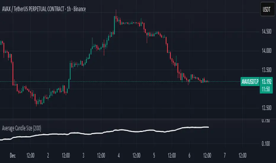
Average Candle SizeI created this indicator because I couldn't find a simple tool that calculates just the average candle size without additional complexity. Built for traders who want a straightforward volatility measure they can fully understand. How it works:
1. Calculate high-low for each candle
2. Sum all results
3. Divide by the total number of candles
Simple math to get the average candle size of the period specified in Length.

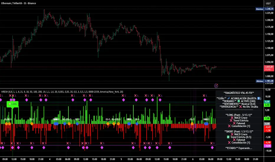
HRESH Pro Dashboard 🦅 HRESH (The Beast) — BTC Specialized System V56.45
This is the fully unlocked, 24-hour version of the HRESH System. It has been mathematically tuned and calibrated specifically for Bitcoin volatility.
🛑 CRITICAL RULES FOR USE (PLEASE READ):
1. STRICT ASSET SELECTION:
BTC (Bitcoin): This is the primary asset for this indicator.
ETH (Ethereum): Allowed ONLY on the 15-Minute timeframe.
❌ DO NOT USE on other assets (Forex, Altcoins, Stocks). The internal logic is unique to BTC/ETH structure.
2. TIMEFRAME STRATEGY:
⏱️ 1 MINUTE (Daily Operations): Use this for intraday scalping.
⏱️ 15 MINUTES (Sniper Mode): Use this for Swing Trading. Expect only 1 or 2 high-precision signals PER MONTH. This mode requires extreme patience.
❌ OTHER TIMEFRAMES: Do not operate. The calculations will be incorrect.
🌍 TRADING SESSIONS & VOLUME: While this version functions 24 hours a day, I strongly advise AGAINST trading during low-volume hours (such as late Asian session or weekends).
✅ RECOMMENDED: London & New York Sessions.
⚠️ HIGH RISK: Trading off-hours increases the risk of market manipulation and fakeouts.
🔴🔴🔴 RISK DISCLAIMER & WARNING 🔴🔴🔴
YOU ARE RESPONSIBLE FOR YOUR CAPITAL. This indicator is a powerful analytical tool, but it does not guarantee profits.
MARKET RISK: Trading cryptocurrency involves substantial risk of loss and is not suitable for every investor.
NO FINANCIAL ADVICE: Always manage your risk properly. If you trade outside the recommended hours or assets, you accept 100% of the risk.
Trade wisely and respect the algorithm.
By Lendrush Margaryan
Trend Step Channel [BigBeluga]🔵 OVERVIEW
Trend Step Channel identifies directional bias by forming a dynamic volatility-based step channel. It detects trend shifts when candle lows close above the upper band (bullish) or when candle highs drop below the lower band (bearish). A step-style midline tracks the trend evolution, while an integrated dashboard shows price positioning percentages across multiple timeframes.
🔵 CONCEPTS
ATR-Based Channel — The indicator constructs upper and lower channel boundaries using ATR distance around a single adaptive trend line, providing automatic scaling with volatility.
Trend Direction Logic —
• Low above upper band → uptrend confirmation.
• High below lower band → downtrend confirmation.
Step Trend Line — A reactive midline that locks onto price swings, stepping upward or downward as new trend confirmations occur.
Channel Width — Defines the total volatility range around the midline; a wider channel smooths market noise, while a narrower one reacts faster.
Price Position Ratio — Calculates the relative position of the close within the channel, from 0% (bottom) to 100% (top).
🔵 FEATURES
Volatility-Adaptive Channel — Expands and contracts dynamically to match market volatility, maintaining consistent distance scaling.
Configurable MA Source — Choose from SMA, EMA, SMMA, WMA, or VWMA as the base smoothing method.
Color-Coded Step Line —
• Green indicates an uptrend.
• Orange indicates a downtrend.
Channel Fill Visualization — Semi-transparent fills highlight active volatility zones for clear trend identification.
Price Position Label — Displays a “<” marker and percentage at the channel edge showing how far the current close is from the lower or upper band.
Multi-Timeframe Dashboard —
• Displays alignment across 1H–5H charts.
• Each cell shows an arrow (↑ / ↓) with price % positioning.
• Cell background color reflects bullish or bearish bias.
Real-Time Updating — The channel, midline, and dashboard refresh dynamically every bar for continuous feedback.
🔵 HOW TO USE
Trend Confirmation —
• Bullish trend forms when candle low closes above the upper band.
• Bearish trend forms when candle high closes below the lower band.
Trend Continuation — Maintain bias while the step line color remains consistent.
Volatility Breakouts — Sudden candle breaks outside the band suggest new directional strength.
Dashboard Alignment — Confirm trend consistency across multiple timeframes before entering trades.
Entry Planning — In uptrends, consider entries near the lower band; in downtrends, focus on upper-band rejections.
Price Position Insight — Use the % label to judge whether price is extended (near 100%) or compressed (near 0%) within the channel.
🔵 CONCLUSION
Trend Step Channel delivers a precise, volatility-driven view of trend structure using ATR-based boundaries and a step-line framework. The integrated dashboard, color-coded channel, and live positioning metrics give traders a complete picture of market direction, trend strength, and price location within evolving conditions.

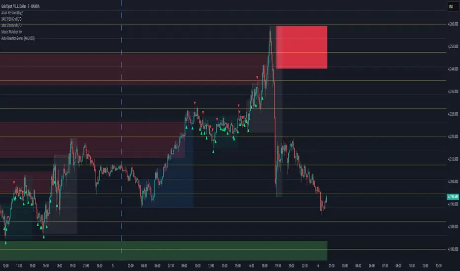
Auto Reaction Zones (XAUUSD)
✅ Auto Reaction Zones (XAUUSD) OANDA:XAUUSD
Auto Reaction Zones (XAUUSD) is an advanced supply & demand mapping tool designed to detect high-probability reaction zones using price impulses, volatility filters, market structure, and adaptive confirmation logic.
This indicator automatically identifies strong bullish and bearish reaction bases formed before impulsive movements, then plots dynamic demand and supply zones that help traders anticipate future reactions, reversals, or continuation points.
🔍 Core Features
▪ Automatic Supply & Demand Zone Detection
Identifies zones based on structural breakout impulses using ATR-based thresholds, volume confirmation, and validated base levels.
▪ Adaptive Confirmation Distance (ADR-Based)
The zone becomes active/confirmed only after price moves a configurable number of points.
A unique 3-case ADR logic adjusts the required confirmation distance based on current market volatility:
Case 1: Low ADR → smaller confirmation required
Case 2: Moderate ADR → medium confirmation
Case 3: High ADR → higher confirmation (more filtering)
This ensures stronger zones in high-volatility conditions (e.g., XAUUSD).
▪ Smart Zone Management
Automatic extension until tested or consumed
Optional lifetime limits (bars or days)
Auto-delete unconfirmed zones if price violates them too early
Hide tested or consumed zones for a cleaner chart
▪ Adjustable Zone Size Filtering
Option to enforce a minimum or maximum zone size, useful for cleaning noise and ultra-small reaction levels.
▪ ADR-Based Zone Spacing Filter
Prevents the creation of zones that are too close to each other.
Different spacing rules for same-direction and opposite-direction zones.
▪ Multi-Timeframe Mode
Overlay zones detected from higher timeframes directly onto your current chart.
▪ Directional Bias (EMA Filter)
Optionally restrict long/short zones based on EMA trend alignment.
▪ Real-Time Alerts
Receive alerts when price touches any active zone or only fresh zones.
🎯 Why This Indicator Is Different
Unlike typical supply/demand indicators that print every swing,
Auto Reaction Zones focuses on:
Only strong reaction bases
Only valid impulse-generated levels
Only zones confirmed by price movement
Only zones that respect volatility and minimum spacing rules
This results in cleaner charting, fewer false zones, and far more reliable reaction levels, especially on volatile instruments like XAUUSD.
⚠️ Disclaimer
This tool is not financial advice. Always combine zone analysis with broader market context and risk management.
Instant Volume Flow1. Volume Bars (Green/Red)
Shows instantly whether buyers or sellers are dominant.
2. Delta Volume Histogram
Green = net buying pressure
Red = net selling pressure
This lets you spot:
Big sell dumps
Sudden buy absorption
Volume momentum shifts
3. Spike Alerts
You get alerts when volume is more than 2× the 20-MA average volume.

Aydan Scalper v2This indicator, called the Aydan Scalper, combines an 8-period EMA (plotted in green) and a 20-period EMA (plotted in red) to identify buy and sell signals based on their crossovers. When the green 8 EMA crosses above the red 20 EMA from below, it signals a buy opportunity. Conversely, when the green 8 EMA crosses below the red 20 EMA from above, it signals a sell opportunity. Additionally, an ATR (Average True Range) indicator is included to gauge market volatility. This combination helps scalpers make informed trading decisions on a one-minute chart.”

Scalp Boost LONG✦ Overview
Scalp Boost LONG is a visual tool designed to highlight potential short-term upward impulses.
A signal is generated only when multiple market conditions align at the candle close, combining momentum dynamics, local probability shifts, and abnormal volume behavior.
The indicator does not repaint.
✦ Concept
The tool focuses on selective situations where the market shows signs of micro-breakout potential.
If all internal conditions are confirmed — a LONG event is displayed.
If not — the chart remains clean.
This builds a low-noise signal model, prioritizing quality over frequency.
✦ Signal Logic
The LONG signal requires confirmation of all core conditions:
• Local impulse dynamics
Identifies short-term acceleration suggesting a breakout from a compressed price structure.
• Probability beyond a statistical zone
Uses relative breakout probability instead of fixed levels, checking whether price exceeds expected local ranges.
• Abnormal volume activity
Highlights candles with monetary flow above a custom threshold, signaling increased market interest.
• Anti-overheat filter
Conditions avoiding exhausted or low-momentum phases where continuation is less likely.
Only when all filters are aligned a LONG marker appears.
✦ Visual Structure
The chart display is intentionally minimal:
• ROC Curve
Subdued line, showing short-term momentum without distraction.
• LONG Marker
Green triangle below the candle on confirmed events.
• Candle Highlight
Soft background highlight on the signal bar.
• Volume Marker
Small red dot at the bottom of candles with abnormal monetary flow.
All visual elements appear only on candle close.
✦ Alerts
A clean event structure is available for notifications:
LONG Signal
This allows receiving alerts during chart analysis or in automated workflows while keeping full control over decision-making.
✦ Notes & Guidelines
This tool:
is not a trading system,
does not provide targets or stops,
may trigger against the dominant trend,
should be combined with the user’s own methodology.
Signals are rare by design.
Do not interpret each event as a trend continuation — it highlights conditions, not outcomes.
✦ Suggested Use
-(Non-mandatory ideas for advanced users)
-identifying potential micro-breakouts,
-timing entries around volume spikes,
-adding context to scalping models,
-filtering impulsive moves from noise.
-suitable for a 5-minute timeframe
The indicator can be helpful as a confirmation layer, not a standalone decision tool.

options millionaireOptions Millionaire is an advanced market-timing indicator designed to identify high-probability turning points by combining volatility analysis with momentum exhaustion levels.
The script uses the Bollinger Band Width Percentage (BBW%) to detect volatility compression (low volatility) and expansion phases (high volatility), and it colors the chart background accordingly.
Green background highlights favorable bullish expansion conditions, while red background signals bearish expansion phases.
How the indicator works (concept overview)
Volatility Model:
BBW% is used to measure how “tight” or “wide” the Bollinger Bands are.
• Low BBW% = volatility compression (potential breakout zone)
• High BBW% = expansion (trend acceleration)
Momentum Exhaustion:
The Stochastic %K identifies overbought and oversold conditions.
Turning-point signals occur when the market reaches an exhaustion level and volatility enters a specific phase.
Signal Generation:
• CALL signals appear when the market is oversold during a bullish or expanding volatility phase.
• PUT signals appear when the market is overbought during a bearish or expanding volatility phase.
How to use it
Works well for options strategies, reversal setups, and mean-reversion entries.
Effective across multiple assets (stocks, crypto, forex).
Best performance on 5m–1h timeframes.
Use with market structure or confirmation indicators to refine entry points.
What makes it original
While BBW% and Stochastic are classic tools, Options Millionaire combines them into a turning-point engine that focuses specifically on volatility compression → expansion transitions aligned with momentum exhaustion.
This dual-filter approach helps identify reversals with better timing compared to using standard indicators separately.

Jefe ORBOpening Range Breakout (ORB) Indicator — Description
The Opening Range Breakout (ORB) Indicator automatically plots the high, low, and midpoint of the opening range for any market and any timeframe. This tool is ideal for intraday traders who rely on the initial price discovery window to identify direction, trend bias, liquidity sweeps, and breakout opportunities.
Features include:
Custom Opening Range start and end times
Opening Range High / Low / Mid lines
Optional session shading
Alerts for ORH/ORL breaks
Works across equities, futures, and crypto
This indicator lets traders tailor the ORB to 1m, 5m, 15m, 30m, or custom opening windows depending on their strategy.
How to Set the Time Correctly (IMPORTANT)
TradingView handles time based on two different factors:
The time zone of the chart/exchange
The time zone selected inside the indicator settings
Your ORB will ONLY plot correctly if your input times match the indicator’s chosen timezone—not your computer’s timezone.
Example: Matching NYSE Open While Trading From PST
NYSE opens at 9:30 AM Eastern Time
In Pacific Time (PST), this is 6:30 AM
In UTC, this is 14:30
If your indicator is set to use UTC, you must enter the ORB Start = 14:30 in order for the lines to align with the actual New York session open.
This is why, even though you personally trade in PST, you may need to use 14:30 when your chart or your indicator timezone is UTC.
Best Practice for Correct ORB Time Inputs
Choose your indicator timezone first, then enter the ORB start/end times in THAT zone:
If Indicator Timezone = America/New_York
Enter 09:30 for the ORB start
No conversion needed
If Indicator Timezone = America/Los_Angeles (PST)
Enter 06:30 for the ORB start
Matches NY open automatically
If Indicator Timezone = UTC
Enter 14:30 for the ORB start
This is 9:30 ET converted to UTC
The indicator intentionally allows manual timezone control so traders can align the opening range across global markets without depending on the chart's display timezone.
Periodis ProIntroduction
The Algorion Periodis Pro represents a paradigm shift in professional trend analysis. Unlike traditional indicators that force the market to fit into rigid, pre-defined settings (like a 14-period MA), this system allows the market to dictate its own parameters.
By combining a Proprietary Anchored Framework with specific temporal resets, Algorion Periodis Pro captures the "natural rhythm" of price action, offering a view of the market that is mathematically synchronized with the current trading session, day, or week.
Core Methodology: The "Zero-Parameter" Philosophy
The true power of Algorion Periodis Pro lies in its unique approach to signal generation. It does not rely on arbitrary user inputs. Instead, it features two distinct, self-adaptive lines that construct themselves in real-time:
1. The Self-Constructing Inertia Line (Adaptive EMA): This line is not calculated using a fixed lookback period. Instead, it builds itself from the ground up starting at each reset point. It accepts the market’s raw price action as its sole instruction set, naturally deriving its own smoothing coefficients based on the speed and flow of the current trend. It represents the market’s "Inertia."
2. The Proprietary Efficiency Filter: The second line utilizes a highly advanced, parameter-free algorithm. It "listens" to the market's noise and volatility levels to determine its own sensitivity. When price is clean, it tightens; when price is chaotic, it relaxes.
The Result: Two lines that are not imposed on the market, but are born from the market. Their interaction reveals the true fair value without the lag caused by human bias.
Features & Functionality
The "Heartbeat" of Volatility (Heatmap Bands): Standard deviation bands often lag. Algorion Periodis Pro, however, calculates the Accumulated Volatility from the anchor point.
These bands represent the "breathing room" the market requires for the current period.
Info Box Dashboard: The panel in the corner displays the Base Volatility State. This value (measured in Ticks/Pips/Points) is the precise distance between the Main Line and the first Deviation Band. This is the current "Volatility Unit" of the asset.
Dual-Set Chronology:
Set 1 (Tactical): Captures the immediate, intraday pulse (Default: 600 Minutes).
Set 2 (Strategic): Captures the broader structural intent (Default: Weekly).
Smart Confluence Coloring: Bars are painted Green or Red only when a "Council of Factors"—including the slopes of both adaptive lines and internal trend metrics—agree on the direction. This filters out weak, non-committal price action.
Strategic Usage: Volatility-Synchronized Trading
Because the Deviation Bands are derived from the market's natural volatility accumulation, they serve as the perfect coordinate system for Risk Management:
Risk (Stop Loss): Use the Base Volatility Unit (the distance of one band) as your natural stop-loss distance. This places your stop outside the current "noise floor" of the market.
Reward (Targets): Target the outer bands.
Band 1-2: High-probability scalping targets during standard moves.
Band 3+: Targets for expansion moves.
Level-to-Level Trading: In a trending market, price often climbs the "ladder" of these bands. A breakout above Band 1 often targets Band 2. When price extends to the outer limits (Band 6 or 7), it often signals a statistical exhaustion, offering a mean-reversion opportunity back to the Main Line.
Configuration
Main Line Switches: Toggle the Main and Secondary lines On/Off for both sets to suit your visual preference.
Reset Frequency: Define the life-cycle of the calculation (Minutes, Daily, Weekly).
Confluence Threshold: Adjust the strictness of the Bar Coloring (voting factors).
Signal Markers: Toggle discrete Buy/Sell shapes based on the structural trend.
Disclaimer
This tool is for informational purposes only. The proprietary algorithms contained herein calculate derived values from past price action and cannot predict future market movements with certainty. Past performance is not indicative of future results. Always manage risk.

Viking Wheel Signals — CSP & CC (BB + RSI Confluence)This indicator highlights moments when Bollinger Bands expand while RSI confirms exhaustion, creating high-probability inflection points for Wheel Strategy entries.
When price tags the lower Bollinger Band while RSI is oversold, it often signals ideal zones for selling Cash-Secured Puts (CSPs). When price tags the upper Bollinger Band with RSI overbought, it helps time Covered Calls (CCs) or anticipate when shares may be called away.
Built specifically for the Wheel Strategy (CSP + CC), this tool maps volatility contractions, expansions, and trend shifts. For best results, use on the Daily chart and combine these signals with your own key support/resistance levels to fine-tune strike selection.
Tags: volatility, bollinger bands, rsi, options trading, wheel strategy, confluence, trend analysis

ASR / ADR by Vanya_zvwey
🇺🇦 Детальний Опис та Інструкція Користувача Індикатора ASR/ADR Grid
Цей індикатор є інструментом для візуалізації волатильності, який використовує історичні дані для прогнозування потенційних цінових рівнів розширення та корекції. Він будує сітки на основі середнього діапазону сесії (ASR) та середнього денного діапазону (ADR).
🔑 Ключові Концепції
ASR (Average Session Range): Середній діапазон High-Low, який зазвичай досягається протягом обраної торгової сесії (Азія, Лондон, Нью-Йорк) за останні N днів.
ADR (Average Daily Range): Середній діапазон High-Low, досягнутий протягом цілого 24-годинного торгового дня за останні N днів.
Синхронізація Часового Поясу: На відміну від багатьох індикаторів, цей індикатор залежить від введеного саме вами Session Timezone. Він гарантує, що ваші сесії та денні відкриття розраховуються правильно, незалежно від часового поясу вашого графіку.
⚙️ Посібник із Налаштування (Вхідні Параметри)
Налаштування згруповані для зручності:
1. General Settings (Загальні Налаштування)
Session Timezone: Виберіть часовий пояс, який використовуватиметься як єдиний орієнтир для всіх часів Start/End. Це може бути "UTC+2", "America/New_York" тощо.
Lookback Period (Days): Кількість днів, що використовується для обчислення середнього значення ASR та ADR.
Grid Direction:
"Up": Сітки будуються від поточного Low сесії/дня і розширюються вгору.
"Down": Сітки будуються від поточного High сесії/дня і розширюються вниз.
Grid Step %: Крок для внутрішніх ліній сітки (наприклад, 25% дасть лінії 25%, 50%, 75%).
2. Session Settings (Asia, London, New York)
Show : Увімкнення/вимкнення відображення сітки для конкретної сесії.
Start Time (HH:MM) / End Time (HH:MM): Час початку та кінця сесії, який відповідає вибраному вами Session Timezone.
3. ADR (Daily) Grid (Сітка Денного Діапазону)
Show ADR Grid: Увімкнення/вимкнення сітки, що охоплює весь день.
ADR Anchor: Визначає, від якої ціни починається відлік ADR (0%):
"Day Open": Як якір використовується ціна відкриття дня (00:00 у вашому часовому поясі).
"Day Low/High": Як якір використовується поточний денний екстремум (Low, якщо напрямок "Up", або High, якщо напрямок "Down").
📈 Використання та Інтерпретація
Сітка складається з рівнів від 0% до 100%, які візуалізують, наскільки далеко ціна просунулася щодо середнього історичного діапазону.
Структура Сітки
0% Рівень (Границя): Це якірна точка (High або Low) поточної сесії/дня, з якої починається розрахунок. Лінія суцільна.
100% Рівень (Границя): Це ціновий рівень, що дорівнює 0% Якір + ASR/ADR. Це статистично очікуваний максимальний рух. Лінія суцільна.
Внутрішні Рівні (Grid Step): Пунктирні лінії (25%, 50%, 75% тощо), які показують проміжні цілі або зони корекції.
Торгова Інтерпретація
Рух до 50%: Ціна досягла половини середнього діапазону.
Досягнення 100%: Ціна досягла "середнього" діапазону волатильності. Це часто служить хорошою ціллю для фіксації прибутку або точкою, де можна очікувати корекції/розвороту, оскільки рух вже відповідає історичним нормам.
Рух за межі 100% (Екстремум): Рух, що перевищує 100% ASR/ADR, вважається нетипово сильним або екстремальним.
🇬🇧 Detailed Description and User Guide for the ASR/ADR Grid Indicator
This indicator is a robust volatility visualization tool designed to project potential price extension and retracement levels based on historical data. It constructs price grids using the Average Session Range (ASR) and the Average Daily Range (ADR).
🔑 Key Concepts
ASR (Average Session Range): The average High-to-Low range typically achieved during a selected trading session (Asia, London, New York) over the last N days
ADR (Average Daily Range): The average High-to-Low range achieved during the entire 24-hour trading day over the last N days.
Timezone Synchronization: This is critical. The indicator relies on a single Session Timezone input to correctly calculate all session start/end times and daily opens, ensuring accuracy regardless of your charting platform's native exchange time.
⚙️ Setup Guide (Input Parameters)
The settings are organized into logical groups:
1. General Settings
Session Timezone: Select the timezone that will serve as the single reference point for all Start/End times below (e.g., "UTC+2", "America/New_York").
Lookback Period (Days): The number of preceding days used to compute the average ASR and ADR values.
Grid Direction:
"Up": The grids are anchored at the current session/day's Low and extend upwards.
"Down": The grids are anchored at the current session/day's High and extend downwards.
Grid Step %: The percentage increment for the inner grid lines (e.g., 25% will plot lines at 25%, 50%, 75%).
2. Session Settings (Asia, London, New York)
Show : Toggles the visibility of the grid for that specific session.
Start Time (HH:MM) / End Time (HH:MM): The start and end times for the session, which must correspond to your chosen Session Timezone. The script supports overnight sessions (e.g., starting at 22:00 and ending at 02:00 the next day).
3. ADR (Daily) Grid
Show ADR Grid: Toggles the visibility of the grid covering the entire trading day.
ADR Anchor: Determines the price point from which the ADR (0%) is measured:
"Day Open": The anchor is the day's opening price (at 00:00 in your chosen timezone).
"Day Low/High": The anchor is the current day's extreme (Low if Direction is "Up", or High if Direction is "Down").
📈 Usage and Interpretation
The grid levels, ranging from 0% to 100%, visualize how far the price has traveled relative to the average historical volatility for that specific period.
Grid Structure
0% Level (Border): This is the anchor point (High or Low) of the current session/day, serving as the starting reference for the calculation. This line is solid.
100% Level (Border): This is the price level equal to the 0% Anchor + ASR/ADR. It represents the statistically expected average maximum move. This line is also solid.
Inner Levels (Grid Step): These dotted lines (25%, 50%, 75%, etc.) serve as intermediate targets or potential zones for pullback.
Trading Interpretation
Reaching 50%: The price has achieved half of the average range.
Reaching 100%: The price has fulfilled the "average" volatility range. This level often acts as an excellent profit target or a point where you might expect correction or reversal, as the move has met historical norms.
Moving Beyond 100% (Extreme): A price move that exceeds 100% ASR/ADR is considered unusually strong or extreme volatility.

HH HL LH LL + BOS / CHoCHHH HL LH LL + BOS / CHoCH Structure Indicator (ATR Adaptive)
This indicator provides a complete market structure framework using swing-based pivots, real-time trend detection, BOS (Break of Structure), CHoCH (Change of Character), and optional ATR-adaptive swing sensitivity.
🔹 Core Features
1. Market Structure Labels
The script detects and labels:
HH – Higher High
LH – Lower High
HL – Higher Low
LL – Lower Low
These labels help visualize trend continuation or weakness in structure.
Each label type can be individually toggled ON/OFF in settings.
2. ATR-Based Adaptive Swing Length (Optional)
Swing pivots can be calculated using:
A fixed manual swing length, or
A dynamic ATR-based swing length that adjusts automatically to volatility.
Increasing volatility → longer swings
Decreasing volatility → tighter swings
This makes structure detection more stable and timeframe-adaptive.
3. Close-Based Break of Structure (BOS)
The indicator identifies a BOS when:
Price closes above the previous swing high (Bullish BOS↑)
Price closes below the previous swing low (Bearish BOS↓)
BOS labels can be turned ON/OFF without affecting internal calculations.
4. CHoCH (Change of Character)
CHoCH is triggered when a BOS occurs against the current trend, indicating a potential trend reversal:
CHoCH↑ – Bearish → Bullish reversal
CHoCH↓ – Bullish → Bearish reversal
CHoCH remains active even when BOS labels are turned off.
5. Alerts
The indicator provides alert conditions for:
CHoCH↑ (Bullish Trend Shift)
CHoCH↓ (Bearish Trend Shift)
This allows traders to automate notifications for significant trend changes.
6. Trend State Tracking
The script internally tracks the current structure-based trend:
Uptrend
Downtrend
Undefined
The trend updates dynamically based on real BOS events.
7. Fully Backwards Compatible
The indicator generates structure, BOS, and CHoCH even when scrolling back deep in chart history, thanks to extended max_bars_back handling.
Summary
This tool provides a complete, flexible, and non-repainting framework for market structure analysis, suitable for:
SMC/ICT traders
Swing & intraday traders
Trend traders
Price action analysts
With adaptive swing detection, clean structure labeling, BOS/CHoCH logic, and alert integration, the indicator helps traders understand market transitions with clarity and precision.

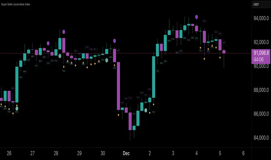
Buyer-Seller Locomotive IndexBuyer-Seller Locomotive Index (BSLI)
An original indicator that measures buyer and seller pressure, momentum shifts, and structural control in the market.
Overview
The Buyer-Seller Locomotive Index evaluates candle-level positioning relative to an adaptive EMA-based reference price. It calculates bull vs bear strength percentages and Total Power momentum using fast and slow EMAs, providing insight into which side currently dominates market structure. By combining pressure analysis with momentum smoothing, BSLI highlights both the intensity and direction of market control.
Features
Bull/Bear Strength Percentages: Normalized 0–100 values showing current dominance and threshold-based high-strength alerts.
Total Power Momentum: Fast and slow EMA crossover signals with a histogram to visualize expansion or contraction of pressure.
Visual Markers: Optional fight diamonds highlight candles intersecting the reference price, while dynamic labels show the exact strength percentages.
Crossover Signals: Circles mark potential shifts in momentum, helping to identify early transitions in market control.
Customizable Display: Users can toggle labels, markers, and histogram visibility for a clean or detailed chart view.
How to Use
BSLI provides traders with a multi-layered view of market structure:
Observe shifts in buyer vs seller dominance.
Spot early momentum transitions before trends become obvious.
Confirm price structure with Total Power and strength percentages.
Highlight periods of compression, conflict, or indecision for additional context.
This indicator is intended as a supportive analysis tool. Traders should combine it with personal methodology, risk management, and other analysis techniques. It is not a standalone trade signal.
Important Notes
Measures relative pressure, not absolute volume.
Percentages reflect current structure, not predicted price direction.
Signals are contextual; do not rely solely on crossovers for trading decisions.
Uses no lookahead; all calculations are based on completed bars.
Results may vary by asset, timeframe, and market volatility.
Originality
BSLI uniquely combines adaptive pressure extraction, normalized strength percentages, dual-EMA power momentum, conflict detection, and integrated labeling. This multi-component approach provides a clear and actionable view of the evolving balance between buyers and sellers, supporting both short-term and structural analysis.