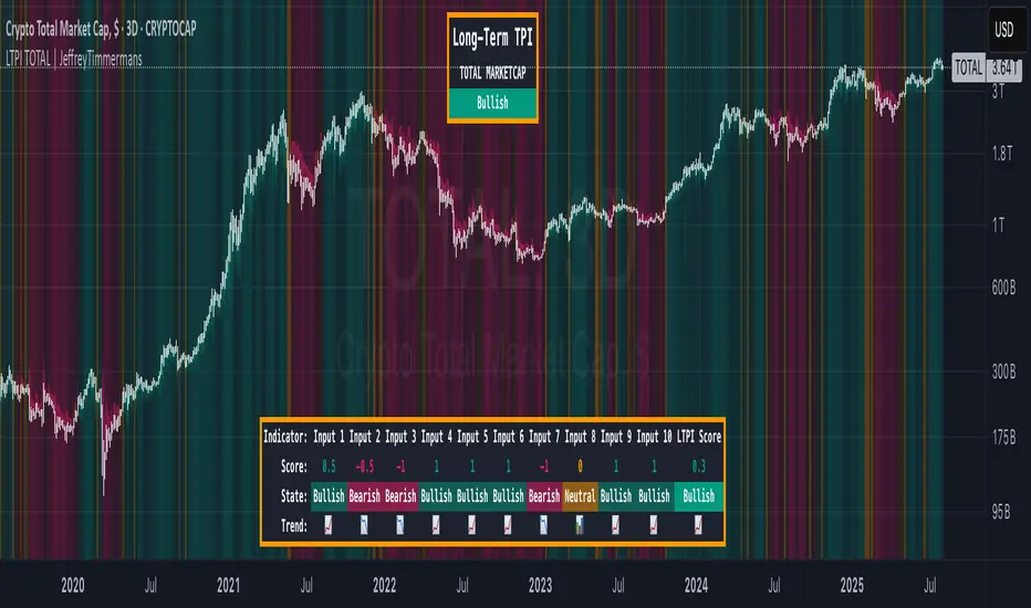
LTPI TOTAL | JeffreyTimmermansLong-Term Trend Probability Indicator
The "Long-Term Trend Probability Indicator" on TOTAL is a custom-built tool designed to analyze the global crypto market (TOTAL) from a long-term perspective. Unlike short-term indicators that react to price volatility, LTPI focuses on major trend shifts across the entire crypto market, helping to identify major trend shifts early.
This version of the LTPI is applied to the TOTAL market cap, making it a broad trend following tool.
Key Features
Long-Term Focus:
Designed for macro market analysis with less sensitivity to short-term noise.
10 Input Signals:
Combines 10 carefully selected inputs (trend following indicators) into a single score that reflects the overall market condition.
Market Regimes:
Classifies the TOTAL market into:
Bullish: Strong uptrend, expansion phase
Bearish: Strong downtrend, contraction phase
Neutral: Transitional or uncertain
Visual Background:
Background colors clearly display which regime is active.
Comprehensive Dashboard:
The panel at the bottom shows each input’s state, the composite LTPI score, and the resulting market trend.
How It Works
Inputs Analysis:
Each of the 10 inputs outputs one of three states:
+1 (Bullish)
-1 (Bearish)
0 (Neutral)
Score Calculation:
The total score is the sum of all 10 input signals divided by 10.
Score > 0.1 = Bullish
Score < -0.1 = Bearish
Between -0.1 and 0.1 = Neutral
Background Coloring:
Background colors dynamically adjust to reflect the long-term market regime.
Use Cases
Long-Term Positioning:
Identify periods of global expansion or contraction to position yourself accordingly.
Macro Confirmation:
Use LTPI in combination with medium-term (MTPI) and short-term tools for multi-timeframe confirmation.
Market Timing:
Alerts when LTPI crosses key thresholds help highlight the start of major bullish or bearish phases.
Dynamic Alerts:
Bullish Entry: LTPI score crosses above 0.1
Bearish Entry: LTPI score crosses below -0.1
Neutral Zone: Score moves back between -0.1 and 0.1
Conclusion
The Long-Term Trend Probability Indicator (LTPI – TOTAL) is a powerful tool for identifying long-term market phases across the entire crypto ecosystem. By focusing on long term trends and combining 10 inputs into a single probability score, it provides a clear macro perspective for strategic decision-making.
Totalmarketcap
Global Market Cap of all measuable assets# Comprehensive Global Market Cap Overview
This indicator provides a dynamic, real-time estimate of the total global market value across multiple asset classes and economic sectors. It aims to give traders and analysts a broad perspective on the state of global markets and wealth.
## Features:
- Real-time data for major market segments including stocks, bonds, real estate, cryptocurrencies, and commodities
- Estimates for hard-to-quantify sectors like derivatives, private equity, and OTC markets
- Includes often-overlooked categories such as cash deposits, insurance markets, and natural resources
- Static estimates for art/collectibles and intellectual property
- Total global value calculation and breakdown by category
- Easy-to-read table display of all categories
## Categories Tracked:
1. Global Stock Market
2. Global Bond Market
3. Real Estate
4. Cryptocurrencies
5. Commodities
6. Derivatives Market
7. Private Equity and Venture Capital
8. Cash and Bank Deposits
9. Insurance Markets
10. Sovereign Wealth Funds
11. OTC Markets
12. Natural Resources
13. Art and Collectibles
14. Intellectual Property
## Data Sources:
- Uses popular ETFs and indices as proxies for global markets where possible
- Incorporates data from specific company stocks to represent certain markets (e.g., CME for derivatives, OTCM for OTC markets)
- Utilizes FRED data for bank deposits
- Includes static estimates for categories without reliable real-time data sources
## Notes:
- All values are approximate and should be used for general perspective rather than precise financial analysis
- Some categories use scaled proxy data, which may not perfectly represent global totals
- Static estimates are used where real-time data is unavailable and should be updated periodically
- The total global value includes human capital but this is not displayed in the table due to its speculative nature
This indicator is designed to provide a comprehensive overview of global market value, going beyond traditional market capitalization metrics. It's ideal for traders, researchers, and anyone interested in gaining a broader understanding of global wealth distribution across various sectors.
Please note that due to the complexity of global markets and limitations in data availability, all figures should be considered estimates and used as part of a broader analysis rather than as definitive values.
Stablecoin Market Cap RiskThe Stablecoins Market Cap Risk indicator serves as a valuable risk oscillator for Bitcoin on a macro scale . This metric is derived by aggregating the market capitalization of CRYPTOCAP:USDT (Tether) and CRYPTOCAP:USDC (USD Coin), subsequently dividing this combined value by CRYPTOCAP:TOTAL (total market capitalization). The resulting figure is further normalized through linear regression.
The regression in question:
drive.google.com
However, it is essential to acknowledge that this model's reliability may diminish over time, as it is based solely on data from the most recent 4.5 years of cryptocurrency market trends. Consequently, adaptations and enhancements to the model are anticipated in the future to ensure its continued relevance and accuracy.

Coin & market cap tableThis table was built specifically for the Crypto market.
It gives you a quick overview of the markets without having to scroll through numerous charts. The information is the overall markets daily change and the charts coins movement on a daily, weekly and monthly basis.
The weeks start on a Monday morning, the months start on the 1st of the month so this is last weeks data and last calendar months data.
It also gives you Bitcoins dominance. (Total2) you can change it to Bitcoin & Ethereum dominance (Total3)
Crypto Map Dashboard v1.0🔰Overview
Charts are an essential part of working with data, as they are a way to condense large amounts of data into an easy to understand format. Visualizations of data can bring out insights to someone looking at the data for the first time, as well as convey findings to others who won’t see the raw data. There are countless chart types out there, each with different use cases. Often, the most difficult part of creating a data visualization is figuring out which chart type is best for the task at hand.
What are the types of metrics, features, or other variables that you plan on plotting? Although it depended on some multiple factors!
But my choices of the chart type for this Crypto datas was Pie chart or Donut char for crypto dominances ,and Colum (Bar) chart for Total MarketCaps .
The audiences that I plan on presenting this for them could be all tradingviewrs , especially crypto lovers ,or those who just aim to have an initial exploration for themselves ,like me!
so this indicator mostly could be an educational indicator script for pine coders !
We can use the " Crypto Map Dashboard " indicator to Get an quick overview of the crypto market and monitor where the smart money Flow changing by comparing the dominances and totals Caps .
In general, it consists of 4 parts:
✅1 =>> Table1 : If you like to see and compare and monitor the changes of dominances of (Bitcoin, Ethereum, Usdt , Usdc , etc.) and their market cap in different times you can see the table on The upper-right corner.
✅2 =>> Table2: Also, in the table lower-right corner, you can see the changes of the totals(Total, Total2 , Total3 and TotalDefi) in the same time periods.
✅3 =>> pie chart or donut chart: By viewing this , you understand better about Table1 Datas, that it depicts exactly how Dominance is distributed and specialized.
✅4 =>> column chart (bar chart) : And in the last you can clearly compare the total marketcaps and see how far they are from their ATHs.
You also can even notice the entry and exit of liquidity from the crypto market!
I must also mention that I am definitely still a beginner compared to more experienced pine coders, and there may be some bugs in my codes and calculations, but I am an open person and I welcome your comments ,Also Let me know if you have any questions.
Lots of Love to all tradingviewers and pineCoder ,Cheers!💚❤️💙

Crypto Correlation Strategy based on Technical Ratings This is a swing trading crypto correlation strategy, based initially on technical ratings but adapted to the entire crypto market environment , by using as a source of calculations the candle values from CRYPTOCAP:TOTAL.
So since TOTAL, is the sum of all the crypto currencies, its going to be our leader. We will get the entries and exits , internally from it and input them into the crypto coins(more than 80-90% of the usdt perpetual pairs are following the same direction but with a higher volatility), and with this in general is going to give us as much better risk/reward than just by trading 1 coin alone.
So this means that all coins will enter and exit at the same time forom a trade. With this, since sometimes we have sudden big changes in the price form one side to another, is going to break a little this effect and since the initial movements were bigger, it would make us lose less. At the same time it can also make us lose more if the changes happen to soon.
One of the things of this particular idea is we dont have to worry about particular optimizations for each asset/coin.
This scenario has been adapted for 30min timeframe, using 0.1% comission per entry and 0.1% comission for exit from the trade.
I have tested so far with most USDT Perpetual Pairs from binance, and it seems to give good results with most of the pairs.
If you have any question please let me know !

Major Mayer MultipleAdjusted version of the BTC Mayer Multiple developed by Trace Mayer www.theinvestorspodcast.com
This version includes two novelties. The first one replaces BTC with Total Market Cap from 2016/2017 (depending on your moving averages) to present and the second is that we consider two Moving Averages to produce more detailed lows.

Trend Direction v1 - by @cryptomrdavis -This little script helps you to get the right trend. It use two RSI - 1. current chart 2. total market cap.
Simple to use:
Blue line cross the orange line = bullish
Orange line cross the blue line = bearish
You can trade it that way or you wait for the bullish cross and sell it, when the line cross under 70 (or higher, depends on which levels you set).
Combine it with the Crypto Trading Helper to find better long or short positions.
This script doesn't plot any lines or buy signals.
Happy trading!
Regards,
CryptoMrDavis
*** use this tool on your own risk ***
--------------------------------------------------------------------------------------------------------
BTC: 1AxLVKpgYjMtQtcRmeuFbhQNVKWKmJ5EZy
ETH: 0x7b825fa752b9926D3E8397cDb1d9E5473D074646
XLM GAXUQJSW55C7MAC4GI26NZUGIKSHFDVFRFKZCXPLMPY4HCADSDT55XK6
BCH: qz57n04ud6mn42u00aymqkku8tfh0lk4jv9c28mjvv
--------------------------------------------------------------------------------------------------------
