Info Box⚙️ Purpose
Shows useful trade and event-related data such as:
% Distance from stop levels (D, DH)
Earnings countdown in bars
All displayed in a single floating info box (table) on the chart.
📋 Key Features
Customizable Display
Choose table position (Top Right, Bottom Center, etc.)
Choose table size (Auto, Large, Tiny, etc.)
Custom text and background colors
Metrics Shown
D: % Distance from stop (difference between close and low/high)
DH: % Distance from midpoint of the candle
Earnings Countdown: Number of bars until next earnings event
Conditional Styling
If earnings are within 3 bars, text color turns red as a warning.
Execution Conditions
Runs only on daily timeframe
Updates on last bar only (no historical clutter)
Output
Displays all selected metrics in one line, separated by “×”
e.g. → D: -2.1% × 5 × DH: 1.4%
🧩 Overall Function
Creates a clean, customizable “info box” showing trade distances and upcoming earnings countdown for quick decision-making directly on your TradingView chart.
Statistics

Zscore COrrelation volatility OberlinThis is a complete multi-strategy dashboard for statistical arbitrage (pairs trading). It is designed to solve the biggest challenge in pairs trading: knowing when to trade mean-reversion and when to trade a regime break.
This indicator automatically analyzes the stability of the pair's relationship using two critical filters (a Volatility Ratio filter and a Correlation Z-Score filter). It then provides clear, actionable signals for two opposite strategies based on the current market "regime."
The Regime "Traffic Light" System
The indicator's background color tells you which strategy is currently active.
• 🟢 GREEN Background (Stable Regime): This is the "Mean Reversion" regime. It means both the volatility and correlation filters are stable. The pair is behaving predictably, and you can trust the Z-Score to revert to its mean.
• 🔴 RED Background (Unstable Regime): This is the "Divergence" or "Breakout" regime. It means the pair's relationship has failed (correlation has broken down OR volatility has exploded). In this regime, the Z-Score is not expected to revert and may continue to diverge.
How to Use: The Two Strategies
The indicator will plot text labels on your chart for four specific signals.
📈 Strategy 1: Mean Reversion (Green Regime 🟢)
This is the classic pairs trading strategy. You only take these signals when the background is GREEN.
• LONG Signal: "ACHAT MOYENNE" (Buy Mean)
• What it means: The Z-Score (blue line) has crossed below the lower band (e.g., -2.0) while the regime is stable.
• Your Bet: The spread is statistically "too cheap" and will rise back to the 0-line.
• Action: Buy the Spread (e.g., Buy MES, Sell MNQ).
• SHORT Signal: "VENTE MOYENNE" (Sell Mean)
• What it means: The Z-Score (blue line) has crossed above the upper band (e.g., +2.0) while the regime is stable.
• Your Bet: The spread is statistically "too expensive" and will fall back to the 0-line.
• Action: Sell the Spread (e.g., Sell MES, Buy MNQ).
• Exit Target: Close your position when the Z-Score (blue line) returns to 0.
🚀 Strategy 2: Divergence / Momentum (Red Regime 🔴)
This is a momentum strategy that bets on the continuation of a regime break. These signals appear on the exact bar the background turns RED.
• LONG Signal: "ACHAT ÉCART" (Buy Divergence)
• What it means: The regime just broke (turned RED) at the same time the Z-Score was already rising.
• Your Bet: The pair's relationship is broken, and the spread will continue to "rip" higher, diverging further from the mean.
• Action: Buy the Spread (e.g., Buy MES, Sell MNQ) and hold for momentum.
• SHORT Signal: "VENTE ÉCART" (Sell Divergence)
• What it means: The regime just broke (turned RED) at the same time the Z-Score was already falling.
• Your Bet: The pair's relationship is broken, and the spread will continue to "crash" lower, diverging further from the mean.
• Action: Sell the Spread (e.g., Sell MES, Buy MNQ) and hold for momentum.
• Exit Target: This is a momentum trade, so the exit is not the 0-line. Use a trailing stop or exit when the regime becomes stable again (turns GREEN).
The 3 Indicator Panes
1. Pane 1: Main Dashboard (Signal Pane)
• Z-Score PRIX (Blue Line): Your main signal. Shows the spread's deviation.
• Regime (Background Color): Your "traffic light" (Green for Mean Reversion, Red for Divergence).
• Trade Labels: The explicit entry signals.
2. Pane 2: Volatility Ratio (Diagnostic Pane)
• This pane shows the ratio of the two assets' volatility (Orange Line) vs. its long-term average (Gray Line).
• It is one of the two filters used to decide if the regime is "stable." If the orange line moves too far from the gray line, the regime turns RED.
3. Pane 3: Correlation Z-Score (Diagnostic Pane)
• This is the most critical filter. It measures the Z-Score of the rolling correlation itself.
• If this Purple Line drops below the Red Dashed Line (the "Danger Threshold"), it means the pair's correlation has statistically broken. This is the primary trigger for the RED "Divergence" regime.
Settings
• Symbol 1 & 2 Tickers: Set the two assets for the filters (e.g., "MES1!" and "MNQ1!"). Note: You must still load the spread chart itself (e.g., MES1!-MNQ1!) for the Price Z-Score to work.
• Z-Score Settings: Adjust the lookback period and bands for the Price Z-Score.
• Volatility Filter Settings: Adjust the ATR period, the MA period, and the deviation threshold.
• Correlation Filter Settings: Adjust the lookback periods and the "danger threshold" for the Correlation Z-Score.
Disclaimer: This indicator is for educational and informational purposes only. It does not constitute financial advice. All trading involves significant risk. Past performance is not indicative of future results.
ZScore correlation volatility spread pacThis is a complete multi-strategy dashboard for statistical arbitrage (pairs trading). It is designed to solve the biggest challenge in pairs trading: knowing when to trade mean-reversion and when to trade a regime break.
This indicator automatically analyzes the stability of the pair's relationship using two critical filters (a Volatility Ratio filter and a Correlation Z-Score filter). It then provides clear, actionable signals for two opposite strategies based on the current market "regime."
The Regime "Traffic Light" System
The indicator's background color tells you which strategy is currently active.
• 🟢 GREEN Background (Stable Regime): This is the "Mean Reversion" regime. It means both the volatility and correlation filters are stable. The pair is behaving predictably, and you can trust the Z-Score to revert to its mean.
• 🔴 RED Background (Unstable Regime): This is the "Divergence" or "Breakout" regime. It means the pair's relationship has failed (correlation has broken down OR volatility has exploded). In this regime, the Z-Score is not expected to revert and may continue to diverge.
How to Use: The Two Strategies
The indicator will plot text labels on your chart for four specific signals.
📈 Strategy 1: Mean Reversion (Green Regime 🟢)
This is the classic pairs trading strategy. You only take these signals when the background is GREEN.
• LONG Signal: "ACHAT MOYENNE" (Buy Mean)
• What it means: The Z-Score (blue line) has crossed below the lower band (e.g., -2.0) while the regime is stable.
• Your Bet: The spread is statistically "too cheap" and will rise back to the 0-line.
• Action: Buy the Spread (e.g., Buy MES, Sell MNQ).
• SHORT Signal: "VENTE MOYENNE" (Sell Mean)
• What it means: The Z-Score (blue line) has crossed above the upper band (e.g., +2.0) while the regime is stable.
• Your Bet: The spread is statistically "too expensive" and will fall back to the 0-line.
• Action: Sell the Spread (e.g., Sell MES, Buy MNQ).
• Exit Target: Close your position when the Z-Score (blue line) returns to 0.
🚀 Strategy 2: Divergence / Momentum (Red Regime 🔴)
This is a momentum strategy that bets on the continuation of a regime break. These signals appear on the exact bar the background turns RED.
• LONG Signal: "ACHAT ÉCART" (Buy Divergence)
• What it means: The regime just broke (turned RED) at the same time the Z-Score was already rising.
• Your Bet: The pair's relationship is broken, and the spread will continue to "rip" higher, diverging further from the mean.
• Action: Buy the Spread (e.g., Buy MES, Sell MNQ) and hold for momentum.
• SHORT Signal: "VENTE ÉCART" (Sell Divergence)
• What it means: The regime just broke (turned RED) at the same time the Z-Score was already falling.
• Your Bet: The pair's relationship is broken, and the spread will continue to "crash" lower, diverging further from the mean.
• Action: Sell the Spread (e.g., Sell MES, Buy MNQ) and hold for momentum.
• Exit Target: This is a momentum trade, so the exit is not the 0-line. Use a trailing stop or exit when the regime becomes stable again (turns GREEN).
The 3 Indicator Panes
1. Pane 1: Main Dashboard (Signal Pane)
• Z-Score PRIX (Blue Line): Your main signal. Shows the spread's deviation.
• Regime (Background Color): Your "traffic light" (Green for Mean Reversion, Red for Divergence).
• Trade Labels: The explicit entry signals.
2. Pane 2: Volatility Ratio (Diagnostic Pane)
• This pane shows the ratio of the two assets' volatility (Orange Line) vs. its long-term average (Gray Line).
• It is one of the two filters used to decide if the regime is "stable." If the orange line moves too far from the gray line, the regime turns RED.
3. Pane 3: Correlation Z-Score (Diagnostic Pane)
• This is the most critical filter. It measures the Z-Score of the rolling correlation itself.
• If this Purple Line drops below the Red Dashed Line (the "Danger Threshold"), it means the pair's correlation has statistically broken. This is the primary trigger for the RED "Divergence" regime.
Settings
• Symbol 1 & 2 Tickers: Set the two assets for the filters (e.g., "MES1!" and "MNQ1!"). Note: You must still load the spread chart itself (e.g., MES1!-MNQ1!) for the Price Z-Score to work.
• Z-Score Settings: Adjust the lookback period and bands for the Price Z-Score.
• Volatility Filter Settings: Adjust the ATR period, the MA period, and the deviation threshold.
• Correlation Filter Settings: Adjust the lookback periods and the "danger threshold" for the Correlation Z-Score.
Disclaimer: This indicator is for educational and informational purposes only. It does not constitute financial advice. All trading involves significant risk. Past performance is not indicative of future results.

Nqaba Goldminer StrategyThis indicator plots the New York session key timing levels used in institutional intraday models.
It automatically marks the 03:00 AM, 10:00 AM, and 2:00 PM (14:00) New York times each day:
Vertical lines show exactly when those time windows open — allowing traders to identify major global liquidity shifts between London, New York, and U.S. session overlaps.
Horizontal lines mark the opening price of the 5-minute candle that begins at each of those key times, providing precision reference levels for potential reversals, continuation setups, and intraday bias shifts.
Users can customize each line’s color, style (solid/dashed/dotted), width, and horizontal-line length.
A history toggle lets you display all past occurrences or just today’s key levels for a cleaner chart.
These reference levels form the foundation for strategies such as:
London Breakout to New York Reversal models
Opening Range / Session Open bias confirmation
Institutional volume transfer windows (London → NY → Asia)
The tool provides a simple visual structure for traders to frame intraday decision-making around recurring institutional time events.

Percentile Rank Oscillator (Price + VWMA)A statistical oscillator designed to identify potential market turning points using percentile-based price analytics and volume-weighted confirmation.
What is PRO?
Percentile Rank Oscillator measures how extreme current price behavior is relative to its own recent history. It calculates a rolling percentile rank of price midpoints and VWMA deviation (volume-weighted price drift). When price reaches historically rare levels – high or low percentiles – it may signal exhaustion and potential reversal conditions.
How it works
Takes midpoint of each candle ((H+L)/2)
Ranks the current value vs previous N bars using rolling percentile rank
Maps percentile to a normalized oscillator scale (-1..+1 or 0–100)
Optionally evaluates VWMA deviation percentile for volume-confirmed signals
Highlights extreme conditions and confluence zones
Why percentile rank?
Median-based percentiles ignore outliers and read the market statistically – not by fixed thresholds. Instead of guessing “overbought/oversold” values, the indicator adapts to current volatility and structure.
Key features
Rolling percentile rank of price action
Optional VWMA-based percentile confirmation
Adaptive, noise-robust structure
User-selectable thresholds (default 95/5)
Confluence highlighting for price + VWMA extremes
Optional smoothing (RMA)
Visual extreme zone fills for rapid signal recognition
How to use
High percentile values –> statistically extreme upward deviation (potential top)
Low percentile values –> statistically extreme downward deviation (potential bottom)
Price + VWMA confluence strengthens reversal context
Best used as part of a broader trading framework (market structure, order flow, etc.)
Tip: Look for percentile spikes at key HTF levels, after extended moves, or where liquidity sweeps occur. Strong moves into rare percentile territory may precede mean reversion.
Suggested settings
Default length: 100 bars
Thresholds: 95 / 5
Smoothing: 1–3 (optional)
Important note
This tool does not predict direction or guarantee outcomes. It provides statistical context for price extremes to help traders frame probability and timing. Always combine with sound risk management and other tools.
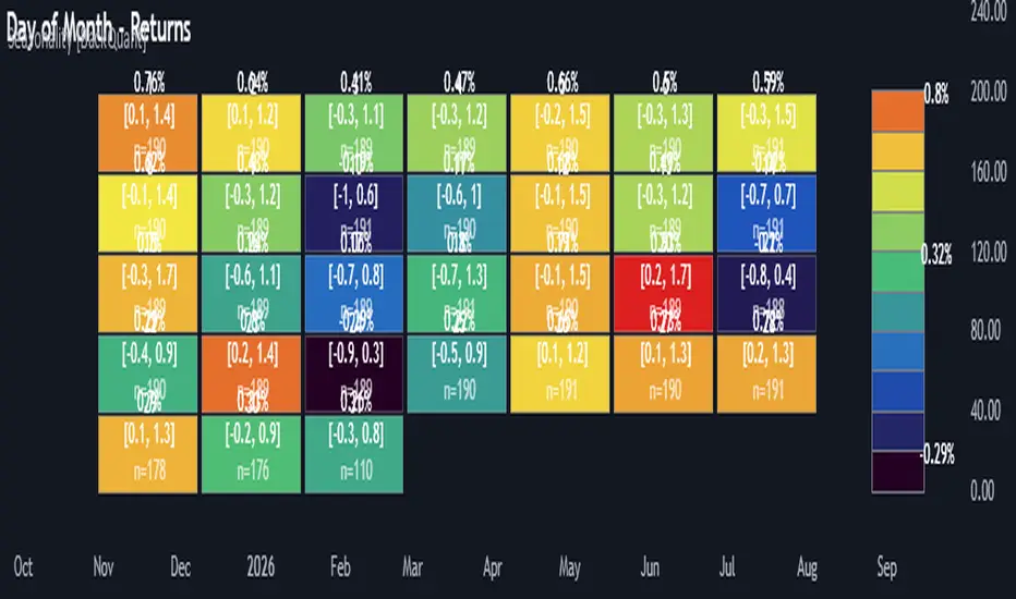
Multi-Mode Seasonality Map [BackQuant]Multi-Mode Seasonality Map
A fast, visual way to expose repeatable calendar patterns in returns, volatility, volume, and range across multiple granularities (Day of Week, Day of Month, Hour of Day, Week of Month). Built for idea generation, regime context, and execution timing.
What is “seasonality” in markets?
Seasonality refers to statistically repeatable patterns tied to the calendar or clock, rather than to price levels. Examples include specific weekdays tending to be stronger, certain hours showing higher realized volatility, or month-end flow boosting volumes. This tool measures those effects directly on your charted symbol.
Why seasonality matters
It’s orthogonal alpha: timing edges independent of price structure that can complement trend, mean reversion, or flow-based setups.
It frames expectations: when a session typically runs hot or cold, you size and pace risk accordingly.
It improves execution: entering during historically favorable windows, avoiding historically noisy windows.
It clarifies context: separating normal “calendar noise” from true anomaly helps avoid overreacting to routine moves.
How traders use seasonality in practice
Timing entries/exits : If Tuesday morning is historically weak for this asset, a mean-reversion buyer may wait for that drift to complete before entering.
Sizing & stops : If 13:00–15:00 shows elevated volatility, widen stops or reduce size to maintain constant risk.
Session playbooks : Build repeatable routines around the hours/days that consistently drive PnL.
Portfolio rotation : Compare seasonal edges across assets to schedule focus and deploy attention where the calendar favors you.
Why Day-of-Week (DOW) can be especially helpful
Flows cluster by weekday (ETF creations/redemptions, options hedging cadence, futures roll patterns, macro data releases), so DOW often encodes a stable micro-structure signal.
Desk behavior and liquidity provision differ by weekday, impacting realized range and slippage.
DOW is simple to operationalize: easy rules like “fade Monday afternoon chop” or “press Thursday trend extension” can be tested and enforced.
What this indicator does
Multi-mode heatmaps : Switch between Day of Week, Day of Month, Hour of Day, Week of Month .
Metric selection : Analyze Returns , Volatility ((high-low)/open), Volume (vs 20-bar average), or Range (vs 20-bar average).
Confidence intervals : Per cell, compute mean, standard deviation, and a z-based CI at your chosen confidence level.
Sample guards : Enforce a minimum sample size so thin data doesn’t mislead.
Readable map : Color palettes, value labels, sample size, and an optional legend for fast interpretation.
Scoreboard : Optional table highlights best/worst DOW and today’s seasonality with CI and a simple “edge” tag.
How it’s calculated (under the hood)
Per bar, compute the chosen metric (return, vol, volume %, or range %) over your lookback window.
Bucket that metric into the active calendar bin (e.g., Tuesday, the 15th, 10:00 hour, or Week-2 of month).
For each bin, accumulate sum , sum of squares , and count , then at render compute mean , std dev , and confidence interval .
Color scale normalizes to the observed min/max of eligible bins (those meeting the minimum sample size).
How to read the heatmap
Color : Greener/warmer typically implies higher mean value for the chosen metric; cooler implies lower.
Value label : The center number is the bin’s mean (e.g., average % return for Tuesdays).
Confidence bracket : Optional “ ” shows the CI for the mean, helping you gauge stability.
n = sample size : More samples = more reliability. Treat small-n bins with skepticism.
Suggested workflows
Pick the lens : Start with Analysis Type = Returns , Heatmap View = Day of Week , lookback ≈ 252 trading days . Note the best/worst weekdays and their CI width.
Sanity-check volatility : Switch to Volatility to see which bins carry the most realized range. Use that to plan stop width and trade pacing.
Check liquidity proxy : Flip to Volume , identify thin vs thick windows. Execute risk in thicker windows to reduce slippage.
Drill to intraday : Use Hour of Day to reveal opening bursts, lunchtime lulls, and closing ramps. Combine with your main strategy to schedule entries.
Calendar nuance : Inspect Week of Month and Day of Month for end-of-month, options-cycle, or data-release effects.
Codify rules : Translate stable edges into rules like “no fresh risk during bottom-quartile hours” or “scale entries during top-quartile hours.”
Parameter guidance
Analysis Period (Days) : 252 for a one-year view. Shorten (100–150) to emphasize the current regime; lengthen (500+) for long-memory effects.
Heatmap View : Start with DOW for robustness, then refine with Hour-of-Day for your execution window.
Confidence Level : 95% is standard; use 90% if you want wider coverage with fewer false “insufficient data” bins.
Min Sample Size : 10–20 helps filter noise. For Hour-of-Day on higher timeframes, consider lowering if your dataset is small.
Color Scheme : Choose a palette with good mid-tone contrast (e.g., Red-Green or Viridis) for quick thresholding.
Interpreting common patterns
Return-positive but low-vol bins : Favorable drift windows for passive adds or tight-stop trend continuation.
Return-flat but high-vol bins : Opportunity for mean reversion or breakout scalping, but manage risk accordingly.
High-volume bins : Better expected execution quality; schedule size here if slippage matters.
Wide CI : Edge is unstable or sample is thin; treat as exploratory until more data accumulates.
Best practices
Revalidate after regime shifts (new macro cycle, liquidity regime change, major exchange microstructure updates).
Use multiple lenses: DOW to find the day, then Hour-of-Day to refine the entry window.
Combine with your core setup signals; treat seasonality as a filter or weight, not a standalone trigger.
Test across assets/timeframes—edges are instrument-specific and may not transfer 1:1.
Limitations & notes
History-dependent: short histories or sparse intraday data reduce reliability.
Not causal: a hot Tuesday doesn’t guarantee future Tuesday strength; treat as probabilistic bias.
Aggregation bias: changing session hours or symbol migrations can distort older samples.
CI is z-approximate: good for fast triage, not a substitute for full hypothesis testing.
Quick setup
Use Returns + Day of Week + 252d to get a clean yearly map of weekday edge.
Flip to Hour of Day on intraday charts to schedule precise entries/exits.
Keep Show Values and Confidence Intervals on while you calibrate; hide later for a clean visual.
The Multi-Mode Seasonality Map helps you convert the calendar from an afterthought into a quantitative edge, surfacing when an asset tends to move, expand, or stay quiet—so you can plan, size, and execute with intent.
Market SessionsMarket Sessions (Asian, London, NY, Pacific)
Summary
This indicator plots the main global market sessions (Asian, European, American, Pacific) as boxes on your chart, complete with dynamic high/low tracking.
It's an essential tool for intraday traders to track session-based volatility patterns and visualize key support/resistance levels (like the Asian Range) that often define price action for the rest of the day.
Who it’s for
Intraday traders, scalpers, and day traders who need to visualize market hours and session-based ranges. If your strategy depends on the London open, the New York close, or the Asian range, this script will map it out for you.
What it shows
Customizable Session Boxes: Four fully configurable boxes for the Asian, European (London), American (New York), and Pacific (Sydney) sessions.
Session High & Low: The script tracks and boxes the highest high and lowest low of each session, dynamically updating as the session progresses.
Session Labels: Clear labels (e.g., "AS", "EU") mark each session, anchored to the start time.
Key Features
Powerful Timezone Control: This is the core feature.
Use Exchange Timezone (Default): Simply enter session times (e.g., 8:00 for London) relative to the exchange's timezone (e.g., "NASDAQ" or "BINANCE").
Use UTC Offset: Uncheck the box and enter a UTC offset (e.g., +3 or -5). Now, all session times you enter are relative to that specific UTC offset. This gives you full control regardless of the chart you're on.
Fully Customizable: Toggle any session on/off.
Style Control: Change the fill color, border color, transparency, border width, and line style (Solid, Dashed, Dotted) for each session individually.
Smart Labels: Labels stay anchored to the start of the session (no "sliding") and float just above the session high.
Why this helps
Track Volatility & Market Behavior: Visually identify the "personality" of each session. Some sessions might consistently produce powerful pumps or dumps, while others are prone to sideways "chop" or accumulation. This indicator helps you see these repeating patterns.
Find Key Support/Resistance Levels: The High and Low of a session (e.g., the Asian Range) often become critical support and resistance levels for the next session (e.g., London). This script makes it easy to spot these "session-to-session" S/R flips and reactions.
Aid Statistical Analysis: The script provides the core visual data for your statistical research. You can easily track how often the London session breaks the Asian high, or which session is most likely to reverse the trend, helping you build a robust trading plan.
Context is King: Instantly see which market is active, which are overlapping (like the high-volume London-NY overlap), and which have closed.
Quick setup
Go to Timezone Settings.
Decide how you want to enter times:
Easy (Default): Leave Use Exchange Timezone checked. Enter session times based on the chart's native exchange (e.g., for BTC/USDT on Binance, use UTC+0 times).
Manual (Pro): Uncheck Use Exchange Timezone. Enter your UTC Offset (e.g., +2 for Berlin). Now, enter all session times as they appear on the clock in Berlin.
Go to each session tab (Asian, European...) to enable/disable it and set the correct start/end hours and minutes.
Style the colors to match your chart theme.
Disclaimer
For educational/informational purposes only; not financial advice. Trading involves risk—manage it responsibly.
Smart Dollar Cost Averaging DashboardThis closed-source TradingView indicator implements a comprehensive Dollar Cost Averaging (DCA) savings plan simulation designed to automate systematic investments. The script allows users to set a fixed investment amount and choose a customizable interval—weekly, monthly, or quarterly—at which purchases are simulated against historical or live price data. The core functionality calculates the average buy-in price dynamically by tracking cumulative invested capital and total acquired shares, providing a true average cost basis rather than simple price signals. This average price is visualized as a persistent, non-draggable horizontal line on the chart, enabling traders to intuitively compare the market price to their average entry point. A movable and toggleable dashboard accompanies the indicator, delivering real-time metrics including total investment, number of purchases, portfolio value, profit/loss both in absolute and percentage terms, and the price gap relative to the computed average buy-in. This transparency helps users understand their position’s health and supports disciplined long-term investment strategies. This script stands unique by combining flexible periodic investment scheduling with real capital calculations and detailed, easy-to-read visual feedback that is rarely bundled so intuitively in similar scripts. Unlike many open-source trend-following or scalping tools, this indicator focuses on systematic investment and passive portfolio growth, ideal for investors pursuing dollar cost averaging. Unlike standard buy/sell signal creators or simplistic moving average crossovers, this script models actual cash flow deployment and quantifies performance in real-time with a clean, professional UI. Its originality lies in marrying realistic capital flow simulation with intuitive visualization and multi-interval flexibility.
How It Works:
Tracks virtual investments of fixed cash amounts at user-defined intervals Converts invested amounts into shares based on closing prices, accumulating holding size Recalculates weighted average purchase price after each simulated buy Continuously displays the average buy-in as a stable graphic element on any price chart Offers detailed investment metrics through an interactive dashboard overlay Supports weekly, monthly, and quarterly investment cadences with user-selectable investment days Use Cases: Ideal for investors employing systematic savings plans to build long-term positions Fits cryptocurrency, stock, ETF, and index investments on TradingView Supports financial education by illustrating dollar cost averaging principles visually Facilitates performance tracking for passive investors who prioritize consistent buying over timing The script is an advanced tool meeting a distinct trading niche: systematic, cash-based, passive investment modeling with transparency and user control. This originality and usefulness justify the closed-source mode to protect intellectual property.

NFCI National Financial Conditions IndexChicago Fed National Financial Conditions Index (NFCI)
This indicator plots the Chicago Fed’s National Financial Conditions Index (NFCI).
The NFCI updates weekly, and its latest value is displayed across all chart intervals.
The NFCI measures how tight or loose overall U.S. financial conditions are. It combines over 100 weekly indicators from the money, bond, and equity markets—along with credit and leverage data—into a single composite index.
The NFCI has three key subcomponents, each of which can be independently selected within the indicator:
Risk: Captures volatility, credit spreads, and overall market stress.
Credit: Tracks how easy or difficult it is to borrow across households and businesses.
Leverage: Reflects the level of debt and balance-sheet strength in the financial system.
When the NFCI rises, financial conditions are tightening — liquidity is contracting, borrowing costs are climbing, and investors tend to reduce risk.
When the NFCI falls, conditions are loosening — liquidity expands, credit flows more freely, and markets generally become more risk-seeking.
Traders often use the NFCI as a macro backdrop for risk appetite: rising values signal growing stress and defensive positioning, while falling values indicate improving liquidity and a more supportive market environment.

Rolling Correlation vs Another Symbol (SPY Default)This indicator visualizes the rolling correlation between the current chart symbol and another selected asset, helping traders understand how closely the two move together over time.
It calculates the Pearson correlation coefficient over a user-defined period (default 22 bars) and plots it as a color-coded line:
• Green line → positive correlation (move in the same direction)
• Red line → negative correlation (move in opposite directions)
• A gray dashed line marks the zero level (no correlation).
The background highlights periods of strong relationship:
• Light green when correlation > +0.7 (strong positive)
• Light red when correlation < –0.7 (strong negative)
Use this tool to quickly spot diversification opportunities, confirm hedges, or understand how assets interact during different market regimes.

Standardization (Z-score)Standardization, often referred to as Z-score normalization, is a data preprocessing technique that rescales data to have a mean of 0 and a standard deviation of 1. The resulting values, known as Z-scores, indicate how many standard deviations an individual data point is from the mean of the dataset (or a rolling sample of it).
This indicator calculates and plots the Z-score for a given input series over a specified lookback period. It is a fundamental tool for statistical analysis, outlier detection, and preparing data for certain machine learning algorithms.
## Core Concepts
* **Standardization:** The process of transforming data to fit a standard normal distribution (or more generally, to have a mean of 0 and standard deviation of 1).
* **Z-score (Standard Score):** A dimensionless quantity that represents the number of standard deviations by which a data point deviates from the mean of its sample.
The formula for a Z-score is:
`Z = (x - μ) / σ`
Where:
* `x` is the individual data point (e.g., current value of the source series).
* `μ` (mu) is the mean of the sample (calculated over the lookback period).
* `σ` (sigma) is the standard deviation of the sample (calculated over the lookback period).
* **Mean (μ):** The average value of the data points in the sample.
* **Standard Deviation (σ):** A measure of the amount of variation or dispersion of a set of values. A low standard deviation indicates that the values tend to be close to the mean, while a high standard deviation indicates that the values are spread out over a wider range.
## Common Settings and Parameters
| Parameter | Type | Default | Function | When to Adjust |
| :-------------- | :----------- | :------ | :------------------------------------------------------------------------------------------------------ | :-------------------------------------------------------------------------------------------------------------------------------------------------------------------------- |
| Source | series float | close | The input data series (e.g., price, volume, indicator values). | Choose the series you want to standardize. |
| Lookback Period | int | 20 | The number of bars (sample size) used for calculating the mean (μ) and standard deviation (σ). Min 2. | A larger period provides more stable estimates of μ and σ but will be less responsive to recent changes. A shorter period is more reactive. `minval` is 2 because `ta.stdev` requires it. |
**Pro Tip:** Z-scores are excellent for identifying anomalies or extreme values. For instance, applying Standardization to trading volume can help quickly spot days with unusually high or low activity relative to the recent norm (e.g., Z-score > 2 or < -2).
## Calculation and Mathematical Foundation
The Z-score is calculated for each bar as follows, using a rolling window defined by the `Lookback Period`:
1. **Calculate Mean (μ):** The simple moving average (`ta.sma`) of the `Source` data over the specified `Lookback Period` is calculated. This serves as the sample mean `μ`.
`μ = ta.sma(Source, Lookback Period)`
2. **Calculate Standard Deviation (σ):** The standard deviation (`ta.stdev`) of the `Source` data over the same `Lookback Period` is calculated. This serves as the sample standard deviation `σ`.
`σ = ta.stdev(Source, Lookback Period)`
3. **Calculate Z-score:**
* If `σ > 0`: The Z-score is calculated using the formula:
`Z = (Current Source Value - μ) / σ`
* If `σ = 0`: This implies all values in the lookback window are identical (and equal to the mean). In this case, the Z-score is defined as 0, as the current source value is also equal to the mean.
* If `σ` is `na` (e.g., insufficient data in the lookback period), the Z-score is `na`.
> 🔍 **Technical Note:**
> * The `Lookback Period` must be at least 2 for `ta.stdev` to compute a valid standard deviation.
> * The Z-score calculation uses the sample mean and sample standard deviation from the rolling lookback window.
## Interpreting the Z-score
* **Magnitude and Sign:**
* A Z-score of **0** means the data point is identical to the sample mean.
* A **positive Z-score** indicates the data point is above the sample mean. For example, Z = 1 means the point is 1 standard deviation above the mean.
* A **negative Z-score** indicates the data point is below the sample mean. For example, Z = -1 means the point is 1 standard deviation below the mean.
* **Typical Range:** For data that is approximately normally distributed (bell-shaped curve):
* About 68% of Z-scores fall between -1 and +1.
* About 95% of Z-scores fall between -2 and +2.
* About 99.7% of Z-scores fall between -3 and +3.
* **Outlier Detection:** Z-scores significantly outside the -2 to +2 range, and especially outside -3 to +3, are often considered outliers or extreme values relative to the recent historical data in the lookback window.
* **Volatility Indication:** When applied to price, large absolute Z-scores can indicate moments of high volatility or significant deviation from the recent price trend.
The indicator plots horizontal lines at ±1, ±2, and ±3 standard deviations to help visualize these common thresholds.
## Common Applications
1. **Outlier Detection:** Identifying data points that are unusual or extreme compared to the rest of the sample. This is a primary use in financial markets for spotting abnormal price moves, volume spikes, etc.
2. **Comparative Analysis:** Allows for comparison of scores from different distributions that might have different means and standard deviations. For example, comparing the Z-score of returns for two different assets.
3. **Feature Scaling in Machine Learning:** Standardizing features to have a mean of 0 and standard deviation of 1 is a common preprocessing step for many machine learning algorithms (e.g., SVMs, logistic regression, neural networks) to improve performance and convergence.
4. **Creating Normalized Oscillators:** The Z-score itself can be used as a bounded (though not strictly between -1 and +1) oscillator, indicating how far the current price has deviated from its moving average in terms of standard deviations.
5. **Statistical Process Control:** Used in quality control charts to monitor if a process is within expected statistical limits.
## Limitations and Considerations
* **Assumption of Normality for Probabilistic Interpretation:** While Z-scores can always be calculated, the probabilistic interpretations (e.g., "68% of data within ±1σ") strictly apply to normally distributed data. Financial data is often not perfectly normal (e.g., it can have fat tails).
* **Sensitivity of Mean and Standard Deviation to Outliers:** The sample mean (μ) and standard deviation (σ) used in the Z-score calculation can themselves be influenced by extreme outliers within the lookback period. This can sometimes mask or exaggerate the Z-score of other points.
* **Choice of Lookback Period:** The Z-score is highly dependent on the `Lookback Period`. A short period makes it very sensitive to recent fluctuations, while a long period makes it smoother and less responsive. The appropriate period depends on the analytical goal.
* **Stationarity:** For time series data, Z-scores are calculated based on a rolling window. This implicitly assumes some level of local stationarity (i.e., the mean and standard deviation are relatively stable within the window).

Multi-Session Viewer and AnalyzerFully customizable multi-session viewer that takes session analysis to the next level. It allows you to fully customize each session to your liking. Includes a feature that highlights certain periods of time on the chart and a Time Range Marker.
It helps you analyze the instrument that you trade and pinpoint which times are more volatile than others. It also helps you choose the best time to trade your instrument and align your life schedule with the market.
NZDUSD Example:
- 3 major sessions displayed.
- Although this is NZDUSD, Sydney is not the best time to trade this pair. Volatility picks up at Tokyo open.
- I have time to trade in the evening from 18:00 to 22:00 PST. I live in a different time zone, whereas market is based on EST. How does the pair behave during the time I am available to trade based on my time zone? Time Range Marker feature allows you to see this clearly on the chart (black lines).
- I have some time in the morning to trade during New York session, but there is no way I am waking up at 05:00 PST. 06:30 PST seems doable. Blue highlighted area is good time to trade during New York session based on what Bob said. It seem like this aligns with when I am available and when I am able to trade. Volatility is also at its peak.
- I am also available to trade between London close and Tokyo open on some days of the week, but... based on what I see, green highlighted area is clearly showing that I probably don't want to waste my time trading this pair from London close and until Tokyo open. I will use this time for something else rather than be stuck in a range.
SPX Bull Market, Bear market and Corrections Since 1929 This script show visually with labels all the BULL & BEAR Market since 1929 with intermediary corrections.
Bear Market = Price drop of >=20% (based on closing price not intra day low)
Corrections = Price drop of >=10% and < 20% (based on closing price not intra day low, in intraday price it may go beyond 20% but closes in less than 20% )
The script doesn't update as we move forward , I need to manually update during every correction/bull/bear phases.
It is a good visual to study the past bull and bear market to gain some key insights!
Basic DCA Strategy by Wongsakon KhaisaengThe Core Principle and Philosophy Behind the Basic DCA Strategy
1. Introduction
The Basic DCA Strategy (Dollar-Cost Averaging) represents one of the most fundamental and enduring investment methodologies in the realm of systematic accumulation. The philosophy underpinning DCA is rooted not in speculation or prediction, but in disciplined participation. It assumes that the consistent act of investing a fixed amount of capital over time—regardless of short-term price volatility—can yield superior long-term outcomes through the natural smoothing effect of cost averaging.
This strategy, expressed through the Pine Script code above, formalizes the DCA concept into a fully systematic trading framework, enabling quantitative backtesting and objective evaluation of long-term accumulation efficiency.
2. Mechanism of Operation
At its technical core, the strategy executes a fixed-value buy order at every predefined interval within a specific accumulation period.
Each DCA event invests a constant “Investment Amount (USD)” irrespective of price fluctuations. When prices decline, this constant investment buys a larger quantity of the asset; when prices rise, it purchases fewer units. Over time, this behavior lowers the average cost basis of the accumulated position, effectively neutralizing short-term timing risks.
Mathematically, this is represented as:
Units Purchased = Investment Amount / Closing Price
Cost Basis = Total Invested USD / Total Units Acquired
Portfolio Value = Total Units Acquired × Current Price
The algorithm tracks cumulative investment, acquired units, and commissions dynamically, continuously recalculating key portfolio metrics such as total profit/loss (PnL), CAGR (Compound Annual Growth Rate), and maximum drawdown (peak-to-trough equity decline).
Furthermore, the script juxtaposes DCA results with a Buy & Hold benchmark, where the entire initial capital is invested at once. This comparison highlights the behavioral resilience and volatility resistance of the DCA method relative to market-timing strategies.
3. The Essence of DCA Philosophy
At its philosophical core, DCA is not a trading system, but a behavioral framework for rational capital deployment under uncertainty. It embodies the principle that time in the market often outweighs timing the market.
The DCA approach rejects the illusion of precision forecasting and embraces probabilistic humility—the recognition that even the most skilled investors cannot consistently predict short-term market fluctuations. Instead, it focuses on controlling what is controllable: the frequency, consistency, and size of investment actions.
This mindset reflects a broader principle of risk dispersion through temporal diversification. Rather than concentrating entry risk into a single price point (as in lump-sum investing), DCA spreads exposure across multiple time intervals, thereby converting volatility into opportunity.
In essence, volatility—often perceived as risk—is reframed as a mechanism for mean reversion advantage. The strategy thrives precisely because markets oscillate; each fluctuation provides a chance to accumulate at varied price levels, improving the weighted-average entry over time.
4. Long-Term Rationality Over Short-Term Emotion
DCA’s endurance stems from its ability to neutralize emotional biases inherent in human decision-making. Investors tend to overreact to market euphoria or panic—buying high out of greed and selling low out of fear. By automating purchases through predefined intervals, the DCA model enforces mechanical discipline, detaching decision-making from sentiment.
This transforms investing from an emotional endeavor into a systematic, algorithmic routine governed by rules rather than reactions. In doing so, DCA serves not only as a financial model but also as a psychological safeguard—aligning investor behavior with long-term compounding logic rather than short-term speculation.
5. Comparative Insight: DCA vs. Buy & Hold
While both DCA and Buy & Hold share a long-term investment horizon, they diverge in their treatment of entry timing. The Buy & Hold model assumes full deployment of capital at the beginning, maximizing exposure to growth but also to volatility. Conversely, DCA smooths the entry curve, trading off short-term returns for long-term stability and improved average entry price.
In environments characterized by volatility and cyclical corrections, DCA tends to outperform in terms of risk-adjusted returns, lower drawdowns, and improved investor adherence—since it reduces the psychological pain of entering at local peaks.
6. Conclusion
The Basic DCA Strategy exemplifies the synthesis of mathematical rigor and behavioral discipline. Its algorithmic construction in Pine Script transforms a classical investment philosophy into a quantifiable, testable, and transparent framework.
By automating fixed-amount purchases across time, the system operationalizes the central axiom of DCA: consistency over conviction. It is not concerned with predicting future prices but with ensuring persistent participation—trusting that the market’s upward bias and the power of compounding will reward patience more than precision.
Ultimately, DCA embodies the timeless principle that successful investing is less about forecasting markets, and more about designing behavior that can endure them.

Forex Dynamic Lot Size CalculatorForex Dynamic Lot Size Calculator for Forex. Works on USD Base and USD Quote pairs. Provides real-time data based on stop-loss location. Allows you to know in real-time how the number of lots you need to purchase to match your risk %.
Number of Lots is calculated based on total risk. Total risk is calculated based on Stop-Loss + Commission + Spread Fees + Slippage measured in pips. Also includes data such as break-even pips, net take profit, margin required, buying power used, and a few others. All are real-time and anchored to the current price.
The intention of creating this indicator is to help with risk management. You know exactly how many lots you need to get this very moment to have your total risk at lets say $250, which includes commission fees, spread fees, and slippage.
To put it simply, if I was to enter the trade right now and willing to risk exactly $250, how many lots will I need to get right this second?
---
- To use adjust Account Settings along with other variables.
- Stop Loss Mode can be Manual or Dynamic. If you select Dynamic, then you will have to adjust Stop Loss Level to where you can see the reference line on the screen. It is at 1.1 by default. Just enter current price and the line will appear. Adjust it by dragging it to where you want your stop loss to be.
- Take Profit Mode can also be Manual or Dynamic. I just keep my TP at Manual and use Quick Access to set Quick RR levels.
- Adjust Spreads and Slippage to your liking. I tried to have TV calculate current spread, but it seem like it doesn't have access to real-life data for me like MT5 does. I just use average instead. Both are optional, depending on your broker and type of account you use.
- Pip Value for the current pair, Return on Margin, and Break-even line can be turned on and off, based on your needs. I just get the Break-even value in pips from the pannel and use that as reference where I need to relocate my stop loss to break-ever (commission + spreds + slippage).
- Panel is fully customizable based on your liking. Important fields are highlighted along with reference lines.

💰 Position Size Table Compact Quickly see how many shares you can buy for preset investment amounts at the current price. This compact, customizable table is perfect for traders who want to calculate position sizes instantly without manual math.
Features
- Pre-set investment amounts: $500, $1000, $2000, $3000, $5000, $10000
- Per-row toggle: Show or hide specific investment amounts
- Live updates: Table recalculates as the stock price changes
- Customizable colors: Background, header, text, and border
- Master toggle: Hide or show the entire table on demand
Use it to
- Quickly calculate position sizes for multiple investment levels
- Plan trades efficiently and reduce manual calculation errors
- Keep your chart clean with a compact, flexible table
Signature [Pro+]Signature - Release
Indicator Table Features:
- Customizable indicator title display
- Real-time clock with timezone support
- 12-hour or 24-hour time format options
- Toggle AM/PM display for 12-hour format
- Individual text size control for clock
- Ticker symbol display
- Timeframe display
- Flexible table positioning (9 positions available)
- Customizable text colors, background colors, and border colors
- Font family selection (Default or Monospace)
- Individual control to enable/disable each element
- Text alignment control (Left, Center, Right)
Watermark Table Features:
- Customizable header text
- Customizable subtitle text
- Current date display with multiple format options
- Date month format: Full, Abbreviated, or Number
- Date year format: Full or Abbreviated
- Date separator options: dot, slash, dash, or space
- Flexible table positioning (9 positions available)
- Customizable text colors, background colors, and border colors
- Font family selection (Default or Monospace)
- Individual control to enable/disable each element
- Text alignment control (Left, Center, Right)
General Features:
- Two independent tables that can be positioned anywhere
- All styling consistent across both tables
- Minimal and clean design
- No performance impact on chart analysis
- Text alignment options for both indicator and watermark tables

Psychological Levels + Retest The script detects key round-number psychological levels such as 00, 50, and 100 zones based on the pair’s pip structure.
It then monitors price behavior around these zones using customizable buffers to highlight reaction areas.
When price breaks above a major or minor psychological level while trading above the 200 EMA, the indicator tracks for a retest confirmation. Once the required number of touches occurs within the defined buffer, the indicator marks the retest area and can trigger alerts for trade opportunities.

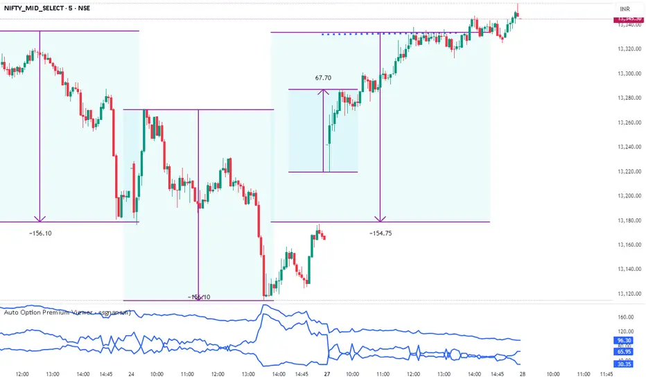
Auto Option Premium Viewer - csgnanamThat's a great idea! Clear documentation is key for anyone using your script. Since your selected code block is the dedicated space for documentation, I'll provide an explanation tailored for that context, covering the main features of your "Auto Option Premium Viewer" Canvas.
Here is a detailed explanation of the script's core functionality, which you can use in your Canvas description or in a separate document to help users understand it.
I will not edit the Canvas itself, as you requested a separate explanation.
***
### Explanation of the "Auto Option Premium Viewer" Canvas
This Pine Script indicator, **"Auto Option Premium Viewer — Full Auto Symbols (NSE format, improved detection),"** is designed to automatically fetch and display the At-The-Money (ATM) Call and Put option premiums for major NSE indices (NIFTY, BANKNIFTY, MIDCPNIFTY, FINNIFTY) in real-time.
The primary goal is to provide a single, clean chart overlay showing the total premium (CE + PE) for the options closest to the current spot price, without requiring the user to manually enter strike prices or steps.
#### 1. Automatic Index Detection (`AUTO` Functionality)
* **Smart Underlying Detection:** The script attempts to automatically detect the index you are currently viewing (`activeUnderlying`). For example, if your chart is set to `BANKNIFTY`, the indicator automatically focuses on Bank Nifty options.
* **Spot Ticker Mapping (The Fix):** To accurately find the spot price, the script uses a helper function (`getSpotTicker`) to map the common index name (like `FINNIFTY`) to the specific underlying ticker required by TradingView (like `CNXFINANCE` or `NIFTY_MID_SELECT`). This ensures accurate price referencing for ATM calculation across all indices.
#### 2. Fully Automated Strike & Step Sizing
* **No Base Strike Inputs:** The script dynamically calculates the At-The-Money (ATM) strike price based on the live spot price of the underlying index.
* **Fixed Strike Steps:** The strike increment (`current_step`) is hardcoded based on market conventions:
* **100:** NIFTY, BANKNIFTY, FINNIFTY
* **50:** MIDCPNIFTY
* **Dynamic ATM Calculation:** The live spot price is rounded to the nearest valid strike based on the correct step size. This automatically determines the central strike (B), along with the adjacent strikes (A and C) to ensure the fetched data is always relevant.
#### 3. Data Fetching and Display
* **Symbol Construction:** The `buildSymbol` function creates the exact NSE option symbol string (e.g., `NSE:NIFTY251028C26000`) required by the `request.security` function.
* **Option Price Request:** The script uses `request.security` to fetch the closing price (`close`) of the Call and Put options for the three relevant strikes (A, B, C) on a fixed **5-minute** timeframe (`dataTF`).
* **Plots:** The indicator displays three lines on the chart's lower panel:
1. **ATM CE Premium:** The price of the Call option closest to ATM.
2. **ATM PE Premium:** The price of the Put option closest to ATM.
3. **ATM Total Premium:** The sum of CE + PE, often used as a proxy for the minimum expected range or implied volatility.
This automatic setup makes the Canvas extremely efficient for quick analysis without needing to manually adjust any numerical settings.
Risk Leverage ToolRisk Leverage Tool – Calculate Position Size and Required Leverage
This script automatically calculates the optimal position size and the leverage needed based on the amount of capital you are willing to risk on a trade. It is designed for traders who want precise control over their risk management.
The script determines the distance between the entry and stop-loss price, calculates the maximum position size that fits within the defined risk, and derives the notional value of the trade. Based on the available margin, it then calculates the required leverage. It also displays the percentage of margin at risk if the stop-loss is hit.
All results are displayed in a table in the top-right corner of the chart. Additionally, a label appears at the entry price level showing the same data.
To use the tool, simply input your planned entry price, stop-loss price, the maximum risk amount in dollars, and the available margin in the settings menu. The script will update all values automatically in real time.
This tool works with any market where capital risk is expressed in absolute terms (such as USD), including futures, CFDs, and leveraged spot positions. For inverse contracts or percentage-based stops, manual adjustment is required.

Adaptive Trend SelectorThe Adaptive Trend Selector is a comprehensive trend-following tool designed to automatically identify the optimal moving average crossover strategy. It features adjustable parameters and an integrated backtester that delivers institutional-grade insights into the recommended strategy. The model continuously adapts to new data in real time by evaluating multiple moving average combinations, determining the best performing lengths, and presenting the backtest results in a clear, color-coded table that benchmarks performance against the buy-and-hold strategy.
At its core, the model systematically backtests a wide range of moving average combinations to identify the configuration that maximizes the selected optimization metric. Users can choose to optimize for absolute returns or risk-adjusted returns using the Sharpe, Sortino, or Calmar ratios. Alternatively, users can enable manual optimization to test custom fast and slow moving average lengths and view the corresponding backtest results. The label displays the Compounded Annual Growth Rate (CAGR) of the strategy, with the buy-and-hold CAGR in parentheses for comparison. The table presents the backtest results based on the fast and slow lengths displayed at the top:
Sharpe = CAGR per unit of standard deviation.
Sortino = CAGR per unit of downside deviation.
Calmar = CAGR relative to maximum drawdown.
Max DD = Largest peak-to-trough decline in value.
Beta (β) = Return sensitivity relative to buy-and-hold.
Alpha (α) = Excess annualized risk-adjusted returns.
Win Rate = Ratio of profitable trades to total trades.
Profit Factor = Total gross profit per unit of losses.
Expectancy = Average expected return per trade.
Trades/Year = Average number of trades per year.
This indicator is designed with flexibility in mind, enabling users to specify the start date of the backtesting period and the preferred moving average strategy. Supported strategies include the Exponential Moving Average (EMA), Simple Moving Average (SMA), Wilder’s Moving Average (RMA), Weighted Moving Average (WMA), and Volume-Weighted Moving Average (VWMA). To minimize overfitting, users can define constraints such as a minimum and maximum number of trades per year, as well as an optional optimization margin that prioritizes longer, more robust combinations by requiring shorter-length strategies to exceed this threshold. The table follows an intuitive color logic that enables quick performance comparison against buy-and-hold (B&H):
Sharpe = Green indicates better than B&H, while red indicates worse.
Sortino = Green indicates better than B&H, while red indicates worse.
Calmar = Green indicates better than B&H, while red indicates worse.
Max DD = Green indicates better than B&H, while red indicates worse.
Beta (β) = Green indicates better than B&H, while red indicates worse.
Alpha (α) = Green indicates above 0%, while red indicates below 0%.
Win Rate = Green indicates above 50%, while red indicates below 50%.
Profit Factor = Green indicates above 2, while red indicates below 1.
Expectancy = Green indicates above 0%, while red indicates below 0%.
In summary, the Adaptive Trend Selector is a powerful tool designed to help investors make data-driven decisions when selecting moving average crossover strategies. By optimizing for risk-adjusted returns, investors can confidently identify the best lengths using institutional-grade metrics. While results are based on the selected historical period, users should be mindful of potential overfitting, as past results may not persist under future market conditions. Since the model recalibrates to incorporate new data, the recommended lengths may evolve over time.

Market Screener - NarwingThis is a 20 cryptocurrency market screener, it's goal is to provide a broad view of the state of cryptocurrencies using 4 key components
1. ROC
2. Sharpe Ratio
3. Sortino Ratio
4. Omega Ratio
All these metrics are calculated twice with two different lengths, 7 day and 30 days
This allows for broad market screening instead of focusing on one particular asset
This tool is meant for research purposes only, never invest money you can't afford to lose

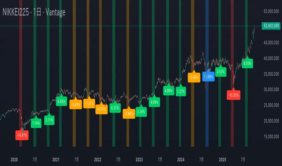
Mercury Retrograde — Daily boxes & bottom % (stable v6)水星逆行のアノマリー検証。対象は日経225の過去5年の値動き。水星逆行開始時の終値と水星逆行終了時の終値を比較。上昇率・下落率に応じて色分け。
Verification of Mercury Retrograde Anomalies. Subject: Nikkei 225 price movements over the past five years. Comparing closing prices at the start and end of Mercury retrograde periods. Color-coded based on percentage increase/decrease.