SMC + OB + FVG + Reversal + UT Bot + Hull Suite – by Fatich.id🎯 7 INTEGRATED SYSTEMS:
✓ Mxwll Suite (SMC + Auto Fibs + CHoCH/BOS)
✓ UT Bot (Trend Signals + Label Management)
✓ Hull Suite (Momentum Analysis)
✓ LuxAlgo FVG (Fair Value Gaps)
✓ LuxAlgo Order Blocks (Volume Pivots) ⭐ NEW
✓ Three Bar Reversal (Pattern Recognition)
✓ Reversal Signals (Momentum Count Style)
⚡ KEY FEATURES:
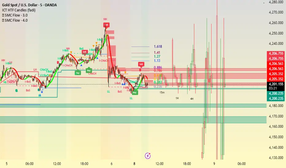
• Smart Money Structure (CHoCH/BOS/I-CHoCH/I-BoS)
• Auto Fibonacci (10 customizable levels)
• Order Block Detection (Auto mitigation)
• Fair Value Gap Tracking
• Session Highlights (NY/London/Asia)
• Volume Activity Dashboard
• Multi-Timeframe Support
• Clean Label Management
🎨 PERFECT FOR:
• Smart Money Concept Traders
• Order Flow & Liquidity Analysis
• Support/Resistance Trading
• Trend Following & Reversals
• Multi-Timeframe Analysis
💡 RECOMMENDED SETTINGS:
Clean Charts: OB Count 3, UT Signals 3, FVG 5
Detailed Analysis: OB Count 5-10, All Signals
Scalping: Low sensitivity, Hull 20-30
Swing Trading: High sensitivity, Hull 55-100
Pesquisar nos scripts por "纳斯达克期货cfd"
VIX/VXV Ratio (TitsNany)This script plots the VXV/VIX ratio, which compares medium-term volatility (90-day fear) to short-term volatility (30-day fear). When the ratio rises above key levels like 1.16 or 1.24, it signals that traders expect future stress, often preceding market pullbacks. When the ratio falls toward or below 1.0, short-term fear is spiking, which typically occurs during active selloffs or volatility events. In short, elevated readings warn of potential market drops ahead, while sharp declines in the ratio reflect panic already hitting the market.

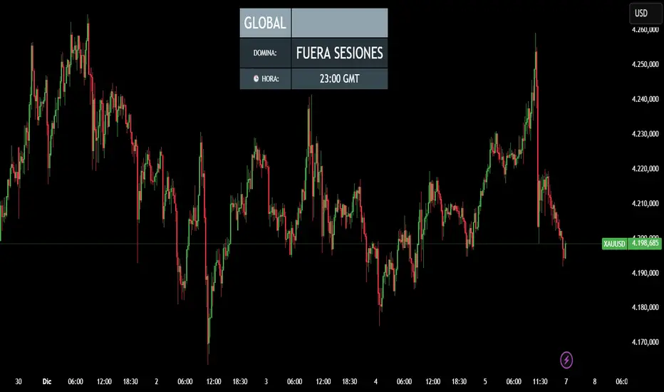
CRR - Reloj Sesiones & DominioIt uses simple rules:
00:00 – 07:00 → Tokyo / ASIA
07:00 – 12:00 → London / EUROPE
12:00 – 21:00 → New York / AMERICA
21:00 – 24:00 → Outside main sessions
Each session is assigned a color:
Tokyo → Blue
London → Yellow
New York → Green
Outside → Gray
2. Displays the current time in GMT format
Example: 14:32 GMT
3. Minimalist on-screen display (HUD)
The top center of the screen shows:
Continent (ASIA / EUROPE / AMERICA)
Which session is currently dominant (TOKYO / LONDON / NEW YORK)
The GMT time
All in a sleek table with dynamic colors based on the session.
🧠 In short:
A smart clock that tells you which session is dominant, which continent you're in, and what time it is in GMT, with a nice on-screen HUD.
CRR - Smart Money Concept (Pro Expo)Detects Market Structure
Finds pivots using Structure Period.
Marks:
HH (Higher High), LH (Lower High)
HL (Higher Low), LL (Lower Low)
Can draw swing points at highs and lows.
Detects Structure Breaks
When the price breaks the last swing:
BMS (Break of Market Structure) → continuation.
ChoCH (Change of Character) → possible trend reversal.
Differentiates between strong and weak movements using filters.
Confirmation Filters (optional)
If useFilters is enabled, to validate breaks it uses:
ATR → the close must cross the level by at least atrMult * ATR.
Volume → the current volume must be > volMult * average volume.
MACD → in the direction of the break.
Gap → avoids some false breakouts due to gaps.
Internal Fibonacci Retracement of the Last Range
Draws 38.2%, 50%, and 61.8% between the last swing high and swing low.
Serves as internal bounce/discount/premium zones.
Current Range
Draws two dashed yellow lines:
Top: last swing High.
Bottom: last swing Low.
Shows you the range where the price is currently trading.
🧩 In short:
This script draws complete SMC structure (HH/HL/LL/LH + BMS + ChoCH), validates breakouts with ATR, volume, MACD, and gaps, and also displays internal Fibonacci retracement + current range, all automatically and cleanly.

CRR - Candlestick Pattern PRO + HUD Analyze each candlestick in detail:
Calculate:
Body size (bodyPct)
Upper wick (upPct)
Lower wick (lowPct)
Total range of the candlestick.
Detect important candlestick patterns:
Hammer
Inverted Hammer
Doji
Strong Bullish Candle
Strong Bearish Candle
Bullish Engulfing
Bearish Engulfing
Optional: Use the EMA 200 as a trend filter
If useTrend is enabled:
Above the EMA200 → “Trend: Bullish”
Below the EMA200 → “Trend: Bearish”
In between → “Trend: Sideways”
Color and mark the candlesticks:
If useColorCandles is active:
Color the candlestick according to the detected pattern.
If showLabels is active:
Write the name of the pattern above or below the candlestick (Hammer, Doji, Engulfing, etc.).
HUD in the upper right corner:
Name of the current pattern (or “None”).
Bias: bullish reversal, bearish reversal, momentum, indecision, etc.
EMA200 status (trend).
Candlestick body and wick percentages.
Pattern “Strength”: Low / Medium / High.
🧠 In simple terms:
This is a professional candlestick pattern radar, with colors, labels, and a HUD that tells you which pattern is present, what the trend is, and how strong the signal is.

CRR Auto 50% Candle A line at 50% of the candle
If a candle is larger than the minimum size you define (minSizePerc),
then calculate the midpoint of the candle (midLevel) and draw a horizontal line:
From the current candle to 44 bars to the right (or the number you choose).
Green if the candle is bullish, red if it is bearish.
2. Signal arrows
If it's a large bullish candle → green arrow pointing up with the text “50”.
If it's a large bearish candle → red arrow pointing down with the text “50”.
3. What is it for?
It marks the 50% level of important candles, which is often:
A mitigation zone.
A level where the price usually returns before continuing.
An institutional equilibrium point.
🧠 In simple terms:
It detects strong candles, draws their 50% level into the future, and marks them with arrows indicating whether they are bullish or bearish. Ideal for SMC.

CRR - Gaps + FVG PROUses ATR
Calculates ATR and, with minAtrR, defines the minimum size for a GAP or FVG to be considered valid.
Detects and draws GAPs between candles
Bullish GAP: low > high (upward gap).
Bearish GAP: high < low (downward gap).
Draws a box between the previous and current candle.
The box can be extended to the right.
If the price fills the gap (touches it), and autoDelGap is active, the box is deleted (mitigated).
Only saves and manages the last bullish GAP and the last bearish GAP.
Detects and draws FVG (3-candle imbalance)
Bullish FVG: high < low → liquidity gap below.
Bearish FVG: low > high → liquidity gap above.
Draws a box for the gap between candle 2 and the current candle.
The box can be extended to the right.
When the price completely enters the zone (fills it), if autoDelFVG is active, the box is deleted (mitigated).
Only monitors the last bullish FVG and the last bearish FVG.
🧠 In simple terms:
It marks GAPs and FVG imbalance zones on the chart, extends them to the right, and automatically deletes them when the price mitigates/fills those zones.

CRR Birgua HUD (HH-HL / LL-LH)CRR Birgua HUD (HH-HL / LL-LH) essentially does three things:
Detects price structure using pivots.
Marks highs as:
HH = Higher High
LH = Lower High
Marks lows as:
HL = Higher Low
LL = Lower Low
It uses a pivot length (pivotLen, default 3) to find these turning points.
Measures the “Birgua” (impulse correction).
In a downtrend:
When an LH appears, it measures how much the retracement rose from the last low to that LH.
In an uptrend:
When an HL appears, it measures how much the retracement fell from the last high to that HL.
It calculates two things:
% correction (birgua_lastPct)
ATR multiples (birgua_lastAtrMult)
It only considers it “valid” if:
% correction ≥ birgua_minBirguaPc (e.g., 25%)
ATR multiple ≥ birgua_minAtrMult (e.g., 0.5)
If valid: it labels it with OK; otherwise: SMALL.
Creates a HUD and a “Birgua Score.”
Calculates a Birgua Score (0–100):
Starts at 50.
If the last Birgua was at an HL (strong bullish), it increases from 50.
If it was at an LH (strong bearish), it decreases from 50.
It can draw a line at the bottom with this score if you enable Show Birgua Score.
At the top of the screen, it displays a HUD with:
Direction: BULL (HL), BEAR (LH), or NEUTRAL.
B: XX.X% (Birgua percentage).
ATR: X.XX (ATR multiples).
Strength: Strong / Weak / N/A based on the minimums you defined.
🧠 Quick Use:
HL + strong Birgua → probable bullish continuation.
LH + strong Birgua → probable bearish continuation.
The HUD summarizes whether the last correction was strong or weak and on which side (bull or bear).

RiskCraft - Advanced Risk Management SystemRiskCraft – Risk Intelligence Dashboard
Trade like you actually respect risk
"I know the setup looks good… but how much am I actually risking right now?"
RiskCraft is an open-source Pine Script v6 indicator that keeps risk transparent directly on the chart. It is not a signal generator; it is a risk desk that calculates size, frames volatility, and reminds you when your behaviour drifts away from the plan.
Core utilities
Calculates professional-style position sizing in real time.
Reads volatility and market regime before position size is confirmed.
Adjusts risk based on the trader’s emotional state and confidence inputs.
Maps session risk across Asian, London, and New York hours.
Draws exactly one stop line and one target line in the preferred direction.
Provides rotating education tips plus contextual warnings when risk escalates.
It is intentionally conservative and keeps you in the game long enough for any separate entry logic to matter.
---
Chart layout checklist
Use a clean chart on a liquid symbol (e.g., AMEX:SPY or major FX pairs).
Main RiskCraft dashboard placed on the right edge.
Session Risk box on the left with UTC time visible.
Floating risk badge above price.
Stop/target guide lines enabled.
Education panel visible in the bottom-right corner.
---
1. On-chart components
Right-side dashboard : account risk %, position size/value, stop, target, risk/reward, regime, trend strength, emotional state, behavioural score, correlation, and preferred trade direction.
Session Risk box : highlights active session (Asian, London, NY), current UTC time, and risk label (High/Med/Low) per session.
Floating risk badge : keeps actual account risk percent visible with colour-coded wording from Ultra Cautious to Very Aggressive.
Stop/target lines : exactly one dashed stop and one dashed target aligned with the preferred bias.
Education panel : rotates core principles and AI-style warnings tied to volatility, risk %, and behaviour flags.
---
2. Volatility engine – ATR with context 📈
atr = ta.atr(atrLength)
atrPercent = (atr / close) * 100
atrSMA = ta.sma(atr, atrLength)
volatilityRatio = atr / atrSMA
isHighVol = volatilityRatio > volThreshold
ATR vs ATR SMA shows how wild price is relative to recent history.
Volatility ratio above the threshold flips isHighVol , which immediately trims risk.
An ATR percentile rank over the last 100 bars indicates calm versus chaotic regimes.
Daily ATR sampling via request.security() gives higher time-frame context for intraday sessions.
When volatility spikes the script dials position size down automatically instead of cheering for maximum exposure.
---
3. Market regime radar – Danger or Drift 🌊
ema20 = ta.ema(close, 20)
ema50 = ta.ema(close, 50)
ema200 = ta.ema(close, 200)
trendScore = (close > ema20 ? 1 : -1) +
(ema20 > ema50 ? 1 : -1) +
(ema50 > ema200 ? 1 : -1)
= ta.dmi(14, 14)
Regimes covered:
Danger : high volatility with weak trend.
Volatile : volatility elevated but structure still directional.
Choppy : low ADX and noisy action.
Trending : directional flows without extreme volatility.
Mixed : anything between.
Each regime maps to a 1–10 risk score and a multiplier that feeds the final position size. Danger and Choppy clamp size; Trending restores normal risk.
---
4. Behaviour engine – trader inputs matter 🧠
You provide:
Emotional state : Confident, Neutral, FOMO, Revenge, Fearful.
Confidence : slider from 1 to 10.
Toggle for behavioural adjustment on/off.
Behind the scenes:
Each state triggers an emotional multiplier .
Confidence produces a confidence multiplier .
Combined they form behavioralFactor and a 0–100 Behavioural Score .
High-risk emotions or low conviction clamp the final risk. Calm inputs allow normal size. The dashboard prints both fields to keep accountability on-screen.
---
5. Correlation guardrail – avoid stacking identical risk 📊
Optional correlation mode compares the active symbol to a reference (default AMEX:SPY ):
corrClose = request.security(correlationSymbol, timeframe.period, close)
priceReturn = ta.change(close) / close
corrReturn = ta.change(corrClose) / corrClose
correlation = calcCorrelation()
Absolute correlation above the threshold applies a correlation multiplier (< 1) to reduce size.
Dashboard row shows the live correlation and reference ticker.
When disabled, the row simply echoes the current symbol, keeping the table readable.
---
6. Position sizing engine – heart of the script 💰
baseRiskAmount = accountSize * (baseRiskPercent / 100)
adjustedRisk = baseRiskAmount * behavioralFactor *
regimeAdjustment * volAdjustment *
correlationAdjustment
finalRiskAmount = math.min(adjustedRisk,
accountSize * (maxRiskCap / 100))
stopDistance = atr * atrStopMultiplier
takeProfit = atr * atrTargetMultiplier
positionSize = stopDistance > 0 ? finalRiskAmount / stopDistance : 0
positionValue = positionSize * close
Outputs shown on the dashboard:
Position size in units and value in currency.
Actual risk % back on account after adjustments.
Risk/Reward derived from ATR-based stop and target.
---
7. Intelligent trade direction – bias without signals 🎯
Direction score ingredients:
EMA stack alignment.
Price versus EMA20.
RSI momentum relative to 50.
MACD line vs signal.
Directional Movement (DI+/DI–).
The resulting Trade Direction row prints LONG, SHORT, or NEUTRAL. No orders are generated—this is guidance so you only risk capital when the structure supports it.
---
8. Stop/target guide lines – two lines only ✂️
if showStopLines
if preferLong
// long stop below, target above
else if preferShort
// short stop above, target below
Lines refresh each bar to keep clutter low.
When the direction score is neutral, no lines appear.
Use them as visual anchors, not auto-orders.
---
9. Session Risk map – global volatility clock 🌍
Tracks Asian, London, and New York windows via UTC.
Computes average ATR per session versus global ATR SMA.
Labels each session High/Med/Low and colours the cells accordingly.
Top row shows the active session plus current UTC time so you always know the regime you are trading.
One glance tells you whether you are trading quiet drift or the part of the day that hunts stops.
---
10. Floating risk badge – honesty above price 🪪
Text ranges from Ultra Cautious through Very Aggressive.
Colour matches the risk palette inputs (High/Med/Low).
Updates on the last bar only, keeping historical clutter off the chart.
Account risk becomes impossible to ignore while you stare at price.
---
11. Education engine & warnings 📚
Rotates evergreen principles (risk 1–2%, journal trades, respect plan).
Triggers contextual warnings when volatility and risk % conflict.
Flags when emotional state = FOMO or Revenge.
Highlights sub-standard risk/reward setups.
When multiple danger flags stack, an AI-style warning overrides the tip text so you can course-correct before capital is exposed.
---
12. Alerts – hard guard rails 🚨
Excessive Risk Alert : actual risk % crosses custom threshold.
High Volatility Alert : ATR behaviour signals danger regime.
Emotional State Warning : FOMO or Revenge selected.
Poor Risk/Reward Alert : risk/reward drops below your standard.
All alerts reinforce discipline; none suggest entries or exits.
---
13. Multi-market behaviour 🕒
Intraday (1m–1h): session box and badge react quickly; ideal for scalpers needing constant risk context.
Higher time frames (1D–1W): dashboard shifts slowly, supporting swing planning.
Asset classes confirmed in validation: crypto majors, large-cap equities, indices, major FX pairs, and liquid commodities.
Risk logic is price-based, so it adapts across markets without bespoke tuning.
15. Key inputs & recommended defaults
Account Size : 10,000 (modify to match actual account; min 100).
Base Risk % : 1.0 with a Maximum Risk Cap of 2.5%.
ATR Period : 14, Stop Multiplier 2.0, Target Multiplier 3.0.
High Vol Threshold : 1.5 for ATR ratio.
Behavioural Adjustment : enabled by default; disable for fixed risk.
Correlation Check : optional; default symbol AMEX:SPY , threshold 0.7.
Display toggles : main dashboard, risk badge, session map, education panel, and stop lines can be individually disabled to reduce clutter.
16. Usage notes & limits
Indicator mode only; no automated entries or exits.
Trade history panel intentionally disabled (requires strategy context).
Correlation analysis depends on additional data requests and may lag slightly on illiquid symbols.
Session timing uses UTC; adjust expectations if you trade localized instruments.
HTF ATR sampling uses daily data, so bar replay on lower charts may show brief data gaps while HTF loads.
What does everyone think RISK really means?

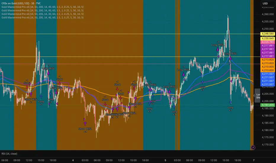
Gold Mastermind Pro v6EMA50 / EMA200 trend (UP / DOWN / FLAT)
VWAP + ATR + RSI filters for entries
ATR-based stop & 2R target
Risk-based position sizing with max 5 contracts
Cooldown in bars after each entry
Long arrows = baby blue, Short arrows = bright orange
Simple dashboard label showing trend, qty, stop & target
BörsenampelThe “VIX/VVIX Traffic Light (Panel)” visualizes the current market risk as a simple traffic light (green / yellow / red) in the top‑right corner of the chart, based on the VIX and VVIX indices.
How it works
The script loads the VIX and VVIX indices via request.security and evaluates them using user‑defined threshold levels.
Green: VIX and VVIX are below their “green” thresholds, indicating a calm market environment and more risk‑on conditions.
Red: VIX and VVIX are above their “red” thresholds, signalling stress or panic phases with elevated risk.
Yellow: Transitional zone between the two extremes.
Chart display
A small panel with the title “Traffic Light” is shown in the upper‑right corner of the chart.
The central box displays the current status (“GREEN”, “YELLOW”, “RED”) with a matching background color.
Optionally, the current VIX and VVIX values are shown below the status.
Inputs and usage
Symbols for VIX and VVIX can be freely chosen (default: CBOE:VIX and CBOE:VVIX).
The green/red thresholds can be adjusted to fit personal volatility rules or different markets.

HTF Candles & Levels Visualizer - SRHTF Candles & Levels Visualizer is a clean higher‑timeframe visualization tool designed to complement any trading strategy by giving clear context of larger‑TF structure directly on your current chart. It plots the previous high and low for up to three user‑selectable timeframes, and draws them as extended levels with optional labels, making it easy to see where current price sits relative to key higher‑timeframe zones.
The script also renders compact proxy candles for each selected timeframe to the right of current price, so you can visually track HTF candle development without switching charts. Each HTF slot has independent settings: timeframe, color, number of displayed candles, and visibility toggles, along with global controls for line style, label size, candle spacing, and colors.
This tool does not generate trading signals; it focuses purely on multi‑timeframe context and market structure visualization to support your own entries, exits, and risk management.

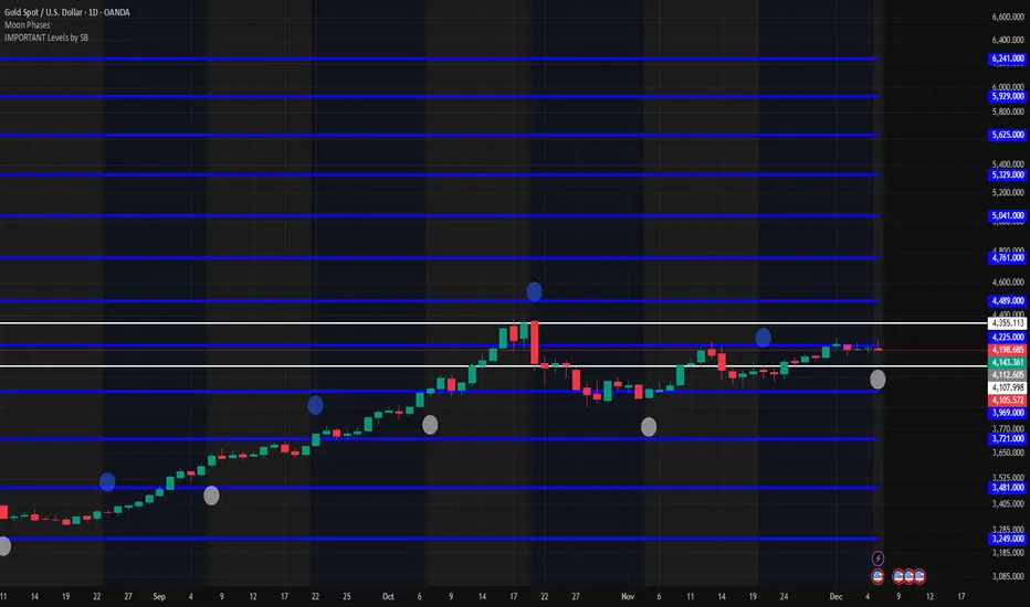
IMPORTANT Levels by SBImportant levels by SB based on gann levels.One can plot these levels once on the chart and can work on these levels .When ever market market come at any of these levels .User can wait for the price action and accordingly user can get inside the trade
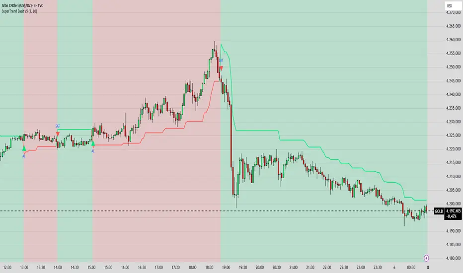
SuperTrend Basit BY İNCEBACAK//@version=5
indicator("SuperTrend Basit v5", overlay=true)
// === Girdi ayarları ===
factor = input.float(3.0, "ATR Katsayısı")
atrPeriod = input.int(10, "ATR Periyodu")
// === Hesaplamalar ===
= ta.supertrend(factor, atrPeriod)
// === Çizim ===
bodyColor = direction == 1 ? color.new(color.lime, 0) : color.new(color.red, 0)
bgcolor(direction == 1 ? color.new(color.lime, 85) : color.new(color.red, 85))
plot(supertrend, color=bodyColor, linewidth=2, title="SuperTrend Çizgisi")
// === Al/Sat sinyali ===
buySignal = ta.crossover(close, supertrend)
sellSignal = ta.crossunder(close, supertrend)
plotshape(buySignal, title="AL", location=location.belowbar, color=color.lime, style=shape.triangleup, size=size.small, text="AL")
plotshape(sellSignal, title="SAT", location=location.abovebar, color=color.red, style=shape.triangledown, size=size.small, text="SAT")
EMA Color Cross + Trend Bars + Background BY İNCEBACAK//@version=5
indicator("EMA Color Cross + Trend Bars + Background", overlay=true)
// EMA ayarları
shortEMA = input.int(9, "Short EMA")
longEMA = input.int(21, "Long EMA")
emaShort = ta.ema(close, shortEMA)
emaLong = ta.ema(close, longEMA)
// Trend yönü
trendUp = emaShort > emaLong
trendDown = emaShort < emaLong
// EMA çizgileri trend yönüne göre renk değiştirsin
plot(emaShort, color=trendUp ? color.green : color.red, linewidth=4)
plot(emaLong, color=trendUp ? color.green : color.red, linewidth=4)
// Barları trend yönüne göre renklendir
barcolor(trendUp ? color.green : color.red)
// Arka plan trend yönüne göre
bgcolor(trendUp ? color.new(color.green, 85) : color.new(color.red, 85))
// Kesişim sinyalleri ve oklar
longSignal = ta.crossover(emaShort, emaLong)
shortSignal = ta.crossunder(emaShort, emaLong)
plotshape(longSignal, title="Long", style=shape.triangleup, location=location.belowbar, color=color.green, size=size.large)
plotshape(shortSignal, title="Short", style=shape.triangledown, location=location.abovebar, color=color.red, size=size.large)

A.P.E Quarter PtsThis indicator draws a set of straight horizontal price levels on your chart.
Each line is spaced evenly apart at a distance you choose — these are called quarter-points.
As price moves, the grid of lines stays centered around the current price, so you always see the nearest support and resistance levels. The lines above price show possible resistance, and the lines below price show possible support.
Some of the lines can be drawn thicker or in a stronger color to show more important levels.
Overall, the indicator gives you a clean, easy-to-read structure of evenly spaced levels that help you see where price may react, stall, bounce, or reverse.
Sree Daily RangeVery simple indicator to draw support and resistance levels given the price. It creates a given lebel at the level

Session Candle Hunter 🎯🎯 Session Candle Hunter — Precision Session Mapping for Smart Traders
Session Candle Hunter 🎯 is a powerful tool designed to help traders identify and track the most important session candle of the trading day—commonly used for liquidity grabs, range mapping, volatility zones, and breakout anticipation.
Whether you trade NY session, London session, or custom time windows, this indicator automatically detects the candle at your chosen New York Time, extracts its high and low, and visually projects these levels into the current session.
🔍 What This Indicator Does
1️⃣ Detects the Key Session Candle
You select:
Hour of the candle (NY Time)
Candle timeframe (1H, 4H, 15m, etc.)
The script automatically:
Identifies the candle when it forms
Stores its High/Low
Prepares levels for visual projection
🎨 2️⃣ Highlights the Candle Zone
Optionally displays a colored zone (box) between the candle’s high and low:
Helps visualize the liquidity pocket
Useful for session traps, expansion moves, and fair value interpretation
You can choose:
Zone color
Whether to show it or not
Whether it should update only for the latest candle
📈 3️⃣ Draws High/Low Lines With Extensions
High and Low of the detected candle can be plotted as:
Standard lines
Or infinitely extended to the right
Great for identifying:
Breakouts
Retests
Range boundaries
Session expansion models
Optional labels display exact price levels.
🕐 4️⃣ Delayed Display Logic
The indicator only shows levels after a user-defined NY time.
For example:
Show lines only after 8:30 NY — perfect for traders who want pre-session levels hidden until relevant.
🔄 5️⃣ “Show Only Last” Mode
A clean, uncluttered mode that removes all historical drawings and only displays:
The latest zone
The latest high/low lines
Latest labels
Perfect for minimal-chart traders.
⚠️ 6️⃣ Alert System
Receive alerts the moment the targeted session candle forms:
“New Candle Detected”
🧾 7️⃣ Info Panel (Top-Left Corner)
Displays:
Target session hour
Display start time
Candle timeframe
Stored High/Low
Indicator name
Always visible and automatically updates.
⭐ Why Traders Love This Tool
✔ Helps visualize major liquidity zones
✔ Works on all markets & timeframes
✔ Perfect for ICT-style session concepts
✔ Helps anticipate session expansion
✔ Automates manual level drawing
✔ Clean visuals with optional minimal mode

PDH/PDL Breakout Pip MeasurerThis indicator measures the maximum distance (in pips or points) that price travels after breaking through the Previous Day's High (PDH) or Previous Day's Low (PDL), before returning to a user-defined stop loss level. It provides statistical insights into breakout behavior for systematic trading analysis.
Input Parameters
Pip Multiplier: Adjust for different instruments (0.0001 for Forex, 1 for indices)
Bull Stop Loss Pips: Distance below PDH to define stop loss for bull breakouts
Bear Stop Loss Pips: Distance above PDL to define stop loss for bear breakouts
Show Table: Toggle statistics table display
Show Labels: Display pip measurements on chart
Show Levels: Toggle PDH/PDL level visibility
Statistics Table Includes
Total breakout counts (Bull/Bear/Combined)
Average pip distance per breakout type
Minimum and maximum recorded moves
Currently active breakout measurement

Multi-Condition Alert System d//@version=5
indicator("Multi-Condition Alert System", shorttitle="MC Alert", overlay=false)
// Timeframe check - Set to 10 minutes
isCorrectTF = timeframe.isintraday and timeframe.multiplier == 10
// EMA Calculations
ema9 = ta.ema(close, 9)
ema21 = ta.ema(close, 21)
ema50 = ta.ema(close, 50)
// MACD Calculations
= ta.macd(close, 12, 26, 9)
// RSI Calculations
rsiValue = ta.rsi(close, 14)
// Define RSI levels (you can adjust these based on your violet/yellow lines)
// Assuming violet is above 50 and yellow is below 50
rsiVioletLevel = 50 // Adjust based on your actual levels
rsiYellowLevel = 50 // Adjust based on your actual levels
// Conditions
emaCondition = ema9 > ema21 and ema9 > ema50
macdCondition = macdLine > signalLine
rsiCondition = rsiValue > rsiVioletLevel and rsiValue > rsiYellowLevel
// All conditions must be true
buySignal = emaCondition and macdCondition and rsiCondition and isCorrectTF
// Plotting for visualization
plot(ema9, color=color.blue, title="EMA 9")
plot(ema21, color=color.orange, title="EMA 21")
plot(ema50, color=color.red, title="EMA 50")
plot(macdLine, color=color.blue, title="MACD Line", style=plot.style_line)
plot(signalLine, color=color.orange, title="Signal Line", style=plot.style_line)
hline(rsiVioletLevel, "RSI Violet Level", color=color.purple)
hline(rsiYellowLevel, "RSI Yellow Level", color=color.yellow)
plot(rsiValue, color=color.white, title="RSI")
// Plot buy signals
plotshape(buySignal ? 1 : na, title="Buy Signal", location=location.bottom,
color=color.green, style=shape.triangleup, size=size.small)
// Alert condition
if buySignal
alert("BUY SIGNAL: EMA 9 > EMA 21 & 50, MACD blue > orange, RSI above levels", alert.freq_once_per_bar)
// Table display
var table signalTable = table.new(position.top_right, 1, 5, bgcolor=color.black,
border_width=1)
if barstate.islast
table.cell(signalTable, 0, 0, "10min TF Check:",
text_color=isCorrectTF ? color.green : color.red)
table.cell(signalTable, 0, 1, "EMA 9 > 21 & 50:",
text_color=emaCondition ? color.green : color.red)
table.cell(signalTable, 0, 2, "MACD Blue > Orange:",
text_color=macdCondition ? color.green : color.red)
table.cell(signalTable, 0, 3, "RSI Condition:",
text_color=rsiCondition ? color.green : color.red)
table.cell(signalTable, 0, 4, "BUY SIGNAL:",
text_color=buySignal ? color.green : color.red)

TRK19121. Add the Script to TradingView
• Copy the Pine Script code I gave you.
• In TradingView, open the Pine Editor (bottom of the screen).
• Paste the code and click Add to Chart.
2. What You’ll See
• On your chart, Fibonacci retracement levels will be drawn automatically between the highest and lowest points in the last lookback bars (default = 100).
• Bollinger Bands (20-period SMA with ±2 standard deviations) will also appear.
• On the top-right corner, a table will show all Fibonacci levels (0%, 23.6%, 38.2%, 50%, 61.8%, 78.6%, 100%) with their exact price values.
• All text in the table is black for clarity.
3. How It Updates
• Every new candle, the script recalculates the highest and lowest points in the lookback window.
• The Fibonacci levels and the table update automatically.
• You don’t need to manually redraw fibo lines — the script does it for you.
4. How to Interpret
• Fibonacci levels act as potential support/resistance zones.
• Bollinger Bands show volatility and overbought/oversold conditions.
• If price is near a Fibonacci level and touches the Bollinger upper/lower band, that’s a strong signal area.
• Example:
• Price near 61.8% fibo + lower band → possible bounce (long).
• Price near 38.2% fibo + upper band → possible rejection (short).
5. Customization
• You can change the value (default 100 bars) to adjust how far back the script finds the high/low.
• You can change Bollinger settings (, ) to fit your trading style.
• The table always shows the current fibo levels clearly, so you don’t need to measure them manually.

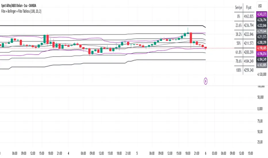
Fibo + Bollinger + Fibo Tablosu1. Add the Script to TradingView
• Copy the Pine Script code I gave you.
• In TradingView, open the Pine Editor (bottom of the screen).
• Paste the code and click Add to Chart.
2. What You’ll See
• On your chart, Fibonacci retracement levels will be drawn automatically between the highest and lowest points in the last lookback bars (default = 100).
• Bollinger Bands (20-period SMA with ±2 standard deviations) will also appear.
• On the top-right corner, a table will show all Fibonacci levels (0%, 23.6%, 38.2%, 50%, 61.8%, 78.6%, 100%) with their exact price values.
• All text in the table is black for clarity.
3. How It Updates
• Every new candle, the script recalculates the highest and lowest points in the lookback window.
• The Fibonacci levels and the table update automatically.
• You don’t need to manually redraw fibo lines — the script does it for you.
4. How to Interpret
• Fibonacci levels act as potential support/resistance zones.
• Bollinger Bands show volatility and overbought/oversold conditions.
• If price is near a Fibonacci level and touches the Bollinger upper/lower band, that’s a strong signal area.
• Example:
• Price near 61.8% fibo + lower band → possible bounce (long).
• Price near 38.2% fibo + upper band → possible rejection (short).
5. Customization
• You can change the value (default 100 bars) to adjust how far back the script finds the high/low.
• You can change Bollinger settings (, ) to fit your trading style.
• The table always shows the current fibo levels clearly, so you don’t need to measure them manually.
Fabio-Style Order Flow SystemFabio-Style Order Flow System — LVN • Delta • Big Trades • FVG • Order Blocks • Liquidity • Volume Profile
This indicator brings together all major components of Fabio Valentino’s order-flow strategy in one unified tool. It visualizes where smart money is active, where inefficiencies form, and where price is likely to react next.
🔍 FEATURES
1. Order Flow & Delta
Smoothed delta to show true market imbalance
Background color shifts to bullish/bearish delta dominance
Alerts for delta spikes & order-flow flips
2. Big Trade Detection
Highlights Big Buy and Big Sell prints (relative to average volume)
Helps identify institutional aggression on both sides
3. Low Volume Nodes (LVNs)
Automatically detects low-volume zones
Flags retests of LVNs for high-probability reactions
Uses dynamic volume thresholds for accuracy
4. Volume Profile (Lightweight)
Bucket-based intrabar profile across user-defined lookback
Highlights volume distribution without heavy TradingView CPU load
Auto-scales bucket density & transparency
5. Fair Value Gaps (FVGs)
Detects both bullish & bearish three-bar imbalances
Marks gaps visually using colored boxes
Updates dynamically with a user-set lookback
6. Order Blocks (OBs)
Identifies valid displacement bars and their origin OB
Plots clean, minimalist rectangles around key OB zones
Uses ATR-based impulse filtering
7. Liquidity Grabs
Detects wick-based liquidity sweeps
Highlights both equal high/low and stop-run type wicks
Useful for spotting reversals & trap setups
8. Strategy Dashboard
Shows real-time order flow state
Displays delta strength, big trades, LVNs, and last directional impulse
Auto-positions in all corners
🎯 PERFECT FOR
Traders who use:
Order Flow
Smart Money Concepts (SMC)
ICT / FVG / Liquidity models
Market Structure + Volume
Fabio Valentino-style analysis
⚙️ PERFORMANCE
All elements optimized
Uses automatic box-clearing to avoid array overload
Works on all timeframes & markets (crypto, FX, indices, stocks)
