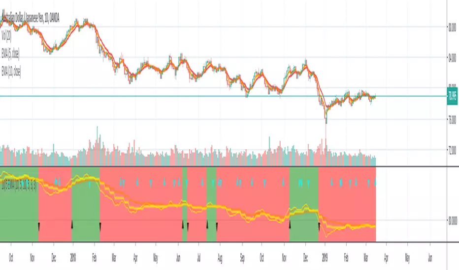
10/5 Weekly/Daily EMAs with ConfirmationsPlots Daily and Weekly 10 & 5 EMAs (but fully customizable to your own).
In addition to plotting the EMAs it color coordinates trend bias and has cross confirmation signals.
Philosophy and how to read:
I use this indicator when trading strictly on the daily timeframe. I have not tested it on other timeframes.
In my trade system I start with both the monthly and weekly charts to define overall bias.
Here’s the general rule of thumb.
10 EMA is direction (bias) and 5 EMA is price.
If 5EMA is below 10EMA there is a bear bias. If 5EMA is above 10EMA there is a bull bias.
This indicator will plot both the daily and weekly 10 & 5 EMAs.
It will also color code the background based on how these EMAs relate to each other.
Light red typically is just the daily is confirmed bear (typically because it could be either or)
Dark red, both daily and weekly in confirmed bear.
Light green, typically just daily is confirmed bull (typically because it could be either or)
Dark green, both daily and weekly in confirmed bull.
In addition to background highlight there is confirmation crosses.
The daily confirmation cross is default yellow triangle.
Down triangle is 5 crossing the 10 downward.
Up triangle is the 5 crossing the 10 upward.
The weekly confirmation is the same only is aqua color.
Generally, on a color change you want to see one or both confirmation in the direction of the bias change.
If you only want to plot the daily bias in the options unclick the setting: Include Weekly Background Plotting. Unclicking this will remove the background coloring for the weekly bias. This might be helpful if you only want to see the strength of what the weekly timeframe is telling you.
Also, I’m primarily a trend trader but I also do have a reversal system I trade with lower R:R parameters.
A good reversal confirmation signal I’ve noticed is the instrument that you are trading should go through a cycle of light color to dark color.
You could also create alerts with this indicator based on just signals. When the signal fires the value will be 1.
Future Updates:
I want to find some way to correlate the distance between these EMAs to enhance the signal. Also to include a velocity component. Plus a few more things.
If you like this indicator please like and leave a comment down below.
Pesquisar nos scripts por "weekly"
Rounded Weekly Pivot (by ChartArt)Trade with the trend. This is an overlay indicator which shows the weekly pivot (rounded) either as line or circle drawing, select-able by the user. The width of the pivot line (or circle) overlay is also adjustable.
In addition the bars can be colored by the trend, depending if the close price is above or below both the weekly and monthly pivots. If the close price is neither above or below both the weekly and monthly pivot prices the trend color is neutral blue.
The weekly pivot indicator with the optional setting that the pivot price is drawn as circles instead of a line:
And here with the pivot drawing disabled, showing only the pivot bar trend color

Monthly Weekly Daily ATR Calculation A weekly options trading script showing optimal levels using daily and weekly ATR ranges and stop loss. (Open ± ATR)

TQ Gold / DXY (Weekly Macro)What this indicator does
This indicator tracks the relative performance of gold versus the U.S. dollar using the Gold/DXY ratio. It helps determine whether gold’s strength is real (monetary) or merely nominal.
Why Gold/DXY matters
Gold rising with a rising dollar is not a strong signal.
Gold rising against a weakening dollar signals monetary outperformance.
This ratio filters out dollar noise and focuses on true purchasing-power strength.
How it works
The indicator calculates Gold ÷ DXY using weekly data.
A 30-week SMA is applied to the ratio.
Regimes are defined as:
Bull: Ratio above a rising 30-week SMA (gold beating the dollar)
Bear: Ratio below a falling 30-week SMA
Neutral: Transition or range-bound periods
A clear on-chart label shows the current regime.
How to use it
Use after confirming Gold Trend is Bull.
When Gold/DXY is Bull, gold has a true monetary tailwind.
When Gold/DXY is Bear, gold rallies are often fragile or dollar-driven.
Neutral readings signal consolidation or regime change.
Best timeframe
Designed for weekly charts and macro analysis.
Not intended for short-term trading signals.

Evil's Weekly Momentum ScoreA momentum scoring system that ranks any ticker on a 0-100 scale based on multi-timeframe relative strength. Built for weekly rotation decisions - example, I like to check this every Tuesday when it's nice and quiet, then rotate into the 3 strongest names.
Works on sector ETFs (XLK, XLF, XLE, etc.), mega caps (AAPL, NVDA, MSFT, GOOGL), or any liquid ticker watchlist you'd like to rank. Sector ETFs are probably more stable, mega caps have higher volatility; build your watchlist according to your comfort threshold.
How It Works
The indicator combines four components into a single score:
13-Week Momentum (40%) - Quarterly relative strength vs SPY. Where are institutions rotating?
4-Week Momentum (25%) - Monthly trend confirmation. Is the medium-term move intact?
2-Week Acceleration (20%) - Is momentum speeding up or fading? Catches turns early.
10-Week MA (15%) - Trend filter. Price above or below the 10-week moving average.
Each component is measured relative to SPY by default, so you're seeing true outperformance - not just whether something is going up, but whether it's beating the market.
Signal Levels
90+ : ON FIRE 🔥
80-89 : STRONG BUY
70-79 : BUY
50-69 : HOLD
Below 50 : AVOID
In my opinion, cash is a valid position so I don't rotate into scores below 80.
Features
Toggle each component on/off — weights auto-redistribute
Compare to SPY or use absolute momentum
Dashboard overlay sits on your price chart
Position dashboard anywhere: top/bottom, left/right
Alerts for signal level crossings
How To Use It
Add to your watchlist and flip through charts. Compare scores across sectors or mega caps. Rotate into the highest-scoring names, trim or avoid the lowest. Green values in the dashboard = outperforming. Red = underperforming. Simple.
Best Used For
Weekly sector rotation
Mega cap relative strength ranking
Momentum-based stock selection
Identifying leadership shifts before they're obvious

[CT] Daily & Weekly Percentage Price Oscillator Daily & Weekly Percentage Price Oscillator, or D&W PPO, is a dual-speed momentum oscillator that blends a slower “weekly-style” percentage oscillator with a faster “daily-style” percentage oscillator, then turns the relationship between them into a clean histogram that is easy to trade. The script builds four EMAs from the chart’s close. The first pair, L1 and L2, is used to create the W component, which behaves like a slow, higher-timeframe trend pressure line. W is calculated as the percentage distance between EMA(L1) and EMA(L2), normalized by EMA(L2). When W is rising and positive, it tells you the broader momentum is expanding upward, and when W is falling and negative, the broader momentum is expanding downward. The second pair, L3 and L4, creates the D component, which behaves like a faster, lower-timeframe momentum pulse, also expressed as a percentage but normalized by the same EMA(L2), so both components share a consistent “scale.” The script then combines them into R = W + D, which represents the total blended momentum, where W supplies the slow structure and D supplies the fast impulse.
The indicator is plotted as a histogram using “R − W,” and that choice is intentional. Because R = W + D, the histogram value “R − W” is mathematically identical to D. In other words, the columns you see are the fast momentum component, but anchored to a clear baseline that reflects whether the fast component is adding to, or subtracting from, the slower component’s trend context. The zero line is the equilibrium point where R equals W, meaning the fast component is neutral relative to the slow trend context. When the histogram is above zero, the fast component is contributing positive momentum and the script colors the columns with the Bull color, indicating that R is above W and the short-term push is aligned to the upside. When the histogram is below zero, the fast component is contributing negative momentum and the script colors the columns with the Bear color, indicating that R is below W and the short-term push is aligned to the downside. If you enable “Color price bars,” the chart candles are painted with the same logic so you can visually stay in sync with the fast momentum regime without staring at the panel.
How to trade it comes down to treating the histogram as your actionable trigger layer and using its behavior around the zero line as the decision boundary. A basic long framework is to prioritize long trades when the histogram is above zero and either expanding or printing consecutive positive columns, because that tells you the fast momentum pulse is supportive and not fighting the current regime. The cleanest long entries usually occur when the histogram flips from negative to positive and holds above zero for at least a bar or two, because that transition often marks the shift from pullback pressure into renewed upside impulse. You can add selectivity by watching for a “dip and re-strengthen” pattern above zero: after a positive run, the histogram contracts toward the baseline without breaking materially below it, then turns back up, which often corresponds to a controlled pullback followed by continuation. A basic short framework is the mirror image: prioritize shorts when the histogram is below zero and expanding downward, and treat flips from positive to negative that hold below zero as the higher-quality transition into downside impulse. In both directions, the histogram is especially useful for avoiding trades during momentum dead zones, because when columns chop tightly around the zero line with frequent flips, it is signaling indecision and a lack of clean directional impulse, which is where most “false starts” tend to happen.
Risk management with this tool is straightforward because the oscillator gives you a natural invalidation concept. For long trades, a common invalidation is the histogram losing the zero line and staying negative, since that indicates the fast component has turned from supportive to opposing. For short trades, invalidation is the histogram regaining the zero line and holding positive. Another practical way to manage trades is to use histogram contraction as an early warning that the impulse is weakening. If you are long and positive columns begin to shrink toward zero for several bars, you can tighten risk, take partials, or wait for a fresh expansion before adding. If you are short and negative columns begin to shrink toward zero, the same concept applies. The optional W line can be shown if you want a visual anchor of the slow component; while the histogram is already built to reflect the fast component relative to the slow context, viewing W can help you quickly recognize whether the larger momentum backdrop is generally rising or falling, which can be used as an additional bias filter for trade selection.
In practice, the D&W PPO is best used as a momentum alignment and timing tool: the slow component defines the “weather,” the fast component defines the “wind,” and the histogram tells you whether the wind is pushing with the weather or pushing against it. When the histogram is cleanly one-sided and expanding, it supports continuation-style trading and trend-following entries. When the histogram is choppy around zero, it warns you that conditions are rotational and patience usually pays.

KD Weekly Oversold Golden Cross (v6)KD Weekly Oversold Golden Cross (v6)
This is a screener for weekly KD indicator bullish crossovers at oversold levels, where the K value does not exceed 25.

Custom Weekly Volume Profile [Multi-Timeframe]Description: This indicator renders a high-precision Weekly Volume Profile that resets at the start of every trading week. Unlike standard fixed-range profiles, this script builds the profile bar-by-bar using lower timeframe data (e.g., 1-minute or 5-minute data) to ensure accuracy even on higher timeframe charts.
It is designed for traders who track the developing value of the current week (Auction Market Theory) and need specific alerts when price tests the edges of value.
Key Features:
Developing Weekly Profile:
The profile resets automatically at the beginning of the week (Sunday/Monday).
It tracks the Point of Control (POC), Value Area High (VAH), and Value Area Low (VAL) in real-time as the week progresses.
Previous Week Levels:
The script automatically stores the final levels (POC, VAH, VAL) of the previous week and projects them forward. This allows you to trade tests of the prior week's value.
Auto-Scaling Histogram:
Smart Width: The profile starts wider at the beginning of the week (when data is sparse) and automatically shrinks as the week progresses (Thursday/Friday) to keep your chart clean and readable.
Advanced Alerting:
Crossover Alerts: Trigger alerts when price crosses the developing VAH/VAL or the previous week's levels.
Time Window Filter: Includes a session input (default 08:30-15:00) to restrict alerts to specific trading hours, preventing notifications during low-volume overnight sessions.
Customization:
Precision: Adjustable "Row Size" and "Calculation Timeframe" to tune performance vs. accuracy.
Visuals: Full color control over the Value Area, Outer Volume, and Level Lines.
Settings:
Calculation Precision: Determines the lower timeframe used to calculate the volume (e.g., set to "5" for 5-minute precision).
Value Area %: Default is 70%, standard for AMT trading.
Timezone: Adjustable to ensure the weekly reset aligns with your local exchange time (e.g., America/Chicago for CME Futures).
Disclaimer: This script is for educational and informational purposes only. It does not constitute financial advice, trading recommendations, or a solicitation to buy or sell any financial instrument. Trading futures and other financial markets involves significant risk and is not suitable for every investor. Past performance of any trading system or methodology is not necessarily indicative of future results. The user assumes all responsibility for any trading decisions made based on the information provided by this tool. Use at your own risk.

NIFTY Weekly Option Seller DirectionalHere’s a straight description you can paste into the TradingView “Description” box and tweak if needed:
---
### NIFTY Weekly Option Seller – Regime + Score + Management (Single TF)
This indicator is built for **weekly option sellers** (primarily NIFTY) who want a **structured regime + scoring framework** to decide:
* Whether to trade **Iron Condor (IC)**, **Put Credit Spread (PCS)** or **Call Credit Spread (CCS)**
* How strong that regime is on the current timeframe (score 0–5)
* When to **DEFEND** existing positions and when to **HARVEST** profits
> **Note:** This is a **single timeframe** tool. The original system uses it on **4H and 1D separately**, then combines scores manually (e.g., using `min(4H, 1D)` for conviction and lot sizing).
---
## Core logic
The script classifies the market into 3 regimes:
* **IC (Iron Condor)** – range/mean-reversion conditions
* **PCS (Put Credit Spread)** – bullish/trend-up conditions
* **CCS (Call Credit Spread)** – bearish/trend-down conditions
For each regime, it builds a **0–5 score** using:
* **EMA stack (8/13/34)** – trend structure
* **ADX (custom DMI-based)** – trend strength vs range
* **Previous-day CPR** – in CPR vs break above/below
* **VWAP (session)** – near/far value
* **Camarilla H3/L3** – for IC context
* **RSI (14)** – used as a **brake**, not a primary signal
* **Daily trend / Daily ADX** – used as **hard gates**, not double-counted as extra points
Then:
* Scores for PCS / CCS / IC are **cross-penalised** (they pull each other down if conflicting)
* Final scores are **smoothed** (current + previous bar) to avoid jumpy signals
The **background colour** shows the current regime and conviction:
* Blue = IC
* Green = PCS
* Red = CCS
* Stronger tint = higher regime score
---
## Scoring details (per timeframe)
**PCS (uptrend, bullish credit spreads)**
* +2 if EMA(8) > EMA(13) > EMA(34)
* +1 if ADX > ADX_TREND
* +1 if close > CPR High
* +1 if close > VWAP
* RSI brake:
* If RSI < 50 → PCS capped at 2
* If RSI > 75 → PCS capped at 3
* Daily gating:
* If daily EMA stack is **not** uptrend → PCS capped at 2
**CCS (downtrend, bearish credit spreads)**
* +2 if EMA(8) < EMA(13) < EMA(34)
* +1 if ADX > ADX_TREND
* +1 if close < CPR Low
* +1 if close < VWAP
* RSI brake:
* If RSI > 50 → CCS capped at 2
* If RSI < 25 → CCS capped at 3
* Daily gating:
* If daily EMA stack is **not** downtrend → CCS capped at 2
**IC (range / mean-reversion)**
* +2 if ADX < ADX_RANGE (low trend)
* +1 if close inside CPR
* +1 if near VWAP
* +0.5 if inside Camarilla H3–L3
* +1 if daily ADX < ADX_RANGE (daily also range-like)
* +0.5 if RSI between 45 and 55 (classic balance zone)
* Daily gating:
* If daily ADX ≥ ADX_TREND → IC capped at 2 (no “strong IC” in strong trends)
**Cross-penalty & smoothing**
* Each regime’s raw score is reduced by **0.5 × max(other two scores)**
* Final IC / PCS / CCS scores are then **smoothed** with previous bar
* Scores are always clipped to ** **
---
## Regime selection
* If one regime has the highest score → that regime is selected.
* If there is a tie or close scores:
* When ADX is high, trend regimes (PCS/CCS) are preferred in the direction of the EMA stack.
* When ADX is low, IC is preferred.
The selected regime’s score is used for:
* Background colour intensity
* Minimum score gate for alerts
* Display in the info panel
---
## DEFEND / HARVEST / REGIME alerts
The script also defines **management signals** using ATR-based buffers and Camarilla breaks:
* **DEFEND**
* Price moving too close to short strikes (PCS/CCS/IC) relative to ATR, or
* Trend breaks through Camarilla with ADX strong
→ Suggests rolling away / widening / converting to reduce risk.
* **HARVEST**
* Price has moved far enough from your short strikes (in ATR multiples) and market is still range-compatible
→ Suggests booking profits / rolling closer / reducing risk.
* **REGIME CHANGED**
* Regime flips (IC ↔ PCS/CCS) with cooldown and minimum score gate
→ Suggests switching playbook (range vs trend) for new entries.
Each of these has a plotshape label plus an `alertcondition()` for TradingView alerts.
---
## UI / Panel
The **top-right panel** (optional) shows:
* Strategy + final regime score (IC / PCS / CCS, x/5)
* ADX / RSI values
* CPR status (Narrow / Normal / Wide + %)
* EMA Stack (Up / Down / Mixed) and EMA tightness
* VWAP proximity (Near / Away)
* Final **IC / PCS / CCS** scores (for this timeframe)
* H3/L3, H4/L4, CPR Low/High and VWAP levels (rounded)
These values are meant to be **read quickly at the decision time** (e.g. near the close of the 4H bar or daily bar).
---
## Intended workflow
1. Run the script on **4H** and **1D** charts separately.
2. For each timeframe, read the panel’s **IC / PCS / CCS scores** and regime.
3. Decide:
* Final regime (IC vs PCS vs CCS)
* Combined score (e.g. `AlignScore = min(Score_4H, Score_1D)`)
4. Map that combined score to **your own lot-size buckets** and trade rules.
5. During the life of the position, use **DEFEND / HARVEST / REGIME** alerts to adjust.
The script does **not** auto-calculate lot size or P&L. It focuses on giving a structured, consistent **market regime + strength + levels + management** layer for weekly option selling.
---
## Disclaimer
This is a discretionary **decision-support tool**, not a guarantee of profit or a replacement for risk management.
No performance is implied or promised. Always size positions and manage risk according to your own capital, rules, and regulations.

GBPUSD Weekly Cross LinesThis indicator tracks 20/50 EMA crossovers on GBPUSD (Weekly timeframe) and displays the crossover points across all symbols and timeframes, allowing traders to visually align current price action with key historical turning points in GBPUSD.
The script works by detecting bullish (20 EMA crossing above 50 EMA) and bearish (20 EMA crossing below 50 EMA) signals since 2010, using request.security() to source data from GBPUSD weekly candles, even if the indicator is applied to AAPL, EURJPY, BTCUSD, or any other asset.
Each crossover is marked with a vertical line that persists across all charts, offering a powerful way to:
Compare current market context with GBPUSD’s historical trend shifts
Observe intermarket correlations
Align trading timing across multiple assets
Spot macro trend transitions that ripple across global markets

Monthly, Weekly Open + Daily Pivot (Broken Lines, fixed)monthly open line weekly open and daily pivot
This TradingView indicator plots three key reference levels on your chart:
Monthly Open Line – shows the current month’s opening price.
Weekly Open Line – shows the current week’s opening price.
Daily Pivot Line – shows the pivot level based on the previous day’s high, low, and close.
Each line resets at the start of its new period (month, week, or day), so the lines are broken, not continuous.
You can fully customize visibility, color, and thickness for each line.
It helps traders quickly see market bias and important support/resistance levels for better intraday or swing trading decisions.
Slick Strategy Weekly PCS TesterInspired by the book “The Slick Strategy: A Unique Profitable Options Trading Method.” This indicator tests weekly SPX put-credit spreads set below Monday’s open and judged at Friday’s close.
WHAT IT DOES
• Sets weekly PCS level = Monday (or first trading day) OPEN − your offset; win/loss checked at Friday close.
• Optional core filter at entry: Price ≥ 200-SMA AND 10-SMA ≥ 20-SMA; pause if Price < both 10 & 20 while > 200.
• Reference modes: Strict = Mon OPEN vs Fri SMAs (no repaint); Mid = Mon OPEN vs Mon SMAs
KEY INPUTS
• Date range (Start/End) to limit backtest window.
• Offset mode/value (Points or Percent).
• Entry day (Monday only or first trading day).
• Core filters (On/Off) and Strict/Mid reference.
• SMA settings (source; 10/20/200 lengths).
• Table settings (position, size, padding, border).
VISUALS
• Active week line: Orange = trade taken; Gray = skipped.
• History: Green = win; Red = loss; Purple = skipped.
• Optional week bands highlight active/win/loss/skipped weeks (adjustable opacity).
TABLE
• Shows Date range, Trades, Wins, Losses, Win rate, and Active level (this week’s PCS price).
NOTES
• PCS level freezes at week open and persists through the week.

Current Weekly Open LineThis indicator is an indicator to make your weekly review.
It shows exactly where the last weekly open candle has been, so you don't have to search it manually.

Current Weekly Open LineVertical line on current weekly open.
To know exactly on every chart where the current weekly opening is, without having to do it manually.

VWAP Daily/Weekly/Monthly - Automatic AnchoredExplanation:
This script plots Volume-Weighted Average Price (VWAP) lines that are automatically anchored to the beginning of key timeframes — daily, weekly, and monthly. VWAP is a widely used trading indicator that shows the average price of an asset weighted by trading volume, making it useful for identifying fair value and institutional trading levels.
The “automatic anchored” feature means that you don’t have to manually select starting points. Instead, the script automatically resets the VWAP at the start of each day, week, or month, depending on the chosen setting. This ensures the VWAP always reflects the true average price for that period, providing traders with a consistent reference for support, resistance, and trend direction across multiple timeframes.
Notice:
On the chart, you may notice visible “jumps” in the VWAP lines. These are intentional. Each jump marks the reset point at the start of a new day, week, or month, depending on the selected setting. This design keeps the VWAP history from the previous period intact, allowing you to clearly see how price interacted with VWAP in past sessions.
By keeping these historical resets, you can easily compare short-term (daily) VWAP behavior against longer-term levels like weekly and monthly VWAP. This provides valuable context, helping you spot when price respects or diverges from fair value across different timeframes.
In short:
Daily VWAP resets at the start of each trading day.
Weekly VWAP resets at the beginning of each trading week.
Monthly VWAP resets at the start of each month.
This makes it easy to analyze how price interacts with VWAP levels across different time horizons without manual adjustments.
Dani u nedelji + midnight open @mladja123This indicator breaks the weekly timeframe into cycles and marks the midnight open for each day. It helps traders visualize weekly structure, identify key daily openings, and track market rhythm within the week. Perfect for analyzing trend patterns, swing setups, and session-based strategies.

Daily Weekly Monthly HLC (بهداد)خطوط مهم روزانه هفتگی ماهانه This is an indicator that shows the closing lines and the highest and lowest prices for daily, weekly and monthly periods. In addition, we can divide the entire weekly period into several parts.
Daily / Weekly / Monthly High-Low Levels (Arindam )How it works:
Daily levels are taken from the previous day.
Weekly levels are from the previous week.
Monthly levels are from the previous month.
They extend across the chart for visual reference.
You can customize colors, line styles, or whether they reset each session.
Do you want me to also add labels on the right side (e.g., “Daily High”, “Weekly Low”) so the lines are clearly marked?
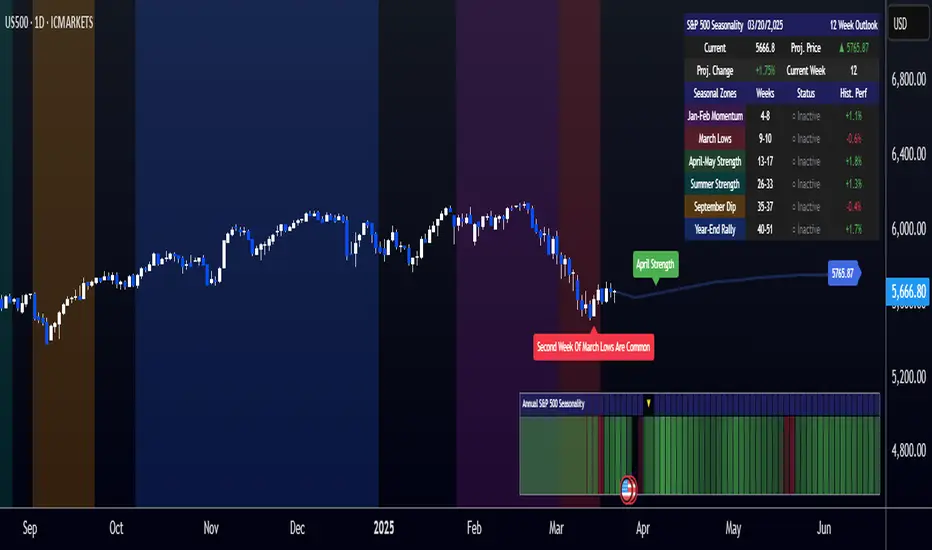
[COG]S&P 500 Weekly Seasonality ProjectionS&P 500 Weekly Seasonality Projection
This indicator visualizes S&P 500 seasonality patterns based on historical weekly performance data. It projects price movements for up to 26 weeks ahead, highlighting key seasonal periods that have historically affected market performance.
Key Features:
Projects price movements based on historical S&P 500 weekly seasonality patterns (2005-2024)
Highlights six key seasonal periods: Jan-Feb Momentum, March Lows, April-May Strength, Summer Strength, September Dip, and Year-End Rally
Customizable forecast length from 1-26 weeks with quick timeframe selection buttons
Optional moving average smoothing for more gradual projections
Detailed statistics table showing projected price and percentage change
Seasonality mini-map showing the full annual pattern with current position
Customizable colors and visual elements
How to Use:
Apply to S&P 500 index or related instruments (daily timeframe or higher recommended)
Set your desired forecast length (1-26 weeks)
Monitor highlighted seasonal zones that have historically shown consistent patterns
Use the projection line as a general guideline for potential price movement
Settings:
Forecast length: Configure from 1-26 weeks or use quick select buttons (1M, 3M, 6M, 1Y)
Visual options: Customize colors, backgrounds, label sizes, and table position
Display options: Toggle statistics table, period highlights, labels, and mini-map
This indicator is designed as a visual guide to help identify potential seasonal tendencies in the S&P 500. Historical patterns are not guarantees of future performance, but understanding these seasonal biases can provide valuable context for your trading decisions.
Note: For optimal visualization, use on Daily timeframe or higher. Intraday timeframes will display a warning message.
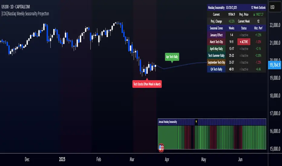
[COG]Nasdaq Weekly Seasonality ProjectionNasdaq Weekly Seasonality Projection
This indicator provides a visualization of Nasdaq seasonality patterns based on historical weekly performance data. It projects price movements for up to 26 weeks ahead, highlighting key seasonal periods that have historically affected tech stocks.
Key Features:
Projects price movements based on historical Nasdaq weekly seasonality patterns
Highlights six key seasonal periods: January Effect, March Lows, April-May Strength, Tech Summer Rally, September Dip, and Q4 Tech Rally
Customizable forecast length from 1-26 weeks with quick timeframe selection buttons
Optional moving average smoothing for more gradual projections
Detailed statistics table showing projected price and percentage change
Seasonality mini-map showing the full annual pattern with current position
Customizable colors and visual elements
How to Use:
Apply to Nasdaq indices or tech-focused instruments (daily timeframe or higher recommended)
Set your desired forecast length (1-26 weeks)
Monitor highlighted seasonal zones that have historically shown consistent patterns
Use the projection line as a general guideline for potential price movement
Settings:
Forecast length: Configure from 1-26 weeks or use quick select buttons (1M, 3M, 6M, 1Y)
Visual options: Customize colors, backgrounds, label sizes, and table position
Display options: Toggle statistics table, period highlights, labels, and mini-map
This indicator is designed as a visual guide to help identify potential seasonal tendencies in Nasdaq and tech stocks. Historical patterns are not guarantees of future performance, but understanding these seasonal biases can provide valuable context for your trading decisions.
Note: For optimal visualization, use on Daily timeframe or higher. Intraday timeframes will display a warning message.
Even vs Odd Weeks Performance█ OVERVIEW
The Even vs Odd Weeks Performance indicator is designed to visualise and compare the performance of even-numbered weeks versus odd-numbered weeks. This indicator explores one of the many calendar based anomalies that exist in financial markets.
In the context of financial analysis, a calendar based anomaly refers to patterns or tendencies that are linked to specific time periods, such as days of the week, weeks of the month, or months of the year. This indicator helps explore whether such a calendar based anomaly exists between even and odd weeks.
By calculating cumulative weekly performance and counting the number of weeks with positive returns, it provides a clear snapshot of whether one set of weeks tends to outperform the other, potentially highlighting a calendar based anomaly if a significant difference is observed.
█ FEATURES
Customisable time window through input settings.
Tracks cumulative returns for even and odd weeks separately.
Easily adjust table settings like position and font size via input options.
Clear visual distinction between even and odd week performance using different colours.
Built-in error checks to ensure the indicator is applied to the correct timeframe.
█ HOW TO USE
Add the indicator to a chart with a Weekly timeframe.
Choose your start and end dates in the Time Settings.
Enable or disable the performance table in the Table Settings as needed.
View the cumulative performance, with even weeks in green and odd weeks in red.

XAUUSD Weekly Gap Indicator (oberlunar)The XAUUSD Weekly Gap Indicator is a technical tool designed specifically for tracking weekly price gaps in the XAUUSD (gold) market. It identifies and visualizes the price difference between the Friday close and the Monday open, providing valuable insights into market dynamics over the weekend.
Gap Detection:
Measures the price difference between Friday's closing price and Monday's opening price.
Highlights whether the gap is bullish (Monday opens above Friday’s close) or bearish (Monday opens below Friday’s close).
Visualization:
Draws a line or rectangle to connect the Friday close and the Monday open, clearly marking the gap on the chart.
Displays an indicator label with the gap value, often in pips or points, to quantify the gap size.
Color Coding:
Green: Bullish gap (positive price movement).
Red: Bearish gap (negative price movement).
Market Sentiment:
Large gaps can indicate significant market sentiment shifts due to weekend events, such as economic reports or geopolitical news.
Support and Resistance:
Weekly gaps often act as temporary support or resistance levels, as the market may attempt to revisit or "fill" the gap.
Trading Strategies:
Gap Filling: XAUUSD often tends to "fill" these gaps, providing trading opportunities.
Continuation or Reversal: The reaction to the gap can signal whether the trend is likely to continue or reverse.

2024 - Median High-Low % Change - Monthly, Weekly, DailyDescription:
This indicator provides a statistical overview of Bitcoin's volatility by displaying the median high-to-low percentage changes for monthly, weekly, and daily timeframes. It allows traders to visualize typical price fluctuations within each period, supporting range and volatility-based trading strategies.
How It Works:
Calculation of High-Low % Change: For each selected timeframe (monthly, weekly, and daily), the script calculates the percentage change from the high to the low price within the period.
Median Calculation: The median of these high-to-low changes is determined for each timeframe, offering a robust central measure that minimizes the impact of extreme price swings.
Table Display: At the end of the chart, the script displays a table in the top-right corner with the median values for each selected timeframe. This table is updated dynamically to show the latest data.
Usage Notes:
This script includes input options to toggle the visibility of each timeframe (monthly, weekly, and daily) in the table.
Designed to be used with Bitcoin on daily and higher timeframes for accurate statistical insights.
Ideal for traders looking to understand Bitcoin's typical volatility and adjust their strategies accordingly.
This indicator does not provide specific buy or sell signals but serves as an analytical tool for understanding volatility patterns.
