XAUMOvisionXAUMOvision: T he XAU/USD Composite Correlation Indicator with Weighted Spillover & Dynamic Lines
XAUMOvision is a custom-built trading indicator designed to track the intricate relationship between XAU/USD (Gold) and key economic factors: DXY (US Dollar Index), US Treasury Yields, S&P 500, and Crude Oil. By blending correlation metrics with weighted spillover effects, XAUMOvision offers actionable insights to refine your Gold trading strategy.
Core Features of XAUMOvision
1. Correlation (CC)
Definition: Measures how closely two assets move together over a given period.
Calculation: Pearson Correlation is used to assess Gold's relationship with:
DXY: Negative correlation—when DXY rises, Gold typically falls.
US Treasury Yields: Negative correlation—higher yields reduce Gold’s appeal.
S&P 500: Opposite movement, as Gold acts as a safe-haven.
Crude Oil: Positive correlation—both often rise during inflationary pressures.
2. Weighted Spillover
What It Does: Quantifies how movements in each asset (DXY, Yields, etc.) influence Gold.
Weighting: User-defined values (e.g., DXY weight = 0.4) scale each factor’s impact.
Result: A total spillover score reveals bullish or bearish sentiment for XAU/USD.
3. Composite Bias Line
Purpose: Consolidates spillover impacts into a single sentiment indicator.
Readings:
Strong Bullish: Composite Bias > 0.5.
Neutral: Close to 0.
Strong Bearish: Composite Bias < -0.5.
Output: A directional bias to guide your trading decisions.
4. Traffic Signal Line
Visual Cues:
Green: Strong Bullish Signal.
Red: Strong Bearish Signal.
Gray: Neutral—avoid trading.
Utility: A quick, color-coded overview of market conditions.
Using XAUMOvision Effectively
When to Use
During high volatility or major news events (e.g., CPI, interest rate decisions).
To understand macroeconomic forces driving Gold’s price action.
Recommended Timeframes
4-Hour: Ideal for swing traders seeking medium-term setups.
Daily: Perfect for macro trend analysis.
Weekly: Suitable for long-term investors aligning with broader trends.
---------------------------------------------------------------------------------
Practical Example
Monday, January 13, 2025 (Neutral Market)
Market Behavior: Gold stagnated (-0.96%), with low volume (681.13K).
Indicator Insights:
Composite Spillover: -0.92 (mild bearish pressure).
Traffic Signal Line: Gray—stay out of the market.
Bias Line: Weak Bearish (-1), signaling no strong trend.
Result: XAUMOvision kept traders from entering a choppy, low-volume market.
Wednesday, January 15, 2025 (CPI-Driven Rally)
CPI Release: Core CPI softer than expected (0.2% vs. 0.3%), weakening the DXY and Yields. Gold surged.
Indicator Insights:
Composite Spillover: +0.57 (strong bullish sentiment).
Traffic Signal Line: Green—clear buy signal.
Bias Line: Strong Bullish (+2), confirming the trend.
Result: Traders aligned with institutional flows and profited from the CPI-driven rally.
--------------------------------------------------------------------------------
Why XAUMOvision Stands Out
Avoids Bad Trades: Neutral signals and low-volume days keep you sidelined during indecisive markets.
Pinpoints Big Moves: Green signals during high-impact events help you capitalize on major trends.
Volume Validation: Confirms institutional activity to distinguish real trends from fakeouts.
Conclusion: Trade Like a Pro
XAUMOvision blends macroeconomic analysis with real-time technical indicators, ensuring you stay ahead of market moves. Whether navigating neutral markets or CPI-driven surges, this tool provides clarity and confidence in your trading decisions. For swing traders and macro enthusiasts, XAUMOvision is the ultimate weapon in Gold trading.
Pesquisar nos scripts por "weekly"

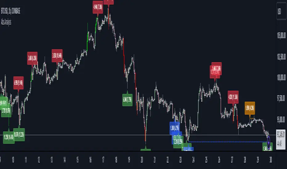
Absorption AnalysisThe Absorption Analysis indicator identifies potential market turning points by analyzing volume, price patterns, and market structure across multiple dimensions. It combines traditional technical signals with volume analysis and success rate tracking to provide high-probability reversal opportunities.
Signal Types & Classification
1. Pattern-Based Signals (W-Bottom & M-Top)
**W-Bottom Pattern**
- Pattern Structure:
* Price makes a low below the lower Bollinger Band
* First bounce occurs with price moving higher
* Secondary test forms a higher low
* Final confirmation with bullish close above lower band
- Volume Requirements:
* Must exceed 1.5x the 20-period volume moving average
- Visual Indicators:
* Blue dotted line appears at pattern low
* Line remains until broken by price
* Label shows volume and percentage from baseline
- Success Tracking:
* Pattern stored in historical database
* Success measured by upward price movement
* Historical success rate displayed with signal
**M-Top Pattern**
- Pattern Structure:
* Price makes a high above the upper Bollinger Band
* First pullback occurs with price moving lower
* Secondary push forms a lower high
* Final confirmation with bearish close below upper band
- Volume Requirements:
* Must exceed 1.5x the 20-period volume moving average
- Visual Indicators:
* Orange dotted line appears at pattern high
* Line remains until broken by price
* Label shows volume and percentage from baseline
- Success Tracking:
* Pattern stored in historical database
* Success measured by downward price movement
* Historical success rate displayed with signal
2. Technical Reversals
**Bullish Reversal**
- Entry Conditions:
* Previous candle closes below lower Bollinger Band
* Previous candle must be bearish
* Current candle closes above lower band
* Current candle must be bullish
- Volume Validation:
* Volume must exceed 1.5x 20-period MA
- Visual Markers:
* Green label at reversal point
* Includes volume context
- Trading Implementation:
* Suggests strong buying pressure overcoming selling
* Often marks end of downward price exhaustion
**Bearish Reversal**
- Entry Conditions:
* Previous candle closes above upper Bollinger Band
* Previous candle must be bullish
* Current candle closes below upper band
* Current candle must be bearish
- Volume Validation:
* Volume must exceed 1.5x 20-period MA
- Visual Markers:
* Red label at reversal point
* Includes volume context
- Trading Implementation:
* Suggests strong selling pressure overcoming buying
* Often marks end of upward price exhaustion
3. Volume-Based Reversals
**High Volume Bear to Bull**
- Signal Formation:
* High volume bearish candle (2.5σ above mean)
* Immediately followed by high volume bullish candle
- Market Psychology:
* Shows strong selling being absorbed by buying
* Often indicates institutional accumulation
- Visual Identification:
* Purple "HV Bull" label
* Includes volume statistics
- Trading Context:
* Strong signal for trend reversal
* Most effective at support levels
**High Volume Bull to Bear**
- Signal Formation:
* High volume bullish candle (2.5σ above mean)
* Immediately followed by high volume bearish candle
- Market Psychology:
* Shows strong buying being absorbed by selling
* Often indicates institutional distribution
- Visual Identification:
* Purple "HV Bear" label
* Includes volume statistics
- Trading Context:
* Strong signal for trend reversal
* Most effective at resistance levels
4. Absorption Signals
**Buy Absorption**
- Technical Requirements:
* High volume conditions (2.5σ above mean)
* Spread momentum must be negative
* Fast spread MA below slow spread MA
* Bullish closing candle
- Market Interpretation:
* Indicates buying pressure absorbing selling
* Often precedes upward movement
- Visual Markers:
* Red label with volume context
* Placed at significant price levels
**Sell Absorption**
- Technical Requirements:
* High volume conditions (2.5σ above mean)
* Spread momentum must be negative
* Fast spread MA below slow spread MA
* Bearish closing candle
- Market Interpretation:
* Indicates selling pressure absorbing buying
* Often precedes downward movement
- Visual Markers:
* Green label with volume context
* Placed at significant price levels
Volume Analysis Components
Volume Calculation
- Rolling baseline volume calculated based on timeframe:
* Monthly: 6-period sum
* Weekly: 12-period sum
* Daily: 20-period sum
* Intraday: Proportional to timeframe
- Net volume = Bullish volume - Bearish volume
- Volume percentage calculated against baseline
- High volume threshold = 2.5 standard deviations
- Pattern volume threshold = 1.5x 20MA
Exchange Aggregation
- Primary symbol (chart) always included
- Optional secondary symbol data
- Combines volume data for stronger signals
- Useful for crypto markets with split liquidity
Success Rate Implementation
Rate Calculation
- Based on user-defined lookback period
- Separately tracked for each pattern type
- Bullish patterns: Percentage of times price moved higher
- Bearish patterns: Percentage of times price moved lower
- Used to filter alerts with minimum threshold
Pattern Storage
- Arrays maintain historical pattern data
- Limited to lookback period size
- Oldest patterns removed as new ones form
- Constantly updated success rates
## Trading Implementation
### Signal Priority
1. Pattern Signals (W/M)
- Highest reliability due to complex criteria
- Must meet all volume and price conditions
- Line break provides clear invalidation
2. High Volume Reversals
- Strong indication of institutional activity
- Clear volume confirmation
- Immediate reversal potential
3. Technical Reversals
- Traditional technical analysis backbone
- Enhanced with volume confirmation
- Good for trend trading
4. Absorption Signals
- Early warning system
- Best used with other confirmations
- Good for position building
Best Practices
- Look for multiple signal types aligning
- Consider higher timeframe context
- Use success rates to filter setups
- Monitor volume context closely
- Wait for candle closes
- Use line breaks for clear invalidation
- Consider market structure
- Pay attention to success rates
- Use appropriate position sizing
Risk Management
- Use pattern breaks for stop losses
- Consider historical success rates
- Larger positions for multiple signal confluence
- Respect timeframe hierarchy
- Monitor volume for confirmation
- Use proper position sizing
- Consider market volatility
This indicator provides a comprehensive framework for identifying potential market turning points while maintaining rigorous risk management through multiple confirmation factors and clear invalidation levels.
Holy-Cow IndicatorHoly-Cow Indicator
Advanced Multi-Pattern Candlestick Analyzer (HC, NV, RN)
Description
Overview
This indicator is designed to detect key candlestick patterns based on foundational principles of price action analysis, now presented with a modernized approach for easier recognition and enhanced utility. Drawing inspiration from the work of candlestick charting pioneer Steve Nison (Japanese Candlestick Charting Techniques) and advanced price action strategies popularized by Linda Raschke (Street Smarts), this tool identifies and highlights unique combinations such as the Holy-Cow (HC), Nova (NV), and Red-Nova (RN) patterns.
These patterns simplify the complexities of price action into actionable setups, making them suitable for all types of traders.
Features
Inside Bars (IB):
Marks consolidation zones where the current candle’s range is inside the previous candle’s range. Useful for spotting breakout opportunities.
Outside Bars (OB):
Identifies candles where the current range exceeds the previous candle’s range.
Indicates potential reversals or trap setups.
Holy-Cow Pattern (HC):
Inspired by: Trap + Consolidation Setup
An Outside Bar followed by an Inside Bar.
Highlights volatility followed by tight consolidation, often preceding a breakout.
Nova Pattern (NV):
Inspired by: Breakout Trap + Expansion
An Inside Bar followed by an Outside Bar.
Signals breakout traps and subsequent volatility, useful for reversals or momentum moves.
Red-Nova Pattern (RN):
Inspired by: Volatility Trap + Major Breakout Zone
A combination of Holy-Cow (HC) and Nova (NV) patterns.
Represents a highly compressed market state, often leading to significant, high-intensity moves.
Bollinger Bands Integration:
Provides context on volatility and potential overbought/oversold levels.
Customizable Visibility:
Toggle specific patterns (IB, OB, HC, NV, RN) to suit your trading strategy.
How to Use
Pattern Detection:
Enable the patterns you want to focus on through the settings panel (e.g., HC for breakout setups, RN for high-intensity moves).
Observe highlighted zones and labels for actionable trade setups.
Trading Strategies:
Breakout Trades:
Look for HC, NV, or RN patterns near support/resistance and trade in the breakout direction.
Reversal Trades:
Use NV or RN patterns forming near key levels to catch reversals.
Stop-Loss:
Place below/above the low/high of the identified pattern.
Take Profit:
Use support/resistance levels, Fibonacci extensions, or a predefined risk-reward ratio (e.g., 2:1).
Recommended Timeframes:
1–15 minutes: Scalping or intraday trading.
1-hour: Intraday and swing trading.
Daily/Weekly: Ideal for significant trend analysis and major market moves.
Acknowledgments
This indicator is based on well-established trading principles and enhanced with unique combinations for modern trading. The foundational ideas behind these patterns are drawn from:
Steve Nison: Who introduced candlestick charting to Western traders in his seminal work, Japanese Candlestick Charting Techniques, and popularized concepts such as Inside and Outside Bars.
Linda Raschke: Who furthered the application of price action patterns in her book Street Smarts, showcasing multi-bar setups and momentum strategies.
While the patterns Holy-Cow (HC), Nova (NV), and Red-Nova (RN) are unique to this indicator, they build upon these foundational principles to offer traders actionable insights.
Disclaimer
This indicator is an independent creation inspired by publicly available price action principles. It is not affiliated with any proprietary tool or service. Back testing and proper risk management are strongly advised before live trading.

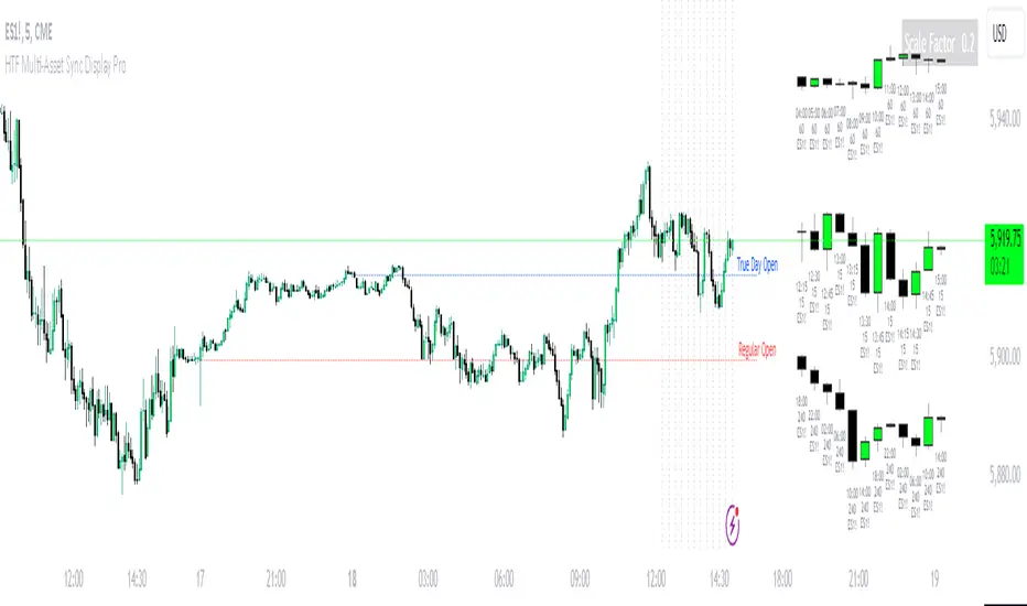
HTF Multi-Asset Sync Display ProHTF Multi-Asset Sync Display Pro
A professional-grade indicator designed for advanced multi-timeframe and multi-symbol analysis. This powerful tool enables synchronized visualization of up to three different assets across various timeframes, making it perfect for correlation analysis, market structure comparison, and smart money tracking.
Overview
HTF Multi-Asset Sync Display Pro is an advanced visualization tool that allows traders to monitor up to three different symbols simultaneously on a single chart. Whether you're analyzing correlations, divergences, or inter-market relationships, this indicator provides a comprehensive solution for complex market analysis.
Usage Examples
1. Multi-Timeframe Analysis of Single Symbol
Perfect for traders focusing on market structure and order flow:
- Configure all three sets to display different higher timeframes of the chart's main symbol
- Example: On 5M chart, display 15M, 1H, and 4H timeframes
Benefits:
- Clear visualization of higher timeframe market structure
- Real-time order flow analysis across multiple timeframes
- Better context for ICT PD Arrays on higher timeframes
- Enhanced understanding of support/resistance levels
- Improved timing for entries and exits
2. Correlated Assets Analysis
Ideal for traders working with related instruments:
- Display higher timeframes of correlated assets (e.g., ES, NQ, and YM)
Benefits:
- Easy identification of divergences between correlated symbols
- Enhanced probability assessment for CRT setups
- Improved Turtle Soup trading opportunities
- Clear visualization of relative strength/weakness
- Better timing for market reversals
3. Extended Analysis with Multiple Indicators
Advanced setup for comprehensive market analysis:
- Use two instances of the indicator to display up to 6 different HTF sets
- Synchronization capabilities ensure precise alignment between indicators
Benefits:
- Extended market coverage with up to 6 HTF sets
- Perfect synchronization between indicator instances
- Comprehensive view of market structure
- Enhanced correlation analysis capabilities
- Maximum flexibility in timeframe selection
Note: The ability to combine multiple instances of the indicator, each showing three HTF sets, provides traders with unprecedented analytical capabilities while maintaining perfect synchronization across all displayed timeframes.
Key Features
Multi-Symbol Display
- Display up to three different symbols simultaneously
- Up to 12 candles for each symbol
- Customizable colors and styles for each symbol
- Adjustable vertical offsets for optimal visual arrangement
- Flexible scale factor for precise price movement comparison
Comprehensive Timeframe Support
- Intraday: 1, 2, 3, 4, 5, 6, 10, 15, 30, 45, 60, 90, 120, 180, 240 minutes
- Daily: D, 2D
- Weekly: W, 2W
- Monthly: M
- Compatibility between all minutes timeframes for synchronization
Dual Synchronization Modes
Auto Mode
- Automatic alignment based on relative price levels
- Perfect for quick visual comparison
Manual Mode
- Precise synchronization based on candle closing times
- Ideal for detailed technical analysis
Session Markers
- Two configurable session lines (e.g., Regular Open and True Day Open)
- Adjustable line length, style, and color
- Flexible timezone support for global markets
Visual Customization
- Fully customizable candle appearance including wicks
- Optional vertical lines for better time orientation
- Scalability for optimal price movement comparison
- Professional labeling system
Trading Applications
Correlation Analysis
- Monitor relationships between currency pairs
- Analyze crypto/stock correlations
- Identify divergences between related instruments
- Track inter-market relationships
Smart Money Analysis
- Identify accumulation zones
- Detect manipulation phases
- Track distribution phases
- Analyze institutional levels
- Monitor smart money footprints
ICT Price Delivery (PD) Arrays Analysis
- Enhanced visualization for manual PD Arrays identification
- Clear display of higher timeframe price action
- Improved visibility of potential PD Array structures
- Better context for manual analysis
Visual aid for ICT concepts identification
- Helps traders manually spot potential Breaker Blocks and Order Blocks
- Clearer view for identifying Inefficient Price Points
- Better context for Fair Value Gaps analysis
- Enhanced visibility for Mitigation Points and Liquidity Voids detection
Note: This indicator provides enhanced visualization tools to support manual ICT analysis. It does not automatically detect or mark PD Arrays or other ICT concepts - it serves as a visual aid for traders who understand and manually apply ICT concepts in their analysis.
Market Structure Analysis
- Compare price structure across timeframes
- Identify key levels on multiple timeframes
- Analyze session breakouts and swings
- Track market structure shifts
Candle Range Theory (CRT)
- Compare candle ranges across timeframes
- Identify potential breakout/breakdown levels
- Analyze relationships between HTF and LTF candle ranges
- Recognize reversal points at HTF range extremes
Turtle Soup Strategy Enhancement
- Identify false breakouts
- Validate breakouts by comparing LTF momentum with HTF structure
- Precise entry and exit level determination
Trading Efficiency
Time Management
- All necessary information on one chart
- Eliminate timeframe switching
- Quick market condition analysis
- Enhanced trading efficiency
Decision Making
- Instant market structure overview
- Quick key level identification
- Efficient trade setup confirmation
- Better entry and exit timing
Note
For optimal results, we recommend starting by setting the Base Price Level to the approximate price level of the main symbol, then adjusting the vertical offsets of other symbols according to your preferences.
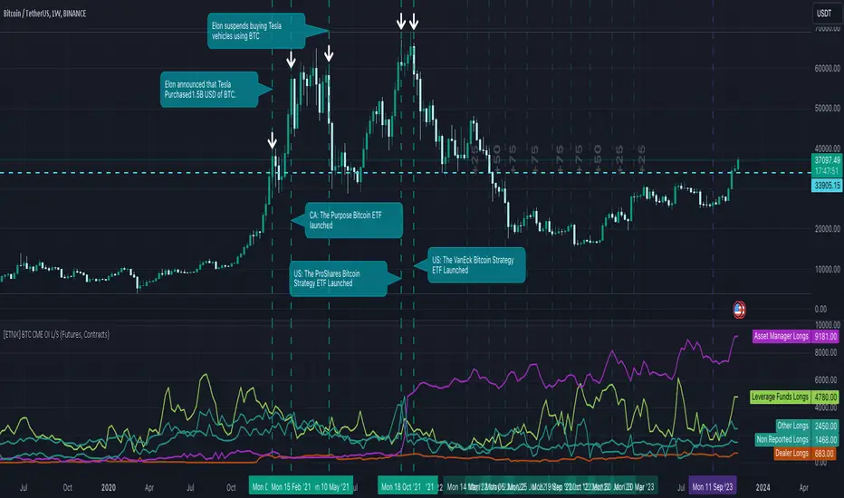
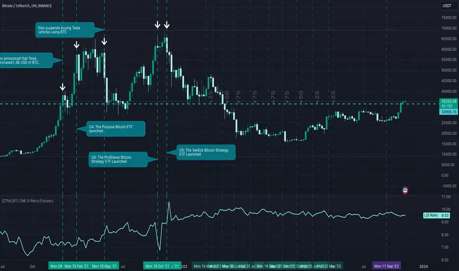
[ETNX] BTC CME OI L/SOVERVIEW
This indicator displays how many traders have Long and Short positions opened on CME Bitcoin Futures and Options. The data is provided from the CFTC Commitments of Traders Reports. These reports are given weekly. Therefore, this indicator works better on weekly timeframes.
The COT reports are separated into 5 categories:
Dealer/Intermediary - These participants are typically described as the “sell side” of the market. Though they may not predominately sell futures, they design and sell various financial assets to clients. They tend to have matched books or offset their risk across markets and clients. Futures contracts are part of the pricing and balancing of risk associated with the products they sell and their activities. These include large banks (U.S. and non-U.S.) and dealers in securities, swaps, and other derivatives.
Asset Manager/Institutional - These are institutional investors, including pension funds, endowments, insurance companies, mutual funds, and portfolio/investment managers whose clients are predominantly institutional.
Leveraged Funds - These are typically hedge funds and various types of money managers, including registered commodity trading advisors (CTAs); registered commodity pool operators (CPOs), or unregistered funds identified by CFTC. The strategies may involve taking outright positions or arbitrage within and across markets. The traders may be engaged in managing and conducting proprietary futures trading and trading on behalf of speculative clients.
Other Reportables - Reportable traders not placed into one of the first three categories are placed into the “other reportables” category. The traders in this category mostly use markets to hedge business risk, whether that risk is related to foreign exchange, equities, or interest rates. This category includes corporate treasuries, central banks, smaller banks, mortgage originators, credit unions and any other reportable traders not assigned to the other three categories.
Non Reportable
INPUT DISPLAY
The Open Interest can be displayed in three ways:
Contracts - How many contracts are opened on CME
BTC - How many BTC the contracts worth
Billions USD - How much is worth in USD based on the CME BTC Price
The Open Interest is calculated for:
Futures - The Futures Short and Long Positions Opened
Futures & Options - The Futures & Options Short and Long Positions Opened
[ETNX] BTC CME TradersOVERVIEW
This indicator displays how many traders have Long and Short positions opened on CME Bitcoin Futures and Options. The short traders have negative values only for display purposes. Therefore, if the short value is displayed as -56, that means that there are 56 traders that have short positions opened. The total of traders is the sum of short and long traders. The data is provided from the CFTC Commitments of Traders Reports. These reports are given weekly. Therefore, this indicator works better on weekly timeframes.
The COT reports are separated into 5 categories:
Dealer/Intermediary - These participants are typically described as the “sell side” of the market. Though they may not predominately sell futures, they design and sell various financial assets to clients. They tend to have matched books or offset their risk across markets and clients. Futures contracts are part of the pricing and balancing of risk associated with the products they sell and their activities. These include large banks (U.S. and non-U.S.) and dealers in securities, swaps, and other derivatives.
Asset Manager/Institutional - These are institutional investors, including pension funds, endowments, insurance companies, mutual funds, and portfolio/investment managers whose clients are predominantly institutional.
Leveraged Funds - These are typically hedge funds and various types of money managers, including registered commodity trading advisors (CTAs); registered commodity pool operators (CPOs), or unregistered funds identified by CFTC. The strategies may involve taking outright positions or arbitrage within and across markets. The traders may be engaged in managing and conducting proprietary futures trading and trading on behalf of speculative clients.
Other Reportables - Reportable traders not placed into one of the first three categories are placed into the “other reportables” category. The traders in this category mostly use markets to hedge business risk, whether that risk is related to foreign exchange, equities, or interest rates. This category includes corporate treasuries, central banks, smaller banks, mortgage originators, credit unions and any other reportable traders not assigned to the other three categories.
Non Reportable
INPUT DISPLAY
The Open Interest can be displayed in three ways:
Futures - The Futures Short and Long Positions Opened
Options - The Options Short and Long Positions Opened
Futures & Options - The Futures & Options Short and Long Positions Opened

[ETNX] BTC CME OI RatioOVERVIEW
This indicator displays the Ratio between the Long and Short positions opened on CME Bitcoin Futures and Options. The data is provided from the CFTC Commitments of Traders Reports. These reports are given weekly. Therefore, this indicator works better on weekly timeframes.
The COT reports are separated into 5 categories:
Dealer/Intermediary - These participants are typically described as the “sell side” of the market. Though they may not predominately sell futures, they design and sell various financial assets to clients. They tend to have matched books or offset their risk across markets and clients. Futures contracts are part of the pricing and balancing of risk associated with the products they sell and their activities. These include large banks (U.S. and non-U.S.) and dealers in securities, swaps, and other derivatives.
Asset Manager/Institutional - These are institutional investors, including pension funds, endowments, insurance companies, mutual funds, and portfolio/investment managers whose clients are predominantly institutional.
Leveraged Funds - These are typically hedge funds and various types of money managers, including registered commodity trading advisors (CTAs); registered commodity pool operators (CPOs) or unregistered funds identified by CFTC. The strategies may involve taking outright positions or arbitrage within and across markets. The traders may be engaged in managing and conducting proprietary futures trading and trading on behalf of speculative clients.
Other Reportables - Reportable traders not placed into one of the first three categories are placed into the “other reportables” category. The traders in this category mostly use markets to hedge business risk, whether that risk is related to foreign exchange, equities, or interest rates. This category includes corporate treasuries, central banks, smaller banks, mortgage originators, credit unions and any other reportable traders not assigned to the other three categories.
Non Reportable
IMPORTANT
The SPREADS are excluded. “Spreading” is a computed amount equal to offsetting long and short positions held by a trader. The computed amount of spreading is calculated as the amount of offsetting futures in different calendar months or offsetting futures and options in the same or different calendar months. Any residual long or short position is reported in the long or short column. Inter-market spreads are not considered.
INPUT INCLUDE Non-Reportable
This ratio excludes by default the Non-Reportable category. If this input is enabled, the ratio between Longs and Shorts should flatten.
INPUT DISPLAY
The Open Interest can be displayed in three ways:
Futures - The Futures Short and Long Positions Opened
Options - The Options Short and Long Positions Opened
Futures & Options - The Futures & Options Short and Long Positions Opened
MTF Key Levels [Mxwll]Mxwll MTF S/R:
The Mxwll MTF Support & Resistance indicator is designed to identify crucial support and resistance levels across multiple timeframes. By considering various timeframes, this indicator provides a more comprehensive view of the market's underlying structure. It allows traders to extend lines in various configurations and covers timeframes ranging from 5 minutes to weekly. By considering price action across multiple timeframes, the indicator provides a more comprehensive understanding of the market's supply and demand dynamics. Traders can use the Mxwll MTF Support & Resistance Indicator to refine their trade entries and exits, manage risk, and establish potential price targets.
FEATURES
5 Minute to Weekly Key Levels
Accurate Multi-Timeframe Support and Resistance
Customize To Extend The Lines - Left, Right and Right Across The Chart
Interplay Between Support and Resistance Levels
Change Colours Of S&R
Change Colours Of S&R Lines
INSTRUCTIONS
Select Your Timeframe -> Unselect the S&R Levels That Are Less Than The Timeframe - Trade

DB ZEMAThe DB ZEMA indicator is a no repaint indicator that is designed to local trends and local tops/bottoms. Since the indicator does not repaint, decisions can be made upon bar/period OPEN.
That means, when the indicator turns red indicating a market top is finished, then a decision can be made to close at the OPEN of that period. Likewise, when the indicator turns green, a decision can be made to buy at OPEN or during the current bar.
Additionally, traders may use the ZEMA level to get insight on the strength of the asset. For example, when the ZEMA is below -50 that would indicate a major low or weakness is present. ZEMAs under a certain threshold can indicate very good investment long entry points. Alternatively, zooming the chart out to view a long range of periods can show a pattern of common low ZEMA levels can be used as a baseline for good entry points. The same holds true for existing a long or entering a short.
Using a combination of the ZEMA color and the ZEMA level it's can be easy to tell smart entry and exist points. Especially on the weekly or higher timeframes.
For traders wanting real time data, there is a setting to disable the no-repaint mode to display the current real time ZEMA value. Traders may also adjust the length. By default the length of 10 is provided which is excellent for Weekly. We recommend a length of less than 10 for even high timeframes. For example a length of 2 is excellent on 4 Month timeframe for looking at market cycles, etc.
Finally the indicator offers the ability to change the symbol. This can be helpful in crypto in comparing the chart asset again BTC or similar.
Enjoy!

LIZ-ATR-Based EMA EnvelopesThis envelope has an "auto band adjustment function" that reflects the most recent volatility in the band width by ATR.
This makes it easy to handle without the need to change the band width according to the volatility of the stocks to be displayed.
The time periods and colors of each time frame that can be displayed and the central band of the envelope are as follows.
Monthly: 2-year line (light blue)
Weekly: 3-month line (black)
Daily: 1 month line (blue)
4-hourly: 1-week line (green)
1 hour: 24 hour line (purple)
30-minute: 12-hour line (light purple)
15-minute: 4-hour line (orange)
5min:2hr (skin color)
1 minute: 30 minute line (gray-blue)
30 seconds: 10 minute line (blue-purple)
15-seconds: 7.5-minute line (sky blue)
10-seconds: 5-minute line (brown)
5-seconds: 2-minute line (emerald green)
Depending on where the price resides in the band, the following situations can be identified
・When inside the first band: Trendless
・Between the first and second band: Normal trend
・Between the 2nd and 3rd band: Strong trend
・When the third line is exceeded: Overheat condition
The first range is painted in gray and encourages not to follow the trend. In addition, the "up" sign will automatically light up when the price is above this gray zone, the "middle" sign when the price is in the middle of the gray zone, and the "down" sign when the price is below the gray zone.
このエンベロープは直近のボラティリティーをATRによってバンド幅に反映させる、「オートバンド調整機能」を搭載しています。
そのため、表示させる銘柄のボラティリティーに合わせてバンド幅を変更する必要がなく扱いやすいです。
表示できる各時間足と、エンベロープの中心バンドの期間・色は、以下の通りです。
月足:2年線(水色)
週足:3ヶ月線(黒)
日足:1ヶ月線(青)
4時間足:1週間線(緑)
1時間足:24時間線(紫)
30分足:12時間線(薄紫)
15分足:4時間線(オレンジ)
5分足:2時間線(肌色)
1分足:30分線(グレーブルー)
30秒足:10分線(青紫)
15秒足:7.5分線(スカイブルー)
10秒足:5分線(茶色)
5秒足:2分線(エメラルドグリーン)
価格がバンドのどこに存在するかによって以下の状況がわかります。
・1本目のバンド内側にある時:トレンドレス
・1本目から2本目の間にある時:ノーマルトレンド
・2本目から3本目の間にある時:強いトレンド
・3本目をオーバーしている時:過熱状態
1本目の範囲はグレーで塗られ、トレンドフォローしない事を促します。また、このグレーゾーンの上に価格がある時は「上」、中にある時は「中」、下にあるときは「下」の文字サインが自動点灯します。
TriexDev - SuperBuySellTrend (PLUS+)Minimal but powerful.
Have been using this for myself, so thought it would be nice to share publicly. Of course no script is correct 100% of the time, but this is one of if not the best in my basic tools. (This is the expanded/PLUS version)
Github Link for latest/most detailed + tidier documentation
Base Indicator - Script Link
TriexDev - SuperBuySellTrend (SBST+) TradingView Trend Indicator
---
SBST Plus+
Using the "plus" version is optional, if you only want the buy/sell signals - use the "base" version.
## What are vector candles?
Vector Candles (inspired to add from TradersReality/MT4) are candles that are colour coded to indicate higher volumes, and likely flip points / direction changes, or confirmations.
These are based off of PVSRA (Price, Volume, Support, Resistance Analysis).
You can also override the currency that this runs off of, including multiple ones - however adding more may slow things down.
PVSRA - From MT4 source:
Situation "Climax"
Bars with volume >= 200% of the average volume of the 10 previous chart TFs, and bars
where the product of candle spread x candle volume is >= the highest for the 10 previous
chart time TFs.
Default Colours: Bull bars are green and bear bars are red.
Situation "Volume Rising Above Average"
Bars with volume >= 150% of the average volume of the 10 previous chart TFs.
Default Colours: Bull bars are blue and bear are blue-violet.
A blue or purple bar can mean the chart has reached a top or bottom.
High volume bars during a movement can indicate a big movement is coming - or a top/bottom if bulls/bears are unable to break that point - or the volume direction has flipped.
This can also just be a healthy short term movement in the opposite direction - but at times sets obvious trend shifts.
## Volume Tracking
You can shift-click any candle to get the volume of that candle (in the pair token/stock), if you click and drag - you will see the volume for that range.
## Bollinger Bands
Bollinger Bands can be enabled in the settings via the toggle.
Bollinger Bands are designed to discover opportunities that give investors a higher probability of properly identifying when an asset is oversold (bottom lines) or overbought (top lines).
>There are three lines that compose Bollinger Bands: A simple moving average (middle band) and an upper and lower band.
>The upper and lower bands are typically 2 standard deviations +/- from a 20-day simple moving average, but they can be modified.
---
Base Indicator
## What is ATR?
The average true range (ATR) is a technical analysis indicator, which measures market volatility by decomposing the entire range of an asset price for that period.
The true range indicator is taken as the greatest of the following:
- current high - the current low;
- the absolute value of the current high - the previous close;
- and the absolute value of the current low - the previous close.
The ATR is then a moving average, generally using 10/14 days, of the true ranges.
## What does this indicator do?
Uses the ATR and multipliers to help you predict price volatility, ranges and trend direction.
> The buy and sell signals are generated when the indicator starts
plotting either on top of the closing price or below the closing price. A buy signal is generated when the ‘Supertrend’ closes above the price and a sell signal is generated when it closes below the closing price.
> It also suggests that the trend is shifting from descending mode to ascending mode. Contrary to this, when a ‘Supertrend’ closes above the price, it generates a sell signal as the colour of the indicator changes into red.
> A ‘Supertrend’ indicator can be used on equities, futures or forex, or even crypto markets and also on daily, weekly and hourly charts as well, but generally, it will be less effective in a sideways-moving market.
Thanks to KivancOzbilgic who made the original SuperTrend Indicator this was based off
---
## Usage Notes
Two indicators will appear, the default ATR multipliers are already set for what I believe to be perfect for this particular (double indicator) strategy.
If you want to break it yourself (I couldn't find anything that tested more accurately myself), you can do so in the settings once you have added the indicator.
Basic rundown:
- A single Buy/Sell indicator in the dim colour; may be setting a direction change, or just healthy movement.
- When the brighter Buy/Sell indicator appears; it often means that a change in direction (uptrend or downtrend) is confirmed.
---
You can see here, there was a (brighter) green indicator which flipped down then up into a (brighter) red sell indicator which set the downtrend. At the end it looks like it may be starting to break the downtrend - as the price is hitting the trend line. (Would watch for whether it holds above or drops below at that point)
Another example, showing how sometimes it can still be correct but take some time to play out - with some arrow indicators.
Typically I would also look at oscillators, RSI and other things to confirm - but here it held above the trend lines nicely, so it appeared to be rather obvious.
It's worth paying attention to the trend lines and where the candles are sitting.
Once you understand/get a feel for the basics of how it works - it can become a very useful tool in your trading arsenal.
Also works for traditional markets & commodities etc in the same way / using the same ATR multipliers, however of course crypto generally has bigger moves.
---
You can use this and other indicators to confirm likeliness of a direction change prior to the brighter/confirmation one appearing - but just going by the 2nd(brighter) indicators, I have found it to be surprisingly accurate.
Tends to work well on virtually all timeframes, but personally prefer to use it on 5min,15min,1hr, 4hr, daily, weekly. Will still work for shorter/other timeframes, but may be more accurate on mid ones.
---
This will likely be updated as I go / find useful additions that don't convolute things. The base indicator may be updated with some limited / toggle-able features in future also.

SSS50 StatusSSS50 Status Box with Auto Chart Levels and Labels
I made this indicator due to receiving a lot of messages on how to use my other SSS50% indicators. This indicator helps you learn and understand the Sara Strat Snipers 50 Percent Rule. Remember this indicator does not tell you when to buy or sell this is a guide on the setup ONLY.
You Must Use Rob Smith's The Strat Principles and Remember we need TIME in our favour. Ideally we want to see setups go In-Force early on during the candles lifespan (Timeframe).
Using the indicator logic, the SSS50% Rule has FOUR Conditions:
1. SSS50 INVALID = No Trade = The Candle is currently an Inside Bar OR a Green 2UP OR a Red 2DOWN.
2. SSS50 STANDBY = Failed 2* = The Candle is currently a Failed 2UP (Red 2UP) OR a Failed 2DOWN (Green 2DOWN).
3. SSS50 ACTIVE = Outside Bar Possible = The Candle is currently a Failed 2 and has crossed over the Previous Candles 50% level.
4. SSS50 COMPLETE = Outside Bar Complete = The Candle is now an Outside Bar.
How to Use this Indicator?
Add Indicator to your chart and open up the Indicator's Settings.
1. Select Indicators Timeframe.
- Chart = SSS50% rules will be applied to whichever timeframe chart you open.
- Single Timeframe = SSS50% rules will be only applied to one fixed timeframe when viewing on other timeframe charts. For Example: if you select Weekly. The Indicator's Status and Levels/Labels will only be displayed on your chart if the Weekly Candle has a SSS50 Standby, Active or Complete condition.
2. Select Status Box On/Off. If ON - Select View Type.
- Normal View = Detailed View with Price Targets.
- Compact View = Condensed View to reduce chart clutter.
3. Select AUTO or MANUAL Chart Levels/Labels. Select ONE type only or leave both off for no level/label display.
- AUTO = When an SSS50 STANDBY, ACTIVE or COMPLETE Condition occurs the related High, Low and 50% Levels will be displayed.
- MANUAL = When AUTO is OFF, MANUAL will display High, Low and 50% Levels always regardless of SSS50 Conditions.
4. Select AUTO Features.
- Display High/Low and/or 50% Price Labels when using AUTO Chart Mode.
4.1 Select AUTO Colors if required. Default to Traffic Light System.
- INVALID = Red
- STANDBY = Orange
- ACTIVE or COMPLETE = GREEN
5. Select MANUAL Features if AUTO Chart Mode is OFF.
- Display High/Low and/or 50% Price Labels when using MANUAL Chart Mode.
5.1 Select MANUAL Colors if required.
6. Additional Features. Title OR Timeframe available is Normal View. Title AND Timeframe BOTH available in Compact View.
- Show SSS50 Title next to Status Box.
- Show the indicators selected Timeframe next to Status Box. Timeframe will be displayed next to Status Box Only when ONE Individual Timeframe is selected.
7. Color Settings.
- Match your chart's current Background Color to this color.
8. Additional Settings
- Customise Label Offset Locations, Line Types and Line Types.
- Any issues let me know.
- Note I removed the price tags (used in my previous SSS50 indicators) from the right of the line to avoid clutter. Now you can see the current price move through the High, Low and 50% level lines.
- No alerts setup within script, just manually click the plus sign on each level if you wish to add alerts.

Natenberg's VolatilityThis indicator is historical volatility indicator created by Sheldon Natenberg , as the standard deviation of the logarithmic price changes measured at regular intervals of time.
In Mr. Natenberg's book, Option Volatility & Pricing, he covers volatility in detail and gives the formula for computing historical volatility.
My changes :
I didn't changed formula, i just added smooth version of volatility it can be used as trigger when cross(over/under) non-smoothed volatility.
Note:
There is two formulas for daily and weekly. Indicator showing only daily formula !
Who wants to display the weekly formula change line 17, namely remove "//"
Enjoy!
20 SMA based Bull/Bear sentiment indicatorThis script is only doing one thing, plots the 20 SMA and based on whether the asset's price is above or below of the SMA it changes the color of the SMA and the background's color.
Helping it to visualize whether from the 20 SMA's point of view we are in a Bull or a Bear trend.
I created this because I myself use this SMA with Bitcoin on the weekly time frame to identify the macro trend on the weekly.
IMO this is a good crypto market sentiment indicator.
Bitcoin Bull Runs Mid Cycle Aligned This script plots 2 lines which are the 2013 and 2016 bull run. The plots are aligned on their mid cycles to the 2021 mid cycle.
Settings:
You can move the plots on the x and y axis in the settings for the Daily, Weekly and Monthly TFs.
The plot is weird on the Monthly TF, best to use the Daily and Weekly.
If it doesn't load at first you have to zoom out fully and go back to 2013 for it to load. Then it will load.
Anti-Volume Stop LossFINALLY!
As everyone who tried to create, understand, or even find the Buff Pelz Dormeier Anti-volume stop-loss indicator knows that - it's not easy. Personally, I have partially, or perhaps completely figured out, the tips Buff had given in Investing with Volume Analysis book.
AVSL now is ready.
Please do some test and give me a feedback how it works in your trade strategy.
Anti-Volume stop loss - AVSL
from Investing with Volume Analysis book CHAPTER 20 • RISKY BUSINESS 253-256:
"It is important in any risk-management process to predetermine an objective decision point level (a stop loss) to exit, thereby protecting principal in case you are wrong. My objective sell point is determined by using a quantitative formula I refer to as Anti-Volume Stop Loss (AVSL). Having a quantitative, yet intelligent sell point eliminates the emotional struggles involved in deciding when to exit a position.
AVSL is a technical methodology that incorporates the concepts of support, volatility, and, most importantly, the inverse relationship between price and volume. The AVSL combines the concepts of the VPCI (Volume Price Confirmation Indicator) and John Bollinger’s Bollinger Bands to create a trailing stop loss.
AVSL = Lower Bollinger Band – (Price, Length, Standard Deviation)
Where:
Length = Round (3 + VPCI)
Price = Average (Lows × 1 / VPC × 1 / VPR, Length)
Standard Deviation = 2 × (VPCI × VM)
One of the most difficult decisions is determining what one’s maximum loss threshold should be. Some say 2 percent; others say 20 percent. I believe the more volatile a security, the looser the stop should be. A nonvolatile security, such as Coca-Cola, might move 7 percent a year, while a volatile security such as Google might move 7 percent in a day. If you use a 7 percent stop for Coca-Cola, it might take a year to be stopped out while the security underperforms.
However, if you use 7 percent for Google, you can be stopped out intraday, not allowing the investment an opportunity to develop. By using the lower Bollinger Band of the securities lows, the AVSL considers each individual security’s own volatility. Thus, a volatile security would be granted more room of the stocks low while a stable security would have a tighter leash (see Figure 20.7).
The next important step is employing the price-volume relationship into the calculation. Volume gauges the power behind price moves. In accounting for this, when a security is in an uptrend and has positive volume characteristics, it is given more room. However, if the security exhibits contracting volume characteristics, then the stop is tightened. In this way, if a negative news event affects an unhealthy security, the stop is tighter, thus preserving more of your profits.
However, if the negative news event affects a security whose price-volume relationship is healthy, the stop has been loosened, avoiding the temporary whipsaw of an otherwise strong position. In these ways, AVSL lets the market decide when to exit your position.
AVSL tailors each security for support, volatility, and the pricevolume relationship based on an investor’s time frame as calculated from the chart data. For example, my portfolio positions are continually re-evaluated with this AVSL methodology, which yields the possibility of raising the decision point threshold periodically based on the time frame of my investment objective. With my short-term Giddy-up portfolios, I use daily chart data and seek to raise my maximum loss stop on a daily basis.
My intermediate ETF and stock positions are calculated off of weekly data and then re-evaluated weekly. With my longer term stock portfolios, the decision point is calculated off data revised monthly. This analytical approach that uses measurable facts over emotion or gut instincts allows me to maintain my objectivity. Thus objectivity, not emotion, informs my investment decisions."
How look mine AVSL:
Price component = low × 1/VPC × 1/VPR : for VPC > 1 and VPC < -1 | low × 1 × 1/VPR : for 1 > VPC > 0 | low × -1 × 1/VPR : for 0 > VPC > -1
AVSL Price = sma((low × 1/VPC × 1/VPR) , length) / 100
length = round : for VPCI > 0 | round [ absolute ] : for VPCI < 0 | 3 : for VPCI=0
Standard Deviation = mult × VPCI × VM)
AVSL = sma(Actual low price - AWSL Price + Standard Deviation, 26)
It's hard to say is it the same as in Buff Pelz Dormeier book, but I encourage you to modify the script for better results.

[co.n.g] LeathermanThis is a modest approach of assembling my most favorite strategies into a single indicator script!
I extended the functionality of the ART to the maximum in this piece of price action and volume analysis.
The original "Average Range Targets" - though by default turned off t due to heavily re-scaling the chart -
and the previous day's high and low.
What I've added:
high and low of the actual week
high and low of the previous week
open of the day
close of the previous day
VWAP of the daily session - adjustable to any length
VWAP of the weekly session
opening range / inital balance of the session -fixed to 15 Minutes
I've decluttered the chart as good as possible.
KNOWN BUGS:
Sometimes the plotting is incorrect due to rescaling or zooming in and out of the chart.
How to use - a quick price action guide:
The breakout of the open range is often indicating the trend of the day, a false breakout is often seen as a reversal sign.
A price below the VWAP is seen as cheap, a price above as expensive. In contrary to others, I personally prefer to see a rising price on a rising VWAP ;
additionally, I like bounces off or spikes and reversals through the VWAP , either the daily or the weekly.
The highs and lows of the days and weeks are seen as support and resistance . Trade preferably long above and short below those levels.
The ADR is an indication not working perfectly, especially with stocks.
!!! WARNING !!!
Don't rely solely on a single script nor a single indicator!
Always consider the price action, the trend, the overall market and especially the volume.
There is no "Get-Rich-Quick"-scheme, learn to read the chart and trade accordingly.
Enjoy and make money!
Yours,
Constantine
p.s.:
If you like to show your gratitude for my work:
CHEER!

Moving Average Over Timea simple moving average and an exponential moving average that change periods along with temporality: WEEKLY: MA48, EMA24; DAILY: MA21, EMA11; H4: MA30, EMA15; H1: MA120, EMA30.

Trend AnalyzerA simple script that plots difference between 2 moving averages and depicts convergance/divergance in color coded format.
Anything <= 0 is red and shows a bearish trend whereas > 0 is green and shows bullish trend.
Adjust the input parameters as following for your preferred time frame :
4-Hr: Exponential, 15, 30
Daily: Exponential, 10, 20
Weekly: Exponential, 5, 10
Higher Timeframe EMA @ silenThunderrThe Script is Used for Exponential Moving Average which are fixed for Daily and Weekly.
Can Be used in any Timeframe but EMA are fixed to Daily and Weekly only.
One option of Open EMA is kept which can be modified in settings.
Turn On/OFF various EMA's and enjoy the play of EMA's
Its can change colours if selected in the Settings.
OFFSET is also available.
Upslope is White and Downwards is Yellow. (I use Dark Theme hence White u can change the colour to what ever u wish )
All in settings

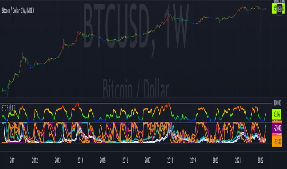
Bitcoin Risk Long Term indicatorOBJECTIVE:
The purpose of this indicator is to synthesize via an average several indicators from a wide choice with in order to simplify the reading of the bitcoin price and that on a long term vision.
Useful for those who want to see things simply, typically to make a smart DCA based on risk.
I originally used this script as a sandbox to understand and test the usefulness of several indicators, and to develop my PineScript skills, but finally the Risk Indicator output seems relevant so I decided to share it.
USAGE:
The selected indicators are the ones that I think give the best market bottoms, but the idea here is that anyone can try and use any set of indicators based on those preferences (post in comments if you find a relevant config)
Most of the indicator inputs are configurable. And some are not taken into account in the calculation of the Risk indicator because I consider them not relevant, this script is also a test more than a final version.
NOTES :
If you have any idea of adding an indicator, modification, criticism, bug found: share them, it is appreciated!
In the future I will create another more versatile Risk indicator that will not be focused on bitcoin in weekly. (this indicator is still usable on other assets and timeframe)
THANKS:
to Benjamin Cowen for inspiring me with his Bitcoin Risk metric
to Lazybear for his Wavetrend Indicator and all the scripts he shares
to Mabonyi for his Bitcoin Logarithmic Growth Curves & Zones script
to VuManChu for his VMC Cypher B Divergence
to the Trading view team for developing TV and PineScript
And to all the community for all the published codes that allowed me to progress and create this script
---- FR ----
OBJECTIF :
L'objectif de cet indicateur est de synthétiser via une moyenne plusieurs indicateurs parmi un large choix avec afin de simplifier la lecture du cours de bitcoin et cela sur une vision longue terme.
Utile pour ceux qui veulent voir les choses simplement, typiquement faire un DCA intelligent en fonction du risque.
À la base j'ai utilisé ce script comme un bac à sable pour comprendre puis tester l'utilité de plusieurs indicateurs, et développer mes compétences PineScript, mais finalement l'output Risk Indicateur me semble pertinent donc autant le partager.
UTILISATION :
Les indicateurs sélectionnés sont ceux qui permettent selon moi d'avoir les meilleurs point bas de marché, mais l'idée ici est que chacun puisse essayer et utiliser n'importe quel ensemble d'indicateur en fonction de ces préférences (poster en commentaire si vous trouvez une configuration pertinente)
La plupart des inputs indicateurs sont paramétrables. Et certains ne sont pas pris en compte dans le calcul du Risk indicateur car je les estime non pertinent, ce script est aussi un essai plus qu'une version finale.
NOTES :
Si vous avez la moindre idée d'ajout d'indicateur, modification, critique, bug trouvé : partagez-les, c'est apprécié !
à l'avenir je créerais un autre Risk indicator plus polyvalent qui ne sera pas focalisé sur bitcoin en weekly. (cet indicateur est tout de même utilisable sur d'autre actif et timeframe)
REMERCIEMENT :
à Benjamin Cowen pour m'avoir inspiré avec son Bitcoin Risk metric
à Lazybear pour son Wavetrend Indicator et globalement tout les scripts qu'il partage
à Mabonyi pour son script Bitcoin Logarithmic Growth Curves & Zones
à VuManChu pour son VMC Cypher B Divergence
à l'équipe Trading view pour avoir développé TV et PineScript
Et à toute la communauté pour tous les codes publiés qui m'ont permis de progresser et de créer ce script
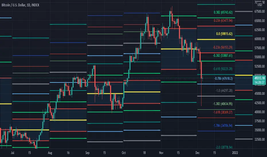
[MF] Auto Fibonacci LevelsDescription:
Automatically draw Fibonacci Pivot levels based on the previous (day's, week's or month's)
Range ( High-Low ). The HLC3 is used as the default Pivot level.
Unlike the "Auto Fibonacci Levels", this variation does not update
Levels on current day even if the price goes past the R3/S3 levels.
Timeframes: 1D, 1W, 1M
Range = (High - Low) - From previous Day, Week or month.
FIB LEVELS:
- Yellow = Pivot and Pivot Zone (HLC3 by default)
- red = R1,S1 Levels 0.236 * Range
- Green = R2,S2 Levels 0.368 * Range
- Lime = R3,S3 Levels 0.618 * Range
- Blue = R4,S4 Levels 0.786 * Range
- Gray = R5,S5 Levels 1.000 * Range
- Lime = R6,S6 Levels 1.236 * Range
- Red = R7,S7 Levels 1.382 * Range
- Blue = R8,S8 Levels 1.618 * Range
- Green = R9,S9 Levels 2.000 * Range
CLASSIC LEVELS:
- Yellow = Pivot and Pivot Zone (HLC3)
- Green = R1,S1 Levels (Pivot*2 - Low), (Pivot*2 - High)
- Lime = R2,S2 Levels ( Pivot + Range), ( Pivot - Range)
- Lime = R3,S3 Levels (High + 2*( Pivot - Low)), (Low - 2*(High - Pivot ))
- Blue = R4,S4 Levels (High + 3*( Pivot - Low)), (Low - 3*(High - Pivot ))
Refrences:
- Auto Daily Fib Levels R3.0 by JustUncleL
- Auto Fib by TheYangGuizi
- Monthly Dynamic Range Levels (Fibonaci) V0 by RicardoSantos
Modifications:
- Added next FIB Levels. (changes during the current cycle)
- Added FIB 0.236 Levels
- Added Option to change the colors of the Fib Levels
- Changed Default colors to the colors of Tradingview
- Upgraded to Version4 Pinescript
Market Sessions — FOREXSOM Editionding for chart screenshots and videos.
Cleaner Interface: Organized settings into clear groups for a smoother user experience.
Bug Fixes: Improved “Only Last…” logic for more stable plotting.
Why I Use and Recommend It:
Easily spot active trading sessions with visual clarity.
Identify key institutional price levels in real time.
Ideal for day traders, swing traders, and anyone applying Smart Money Concepts.
Fully customizable colors and styles to fit any personal workflow.
