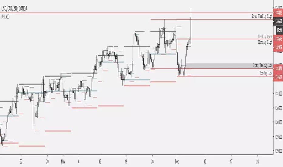
X0_Trading_levelsScript which marks out the trading ranges I often like to have mapped out on the charts:
Mondays Trading range - open, high, low
Daily open, high, low
Weekly open
Monthly open.
Can change all colours
Pesquisar nos scripts por "weekly"


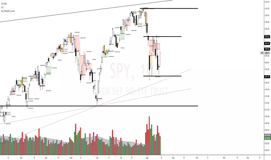
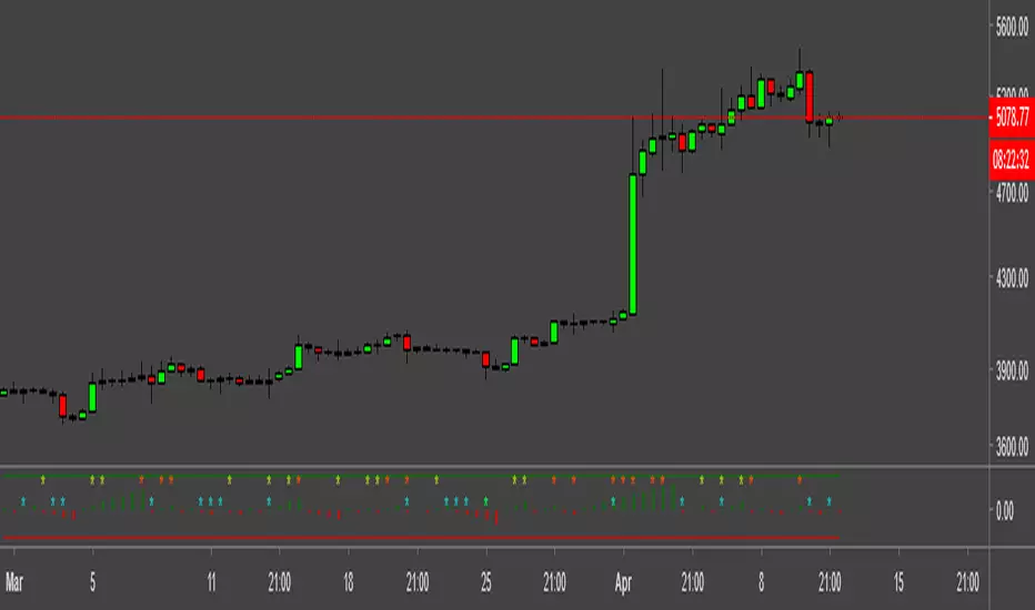
Key Weekly LevelsIncluded is the current weekly open, previous high, Low, Close, and the gap is highlighted.
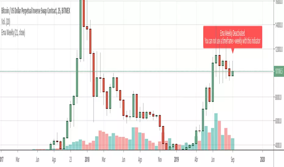
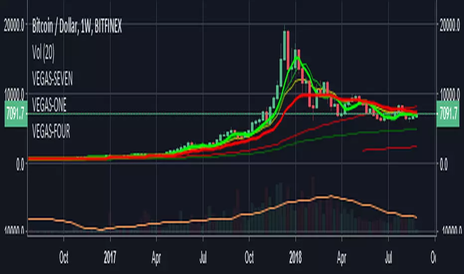
Ema Weekly In current TimeframeThis simple indicator shows the Ema with data extracted from weekly timeframe in your current displayed timeframe.
Due to Tradingview working restrictions, this indicator only works if is used in a timeframe lower (or equal) to one week, otherways shows an error red label showing this error.
All my scripts:
es.tradingview.com
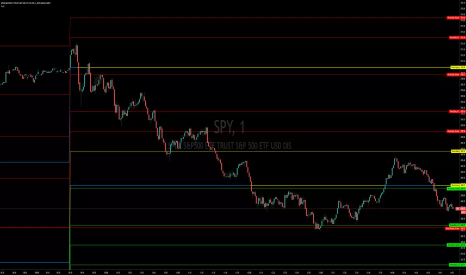
Pivot Points, Daily, Weekly, Open and Close lines What is a Pivot Point?
A pivot point is a technical analysis indicator, or calculations, used to determine the overall trend of the market over different time frames. The pivot point itself is simply the average of the high, low and closing prices from the previous trading day. On the subsequent day, trading above the pivot point is thought to indicate ongoing bullish sentiment, while trading below the pivot point indicates bearish sentiment.
The pivot point is the basis for the indicator, but it also includes other support and resistance levels that are projected based on the pivot point calculation. All these levels help traders see where the price could experience support or resistance. Similarly, if the price moves through these levels it lets the trader know the price is trending in that direction.
When the price of an asset is trading above the pivot point, it indicates the day is bullish or positive.
When the price of an asset is trading below the pivot point, it indicates the day is bearish or negative.
The indicator typically includes four additional levels: S1, S2, R1, and R2. These stand for support one and two, and resistance one and two.
Support and resistance one and two may cause reversals, but they may also be used to confirm the trend. For example, if the price is falling and moves below S1, it helps confirm the downtrend and indicate a possible continuation to S2.
This Script includes the Mid Pivot Points, Open and Close levels
TKP Weekly, Monthly and Yearly Fib Pivot PointsThis script allows you to plot Weekly, Monthly and Yearly Fibonacci Pivot Points. I used templates from others I found on TradingView, special thanks given in the Script. I prefer Longer time frames, especially yearly Pivots, to predict reversals and places to trim risk, so this was tailored to my needs. Hope this helps!
Anas crypto auto regrission channel weekly crypto auto regression channel for weekly period , recommend to be used on 4 hours time frame , this will not work on any thing else , only crypto or any 24 hours/7(days) charts , other charts 24/5 , 8/5 , 16/5 will not work .
enjoy and don't forget to like :)

Bars Counter + Daily/Weekly Highs/Low highlight.Hey!
This script is a remake from other's devs scripts.
The * makes a signal if there is a higher high or lower low , RED( I don't know why looks orange )/LIME for WEEKLY and AQUA/YELLOW for a 36 hs WINDOW.
You can change this parameter as u wish.
The bar counter is simple.
Let me know ur feedback.
MWD_XO_OPENSCreated by TraderX0 & Stingray
Helps you plot the Monthly, Weekly, and Daily Opens quickly on your chart; Open the options menu to adjust colors and toggle time-frames(M/W/D) on/off.

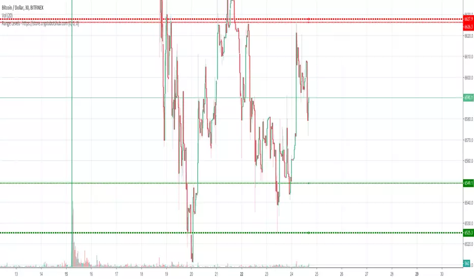
Range Levels - High and Low of Daily, Weekly, and Montly RangesThis is a great free script for the current ranging crypto markets.
You can see the daily, weekly, and monthly high and low of ranges. It also has alerts that you can enable in the settings and then setup in your TradingView alerts for when the price crosses these levels.
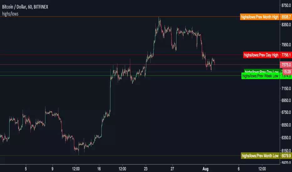
Instabots previous highs and lowsAdds previous daily, weekly and monthly highs and lows to the chart.
By default it just adds the price line to the chart. Change the default option to plot the highs and lows onto the chart, like below...


wPiv21This is a customised indicator highlighting key levels of support and resistance on the weekly time frame.

wPiv11This is a customised indicator highlighting key levels of support and resistance on the weekly time frame.
wPiv4This is a customised indicator highlighting key levels of support and resistance on the weekly time frame.
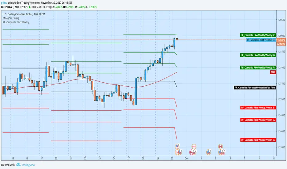
Camarilla Fibo Weekly (pffxcz)Camarilla Fibo Weekly ( Pivot +R1 - R3 and S1 - S3)
R1/S1 = 38.2
R2/S2 = 61.8
R2/S3 = 100
Close of relevant previous periodThis indicator puts the previous close value of a higher relevant time frame on the chart, it adepts to the period of the chart. Relevant means that it puts:
Close of previous year in monthly chart
Close of previous month in weekly chart
Close of either previous month of week in daily chart, default setting is week
Close of previous week in 4hourly and 3hourly charts
Close of previous day in 30minute and higher intraday charts
Not bother the user below 30 minutes.


Pivots Daily Weekly Monthly YearlyDaily, Weekly, Monthly and yearly pivot lines
Just the pivot lines without the support and resistance lines
