Pesquisar nos scripts por "wave"
Wave MasterThis indicator will automatically paint the candles in Green/Red if they are Above/Below the inputted MA, which will also be Green when up and Red when down.
The default MA setting is 60 periods.
There's also a longer term MA pre-setted at 200 periods to give you a longer term perspective of Trend.
All of this concept is from the work of @Kazonomics


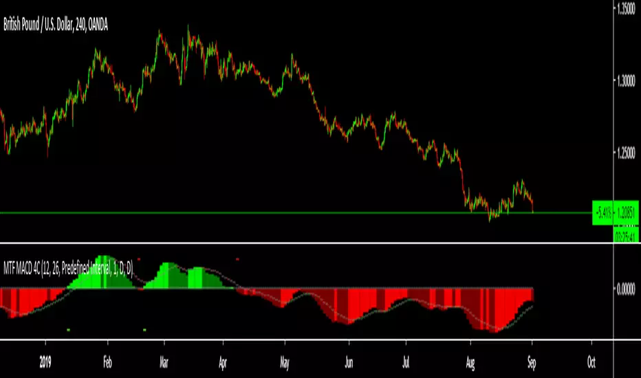
Wave Trend Arrows [Salty]This is just like WT_LB, but with arrows that increase in size to show cross over points. The larger down arrows indicate resistance for overbought levels, and the larger up arrows indicate support for oversold levels.


Wave SMA As far as i can tell there is no other SMA thats works the same, the signal line changes color if closing above or below it.


GLI / Asset Structural Trend RatioBasicly I asked AI to create a GLI to Asset trend ratio indicator.

Sazonalidade FullTitle: Seasonality Full
Description:
Unlock the "Market Memory" with Institutional Precision.
The Seasonality Full is the ultimate evolution of seasonal analysis tools. It combines the robust mathematical engine of classic institutional seasonality with a modern, data-driven dashboard.
Designed for both professional traders and serious students of the market, this version features Educational Tooltips on every setting, teaching you the "Why" behind the "How".
🔥 Key Features:
1. True Institutional Mathematics:
Trading Days Engine: Calculates seasonality based on actual trading days (252/year), ignoring weekends/holidays for perfect candle alignment.
Forced Detrending: Automatically removes long-term trend bias to isolate pure cyclical peaks and troughs. This reveals "cheap" vs. "expensive" zones regardless of the broader market trend.
2. The Sniper Dashboard (HUD): Real-time statistical validation of the seasonal pattern:
🎯 WinRate: Historical probability of a positive close for the current month.
📊 Avg/Target (Smart Volatility): Expected return dynamically adjusted to the asset's volatility profile (e.g., knows that 1% is huge for Forex but normal for Crypto).
⚠️ Risk (StdDev): Identifies if the seasonal pattern is "Stable" (reliable) or "Chaotic" (high variance).
🔍 Correlation (Pearson): The "Lie Detector". Compares the current price action against the projected seasonality.
Green: Price is respecting history (High Confidence).
Red: Price has decoupled from history (Caution).
3. Smart Visualization (Auto-Stack):
Percentage Stacking: A unique control to adjust chart layout.
0%: Overlay mode (compare relative strength).
100%: Joyplot mode (clean, stacked lines).
Dark Mode Optimized: Professional aesthetic designed for long hours of screen time.
4. Built-in Education:
Hover over the "i" icon on any setting to read a detailed explanation of its impact on the analysis. Perfect for learning while trading.
🚀 How to Use:
Use this indicator as a Directional Bias Filter:
Check Confluence: Do the 5, 10, and 15-year lines align?
Validate: Is the Correlation Positive? Is the WinRate favorable?
Execute: If the statistical bias aligns with your Price Action setup, you have a high-probability trade.
Master the cycles. Trade with the flow.

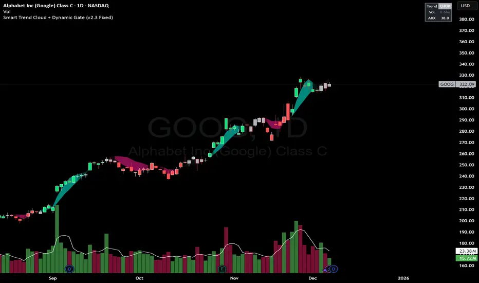
Smart Trend Cloud + Dynamic Gate (V 2.3)Smart Trend Cloud + Dynamic Gate
The Smart Trend Cloud + Dynamic Gate is a comprehensive trend-following system designed to filter out market noise and identify high-probability trend entries. Unlike simple Moving Average crossovers which often fail in ranging markets, this indicator employs a multi-stage validation system (The "Gate") combining Volume, Momentum, and Volatility filters to ensure you only trade when the market has conviction.
Key Features:
> Multi-Type Trend Cloud: Choose between HMA (Hull Moving Average), EMA, or ZeroLag EMA to define the trend baseline.
> The "Dynamic Gate" Filter: A crossover alone does not trigger a signal. The move must be validated by Relative Volume or MACD Histogram momentum within a specific window.
> Choppiness Suppression: Integrated ADX filter turns the candles gray during low-volatility consolidation zones to prevent over-trading.
> Stretch Bands: Optional ATR-based bands to highlight when price is over-extended from the mean.
> Live Dashboard: A table on the chart displaying current Trend State, Relative Volume strength, and ADX values.
How logic Works
1. Trend Definition & The Cloud The core trend is defined by the relationship between a Fast and Slow Moving Average.
Visuals: The space between these MA's forms the "Cloud". The cloud color transparency adjusts dynamically based on the strength of the trend (the spread between the MAs).
MA Options:
HMA: Best for scalping (1m/5m) due to low lag.
ZeroLag EMA: Custom calculation to reduce latency while retaining smoothness.
EMA: Standard trend following.
2. The Entry Gate (Validation) To avoid false signals during "whipsaw" price action, this script uses a logic gate. When a MA crossover occurs, it enters a "Pending" state. It only confirms a BULL or BEAR state if one of the following conditions is met within Gate Window bars:
Volume Spike: Relative Volume (Current Vol / Avg Vol) is greater than the defined threshold (default 1.2x).
Momentum Shift: The MACD Histogram confirms the direction of the trend.
3. Consolidation Filter The script calculates the ADX (Average Directional Index). If the ADX is below the Min ADX Strength threshold (default 20), the market is considered "Choppy."
Visual: Bars turn Gray.
Logic: Trend signals are suppressed until volatility expands.
4. Visual Dashboard A panel is located in the top-right corner providing real-time data:
Trend: Current State (Bull, Bear, or Chop).
Vol: Current Relative Volume (Green if > 1.0).
ADX: Current Trend Strength value.
Settings:
Trend Settings:
Adjust MA types and lengths to fit your timeframe.
Entry Gate: Toggle the Volume/Price gate on/off and adjust the Relative Volume requirement.
Consolidation: Enable/Disable the ADX filter to see all signals or only high-strength ones.
Visuals: Toggle the Cloud, Dashboard, or "Stretch Bands" (ATR bands) to declutter your chart.
Recommended Settings by Timeframe
Since different timeframes require different sensitivities to noise, here are the optimized settings for the Smart Trend Cloud:
⚡ 5 Minute Chart (Scalping)
Best for: Catching quick intraday momentum bursts while filtering chop.
MA Type: HMA (Hull Moving Average for speed)
Fast Length: 9
Slow Length: 21
Min Relative Volume: 1.3 (Requires higher volume to confirm entry)
Min ADX: 25 (Stricter chop filter)
⏱️ 15 Minute Chart (Intraday Swing)
Best for: Day trading with a balance of speed and stability.
MA Type: ZeroLag EMA (Reduces noise better than HMA)
Fast Length: 10
Slow Length: 30
Min Relative Volume: 1.2
Min ADX: 20
hrs 1 Hour Chart (Short-Term Swing)
Best for: Capturing the trend of the week.
MA Type: EMA or ZeroLag EMA
Fast Length: 12
Slow Length: 26 (Classic MACD correlation)
Min Relative Volume: 1.1
Min ADX: 20
📅 1 Day Chart (Position Trading)
Best for: Long-term trends and "Golden Cross" style entries.
MA Type: EMA (Standard Institutional Moving Average)
Fast Length: 20
Slow Length: 50
Min Relative Volume: 1.2
Min ADX: 15 (Allows for earlier entries on major trend shifts)
Alerts:
The script includes built-in alertcondition events for:
Trend Start: Bull (Valid trend detected after filtering).
Trend Start: Bear (Valid trend detected after filtering).
Access & Authorization
This is an Invite-Only script.
SK Trading System v1.6 SK Trading System v0.16 – Rule-Based Market Strategy for Precise Entries & Exits
The SK Trading System v0.16 is a comprehensive, rule-based approach to trading designed to identify market turning points using price action and Fibonacci levels. Built on over 6 years of trading experience and thousands of hours of market analysis, this system combines the power of Fibonacci retracements and extensions with structured price sequences to provide a high-probability framework for identifying trend reversals and market entries.
Key Features:
Price Action-Based: The system leverages market structure, including price highs and lows, to identify significant turning points in the market.
Fibonacci Levels: Key retracement and extension levels (0.382, 0.5, 0.618, 1.618, 2.000) are used to identify optimal entry and exit points for trades.
Clear Sequences: The strategy identifies sequences of price movements (Points 0, A, B, and C) that follow a well-defined pattern of market behavior.
Risk & Money Management: The system enforces strict risk management principles, capping loss exposure to 1-3% per trade and targeting a minimum 1:1 risk/reward ratio.
Automated Trade Setup: Automatic detection of key price levels, including the Golden Pocket zone, targets, and invalidation points.
Visual Trade Markers: Easy-to-read visual indicators, including Fibonacci zones, points of interest, and target levels, to support your trading decisions.
Why Use It:
Disciplined Approach: Follow a strict, rule-driven methodology to eliminate emotional trading and boost consistency.
Multi-Timeframe Analysis: Ideal for traders who analyze multiple timeframes, from higher timeframes for trend direction to lower timeframes for precise entry points.
Comprehensive Risk Management: The system includes built-in stop loss and take profit management to protect your capital and lock in profits.
Continuous Adaptation: The strategy can adapt to changing market conditions, ensuring you stay on the right side of the market.
Who Can Benefit:
Swing Traders: Ideal for traders looking to capture medium- to long-term price movements with high-probability setups.
Trend Followers: Perfect for those who want to trade with the prevailing trend while managing risk.
Fibonacci Enthusiasts: This strategy leverages Fibonacci retracements and extensions to find high-confluence entry and exit zones.
Maximize your trading efficiency and reduce the noise of unpredictable market moves with the SK Trading System v16. Let the system guide your trading decisions with clear, actionable signals and reliable market patterns.

Abdu Trading System 2This private indicator combines swing signals, overlays, trend tracing, and reversal zones.
It is an invite-only script and accessible only to authorized users.

Abdu Trading SystemThis private indicator combines swing signals, overlays, trend tracing, and reversal zones.
It is an invite-only script and accessible only to authorized users.

Myfxschool Trade Pick v25Introducing the MyFXSchool Leading Indicator™, a next-generation market prediction tool designed exclusively for traders who want accuracy, clarity, and early trend identification. Built using advanced price-action logic, institutional order-flow concepts, and dynamic volatility algorithms, this indicator gives you a true leading advantage—not just lagging signals.

DX Supply and Demand Pro💎 DX Supply and Demand Pro: Adaptive Line and Zone Mastery
The DX Supply and Demand Pro indicator is an advanced, hybrid trading tool engineered for precision and context. It seamlessly integrates the proprietary Arbitor Line with dynamic, volume-weighted Supply and Demand Zones. This unique combination provides traders with a clear, adaptive view of both the current trend bias and critical structural price levels.
⚠️ Critical Trading Disclaimer 🛑
Trading is highly speculative and carries a substantial risk of loss. The use of this indicator does not guarantee profits, and you may lose more than your initial capital. Before using this tool in a live trading environment, you must test its performance thoroughly using paper trading or a simulated account.
Why Traders Need the DX S&D Pro 🎯
Proprietary Adaptive Intelligence: The Arbitor Line is a calculated price anchor derived from a complex, undisclosed combination of multiple market factors and proprietary equations. It automatically adjusts its sensitivity based on the chart's timeframe, effectively filtering out market noise to present an accurate, weighted average of the prevailing market bias.
Structural Clarity: It detects high-probability Supply and Demand Zones using pivot points, filtering them for strength based on volume, ATR (volatility), and High Volume Node (HVN) confirmation from a higher timeframe.
Actionable Confluence: The indicator combines dynamic trend bias (the Arbitor Line) with static structural levels (S&D Zones). This allows traders to identify high-conviction setups where the structural turning point is confirmed by the real-time bias of the Arbitor Line.
Feedback & Accountability 🤝
This indicator is provided "as is" and its performance is based on the parameters set by the user. Any suggestions or comments from users regarding performance, bugs, or feature requests should be directed to the developer here or X @Falcondxeye. The developer assumes no liability for trading losses incurred using this tool.
📚 How to Use DX Supply and Demand Pro
This indicator is best used as a confluence tool, where the Arbitor Line confirms the strength and direction of the setup identified by the Supply/Demand Zones.
Trading Confluence with the Arbitor Line:
Scenario: Buy Zone Rejection 🟢
Condition: Price touches a Demand Zone.
Confluence: The Arbitor Line is Above the zone.
Interpretation: Indicates a Bullish Bias is confirming the structural support. Focus on long entries.
Scenario: Sell Zone Rejection 🔴
Condition: Price touches a Supply Zone.
Confluence: The Arbitor Line is Below the zone.
Interpretation: Indicates a Bearish Bias is confirming the structural resistance. Focus on short entries.
Scenario: Momentum Break ⚡
Condition: Price Closes strongly beyond a zone.
Confluence: The Arbitor Line is Aligned with the Break.
Interpretation: Confirms market momentum and suggests the structural break is valid for directional continuation.
⚙️ Key Settings and Optimization Guide 🔧
Arbitor Line Settings (Trend Bias):
VWAP Weight: (Default: 0.33) — The weight applied to a key volume component within the proprietary Arbitor calculation.
Suggestion for High Volatility/Volume: Increase to 0.40 to emphasize volume's influence.
Suggestion for Clean Trends: Decrease to 0.25 to allow momentum components to dictate the line's position.
Supply & Demand Zone Settings (Structural Levels)
HVN Volume TF: (Default: D - Daily) — Crucial Context Setter. The higher timeframe used to look for High Volume Nodes (HVNs) to confirm zone strength.
For Scalping (1m-15m): Use 1H or 4H for validation.
For Day Trading (30m-1H): Use 4H or D. D is the recommended default.
For Swing Trading (4H-Daily): Use W (Weekly).
HVN Bonus %: (Default: 20) — The strength boost applied to a zone if it aligns with an HVN.
Max Supply/Demand Zones: (Default: 2) — Limits the number of active, displayed zones to keep the chart clean.
Retest Bonus %: (Default: 10) — Boosts a zone's strength score each time it is retested (up to max retests).
Time Decay Rate %: (Default: 1) — Reduces a zone's strength for every 10 bars it remains unbroken (stale zones weaken).
Flip Zone on Break: (Default: True) — Turns a broken Demand Zone into a Supply Zone (and vice versa), reflecting structural flip concepts.
💡 Suggestions for Power Users 🚀
Look for Flipped Zones: Pay attention to zones that have been broken and flipped (indicated by yellow text in the labels). Flipped zones that confirm the Arbitor direction often lead to high-momentum continuation moves.
Confirm HVN Strength: Always prioritize trading zones with a high strength score (e.g., 90% or higher), as this indicates maximum confluence of Volume, Volatility, and the HVN Bonus.
Adaptive Timeframes: Use the indicator on multiple timeframes to ensure the Arbitor bias aligns with your trade direction. If the Arbitor is bullish on both the 5-minute and the 1-hour chart, the conviction is exceptionally high.
Final Note: The DX S&D Pro combines the best of trend following with the best of structural trading. It's so good, we call it the Arbitor because it settles the arguments between buyers and sellers... until the next bar, of course! 😉
....................................................................................
💎 مؤشر DX Supply and Demand Pro: خط التكيّف وإتقان المناطق ✨
مؤشر DX Supply and Demand Pro هو أداة تداول هجينة ومتقدمة مصممة للدقة والسياق. إنه يدمج بسلاسة خط Arbitor الخاص بنا مع مناطق العرض والطلب الديناميكية المرجحة بالحجم. يوفر هذا المزيج الفريد للمتداولين رؤية واضحة ومتكيفة لكل من انحياز الاتجاه الحالي ومستويات الأسعار الهيكلية (Structural Price Levels) الحرجة.
⚠️ إخلاء مسؤولية حاسم بشأن التداول 🛑
التداول ينطوي على مخاطرة عالية للغاية ويحمل مخاطر خسارة كبيرة. استخدام هذا المؤشر لا يضمن الأرباح، وقد تخسر أكثر من رأس مالك الأولي. قبل استخدام هذه الأداة في بيئة تداول حقيقية، يجب عليك اختبار أدائها بشكل شامل باستخدام التداول الورقي (Paper Trading) أو حساب محاكاة.
لماذا يحتاج المتداولون إلى مؤشر DX S&D Pro 🎯
ذكاء تكيّفي خاص (Proprietary Adaptive Intelligence): خط Arbitor هو مرساة سعر محسوبة مشتقة من تركيبة معقدة وغير معلنة من عوامل سوق متعددة ومعادلات خاصة. يقوم بضبط حساسيته تلقائيًا بناءً على الإطار الزمني للرسم البياني، مما يزيل ضوضاء السوق بشكل فعال لتقديم متوسط مرجح ودقيق للانحياز السائد في السوق.
وضوح هيكلي (Structural Clarity): يكتشف مناطق العرض والطلب ذات الاحتمالية العالية باستخدام نقاط التحول (Pivot Points)، ويقوم بترشيحها وتحديد قوتها بناءً على الحجم، ATR (التقلب)، وتأكيد من عقدة الحجم العالية (HVN) من إطار زمني أعلى.
تضافر قابل للتطبيق (Actionable Confluence): يجمع المؤشر بين انحياز الاتجاه الديناميكي (خط Arbitor) ومستويات الهيكل الثابتة (مناطق العرض والطلب). يتيح ذلك للمتداولين تحديد إعدادات ذات قناعة عالية حيث يتم تأكيد نقطة التحول الهيكلية من خلال انحياز خط Arbitor في الوقت الفعلي.
الملاحظات والمساءلة 🤝
يتم توفير هذا المؤشر "كما هو" ويستند أدائه إلى الاعدادات التي يحددها المستخدم. يجب توجيه أي اقتراحات أو تعليقات من المستخدمين بخصوص الأداء أو الأخطاء أو طلبات الميزات إلى المطور هنا أو على X @Falcondxeye. لا يتحمل المطور أي مسؤولية عن خسائر التداول المتكبدة باستخدام هذه الأداة.
📚 كيفية استخدام مؤشر DX Supply and Demand Pro
يُفضل استخدام هذا المؤشر كأداة تضافر، حيث يؤكد خط Arbitor قوة واتجاه الإعداد المحدد بواسطة مناطق العرض والطلب.
تضافر التداول مع خط Arbitor:
السيناريو: ارتداد منطقة الشراء 🟢
الحالة: يلامس السعر منطقة الطلب (Demand Zone).
التضافر: يقع خط Arbitor فوق المنطقة.
التفسير: يشير إلى أن انحياز صعودي (Bullish Bias) يؤكد الدعم الهيكلي. التركيز على صفقات الشراء (Long Entries).
السيناريو: ارتداد منطقة البيع 🔴
الحالة: يلامس السعر منطقة العرض (Supply Zone).
التضافر: يقع خط Arbitor أسفل المنطقة.
التفسير: يشير إلى أن انحياز هبوطي (Bearish Bias) يؤكد المقاومة الهيكلية. التركيز على صفقات البيع (Short Entries).
السيناريو: كسر الزخم ⚡
الحالة: يُغلق السعر بقوة خارج المنطقة.
التضافر: يتماشى خط Arbitor مع الكسر.
التفسير: يؤكد زخم السوق ويشير إلى أن الكسر الهيكلي صالح للاستمرار الاتجاهي.
⚙️ الإعدادات الرئيسية ودليل التحسين 🔧
إعدادات خط Arbitor (انحياز الاتجاه)
VWAP Weight (وزن VWAP): (افتراضي: 0.33) — الوزن المطبق على مكون حجم رئيسي ضمن حساب Arbitor الخاص بنا.
اقتراح للتقلب/الحجم العالي: زيادة إلى 0.40 للتأكيد على تأثير الحجم.
اقتراح للاتجاهات النظيفة: تقليل إلى 0.25 للسماح لمكونات الزخم بتحديد موقع الخط بشكل أقوى.
إعدادات مناطق العرض والطلب (المستويات الهيكلية)
HVN Volume TF (الإطار الزمني لحجم HVN): (افتراضي: D - يومي) — مُحدِد السياق الحاسم. الإطار الزمني الأعلى المستخدم للبحث عن عقد الحجم العالية (HVNs) لتأكيد قوة المنطقة.
للمضاربة اللحظية (1د-15د): استخدم 1س أو 4س للتحقق.
للتداول اليومي (30د-1س): استخدم 4س أو D. D هو الإعداد الافتراضي الموصى به.
للتداول المتأرجح (4س-يومي): استخدم W (أسبوعي).
HVN Bonus % (مكافأة HVN %): (افتراضي: 20) — تعزيز القوة المطبق على المنطقة إذا كانت تتماشى مع عقدة HVN.
Max Supply/Demand Zones (الحد الأقصى لمناطق العرض/الطلب): (افتراضي: 2) — يحد من عدد المناطق النشطة المعروضة للحفاظ على نظافة الرسم البياني.
Retest Bonus % (مكافأة إعادة الاختبار %): (افتراضي: 10) — يعزز درجة قوة المنطقة في كل مرة يتم فيها إعادة اختبارها (حتى الحد الأقصى لإعادة الاختبارات).
Time Decay Rate % (معدل الاضمحلال الزمني %): (افتراضي: 1) — يقلل من قوة المنطقة لكل 10 شمعات تبقى فيها دون كسر (المناطق القديمة تضعف).
Flip Zone on Break (قلب المنطقة عند الكسر): (افتراضي: True - صحيح) — يحول منطقة الطلب المكسورة إلى منطقة عرض (والعكس صحيح)، مما يعكس مفاهيم التحول الهيكلي.
💡 اقتراحات للمستخدمين المتقدمين 🚀
ابحث عن المناطق المقلوبة (Flipped Zones): انتبه بشكل خاص إلى المناطق التي تم كسرها وقلبها (يشار إليها بنص أصفر في التسميات). غالبًا ما تؤدي المناطق المقلوبة التي تؤكد اتجاه Arbitor إلى تحركات استمرارية ذات زخم عالٍ.
تأكيد قوة HVN: أعطِ الأولوية دائمًا لتداول المناطق ذات درجة القوة العالية (على سبيل المثال، 90% أو أعلى)، حيث يشير هذا إلى أقصى درجات التضافر بين الحجم والتقلب ومكافأة HVN.
الأطر الزمنية التكيفية: استخدم المؤشر على أطر زمنية متعددة للتأكد من توافق انحياز Arbitor مع اتجاه تداولك. إذا كان Arbitor صعوديًا على كل من الرسم البياني 5 دقائق والساعة الواحدة، تكون القناعة عالية بشكل استثنائي.
ملاحظة أخيرة: يجمع مؤشر DX S&D Pro أفضل ما في تتبع الاتجاه مع أفضل ما في التداول الهيكلي. إنه جيد جدًا، لدرجة أننا نطلق عليه اسم Arbitor لأنه يحسم الجدل بين المشترين والبائعين... حتى الشمعة التالية بالطبع! 😉
دعواتكم 🙏..
