The Kyber Cell's – TTM Wave CThe Kyber Cell’s Wave C – TTM Squeeze Macro Bias & Structural Filter
⸻
1. Introduction
Wave C is the strategic compass in the TTM Squeeze Wave system — the final layer that helps you align with the larger trend or macro context. While Wave A delivers momentum bursts and Wave B confirms active trend direction, Wave C filters trades through a broader lens, helping you avoid taking strong intraday setups that go against the dominant structure.
Wave C is designed to act as your macro bias validator — filtering out trades that contradict higher-timeframe flows or major moving average slopes. When all three waves line up, you’re no longer just reacting to signals — you’re trading with intention and structure. When in doubt, zoom out and that is what Wave C gives you.
⸻
2. Core Concept and Calculation
Wave C is built to measure high-level trend bias, either on the current chart timeframe or derived from a higher timeframe (HTF). Its logic is based on one or more of the following structural tools:
• Long-term EMA slope (e.g., 55, 89, or 200 EMA)
• HTF VWAP positioning (price above or below)
• Long-period HMA slope (e.g., HMA 144 or HMA 233)
• Directional bias from HTF TTM Squeeze or MTF trend engine
Unlike Wave A and B, which may fluctuate during normal price swings, Wave C changes more slowly. That’s the point — it gives a “big picture” backdrop against which all lower-level signals should be evaluated. It reduces false positives and helps you wait for trades in the direction of the broader trend.
⸻
3. Visual Output and Color Logic
Wave C uses a simple and deliberate color scheme to communicate macro alignment:
• Green: Bullish macro structure
• Red: Bearish macro structure
• Gray: Neutral, indecisive, or flat macro trend
This muted but firm logic encourages patient, structured trading. The goal isn’t to trigger trades directly from Wave C, but to filter out trades that contradict market posture.
• When Wave C is Green, you ideally want Wave B to be blue and Wave A to turn cyan before going long.
• When Wave C is Red, you look for Wave B to be red and Wave A to turn bright red before shorting.
• If Wave C is Gray, it may signal choppy, indecisive structure — use caution or reduce trade size.
⸻
4. Ideal Use Case
Wave C functions as your global bias filter:
1. Set your directional bias for the session or week.
2. Only take trades that agree with Wave C direction.
3. When all waves align, trade with size and confidence.
4. When Wave C disagrees, wait or downshift your trade plan.
This makes Wave C especially valuable for swing traders, position traders, or intraday traders who want to anchor their entries within a broader trend.
⸻
5. Configuration and Customization
Wave C is built with advanced users in mind, and its configuration allows multiple structural methods:
• EMA Slope Method: Set EMA length and threshold angle
• HTF Source Method: Request HTF data for squeeze trend, VWAP, or Wave B analog
• HMA Trend Filter: Longer-term smoothing to detect sustained directional flow
• Color Preferences: Customize green/red/gray scheme as needed
This flexibility allows you to tailor Wave C to your strategy — whether you’re anchoring to a Daily EMA while scalping the 5-minute chart, or aligning swing entries with the Weekly VWAP.
⸻
6. Alerts and Add-ons
Although Wave C isn’t typically used for alerts, it can be incorporated into confluence-based alert stacks. For example:
• Alert only when Wave C = Green, Wave B = Blue, and Wave A = Rising
• Alert on macro flip (e.g., Green → Red) as a possible regime change
• Alert when macro bias agrees with MTF Squeeze Panel bias
These setups are more advanced but help automate disciplined trade selection.
⸻
7. Disclaimer
This indicator is for educational and research purposes only. It is not trading advice. Wave C is most effective when used in conjunction with Wave A, Wave B, and other structural context. All trades should be executed with proper risk management and backtested methodology.
Pesquisar nos scripts por "the strat"

NY HIGH LOW BREAKNY HIGH LOW BREAK: A New York Session Breakout Strategy
The "NY HIGH LOW BREAK" indicator is a powerful TradingView script designed to identify and capitalize on breakout opportunities during the New York trading session. This strategy focuses on the initial price action of the New York market open, looking for clear breaches of the high or low established within the first 30 minutes. It's particularly suited for intraday traders who seek to capture momentum-driven moves.
Strategy Logic
The core of the "NY HIGH LOW BREAK" strategy revolves around these key components:
New York Session Opening Range Identification:
The script first identifies the opening range of the New York session. This is defined by the high and low prices established during the first 30 minutes of the New York trading session (from 7:01 AM GMT-4 to 7:31 AM GMT-4).
These crucial levels are then extended forward on the chart as horizontal lines, serving as potential support and resistance zones.
Breakout Signal Generation:
Long Signal: A buy signal is generated when the price breaks above the high of the New York opening range. Specifically, it looks for a candle whose open and close are both above the highLinePrice, and importantly, the previous candle's open was below and close was above the highLinePrice. This indicates a strong upward momentum confirming the breakout.
Short Signal: Conversely, a sell signal is generated when the price breaks below the low of the New York opening range. It looks for a candle whose open and close are both below the lowLinePrice, and the previous candle's open was above and close was below the lowLinePrice. This suggests strong downward momentum confirming the breakdown.
Supertrend Filter (Implicit/Future Enhancement):
While the supertrend and direction variables are present in the code, they are not actively used in the current signal generation logic. This suggests a potential future enhancement where the Supertrend indicator could be incorporated as a trend filter to confirm breakout directions, adding an extra layer of confluence to the signals. For example, only taking long breakouts when Supertrend indicates an uptrend, and short breakouts when Supertrend indicates a downtrend.
Second Candle Confirmation (Possible Future Enhancement):
The close_sec_candle function and openSEC, closeSEC variables indicate an attempt to capture the open and close of a "second candle" (30 minutes after the initial New York open). Currently, closeSEC is used in a specific condition for signal_way but not directly in the primary longSignal or shortSignal logic. This also suggests a potential future refinement where the price action of this second candle could be used for further confirmation or specific entry criteria.
Time-Based Filtering:
Signals are only considered valid within a specific trading window from 8:00 AM GMT-4 to 8:00 AM GMT-4 + 16 * 30 minutes (which is 480 minutes, or 8 hours) on 1-minute and 5-minute timeframes. This ensures that trades are taken during the most active and volatile periods of the New York session, avoiding late-session chop.
The script also highlights the New York session and lunch hours using background colors, providing visual context to the trading day.
Key Features
Automated New York Open Range Detection: The script automatically identifies and plots the high and low of the first 30 minutes of the New York trading session.
Clear Breakout Signals: Visually distinct "BUY" and "SELL" labels appear on the chart when a breakout occurs, making it easy to spot trading opportunities.
Timeframe Adaptability: While optimized for 1-minute and 5-minute timeframes for signal generation, the opening range lines can be displayed on various timeframes.
Customizable Risk-to-Reward (RR): The rr input allows users to define their preferred risk-to-reward ratio for potential trades, although it's not directly implemented in the current signal or trade management logic. This could be used by traders for manual trade management.
Visual Session and Lunch Highlights: The script colors the background to clearly delineate the New York trading session and the lunch break, helping traders understand the market context.
How to Use
Apply the Indicator: Add the "NY HIGH LOW BREAK" indicator to your chart on TradingView.
Select a Relevant Timeframe: For optimal signal generation, use 1-minute or 5-minute timeframes.
Observe the Opening Range: The green and red lines represent the high and low of the first 30 minutes of the New York session.
Look for Breakouts: Wait for price to decisively break above the green line (for a buy) or below the red line (for a sell).
Confirm Signals: The "BUY" or "SELL" labels will appear on the chart when the breakout conditions are met within the active trading window.
Implement Your Risk Management: Use your preferred risk management techniques, including stop-loss and take-profit levels, in conjunction with the signals generated. The rr input can guide your manual risk-to-reward calculations.
Potential Enhancements & Considerations
Supertrend Confirmation: Integrating the supertrend variable to filter signals would significantly enhance the strategy's robustness by aligning trades with the prevailing trend.
Stop-Loss and Take-Profit Automation: The rr input currently serves as a manual guide. Future versions could integrate automated stop-loss and take-profit placement based on this ratio, potentially using ATR for dynamic sizing.
Volume Confirmation: Adding a volume filter to confirm breakouts would ensure that only high-conviction moves are traded.
Backtesting and Optimization: Thorough backtesting across various assets and market conditions is crucial to determine the optimal settings and profitability of this strategy.
Session Times: The current session times are hardcoded. Making these user-definable inputs would allow for greater flexibility across different time zones and trading preferences.
The "NY HIGH LOW BREAK" is a straightforward yet effective strategy for capturing initial New York session momentum. By focusing on clear breakout levels, it aims to provide timely and actionable trading signals for intraday traders.

LANZ Strategy 1.0🔷 LANZ Strategy 1.0 — Session-Based Directional Logic with Visual Multi-Account Risk Management
LANZ Strategy 1.0 is a structured and disciplined trading strategy designed for the 1-hour timeframe, operating during the NY session and executing trades overnight. It uses the directional behavior between 08:00 and 18:00 New York time to define precise limit entries for the following night. Ideal for traders who prefer time-based execution, clear visuals, and professional risk management across multiple accounts.
🧠 Core Components:
1. Session Direction Confirmation:
At 18:00 NY, the system evaluates the market direction by comparing the open at 08:00 vs the close at 18:00:
If the direction matches the previous day, it is reversed.
If it differs, the current day’s direction is kept.
This logic is designed to avoid trend exhaustion and favor potential reversal opportunities.
2. EP Level & Risk Definition:
Once direction is defined:
For BUY, EP is set at the Low of the session.
For SELL, EP is set at the High of the session.
The system automatically plots:
SL fixed at 18 pips from EP
TP at 3.00× the risk → 54 pips from EP
All levels (EP, SL, TP) are shown with visual lines and price labels.
3. Time-Restricted Entry Execution:
The entry is only valid if price touches the EP between 19:00 and 08:00 NY.
If EP is not touched before 08:00 NY, the trade is automatically cancelled.
4. Multi-Account Lot Sizing:
Traders can configure up to five different accounts, each with its own capital and risk percentage.
The system calculates and displays the lot size per account, based on SL distance and pip value, in a dynamic floating label.
5. Outcome Tracking:
If TP is hit, a +3.00% profit label is displayed along with a congratulatory alert.
If SL is hit, a -1.00% label appears with a loss alert.
If the trade is still open by 09:00 NY, it is manually closed, and the result is shown as a percentage of the initial risk.
📊 Visual Features:
Custom-colored angle and guide lines.
Dynamic angle line starts at 08:00 NY and tracks price until 18:00.
Shaded backgrounds for key time zones (e.g., 08:00, 18:00, 19:00).
BUY/SELL signals shown at 19:00 based on match/divergence logic.
Label panel showing risk metrics and lot size for each active account.
⚙️ How It Works:
08:00 NY: Marks the session open and initiates a dynamic angle line.
18:00 NY: Evaluates the session direction and calculates EP/SL/TP based on outcome.
19:00 NY: Activates limit order monitoring.
During the night (until 08:00 NY): If EP is touched, the trade is triggered.
At 08:00 NY: If no touch occurred, trade is cancelled.
Overnight: TP/SL logic is enforced, showing percentage outcomes.
At 09:00 NY: If still open, trade is closed manually and result is labeled visually.
🔔 Alerts:
🚀 EP execution alert when touched
💢 Stop Loss hit alert
⚡ Take Profit hit alert
✅ Manual close at 09:00 NY with performance result
🔔 Daily reminder at 19:00 NY to configure and prepare the trade
📝 Notes:
Strategy is exclusive to the 1-hour timeframe.
Works best on assets with clean NY session movement.
Perfect for structured, semi-automated swing/overnight trading styles.
Fully visual, self-explanatory, and backtest-friendly.
👨💻 Credits:
Developed by LANZ
A strategy created with precision, discipline, and a vision for traders who value time-based entries, clean execution logic, and visual confidence on the chart.
Special thanks to Kairos — your AI assistant — for the detailed structure, scripting, and documentation of the strategy.
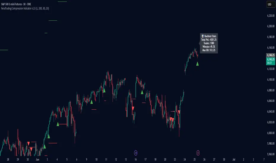
FeraTrading Compression Indicator v1.3🧠 Overview:
The FeraTrading Compression Indicator v1.3 identifies early-stage directional breakouts that follow periods of volatility contraction. This tool is built for intraday traders looking to catch clean breakouts out of tight consolidations. It doesn’t just detect compression—it confirms when that compression is being forcefully released with directional intent.
By combining volatility filtering, trend structure via EMAs, body dominance checks, and an optional session filter, the indicator isolates breakout signals with a high degree of confluence. Users can optionally enable a Signal Flip mode to invert long/short logic—useful in mean-reverting environments or inverse structures.
⚙️ How It Works:
🔹 Volatility Compression Detection:
Compression is detected using a relative ATR comparison between short-term and long-term range averages.
When the short-term range falls below a threshold, the market is considered to be compressing.
This approach is fully adaptive—self-scaling across different asset types and timeframes.
🔹 Breakout Confirmation Logic:
A breakout is confirmed only when the following conditions align:
Range Expansion:
The breakout candle must exceed the long-term average range—confirming actual price expansion.
Strong Candle Body:
The body must represent a significant portion of the candle’s range, confirming momentum and directionality.
EMA Trend Alignment:
The script checks that a fast EMA is properly aligned with a slower EMA and that the candle closes beyond the fast EMA in the correct direction.
Optional Session Filter (08:30–11:30 EST):
Focuses signals to the high-volume portion of the day, increasing reliability. Can be disabled for full-session use.
Signal Flip Option:
Reverses signal logic for assets that often fade breakouts or move counter to structural expectations.
🧪 Built-In Backtester:
The script includes a bar-level backtester, enabling users to simulate SL/TP outcomes and visualize strategy performance directly on the chart.
🧮 Logic & Assumptions:
Trades enter at the open of the signal bar.
SL/TP levels are applied immediately.
If both are hit on the same bar, SL is assumed to hit first (for realism).
An optional setting closes trades at the end of day.
📊 Visual Feedback:
TP and SL levels are plotted in real time.
A stats box displays:
Win rate
Total trades
Max drawdown
Cumulative PnL
This provides an instant read on strategy behavior using your exact market view.
🎯 What Makes It Original:
Compression breakout logic without oscillators: Signals are built from candle structure, EMA alignment, and raw volatility—no lagging tools required.
Real-time SL/TP backtesting: Built-in engine allows traders to test performance without switching tools or exporting data.
Modular logic design: Session filters, signal flip, and compression strictness can be tailored to different markets and conditions.
Minimal input, deep logic: Two volatility filters, two EMAs, and a candle body check combine into a layered signal system that adapts in real time.
This balance of simplicity and structural precision makes it highly versatile for active day traders across asset classes.
✅ How to Use:
Add the script to any chart (1m–15m ideal).
Watch for triangle signals:
Green = bullish breakout
Red = bearish breakout
Toggle session filters or signal flip as needed.
Enable the backtester to visualize edge over time.
Combine with structure, liquidity zones, or volume tools for confluence.
This indicator is best deployed during active market hours when breakout momentum has the highest chance of follow-through.
💎 Why It’s Worth Paying For
The FeraTrading Compression Indicator v1.3 is not just another breakout tool—it is a modular signal system with embedded trade testing logic, built specifically for real-world trading environments.
What makes it premium:
Live confluence-based signals with real volatility and momentum context
Custom-built SL/TP backtester with chart-based visual performance feedback
Non-repainting, directional logic with trend and structure confirmation
Adaptive signal behavior via session and flip toggles
Designed for real execution, not just visual alerts
The blend of signal accuracy, trade simulation, and structural adaptability makes this script more than an entry indicator—it’s a breakout testing and execution framework, ready to plug into any strategy.
✅ Compliance & Originality
This script was written entirely from scratch using original compression logic, trend structure filtering, and trade simulation. It does not reuse any public code, open-source snippets, or repackaged modules. All calculations, condition checks, visuals, and stats logic are unique to this tool. EMA's and ATR were used in filter logic, yet they are only 2 of many filters used, all of the others being fully custom built.
⚠️ Risk Disclaimer & Access Policy
This tool does not predict market direction or guarantee trade results. It provides a rule-based breakout signal structure designed to align with price expansion logic.
Always use your own risk management practices and trade plans. This script is meant as a supportive tool, not a financial advisory system.
🔒 Why This Script Is Invite-Only and Closed-Source
To preserve the tool’s edge and prevent unauthorized replication, the script is invite-only and closed-source.
The following features are proprietary:
Compression zone and range expansion filter logic
Real-time SL/TP backtesting engine
Signal flip and session filtering integration
Confluence layering using structure, volatility, and body-based validation
Opening the source would expose key mechanics and reduce the integrity of the strategy’s edge. Closed access ensures the system remains performant, exclusive, and trusted by serious traders.
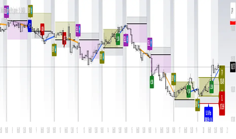
Failed 2U/2D + 50% Retrace Scanner📈 Multi-Ticker Failed 2U/2D Scanner with Daily Retrace & Market Breadth Table
This TradingView indicator is a multi-symbol price action scanner designed to catch high-probability reversal signals using The Strat’s failed 2U/2D patterns and daily 50% retrace logic, while also displaying market breadth metrics ( USI:TICK and USI:ADD ) for context.
Monitored Symbols:
SPY, SPX, QQQ, IWM, NVDA, AMD, AAPL, META, MSTR
🔍 Detection Logic
1. Failed 2U / Failed 2D Setups
Failed 2U: Price breaks above the previous candle’s high but closes back below the open → Bearish reversal
Failed 2D: Price breaks below the previous candle’s low but closes back above the open → Bullish reversal
Timeframes Monitored:
🕐 1-Hour (1H)
⏰ 4-Hour (4H)
2. Daily 50% Candle Retrace
Checks if price has retraced 50% or more of the previous day’s candle body
Highlights potential trend exhaustion or reversal confluence
3. Market Breadth Metrics (Display Only)
USI:TICK : Measures real-time NYSE up vs. down ticks
USI:ADD : Advance-Decline Line (net advancing stocks)
Not used in signal logic — just displayed in the table for overall market context
🖼️ Visual Elements
✅ Chart Markers
🔺 Red/Green Arrows for 1H Failed 2U/2D
🟨 Yellow Squares for 4H Failed 2U/2D
Visual markers are plotted directly on the relevant candles
📊 Signal Table
Lists all 9 tickers in rows
Columns for:
1H Signal
4H Signal
Daily 50% Retrace
USI:TICK Value
USI:ADD Value
Color-Coded Cells:
🔴 Red = Failed 2U
🟢 Green = Failed 2D
⚠️ Highlight if 50% Daily Retrace condition is true
🟦 Neutral-colored cells for TICK/ADD numeric display
🔔 Alerts
Hardcoded alerts fire when:
A 1H or 4H Failed 2U/2D is detected
The Daily 50% retrace condition is met
Each alert is labeled clearly by symbol and timeframe:
"META 4H Failed 2D"
"AAPL Daily 50% Retrace"
🎯 Use Case
Built for:
Reversal traders using The Strat
Swing or intraday traders watching hourly setups
Traders wanting quick visual context on market breadth without relying on it for confirmation
Monitoring multiple tickers in one clean view
This is scan 2
Add scan 1 for spx, spy, iwm, qqq, aapl
This indicator is not financial advice. Use the alerts to check out chart and when tickers trigger.
Inside Bar Detector - 15min
🔍 What is an Inside Bar?
An **Inside Bar** is a candle that forms **entirely within the high and low of the previous candle**. It represents **consolidation**, **indecision**, or **potential reversal**, and is a key signal in The Strat trading method.
🔧 What the Script Does:
1. **Timeframe Restriction**:
* The script activates **only on the 15-minute timeframe**, avoiding clutter on other timeframes.
2. **Inside Bar Logic**:
* It checks whether the **current bar’s high is lower than the previous bar’s high**, **AND** the **current bar’s low is higher than the previous bar’s low**.
* If both conditions are true, it confirms an Inside Bar.
3. **Visual Display**:
* When an Inside Bar is detected, the script **plots a yellow label ("1") above the bar**.
* The label represents the Strat 1-bar and helps you easily spot potential setups.
🎯 Use Case:
* Ideal for **Strat traders**, **price action analysts**, or **any trader** looking for breakout or reversal opportunities.
* Common setups include **1-2**, **1-3**, or **double inside bar** breakouts.

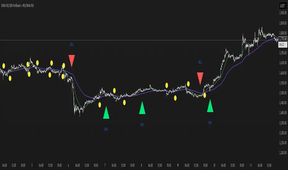
EMA 50/200 Pullback + RSI/SMA RSI
Strategy Description: EMA 50/200 Pullback + RSI/SMA RSI
1. Trend Identification with EMA:
Uses two Exponential Moving Averages (EMA): a fast EMA (default 50) and a slow EMA (default 200).
When the fast EMA crosses above the slow EMA (bullish crossover), an uptrend is identified.
When the fast EMA crosses below the slow EMA (bearish crossover), a downtrend is identified.
The lengths of both EMAs are fully customizable.
2. EMA Distance Condition:
Signals are only valid when the absolute percentage distance between the two EMAs is within a user-defined range (default: 0.4% to 1%).
This helps filter out weak signals when the EMAs are too close or too far apart.
3. Pullback Condition:
After a new trend is detected (EMA crossover), the strategy waits for the price to pull back to touch or cross the fast EMA (EMA 50).
This ensures entries are not taken immediately at the crossover, but after a retracement to a dynamic support/resistance area.
4. RSI Confirmation:
Uses the RSI indicator (default 14) and its Simple Moving Average (SMA RSI, default 14).
Buy signal: RSI crosses above its SMA.
Sell signal: RSI crosses below its SMA.
Both RSI and SMA RSI lengths are fully customizable.
5. Entry Rules:
The indicator only gives the first buy/sell signal after each EMA crossover (start of a new trend), and will not repeat signals until the next EMA crossover.
Buy signal:
Fast EMA crosses above slow EMA
EMA distance is within the valid range
Price pulls back to the fast EMA
RSI crosses above its SMA
Sell signal:
Fast EMA crosses below slow EMA
EMA distance is within the valid range
Price pulls back to the fast EMA
RSI crosses below its SMA
6. Customization:
All parameters (EMA lengths, RSI length, SMA RSI length, EMA distance range) can be adjusted in the indicator’s settings.
Note:
This is a signal indicator, not a complete trading strategy. For real trading, always combine with risk management and additional confirmations.
Algo BOT 3.0Algo BOT 3.0 is a sophisticated, rule-based intraday trading strategy designed for index option traders who seek high-probability entries based on market structure, institutional zones, and controlled risk management. This strategy intelligently identifies BUY and SELL trade opportunities using price action, Fibonacci retracements, and pivot confluences, layered with dynamic trade management through trailing stop loss (TSL) and predefined profit/loss thresholds.
🔍 Strategic Foundation
Algo BOT 3.0 combines multiple proven intraday trading concepts into a single unified system:
Candle Behavior Analysis:
Detects strong green (bullish) and red (bearish) candles based on configurable range filters, wick/body ratios, and volume-backed movement.
Ensures only impactful candles are considered for signal generation, filtering out noise.
Dynamic Candle Range Filtering:
Filters out low-momentum candles by comparing their range against a dynamically calculated threshold (based on recent 30-minute close).
Prevents premature or weak entries by focusing on high-volatility structures.
Fibonacci Entry Zones:
Automatically calculates 0.382 and 0.618 Fibonacci levels between the most recent key candles (highest green & lowest red).
These fib levels are used to define entry zones for BUY (above red fib 0.382) and SELL (below green fib 0.382).
Optional fib zones can be visually shown on the chart with real-time drawing.
📈 Signal Generation Logic
The core BUY/SELL signals are triggered based on a combination of:
Green/Red Candle Identification:
A green candle qualifies if:
Open is near the bottom 38.2% of its range.
Close is above the top 61.8% of the range.
High is above a pivot or institutional level.
A red candle qualifies if:
Open is near the top 38.2% of its range.
Close is below the bottom 61.8% of the range.
Low is below a pivot or institutional level.
Support/Resistance Touch Confirmation:
Signals are only considered valid if the qualifying candle touches:
CPR Top/Bottom
Daily Pivot Points (PP, R1–R4, S1–S4)
VWAP or MVWAP
CE Entry (BOT BUY):
Occurs when the price crosses above red fib 0.382 after red candle touch at support.
PE Entry (BOT SELL):
Occurs when the price crosses below green fib 0.382 after green candle touch at resistance.
Signal Controls:
Only one active signal per type (BUY/SELL) at a time.
Real-time tracking of active trade with condition-based resets.
🎯 Exit Management
Built-in risk and profit control with dynamic logic:
Trailing Stop Loss (TSL):
TSL is dynamically adjusted based on peak price after entry.
Trail distance is customizable via input (% below peak).
Visual alerts notify when TSL is hit.
Profit Target:
Trade exits automatically when desired % profit is achieved from entry.
Loss Limit:
Trade exits immediately if unrealized loss exceeds a set % threshold.
Helps prevent large drawdowns during volatile market moves.
🧠 Technical Indicator Integration
To enhance trade accuracy, the strategy includes several optional filters:
RSI: Momentum confirmation or divergence filtering.
SMA/EMA: Trend direction confirmation.
MVWAP: Modified VWAP for smoother institutional bias tracking.
🖼️ Visuals & Alerts
BOT BUY and BOT SELL Signal Labels appear directly on the chart with trade type and candle reference.
TSL, Target, and SL Exits shown as label markers with optional background highlight.
Live Alerts:
BOT BUY (CE Entry)
BOT SELL (PE Entry)
Trailing Stop Loss Triggered
Profit Target Hit
Stop Loss Triggered
⚙️ Customizable Settings
Users can fine-tune the strategy using the following input options:
MVWAP Length
RSI / SMA / EMA Lengths
Candle Range Sensitivity
TSL Distance (%)
Profit Target (%)
Loss Limit (%)
Enable/Disable Background Highlights & Labels
Display Fib Zones
⏱️ Best Use Case & Timeframes

SMA Backtest Optimizer [Mr_Rakun]The SMA Backtest Optimizer is a powerful Pine Script tool designed to systematically analyze and compare various Simple Moving Average (SMA) periods to identify the most profitable configuration for trading strategies. This indicator tests multiple SMA periods (from 10 to 100) using a crossover strategy where buys occur when price crosses above the SMA and sells when price crosses below it.
Key Features:
Tests 10 different SMA periods to determine optimal settings
Calculates profit/loss based on a defined starting capital
Tracks total profit and number of trades for each period
Visually highlights the best performing SMA on your chart
Displays comprehensive results in an easy-to-read table
Labels the chart with key performance metrics
This code serves as a core framework that traders can customize for their specific needs. You can easily modify the strategy parameters, test different technical indicators, adjust capital settings, or implement more complex entry/exit rules. The optimization methodology can be applied to virtually any trading approach you wish to evaluate.
Feel free to adapt this framework to test your own trading ideas and discover which parameters work best in different market conditions.

Metrics TJ
📘 Metrics TJ
Author: Trade Journey
Type: Market Metrics / Intraday
Timeframes:
Context: 1H
Entry Points: 15m
---
🎯 Core Idea
Metrics TJ is a powerful market metrics tool designed for intraday traders. It provides essential market data — including volume, ATR (Average True Range), and correlation with other assets — to help you make informed decisions. By combining multiple indicators into a unified view, this tool allows you to spot key trends, volatility, and relative strength within a single chart.
---
🔍 Strategy Logic
1. Context (1H)
Before making intraday decisions on smaller timeframes (such as the 15m chart), use the 1H timeframe to understand the broader market context:
Look at candle structure, levels, volume, and other signals to identify if the market is trending or consolidating.
Example: If the 1H chart shows rising volume and a series of higher highs and lows, it indicates an uptrend.
2. Core Metrics
Day Volume (DV): Total volume traded over the past 24 hours. A sharp increase may indicate increased market interest and potential for higher volatility.
Average Volume (AV): A smoothed average volume over a set period. Spikes in average volume can highlight unusual activity, signaling potential moves.
ATR (NATR): Measures the market's volatility. A high ATR means the market is moving more dynamically, often correlating with larger price moves.
Correlation (CR): Measures how strongly the asset is correlated with a reference pair, such as BTC. A strong positive or negative correlation could indicate an impending move or reversal.
3. Trade Filter
To improve the accuracy of the strategy:
Use Volume and ATR thresholds to filter out low-volatility or range-bound conditions.
Correlation with a reference asset helps identify when the market's behavior diverges from its usual pattern.
---
📈 Example of Entry Logic
1. On 1H: The market is in a confirmed uptrend, with rising volume and a series of higher highs.
2. On 15m: You observe an increase in Day Volume and Average Volume signaling potential for a breakout.
3. ATR is high, showing the market is volatile — indicating a good environment for intraday trading.
4. Correlation with BTC shows strong positive correlation, suggesting a price move in sync with the larger crypto market.
5. Trade Decision:
Enter long if the conditions are met: Volume spikes, ATR confirms volatility, and correlation supports the price direction.
Exit if volume decreases, ATR drops, or if the correlation weakens.
---
⚙️ Settings
(tradingview\.com/x/Y6PjccKy/)
---
📊 Why It Works
Day Volume and Average Volume help identify unusual activity, potentially signaling a price move.
ATR highlights periods of high volatility, which are crucial for intraday trading.
Correlation with major assets (like BTC) gives additional context on the market's broader movement, improving the probability of profitable trades.
Using a combination of volume and ATR reduces the likelihood of false signals, especially in choppy or low-volume environments.
---
🔔 Recommendations
Best used in strong trending markets where volume and volatility are in sync.
Avoid trading in range-bound conditions where price action lacks momentum.
Use this strategy as a supplement to other technical indicators or as part of a larger trading system.
---
✅ Conclusion
Metrics TJ provides a holistic view of the market, combining key metrics to help traders make smarter intraday decisions. By focusing on volume, volatility, and correlation, it can help you spot high-probability trades and avoid noise.
Try it on demo, adjust the settings to fit your trading style, and start identifying profitable opportunities!
---
📌 Important Note:
This indicator is best used in combination with higher timeframe analysis. Always consider the broader market context before making any trades.

SR Nube 1.1The SR Nube 1.1 indicator offers a comprehensive perspective on price action through the strategic combination of three key elements: a dynamic cloud based on two Volume Weighted Moving Averages (VWMA), a consistent reference Exponential Moving Average (EMA) across all timeframes, and an intuitive information table.
The Dynamic Cloud: This cloud is calculated using two VWMA with lengths that automatically adjust based on the chart's timeframe. This dynamic adaptation allows for the identification of relevant support and resistance zones across different timeframes, providing contextual insight into potential price movement. The cloud visualizes areas of volume confluence, helping traders pinpoint zones where buying or selling pressure may be significant.
The Consistent Reference EMA: An EMA with a specific length (calculated to be representative of a higher timeframe, such as 1 hour, and displayed consistently across all timeframes) is overlaid on the chart. This EMA serves as a macro trend guide and a constant visual reference point, making it easier to identify the overall market direction regardless of the active trading timeframe. Its consistency across timeframes helps maintain perspective and align trades with the dominant trend.
The Information Table: Located in the top-left corner of the chart, a concise table summarizes the current price status relative to the cloud (on the 20-minute timeframe, as a reference for the main strategy) and the price's position concerning the reference EMA (based on the 1-hour timeframe). This table provides a quick, color-coded overview of trend alignment across multiple key timeframes, which can assist traders in making more informed decisions.
Utility and Underlying Concepts:
This indicator is designed for traders seeking a tool that combines volume analysis (through the VWMA in the cloud) with a higher timeframe trend reference (the consistent EMA). The dynamic cloud helps identify potential entry and exit zones within the trading timeframe, while the reference EMA provides a directional filter. The information table simplifies the evaluation of trend confluence across multiple timeframes, potentially increasing the probability of successful trades.
The underlying strategy is based on the idea of trading in the direction of volume and in alignment with a higher timeframe trend, using the cloud to identify value areas and the EMA as a key directional filter. The information table acts as a quick visual aid for assessing this alignment.
How to Use:
Add the "SR Nube 1.1" indicator to your TradingView chart.
Observe the dynamic cloud to identify potential support and resistance zones on your trading timeframe.
Use the blue EMA as a guide for the overall market trend.
Consult the information table in the top-left corner to see the price alignment with the 20-minute cloud and the 1-hour EMA. The colors will provide a quick indication of the potential direction.
Look for confluence between the cloud signals on your trading timeframe, the price's position relative to the EMA, and the information provided in the table to identify potential entry and exit opportunities.

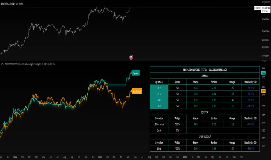
Simple Portfolio System | QuantumResearchStatic Allocation Engine for Smarter Crypto Exposure
The Simple Portfolio System (SPS) by QuantumResearch is a lightweight yet powerful asset allocation framework, designed for investors who want a smarter, more disciplined alternative to passive buy-and-hold. SPS allocates capital across four customizable assets — BTC, ETH, SOL, and SUI — using a volatility-adjusted momentum engine powered by the proprietary AVWO indicator.
🔍 Key Features:
✅ Adaptive Allocation Logic
Every day, the system evaluates trend strength using the AVWO oscillator. Each asset showing a bullish signal receives a fixed 25% portfolio allocation.
📉 Dynamic Cash Protection
If no asset is trending, SPS automatically shifts to 100% cash, minimizing exposure during sideways or bearish market phases.
📈 Equity Curve Overlay
Compare the strategy's performance against traditional Buy & Hold — both equity curves are plotted for clear benchmarking.
🧠 Proprietary Signal Engine
Powered by AVWO, a custom volatility-weighted oscillator developed by QuantumResearch, designed to filter noise and highlight adaptive trend signals.
📋 Live Performance Dashboard
Real-time metrics include:
Sharpe Ratio
Sortino Ratio
Omega Ratio
Max Drawdown (%)
Current Asset Allocations & Weights
⚙️ System Logic Overview:
Up to four assets analyzed: BTC, ETH, SOL, SUI
If one or more assets are detected as trending, each receives 25% allocation
If none are trending, capital remains unallocated (cash)
Allocation signals are recalculated daily
Backtest begins: 03 May 2023
📌 Use Case:
This system is ideal for:
-Investors seeking to avoid overexposure during weak or range-bound markets
-Traders who want to capture clear trend opportunities
-Portfolio builders looking to benchmark adaptive exposure vs. passive HODL strategies
Built by QuantumResearch — engineered for simplicity, clarity, and tactical trend participation.
⚠️ Important Disclaimer:
Past performance is not indicative of future results. All trading strategies carry risk.
This tool is provided for educational and research purposes only.
Not financial advice. Always conduct your own analysis and consult with a financial advisor before making investment decisions.
Order Block with BoSHere’s a professional and concise description you can use for publishing your **TradingView script** titled **"Order Block with BoS"**:
---
### 📌 **Description for TradingView Publication:**
**"Order Block with Break of Structure (BoS)"** is a powerful price action-based indicator designed to identify potential reversal zones and momentum shifts using **Order Block** detection combined with **Break of Structure (BoS)** confirmation.
### 🔍 **Key Features:**
* **Order Block Detection**: Highlights bullish and bearish order blocks using precise candle structure logic.
* **Break of Structure (BoS)**: Confirms structural breaks above swing highs or below swing lows to validate potential trend continuation or reversal.
* **Dynamic ATR Filter**: Uses a 14-period ATR with dynamic thresholds to confirm significant moves, filtering out weak breakouts.
* **Visual Aids**:
* Color-coded **boxes** to mark detected Order Blocks.
* **Arrows** at BoS confirmation points when ATR confirms strong momentum.
* Optional **dashed BoS lines** to show where price broke structure.
### ⚙️ **Customizable Inputs**:
* `Swing Length`: Defines the sensitivity of swing high/low detection.
* `Show Break of Structure`: Toggle on/off BoS confirmation lines.
* `Candle Lookback`: Number of historical candles to consider.
This indicator is ideal for traders who incorporate **smart money concepts**, **market structure analysis**, or **institutional order flow** strategies.
---
Would you like me to help write the **strategy** version of this or translate the description into another language for international audiences?

Stochastic RSI with MTF TableShort Description of the Script
The provided Pine Script indicator, titled "Stochastic RSI with MTF Table," calculates and displays the Stochastic RSI for the current timeframe and multiple other timeframes (5m, 15m, 30m, 60m, 240m, and daily). The Stochastic RSI is a momentum indicator that blends the Relative Strength Index (RSI) and Stochastic Oscillator to identify overbought and oversold conditions, as well as potential trend reversals via K and D line crossovers.
Key features of the script include:
Inputs: Customizable parameters such as K smoothing (default 3), D smoothing (default 3), RSI length (default 14), Stochastic length (default 14), source price (default close), and overbought/oversold levels (default 80/20).
MTF Table: A table displays the Stochastic RSI status for each timeframe:
"OB" (overbought) if K > 80, "OS" (oversold) if K < 20, or "N" (neutral) otherwise.
Crossovers: "K↑D" for bullish (K crosses above D) and "K↓D" for bearish (K crosses below D).
Visualization: Plots the K and D lines for the current timeframe, with horizontal lines at 80 (overbought), 50 (middle), and 20 (oversold), plus a background fill for clarity.
Table Position: Configurable to appear in one of four chart corners (default: top-right).
This indicator helps traders assess momentum across multiple timeframes simultaneously, aiding in the identification of trend strength and potential entry/exit points.
Trading Strategy with 50EMA and 200EMA for Highest Winning Rate
To create a strategy with the best probability of a high winning rate using the Stochastic RSI MTF indicator alongside the 50-period Exponential Moving Average (50EMA) and 200-period Exponential Moving Average (200EMA), we can combine trend identification with momentum-based entry timing. The 50EMA and 200EMA are widely used to determine medium- and long-term trends, while the Stochastic RSI MTF table provides multi-timeframe momentum signals. Here’s the strategy:
1. Determine the Overall Trend
Bullish Trend: The 50EMA is above the 200EMA on the current timeframe (e.g., daily or 60m chart). This suggests an uptrend, often associated with a "Golden Cross."
Bearish Trend: The 50EMA is below the 200EMA on the current timeframe. This indicates a downtrend, often linked to a "Death Cross."
Implementation: Plot the 50EMA and 200EMA on your chart and visually confirm their relative positions.
2. Identify Entry Signals Using the Stochastic RSI MTF Table
In a Bullish Trend (50EMA > 200EMA):
Look for timeframes in the MTF table showing:
Oversold (OS): K < 20, indicating a potential pullback in the uptrend where price may rebound.
Bullish Crossover (K↑D): K crosses above D, signaling rising momentum and a potential entry point.
Example: If the 60m and 240m timeframes show "OS" or "K↑D," this could be a buy signal.
In a Bearish Trend (50EMA < 200EMA):
Look for timeframes in the MTF table showing:
Overbought (OB): K > 80, suggesting a rally in the downtrend where price may reverse downward.
Bearish Crossover (K↓D): K crosses below D, indicating declining momentum and a potential short entry.
Example: If the 30m and daily timeframes show "OB" or "K↓D," this could be a sell/short signal.
Current Timeframe Check: Use the plotted K and D lines on your trading timeframe for precise entry timing (e.g., confirm a K↑D crossover on a 60m chart for a long trade).
3. Confirm Signals Across Multiple Timeframes
Strengthen the Signal: A higher winning rate is more likely when multiple timeframes align with the trend and signal. For instance:
Bullish trend + "OS" or "K↑D" on 60m, 240m, and daily = strong buy signal.
Bearish trend + "OB" or "K↓D" on 15m, 60m, and 240m = strong sell signal.
Prioritize Higher Timeframes: Signals from the 240m or daily timeframe carry more weight due to their indication of broader trends, increasing reliability.
4. Set Stop-Loss and Take-Profit Levels
Long Trades (Bullish):
Stop-Loss: Place below the most recent swing low or below the 50EMA, whichever is closer, to protect against trend reversals.
Take-Profit: Target a key resistance level or use a risk-reward ratio (e.g., 2:1 or 3:1) based on the stop-loss distance.
Short Trades (Bearish):
Stop-Loss: Place above the most recent swing high or above the 50EMA, whichever is closer.
Take-Profit: Target a key support level or apply a similar risk-reward ratio.
Trailing Stop Option: As the trend progresses, trail the stop below the 50EMA (for longs) or above it (for shorts) to lock in profits.
5. Risk Management
Position Sizing: Risk no more than 1-2% of your trading capital per trade to minimize losses from false signals.
Volatility Consideration: Adjust stop-loss distances and position sizes based on the asset’s volatility (e.g., wider stops for volatile stocks or crypto).
Avoid Overtrading: Wait for clear alignment between the EMA trend and MTF signals to avoid low-probability setups.
Example Scenario
Chart: 60-minute timeframe.
Trend: 50EMA > 200EMA (bullish).
MTF Table: 60m shows "OS," 240m shows "K↑D," and daily is "N."
Action: Enter a long position when the 60m K line crosses above D, confirming the table signal.
Stop-Loss: Below the recent 60m swing low (e.g., 2% below entry).
Take-Profit: At the next resistance level or a 3:1 reward-to-risk ratio.
Outcome: High probability of success due to trend alignment and multi-timeframe confirmation.
Why This Strategy Works
Trend Following: Trading in the direction of the 50EMA/200EMA trend reduces the risk of fighting the market’s momentum.
Momentum Timing: The Stochastic RSI MTF table pinpoints pullbacks or reversals within the trend, improving entry timing.
Multi-Timeframe Confirmation: Alignment across timeframes filters out noise, increasing the win rate.
Risk Control: Defined stop-loss and position sizing protect against inevitable losses.
Caveats
No strategy guarantees a 100% win rate; false signals can occur, especially in choppy markets.
Test this strategy on historical data or a demo account to verify its effectiveness for your asset and timeframe.
This approach leverages the strengths of both trend-following (EMA) and momentum (Stochastic RSI) tools, aiming for a high-probability, disciplined trading system.

Camarilla Pivot Plays█ OVERVIEW
This indicator implements the Camarilla Pivot Points levels and a system for suggesting particular plays. It only calculates and shows the 3rd, 4th, and 6th levels, as these are the only ones used by the system. In total, there are 12 possible plays, grouped into two groups of six. The algorithm constantly evaluates conditions for entering and exiting the plays and indicates them in real time, also triggering user-configurable alerts.
█ CREDITS
The Camarilla pivot plays are defined in a strategy developed by Thor Young, and the whole system is explained in his book "A Complete Day Trading System" . The indicator is published with his permission, and he is a user of it. The book is not necessary in order to understand and use the indicator; this description contains sufficient information to use it effectively.
█ FEATURES
Automatically draws plays, suggesting an entry, stop-loss, and maximum target
User can set alerts on chosen ticker to call these plays, even when not currently viewing them
Highly configurable via many options
Works for US/European stocks and US futures (at least)
Works correctly on both RTH and ETH charts
Automatically switches between RTH and ETH data
Optionally also shows the "other" set of pivots (RTH vs ETH data)
Configurable behaviour in the pre-market, not active in the post-market
Configurable sensitivity of the play detection algorithm
Can also show weekly and monthly Camarilla pivots
Well-documented options tooltips
Sensible defaults which are suitable for immediate use
Well-documented and high-quality open-source code for those who are interested
█ HOW TO USE
The defaults work well; at a minimum, just add the indicator and watch the plays being called. To avoid having to watch securities, by selecting the three dots next to the indicator name, you can set an alert on the indicator and choose to be alerted on play entry or exit events—or both. The following diagram shows several plays activated in the past (with the "Show past plays" option selected).
By default, the indicator draws plays 5 days back; this can be changed up to 20 days. The labels can be shifted left/right using the "label offset" option to avoid overlapping with other labels in this indicator or those of another indicator.
An information box at the top-right of the chart shows:
The data currently in use for the main pivots. This can switch in the pre-market if the H/L range exceeds the previous day's H/L, and if it does, you will see that switch at the time that it happens
Whether the current day's pivots are in a higher or lower range compared to the previous day's. This is based on the RTH close, so large moves in the post-market won't be reflected (there is an advanced option to change this)
The width of the value relationship in the current day compared to the previous day
The currently active play. If multiple plays are active in parallel, only the last activated one is shown
The resistance pivots are all drawn in the same colour (red by default), as are the support pivots (green by default). You can change the resistance and support colours, but it is not possible to have different colours for different levels of the same kind. Plays will always use the correct colour, drawing over the pivots. For example, R4 is red by default, but if a play treats R4 as a support, then the play will draw a green line (by default) over the red R4 line, thereby hiding it while the play is active.
There are a few advanced parameters; leave these as default unless you really know what they do. Please note the script is complicated—it does a lot. You might need to wait a few seconds while it (re)calculates on new tickers or when changing options. Give it time when first loading or changing options!
█ CONCEPTS
The indicator is focused around daily Camarilla pivots and implements 12 possible plays: 6 when in a higher range, 6 when in a lower range. The plays are labelled by two letters—the first indicates the range, the second indicates the play—as shown in this diagram:
The pivots can be calculated using only RTH (Regular Trading Hours) data, or ETH (Extended Trading Hours) data, which includes the pre-market and post-market. The indicator implements logic to automatically choose the correct data, based on the rules defined by the strategy. This is user-overridable. With the default options, ETH will be used when the H/L range in the previous day's post-market or current day's pre-market exceeds that of the previous day's regular market. In auto mode, the chosen pivots are considered the main pivots for that day and are the ones used for play evaluation. The "other" pivots can also be shown—"other" here meaning using ETH data when the main pivots use RTH data, and vice versa.
When displaying plays in the pre-market, since the RTH open is not yet known (and that value is needed to evaluate play pre-conditions), the pre-market open is used as a proxy for the RTH open. After the regular market opens, the correct RTH open is used to evaluate play conditions.
█ NOTE FOR FUTURES
Futures always use full ETH data in auto mode. Users may, however, wish to use the option "Always use RTH close," which uses the 3 p.m. Central Time (CME/Chicago) as a basis for the close in the pivot calculations (instead of the 4 p.m. actual close).
Futures don't officially have a pre-market or post-market like equities. Let's take ES on CME as an example (CME is in Chicago, so all times are Central Time, i.e., 1 hour behind Eastern Time). It trades from 17:00 Sunday to 16:00 Friday, with a daily pause between 16:00 and 17:00. However, most of the trading activity is done between 08:30 and 15:00 (Central), which you can tell from the volume spikes at those times, and this coincides with NYSE/NASDAQ regular hours (09:30–16:00 Eastern). So we define a pseudo-pre-market from 17:00 the previous day to 08:30 on the current day, then a pseudo-regular market from 08:30 to 15:00, then a pseudo-post-market from 15:00 to 16:00.
The indicator then works exactly the same as with equities—all the options behave the same, just with different session times defined for the pre-, regular, and post-market, with "RTH" meaning just the regular market and "ETH" meaning all three. The only difference from equities is that the auto calculation mode always uses ETH instead of switching based on ETH range compared to RTH range. This is so users who just leave all the defaults are not confused by auto-switching of the calculation mode; normally you'll want the pivots based on all the (ETH) data. However, both "Force RTH" and "Use RTH close with ETH data" work the same as with equities—so if, in the calculations, you really want to only use RTH data, or use all ETH H/L data but use the RTH close (at 15:00), you can.
█ LIMITATIONS
The pivots are very close to those shown in DAS Trader Pro. They are not to-the-cent exact, but within a few cents. The reasons are:
TradingView uses real-time data from CBOE One, so doesn't have access to full exchange data (unless you pay for it in TradingView), and
the close/high/low are taken from the intraday timeframe you are currently viewing, not daily data—which are very close, but often not exactly the same. For example, the high on the daily timeframe may differ slightly from the daily high you'll see on an intraday timeframe.
I have occasionally seen larger than a few cents differences in the pivots between these and DAS Trader Pro—this is always due to differences in data, for example a big spike in the data in TradingView but not in DAS Trader Pro, or vice versa. The more traded the stock is, the less the difference tends to be. Highly traded stocks are usually within a few cents. Less traded stocks may be more (for example, 30¢ difference in R4 is the highest I've seen). If it bothers you, official NYSE/NASDAQ data in TradingView is quite inexpensive (but even that doesn't make the 8am candle identical).
The 6th Camarilla level does not have a standard definition and may not match the level shown on other platforms. It does match the definition used by DAS Trader Pro.
The indicator is an intraday indicator (despite also being able to show weekly and monthly pivots on an intraday chart). It deactivates on a daily timeframe and higher. It is untested on sub-minute timeframes; you may encounter runtime errors on these due to various historical data referencing issues. Also, the play detection algorithm would likely be unpredictable on sub-minute timeframes. Therefore, sub-minute timeframes are formally unsupported.
The indicator was developed and tested for US/European stocks and US futures. It may or may not work as intended for stocks and futures in different locations. It does not work for other security types (e.g., crypto), where I have no evidence that the strategy has any relevance.

[Tradevietstock] Fair Value Channel – Premium/Discount ZonesThe Ultimate Tool for Value Traders
Fair Value Channel – Premium/Discount Zones (Polynomial Regression)
Hello again, it’s Tradevietstock ,
This time, we’re introducing a powerful long-term tool for value investors and swing traders — a visual framework that answers one key question:
i. Overview
1. 🧠 Logic Behind the Script
This script creates a Fair Value Channel using polynomial regression to model the upper and lower bounds of a stock's expected price range. The core idea is to estimate "fair value" zones that indicate whether the current price is at a premium (overvalued) or discount (undervalued) relative to its historical range.
The script uses fixed coefficients for third-degree (cubic) polynomial equations to define a top channel and bottom channel, then scales and shifts these curves to match the actual price data. Intermediate levels (25%, 50%, 75%) are calculated using geometric interpolation, offering a graded assessment of price positioning within the channel.
2. The Trading Theory
This indicator is based on the idea that markets move in repeatable cycles of overvaluation and undervaluation. Rather than relying on instinct to judge whether an asset is “cheap” or “expensive,” it uses mathematical modeling — specifically, a fixed third-degree polynomial regression — to identify structured price patterns over time. This regression captures the natural wave-like behavior of prices and defines a fair value channel, with upper and lower bounds representing premium and discount zones.
The lower zone signals undervalued conditions, ideal for accumulating positions, while the upper zone reflects overvalued areas, where it may be time to reduce exposure. These zones are scaled to align with the asset’s real price range, making them practical and adaptive.
Ultimately, the indicator brings logic and discipline to value investing. It helps traders recognize favorable buying opportunities within a cycle — and hold until the next major uptrend, instead of reacting emotionally. The strategy: buy low, hold smart, sell high — driven by data, not guesswork.
ii. How to use
1. Key terms
Lookback_period : Sets the historical period used to calculate the highest and lowest prices. Determines whether the analysis is short-term, mid-term, or long-term.
Timeframe_input : Specifies the timeframe used for polynomial regression calculations. Higher timeframes smooth out noise.
Extrapolation_bars : Defines how many bars into the future the fair value channel should be projected (forecasted). Helps visualize future zones.
Show_forecast : Enables or disables the display of forecasted (future) evaluation zones based on extrapolated regression curves.
🎯 Evaluation Zones Based on Fair Value Range
Each of these zones represents a valuation level relative to a stock's or asset's estimated fair value. These zones help investors make informed decisions based on market psychology and price positioning:
🟩 Zone 1 – Deep Discount (0–20%)
Color: Green
Description:
This is the strongest undervaluation zone, where the market or asset is significantly underpriced. It typically reflects extreme fear and pessimism among investors.
A great opportunity for long-term investors to accumulate high-potential assets at bargain prices.
For example, Tesla (TSLA) stock dropped into the Deep Discount Zone in 2019, offering an exceptional entry point. By 2020, the stock had surged approximately 430%, illustrating how powerful the recovery can be from this zone.
The Deep Discount Zone often appears only during recessionary periods or times of extreme market fear, making it one of the best opportunities to accumulate high-quality stocks.
However, due to the elevated risks and uncertainty in such conditions, it’s crucial to prioritize risk management and approach this zone with a mid- to long-term investment mindset, rather than seeking short-term gains.
🟩 Zone 2 – Undervalued (20–40%)
Color: Lime
Description:
Still considered a strong buying opportunity, this zone offers assets at meaningful discounts. While not as deeply undervalued as Zone 1, it remains attractive for value-seeking investors.
For example, Netflix (NFLX) stock experienced a sharp decline of nearly 80% in 2011, pushing it into the Undervalued Zone. This presented a prime buying opportunity for long-term investors.
After a period of consolidation, NFLX surged over 500% by 2013, demonstrating how deeply discounted zones can signal powerful reversal and growth potential when backed by strong fundamentals.
🟨 Zone 3 – Fair Value (40–60%)
Color: Yellow
Description:
This zone represents the true fair value range. Many high-growth or in-demand assets may only dip this low due to market optimism. Buying in this zone can still be wise—especially for fundamentally strong stocks or tokens—depending on broader conditions and expectations.
For example, Apple stock has historically never fallen below the Fair Value Zone, largely due to the company’s strong core values, resilient business model, and consistent performance. Whether a stock dips further into undervalued zones often depends on its intrinsic fundamentals and long-term growth potential.
Likewise, NVDA stock has only dipped into the Fair Value Zone, but not deeper, due to the company’s strong fundamentals and high growth potential.
🟧 Zone 4 – Overvalued (60–80%)
Color: Orange
Description:
In this range, prices are becoming expensive. This is generally a time to pause further buying and begin looking for potential exit or profit-taking opportunities.
Despite potential continued upside, staying disciplined here is key, as price increases may be driven more by speculation than fundamentals.
🟥 Zone 5 – Extended Premium (80–100%)
Color: Red
Description:
This is the extreme overvaluation zone, often driven by market euphoria, FOMO (Fear of Missing Out), and greed.
Avoid buying in this range. Instead, focus on exiting positions and securing profits. Risk of a reversal is high.
2. How to Use?
This indicator is not designed for short-term trading. Instead, it supports a value investing mindset, applicable across various financial instruments—including stocks, indices, tokens, and CFDs.
Investing based on fair value means focusing on the intrinsic worth of an asset and holding through market cycles—from fear to euphoria.
The goal is to accumulate positions during Deep Discount Zones (often during extreme fear or recession) and hold them patiently until the market reaches the FOMO and Extreme Greed stages.
At that point, those who bought during deep discounts become the true winners, having captured both value and long-term upside.
Trading Tutorial
The strategy is simple: Buy cheap, sell high.
Note:
Discount zones are based on the historical price behavior of each asset.
A strong stock may never drop into the lowest zones, while some tokens/indices/stocks might reach the Deep Discount Zone and still dip further before recovering.
Always analyze the asset’s history—does it usually bounce from the Fair Value Zone, or does it often fall deeper before reversing?
Your strategy should adapt to the specific behavior of the stock, token, or index you're trading.
This indicator works with stocks, crypto, indices, and CFDs.
You can adjust any input settings to match your own strategy and risk tolerance, as long as you understand what you're doing.

Best SMA FinderThis script, Best SMA Finder, is a tool designed to identify the most robust simple moving average (SMA) length for a given chart, based on historical backtest performance. It evaluates hundreds of SMA values (from 10 to 1000) and selects the one that provides the best balance between profitability, consistency, and trade frequency.
What it does:
The script performs individual backtests for each SMA length using either "Long Only" or "Buy & Sell" logic, as selected by the user. For each tested SMA, it computes:
- Total number of trades
- Profit Factor (total profits / total losses)
- Win Rate
- A composite Robustness Score, which integrates Profit Factor, number of trades (log-scaled), and win rate.
Only SMA configurations that meet the user-defined minimum trade count are considered valid. Among all valid candidates, the script selects the SMA length with the highest robustness score and plots it on the chart.
How to use it:
- Choose the strategy type: "Long Only" or "Buy & Sell"
- Set the minimum trade count to filter out statistically irrelevant results
- Enable or disable the summary stats table (default: enabled)
The selected optimal SMA is plotted on the chart in blue. The optional table in the top-right corner shows the corresponding SMA length, trade count, Profit Factor, Win Rate, and Robustness Score for transparency.
Key Features:
- Exhaustive SMA optimization across 991 values
- Customizable trade direction and minimum trade filters
- In-chart visualization of results via table and plotted optimal SMA
- Uses a custom robustness formula to rank SMA lengths
Use cases:
Ideal for traders who want to backtest and auto-select a historically effective SMA without manual trial-and-error. Useful for swing and trend-following strategies across different timeframes.
📌 Limitations:
- Not a full trading strategy with position sizing or stop-loss logic
- Only one entry per direction at a time is allowed
- Designed for exploration and optimization, not as a ready-to-trade system
This script is open-source and built entirely from original code and logic. It does not replicate any closed-source script or reuse significant external open-source components.

Change in State of Delivery (CISD) [SB Instant]🧠 Modified by SB | Core Logic by LuxAlgo
🔗 Licensed under CC BY-NC-SA 4.0
Change in State of Delivery (CISD) is a concept rooted in observing shifts in order flow behavior, designed to detect the first signs of trend exhaustion and potential reversal. This model tracks when the current delivery (trend) structure — bullish or bearish — is violated by an opposing force, signaling a potential change in market intent.
In simple terms:
A Bullish CISD is triggered when sellers fail to maintain control, and buyers break above a delivery line.
A Bearish CISD is triggered when buyers fail, and sellers break below a delivery line.
This version uses real-time logic, triggering alerts immediately on break, rather than waiting for candle-close confirmation — giving faster, actionable signals to precision-driven traders.
⚙️ Core Features
Detection Modes
Classic: Traditional swing-based structural break detection
Liquidity Sweep: Logic incorporating wick sweeps (liquidity grabs)
Custom Parameters
Swing Length: Number of candles used to identify swing points
Minimum CISD Duration: Minimum length required for valid delivery phase
Maximum Swing Validity: How long the structure remains valid for potential breaks
Visual Options
Label and line styling options
Solid line = Initial break of delivery structure
Dashed line = Continuation break in the same trend direction
This allows you to visually differentiate a new reversal vs. a continuation of the existing trend.
🚨 Built-in Alerts
Bullish CISD Detected (Instant)
Bearish CISD Detected (Instant)
These alerts fire immediately when structure is broken, offering early confirmation for aggressive or reactive trade setups.
🔔 IMPORTANT:
If an alert triggers but the delivery line is not present, wait for the price to form the CISD label again and manually mark the price level using a horizontal ray. This ensures you are trading from a clearly defined structure.
🕒 Recommended Timeframes
✅ Use 30-Minute or 4-Hour charts to identify high-confidence CISD zones
🎯 Then drop to the 1-Minute or 5-Minute chart for precise entry execution
This top-down approach aligns higher timeframe narrative with lower timeframe entry triggers, increasing your edge in both timing and context.
🧠 How to Use CISD Effectively
Bullish Scenario:
Watch for breaks above bearish delivery structures, especially if confirmed with:
Fair Value Gaps (FVG)
The Strat 2-2 reversal
MSS (Market Structure Shift)
Bearish Scenario:
Look for breaks below bullish delivery setups in alignment with:
BOS (Break of Structure)
The Strat 3-1-2
Bearish liquidity sweeps
Key Tip:
Solid line = Initial CISD (new shift)
Dashed line = Continuation of current trend
This visual distinction helps you determine when a market is shifting vs. extending.
📎 Disclaimer
This tool is provided for educational purposes only and is not intended as financial advice. Always backtest, paper trade, and manage risk responsibly.
📚 Credits
Original CISD framework developed by LuxAlgo
Real-time execution logic, alert enhancements, and intraday utility designed by SB (SamB)
BTC Daily DCA CalculatorThe BTC Daily DCA Calculator is an indicator that calculates how much Bitcoin (BTC) you would own today by investing a fixed dollar amount daily (Dollar-Cost Averaging) over a user-defined period. Simply input your start date, end date, and daily investment amount, and the indicator will display a table on the last candle showing your total BTC, total invested, portfolio value, and unrealized yield (in USD and percentage).
Features
Customizable Inputs: Set the start date, end date, and daily dollar amount to simulate your DCA strategy.
Results Table: Displays on the last candle (top-right of the chart) with:
Total BTC: The accumulated Bitcoin from daily purchases.
Total Invested ($): The total dollars invested.
Portfolio Value ($): The current value of your BTC holdings.
Unrealized Yield ($): Your profit/loss in USD.
Unrealized Yield (%): Your profit/loss as a percentage.
Visual Markers: Green triangles below the chart mark each daily investment.
Overlay on Chart: The table and markers appear directly on the BTCUSD price chart for easy reference.
Daily Timeframe: Designed for Daily (1D) charts to ensure accurate calculations.
How to Use
Add the Indicator: Apply the indicator to a BTCUSD chart (e.g., Coinbase:BTCUSD, Binance:BTCUSDT).
Set Daily Timeframe: Ensure your chart is on the Daily (1D) timeframe, or the script will display an error.
Configure Inputs: Open the indicator’s Settings > Inputs tab and set:
Start Date: When to begin the DCA strategy (e.g., 2024-01-01).
End Date: When to end the strategy (e.g., 2025-04-27 or earlier).
Daily Investment ($): The fixed dollar amount to invest daily (e.g., $100).
View Results: Scroll to the last candle in your date range to see the results table in the top-right corner of the chart. Green triangles below the bars indicate investment days.
Settings
Start Date: Choose the start date for your DCA strategy (default: 2024-01-01).
End Date: Choose the end date (default: 2025-04-27). Must be after the start date and within available chart data.
Daily Investment ($): Set the daily investment amount (default: $100). Minimum is $0.01.
Notes
Timeframe: The indicator requires a Daily (1D) chart. Other timeframes will trigger an error.
Data: Ensure your BTCUSD chart has historical data for the selected date range. Use reliable pairs like Coinbase:BTCUSD or Binance:BTCUSDT.
Limitations: Does not account for trading fees or slippage. Future dates (beyond the current date) will not display results.
Performance: Works best with historical data. Free TradingView accounts may have limited historical data; consider premium for longer ranges.

[Tradevietstock] Market Cycle Detector_Quantum Flux Best technical indicator to detect market cycles - Quantum Flux
Hello folks, it's Tradevietstock again! Today, I will introduce you to Quantum Flux Indicator, which can help you identify market cycle and find your best entry/exit effectively.
i. Overview
1. What is Market Cycle Detector_Quantum Flux?
The Quantum Flux Indicator is developed specifically to analyze and detect market cycles across a variety of asset classes. Whether you trade stocks, crypto, forex, or commodities, this indicator provides a consistent framework to track trends and time your positions.
2. Supported Markets:
Stock Market
Crypto Market
Commodities
Forex
You can apply the same cycle-based strategy across all these markets using QFI.
Depending on the platform you're using, here’s how you can start using Quantum Flux:
TradingView Users:
Once your invite is approved, the indicator will be added to your TradingView account. You can access it directly through the Indicators tab.
MT5 / Amibroker Users:
After your payment is completed, we will send you the QFI script. You can then import it manually into your MT5 or Amibroker trading platform.
ii. Setting Up the Indicator
1. Choose Your Setup
There are two ways to configure the Quantum Flux - The best indicator to detect market cycles
Default Setup (Recommended)
This includes both the Quantum Aroon and some of the Premium MACD signals. This full setup is ideal for traders who want a complete view of the market cycle with detailed signals. You just need to turn off the Premium MACD_Components as the image below
MACD-Only Setup
In this mode, the Quantum Aroon module is disabled. The indicator will rely solely on the Premium MACD Setting to generate signals. While this option is available, we recommend using the full setup for the most accurate performance.
2. Recognize the Market Cycle Phases
According to Tradevietstock’s theory , every trading asset typically moves through four distinct phases in a complete cycle:
Bearish Phase - Bear Market
First Bullish Wave - The Recovery
Strong Correction Phase
Final Bullish Wave
Quantum Flux generates visual and data-driven signals to help you time your trades accurately.
Green Dots: MACD crossover → Potential buy signal
Red Dots: MACD crossunder → Potential sell signal
Quantum Aroon Crossover: Confirms bullish trend or Buy Signals
Quantum Aroon Crossunder: Confirms bearish trend or Exit Signals
Green background: Extreme Bullish Phase
Red background: Extreme Bearish Phase
The Extreme Bullish/Bearish Phase is a unique feature of our system that enhances trading signals by capturing moments when the market moves aggressively—either in a strong uptrend or downtrend. This phase often represents the peak of Greed in bullish markets and Fear in bearish ones, offering a way to gauge market sentiment visually. The intensity of the background color helps interpret this: a bolder green indicates a more extreme bull market, while a deeper red signals an extreme bear market.
It's important to note that the Extreme Bullish/Bearish Phases are not direct entry or exit signals. Instead, they serve as enhancement signals that help traders make more informed decisions. These phases provide insight into whether it's wise to wait for additional confirmation before entering a trade, or to hold existing positions longer until clearer exit signals—like red dots or crosses—appear. By identifying the market's most intense emotional points, these signals help traders better align with momentum rather than react prematurely.
=> In summary, the Extreme Bullish/Bearish Phase provides valuable insight into market sentiment by highlighting emotional extremes, helping traders navigate aggressive trends with greater confidence. However, like all features in the indicator, its purpose is to complement, not replace, the core entry and exit signals—which are still based on crosses and dots. As always, green indicates bullish conditions, and red indicates bearish, but sentiment alone doesn't drive the trades—signals do.
3. The logic of the indicator and its trading strategy
Many traders are familiar with Wyckoff's theory, which, while foundational, can feel outdated and inefficient for real-life trading in today's fast-paced markets. It takes time to apply and may not be the most practical approach. That’s why many turn to day trading, but without the right tools and strategy, it can lead to account blow-ups.
The traditional market cycle consists of four stages: accumulation, markup, distribution, and markdown. While this is accurate, it's not always sufficient for modern trading. We need something more practical.
According to Tradevietstock's theory, the market cycle can be broken into four stages: a bear market, recovery, correction wave, and a bull market (the strongest uptrend). This new approach offers a shorter and more efficient timeline compared to Wyckoff's or other older cycle theories, making it a safer and more practical alternative to intraday trading.
To trade with market cycles, you need to remember these four stages:
Bearish Phase - Bear Market
First Bullish Wave - The Recovery
Strong Correction Phase
Final Bullish Wave
The logic for BUY/SELL (Entry/Exit) signals is built on a combination of crossover and crossunder events from the Quantum Aroon and Premium MACD indicators. Our Quantum Aroon is an enhanced version that applies a custom zero-lag smoothing function, making its trend signals more responsive and accurate than the traditional Aroon. It also includes a signal line for crossover alerts, along with visual enhancements like color-coded backgrounds, arrows, and gradient fills to highlight different market phases. Integrated with normalized MACD and RSI, it helps confirm signals and identify overbought or oversold conditions. Most importantly, it's aligned with Tradevietstock’s 4-phase market cycle—Bear Market, Recovery, Correction, and Bull Market—making it especially practical for real-world trading.
The Premium MACD differs from the standard version by introducing several key improvements. It normalizes the MACD line, signal line, and histogram for consistent interpretation across assets and timeframes, improving visual clarity. It also supports multi-timeframe analysis, allowing users to choose between the current chart resolution or a custom timeframe. The indicator includes color-coded histogram bars to show momentum changes and uses large dynamic circles to highlight crossover points.
=> These enhancements improve signal accuracy and make trend reversals easier to spot. Paired with the Quantum Aroon, it serves as a powerful confirmation tool within the Tradevietstock cycle framework.
4. Get to practice
In the example of NVDA, you can observe all four phases in action. For medium- to long-term traders, Phase 2 and Phase 4 usually present the strongest buying opportunities. Phase 1 and Phase 3 are accumulation phases — where prices are lower and preparations are made for the next bullish leg.
We can examine the following example to better understand Phase 1: The Bear Market . This phase only begins after a prior uptrend in the stock price . It’s crucial to remember that Phase 1 is not the start of the overall trend—it marks the reversal following a bullish run.
For instance, take the LMT stock: after a 50% rise, Quantum Flux displays a green background, indicating an 'Extreme Bullish Phase.' Once this bullish phase concludes, it sets the stage for a valid Phase 1—the beginning of the Bear Market.
The stock price declines sharply, triggering Quantum Flux to display a red background as the Aroon line crosses below the signal line.
Phase 1 concludes when we observe multiple crossover signals—most notably when the Aroon line crosses above the Signal line—and the red background, which signifies the Extreme Bearish Phase, disappears. Let's take a look at the image below:
Let’s move on to Phase 2: The Recovery. This phase follows the Bear Market—Phase 1. After a significant decline in the stock price, a recovery or pullback is expected.
Our signals for this phase include green dots and crosses, along with the confirmation signals that mark the end of Phase 1. This combination provides valid Buy signals and presents opportunities for mid-term investment strategies.
Phase 3 is a correction wave after the recovery . We also incorporate the cross and dot signals during this phase. In Phase 2, the strategy involves preparing to sell or take profits once the recovery phase matures. Whenever red dots or red crosses appear, they serve as indicators to consider taking profits, signaling the potential end of the upward move.
In Phase 3, known as the correction wave, the key objective is to take profits before the price begins to decline. This phase represents a temporary pullback following the recovery. Importantly, the end of Phase 3 often presents a strong buying opportunity—just before the onset of Phase 4, which is the strongest bullish wave. Whenever green dots and crosses appear at this stage, they serve as clear Buy signals, allowing us to position early for the upcoming bullish momentum.
Phase 4 is the strongest bullish wave—one that investors definitely don’t want to miss. Having entered at the end of Phase 3, the goal in Phase 4 is to maximize gains by targeting the highest highs.
During this phase, we closely monitor our exit signals, which include the appearance of red dots and red crosses, as well as the disappearance of the Extreme Bullish Phase indicator (green background). These signals help us lock in profits at the peak of the bullish momentum.
iii. Brief Conclusion on the Signals
End of Phase 1:
As Phase 1 nears completion, green dots start to appear. These serve as early entry signals, offering an opportunity to buy at lower prices before the trend reversal begins.
Phase 2 – Recovery:
Momentum begins to build during this phase. As it approaches its peak, red dots and Aroon line crossunders emerge—signaling that it's time to exit or reduce exposure in anticipation of a correction.
Phase 3 – Correction:
The indicator typically shows a red background, reflecting a bearish environment. This is a waiting phase—traders should remain cautious and avoid entering until green signals reappear.
Phase 4 – Strong Bullish Wave:
With the return of bullish signals (green dots, crosses, and green background), Phase 4 begins. After entering, the position is held to ride the strong momentum. Profit-taking signals include the appearance of red dots, red crosses, and the disappearance of the green background.
iv. Optimal Use by Market Type
Here’s how we suggest using QFI depending on what you trade:
Stocks: Best used on the Daily or Weekly chart for swing trades.
Cryptocurrency: Works well on BTC, ETH, or major altcoins using Daily and Weekly charts. Great for catching larger trend reversals.
CFDs and Forex: QFI is built for higher timeframes (H4, D1, W1), where it produces cleaner and more reliable signals.
Best Ways to Use It
🟢 Stocks
Works well on Weekly and Daily charts for swing entries
🟡 Crypto
Works best on Weekly and Daily charts
Good for trend-catching on BTC, ETH, or altcoins
🔴 CFDs
Designed with precision in mind — works on bigger timeframes, like H4, D1, and W1
The Quantum Flux Indicator is a flexible and powerful tool for anyone looking to navigate the full market cycle — from bottom to top and back again. With its ability to highlight key phases and generate timely signals, it becomes easier to plan your entries, hold through trends, and exit with confidence.
If you're serious about understanding market structure and improving your timing, Quantum Flux, the best Indicator to detect market cycles, can become a central part of your strategy — no matter what market you're in.

RSI + SMA Strategy (Second Touch Confirmation + Volume Filter)RSI + SMA Strategy (Second Touch Confirmation + Volume Filter)
👉 Optimized for the 3-minute timeframe
This indicator combines the power of the RSI (Relative Strength Index) and its SMA (Simple Moving Average) to generate highly reliable BUY and SELL signals. The strategy is designed to confirm signals only on the second consecutive touch of the overbought (70) and oversold (30) thresholds, reducing false signals caused by sudden market movements. Additionally, it includes a dynamic volume filter, ensuring that signals are generated only during periods of high liquidity.
Key Features
Second Touch RSI:
BUY and SELL signals are generated only after the RSI reaches the overbought/oversold threshold for the second consecutive time, improving accuracy.
Volume Filter:
Signals are confirmed only if the current volume exceeds the 20-period moving average multiplied by a configurable value (volume_multiplier), filtering out low-liquidity moments.
Optimized for Short Timeframes:
Perfect for the 3-minute timeframe, ideal for scalping and intraday trading strategies.
Customizable Parameters:
Adjustable settings for RSI, SMA, overbought/oversold thresholds, and volume filter, making it adaptable to various markets and conditions.
How to Use It
BUY Signal: When RSI touches the oversold threshold (30) for the second consecutive time and crosses above its SMA, with volume higher than average.
SELL Signal: When RSI touches the overbought threshold (70) for the second consecutive time and crosses below its SMA, with volume higher than average.
Upcoming Developments
📢 We will soon release our private strategy!
This strategy will be based on advanced logic and optimized to achieve even more consistent results in volatile markets like cryptocurrencies. Stay tuned for more details!
Disclaimer
This indicator is designed to support decision-making in trading. We recommend testing it on a demo account before using it in live trading. Remember that trading involves risks and does not guarantee profits.
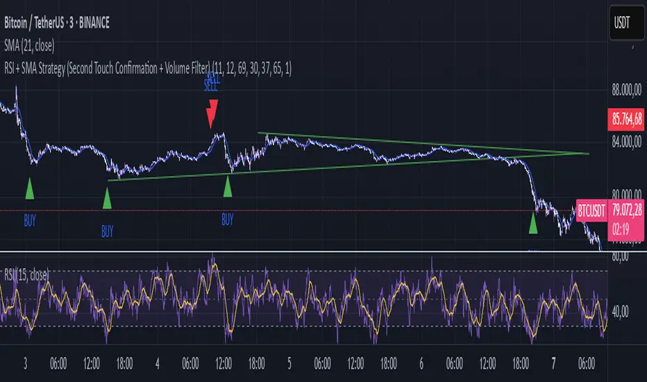
Falcon SignalsThis script is a TradingView Pine Script for a trading strategy called "Falcon Signals." It combines multiple technical indicators and strategies to generate buy and sell signals. Here’s a breakdown of what the script does:
1. Supertrend Indicator:
The script calculates the Supertrend indicator using the Average True Range (ATR) and a specified multiplier (factor). The Supertrend is used to define the trend direction, with a green line for an uptrend and a red line for a downtrend.
2. EMA (Exponential Moving Average):
Two EMAs are used: a fast EMA (9-period) and a slow EMA (21-period). The script checks for crossovers of the fast EMA above or below the slow EMA as a basis for buying and selling signals.
3. RSI (Relative Strength Index):
The RSI (14-period) is used to measure the momentum of the price. A buy signal is generated when the RSI is less than 70, while a sell signal is generated when it’s greater than 30.
4. Take Profit (TP) and Stop Loss (SL):
The script allows users to set custom percentages for take profit and stop loss. The take profit is set at a certain percentage above the entry price for buy signals, and the stop loss is set at a percentage below the entry price, and vice versa for sell signals.
5. Trailing Stop:
A trailing stop can be enabled, which dynamically adjusts the stop loss level as the price moves in the favorable direction. If the price moves against the position by a certain trailing percentage, the position will be closed.
6. Engulfing Patterns:
The script checks for bullish and bearish engulfing candlestick patterns, indicating potential reversals. A bullish engulfing pattern is marked with a teal label ("🔄 Reversal Up"), and a bearish engulfing pattern is marked with a fuchsia label ("🔄 Reversal Down").
7. Plotting:
The script plots various indicators and signals:
Entry line: Shows where the buy or sell signal is triggered.
Take profit and stop loss levels are plotted as lines.
EMA and Supertrend lines are plotted on the chart.
Trailing stop line, if enabled, is also plotted.
8. Buy and Sell Labels:
The script places labels on the chart when buy or sell signals are triggered, indicating the price at which the order should be placed.
9. Exit Line:
The script plots an exit line when the trailing stop is hit, signaling when a position should be closed.
10. Alerts:
Alerts are set for both buy and sell signals, notifying the trader when to act based on the strategy's conditions.
This strategy combines trend-following (Supertrend), momentum (RSI), and price action patterns (EMA crossovers and engulfing candlestick patterns) to generate trade signals. It also offers the flexibility of take profit, stop loss, and trailing stop features.

FRACTAL DIMENSIONSFRACTAL DIMENSIONS was created to allow us to properly visualize
the higher time frame dimensional data, While remaining on a lower
time frame. The Fractal dimensions are basically the higher time frames.
Remaining on a lower time frame allows us to get tighter entries and exits.
Each dimension is set in a wave degree formation. From primary to sub-minute,
depending on the time frame being utilized.
These multidimensional wave degrees will be utilized later in the strategy.
This indicator was broken off of the whole for the sake of drawing lines.
The data here is just for debugging purposes and is not used in the strategy,
but yet remains pretty awesome by itself.
Fractal dimensions is the foundation of the main strategy to come.
Now that we have this data, what are we going to do with it?