Oscilator candles - momentum strategyThis is momentum based strategy based on indicators published earlier:
Also trying to use delayed supertrend based on steps as mentioned in the published indicator:
Added option to filter trade entries based on higher timeframe pivots. But, it is not so effective and may need further optimization.
Pesquisar nos scripts por "supertrend"
super Z Ok I try to make this indicator to be a super trend based on candles MTF , need to be warned that it can repaint , I did not had time to check this issue so i post it as idea only (if such issue exist let me know )
the trendline is not repaint based on VHMA (or volume HMA ) that i posted last time
So it a cool idea to make the supertrend in this way ,but need to be tested further
signals are based on this supertrend

Easy Sys 1I just updated Easy indicator to make it little more advance
add (SAR,Zigzag,Supertrend etc)
very important that when you set the info panel make sure its in correct position , so here in btc 4 hour chart I put 10500
for other tf or assets this you need to fix by your own. so lets say you load xrp then put a number like 0.3 and try to see if it fit.
the buy and sell based on score of the indicators total
the colors are based on supertrend
so main purpose here to get much info fast on one chart before to make a move to buy or sell based on multiple indicators

ANN RSI SUPER TRENDSo I was bored and I made this Hybrid
ANN taken from
and alex super trend ,
instead of normal ATR for the supertrend I use RSI and the ANN combination
alerts included
Noro's SILA v1.2Noro's SILA v1.2 - these are 5 trend indicators in 1, for the sake of better accuracy.
Added:
1) Settings
2) Arrows
Noro's SILA v1.2 uses 5 trend indicators:
1) SuperTrend
2) DI Plus-Minus
3) WOW trend indicator (my idea)
4) BarColor indicator (my idea)
5) BestMA (or "BMA") indicator (my idea)
The user can switch-off any indicator from 5 to achieve big accuracy.
How does it work?
Each indicator from 5 defines a trend in own way. If two indicators report that there will be a uptrend, and three others the indicator report that there will be a downtrend - it is downtrend (a red background).
For an example
Now SuperTrend = uptrend = +1
Now DI Plus-Minus = downtrend = -1
Now WOW trend indicator = downtrend = -1
Now BarColor indicator = downtrend = -1
Now BestMA (or "BMA") indicator = uptrend = +1
Sum = + 1 - 1 - 1 - 1 + 1 = -1 = downtrend
If sum > 0 = uptrend
Sensivity
The user himself chooses what there will be a sensitivity (in settings).
If sensivity = 3:
sum > or = 3 - uptrend
sum < or = -3 - downtrend
sum > -3 and < 3 - NA-color of background
Trendlines
3 lower trendlines (blue plots) is "sum+3"
5 upper trendlines is "sum-5"
etc
Settings:
1) sensivity - you see above
2) distance - distance between the price and lines (for convenience)

Clean CPR v7.0 (Call & Put)// --------------------------------------------------------------------
// DESCRIPTION
// --------------------------------------------------------------------
// Clean CPR v7.1 is a multi-module trading and analysis toolkit built
// around Central Pivot Range (CPR) for intraday and swing trading.
//
// Core features:
// • Daily / Weekly / Monthly CPR with fills, labels and price display
// • Automatic CPR width classification (Super Narrow → Wide)
// • Visual alert when today’s CPR is WIDE (“WIDE CPR TODAY”)
// • Trade filtering: Wide CPR days are blocked from new entries
// • Pivot-based Support & Resistance (R1–R5, S1–S5, optional historical)
// • Developing CPR and Developing R1 / S1 levels
// • Previous Session High/Low with optional shaded zones
// • Dual Donchian Channels with auto-alignment coloring
// • Anchored Day-Open VWAP
// • Initial Balance (first hour range)
// • CPR + ATR + EMA + Fundamentals information table
// • Integrated 1H Call & Put breakout strategy with Supertrend, ADX,
// ATR trailing stop, targets, gap handling and time filters
//
// This script is designed as a single dashboard combining market bias,
// volatility, structure, and execution logic in one indicator.
// --------------------------------------------------------------------

Dual MA Trendline with Angle Lock"Dual MA Trendline with Angle Lock + Multiplier Bands" is a trend-following overlay indicator that combines two moving averages (MAs), each with a special "angle lock" mechanism.
Key mechanics: Instead of plotting the raw MA directly as the main trend line, it creates a piecewise-linear trendline for each MA.
The trendline locks its slope (angle) and starting value whenever the MA's recent slope changes significantly (more than the user-defined angleThreshold).
Between these "slope reset" points, the trendline continues with constant slope (straight line segments), producing flatter, more persistent trend representations than a curving MA.
Around the locked trendline, it draws symmetric bands:Base band (1×) — always shown
Optional multiplier bands (2×, 4×, 8×) — configurable
Bands can be in percentage (volatility-adaptive) or fixed points (useful for forex/crypto with small price units or tick-based instruments).
It also plots fills between the two MAs' bands/trendlines → visually highlights:Upper zone (greenish fill)
Middle zone (blueish fill)
Lower zone (reddish fill)
In short: two independent "locked-angle trend ribbons" with multiplier deviation bands + inter-ribbon fills.
Main Use Cases
Trend direction & strength visualization
The locked-slope trendlines stay straighter and change direction less frequently than normal MAs → clearer visual read of the prevailing trend (especially useful on noisy charts).
Dynamic support/resistance zones
1× bands act as near-term dynamic S/R.
2× / 4× / 8× bands serve as progressively stronger support/resistance or "overextended" levels.
→ Many traders watch for price rejection, bounces, or acceleration once price reaches 2×–4× bands.
Mean-reversion / pullback entries (especially in ranging or mildly trending markets)
Price touching or exceeding outer multiplier bands + returning toward the trendline often signals good mean-reversion setups.
Trend-continuation / breakout filtering Price riding above the upper bands in uptrend → strong momentum continuation. Price breaking and closing outside 4×–8× bands → potential acceleration or trend exhaustion signal.
Dual-timeframe / dual-speed MA comparison MA 1 is usually longer/slower (default 128), MA 2 is shorter/faster (default 14).
The fills between them act like a "trend tunnel" — wide middle fill = strong trend, narrowing = consolidation, color changes = possible reversal.
Clean chart alternative to channels / regression / envelopes
The angle-locking creates straighter, less whipsaw-prone lines than typical Bollinger Bands, Keltner Channels, or regression channels, while still adapting to price.
Typical settings example MA1: longer period (50–200), small angle threshold → persistent major trend
MA2: shorter period (9–34), larger angle threshold → more responsive minor trend
Use percentage bands on stocks/indices, fixed points on forex/crypto with small pip values.
Overall → very popular style among traders who like clean, low-repaint trend + deviation band systems (similar spirit to SuperTrend + envelopes, but with custom slope-locking logic).

ACHT EMA Cross Pullback Strategy with HTF Filter, RSI SignalsADVANCED INDICATOR FOR TRADING USING EMA CROSS PULLBACK STRATEGY
✨ MAIN FEATURES:
• 📈 Signals on pullback after EMA9/EMA20 crossover
• 🔍 Multi-level signal filtering
• 🕒 Multi-timeframe analysis (HTF filter)
• 🛡️ Trend indicator protection
• 📊 Compact information panel
🎯 MAIN SIGNALS:
1️⃣ EMA CROSS + PULLBACK
• EMA9 crosses EMA20 up/down
• Price pullback to EMA9 after crossover
• EMA200 filter (bullish/bearish trend)
2️⃣ RSI SIGNALS IN HTF ZONES
• RSI crossing its SMA
• Works only in HTF zones
• "First signal only" option in zone
🛡️ INDICATOR FILTERS:
• ✅ SuperTrend - main trend identification
• ✅ MACD - additional trend confirmation
• ✅ RSI - overbought/oversold filter
• ✅ HTF filter - higher timeframe analysis
⚙️ CUSTOMIZATION OPTIONS:
• Adjustable periods for all indicators
• Enable/disable each filter
• RSI level settings
• HTF filter timeframe selection
• Signal visualization options
📱 INFORMATION PANEL:
• Compact table with key metrics
• Status of all filters and indicators
• Visual HTF zone indicators
• Emoji for quick perception
🚨 ALERT SYSTEM:
• Alerts on main signals
• Alerts on HTF zone entry
• Alerts on RSI signals
• Customizable trigger conditions
📈 USAGE RECOMMENDATIONS:
1. Wait for EMA9 and EMA20 crossover
2. Look for price pullback to EMA9
3. Check all filter compliance
4. Ensure HTF zone presence
5. Use RSI signals as supplement
⚠️ RISKS AND LIMITATIONS:
• Indicator doesn't guarantee profit
• Always use stop-losses
• Test strategy on demo account
• Adapt parameters to your trading style

Zero-Lag ATR Trend [BackQuant]Zero-Lag ATR Trend
Overview
Zero-Lag ATR Trend is a volatility-adaptive trend-following overlay designed to identify directional market regimes with minimal delay while preserving structural clarity. The indicator combines a zero-lag moving average framework with a zero-lag volatility model to produce a trailing trend line that reacts quickly to meaningful price changes without becoming unstable or overly sensitive.
Unlike conventional ATR-based trend tools that rely on lagging averages and delayed volatility estimates, this indicator applies zero-lag logic to both the trend centerline and the volatility calculation. The result is a trend structure that aligns more closely with real-time price action while still maintaining the discipline required for trend continuation trading.
Core design philosophy
The core idea behind Zero-Lag ATR Trend is simple:
Reduce signal delay without sacrificing trend integrity.
Adapt dynamically to changing volatility regimes.
Provide a single, clean structure that defines trend direction, continuation, and invalidation.
Instead of stacking multiple indicators, the script builds a complete trend framework from two tightly integrated components: a zero-lag trend spine and a zero-lag ATR trailing mechanism.
Zero-lag trend spine
The trend spine is constructed using a zero-lag moving average (ZLMA). This is achieved by applying a corrective step to a traditional moving average, effectively compensating for smoothing delay.
Conceptually, the process works as follows:
A base moving average is calculated from the selected price source.
That moving average is then passed through a zero-lag correction.
The correction pulls the line closer to current price without introducing noise.
This produces a trend line that reacts faster than standard EMA, SMA, or HMA signals, particularly during early trend acceleration phases. Multiple moving-average types can be used inside the zero-lag framework, allowing traders to fine-tune responsiveness based on asset behavior and timeframe.
Zero-lag volatility model
Volatility is measured using True Range, but instead of applying classic ATR smoothing, the indicator uses a zero-lag smoothing pass on the True Range itself.
This approach offers several advantages:
Volatility expands more quickly during impulse moves.
Volatility contracts faster during consolidations.
Band width adjusts in near real-time to changing conditions.
The smoothed zero-lag ATR is multiplied by a user-defined factor to create adaptive upper and lower boundaries around the trend spine. These boundaries define how much counter-movement price is allowed before the trend structure is invalidated.
Volatility-aware trailing structure
The trailing output is the defining feature of the indicator. It behaves as a one-directional trailing structure:
In bullish conditions, the trailing line can only move upward.
In bearish conditions, the trailing line can only move downward.
Minor pullbacks inside the volatility envelope do not flip the trend.
This logic prevents the indicator from reacting to shallow retracements and focuses instead on structural trend changes. Because the trailing behavior is volatility-scaled, the indicator remains stable during high volatility while still responding promptly during regime shifts.
Trend flips and regime transitions
Trend direction is determined by changes in the trailing structure itself rather than raw price crosses. A trend flip occurs only when price movement is strong enough, relative to current volatility, to force the trailing line to reverse direction.
This means:
Bullish flips represent genuine transitions into upward regimes.
Bearish flips represent genuine transitions into downward regimes.
Sideways noise is largely filtered out.
As a result, the indicator is well suited for identifying medium-to-long trend phases rather than short-term oscillations.
Visual structure and chart clarity
The visual design is intentionally minimal and functional:
The main trailing line is color-coded by trend direction.
An optional ribbon or cloud reinforces directional bias.
Optional candle coloring aligns price bars with the active trend.
These elements allow traders to assess trend state instantly without interpreting multiple signals or overlays.
How to use for trend following
Trend bias
Maintain a bullish bias while price holds above the trailing line.
Maintain a bearish bias while price holds below the trailing line.
Entries
Trend flips can be used as initial directional entries.
Pullbacks toward the trailing line often act as continuation opportunities.
Momentum confirmation can be layered on top for additional confluence.
Trend management
The trailing line naturally functions as a dynamic stop reference.
As long as price respects the trailing structure, the trend remains valid.
A flip in direction signals a full regime transition rather than a minor correction.
Why zero-lag matters for trend trading
Traditional trend indicators often react late, especially during fast expansions, resulting in delayed entries and early exits. By reducing lag in both the trend calculation and the volatility model, Zero-Lag ATR Trend aims to capture a larger portion of directional moves while maintaining consistency and discipline.
This makes it particularly effective for momentum-based trend following, breakout continuation strategies, and traders who prioritize staying aligned with dominant market structure rather than predicting reversals.
Summary
Zero-Lag ATR Trend is a complete trend-following framework built around responsiveness, adaptability, and clarity. Its zero-lag architecture allows it to respond earlier to meaningful price changes, while its volatility-aware trailing logic ensures that trends are only invalidated when structure truly breaks. The result is a clean, intuitive tool that supports disciplined trend participation across assets and timeframes.

5 Supertrend Breakout BUY SELL (CLEAN)The script internally analyzes multiple price references and volatility behavior to determine when the market shows strong directional intent. Signals are plotted only after confirmation, helping reduce noise and false triggers commonly seen in choppy or sideways markets.
This indicator is intentionally kept minimal and distraction-free, displaying only BUY and SELL labels on the chart, making it suitable

[CT] D&W PPO + RBF + DivergenceThis indicator combines two separate ideas into one tool so you can read trend context from your price chart while timing momentum shifts from a clean oscillator panel. The first component is the Daily and Weekly Percentage Price Oscillator (D&W PPO), which measures the relationship between two EMA spreads that are intentionally built to reflect two “speeds” of market structure. The “weekly” leg is calculated as the percentage distance between a slower and faster EMA pair (L1 and L2), and the “daily” leg is calculated as the percentage distance between a shorter EMA pair (L3 and L4), but both are normalized by the same long EMA (e2) so the values behave like a percent-based oscillator rather than raw points. The script then combines those two legs by creating R = W + D, and it plots the histogram as R − W, which simplifies to D. That is not a mistake, it is the point of the design. By setting the baseline at “R equals W,” the zero line becomes a very intuitive threshold that tells you whether the shorter-term push is adding to the longer-term bias or subtracting from it. When the histogram is above zero, the daily component is supportive of the larger trend pressure, and when it is below zero, the daily component is opposing it. The histogram color is intentionally binary and stable, green when the histogram is at or above zero and red when it is below, so the panel reads like a momentum confirmation tool rather than a noisy oscillator that constantly shifts shades.
The second component is the RBF Price Trail, which is drawn on the upper price chart even though the indicator itself lives in a lower panel. This line is not a moving average in the traditional sense. It is a Radial Basis Function kernel smoother that weights recent prices based on their similarity rather than only their recency. In plain terms, the kernel attempts to build a smoother “baseline” that adapts to the shape of price action, and then the script optionally wraps that baseline inside an ATR band and applies a Supertrend-like trailing clamp. When the ATR band is enabled, the line will not simply track the kernel value, it will trail price and hold its position until price forces it to ratchet. This behavior is what makes it useful as a structure-aligned trend line rather than just another smoothing curve. When the adaptive band boost is enabled, the band width is multiplied by a factor that grows when recent price change is large relative to a lookback normalization window. That means the trailing mechanism can adapt to fast markets by changing the effective band behavior, which helps reduce whipsaws in choppy conditions while still allowing the line to respond when volatility expands. The line color is determined by where price closes relative to the trail, bullish when price is above the trail and bearish when price is below it, and you can optionally color your actual chart candles from either the PPO state or the RBF state depending on what you want your eyes to follow.
The settings are organized so you can control each module without changing how the core PPO trend logic behaves. The PPO settings L1, L2, L3, and L4 define the EMA lengths used to compute the weekly leg W and the daily leg D. Increasing these values makes the oscillator slower and smoother, while decreasing them makes it react faster to recent movement. “Show W line” is simply a visual aid, it plots the W line in the oscillator panel so you can see the longer-term component, but it does not change the histogram logic. “Histogram thickness” is purely visual and controls how thick the column bars are. The PPO colors are the two base colors used for the histogram state, green when the daily component is supportive and red when it is opposing.
The RBF settings control what you see on the upper chart. “Show RBF on Price Chart” turns the trail line on or off. “Source” chooses which price series feeds the kernel, and close is usually the cleanest choice. “Kernel Length” determines how many bars the kernel uses; a larger value makes the baseline smoother and slower, and a smaller value makes it more reactive. “Gamma Adj” controls how quickly the kernel’s weights decay as price becomes dissimilar, so higher gamma tends to make the kernel react more sharply to changes while lower gamma produces a broader smoothing effect. “Use ATR Trail Band” is the switch that turns the kernel baseline into a trailing band line, and it is the reason the line can “hold” and then ratchet instead of moving continuously like a normal moving average. “ATR Length” and “ATR Factor” control the width of that band, and widening the band will generally reduce flips and noise at the cost of later signals. “Use Adaptive Band Boost” turns on the volatility normalization idea, “Boost Normalization Lookback” defines how far back the script looks to determine what counts as a large price change, and “Boost Multiplier” controls how strongly the band behavior is adjusted during those periods. The line width and bull/bear colors are visual controls only.
Price bar coloring is intentionally handled with a single selector so you do not end up with two modules fighting to color candles differently. If you choose “Off,” nothing on the main chart is recolored. If you choose “PPO,” your price candles reflect whether the PPO histogram is above or below zero. If you choose “RBF,” your price candles reflect whether price is above or below the RBF trail. Most traders will pick one and stick with it so the chart communicates a single bias at a glance.
The divergence module is optional and is designed to be a confirmation layer rather than a primary trigger. When enabled, it can mark regular divergence and hidden divergence, and it lets you decide what the pivots should be based on. The divergence source can be the PPO histogram or the R line, depending on whether you want divergence measured on the cleaner momentum component or on the combined series. “Key off pivots” determines whether pivot detection is driven by oscillator pivots or by price pivots. If you choose oscillator pivots, divergence anchors are found where the oscillator makes pivot highs or lows and those are compared against price at the same points. If you choose price pivots, the pivots are taken from price first and the oscillator value at those pivot bars is used for the comparison, which can feel more intuitive when you want divergence to respect obvious swing structure on the chart. Pivot Left and Pivot Right control how strict the swing definition is, larger values create fewer but more meaningful pivots and smaller values create more frequent signals. “Mark on Price Chart” adds tiny markers on the candles at the pivot location so you can see where the divergence event was confirmed, while the oscillator panel uses lines and labels to make the divergence relationship obvious.
For trading, the cleanest way to use this tool is to separate “bias” from “timing.” The RBF Price Trail is your bias filter because it is structure-like and tends to hold and ratchet rather than constantly drifting. When price is closing above the trail and the trail is colored bullish, you treat the market as long-biased and you focus on long setups, pullbacks, and continuation entries. When price is closing below the trail and the trail is bearish, you treat the market as short-biased and you focus on short setups, rallies, and continuation shorts. The PPO histogram is then your timing and pressure confirmation. In an up-bias, the highest quality continuation conditions are when the histogram is above zero and stays above zero through pullbacks, because that means the shorter-term pressure is still supporting the longer-term drift. When the histogram dips below zero during an up-bias, it is a warning that the daily component is now opposing, which often corresponds to a deeper pullback, a rotation, or a period of consolidation, so you either wait for the histogram to recover above zero or you tighten expectations and manage risk more aggressively. In a down-bias, the mirror logic applies: the best continuation conditions are when the histogram is below zero, and pushes above zero tend to represent countertrend rotations or pauses inside the bearish condition.
Divergence is best used as an early warning and a location filter, not as a standalone entry button. Regular bullish divergence, where price makes a lower low but the oscillator makes a higher low, can signal bearish pressure is weakening and is most useful when it appears while price is below the RBF trail but failing to continue downward, because it often precedes a reclaim of the trail or at least a meaningful rotation. Regular bearish divergence, where price makes a higher high but the oscillator makes a lower high, can signal bullish pressure is weakening and is most useful when it appears while price is above the trail but extension is failing, because it often precedes a drop back to the trail or a full flip. Hidden divergence is a continuation concept. Hidden bullish divergence, where price makes a higher low while the oscillator makes a lower low, often shows up during pullbacks in an uptrend and can help you confirm continuation as long as the RBF bias remains bullish. Hidden bearish divergence, where price makes a lower high while the oscillator makes a higher high, often shows up during rallies in a downtrend and can help you confirm continuation as long as the RBF bias remains bearish. In practice, you’ll get the best results when you only act on divergence that aligns with the RBF bias for hidden divergence continuation, and you treat regular divergence as a caution or reversal setup only when it occurs near a meaningful swing and is followed by a bias change or a strong momentum shift on the PPO.
The most practical workflow is to keep the RBF trail visible on the price chart as your regime guide, keep the PPO histogram as your momentum confirmation, and decide in advance whether you want candle coloring to represent the PPO state or the RBF state so your eyes are not reading two different meanings at once. if you want the cleanest “trend-following” behavior, color candles by the RBF trail and use the PPO histogram as the timing trigger. If you want the cleanest “momentum-first” behavior, color candles by PPO and treat the RBF trail as the higher-level filter for whether you should press a move or fade it.

TrendSurfer Lite TrendSurfer Lite ⚡
Advanced Multi-Signal Trading Indicator for Precision Market Analysis
TrendSurfer Pro LITE is a comprehensive trading system combining multiple technical analysis tools into one powerful indicator. Designed for traders seeking high-probability setups with customizable filters.
Key Features:
📊 Core Signals
Triangle Signals (▲▼): Volume-weighted momentum entries with 10-level volume scoring
Master Trend System (△▽): Multi-EMA confirmation with RSI validation
Order Blocks (🟩🟥): Smart money institutional zones with rejection detection
Take Profit System (🎯): 8-indicator confluence system (RSI, Stochastic, Supertrend, CCI, MACD, BB, EMA Cross, Price Action)
🎯 Rejection Signals
Master Trend Rejections: Dynamic support/resistance from trend lines
EMA750 Rejections (White "R"): Major trend filter bounces
VWAP Rejections (Pink "W"): Institutional level reactions
Butterworth Filter Rejections (🟡): Advanced smoothing algorithm reversals
Session Rejections (⚡): Tokyo/London/NY session high/low bounces
Session Midline Rejections (Orange "M"): Half-range mean reversion
🌍 Session Analysis
Tokyo Session (💴): Asian market range with automatic extensions
London Session (💶): European volatility zones
New York Session (💵): US market key levels
Auto-adjusting timezone with UTC offset support
🔧 Advanced Filters
EMA750 Master Filter: Global trend alignment for all signals
VWAP Filter: Institutional bias confirmation
Yellow Box Filter (🟨): Consolidation zone proximity detection
3 Time Filters: Customizable trading windows with visual backgrounds
Volume Filter: Signal strength validation (6-10 scale)
📈 Visual Tools
VWAP Purple Candles: Special candle coloring for VWAP crosses above EMA750
Stochastic-based Candle Colors: Overbought/oversold visual cues
Previous Day Close Line: Key reference level
Master Trend Table: Real-time multi-indicator dashboard
⚙️ Customization
Full color customization for all elements
Adjustable line thickness and transparency
Configurable alert system for every signal type
19 independent alert conditions
Best For:
Intraday scalping and swing trading
Multi-timeframe analysis
Confluence-based trading strategies
Institutional level detection
Version 1.0 | Clean interface | Maximum flexibility | Professional-grade signals

Forex Supertrend 15m Entry + 1H EMA200 Filterworks well for trend trading using superttend 1h and 15 m

deKoder | Whale Prints [WP]deKoder | Whale Prints | Large Trade Orderflow Detection
This open-source indicator is a clean, precision tool for revealing hidden large-volume activity directly on your chart. By scanning ultra-low timeframes while you view higher ones, it projects statistically significant volume spikes as intuitive markers giving you a clear window into institutional orderflow without visually overwhelming the price action.
Key Features & Strengths
True Intra-Bar Detection | Monitors lower timeframes down to 1-second bars, catching aggressive block trades and absorption that occur within a single higher-TF candle.
Accurate Trade Levels | Markers are placed at the actual hl2 price of the aggressive lower-TF bar, providing a far more accurate estimate of where the large trade executed than typical mid-candle approximations.
Multiple Trades Per Bar | If several significant volume spikes occur inside one higher-TF candle, all qualifying levels are displayed individually – offering greater granularity and context.
Adaptive Thresholding | Uses higher-TF volume standard deviation (stable baseline) intelligently scaled to the lower timeframe, reducing noise in quiet markets while remaining sensitive to genuine outliers.
Clean Visual Hierarchy | Three tiers (Small 🞉 / Medium ⏣ / Large 🞊) with dynamic symbol size, line thickness, transparency, and user-definable bullish/bearish coloring based on LTF candle direction.
How to Use It as an Orderflow Tool
Large volume spikes often mark the footprints of institutional players. This indicator helps you read those footprints in real time.
Small (🞉) | Moderate excess volume: early interest, probing, or building positions.
Medium (⏣) | Strong spike: increasing conviction, potential momentum shift.
Large (🞊) | Extreme outlier: frequently climactic volume signalling exhaustion or major absorption.
Why Price Often Reverses at These Levels
Large players frequently place limit orders in areas rich with liquidity – commonly just beyond recent highs/lows where retail stop-losses cluster. When price sweeps those zones:
Stop hunts trigger a cascade of forced exits, creating liquidity for larger participants to fill their limit orders.
Breakout traders who entered on the move are trapped offside and become forced buyers/sellers when price reverses.
Institutions use this liquidity to execute large orders at favorable prices with minimal immediate market impact.
The result is aggressive volume at the extreme, followed by reversal as smart money finishes filling and price returns toward fair value. Clusters of medium/large markers at swing points are classic signs of this dynamic.
Practical Analysis Tips
Reversals/Absorption | Clusters of large markers at swing highs/lows (especially opposing-color spikes) signal potential turns – buyers or sellers stepping in aggressively.
Level Defense | Trades piling up at key support/resistance suggest institutions protecting or building positions.
Trapped Traders | Large spikes beyond range pivots followed by reversal back into the range often highlight trapped breakout traders who add fuel to a move when they are forced to liquidate their positions.
Use Offset (-3 to +3) to shift markers away from current price for clearer viewing.
Pro tip: Zoom into the lower TF occasionally to see how these projected levels align exactly with aggressive candles.
Recommended Pairings
This is designed as a pure orderflow overlay to be layered with your existing setup:
Support & Resistance (horizontals, pivots, Volume Profile POC/VAH/VAL)
Market Structure tools (swing points, order blocks, fair value gaps)
Trend filters (EMAs, SuperTrend, higher-TF bias)
Momentum oscillators for timing confluence
Best Suited For
Scalping & day trading (1–15 min charts with 5–30S lower TF)
Swing trading entries (1H–4H charts with 1–5 min lower TF)
High-liquidity markets: crypto perpetuals, forex majors, volatile stocks
Add this indicator to start seeing the hidden aggression driving price and expose the hidden edges beyond the noise.
☠ FR33FA11 | deKoder ☠
Released January 2025 | Open Source

Turki alghamdiThis indicator is an advanced Pivot-based SuperTrend designed to provide maximum clarity for traders. It visually displays: - Exact entry candle - Dynamic stop loss - Up to 3 R-based profit targets - Clear trend direction

Turki alghamdiThis indicator is an advanced Pivot-based SuperTrend designed to provide maximum clarity for traders. It visually displays: - Exact entry candle - Dynamic stop loss - Up to 3 R-based profit targets - Clear trend direction

Nuh's Complete Multi-Timeframe Dashboard v4.0Nuh's Complete Multi-Timeframe Dashboard v4.0 - Unified Power System
Professional Multi-Timeframe Technical Analysis Dashboard
Nuh's Complete Multi-Timeframe Dashboard v4.0 represents a comprehensive trading analysis system that unifies 20 powerful technical indicators across up to 6 customizable timeframes into a single, intelligent dashboard. This advanced indicator combines trend analysis (EMA, Alpha Trend, SuperTrend, ADX, DI), momentum oscillators (RSI, Stochastic RSI, MACD, CCI, Williams %R, WaveTrend, KST), volume indicators (OBV, CMF, Volume Analysis, MFI), and volatility measures (Squeeze Momentum, Bollinger Bands, ATR, Williams VIX Fix) to provide traders with a holistic market perspective. Each indicator can be independently enabled or disabled, allowing complete customization based on your trading strategy and preferences.
The revolutionary Weighted Power System is the core innovation of this dashboard, transforming raw indicator signals into actionable market power scores. Unlike traditional dashboards that simply count bullish or bearish signals, this system applies sophisticated weighting to each indicator based on your chosen preset (Balanced, Trend Focus, Momentum Focus, Volume Focus) or custom weights. It then combines these weighted signals across multiple timeframes—with timeframe-specific weighting for scalping, day trading, or swing trading styles—to calculate an Overall Market Power score. This provides you with clear percentage-based bullish and bearish power readings, eliminating guesswork and enabling confident trade decisions backed by mathematical confluence.
Built for serious traders who demand precision and flexibility, the dashboard features a fully customizable display with 20 indicator rows that can be reordered to match your preferences, color-coded gradient visualization for instant market sentiment recognition, and integrated Wundertrading-compatible alerts for automated trading. The system supports both legacy count-based alerts and modern power-threshold alerts, allowing you to receive notifications when market conditions meet your specified confluence requirements. Whether you're scalping on lower timeframes or swing trading on higher timeframes, this professional-grade tool adapts to your trading style while maintaining clean, readable visualization that won't clutter your charts.

Oxscope 1hr V1This indicator is a sophisticated trend-following tool designed to filter market noise by aggregating signals from 20 distinct technical indicators—including EMA, RSI, MACD, Bollinger Bands, SuperTrend, and Ichimoku. Instead of relying on a single metric, it calculates a real-time "consensus score" for every candle, where each indicator votes +1 for bullish or -1 for bearish.
Key Features:
High-Confidence Threshold: The strategy operates on a strict threshold of ±6. A score of +6 or higher activates the Long Zone (Green Background), while -6 or lower triggers the Short Zone (Red Background). This ensures trades are only suggested when there is strong technical agreement.
Visual Clarity: Designed for a distraction-free experience, this version removes complex data tables and indicator lines. It features massive, easy-to-read emoji labels ("🚀" for Long entries, "📉" for Short entries).
Smart Signal Logic: The script prioritizes entry signals over exit signals during sharp reversals, keeping your chart clean and focusing solely on the most critical trend changes.
This tool is ideal for traders seeking high-conviction setups without visual clutter.

Momentum & Breakout Confirmationwatch momentum build in real time on the current candle so you can confirm weather a breakout is indeed a breakout or will be a fake out. This is what it does
This is a Momentum & Breakout Confirmation (MBC) indicator that analyzes the current candle in real-time to determine if it's a strong continuation move or possible reversal. Here's the breakdown:
What It Measures:
Momentum Strength - How much % the candle moved:
STRONG = >0.5% move
MEDIUM = 0.2-0.5%
WEAK = <0.2%
Direction - Simply bullish (green candle) or bearish (red candle)
Four Confirmation Factors:
Volume Surge - Is volume 1.5x above the 20-period average?
Move Size - Is the candle body larger than 0.5x ATR (significant)?
Body Strength - Is the body >60% of total candle range (strong conviction, minimal wicks)?
Trend Aligned - Does it align with 9/21 MA trend direction?
The Scoring System:
Adds 1 point for each confirmation factor met (max 4 points)
3-4 points = "STRONG CONTINUATION" 🚀
2 points = "LIKELY CONTINUATION"
1 point = "WEAK SIGNAL"
0 points = "POSSIBLE REVERSAL" ⚠️
Key Difference from TPC:
TPC uses multi-timeframe SuperTrend for strategic entries
MBC focuses on the current candle only - it's asking "Is THIS candle showing real momentum or is it weak/fake?"
Practical Use:
Great for confirming if a breakout or move is "real" with strong conviction behind it, or if it's low-volume/weak-bodied and likely to fail. The table updates live so you can watch momentum build during the candle formation.
Hope it helps. if you guys have any ideas for any indicators you want made please feel free to dm me as i like a good challenge lol ill sit here and try to code anything now im not saying i will be 100 percent successful but i will try for you, thanks for all the support from all you guys i def do appreciate it.

MA20 ATR Trend Failure FilterA volatility-adaptive filter designed to identify early trend invalidation.
This indicator combines a 20-period Moving Average (MA20) with Average True Range (ATR) to dynamically define a lower volatility boundary.
When price closes below this boundary, it signals that the current trend is no longer valid and risk is increasing.
Core Concept(核心思想)
MA defines the trend baseline
ATR measures current market volatility
MA − k × ATR forms a dynamic risk threshold
A close below this threshold = trend failure
👉 中文补充:
这不是反转指标,而是趋势失效过滤器,用于避免在趋势已经被破坏后继续持仓或加仓。
How It Works
Calculate MA20 as the trend reference
Calculate ATR(14) as volatility proxy
Build adaptive bands:
Upper Band = MA20 + k × ATR
Lower Band = MA20 − k × ATR
If close < Lower Band, trend is considered failed
The ATR multiplier k automatically adjusts the tolerance based on volatility, avoiding rigid fixed-percentage rules.
Visual Elements
Yellow line: MA20
Green band: MA20 + k × ATR
Red band: MA20 − k × ATR (key risk boundary)
Red triangle + “FAIL” label: Trend failure signal
Optional background shading to highlight risk zones
Typical Use Cases
Trend-following strategies (exit / reduce exposure)
Breakout strategies (filter false continuation)
Risk management overlay (non-intrusive, no repaint)
Combine with HMA, SuperTrend, structure-based entries
👉 中文补充:
非常适合作为**“不该再拿”的客观判断条件**,而不是频繁交易信号。
Why This Indicator
Volatility-adaptive (ATR-based)
No future data, no repaint
Simple logic, strong risk control
Works across stocks, crypto, futures, indices
This tool is designed to answer one question only:
Is the current trend still valid?
Parameters
MA Length (default: 20)
ATR Length (default: 14)
ATR Multiplier k (default: 0.8)
Lower k → stricter risk control
Higher k → more tolerance, fewer false signals SSE:600595

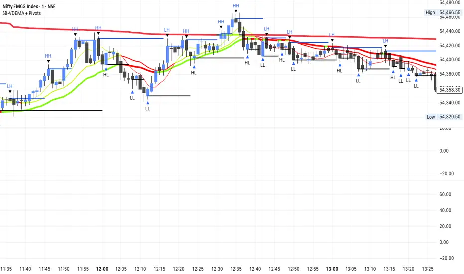
SB-VDEMA + PivotsBest use - Intraday Scalping ( 1 Mt, 3 Mts, 5 Mts )
Uses Volatility weighted DEMA for smoother and reliable signals.
One can use dynamic colour coding of VWDEMA for entering call or puts. VWAP and Henkin ashi Supertrend is also there but, i think VWDEMA is quite enogh for decision making.
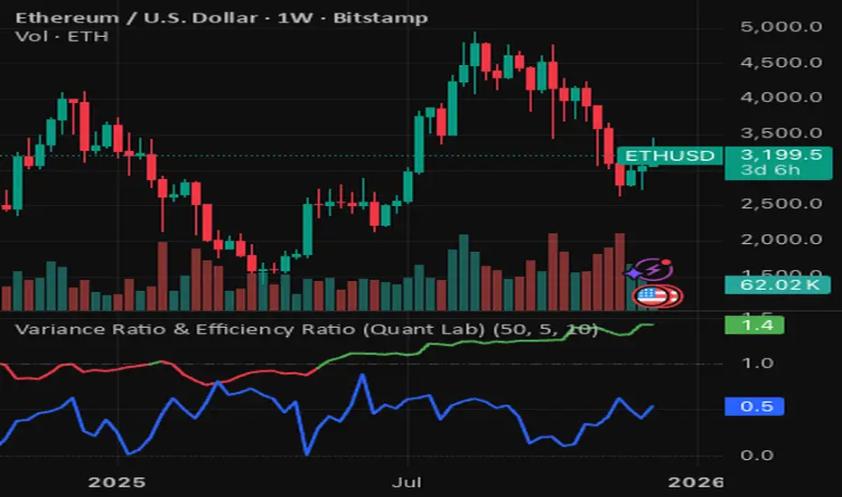
Variance Ratio & Efficiency Ratio (Quant Lab)1️⃣ Variance Ratio (VR)
Formula:
VR ≈ Var(q-step returns) / (q × Var(1-step returns))
Interpretation:
• VR ≈ 1 → The market is like a random walk; neither trend nor mean-reversion is dominant.
• VR > 1 → Trend behavior is dominant.
• Trend-following systems (EMA, Supertrend, breakout) work better.
• VR < 1 → Mean-reversion is dominant.
• Range/reversal strategies (Z-score, Bollinger fade, RSI reversal) work better.
In short:
• VR > 1 → Trending market
• VR < 1 → Mean-reverting market
This tells you:
“Should I build a trend system or a mean-reversion system for this instrument?”
⸻
2️⃣ Efficiency Ratio (ER)
Formula logic:
ER = |Close_now – Close_n-bars-ago| / Σ|Close_i – Close_{i+1}|
In other words:
• Numerator → Net movement over N bars
• Denominator → Total noise over N bars
Interpretation:
• ER ≈ 1 → The price has moved in almost a straight line in one direction.
→ The trend is very efficient, noise is low.
• ER ≈ 0 → The price has fluctuated a lot but hasn't gone anywhere definitively.
→ A complete noise/range market.
This tells you:
“How clear is the trend in this last N bars, and how much noise is there?”
⸻
🔥 The intelligence provided by both together:
• VR > 1 and ER is high (0.6–1.0) →
➜ Strong, high-quality trend. Golden age for trend-following.
• VR > 1 but ER is low (0.2–0.4) →
➜ Trend exists but there is a lot of noise, many fake movements. • VR < 1 and ER is low →
➜ Net range / sideways market. Ideal for mean-reversion.