Dynamic Equity Allocation Model"Cash is Trash"? Not Always. Here's Why Science Beats Guesswork.
Every retail trader knows the frustration: you draw support and resistance lines, you spot patterns, you follow market gurus on social media—and still, when the next bear market hits, your portfolio bleeds red. Meanwhile, institutional investors seem to navigate market turbulence with ease, preserving capital when markets crash and participating when they rally. What's their secret?
The answer isn't insider information or access to exotic derivatives. It's systematic, scientifically validated decision-making. While most retail traders rely on subjective chart analysis and emotional reactions, professional portfolio managers use quantitative models that remove emotion from the equation and process multiple streams of market information simultaneously.
This document presents exactly such a system—not a proprietary black box available only to hedge funds, but a fully transparent, academically grounded framework that any serious investor can understand and apply. The Dynamic Equity Allocation Model (DEAM) synthesizes decades of financial research from Nobel laureates and leading academics into a practical tool for tactical asset allocation.
Stop drawing colorful lines on your chart and start thinking like a quant. This isn't about predicting where the market goes next week—it's about systematically adjusting your risk exposure based on what the data actually tells you. When valuations scream danger, when volatility spikes, when credit markets freeze, when multiple warning signals align—that's when cash isn't trash. That's when cash saves your portfolio.
The irony of "cash is trash" rhetoric is that it ignores timing. Yes, being 100% cash for decades would be disastrous. But being 100% equities through every crisis is equally foolish. The sophisticated approach is dynamic: aggressive when conditions favor risk-taking, defensive when they don't. This model shows you how to make that decision systematically, not emotionally.
Whether you're managing your own retirement portfolio or seeking to understand how institutional allocation strategies work, this comprehensive analysis provides the theoretical foundation, mathematical implementation, and practical guidance to elevate your investment approach from amateur to professional.
The choice is yours: keep hoping your chart patterns work out, or start using the same quantitative methods that professionals rely on. The tools are here. The research is cited. The methodology is explained. All you need to do is read, understand, and apply.
The Dynamic Equity Allocation Model (DEAM) is a quantitative framework for systematic allocation between equities and cash, grounded in modern portfolio theory and empirical market research. The model integrates five scientifically validated dimensions of market analysis—market regime, risk metrics, valuation, sentiment, and macroeconomic conditions—to generate dynamic allocation recommendations ranging from 0% to 100% equity exposure. This work documents the theoretical foundations, mathematical implementation, and practical application of this multi-factor approach.
1. Introduction and Theoretical Background
1.1 The Limitations of Static Portfolio Allocation
Traditional portfolio theory, as formulated by Markowitz (1952) in his seminal work "Portfolio Selection," assumes an optimal static allocation where investors distribute their wealth across asset classes according to their risk aversion. This approach rests on the assumption that returns and risks remain constant over time. However, empirical research demonstrates that this assumption does not hold in reality. Fama and French (1989) showed that expected returns vary over time and correlate with macroeconomic variables such as the spread between long-term and short-term interest rates. Campbell and Shiller (1988) demonstrated that the price-earnings ratio possesses predictive power for future stock returns, providing a foundation for dynamic allocation strategies.
The academic literature on tactical asset allocation has evolved considerably over recent decades. Ilmanen (2011) argues in "Expected Returns" that investors can improve their risk-adjusted returns by considering valuation levels, business cycles, and market sentiment. The Dynamic Equity Allocation Model presented here builds on this research tradition and operationalizes these insights into a practically applicable allocation framework.
1.2 Multi-Factor Approaches in Asset Allocation
Modern financial research has shown that different factors capture distinct aspects of market dynamics and together provide a more robust picture of market conditions than individual indicators. Ross (1976) developed the Arbitrage Pricing Theory, a model that employs multiple factors to explain security returns. Following this multi-factor philosophy, DEAM integrates five complementary analytical dimensions, each tapping different information sources and collectively enabling comprehensive market understanding.
2. Data Foundation and Data Quality
2.1 Data Sources Used
The model draws its data exclusively from publicly available market data via the TradingView platform. This transparency and accessibility is a significant advantage over proprietary models that rely on non-public data. The data foundation encompasses several categories of market information, each capturing specific aspects of market dynamics.
First, price data for the S&P 500 Index is obtained through the SPDR S&P 500 ETF (ticker: SPY). The use of a highly liquid ETF instead of the index itself has practical reasons, as ETF data is available in real-time and reflects actual tradability. In addition to closing prices, high, low, and volume data are captured, which are required for calculating advanced volatility measures.
Fundamental corporate metrics are retrieved via TradingView's Financial Data API. These include earnings per share, price-to-earnings ratio, return on equity, debt-to-equity ratio, dividend yield, and share buyback yield. Cochrane (2011) emphasizes in "Presidential Address: Discount Rates" the central importance of valuation metrics for forecasting future returns, making these fundamental data a cornerstone of the model.
Volatility indicators are represented by the CBOE Volatility Index (VIX) and related metrics. The VIX, often referred to as the market's "fear gauge," measures the implied volatility of S&P 500 index options and serves as a proxy for market participants' risk perception. Whaley (2000) describes in "The Investor Fear Gauge" the construction and interpretation of the VIX and its use as a sentiment indicator.
Macroeconomic data includes yield curve information through US Treasury bonds of various maturities and credit risk premiums through the spread between high-yield bonds and risk-free government bonds. These variables capture the macroeconomic conditions and financing conditions relevant for equity valuation. Estrella and Hardouvelis (1991) showed that the shape of the yield curve has predictive power for future economic activity, justifying the inclusion of these data.
2.2 Handling Missing Data
A practical problem when working with financial data is dealing with missing or unavailable values. The model implements a fallback system where a plausible historical average value is stored for each fundamental metric. When current data is unavailable for a specific point in time, this fallback value is used. This approach ensures that the model remains functional even during temporary data outages and avoids systematic biases from missing data. The use of average values as fallback is conservative, as it generates neither overly optimistic nor pessimistic signals.
3. Component 1: Market Regime Detection
3.1 The Concept of Market Regimes
The idea that financial markets exist in different "regimes" or states that differ in their statistical properties has a long tradition in financial science. Hamilton (1989) developed regime-switching models that allow distinguishing between different market states with different return and volatility characteristics. The practical application of this theory consists of identifying the current market state and adjusting portfolio allocation accordingly.
DEAM classifies market regimes using a scoring system that considers three main dimensions: trend strength, volatility level, and drawdown depth. This multidimensional view is more robust than focusing on individual indicators, as it captures various facets of market dynamics. Classification occurs into six distinct regimes: Strong Bull, Bull Market, Neutral, Correction, Bear Market, and Crisis.
3.2 Trend Analysis Through Moving Averages
Moving averages are among the oldest and most widely used technical indicators and have also received attention in academic literature. Brock, Lakonishok, and LeBaron (1992) examined in "Simple Technical Trading Rules and the Stochastic Properties of Stock Returns" the profitability of trading rules based on moving averages and found evidence for their predictive power, although later studies questioned the robustness of these results when considering transaction costs.
The model calculates three moving averages with different time windows: a 20-day average (approximately one trading month), a 50-day average (approximately one quarter), and a 200-day average (approximately one trading year). The relationship of the current price to these averages and the relationship of the averages to each other provide information about trend strength and direction. When the price trades above all three averages and the short-term average is above the long-term, this indicates an established uptrend. The model assigns points based on these constellations, with longer-term trends weighted more heavily as they are considered more persistent.
3.3 Volatility Regimes
Volatility, understood as the standard deviation of returns, is a central concept of financial theory and serves as the primary risk measure. However, research has shown that volatility is not constant but changes over time and occurs in clusters—a phenomenon first documented by Mandelbrot (1963) and later formalized through ARCH and GARCH models (Engle, 1982; Bollerslev, 1986).
DEAM calculates volatility not only through the classic method of return standard deviation but also uses more advanced estimators such as the Parkinson estimator and the Garman-Klass estimator. These methods utilize intraday information (high and low prices) and are more efficient than simple close-to-close volatility estimators. The Parkinson estimator (Parkinson, 1980) uses the range between high and low of a trading day and is based on the recognition that this information reveals more about true volatility than just the closing price difference. The Garman-Klass estimator (Garman and Klass, 1980) extends this approach by additionally considering opening and closing prices.
The calculated volatility is annualized by multiplying it by the square root of 252 (the average number of trading days per year), enabling standardized comparability. The model compares current volatility with the VIX, the implied volatility from option prices. A low VIX (below 15) signals market comfort and increases the regime score, while a high VIX (above 35) indicates market stress and reduces the score. This interpretation follows the empirical observation that elevated volatility is typically associated with falling markets (Schwert, 1989).
3.4 Drawdown Analysis
A drawdown refers to the percentage decline from the highest point (peak) to the lowest point (trough) during a specific period. This metric is psychologically significant for investors as it represents the maximum loss experienced. Calmar (1991) developed the Calmar Ratio, which relates return to maximum drawdown, underscoring the practical relevance of this metric.
The model calculates current drawdown as the percentage distance from the highest price of the last 252 trading days (one year). A drawdown below 3% is considered negligible and maximally increases the regime score. As drawdown increases, the score decreases progressively, with drawdowns above 20% classified as severe and indicating a crisis or bear market regime. These thresholds are empirically motivated by historical market cycles, in which corrections typically encompassed 5-10% drawdowns, bear markets 20-30%, and crises over 30%.
3.5 Regime Classification
Final regime classification occurs through aggregation of scores from trend (40% weight), volatility (30%), and drawdown (30%). The higher weighting of trend reflects the empirical observation that trend-following strategies have historically delivered robust results (Moskowitz, Ooi, and Pedersen, 2012). A total score above 80 signals a strong bull market with established uptrend, low volatility, and minimal losses. At a score below 10, a crisis situation exists requiring defensive positioning. The six regime categories enable a differentiated allocation strategy that not only distinguishes binarily between bullish and bearish but allows gradual gradations.
4. Component 2: Risk-Based Allocation
4.1 Volatility Targeting as Risk Management Approach
The concept of volatility targeting is based on the idea that investors should maximize not returns but risk-adjusted returns. Sharpe (1966, 1994) defined with the Sharpe Ratio the fundamental concept of return per unit of risk, measured as volatility. Volatility targeting goes a step further and adjusts portfolio allocation to achieve constant target volatility. This means that in times of low market volatility, equity allocation is increased, and in times of high volatility, it is reduced.
Moreira and Muir (2017) showed in "Volatility-Managed Portfolios" that strategies that adjust their exposure based on volatility forecasts achieve higher Sharpe Ratios than passive buy-and-hold strategies. DEAM implements this principle by defining a target portfolio volatility (default 12% annualized) and adjusting equity allocation to achieve it. The mathematical foundation is simple: if market volatility is 20% and target volatility is 12%, equity allocation should be 60% (12/20 = 0.6), with the remaining 40% held in cash with zero volatility.
4.2 Market Volatility Calculation
Estimating current market volatility is central to the risk-based allocation approach. The model uses several volatility estimators in parallel and selects the higher value between traditional close-to-close volatility and the Parkinson estimator. This conservative choice ensures the model does not underestimate true volatility, which could lead to excessive risk exposure.
Traditional volatility calculation uses logarithmic returns, as these have mathematically advantageous properties (additive linkage over multiple periods). The logarithmic return is calculated as ln(P_t / P_{t-1}), where P_t is the price at time t. The standard deviation of these returns over a rolling 20-trading-day window is then multiplied by √252 to obtain annualized volatility. This annualization is based on the assumption of independently identically distributed returns, which is an idealization but widely accepted in practice.
The Parkinson estimator uses additional information from the trading range (High minus Low) of each day. The formula is: σ_P = (1/√(4ln2)) × √(1/n × Σln²(H_i/L_i)) × √252, where H_i and L_i are high and low prices. Under ideal conditions, this estimator is approximately five times more efficient than the close-to-close estimator (Parkinson, 1980), as it uses more information per observation.
4.3 Drawdown-Based Position Size Adjustment
In addition to volatility targeting, the model implements drawdown-based risk control. The logic is that deep market declines often signal further losses and therefore justify exposure reduction. This behavior corresponds with the concept of path-dependent risk tolerance: investors who have already suffered losses are typically less willing to take additional risk (Kahneman and Tversky, 1979).
The model defines a maximum portfolio drawdown as a target parameter (default 15%). Since portfolio volatility and portfolio drawdown are proportional to equity allocation (assuming cash has neither volatility nor drawdown), allocation-based control is possible. For example, if the market exhibits a 25% drawdown and target portfolio drawdown is 15%, equity allocation should be at most 60% (15/25).
4.4 Dynamic Risk Adjustment
An advanced feature of DEAM is dynamic adjustment of risk-based allocation through a feedback mechanism. The model continuously estimates what actual portfolio volatility and portfolio drawdown would result at the current allocation. If risk utilization (ratio of actual to target risk) exceeds 1.0, allocation is reduced by an adjustment factor that grows exponentially with overutilization. This implements a form of dynamic feedback that avoids overexposure.
Mathematically, a risk adjustment factor r_adjust is calculated: if risk utilization u > 1, then r_adjust = exp(-0.5 × (u - 1)). This exponential function ensures that moderate overutilization is gently corrected, while strong overutilization triggers drastic reductions. The factor 0.5 in the exponent was empirically calibrated to achieve a balanced ratio between sensitivity and stability.
5. Component 3: Valuation Analysis
5.1 Theoretical Foundations of Fundamental Valuation
DEAM's valuation component is based on the fundamental premise that the intrinsic value of a security is determined by its future cash flows and that deviations between market price and intrinsic value are eventually corrected. Graham and Dodd (1934) established in "Security Analysis" the basic principles of fundamental analysis that remain relevant today. Translated into modern portfolio context, this means that markets with high valuation metrics (high price-earnings ratios) should have lower expected returns than cheaply valued markets.
Campbell and Shiller (1988) developed the Cyclically Adjusted P/E Ratio (CAPE), which smooths earnings over a full business cycle. Their empirical analysis showed that this ratio has significant predictive power for 10-year returns. Asness, Moskowitz, and Pedersen (2013) demonstrated in "Value and Momentum Everywhere" that value effects exist not only in individual stocks but also in asset classes and markets.
5.2 Equity Risk Premium as Central Valuation Metric
The Equity Risk Premium (ERP) is defined as the expected excess return of stocks over risk-free government bonds. It is the theoretical heart of valuation analysis, as it represents the compensation investors demand for bearing equity risk. Damodaran (2012) discusses in "Equity Risk Premiums: Determinants, Estimation and Implications" various methods for ERP estimation.
DEAM calculates ERP not through a single method but combines four complementary approaches with different weights. This multi-method strategy increases estimation robustness and avoids dependence on single, potentially erroneous inputs.
The first method (35% weight) uses earnings yield, calculated as 1/P/E or directly from operating earnings data, and subtracts the 10-year Treasury yield. This method follows Fed Model logic (Yardeni, 2003), although this model has theoretical weaknesses as it does not consistently treat inflation (Asness, 2003).
The second method (30% weight) extends earnings yield by share buyback yield. Share buybacks are a form of capital return to shareholders and increase value per share. Boudoukh et al. (2007) showed in "The Total Shareholder Yield" that the sum of dividend yield and buyback yield is a better predictor of future returns than dividend yield alone.
The third method (20% weight) implements the Gordon Growth Model (Gordon, 1962), which models stock value as the sum of discounted future dividends. Under constant growth g assumption: Expected Return = Dividend Yield + g. The model estimates sustainable growth as g = ROE × (1 - Payout Ratio), where ROE is return on equity and payout ratio is the ratio of dividends to earnings. This formula follows from equity theory: unretained earnings are reinvested at ROE and generate additional earnings growth.
The fourth method (15% weight) combines total shareholder yield (Dividend + Buybacks) with implied growth derived from revenue growth. This method considers that companies with strong revenue growth should generate higher future earnings, even if current valuations do not yet fully reflect this.
The final ERP is the weighted average of these four methods. A high ERP (above 4%) signals attractive valuations and increases the valuation score to 95 out of 100 possible points. A negative ERP, where stocks have lower expected returns than bonds, results in a minimal score of 10.
5.3 Quality Adjustments to Valuation
Valuation metrics alone can be misleading if not interpreted in the context of company quality. A company with a low P/E may be cheap or fundamentally problematic. The model therefore implements quality adjustments based on growth, profitability, and capital structure.
Revenue growth above 10% annually adds 10 points to the valuation score, moderate growth above 5% adds 5 points. This adjustment reflects that growth has independent value (Modigliani and Miller, 1961, extended by later growth theory). Net margin above 15% signals pricing power and operational efficiency and increases the score by 5 points, while low margins below 8% indicate competitive pressure and subtract 5 points.
Return on equity (ROE) above 20% characterizes outstanding capital efficiency and increases the score by 5 points. Piotroski (2000) showed in "Value Investing: The Use of Historical Financial Statement Information" that fundamental quality signals such as high ROE can improve the performance of value strategies.
Capital structure is evaluated through the debt-to-equity ratio. A conservative ratio below 1.0 multiplies the valuation score by 1.2, while high leverage above 2.0 applies a multiplier of 0.8. This adjustment reflects that high debt constrains financial flexibility and can become problematic in crisis times (Korteweg, 2010).
6. Component 4: Sentiment Analysis
6.1 The Role of Sentiment in Financial Markets
Investor sentiment, defined as the collective psychological attitude of market participants, influences asset prices independently of fundamental data. Baker and Wurgler (2006, 2007) developed a sentiment index and showed that periods of high sentiment are followed by overvaluations that later correct. This insight justifies integrating a sentiment component into allocation decisions.
Sentiment is difficult to measure directly but can be proxied through market indicators. The VIX is the most widely used sentiment indicator, as it aggregates implied volatility from option prices. High VIX values reflect elevated uncertainty and risk aversion, while low values signal market comfort. Whaley (2009) refers to the VIX as the "Investor Fear Gauge" and documents its role as a contrarian indicator: extremely high values typically occur at market bottoms, while low values occur at tops.
6.2 VIX-Based Sentiment Assessment
DEAM uses statistical normalization of the VIX by calculating the Z-score: z = (VIX_current - VIX_average) / VIX_standard_deviation. The Z-score indicates how many standard deviations the current VIX is from the historical average. This approach is more robust than absolute thresholds, as it adapts to the average volatility level, which can vary over longer periods.
A Z-score below -1.5 (VIX is 1.5 standard deviations below average) signals exceptionally low risk perception and adds 40 points to the sentiment score. This may seem counterintuitive—shouldn't low fear be bullish? However, the logic follows the contrarian principle: when no one is afraid, everyone is already invested, and there is limited further upside potential (Zweig, 1973). Conversely, a Z-score above 1.5 (extreme fear) adds -40 points, reflecting market panic but simultaneously suggesting potential buying opportunities.
6.3 VIX Term Structure as Sentiment Signal
The VIX term structure provides additional sentiment information. Normally, the VIX trades in contango, meaning longer-term VIX futures have higher prices than short-term. This reflects that short-term volatility is currently known, while long-term volatility is more uncertain and carries a risk premium. The model compares the VIX with VIX9D (9-day volatility) and identifies backwardation (VIX > 1.05 × VIX9D) and steep backwardation (VIX > 1.15 × VIX9D).
Backwardation occurs when short-term implied volatility is higher than longer-term, which typically happens during market stress. Investors anticipate immediate turbulence but expect calming. Psychologically, this reflects acute fear. The model subtracts 15 points for backwardation and 30 for steep backwardation, as these constellations signal elevated risk. Simon and Wiggins (2001) analyzed the VIX futures curve and showed that backwardation is associated with market declines.
6.4 Safe-Haven Flows
During crisis times, investors flee from risky assets into safe havens: gold, US dollar, and Japanese yen. This "flight to quality" is a sentiment signal. The model calculates the performance of these assets relative to stocks over the last 20 trading days. When gold or the dollar strongly rise while stocks fall, this indicates elevated risk aversion.
The safe-haven component is calculated as the difference between safe-haven performance and stock performance. Positive values (safe havens outperform) subtract up to 20 points from the sentiment score, negative values (stocks outperform) add up to 10 points. The asymmetric treatment (larger deduction for risk-off than bonus for risk-on) reflects that risk-off movements are typically sharper and more informative than risk-on phases.
Baur and Lucey (2010) examined safe-haven properties of gold and showed that gold indeed exhibits negative correlation with stocks during extreme market movements, confirming its role as crisis protection.
7. Component 5: Macroeconomic Analysis
7.1 The Yield Curve as Economic Indicator
The yield curve, represented as yields of government bonds of various maturities, contains aggregated expectations about future interest rates, inflation, and economic growth. The slope of the yield curve has remarkable predictive power for recessions. Estrella and Mishkin (1998) showed that an inverted yield curve (short-term rates higher than long-term) predicts recessions with high reliability. This is because inverted curves reflect restrictive monetary policy: the central bank raises short-term rates to combat inflation, dampening economic activity.
DEAM calculates two spread measures: the 2-year-minus-10-year spread and the 3-month-minus-10-year spread. A steep, positive curve (spreads above 1.5% and 2% respectively) signals healthy growth expectations and generates the maximum yield curve score of 40 points. A flat curve (spreads near zero) reduces the score to 20 points. An inverted curve (negative spreads) is particularly alarming and results in only 10 points.
The choice of two different spreads increases analysis robustness. The 2-10 spread is most established in academic literature, while the 3M-10Y spread is often considered more sensitive, as the 3-month rate directly reflects current monetary policy (Ang, Piazzesi, and Wei, 2006).
7.2 Credit Conditions and Spreads
Credit spreads—the yield difference between risky corporate bonds and safe government bonds—reflect risk perception in the credit market. Gilchrist and Zakrajšek (2012) constructed an "Excess Bond Premium" that measures the component of credit spreads not explained by fundamentals and showed this is a predictor of future economic activity and stock returns.
The model approximates credit spread by comparing the yield of high-yield bond ETFs (HYG) with investment-grade bond ETFs (LQD). A narrow spread below 200 basis points signals healthy credit conditions and risk appetite, contributing 30 points to the macro score. Very wide spreads above 1000 basis points (as during the 2008 financial crisis) signal credit crunch and generate zero points.
Additionally, the model evaluates whether "flight to quality" is occurring, identified through strong performance of Treasury bonds (TLT) with simultaneous weakness in high-yield bonds. This constellation indicates elevated risk aversion and reduces the credit conditions score.
7.3 Financial Stability at Corporate Level
While the yield curve and credit spreads reflect macroeconomic conditions, financial stability evaluates the health of companies themselves. The model uses the aggregated debt-to-equity ratio and return on equity of the S&P 500 as proxies for corporate health.
A low leverage level below 0.5 combined with high ROE above 15% signals robust corporate balance sheets and generates 20 points. This combination is particularly valuable as it represents both defensive strength (low debt means crisis resistance) and offensive strength (high ROE means earnings power). High leverage above 1.5 generates only 5 points, as it implies vulnerability to interest rate increases and recessions.
Korteweg (2010) showed in "The Net Benefits to Leverage" that optimal debt maximizes firm value, but excessive debt increases distress costs. At the aggregated market level, high debt indicates fragilities that can become problematic during stress phases.
8. Component 6: Crisis Detection
8.1 The Need for Systematic Crisis Detection
Financial crises are rare but extremely impactful events that suspend normal statistical relationships. During normal market volatility, diversified portfolios and traditional risk management approaches function, but during systemic crises, seemingly independent assets suddenly correlate strongly, and losses exceed historical expectations (Longin and Solnik, 2001). This justifies a separate crisis detection mechanism that operates independently of regular allocation components.
Reinhart and Rogoff (2009) documented in "This Time Is Different: Eight Centuries of Financial Folly" recurring patterns in financial crises: extreme volatility, massive drawdowns, credit market dysfunction, and asset price collapse. DEAM operationalizes these patterns into quantifiable crisis indicators.
8.2 Multi-Signal Crisis Identification
The model uses a counter-based approach where various stress signals are identified and aggregated. This methodology is more robust than relying on a single indicator, as true crises typically occur simultaneously across multiple dimensions. A single signal may be a false alarm, but the simultaneous presence of multiple signals increases confidence.
The first indicator is a VIX above the crisis threshold (default 40), adding one point. A VIX above 60 (as in 2008 and March 2020) adds two additional points, as such extreme values are historically very rare. This tiered approach captures the intensity of volatility.
The second indicator is market drawdown. A drawdown above 15% adds one point, as corrections of this magnitude can be potential harbingers of larger crises. A drawdown above 25% adds another point, as historical bear markets typically encompass 25-40% drawdowns.
The third indicator is credit market spreads above 500 basis points, adding one point. Such wide spreads occur only during significant credit market disruptions, as in 2008 during the Lehman crisis.
The fourth indicator identifies simultaneous losses in stocks and bonds. Normally, Treasury bonds act as a hedge against equity risk (negative correlation), but when both fall simultaneously, this indicates systemic liquidity problems or inflation/stagflation fears. The model checks whether both SPY and TLT have fallen more than 10% and 5% respectively over 5 trading days, adding two points.
The fifth indicator is a volume spike combined with negative returns. Extreme trading volumes (above twice the 20-day average) with falling prices signal panic selling. This adds one point.
A crisis situation is diagnosed when at least 3 indicators trigger, a severe crisis at 5 or more indicators. These thresholds were calibrated through historical backtesting to identify true crises (2008, 2020) without generating excessive false alarms.
8.3 Crisis-Based Allocation Override
When a crisis is detected, the system overrides the normal allocation recommendation and caps equity allocation at maximum 25%. In a severe crisis, the cap is set at 10%. This drastic defensive posture follows the empirical observation that crises typically require time to develop and that early reduction can avoid substantial losses (Faber, 2007).
This override logic implements a "safety first" principle: in situations of existential danger to the portfolio, capital preservation becomes the top priority. Roy (1952) formalized this approach in "Safety First and the Holding of Assets," arguing that investors should primarily minimize ruin probability.
9. Integration and Final Allocation Calculation
9.1 Component Weighting
The final allocation recommendation emerges through weighted aggregation of the five components. The standard weighting is: Market Regime 35%, Risk Management 25%, Valuation 20%, Sentiment 15%, Macro 5%. These weights reflect both theoretical considerations and empirical backtesting results.
The highest weighting of market regime is based on evidence that trend-following and momentum strategies have delivered robust results across various asset classes and time periods (Moskowitz, Ooi, and Pedersen, 2012). Current market momentum is highly informative for the near future, although it provides no information about long-term expectations.
The substantial weighting of risk management (25%) follows from the central importance of risk control. Wealth preservation is the foundation of long-term wealth creation, and systematic risk management is demonstrably value-creating (Moreira and Muir, 2017).
The valuation component receives 20% weight, based on the long-term mean reversion of valuation metrics. While valuation has limited short-term predictive power (bull and bear markets can begin at any valuation), the long-term relationship between valuation and returns is robustly documented (Campbell and Shiller, 1988).
Sentiment (15%) and Macro (5%) receive lower weights, as these factors are subtler and harder to measure. Sentiment is valuable as a contrarian indicator at extremes but less informative in normal ranges. Macro variables such as the yield curve have strong predictive power for recessions, but the transmission from recessions to stock market performance is complex and temporally variable.
9.2 Model Type Adjustments
DEAM allows users to choose between four model types: Conservative, Balanced, Aggressive, and Adaptive. This choice modifies the final allocation through additive adjustments.
Conservative mode subtracts 10 percentage points from allocation, resulting in consistently more cautious positioning. This is suitable for risk-averse investors or those with limited investment horizons. Aggressive mode adds 10 percentage points, suitable for risk-tolerant investors with long horizons.
Adaptive mode implements procyclical adjustment based on short-term momentum: if the market has risen more than 5% in the last 20 days, 5 percentage points are added; if it has declined more than 5%, 5 points are subtracted. This logic follows the observation that short-term momentum persists (Jegadeesh and Titman, 1993), but the moderate size of adjustment avoids excessive timing bets.
Balanced mode makes no adjustment and uses raw model output. This neutral setting is suitable for investors who wish to trust model recommendations unchanged.
9.3 Smoothing and Stability
The allocation resulting from aggregation undergoes final smoothing through a simple moving average over 3 periods. This smoothing is crucial for model practicality, as it reduces frequent trading and thus transaction costs. Without smoothing, the model could fluctuate between adjacent allocations with every small input change.
The choice of 3 periods as smoothing window is a compromise between responsiveness and stability. Longer smoothing would excessively delay signals and impede response to true regime changes. Shorter or no smoothing would allow too much noise. Empirical tests showed that 3-period smoothing offers an optimal ratio between these goals.
10. Visualization and Interpretation
10.1 Main Output: Equity Allocation
DEAM's primary output is a time series from 0 to 100 representing the recommended percentage allocation to equities. This representation is intuitive: 100% means full investment in stocks (specifically: an S&P 500 ETF), 0% means complete cash position, and intermediate values correspond to mixed portfolios. A value of 60% means, for example: invest 60% of wealth in SPY, hold 40% in money market instruments or cash.
The time series is color-coded to enable quick visual interpretation. Green shades represent high allocations (above 80%, bullish), red shades low allocations (below 20%, bearish), and neutral colors middle allocations. The chart background is dynamically colored based on the signal, enhancing readability in different market phases.
10.2 Dashboard Metrics
A tabular dashboard presents key metrics compactly. This includes current allocation, cash allocation (complement), an aggregated signal (BULLISH/NEUTRAL/BEARISH), current market regime, VIX level, market drawdown, and crisis status.
Additionally, fundamental metrics are displayed: P/E Ratio, Equity Risk Premium, Return on Equity, Debt-to-Equity Ratio, and Total Shareholder Yield. This transparency allows users to understand model decisions and form their own assessments.
Component scores (Regime, Risk, Valuation, Sentiment, Macro) are also displayed, each normalized on a 0-100 scale. This shows which factors primarily drive the current recommendation. If, for example, the Risk score is very low (20) while other scores are moderate (50-60), this indicates that risk management considerations are pulling allocation down.
10.3 Component Breakdown (Optional)
Advanced users can display individual components as separate lines in the chart. This enables analysis of component dynamics: do all components move synchronously, or are there divergences? Divergences can be particularly informative. If, for example, the market regime is bullish (high score) but the valuation component is very negative, this signals an overbought market not fundamentally supported—a classic "bubble warning."
This feature is disabled by default to keep the chart clean but can be activated for deeper analysis.
10.4 Confidence Bands
The model optionally displays uncertainty bands around the main allocation line. These are calculated as ±1 standard deviation of allocation over a rolling 20-period window. Wide bands indicate high volatility of model recommendations, suggesting uncertain market conditions. Narrow bands indicate stable recommendations.
This visualization implements a concept of epistemic uncertainty—uncertainty about the model estimate itself, not just market volatility. In phases where various indicators send conflicting signals, the allocation recommendation becomes more volatile, manifesting in wider bands. Users can understand this as a warning to act more cautiously or consult alternative information sources.
11. Alert System
11.1 Allocation Alerts
DEAM implements an alert system that notifies users of significant events. Allocation alerts trigger when smoothed allocation crosses certain thresholds. An alert is generated when allocation reaches 80% (from below), signaling strong bullish conditions. Another alert triggers when allocation falls to 20%, indicating defensive positioning.
These thresholds are not arbitrary but correspond with boundaries between model regimes. An allocation of 80% roughly corresponds to a clear bull market regime, while 20% corresponds to a bear market regime. Alerts at these points are therefore informative about fundamental regime shifts.
11.2 Crisis Alerts
Separate alerts trigger upon detection of crisis and severe crisis. These alerts have highest priority as they signal large risks. A crisis alert should prompt investors to review their portfolio and potentially take defensive measures beyond the automatic model recommendation (e.g., hedging through put options, rebalancing to more defensive sectors).
11.3 Regime Change Alerts
An alert triggers upon change of market regime (e.g., from Neutral to Correction, or from Bull Market to Strong Bull). Regime changes are highly informative events that typically entail substantial allocation changes. These alerts enable investors to proactively respond to changes in market dynamics.
11.4 Risk Breach Alerts
A specialized alert triggers when actual portfolio risk utilization exceeds target parameters by 20%. This is a warning signal that the risk management system is reaching its limits, possibly because market volatility is rising faster than allocation can be reduced. In such situations, investors should consider manual interventions.
12. Practical Application and Limitations
12.1 Portfolio Implementation
DEAM generates a recommendation for allocation between equities (S&P 500) and cash. Implementation by an investor can take various forms. The most direct method is using an S&P 500 ETF (e.g., SPY, VOO) for equity allocation and a money market fund or savings account for cash allocation.
A rebalancing strategy is required to synchronize actual allocation with model recommendation. Two approaches are possible: (1) rule-based rebalancing at every 10% deviation between actual and target, or (2) time-based monthly rebalancing. Both have trade-offs between responsiveness and transaction costs. Empirical evidence (Jaconetti, Kinniry, and Zilbering, 2010) suggests rebalancing frequency has moderate impact on performance, and investors should optimize based on their transaction costs.
12.2 Adaptation to Individual Preferences
The model offers numerous adjustment parameters. Component weights can be modified if investors place more or less belief in certain factors. A fundamentally-oriented investor might increase valuation weight, while a technical trader might increase regime weight.
Risk target parameters (target volatility, max drawdown) should be adapted to individual risk tolerance. Younger investors with long investment horizons can choose higher target volatility (15-18%), while retirees may prefer lower volatility (8-10%). This adjustment systematically shifts average equity allocation.
Crisis thresholds can be adjusted based on preference for sensitivity versus specificity of crisis detection. Lower thresholds (e.g., VIX > 35 instead of 40) increase sensitivity (more crises are detected) but reduce specificity (more false alarms). Higher thresholds have the reverse effect.
12.3 Limitations and Disclaimers
DEAM is based on historical relationships between indicators and market performance. There is no guarantee these relationships will persist in the future. Structural changes in markets (e.g., through regulation, technology, or central bank policy) can break established patterns. This is the fundamental problem of induction in financial science (Taleb, 2007).
The model is optimized for US equities (S&P 500). Application to other markets (international stocks, bonds, commodities) would require recalibration. The indicators and thresholds are specific to the statistical properties of the US equity market.
The model cannot eliminate losses. Even with perfect crisis prediction, an investor following the model would lose money in bear markets—just less than a buy-and-hold investor. The goal is risk-adjusted performance improvement, not risk elimination.
Transaction costs are not modeled. In practice, spreads, commissions, and taxes reduce net returns. Frequent trading can cause substantial costs. Model smoothing helps minimize this, but users should consider their specific cost situation.
The model reacts to information; it does not anticipate it. During sudden shocks (e.g., 9/11, COVID-19 lockdowns), the model can only react after price movements, not before. This limitation is inherent to all reactive systems.
12.4 Relationship to Other Strategies
DEAM is a tactical asset allocation approach and should be viewed as a complement, not replacement, for strategic asset allocation. Brinson, Hood, and Beebower (1986) showed in their influential study "Determinants of Portfolio Performance" that strategic asset allocation (long-term policy allocation) explains the majority of portfolio performance, but this leaves room for tactical adjustments based on market timing.
The model can be combined with value and momentum strategies at the individual stock level. While DEAM controls overall market exposure, within-equity decisions can be optimized through stock-picking models. This separation between strategic (market exposure) and tactical (stock selection) levels follows classical portfolio theory.
The model does not replace diversification across asset classes. A complete portfolio should also include bonds, international stocks, real estate, and alternative investments. DEAM addresses only the US equity allocation decision within a broader portfolio.
13. Scientific Foundation and Evaluation
13.1 Theoretical Consistency
DEAM's components are based on established financial theory and empirical evidence. The market regime component follows from regime-switching models (Hamilton, 1989) and trend-following literature. The risk management component implements volatility targeting (Moreira and Muir, 2017) and modern portfolio theory (Markowitz, 1952). The valuation component is based on discounted cash flow theory and empirical value research (Campbell and Shiller, 1988; Fama and French, 1992). The sentiment component integrates behavioral finance (Baker and Wurgler, 2006). The macro component uses established business cycle indicators (Estrella and Mishkin, 1998).
This theoretical grounding distinguishes DEAM from purely data-mining-based approaches that identify patterns without causal theory. Theory-guided models have greater probability of functioning out-of-sample, as they are based on fundamental mechanisms, not random correlations (Lo and MacKinlay, 1990).
13.2 Empirical Validation
While this document does not present detailed backtest analysis, it should be noted that rigorous validation of a tactical asset allocation model should include several elements:
In-sample testing establishes whether the model functions at all in the data on which it was calibrated. Out-of-sample testing is crucial: the model should be tested in time periods not used for development. Walk-forward analysis, where the model is successively trained on rolling windows and tested in the next window, approximates real implementation.
Performance metrics should be risk-adjusted. Pure return consideration is misleading, as higher returns often only compensate for higher risk. Sharpe Ratio, Sortino Ratio, Calmar Ratio, and Maximum Drawdown are relevant metrics. Comparison with benchmarks (Buy-and-Hold S&P 500, 60/40 Stock/Bond portfolio) contextualizes performance.
Robustness checks test sensitivity to parameter variation. If the model only functions at specific parameter settings, this indicates overfitting. Robust models show consistent performance over a range of plausible parameters.
13.3 Comparison with Existing Literature
DEAM fits into the broader literature on tactical asset allocation. Faber (2007) presented a simple momentum-based timing system that goes long when the market is above its 10-month average, otherwise cash. This simple system avoided large drawdowns in bear markets. DEAM can be understood as a sophistication of this approach that integrates multiple information sources.
Ilmanen (2011) discusses various timing factors in "Expected Returns" and argues for multi-factor approaches. DEAM operationalizes this philosophy. Asness, Moskowitz, and Pedersen (2013) showed that value and momentum effects work across asset classes, justifying cross-asset application of regime and valuation signals.
Ang (2014) emphasizes in "Asset Management: A Systematic Approach to Factor Investing" the importance of systematic, rule-based approaches over discretionary decisions. DEAM is fully systematic and eliminates emotional biases that plague individual investors (overconfidence, hindsight bias, loss aversion).
References
Ang, A. (2014) *Asset Management: A Systematic Approach to Factor Investing*. Oxford: Oxford University Press.
Ang, A., Piazzesi, M. and Wei, M. (2006) 'What does the yield curve tell us about GDP growth?', *Journal of Econometrics*, 131(1-2), pp. 359-403.
Asness, C.S. (2003) 'Fight the Fed Model', *The Journal of Portfolio Management*, 30(1), pp. 11-24.
Asness, C.S., Moskowitz, T.J. and Pedersen, L.H. (2013) 'Value and Momentum Everywhere', *The Journal of Finance*, 68(3), pp. 929-985.
Baker, M. and Wurgler, J. (2006) 'Investor Sentiment and the Cross-Section of Stock Returns', *The Journal of Finance*, 61(4), pp. 1645-1680.
Baker, M. and Wurgler, J. (2007) 'Investor Sentiment in the Stock Market', *Journal of Economic Perspectives*, 21(2), pp. 129-152.
Baur, D.G. and Lucey, B.M. (2010) 'Is Gold a Hedge or a Safe Haven? An Analysis of Stocks, Bonds and Gold', *Financial Review*, 45(2), pp. 217-229.
Bollerslev, T. (1986) 'Generalized Autoregressive Conditional Heteroskedasticity', *Journal of Econometrics*, 31(3), pp. 307-327.
Boudoukh, J., Michaely, R., Richardson, M. and Roberts, M.R. (2007) 'On the Importance of Measuring Payout Yield: Implications for Empirical Asset Pricing', *The Journal of Finance*, 62(2), pp. 877-915.
Brinson, G.P., Hood, L.R. and Beebower, G.L. (1986) 'Determinants of Portfolio Performance', *Financial Analysts Journal*, 42(4), pp. 39-44.
Brock, W., Lakonishok, J. and LeBaron, B. (1992) 'Simple Technical Trading Rules and the Stochastic Properties of Stock Returns', *The Journal of Finance*, 47(5), pp. 1731-1764.
Calmar, T.W. (1991) 'The Calmar Ratio', *Futures*, October issue.
Campbell, J.Y. and Shiller, R.J. (1988) 'The Dividend-Price Ratio and Expectations of Future Dividends and Discount Factors', *Review of Financial Studies*, 1(3), pp. 195-228.
Cochrane, J.H. (2011) 'Presidential Address: Discount Rates', *The Journal of Finance*, 66(4), pp. 1047-1108.
Damodaran, A. (2012) *Equity Risk Premiums: Determinants, Estimation and Implications*. Working Paper, Stern School of Business.
Engle, R.F. (1982) 'Autoregressive Conditional Heteroskedasticity with Estimates of the Variance of United Kingdom Inflation', *Econometrica*, 50(4), pp. 987-1007.
Estrella, A. and Hardouvelis, G.A. (1991) 'The Term Structure as a Predictor of Real Economic Activity', *The Journal of Finance*, 46(2), pp. 555-576.
Estrella, A. and Mishkin, F.S. (1998) 'Predicting U.S. Recessions: Financial Variables as Leading Indicators', *Review of Economics and Statistics*, 80(1), pp. 45-61.
Faber, M.T. (2007) 'A Quantitative Approach to Tactical Asset Allocation', *The Journal of Wealth Management*, 9(4), pp. 69-79.
Fama, E.F. and French, K.R. (1989) 'Business Conditions and Expected Returns on Stocks and Bonds', *Journal of Financial Economics*, 25(1), pp. 23-49.
Fama, E.F. and French, K.R. (1992) 'The Cross-Section of Expected Stock Returns', *The Journal of Finance*, 47(2), pp. 427-465.
Garman, M.B. and Klass, M.J. (1980) 'On the Estimation of Security Price Volatilities from Historical Data', *Journal of Business*, 53(1), pp. 67-78.
Gilchrist, S. and Zakrajšek, E. (2012) 'Credit Spreads and Business Cycle Fluctuations', *American Economic Review*, 102(4), pp. 1692-1720.
Gordon, M.J. (1962) *The Investment, Financing, and Valuation of the Corporation*. Homewood: Irwin.
Graham, B. and Dodd, D.L. (1934) *Security Analysis*. New York: McGraw-Hill.
Hamilton, J.D. (1989) 'A New Approach to the Economic Analysis of Nonstationary Time Series and the Business Cycle', *Econometrica*, 57(2), pp. 357-384.
Ilmanen, A. (2011) *Expected Returns: An Investor's Guide to Harvesting Market Rewards*. Chichester: Wiley.
Jaconetti, C.M., Kinniry, F.M. and Zilbering, Y. (2010) 'Best Practices for Portfolio Rebalancing', *Vanguard Research Paper*.
Jegadeesh, N. and Titman, S. (1993) 'Returns to Buying Winners and Selling Losers: Implications for Stock Market Efficiency', *The Journal of Finance*, 48(1), pp. 65-91.
Kahneman, D. and Tversky, A. (1979) 'Prospect Theory: An Analysis of Decision under Risk', *Econometrica*, 47(2), pp. 263-292.
Korteweg, A. (2010) 'The Net Benefits to Leverage', *The Journal of Finance*, 65(6), pp. 2137-2170.
Lo, A.W. and MacKinlay, A.C. (1990) 'Data-Snooping Biases in Tests of Financial Asset Pricing Models', *Review of Financial Studies*, 3(3), pp. 431-467.
Longin, F. and Solnik, B. (2001) 'Extreme Correlation of International Equity Markets', *The Journal of Finance*, 56(2), pp. 649-676.
Mandelbrot, B. (1963) 'The Variation of Certain Speculative Prices', *The Journal of Business*, 36(4), pp. 394-419.
Markowitz, H. (1952) 'Portfolio Selection', *The Journal of Finance*, 7(1), pp. 77-91.
Modigliani, F. and Miller, M.H. (1961) 'Dividend Policy, Growth, and the Valuation of Shares', *The Journal of Business*, 34(4), pp. 411-433.
Moreira, A. and Muir, T. (2017) 'Volatility-Managed Portfolios', *The Journal of Finance*, 72(4), pp. 1611-1644.
Moskowitz, T.J., Ooi, Y.H. and Pedersen, L.H. (2012) 'Time Series Momentum', *Journal of Financial Economics*, 104(2), pp. 228-250.
Parkinson, M. (1980) 'The Extreme Value Method for Estimating the Variance of the Rate of Return', *Journal of Business*, 53(1), pp. 61-65.
Piotroski, J.D. (2000) 'Value Investing: The Use of Historical Financial Statement Information to Separate Winners from Losers', *Journal of Accounting Research*, 38, pp. 1-41.
Reinhart, C.M. and Rogoff, K.S. (2009) *This Time Is Different: Eight Centuries of Financial Folly*. Princeton: Princeton University Press.
Ross, S.A. (1976) 'The Arbitrage Theory of Capital Asset Pricing', *Journal of Economic Theory*, 13(3), pp. 341-360.
Roy, A.D. (1952) 'Safety First and the Holding of Assets', *Econometrica*, 20(3), pp. 431-449.
Schwert, G.W. (1989) 'Why Does Stock Market Volatility Change Over Time?', *The Journal of Finance*, 44(5), pp. 1115-1153.
Sharpe, W.F. (1966) 'Mutual Fund Performance', *The Journal of Business*, 39(1), pp. 119-138.
Sharpe, W.F. (1994) 'The Sharpe Ratio', *The Journal of Portfolio Management*, 21(1), pp. 49-58.
Simon, D.P. and Wiggins, R.A. (2001) 'S&P Futures Returns and Contrary Sentiment Indicators', *Journal of Futures Markets*, 21(5), pp. 447-462.
Taleb, N.N. (2007) *The Black Swan: The Impact of the Highly Improbable*. New York: Random House.
Whaley, R.E. (2000) 'The Investor Fear Gauge', *The Journal of Portfolio Management*, 26(3), pp. 12-17.
Whaley, R.E. (2009) 'Understanding the VIX', *The Journal of Portfolio Management*, 35(3), pp. 98-105.
Yardeni, E. (2003) 'Stock Valuation Models', *Topical Study*, 51, Yardeni Research.
Zweig, M.E. (1973) 'An Investor Expectations Stock Price Predictive Model Using Closed-End Fund Premiums', *The Journal of Finance*, 28(1), pp. 67-78.
Pesquisar nos scripts por "spy"

Gabriel's Triple Impulsive Candle DetectorTriple Impulsive Candle Detector
Overview, critical for catching impulse moves in either direction.
SPX Income System is a rule-based framework designed to identify frequent, high-probability income opportunities on the S&P 500 cash index (SPX/SPY) using 0-DTE credit spreads. The core engine operates on 30-minute Impulse bars during the morning trade window and can be extended with optional modules for afternoon, overnight, and weekly swing opportunities. The methodology centers on a single, mechanical price event called a Impulse Bar (small wick to body ratio) to minimize discretion and keep execution consistent.
🔶What’s Inside
Core Strategy: SPX Daily Income
Timeframe: 3 kinds of 30-min bars.
Window: 09:30–11:30 ET (new setups only)
Instrument: SPX (cash index, XSP/SPY), executed with $5-wide credit spreads on 0-DTE SPX options
Bullish Setup
Entry on the break of setup bar high
Use an at the money put credit spread
Bearish Setup
Entry on the break of setup bar low
Use an at the money call credit spread
Intent: Enter shortly after setup; manage to >80% max profit or EOD expiration if SPX. If it's another stock, then a 1.5~2x D ATR is suggested.
Signal: An Impulse Bar that closes at/near the high (bullish) or low (bearish) of its 30-min range, verified with Volume above average.
Risk—limited to the risk of the option spread.
The spread is 5 dollars wide
The premium collected is $2.50
$5 - 2.50 = $2.50, or the breakeven point.
Which means what's left is the risk involved.
The risk is $2.50 per spread
🔶Why the 30-Minute Chart?
The 30-minute bar is the “chart of choice” because it filters noise and aligns with morning institutional flows.
On alternate timeframes, price often retraces half the candle body before following through.
On the 30m: the follow-through is more consistent, especially with 2x volume confirmation.
Adding support/resistance levels at the impulse bar hl2 strengthens execution.
This strategy has roots in MTF Crypto, and SPX/SPY TPO-Order Block logic.
🔶Bonus Examples:
🔹Afternoon SPX Income
Second chance window (typically 14:00–15:00 ET) if the morning trade has exited, 60-min bars instead.
🔹ORB 30 – Opening Range Break (first 30 min)
Classic ORB with an income twist for early action when time is limited. This can be entered on the 15 minute candle break.
🔹ORB 60 – Opening Range Break (second 30 min)
A follow-up ORB variant for traders who miss the first window, verified on a 60-min chart. Enter on the final 3 minutes of the hourly candle or wait for a pullback.
🔹B&B – Bed & Breakfast (Overnight)
Identifies income setups via the 10-minute chart in the last 30–60 minutes of the session with next-day open as the exit.
🔹JB – Just Breakfast
Uses the prior day’s end-of-day setup to enter at the opening bell, then manages into the daily income flow. I trade 0-date, and selling an ITM spread either partially or fully then gives me a head start on the daily income potential. This may work better if you either roll or the ORB 30 also meets the criteria.
🔹All-Day-Scalper
Converts income logic into 30-minute scalps using deep 75/80 delta ITM options as synthetic stock (requires >PDT). Meaning that the option will behave as if it is stock. This strategy comes with a warning: it's better if you can day trade.
🔹Tag ’n Turn—Weekly SPX Income Swing
Weekly swing overlay using 30-min Pulse Bars + Bollinger Bands (50) for 3–7 day swings and as a filter for daily income alignment. I use the TTM Squeeze and obtain similar results. Target heuristics (directional days) with a fired squeeze.
Part of my Gamma Scalping System.
🔶The Impulse Bar (10~40% Wick to Body Bar)
An Impulse Bar is a candle that:
Bullish: Closes higher than it opens and within the top ~10% of its high-low range.
Bearish: Closes lower than it opens and within the bottom ~10% of its high-low range.
Practical tip: Many traders mark 0-10-80-100% levels on the candle range (custom Fib or ruler) to quickly validate Pulse Bars. If it's accompanied by a volume spike, then it's better quality.
🔶SPX Daily Income—Rules & Execution
🔹Rules
Chart: 30 min, no indicators required. Pure PA, TPO-based strategy.
New Setups: 09:30–11:30 ET
Instrument: SPX signals, executed via SPX 0-DTE credit spreads ($5 wide, $2 for SPY)
🔹Entries
Bullish: Enter on a break of the setup bar high, use ATM put credit spread
Bearish: Enter on a break of the setup bar low, use ATM call credit spread
🔹Exits
Primary: Close at >80% of max profit (credit received)
Alternate: Hold to EOD expiration
Stop: Risk of the spread (defined by width – credit)
Target Heuristics (directional days)
Optional: 1.5–2× ATR as a reference (mirrors directional follow-through that often accelerates the >80% outcome)
Credit Guidance (typical)
OTM short strike ≈ $2.40
ITM short strike ≈ $2.50–$2.80
2× ITM short strike ≈ $2.80–$3.00
Trade Management (PDT-Aware)
If under PDT, many prefer set-and-forget with GTC buy-back (e.g., $0.20) or EOD expiration.
1:00 PM ET time check
Trending day ±$15–$20 SPX: usually no action, run to expiration
Non-trending day ±$5 SPX: consider taking 40–60% if available (optional) to avoid 50/50 end-of-day decay dynamics
Rationale: Without a favorable trend by ~1 PM, the odds of a late push decline; choosing a controlled partial outcome can improve long-run expectancy and reduce variance.
🔶Examples (Conceptual)
🔹Bullish: A green dot marks a bullish impulse bar; minor follow-through pushes the spread to >80% quickly.
🔹Bearish: A red triangle marks a bearish Impulse Bar; a modest down move is often sufficient for >80–95%.
🔹Tag ’n Turn—Weekly Swing (Filter & Stand-Alone)
Chart: 30-minute
Overlay: Bollinger Bands 50 (mean-reversion lens), or KC or TTM.
Setup: Tag of upper/lower band + Pulse Bar, enter on break of Pulse Bar in that direction
Target: Opposite Bollinger Band
Use Case: 3–7 day swings and a directional filter for Daily Income signals (trade with weekly bias)
🔹Afternoon SPX Income: Same Pulse logic, 14:00–15:00 ET window.
🔹ORB 30 / ORB 60: Uses 30/60-min opening range; can relax Pulse threshold (up to 40% bars) for early positioning when time-constrained.
🔹B&B (Overnight): Lasts 30–60 minutes; closes the next day at open or after the first 30-minute bar.
🔹JB (Just Breakfast): Enter at open using prior day’s signal; optionally roll into Daily Income if eligible.
🔹All-Day-Scalper: Deep ITM options (~0.75–0.80 delta) as synthetic stock.
Entry: Long ITM option
Stop: ~40% of option price
Target: 70–150% or 30-minute timed exit
Note: Time-intensive; for accounts above PDT.
🔹Brokerage: Must efficiently support SPX options; a <10% spread between OI and Volume is ideal. Preferences vary; Tastytrade, Thinkorswim, and Interactive Brokers are common choices. Use what’s reliable, available in your region, and cost-effective.
🔶Alerts (Check-in)
Bullish Impulse Detected (within 09:30–11:30 ET)
Bearish Impulse Detected (within 09:30–11:30 ET)
Afternoon Pulse (14:00–15:00 ET)
ORB 30/60 Trigger
B&B Window Open (last 60 mins)
JB at Open
Tag ’n Turn: Band Tag + Impulse (Bull/Bear)
🔶Inputs (Typical)
Session windows (morning, afternoon, last hour) ~5~15 Average Bar
Impulse threshold (strict 10% vs relaxed up to 40% for ORB variants)
Marker/label styles (bull/bear colors, dots vs arrows)
Filters (optional ATR TP, band touch BB(50-SMA, 2 Stdv.) for Tag ’n Turn)
Alert toggles (on-close for webhooks)
🔶Best Practices
One playbook, many Doors: Start with daily income; add afternoon or B&B/JB only after you’re consistent.
Credit discipline: Don’t chase poor pricing; stick to the credit guidance.
Time awareness: If no trend by ~1 PM ET, consider variance control.
Weekly bias: When using Tag ’n Turn, align daily trades with the weekly swing direction for added confluence.
Risk is defined as width – credit = max risk per spread. Size, accordingly, 1~2%.
🔶Disclosures & Risk
This is not financial advice. Options involve risk and are not suitable for all investors. Past performance (including backtests or theoretical studies) does not guarantee future results. Slippage, fills, assignment risk, and latency can materially impact outcomes. Trade a plan you fully understand and always size for durability. On the Daily, the Impulse bars, are often a signal that you should plan for it to return back to half of the Candle's body, and plan accordingly. Plot a horizontal support/resistance level and see how price reacts to it. Keep house-money, and use 1~2% Risk, reduce exposure when VIX is low and increase it when VIX is high.
TL;DR (Summary)
Signal: 30-min Pulse Bar (strict 10% close in range)
Window: 09:30–11:30 ET (new setups)
Execution: 0-DTE $5-wide SPX credit spreads
Exit: >80% max profit or EOD
Add-ons: Afternoon, ORB 30/60, B&B/JB overnights, All-Day-Scalper, Tag ’n Turn weekly swing/filter
Philosophy: Fully rule-based, minimal discretion, production-line consistency 0-date.

Kelly Position Size CalculatorThis position sizing calculator implements the Kelly Criterion, developed by John L. Kelly Jr. at Bell Laboratories in 1956, to determine mathematically optimal position sizes for maximizing long-term wealth growth. Unlike arbitrary position sizing methods, this tool provides a scientifically solution based on your strategy's actual performance statistics and incorporates modern refinements from over six decades of academic research.
The Kelly Criterion addresses a fundamental question in capital allocation: "What fraction of capital should be allocated to each opportunity to maximize growth while avoiding ruin?" This question has profound implications for financial markets, where traders and investors constantly face decisions about optimal capital allocation (Van Tharp, 2007).
Theoretical Foundation
The Kelly Criterion for binary outcomes is expressed as f* = (bp - q) / b, where f* represents the optimal fraction of capital to allocate, b denotes the risk-reward ratio, p indicates the probability of success, and q represents the probability of loss (Kelly, 1956). This formula maximizes the expected logarithm of wealth, ensuring maximum long-term growth rate while avoiding the risk of ruin.
The mathematical elegance of Kelly's approach lies in its derivation from information theory. Kelly's original work was motivated by Claude Shannon's information theory (Shannon, 1948), recognizing that maximizing the logarithm of wealth is equivalent to maximizing the rate of information transmission. This connection between information theory and wealth accumulation provides a deep theoretical foundation for optimal position sizing.
The logarithmic utility function underlying the Kelly Criterion naturally embodies several desirable properties for capital management. It exhibits decreasing marginal utility, penalizes large losses more severely than it rewards equivalent gains, and focuses on geometric rather than arithmetic mean returns, which is appropriate for compounding scenarios (Thorp, 2006).
Scientific Implementation
This calculator extends beyond basic Kelly implementation by incorporating state of the art refinements from academic research:
Parameter Uncertainty Adjustment: Following Michaud (1989), the implementation applies Bayesian shrinkage to account for parameter estimation error inherent in small sample sizes. The adjustment formula f_adjusted = f_kelly × confidence_factor + f_conservative × (1 - confidence_factor) addresses the overconfidence bias documented by Baker and McHale (2012), where the confidence factor increases with sample size and the conservative estimate equals 0.25 (quarter Kelly).
Sample Size Confidence: The reliability of Kelly calculations depends critically on sample size. Research by Browne and Whitt (1996) provides theoretical guidance on minimum sample requirements, suggesting that at least 30 independent observations are necessary for meaningful parameter estimates, with 100 or more trades providing reliable estimates for most trading strategies.
Universal Asset Compatibility: The calculator employs intelligent asset detection using TradingView's built-in symbol information, automatically adapting calculations for different asset classes without manual configuration.
ASSET SPECIFIC IMPLEMENTATION
Equity Markets: For stocks and ETFs, position sizing follows the calculation Shares = floor(Kelly Fraction × Account Size / Share Price). This straightforward approach reflects whole share constraints while accommodating fractional share trading capabilities.
Foreign Exchange Markets: Forex markets require lot-based calculations following Lot Size = Kelly Fraction × Account Size / (100,000 × Base Currency Value). The calculator automatically handles major currency pairs with appropriate pip value calculations, following industry standards described by Archer (2010).
Futures Markets: Futures position sizing accounts for leverage and margin requirements through Contracts = floor(Kelly Fraction × Account Size / Margin Requirement). The calculator estimates margin requirements as a percentage of contract notional value, with specific adjustments for micro-futures contracts that have smaller sizes and reduced margin requirements (Kaufman, 2013).
Index and Commodity Markets: These markets combine characteristics of both equity and futures markets. The calculator automatically detects whether instruments are cash-settled or futures-based, applying appropriate sizing methodologies with correct point value calculations.
Risk Management Integration
The calculator integrates sophisticated risk assessment through two primary modes:
Stop Loss Integration: When fixed stop-loss levels are defined, risk calculation follows Risk per Trade = Position Size × Stop Loss Distance. This ensures that the Kelly fraction accounts for actual risk exposure rather than theoretical maximum loss, with stop-loss distance measured in appropriate units for each asset class.
Strategy Drawdown Assessment: For discretionary exit strategies, risk estimation uses maximum historical drawdown through Risk per Trade = Position Value × (Maximum Drawdown / 100). This approach assumes that individual trade losses will not exceed the strategy's historical maximum drawdown, providing a reasonable estimate for strategies with well-defined risk characteristics.
Fractional Kelly Approaches
Pure Kelly sizing can produce substantial volatility, leading many practitioners to adopt fractional Kelly approaches. MacLean, Sanegre, Zhao, and Ziemba (2004) analyze the trade-offs between growth rate and volatility, demonstrating that half-Kelly typically reduces volatility by approximately 75% while sacrificing only 25% of the growth rate.
The calculator provides three primary Kelly modes to accommodate different risk preferences and experience levels. Full Kelly maximizes growth rate while accepting higher volatility, making it suitable for experienced practitioners with strong risk tolerance and robust capital bases. Half Kelly offers a balanced approach popular among professional traders, providing optimal risk-return balance by reducing volatility significantly while maintaining substantial growth potential. Quarter Kelly implements a conservative approach with low volatility, recommended for risk-averse traders or those new to Kelly methodology who prefer gradual introduction to optimal position sizing principles.
Empirical Validation and Performance
Extensive academic research supports the theoretical advantages of Kelly sizing. Hakansson and Ziemba (1995) provide a comprehensive review of Kelly applications in finance, documenting superior long-term performance across various market conditions and asset classes. Estrada (2008) analyzes Kelly performance in international equity markets, finding that Kelly-based strategies consistently outperform fixed position sizing approaches over extended periods across 19 developed markets over a 30-year period.
Several prominent investment firms have successfully implemented Kelly-based position sizing. Pabrai (2007) documents the application of Kelly principles at Berkshire Hathaway, noting Warren Buffett's concentrated portfolio approach aligns closely with Kelly optimal sizing for high-conviction investments. Quantitative hedge funds, including Renaissance Technologies and AQR, have incorporated Kelly-based risk management into their systematic trading strategies.
Practical Implementation Guidelines
Successful Kelly implementation requires systematic application with attention to several critical factors:
Parameter Estimation: Accurate parameter estimation represents the greatest challenge in practical Kelly implementation. Brown (1976) notes that small errors in probability estimates can lead to significant deviations from optimal performance. The calculator addresses this through Bayesian adjustments and confidence measures.
Sample Size Requirements: Users should begin with conservative fractional Kelly approaches until achieving sufficient historical data. Strategies with fewer than 30 trades may produce unreliable Kelly estimates, regardless of adjustments. Full confidence typically requires 100 or more independent trade observations.
Market Regime Considerations: Parameters that accurately describe historical performance may not reflect future market conditions. Ziemba (2003) recommends regular parameter updates and conservative adjustments when market conditions change significantly.
Professional Features and Customization
The calculator provides comprehensive customization options for professional applications:
Multiple Color Schemes: Eight professional color themes (Gold, EdgeTools, Behavioral, Quant, Ocean, Fire, Matrix, Arctic) with dark and light theme compatibility ensure optimal visibility across different trading environments.
Flexible Display Options: Adjustable table size and position accommodate various chart layouts and user preferences, while maintaining analytical depth and clarity.
Comprehensive Results: The results table presents essential information including asset specifications, strategy statistics, Kelly calculations, sample confidence measures, position values, risk assessments, and final position sizes in appropriate units for each asset class.
Limitations and Considerations
Like any analytical tool, the Kelly Criterion has important limitations that users must understand:
Stationarity Assumption: The Kelly Criterion assumes that historical strategy statistics represent future performance characteristics. Non-stationary market conditions may invalidate this assumption, as noted by Lo and MacKinlay (1999).
Independence Requirement: Each trade should be independent to avoid correlation effects. Many trading strategies exhibit serial correlation in returns, which can affect optimal position sizing and may require adjustments for portfolio applications.
Parameter Sensitivity: Kelly calculations are sensitive to parameter accuracy. Regular calibration and conservative approaches are essential when parameter uncertainty is high.
Transaction Costs: The implementation incorporates user-defined transaction costs but assumes these remain constant across different position sizes and market conditions, following Ziemba (2003).
Advanced Applications and Extensions
Multi-Asset Portfolio Considerations: While this calculator optimizes individual position sizes, portfolio-level applications require additional considerations for correlation effects and aggregate risk management. Simplified portfolio approaches include treating positions independently with correlation adjustments.
Behavioral Factors: Behavioral finance research reveals systematic biases that can interfere with Kelly implementation. Kahneman and Tversky (1979) document loss aversion, overconfidence, and other cognitive biases that lead traders to deviate from optimal strategies. Successful implementation requires disciplined adherence to calculated recommendations.
Time-Varying Parameters: Advanced implementations may incorporate time-varying parameter models that adjust Kelly recommendations based on changing market conditions, though these require sophisticated econometric techniques and substantial computational resources.
Comprehensive Usage Instructions and Practical Examples
Implementation begins with loading the calculator on your desired trading instrument's chart. The system automatically detects asset type across stocks, forex, futures, and cryptocurrency markets while extracting current price information. Navigation to the indicator settings allows input of your specific strategy parameters.
Strategy statistics configuration requires careful attention to several key metrics. The win rate should be calculated from your backtest results using the formula of winning trades divided by total trades multiplied by 100. Average win represents the sum of all profitable trades divided by the number of winning trades, while average loss calculates the sum of all losing trades divided by the number of losing trades, entered as a positive number. The total historical trades parameter requires the complete number of trades in your backtest, with a minimum of 30 trades recommended for basic functionality and 100 or more trades optimal for statistical reliability. Account size should reflect your available trading capital, specifically the risk capital allocated for trading rather than total net worth.
Risk management configuration adapts to your specific trading approach. The stop loss setting should be enabled if you employ fixed stop-loss exits, with the stop loss distance specified in appropriate units depending on the asset class. For stocks, this distance is measured in dollars, for forex in pips, and for futures in ticks. When stop losses are not used, the maximum strategy drawdown percentage from your backtest provides the risk assessment baseline. Kelly mode selection offers three primary approaches: Full Kelly for aggressive growth with higher volatility suitable for experienced practitioners, Half Kelly for balanced risk-return optimization popular among professional traders, and Quarter Kelly for conservative approaches with reduced volatility.
Display customization ensures optimal integration with your trading environment. Eight professional color themes provide optimization for different chart backgrounds and personal preferences. Table position selection allows optimal placement within your chart layout, while table size adjustment ensures readability across different screen resolutions and viewing preferences.
Detailed Practical Examples
Example 1: SPY Swing Trading Strategy
Consider a professionally developed swing trading strategy for SPY (S&P 500 ETF) with backtesting results spanning 166 total trades. The strategy achieved 110 winning trades, representing a 66.3% win rate, with an average winning trade of $2,200 and average losing trade of $862. The maximum drawdown reached 31.4% during the testing period, and the available trading capital amounts to $25,000. This strategy employs discretionary exits without fixed stop losses.
Implementation requires loading the calculator on the SPY daily chart and configuring the parameters accordingly. The win rate input receives 66.3, while average win and loss inputs receive 2200 and 862 respectively. Total historical trades input requires 166, with account size set to 25000. The stop loss function remains disabled due to the discretionary exit approach, with maximum strategy drawdown set to 31.4%. Half Kelly mode provides the optimal balance between growth and risk management for this application.
The calculator generates several key outputs for this scenario. The risk-reward ratio calculates automatically to 2.55, while the Kelly fraction reaches approximately 53% before scientific adjustments. Sample confidence achieves 100% given the 166 trades providing high statistical confidence. The recommended position settles at approximately 27% after Half Kelly and Bayesian adjustment factors. Position value reaches approximately $6,750, translating to 16 shares at a $420 SPY price. Risk per trade amounts to approximately $2,110, representing 31.4% of position value, with expected value per trade reaching approximately $1,466. This recommendation represents the mathematically optimal balance between growth potential and risk management for this specific strategy profile.
Example 2: EURUSD Day Trading with Stop Losses
A high-frequency EURUSD day trading strategy demonstrates different parameter requirements compared to swing trading approaches. This strategy encompasses 89 total trades with a 58% win rate, generating an average winning trade of $180 and average losing trade of $95. The maximum drawdown reached 12% during testing, with available capital of $10,000. The strategy employs fixed stop losses at 25 pips and take profit targets at 45 pips, providing clear risk-reward parameters.
Implementation begins with loading the calculator on the EURUSD 1-hour chart for appropriate timeframe alignment. Parameter configuration includes win rate at 58, average win at 180, and average loss at 95. Total historical trades input receives 89, with account size set to 10000. The stop loss function is enabled with distance set to 25 pips, reflecting the fixed exit strategy. Quarter Kelly mode provides conservative positioning due to the smaller sample size compared to the previous example.
Results demonstrate the impact of smaller sample sizes on Kelly calculations. The risk-reward ratio calculates to 1.89, while the Kelly fraction reaches approximately 32% before adjustments. Sample confidence achieves 89%, providing moderate statistical confidence given the 89 trades. The recommended position settles at approximately 7% after Quarter Kelly application and Bayesian shrinkage adjustment for the smaller sample. Position value amounts to approximately $700, translating to 0.07 standard lots. Risk per trade reaches approximately $175, calculated as 25 pips multiplied by lot size and pip value, with expected value per trade at approximately $49. This conservative position sizing reflects the smaller sample size, with position sizes expected to increase as trade count surpasses 100 and statistical confidence improves.
Example 3: ES1! Futures Systematic Strategy
Systematic futures trading presents unique considerations for Kelly criterion application, as demonstrated by an E-mini S&P 500 futures strategy encompassing 234 total trades. This systematic approach achieved a 45% win rate with an average winning trade of $1,850 and average losing trade of $720. The maximum drawdown reached 18% during the testing period, with available capital of $50,000. The strategy employs 15-tick stop losses with contract specifications of $50 per tick, providing precise risk control mechanisms.
Implementation involves loading the calculator on the ES1! 15-minute chart to align with the systematic trading timeframe. Parameter configuration includes win rate at 45, average win at 1850, and average loss at 720. Total historical trades receives 234, providing robust statistical foundation, with account size set to 50000. The stop loss function is enabled with distance set to 15 ticks, reflecting the systematic exit methodology. Half Kelly mode balances growth potential with appropriate risk management for futures trading.
Results illustrate how favorable risk-reward ratios can support meaningful position sizing despite lower win rates. The risk-reward ratio calculates to 2.57, while the Kelly fraction reaches approximately 16%, lower than previous examples due to the sub-50% win rate. Sample confidence achieves 100% given the 234 trades providing high statistical confidence. The recommended position settles at approximately 8% after Half Kelly adjustment. Estimated margin per contract amounts to approximately $2,500, resulting in a single contract allocation. Position value reaches approximately $2,500, with risk per trade at $750, calculated as 15 ticks multiplied by $50 per tick. Expected value per trade amounts to approximately $508. Despite the lower win rate, the favorable risk-reward ratio supports meaningful position sizing, with single contract allocation reflecting appropriate leverage management for futures trading.
Example 4: MES1! Micro-Futures for Smaller Accounts
Micro-futures contracts provide enhanced accessibility for smaller trading accounts while maintaining identical strategy characteristics. Using the same systematic strategy statistics from the previous example but with available capital of $15,000 and micro-futures specifications of $5 per tick with reduced margin requirements, the implementation demonstrates improved position sizing granularity.
Kelly calculations remain identical to the full-sized contract example, maintaining the same risk-reward dynamics and statistical foundations. However, estimated margin per contract reduces to approximately $250 for micro-contracts, enabling allocation of 4-5 micro-contracts. Position value reaches approximately $1,200, while risk per trade calculates to $75, derived from 15 ticks multiplied by $5 per tick. This granularity advantage provides better position size precision for smaller accounts, enabling more accurate Kelly implementation without requiring large capital commitments.
Example 5: Bitcoin Swing Trading
Cryptocurrency markets present unique challenges requiring modified Kelly application approaches. A Bitcoin swing trading strategy on BTCUSD encompasses 67 total trades with a 71% win rate, generating average winning trades of $3,200 and average losing trades of $1,400. Maximum drawdown reached 28% during testing, with available capital of $30,000. The strategy employs technical analysis for exits without fixed stop losses, relying on price action and momentum indicators.
Implementation requires conservative approaches due to cryptocurrency volatility characteristics. Quarter Kelly mode is recommended despite the high win rate to account for crypto market unpredictability. Expected position sizing remains reduced due to the limited sample size of 67 trades, requiring additional caution until statistical confidence improves. Regular parameter updates are strongly recommended due to cryptocurrency market evolution and changing volatility patterns that can significantly impact strategy performance characteristics.
Advanced Usage Scenarios
Portfolio position sizing requires sophisticated consideration when running multiple strategies simultaneously. Each strategy should have its Kelly fraction calculated independently to maintain mathematical integrity. However, correlation adjustments become necessary when strategies exhibit related performance patterns. Moderately correlated strategies should receive individual position size reductions of 10-20% to account for overlapping risk exposure. Aggregate portfolio risk monitoring ensures total exposure remains within acceptable limits across all active strategies. Professional practitioners often consider using lower fractional Kelly approaches, such as Quarter Kelly, when running multiple strategies simultaneously to provide additional safety margins.
Parameter sensitivity analysis forms a critical component of professional Kelly implementation. Regular validation procedures should include monthly parameter updates using rolling 100-trade windows to capture evolving market conditions while maintaining statistical relevance. Sensitivity testing involves varying win rates by ±5% and average win/loss ratios by ±10% to assess recommendation stability under different parameter assumptions. Out-of-sample validation reserves 20% of historical data for parameter verification, ensuring that optimization doesn't create curve-fitted results. Regime change detection monitors actual performance against expected metrics, triggering parameter reassessment when significant deviations occur.
Risk management integration requires professional overlay considerations beyond pure Kelly calculations. Daily loss limits should cease trading when daily losses exceed twice the calculated risk per trade, preventing emotional decision-making during adverse periods. Maximum position limits should never exceed 25% of account value in any single position regardless of Kelly recommendations, maintaining diversification principles. Correlation monitoring reduces position sizes when holding multiple correlated positions that move together during market stress. Volatility adjustments consider reducing position sizes during periods of elevated VIX above 25 for equity strategies, adapting to changing market conditions.
Troubleshooting and Optimization
Professional implementation often encounters specific challenges requiring systematic troubleshooting approaches. Zero position size displays typically result from insufficient capital for minimum position sizes, negative expected values, or extremely conservative Kelly calculations. Solutions include increasing account size, verifying strategy statistics for accuracy, considering Quarter Kelly mode for conservative approaches, or reassessing overall strategy viability when fundamental issues exist.
Extremely high Kelly fractions exceeding 50% usually indicate underlying problems with parameter estimation. Common causes include unrealistic win rates, inflated risk-reward ratios, or curve-fitted backtest results that don't reflect genuine trading conditions. Solutions require verifying backtest methodology, including all transaction costs in calculations, testing strategies on out-of-sample data, and using conservative fractional Kelly approaches until parameter reliability improves.
Low sample confidence below 50% reflects insufficient historical trades for reliable parameter estimation. This situation demands gathering additional trading data, using Quarter Kelly approaches until reaching 100 or more trades, applying extra conservatism in position sizing, and considering paper trading to build statistical foundations without capital risk.
Inconsistent results across similar strategies often stem from parameter estimation differences, market regime changes, or strategy degradation over time. Professional solutions include standardizing backtest methodology across all strategies, updating parameters regularly to reflect current conditions, and monitoring live performance against expectations to identify deteriorating strategies.
Position sizes that appear inappropriately large or small require careful validation against traditional risk management principles. Professional standards recommend never risking more than 2-3% per trade regardless of Kelly calculations. Calibration should begin with Quarter Kelly approaches, gradually increasing as comfort and confidence develop. Most institutional traders utilize 25-50% of full Kelly recommendations to balance growth with prudent risk management.
Market condition adjustments require dynamic approaches to Kelly implementation. Trending markets may support full Kelly recommendations when directional momentum provides favorable conditions. Ranging or volatile markets typically warrant reducing to Half or Quarter Kelly to account for increased uncertainty. High correlation periods demand reducing individual position sizes when multiple positions move together, concentrating risk exposure. News and event periods often justify temporary position size reductions during high-impact releases that can create unpredictable market movements.
Performance monitoring requires systematic protocols to ensure Kelly implementation remains effective over time. Weekly reviews should compare actual versus expected win rates and average win/loss ratios to identify parameter drift or strategy degradation. Position size efficiency and execution quality monitoring ensures that calculated recommendations translate effectively into actual trading results. Tracking correlation between calculated and realized risk helps identify discrepancies between theoretical and practical risk exposure.
Monthly calibration provides more comprehensive parameter assessment using the most recent 100 trades to maintain statistical relevance while capturing current market conditions. Kelly mode appropriateness requires reassessment based on recent market volatility and performance characteristics, potentially shifting between Full, Half, and Quarter Kelly approaches as conditions change. Transaction cost evaluation ensures that commission structures, spreads, and slippage estimates remain accurate and current.
Quarterly strategic reviews encompass comprehensive strategy performance analysis comparing long-term results against expectations and identifying trends in effectiveness. Market regime assessment evaluates parameter stability across different market conditions, determining whether strategy characteristics remain consistent or require fundamental adjustments. Strategic modifications to position sizing methodology may become necessary as markets evolve or trading approaches mature, ensuring that Kelly implementation continues supporting optimal capital allocation objectives.
Professional Applications
This calculator serves diverse professional applications across the financial industry. Quantitative hedge funds utilize the implementation for systematic position sizing within algorithmic trading frameworks, where mathematical precision and consistent application prove essential for institutional capital management. Professional discretionary traders benefit from optimized position management that removes emotional bias while maintaining flexibility for market-specific adjustments. Portfolio managers employ the calculator for developing risk-adjusted allocation strategies that enhance returns while maintaining prudent risk controls across diverse asset classes and investment strategies.
Individual traders seeking mathematical optimization of capital allocation find the calculator provides institutional-grade methodology previously available only to professional money managers. The Kelly Criterion establishes theoretical foundation for optimal capital allocation across both single strategies and multiple trading systems, offering significant advantages over arbitrary position sizing methods that rely on intuition or fixed percentage approaches. Professional implementation ensures consistent application of mathematically sound principles while adapting to changing market conditions and strategy performance characteristics.
Conclusion
The Kelly Criterion represents one of the few mathematically optimal solutions to fundamental investment problems. When properly understood and carefully implemented, it provides significant competitive advantage in financial markets. This calculator implements modern refinements to Kelly's original formula while maintaining accessibility for practical trading applications.
Success with Kelly requires ongoing learning, systematic application, and continuous refinement based on market feedback and evolving research. Users who master Kelly principles and implement them systematically can expect superior risk-adjusted returns and more consistent capital growth over extended periods.
The extensive academic literature provides rich resources for deeper study, while practical experience builds the intuition necessary for effective implementation. Regular parameter updates, conservative approaches with limited data, and disciplined adherence to calculated recommendations are essential for optimal results.
References
Archer, M. D. (2010). Getting Started in Currency Trading: Winning in Today's Forex Market (3rd ed.). John Wiley & Sons.
Baker, R. D., & McHale, I. G. (2012). An empirical Bayes approach to optimising betting strategies. Journal of the Royal Statistical Society: Series D (The Statistician), 61(1), 75-92.
Breiman, L. (1961). Optimal gambling systems for favorable games. In J. Neyman (Ed.), Proceedings of the Fourth Berkeley Symposium on Mathematical Statistics and Probability (pp. 65-78). University of California Press.
Brown, D. B. (1976). Optimal portfolio growth: Logarithmic utility and the Kelly criterion. In W. T. Ziemba & R. G. Vickson (Eds.), Stochastic Optimization Models in Finance (pp. 1-23). Academic Press.
Browne, S., & Whitt, W. (1996). Portfolio choice and the Bayesian Kelly criterion. Advances in Applied Probability, 28(4), 1145-1176.
Estrada, J. (2008). Geometric mean maximization: An overlooked portfolio approach? The Journal of Investing, 17(4), 134-147.
Hakansson, N. H., & Ziemba, W. T. (1995). Capital growth theory. In R. A. Jarrow, V. Maksimovic, & W. T. Ziemba (Eds.), Handbooks in Operations Research and Management Science (Vol. 9, pp. 65-86). Elsevier.
Kahneman, D., & Tversky, A. (1979). Prospect theory: An analysis of decision under risk. Econometrica, 47(2), 263-291.
Kaufman, P. J. (2013). Trading Systems and Methods (5th ed.). John Wiley & Sons.
Kelly Jr, J. L. (1956). A new interpretation of information rate. Bell System Technical Journal, 35(4), 917-926.
Lo, A. W., & MacKinlay, A. C. (1999). A Non-Random Walk Down Wall Street. Princeton University Press.
MacLean, L. C., Sanegre, E. O., Zhao, Y., & Ziemba, W. T. (2004). Capital growth with security. Journal of Economic Dynamics and Control, 28(4), 937-954.
MacLean, L. C., Thorp, E. O., & Ziemba, W. T. (2011). The Kelly Capital Growth Investment Criterion: Theory and Practice. World Scientific.
Michaud, R. O. (1989). The Markowitz optimization enigma: Is 'optimized' optimal? Financial Analysts Journal, 45(1), 31-42.
Pabrai, M. (2007). The Dhandho Investor: The Low-Risk Value Method to High Returns. John Wiley & Sons.
Shannon, C. E. (1948). A mathematical theory of communication. Bell System Technical Journal, 27(3), 379-423.
Tharp, V. K. (2007). Trade Your Way to Financial Freedom (2nd ed.). McGraw-Hill.
Thorp, E. O. (2006). The Kelly criterion in blackjack sports betting, and the stock market. In L. C. MacLean, E. O. Thorp, & W. T. Ziemba (Eds.), The Kelly Capital Growth Investment Criterion: Theory and Practice (pp. 789-832). World Scientific.
Van Tharp, K. (2007). Trade Your Way to Financial Freedom (2nd ed.). McGraw-Hill Education.
Vince, R. (1992). The Mathematics of Money Management: Risk Analysis Techniques for Traders. John Wiley & Sons.
Vince, R., & Zhu, H. (2015). Optimal betting under parameter uncertainty. Journal of Statistical Planning and Inference, 161, 19-31.
Ziemba, W. T. (2003). The Stochastic Programming Approach to Asset, Liability, and Wealth Management. The Research Foundation of AIMR.
Further Reading
For comprehensive understanding of Kelly Criterion applications and advanced implementations:
MacLean, L. C., Thorp, E. O., & Ziemba, W. T. (2011). The Kelly Capital Growth Investment Criterion: Theory and Practice. World Scientific.
Vince, R. (1992). The Mathematics of Money Management: Risk Analysis Techniques for Traders. John Wiley & Sons.
Thorp, E. O. (2017). A Man for All Markets: From Las Vegas to Wall Street. Random House.
Cover, T. M., & Thomas, J. A. (2006). Elements of Information Theory (2nd ed.). John Wiley & Sons.
Ziemba, W. T., & Vickson, R. G. (Eds.). (2006). Stochastic Optimization Models in Finance. World Scientific.
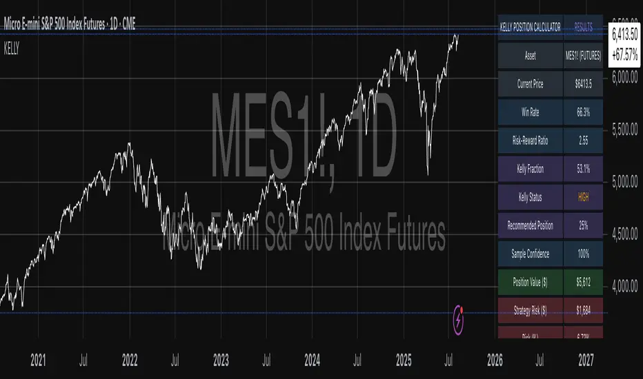
Mean Reversion Trading With IV Metrics (By MC) - Mobile FriendlyThis script is a comprehensive toolkit for traders who want to combine price mean reversion analysis with advanced volatility metrics, including Implied Volatility Rank (IVR), Implied/“Fair” Volatility projections, and real-time market volatility indicators. It is optimized for both desktop and mobile use, providing a detailed statistics table directly on the chart, and is suitable for stocks, ETFs, indices, and even paired asset analysis.
Key Features & How They Work Together
1. Mean Reversion Probability & Z-Score
Mean Reversion Analysis: Calculates z-scores and statistical probabilities that the asset’s price will revert to its mean, using customizable lookback windows (e.g., 10-60 bars). This helps traders spot potentially overbought or oversold conditions.
Strong & Moderate Signals: Highlights strong and moderate reversion opportunities based on user-defined probability thresholds, providing clear visual cues for timing entries and exits.
2. Paired Asset Correlation
Pairs Trading Support: Allows comparison of two symbols (e.g., SPY vs TLT). It computes the ratio, rolling mean, standard deviation, and correlation, helping traders identify divergence/convergence opportunities in pairs trading.
3. Volatility Metrics & Projections
Historical & Implied Volatility: Estimates implied volatility (IV) using historical price data, calculates IVR (the asset’s IV relative to its own history), and provides user-customized percentile bands (e.g., 20th/80th percentiles).
Fair IV Calculation: Offers three methods to compute “fair” volatility:
Market-Aware (relative to VIX/SPX HV)
SMA of historical volatility
SMA of VIX Traders can choose the method that best fits current market conditions.
Future Projections: Projects IV, “Fair” IV, and IVR for a user-defined future period, giving insight into potential volatility trends.
4. Implied Move Range
Implied Move Calculation: Shows the expected price range (upper/lower bounds) for the forecast period based on the current IV, making risk management and target setting more objective.
Dynamic Labels: Automatically updates labels with the latest projected moves and bounds, keeping traders informed in real time.
5. Market Volatility Dashboard
Broad Market Indicators: Displays real-time values and daily changes for VIX, VIX1D, VVIX, MOVE (bond volatility), GVZ (gold volatility), and OVX (oil volatility). Color-coded thresholds help traders gauge market stress across asset classes.
Correlation to SPY: Shows how closely the asset moves with SPY, aiding in diversification and hedging decisions.
6. Performance Metrics
Daily Move Analysis: Tracks today’s price move (absolute and percentage), average rises/falls, and the percentage of green/red days over a custom period.
Trade Quality Assessment: Ranks trade opportunities (High/Moderate/Low/Very Low) based on mean reversion probability.
7. Highly Customizable Table
Mobile Friendly: The stats table can be placed anywhere on the chart, toggled between compact/full/extra modes, and resized for readability on any device.
Visual Cues: Color coding and dynamic labels make interpretation easy and fast.
8. Alert Conditions
Built-in alerts for strong/moderate mean reversion, IV crossing above/below “Fair” IV, allowing proactive trade management.
9. VIX-Based Expected Move Bands
Optionally plots ±1, 2, 3 standard deviation bands using VIX-based expected move, helping to visualize potential price extremes.
How These Features Help Traders
Unified Trading Dashboard: All key mean reversion and volatility insights are available at a glance, reducing the need to switch between multiple indicators or screens.
Informed Entries & Exits: By combining mean reversion probabilities, IV projections, and market volatility, traders can time trades more confidently and avoid false signals.
Risk Management: The implied move bounds and volatility levels support realistic stop-loss and target setting, adapting dynamically to market conditions.
Cross-Asset Awareness: Market-wide volatility metrics and asset correlation to SPY provide context, helping traders avoid surprises from macro shocks.
Pairs Trading: Direct support for ratio and correlation analysis streamlines pairs strategies.
Customization & Clarity: The flexible UI and color-coded stats make the tool accessible for both beginners and advanced users.
Mean Reversion, Correlation value & interpretation:
For Meant Reversion % Probability:
Lookback Period to use:
| Trading Horizon | Lookback Period (Length) | Rationale |
| 5–10 days | 10–20 bars | More sensitive, good for quick reversals |
| 10–20 days | 20–30 bars | Standard for short swing |
| 20–40 days | 40–60 bars | More stable mean for longer swing |
Interpretation Guide:
Only consider trades if Correlation ≥ 0.6 or Reversion % ≥ 75%.
Avoid trades with Reversion % < 20%.
Correlation and Reversion % together form a powerful trade quality filter.
| Reversion % | Correlation | Signal Strength | Action |
| ≥ 75% | ≥ 0.4 | High Probability | Consider full position |
| ≥ 50% | ≥ 0.6 | Moderate Probability | Trade with standard size |
| ≥ 75% | < 0.4 | Uncorrelated Edge | Trade small or hedge carefully |
| < 50% | Any | Weak | Avoid |
| Any | < 0.3 | Low Coherence | Avoid unless extreme Reversion |
| Correlation Value | Interpretation |
| +1.0 | Perfect positive correlation (price of both move in the same direction)|
| +0.7 to +0.9 | Strong positive correlation |
| +0.4 to +0.6 | Moderate positive correlation |
| 0 | No correlation (independent) |
| -0.4 to -0.6 | Moderate negative correlation |
| -0.7 to -0.9 | Strong negative correlation |
| -1.0 | Perfect negative correlation (price both move in the opposite direction)|
Summary:
This script empowers traders to navigate markets with a robust, data-driven approach, seamlessly blending mean reversion analytics with deep volatility insight—all in a mobile-friendly, customizable dashboard.
Disclaimer
This tool is for informational and educational purposes only. It does not provide financial advice or trading signals. Always do your own research and consult a professional before making investment decisions.
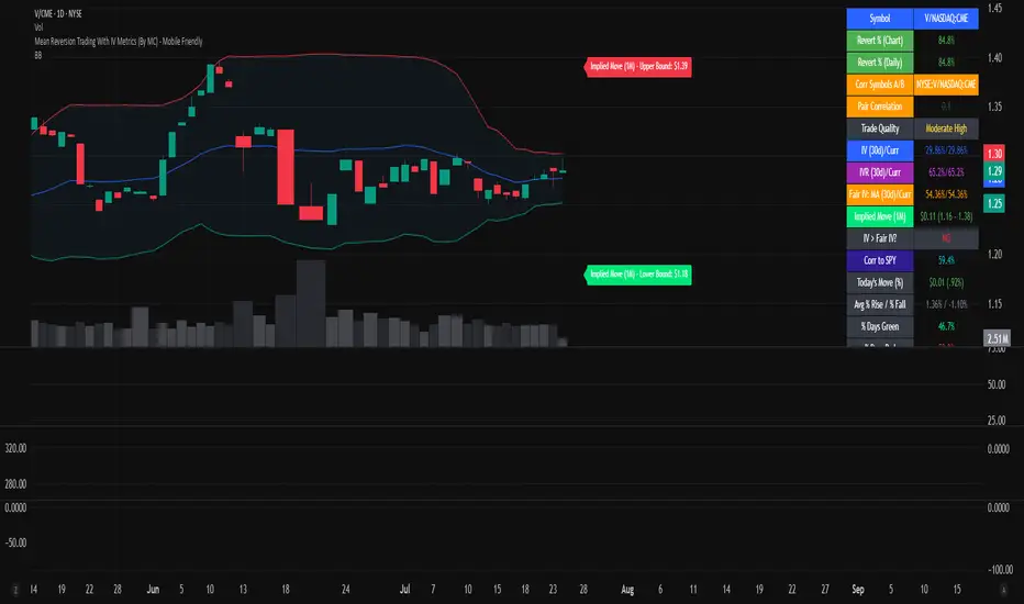
Rotation Phase TriggerHow to Use the Full Rotation Phase Trigger Tool (non-floating version)
This version is ideal for macro-level market context, helping you decide when to rotate between growth, income, and defensive positions using visual cues directly on the chart.
🧱 Components Recap (Non-Floating Version)
ROC Histograms:
SPY:TLT ROC (green bars): Measures equity strength vs. bonds
QQQ:XLU ROC (blue bars): Measures growth vs. defensive rotation
EMA Trend Filter:
Uses a fast/slow EMA crossover on both ratios to confirm the trend
When both are rising → confirms GROWTH phase
Phase Background Colors:
🟩 Green = GROWTH
🟧 Orange = INCOME
🟥 Red = DEFENSIVE
No color = NEUTRAL
Instruction Labels:
Show what sectors to add and what to sell (with ETF tickers)
Alert Conditions:
Can be linked to email, SMS, or app notifications
Triggered when phase changes
✅ Weekly Workflow
Every Monday (or Weekend Prep)
1. Open SPY on a Weekly Chart
This tool is designed around the U.S. equity vs bond regime
Always keep SPY as the main chart for best alignment
2. Check the Background Color
Instantly tells you what regime you're in:
Green → rotate into growth ETFs
Orange → stick to or buy income-generating ETFs
Red → get defensive, raise cash, or buy bond/hedge ETFs
3. Read the Labels
Top label = phase status (e.g., GROWTH)
Bottom label = action instructions:
What ETFs to accumulate (MTUM, VUN, HYLD, etc.)
What sectors or funds to rotate out of
4. Look at Momentum Histograms
Confirms whether the regime shift is gaining strength
Larger bars = stronger conviction
Diverging directions? Wait for confirmation
🔁 Tactical Rotation Plan
Phase Add Trim/Sell
GROWTH MTUM, VUN, XMTM, HXS, VTI HYLD, HHIS, HPYT
INCOME HYLD, HHIS, QQQY, DFN, DGS MTUM, VUN
DEFENSIVE HPYT, HPYT.U, ZGLD, GDE All equities
NEUTRAL Nothing new, rebalance if needed Excess risk positions
🔔 Alert Setup (Optional)
You can create alerts in TradingView using:
Right-click chart → "Add Alert"
Use condition: "Rotation Phase Trigger" → "GROWTH" / "INCOME" / "DEFENSIVE"
Choose notification method (popup, app, email, etc.)
💡 Pro Tips
Use this version on SPY weekly only — for best signal clarity

Internals Elite NYSE [Beta]Overview:
This indicator is designed to provide traders with a quick overview of key market internals and metrics in a single, easy-to-read table displayed directly on the chart. It incorporates a variety of metrics that help gauge market sentiment, momentum, and overall market conditions.
The table dynamically updates in real-time and uses color-coding to highlight significant changes or thresholds, allowing traders to quickly interpret the data and make informed trading decisions.
Features:
Market Internals:
TICK: Measures the difference between the number of stocks ticking up versus those ticking down on the NYSE. Green or red background indicates if it crosses a user-defined threshold.
Advance/Decline (ADD): Shows the net number of advancing versus declining stocks on the NYSE. Color-coded to show positive, negative, or neutral conditions.
Volatility Metrics:
VIX Change (%): Displays the percentage change in the Volatility Index (VIX), a key gauge of market fear or complacency. Color-coded for direction.
VIX Price: Displays the current VIX price with thresholds to indicate low, medium, or high volatility.
Other Market Metrics:
DXY Change (%): Percentage change in the US Dollar Index (DXY), indicating dollar strength or weakness.
VWAP Deviation (%): Percentage of stocks above VWAP (Volume Weighted Average Price), helping traders assess intraday buying and selling pressure.
Asset-Specific Metrics:
BTCUSD Change (%): Percentage change in Bitcoin (BTC) price, useful for monitoring cryptocurrency sentiment.
SPY Change (%): Percentage change in the S&P 500 ETF (SPY), a proxy for the overall stock market.
Current Ticker Change (%): Percentage change in the currently selected ticker on the chart.
US10Y Change (%): Percentage change in the yield of the 10-Year US Treasury Note (TVC:US10Y), an important macroeconomic indicator.
Customizable Appearance:
Adjustable text size to suit your chart layout.
User-defined thresholds for key metrics (e.g., TICK, ADD, VWAP, VIX).
Dynamic Table Placement:
You can position the table anywhere on the chart: top-right, top-left, bottom-right, bottom-left, middle-right, or middle-left.
How to Use:
Add the Indicator to Your Chart:
Apply the indicator to your chart from the Pine Script editor in TradingView.
Customize the Inputs:
Adjust the thresholds for TICK, ADD, VWAP, and VIX according to your trading style.
Enable or disable the metrics you want to see in the table by toggling the display options for each metric (e.g., Show TICK, Show BTC, Show SPY).
Set the table placement to your preferred position on the chart.
Interpret the Table:
Look for color-coded cells to quickly identify significant changes or breaches of thresholds.
Positive values are typically shown in green, negative values in red, and neutral/insignificant changes in gray.
Use metrics like TICK and ADD to gauge market breadth and momentum.
Refer to VWAP deviation to assess intraday buying or selling pressure.
Monitor the VIX and US10Y changes to stay aware of macroeconomic and volatility shifts.
Incorporate Into Your Strategy:
Use the indicator alongside technical analysis to confirm setups or identify areas of caution.
Keep an eye on correlated metrics (e.g., VIX and SPY) for broader market context.
Use BTCUSD or DXY as additional indicators of risk-on/risk-off sentiment.
Ideal Users:
Day Traders: Quickly gauge intraday market conditions and momentum.
Swing Traders: Identify broader sentiment shifts using metrics like ADD, DXY, and US10Y.
Macro Investors: Stay updated on key macroeconomic indicators like the 10-Year Treasury yield (US10Y) and the US Dollar Index (DXY).
This indicator serves as a comprehensive tool for understanding market conditions at a glance, enabling traders to act decisively based on the latest data.

Advanced Economic Indicator by USCG_VetAdvanced Economic Indicator by USCG_Vet
tldr:
This comprehensive TradingView indicator combines multiple economic and financial metrics into a single, customizable composite index. By integrating key indicators such as the yield spread, commodity ratios, stock indices, and the Federal Reserve's QE/QT activities, it provides a holistic view of the economic landscape. Users can adjust the components and their weights to tailor the indicator to their analysis, aiding in forecasting economic conditions and market trends.
Detailed Description
Overview
The Advanced Economic Indicator is designed to provide traders and investors with a powerful tool to assess the overall economic environment. By aggregating a diverse set of economic indicators and financial market data into a single composite index, it helps identify potential turning points in the economy and financial markets.
Key Features:
Comprehensive Coverage: Includes 14 critical economic and financial indicators.
Customizable Components: Users can select which indicators to include.
Adjustable Weights: Assign weights to each component based on perceived significance.
Visual Signals: Clear plotting with threshold lines and background highlights.
Alerts: Set up alerts for when the composite index crosses user-defined thresholds.
Included Indicators
Yield Spread (10-Year Treasury Yield minus 3-Month Treasury Yield)
Copper/Gold Ratio
High Yield Spread (HYG/IEF Ratio)
Stock Market Performance (S&P 500 Index - SPX)
Bitcoin Performance (BLX)
Crude Oil Prices (CL1!)
Volatility Index (VIX)
U.S. Dollar Index (DXY)
Inflation Expectations (TIP ETF)
Consumer Confidence (XLY ETF)
Housing Market Index (XHB)
Manufacturing PMI (XLI ETF)
Unemployment Rate (Inverse SPY as Proxy)
Federal Reserve QE/QT Activities (Fed Balance Sheet - WALCL)
How to Use the Indicator
Configuring the Indicator:
Open Settings: Click on the gear icon (⚙️) next to the indicator's name.
Inputs Tab: You'll find a list of all components with checkboxes and weight inputs.
Including/Excluding Components
Checkboxes: Check or uncheck the box next to each component to include or exclude it from the composite index.
Default State: By default, all components are included.
Adjusting Component Weights:
Weight Inputs: Next to each component's checkbox is a weight input field.
Default Weights: Pre-assigned based on economic significance but fully adjustable.
Custom Weights: Enter your desired weight for each component to reflect your analysis.
Threshold Settings:
Bearish Threshold: Default is -1.0. Adjust to set the level below which the indicator signals potential economic downturns.
Bullish Threshold: Default is 1.0. Adjust to set the level above which the indicator signals potential economic upswings.
Setting the Timeframe:
Weekly Timeframe Recommended: Due to the inclusion of the Fed's balance sheet data (updated weekly), it's best to use this indicator on a weekly chart.
Changing Timeframe: Select 1W (weekly) from the timeframe options at the top of the chart.
Interpreting the Indicator:
Composite Index Line
Plot: The blue line represents the composite economic indicator.
Movement: Observe how the line moves relative to the threshold lines.
Threshold Lines
Zero Line (Gray Dotted): Indicates the neutral point.
Bearish Threshold (Red Dashed): Crossing below suggests potential economic weakness.
Bullish Threshold (Green Dashed): Crossing above suggests potential economic strength.
Background Highlights
Red Background: When the composite index is below the bearish threshold.
Green Background: When the composite index is above the bullish threshold.
No Color: When the composite index is between the thresholds.
Understanding the Components
1. Yield Spread
Description: The difference between the 10-year and 3-month U.S. Treasury yields.
Economic Significance: An inverted yield curve (negative spread) has historically preceded recessions.
2. Copper/Gold Ratio
Description: The price ratio of copper to gold.
Economic Significance: Copper is tied to industrial demand; gold is a safe-haven asset. The ratio indicates risk sentiment.
3. High Yield Spread (HYG/IEF Ratio)
Description: Ratio of high-yield corporate bonds (HYG) to intermediate-term Treasury bonds (IEF).
Economic Significance: Reflects investor appetite for risk; widening spreads can signal credit stress.
4. Stock Market Performance (SPX)
Description: S&P 500 Index levels.
Economic Significance: Broad measure of U.S. equity market performance.
5. Bitcoin Performance (BLX)
Description: Bitcoin Liquid Index price.
Economic Significance: Represents risk appetite in speculative assets.
6. Crude Oil Prices (CL1!)
Description: Front-month crude oil futures price.
Economic Significance: Influences inflation and consumer spending.
7. Volatility Index (VIX)
Description: Market's expectation of volatility (fear gauge).
Economic Significance: High VIX indicates market uncertainty; inverted in the indicator to align directionally.
8. U.S. Dollar Index (DXY)
Description: Value of the U.S. dollar relative to a basket of foreign currencies.
Economic Significance: Affects international trade and commodity prices; inverted in the indicator.
9. Inflation Expectations (TIP ETF)
Description: iShares TIPS Bond ETF prices.
Economic Significance: Reflects market expectations of inflation.
10. Consumer Confidence (XLY ETF)
Description: Consumer Discretionary Select Sector SPDR Fund prices.
Economic Significance: Proxy for consumer confidence and spending.
11. Housing Market Index (XHB)
Description: SPDR S&P Homebuilders ETF prices.
Economic Significance: Indicator of the housing market's health.
12. Manufacturing PMI (XLI ETF)
Description: Industrial Select Sector SPDR Fund prices.
Economic Significance: Proxy for manufacturing activity.
13. Unemployment Rate (Inverse SPY as Proxy)
Description: Inverse of the SPY ETF price.
Economic Significance: Represents unemployment trends; higher inverse SPY suggests higher unemployment.
14. Federal Reserve QE/QT Activities (Fed Balance Sheet - WALCL)
Description: Total assets held by the Federal Reserve.
Economic Significance: Indicates liquidity injections (QE) or withdrawals (QT); impacts interest rates and asset prices.
Customization and Advanced Usage
Adjusting Weights:
Purpose: Emphasize components you believe are more predictive or relevant.
Method: Increase or decrease the weight value next to each component.
Example: If you think the yield spread is particularly important, you might assign it a higher weight.
Disclaimer
This indicator is for educational and informational purposes only. It is not financial advice. Trading and investing involve risks, including possible loss of principal. Always conduct your own analysis and consult with a professional financial advisor before making investment decisions.
BetaBeta , also known as the Beta coefficient, is a measure that compares the volatility of an individual underlying or portfolio to the volatility of the entire market, typically represented by a market index like the S&P 500 or an investible product such as the SPY ETF (SPDR S&P 500 ETF Trust). A Beta value provides insight into how an asset's returns are expected to respond to market swings.
Interpretation of Beta Values
Beta = 1: The asset's volatility is in line with the market. If the market rises or falls, the asset is expected to move correspondingly.
Beta > 1: The asset is more volatile than the market. If the market rises or falls, the asset's price is expected to rise or fall more significantly.
Beta < 1 but > 0: The asset is less volatile than the market. It still moves in the same direction as the market but with less magnitude.
Beta = 0: The asset's returns are not correlated with the market's returns.
Beta < 0: The asset moves in the opposite direction to the market.
Example
A beta of 1.20 relative to the S&P 500 Index or SPY implies that if the S&P's return increases by 1%, the portfolio is expected to increase by 12.0%.
A beta of -0.10 relative to the S&P 500 Index or SPY implies that if the S&P's return increases by 1%, the portfolio is expected to decrease by 0.1%. In practical terms, this implies that the portfolio is expected to be predominantly 'market neutral' .
Calculation & Default Values
The Beta of an asset is calculated by dividing the covariance of the asset's returns with the market's returns by the variance of the market's returns over a certain period (standard period: 1 years, 250 trading days). Hint: It's noteworthy to mention that Beta can also be derived through linear regression analysis, although this technique is not employed in this Beta Indicator.
Formula: Beta = Covariance(Asset Returns, Market Returns) / Variance(Market Returns)
Reference Market: Essentially any reference market index or product can be used. The default reference is the SPY (SPDR S&P 500 ETF Trust), primarily due to its investable nature and broad representation of the market. However, it's crucial to note that Beta can also be calculated by comparing specific underlyings, such as two different stocks or commodities, instead of comparing an asset to the broader market. This flexibility allows for a more tailored analysis of volatility and correlation, depending on the user's specific trading or investment focus.
Look-back Period: The standard look-back period is typically 1-5 years (250-1250 trading days), but this can be adjusted based on the user's preference and the specifics of the trading strategy. For robust estimations, use at least 250 trading days.
Option Delta: An optional feature in the Beta Indicator is the ability to select a specific Delta value if options are written on the underlying asset with Deltas less than 1, providing an estimation of the beta-weighted delta of the position. It involves multiplying the beta of the underlying asset by the delta of the option. This addition allows for a more precise assessment of the underlying asset's correspondence with the overall market in case you are an options trader. The default Delta value is set to 1, representing scenarios where no options on the underlying asset are being analyzed. This default setting aligns with analyzing the direct relationship between the asset itself and the market, without the layer of complexity introduced by options.
Calculation: Simple or Log Returns: In the calculation of Beta, users have the option to choose between using simple returns or log returns for both the asset and the market. The default setting is 'Simple Returns'.
Advantages of Using Beta
Risk Management: Beta provides a clear metric for understanding and managing the risk of a portfolio in relation to market movements.
Portfolio Diversification: By knowing the beta of various assets, investors can create a balanced portfolio that aligns with their risk tolerance and investment goals.
Performance Benchmarking: Beta allows investors to compare an asset's risk-adjusted performance against the market or other benchmarks.
Beta-Weighted Deltas for Options Traders
For options traders, understanding the beta-weighted delta is crucial. It involves multiplying the beta of the underlying asset by the delta of the option. This provides a more nuanced view of the option's risk relative to the overall market. However, it's important to note that the delta of an option is dynamic, changing with the asset's price, time to expiration, and other factors.

RedK Relative Strength Ribbon: RS Ribbon and RS ChartsRedK Relative Strength Ribbon (RedK RS_Ribbon) is TA tool that plots the Relative Strength of the current chart symbol against another symbol, or an index of choice. It enables us to see when a stock is gaining strength (or weakness) relative to (an index that represents) the market, and when it hits new highs or lows of that relative strength, which may lead to better trading decisions.
I searched TV for existing RS indicators but didn't find what I really wanted, so I put this together and added some additional features for my own use. It started as a simple RS line with new x-weeks Hi/Lo markers, then evolved into what you see here in v1.0 with the ability to plot a full RS chart in regular or HA candle types. Hope this will be useful to some other growth traders here on TV.
What is Relative Strength (RS)
------------------------------------
(RS is a comprehensive concept in TA, below is a quick summary - please research further if it's not already a familiar topic)
Relative Strength (RS) is a technical concept / indicator used mainly by growth / swing / momentum traders to compare the performance of one security or asset against another. RS measures the price performance of a specific security relative to a benchmark, such as an index or another asset. It's not to be confused with the famous Relative Strength Index (RSI) technical indicator
For example, In the context of comparing a stock's relative strength to the SPY (S&P 500) index, the relative strength calculation involves dividing the stock's price or price-related value (e.g., close price) by the corresponding value of the SPY index. The resulting ratio (and its trend over time) indicates the relative performance of the stock compared to the index.
Traders and investors use relative strength analysis to identify securities that have been showing relative strength or weakness compared to a benchmark, which can help in making investment decisions or identifying the "market leaders" and potential trading opportunities.
There are so many books and documentation about the RS concept and its importance to identify market leaders, especially when recovering from a bear market - if you're interested in the concept, please search more about it and review some of that literature. There's also a more detailed definition of Relative Strength in this article on Invstopedia
RedK RS_Ribbon features and options
---------------------------------------------------
The indicator settings provide many options and features - see the settings box below
- Change / choose base symbol
The default is to use SPY as the base symbol - so we're comparing the chart's symbol to a proxy of the S&P 500 - Some traders may prefer to use the QQQ - or other index or ETF that acts as a proxy for the industry / sector / market they are trading
- RS Calculation / RS line
we use the simple form of the RS calculation,
RS = closing price of current chart symbol / closing price of the base symbol (default is SPY) * 100
some RS documentation will use the Rate of Change (RoC) - but that's not what we're using here.
- The RS_Ribbon
* Once the RS line is plotted, it made sense to add couple of moving averages to it, to make it easier to observe the trend of the RS and the changes in that trend as you can see in the sample chart on top.
* The RS_Ribbon is made up of a fast and slow moving averages and will change color (green / red) based on detected trend RS direction - the 2 MA types and lengths can be changed until you get the setup that provides the best view for you of the RS trend over time. My preferred settings are used as defaults here.
- Identifying New (x)Week Hi/Lo RS Values
* Most traders would be interested when the calculated RS hits a new 52-week high or low value.
* There are cases where we may want to see when a new RS Hi/Lo has been hit for a different period - for example, a quarter (13 weeks)
* the number of weeks can be changed as well as adjusting the numbers of trading days per week (if needed for certain symbols/exchanges)
- Working with Different Timeframes
* Now these "markers" will only be available in the daily and weekly timeframes and there is a good reason for that, it's not the fact that i'm lazy :) and that enabling this in timeframes lower than 1D would have been some heavy lifting, but the reality is that with RS, we're really interested if a "day's close" hits a new RS high or low value against the moving window of x weeks (and the weeks close also) - if you think of this more, at lower TF, RS can hit a lower value that never end up registering on the daily closing and that causes a lot of visual confusion. So i took the "cleaner way out" of that issue.
* note that you can choose a different timeframe for the RS_Ribbon than the chart - if you do, please make sure the chart is at a lower timeframe than the indicator's - (and in that case remember to hide the candles because they won't make much sense)
i wanted to leverage TV's built-in multi-Timeframe (MTF) support with the caveat that using the indicator at lower TF with a chart at a higher TF (example chart at 1Wk and indicator at 1D) will show inaccurate results. If this sounds confusing, keep the indicator TF same as the chart.
the example here shows a 2-Hr chart against 1D RS_Ribbon
- Using RS Charts and RS Candles
* Beside the ability to plot the RS "closing" value with the RS line, the indicator provides the ability to show a "full" RS Chart with candles that represent the relative values of open, high, low. and close against the base symbol.
* the RS Charts can be used for regular chart analysis, for example, we can identify common chart patterns like Cup & Handle, VCP, Head & Shoulder..etc using these charts .. which can provide some edge over the price charts
* for the Heikin Ashi fans, I added the ability to choose classic or HA candles for the chart. note you have to enable the option to show the RS candles first before you choose the option to switch to HA.
The chart below shows a side-by-side comparison on the 2 RS chart types
Closing remarks
-----------------------
* RS is a good way to identify market/sector leaders (who will usually recover from a bear market before others) - and enable us to see the strength that comes from the broader makrket versus the one that comes from the stock's own performance and identify good trading opportunities
* I'll continue to update this work and alerts will come in next version - but wanted to check initial reaction and value
* as usual, if you decide to use this in your chart analysis, it's necessary to combine with other momentum, trend, ...etc indicators and do not make trading decision only based on the signales from a single indicator

Modern Portfolio Management IndicatorAfter weeks of grueling over this indicator, I am excited to be releasing it!
Intro:
This is not a sexy, technical or math based indicator that will give you buy and sell signals or anything fancy, but it is an indicator that I created in hopes to bridge a gap I have noticed. That gap is the lack of indicators and technical resources for those who also like to plan their investments. This indicator is tailored to those who are either established investors and to those who are looking to get into investing but don't really know where to start.
The premise of this indicator is based on Modern Portfolio Theory (MPT). Before we get into the indicator itself, I think its important to provide a quick synopsis of MPT.
About MPT:
Modern Portfolio Theory (MPT) is an investment framework that was developed by Harry Markowitz in the 1950s. It is based on the idea that an investor can optimize their investment portfolio by considering the trade-off between risk and return. MPT emphasizes diversification and holds that the risk of an individual asset should be assessed in the context of its contribution to the overall portfolio's risk. The theory suggests that by diversifying investments across different asset classes with varying levels of risk, an investor can achieve a more efficient portfolio that maximizes returns for a given level of risk or minimizes risk for a desired level of return. MPT also introduced the concept of the efficient frontier, which represents the set of portfolios that offer the highest expected return for a given level of risk. MPT has been widely adopted and used by investors, financial advisors, and portfolio managers to construct and manage portfolios.
So how does this indicator help with MPT?
The thinking and theory that went behind this indicator was this: I wanted an indicator, or really just a "way" to test and back-test ticker performance over time and under various circumstances and help manage risk.
Over the last 3 years we have seen a massive bull market, followed by a pretty huge bear market, followed by a very unexpected bull market. We have been and continue to be plagued with economic and political uncertainty that seems to constantly be looming over everyone with each waking day. Some people have liquidated their retirement investments, while others are fomoing in to catch this current bull run. But which tickers are sound and how tickers and funds have compared amongst each other remains somewhat difficult to ascertain, absent manually reviewing and calculating each ticker individually.
That is where this indicator comes in. This indicator permits the user to define up to 5 equities that they are potentially interested in investing in, or are already invested in. The user can then select a specific period in time, say from the beginning of 2022 till now. The user can then define how much they want to invest in each company by number of shares, so if they want to buy 1 share a week, or 2 shares a month, they can input these variables into the indicator to draw conclusions. As many brokers are also now permitting fractional share trading, this ability is also integrated into the indicator. So for shares, you can put in, say, 0.25 shares of SPY and the indicator will accept this and account for this fractional share.
The indicator will then show you a portfolio summary of what your earnings and returns would be for the defined period. It will provide a percent return as well as the projected P&L based on your desired investment amount and frequency.
But it goes beyond just that, you can also have the indicator display a simple forecasting projection of the portfolio. It will show the projected P&L and % Return over various periods in time on each of the ticker (see image below):
The indicator will also break down your portfolio allocation, it will show where the majority of your holdings are and where the majority of your P&L in coming from (best performers will show a green fill and worst will show a red fill, see image below):
This colour coding also extends to the portfolio breakdown itself.
Dollar cost averaging (DCA) is incorporated into the indicator itself, by assuming ongoing contributions. If you want to stop contributions at a certain point, you just select your end time for contributions at the point in which you would stop contributing.
The indicator also provides some basic fundamental information about the company tickers (if applicable). Simply select the "Fundamental" chart and it will display a breakdown of the fundamentals, including dividends paid, market cap and earnings yield:
The indicator also provides a correlation assessment of each holding against each other holding. This emphasizes the profound role of diversification on portfolios. The less correlation you have in your portfolio among your holdings, the better diversified you are. As well, if you have holdings that are perfectly inverse other holdings, you have a pseudo hedge against the downturn of one of your holdings. This is even more helpful if the inverse is a company with solid fundamentals.
In the below example you will see NASDAQ:IRDM in the portfolio. You will be able to see that NASDAQ:IRDM has a slight inverse relationship to SPY:
Yet IRDM has solid fundamentals and is performing well fundamentally. Thus, this makes IRDIM a solid addition to your portfolio as it can potentially hedge against a downturn for SPY and is less risky than simply holding an inverse leveraged share on SPY which is most likely just going to cost you money than make you money.
Concluding remarks:
There are many fun and interesting things you can do with this indicator and I encourage you to try it out and have fun with it! The overall objective with the indicator is to help you plan for your portfolio and not necessarily to manage your portfolio. If you have a few stocks you are looking at and contemplating investing in, this will help you run some theoretical scenarios with this stock based on historical performance and also help give you a feel of how it will perform in the future based on past behaviour.
It is important to remember that past behaviour does not indicate future behaviour, but the indicator provides you with tools to get a feel for how a stock has performed under various circumstances and get a general feel of the fundamentals of the company you could potentially be investing in.
Please note, this indicator is not meant to replace full, fundamental analyses of individual companies. It is simply meant to give you a "gist" of how companies are fundamentally and how they have performed historically.
I hope you enjoy it!
Safe trades everyone!
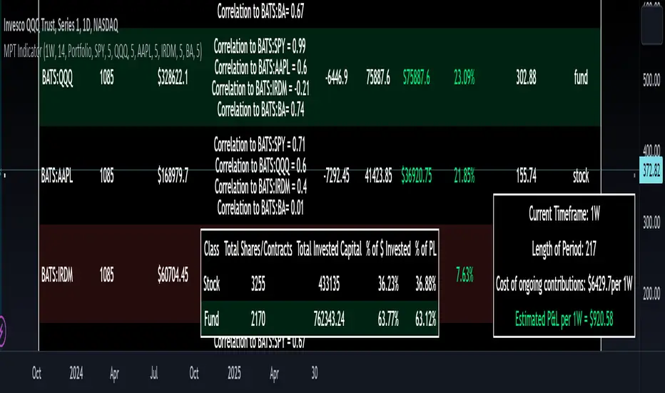
Trend Correlation HeatmapHello everyone!
I am excited to release my trend correlation heatmap, or trend heatmap for short.
Per usual, I think its important to explain the theory before we get into the use of the indicator, so let's get into the theory!
The theory:
So what is a correlation?
Correlation is the relationship one variable has to another. Correlations are the basis of everything I do as a quantitative trader. From the correlation between the same variables (i.e. autocorrelation), the correlation between other variables (i.e. VIX and SPY, SPY High and SPY Low, DXY and ES1! close, etc.) and, as well, the correlation between price and time (time series correlation).
This may sound very familiar to you, especially if you are a user, observer or follower of my ideas and/or indicators. Ninety-five percent of my indicators are a function of one of those three things. Whether it be a time series based indicator (i.e.my time series indicator), whether it be autocorrelation (my autoregressive cloud indicator or my autocorrelation oscillator) or whether it be regressive in nature (i.e. my SPY Volume weighted close, or even my expected move which uses averages in lieu of regressive approaches but is foundational in regression principles. Or even my VIX oscillator which relies on the premise of correlations between tickers.) So correlation is extremely important to me and while its true I am more of a regression trader than anything, I would argue that I am more of a correlation trader, because correlations are the backbone of how I develop math models of stocks.
What I am trying to stress here is the importance of correlations. They really truly are foundational to any type of quantitative analysis for stocks. And as such, understanding the current relationship a stock has to time is pivotal for any meaningful analysis to be conducted.
So what is correlation to time and what does it tell us?
Correlation to time, otherwise known and commonly referred to as "Time Series", is the relationship a ticker's price has to the passing of time. It is displayed in the traditional Pearson Correlation Coefficient or R value and can be any value from -1 (strong negative relationship, i.e. a strong downtrend) to + 1 (i.e. a strong positive relationship, i.e. a strong uptrend). The higher or lower the value the stronger the up or downtrend is.
As such, correlation to time tells us two very important things. These are:
a) The direction of the stock; and
b) The strength of the trend.
Let's take a look at an example:
Above we have a chart of QQQ. We can see a trendline that seems to fit well. The questions we ask as traders are:
1. What is the likelihood QQQ breaks down from this trendline?
2. What is the likelihood QQQ continues up?
3. What is the likelihood QQQ does a false breakdown?
There are numerous mathematical approaches we can take to answer these questions. For example, 1 and 2 can be answered by use of a Cumulative Distribution Density analysis (CDDA) or even a linear or loglinear regression analysis and 3 can be answered, more or less, with a linear regression analysis and standard error ascertainment, or even just a general comparison using a data science approach (such as cosine similarity or Manhattan distance).
But, the reality is, all 3 of these questions can be visualized, at least in some way, by simply looking at the correlation to time. Let's look at this chart again, this time with the correlation heatmap applied:
If we look at the indicator we can see some pivotal things. These are:
1. We have 4, very strong uptrends that span both higher AND lower timeframes. We have a strong uptrend of 0.96 on the 5 minute, 50 candle period. We have a strong uptrend at the 300 candle lookback period on the 1 minute, we have a strong uptrend on the 100 day lookback on the daily timeframe period and we have a strong uptrend on the 5 minute on the 500 candle lookback period.
2. By comparison, we have 3 downtrends, all of which have correlations less than the 4 uptrends. All of the downtrends have a correlation above -0.8 (which we would want lower than -0.8 to be very strong), and all of the uptrends are greater than + 0.80.
3. We can also see that the uptrends are not confined to the smaller timeframes. We have multiple uptrends on multiple timeframes and both short term (50 to 100 candles) and long term (up to 500 candles).
4. The overall trend is strengthening to the upside manifested by a positive Max Change and a Positive Min change (to be discussed later more in-depth).
With this, we can see that QQQ is actually very strong and likely will continue at least some upside. If we let this play out:
We continued up, had one test and then bounced.
Now, I want to specify, this indicator is not a panacea for all trading. And in relation to the 3 questions posed, they are best answered, at least quantitatively, not only by correlation but also by the aforementioned methods (CDDA, etc.) but correlation will help you get a feel for the strength or weakness present with a stock.
What are some tangible applications of the indicator?
For me, this indicator is used in many ways. Let me outline some ways I generally apply this indicator in my day and swing trading:
1. Gauging the strength of the stock: The indictor tells you the most prevalent behavior of the stock. Are there more downtrends than uptrends present? Are the downtrends present on the larger timeframes vs uptrends on the shorter indicating a possible bullish reversal? or vice versa? Are the trends strengthening or weakening? All of these things can be visualized with the indicator.
2. Setting parameters for other indicators: If you trade EMAs or SMAs, you may have a "one size fits all" approach. However, its actually better to adjust your EMA or SMA length to the actual trend itself. Take a look at this:
This is QQQ on the 1 hour with the 200 EMA with 200 standard deviation bands added. If we look at the heatmap, we can see, yes indeed 200 has a fairly strong uptrend correlation of 0.70. But the strongest hourly uptrend is actually at 400 candles, with a correlation of 0.91. So what happens if we change the EMA length and standard deviation to 400? This:
The exact areas are circled and colour coded. You can see, the 400 offers more of a better reference point of supports and resistances as well as a better overall trend fit. And this is why I never advocate for getting married to a specific EMA. If you are an EMA 200 lover or 21 or 51, know that these are not always the best depending on the trend and situation.
Components of the indicator:
Ah okay, now for the boring stuff. Let's go over the functionality of the indicator. I tried to keep it simple, so it is pretty straight forward. If we open the menu here are our options:
We have the ability to toggle whichever timeframes we want. We also have the ability to toggle on or off the legend that displays the colour codes and the Max and Min highest change.
Max and Min highest change: The max and min highest change simply display the change in correlation over the previous 14 candles. An increasing Max change means that the Max trend is strengthening. If we see an increasing Max change and an increasing Min change (the Min correlation is moving up), this means the stock is bullish. Why? Because the min (i.e. ideally a big negative number) is going up closer to the positives. Therefore, the downtrend is weakening.
If we see both the Max and Min declining (red), that means the uptrend is weakening and downtrend is strengthening. Here are some examples:
Final Thoughts:
And that is the indicator and the theory behind the indicator.
In a nutshell, to summarize, the indicator simply tracks the correlation of a ticker to time on multiple timeframes. This will allow you to make judgements about strength, sentiment and also help you adjust which tools and timeframes you are using to perform your analyses.
As well, to make the indicator more user friendly, I tried to make the colours distinctively different. I was going to do different shades but it was a little difficult to visualize. As such, I have included a toggle-able legend with a breakdown of the colour codes!
That's it my friends, I hope you find it useful!
Safe trades and leave your questions, comments and feedback below!

Vola2vola Volatility indicatorHello everyone!
For those who remember vola2vola volatility script, we are excited to bring it back within the Myfractalrange Tradingview account!
As you know, Volatility is very important to assets and many people use it to trade. This tool automate the calculation of the volatility of every asset as well as provide an estimated value of its "Trend" and "Trade".
The idea in this script is to allow users to have an idea of the current volatility regime of the asset he is monitoring: Is its volatility Bullish or Bearish Trend, Bearish or Bullish Trade? Is its volatility compressed to a previous minimum value? Is it about to experience a spike in volatility? Let's dig together into how this tool works and how you could integrate it into your trading shall we?
What are the data provided by the script, let see one by one:
- Volatility: The value of what vola2vola calls the "synthetic" volatility of the asset is calculated using a custom formula based on the VIXFIX formula. Default colour is blue
- Trade : Trade is generated using an arbitrary and fixed look back period, it acts as a short-term trend. It will give the user the possibility to know if the volatility of the asset is still trending short-term or not. Default colour is black
- Trend: Trend is also generated using an arbitrary and fixed look back period (20 times the one used for Trade), it acts as a longer-term trend. It works the same way as Trade and will give the user the possibility to know if the volatility of the asset is trending a longer-term basis or not. Default colours are: red when the Trend of the volatility of the asset is Bearish and green when the Trend of the volatility of the asset is Bullish
- 52-weeks high & low: Based on the highest and lowest value of Volatility in the past 52 weeks, a 52-weeks high and a 52-weeks low will be marked. These values usually acts as Resistance and Support for volatility. Default colour is black and they are in dotted lines
Here are some of the questions you need to know the answer to before using this script:
- How do you define a "Bullish/Bearish volatility Trade"? Volatility is Bullish Trade is when Volatility is above Trade and it is Bearish Trade when volatility is below Trade
- How do you define a "Bullish/Bearish volatility Trend"? Volatility is Bullish Trend is when Volatility is above Trend and it is Bearish Trend when volatility is below Trend
- On which time frame should i use this script? You want to use the Daily time frame. Although, for short term moves in the volatility space, users could monitor the Hourly timeframe
Understanding the volatility of an asset, along with the bullish or bearish nature of its Trade and Trend, is crucial for investors. Assets with decreasing volatility tend to appreciate in value, while those with increasing volatility tend to depreciate. Therefore, we recommend investors be aware of the volatility situation of the asset they are holding in their portfolio.
Here are the different scenarios that you will encounter on a Daily timeframe and how to interpret them:
- Volatility is below Trade & Trend and Volatility is Bearish Trade and Trend: It is the most Bullish set up for the price of an asset
- Volatility is above Trade & Trend and Volatility is Bullish Trade and Trend: It is the most Bearish set up for the price of an asset
- Any other set up suggests uncertainty, caution is therefore recommended
These are some cases that you could experience while using this script:
1) Bearish Volatility set up on a daily timeframe:
In this example using SPY, when its Volatility is Bearish Trend on a daily timeframe, the price of SPY tends to appreciate
2) Bullish Volatility set up on a daily timeframe:
In this example using SPY, when its Volatility is Bullish Trend on a daily timeframe, the price of SPY tends to depreciate
We hope that you will find these explanations useful, please contact us by private message for access.
Enjoy!
DISCLAIMER: No sharing, copying, reselling, modifying, or any other forms of use are authorised. This script is strictly for individual use and educational purposes only. This is not financial or investment advice. Investments are always made at your own risk and are based on your personal judgement. Myfractalrange is not responsible for any losses you may incur. Please invest wisely.

Accelerating Dual Momentum ScoreThis is a score metric used by the Accelerating Dual Momentum strategy.
According to the website you referenced when you created, the strategy is as follows:
Strategy Rules
This strategy allocates 100% of of the portfolio to one asset each month.
1. On the last trading day of each month, calculate the “momentum score” for the S&P 500 ( SPY ) and the international small cap equities (SCZ). The momentum score is the average of the 1, 3, and 6-month total return for each asset.
2. If the momentum score of SCZ > SPY and is greater than 0, invest in SCZ.
3. If the momentum score of SPY > SCZ and is greater than 0, invest in SPY .
4. If neither momentum score is greater than 0, calculate the 1-month total return for long-term US Treasuries ( TLT ) and US TIPS (TIP). Invest in whichever has the higher return.
Source: portfoliodb.co

Volatility/Volume ImpactWe often hear statements such as follow the big volume to project possible price movements. Or low volatility is good for trend. How much of it is statistically right for different markets. I wrote this small script to study the impact of Volatility and Volume on price movements.
Concept is as below:
Compare volume with a reference median value. You can also use moving average or other types for this comparison.
If volume is higher than median, increment positive value impact with change in close price. If volume is less than median, then increment negative value impact with change in close price.
With this we derive pvd and nvd which are measure of price change when volume is higher and lower respectively. pvd measures the price change when volume is higher than median whereas nvd measures price change when volume is lower than median.
Calculate correlation of pvd and nvd with close price to see what is impacting the price by higher extent.
Colors are applied to plots which have higher correlation to price movement. For example, if pvd has higher correlation to price movement, then pvd is coloured green whereas nvd is coloured silver. Similarly if nvd has higher correlation to price then nvd is coloured in red whereas pvd is coloured in silver.
Similar calculation also applied for volatility.
With this, you can observe how price change is correlated to high/low volume and volatility.
Let us see some examples on different markets.
Example 1: AMEX:SPY
From the chart snapshot below, it looks evident that SPY always thrive when there is low volatility and LOW VOLUME!!
Example 2: NASDAQ:TSLA
The picture will be different if you look at individual stocks. For Tesla, the price movement is more correlated to high volume (unlike SPY where low volume days define the trend)
Example 3: KUCOIN:BTCUSDT
Unlike stocks and indices, high volatility defined the trend for BTC for long time. It thrived when volatility is more. We can see that high volume is still major influencer in BTC price movements.
Settings are very simple and self explanatory.
Hint: You can also move the indicator to chart overlay for better visualisation of comparison with close price.
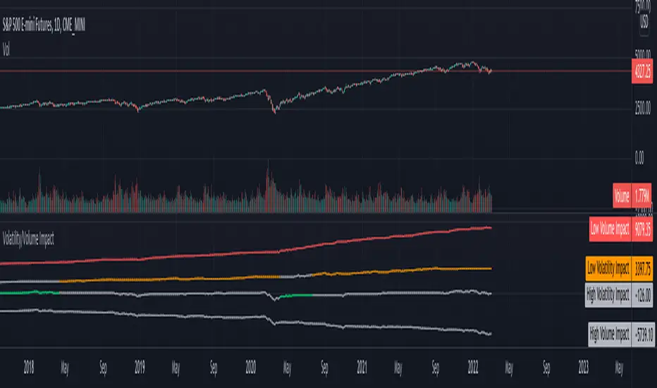
Linear Regression Relative Strength[image/x/iZvwDWEY/
Relative Strength indicator comparing the current symbol to SPY (or any other benchmark). It may help to pick the right assets to complement the portfolio build around core ETFs such as SPY.
The general idea is to show if the current symbol outperforms or underperforms the benchmark (SPY by default) when bought some certain time ago. Relative performance is displayed as percent and is calculated for three different time ranges - short (1 mo by default), mid (1 quarter), and long (half a year). To smooth the volatility, the script uses linear regression to estimate the trend and takes the start and the end points of the linear regression line to compute the relative strength.
It is important to remember that the script shows the gain relative to SPY (or other selected benchmark), not the asset's gain. Therefore, it may indicate that the asset is profitable, but it still may lose value if SPY is in downtrend.
Therefore, it is crucial to check other indicators before making a decision. In the example above, standard linear regression for one quarter is used to indicate the direction of the trend.
Drawdown RangeHello death eaters, presenting a unique script which can be used for fundamental analysis or mean reversion based trades.
Process of deriving this table is as below:
Find out ATH for given day
Calculate the drawdown from ATH for the day and drawdown percentage
Based on the drawdown percentage, increment the count of basket which is based on input iNumber of ranges . For example, if number of ranges is 5, then there will be 5 baskets. First basket will fit drawdown percentage 0-20% and each subsequent ones will accommodate next 20% range.
Repeat the process from start to last bar. Once done, table will plot how much percentage of days belong to which basket.
For example, from the below chart of NASDAQ:AAPL
We can deduce following,
Historically stock has traded within 1% drawdown from ATH for 6.59% of time. This is the max amount of time stock has stayed in specific range of drawdown from ATH.
Stock has traded at the drawdown range of 82-83% from ATH for 0.17% of time. This is the least amount of time the stock has stayed in specific range of drawdown from ATH.
At present, stock is trading 2-3% below ATH and this has happened for about 2.46% of total days in trade
Maximum drawdown the stock has suffered is 83%
Lets take another example of NASDAQ:TSLA
Stock is trading at 21-22% below ATH. But, historically the max drawdown range where stock has traded is within 0-1%. Now, if we make this range to show 20 divisions instead of 100, it will look something like this:
Table suggests that stock is trading about 20-25% below ATH - which is right. But, table also suggests that stock has spent most number of days within this drawdown range when we divide it by 20 baskets instad of 100. I would probably wait for price to break out of this range before going long or short. At present, it seems a stage ranging stage. I might think about selling PUTs or covered CALLs outside this range.
Similarly, if you look at AMEX:SPY , 36% of the time, price has stayed within 5% from ATH - makes it a compelling bull case!!
NYSE:BABA is trading at 50-55% below ATH - which is the most it has retraced so far. In general, it is used to be within 15-20% from ATH
NOW, Bit of explanation on input options.
Number of Ranges : Says how many baskets the drawdown map needs to be divided into.
Reference : You can take ATH as reference or chose a time window between which the highest need to be considered for drawdown. This can be useful for megacaps which has gone beyond initial phase of uncertainity. There is no point looking at 80% drawdown AAPL had during 1990s. More approriate to look at it post 2000s where it started making higher impact and growth.
Cumulative Percentage : When this is unchecked, percentage division shows 0-nth percentage instad of percentage ranges. For example this is how it looks on SPY:
We can see that SPY has remained within 6% from ATH for more than 50% of the time.
Hope this is helpful. Happy trading :)
PS: this can be used in conjunction with Drawdown-Price-vs-Fundamentals to pick value stocks at discounted price while also keeping an eye on range tendencies of it.
Thanks to @mattX5 for the ideas and discussion today :)

Altered True Strength Indicator (TSI) Reupload-
Altered TSI provides a slightly more volatile signal that demonstrates extremities in price action with greater success than standard TSI. In addition, I added bull/bear cross indicators (green/red) to make it easier to notice the crosses to save time when the market is moving fast (I couldn't find a regular TSI script with this addition). Finally, the signal also has overextension parameters (red and green lines)
I think this is best used on Intraday time frames as the signals respond to volatility very well and using Heikin Ashi candles, trend is more visual. In this particular example, I am showing SPY on the 3m time chart (my favorite short time frame) and the signal alone provided many opportunities for trades when using simple divergences and countering overextension direction when short term (blue) signal crosses either
In the first example (purple lines), SPY ramps but it was a dull signal given the signal strength flatlining- we would be looking for a short entry. When the signal fires, it provides a clean $1.50 move down in spy.
In the second example (orange), the blue signal provides a nice V shape (rebound signal) in which we are looking for a long entry. 390.50 is a strong SPY support in confluence with 2nd std dev VWAP extension, but disregarding that bull signal fires resulting in a 2 dollar move upwards. Exit is provided when blue line crosses green overextension.
In the third example (white), we are searching for a short entry at 392.5 resistance in confluence with divergently higher highs. Bear cross signal when fired and a significant cross is visible provides a $2.50 move to the downside with a potential exit provided when blue line crosses red overextension line in confluence with previous LOD area.
In the fourth example (green), we watch as the blue line provides a V pattern, we are searching for a long entry. If you didn't take a riskier long at 2nd std dev VWAP overextension with V recovery on blue line at red overextension for a ride to vwap, then you are looking for a secondary entry long as you wouldn't take the trade at resistance (vwap). Bullishly divergent lows provide this entry and the signal does not bear cross at all (but looking for significant crosses is more important even if the signal were to make a minor bear cross). Bullishly divergent double bottom provides a long entry to end of day with a nice clean signal for a $5.00 move until eod or when signal crosses overextension range.
Ideally, close to the money options or SPY/SPXS/SPXL are best used in the intraday time frame.
Again, this is not a standalone indicator but it's best used in conjunction with other indicators/trading strategies
Any questions feel free to comment

Candlestick RSThis is a candlestick charted Relative Strength indicator. It compares the chosen stock's progress compared to that of the SPY ETF ... ( SPY is used so it should hopefully update intraday). I use this indicator to see which stocks are outperforming the market.
Input Variable Descriptions:
Ratio: this variable is a float (0 to 1) that is basically how close the Candlestick RS is to the actual price action of the chart. (1.0 being right on top of it, 0.0 being as far away as possible from it)
Ballpark SPY price: this variable has to be constant, and due to the way pinescript works, you have to manually put in a ballpark of what SPY is at.
Neither of these variables influences the actual data of the indicator, but rather how it is shown on screen. It's difficult to describe, so I recommend you messing around with the variables and see what changes.
Hope this helps, I find this useful, so I figured I'd publish this... This is my first pine script so forgive me for any errors, just want to help :)
Nexural QWAPQWAP - Quantitative Weighted Average Price with True Order Flow Analysis
INTRODUCTION
This is legit one of the best indicators I can possibly make. Since I don't have access to tick data on tradingview I can't claim it's as accurate as possible but it is a very polished indicator for VWAP based trading and the bands are VERY useful for mean reverting trading.
QWAP Elite is an advanced Volume Weighted Average Price indicator that incorporates true order flow analysis through intrabar data decomposition. Unlike traditional VWAP indicators that simply calculate price multiplied by volume divided by total volume, this indicator attempts to identify the directional intent behind that volume by analyzing whether buying or selling pressure dominated each bar at a granular level.
The fundamental premise of this indicator is that not all volume is created equal. A bar with 10000 contracts where 8000 were aggressive buyers tells a very different story than a bar with 10000 contracts where 8000 were aggressive sellers, even if both bars close at the same price. Traditional VWAP treats these identically. QWAP attempts to weight the VWAP calculation based on this directional flow information.
This indicator was designed for traders who believe that institutional order flow leaves detectable footprints in price and volume data, and that identifying these footprints can provide an edge in determining likely future price direction. It is not a holy grail and it is not a replacement for proper risk management and trading discipline.
HOW THE INDICATOR WORKS
The True CVD Engine
The core of this indicator is its Cumulative Volume Delta calculation. Most indicators on TradingView approximate buying and selling volume by looking at whether a bar closed higher or lower than it opened. If the bar closed green, they assign all volume as buying volume. If it closed red, they assign all volume as selling volume. This is a crude approximation that misses significant nuance.
QWAP Elite uses the request security lower tf function to pull actual intrabar data. This means if you are on a 5 minute chart, the indicator is looking at the individual ticks or smaller timeframe bars that occurred within that 5 minute period. It then calculates how much volume occurred on up moves versus down moves within that bar, giving a much more accurate picture of whether buyers or sellers were more aggressive.
The Delta Ratio is calculated as the net delta divided by total volume, resulting in a value between negative one and positive one. A value of positive 0.6 means that 80 percent of volume was buying and 20 percent was selling. A value of negative 0.4 means that 70 percent was selling and 30 percent was buying. This ratio is then used to weight the VWAP calculation.
The intrabar precision is displayed in the dashboard as the number of bars analyzed. More bars means more granular data and theoretically more accurate delta calculation. The indicator automatically selects an appropriate lower timeframe based on your chart timeframe to balance accuracy with computational performance.
VIX Integration and Volatility Intelligence
The indicator pulls live VIX data and uses it to adjust its calculations dynamically. The VIX or CBOE Volatility Index represents the market expectation of 30 day forward looking volatility derived from SP500 option prices. When VIX is elevated, markets behave differently than when VIX is compressed.
Specifically, the indicator uses VIX to adjust the standard deviation bands around VWAP. In high volatility environments where VIX is above 25 or 30, the bands automatically widen to account for larger price swings. In low volatility environments where VIX is below 15, the bands tighten. This prevents false signals that would occur if static band widths were used across all market conditions.
The indicator also pulls VVIX which is the volatility of the VIX itself and VIX9D which is the 9 day VIX. By comparing VIX to VIX9D, the indicator can identify term structure conditions. When short term VIX is higher than longer term VIX, this is called backwardation and often indicates fear or stress in the market. When short term VIX is lower, this is contango and indicates complacency.
The VIX regime classification in the dashboard shows CALM when VIX is below 12, NORMAL between 12 and 20, ELEVATED between 20 and 30, and FEAR when above 30. Each regime suggests different trading approaches and position sizing considerations.
DETECTION SYSTEMS
Absorption Detection
Absorption occurs when large volume enters the market but price barely moves. This happens when one side is absorbing all the aggression from the other side. For example, if aggressive sellers are hitting the bid repeatedly but price is not dropping, it suggests there is a large buyer absorbing all that selling pressure. This often precedes reversals.
The indicator detects absorption by looking for bars with above average volume, below average range, and high wick ratios. A high wick ratio means the bar has long wicks relative to its body, indicating price moved but was pushed back. When these conditions coincide with strong delta in one direction, it suggests institutional absorption.
Liquidity Sweep Detection
Liquidity sweeps, also known as stop hunts, occur when price briefly exceeds a recent high or low to trigger stop losses, then reverses. Large traders need liquidity to fill their orders, and stops clustered above swing highs or below swing lows represent pools of liquidity they can tap into.
The indicator identifies sweeps by detecting when price exceeds the 5 or 20 bar high or low but closes back inside. A bull trap is identified when price sweeps above recent highs but closes below them, suggesting sellers trapped buyers who bought the breakout. A bear trap is the opposite, where price sweeps lows but closes above, trapping shorts.
Sweep detection is most useful when combined with delta analysis. A sweep with strong opposing delta, meaning price swept highs but delta was heavily negative, is a higher probability reversal signal than a sweep alone.
CVD Divergence Detection
Divergence between price and cumulative delta is one of the most reliable signals the indicator produces. When price is making higher highs but cumulative delta is making lower highs, it suggests that buying pressure is weakening even though price is still rising. This bearish divergence often precedes pullbacks or reversals.
Conversely, bullish divergence occurs when price makes lower lows but cumulative delta makes higher lows. This suggests that even though price is dropping, buying pressure is actually increasing, and sellers may be exhausted. These divergences are calculated over a 5 bar lookback period.
Stacked Imbalance Detection
Stacked imbalances occur when there are three or more consecutive bars with strong delta in the same direction. This represents sustained aggressive positioning by one side of the market. Three consecutive bars with delta above 0.5 suggests aggressive institutional buying. Three consecutive bars below negative 0.5 suggests aggressive institutional selling.
The count of consecutive imbalanced bars is displayed in the detection section. Four or more stacked imbalances is considered highly significant. This pattern often precedes continuation moves in the direction of the imbalance, as it suggests a committed directional player has entered the market.
Institutional Flow Detection
The indicator attempts to identify institutional activity by looking for the convergence of multiple factors. Specifically, it requires strong delta above 0.5 or below negative 0.5, volume persistence across multiple bars meaning above average volume for at least 2 to 3 bars in a row, and delta persistence meaning delta in the same direction for multiple consecutive bars.
When these factors align, the dashboard displays INST BUY or INST SELL instead of RETAIL. This classification should be viewed as a probability estimate rather than a certainty. Retail traders can produce similar patterns, and institutions can hide their activity. The designation is meant to highlight periods where the characteristics of flow are consistent with larger players.
ADAPTIVE WEIGHT SYSTEM
The indicator includes an adaptive system that automatically adjusts how much weight the CVD analysis has on the VWAP calculation. In quiet, low volatility markets, the CVD weight is reduced because the signal to noise ratio is lower. In active, high volatility markets with clear directional flow, the weight is increased.
The adaptation considers multiple factors including VIX regime, delta clarity meaning how strong and consistent the delta readings are, volume persistence, and time of day session weighting. The current adaptive weight is displayed in the dashboard and typically ranges from 0.05 to 0.50.
The adaptation speed setting controls how quickly the weight responds to changing conditions. A higher speed means faster adaptation but potentially more noise. A lower speed means smoother adaptation but potentially slower response to regime changes.
SESSION AWARENESS
Not all trading hours are equal. The indicator applies different weights to different trading sessions based on typical liquidity and reliability patterns. The open drive, which covers 9 30 to 10 30 AM Eastern time, receives a 1.4x weight multiplier because this is typically the highest volume and most directionally significant period of the day.
Power hour from 3 00 to 4 00 PM Eastern receives a 1.3x multiplier as institutional traders often execute their daily positioning in this final hour. The lunch hour from 11 00 AM to 2 00 PM receives a 0.9x multiplier due to typically lower volume and more choppy price action. Premarket receives 0.7x and after hours receives 0.5x due to thin liquidity and unreliable signals.
The current session is displayed in the dashboard header. Traders should consider reducing position sizes and widening stops during lower weight sessions, particularly premarket and after hours where the indicator readings are less reliable.
COMPOSITE SCORES
Bias Score
The Bias Score ranges from negative 100 to positive 100 and represents the indicators overall directional lean. It synthesizes delta analysis, VWAP momentum, and multi-timeframe confluence into a single number. A score above 50 indicates strong bullish bias. A score below negative 50 indicates strong bearish bias. Scores between negative 20 and positive 20 are considered neutral.
The visual bias meter in the dashboard shows this score as a bar that leans left for bearish or right for bullish. This provides an at a glance summary of the indicators current directional reading without needing to interpret multiple individual metrics.
Setup Quality Score
The Setup Quality Score ranges from 0 to 100 and measures how many factors are aligning to support a potential trade. It awards points for strong delta readings, volume persistence, multi-timeframe confluence, detection events like absorption or divergence, and favorable session timing. A score above 60 suggests multiple factors are confirming. A score below 30 suggests the setup lacks confirmation.
This score is designed to help traders filter trades. Rather than acting on every signal, traders can set a minimum quality threshold. For example, only taking trades when quality is above 50 will filter out lower probability setups. Higher thresholds mean fewer trades but potentially higher win rates.
Heat Score
The Heat Score measures overall market activity intensity and ranges from 0 to 100. It combines volume heat meaning how elevated current volume is relative to average, volatility heat based on ATR expansion or VIX levels, delta heat meaning how strong the current delta reading is, and deviation heat meaning how far price is from VWAP.
Markets with heat above 75 are classified as EXTREME and typically represent high opportunity but also high risk environments. Heat between 50 and 75 is ACTIVE and represents good trading conditions. Heat between 25 and 50 is NORMAL. Heat below 25 is QUIET and suggests range bound conditions where mean reversion strategies may outperform trend following.
DASHBOARD GUIDE
Header Row
The header row displays QWAP with a lightning bolt icon, the current session abbreviation like OPEN or POWER or LUNCH, the current regime classification, and VIX status with a colored indicator. Green indicates low VIX and favorable conditions. Yellow indicates elevated VIX. Red indicates high VIX or that VIX data is unavailable.
Signal Row
The signal row is the largest and most prominent element. It displays the primary signal which will be LONG, SHORT, REVERSAL, or WAIT. LONG appears when bias is strongly bullish and quality is high. SHORT appears when bias is strongly bearish and quality is high. REVERSAL appears when divergence or absorption is detected at an extreme sigma level. WAIT appears when conditions do not meet the threshold for a signal.
Next to the signal is the quality score displayed as Q followed by a number out of 100. This helps traders quickly assess how confirmed the signal is. A LONG signal with Q 72 is more compelling than a LONG signal with Q 45.
Order Flow Section
The delta row shows the current delta direction as BUY or SELL, the percentage strength, a visual indicator of strength with filled or empty circles, and an arrow indicating whether delta is accelerating or decelerating. The flow row shows whether activity is classified as INST BUY, INST SELL, or RETAIL, along with the number of intrabar data points used in the calculation.
Market Section
The heat row displays the heat score as a visual bar and numeric value. The vol row shows volatility state as EXPAND, COMPRESS, or NORMAL along with relative volume. The dist row shows distance from VWAP in sigmas and percentage, plus momentum direction.
Detection Section
This section only appears when detections are active. It displays warning icons next to detection types like BUY ABS, SELL ABS, BULL TRAP, BEAR TRAP, BULL DIV, BEAR DIV, BUY STACK, or SELL STACK. Each detection includes a score representing its strength or significance.
HOW TO USE THIS INDICATOR
Recommended Workflow
First, check the regime and session. If VIX is in FEAR mode or you are in premarket or after hours, consider reduced position sizing or waiting for better conditions.
Second, look at the primary signal and quality score. Signals with quality below 40 are low conviction. Consider requiring quality above 50 or 60 before acting.
Third, check the bias meter for overall directional lean. Ensure it aligns with your intended trade direction.
Fourth, review active detections. Absorption and divergence near VWAP bands increase reversal probability. Stacked imbalances support continuation.
Fifth, use VWAP and sigma bands for entry, stop, and target placement. The bands provide natural support and resistance levels based on statistical distribution.
Sixth, monitor for changes in delta and flow classification. Institutional activity transitioning to retail or delta reversing direction are warning signs.
TRADE EXAMPLES
Mean Reversion Setup
Price extended to 2.5 sigma above VWAP. Signal shows REVERSAL. Quality is 55. Absorption detected with BUY ABS showing score of 2.3. Delta is showing SELL at 45 percent despite price being elevated. This suggests buyers are being absorbed and a pullback to VWAP is likely. Enter short with stop above the 3 sigma band and target at VWAP or 1 sigma band.
Trend Continuation Setup
Signal shows LONG with quality 68. Bias meter shows STRONG BULL. BUY STACK detected with 4 consecutive imbalanced bars. Flow shows INST BUY. Price has pulled back to VWAP and is finding support. Heat is at 62 indicating ACTIVE conditions. Enter long on VWAP touch with stop below 1 sigma band and target at 2 sigma band.
Liquidity Sweep Setup
BEAR TRAP detected with score of 1.8. Price swept below recent lows but closed back above. Delta is showing BUY at 52 percent on the sweep bar. BULL DIV also active as price made lower low but delta made higher low. Signal shows REVERSAL with quality 58. Enter long with stop below the sweep low and target at VWAP.
HONEST ASSESSMENT OF STRENGTHS AND WEAKNESSES
Strengths
True CVD calculation using intrabar data is significantly more accurate than close greater than open approximations used by most indicators. This provides genuine insight into buying versus selling pressure.
VIX integration with term structure analysis is institutional grade thinking applied to a retail tool. Dynamic band adjustment prevents false signals in different volatility regimes.
Multiple detection systems provide different perspectives on the same market. Absorption, sweeps, divergence, and imbalances each capture different footprints of institutional activity.
Composite scores synthesize complex information into actionable numbers. Traders do not need to mentally integrate 15 different metrics. The quality score and bias score do this automatically.
Session awareness prevents trading during low quality periods. The automatic weighting helps filter out noise from premarket, after hours, and lunch periods.
Adaptive system self adjusts to market conditions. Traders do not need to manually tune parameters as volatility and activity change.
Weaknesses and Limitations
Intrabar data is still an approximation of true tick level order flow. Without actual tick data showing individual trades hitting bid versus lifting offer, even this calculation has error bars. Professional platforms like Sierra Chart or Quantower with direct exchange feeds will always have more accurate delta.
The indicator is computationally heavy. Users may experience slower chart loading particularly on lower end hardware or when viewing many bars. The optimization features help but cannot eliminate this cost entirely.
Institutional detection is probabilistic not definitive. Retail traders in aggregate can produce patterns that look institutional. Institutions can and do hide their activity. The INST BUY and INST SELL labels should be viewed as probability shifts not certainties.
The indicator works best on liquid instruments with significant volume. On thinly traded stocks or during illiquid periods, delta calculations become noisy and unreliable. The indicator is optimized for ES, NQ, SPY, QQQ, and similar high volume instruments.
VIX integration only works for US equity index products. If trading forex, crypto, or other asset classes, the VIX data is not directly applicable and should be disabled.
No indicator can predict the future. Order flow analysis shows what happened and what is happening. It cannot guarantee what will happen next. Large players can and do reverse their positioning. News events can invalidate any technical setup instantly.
The complexity of the indicator means there is a learning curve. New users may be overwhelmed by the number of metrics displayed. It takes time to develop intuition for what combinations of readings are significant.
The indicator does not include automated backtesting or historical performance statistics. Users cannot easily quantify the win rate or expected value of following its signals without manual journaling and analysis.
RISK MANAGEMENT GUIDELINES
This indicator is a tool not a trading system. It provides information that may help inform trading decisions but it does not make those decisions for you. Proper risk management is essential regardless of how compelling the indicator readings appear.
Position Sizing
Never risk more than 1 to 2 percent of your account on any single trade regardless of how high the quality score is. High quality setups still fail regularly. A setup with 70 percent win rate still loses 30 percent of the time, and those losses can come in clusters.
Consider reducing position size when VIX is in ELEVATED or FEAR regime, when trading during premarket or after hours sessions, when quality score is below 50, and when multiple detection systems are conflicting with each other.
Stop Loss Placement
The sigma bands provide natural levels for stop placement. For mean reversion trades, stops should typically be placed beyond the next sigma level. For example, if entering short at 2 sigma, place stop beyond 3 sigma. For trend trades entering at VWAP, consider stops beyond 1 sigma in the opposite direction.
Stops should also respect market structure. If there is a recent swing high or low near your calculated stop level, extend the stop beyond that swing point. Placing stops at obvious levels invites stop hunting.
In high VIX environments, consider wider stops. The VIX band multiplier automatically widens the sigma bands, and your stops should reflect this increased volatility. A stop that works in a 15 VIX environment may be too tight when VIX is 30.
Taking Profits
The sigma bands also provide natural profit targets. For mean reversion trades, VWAP itself is often the first target with the opposite 1 sigma band as an extended target. For trend trades, each sigma band can serve as a scaling point.
Pay attention to delta and flow changes as price approaches targets. If delta is weakening or flow classification shifts from institutional to retail, consider taking profits early. Conversely, if delta is strengthening into the target, consider holding for extension.
When to Avoid Trading
Consider sitting out when the signal shows WAIT and quality is below 30. In these conditions, the indicator is essentially saying there is no clear edge. Trading anyway is gambling not trading.
Avoid trading during major news events. The indicator cannot account for sudden information shocks. Economic releases, Fed announcements, earnings reports, and geopolitical events can invalidate any technical setup instantly.
Consider avoiding the first and last 5 minutes of regular trading hours. These periods often have erratic price action and unreliable delta calculations due to order imbalances at open and close.
SETTINGS REFERENCE
Core Engine Settings
VWAP Source determines what price is used for the VWAP calculation. The default HLC3 uses the average of high, low, and close which provides a balanced representation. HL2 uses just high and low average. Close uses only the closing price. Most traders should leave this at HLC3.
True CVD Engine should remain enabled for accurate order flow analysis. Disabling it falls back to close greater than open estimation which is significantly less accurate. Only disable if you are experiencing performance issues.
CVD Impact controls how much the delta analysis affects the VWAP calculation. Higher values mean delta has more influence. The default 0.2 provides a balance. Increase toward 0.5 if you want delta to have stronger effect. Decrease toward 0.1 if you want something closer to traditional VWAP.
Detection Sensitivity offers three presets. Conservative produces fewer signals but higher confidence. Balanced is the default middle ground. Aggressive produces more signals but with more false positives. New users should start with Balanced and adjust based on experience.
VIX Settings
VIX Integration should be enabled when trading US equity index products like ES, NQ, SPY, or QQQ. Disable it when trading forex, crypto, commodities, or individual stocks where VIX is not directly applicable.
VIX Symbol allows selection between VIX for SP500 volatility, VXN for Nasdaq volatility, and RVX for Russell 2000 volatility. Choose the one most relevant to your trading instrument.
VIX Baseline sets the historical average VIX level used for normalization. The default 16 represents the long term average. If trading in a persistently higher or lower VIX environment, adjusting this can help calibrate the regime classifications.
Display Settings
Dashboard Style offers three options. Compact shows only the signal and bias meter for minimal screen footprint. Elite adds order flow and market sections for balanced information. Full adds VIX details, detections, and adaptive system information for complete visibility.
FREQUENTLY ASKED QUESTIONS
Why does the indicator sometimes show WAIT when there is an obvious trend
The signal system is designed to identify high probability entry points not to constantly indicate trend direction. A strong uptrend may show WAIT because price is extended from VWAP and a pullback is likely before continuation. The indicator is trying to prevent you from buying the top of an impulse move.
Why is my delta reading different from another order flow tool
Different platforms calculate delta differently. Some use tick data. Some use time based aggregation. Some use volume based aggregation. The timeframe being analyzed matters as well. QWAP uses intrabar data which is more accurate than close versus open approximations but less accurate than true tick data from professional platforms.
Can I use this indicator for scalping
The indicator can be used on lower timeframes but becomes less reliable. On 1 minute charts, the intrabar decomposition has fewer data points to work with. For scalping, consider using 3 to 5 minute charts as a minimum. Also note that the session weighting and detection systems are calibrated for swing and intraday trading, not ultra short term scalping.
Does this indicator repaint
The VWAP line and sigma bands can adjust slightly as intrabar data comes in during a live bar. Once a bar closes, those values are fixed. The signals and detections are calculated on closed bars and do not repaint. For live trading, wait for bar close confirmation before acting on signals.
What markets does this work best on
The indicator is optimized for high liquidity US equity index products including ES, NQ, SPY, QQQ, IWM, and DIA. It can work on other liquid instruments but the VIX integration should be disabled for non equity products. Avoid using on low volume stocks or illiquid markets where delta calculations will be noisy.
DISCLAIMER
This indicator is provided for educational and informational purposes only. It is not financial advice. Past performance of any trading methodology is not indicative of future results. Trading futures, options, and other derivatives involves substantial risk of loss and is not suitable for all investors.
The creator of this indicator makes no guarantees about its accuracy or profitability. All trading decisions are the sole responsibility of the user. Before trading with real money, thoroughly test any strategy in simulation and ensure you understand the risks involved.
Order flow analysis provides information about market microstructure but cannot predict future price movements with certainty. Markets are complex adaptive systems influenced by countless variables including news events, economic data, central bank policy, geopolitical developments, and collective human psychology. No indicator can fully capture this complexity.
Use this tool as one input among many in your trading process. Combine it with sound risk management, proper position sizing, and continuous education. The best traders are those who remain humble about what they do not know and disciplined about protecting their capital.
Real Relative Strength Indicator### What is RRS (Real Relative Strength)?
RRS is a volatility-normalized relative strength indicator that shows you – in real time – whether your stock, crypto, or any asset is genuinely beating or lagging the broader market after adjusting for risk and volatility. Unlike the classic “price ÷ SPY” line that gets completely fooled by volatility regimes, RRS answers the only question that actually matters to professional traders:
“Is this ticker moving better (or worse) than the market on a risk-adjusted basis right now?”
It does this by measuring the excess momentum of your ticker versus a benchmark (SPY, QQQ, BTC, etc.) and then dividing that excess by the average volatility (ATR) of both instruments. The result is a clean, centered-around-zero oscillator that works the same way in calm markets, crash markets, or parabolic bull runs.
### How to Use the RRS Indicator (Aqua/Purple Area Version) in Practice
The indicator is deliberately simple to read once you know the rules:
Positive area (aqua) means genuine outperformance.
Negative area (purple) means genuine underperformance.
The farther from zero, the stronger the leadership or weakness.
#### Core Signals and How to Trade Them
- RRS crossing above zero → one of the highest-probability long signals in existence. The asset has just started outperforming the market on a risk-adjusted basis. Enter or add aggressively if price structure agrees.
- RRS crossing below zero → leadership is ending. Tighten stops, take partial or full profits, or flip short if you trade both sides.
- RRS above +2 (bright aqua area) → clear leadership. This is where the real money is made in bull markets. Trail stops, add on pullbacks, let winners run.
- RRS below –2 (bright purple area) → clear distribution or capitulation. Avoid new longs, consider short entries or protective puts.
- Extreme readings above +4 or below –4 (background tint appears) → rare, very high-conviction moves. Treat these like once-a-month opportunities.
- Divergence (not plotted here, but easy to spot visually): price making new highs while the aqua area is shrinking → distribution. Price making new lows while the purple area is shrinking → hidden buying and coming reversal.
#### Best Settings by Style and Asset Class
For stocks and ETFs: keep benchmark as SPY (or QQQ for tech-heavy names) and length 14–20 on daily/4H charts.
For crypto: change the benchmark to BTCUSD (or ETHUSD) immediately — otherwise the reading is meaningless. Length 10–14 works best on 1H–4H crypto charts because volatility is higher.
For day trading: drop length to 10–12 and use 15-minute or 5-minute charts. Signals are faster and still extremely clean.
#### Highest-Edge Setups (What Actually Prints Money)
- RRS crosses above zero while price is still below a major moving average (50 EMA, 200 SMA, etc.) → early leadership, often catches the exact bottom of a new leg up.
- RRS already deep aqua (+3 or higher) and price pulls back to support without RRS dropping below +1 → textbook add-on or re-entry zone.
- RRS deep purple and suddenly turns flat or starts curling up while price is still falling → hidden accumulation, usually the exact low tick.
That’s it. Master these few rules and the RRS becomes one of the most powerful edge tools you will ever use for rotation trading...

Pro Order Flow – NQ 5m/15mThis is a professional-grade order flow tool designed for scalpers and intraday futures traders (especially NQ 5m/15m, ES, SPY, BTC, and gold).
Right-click indicator → Move to new pane below (recommended, so price is clean)
It combines five high-probability institutional signals into one clean, fast indicator:
What This Indicator Shows
1. Candle Delta Histogram (Buyer vs Seller Pressure)
Each bar shows whether aggressive buyers (market orders lifting ask) or aggressive sellers (hitting bid) controlled that candle.
Green = buying pressure
Red = selling pressure
2.Session Cumulative Delta (True Direction)
Tracks buyer/seller domination for the entire session.
Rising cumDelta = buyers absorbing sellers
Falling cumDelta = sellers absorbing buyers
If price goes up but cumulative delta goes down → distribution (short signal)
If price goes down but cumulative delta goes up → accumulation (long signal)
This is one of the strongest institutional signals.
3 Big Delta Bars (Unusual Aggression)
Highlights candles where delta is 2.2× larger than average volume.
These mark:
Institutional absorption
Breakout pressure
Stop-run attacks
Failed breakout reversals
Green = big buying aggression
Red = big selling aggression
4 Smart-Money Wick Absorption (Absorb↑ / Absorb↓)
Tracks wick length vs body size + delta.
Used to detect:
Stop hunts
Liquidity grabs
Reversals off trapped traders
Absorb↓ (triangle up) = buyers absorbed sell-side liquidity (bullish)
Absorb↑ (triangle down) = sellers absorbed buy-side liquidity (bearish)
This is a high-confidence signal for NQ.
5 Real Delta Divergences (Δ Bull / Δ Bear)
Not RSI divergences — order flow divergences:
🔻 Bearish Delta Divergence (Δ Bear)
Price makes higher high
Cumulative delta makes lower high → buyers weakening
High-probability short
🔺 Bullish Delta Divergence (Δ Bull)
Price makes lower low
Cumulative delta makes higher low → sellers weakening
High-probability long
These are professional reversal points.
How to Use (Trading Strategy)
Recommended for:
NQ 5m entries + 15m bias, ES, SPY, BTC, gold.
🟩 Long Setup (Buy)
On 15m, session cumulative delta sloping UP
Price in an uptrend (higher highs/lows)
On 5m, look for ANY of these:
Δ Bull divergence
Absorb↓ tail after a stop-hunt wick
Big positive delta bar at support
Delta flips from red → green at VWAP
Entry: Enter on close of the signal candle
Stop: Below swing low or wick
Targets: Next liquidity high, or 2R–3R
🟥 Short Setup (Sell)
On 15m, session cumulative delta sloping DOWN
Price in a downtrend
On 5m, look for:
Δ Bear divergence
Absorb↑ tail above a high
Big negative delta bar
Delta flips from green → red at resistance
Entry: Enter on close
Stop: Above wick or structure
Targets: Prior low, or 2R–3R
Best Timeframes
15m = trend/bias
5m = signal + entry
Works on: NQ, ES, SPY, QQQ, BTC, Gold, Oil
Settings (Recommended)
Avg Volume Length = 100 (best for NQ volatility)
Big Delta Sensitivity = 2.2×
Pivots = 3 left / 3 right (good for intraday swings)
Included Alerts
Bullish Delta Divergence
Bearish Delta Divergence
Big Positive Delta (aggressive buying)
Big Negative Delta (aggressive selling)
Perfect for scalpers who want real-time signals.
O'Neil Market TimingBill O'Neil Market Timing Indicator - User Guide
Overview
This Pine Script indicator implements William O'Neil's market timing methodology, which assigns one of four distinct states to a market index (such as SPY or QQQ) to help traders identify optimal market conditions for investing. The indicator is designed to work exclusively on Daily timeframe charts.
The Four Market States
The indicator tracks the market through four distinct states, with specific transition rules between them:
1. Confirmed Uptrend (Green)
- Meaning: The market is in a healthy uptrend with institutional support
- Action: Favorable conditions for building positions in leading stocks
- Can transition to: State 2 (Uptrend Under Pressure)
2. Uptrend Under Pressure (Yellow)
- Meaning: The uptrend is showing signs of weakness with increasing distribution
- Action: Be cautious, tighten stops, reduce position sizes
- Can transition to: State 1 (Confirmed Uptrend) or State 3 (Downtrend)
3. Downtrend (Red)
- Meaning: The market is in a confirmed downtrend
- Action: Stay mostly in cash, avoid new purchases
- Can transition to: State 4 (Rally Attempt)
4. Rally Attempt (Pink/Fuchsia)
- Meaning: The market is attempting to bottom and reverse
- Action: Watch for Follow-Through Day to confirm new uptrend
- Can transition to: State 1 (Confirmed Uptrend) or State 3 (Downtrend)
Key Concepts
Distribution Day
A distribution day occurs when:
1. The index closes down by more than the critical percentage (default 0.2%)
2. Volume is higher than the previous day's volume
Distribution days indicate institutional selling and are marked with red triangles on the indicator.
Follow-Through Day
A follow-through day occurs during a Rally Attempt when:
1. The index closes up by more than the critical percentage (default 1.6%)
2. Volume is higher than the previous day's volume
A Follow-Through Day confirms a new uptrend and triggers the transition from Rally Attempt to Confirmed Uptrend.
State Transition Logic
Valid Transitions
The system only allows specific transitions:
- 1 → 2: When distribution days reach the "pressure number" (default 5) within the lookback period (default 25 bars)
- 2 → 1: When distribution days drop below the pressure number
- 2 → 3: When distribution days reach "downtrend number" (default 7) AND price drops by "downtrend criterion" (default 6%) from the lookback high
- 3 → 4: When the market doesn't make a new low for 3 consecutive days
- 4 → 3: When a new low is made, undercutting the downtrend low
- 4 → 1: When a Follow-Through Day occurs during the Rally Attempt
Input Parameters
Distribution Day Parameters
- Distribution Day % Threshold (default 0.2%, range 0.1-2.0%)
- Minimum percentage decline required to qualify as a distribution day. While 0.2% seems to be the canonical number I see in literature about this, I use a much higher threshold (at least 0.5%)
Follow-Through Day Parameters
- Follow-Through Day % Threshold (default 1.6%, range 1.0-2.0%)
- Minimum percentage gain required to qualify as a follow-through day
### State Transition Parameters
- Pressure Number (default 5, range 3-6)
- Number of distribution days needed to transition from Confirmed Uptrend to Uptrend Under Pressure
- Lookback Period (default 25 bars, range 20-30)
- Number of days to count distribution days
- Downtrend Number (default 7, range 4-10)
- Number of distribution days needed (with price drop) to transition to Downtrend
- Downtrend % Drop from High (default 6%, range 5-10%)
- Percentage drop from lookback high required for downtrend confirmation
Visual Settings
- Color customization for each state
- Table position selection (Top Left, Top Right, Bottom Left, Bottom Right)
## How to Use This Indicator
### Installation
1. Open TradingView and navigate to SPY or QQQ (or another major index)
2. **Important**: Switch to the Daily (1D) timeframe
3. Click on "Indicators" at the top of the chart
4. Click "Pine Editor" at the bottom of the screen
5. Copy and paste the Pine Script code
6. Click "Add to Chart"
### Interpretation
**When the indicator shows:**
- **Green (State 1)**: Market is healthy - consider adding quality positions
- **Yellow (State 2)**: Exercise caution - tighten stops, be selective
- **Red (State 3)**: Defensive mode - preserve capital, avoid new buys
- **Pink (State 4)**: Watch closely - prepare for potential Follow-Through Day
### The Information Table
The table displays:
- **Current State**: The current market condition
- **Distribution Days**: Number of distribution days in the lookback period
- **Lookback Period**: Number of bars being analyzed
- **Rally Attempt Day**: (Only in State 4) Days into the current rally attempt
### Visual Elements
1. **State Line**: A stepped line showing the current state (1-4)
2. **Red Triangles**: Mark each distribution day
3. **Horizontal Reference Lines**: Dotted lines marking each state level
4. **Color-Coded Display**: The state line changes color based on the current market condition
## Trading Strategy Guidelines
### In Confirmed Uptrend (State 1)
- Build positions in stocks breaking out of proper bases
- Use normal position sizing
- Focus on stocks showing institutional accumulation
- Hold winners as long as they act properly
### In Uptrend Under Pressure (State 2)
- Take partial profits in extended positions
- Tighten stop losses
- Be more selective with new entries
- Reduce overall exposure
### In Downtrend (State 3)
- Move to cash or maintain very light exposure
- Avoid new purchases
- Focus on preservation of capital
- Use the time for research and watchlist building
### In Rally Attempt (State 4)
- Stay mostly in cash but prepare
- Build a watchlist of strong stocks
- On Day 4+ of the rally attempt, watch for Follow-Through Day
- If FTD occurs, begin cautiously adding positions
## Best Practices
1. **Use with Major Indices**: This indicator works best with SPY, QQQ, or other broad market indices
2. **Daily Timeframe Only**: The indicator is designed for daily bars - do not use on intraday timeframes
3. **Combine with Stock Analysis**: Use the market state as a filter for individual stock decisions
4. **Respect the Signals**: When the market enters Downtrend, reduce exposure regardless of individual stock setups
5. **Monitor Distribution Days**: Pay attention when distribution days accumulate - it's a warning sign
6. **Wait for Follow-Through**: Don't jump back in too early during Rally Attempt - wait for confirmation
## Alert Conditions
The indicator includes built-in alert conditions for:
- State changes (entering any of the four states)
- Distribution Day detection
- Follow-Through Day detection during Rally Attempt
To set up alerts:
1. Click the "Alert" button while the indicator is on your chart
2. Select "O'Neil Market Timing"
3. Choose your desired alert condition
4. Configure notification preferences
## Customization Tips
### For More Sensitive Detection
- Lower the "Pressure Number" to 3-4
- Lower the "Distribution Day % Threshold" to 0.15%
- Reduce the "Downtrend Number" to 5-6
### For More Conservative Detection
- Raise the "Pressure Number" to 6
- Raise the "Distribution Day % Threshold" to 0.3-0.5%
- Increase the "Downtrend Number" to 8-9
### For Different Market Conditions
- **Bull Market**: Consider slightly higher thresholds
- **Bear Market**: Consider slightly lower thresholds
- **Volatile Market**: May need to increase percentage thresholds
## Limitations and Considerations
1. **Not a Crystal Ball**: The indicator identifies conditions but doesn't predict the future
2. **False Signals**: Follow-Through Days can fail - use proper risk management
3. **Whipsaws Possible**: In choppy markets, the indicator may switch states frequently
4. **Confirmation Lag**: By design, there's a lag as the system waits for confirmation
5. **Works Best with Price Action**: Combine with your analysis of individual stocks
## Historical Context
This methodology is based on William J. O'Neil's decades of market research, documented in books like "How to Make Money in Stocks" and through Investor's Business Daily. O'Neil's research showed that:
- Most major market tops are preceded by accumulation of distribution days
- Most successful rallies begin with a Follow-Through Day on Day 4-7 of a rally attempt
- Identifying market state helps prevent buying during unfavorable conditions
## Troubleshooting
**Problem**: Indicator shows "Initializing"
- **Solution**: Let the chart load at least 5 bars to establish the initial state
**Problem**: No distribution day markers appear
- **Solution**: Verify you're on daily timeframe and check if volume data is available
**Problem**: Table not visible
- **Solution**: Check the table position setting and ensure it's not off-screen
**Problem**: State seems to change too frequently
- **Solution**: Increase the lookback period or adjust threshold parameters
## Support and Further Learning
For deeper understanding of this methodology:
- Read "How to Make Money in Stocks" by William J. O'Neil
- Study Investor's Business Daily's "Market Pulse"
- Review historical market tops and bottoms to see the pattern
- Practice identifying distribution days and follow-through days manually
## Version History
**Version 1.0** (November 2025)
- Initial implementation
- Four-state system with proper transitions
- Distribution day detection and marking
- Follow-through day detection
- Customizable parameters
- Information table display
- Alert conditions
---
## Quick Reference Card
| State | Number | Color | Action |
|-------|--------|-------|--------|
| Confirmed Uptrend | 1 | Green | Buy quality setups |
| Uptrend Under Pressure | 2 | Yellow | Tighten stops, be selective |
| Downtrend | 3 | Red | Cash position, no new buys |
| Rally Attempt | 4 | Pink | Watch for Follow-Through Day |
**Distribution Day**: Down > 0.2% on higher volume (red triangle)
**Follow-Through Day**: Up > 1.6% on higher volume during Rally Attempt (triggers State 4→1)
---
*Remember: This indicator is a tool to help identify market conditions. It should be used as part of a comprehensive trading strategy that includes proper risk management, position sizing, and individual stock analysis.*
Also, I created this with the help of an AI coding framework, and I didn't exhaustively test it. I don't actually use this for my own trading, so it's quite possible that it's materially wrong, and that following this will lead to poor investment decisions.. This is "copy left" software, so feel free to alter this to your own tastes, and claim authorship.

26 EMA Reversal LogicThis indicator identifies two distinct price behaviours on the daily charts of SPY, SPX, QQQ, or IXIC, using the 26-period EMA as a reference. It plots one signal per downtrend — either a yellow circle (bearish continuation) or a green circle (bullish reversal) — and locks further signals until price closes above the 26 EMA.
The yellow circles are when we close below the 26-day EMA and the next day we make a lower low.
The green circles are when we close below the 26-day EMA and the next day we actually open higher and that low is never revisited.
Symbol Restriction
Only works on: SPY, SPX, QQQ, IXIC
On any other symbol, the script will display an error and stop.
Timeframe Restriction
DAILY chart only — will show an error on any other timeframe.
Core Logic: Two-Candle Pattern Detection
Both signals start with the same Day 1 condition:
Day 1: The candle closes below the 26 EMA
From there, Day 2 determines the signal:
Yellow Circle (Bearish Continuation)
Plotted BELOW the Day 2 candle
Conditions:
Day 1 closed below the 26 EMA
Day 2 makes a lower low than Day 1’s low → low < low Interpretation:
Price is weakening — pushing to new lows below the EMA.
Confirms downward momentum.
Green Circle (Bullish Reversal / Failed Breakdown)
Plotted ABOVE the Day 2 candle
Conditions:
Day 1 closed below the 26 EMA
Day 2 opens higher than Day 1’s close → open > close
Day 2’s low never revisits Day 1’s low → low >= low Interpretation:
Buyers defend the prior low with a higher open — classic false breakdown.
Suggests a potential reversal higher.
One Signal Per Downtrend (Lock & Reset)
After either a yellow or green circle is plotted, no more circles appear
Prevents clutter — focuses on first meaningful reaction
Reset Rule:
Lock is released only when price closes above the 26 EMA
Best Used On
Daily timeframe
SPY, SPX, QQQ, IXIC only
With trend, volume, or broader market context
