Dual TF VWAP + ATR BandsDual TF VWAP + EMA (3×3 Outer Shells)
A precision volatility framework combining institutional VWAP structure with trend-anchored EMA logic.
🔍 Overview
Dual TF VWAP + EMA is a multi-layer trend and volatility system designed for traders who want clean directional context, controlled volatility boundaries, and a reliable method to spot pivots, expansions, compressions, and exhaustion points across any timeframe.
This tool blends:
Higher-Timeframe VWAP (50-period rolling)
Local EMA Midline (configurable)
3×3 ATR Outer Shells
Directional Color Coding
Signal-Ready Interaction Zones
Unlike traditional Bollinger Bands, Keltner channels, or static envelopes, this indicator adapts dynamically with both price and volume, giving deeper insight into how institutions accumulate, distribute, or expand trends.
🎯 What It Shows
1. Higher-Timeframe VWAP Midline
A 50-period Rolling VWAP that reflects where real volume-weighted control sits.
Perfect for reading:
Institutional trend bias
Value area reclaims
High-confidence mean reversions
High-probability trend continuations
2. Local EMA Trendline (Configurable)
A flexible EMA that acts as your local “risk-on/off” trend gauge.
You can use:
12 EMA for aggression
20 EMA for balanced trending
50 EMA for slower institutional rhythm
This EMA + VWAP pairing creates a powerful trend confirmation system.
3. Outer ATR Shells (U1–U3 / L1–L3)
Three upper and three lower ATR-based shells form a volatility map showing:
U1/L1: First reaction zones
U2/L2: Overextension zones
U3/L3: Exhaustion / blow-off tops / panic bottoms
The 3×3 shells tell you instantly whether price is:
Expanding
Compressing
Overextended
Reversing
Trending cleanly
📘 How To Use It — Practical Trading Logic
1. Trend Confirmation
Bullish: Price above VWAP + EMA rising + 12 EMA above U1
Bearish: Price below VWAP + EMA falling + 12 EMA under L1
2. Reversals
U3/L3 taps signal exhaustion
EMA rejection at U1/U2 confirms fading momentum
VWAP reclaim confirms the reversal
Trend resumes once EMA crosses back above/below VWAP
3. Momentum Acceleration
When price floats above the EMA without touching it and rides between:
EMA → U1 → U2
trend acceleration is underway (trip-wire continuation signal).
4. Safe Entries
EMA reclaim
VWAP reclaim after sweep
EMA → VWAP “compression and release”
Price floating above EMA with U1 break
5. Safe Exits
U2/U3 spikes
EMA flattening
EMA cross back under VWAP
Shell compression before trend shift
---Why This Tool Works---
Traditional bands are one-dimensional:
They react to price only.
This tool uses price + volatility + volume, so it shows:
Real trend strength
Institutional control zones
High-probability reversal points
Low-risk entry pockets
It performs exceptionally well across:
SPY / QQQ
Tech momentum
Small caps
Crypto
High-beta growth names
Summary
Dual TF VWAP + EMA (3×3 Outer Shells) is built for traders who want:
Clear trend direction
Accurate expansion/reversal signals
Dynamic institutional value zones
Multi-timeframe confidence
Clean volatility boundaries
A powerful companion for confirmation systems, breakout strategies, and liquidity-based execution.
Pesquisar nos scripts por "spy"

GEX / Gamma - SPX Indicator Description – GEX / Gamma (SPX)
This indicator allows you to manually plot your daily +GEX, TRANS-GEX, and –GEX levels on SPX and visualize how price reacts around key gamma zones.
You enter the three levels each morning, and the script automatically draws:
+GEX / TRANS / –GEX zones with an adjustable buffer
Clean labels (e.g., “+GEX: 6850”) pinned to the right side of the chart
Today-only candle coloring (green above TRANS-GEX, red below)
Zones extend from yesterday’s session through the current session, helping highlight areas where dealer hedging flows may influence volatility, compression, or acceleration.
How to Use
Add the indicator to any intraday SPX chart.
Open settings and enter your +GEX, TRANS-GEX, and –GEX levels for the day.
Adjust the buffer, colors, and label style as needed.
Watch how price behaves as it moves above or below TRANS-GEX and interacts with +/- GEX zones.
Best For
Intraday SPX / ES / SPY
Options traders
Volatility and gamma-aware strategies
Strategy Behind It (Tight Version)
GEX levels help identify where dealer hedging flows can influence SPX price behavior.
+GEX (Positive Gamma)
Market tends to stabilize here. Dealers hedge against price moves, creating mean-reversion and lower volatility.
TRANS-GEX (Transition Level)
Key pivot where gamma flips. Price crossing this level often signals a shift in volatility or intraday direction.
–GEX (Negative Gamma)
Market becomes more reactive. Dealers hedge with price, increasing volatility, momentum, and trend potential.
How traders use it:
Expect resistance or slowdown into +GEX
Watch for potential bottoming or increased volatility –GEX
Use TRANS-GEX as a bias line or trigger for intraday shifts
A move outside of either the +GEX or -GEX will likely result in some type of high volume move.

TradeUniv.com Expected MovesTradeUniv.com Expected Moves
See where the market expects stocks to move based on options pricing data. This indicator shows you upper and lower price levels that help identify potential support, resistance, and overextended moves.
What Are Expected Moves?
Expected moves are calculated from option prices and show where the market thinks a stock is likely to trade by the end of the day or week. Think of them as probability zones - when price reaches or crosses these levels, it may signal an unusual
move or potential reversal opportunity.
What You'll See on Your Chart:
• Upper Level (Green) - Expected high for the period
• Lower Level (Red) - Expected low for the period• Midpoint (Gray) - Previous day's closing price (your reference point)
• Shaded Area - The expected trading range between levels
How to Use:
1. Visit www.tradeuniv.com
2. Select your favorite tickers
3. Click "Generate Script" and copy the TradingView input
4. Paste it into this indicator's settings
5. The indicator automatically shows the expected moves for whatever chart you're viewing
Perfect For:
• Day traders planning entry and exit zones
• Identifying when price has moved "too far too fast"
• Spotting potential reversal areas
• Understanding daily volatility expectations
• Planning option strategies around expected ranges
Features:
• Automatically detects daily vs weekly expirations (SPY, IWM, QQQ use daily; others use weekly)
• Customizable colors and line styles
• Price crossing alerts (get notified when price breaks above/below expected levels)
• Works on any timeframe
• Clean, minimal chart display
Important:
• Requires TradeUniv.com free account to generate data
• Refresh your data daily for accurate calculations
• Only shows levels for tickers you selected when generating

P1 - Multi-Instrument Weekly Levels - Version 11.9.25.5Levels based on RDGD channels.
// ===========================================================================
// Multi-Instrument Weekly Levels + MSL X + Alerts + ES to SPX Converter
// Version: 11.9.25.5
//
// VERSION TRACKING:
// Format: xx.xx.xx.x (Month.Day.Year.Revision)
// - First number: Month (11 = November)
// - Second number: Day (9 = 9th)
// - Third number: Year (25 = 2025)
// - Fourth number: Revision (5 = updated MSL/NPL values and reorganized settings)
//
// CHANGE LOG:
// 11.9.25.5 - Updated MSL/NPL values and reorganized settings layout
// 11.9.25.4 - Updated NQ Monday and Weekly levels
// 11.9.25.3 - Fixed showSPXLevels variable name (capital L)
// 11.9.25.2 - Updated SPY, QQQ, ES, YM, RTY, GC weekly and daily levels
// 11.9.25.1 - Initial version saved as starting script
// ===========================================================================

X ATM Option Ladder FlowX ATM Option Ladder Flow is a specialized options-market visualization tool designed for intraday tracking of at-the-money (ATM) option volume flow in index ETFs such as QQQ and SPY.
The script dynamically identifies the ATM contract on every bar and plots real-time call-versus-put volume distributions and marker to represent if the volume corresponded with the price of the option going up or down.
By analyzing volume and direction data from multiple strikes within an ±8-point range, the indicator produces a real-time histogram that reflects how order flow evolves relative to the underlying price.
Complementary status tables display the active strike, ladder position, and warnings when the underlying moves outside the monitored range.
Core Features
Dynamic ATM selection – Each bar automatically maps to the option contract closest to the underlying’s price.
Bidirectional volume comparison – Visual separation of call and put volume, with “up” markers highlighting contracts trading above their prior close.
Multi-strike ladder analysis – Samples strikes ±8 points from the defined center to capture flow skew and momentum near the money.
Optimized data calls – Uses tuple requests to minimize request.security() load, enabling a deeper ladder within TradingView limits.
Session awareness – Restricts processing to the 9:30 AM – 4:15 PM ET option-trading window.
Status dashboard – Displays date, active strike, warning flags (“⚠︎ / •outside”), and ladder parameters directly on chart.
Use Case
The indicator is intended for intraday traders and options-flow analysts who want to visualize how short-term liquidity and sentiment migrate across the ATM region as the underlying moves. Typical applications include:
Monitoring real-time call/put volume balance to confirm directional momentum or detect absorption zones.
Identifying volatility clustering near the money—where hedging pressure or gamma concentration can influence underlying price stability.
Detecting when price exits the monitored ladder (⚠︎ / •outside), signaling a potential shift to a new dominant option band or requiring manual recentering.
Integrating option flow into broader futures or ETF bias models (e.g., NQ/ES alignment or QQQ/SPY flow confirmation).
Technical Notes
Static-center architecture ensures historical consistency: prior bars remain fixed even after re-centering.
Ladder depth is hard-coded to ±8, the maximum possible within TradingView’s security-call limits.
auto_nudge is enabled to smoothly align the selected lane with the active ATM without requiring user intervention.
Indicator is optimized for 1-minute to 5-minute charts; use overlay = false to preserve scale clarity.

MACD Volume VWAP Scalping (2min) by Obiii📘 Strategy Description (for TradingView)
MACD Volume VWAP Scalping Strategy (2-Minute Intraday Momentum)
This strategy is designed for scalpers and short-term intraday traders who focus on capturing small, high-probability moves during the most active hours of the trading session — typically between 9:45 AM and 11:30 AM (New York time).
The system combines three key momentum confirmations:
MACD crossovers to detect short-term trend shifts,
Volume spikes to validate real market participation, and
VWAP / EMA alignment to filter trades in the direction of the prevailing intraday trend.
🔹 Entry Logic
Long Entry:
MACD line crosses above the signal line
Both MACD and Signal are above zero
Current volume > average of the last 10 candles
Price is above VWAP and (optionally) above EMA 9 and EMA 20
Short Entry:
MACD line crosses below the signal line
Both MACD and Signal are below zero
Current volume > average of the last 10 candles
Price is below VWAP and (optionally) below EMA 9 and EMA 20
🎯 Exit Logic
Fixed Take Profit: +0.25%
Fixed Stop Loss: -0.15% to -0.20%
Optionally, switch to the 5-minute chart after entry to monitor momentum and manage exits more smoothly.
⚙️ Recommended Settings
Timeframe: 2 minutes (entries), 5 minutes (monitoring)
Market Session: 9:45 AM – 11:30 AM EST
Assets: Highly liquid instruments such as SPY, QQQ, NVDA, TSLA, AAPL, or large-cap momentum stocks.
💡 Notes
This is a momentum-based scalping strategy — precision and discipline are key.
It performs best in high-volume environments where clear direction emerges after the morning volatility settles.
The system can be fine-tuned for different profit targets, MACD settings, or volume thresholds depending on volatility.

A+ Trade Checklist (Bullish + Bearish Mode + Alerts) – Fixed v61. Trend direction (EMA alignment)
2. Relative Strength vs SPY (is your stock stronger than the market?)
3. Volume confirmation
4. RSI strength
5. Candle momentum

Price Action Scanner (v1)Price Action Scanner 1st addition, This indicator is begging developed using many combination and basing signal in price action and market volume. After years of trading I'm trying to make something simple to trade SPY, IWM and QQQ.

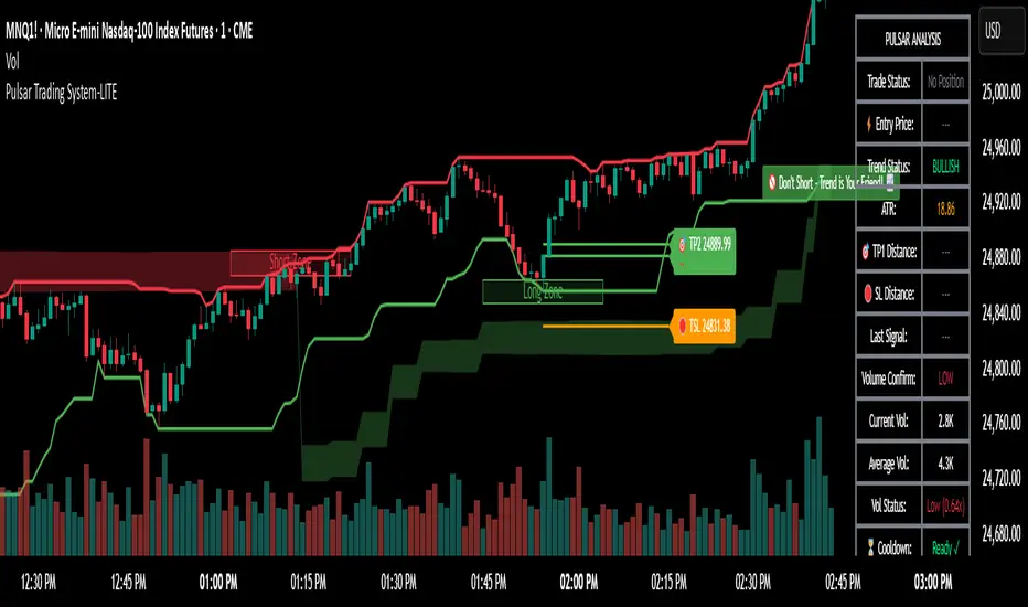
Pulsar Trading System-LITE📡 Pulsar Trading System
OVERVIEW
Pulsar is a comprehensive breakout trading system that combines dynamic support/resistance detection, trend filtering, and volume confirmation to identify high-probability entry opportunities. Unlike simple breakout indicators, Pulsar uses multi-timeframe analysis and adaptive ATR-based calculations to filter false signals and provide complete trade management from entry to exit.
WHAT MAKES THIS ORIGINAL
This indicator is unique in its integration of multiple complementary systems:
-Adaptive ATR Zones: Support and resistance levels are not static—they dynamically adjust based on current market volatility (ATR), creating entry zones that expand and contract with market conditions rather than using fixed price levels.
-Multi-Timeframe SuperTrend Filter: The trend filter operates on a higher timeframe than the chart (e.g., 5-minute SuperTrend on a 1-minute chart) to prevent counter-trend trades while maintaining granular entry precision. The visual ribbon with humorous warning text ("🚫 Don't Short - Trend is Your Friend! 📈") provides immediate trend awareness.
-Intelligent Cooldown System: After any trade exit (stop loss or take profit), the system enters a configurable cooldown period, preventing overtrading during choppy or consolidating market conditions—a critical feature often missing in breakout systems.
-Dynamic Trailing Stops: The trailing stop uses ATR multipliers to lock in profits while adapting to volatility, moving only in the favorable direction and never loosening.
-Comprehensive Dashboard: Real-time analysis displays trade status, entry prices, distances to targets in both points and ATR multiples, volume confirmation status, and cooldown countdown.
HOW IT WORKS
Core Detection Logic:
Pulsar identifies breakout opportunities by monitoring price interaction with dynamically calculated support and resistance levels:
Support/Resistance Calculation: Uses ta.lowest() and ta.highest() over a configurable lookback period to identify key levels, then adds ATR-based buffers (0.5 × ATR) to create entry zones.
Breakout Conditions:
Long Entry: Price closes above support buffer AND recent low touched support AND volume exceeds threshold
Short Entry: Price closes below resistance buffer AND recent high touched resistance AND volume exceeds threshold
SuperTrend Filter: A separate higher-timeframe SuperTrend calculation determines overall trend direction. Entries only trigger when breakout direction aligns with SuperTrend (bullish breakout + bullish trend, or bearish breakout + bearish trend).
Volume Confirmation: Current volume must exceed a configurable multiple of the 14-period SMA (default 1.0×) to confirm genuine interest in the breakout.
Cooldown Mechanism: After exit, the system tracks bars elapsed and blocks new signals until the cooldown period completes, preventing rapid-fire entries in ranging markets.
Trade Management:
Stop Loss: Calculated as entry zone ± (ATR × SL Multiplier)
Take Profit 1: Entry zone ± (ATR × TP1 Multiplier)
Take Profit 2: Entry zone ± (ATR × TP2 Multiplier)
Trailing Stop (optional): Updates every bar, moving the stop closer by maintaining distance of (ATR × Trailing Multiplier) from current price, but only in favorable direction
SuperTrend Calculation:
The SuperTrend uses standard methodology:
Upper Band = (High + Low) / 2 + (Multiplier × ATR)
Lower Band = (High + Low) / 2 - (Multiplier × ATR)
Direction changes when price crosses opposite band
The ribbon visualization adds a width offset (ATR × Ribbon Width) to create a filled zone rather than a single line.
HOW TO USE
Setup:
Add Pulsar to your chart (works best on liquid instruments like NQ, ES, CL)
Configure timeframe-specific settings (see recommendations below)
Enable SuperTrend Filter for trend-following mode, or disable for pure breakout mode
Set up alerts for Entry, TP1, TP2, and Stop Loss events
Recommended Settings by Timeframe:
1-Minute Charts:
Lookback Period: 10-15
SuperTrend Timeframe: 5 min
ATR Timeframe: 5 min (for stability)
Cooldown: 8-12 bars
Trailing Stop: Enabled with 0.8-1.0 multiplier
5-Minute Charts:
Lookback Period: 15-20
SuperTrend Timeframe: 15 min
ATR Timeframe: current chart
Cooldown: 5-8 bars
Trailing Stop: Optional
15-Minute+ Charts:
Lookback Period: 20-30
SuperTrend Timeframe: 1 hour
ATR Timeframe: current chart
Cooldown: 3-5 bars
Trailing Stop: Optional
Interpreting Signals:
Long/Short Zone Box: Green (long) or red (short) box appears when breakout conditions are met
Blue Entry Line: Shows your entry price
Red/Orange SL Line: Red = fixed stop, Orange = trailing stop (moves in real-time)
Green TP Lines: TP1 (closer) and TP2 (further) targets
SuperTrend Ribbon: Green = bullish trend (favor longs), Red = bearish trend (favor shorts)
Dashboard Status: Monitor trade state, distances, volume confirmation, and cooldown
Best Practices:
Use SuperTrend Filter: Significantly reduces false signals by avoiding counter-trend trades
Enable Cooldown on Fast Timeframes: Prevents overtrading on 1-5 minute charts
Volume Confirmation is Critical: Don't lower volume multiplier below 0.9 on futures
Use Higher Timeframe ATR: On 1-minute charts, use 5-minute ATR for stability
Avoid Major News Events: Disable during FOMC, NFP, CPI releases
Scale Out Strategy: Consider taking partial profits at TP1, letting remainder run to TP2
Parameter Optimization:
Start conservative and adjust based on results:
Too many stop-outs: Increase SL multiplier or SuperTrend multiplier
Missing good trades: Decrease volume multiplier or cooldown period
Too many false signals: Increase volume multiplier, lookback period, or cooldown
Profits not protected: Enable trailing stop or reduce trailing multiplier
KEY FEATURES
✅ Dynamic ATR-Based Zones: Entry, stop loss, and take profit levels automatically adjust to market volatility
✅ Multi-Timeframe Trend Filter: Uses higher timeframe SuperTrend to eliminate counter-trend trades
✅ Volume Confirmation: Filters low-volume false breakouts
✅ Intelligent Cooldown: Prevents overtrading with configurable post-trade waiting period
✅ Trailing Stop System: Optional dynamic stops that lock in profits using ATR distance
✅ Real-Time Dashboard: 13-row analysis showing trade status, targets, distances, volume, and cooldown
✅ Visual Ribbon Warnings: Humorous trend-following reminders on SuperTrend ribbon
✅ Complete Alert System: Notifications for entries, TP1, TP2, fixed stops, and trailing stops
✅ Customizable Visuals: Adjustable colors, dashboard position, text size, and line lengths
✅ Non-Repainting: Uses lookahead = barmerge.lookahead_off for all multi-timeframe calculations
SETTINGS EXPLAINED
SuperTrend Filter:
Enable: Toggle trend filtering on/off
Timeframe: Higher timeframe for trend analysis (recommended 3-5x chart timeframe)
ATR Period: Period for ATR calculation in SuperTrend (10-14 standard)
Multiplier: Distance from center band (2.5-3.5 for most markets)
Ribbon Width: Visual thickness of trend ribbon (0.2-0.5)
Core Parameters:
Lookback Period: Bars used to identify support/resistance (lower = more sensitive)
ATR Period: Bars for Average True Range calculation (14 is standard)
ATR Timeframe: Use higher timeframe ATR for smoother calculations on fast charts
Volume Multiplier: Required volume vs average (1.0 = average, 1.5 = 50% above average)
TP/SL:
SL Multiplier: Stop loss distance in ATR units (1.0-2.0 typical)
TP1 Multiplier: First target in ATR units (1.5-2.5 typical)
TP2 Multiplier: Second target in ATR units (2.0-3.5 typical)
Trailing Stop:
Enable: Activate dynamic trailing stop
Multiplier: Distance from current price in ATR units (0.8-1.5 typical)
Cooldown:
Enable: Prevent new signals after trade exit
Bars: Number of bars to wait before allowing next trade (higher on fast timeframes)
IMPORTANT NOTES
⚠️ Not a Holy Grail: No indicator is perfect. Pulsar is a tool that requires proper risk management, position sizing, and trading discipline.
⚠️ Backtest First: Test settings on historical data before live trading. Results vary by instrument, timeframe, and market conditions.
⚠️ Market Conditions Matter: Breakout systems perform best in trending markets. Consider reducing size or disabling during known choppy periods.
⚠️ Stop Loss is Mandatory: Always use the provided stop loss levels. Markets can move against you rapidly.
⚠️ Volume Data Required: This indicator requires volume data to function properly. It will display a warning if volume is unavailable.
⚠️ No Repainting: All multi-timeframe calls use non-repainting settings. What you see in real-time is what will be plotted historically.
TECHNICAL SPECIFICATIONS
Version: Pine Script v6
Type: Indicator (overlay = true)
Max Boxes: 500 (for zone visualization)
Max Lines: 500 (for TP/SL levels)
Max Labels: Unlimited (for annotations)
Repainting: None (uses lookahead = barmerge.lookahead_off)
COMPATIBLE INSTRUMENTS
Works best on liquid instruments with reliable volume data:
✅ Futures: NQ, MNQ, ES, MES, YM, MYM, RTY, M2K, CL, GC
✅ Forex: Major pairs (EUR/USD, GBP/USD, etc.)
✅ Stocks: Large-cap stocks with high volume
⚠️ Crypto: Works but requires higher ATR multipliers
❌ Low Volume Stocks: May produce unreliable signals
SUPPORT
For questions, suggestions, or to report issues, please comment below. I actively maintain this indicator and appreciate feedback from the community.
Enjoy trading with Pulsar! 🌟
TrendRebel.pro SMA 🆓Welcome to Trend Rebel!
This 🆓 Indicator will help guide you through boundaries across multiple timeframes.
Seamlessly watch your 4 Hour or any other timeframe while being able to plot aand or just view other important SMA's.
Add this with a FREE subscription to Trend Rebels Bootcamp and you can master the boundaries that SMA"s provide giving you an edge.
SMA's provide you with the boundaries that define how technicals move, while they are based on previous candles, future candles respect them with patterns and institutions use them to guide their trading as well. This of it as a cheat sheet to awareness of whats to come.
This Free version is somewhat limited, so make sure you get a free trial to trend rebel and explore the many Indicators we use to navigate the market with precision.
For instance our Pivot Indicator which is based on charting techniques that Trading View cannot duplicate, therefore we manually update our Pivots DAILY and deliver them to your screen!
For a Paid Subscription to TrendRebel copy paste this link to your browser:
whop.com
For a FREE subscription to Bootcamp copy paste this link to your browser:
whop.com
For more information go to:
www.trendrebel.pro

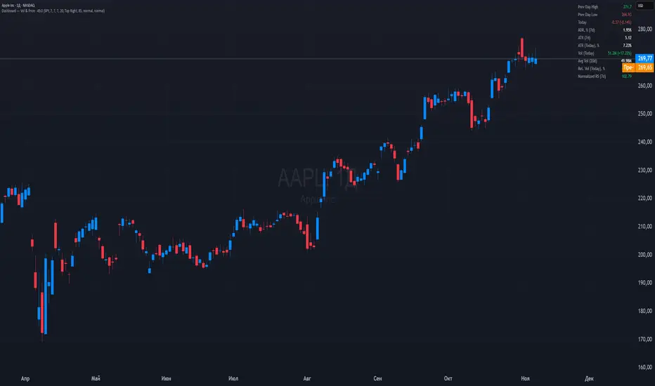
Dashboard — Vol & PriceDashboard for traders
Indicator Description
1. Prev Day High
What it shows: the previous trading day's high.
Why it shows: a resistance level. Many traders watch to see if the price will hold above or below this level. A breakout can signal buying strength.
2. Prev Day Low
What it shows: the previous day's low.
Why it shows: a support level. If the price breaks downwards, it signals weakness and a possible continuation of the decline.
3. Today
What it shows:
The difference between the current price and yesterday's close (in absolute values and as a percentage).
Color: green for an increase, red for a decrease.
Why it shows: immediately shows how strong a gap or movement is today relative to yesterday. This is an indicator of current momentum.
4. ADR, % (Average Daily Range)
What it shows: Average daily range (High – Low), expressed as a percentage of the closing price, for the selected period (default 7 days).
Why it's useful: To understand the "normal" volatility of an instrument. For example, if the ADR is 3%, then a 1% move is small, while a 6% move is very large.
5. ATR (Average True Range)
What it shows: Average fluctuation range (including gaps), in absolute points, for the specified period (default 7 days).
Why it's useful: A classic volatility indicator. Useful for setting stops, calculating position sizes, and identifying "noise" movements.
6. ATR (Today), %
What it shows: How much the current movement today (from yesterday's close to the current price) represents in % of the average ATR.
Why it shows: Shows whether the instrument has "played out" its average range. If the value is already >100%, there is a high probability that the movement will begin to slow.
7. Vol (Today)
What it shows:
Current trading volume for the day (in millions/billions).
Comparison with yesterday as a percentage (for example: 77.32M (-52.78%)).
Color: green if the volume is higher than yesterday; red if lower.
Why it shows:Quickly shows whether the market is active today. Volume = fuel for price movement.
8. Avg Vol (20d)
What it shows: Average daily volume over the last 20 trading days.
Why it's useful:"normal" activity level. It's a convenient backdrop for assessing today's turnover.
9. Rel. Vol (Today), % (Relative Volume)
What it shows: Deviation of the current volume from the average (20 days).
Formula: `(today / average - 1)` * 100`.
+30% = volume 30% above average, -40% = 40% below average.
Color: green for +, red for –.
Why it's useful:A key indicator for a trader. If RelVol > 100% (green), the market is "charged," and the movement is more significant. If low, activity is weak and movements are less reliable.
10. Normalized RS (Relative Strength)
What it shows: the relative strength of a stock to a selected benchmark (e.g., SPY), normalized by the period (default 7 days).
100 = same result as the market.
> 100 = the stock is stronger than the index.
<100 = weaker than the index.
Why it's needed: filtering ideas. Strong stocks rise faster when the market rises, weak stocks fall more sharply. This helps trade in the direction of the trend and select the best candidates.
In summary:
Prev High / Low — key support and resistance levels.
Today — an instant understanding of the current momentum.
ADR and ATR — volatility and potential movement.
ATR (Today) — how much the instrument has already "run."
Vol + Rel.Vol — activity and confirmation of the movement's strength.
RS — selecting strong/weak leaders against the market.
SMC ORB vs Pre-Market SPY/IWMStacks institutional confluences such as Smart Money Concepts, Inner Circle Trading, volatility, and structure.
Plots Premarket high/low and 15 minute Opening range
Plots the first sweep of Premarket high/low and any subsequent orb breaks

Local Hurst Slope [Dynamic Regime]1. HOW THE INDICATOR WORKS (Math → Market Edge)Step
Math
Market Intuition
1. Log-Returns
r_t = log(P_t / P_{t-1})
Removes scale, makes series stationary
2. R/S per τ
R = max(cum_dev) - min(cum_dev)
S = stdev(segment)
Measures memory strength over window τ
3. H(τ) = log(R/S) / log(τ)
Di Matteo (2007)
H > 0.5 → Trend memory
H < 0.5 → Mean-reversion
4. Slope = dH/d(log τ)
Linear regression of H vs log(τ)
Slope > 0.12 → Trend accelerating
Slope < -0.08 → Reversion emerging
LEADING EDGE: The slope changes 3–20 bars BEFORE price confirms
→ You enter before the crowd, exit before the trap
Slope > +0.12 + Strong Trend = Bullish = Long
Slope +0.05 to +0.12 = Weak Trend = Cautious = Hold/Trail
Slope -0.05 to +0.05 = Random = No Edge
Slope-0.08 to -0.05 = Weak Reversion = Bearish setup = Prepare Short
Slope < -0.08 = Strong Reversion = Bearish= Short
PRO TIPS
Only trade in direction of 200-day SMA
Filters false signals
Avoid trading 3 days before/after earnings
Volatility kills edge
Use on ETFs (SPY, QQQ)
Cleaner than single stocks
Combine with RSI(14)
RSI < 30 + Hurst short = nuclear reversal

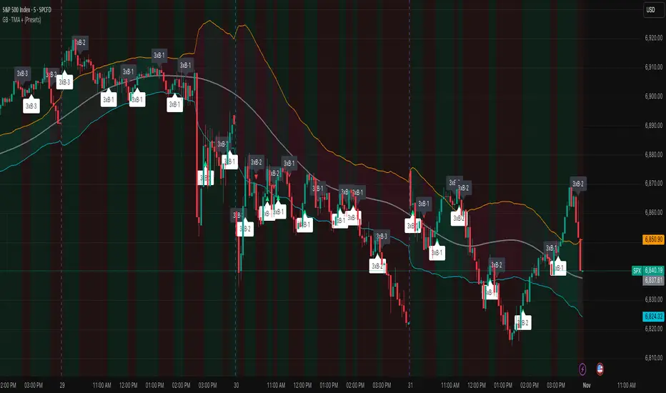
Volume Area 80 Rule Pro - Adaptive RTHSummary in one paragraph
Adaptive value area 80 percent rule for index futures large cap equities liquid crypto and major FX on intraday timeframes. It focuses activity only when multiple context gates align. It is original because the classic prior day value area traverse is fused with a daily regime classifier that remaps the operating parameters in real time.
Scope and intent
• Markets. ES NQ SPY QQQ large cap equities BTC ETH major FX pairs and other liquid RTH instruments
• Timeframes. One minute to one hour with daily regime context
• Default demo used in the publication. ES1 on five minutes
• Purpose. Trade only the balanced days where the 80 percent traverse has edge while standing aside or tightening rules during trend or shock
Originality and usefulness
• Unique fusion. Prior day value area logic plus a rolling daily regime classifier using percentile ranks of realized volatility and ADX. The regime remaps hold time end of window stop buffer and value area coverage on each session
• Failure mode addressed. False starts during strong trend or shock sessions and weak traverses during quiet grind
• Testability. All gates are visible in Inputs and debug flags can be plotted so users can verify why a suggestion appears
• Portable yardstick. The regime uses ATR divided by close and ADX percent ranks which behave consistently across symbols
Method overview in plain language
The script builds the prior session profile during regular trading hours. At the first regular bar it freezes yesterday value area low value area high and point of control. It then evaluates the current session open location the first thirty minute volume rank the open gap rank and an opening drive test. In parallel a daily series classifies context into Calm Balance Trend or Shock from rolling percentile ranks of realized volatility and ADX. The classifier scales the rules. Calm uses longer holds and a slightly wider value area. Trend and Shock shorten the window reduce holds and enlarge stop buffers.
Base measures
• Range basis. True Range smoothed over a configurable length on both the daily and intraday series
• Return basis. Not required. ATR over close is the unit for regime strength
Components
• Prior Value Area Engine. Builds yesterday value area low value area high and point of control from a binned volume profile with automatic TPO fallback and minimum integrity guards
• Opening Location. Detects whether the session opens above the prior value area or below it
• Inside Hold Counter. Counts consecutive bars that hold inside the value area after a re entry
• Volume Gate. Percentile of the first thirty minutes volume over a rolling sample
• Gap Gate. Percentile rank of the regular session open gap over a rolling sample
• Drive Gate. Opening drive check using a multiple of intraday ATR
• Regime Classifier. Percentile ranks of daily ATR over close and daily ADX classify Calm Balance Trend Shock and remap parameters
• Session windows optional. Windows follow the chart exchange time
Fusion rule
Minimum satisfied gates approach. A re entry must hold inside the value area for a regime scaled number of bars while the volume gap and drive gates allow the setup. The regime simultaneously scales value area coverage end minute time stop and stop buffer.
Signal rule
• Long suggestion appears when price opens below yesterday value area then re enters and holds for the required bars while all gates allow the setup
• Short suggestion appears when price opens above yesterday value area then re enters and holds for the required bars while all gates allow the setup
• WAIT shows implicitly when any required gate is missing
• Exit labels mark target touch stop touch or a time based close
Inputs with guidance
Setup
• Signal timeframe. Uses the chart by default
• Session windows optional. Start and end minutes inside regular trading hours
• Invert direction is not used. The logic is symmetric
Logic
• Hold bars inside value area. Typical range 3 to 12. Raising it reduces trades and favors better traverses. Lowering it increases frequency and risk of false starts
• Earliest minute since RTH open and Latest minute since RTH open. Typical range 0 to 390. Reducing the latest minute cuts late session trades
• Time stop bars after entry. Typical range 6 to 30. Larger values give setups more room
Filters
• Value area coverage. Typical range 0.70 to 0.85. Higher coverage narrows the traverse but accepts fewer days
• Bin size in ticks. Typical range 1 to 8. Larger bins stabilize noisy profiles
• Stop buffer ticks beyond edge. Typical range 2 to 20. Larger buffers survive noise
• First thirty minute volume percentile. Typical range 0.30 to 0.70. Higher values require more active opens
• Gap filter percentile. Typical range 0.70 to 0.95. Lower values block more gap days
• Opening drive multiple and bars. Higher multiple or longer bars block strong directional opens
Adaptivity
• Lookback days for regime ranks. Typical 150 to 500
• Calm RV percentile. Typical 25 to 45
• Trend ADX percentile. Typical 55 to 75
• Shock RV percentile. Typical 75 to 90
• End minute ratio in Trend and Shock. Typical 0.5 to 0.8
• Hold and Time stop scales per regime. Use values near one to keep behavior close to static settings
Realism and responsible publication
• No performance claims. Past results never guarantee future outcomes
• Shapes can move while a bar forms and settle on close
• Sessions use the chart exchange time
Honest limitations and failure modes
• Economic releases and thin liquidity can break the balance premise
• Gap heavy symbols may work better with stronger gap filters and a True Range focus
• Very quiet regimes reduce signal contrast. Consider longer windows or higher thresholds
Legal
Education and research only. Not investment advice. Test in simulation before any live use.

Daniel.Yer Volume Breakout Signal🧠 Summary – Daniel.Yer Volume Breakout Signal
The indicator only works on time frames of minutes.
An indicator that detects high-volume breakouts after the market opens and highlights potential entry zones.
Based on sampling the opening volume window and comparing it to the session’s volume peak.
Visually marks preparation areas (colored background) and plots BUY/SELL triangles for confirmation candles.
Includes real-time alert conditions for leading tickers: SPY, AAPL, MSFT, META, AMD, TSLA, NVDA, PLTR, GOOG, and AMZN.
Optimized for day trading — provides actionable alerts even when the user is offline.

Grizzly Brahman · PRO SCALPERGrizzly Brahman TMAX 4 is a fourth-generation Trend-Momentum-Adaptive Crossover system built to identify true intraday direction and volatility alignment before price acceleration begins.
It combines adaptive moving-average bands, momentum filtration, and trend-fill logic to produce crystal-clear long/short zones directly on the chart.
Preset Modes
“Aggressive / Balanced / Disciplined” presets optimize responsiveness for scalping, intra-day, or swing conditions.
Session Shading & ORB Levels
Optional overlays for Opening Range Breakout, Pre-Market High/Low, and Previous Day High/Low to frame liquidity targets.
Heikin Ashi Compatibility
Optimized to read momentum flow cleanly on Heikin Ashi charts for false-breakout filtering.
Momentum Bands
Adaptive outer bands act as over-extension or “take-profit” zones — similar to ATR channels but smoothed for consistency.
How to Use
Identify Trend Zone — watch for color fill change and TMA alignment.
Enter on Marker Confirmation — green triangle = long momentum confirm, red triangle = short.
Manage Risk around outer TMA/ATR band touches or when color intensity fades.
Combine with GB Set-Up & Confirmation (lower pane) for dual-signal entry validation.
NSR Dynamic Channel - HTF + ReversionNSR Dynamic Channel – HTF Volatility + Reversion
(Beginner-friendly, pro-grade, non-repainting)
The NSR Dynamic Channel builds an adaptive volatility envelope that compares current price action to a statistically-derived “expected” range pulled from a user-selected higher timeframe (HTF).
Is this just another keltner variation?
In short: Keltner reacts. NSR anticipates.
Keltner says “price moved a lot.”
NSR says “this move is abnormal compared to the last 2 days on a higher timeframe — and here’s the probability it snaps back.”
The channel is not a simple multiple of recent ATR or standard deviation; instead it:
Samples HTF volatility over a rolling window (default: last 2 days on the chosen HTF).
Expected Range
HTF Volatility Spread = StDev of 1-bar ATR on the HTF
Scales this HTF range to the current chart’s volatility using a compression ratio :
compRatio = SMA(High-Low over lookback) / Expected Range
This makes the channel tighten in low-vol regimes and widen in high-vol regimes .
Centers the channel on a composite mean ( AVGMEAN ) calculated from:
Smoothed Adaptive Averages of the current timeframe close
SMA of close over the user-defined lookback ( Slow )
The three means are averaged to reduce lag and noise.
Draws two layers :
HTF Expected Channel (gray fill) = PAMEAN ± expectedD
Dynamic Expected Band (inner gray) = HTF Expected Range
Adds a fast 2σ envelope around AVGMEAN using the standard deviation of close over the lookback period.
Core Calculations (Conceptual Overview)
HTF Baseline → ATR on user HTF → SMA & StDev over a defined number of days
Compression Ratio → Normalizes current range to HTF “normal” volatility
Expected Band Width → Expected Range × CompressionRatio
Bias Detection → % change of composite mean over 2 bars → “bullish” / “bearish” filter
Overextension % → Position of price within the expected band (0–100%)
How to Use It (3 Steps)
Apply to any chart – defaults work on futures (NQ/ES), stocks (SPY), crypto (BTC), forex, etc.
Price is outside both the fast 2σ envelope and the HTF-scaled expected band
Expect some sort of reversion
Enable alerts – two built-in conditions:
NSR Exit Long – bullish bias + high crosses upper expected edge
NSR Exit Short – bearish bias + low crosses lower expected edge
Optional toggles :
Show 2σ Price Range → fast overextension lines
Expected Channel → HTF-based gray fill
Mean → MEAN centerline
Why It Works
Context-aware : Uses HTF “normal” volatility as anchor
Adaptive : Shrinks in consolidation, expands in breakouts
Filtered signals : Only triggers when both statistical layers agree
Non-repainting : All calculations use confirmed bars
Happy trading!
nsrgroup

Relative Rotation - RRG JdK RS-Ratio & RS-MomentumThis indicator calculates the JdK RS-Ratio and RS-Momentum, which form the basis of Relative Rotation Graphs (RRG). It compares the performance of any asset against a benchmark (default: SPY) to identify the current RRG quadrant: LEADING, WEAKENING, LAGGING, or IMPROVING.
The RS-Ratio (red line) and RS-Momentum (green line) are plotted around a baseline of 100. The background color indicates the current quadrant, and an optional feature allows coloring chart candles based on the RRG phase.
Alerts can be configured to notify when the asset transitions between quadrants, helping traders identify rotational shifts in relative strength.

Sector Relative StrengthThis indicator measures a stock's Real Relative Strength against its sector benchmark, helping you identify stocks that are outperforming or underperforming their sector peers.
The concept is based on the Real Relative Strength methodology popularized by the r/realdaytrading community.
Unlike traditional relative strength calculations that simply compare price ratios, this indicator uses a more sophisticated approach that accounts for volatility through ATR (Average True Range), providing a normalized view of true relative performance.
Key Features
Automatic Sector Detection
Automatically detects your stock's sector using TradingView's built-in sector classification
Maps to the appropriate SPDR Sector ETF (XLK, XLF, XLV, XLY, XLP, XLI, XLE, XLU, XLB, XLC)
Supports all 20 TradingView sectors
Sector ETF Mappings
The indicator automatically compares your stock against:
Technology: XLK (Technology Services, Electronic Technology)
Financials: XLF (Finance sector)
Healthcare: XLV (Health Technology, Health Services)
Consumer Discretionary: XLY (Retail Trade, Consumer Services, Consumer Durables)
Consumer Staples: XLP (Consumer Non-Durables)
Industrials: XLI (Producer Manufacturing, Industrial Services, Transportation, Commercial Services)
Energy: XLE (Energy Minerals)
Utilities: XLU
Materials: XLB (Non-Energy Minerals, Process Industries)
Communications: XLC
Default: SPY (for Miscellaneous or unclassified sectors)
Customizable Settings
Comparison Mode: Choose between automatic sector comparison or custom symbol
Length: Adjustable lookback period (default: 12)
Smoothing: Apply moving average to reduce noise (default: 3)
Visual Clarity
Green line: Stock is outperforming its sector
Red line: Stock is underperforming its sector
Zero baseline: Clear reference point for performance
Clean info box: Shows which ETF you're comparing against
How It Works
The indicator calculates relative strength using the following methodology:
Rolling Price Change: Measures the price movement over the specified length for both the stock and its sector ETF
ATR Normalization: Uses Average True Range to normalize for volatility differences
Power Index: Calculates the sector's strength relative to its volatility
Real Relative Strength: Compares the stock's performance against the sector's power index
Smoothing: Applies a moving average to reduce single-candle spikes
Formula:
Power Index = (Sector Price Change) / (Sector ATR)
RRS = (Stock Price Change - Power Index × Stock ATR) / Stock ATR
Smoothed RRS = SMA(RRS, Smoothing Length)
NDOG [派大星]🧠 Indicator Description — “NDOG ”
This indicator visualizes Night-Day Opening Gaps (NDOG) based on the custom trading session timing used in U.S. markets.
Instead of using the standard daily candle change, it detects gaps between the 16:59 close and the 18:00 open (New York time, UTC-4).
Whenever the market reopens after the evening pause (from 16:59 → 18:00),
the script measures the price difference between the previous session’s close and the new session’s open,
then draws a shaded box to highlight the opening gap region.
🟦 Bullish Gap (Upward) — when the new session opens above the previous close.
🟪 Bearish Gap (Downward) — when the new session opens below the previous close.
You can control the maximum number of displayed gaps with the “Amount” setting.
This custom session logic allows more accurate visualization of after-hours transitions for futures or extended-hours instruments (e.g., ES, NQ, SPY).

(FTD) Follow-Through Day SignalFollow-Through Day (FTD) Signal
This indicator detects potential Follow-Through Days (FTDs) — a concept popularized by William O’Neil — to help identify possible market trend confirmations.
A Follow-Through Day occurs when an index shows strong upside action on higher volume several days after a market low, suggesting institutional buying rather than short covering.
How it works:
The indicator checks for a session where the price gains a defined minimum percentage from the prior close (default: 1.2% or more).
Volume must be greater than the previous day’s volume.
The rally must occur at least three days after a recent low, determined by the lookback period (default: 20 days).
Additional safeguards require that recent bars are not making new lows and that the bar three days prior either closed positive or was not at a new low — filtering out false signals from oversold bounces.
When all conditions are met, a blue up arrow is plotted beneath the bar, and an optional “FTD” label appears if enabled.
Inputs:
Min % Gain from Previous Close (%): Sets the minimum daily percentage gain to qualify as a Follow-Through Day.
Lookback Period for Lowest Low Checks: Defines how many bars back to search for a recent market low (default: 20).
Show Signal Label: Toggles the on-chart “FTD” label display.
Usage:
This indicator is intended for use on daily charts of major market indexes — such as the Nasdaq Composite (symbol: IXIC) or broad index ETFs including QQQ, SPY, and DIA — where Follow-Through Day signals are most relevant for confirming potential trend reversals.

Rolling Correlation vs Another Symbol (SPY Default)This indicator visualizes the rolling correlation between the current chart symbol and another selected asset, helping traders understand how closely the two move together over time.
It calculates the Pearson correlation coefficient over a user-defined period (default 22 bars) and plots it as a color-coded line:
• Green line → positive correlation (move in the same direction)
• Red line → negative correlation (move in opposite directions)
• A gray dashed line marks the zero level (no correlation).
The background highlights periods of strong relationship:
• Light green when correlation > +0.7 (strong positive)
• Light red when correlation < –0.7 (strong negative)
Use this tool to quickly spot diversification opportunities, confirm hedges, or understand how assets interact during different market regimes.

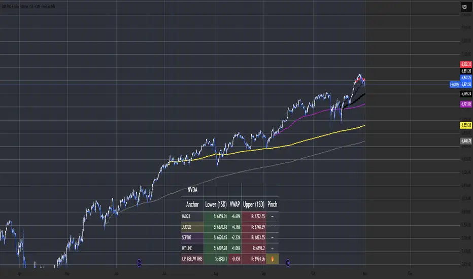
Multi-Anchor VWAP Deviation Dashboard Overview
Multi-Anchor VWAP Deviation Dashboard (Optimized Global) is an overlay indicator that computes up to five user-defined Anchored Volume Weighted Average Prices (AVWAPs) from custom timestamps, plotting their lines and displaying real-time percentage deviations from the current close. It enables precise analysis of price positioning relative to key events (e.g., earnings, news) or periods (e.g., weekly opens), with a compact dashboard for quick scans. Optimized for performance, it uses manual iterative calculations to handle dynamic anchor changes without repainting.
Core Mechanics
The indicator focuses on efficient AVWAP computation and deviation tracking:
Anchor Configuration: Five independent anchors, each with a name, UTC timestamp (e.g., "01 Oct 2025 00:00" for monthly open), show toggle, and color. Timestamps define the calculation start—e.g., AVWAP1 from "20 Oct 2025" onward.
AVWAP Calculation: For each enabled anchor, it identifies the first bar at/after the timestamp as the reset point, then iteratively accumulates (price * volume) / total volume from there. Uses HLC3 source (customizable); handles input changes by resetting sums on new anchors.
Deviation Metric: For each AVWAP, computes % deviation = ((close - AVWAP) / AVWAP) * 100—positive = above (potential resistance), negative = below (support).
Visuals: Plots lines (linewidth 1–2, user colors); dashboard (2 columns, 6 rows) shows names (anchor-colored if enabled) and deviations (green >0%, red <0%, gray N/A), positioned user-selectable with text sizing. Updates on last bar for efficiency.
This setup scales deviations across volatilities, aiding multi-period bias assessment.
Why This Adds Value & Originality
Standard VWAPs limit to session anchors (daily/weekly); deviation tools often lack multiples. This isn't a simple mashup: Manual iterative AVWAP (no built-in ta.vwap reliance) ensures dynamic resets on timestamp tweaks—e.g., shift "Event" to FOMC date without recalc lag. The 5-anchor flexibility (arbitrary UTC times) + centralized dashboard (colored deviations at a glance) creates a "global timeline scanner" unique to event-driven trading, unlike rigid multi-VWAP scripts. It streamlines what requires 5 separate indicators, with % normalization for cross-asset comparison (e.g., SPY vs. BTC).
How to Use
Setup: Overlay on chart. Configure anchors (e.g., Anchor1: "Weekly Open" at next Monday 00:00 UTC; enable/show 2–3 for focus). Set source (HLC3 default), position (Top Right), text size (Small).
Interpret Dashboard:
Left Column: Anchor names (e.g., "Monthly Open" in orange).
Right Column: Deviations (e.g., "+1.25%" green = above, bullish exhaustion?).
Scan for confluence (e.g., all >+2% = overbought).
Trading:
Lines: Price near AVWAP = mean reversion; breaks = momentum.
Example: -0.8% below "Event" anchor post-earnings → potential bounce buy.
Use on 1H–D; adjust timestamps via calendar.
Tips: Enable 1–3 anchors to avoid clutter; test on historical events.
Limitations & Disclaimer
AVWAPs reset on anchor bars, potentially lagging mid-period; deviations are % only (add ATR for absolute). Table updates on close (no intrabar). Timestamps must be UTC/future-proof. No alerts/exits—integrate manually. Not advice; backtest deviations on your assets. Past ≠ future. Comments for ideas.