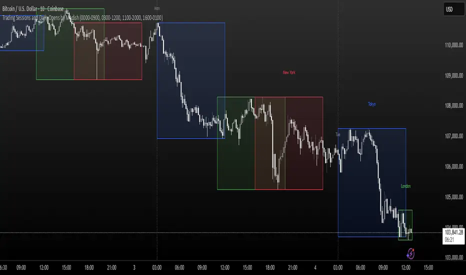
Trading Sessions and Daily Opens by ModishThis Pine Script indicator overlays key forex trading sessions (Sydney, Tokyo, London, New York) on your chart using Kenyan time (EAT/UTC+3), with customizable translucent boxes, borders, and labels positioned neatly above each session for clear visualization. It also plots dotted vertical lines at daily opens (Monday-Friday) with abbreviated day labels for quick reference. Toggle sessions on/off, adjust colors, and ensure seamless integration with candlesticks for dynamic, real-time analysis. Ideal for session-based traders seeking precise timing and structure.
Pesquisar nos scripts por "session"
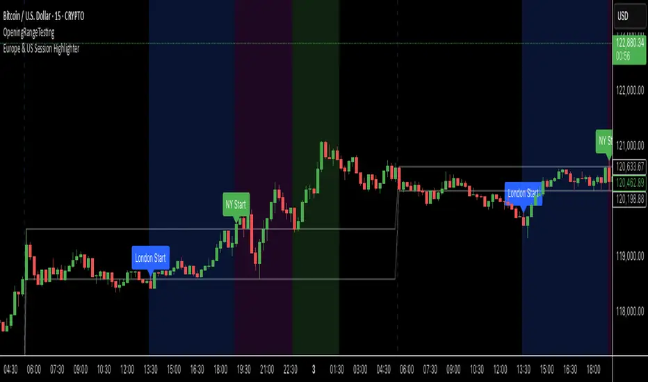
Europe & US Session Highlighter
Bitcoin trading volumes peak during the Europe-US session overlap (13:30–17:00 UTC), driven by institutional activity and market news. This indicator helps traders:
- Focus on high-liquidity periods for better trade execution.
- Avoid low-volume, high-volatility periods outside major sessions.
- Plan entries and exits during Bitcoin’s most active hours.
How to Use:
- Apply the indicator to any Bitcoin intraday chart (e.g., 1M, 5M, 15M).
- Look for blue (London), green (NY), or purple (overlap) backgrounds to identify active sessions.
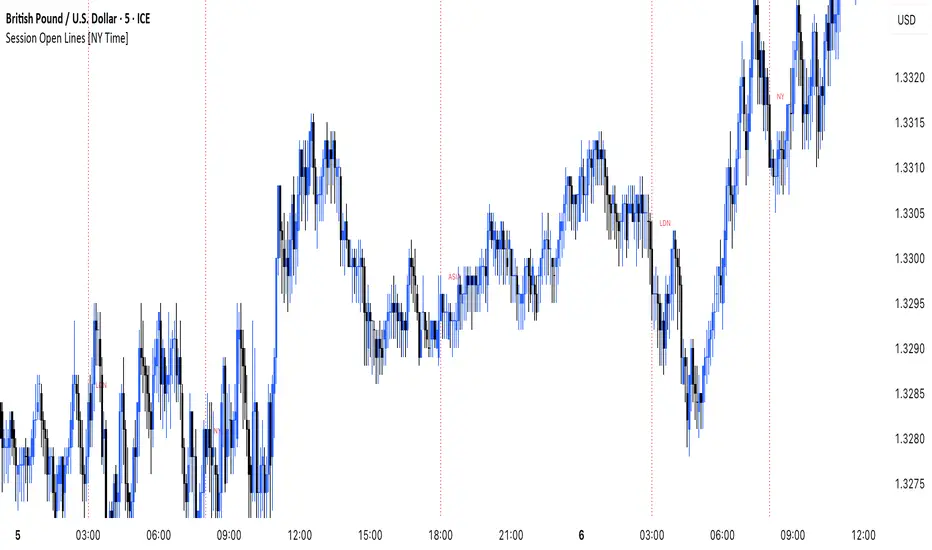
MANI SESSIONSOANDA:GBPUSD This indicator marks the opening times of the three main trading sessions — Asia, London, and New York — using vertical red dotted lines on the chart.
Each session is labeled with a minimal tag (“ASIA”, “LDN”, “NY”) displayed directly on the line for clean and unobtrusive reference.
All session times are based on the New York time zone and adjust automatically for each new day.
This tool helps intraday traders quickly identify session shifts, plan entries around high-volume hours, and stay locked into session-based strategy.
OANDA:GBPUSD
Time Intervals [signBTC]This script is designed to visualize 6 auxiliary time intervals on the chart near the time axis. Each of these intervals can be configured by the user with the following options:
Interval duration: Any duration can be set (for example, 1 hour, 2 hours, 4 hours, etc.).
Interval color: Each time block can have its own color for better visual distinction.
Label: Users can add a custom label for each of the 6 intervals to indicate its purpose or highlight important features.
In the default configuration, the script automatically draws 6 equal four-hour intervals for each trading day, dividing each daily trading session into six parts—two for each of the three standard market sessions, or three per each of two major sessions (if considering only regular daytime and extended overnight trading).
This tool is particularly useful for traders who want to quickly navigate different time areas of the trading day, monitor individual parts of a session, or highlight specific time windows for strategy analysis. All script parameters (interval, color, and label for each block) are easily adjustable in the indicator's settings.

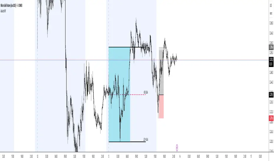
Asia Session Range @mrxautrades🗺️ Asia Session Range by @mrxautrades
🚨 This script is closed-source because it implements a custom logic for session range visualization, deviation projections, and adaptive display based on chart timeframe. No other public script offers this exact functionality.
✅ What does this script do?
This indicator highlights the Asian session range and calculates dynamic extensions during the New York session open. It's designed for traders who rely on price action around key market sessions.
🔧 Unique Features (compared to existing scripts):
Timeframe-aware visibility: The script includes conditional logic to show or hide elements based on the chart timeframe (e.g., only visible on 60-minute or lower charts).
Automatic deviation levels: Calculates and plots extensions above/below the Asian range based on its size, offering projected support/resistance levels in real time.
Adaptive labels: Labels adjust dynamically to chart styling, with options for background, color, and visibility control.
⚙️ Customizable Inputs:
Asian and New York session times
Box, line, and label colors
Number and spacing of deviation levels
Line extension duration (in hours)
Label style: plain text or with background
🧠 Best suited for:
Breakout strategies based on the Asian session range
Using prior session levels as support/resistance
Intraday traders in Forex, indices, or crypto markets
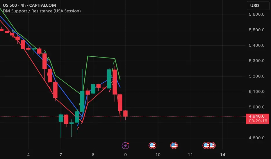
DM Support / Resistance (USA Session)This indicator is specifically designed for use on the 4-hour time frame and helps traders identify key support and resistance levels during the USA trading session (9:30 AM to 4:00 PM Eastern Time). The indicator calculates important price levels to assist in making well-informed entry and exit decisions, particularly for those focusing on swing trades or longer-term intraday strategies. It also includes a feature to skip setups when relevant fundamental news is scheduled, ensuring you avoid trading during periods of high volatility.
Key Features:
Support and Resistance Levels (S1 & R1):
The indicator calculates and displays Support 1 (S1) and Resistance 1 (R1) levels, which act as key barriers for price action and help traders spot potential reversal or breakout zones on the chart.
Pivot Point (PP):
The Pivot Point (PP) is calculated as the average of the previous period's high, low, and close. It serves as a central reference point for market direction, allowing traders to evaluate whether the market is in a bullish or bearish trend.
Market Bias:
The Bias is shown as a histogram that helps traders assess the strength of the market trend. A positive bias suggests bullish sentiment, while a negative bias signals bearish conditions. This can be used to confirm the overall trend direction.
4-Hour Time Frame:
The indicator is optimized for the 4-hour time frame, making it suitable for traders looking for swing trades or those who wish to capture longer-term trends within the USA session. The key support, resistance, and pivot levels are recalculated dynamically to reflect price action over 4-hour periods.
Dynamic Plotting and Alerts:
Support and resistance levels are drawn as dashed horizontal lines, updating in real-time to reflect the most current market data during the USA session. Alerts can be set for significant price movements crossing these levels.
Stop-Loss Strategy Based on 15-Minute Time Frame:
A unique feature of this indicator is its stop-loss strategy, which uses 15-minute time frame support and resistance levels. When a long or short entry is triggered on the 4-hour chart, traders should place their stop-loss according to the relevant 15-minute support or resistance level.
If the price closes above the 15-minute support for a long entry, or closes below the 15-minute resistance for a short entry, it signals the need to exit or adjust your position based on these levels.
Fundamental News Filter:
To avoid unnecessary risk, the indicator incorporates a fundamental news filter. If there is relevant news scheduled during the USA session, such as high-impact economic data or central bank announcements, the indicator will skip the setup for that period. This prevents traders from entering positions during times of elevated volatility caused by news events, which could result in unpredictable price movements.
How to Use:
Long Entry: When the Bias is positive and the price breaks above Support 1 (S1), this signals a potential bullish move. Consider entering a long position at this point.
Stop-Loss Strategy: Set your stop-loss at the respective 15-minute support level. If the price closes below this level, it could signal a reversal, prompting you to exit the trade.
Short Entry: When the Bias is negative and the price breaks below Resistance 1 (R1), this signals a potential bearish move. Enter a short position at this point.
Stop-Loss Strategy: Set your stop-loss at the respective 15-minute resistance level. If the price closes above this level, exit the short trade as it could indicate a bullish reversal.
Pivot Point (PP): The Pivot Point serves as a reference level to gauge potential price reversals. A move above the PP suggests a bullish bias, while trading below the PP suggests a bearish outlook.
Bias Histogram: The Bias Histogram helps confirm trend direction. A positive bias confirms long positions, while a negative bias reinforces short trades.
Avoid Trading During High-Impact News: If there is significant economic news or fundamental events scheduled during the USA session, the indicator will automatically skip any potential setup. This feature ensures you avoid entering trades that might be affected by unexpected news-driven volatility, keeping your trading strategy safer and more reliable.
Why Use This Indicator:
The 4-hour time frame is ideal for traders who prefer swing trading or those looking to capture longer-term trends in a structured manner. This indicator provides crucial insights into market direction, support/resistance levels, and potential entry/exit points.
The stop-loss management based on the 15-minute support and resistance levels helps traders protect their positions from sudden price reversals, ensuring more precise risk management.
The fundamental news filter is particularly useful for avoidance of high-risk periods. By skipping setups during high-impact news events, traders can avoid entering trades when price volatility could be unpredictable.
Overall, this indicator is a powerful tool for traders who want to make data-driven decisions based on technical analysis while ensuring that their positions are managed responsibly and avoiding news-driven risk.
Kviateq - Session Opening RangesThis indicator plots the opening range for each of the market sessions.
Users can chose the length of the opening range, as well as change the time for each of the sessions.
This script is based on opening range breakout strategies, which entail taking a long/short depending on which way the price breaks out.
To trade it, we wait for the session opening range to print, and then we enter upon a candle close.
It's meant to be used on lower timeframes, ideally one hour or lower.
It can be used by itself, but it works even better in combination with other indicators, like moving averages.
Enjoy
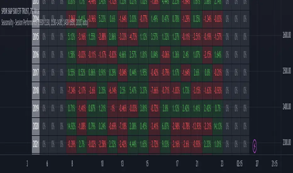
Seasonality - Session Performance - Morning Afternoon EveningUse this indicator on Intraday Timeframe. Higher the timeframe, more the data
This script calculates the performance of an instrument for different sessions.
Session inputs can be updated to study performance of
- Morning vs Afternoon vs Evening
- Pre-Market vs Market vs Post-Market (provided the data feed supports pre and post market)
- Overnight vs Intraday
Three session inputs are provided to tweak the session range
Performance is calculated as session close / session open - 1
Session timeframes can be set for various countries. Make sure the session timeframe aligns with the Candle open/close for the timeframe you choose. Some examples below
US Markets: 0930-1130 1130-1430 1430-1630 Timeframe 1 hour
India Markets: 0915-1030 1030-1415 1415-15:30 Timeframe 75min
High & Low Of Custom SessionThis script boxes a custom session and sets the box at the high and low of the session and draws that box to the next session.
Box color is determined by price in relation to the box position. Box color is set at the start of the next session. This allows
user to lookback at multiple box sets to see how each day closed in relation to the session highlighted.
I have written this for backtesting purposes and intend to expand it to use with volume analysis and gradient color to change the box color based on how many times price tests
the box.
Market Profile with Past SessionsThis script plots market profiles that show the amount of time price has remained at a particular level during past sessions, often referred to as "time price opportunity".
TV user @LonesomeTheBlue created the original Market Profile indicator on which this script is based. This version makes minor changes to the automatic timeframes, and to show historic market profiles and points of control.
The market profile drawing begins at the START of the relevant session being profiled and extends to the right. There is a checkbox in the options that will plot the market profile at the END of the relevant session, if desired.
If you want to view the market profiles for shorter or longer sessions, use the drop down menu to take the Higher Time Frame setting off "Auto", and instead select a specific time interval that is HIGHER than the timeframe your chart is showing.
The market profile and points of control can be used to identify areas likely to serve as potential support or resistance, as well areas where price is likely to retest when it is ranging.

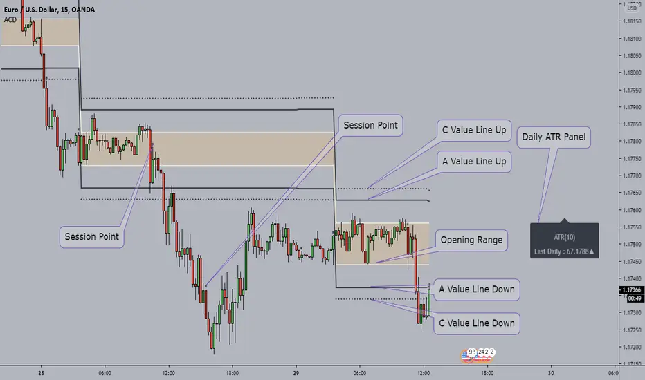
ACD - Fisher's Methodology(Manual Sessions & Values)ACD - Fisher's Methodology(Manual Sessions & Values)
Version 1.00
Created by TWA_TradeWithAmir(TWA_PriceActionTips)
Updated 10/14/2020
Based On Mark B. Fisher's ACD Methodology
* Open the Indicator only in GMT+0(UTC+0)
* You Can Change the Session with First Parameter in input
* Run Indicator with Session Breaks for better view
* Do not change the Session Values(Session Periods)
* Enjoy!
Oil Pit VWAPOil future traders commonly watch the pit session VWAP (9:00am to 2:30pm). The Oil Pit VWAP indicator overlays the VWAP from 9-2:30 (using hlc3) onto any futures asset, but its probably only useful for oil...

DA - Time - Trading SessionsDigital Assassins - Time - Trading Sessions
Code adds vertical bars to chart to highlight different trading sessions.
Settings can be adjusted to line up sessions to your time zone.
08/04/2019 - Cryptooblong72
Big thanks to Chris Moody's "CM Time Based Vertical Lines"

Multi-Session Volume Profile Suite [MarkitTick]💡 This indicator provides a sophisticated, institutional-grade Volume Profile analysis suite that renders multiple temporal profiles simultaneously. It is designed for traders utilizing Auction Market Theory who require a holistic view of where value is being established across Daily, Weekly, and Monthly timeframes, alongside custom intraday sessions. By bypassing standard built-in functions in favor of a custom array-based calculation engine, this tool offers granular control over Value Area logic, Point of Control (POC) migration, and multi-timeframe confluence detection.
✨ Originality and Utility
Standard Volume Profile tools often limit traders to a single timeframe or the visible range of the chart. This creates a fragmented view of the market, where a trader might see the daily value but miss the context of the weekly or monthly auction.
This script solves that problem by layering three distinct higher-timeframe profiles (Daily, Weekly, Monthly) plus three customizable intraday session profiles onto a single chart.
● Key Differentiators
Confluence Detection Engine: The script mathematically calculates when the Points of Control (POC) of different timeframes overlap (e.g., Daily POC inside Weekly POC). It explicitly highlights these high-probability zones with specific labels (e.g., "TRIPLE CONFLUENCE"), automating the search for key support/resistance levels.
POC Migration Tracking: Unlike static profiles, this tool tracks the "Shift" of the POC. It visualizes whether value is migrating higher (▲), lower (▼), or remaining neutral (=) compared to the previous period, providing immediate insight into the trend's acceptance.
Synthetic Chart Protection: The script includes logic to detect and prevent usage on non-standard chart types like Heikin Ashi or Renko, ensuring that the volume data processed is accurate and not subject to the repainting often found in synthetic OHLC variations.
🔬 Methodology and Concepts
The core engine relies on a custom implementation of the Volume Profile formula using dynamic arrays. It does not simply pull pre-calculated data but processes the tick volume of the underlying asset relative to price action.
• Volumetric Binning
The script divides the price range of a specific period (e.g., a Day) into a user-defined number of "rows" (bins). As price trades within a specific bin, the corresponding volume is accumulated.
Point of Control (POC): The bin with the highest accumulated volume is identified as the POC. This represents the "Fair Value" or the mode of the distribution for that period.
Value Area (VA): The script calculates the total volume of the profile and then identifies the range surrounding the POC that contains a specific percentage (default 70%) of that volume. It uses a dual-scanning algorithm that expands upwards or downwards from the POC based on which adjacent row has higher volume, mimicking the auction process of testing prices.
• Exact-Anchor Pivots
Simultaneously, the script tracks "Exact-Anchor" pivots. Unlike standard pivots that settle at the close, these track the absolute High and Low of the period (Daily/Weekly/Monthly) in real-time and extend them until a new period begins.
🎨 Visual Guide
The indicator uses a color-coded hierarchy to distinguish between timeframes. Understanding this visual language is critical for interpreting the data.
● Profile Hierarchy (Default Theme)
Daily Profile (Yellow/Gold): Represents the immediate, short-term auction.
Solid Line: Daily POC.
Dotted Line: Daily Value Area High (VAH) and Low (VAL).
Weekly Profile (Blue): Represents the intermediate auction. A solid Blue line indicates the Weekly POC.
Monthly Profile (Purple): Represents the macro auction. A solid Purple line indicates the Monthly POC.
● Labels and Symbols
Right-Side Labels: At the end of profile lines, text labels display the exact price of the POC.
Shift Arrows (▲ / ▼): Located inside the POC label, these arrows indicate the direction the POC has moved relative to the previous period's POC. An Up arrow (▲) suggests buyers are accepting higher prices.
Confluence Labels: If enabled, a text box appears near price action stating "POC CONFLUENCE" or "TRIPLE CONFLUENCE" when the POCs of different timeframes align within a tight margin.
Block Symbol (⬛): A small block icon may appear above bars to denote the center of a specific session's time window.
● Pivot Lines
Orange Lines: Previous Daily High (PDH) and Low (PDL).
Green Dashed Lines: Previous Weekly High (PWH) and Low (PWL).
Red Dotted Lines: Previous Monthly High (PMH) and Low (PML).
White Dashed Line: New York Midnight Open price (if enabled).
📖 How to Use
This suite is designed for "Contextual Trading." It answers the question: Where are we relative to value?
• Trend Acceptance
Observe the Shift Arrows on the POC labels. In a healthy uptrend, you should see a sequence of Daily and Weekly profiles with (▲) arrows, indicating that the market is validating higher prices as fair value. If price rises but the POC remains lower or shifts down, it may indicate a "weak high" or a potential reversal (divergence between price and value).
• Support and Resistance
The POC lines act as high-probability support and resistance. Price returning to a Weekly (Blue) or Monthly (Purple) POC often results in a reaction, as these are areas of significant historical agreement between buyers and sellers.
• The Confluence Play
Pay special attention when the "Confluence" label appears. When a Daily POC aligns with a Weekly or Monthly POC, that specific price level possesses reinforced structural importance. A rejection from such a level is a strong signal; a breakout through such a level often leads to an explosive move as value transitions rapidly.
⚙️ Inputs and Settings
The script is highly customizable via the settings menu.
● General Settings
Row Resolution: Determines the granularity of the profile. Higher numbers (e.g., 100) create smoother, more detailed profiles but use more calculation resources.
Value Area %: Default is 70.0, representing the standard deviation of value.
Show POC Shift: Toggles the (▲/▼) comparison logic.
● Profile Scope
Show Daily/Weekly/Monthly: Checkboxes to individually enable or disable specific timeframe profiles.
Session Lookback: Controls how many historical days/weeks the profiles are kept on the chart.
● Pivots (PDH/PMH/NYM)
Show Pivots: Enables the High/Low lines for previous periods.
Show NY Midnight: Specifically toggles the opening price of the New York session (00:00 EST).
● Alerts
Approach Distance: Sets the sensitivity (in ticks) for alerts when price nears a key POC level.
🔍 Deconstruction of the Underlying Scientific and Academic Framework
This indicator is grounded in Auction Market Theory (AMT) and statistical distribution analysis.
• The Market as a Mechanism
AMT postulates that the primary purpose of the market is to facilitate trade. Price advertises opportunity, while Time regulates the opportunity. Volume is the validation of that price. When the market spends significant time and transacts significant volume at a specific level, it establishes "Value."
• Gaussian Distribution and Central Limit Theorem
A Volume Profile is essentially a histogram of volume over price, often resembling a Gaussian (Normal) Distribution or "Bell Curve" when the market is balanced.
POC (Mode): The peak of the curve. Mathematically, this is the mode of the dataset—the price occurring with the highest frequency (volume).
Value Area (Standard Deviation): In a normal distribution, approximately 68.2% of data points fall within one standard deviation of the mean. This script defaults to a 70% Value Area to approximate this statistical boundary. Prices outside this area are considered statistically significant anomalies or "imbalanced."
• Confluence and Probability
The "Confluence" feature leverages the intersection of independent datasets. If the mode (POC) of a short-term distribution (Daily) aligns with the mode of a long-term distribution (Weekly), the probability of that price representing "True Value" increases exponentially. This aligns with statistical principles where overlapping data clusters suggest a stronger underlying signal amidst market noise.
⚠️ Disclaimer
All provided scripts and indicators are strictly for educational exploration and must not be interpreted as financial advice or a recommendation to execute trades. I expressly disclaim all liability for any financial losses or damages that may result, directly or indirectly, from the reliance on or application of these tools. Market participation carries inherent risk where past performance never guarantees future returns, leaving all investment decisions and due diligence solely at your own discretion.

Saptx Trading Time Ranges v2Saptx – Trading Time Ranges is a session-based market timing indicator designed for traders who focus on specific intraday trading windows rather than constant screen time.
The indicator highlights predefined key trading times using vertical ranges and reference lines, allowing traders to quickly identify when to actively look for trade setups during live trading, backtesting, or TradingView Replay Mode.
Unlike many session indicators, this tool is specifically engineered to work reliably in Replay Mode without auto-scale or zoom distortions.
Once a trading window has ended, its range automatically freezes to the true High and Low of that session, providing clean and stable historical reference levels.
────────────────────
CORE FEATURES
────────────────────
• Session-based trading time ranges
• Automatic High & Low range detection
• Ranges freeze after the session window ends
• Clean and non-intrusive chart visuals
• Replay and backtesting optimized logic
• No auto-scale or zoom distortion issues
────────────────────
SESSION WINDOWS
────────────────────
• Frankfurt Open
• London Open
• MMM1
• MMM2
• New York Open
• New York Trap
• Market Closing
────────────────────
BACKTEST & REPLAY
────────────────────
• Displays previous, current, and next trading day
• Fast navigation to key trading windows in Replay Mode
• Designed for efficient historical trade review
• Stable behavior while scrolling and zooming the chart
────────────────────
CUSTOMIZATION
────────────────────
• Adjustable UTC offset (Winter / Summer time support)
• Custom colors and transparency for ranges and lines
• Clean session labels with optional visibility
• Optional next-session countdown timer
────────────────────
IMPORTANT NOTE
────────────────────
This indicator does NOT generate trade signals.
It is a visual timing and structural tool intended to support discretionary and session-based trading strategies.
────────────────────
RECOMMENDED MARKETS & TIMEFRAMES
────────────────────
• Forex (EUR/USD, GBP/USD, DXY, etc.)
• Intraday timeframes (M5, M15, H1)

Michael Ultimate Open session/sentiment.Overview This indicator is a precision tool designed for intraday traders who need a complete overview of market time and structure in a single, compact panel. It combines Session Liquidity Levels with Multi-Timeframe Trend Analysis, allowing you to spot alignments between session ranges and the broader market direction instantly.
Key Features
1. Advanced Session Tracking The dashboard monitors three key trading sessions with custom operational hours:
Asia (23:00 - 06:00): Captures the overnight range.
London (08:00 - 11:00): Focuses on the European open volatility.
New York (14:30 - 16:30): Targets the US market overlap.
For each session, the dashboard calculates and displays real-time data:
High & Low: Crucial for liquidity sweeps and breakout targets.
Midpoint: The equilibrium level of the session, often acting as dynamic support/resistance.
Status: A visual "Traffic Light" (🟢 Open / 🔴 Closed) indicating if the specific window is currently active.
2. Multi-Timeframe Trend Correlation Instead of a generic trend filter, this tool links each session to a relevant higher timeframe to provide context:
Asia Row ➔ Daily Trend (D1): Shows the macro bias.
London Row ➔ 4-Hour Trend (H4): Shows the structural bias.
New York Row ➔ 15-Minute Trend (M15): Shows the immediate execution momentum.
3. Visual Logic & Design
EMA 50 Strategy: Trends are determined by price action relative to the 50 EMA (Green = Bullish, Red = Bearish).
Modern UI: Features a sleek, dark-themed aesthetic with semi-transparent backgrounds to keep your chart clean and professional.
Instant Read: Uses color-coded icons (🟢/🔴) so you can assess market conditions in milliseconds.
How to Use Use this dashboard to find confluence. For example, if the London Session opens while the H4 Trend is Bullish (Green), look for buy setups near the Asia Midpoint or Asia Low.
Settings
Fully customizable session times.
Adjustable EMA length (Default: 50).
Table position and size can be modified to fit your screen.
